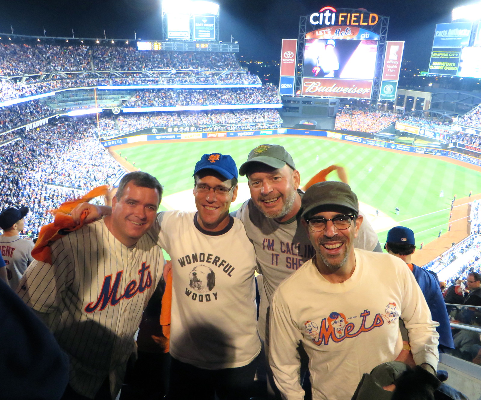
Photo by some guy sitting two rows behind us; click to enlarge
Great time last night at Shea, as I was fortunate enough to be part of a stalwart quartet of my favorite Mets fans and writers. From left to right, that’s Mets Police blogger and Queens Baseball Convention poobah Shannon Shark, wearing a Mets jersey (which, although you can’t see it in that photo, had “Murphy 28” on the back); Mets numerology expert and Mets by the Numbers honcho Jon Springer, wearing a replica of the “Wonderful Woody” T-shirt that former Mets second baseman Doug Flynn used to wear in tribute to his dog back in the late 1970s; Uni Watch weekend editor Phil Hecken, wearing the always-fashionable stylings of “I’m Calling It Shea”; and yours truly, wearing a long-sleeved tee based on this old Mets pennant (as you can see, Lady Met was so much woman that it took two Mr. Mets — or would that be Messrs. Met? — to satisfy her).
Although the company was great and the home team coasted to a lopsided victory, the game was unsatisfying from a uniform standpoint. Matt FratBro was starting for the Mets, which meant they wore their blue alternate jerseys and, even worse, their orange-billed alternate caps. Pfeh.
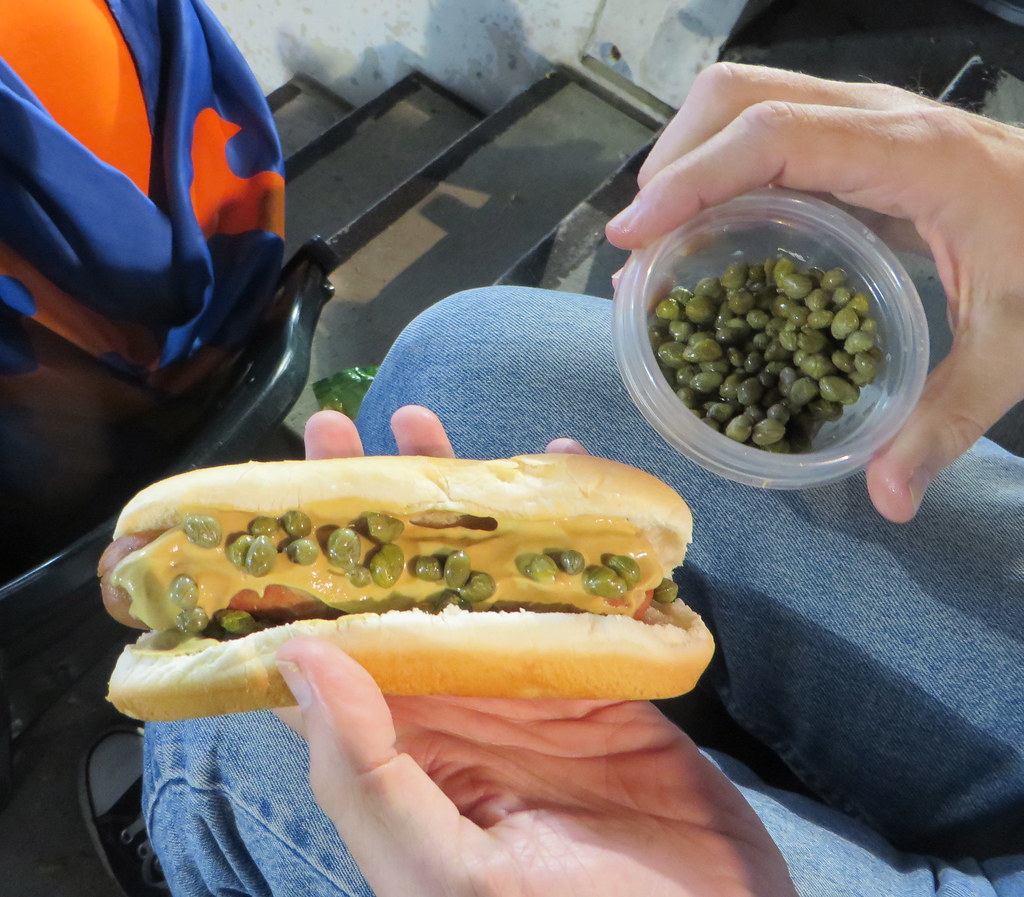
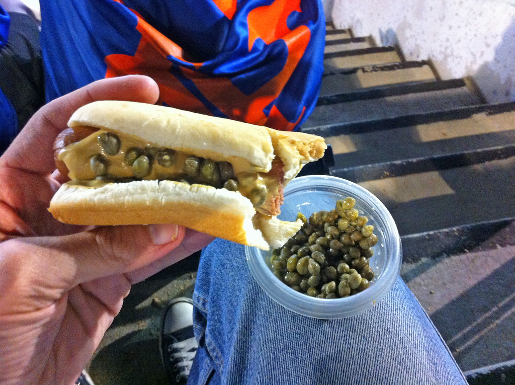
Meanwhile, I know what you’re thinking. You’re thinking, “Paul, enough about the uniforms and your friends and all the rest. Did you bring capers to the ballpark to put on your hot dog?” I hear your cry, my friend. Here’s the deal: There had been talk about some yobbos bringing batteries to throw at Dodgers infielder Chase Utley after he broke Ruben Tejada’s leg in Game 2, so I thought security might be extra-tight and that it therefore might not be a good idea to bring a small glass jar of capers in my bag. So instead I brought some capers in a little Tupperware-style plastic container, which worked fine. And I don’t mind saying that a capers-laden hot dog tastes every bit as good at the ballpark as it does at home (first two photos by Phil, third one by me; click to enlarge):

Big thanks to Shannon, Jon, and Phil for a great night, and doubleplusthanks to Mike Zulla for making it all possible. Now let’s go wrap up the series tonight.
November T-Shirt Club launch: A few weeks ago I showed you the amazing tequila sunrise design that we were planning as November’s offering from the Uni Watch T-Shirt Club. I’m happy to report that the shirt is now available for ordering.
As I explained a few weeks back, the design and production issues on this one were fairly complex, so we decided to have some samples made. Check it out (click to enlarge):
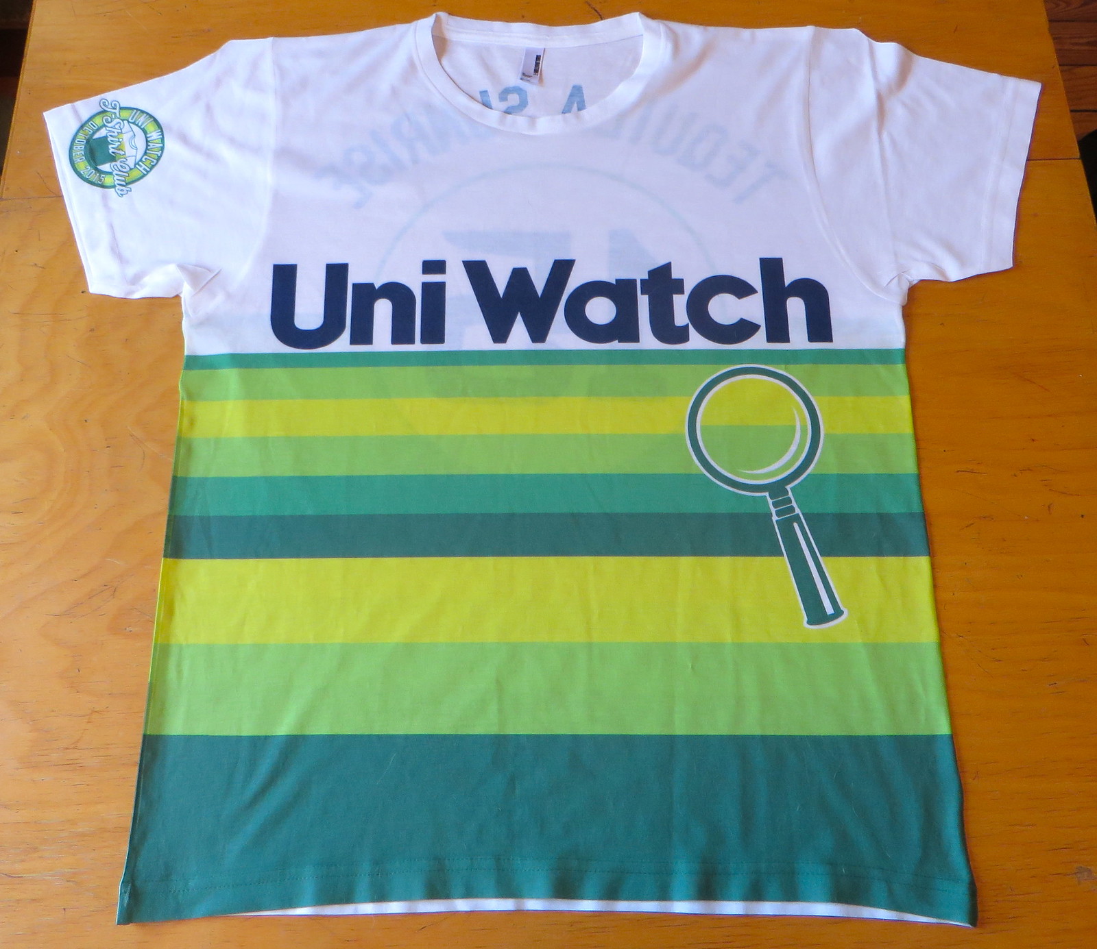
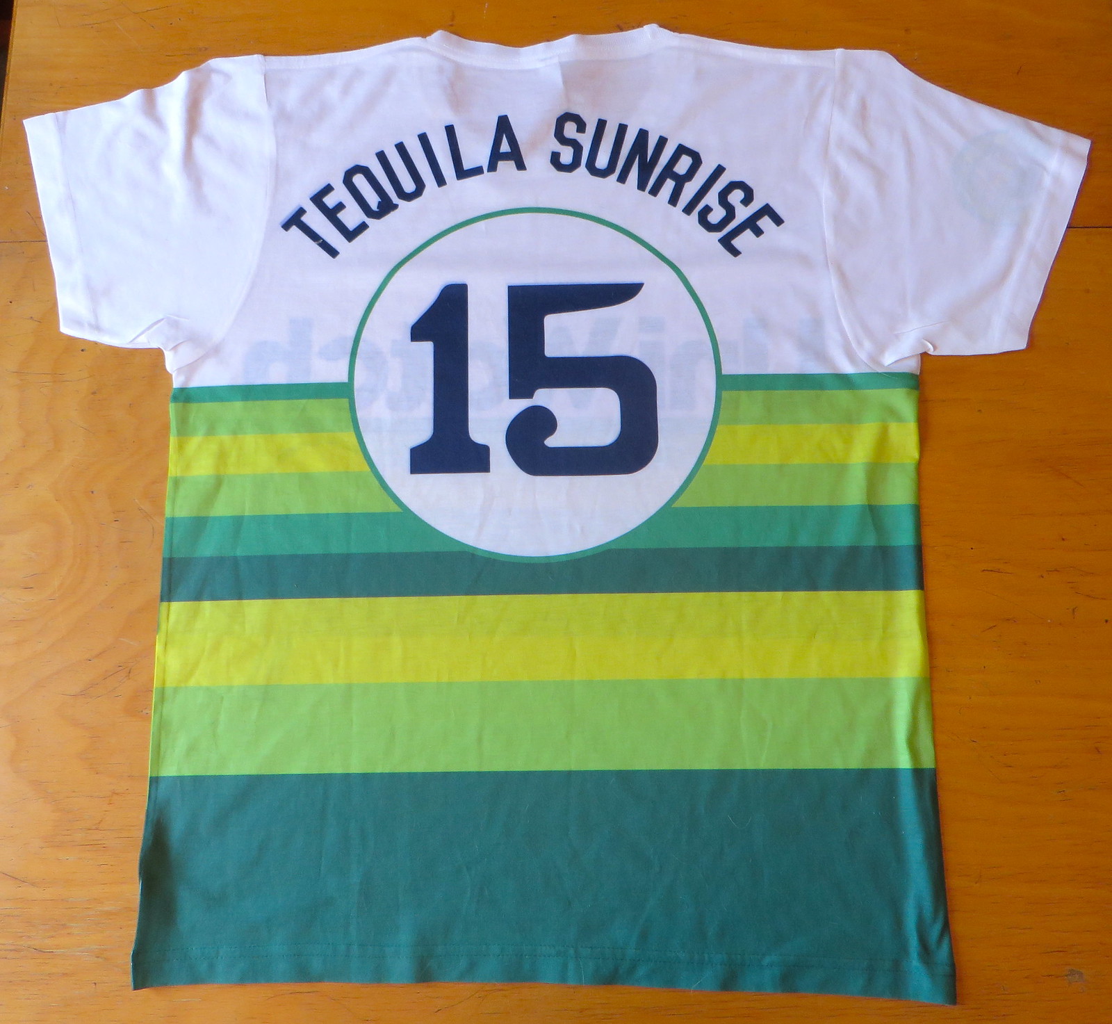
Not bad, right? This shirt is completely unlike any of the others we’ve done, and there are also several aspects of the design that I want to share with you and some issues I want to address. Please bear with me while I explain:
1. All our other shirts have been screen-printed, but this one is sublimated. Why? Two reasons: First, traditional screen-printing wouldn’t have allowed us to print all the way to the sides and the bottom of the shirt. Second, even if we had stayed within the traditional screen-print boundaries, the stripe coverage would have used so much ink that the shirt would have been extremely stiff and heavy. Using sublimated dyes avoids this problem — the shirt is light and flexible. Sublimation has its drawbacks (it’s not quite as crisp or vibrant), but it was the best approach for this design.
2. Once we decided to go with sublimation, we had no choice but to go with a 100%-polyester shirt. It definitely doesn’t feel as nice as our usual cotton. On the plus side, however, the poly fabric feels a lot more like a real jersey, so there’s that.
3. In the photo of the front of the shirt, you can see the NOB “bleeding” through on the back side. Similarly, if you look at the back photo, you can see the “Uni Watch” chest lettering showing through from the front side. This is NOT due to the shirt fabric being thin or flimsy. It’s because of the way sublimation works — the pigment is in the fabric instead of on the fabric, so it tends to show through to the reverse side. The fabric is high-quality, promise.
4. If you look closely, you’ll see that the back numerals and some of the NOB letters have a faint shadow. That was basically sloppy work on the sample. Won’t happen with the real shirts. Also, the “1” is sitting slightly higher than the “5”; again, that has been corrected.
5. We usually have the sleeve patch graphic centered on the side of the sleeve, so it’s partially visible both from the front and the back. But as you can see in the photos above, the sleeve patch on this shirt is truly on the front of the sleeve and will not be visible from the back — that’s due to a production limitation. I’ve tried on the sample and can honestly say the front/back issue doesn’t seem like a problem when the shirt is being worn. (The patch on the sample is also too close to the sleeve hem, but that’s been fixed that for our production run.)
6. Contrary to what I said a few weeks ago, this shirt is available in 3XL after all.
7. Because of the design and production issues involved, this will be our most expensive shirt, with a price tag of $28.99. Given how awesome it looks, I do think it’s worth it, and I hope you agree. But if you think that’s too much to spend on a T-shirt, I completely understand.
8. The design, obviously, is based on the Astros’ tequila sunrise jerseys from the 1970s. One difference is that we weren’t able to duplicate the rainbow stripes on the sleeves (production limitations), but I don’t think that’s a dealbreaker.
I think that’s everything. Again, the shirt is available here.
(Special shout-out to my Teespring partner Bryan Molloy, who put in a lot of work on this one. You da man, Bry!)

Click to enlarge
Collector’s Corner
By Brinke Guthrie
“Hormel makes real Chili — the official choice of the National Football League”! That’s what this ad says — guess they were just starting to dip their Riddells into league-wide sponsorships at that point. “Selected Training Table Meats,” too! And hey, as long as we’re talking Hormel, here’s a nice-looking set of those 1960s Hormel NFL serving trays.
Here are the rest of this week’s vintage sports picks:
• Here’s a 1970s L.A. Dodgers clock, made by Westclox. (The ad says 1960s — that’s wrong.) I had one of these for the Reds and had forgotten about it ’til this very moment! Can’t find an image of that online anywhere.
• Dave Boss alert! The Eagles should use this 1960s poster art as a template and ditch the BFBS look, what do you say? This poster is in great shape considering its age, too — just a couple of tiny tears.
• Here’s a 1970s Mets puzzle featuring Shea Stadium, Dave Kingman, Tom Seaver, Ed Kranepool, Jerry Koosman, and Jon Matlack. [Interesting that they show Matlack wearing white shoes. ”” PL]
• Staying with the Mets, check out this dynamite DeLong pullover. Got that great quilting in there, too.
• One more from New York: a vintage 1960s look to this New York Nets gold-trimmed stein.
• Note the simplicity of the 1960s version of the Bruins B logo on this patch.
• Show your St. Louis Blues pride with this 1960s bumper sticker (though it’s not horizontal like most bumper stickers) from KPLR TV 11.
• A Boston Red Sox beret from the 1960s/1970s? Sure, why not! (Did they wear a lot of berets in Boston back then, I guess? Was that a thing?)
• This 1970s Buffalo Sabres youth jersey by Champion looks to be in great shape.
Finally, an official Collector’s Corner shout-out to Uni Watch fan Casey, who my wife and I met Saturday at the Giants Dugout Store in Walnut Creek (I was perusing the “Fade To Black” jerseys — birthday in one month, don’tcha know. ) I spoke to him and said, “I love uniforms, I do a little something every week with them online.” He goes, “Sports Logos.net?” I say, “Uni Watch.” He responds, “Uni Watch? I love that site!” Keep reading, Casey!
Follow Brinke on Twitter: @brinkeguthrie
The Ticker
By Mike Chamernik

Baseball News: Odd sight in last night’s Cubs/Cardinals NLDS game, as Cubs reliever Trevor Cahill pulled up his pant leg at one point, revealing that he wears Dodgers socks. Cahill was in Los Angeles’s minor league system for a bit this summer before signing with the Cubs down the stretch. He wears the socks because they are thicker and help prevent blisters (thanks to Dave Garabedian and Adam Steinberg, respectively). … A 101-year-old Cubs fan has a triple-digit jersey number. Her nickname must be hectogram. … Speaking of the Cubs, here’s more info on the players eating breakfast on the field at Wrigley on Sunday, as mentioned in yesterday’s Ticker (from Douglas Ford). … Here’s a gallery of Chicago NBAers wearing Cubs and Sox jerseys. … The Rangers painted a logo at Founders’ Plaza at DFW. The Blue Jays decided to one-up their ALDS foes with a large public logo display of their own. … The aptly-named Stan Capp saw this hybrid Jays/Cubs hat at a 13U Little League game. ”¦ Royals speed demon Terrance Gore got his spikes impaled on Astros 3B Luis Valbuena’s pant leg during a disputed stolen base attempt yesterday. ”¦ Here’s an article on the Royals’ stitcher (from Josh Carson).

NFL News: PGA golfer and Indiana native Patrick Rodgers uses a Colts golf bag (from Douglas Ford). … Raiders superfan Dr. Death is celebrating Pinktober. That comes from his Twitter account (from Mike Davie). … Also, Facebook’s Monday Night Football scoreboard went full Pinktober (from P.K. Richardson). ”¦ ESPN’s E:60 piece on Cam Newton made interesting use of an NFL captaincy patch.

College & High School Football News: Here’s a bit of the backstory behind Ohio State’s black uniforms, with additional info here (from Jason Hillyer). … Maine will wear throwbacks against Yale this Saturday. The jerseys honor the school’s 150th year (from John Diamond). … Last week, West Virginia’s Parkersburg High School wore these digi-camo jerseys with barely-visible uni numbers (from @TheEricLittle via Coleman Mullins). … Jeff Flynn found a great photo of the 1966 All-America Team on eBay.

Hockey News: Ducks draft pick Nick Ritchie wears No. 20 for the AHL San Diego Gulls, a team that was relocated from Norfolk this summer. The Gulls take their name from the WHL’s San Diego team from the 1960s and 70s. That team, however, retired No. 20 in honor of Willie O’Ree, the NHL’s first black player. The current Gulls will raise O’Ree’s jersey to the rafters on Friday; unclear if Ritchie will switch uniform numbers (from Charles Eldridge).

Soccer News: The Japanese soccer team Yokohama F. Marinos have manhole covers with their mascot and an arrow that directs visitors toward their stadium. More info towards the bottom of this piece. Also with the covers, “When visitors who have downloaded a free app point their smartphones at one of the manhole covers, their phones automatically play an entertaining video about the sponsor. The project attracted 11 private sponsors, including a bookstore, a restaurant, a food manufacturer and even the local kindergarten” (Thanks, Will Scheibler). ”¦ New away kits for Sweden and Belgium.

Pro Basketball News: The 76ers refuse to call their arena by its official corporate-sponsored name. After getting a new court this offseason, the Sixers did put Wells Fargo’s name on their court, but they made the name as hard to read as possible. Here’s another look at the court (from Kristopher Kolob). … Yesterday we said that Brazilian hoops team Paschoalotto Bauru influenced the Hawks new design. Not so, says Brazilian Rafael Placce, who reports that Bauru started wearing their design in September for the World Championship against Real Madrid and in NBA preseason games (i.e., after the Hawks had already unveild their new design). The team’s uniforms normally look like this. … Spike Lee had a hand in creating the single-player campaign mode in NBA 2K16. Not only is he a playable character in the game, he apparently can take the court wearing a Kangol cap and sunglasses. ”¦ A new Vegas-based developmental league, called the AmeriLeague, has unveiled its new logo, new uniforms, and more uniforms.

College Hoops News: A few Under Armour schools, including Auburn and Cincinnati, will unveil new uniforms on Friday. ”¦ New road uniforms for San Diego State (from Drew McClintock). ”¦ Tennessee has a player wearing JrOB — or do they?

Grab Bag: The Holy Tunic of Argenteuil, a garment purported to be worn by Jesus Christ at Calvary, will be available for public display for a few weeks in spring 2016. It is displayed every 50 years (from reader ChrisH). … David Firestone wrote about the boot stylings of NHRA racers Cruz and Tony Pedregon. … Two 11-year-olds in Texas broke their school’s dress code by wearing Air Force logo jackets (from Brinke). … While dining at a Philadelphia Shake Shack a few weeks ago, Tom Konecny sat at a table made out of wood from a bowling lane. I have to say, a Shake Shack opened in Chicago last winter, and I found the place to be overrated. The burgers, fries and shakes were good, but exceptionally small and expensive. [As a NYCer, I agree that Shake Shack is overrated. ”” PL].
Proofreading: “and, even worse, they’re orange-billed alternate caps”
Glad you guys enjoyed the game. Me, I have some tickets for an unplayed game yesterday that I need to go get refunded. So it goes.
Thanks, Jerry — fixed. Sorry about your unused tix!
I think it’s a bit tacky to stamp the table with a note telling everyone that it used to be a bowling lane. What are you fishing for? A compliment? A medal?
We have a great deli in Indianapolis in which the counter and the tables are also made of former bowling lanes. How do I know this? Because the lane markings are still on them, not because they’ve been sanded and stained to look like reclaimed wood and had the pertinent information about their former lives stamped into them.
I am pretty much with you on that. There is no joy in being *told* what you are looking at–particularly if it is discoverable by the looker. Can’t see if this table has any arrows or not, but that (to me) is the beauty of reclaiming/reusing things–letting people discover its previous life. If it’s not so unique that one needs to be be told what it is, then it isn’t very interesting to start with.
“THIS TABLE WAS ONCE A TREE.”
Sounds like a Mitch Hedberg line. (RIP Mitch)
Can’t agree with you there. I was at a Shake Shack in Battery Park City with my kids a couple days ago, and one of my sons noticed the same slogan burned into the wood table. It started a really good conversation about reusing, re-purposing and even upcycling.
Sure, but can’t the same thing be accomplished in a much cleaner and more authentic way by simply leaving the lane markings on the wood? I think it engages the user in much the same way.
A good thing was done in re-using the bowling lanes. How much of that positivity is offset by sanding (probably with a power tool that uses electricity) and re-finishing the wood (probably with relatively harsh chemicals)?
Also, how far away was the bowling alley? Was it in Brooklyn, then trucked to Philadelphia after completion? Was it somewhere else, then trucked to Brooklyn, then trucked to Philadelphia?
The whole thing just reeks of a “Look how green we are!” move, from both the company who made it and Shake Shack.
I would have loved to know more about the bowling alley the materials came from. But it’s not always possible to keep such track of reclaimed materials.
I wouldn’t expect any info about the alley. I meant that more in the tone of, “I wonder how much the travel costs offset the good of reclaiming it in the first place.”
Ah, gotcha. Good question.
For my own part, I don’t think that travel costs necessarily offset the good (unless they’re obscene, perhaps). Reclaiming wood and therefore harvesting less can be a good in its own right.
I was in the Dedham, MA, Shake Shack two nights ago and saw a similarly-marked table, except it didn’t identify the location of the bowling alley. Made me wonder if they marked it with one of these relics from my youth:
link
It’s amazing the things kids were allowed to play with back in the day…
OUCH!
Had a similar kit as a kid. Loved it, except the time I accidentally pinched a little too low on it. . .ouch!
They might be fishing for some brand authenticity. The fact that they are using recycled materials and that said materials are “handcrafted in Brooklyn, NY” means something to them as a company. I do love Shake Shack burgers but the tables don’t make them taste any better.
From the “Maybe It’s Just Me” files…
While I love the idea of the Shake Shack table made from a bowling lane, something about its label rubs me the wrong way (and it’s not just the lack of punctuation). I think a label that reads something like “Salvaged from ‘Don’s Beer & Bowl,’ Poughkeepsie, NY” is infinitely more interesting and gives it a tiny bit of history.
Agreed. Tell me the history of it, not simply that you upcycled it from somewhere.
Small measure of self-aggrandizement aside, it’s kind of a cool story actually:
link
Along with the idea of adding a label saying where it’s from, adding a historic photo of the bowling alley it came from on the wall next to the table would have added a lot.
“Here’s another look at the court”
That’s exactly how all courts should look!
Just got back from the Columbus Day break, so am 1 day late…
Not sure if the diner check deciphering contest is still open, but here’s my shot:
– 2 eggs, over easy, with rye toast and Taylor ham;
– 1 order of silver dollar pancakes with Taylor ham;
– 1 large orange juice;
– 1 coffee; and
– 1 piece of pie (since it’s October, I’m guessing pumpkin)
Not sure if the diner check deciphering contest is still open, but here’s my shot:
– 2 eggs, over easy, with rye toast and Taylor ham;
– 1 order of silver dollar pancakes with Taylor ham;
– 1 large orange juice;
– 1 coffee; and
– 1 piece of pie (since it’s October, I’m guessing pumpkin)
My apologies for the multiple comments. Our network was acting finicky this morning, so none of my comments were showing “posted.” Feel free to delete the duplicates.
Don’t know why, but that Hormel Chili ad remided me of This Is Hormel, a short from the 1950’s about Hormel products.
There’s a part of me that wishes that the Tennessee basketball player had taken up place-kicking instead of hoops.
This comment is inevitably getting blocked, but…
…that 101-year-old Cubs fan STILL hasn’t seen them win it all!
Just noticed this photo of Cubs first base coach Brandon Hyde with a mic in his pocket. Is that just a TV thing?
link
Hmmmmm,….. odd.
Two 11-year-olds in Texas broke their school’s dress code by wearing Air Force logo jackets
The comments from their father really rub me the wrong way, and not only because he seems deeply confused about the definition of “political correctness”. He thinks his daughters have free reign to violate a blanket dress code, because military. What a bizarre sense of entitlement.
Agreed. If you allow any logo to be displayed at school, will gang symbols be next?
They can display logos, just logos within a certain size.
I have mixed feelings about dress codes, but this one doesn’t seem unreasonable. Provided they apply it consistently, which they are trying to do.
I find it amusing that the father refers to the enforcement of the school dress code as “political correctness run amuck.” Usually, I would expect to hear someone in his position use that phrase to describe something like a situation where a school board was loosening or abolishing a dress code because it was determined to be restricting students’ First Amendment rights. To the extent that phrase has any actual meaning, isn’t he describing a situation that is the opposite of political correctness?
No, the father understands the meaning of “political correctness” and is using the phrase with perfect precision. “Political correctness” simply means, “I believe people who disagree with my opinion are wrong, but I can’t think of a good enough reason for why my opinion is correct to argue to point, so instead I’ll just call people names.”
It’s a remarkably accurate rule of rhetoric: The first person to introduce the term “political correctness” into an argument is wrong. A person who has both facts and reason on his side would not bother invoking PC to justify his own opinion or attack another’s.
Touché.
I stand corrected; he is using the term with uncommon precision. ;)
Has Paul ever done a written piece about his signature hat?
That’s becoming a iconic piece of headwear on this site. :)
Never written about it.
It’s from Old Navy.
I have a similar one in an olive-khaki-ish tone (not from Old Navy — don’t recall where I got it), and a wool one in olive (again, I don’t recall where I got that one).
I wear these hats a lot in cool weather.
That’s pretty much all there is to write.
Shake Shack is a bit overpriced. But when I’m in New York, it’s just one of those things I gotta do. That and Burger Joint of course.
There are soooooooooo many things that are more quintessentially New York than Shake Shack will ever, ever be.
Even if they ever had a claim to being quintessentially New York, I think opening locations in Covent Garden and Istanbul (not to mention a half-dozen in Dubai) would lose them to forfeit it.
So Shake Shack is to New York as a steak with Cheez Whiz is to Philadelphia?
Though there is something quintessentially Philly about inventing a crappier version of your signature sandwich and then convincing tourists to pay extra for it.
Well, I don’t think Shake Shack is awful or anything. It’s just not terribly unique to New York, nor is it particularly part of our local gastronomic culture. (They actually taste more than anything like a highbrow version of a Milwaukee custard stand burger.)
I would say that queuing up in those insane lines at their original Madison Square Park location is quintessentially New York to me. But that’s about the overall experience, not the food.
Can you share some examples, please?
Restricting ourselves to the food category:
Katz’s Deli
Yonah Schimmel’s Knishes
Brennan & Carr
L&B Spumoni Gardens
Several dozen pizza joints
Several dozen Chinatown joints
Tom’s Luncheonette
And literally hundreds and hundreds more.
Looks like you had a good supply of capers with you. Did anyone around you notice and ask to try some?
Nope. Phil was to my left, and the aisle was to my right, so I’m not sure anyone else even noticed.
I am going to try capers on a hot dog. What brand of mustard is that on your dogs last night. Just curious.
The mustard was from a packet (or, rather, two or three packets). Can’t recall the brand. Not Gulden’s.
I want to say Gray Poupon. Not 100% on that tho…
Was not Grey Poupon — of that I’m sure.
OK. It definitely was dijon-style. So I’m gonna say it was French’s then.
And Phil also had a dog with capers (not pictured — the ones you see above where Paul has both hands visible were taken by me — the one with one hand was shot by Paul himself).
I enjoyed the capers on my dog as well. In retrospect I probably should have put more on than I did (I went with slightly less than the amount on Paul’s frank).
And yeah — I don’t think anyone, including Jon who was to my left, even noticed.
Question about the Tequila Sunrise shirts. They’re still American Apparel, even thought they’re polyester? Do the same American Apparel snugness rules (order a size larger if you don’t want it form-fitting) apply?
I know American Apparel makes an 85/15 (poly/cotton) garment called the drirelease T, but I’m not sure if that’s what is pictured.
85/15 does make for a really nice athletic fabric, though. Nice feel.
On the fence with the Tequila Sunrise shirts. Easily my favourite so far, but with shipping it’s $49 and change (CDN) to get one to Canada. Have to think on it a while.
Don’t blame ya. Wish it could be less expensive. Actually a much smaller margin on this one, because I wanted to keep it at least semi-reasonable.
A tangy baby dill pickle (garlic free) sounds like a nice side with your caper dog.
1- The signature Paul-lukas-logo-free hat is a bossmove and looks smooth when wearing a shirt with a design on it.
2- I loved this string of words:
Meanwhile, I know what you’re thinking. You’re thinking, “Paul, enough about the uniforms and your friends and all the rest. Did you bring capers to the ballpark to put on your hot dog?” I hear your cry, my friend.
3- I will admit thought of seeing Paul cuffed&stuffed on TV for smuggling in a glass jar of capers is amusing. Even more amusing to me is if Utley had played and been hit with a jar of capers! While ESPN would bill it as “the CAPER caper”, we would all laugh knowing whose fingerprints are on the jar.
4- that tequila sunrise uniwatch jersey is gorgeous. Nice work!
Further adventures in capers: I was making chicken piccata last night, for the first time in a while, and mistakenly diced the chicken before sauteeing it. Normally, you sautee the breasts whole or butterflied. Anyway, since you can’t un-dice chicken breast, I just went ahead with the recipe stir-fry style. Turned out very well – I was afraid the diced chicken would dry out, but it remained nice and moist. Shaved about 5 minutes off the cooking time, since you don’t have to remove the breasts from the pan to sweat the shallots and garlic to start building the sauce.
Leaving aside the question of why anyone would ever eat a chicken breast (white meat’s for suckers!), how does one “mistakenly dice” a hunk of meat??
Cahill’s socks are from link and are an old model of their “City” sock. Los Angeles socks in Dodger colors. Here’s a link to the new model link BTW, great socks, if you like the style.
Re: Stitcher article – some 25 years ago or so, I was told by the shop that assembled many of the on-field jerseys for S.F. Bay Area teams, that the Giants and A’s only issued two sets of each jersey (home and away) per player. Over the course of the season, torn pants were rarely replaced, but instead patched and/or repaired. I don’t know if that’s still the case, but given the huge revenue and budgets of MLB teams, I was surprised that they didn’t just replace badly damaged pants, which at the time would have typically been $30 each at the most.
Caught part of Sunday Night Football and I’m pretty sure Pinktober took over the broadcast booth as well. I didn’t get a picture but the telestrater pens they used to circle players on replays wrote in pink. Wow.
Paul: The only thing I did not see you address on the T-shirts was whether or not they were able to do a better job of matching up the sublimation patterns on the front and rear of the shirts where they meet up on the sides. I can’t find where it was originally discussed but seem to recall that that was also something which, at the time, was a work in progress.
Yes, we’ve given strict instrux on that. The stripes may not match up 100% exactly, but they’ll be close.
Very good, sir. Thank you.
Paul where did you get the Mets pennant T-shirt? That’s a must have.
That was a gift quite a few years ago from Peter Capolino (Mitchell & Ness prexy). I think it was overstock or a sample — something like that. No longer available, alas.
Mets getting it right tonight. Home whites.