Yesterday was NBA Media Day, with lots of teams doing photo shoots and showcasing players in full uniform. That included five teams with new uniforms. Let’s see how those new duds looked on living, breathing basketball players, instead just as mock-ups or stand-alone jersey photos, shall we? One team at a time (for some of these, you can click to enlarge):
1. Raptors
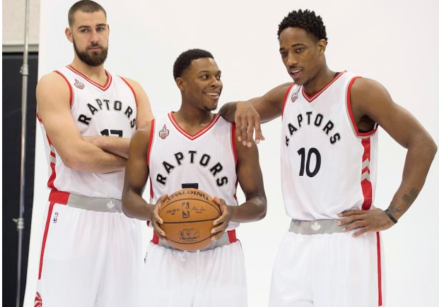
Not bad. The arched lettering doesn’t hug the numbers like we had initially been led to believe, which is a major plus. The “T” on the shorts is still silly, and the grey waistband panel leaves me cold, but this is a perfectly acceptable uniform — no more, no less.
2. Bucks
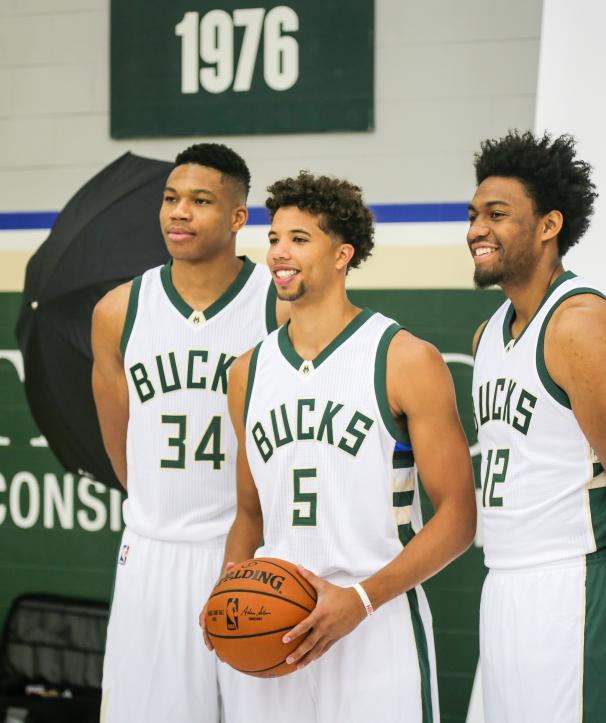
Liked it when I first saw it last winter, liked it when I wrote about the design process in April, still like it now. Is it perfect? No: The blue and black stripes at the top of the side panel feel forced and contrived (would’ve been better to stick with green, cream, and white), and I worry that the type font may not have staying power. But this is still an upper-echelon NBA uniform — definitely top 10, and maybe a bit higher. Major upgrade over what they had. (Lots of additional phtoso here.)
3. Hawks
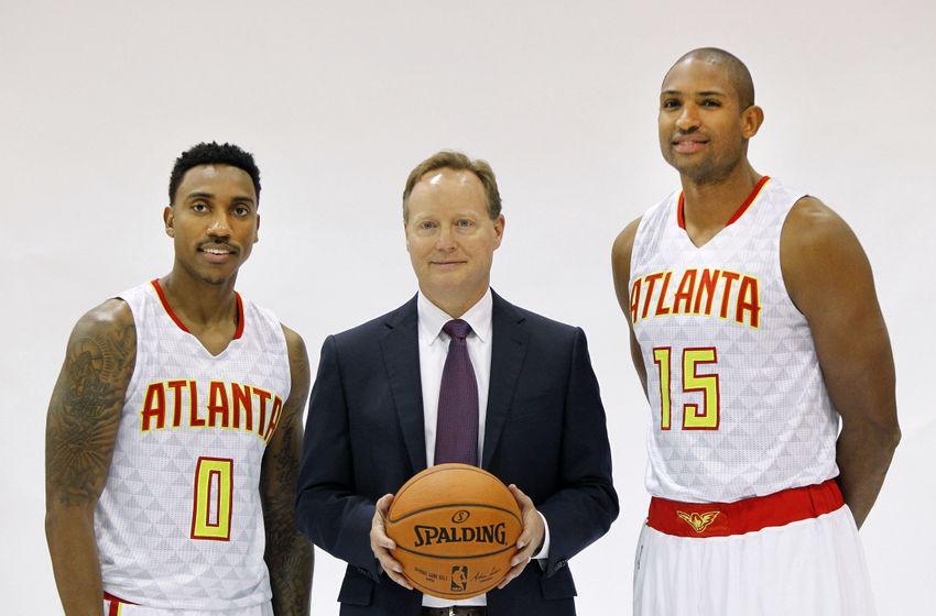


These look worse every time I see them. Yes, they’re “different,” as apologists keep telling me, but different is not necessarily good, nor is it necessarily bad — it’s just different, which is ultimately a red herring. As I mentioned in my recent ESPN piece on the spread of neon colors, one of the big problems with these fluorescent tones is that they look completely synthetic, while most of the game’s surrounding tones feel more organic. That creates a major color clash, and I don’t see how this uniform is ever going to transcend that. Prediction: In five years this design will have been scrapped, and in another dozen years or so it will be revived as a throwback, by which time we’ll be able to treat it as an amusing novelty (“Oh, right, ha-ha, remember when they wore that?”), just like we do with so many other misbegotten designs that end up as throwbacks. When that happens, I’ll probably say something like, “It’s nice that we live in a world where mistakes as bad as this one can be made,” which is what I usually say about such designs 20 years after the fact. Until then, though, this is a total dog of a uniform.
4. Clippers
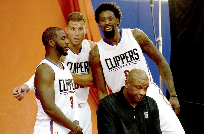
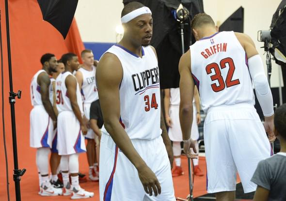
Man, Doc Rivers’s face says it all, doesn’t it? This one is awful in a completely different way than Atlanta’s. It’s not painful to look at, at least not in strictly aesthetic terms. But it’s so poorly conceived, so characterless, that it’s hard not to hate it just on principle. This one won’t last long either, but it won’t be revived as a throwback and everyone will just try to forget it ever happened. (Lots of additional pics here.)
5. 76ers
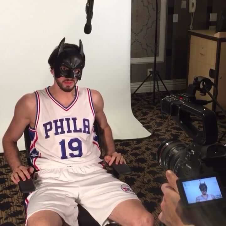
Not an ideal photo, obviously (there are lots of better ones, albeit Getty-watermarked, here), but it’s enough to confirm what we pretty much knew, which is that this is a pretty solid design. Simple, straightforward, and a good example of less-is-more functionality. Most likely nobody will notice until they start playing better, but this is going to be a good-looking team.
6. Bulls
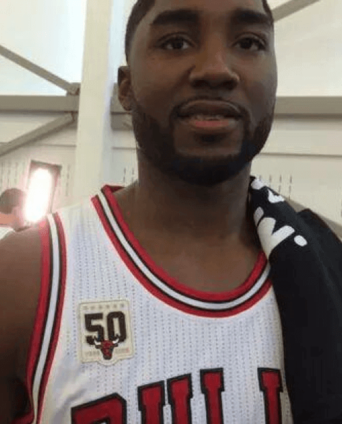
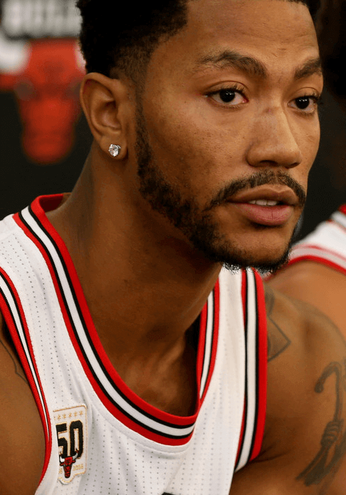
Sort of a ringer, because they don’t have a new uniform, but I’m including them because these are the best shots we (or at least I) have seen of their new 50th-anniversary patch. The weird thing is that the patch looks like it might be beige, not white. But maybe it’s just a trick of the light — or maybe not!
(Special thanks to Phil, who provided many of the photos shown above.)
Click to enlarge
Collector’s Corner
By Brinke Guthrie
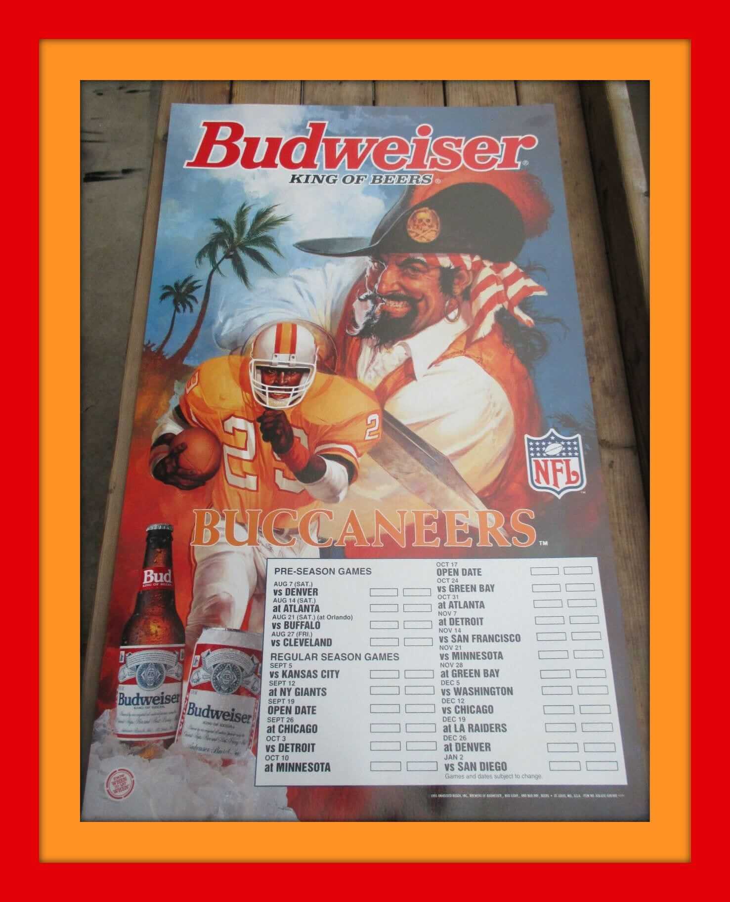
We’ve often mentioned Bucco Bruce, and now we get to see him — or someone very much like him — up close and personal on this 1993 Budweiser/Bucs schedule poster board. Looks like maybe Anheuser-Busch didn’t have permission to use the team’s logo and got around it with that Captain Morgan-like character. Everyone who’d like to see TB ditch the awful current look and return to these, raise your hands!
Now let’s look at the rest of our Collector’s Corner lineup for the week:
• Check out the groovy graphics on this cocktail lounge Atari football game!
• Great old Cincinnati Royals logos on this pair of cufflinks from Welling’s Jewelers in Cincinnati (two locations, Lockland and Mason). [This is one of my favorite Collector’s Corner items ever! Too bad it’s so pricey. Still, really fun to look at. Also love the term “presentational” in the listing title. ”” PL]
• Here’s a classic-looking LeRoy Neiman poster of Cowboys Hall of Famer Roger Staubach from 1983.
• The stores are already starting to roll out — gasp — some Christmas stuff. So now is the perfect time for this DIY Dick Butkus Christmas ornament, no?
• Reader Justin Barrett wrote in to say, “Some homework was done to determine the year of this NFL-AFC glass.
• Show everyone in school you’re a Packer Backer with this 1970s spiral notebook. Could that have been John Brockington on the cover?
• Nice old NHL California Golden Seals logo on this vintage Zippo lighter.
• Think Happy Vikes with this 1970s Vikings fan club button!
• Falcons fans, keep your extra change in this vintage helmet bank!
Take a look at this 1978 Padres ASG promo jacket, brought to you by English Leather. I’d be willing to bet those were made of cheap vinyl, but it’s still a cool-looking design.
Follow Brinke on Twitter: @brinkeguthrie

Blast from the past: NFL Superhero Project revisited: Remember Thomas Correia’s NFL Superhero Underoos Project, which was featured here on Uni Watch throughout the 2014 football season? At the time, many of you said he should turn those designs into real T-shirts, and now he’s gone ahead and done it. Check out his tees here.
The Ticker
By Mike Chamernik

Baseball News: As a final indignity to disgraced Nats reliever Jonathan Papelbon, his jerseys were removed from the Nationals team store yesterday. Maybe this shirt will fill the void. … A Detroit auto sales shop uses the Twins’ logo (from Tony Wilson). … Astros rookies had to wear costumes this weekend. Third baseman Matt Duffy dressed up as the Giants third baseman of the same name. … Over the summer, Justine DeCotis — who was Paul’s T-shirt assistant at the Boston Beefsteak a few months ago — made cornhole boards with a Red Sox stirrup motif. Here are some photos that show how the boards were created. … The White Sox weren’t the only team to wear leisure suit jerseys. One of their minor league affiliates, the 1980 and ’81 Glen Falls White Sox, had a similar look (from Marc Viquez. … Last week’s episode of the futuristic show Minority Report had a character wearing a Nats hat with a 2054 World Series logo patch (from ”@ItsTheBigFish). ”¦ Mets C Travis d’Arnaud and his brother, Phillies INF Chase d’Arnaud (a September call-up) will face each other for the first time in tonight’s Mets/Phils game. Should make for a good NOB photo-op if they end up standing side by side. ”¦ The Astros tried a slump-buster move by wearing their orange alt jerseys, which are normally worn at home, for last night’s game in Seattle. And they won! (From Baldemar Mejia.) ”¦ Bit of a NOB glitch in the movie Rookie of the Year. ”¦ Serious throwbacks — like, back to the 19th century — for Yale.

NFL News: Cam Newton wore a blue camo blazer at a press conference this weekend, and GQ magazine was not impressed (from Ethan Hagen and Andrew Cosentino, respectively). … Drew C was in Playa del Carmen, Mexico, and spotted these excellent NFL-themed masks and Day of the Dead skulls. … Chiefs CB Marcus Peters started off last night’s game against the Packers wearing red-topped socks, but he later changed to white (from @Jarferama).

College & High School Football News: Arizona State unveiled its grey alternates. … Marshall will wear U.S. flag-trimmed helmets this Saturday. … Thanks in part to the athleticwear companies creating all these uniform concepts that appeal to teenagers, jersey numbers are getting harder to read (from Phil). ”¦ With injury concerns mounting, fewer kids are opting to play football, which is leading a small but growing number of high schools to disband their football teams. ”¦ Maryland will wear mono-black this Saturday (from Matt Shevin). ”¦ William & Mary has “1693” on its nose bumpers — a reference to when the school was chartered by King William III and Queen Mary II (from Tommy Turner).

Hockey News: The Canadian province of Quebec has instituted a new series of safety rules for outdoor hockey nets (from Aaron Fusul). ”¦ Flyers G Steve Mason’s new mask depicts past Flyers greats as zombies (from Patrick Thomas).

Basketball News: Paul Pierce isn’t letting his Clipper teammates wear LeBron James’s shoes. … The Wizards have a championship belt. I have no idea what the context behind it is (from John Muir). … New home uniforms for Marshall.

Grab Bag: Odd uniform matchup in college soccer earlier this month: checkerboard (Brown) vs. purple stripes (Holy Cross) (from Bud Brooks). … GQ counted down the best 10 sneakers of 2015 (from Andrew Cosentino). … In Portland, Under Armour and Nike are fighting to see who gets to sponsor two city parks. Key passage: “Although the original agreement allowed for Under Armour ‘signs and logos’ in Lents and Duniway parks, [a local official] now says Under Armour’s $5.5 million donation will be made ‘without recognition'” (from Phil). … This past weekend, friend of Uni Watch Gary Chanko wrote that the scoreboard from Braves Field in Boston was relocated to Kansas City Municipal Stadium. Similarly, North Dakota State’s stadium, Dacotah Field, used Fenway Park’s bleachers from when the Patriots played there (from John Thompsen). … Here’s a video about the design and meaning of the helmets the Iroquois Nationals wore in the World Indoor Lacrosse Championships (from Kevin Mueller). … New logo for the AT&T Pebble Beach Pro Am golf tournament.
The Raptors jerseys look like a middle school team whose Team Mother was REALLY good at aligning the iron-on letters she bought at Hobby Lobby.
Nothing that vertical arching couldn’t improve.
One would think that “America’s Quarterback” would know how to properly grip a football.
What’s with this new trend of boring NBA jerseys? It used to be outlandish designs… now it’s white with block lettering.
You realize that there are many shades of grey in between “outlandish” and “boring,” right?
Yes, of course. To each, their own.
“now it’s white with block lettering.”
~~~
You do realize all teams are required to have a designated “light” (so white or gold) uniform right? And even the teams who have gold (or powder blue, which I think counts as “light”) tops also have a white top. Not a lot can be done there.
Hawks Vs Browns in a cage match, who’s new uniforms win?
I’ve seen that movie. It’s the one where the asteroid plows into the Earth just as the cage match is about to start.
I still feel like the Clippers are worse than the Hawks, and the Browns if we’re going cross sports. Even if the Hawks’ uniforms are not aesthetically pleasing and gimmicky they are at least trying to do something. The Clippers’ redesign is just nothing it kind of looks like clip art or something that an ABA 2000 team would have come up with.
Even if the Hawks’ uniforms are not aesthetically pleasing and gimmicky they are at least trying to do something…
This notion that a team can get an “A for effort” simply by doing something outrageous is nonsense. A lot of times, they only thing they’re “trying to do” is to shock and outrage, as opposed to trying to come up with a good design. That’s where my whole “good vs. stupid” concept came from: In order to be “bad,” something has to be a failed attempt at being good. But lots of designs don’t even bother trying to be good — they’re just trying to be stupid (or different, or shocking, or “edgy,” or any number of other things that have nothing to do with being good).
Bottom line: A good design is a good design, a bad design is a bad design, the end. As a noted cultural critic once observed, “Try not. Do… or do not. There is no try.”
A good design is a good design, a bad design is a bad design, the end.
Couldn’t disagree more. Did the Cowboys white jersey suddenly become a “bad design” because now the collars bleed and become discolored? If Nike started from scratch to make a Cowboys jersey, and designed a jersey that cannot actually be manufactured, that would be bad design. But that’s not what happened; a good design has been ruined by poor execution. Idea and implementation really are distinct things, and any work of design (or art) can be assessed in terms of its concept and its execution.
Now, in the case of the Hawks, I’d grade in exactly the opposite terms: It’s a terrible idea that in practice doesn’t look nearly as bad as it ought to. It’s like a movie with a terrible script, but the acting is so good you keep watching. Conceptually, it seems to me that the biggest problem is how much Atlanta has adopted the visual language of trend-chasing, change-every-game sports fashion. But due to NBA rules, they’re stuck with these “cutting edge” or whatever uniforms for, what, three seasons? Neon is already beginning to feel dated; by 2018 the Hawks are likely to look like the jersey rack at Marshalls. By then, Nike will probably be pushing deeply saturated flat colors or something, and the Hawks will look like a kid wearing a hand-me-down Coca-Cola rugby shirt in 19940.
I’d give the Hawks a C- for effort and the Clippers an incomplete.
“As a noted cultural critic once observed, “Try not. Do… or do not. There is no try.””
~~~
Yoda?
Think the RB on that Packers spiral notebook may be McArthur Lane, Brinke:
link
Wow, nailed it. That’s the exact photo!
Day of the Dead skulls….
What is that grey one with the red stripe in the left foreground?
Probably the Patriots, based on the red, white, and blue trim on it. They aren’t exactly going for total accuracy.
Points to the Minority Report prop people for the credible 2054 World Series logo design. But major deduction for the navy Nats cap. Much as I wish the team would go navy with red highlights, the red cap has become too central to the team’s identity to change. And they don’t put event logos on fashion caps. So while 2054 is far enough in the future that the Nats will no longer have their current GM, manager, and scouting and medical staff, so they might actually make the World Series, they won’t be wearing, and thus won’t be selling, a navy cap with the Series logo on the back.
You really think that 40 years from now they will still be using the curly W?
Absolutely. I wish Bud Selig hadn’t crapped on the Nats original branding and forced the return of the curly W, but he did. It’s become increasingly central to the team’s identity; at this point, it’s as likely to be dropped as Detroit’s Old English D.
I just hope that by 2054, the Nats will have forced their jersey and cap manufacturers to use their actual, updated and much improved curly W logo. The caps and jerseys are still using the 2005 reconstruction of the expansion Senators curly W, which is riddled with basic flaws of draftsmanship. Lines don’t meet, curves are not continuous, line thickness is inconsistent, and so forth. The 2011 revision of the curly W fixed all of those problems. It’s a terrific mark, if only the team would wear it.
Sheesh – I really hope it’s a Sunday-morning-game-only throwback design by then.
In the late 60’s, someone probably said the same about the Orioles cartoon bird.
I really wish they had stuck with the navy hats. Those were nice.
New Era has actually started selling Fashion Caps with patches the past couple of years,
link
I actually find the year-choice interesting. The original movie is set in 2054 and the show is set in 2065. Obviously the props department chose 20154 as a reference to the movie, but they inadvertently set up an interesting thing where the character is either wearing an eleven year old cap or it’s a throwback that’s in the series’ past but the audience’s future.
Impressive homework on that AFC glass, but the seller missed one detail: the Houston Oilers helmet. Houston wore a blue helmet in 1974; the white helmet depicted on the glass debuted in 1975.
I’m interested why the new Nuggets uniforms weren’t included above?
Forgot.
Got to be said, in a league with an increasing number of mediocre uniforms, that last night’s Packers/Chiefs match-up was beautifully pleasing.
link
A little mud and it would have been perfect.
Snow. A little snow and it would have been perfect. Still, best-looking game of the season so far. It was such a classic uni matchup, it could have been a game of Tudor electric football.
Did anyone else first see the maple leaf on the Raptor’s uniform as an Adidas three-leaf logo when they first saw the image?
The new NBA uniforms displayed here are, overall, very pleasing. The trend towards a clean aesthetic is welcome.
Bucks – It’s a shame we don’t see the Bucks’ uniform from the back. Are the names one-colour or two-colour?
Hawks – I don’t like the pattern on the Hawks’ jerseys; and this pattern looks awkward next to white shorts without that pattern. But I do like the yellow-on-red numbers in the inverse of the red-on-yellow wordmark; it reminds me of these great Orioles uniforms:
link
I didn’t catch that the yellow was supposed to be “neon”. While this shade looks bad most of the time, it doesn’t seem out of place on the Hawks’ uniform. I also like the one-colour red names on the back.
Clippers – Their unis are very uninspiring. In addition to the flaws of blah-ness, there is one design flaw: the one-colour names on the back should be blue (the colour of the outline of the two-colour numbers), not red. Note that the Hawks got this right.
Sixers – It is so frustrating that the Sixers, and not the Nets, have brought back the stars-on-the-side motif. This good move by the Sixers only highlights the inadequacy of the Nets’ uniforms.
Bulls – Congratulations to the Bulls for never having changed their logo or their home uniforms. But I wish that they would go back to the White Sox-style “Chicago” on the road.
link
Regarding baseball: while the Yale-Wesleyan game looked absolutely beautiful, the look was more 1930s than 1860s. Here is what the 1860s looked like:
link
Back of Bucks jersey:
link
Great! Thanks.
Even though this violates the principle which I mentioned in critiquing the Clippers’ unis, by which the single-colour name should be in the colour of the outline of the the two-colour number, the Bucks’ uniform back looks very nice.
This illustrates the fact that all such design principles are mere guidelines which should be loosely applied and which can be ignored in favour of the overall look.
The big issue with the Clippers is that they altered the word mark but failed to change the horribly bland template they used before. Those side panels just make me squeamish.
I think you are on to something Mr. J.
A not very inspiring wordmark indeed. Total letterfail
Well the wordmark was never the problem with old Clipper Unis. Especially the Los Angeles script. The problem was the wonky side stripes and the cutout neckline. So they fixed the one part of the uniform that wasn’t broken.
That photo of the 1869 Red Stockings is what the 1870s looked like. Before Cincy went pro, there are no confirmed examples of teams wearing knickers and high socks. Baseball in the 1860s was a long-pantsed affair.
In regards to the NBA uniform piece, whatever happened to the Mavericks skyline jersey? That was for this season right? Or was that another dream of Pamela Barnes-Ewing?
Next season.
No, this season: link
Looking at the lighting on the Hawks jerseys, there seems to me to be a tantalizing look at how well they might have looked using plain classic gold rather than day glow. It would be an easy fix to make them palatable on the eyes.
I feel totally opposite about the Bucks and Hawks. Every time I see the Bucks weird font I like it less and less. It’s a boring design in which they tried to capture the essence of the past but added blue & black instead of gradient green.
As for the Hawks, while I don’t love them by any means they’re not as bad as I initially thought. They ‘neon’ really looks more like regular yellow to me. I could do without the odd pattern in them but like you said, in 5 years they’ll be changing again.
It really bothers me that the Sixers have seven stars on one side of their uniforms and six on the other. I get the symbolism but the lack of symmetry just hurts my brain.
Bucs should definitely go back to creamsicle. Or at least the Gruden era iteration of the pewter. But I’d prefer straight up Jimmie Giles style creamsicle.
If they feel they have to update it, fine. Look to the Bills to see how to do that right.
Sorry if this is old news, but I didn’t see it in the comments; last night, the Daily Show referenced the Mets, using the link. It’s only been about sixteen years since they changed it, why not?
A bit nostalgic for me, since your article about the change in the Voice was my introduction to Uni Watch.
Damn. Forgot link. Little out of practice here….
Chance!
What up, buddy?
Not much. Had a job for a while which limited my ability to surf, but you should be seeing me around a bit more now.
Good to be back – you guys miss me? ;)
Good to have you back!
Love the Yale throwback. It always pains me, though, when the umpires don’t get into it. Get them a dress shirt and tie (for example: link). Or better yet, a sport coat! I understand the comfort and protection arguments, but it just looks silly when you have two teams throw back, especially to the early years of baseball, and the umpires look ready to go golfing.
I like the throwbacks on their own, but they weren’t celebrating a game played in the early (Yale) or mid (Wesleyan) 1900s it was the 1860s! They should have gone with something like this link and I know the schools wouldn’t let the young men play without gloves, but ALUMINUM BATS?!?!?!? Really?
Any reason for the omission of the Nuggets new unis? Or were they more of a touch up to you (granted you could argue that’s what Philly’s are)
Forgot.
I noticed in the third in-line picture for the Hawks–a shot from behind Kent Bazemore, who’s sitting at a table–the gentleman taking a picture/video of him is using his device incorrectly. More accurately, his tripod, which should have a standard screw head, has an adapter to allow it to be used with his (apparent) Samsung Galaxy. Perhaps there’s more to it than I realize, but it would seem that the adapter should clip around the back side of the phone, allowing the user unobstructed view of the screen.
The Astros do wear the orange jerseys on the road. Prior to the September slump, the regular schedule was road greys for road night games, orange tops for road days games. They only switched it in the case of a clash with the home team. But they’ve worn the orange tops exclusively the last couple of weeks on the road to try to change their road luck.
I know I’m in the minority here, but I haven’t been this excited to see a Hawks/Bucks matchup since Tree Rollins faced Bob Lanier.
I believe the Blue Camo Blazer Cam was wearing is from his MADE line of clothing found at Belk. I found one on the sales rack about a month or so ago in Greenville, SC. (I dig MADE’s bowties)
link – link
The NFL Glass is between 1975-1977. Oilers switched to white helmets in 1975, The Jets switched to green in 1978. So it has to be within 75-77 time frame
CRAP, no BUCS no Seahawks. They came into the league in 76, so the Glass IS from 1975!
Yes, the NFL glass is from 1975. I had both (NFC & AFC) that fall as they were containers for Welch’s grape jelly. Can’t remember if the cap had any NFL markings but they were the kind you could pop on and off.