Toward the end of eighth grade, I took the New York State Regents Exam for algebra. A few days later, my math teacher told our class that three of us had aced the exam and gotten a score of 100 — “Miss Imhof, Mr. Baker, and Mr. Lukas.” Upon hearing my name, I turned slightly in my desk and pumped my right fist. It was 1978 and I was 14 years old.
This probably wasn’t the first time I’d done a fist pump, but it’s the earliest I can remember having done one. I don’t know how I learned to start doing it, although I assume I picked it up from watching sports, because athletes are always pumping their fists. That includes players in team sports (football, baseball, basketball, soccer, etc.) and also individual sports (tennis, golf, etc.). Coaches tend to pump their fists too. Also fans. Also just about everyone else, and not just in the sports world, although I still think of it as a sports-based phenomenon.
I’m sure the arbiters of cultural mores once considered fist pumping to be unseemly, or too showy, or too “Look at me,” or too coarse, or too evocative of violence, or too undignified (all of which is somewhat true), but that ship sailed long ago. Fist pumping has become so common, and seems like such an instinctively and intuitively obvious thing to do in certain situations, that it’s easy to think of it as a natural, organic expression of exuberance that we’re hard-wired to do, like laughing or grimacing. But of course that isn’t true. I’m fairly certain nobody was fist pumping 100 years ago, and I suspect there are many parts of the world where it isn’t currently practiced. In other words, fist pumping is a product of nurture, not nature.
Not only that, but fist pumping styles appear to have evolved over the years. Consider: A little more than 10 years after I aced the algebra exam, Kirk Gibson of the Dodgers hit his now-legendary home run to win Game One of the 1988 World Series, and he gave one of history’s classic fist pumps as he rounded second base:
It’s interesting to note that Gibby pumped his fist inward, toward his body. (It almost looks like he was shifting gears on a tractor trailer.) As I recall it, that’s how I did my eighth grade pump as well — down and toward my waist. You don’t see that pump style very often these days. It’s more common to see the fist pumping forward, which is slightly more aggressive. When did the inward style give way to the forward style?
For that matter, when did fist pumping begin, and how did it catch on? Can its origins be traced to the sports world? If so, which sport?
Unlike the origins of, say, the high five or the football spike, I have a feeling we’ll never know where the fist pump started. But if anyone has any insights, do tell.
Meanwhile, here’s one more question to ponder: Since fist pumping is just a cultural trope that happens to be in favor at the moment, will it one day fall out of favor? And if so, will a different gesture rise to take its place?
Discuss. (And while you’re at it, here’s a something good to listen to.)
The Ticker
By Paul

’Skins Watch: Some asshole showed up for last night’s Giants/Washington game in full redface. Classy. ”¦ An Indiana high school that will no longer call its teams the Redskins after Jan. 1 is now accepting proposals for a replacement name. Interestingly, suggestions will be accepted only from the school’s current students and alumni (from Terry Mark).

Baseball News: Reader Jeffrey McClendon’s cousin sent him some late-’70s photos from Atlanta Fulton County Stadium. Good look at the old red BP tops. ”¦ When the Pirates clinched a playoff spot in Colorado the other night, the Rockies’ clubhouse staff provided them with champagne and even arranged the glasses in the shape of a P (thanks, Mike). ”¦ White Sox 3B Mike Olt has his Billy Pierce memorial patch above the Minnie Minoso patch, while the rest of the Sox have it the other way around (good spot by Jim Hall). ”¦ Hmmm, look how high the “NY” logo seems to be positioned on Yogi Berra’s hemet. Never seen that before (from Jesse Agler).

NFL News: The Giants wore their white alternate pants and white cleats for last night’s game against Washington. ”¦ Good way to ensure you won’t be taken seriously: List the Cardinals as one of the NFL’s six best uniforms (thanks, Phil). ”¦ If you don’t have the rights clearance to show a real NFL jersey in your TV commercial, maybe you just shouldn’t bother. ”¦ Wait, you mean the “G” isn’t for “Greatness”? That and other uni-related myths debunked in this Q&A with the Packers’ team historian (from Jeff Ash). ”¦ Some jokes just write themselves: The Browns are going mono-turd this Sunday. ”¦ Key quote in Gregg Easterbrook’s lastest TMQ column: “Perhaps the football gods are angered by the Saints’ decision to stick with the unpopular Nike collared uniforms, which make Drew Brees look like a headwaiter” (from Douglas Ford). ”¦ Hyundai, which is an NFL corporate partner, has joined in on the Super Bowl golden/50th hype by displaying two full-size gold cars outside its corporate HQ in Orange County, California (from Amanda Punim). ”¦ No photo, but according to this story, Steelers QB Ben Roethlisberger has been wearing socks with Ben Franklin’s likeness (from Jerry Wolper).

College Football News: Blackout uniforms this weekend for Dartmouth. Here’s a closer look at the new black helmet (from Tris Wykes). ”¦ Lots of teams are wearing those thigh pads with raised logos (from Lauren Gudalis). ”¦ Arizona will wear chrome red helmets this weekend (from Storm Byrd). ”¦ UNC will wear solid white this weekend. ”¦ Houston will have new uniforms for the game against Vanderbilt on Oct. 31 but will not reveal them until game day (from Patrick Thomas). ”¦ Oklahoma State is adding a memorial decal for a staffer who just passed away. Interesting to see the centered decal position — we more typically see teams putting such decals off to one side or the other. ”¦ Speaking of which, new memorial decal for Colgate. It’s for two freshman — not football players — who died in a plane crash this week (from Ryan Dowgin). ”¦ New white helmets this weekend for Northern Arizona (from Robert Walsh). ”¦ Boise State is going mono-white this weekend. ”¦ Auburn has added a helmet decal for rormer SEC commissioner Mike Slive. who’s battling prostate cancer (from Jeffrey McClendon). ”¦ We often talk about football pants getting too short, but some players are wearing their pants too long. To see what I mean, check out the player at far left here (from Dustin Semore). ”¦ Memphis’s QB wore an untucked base-layer shirt last night with “Blessed” printed on the shirttail.

Hockey News: The Hurricanes have posted their third jersey schedule for the coming season (from Kenny, who didn’t give his last name). ”¦ Check it out: Yogi Berra playing hockey, in uniform! That’s from 1948, when he was working out with a minor league team in Missouri (from Jonathan Daniel). ”¦ New BFBS alts for the London Nationals. ”¦ Volkswagen is selling VW hockey jerseys at their U.S. dealerships. Gonna take more than that to repair the damage from their latest scandal, though. ”¦ Our DIY friend Wafflebored has made himself a very cool goalie’s chest/arm protector. ”¦ New throwbacks for Marshall University’s club team. ”¦ Montreal’s team in the Women’s Canadian Hockey League has a new name and a new logo.

NBA News: Here are the dates when the Pacers will wear their Hoosiers-inspired throwbacks — six games at home and four on the road (thanks, Phil). ”¦ Speaking of the Pacers, they’re donating uniforms to an Indiana high school (from Andrew Lehman). ”¦ Here are the Lakers’ new socks (from Adán Encinas). ”¦ New logo for NBA Cares, the league’s global outreach arm. ”¦ The Cavs have listed their throwback dates for the coming season (from Bill Solich). ”¦ Jeremy Lin did a Q&A on Reddit yesterday. When asked what was the craziest thing that happened to him during Linsanity, he answered that he received a jersey made of Fruit Roll Ups from General Mills (thanks, Mike).

College Hoops News: Oooh, check out Minnesota’s awesome warm-up tops from 1990 (big thanks to Devin Driscoll). ”¦ New uniforms for Rhode Island. ”¦ New unis for Nebraska, too (from Ben Matukewicz). ”¦ New sweatbacks for Kentucky.

Soccer News: Here’s how DC United got a customized jersey to Pope Francis (from John Muir). ”¦ Cool Champions League kit poster (from Clay Reichart).

Grab Bag: Aussie rules football news from Graham Clayton, who writes: “Due to the redevelopment of Claremont Oval, WAFL club Claremont has used the Claremont Showground as their temporary home ground in 2015. One of the unusual features of the ground is the scoreboard, which is located on the far side of an equestrian enclosure next to the oval.” ”¦ Sean Clancy checks in with this cycling tidbit: “New world time trial champion Linda Villumsen is in trouble with her United Healthcare team for riding (and winning) the individual time trial in Richmond, Va., on a blacked-out bike that was not provided to her by the team’s bike sponsor, Wilier.” ”¦ Also from Sean: Sandpaper on a bike saddle is not a good idea. ”¦ Everyone knows there are only two kinds of people in this world. The key is finding the right way to divide them up: Lefties vs. righties? Innies vs. outies? Cat people vs. dog people? Vegetarians vs. omnivores? People who put the toilet paper roll under the bottom vs. over the top? Those aren’t bad. But the metric identified in yesterday’s installment of Bloom County is better.
Packers article isn’t a hyperlink Paul.
Thanks. Fixed.
Growing up watching hockey in the ’70s, the default goal celebration was raising both arms straight up in the air. We used to emulate this playing street hockey, and I always thought it was a nice way to celebrate – seemed natural, genuine, and was usually accompanied by a welcoming glance over at your teammates to come over and celebrate with you.
Not as much of a fan of the fist pump celebration after a goal.
Fun topic.
Gotta ask, why the even/odd hotel #’s? I thought at first you were going Mickey Mantle. Color me intrigued…
I’ve just always preferred odd numbers over evens. If I’m attending a sporting event with someone, I’ll always prefer to sit in the odd-numbered seat (or at least have the ticket with the odd-numbered seat, even if that’s not how we end up sitting), and so on.
A couple of things. First, that bad “Cowboys” jersey jumped out at me too. Maybe the “G” stands for “litiGation?” Second, AFAIK the fist pump is only done in hockey by goaltenders, with the catching hand, after stopping a penalty shot–usually the deciding stop in a shootout.
On more thing, re: Skins Watch. How can one be a past alumnus/alumna? Current students are future alumni, but that seems to be the end of it. Alumni are alumni forever.
You’re right. Wording now fixed. Thanks!
One of the most interesting interviews I did back when I was a practicing journalist was with a businessman with a huge personality who had served in the USMC in Vietnam and who credited the Marines with turning his life around. Which resulted in a number of furious letters, including from the interviewee, when the article I published referred to him as a “former Marine.” Apparently, once a Marine, always a Marine; the correct term for a Marine no longer on active duty is “retired Marine.” Never ex- or former. At least, that’s the rule if you don’t want angry retired Marines coming after you with their Ka-Bars.
What if said Marine happens to be dishonorably discharged?
Then hopefully the Corps relieved him of his Ka-Bar knife on the way out, so you don’t have to worry about pissing him off.
If I may interject a Marine story involving my father (whose birthday would be next week)…
My Dad was a retired Major in the Marine Corps. When I was still a dependent and needed my military ID card renewed (my Mom did as well), we got in the car and went to HQMC in Arlington to the Admin office to get new IDs.
We got there about 07:50 and waited for the office to open at 08:00. At 08:02 my Dad knocked on the office half-door window. A young Marine opened the window and said he would be right with us. The Marine and another were in the office “grab-assing”. At 08:05 my Dad (in civilian clothes) walked back up to the window and said something along the lines of, “Marine, this office opens at 08:00. You were late opening. If these two people don’t have IDs in their hands by 08:15 there’ll be hell to pay.”
I had never seen my Dad in “Marine mode”. It was quite impressive. I guess the young Marines somehow knew my Dad was not kidding around. Photos taken, IDs laminated and in our hands at 08:14.
Arthur Ashe, 1975 Wimbledon Gentlemen’s Singles Finals. Beat the highly-favored Jimmy Connors with a brilliantly-conceived game plan. Upon winning, turned to his friend Donald Dell in the player’s guest box…and did a low-key fist pump.
Or was it merely holding his fist in the air? Memory fails…:-)
But it was understated and cool. Like the man himself.
That was one of the first tennis matches I remember watching (it might have even been on some kind of delay back then too — 13″ color tv, bad reception, white balls…very difficult to even watch). I was becoming a big tennis fan (and player) at the time, and I loved Connors, but was pulling for Ashe in that match. Sliced and diced Jimbo to death, and it pissed him off to no end. Was beautiful.
On another note — that fucking video ad keeps jumping to the middle of my screen (happened 3 times as I was typing this). Anyone else having this problem? Running Windows (not 10) and using Chrome, but it happens in Firefox too.
Jimbo was another big fist-pumper. When I think of him, that’s the image that comes to mind.
Phil…I have the same issue on work computer using Chrome and IE (I can’t use any add-ons such as an ad blocker). It’s made UniWatch unreadable. Now I have to wait until I’m home to visit here.
Was a single fist-clenching pump (0:34 of link):
link
Actually, if Connors didn’t *invent* the fist pump, he perhaps more than anyone *popularized* it. If anything he became a parody of himself in later years doing it:
link
Youtube video blocked due to copyright.
Huh — was OK yesterday. I’ve swapped in a different vid. Thanks for the heads-up.
Wow, nice job for Colgate to honor those two. They’re from my hometown and my sister knew CD from high school science.
Two spaces after a period was necessary during the days of typewriters. With modern computers it’s no longer needed, or correct. The AP Stylebook says so.
It’s 2015… how is this even still a debate?
Heck, it wasn’t even necessary for typewriters once they went electric and proportional spacing became common. If you’re using a keyboard, and it’s after 1962, then two spaces after a period is doing it wrong.
What’s interesting is that I grew up in the age of computers (born in 1984), and through elementary school, typing class, etc. was always taught to use 2 spaces after a period. It wasn’t until a couple years ago that I even knew some people only use 1.
I was born in 1991 and it was the same for me. I just can’t get used to typing only one space.
I wonder if Yogi’s NY was up so high because it’d be visible with his catcher’s mask on? Just a thought.
RE: ‘Skins fan in redface….
He seems to be trying to be the personification of the helmet logo (based on his hair style, etc.). I don’t know if that makes it any better though.
Nope. Sure doesn’t.
“He seems to be trying to be the personification of the helmet logo (based on his hair style, etc.). I don’t know if that makes it any better though.”
~~~
Wow — this is either a master trolling job or you fit your screen name perfectly.
Maybe on this topic I should go by Dontreallygiveashitanymore Guy.
Or how about “Notgonnacommentanymore Guy”?
He seems to be trying to be the personification of the helmet logo (based on his hair style, etc.).
You’re not alone; I was thinking the same thing.
The third photo in the Braves collection also shows Chief Noc-A-Homa’s tent in the left field seats. Although not politically correct today, that was always a highlight of going to Braves games as a child – visiting the tent and getting his autograph.
As we’ve discussed here many times before, “politically correct” is a largely meaningless term that functions primarily as a form of name-calling. The problem with Chief Noc-a-Homa is not that he is “not politically correct”; it’s that he is socially unacceptable, because we, as a society, have deemed that such displays are undignified and boorish, and that they are painful to a class of our fellow citizens whose concerns we had previously ignored or dismissed.
There’s a difference.
Granted, we’re not going to give them their land back…but token gestures of guilt don’t cost anything.
;-)
Seems there are 3 different TV football jerseys (can apply to any sport too)….
1) an actual NFL approved jersey
2) a bad allusion to an actual NFL jersey
3) jersey in the colors of the advertiser (not any NFL team)
I have thought of documenting/counting how many of each appear on any given Sunday, but am WAY too lazy.
I think the fist pump will always be around. I am sure Caesar did one in his tent after he won the battle of the Elysian Fields. The fist pump is primal, a expression of might and of victory – it’s not going away.
“…blacked-out bike that was not provided to her by the team’s bike sponsor, Wilier.”
I read that sponsor name and did a triple take. link
On that note, the organization represented in that video don some classic “uniforms.” There’s an article to be written on religious garb or, “unis,” sometime.
Sort of on the celebratory gesture topic….
Teammates used to congratulate each other with a handshake.
When meeting someone, when does a regular handshake become a “handshake, pull in, half hug”? How well do you need to know someone to do that? I’m not a hugger
I’ll stick with a regular handshake at all times, thank you.
(btw, I hate the fist BUMP too)
The red and black smoking jacket Elvis is wearing in that video was bought at a Minneapolis Ragstock store for a Valentine’s Day concert at Jay’s Longhorn. At least that’s what the local legend says.
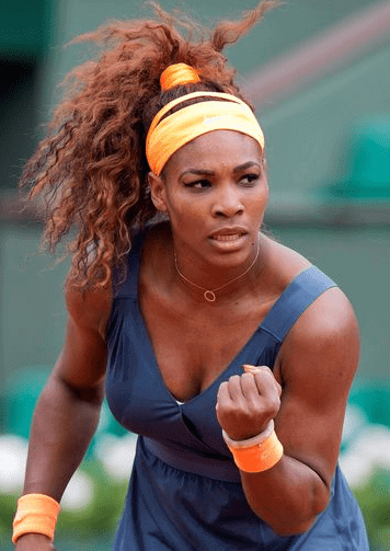
It also seems that the fist pump is usually done with the dominant hand. Perhaps there are some ambi-pumpers out there, but the single pump is done with the dominant hand. Am I right?
I don’t know about that. I’m left-handed, but my eighth grade pump was done with my right hand (yes, I actually remember that detail quite clearly). Also, if you look at today’s splash photo, Serena is pumping with her left hand, because she’s already holding her racket in her dominant hand. I suspect most tennis pumps follow this same protocol.
“I suspect most tennis pumps follow this same protocol.”
~~~
Yep. In high school (#1 singles, dontchaknow — so I got my ass kicked a lot) I had a few fist pumps, and they were always with the left hand (since I was holding the racket in the right hand, just like Serena).
Paul is correct in this assumption. There are a few players I’ve seen who will hold the racket in their non-dominant hand (and pump with the dominant), but for the most part, you’re already holding the racket in your dominant hand, and you’ve just won the point (or game, set or match) so you reflexively pump with your oppo fist.
Hmm,.. I guess I was thinking of the Ashe clip, Tiger Woods massive US Open putt, Gibson as above, Michael Jordon “The Shot”, Miracle on Ice, etc.
Oh well.
If these depictions are to be believed, most (but not all) tennis players fist pump with their dominant hand.
link
Hmm. I write, throw, and bat righty, but I do everything else lefty. Or “backwards” to most observers. So add fist-pump to the short list of things I do righty, despite the fact that left is actually my dominant hand.
Re: “Good way to ensure you won’t be taken seriously: List the Cardinals as one of the NFL’s six best uniforms (thanks, Phil).”
I couldn’t help but notice that after the Cardinals, the next five “best” uniforms were the Packers, Cowboys, Bills, Chargers, and Steelers, choices that are generally considered “acceptable” in the Uni-verse and are also all either decades-old designs or very slightly updated versions of old designs.
This is evidence for my theory that in football, “good” designs = old, constant designs.
Which again is why Jerry Richardson is smart to have the policy that the Panthers will never change uniforms as long as he’s alive…right now the 1995 look is “dated” but at some point will be “classic” and untouchable.
right now the 1995 look is “dated” but at some point will be “classic” and untouchable.
That look will never become classic. From Day One, the Panthers looked bad (the tapered/pointy pants stripes, the diverging helmet stripes, etc.). Now they just look bad in a way that we happen to associate with a particular era.
But don’t you think that in general, the longer a team sticks with any design, the more likely it is to be embraced by fans as “classic” and the more fans will resist attempts at change? Plus it tends to tie the present in with the past – I think that’s why the most successful franchises in most sports (Lakers, Celtics, Yankees, Dodgers, Packers, Steelers, Cowboys, etc.) don’t really change much.
The Panthers are only 20 years old, and have had basically the same look for that entire time. Meanwhile, the Jaguars started the same year and by my count are on their fourth different uniform design. Which team is more likely to have fans attached to their look?
As Jerry Seinfeld once noted…at the end of the day, you’re just cheering for laundry.
But don’t you think that in general, the longer a team sticks with any design, the more likely it is to be embraced by fans as “classic” and the more fans will resist attempts at change?
By fans of the team, yes. But if you look upthread, you’ll see that this discussion was about the perceptions of the larger uni-verse and the overall pantheon of sports design, and I don’t think the Panthers’ unis will ever achieve that status (just as the Colorado Rockies’ unis, which are essentially unchanged since 1993, will also never achieve that status).
You know, I’ve never heard that Seinfeld quote before. Ever.
Paul:
You might not have heard it because I didn’t paraphrase it right. Here’s the actual quote:
“Loyalty to any one sports team is pretty hard to justify because the players are always changing, the team could move to another city – you’re actually rooting for the clothes when you get right down to it. You know what I mean? You are standing, and cheering and yelling for your clothes to beat the clothes from another city.” -Jerry Seinfeld
Someone’s sarcasm meter is on the blink today.
LOL. Yeah, it appears that way.
(Too often) I like to imagine I am in charge of NFL uniforms, and I go through each one imagining the tweaks I’d give each of them.
As I do, it generally turns out that the Carolina Panthers are the only one that there isn’t really anything I’d change.
Helmet stripes? Dumb. Pants stripes? Stupid. But… At this point, I wouldn’t change either.
I might clean up their helmet logo as, to me, it seems muddled. But thats it.
Lee
I’m really curious as to what you’d change about the Raiders, Packers, and Chiefs.
The one thing I definitely think the Panthers could do without is the logo on the hip, since the same logo already appears on the sleeves and the helmet.
Raiders: change the face mask to black.
Packers: match the pants stripe to the sleeves; add stripes to their socks
Chiefs: match the pants stripe to the sleeves and socks
Glad you asked!
Lee
I don’t want to beat a dead horse over the Panthers’ look someday being considered a classic…
But I will make this prediction…on the record, that at some point in the future Paul will change his mind and embrace the Panthers’ look as unchangeable.
Mark it down…
I don’t understand the hate toward the Panthers’ uniforms. Good colors, good stripes, snazzy helmet, traditional numeral font. A modern classic.
Arizona Cardinals could stand to use the Dobler/Dierdorf uniforms, though.
The Panthers uniforms are perfectly fine. Hell, they have better shoulder loops than the Colts, that ought to count for something.
“If it ain’t broke, don’t fix it…”
As for the Cardinals, I’m not a fan of the jerseys, but I do appreciate the relative cleanliness of the helmets. No need for any weird tapering or vanishing stripes. Logos on a white helmet.
Of course, I grew up with the Cardinals of Ottis, Theotis, and Roy, so I have a fondness for that era.
Love the helmet. But even that is a failure, because the old-school helmet, complete with grey facemask, makes no sense with the new-school jersey and pants. (Of course, the jersey and pants have multiple problems of their own, but the stylistic mismatch between the helmet and the rest of the uni is a major misstep.)
That Troy Aikman commercial isn’t as bad as that Eminem video where Tony Romo was wearing Aikman’s number.
To me, Ray Bourque will always be the king of the fist pump. It always seemed so genuine, if that makes any sense.
Speculation here, but I’ll bet the impetus for the fist pump was the famous photo of Muhammad Ali (Cassius Clay, then) standing triumphant over a supine Sonny Liston. The timing seems to favor it.
Personally, I would not call that a fist pump:
link
Agreed. The film footage show Ali making more of a “Come on, get up!” sort of motion. Definitely not a fist “pump” in my book.
Also from Sean: Sandpaper on a bike saddle is not a good idea.
No. Dear God, just… no.
There are two types of people in this world: People who divide the world into two types and people who don’t.
[BTW, not taking credit for creating this. Read it somewhere. Sounds like Steven Wright to me.]
I had set 10am as the over/under for when someone would post that quote. So the under wins.
There are two types of bets in this world: The over, and the under.
RE: Yogi playing hockey. Looks like one-time Ranger Goalie Gump Worsley facing the penalty shot.
I like the Panthers uniforms. The pants don’t bother me. The helmet stripes could be better,but it’s not Jacksonville.Perfect number font.Thirds that work. They could lose the black pants though.
Are my eyes playing tricks on me, or is the logo on Phil Linz’s helmet also very high?
I’m guessing you’re aware of this already, but just in case: link
The SEC Mike Slive decal that Auburn is wearing is part of an SEC wide program to honor Slive and raise awareness for prostate cancer
link
The Giants white pants with the blue jersey is a 700X better look than the gray pants. Throw them in the trash.
While they’re at it, they can throw the white jerseys in the trash too, and get new ones that actually have blue on them.
Yup. They’re called big blue for a reason.
The gray is much more distinctive. Stick with the gray!
In regards to the ticker link of the Mississippi State player wearing “Long Pants”. this appears to be an illusion. The individual is wearing 3/4 length white tights under his white pants. So it looks as if the pants are 3/4 length.
I was going to make the same comment. It’s actually the case of a player wearing pants that are too short, with 3/4 length tights. You’re right, it’s an optical illusion.
“There are two types of people in the world – those who think there are two kinds of people and those who don’t.”
–Andy Rooney
Glad I could find the source, at least.
I’ve always heard that there are actually 3 types of people in the world; those who can count, and those who can’t.
I’m surprised you didn’t mention memphis” Bengal striped helmets last night
Double space, after a period. Course, I’m also still one of the few who put the hyphen in E-Mail.
Me too!
Also, only a hyphen (or dash) for telephone numbers. No dots.
Two spaces. Always.
Just throwing out a guess here…you think the fist pump might have evolved from the black-glove salute at the ’68 Olympics?
Kinda doubt it. But if so, there would be a rich irony in white America’s embrace of the black power symbol!
My fist pump point of reference is Seinfeld’s “Newman” fist pump, which is inward, to suggest negativity. (As with “laundry” I know Paul has heard of this one too, but, hey it’s what I thought of first).
link
So what happened to color on color match ups on TNF? If you’re not do it for NYG v Wash, when are you going to do it??!!
Also, while I wouldn’t necessarily say I dislike them, what exactly is the point of the Giants white pants?
Lee
Color-on-color: From Day One, we’ve known that it was optional this year, mandatory next year. “Optional” means, you know, optional.
“what exactly is the point of the Giants white pants?”: What exactly is the point of ANY alternate uniform element? Oh, right — to sell merch. But they don’t sell pants. Which means we have now reached the point where the appearance of an alternate uni element that CAN’T be sold is somehow befuddling, at least to some people.
Or to put it another way: Maybe they just like to change up the look now and then.
Yes, of course, optional.
And I wouldn’t consider my condition as “befuddled”.
Just asking questions.
Lee
Personally, I’m rather annoyed. Optional it may be, but someone needs to freakin do it so we can get all of the twitter outrage out of the way now and people are used to it by next year. Plus, Redskins/Giants would be an example of good color v color.
When the current batch of Giants’ uniforms runs its course, here’s a vote to go back to the Lawrence Taylor-era suits. But the white britches and shoes were a nice changeup.
I always hated those uniforms. In the 80s the Giants and Bills wore identical uniforms from the neck down, and they were the epitome of dull to me. The Giants’ current set with gray pants has a lot more historical cache.
Also, what is everyone’s huge problem with the fact that the road jersey doesn’t have blue? The St. Louis Cardinals wore navy hats on the road up until a couple years ago, and nobody was outraged by that. I like it when the road uniform isn’t just an inversion of the home.
what is everyone’s huge problem with the fact that the road jersey doesn’t have blue?
My answer to that question:
link
To me, nicknames like “Big Blue” and the “Broadway Blueshirts” are just a nod to the home uniform, but the road uniform is a different story, because it has rules imposed on it that the home doesn’t—the jersey has to be white. Certain teams have such a strong and recognizable home uniform (Raiders, Packers, Michigan et al.) that to try and do a straight conversion of the elements onto a white jersey pales in comparison because it loses so much. To me, the Giants’ red is an attempt to solve that, by making the road uniform more of its own animal. The red numerals and socks have a warmth and power that stand out from the white jersey better than blue could—looking at the blue mockup from your article, the uniform looks very cold (not to mention VERY similar to a certain division rival in Texas).
Another example of an effective road uni that totally breaks from the home colors is Arsenal’s yellow/blue kit. Not a trace of red or white to be found, but it’s still strong and very recognizable on its own.
I had bigger things on my uni plate so I didn’t have time to be outraged, but the Cardinals’ navy caps were always an annoyance to me. Good riddance to them.
Good look at the old red BP tops.
The early/mid 70s look is their best, but man, those Braves BP tops are a close second.
Kind of awesome that Japan celebrates their version every year on “Guts-Pose Day.”
link
Is it actually possible that they’re going to turn Kanye lyrics into a Hyundai PROMOTION?
“You will see him on TV
Any given Sunday
Win the Super Bowl
And drive off in Hyundai”
I never considered Gibson’s gesture to be a fist-pump (as in an upward pump); I always heard that called “pulling the chain” (like starting up a chain-saw or some other motor).
Always liked back in the early 70’s how Bill Goldsworthy of the Minnesota North Stars celebrated goals with the “Goldy Shuffle”. A combination skate on one leg and fist pump.
I dont understand the hate for the Arizona Cardinals uniforms.
Certainly after all the crap we’ve seen Nike design for the NFL we could dial back the hate for something that has decent looking modern lines?
I forgot, this is Uni-Watch, you guys hate anything that looks like it was made after 1970
Meh, they’re okay. I can think of 15 NFL uniforms that are worse. I try to plead the cause of iconoclasm on these pages.
No, we like good design, from any era, and dislike poor design, from any era. And the Cards’ uni is about as bad as it gets.
I mean, seriously, those pants — can ANYONE mount a serious defense of that design? Ready — go!
What would the defense be? Either you think it looks good or it doesn’t.
I’ll admit, if it was up to me, I’d probably clean up/simplify the Cards’ look. There is just a little too much going on there. And I agree with Paul that the “old-school” gray facemask doesn’t make much sense with the modern jerseys.
But I also am going to reject the notion that all football uniform pants need to have the standard “NFL stripe” combo. I think there is room for some experimentation/modernization, even though I generally prefer a more traditional look.
What would the defense be? Either you think it looks good or it doesn’t.
Ideally, you would explain WHY you think it looks good. Believe me, I could devote a few hundred words to why it looks *bad*, but I don’t have time for that now (working on next week’s ESPN column).
Re: The Miss State player with the “too long” pants—I’m sure those are white compression pants under normal length football pants. The only shin-length football pants I’ve seen were in that Pro Bowl a few years back, and nowadays if a team was going to introduce something like that we would’ve seen a bunch of pics of them with black some and floodlights.
Re: fist pumping.
I think sport started going towards fist pumping with the Miami Hurricanes football teams of the 80s — look at old footage of Stanley Shakespeare, Randal Hill, and Michael Irvin.
You also had Joe Montana doing it as well as the aforementioned Kirk Gibson.
(but nobody pumped his fists like Billy Idol …)
Sigh. Let me repeat: I was doing a fist pump in algebra class in 1978. And I almost certainly learned that from watching sports. So the trope almost certainly predated the 1980s Miami teams.
A case might actually be made for Tug McGraw and the 1973 Mets:
link
I’ve been tracking instances of the word “Twerk” through hip-hop history. I’ve gotten back somewhere into the mid-80s, and I suspect that I won’t be able to go any further, because it’s the type of thing that probably doesn’t get into the documentary world too often. Maybe Kinsey has something for me.
Anyhow – It would be great to amateur sleuth fist-pumping. Surely it showed up in some sports columns or in random sports videos over the years.
One space
I’m a lifelong die hard Kentucky fan and I can assure you that the “new” sweat back design isn’t new. They wore these last year and the guy on Twitter said that they are full sweatback now because they were in a section last year is confused. The year before last uniforms were “in a section” but last year we got the current ones and they have the full sweatback design.
Seems like the new uniform related act of defiance by college footballers is leaving their undershirts untucked. Why have Nike/addidas/UnderArmor not already taken advantage of the new ad-space and plastered their logos all over the shirttails?
I’ve always been partial to the gray pants the Gants wear. In the 50s to late 60s, gray was standard for the team. I also have rare color photos taken at the Polo Grounds from the early 50s with the Giants wearing red jerseys. I believe red was their standard ‘dark’ jersey back then.
As a life long A’s fan I’ve seen the Gibson highlight more than ENOUGH. Every stinking October they dust that thing off and use it in World Series highlight reels. I was a freshman in High School in 1988 and I had waited my whole life to see the A’s in the series. I was alive when they had won it in ’74 but just a baby so I didn’t get to see Rollie Fingers toss to first for the final out in a 3-peat… a BETTER highlight in my book. :)