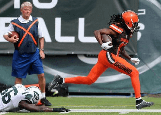
Rumors that that the Jets player in this photo was yelling, “No, wait, you should wear the brown socks if you’re gonna go with the orange pants!” are exaggerated, but only slightly. Man, what a mess. And even if you inexplicably like the big, honking wordmark on the pants, can you (or anyone) explain why they bothered with those few inches of striping at to the top of the pant leg? The lettering has been a bad joke all along, but I’m starting to think the partial stripe is even worse. Additional photos here, if you dare.
Meanwhile, in that same game, Nike demonstrated once again that they’re incapable of giving the Jets a consistent shade of green:
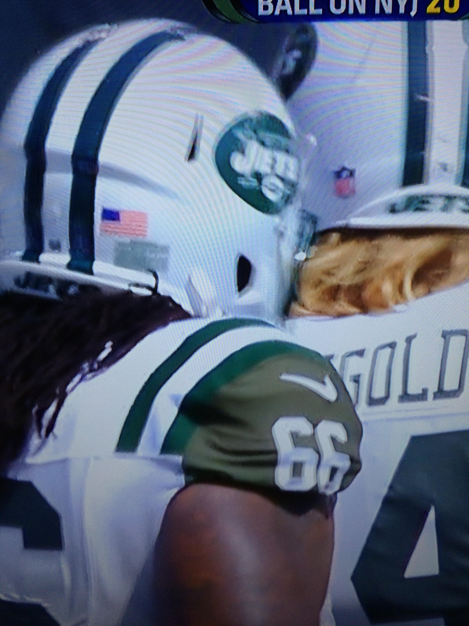
This seems pretty much like the definition of a vendor failing its client. (Too bad this vendor can’t be fired.) I got more tweets and emails about that yesterday than about any other issue, so people are definitely noticing. And as several of them pointed out, the best/worst part is Jets are currently running an ad campaign whose slogan is “Bigger, Better, Greener.” Well, two out of three, right?
But aside from those two things — the Browns and the Jets — it was a great-looking game.
In other developments from the NFL’s opening weekend:
• The Giants unveiled/debuted their Ann Mara memorial patch. (Let’s skip the cash machine jokes, thanks.) Coach Tom Coughlin wore the Mara patch and also wore a “16” pin for Frank Gifford.
• Also debuting yesterday: the Lions’ Charlie Sanders memorial decal.
• In that Lions game, the Chargers went mono-white at home. This is the third consecutive season that they’ve worn white for their home opener.
• The Bills also wore white at home, but with a twist: They went with their standing buffalo throwbacks.
• Odd game in Jacksonville, where the Jags wore white at home and the Panthers took the unusual step of wearing their blue alts on the road.
• Other teams wearing white at home: the Texans, Bucs, Jets, and, of course, the Cowboys.
• The Bears opened the season by wearing their Monsters of the Midway throwbacks.
• So disappointing to see the Rams in mono-blue. Never a good look for them.
• Bengals running back Jeremy Hill’s nameplate was sitting a bit low.
• Lots of players wear necklaces under their pads, but it’s rare to actually see one of them. That’s Browns running back Duke Johnson.
• Just like in the preseason, some players wore waistband towels with gold NFL logos and others had a conventional logo. Surprising that this hasn’t been standardized.
• In Oakland, the 50 yard line markers were white, not gold.
• Speaking of yard line markers, a “3” at FedEx Field was upside-down.
• And one last yard marker item: The Jags are now using their jersey number font on the field.
(Big thanks to all contributors, including Douglas Ford, @NYYDJ2, Clint Richardson, Alex Sinclair, Tyler Smith, @_ynnhoJ, and of course Phil.)
T-Shirt Club LAST CALL: Today is the last day to order the the Uni Watch T-Shirt Club’s latest design, which is available for purchase here. In case you missed it last week, it’s the powder blue shirt (click to enlarge):
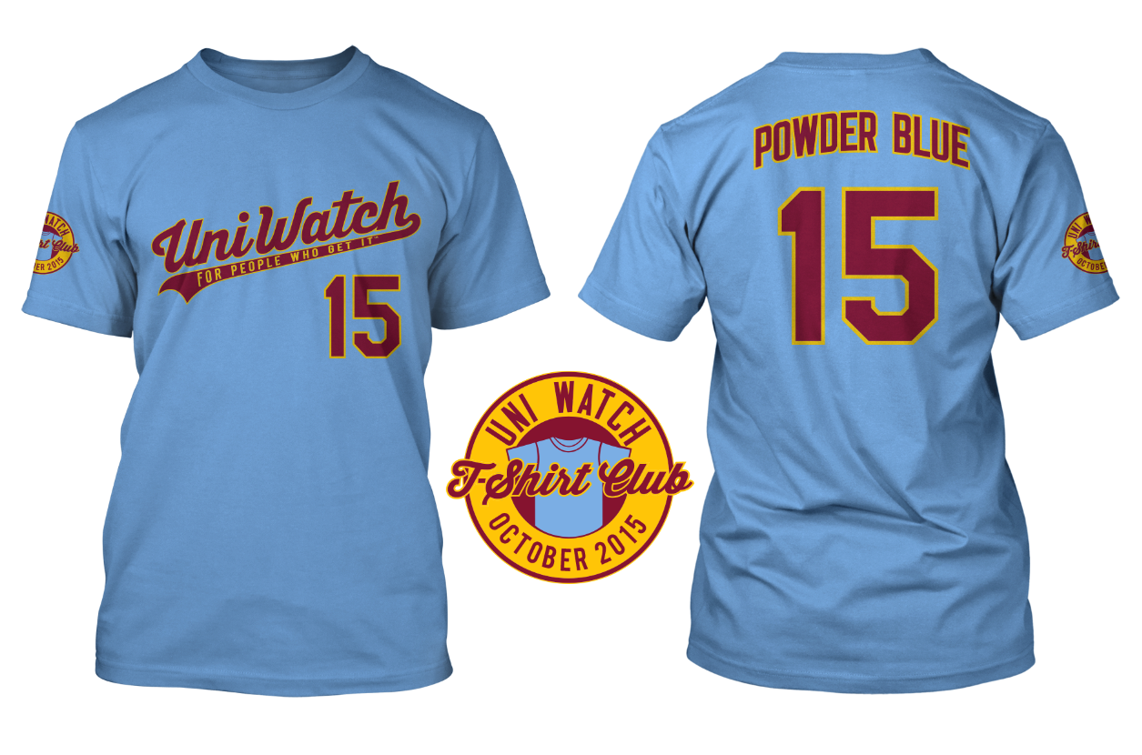
An important note: If you go to the ordering page, you’ll see that we’re offering three different T-shirt brands, each of which has its own shade of powder blue. American Apparel is the lightest shade and Teespring Premium is the darkest, with Gildan in between. Here’s a photo of the AmApp and Teespring fabrics (click to enlarge):
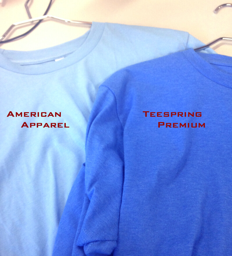
So compare the color shades, and also use the sizing chart for each brand, to choose the shirt that’s best for you.
And as long as we’re talking about the T-Shirt Club, check this out:
.@UniWatch 9 months pic.twitter.com/WSIaVvuSn8
— Michelson (@hmich176) September 11, 2015
The Ticker
By Paul

Baseball News: Reader Tim Dunn points out that the Mariners’ Los Marineros jerseys, which were worn on Saturday, used last season’s lettering style (compare to this season’s). ”¦ Here’s a quiz on MLB teams’ historical logos (from Anthony Nuccio).

NFL/CFL News: The Winnipeg Blue Bombers broke out royal blue and gold throwbacks for the Labour Day rematch game, the Banjo Bowl, against
Saskatchewan (from Wade Heidt). ”¦ Interesting sight yesterday outside a brownstone fairly close to where I live: a female mannequin wearing a skirt and a Bills jersey (from my pal Carrie Klein). ”¦ The Bengals normally post their jersey schedule on their website each season, but they didn’t do it this year until a day or two ago — here it is (from Dave Fiora). ”¦ Dell Michaels was flipping through some old comic books and found great old NFL-theme ads for gumball helmets and Converse.

College Football News: Ooooh, check out the scoreboard at the U. of Idaho’s Neale Stadium at its first game in 1936 (from Will Scheibler). ”¦ Also from Will: a pretty cool architectural rendering of an early scoreboard. ”¦ Nebraska players had inconsistent number typography in the 1996 Fiesta Bowl. ”¦ “Southeastern Louisiana debuted new green jerseys Saturday night in their victory over Florida Tech,” says Chris Mycoskie. “The old jerseys had white numbers with yellow-gold trim and ‘Southeastern’ above them, while the new jerseys have ‘gold gold’ numbers with no trim and ‘Lions’ above them, plus the addition of a Louisiana outline and the removal of the TV numbers.”

Soccer News: I’ll be honest: When this item came in late last night, I was too tired to follow or comprehend all the details, but it has to do with some sort of fuck-up by Adidas and Ipswich Town (from Geoff Holm).

Grab Bag: Looks like the AHL’s Iowa Wild may have a new jersey in the works. … Very entertaining piece by a journalist who wore one of Donald Trump’s “Make America Great Again” caps for a week solid. Recommended, no matter what you think of Trump (big thanks to Eric Trager). ”¦ Want to be dressed and outfitted like Roger Federer or Novak Djokvic? Here’s what it’ll cost you (thanks, Brinke). ”¦ Love the emerald gloves that Floyd Mayweather Jr. wore for Saturday night’s fight against Andre Berto. ”¦ Happy Rosh Hashanah to all who are observing.

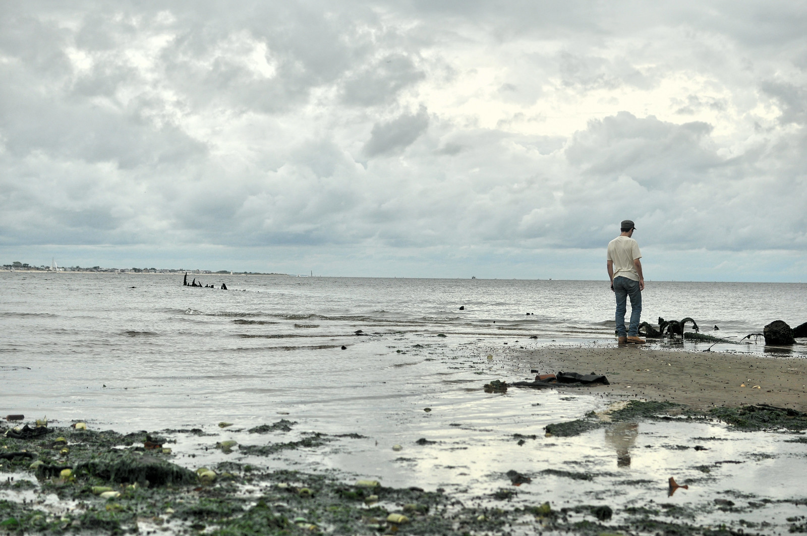
What Paul did last night over the weekend: Way out in a far corner of Brooklyn is this little cove called Dead Horse Bay (the name stems from all the horse carcasses that were dumped into the water after being used to product glue and fertilizer at nearby rendering plants), although many people refer to it by its nickname, Bottle Beach (which refers to all the old bottles that appear on the shoreline at low tide, remnants from a time when the water was used as a dump site for municipal garbage). I’ve been meaning to check it out for more than 20 years — seriously! — and on Saturday, with a sidekick in tow, I finally got around to doing it.
Sure enough, there were oodles of bottles, along with some old China, ceramics, and so on. Apparently all the other trash biodegraded, but the glass and ceramics remain. And scattered amidst all the bottles were some random horse bones. These two forms of detritus — bottles and bones — made for a slightly surreal afternoon, especially given the spooky cloud cover (first photo by Mary Bakija, the rest by me; for all of these, you can click to enlarge):


Afterward, we repaired to the venerable Brennan and Carr, which has been serving roast beef sandwiches and pitchers of beer since 1938. I didn’t take any pics, but you can get the idea here.
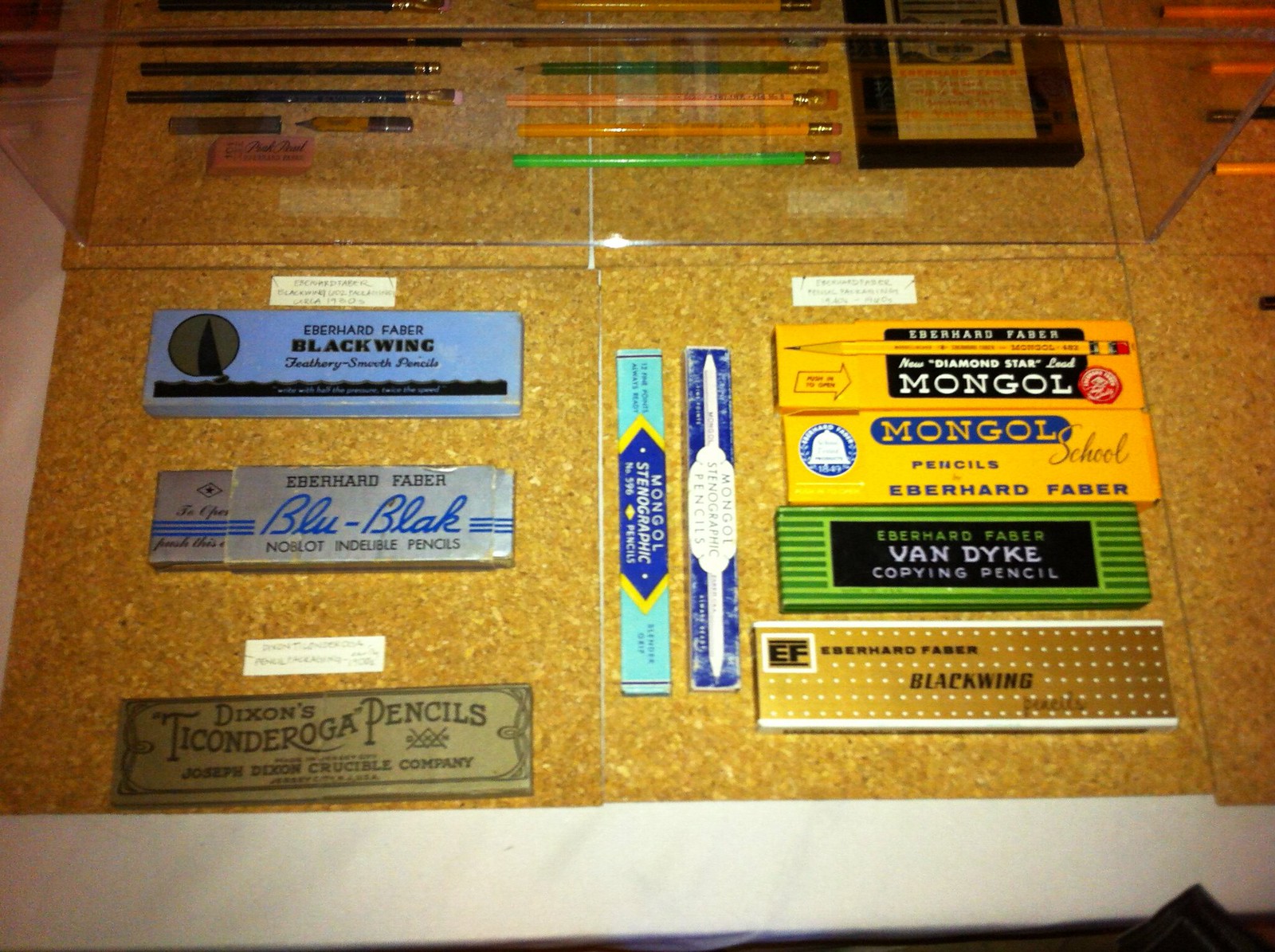
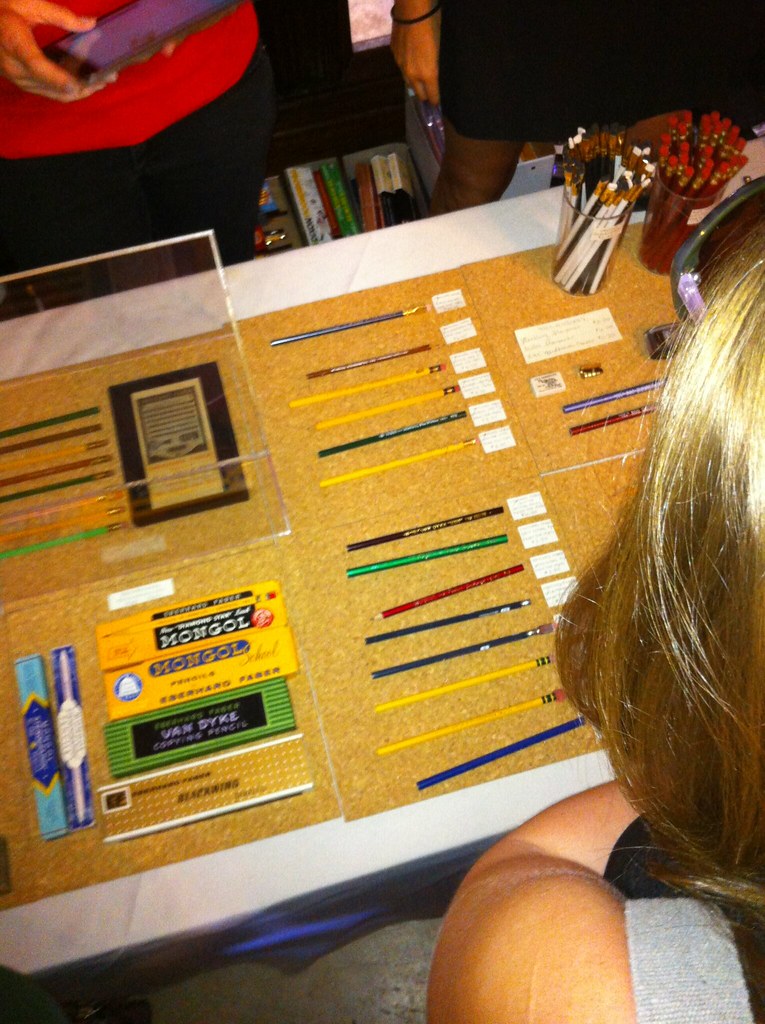
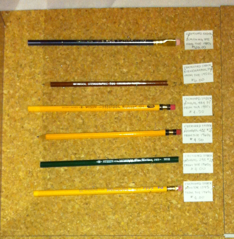
The following day (i.e., yesterday), I biked over to Green-Wood Cemetery to check out a presentation about pencils. (The connection is that onetime pencil magnate Eberhard Faber is buried at Green-Wood.) It was a very cool geek-fest, including some excellent pencil-centric displays (sorry about the photo quality; click to enlarge):

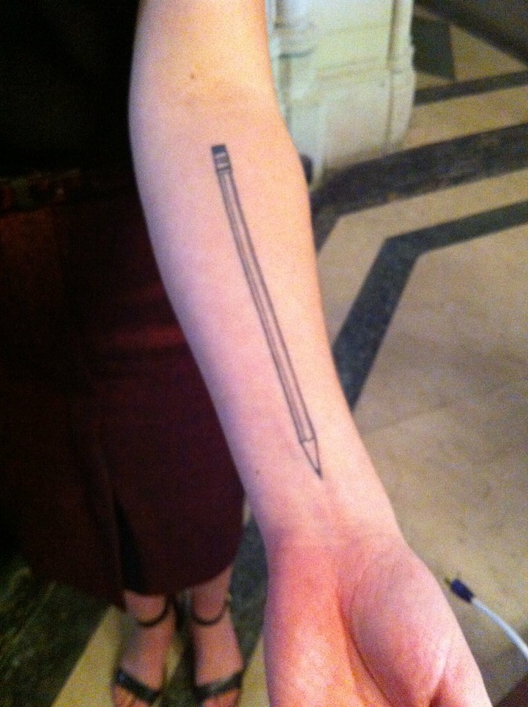
As a nice bonus, the woman giving the presentation had a tattoo of a pencil on one arm and wore a charm bracelet with a pencil charm on the other:

After that I biked over to Union Hall to make my debut on longtime Uni Watch reader/pal Marty Buccafusco’s bocce team. Unfortunately, the team we were supposed to play never showed up, so we won by forfeit (that’s no fun) and just played an intra-squad scrimmage. I’d only played bocce a handful of times before, but it has lots of similarities to curling (at least in terms of the strategy and the drinking), so I did fine. No photos — maybe next time.
All in all, a swell weekend — certainly better than sitting on my ass watching football. There’ll be time for that when the weather gets colder.
Saints were on the road, not at home.
Yup, already fixed. Mea culpa.
Really hard to tell, with that “Arizona Cardinals” banner in the background of the picture ;)
The Jackrabbit video was from the Edmonton/Calgary game not Saskatchewan/Winnipeg, and the “Will Schiebler” links under College Football run into each other only giving the lovely Idaho picture.
If jackrabbit video got posted here, think it got erased in the corrections. Game was from a week ago. Great “touchdown celebration”:
link
If for some reason that doesn’t work it’s up several places on you tube:
link
link
Does anyone know if that counts against Carolina’s two alt maximum for the year? Could they go on to wear the teal twice at home now, given that was a road game?
Unfortunately, it does. According to link they’ll wear the blue again in week 3, and that’s it. Stupid NFL uniform rules…
That’s the second year in a row they’ve worn the alts at an opener in the state of Florida, last year it was at the Bucs.
link
wonder why they just don’t switch to those over to the primary
I would think they wear the blue because those games in Florida are warm weather at the start of the year so they don’t want to wear all black. It just happened two years in a row.
soo is every monday going to be a Browns uniform basing day..or is this just a one of deal?
after each preseason game and this first regular season game you’ve ragged on them .. we get it you don’t like the pants, the wordmarks on the jersey and pants, the color combo etc etc.. now it’s just becoming low hanging fruit
“soo is every monday going to be a Browns uniform basing day..or is this just a one of deal?”
~~~
Do they have any Thursday or Monday night games? If so, I’d expect to see critique of their atrocious uniforms on Fridays or Tuesdays as well.
Yesterday’s look was quite possibly the WORST LOOK ever to grace an NFL field. That wouldn’t even be a good look for a high school or college team, much less one that plays on Sundays. Not much would have salvaged it, but wearing brown socks would have been a start. Seriously, the Browns uniforms may just be the worst in the NFL now — and with the Buccaneers and Jaguars still in the league this is really saying something.
agree to disagree with being the worse,but as a Browns fan, i’ve grown to like them.. but i can see if you have no vest interest not being how they look but still it’s well documented that paul doesnt like them..
yes they have both a TNF and MNF game
That is precisely how you get in the top five (gray face mask, blank helmet) okay maybe not the stripes in the wrong order.
I don’t know about WORST LOOK EVER. The Steelers bumblebees are quite hideous, and let’s not forget about the mess the Bills wore before their current set, especially the road version. And the 49ers black alts.
“The Steelers bumblebees are quite hideous”
~~~
Meh. In theory it’s a “throwback” and it’s an alt. It was designed to take a look from 1934 and fit it into today’s uniform template. And we only see it once a year.
The Browns, OTOH, took TWO YEARS to develop this piece of garbage, and we’ll see it every week (granted, not necessarily in such a horrific iteration as yesterday). The team should be vilified and held up to scorn for approving this mess. Seriously, they had one of the Top 5 uniforms in all of football, and instantly vaulted to the bottom of the uni-tier, and the poor fans and City of Cleveland are stuck with this for (at least) five seasons.
Not EVERY combo will be as bad as yesterday. But few uniforms worn will ever be as bad as this. Of course, they haven’t gone full mono-orange or mono-brown (no doubt with same color socks) yet. Those will probably top yesterday’s combo for awfulness.
Seriously, they had one of the Top 5 uniforms in all of football,
~~~
not according to Paul they werent..
Maybe not according to Paul, but I felt they were.
And if you’re pissed about the Browns-bashing weekly, you can probably blame me, since I criticized the look every week while Paul was on vacation.
I get that you’re a fan of the team and being forced to accept this high school look, you have two choices: 1) embrace it and take an “us against the world” stance (much like fans of the Washington football team do when confronted with a name like they continue to have) or 2) join the rest of the world in saying how crappy the new unis look; you’re circling the wagons — I get it — and I can understand how you might not want impartial observers to critique “your” team and your look.
I think it’s awful. You disagree. Since we won’t soon see eye-to-eye, we’ll just agree to disagree.
They definitely weren’t top 5. You don’t get to be top 5 with a gray facemask, blank helmet, and pant stripes in the wrong order.
Despite the Browns ticking off just about every one of my peeves: all white on the road, gray facemasks, no helmet logo, horrible joke of a team “logo” I still had their former set ranked very high. I wouldn’t slide them into the top 5 but I had them solidly as top 10.
But the new look other than the improvements to the helmet is by far neck and neck with Tampa for worst uniforms. And I’m speaking as a Falcons fan so I’ve known for years what embarrassing uniforms look like.
also some of the players seemed to have half orange and half white socks.. this didn’t look as terrible as the full orange sock look
link
Yes, one could make the case for yesterday’s Browns togs to be the WORST LOOK EVER. The orange numbers are nigh on impossible to read without an up-close shot, and would be worse only if the didn’t have the white back ‘shadowing’. The stripes look horrible; in one up-close photo, the stripe looks like they forgot to sew it on the unfinished sleeve, and attached it while the player was wearing the jersey. Nothing else is flat and straight on the jersey EXCEPT the stripe.
The pants wouldn’t necessarily be that bad (I’m on the fence about the wordmark down the leg), but as the pants have turned into compression shorts, the stripe gets ever shorter, to the point of irrelevance; and yes, the stripe should match the helmet. Add the orange socks to it, and you’ve got the perfect storm of ugly.
“Yesterday’s look was quite possibly the WORST LOOK ever to grace an NFL field.”
Until the 49ers take the field tonight.
Whoa…pump the breaks, Phil. Current Bucs/Jags/Bengals infintely worse than the Browns new sets. By the way, do you guys like the word mark on the pants? Does it look too “high-schooly”? I can’t recall you critiquing that area of the uniform.
The “Worst look to have every grace a football field” is either lazy, hacky, or “The worst example of hyperbole to ever grace this great site’s pages”…I can’t decide quite yet.
Look I am not blind. The uni yesterday was, well, less than stellar, but is this what is happening each week on the site now? Take a shit on the Browns uniforms? It does seem now, that everyone is embellishing how much they loved the old uniforms, even though they consistently have been ranked in the bottom half of the NFL on this very site.
Love the site, will still be visiting here daily, just may avoid Mondays after Browns games now.
I did pump the breaks, Rich — that was a modest version of how I feel.
When I said “worst look ever go grace a football field” (and I said also “quite possibly the worst” — please don’t take this part out of context), I meant it. I wasn’t being “lazy” or “hacky” etc. I truly mean it. I wasn’t harsher on the earlier incarnations of the Browns unis because I hadn’t seen them with orange pants and socks until yesterday. So, while I’ve hated the high school wordmark on the pants (I could actually live with it if it were just the wordmark, but to have the half-stripe makes it HORRENDOUS) — and that’s just the pants. Everything else (and some have mentioned all the imperfections and bad design elements above) compounds the wretched pants mistake; it is truly, excluding the helmet, worse than the Bucs and Jags. And that takes some doing.
You must be either (1) a resident of Cleveland (or suburbs) or (2) a Browns fan or both. The only pushback I’ve gotten from my tweet yesterday or on Uni Watch has been from fans/Clevelanders who think I’m taking a personal shot at their team.
I’m not — This uniform is atrocious, and if it were my team wearing it I’d be calling for heads to roll. Apparently, that’s not how Clevelanders roll (and I spoke to one who lives just outside Cleveland who confirmed this last night). I get it — you got stuck with a shitty uni and you feel you have to defend any and all who attack the uni on an aesthetic basis as though we were fucking your sister. That’s not pumping the breaks.
It. Is. A. Terrible. Look. (Specifically the one worn yesterday and featured in the splash today). You need to see it for what it is — and I’m not coming after you or the fans or supporters of the team personally. Please don’t take it personally. If the Mets or Giants or Knicks or Isles came out in something that aesthetically awful, you can bet I’d be screaming bloody murder, and I’d welcome anyone else to join me.
And the more you guys complain about “tak(ing) a shit on the Browns uniforms,” when this is what (athletic aesthetics) this site does on a daily basis, only hardens the resolve. It is a BAD uniform (or at least this particular iteration is). And we’ll say so. That’s nothing against you, fans or the City of Cleveland.
1. I am a resident of Cleveland
2. I am a Browns fan ( although after yesterday, I am re-evaluating my fandom).
Having said all that, I am not taking this personal. The Unis aren’t what I was hoping for. I don’t like the word mark / stripe on the pants. I want only one of the two. Preferably the stripe.
I am not here to defend the uniform. I only can offer this: there are worse ones in the NFL…which I get isn’t a great “excuse” or “rationalization” of their shitty unis. Obviously, with more interest in the Browns than any other team, I will notice talk about them more than others.
Anyways, all’s good. I just like to discuss things. I have challenged Paul’s opinion as well, and I try to preface it all with the obligatory ” I love this site, and will be here every single day to check it out”. I just am hoping two things: 1. Please Paul, don’t do a tracker to spite us Browns fans who are “Complaining” about (what we see as your) “complaining” and 2. Can we do some sort of “Let’s Fix the Browns new Unis contest” of some sort?
I’d argue this was the worst uniform ever to grace an NFL field
link
after each preseason game and this first regular season game you’ve ragged on them…
1) That statement is incorrect. I did not write about them after each and every preseason game. In fact, most of the preseason games took place during my blogcation, so I couldn’t have written about them even if I’d wanted to.
2) This is the first time we’ve seen the orange pants (and, by extension, the orange pants combined with the orange socks, which was a particularly horrific combo), so it seemed noteworthy.
3) Singling them out every week going forward? I hadn’t thought of that, but it’s not a bad idea. Thanks for the suggestion!
my fault, for crediting you.. but each week it was mentioned that they were horrible..
In other words, you are “accusing” Uni Watch of being consistent.
I suggest you get used to it. It’s a really bad design, and bad designs tend to be called out a lot (not just by me, and not just on this website), especially when they’re new.
i get that people don’t like it.. but i have a feeling it’s going to be a weekly thing when the point has already been hammered to death by the contributors of the site
Again: Nothing about the orange pants had been “hammered to death” because we hadn’t seen the orange pants yet.
Keep bringing up the idea of making this a weekly thing and I assure you you’ll just make me more likely to do just that.
Suggestion: Quit while you’re behind.
i didn’t say it was just about the orange pants, so i am not sure why you’re stuck on that point.
i was speaking on the critique as a whole.
there’s that Paul Lukas charm..
i didn’t say it was just about the orange pants, so i am not sure why you’re stuck on that point.
You’re complaining that you’re just hearing the same thing over and over; I’m explaining that it’s NOT the same thing, because the Browns WEREN’T WEARING the same thing. They were wearing something new, which I felt was worthy of a new critique. I don’t see why that’s so hard for you to grasp.
Hard to be “charm[ing]” to someone who’s being obtuse-verging-on-trolling. We’re done here. Let’s move on — thanks.
Tony,
When Paul speaks about a uniform design, he is basing his judgement on a uniform aesthetic. You know, generally agreed upon ideas of design about what is good or beautiful (i.e. NY Yanks pin-stripey home) and what is not (latest Cleveland Browns thing).
Generally agreed upon over time by $ales, fans, journalists, uniform makers and artists / designers as good, bad or meh. I mention this so you understand that there’s no need to defend a bad design because you are a fan, i.e. it grows on you – so does cancer – but I do not want it on or near my person at any time.
You may love the Browns unis and that is awesome, Paul not so much, such is the way of the uni-verse, but this is important…
Of all the online Uni-Critics that claim knowledge of the design aesthetic, he is the only one I am aware of (Phil too) that actually takes the time to explain in detail, how he came about his opinion. This is important because it shows that their opines are “grounded” in what they believe are general rules of uni-aesthetics.
As for me, this design perfectly highlights everything that is wrong with the Browns and is a perfect metaphor for the organization.
I would be glad to be the weekly Browns uniwatch tracker. Every week I can post the pic of the combination Cleveland went with, and then have a pic like the one below of what it looks like and how anyone with taste reacted when they saw it.
Here is my week #1 submission.
link
Bad uniforms, bad ownership, bad QBs, bad coaching… All around the Browns are a low-hanging fruit.
I’m a Clevelander as well and agree whole-heartedly with Paul. The unis – and the franchise as a whole – are a train-wreck from top to bottom.
Heaven help the Brown fans when that stadium is 25+ years old. Either buy them a new palace or kiss them goodbye.
You got that straight, mild bill.
Since day one, the only thing the Browns have done correctly is having left the unis alone (for the most part). Now they’ve botched that – and badly. I’m to the point where I’ll gladly become a Bills, Colts or Lions fan (’cause eff the Steelers and Bengals) to be rid of this pathetic excuse for a franchise. Maybe I’ll even start rooting for the Ravens in the hope they return from whence they came. If LA wants this dreck, they can have ’em. Ownership has been either absent or (allegedly) criminal, management has been completely and thoroughly inept and the team itself is a revolving door of has beens, never weres and never will bes. Of the six(!) Pro Bowlers they had last season, two are gone, one is serving a season-long suspension for idiocy, one got his rear-end handed to him yesterday by Brandon Marshall and the other two couldn’t get the running game established.
Paul, if you want to bash this team on a weekly (hell, even DAILY) basis, go for it, man!
…is every Monday going to be a Browns uniform basing [sic] day[?]
If they debut a new hideous combination on Sunday, then probably, yes.
I don’t think there’s anything unreasonable or arbitrary about pointing out that a new combo we haven’t seen yet looked terrible on the field. Indeed, now that it seems they’ve decided to mix-and-match the brown and orange socks, they have 18 possible combinations of jersey/pants/socks, so I have a feeling we’ll be revisiting this each time one of them debuts.
Yes, every Monday between now and late December should be Browns Uniform Bashing Day! I am still blown away by how Nike said it took their graphic “artists” two years “of precise planning and laborious execution,” to come up with this unreadable, supremely ugly, utterly childish costume. The Cleveland Browns had the best uniform in the AAFC and then the NFL until reverse carpet baggers from Tennessee decided to “upgrade.” Not even Pro Bowl talent, which the Browns are short on, is going to play well in this hideously designed monstrosity.
Nike’s promotional people are full of shit. Maybe that’s why they know brown so well.
Two teams that look MUCH MUCH better in all white did so yesterday: the Chargers and Texans. It’s a good look anyway, but especially since both teams’ look like they’re wearing tights when they go blue pants with blue socks.
If you think that’s a good look, just look at how good the Browns looked (in today’s splash) when they went with the spandex look.
If you’re going to wear dark pants, you need to wear contrasting color (or white) socks.
It’s a shame the Chargers and Texans only do this white over white once a season (or if more than once, it’s only once or twice).
With SD in white-over-white against Detroit in their Honolulu Blue (not a million miles off SD’s powder blues) I did do a double-take on a number of occasions when the Lions had the ball but I saw Chargers!
The Chargers looked especially good in the second half, when they proceeded to lay the smack down on the Lions. *sigh*
If only the Chargers could put the lighting bolt stripes back over the shoulders, then they’d look even better to me.
Disagree on the Chargers. I hate that look. Primarily, because the pant have that large blue stripe, while the shoulder stripes are much thinner (less navy showing) and the helmet bolt has even less navy outline. I don’t think they fit. I think they would look 100 times better with both the shoulder and pants stripes being the bolt only, like the helmet. I’t also suggest a slightly wider navy outline on the helmet bolt. I’ve always thought, during the far off shots, it almost looks like the helmets are blank white.
The Texans really need to go with a red jersey/navy pants look. I don’t think they’ve ever worn that, and I’ve only seen it it photoshop mockups.
link
HAH! Yeah, that’s MY photoshop (actually GIMP, when I was using that) mockup.
I’d love for them to wear that look!
I knew I’d seen it before. I don’t think I’ve ever seen a reason stated as to why they haven’t worn it. I think it would be a good standard look.
Is this the most expensive football/soccer shirt of all time? Costs £699…
link
Yikes. I guess this is one way to get game-worn shirts….
As bad as the Brownies looked the Jets uni’s were just as bad. Not only was the shoulder wrong but their pants were that odd olive green with a darker green stripe. Nearing Cowboys territory on the “how many shades…”
Which is worse:
The Cowboys, who wear different shades of blue and silver due to the inertia of “tradition”, or perhaps as a misguided attempt at aesthetics (I recall reading they think the metallic silver-green goes better with royal blue/white, while the pearl silver goes better with navy)?
Or the Jets, who have one color — a dark green — but cannot get it correct on the various elements of their uniform?
I apologize in advance for throwing a koan out so early on a Monday morning.
Jets.
Bad design is one thing, but bad EXECUTION of a design is another. One is an act of will; the other is an act of incompetence.
The shoulder insert is about the only part of the Jets uniform that is in the correct shade of green (that, and the helmet decals). Everything else is wrong. The numerals on the white jerseys and the nameplates, side panels and abdominal panels on the green jerseys are too dark; the sleeves on the white jerseys and the main body of the green jerseys are a dull olive drab in sunlight.
I’ve never minded the Jets’ white-jersey/green-trou look, but the pants yesterday looked almost colorless; more gray than green. For some reason, like the jerseys, they look ten times worse in sunlight than under stadium lights.
The Jets green pants should be retired forever.
Maybe it’s a pseudo military thing. You know, shades of “army” green…
Had no idea Eberhard Faber was one person’s name. Always assumed it was two surnames. Kinda odd to see a person’s full name as a company moniker for a product so mundane (to most people). That’s territory usually reserved for fashion designers (and Tim Hortons).
A very small sampling of companies/brands named after a person’s full name:
Duncan Hines
Alfred A. Knopf
Jack Daniel’s
RJ Reynolds
Joe Gibbs Racing
And so on. Not super-common, but certainly not rare.
From your retail division:
JC Penney
Montgomery Ward
LL Bean
Betty Crocker
Haagen Daas
Johnson N. Johnson
And from the sports world: Tim Horton’s
Dammit. Read more carefully, Mike.
Possibly even more than the color-matching issue, the thing that bugs me about the Jets jersey since switching to the modern Nike template is the shoulder striping, and how there’s that right-angle cutoff between the striping and the sleeve.
Is it really all that hard to just flip the stripe panel’s colors to get rid of that? Just use the white-green-white pattern on the white jerseys, and the green-white-green pattern on the green jerseys, and that takes care of that issue – the look will then be closer to what they had in 1998.
And, of course, Kelly green, Kelly green, Kelly green. Even more so than the Eagles, the Jets need to go back to the green that made them famous in the first place. And though I’m no fan of Philly’s midnight green, at least it has some pop, some character, compared to the Jets’ dark, dreary, and drab current look.
wouldn’t that be something if both Philly and NY went with Kelly green like the football gods intended
I’d rather only the Jets went back (preferably to something similar to the 90’s uniform with the green pants). Then we’d have 4 different greens in the league. More unique colors is better, IMO.
you know the merchandising people wont allow there to be too many different shades of one color
I am with you but maybe a tad earlier, circa the Wesley Walker and Richard Todd era.
In looking up the Reebok Jets jerseys, I found link that shows how they did the shoulder stripes before. Same style of panels, but cut in such a way that the color split is straight, if not completely seamless.
If Nike couldn’t replicate that, then flipping the stripe colors would be the next best thing.
Amen to flipping the shoulder inserts. I’ve been saying since ’98 that they should do that.
That said, Nike does a much better job with the shoulder/sleeve treatment than Reebok ever did. The shoulder inserts there were vertical rather than angled; far too much white space above the number on the sleeve. At least on the Nike jersey, you can see the stripe from the side as well as the front. I just wish they’d get the green right.
Geez, that coastline is a disgrace. How weird/sad is it that that’s ‘acceptable’ in that area of the country?
I think it looks a lot worse than it’s actual environmental impact. Remember, glass is basically just melted sand.
Surprise, Scotty: Dead Horse Bay is administered by the National Park Service (it’s part of Gateway National Recreation Area). It’s “acceptable” because it’s educational.
If your reference to “that area of the country” was meant as a knock on NYC, please try again.
“Administered” sure seems an odd word to describe the NPS’ role w/r/t a geographical area under its purview. “Operate”? Sure. “Oversee”? Mos def. “Maintain”? In some instances. But “administer”?
Come to find out, “administer” is simply government doublespeak for “doesn’t do jack shit, and hasn’t for half-a-century.”
link
Whatever. The point is that it’s a National Park Service property, not some misbegotten wasteland. Teachers bring their classes their regularly.
Actually, the only reason teachers bring classes there is precisely BECAUSE it’s a misbegotten wasteland (speaking of which, are school field trips still a thing in NYC? B/c they’re mostly not anymore). A garbage dump may be an interesting place to visit, but it’s still a garbage dump.
This might be a good time to acknowledge that you don’t actually know what you’re talking about.
Good advice. Because field trips are still very much a thing for my kids in NYC public schools.
Not sure what you’re suggesting I acknowledge, as it was a simple question of whether the NYC school system still offers field trips. Because my daughter’s school system (for decades rated one of the nation’s best, FWIW) largely did away with them years ago.
As for the site itself, true, it began life as a landfill and not a dump. But it is not nor since the Federal Government’s takeover of it has it been operated, maintained, or regulated in the manner that a landfill typically is, and as a result is giving up more and more of its debris due to erosion. The water itself is foul beyond measure.
None of which isn’t to say (for the second time) that it can’t be a fascinating place to visit, but “misbegotten wasteland” seems as apt a description of it as any. The definition of “misbegotten” is “badly conceived, designed or planned,” and as for “wasteland,” well, the area’s topography speaks for itself.
It’s full of wildlife and quite lovely. I know this because I was there 48 hours ago; you don’t know this because you’d apparently never even heard of it until today. Let’s leave it at that. Thanks.
Field trips are definitely a part of NYC schools and for good reason as students actually get to experience things in person rather than in the virtual or vacuum (aka classroom) worlds. Not sure who is rating your school system scottrj but all of the pedagogical professional best practices point towards immersive learning (i.e. filed trips) as the way forward in education
As an architect (and a pedantic one at that), I’d refer to the old scoreboard image as an “architectural drawing”, or more specifically an “architectural elevation”. For it to be considered a rendering, it should have some coloring or shading, or be a three dimensional view like a perspective.
But it is still lovely to see old architectural drawings. ☺
Took me a moment to notice the mismatched green on the Jets shoulder photo. At first, I thought the issue was how Nike made sure to give the swoosh enough room to appear perfectly pristine and visible, while the numbers on the sleeve are shunted so far down that they fold under the pad and are barely legible. That also seems like a textbook example of how Nike regularly screws over its clients.
Bear in mind the Reebok vector logo had that piece of real estate previously.
I found the dead horse bay story very interesting. Bottles and bones, that’s got to be a very surreal scene. Good stuff.
…and so romantic. If you last name is Addams or Lukas!
Interesting indeed; however, I can not imagine having a meal right after a visit to that place.
I have ridden my bike on that part of Flatbush Avenue many times, going there on the Shore Parkway (Belt Parkway) Greenway. And riding around on the runways of Floyd Bennett Field is something that I enjoy doing several times a year.
But I have never gone to Dead Horse Bay — indeed, I had never before realised that one could go there. I guess I thought it was off-limits or something.
According to Google Maps, there seems to be a footpath to the bay that originates on the western side of Flatbush Avenue across the street from the entry to the airfield, just north of the Marine Parkway (Gil Hodges) Bridge. Is that where you entered?
Also, if you went there on your bike, I hope you took some time to ride around the airfield and the surrounding grasslands, which house New York City’s only campground. If not, I suggest that you get to it at some point.
Hi, Ferdinand. I’m surprised you’ve never been to Dead Horse Bay — seems like exactly the kind of place you’d explore!
Yes, you can access the footpath simply by walking across Flatbush Ave from the Floyd Bennett Field parking lot. And yes, I’ve biked around FBF — very cool. I assume you’re familiar with Hangar B, which is an amazing space to visit.
My Scout troop has gone camping at FBF, which is always very cool. Didn’t know about Dead Horse Bay, will definitely take them there next time.
” … can you (or anyone) explain why they bothered with those few inches of striping at to the top of the pant leg?
Well, it’s because that’s what Ms. Parker’s third grade art class liked. Maybe we should ask Jimmy this question. I assume he had to approve this Nike design foolishness.
The truncated striping makes them look like a flag football team. Ugh.
The Houston Cougars have tweeked their matte white helmets by adding chrome decals, a red chrome facemask, and the Texas state flag decal.
link
link
I actually dislike the Jets’ uniforms more than the Browns’ in their game. I have a strong hatred for teams that randomly wear white at home. I’ll give an exception to teams like Dallas, because it’s not random– it’s what they do consistently. Everybody else? Either be white or color at home, and stick with it all year.
But yeah, the Browns looked terrible too. No getting around that.
Some teams like wearing white early in the season because it’s hot. It’s not always a random decision. Even if it was, so what?
I get the reasoning behind it. I just don’t like it. And something tells me the Texans in their retractable-roof stadium aren’t worried about the heat.
FWIW, the Panthers, for as long as I can remember, generally wear white for the first four home games and black for the last four (with the blue alt sometimes being thrown in there).
So it’s probably not accurate to say they “randomly” switch up.
A favorite scene of mine from M*A*S*H…. A visiting female Colonel is smitten with Henry Blake and tries to get him drumk:
Col. Blake: “Well, I’m not usually one for the hard stuff, Colonel.”
Col. Reese: “This is just fruit juice, Major honey. Just blackberry brandy. Upsa-daisy now. Down the old hatch.”
Col. Blake: [Chuckles] [Whimpers, Gasps] “Whoo! That makes my feet tingle.”
Col. Reese: “That’ll put lead in your Eberhard Faber.”
Um that was Maj. Frank Burns. They were in Maj. Houlihan’s tent.
The episode is when Hawkeye belts Maj. Burns in the scrub room and is under house arrest.
(yes I know could I be anymore of a M*A*S*H geek)
Sufferin’ saddle soap! I could have swore it was Blake.
I better get watchin’ on Netflix.
Rare colour on colour in the CFL yesterday as BC wore orange and Ottawa wore black. No problem with contrast.
This Browns combo will probably be my fave. If you’re going to have a uniform with such a terrible design, might as well go with such crazy and unusual colours. Plus it’s harder to see the word marks in this format. I do like orange and brown together.
I’m OK with the Jags, and other teams, using uni number fonts on the field. It’s a bit more cohesive.
I think most teams should do that… and the Raiders should go back to putting the numbers inside a shield.
…and the Chargers inside a diamond (c.1968-c.1972).
Denver had diamonds too. If you watched the UCLA-UNLV game last Saturday, the yard markers on Sam Boyd Stadium had diamonds of different colors on the 10-40 yard lines and a pink starburst on the 50.
The Browns uniforms just make me sad.
Hey I thought teams were only allowed one helmet anymore. How come the Bills have an alternate?
They’re only allowed one helmet, but they can swap decals. The Bills and Rams both take advantage of that for throwback uniforms, while the Patriots or Bucs can’t.
The Bills and Rams both take advantage of that for throwback uniforms…
Packers, too. And the Dolphins will join that list later this year.
The Bears also remove their decals for their throwbacks, as they did yesterday.
Sadly, these colors do run.
Best line of the Trump article.
So, bocce’s similar to curling, eh? Hmm, I’m thinking of making a hybrid game for the backyard now.
When friends of mine say they don’t understand curling, I tell them it’s bocce but on an ice rink and with 40 pound rocks, and that’s usually all it takes.
I’m curious how you’ve concocted a hybrid in your head, because to me they’re the same basic game.
In “Animal House,” the Faber College teams were known as the Mongols. Emil Faber, the founder of Faber College, was Eberhard Faber’s brother.
From this article: “Allyne Price from the Players Association was in the Yankees’ clubhouse showing several pitchers a new protective head gear that will replace the cap and has ear flaps.”
link
Cleveland Browns = Yuck.
No, wait, that doesn’t get my true feelings across.
Cleveland Browns = Visual Vomit.
There has got to be a way to petition the NFL to GO BACK to the old and still classic uniforms. Seriously. Bad.
Got a note from Florian Steininger: “First, the Panthers usually wear their link in September games where the temperatures could get really high (at Tampa, Bay, Arizona, San Diego, Miami and Jacksonville). Nothing out of the ordinary there. They’ll wear them again in week 4 at Tampa Bay.
“Second, I’m pretty sure (after checking the Gridiron Uniform Database) the Jets wore their white jersey/green pants combo for the very first time at home since they re-introduced their green pants in 2002. They always wear white pants with the white jerseys at home otherwise.”
Good stuff re: the Panthers — thanks, Florian!
Count me in as a Panther fan who would vote to make the blue jerseys the main ones with black the alternate.
I think they both look fine, but the blue is a unique color in the NFL while obviously a number of teams wear black.
(BTW, I learned for a NFL trivia book I wrote that the Panthers’ color is officially known as “Process Blue”.)
If interested, “Truly Obscure! Pro Football Trivia” is available on Amazon for $3.99. It’s gotten good reviews thus far.
That Neale Stadium scoreboard shows Idaho playing Oregon State (“Oregon State College”), when both were in the Pacific Coast Conference — the grandfather of the Pac-12. Hard to imagine Idaho playing in that conference today…!
“- In Oakland, the 50 yard line markers were white, not gold.”
No wondering if it was an “oversight” or could it have something to do with the the color and being able to hide it for A’s games?
Either it’s in consideration for the A’s or the Raiders couldn’t afford the gold paint.
Ug should be Now not no.
Personally, I find the Rams mismatched blue jerseys and pants to be the worst look from yesterday. Couldn’t the pant color at least be a bit closer to the jersey color?
At the unveiling, I thought the Browns pants were the worst part of the uniform. But after seeing them in action, the orange numbers on brown jersey are much worse.
Also, after seeing it in action (I didn’t watch many preseason games), I think the gold 50 yard line numbers looked very nice. It’s a good, relatively subtle, way to mark Super Bowl 50.
I need to go to Brennan and Carr
Mike, based on our chats about Hot Doug’s and related places, I’m pretty sure you’d *love* B+C. Next time you’re in NYC (which I hope will be soon!), I’ll take you.
Sorry to overhear your conversation…
I hit a place called Hot “G” Dogs in Chicago yesterday for lunch. It’s operated by two brothers who were line cooks at Hot Doug’s for nearly the entire existence and, after it closed last fall, received Doug Sohn’s blessing to carry on his legacy in their own place–including the specialty sausages and duck-fat fries.
The place was beyond excellent. I’ve been to both and although there will never be another Hot Doug’s, this is as close as you can get to it.
link
Cheers!
-ant
Nice picture of Bob Gainey’s #23 Canadiens jersey… with 23 days to go before the start of the season.
link
Teespring is now showing two different colors of the Gildan shirt (light blue and Carolina blue), for FOUR total options.
The “light blue” looks closer to the AA blue in the above picture, and the “Carolina blue” looks closer to the Teespring blue in the picture, but I’d say that they’re both slightly in the middle of the two.
I am so surprised that this isn’t blowing up the website today. The Browns’ brown jerseys have orange stitching! link Did we know this already? Granted, it looks awful, like one of those fashion jerseys with faux stitching on the outside, but it seems rather remarkable. I am certain this element has never been used on a professional jersey. As for the Bengals’ nameplates riding low, this is a problem that has plagued this team for years. When Nike introduced the new tailoring, the issue was fixed. Presumably, the nameplates are sewn down in-house, so the the problem has since returned.
Was the pencil lady Caroline Weaver? She runs an excellent mail order shop. I’ve gotten Blackings from her before.
BlackWings.
Yes!
I think the 49ers are laughing at everyone complaining about Cleveland’s numbers being hard to read.
Yes, those are painfully difficult to read, especially from the standard TV distance.
The 49ers are wearing uniforms that would look great on the Falcons!
Still waiting for the Bills to wear historically accurate white throwback jerseys…
Are my eyes playing tricks on me, but when you zoom in on the Floyd Mayweather, Jr. photo, look at his left ear. Just underneath the lobe it looks like he’s wearing a diamond earring backwards. There’s obviously no clasp on the front side plus safety concerns.
I know it’s most likely just shadows and sweat… but it’s still a pretty cool illusion (if it actually is just an illusion).
So much wrong in my first sentence.
My eyes may be playing tricks on me, but when you zoom in on the Flloyd Mayweather, Jr. photo, look at his RIGHT ear…
Apologies!
I am sure its been said here already but it finally hit me last night. We know why Nike has been outfitting the Oregon Ducks in black, silver and neon highlighter yellow. Nike cannot consistently produce any shade of green so they simply ignore the schools primary team color. Genius.