
By Phil Hecken
Mono-Orange is the new BFBS. Or something.
Welcome to the first Sunday Morning Uni Watch of the 2015 NCAA football season! Yesterday we got a taste of what’s to come this year with a look-back at week one of the season, and today we take a look back (via Terry Duroncelet’s SMUW) at this week’s action, get a feel for the “best 5 and worst 1” of the week’s uni-matchups (in Joe Ringham’s 5 & 1), and a tracking of the ACC, SEC and PAC-12 (from Rex & Dennis).
There was a LOT going on, uni-wise yesterday, so let’s get right to it with TJ’s…
Sunday Morning Uni Watch
By Terry Duroncelet
Second verse, same as the first.
From Thursday:
• Louisiana Tech wore flag decals in recognition of the September 11th attacks. I personally don’t approve of using such a loud gesture for a day of remembrance (a black ribbon and a moment of silence would be far more efficient), but if you have to delve into flag desecration, it helps that your colors complement the flag.
From Friday:
• (Kinda) color-vs-color matchup between Utah (who wore “Never Forget” decals on the back of their helmets) and Utah State, who tweaked their jersey tops to reflect contrast sleeve caps, as well as moving to Nike’s new Mach Speed template. Also, Utah apparently wore a “Dirty Bird” inspired uniform combination that same day (black helmets, red jerseys, and white pants).
From Saturday:
• So apparently, Illinois didn’t wear their old blue tops from last year’s redesign at all in 2014, and they’ve already tweaked them to reflect an orange outline compared to last year’s navy “outline” (because the outline is the same color as the jersey). And yes, they actually wore them for once as of yesterday. Nice!
• Iowa wore ‘9’ decals on one side of their helmets in memory of Tyler Sash (who’s recent professional venture was with the Giants), who died on Sep. 8th at the age of 27. He played his college ball at Iowa.
• Durong the Florida St./USF game, a play card surfaced that featured a Heat-clad LeBron James. I thought it was bad to hold on to the past??
• SMU also wore flag decals in their game against North Texas. See: Louisiana Tech.
• Northwestern, Purdue, and probably a myriad of others that I’m most likely missing wore flag decals in recognition of 9/11.
• TCU wore… uhh… yeah. Well, at least they look the part.
• Virginia Tech wore these helmets with a mono-white combo on Saturday.
• Tennessee is definitely proud of their UTSI program (from WK).
• R.I.P. in peace Cavaliers fans.
• Well, at least nobody can accuse Syracuse of not having any team spirit (I think it’s in everyone’s best interest if I don’t use a large image here). This is the first time since 2007 that they’ve worn all-orange.
• Florida also took the field on Saturday in full-orange for the first time since 1989. Looking at the game, it reminded me of something out of the 1990s.
• Louisiana-Monroe. That’s all.
• Though the following image may not be from yesterday’s game (it’s from last week’s game against Southern Miss.), something that I noticed when watching the LSU/Miss. St. game was that Adidas’s newest uniform actually gives the sleeve stripes some structure. Like, they actually have some decent length to them, not those little nubs from before. I guess in between the shiny screenprinted numbers, Trademark Treadmarks that are only appropriate if your team calls themselves the Leopards, slit-heavy graphics, billboard of a logo on the pants, and uniforms that are virtually two sizes too small deliberately, Adidas actually can do something right on occasion.
• Ohio State’s black T.V. numbers looked alright, but shoutout to Hawai’i, who wore some really rad throwbacks against the Buckeyes.
• ♫It don’t matter if you’re black or white♫… unless black isn’t one of your school colors. Damn it, Boise State.
And just like that, Week 2 is in the books. It’s good to be back. Tune in next Sunday for Week 3!
Thanks, TJ! OK, now on to the rest of yesterday’s uni stuff.

NCAA Uni Tracking
Back again today with our new feature: NCAA Uniform Tracking.
As I mentioned yesterday, we have trackers for the SEC, ACC and PAC-12 conferences, and I hope to add the B1G and Big XII as well. I was also contacted by another reader who was hoping to go beyond the Power 5 conferences, so we’ll see how that plays out. For today, however, it’s Rex Henry (ACC & SEC) and Dennis Bolt (PAC-12) back again with the tracking of those conferences. You can click on the images to enlarge and (where appropriate) click the link for additional information/resources.
Rex is up first today:

ACC
More Here.

SEC
And now, here’s Dennis with the PAC-12:

PAC-12
More here.
And that’s all for today — depending on how things shake out this week, there will be at the very least these three trackers next weekend, and possibly a whole lot more! Thanks Rex & Dennis!

Joe Ringham’s 5 & 1
It’s a NEW NCAA Football Season, and this year we have a NEW 5 & 1 decider — Joe Ringham — who has some big shoes to fill (for Catherine Ryan, who did the 5 & 1 for the past three years, and Jim Vilk before that) but I’m sure he’ll do just fine.
Here’s Joe:
Good Sunday everyone! Hope everyone enjoyed their football Saturday yesterday! A huge thanks to Phil for the words of welcome yesterday. I know I have huge shoes to fill, but I think we got off to a great start yesterday.
Now, on to the list for Week 2…
5) San Jose State at Air Force — Really liked Air Force’s 1985 throwbacks, which really don’t look too dissimilar to their actual home jerseys. Throw in the Spartans blue/white/gold look, and you had yourself a sharp looking game over in Colorado Springs.
4) Oklahoma at Tennessee — Another week where we have two damn-near iconic uniforms going head to head. Not much else to say about it.
3) Presbyterian at Charlotte — Going off the radar here, but I found this game while channel surfing and absolutely LOVED it. The white/green/white of the 49ers matches up damn near flawlessly with the white/white/blue of the Blue Hose, which also happens to be one of my favorite nicknames in all of D-I.
2) Oregon at Michigan State — Primetime was the perfect time for Sparty to break out the new alts. Loved how they matched them up with black socks and shoes. Pair that against the Ducks sparkly white/white/gray get-up and you have yourselves a beauty of a game under the lights in East Lansing.
1) Minnesota at Colorado State — Absolutely loved the Gophers going gold/white/gold for their trip to Fort Collins. It matched up so well, and so brightly in the Colorado sunshine, with the Rams green/green/gold home look.
Special mentions going out to our “Salute to Road Construction” Games of the Week (aka games featuring someone wearing mono-orange): Wake Forest at Syracuse, UTEP at Texas Tech, Kansas State at UT-San Antonio, and East Carolina at Florida. Kudos to you guys!
And, finally…
+1) Monmouth at Central Michigan — Would it be wrong for me to say that I was waiting for CMU to bring this out, just so I could put them here?? Not the most flattering look out there.
See you all next week!
Thanks, Joe! And welcome aboard. Looking forward to your 5 & 1’s for the rest of the season — readers, please welcome Joe to the SMUW family.
T-Shirt Club reminder: In case you missed Paul’s earlier notices on this, the Uni Watch T-Shirt Club’s latest design is available for purchase from now through Monday. It’s the powder blue design (click to enlarge):
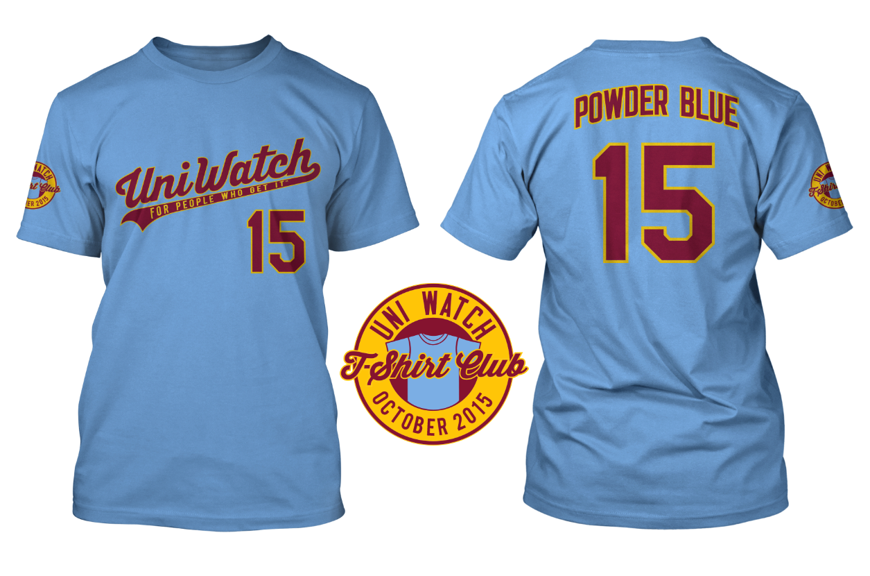
An important note: If you go to the ordering page, you’ll see that three different T-shirt brands are available, each with its own shade of powder blue. American Apparel is the lightest shade and Teespring Premium is the darkest, with Gildan in between. So compare the color shades, and also use the sizing chart for each brand, to choose the shirt that’s best for you.
.@UniWatch 9 months pic.twitter.com/WSIaVvuSn8
— Michelson (@hmich176) September 11, 2015
Uni Watch News Ticker:

Baseball News: The Blue Jays, as reported in yesterday’s ticker, wore both American and Canadian flag patches, and it looks as if they just peeled them off for last night’s game against the Yankees (screen grab by Ben Dougson). … Speaking of American flag patches, last night Wade Davis of the Royals was still sporting his — he must really love ‘murica (via Jared Hinton). … Couple cool items from Will Scheibler: (1) Interesting stadium poster at the Smithsonian site; (2) From same place – 1968 mlb lunchbox with game to be used on back, and this site with additional photos. Also, Salt Lake City Tribune with scoreboard “Old Ironsides” and another view. … The Seattle Mariners announced their Latin heritage night with last year’s jersey style — note the silver outlining on the outside of the wordmark (great spot by Wes Walton).

NFL News: “Maybe you are aware of this but I just noticed this’s tonight,” writes Rick DiRubbo. “While watching a show on Don Shula, I realized some players had stripes on their sleeves while other players had no stripes. See Bob Griese had no stripes, but number 62 wore them. Same with number 81 and 42 in the second picture. I then did a search and found a picture of Larry Csonka in Super Bowl 7. He didn’t have stripes on his sleeves but his blocking lineman did. Thanks, Rick — yes, we’ve covered this before (good article on inconsistent jersey typography here, which also talks about the 1972 Dolphins). According to one of the comments there, “The only year the Dolphins wore 2 styles of jerseys was 1972. 1971 was stripeless, and 1973 was with stripes. In 1972 they introduced a new striped jersey, but many players chose to wear their 1971 shirts,” and “A quick uni-history of the Dolphins (60s and 70s): 1966-1969: Wilson uniforms, stripes on sleeves; 1970-1971: Wilson uniforms, no stripes on sleeves; 1972: A “mish-mash” of Wilson with stripes (Vern den Herder); Wilson without stripes (Bob Griese); Sand Knit with stripes (Nick Buoniconti). And that’s just the white uniforms, which they wore, home and away. The aqua uniforms, which they rarely wore, were all Wilson without stripes; 1973: Russell uniforms, stripes on sleeves (thru 1986).” … Jeff Wilk was at an Old Navy store yesterday. “They carry some NFL t-shirts and all have the tagless print with the new logo. However, the NFL branded shirt has the old logo on the front.” He adds, “I thought it was because all the shirts were retro, but if you look at the collection, it is nothing but the current team logos.”

College/other Football News: Nike just unveiled a new film, “Shout,” celebrating the longstanding relationship between the University of Oregon, its fans and the seminal 1978 film “Animal House,” in which Otis Day and the Knights originally performed the song “Shout,” (thanks to Heter Myers). … Since the Charlotte 49ers football program started in 2013, here’s the program’s record corresponding to the uniform worn (nice find by Josh Edney). … This is rather disconcerting (and a good spot by Susan Freeman) — Aggie Football has a sponsored tweet — how do I get in on that action??? … “I’ve mentioned previously about the #FreeUAB movement about the reinstatement of the football team at UAB,” writes Dustin Semore. “Many schools are sending along their support — and many people were surprised to see a coach/assistant on the Jacksonville State sideline in their overtime loss to Auburn sporting the #FreeUAB shirt.” … Here’s another September 11 pandering uniform, this time from Saint Augusts prep in New Jersey (h/t Lionuscp).

Basketball News: Here’s a fairly in-depth (and pretty good) article entitled “Panic over Patience: A Logo Story,” which details the the rush job of a logo the Clippers undertook this past year or so. Funny line: “Purportedly, in late 2014, Gillian Zucker addressed the Clippers in-house design team and stated that she wanted a rebrand.” Which is exactly what Paul would not call a rebrand. Thanks to Noah Patterson.

Hockey News: As we reported a while back, adidas is getting ready to take over the rights to outfit Nationwide Hockey League. Here’s more on that. … Here’s a shot of Sidney Crosby wearing all CCM gear instead of RBK. Says tweeter Dave Dunn, “Same company, but big for CCM brand.” I’m pretty sure all RBK-sponsored athletes will now be branded by CCM though. … The San Jose Sharks have officially revealed their Heritage Jersey, which they will wear three times (thanks, Brinke). … “The Canucks, Flames, Jets and Oilers are playing a tournament of their young talent,” writes Craig Snyder. “The Flames-Jets game was colour on colour.”

Grab Bag: “Gallery here for the arrival of teams to the Rugby World Cup,” writes Caleb Borchers. “Coolest thing is each team has their own bus wrapped with team colors and logo.” … Here’s a look at the evolution of Stormtrooper helmets (No — not the football kind, the Star Wars kind — with thanks to Bob Kile). … Reader Roch Smith saw “this uni-watch coloured sweater in a shop in Toronto (yesterday) morning and had to send it along — pretty nice. The patch was amazing.” He adds, “I would have picked it up for you but Jim Bullis was an xxl sized curler.” … JMU is doing a tribute to Alison Parker on their 83 car (h/t Andrew Rader).
And that’s all for today — thanks (again) to Terry, Joe, Rex, Dennis and anyone who submitted for the ticker. The NFL (technically) kicks off today with the first full slate of games for 2015…and I know you are ready for some football in the league where they play for pay. Everyone have a great Sunday, a better week, and I’ll be back before you know it.
Follow me on Twitter @PhilHecken.
Peace.
“I’m a traditionalist but I thought UCLA looked great this week. Does that mean I have to turn in my Uni Watch membership card?”
–Vee63
the seminal 1978 film “Animal House,” in which Otis Day and the Knights originally performed the song “Shout,”
Shout was originally written and performed by the Isley Brothers link. That doesn’t mean Oregon shouldn’t celebrate the movie version, but credit where credit’s due.
True that. Also, just because Nike calls the commercial a “film” doesn’t mean we have to!
And why does that linked article about Adidas doing hockey call it the “Nationwide Hockey League”? It’s not just the ticker, that’s what the article says. Yeesh.
The Michigan State uniforms were horrible on tv. I had to brighten my screen because the dark uniforms, with poor stadium lighting, made it very tough to see the players on tv. Would have looked better with white pants…maybe. The helmet was also unrecognizable when it came to details at night.
Loved the MSU uniforms, the bronze with the green and black, and normally I’m not a big fan of AFTSOA.
The Miami at Wisconsin game on the other hand, YUCK!! UW’s classic look couldn’t save Miami’s uniforms from it being a bad looking game.
link
Strongly echo these remarks. Joe totally missed the mark on the Michigan State – Oregon mash up.
Both uniforms were beyond hideous. Michigan State look was nothing but a murky blur. Add to that what looked like a bucket for their head gear and you wind up with a halloween costume.
As for Oregon, well as they say, you can’t fix stupid. I’d like to have Oregon alumni, that contribute to the school’s athletic fund, how they can endorse helmets that were intended to look like egg shells.
Duck eggs, at that
Ducks still haven’t won a big game wearing the no green and no yellow look….
Joe’s new…Phil’s obviously using that to weild some evil Duck-loving influence on him. NO WAY that game is #2. Or #42. Pure &1 material there.
Speaking of the &1…Yo, Monmouth, the diamond piping went out of style during Vilk’s 5&1 reign of terror. Welcome to the 2010s.
Although Florida wore the mono oranges the best, I’d elect KSU/UTSA to replace today’s #2.
Sorry, but the ACC & SEC trackers were not accurate.
Please see the updated files here:
ACC:
link
SEC:
link
They’ve been updated above now (sorry for the delay).
Whoever is doing the Pac-12 tracker really needs to update the number font for Washington, because the one on the tracker is not really close to the real one.
Hi JayJay. I’m doing it and this is my first week, so doing 24 (2weeks of 12) uniforms in 3 days on deadline with no template tested by timing and ability to be detail oriented. I tried to find good samples of UW numbers and unlike some programs that publish their fonts etc, I could not quickly get a decent UW sample. I got it pretty close, but I’ll admit that some of the curves and lines are slightly off. Do you have any good sources? Plus I’m a Duck, so even drawing the Huskies makes me feel creepy:-) Kidding…
FYI – the NJ prep school wearing the 9/11 uniforms is St. Augustine’s, not St. August.
9/11 just isn’t a day of remembrance, like the anniversary of a natural disaster or some kind of accident. I think it would very appropriate for virtually all college and pro sports teams playing on that day to have it marked on a uniform, or in football, a helmet decal.
Or… it’s been 14 years, let it go.
Just like they do for the Oklahoma City bombing, Pearl Harbor, USS Cole attack, etc.?
What the United States currently does for 9/11 does not help the nation heal whatsoever from the tragedy of 9/11.
I really like those holographic sparkle Ducks helmets, especially paired with the cartoon Duck logo. I guess I’m not opposed to all of these new finishes teams are using – chrome and coloured chrome helmets and face masks, metallics, sparkles, etc. Yes some of the designs are gimmicky and tacky, but I still like these new finishes. Often with new ideas they will be taken too far, then pared back to where they work, might be the case with modern uniforms.
I wouldn’t be opposed to seeing a hockey team experiment with a chrome helmet or other modern uni material. Non traditional markets like Vegas would be suitable.
And thumbs up for mono orange!!!!!
Florida and Georgia are both false on the tracker.
Stating what is probably the obvious, but the assistant wearing the UAB tee may be a former UAB staffer. Those guys and players scattered to other teams, a lot in state. UAB also has the sympathy of the smaller programs in state, i.e., South AL, Troy, Jacksonville, West AL, ect.
Dennis really needs to correct the number fonts on his Pac-12 tracker. Colorado uses a school-specific italicized font. And does he really think they share the same font as their fellow Nike schools Oregon State, Stanford, and USC? Or that they all share the same font with Utah, an Under Armour school. It’s a significant error in his work.
Hi DJ. I’m a Duck, so will readily admit that trying to find the exact font on three days notice was hard. UO actually has a font to download but trying to guess on the other more boring fonts was the best I could do. So I was going on photos and other not very definitive base materials. Plus since this is volunteer work, I’ll have to step up my game before I get my pay docked:-) I did notice that CU was italics and you have to give me credit for trying. Any help you can give me. shoot me an email. link
Great job UW crew, but I feel Michigan vs. Oregon St. deserves some major uni attention this week, too. Not only did M switch to a classic, bolder shade of maize after years of Adidas neon yellow but the overall game was really nice with OS’s white/white/black with orange trim on the other side of the ball.
Michigan St looked awful. A dark mess.
At a glance, Oregon looked good with the cartoon duck. But looking closer, there were many issues. The pants were light gray — either make it dark enough to show contrast or go with white. The duck logos were inconsistent, with an angry duck on the helmet and a smiling one on the sleeve. Also, I wanted to give my kids some crayons to color in those duck logos — opportunity missed by going black and white.
“Animal House” was filmed in and around Eugene, Oregon, which is the home of the Ducks. The video of the song “Shout” from that movie is played at the end of the third quarter of every game, causing the entire crowd to sing and dance.
I really guess nobody follows up on the comments!!! I have mentioned it on the two. An athletic aethstetic tragedy happened on Friday and made it nearly impossible to watch my team!
THE UNIVERSITY OF MIAMI HURRICANES WERE WEARING BLUE & WHITE SOCKS!!! A school known for ‘The U’ and jersey colors, Orange and Green, were wearing white socks with blue patterns. WHAT IS ADIDAS DOING TO OUR BRAND. This was a travesty of uniform issues.
Wow, Vanderbilt’s number font sure isn’t very readable, is it?
First Salt Lake City “Old Ironsides” photo is very slow to load so here’s another photo showing the building with scoreboard.
link
Nationwide Hockey League? To be fair, the article in the ticker is wrong too. National!
That’s hilarious!
Not to mention the “Inexperienced Bay Packers”!
That article is just horribly written, with such mangled grammar that it seems like the writer couldn’t have possibly been starting in English. And several other articles on that site reflect the same horrible grammar.
I’ve been trying to search for any information about this “suffoldtimes.com”, but the site is minimalist, and I’ve yet to find out anything about them.
*suffield* – my bad
And then there’s link.
… WHAT.
Tremendous Bowl 50? I may need to scoop up that domain and trademark that.
No love for Notre Dame/Virginia in the top 5 of the 5 & 1? The only bad-looking part of the game was Virginia’s butt/hammy stripes. Those notwithstanding, they looked almost as good as Da Bears, whom we all can agree are the best-looking NFL team. And Notre Dame didn’t muck it up, but went with its classic gold/white/gold look.
link
Infinitely better than that dumpster fire that Michigan State wore.
Michigan State looked awful last night. They might have looked better in bright sunshine. Just a poor choice. The Ducks’ helmets sparkled nicely under the lights, but they didn’t really fit with rest of the get up.
Why the hell are the Browns wearing orange socks with the orange pants? God dammit Cleveland, can’t you do anything right?
Do the Browns even have brown socks anymore? If no, they need to buy them all back from that guy who bought the lot at the yard sale immediately. I don’t hate orange pants for Cleveland, but with the truncated pants stripe, today’s combo looks like fashion orange yoga pants, which is an oxymoron even for Oompa Loompas.
Yeah, they do.
link
Why they’re deliberately wearing the wrong socks now is beyond me. They did it right when they unveiled the uniforms.
Thank you Jeff. Face palm, there is no excuse for that.
Exactly what I was thinking. They fucked up the units and they are making them worse as they go.
Well if you’re going to play like a terrible high school team you might as well also dress like a terrible high school team.
Never did see the pics in that Salt Lake City Tribune link in the ticker. While I was waiting (and waiting) for the site to load, though, I was mesmerized by the Utah History logo:
link
EXCELLENT use of negative space!
The second close up photo seems to work okay.
The first photo with the ‘Salt Lake Tribune’ link was a picture containing the scoreboard but was more of the building; worked okay last night, but is very slow or non-working today. Tried it a minute ago and it worked, but twice earlier today didn’t – guessing site can’t handle much traffic.
Here’s one of the building from another site:
link
and here (with some other interesting photos in the ‘Article Photo Gallery’)
link
Oops, I don’t know how I forgot to mention Vanderbilt.
The Clippers rush-job story is plausible. And sad.
I can’t remember the last time I saw such a drastically brand new logo package on the same old template. And I’m not counting teams that moved either, so yes I know that the KC Scouts and Colorado Rockies, and Atlanta/Calgary Flames have the same templates. Even the Islanders deliberately took heir time with the Fishermen, though they rushed to hit the undo button as fast as possible, resulting in the mishmash of old logo and traditional fonts on seasick jerseys.
So yes, super obvious it was a rush job. Which makes a bad job look even worse.
I think the sad part is that it takes so long for the “design process” in the first place. There’s plenty of internet amateurs who can re-design logos for an entire league in just a couple weeks, but it takes over a year for a professional team to get a new logo designed? Give me a break. Hell, just look at the Uni Watch contest for the Clippers. People only had like 2 weeks to come up with their designs, and the vast majority of them were better than what the team decided to use.
As usual, Pitt’s uniforms are the most boring in the ACC. Michigan State’s were disappointing as well. Looks like a NY Jets green. The helmets were horrendous.
Boring to you = Solid to me. I rank Pitt 4th in the ACC behind Clemson, FSU, and UNC.
As a Panther fan the white pants drive me crazy. That OTHER school in the middle of nowhere, Pa wears white pants. We need to burn them. Gold-blue-gold at home and gold-white-blue in the road! But there will be new uniforms next season which makes me shudder in fear as to how bad they will be,
Mustard-blue-mustard at home and mustard-white-mustard on the road.
(Fixed)
Agreed, though, on the white pants. They belong in State College.
“Nationwide Hockey League” is only part of it. The linked article also refers to:
Nationwide Basketball Affiliation
Main League Baseball
Main League Soccer
Just found link that suggests that this site just steals other, legitimate articles, and changes certain words around.
Yeah, we might want to blacklist this suffieldtimes.com page, if they’re that illegitimate.
Found the original NHL article, and it’s from the link.
Miami Dolphins’ helmet stripe and uni numbers are totally different colours. Pretty cert=ain it’s not a wet/dry issue.
And here come the Lions, still wearing the WCF patch on the front of their jerseys.
*SIGH*
Does William Clay Ford, Jr. not understand that Lions fans do NOT want to be reminded anymore of his father’s ownership?
To the college uni-trackers: thanks for dropping the conference logo backdrop. It really cleans up the presentation.
Thanks tosaman. Its nice to get a comment for something we did right:-) Phil will have to up our pay!
Thanks to all the NCAA trackers. With so many costumes, it truly is Herculean or even Sisyphean to make heads and tails of it all. In a few years, it will be a great reference guide. Imperfections aside, you gotta give it some time to hit its stride. Thanks for giving the UW community your time and effort in arenas I don’t have any energy to muster. I truly mean it.
Mike. When I was a UO student in the 90s, Huskies were definitely the enemy, but unfortunately for UW, the tables have turned and been turned for a long time, so I appreciate your patience with us new trackers. Getting all the different/but similar uni-fonts straight and doing it times 12 this week was a task. About half the Pac has slightly tweaked versions of the standard collegiate font, and trying to find accurate looks when they seem to change weekly and monthly is crazy. Just drawing that Combat Duck last night on deadline of 9pm when the thing was only unveiled that afternoon was crazy. I have to be happy that Cal had same uniform as last week (I think)
Mike has hit the nail on the head.
This whole tracking thing is still a work in progress (hell, we may not get it right until mid-season) and I still hope to add more conferences.
But this is Uni Watch Dennis — welcome to the world of perfectionism and attention to detail (not that that’s a bad thing, by any means)!
To anyone who has expressed their concerns that the trackers aren’t perfect — I have some words:
Chillthefuckout.
The trackers are doing yeoman work (and under my deadline) and they will get things right sooner or later. We all need patience now, and this will (as Mike said and I should have said earlier) become a wonderful guide down the road. I haven’t yet asked Paul, but I’m sure once the season ends it can become a part of the Research Projects (or other) section and have a permanent residence on UW.
Meanwhile, if anyone can do better than Messers. Bolt or Henry, please do volunteer to assist, as we’d love the help.
If you can’t, please allow it some time to get the kinks worked out. This will be great, eventually…trust me!
I don’t believe you!!! OK, I’m not seeing the trackers until now so all the earlier bugs have been worked out. But I think it looks awesome already. My only question is why did it take so many years to start doing this? Great work by everyone involved!
Both the Cleveland Browns and the Tampa Bay Buc uni launches have been complete “disasters” (Arnold voice). An issue more unforgivable than deflate-gate from my extremely biased eyes
Its like the five year wait can’t happen fast enough. I have to believe, the Browns will be allowed to modify that Brown jersey, for next year, the numbers are a mess. I can’t believe a franchise that say somewhat akin to the Toronto Maple Leafs (proud history, but 40+ years of mostly failure) would resort to a MAC conference look.
Have the Jets officially change their green color, it looks to me like no other green worn in sports, a very stale muted army like dark green.
Re: The Jets, it looks terrible in sunlight, not quite as bad under lights. The pants today looked almost colorless; as you described, very stale muted olive drab. Ych.
The Jets seem to have a sort of Cowboy-ish issue with colors. Those greens are about 17 different shades depending on light and what part of the uniform it is. The Jets of the mid-90’s looked much better.
I like the orange pants and the Orange numbers for the Browns but they need to change the white shadow to a more traditional. The white shadowing on the numbers looks like the numbers are on upside down to me. Of course they also need to get rid of the huge Cleveland across the chest, make the road numbers brown with orange trim, change the pants stripes to real pants stripes, and wear the right color socks. Aside from that they looked OK. The changes to the helmet were an upgrade at least.
“they need to change the white shadow to a more traditional. The white shadowing on the numbers looks like the numbers are on upside down to me. Of course they also need to get rid of the huge Cleveland across the chest, make the road numbers brown with orange trim, change the pants stripes to real pants stripes, and wear the right color socks. Aside from that they looked OK.”
~~~
HAH!
Yes, other than that, they looked perfect.
If you have as many as two of that litany of things wrong with your uniform, you’re not doing something right.
To have ALL those things wrong with your uniform…means you’re the Browns.
Hell, even when the Jets first switched to the darker-green retro jerseys, they looked better than they do with the current Nike setup. Of course, one thing that would help a little bit is fixing the sleeve striping so you don’t have that cutout look. (That, and going back to Kelly green, of course.) They could also get rid of the logo patch – I’ve never been a fan of logos on the front of football jerseys.
Adidas may have gotten the shoulder stripes right on the Mississippi State uniform, but never bothered to tell the athletic department about the equipment changes — which included removing the TV numbers.
link