Paul here, making another doubly rare August-weekend appearance.
Remember last year when the Nikelace on some Cowboys jerseys appeared to be tinted blue? The party line at the time — and I got this from ESPN’s Cowboys beat reporter, who got it from the team — was that it was due to blue dye from the numbers and/or stripes bleeding in the laundry and being picked up by the collar (although it was never explained why the bands of the Nikelace would be so susceptible to picking up the dye).
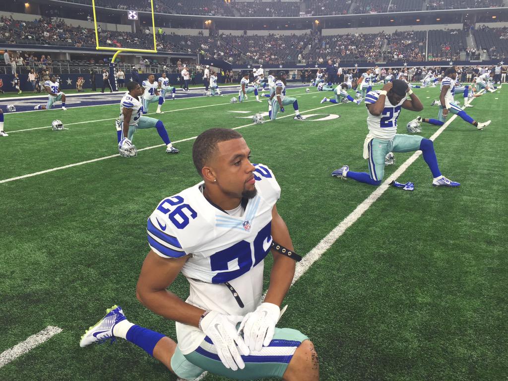
That problem didn’t appear last year until about the fifth week of the season. This year, however, it’s already popping up during the preseason — either that or they’re re-using some of last season’s jerseys, at least judging by last night’s Cowboys/Vikings game (for all of these, you can click to enlarge):


As several people pointed out on Twitter, the Cowboys already have several shades of blue, so why not add more to the mix?
Just like last year, the stains were inconsistent — some players had them but others, like those shown below, did not:

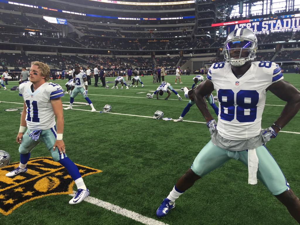
The weird thing is that if you look at photos from the Cowboys’ previous preseason game, there’s no evidence of the blue staining. So all of this apparently happened during the past week’s laundry cycle. Weird.
It all reminds me of that 1970s ad campaign for Wisk:
(My thanks to Jared Sloan, who was the first person to bring this to my attention.)
Meanwhile, in Tampa,, the Browns and Bucs faced off in what Twitter user @RNs_Funhouse aptly called “the “Hideous Uniforms Bowl” (click to enlarge):

As I looked at that screen shot, it occurred to me that you could combine both teams’ partial pant leg striping and you still wouldn’t have a full stripe. Yeesh.
That’s it for today. Phil will be back tomorrow for his last August entry, and then I’ll be back in the saddle on Tuesday. See you then. ”” Paul
If the Swooshkateers can give De La Salle HS a full set of UCLA stripes, why can’t they do it for the colleges and pros?
I’m thinking that guys on big contracts (Romo, Dez, etc) probably have new uniforms worked into they’re deals. Or they may just get new uniforms regardless. Just a guess, but it’s the only sense I can make of it from the photos.
Might actually be because the game jerseys of the popular players are sold or auctioned later on. I could see them having some sort of “game worn” resale value.
Let me repeat: Nobody appeared to have the blue collars last week.
The “Hideous Uniforms Bowl”: If this is what the future of the NFL looks like…
I’m thinkin’ that Pats vs. Panthers was the worst of the weekend (dishonorable mention: Jags vs. Lions).
Panthers’ uniforms will soon be considered “classics”, but they’re not old enough yet so they are (as Paul is fond of saying) “dated”.
They’ll never be classics. They looked bad at the start and now look bad AND dated.
Paul, do you ever delete comments from people who don’t share your opinion or taste? I realize that uniform preference is all subjective. I’ve been reading for a while, and you are thoughtful and very intelligent. I just don’t like when you sound so authoritative. Then again, it is your blog. Carry on.
BTW- I like the Panthers uniforms. Now the Ravens uniform? That’s a joke. What’s with the Looney Toons severed bird head?
Paul, do you ever delete comments from people who don’t share your opinion or taste?
Only if their tone is out of line and/or if they violate a stated rule of the site. Nobody is required to agree with me, but everyone is required to be civil.
I just don’t like when you sound so authoritative.
What you’re really saying, whether you realize it or not, is that you don’t like cultural criticism, because it’s a critic’s job to sound authoritative. For more on this, look here:
link
You’re free to dislike cultural criticism, of course — nothing wrong with that. But it brings us yet again to the question of why you’d be spending time on a cultural critic’s website. It seems like you’re essentially complaining that water is wet.
That said, my response to your comment didn’t have a particularly authoritative angle. I said I “don’t understand” your linkage of uniforms and performance, which means I’m befuddled, not authoritative. I further said people are free to disagree with me, and then went on to say that preferring performance over aesthetics is perfectly reasonable. I did try to apply some rigorous logic to the situation (which is what I almost always do in these discussions), but logic isn’t “authoritative”; it’s just logical.
What was your complaint again..?
Paul, as you know, beauty is in the eye of the beholder…and let’s face it, if an expansion team came out today and called themselves the “Red Sox” or came out with a blank helmet like the Browns or Penn State everybody would wonder what they were doing…
Simply put, stuff becomes “classic” not because it has an objectively good look, because tastes change. Designs become “classic” because they stick around for long periods of time and they tie the present to the past…
I may be alone/crazy with this, but I kinda like the very faint blue on the collars for the Cowboys. It’s not too much, but just enough to fit with the white and kinda fits. That being said, the accident should either be fixed, or adopt it fully.
I basically said this last year. I’m surprised no one this year has already put a contrasting colored Nikelace on their actual uniform.
Never have understood why Dallas can’t get blue (pick any blue) and silver consistent from head to toe. Has driven me nuts for years.
Thank you!!! It should be seen as an unacceptable lapse by the uni watching community.
Ha… when I came out of watching something recorded on my DVR, NFL network was the channel I was last watching live and the Browns/Bucs game was on… it literally took me one glimpse… maybe half a second to say “ugh, what an ugly game.” Think that’s what the geniuses at Nike were going for? A split second negative reaction? Time to go back to YouTube for old 70’s and 80’s highlights to cleanse my eyes I guess :)
I was watching the Jags for a minute this weekend. Their partial pant stripes actually look good. If they would get rid of their joke of a helmet, they would possibly have the best looking set of modern NFL unis.
As a lifelong Browns fan (I know, I like to punish myself) I am so disappointed with the Browns new unis. In general, I love the jersey, and love that they kept the helmet plain, but I dislike the brown facemask, and the “BROWNS” down the leg looks amateurish. A full pant stripe and some striped socks would have been fantastic. Thanks Nike (and you too Haslam).
As another die-hard Browns fan – going back to the Mike Phipps days (as brief as they were), I’m forcing myself to like the Browns unis. But I see why they bother people.
I know many on this forum hate the new Browns unis, but I have to say that the brown over white combo is one of the better ones.
They are growing on me.
I’m a Browns fan back to the days of Paul McDonald AND a uni-traditionalist and I don’t mind any of these looks.
I just don’t understand the hate for them here and in many other places. If I were to change one thing it would probably be the BROWNS wordmark, but even that doesn’t bother me.
How can ANYONE call our uniforms terrible in a league that features those Jacksonville atrocities? I think you’d have to be at least 1/100th as bad as those to even be deserving of criticism.
How can ANYONE call our uniforms terrible in a league that features those Jacksonville atrocities?
I really don’t see what one has to do with the other. Yes, the Jags have the worst look in the league. That doesn’t mean every other team automatically looks good.
If you’re a Browns fan and like the team’s new look, that’s great — I’m happy for you. Personally, though, I think the design is a failure. We’ll have to agree to disagree.
No doubt in a few years they will return to the classics they had last year and make a big smash about it. These will look like leisure suits when people look back on them. Why do teams in all sports constantly do that and then return to what works? Just stick with what works (Yankees, Celtics, Cowboys, Raiders, USC football, Alabama football, etc.).
I am fine with the Browns new look. I’m glad they are trying something new. Our history of losing with the old look is reason alone to go a new direction. From the player comments I’ve read, they seem to be positive. If a brighter orange and Browns running down their legs can be a motivation for better play, that’s all that matters. If the players like them, who cares what fashion bloggers say, they don’t have to wear them. I know it’s been said before, winning teams always look good.
Our history of losing with the old look is reason alone to go a new direction.
I’ve never understood this way of thinking. A good team is a good team (and a bad team is a bad team) no matter what it’s wearing. And a good uniform is a good uniform (and a bad uni is a bad one) no matter how the team performs in it.
The early Mets are one of the worst-performing teams in sports history. I’m glad they didn’t change their uniforms as a result — it was, and still is, a great look.
If a brighter orange and Browns running down their legs can be a motivation for better play, that’s all that matters.
If you honestly believe either of those things will be a “motivation for better play,” I have a bridge to sell you.
If the players like them, who cares what fashion bloggers say…
Who are these “fashion bloggers” you refer to? If you mean Uni Watch, this site is about design, not fashion. I completely agree that the players (and fans, and anyone else) are free to disagree with my assessment. But if you don’t care what I think, why are you here reading this website? Just askin’.
winning teams always look good.
In other words, you don’t care about uniforms; you only care about results. Nothing wrong with that — it’s a perfectly reasonable standard to apply. But again, it begs the question of why you’d be reading a website about uniforms in the first place.
Changing uniforms due to a history of losing is stupid indeed, and I believe if the Browns had been a winning team since they came back, they never would have changed looks. Silly but true IMO.
Interesting discussion/observations during the A’s-Diamondbacks game right now. Several players are wearing ribbon style faux-stirrups, Billy Burns is wearing green socks (don’t look like stirrups but I didn’t get a good view) with “A’s” on the side, while several other players are wearing pajama pants.
Brenly: I don’t know if this was coordinated or just a coincidence, but the guys on the left side of the field, shortstop, third baseman and leftfielder, all are wearing their pants right down on their show tops. Everybody on the right side, including the centerfielder Billy Burns, has their pants hiked way up to their knees.
Steve Berthiaume: The whole color scheme is tilted.
Brenly: And Burns is wearing green stirrups, while the other guys are wearing the bright yellow … [I’m] Pretty sure ‘uniform’ means ‘all the same’.
I can’t believe it took me this long to realize it, but the Browns’ brown jersey with the orange numbers: I thought the NFL had a rule against the actual numerals on colored jerseys being any color other than white.
I read somewhere some time ago that this supposed rule was the reason the Chargers switched from yellow numbers with white trim on their blues to white numbers and yellow trim, and also why the Lions ditched the silver numbers with white trim on their Honolulu blues.
Am I wrong in my recollection?
Um, are you aware that the Saints’ black jerseys have gold numbers, the Raiders’ black jerseys have silver numbers, and the Rams’ blue jerseys have bronze (or whatever) numbers?
Packers’ and Bears’ throwbacks could also be added to this list….
Oh, and the Seahawks’ blue jerseys have silver/grey/whatever numbers.
No rule against it, just makes it easier to see the numbers. Metallic numbers on anything but black or navy are hard to read from a distance because of the reflection they give off, this was likely the reason why the Lions ditched that look, the Chargers were definitely not forced to change their unis because of any rules, if they were it would be pretty unfair that the 2 of the other 3 teams in California at the time would be allowed to keep their looks (Rams even had a similar color scheme).
The NFL has a legibility rule when it comes to normal unis (throwbacks are allowed to be historically accurate even if it violates other uni rules; no TV numbers, less than ideal number contrast, circles with numbers in them instead of full-sized numbers), the NFL clearly okayed the Orange on Brown look because they are wearing them in games and they aren’t throwbacks (I don’t think they would have gotten the clearance without the white accents, but that’s pure speculation on my part).
The numbers don’t have to be white…. heck I don’t even know if they have to be contrasting (never actually read the rule), but one thing is for sure, the orange numbers on the brown jersey don’t contrast enough, and the white outline/dropshadow doesn’t help enough. They may not drop the look and return to the previous design, but I’d bet good money they rethink the orange number thing…. it simply needs to be reversed… white number with orange outline – no dropshadow…. and then it wouldn’t be terrible…. it wouldn’t be great, but not as terrible :)
As a Bucs fan and Florida State alum I really hate what Nike has done to both teams.