[Editor’s Note: Paul is on his annual August break from the site and will return in September. Daily content is continuing under the direction of deputy editor Phil Hecken, who’s running the site this month. Our lede today was prepared by Mike Chamernik]
Mike here. I got a good email from Michael Doucette a little while ago. I’ll let him explain the work he did.
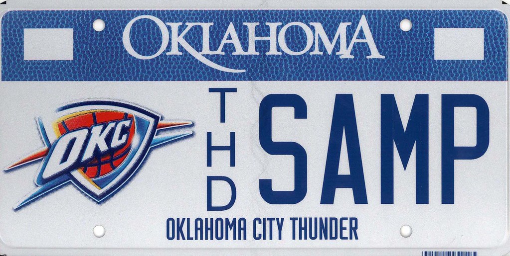
As One Who’s Got It longer than almost anyone anywhere, I figured Uni Watch would be the right place to share this “collection.”
I moved from New York to the Northern Midwest, and I drive in and around Chicago a lot. I started to notice cars with Chicago Blackhawks-themed license plates and thought they were just so cool. They were red like the team’s home jersey, and even had the white and black stripes like the jersey does — one of the top three or four jerseys in pro sports in my opinion, by the way.
That piqued my curiosity into other sports-themed plates. I put together a collection of all the pro sports-themed plates I could find on the web. I included the four major sports and MLS. And I only looked at states’ official DMV websites, to try to get as “official” as I could.
Here are some of my favorite observations:
• The Blackhawks plate is still my favorite, but I think it’s now tied for first with the Brewers throwback plate.
• I think Illinois and Texas finish 1-2 as best state collections. I love that Texas has “alternate jersey” versions for most of its teams (even the dreaded BFBS).
• I think it’s awesome that New York has a Brooklyn Dodgers plate.
• Rhode Island goes Green Monster for its Red Sox plate.
• It was interesting to see when states didn’t offer plates for certain teams. Arizona doesn’t have a Coyotes plate, and DC thankfully doesn’t have a Washington DC Football Team plate. No Pacers plates in Indiana or Rams in Missouri.
There’s also a larger collection of miscellaneous sports license plates that I collected. Examples include a ton of NASCAR varieties, plates commemorating each sport’s hall of fame, those encouraging youth golf, and a plate for an Iditarod finisher.
+++
Mike here again. Excellent stuff from Michael! I had a few observations myself.
• Delaware has a Flyers plate in the state’s blue-and-gold color scheme.
• Massachusetts’ Celtics plate shows the old green-and-white logo, which I actually enjoy a bit more than their current logo.
• New Jersey has plates for 10 teams.
Every state’s complete history can be seen here. I’ve always loved license plates. When I was little, I had a book that showed the plate for each state and every Canadian province. I was transfixed, and that was even before sports logo plates existed.
My grandma must have a soft spot for sports-themed plates, too. She has a Chicago Bulls one. Her vanity plate is her nickname with the number 1 ”” for her favorite current player, Derrick Rose.
Collector’s Corner
By Brinke Guthrie

This one was up a few weeks ago on eBay but it was scheduled to end before the next Tuesday morning- but now it’s back, and that’s good for you! A terrific late 1970s NFL/Pop Tarts promo poster with all the helmet stickers included! This is a big one, too- 24″ x 18″.
• Check the totally groovy artwork on this mid 1970s NFL/Avon soap-on-a-rope; got some vague reverse Rams action there.
• Here’s a 1970s Baltimore Orioles helmet bank c/o your friends at Hardees.
• Houston Oilers Helmet Buggy– still on the card!
• Guess they ran outta room for a full facemask on these 1970s “modern NY” NY Giants stickers.
• Notice the lack of BFBS on this 1970s Detroit Lions Cliff Engle sweater.
• Remember “Sport” magazine? Joe Morgan and Pete Rose have their game faces on complete with Bicentennial patches on the sleeve, on this 1976 cover.
• This 1960s KC Chiefs plastic football looks to be in perfect shape.
• Remember the artwork on these packages? This auction is just for the wrappers (must be pre-1972, shows Senators) for those MLB/Fleers cloth patches. Loved those, AND the gum, too! (Which, as I recall, was not quite as generous as the Topps gum was.)
• Sock ’em, White Sox- with this 1970s pocket mirror.
• Killer graphics on this 1976 Chicago White Sox ticket brochure.
Follow Brinke on Twitter @brinkeguthrie.

Uni Watch News Ticker
Compiled by Mike Chamernik
Baseball News: Why was Andrew McCutchen doing all he could to shield his mouth on Sunday night? He chipped his tooth during the game. Also within that story it is confirmed that Cutch wears a cut-off sock on his arm (from ”@redbuppy). … @JameRockT7L says that Cubs OF Jorge Soler has “Eyes on the can!” written under the brim of his helmet. … Great mix here of stirrups, camo and an all-turf field. … We’ve read about some of these details before, but Todd Radom wrote a good piece on the 1976 White Sox uniforms. Speaking of the White Sox: Awesome!!!! Here’s a sneak peek at the ChiSox 1976 throwbacks (via C.D. Tatak). … Toyota, a new Cubs sponsor, will put its logo on the Wrigley marquee.

NFL News: New logo for Monday Night Football. … Tom Brady will become the face of Under Armour (from Brinke). … The Falcons released some renderings of their new stadium (also from Brinke). … The Bears unveiled a George Halas statue.

College & High School Football News: Ball State will have six helmet designs this season. … Miami unveiled its new Adidas uniforms (from Phil). … New uniforms for New Mexico (from Phil). … Iowa will wear alternate uniforms against Minnesota in November. … After a three-year hiatus, San Diego’s Kearny High School once again has shoulder stripes. The jerseys were even better back in the day, like in 1989. The Komets started wearing the stripes in 1961 but stopped in 2012 because of a pedantic rule (thanks, Stephen Grooms). … Boise State’s new mobile app allows you to customize uniform options (and much more) — thanks to James Gilbert. … Hmmmm — check out these helmets for the Hirschi Huskies in Wichita Falls TX (via Isaac Collins).

NBA News: After Kobe Bryant injured his hand in late 1999, he wore a glove during games to protect it. More info here. … A clothing company called Almanac Brand makes hat with NBA teams’ championship years on them. The font of the numbers is in the style of the teams’ jerseys. I like them. … John Weber found a T-Wolves-esque jersey in a thrift shop in Japan. “I think it reads ‘B’HURUGLUB'” he says. … A designer created a logo for every NBA team over the course of 30 days. Like every unofficial redesign, some are good and some are really bad. But, none of them look authentic, you know? Can anyone explain what qualities separate fan logo concepts from the real deal designs? (Thanks, Gorden Cromer).

College Hoops News: Xavier’s new court has the Cincinnati skyline on it (from Andrew Cosentino). … New court for Illinois (from Josh Sanchez).

Grab Bag: New anniversary jerseys for the WHL’s Kelowna Rockets (from Phil). … Here’s a first look at the World Club Cup 2015 logo. … Wisconsin-Green Bay signed a deal with Adidas (from William Sentowski). … The designer who created the Nike swoosh was paid only $35 for it in 1971. … Hockey jersey ads are gonna suck, right? Well, here’s an article that doesn’t think so.
Phil here — thanks to Mike and Michael for the lede, Brinke for his Collector’s Corner, and Mike (again) for handling the ticker. Back with more tomorrow…should be three good columns to close out the week (including one from Paul). Everyone have a good Tuesday!
Peace.
“For Hallowe’en in 3rd grade, I dressed as Mr Red (Running Man, no mustache, it was 1984)…Anyway, my mom made the head out of papier-mâché from my Spider-Man Hippity Hop. In hindsight, I wish I still had the Hippity shop since I outgrew the jersey a log time ago.”
–MJ
The Nike Logo designer story always get me, it always reads like they fleeced her, i think she solder her stock in Nike and got a few million dollers.
As an Ohio native, the license plates for ohio he has arent accurate at all. There is a red stripe at the top and a blue one on the bottom. Not too mention the font is off
Apparently you haven’t seen the newer plates. Go check oplates.com. The problem is that Ohio has had a ton of different plate designs in the last 20 years and people keep them forever. Hell, I’m still using my white & gold plate from like 1999.
Having just driven cross-country, I’ve gotta say that the new Ohio plates are among my favorites. Even the sublimated text on the white part works for me in practice, even though in theory it seems like it should look terrible.
I don’t recall ever noticing the text when I’ve spotted one of these in the field. From a distance, under normal daytime conditions, it looks like a plain white plate with an angled red banner.
The top of those red and white Ohio plates remind me of the the Dow Chemical logo.
I’m ok with the sublimated white text, it’s kind of unnecessary but it isn’t a boring or busy plate.
*link*
Wow, the site’s been slow for me today. I refreshed not long before posting that, and there had only been 2 comments, but now responses show up. Weird.
Good to see a Crew SC plate again! I know when I moved back to Ohio in 2011, there wasn’t one. Sucked.
Now I’m gone again…they have one. Grrrrrrrr.
I’m not seeing Virginia in the slideshow. The Old Dominion has plates for the Nats, Redskins, and Caps:
link
Along with plates for basically every college east of the Mississippi.
Not every school — you can’t get Syracuse on Virginia license plate
Funny enough, Coyotes just announced their new license plate yesterday.
link
I didn’t see any North Carolina tags on here. Did I miss them? I know they do the Panthers, Hurricanes, Braves, and tons of NASCAR plates.
Always weird to me to see “rival” teams on “rival” states’ license plates–whether they be pro or college.
btw: Who here says license “plate” and who says “tag”?
I say plate, my wife says tag.
Well, to my knowledge, you have to get tags for your plates. Is that improper terminology?
You get plates. Then, every year you have to renew your tags. Is that the same thing? Could be…?
Oh yeah, the first thing that struck me was the Cardinals BFBS license plate!
I think many of those NBA logo redesigns are quite good.
Some are minor tweaks.
Orlando Magic: Nope. Just nope.
It may look the same upside down or backwards or whatever he was saying… but it doesn’t say MAGIC!
Would love if Illinois had a St Louis Cardinals plate, given that the Cards are the baseball team of choice in much of central and southern Illinois. This would be cool to see, what with Illinois plates for pro teams having superior designs to the boring Missouri versions.
Hey, there’s a Flyers design for Delaware and a Nats design for Maryland, so let’s get on this, Illinois!
Same for the Blues!!!!!
And the Rams, I suppose…
Just wanted to point out that Ontario (and I assume other Canadian provinces) does plates for its teams too:
link
link
link
link
One interesting thing is that many people don’t get a personalized plate number for these plates but it is clear that they are assigned differently than regular plates. For example, every Leafs plate will have TM (or maybe its ML?) embedded in the middle of the sequence.
For Ontario plates for pro sport you missed the CFL ones:
link
link
link
All the graphics they have can be seen here:
link
Manitoba has the Jets and the Blue Bombers:
link
link
Saskatchewan has “Rider Pride”
link
and “Vintage Rider”
link
After a quick look, doesn’t look like any other provinces have pro sports team license plates. Correct me if I’m wrong.
B.C. doesn’t have pro sports plates, but ran across this page that has a history of British Columbia license plates. Some may find it interesting.
link
Those Blue Bombers plates are the second edition. The original run were blue as seen here along with the Winnipeg Goldeyes (American Association) and Brandon Wheat kings (and somne of the seemingly 600 other plates Manitoba has)
link
No Bills plate in NY or did I miss it? Funny how RI does a better job with the MA teams than MA does.
When you drive into western New York on I-90 East, there used to be a big sign that said, “You’re in BILLS COUNTRY” with the surging Bison logo beneath the slogan. (It might still be there; I haven’t made that drive in a while.) I cannot imagine New York State not offering a Bills plate. Rooting for the Bills is the grandest of the many sadomasochistic cultural traditions that mark life in WNY. You root for the Bills, then you die of a heart attack, shoveling snow off your driveway.
Yes, NY does make a Bills’ plate: link
They also make plates for the Giants & Jets, which were not included in the gallery.
NY also has minor league plates: link
Like every unofficial redesign, some are good and some are really bad. But, none of them look authentic, you know? Can anyone explain what qualities separate fan logo concepts from the real deal designs?
I think the issue is that when one person does an entire league like that, the logos all tend to share much of the same art/design style, while when you look at the real league, there’s more variety. Logos created during different time periods all have a different “feel” to them, even if it’s really subtle and you can’t explain it very well. If you only saw a small sample of the teams, they might look legitimate, but when you see the whole league in one shot, it doesn’t.
I agree completely. Looking at two or three of these designs at a time, I really, really like nearly all of them. Looking at them all at once lessens the appeal.
This is a very good point. Also related to this is that these are usually done in a short amount of time. (In this case 30 days.) While a professional sports team takes a few years working on and finalizing a design. In the design process, it sees multiple drafts and receives input from multiple minds. The end result is a very concrete design. All design elements have been smoothed out and very purposefully chosen. The only criticism left is just based on personal preference. While for these fan designs, you can look at them and dislike them for poor design reasons.
I learned in my art school experience that you must do many sketches and drafts. Your final piece could take months and years just because of the time spent on the blueprint stages.
Dumb Guy… At least growing up, our License Plates had the renewable tags. I have plates, and renew the tags. We used both words.
I checked out the Oregon page for the license plates. It is good, but missing the sports options. I have seen lots of UO, OSU, Western, and more. No Blazers, MiLB, or Timbers plates though.
Right… the plate is the metal…uh.. plate, and the tag is the yearly sticker you have to put on it.
I guess being from Virginia (and being OLD), I remember when you got a new *plate* each year. It wasn’t until 1974 (apparently) that VA went to the yearly “tag” sticker thing.
link
Texas abandoned plate-affixed registration stickers years ago, and most Texans I know still call plates “tags”. The ladies at the county clerk’s office (county clerks handle vehicle registration in Texas) almost always call them tags. You’re tagging the vehicle. With a plate.
On a almost unrelated note, growing up in Buffalo, I was taught that the thing you use to indicate a turn is called a “directional”. Every other place I’ve every lived – California, Utah, Texas – they’ve been universally referred to as “Blinkers”. Is directional a Buffalo thing, or is it another indication that I was raised by people who were not quite right?
Here in Ohio, I’ve never heard “directional”. It’s either “blinker” or the more obvious “turn signal”.
The Brits called them “indicators.”
You are actually missing a brand new plate in this category. The Arizona Coyotes plate went on sale yesterday: link
It’s an OK design that uses the team’s new NOB typeface. It’s better than the not-great “Supporting Firefighter Training” plate, at least.
As to the Cardinals having a BFBS plate, that’s probably been helpful for plate sales as it is the second most popular specialty plate of the dozens Arizona issues. We also have an agriculture plate that is a very, very dark brown that is popular for the same reason. At ASU we have international students (chiefly from the Middle East) who ride around in fancy sports cars, and some of them have the agriculture plate–not because they want to support Arizona FFA, but because of its appearance.
that NFL poster is beautiful….. like a time machine. i didn’t have it, but my old sticker book from 1982 had the helmets around the outside of the back cover and it reminds me of that. beautiful painting too….. stunning… not $45.00 plus $10.00 shipping stunning, but stunning.
Tennessee just got a Grizzlies license plate (in the Spring)
“…and DC thankfully doesn’t have a Washington DC Football Team plate.”
A portion of the fees associated with the sale of Redskins plates in VA and MD help fund a number of youth programs.
link
“Can anyone explain what qualities separate fan logo concepts from the real deal designs?”
Well since you asked… First and fore mostly, real deal designs are ORIGINAL-ish creations and PROFESSIONALLY executed. You know, the same way it’s done with elite college football players – SOMEONES GETTING PAID).
Quality of craftsmanship was supposed to be mentioned here, but PL could tell you that in some cases (CLIPPERS)even that is hit and miss.
There is a whole process of Logo creation that the artist has to understand and work within. Almost all of it is non-art related and involves working with… let’s just call them non-artists whose opinions MATTER. Even if you think of them as a couple of brain cells short of a Homunculus. They have a big say and it is “John Holmesian” compared to your say.
For example, in the NBA designs are then Reviewed and revised by team / NBA officials in a Kabuki theater of process so that all angles (mostly marketing ones – waves fingers around in the air… very complicated selling to kids these days) are covered.
This also includes due diligence in making sure that the final work does not create embarrassing lawsuits over infringement issues like say, stealing other peoples clip art and or templates, something that Fanartistas do all the time in the name of getting “hired” by an ad agency.
As a former Creative Director I will be blunt – It’s Not.
Fan designs are personal takes most commonly on existing graphic designs that can involve re-using clip art, re-purposing existing logos or tweaks, Photoshop / Illustrator templates, updated fonts from the interlink and so on. Here is the rub…
Nobody really cares that you are using a Photoshop fabric template you “found” on the interlink, it’s the design that’s on it that counts. No amount of hype will hide a bad design. As the Brooklyn Nets.
Moreover, these mockups more often then not, display a woeful lack of creativity and talent, starting with the inability to actually draw… You know, like with cave tools. Handy if you are in the art & logo bidness.
A stunning lack of design and composition foundations, apparently these were the college classes that art majors slept through … thanks a lot interlink porn.
To actually create Letter-forms based on a fundamental understanding of the craft – much harder than it looks, but a mastery of this skill is what separates the creators (Paid) from amateurs (unpaid).
Look I am not saying that unpaid submitters don’t have a place in the design uni-verse – they really do. Their work serves to remind us “What could be if we just pulled our heads out of our arses and looked at a concept from a slightly different angle”.
There is great value in that.
…why do you keep saying interlink instead of internet?
See “V for Vendetta” – the government controlled internet.
Evey: My father used to tell me that artists use lies to tell the truth while politicans use them to cover the truth up.
V: A man after my own heart.
I do need to watch that again. Ok then.
Interesting stuff – thanks!
Of those NBA logo concepts, I find the Magic one to be the worst. In its attempt to be readable upside-down, it’s unreadable at any angle.
Yeah, that one looks like bad graffiti. It’s definitely the worst of the group. I don’t think “Magic” is a word you can flip like that… Orlando might actually work if you’re creative, since it does have O’s at both ends.
There are ambigram generators on line that you can play with.
Wonder what “The Jeff” would look like ambigrammed. ???
I’ve always admired that the Blackhawks illinois plate has the classic jersey striping. Way too many team plates are just a plain backdrop with a team logo, so I can appreciate that they actually put some effort to create a design.
How about NY having a Devil Rays license plate? I don’t understand the connection, other than the Hudson Valley Renegades being a minor league affiliate, and I believe they were with the Rangers when that logo was in use.
Speaking of year tags/stickers affixed to your license plate….
If you put the new Year sticker anywhere else but on top of (in place of) the old one; you are a dumb@$$!!!
link
Agreed.
But, y’know, I’m pretty sure “dumbass” is acceptable on Uni Watch.
@JameRockT7L says that Cubs OF Jorge Soler has “Eyes on the can!” written under the brim of his helmet…
I found this very interesting and there might be something to this! As I was watching the video of Kris Bryant’s walk off home run against the Cleveland Indians yesterday, 8.24.15. I noticed something odd in the celebration at home plate. It was a large unopened can, similar to a tomato sauce or car oil metal can. Please see the picture link below and its being held by a player on the far left had side. Anyone have thoughts or insights? I know Joe Maddon to be a very unique coach, so it could be one of his gimmicks.
link
Sorry about the link…
link
Still not working, here is the article…
link
Not a uniform story, but the type of interesting stadium factoids that we like. Make sure to read the comments for bonus info.
link
Don’t know what the “can” refers too – and that photo looks odd – but reviewing the video of Bryant’s walk off, it appears that Jonathan Herrera (No. 19) is wearing a black bucket on his head during the home plate celebration. (Channeling guitar player Buckethead?) Someone needs to explain.
I’m a little disappointed in the lack of sideline tarp coverage here…can we get a rundown of the top tarp designs in the ACC at least? We know my Heels are #1, but who else?
Lived in Jersey for 4 years, the Yankees plate is the only sports plate that exists. Well, no, I saw the Devils one like twice. I seriously doubt they’ve ever sold any of the others.