By John Ekdahl
From The Tennessean, Tennessee State will unveil new alternate gray uniforms today.
Tennessee State will unveil its new gray alternative football uniforms at its Fan Day on Sunday in the team’s indoor facility.
The event is scheduled for 2-5 p.m. Admission is free.
The Adidas gray uniforms have not yet been seen by the public. They have royal blue numbers trimmed in white and “Tennessee State” in white trimmed in red across the front.
New white uniforms also will be unveiled this season. Those have the state of Tennessee three-star logo on the sleeves.
The Tigers will wear the same blue uniforms they wore last season.
Look who got some love from the New Mexico Lobos.
Hey, @UniWatch & @PhilHecken, do you like our new football uniforms? pic.twitter.com/FTlz8Xq3ei
— New Mexico Lobos (@UNMLOBOS) August 22, 2015
In case you missed it, Washington Post columnist Clinton Yates takes a look at Paul’s Best-Dressed Cities rankings with a focus on his local teams in D.C.
As someone who spends way too much time looking at uniforms, Lukas is correct about the Capitals’ throwback. Why they haven’t gone to a navy blue alternate, similar to their practice jerseys is baffling. But to call the Nationals look hopelessly generic doesn’t make much sense. Would I like to see some sock stripes a la Seattle Mariners or San Francisco Giants? Sure. But there’s an argument that the Nationals’ look is classic, rather than simply boring. They’re a bit unfairly judged because they’re a new team with an old look, and they replaced the Expos, who have one of the best uniform histories in Major League Baseball.
Read the full column here.
It’s not everyday you see a ballboy get his uniform dirty, but that’s what happened in Oakland last night (or was it Friday?).

The full story is over at MLB.com.
New sideline tarps for UNC this season.
Sharp looking new sideline tarps for @TarHeelFootball this year. pic.twitter.com/4hXJjR9ot5
— Lee Pace (@LeePaceTweet) August 22, 2015

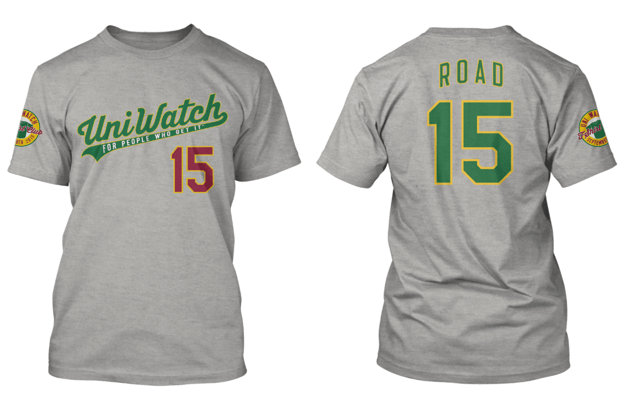
T-Shirt Club reminder ”” only available until Monday: In case you missed it earlier this week, the Uni Watch T-Shirt Club’s latest offering — the road grey shirt — is now available for ordering, but only through Monday night. Obviously, this one is pretty straightforward, but it’s still plenty handsome. In fact, it’s arguably the nicest design we’ve done so far (click to enlarge):

Again, this shirt is available here, and there’s additional information about how this shirt fits into the larger T-Shirt Club program here. Thanks.
You know that college football is becoming less about the sport and more about the fashion when a division 1 school asks PL and Phil if they like the uniforms. What’s next, the Padres asking for a personal critique of their next redesign?
I don’t know about you, but if any teams want to ask me what I think of their uniforms before they unveil them to the public, I’m absolutely willing to help make sure they don’t look like crap. UCLA certainly wouldn’t be wearing black with a bunch of sliced up stripes if I had a say in it.
College football is about the money. It hasn’t been about the sport for two decades.
Only 2 decades? You really think it only started being about money in 1995? I’m pretty sure it goes back quite a bit further than that.
There was only a tiny bit about the sport in the 90s.
Mixed opinions on the Lobos. The Lobo logo and wordmark are snappy. The inconsistencies in the lettering in the New Mexico wordmark are annoying and the school colors are cherry and silver. Slate (or whatever it’s being called this week) isn’t a good fit.
Sideline tarps are now a thing? I’m pretty sure that they are a biblical sign of the apocalypse. God save us all.
Been staring at the Lobos jerseys for 4 minutes to make sure my eyes are not playing tricks on me. Reading right to left like the good Hebrew I am I see:
Nike swoosh on right
Lobo face in center on neckline.
Kind of a 3d cube combining an “M” with a “W” so I see MW. Why would they have “MW” on their shirt?
Am I seeing it wrong?
The MW is for Mountain West, the conference they play in. So, you’re seeing it correctly.
New Mexico are in the Mountain West Conference (MW).
Mazel Tov!
Good God. For the next 3 months am I going to be subject to the stylings of sideline tarps in the ticker? Nip this in the bud.
MW is for Mountain West because they are in the Mountain West conference
I’m probably the only one but the NM logo for New Mexico immediately reminded me of the DW “logo” for past couple of seasons of Doctor Who.
link
Sorry meant that to be “the MW logo on the New Mexico uniforms”
No grey for grey’s sake with the Lobos, like my alma mater, Stony Brook, Grey and Red are the school colours. I think their uniform is one of the best of the new ones I have seen in a while.
Whoa,whoa,whoa, hold on there now. There’s a NEW Mexico?
One of my favorite Mr. Burns quotes.
I don’t know what the Washington newspaper columnist is talking about when he mentions “a new team with an old look”, the only commonality with the Expos and Nats is the color scheme. I liked the “DC” appearance on their uniform set a while back, but their look today is kind of generic.
In time, perhaps the Nationals will attain some traction with a uniform set, but that will depend partly on success on the field. Washington has not celebrated a WS victory since 1931, and this is the third go around for the MLB in that city.
“Old look” = the “curly W” which approximates that which the expansion Senators used 1963-71.
Someone may correct you before I do that the last Washington World Series championship came in 1924 – the current Nats link to that team in 2012.
I like the current Washington road unis as the link and link are very subtly reminiscent of the link on the last link
While we’re on the topic of the city uniform rankings, when all of the stadium, color scheme, and other aspects for which Paul gave or took additional points, Philadelphia tied Boston for the top score on just their uniforms. That kind of surprised me, but I agree that Philly has some classic uniforms without a lot of chaos.
As a UNC grad, and sideline tarp fanatic, I am very happy that finally UniWatch has come to its senses and given us some pics of the glorious plastic at Kenan Stadium.
The link to Pro Stock without the hoodscoop is the same as the old version.