Paul here, making a rare August appearance, because today’s a big day. We’re rolling out a new edition of the Uni Watch Power Rankings over on ESPN. And instead of ranking the teams in a given league, we’re adding a new category: ranking the best-looking cities as judged by their teams’ uniforms, which I’m sure will result in lots of arguments, debate, and so on.
The rules were as follows:
• In order to be included in the rankings, a city had to have at least three teams in the “Big Four” pro leagues (NFL, MLB, NBA, NHL), a criterion that resulted in 20 eligible cities. A separate set of rankings was conducted for 11 small-market cities that have only two major-level teams. Minor league and college teams were not considered, because there are too many of them and they change their uniforms too often. MLS teams were also not considered, because they change kits too often, most of the jerseys have corporate advertising that renders them worthless, and I’m not equipped to assess soccer uniforms anyway.
• The rankings are based on each city’s Uniform Numerical Index, or UNI, which is calculated like so: Each team’s uniform set was ranked on a scale of 1 to 10. When applicable, points were added or subtracted for intangibles that affect the fan’s visual experience, such as a particularly attractive ballpark (always good for an extra point or two) or a domed football stadium (an automatic two-point deduction). The city’s total points were then tallied and divided by its number of teams, resulting in the UNI.
For example, a city with a good-looking MLB team (8.5 points), a mediocre-looking NBA team (4), and a decent-looking NFL team that plays in a dome (6 minus 2) would have a UNI of 5.5.
• All teams were judged based on their current uniform sets, even if those sets haven’t yet seen any game action. For example, several NBA teams have unveiled new uniforms this summer — those unis were factored into these rankings, even though they haven’t yet been worn on the court. Points were based primarily on home and road uniforms, with alternate designs factored in based on how often they’re worn. One-off designs and special promotional jerseys were not considered.
• A few judgment calls were necessary regarding which teams should be associated with which cities. San Francisco, Oakland, and San Jose, for example, were all considered to be one municipality for the purposes of these rankings. Ditto for New York, Brooklyn, and New Jersey; Los Angeles and Anaheim; Dallas and Arlington; Minneapolis and St. Paul; Tampa and St. Petersburg; and Boston and Foxboro.
I also considered lumping Baltimore and DC into one metro area. But after consulting with several fans from both cities, I decided to treat them as separate entities. This meant that DC made the primary list of 20 big-market cities and Baltimore was relegated to the list of two-team cities.
Okay, ready to find out if your city’s uniforms were judged to be eye candy or an eyesore? Here you go.

T-Shirt Club reminder: In case you missed it yesterday, the Uni Watch T-Shirt Club’s latest offering — the road grey shirt — and it’s now available for ordering. Obviously, this one is pretty straightforward, but it’s still plenty handsome. In fact, I think this is my favorite design we’ve done so far (click to enlarge):
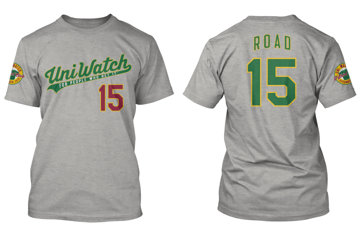
Again, this shirt is available here. And there’s additional information about how this shirt fits into the larger T-Shirt Club program here. Thanks.
Now here’s Phil with the rest of today’s content.

Classic Ballpark Scoreboards
Thanks, Paul.
I’m pleased to continue with a favorite weekend feature here at Uni Watch, “Classic Ballpark Scoreboards,” which are created by Gary Chanko. These run on the weekends when I’m handling those duties, but since I’ve got the weekday duties (except for today’s lede), they’ll run on Wednesdays for the month of August. The feature will return to the weekends when I do.
Here’s Gary (click on image to enlarge):
Classic Ballpark Scoreboards – Series II
by Gary Chanko
Classic Scoreboards next travels to east Montreal to visit the much ridiculed former home of the Expos, Olympic Stadium, or Stade Olympique if you prefer.

Olympic Stadium/ Stade Olympique (Montreal)
Baseball and Football Home of: Montreal Expos (1977”“2004), Montreal Alouettes (CFL) (1976”“1986; part time from 1996 to present); 1982 MLB All Star Game; Six Grey Cup games.
Opened (although not fully completed): Summer Olympics 1976
First Expos game: April 15, 1977
Last Expos game: September 29, 2004
Current Status: Multipurpose facility for special events; concerts, conventions. Reportedly needs major renovations over the next decade.
Olympic Stadium served as the home of the Montreal Expos from 1977-2004. It was and remains a multi-purpose facility located in the former Olympic complex.
Le Stade Olympique suffers a number one ranking in at least one Top Ten Worst lists, largely because of two decades of financial problems, roof construction and stability problems and other structure mishaps. Setting those controversies aside, the ballpark itself wasn’t all that bad a venue for watching baseball. This was arguably so after improvements in the early 90s that moved the outfield seating closer and added a major centerfield scoreboard upgrade. After the damaged roof was removed in 1998 for repairs, the ballpark became “outdoors” for a season!
Olympic Stadium has a few nicknames. ”The Big O” is a reference to the stadium’s name and to the doughnut-shape of the structure.”The Big Owe” is a mocking reference to the enormous expenditures for construction and repairs (about C$1.6 billion).
For more about the complicated history of Olympic Stadium you will want to read this comprehensive SABR article.
This Baseball-Fever posting provides an interesting pictorial history of Olympic Stadium’s scoreboards. The 1992 vintage centerfield scoreboard was recently upgraded with new LED displays.
The illustration features the original matrix scoreboard (c.1990) with the reviled orange roof (finally installed in 1987) as the panoramic backdrop.
A Few Things to Know
• The Big O is one of three former Olympic Stadiums to suffer a conversion for Major League Baseball. The other two are: Los Angeles Memorial Coliseum (1932 and 1984 Summer Games) and Centennial Olympic Stadium (1996 Summer Games).
• The Expos’ Pete Rose got his 4,000th hit in Olympic Stadium in April 1984.
• The largest ever paid crowd to the Olympic Stadium was a 1977 Pink Floyd concert attended by over 78,000 fans.
If anyone is interested in purchasing a digital copy of these posters, Gary is working on an online purchase option. In the interim you can contact him directly at Classicscoreboards@gmail.com.
Uni Watch News Ticker:

Baseball News: On Monday night, a Cardinals fan and a Giants fan attended the St. Louis/San Francisco game — as their jerseys indicate, they’ve been together since 1952. I’m generally opposed to jersey chicanery like this, but in this case it’s awesome. What do you guys think? … A local Michigan club baseball team out of Dexter recently dressed in 1860’s uniforms and played with 1860’s rules. Photos here and here (from PK Richardson). Some additional photos here. … Apologies if we’ve had these before, but here’s a look at the Andy Pettitte and Jorge Posada retirement patches for the Yankees (from Diego Bauzá). … “I don’t think I’ve ever seen a manager wearing a glove in the dugout during a game,” says Dustin Semore. “Which makes this screenshot of Bobby Cox wearing a catcher’s mitt in 2009 all the more interesting. This was taken during ejection #149, so 1 away from the record of 150. Maybe he was trying an anger management technique? Didn’t seem to work.” … Here are a couple of neat old Colorado baseball photos. Submitter jbird8212 adds, “The pictures aren’t that great – but found these pictures of Mine supported teams that played around Frisco CO Back in the 20’s.” … The Schaumburg Boomers are hosting a “Zombie Night” this Saturday, and these are the jerseys they’ll be wearing (from Steve Johnston). … Wow, some intern at the MLB Network is probably about to get fired (nice grab by Jeremie Archer). … Tonight at Wrigley, the Tigers and Cubs will wear 1945 throwback uniforms. (That was the last year the Cubs were in the World Series. They didn’t win.) … Ooof: Color vs. color was taken to a new level in Wilmington yesterday, as the Nats & Blue Rocks both wore navy tops (h/t Mike Diodati). … Also not a good color vs. color combo: navy vs black for The Sugarland Skeeters and Bridgeport Bluefish (h/t Derrick Lockridge). … Roberto Clemente would have turned 81 years old yesterday. The great Rob Ullman posted this illo of Clemente on Twitter to commemorate his birthday. … The Rangers’ longstanding red/blue confusion nicely captured by Chi Chi Gonzalez’s socks and shoes (good spot by Paul). … Last evening, Andrew McCutchen wore an interesting new arm sleeve (thanks to Rob Ullman). … During a pitching change last night, Juan Lagares became a human cap & glove rack (h/t Frank Bledsoe, Jr.).

NFL News: Ronnie Hillman sure has an interesting mouthpiece! says Andrew Cosentino. … This is interesting: Color-changing NFL helmets could indicate brain damage. … Yesterday’s ticker item about shadowing on the Browns’ practice jerseys was i.d.’d the shadowing as “drop shadow.”. Scott Turner points out the correct term is actually block shadow (actually block shadow outlined). This is a mistake I myself make often, so it’s good to know the correct terminology. Thanks, Scott!

College Football News: Unlike other high-profile Division I schools who have gone to ‘generic’ jersey numbering for retail sales, UNC still sells player jerseys, for now. … Clemson helmets are coming together (h/t Mark Johnson). … Check the brand new Pitt football locker room and player lounge (via Josh Sánchez). … ASU will be unveiling a new “Desert Ice” uniform on Thursday. … Those new Vanderbilt alternates that were released on Sunday? Seems Redditors had some fun with one of the poses. … The Oregon State University “BeaverDam” has a logo for the student section (h/t Tanner Karp). … This is pretty cool: check out some nice drone video footage of Alabama’s Bryant-Denny Stadium (from Wayne Harder). … The new Hawai’i home uniform has been released. Looks pretty nice! More here. Not quite sure about the pants yet tho. … The Georgia Bulldogs have officially designated their “black out” and “red out” games (note, this doesn’t mean they’re going to wear a black jersey for any of the “black out” games; pretty sure Richt has said no black jerseys this year). … Speaking of black — is this a black helmet for THE Ohio State? (via Jamie Dupler). … “Just finished up a project documenting every Virginia Tech football helmet design worn under Frank Beamer,” writes Clark Ruhland. “Since 1987, the Hokies have worn over 50 different variances. Here is a look at every helmet design and detail from those years.” … Looks like the Arkansas Razorbacks may have chrome helmet decals this season. … I love this hed from the Gwinnett Daily Post: “Oregon more than just uniforms.”

NBA News: Reader Dan Michalek asks, “New Hornets court? I really hope not, since their honeycomb court is killer.” … A designer created some basketball uniform concepts that combine rap and NBA logos and wordmarks (thanks Mike).

Hockey News: Check out this beautiful 1974 NHL All-Star Game program cover, back when the league had 16 teams (several of whom have since moved or been renamed), from Super 70s Sports. Also from Super 70s, feast your eyes on this 1979-80 NHL guide, with 21 teams (which included more expansion clubs and teams absorbed from the WHA). … Here’s a look at the 20th Anniversary Logo for the AHL’s Grand Rapids Griffins (via Matt McClain). … The Griffins also unveiled new home and road uniforms; here’s a better look at the jerseys (thanks to Ben Greene). Here’s a bit more on that. … Reader Jimmy Lonetti saw this tweet (announcing the Minnesota Wild would “will don something like this”), which is obviously a harkback to the old North Stars colors, with the Wild logo. The tweeter later added, “Per source, within Wild something ‘like this’ will be worn for ONLY the alumni game February 20th not the actual Stadium Series.” Here’s a bit more on that. … Andrew Hammond’s new mask features the Hamburglar and a tribute to Ottawa’s Butterfly Boy. Adds T.W. Feren, “Looking like the Golden Arches on the chin.”

Soccer News: Here’s a list of the “10 Worst FA Logos in the world (h/t Jim Collier). … The USWNT debuted their 3rd star and what they call the FIFA Champions badge during their victory tour in Pittsburgh on Sunday (thanks to Julie Streeter). … New soccer kits for Dayton Women (from Tom Hirt). … Metro State Denver Soccer has new kits. … “Great uniform matchup in (Mon)day’s Champions League game between Manchester United & Club Brugge,” notes Saurel Jean. “Even the uniform fonts were a great contrast (Schneiderlin – De Bock).”

Grab Bag: Here are the kits Leinster’s rugby stars will be wearing this season. … A Dallas violinist and businessman have engineered a stretchable, breathable men’s tuxedo shirt, a mix of formal attire and athletic performance wear (thanks, Paul). … This is what Danica Patrick’s car will look like next NASCAR season (via Jerry Nitzh). Here’s another view (h/t Chris Cruz). … A Baseball-themed play is coming this winter to the Japan Society in NYC (from Karen McBurnie). … Indiana University just inked a $53.6 million apparel deal with adidas (second only to Michigan and UCLA for schools signed with the three stripes). … NASA’s logo from the ’70s was ridiculously cool (thanks Brinke). … New volleyball unis for the ASU ladies.
And that’s all for today — thanks to Paul for grabbing the lede today (and I’m looking forward to seeing those city rankings), to Gary for the Scoreboard feature, and everyone who emailed or tweeted a ticker item. Back tomorrow with more stuff.
Follow me on Twitter @PhilHecken.
Peace.
“RE: Curve on baseball brims. The brims of baseball hats should be ‘curved’ in an exact duplication of the curve on batting helmets. No more, no less.”
— Mainspark
Thank you for acknowledging that DC and Baltimore are unique cities, I wish the Oriole-fanboys in the DC MSM would do the same.
Amen.
Aren’t Orioles fans who pre-date the Nationals well within their rights to remain O’s fans even if they live/work in DC?
Amen.
If they want to support a corrupt and cowardly franchise that hates DC, they are within their rights to be bad Washingtonians. Let them read the Sun.
Perhaps you are unaware of the bad faith that is the Oriole Way. The Orioles swindled the Nats TV rights away and kept good Washingtonians from seeing most of the first 2 seasons. Currently, the Orioles are in the courts trying to get out of paying the Nats rights fees dating back to 2012. The Nats, their fans and the District of Columbia have been punished because the Angelos family doesn’t believe in Baltimore or that fanbase. But hey, maybe you agree that with Angelos that the Nats and their fans should have to subsidize him in perpetuity.
Someone’s salty.
Great idea for the ESPN piece. Off the top of my head Chicago would be best with NoCal and NY/NJ rounding out the top three.
Worst would be Atlanta or maybe Phoenix.
I think Chicago vs NoCal comes down to whether the Raiders get a deduction or a point for playing half their games with a baseball infield in play. It does lead to the occasional mud game, and those are always fun… right?
The O.Co Coliseum is an eye sore and should deduct points from both the Raiders and A’s, who both might have the best uniforms in their respective leagues. AT&T Park and Levis Stadium should both get bonus points to off set that though.
Our biggest deductions should come from that loser hockey team. Its fitting that the giant shark head throws them up onto the ice haha!
The only thing I don’t like about Chicago right now is the fact that the Bears play in the space ship. That doesn’t look right to me.
Oakland should *get* points for sharing a stadium. So tired of everybody having to have their own this and their own that. Sharing colds, spouses and underwear are bad, yes, but sharing a stadium is a very commendable and awesome thing.
I always thought that seeing a baseball diamond on a football field in a shared stadium was cool. Seems very “retro” to me.
You say “retro,” I say “awesome.” Literally my favorite thing about football, aesthetically, is the once-common sight of early season games with the infield dirt underfoot. Well, maybe my second-favorite thing, after a game in the snow.
Or worst might be Denver, DenverGregg haha!
Philly and Pittsburgh could rank pretty high…like to see them in the top 3(behind Chicago).
Washington DC and Cleveland may compete for the bottom though.
Miami and, sadly, Minnesota would compete for the bottom if I were doing this list. Great as the Wild look, the current Twins and Vikes are close to all-time league bottoms in their respective sports.
DC is actually a pretty well dressed sporting town these days. Worst that can be said is that the Nats have too many alternate uniforms, and a couple of them are clown shirts, bro. But the basic Nats unis are above average, the Wizards look fantastic lately, the Caps have solid unis, and despite the name the ‘Skins have one of the best looks in the NFL. Anything below #6 for DC will be a travesty.
The Twins look like knockoffs of the Nats these days. The T-Wolves looked good at the very beginning, then went downhill after that.
Aaaaaand … Travesty! (Note: Not actually a travesty.)
But I am a little gobsmacked to read a careful writer like Paul refer to Nats uniforms as “hopelessly generic.” “Generic” is, ironically, a specific word with a unique meaning and definition. For the Nats unis to be “generic,” it must be the case that there exists a class of essentially indistinguishable MLB uniforms, and the Nats are a part of this class whose players cannot be told apart from other teams on the field of play. Anyone care to list all the teams that look just like the Nats?
There are plenty of rational grounds for criticizing the Nats uniforms. “Generic” ain’t one of them. If anything, truly generic unis would be an upgrade: The single most consistent, defining characteristic of Washington baseball uniforms for more than a century has been a generic, un-distinctive look. When the original Nats/Senators weren’t wearing catalog-order jersey script, they wore literally plain jerseys. An actually generic Nats uniform would at least have history behind it!
Minnesota as a whole is terrible, but Viking uniforms are easily closer to the top than the bottom. The helmet design alone – one of the four or five best in the league – elevates everything.
The Nationals road hat is basically the Braves home hat with a different letter on it. The Nationals share the EXACT same color scheme as the Braves, Twins, Red Sox, Cardinals, Indians, and Angels.
How is New York NOT going to win this? They have the most teams and they all look good to awesome and now all play in state of the art stadiums!
One more reason to hate the Sharks haha! They’re going to hold back our San Francisco Bay Area ranking! Its funny how Baltimore and Washington are closer to each other than San Francisco and San Jose, but are considered separate. In fact, the 49ers playing in Santa Clara are farther away from San Francisco then Baltimore and Washington from each other haha!
NY would be in better shape if the Jets hadn’t screwed up their colors. Also new Shea, while not as ugly as old Shea, doesn’t look good on TV. I haven’t been to a game there yet, so I can’t say if it’s any good in person.
It’s actually quite nice on the inside, great sight lines, wide walkways. I don’t think it is that bad of a park on the outside either, it’s one of those “faux-classic” style of parks as an homage to Ebbet’s Field.
re: USWNT, it isn’t just “What they call the FIFA Champions Badge”, it is a standard badge with World Cup Winners.
Here’s Germany on the men’s side link
Here’s Real Madrid on the men’s club side link
Beaten to the punch by a minute! :-)
Ah, but you remembered Japan Women and the Spain men (actually I try to forget Spain in 2014, oh well…), definitely agree that it’s an eyesore!
It’s less an eyesore on Real than it was on Bayern’s red/blue striped kit of 14/15, where it overpowered that middle blue stripe.
Guess I’ve never paid attention to past champions of the last few tournaments or just completely forgot they did this. Definitely an eyesore, perhaps if it were smaller?
The FIFA champions badge on the USWNT jersey is not new. It’s worn by the reigning World Champions in whatever FIFA category the champions championed.
The Japan women’s team was wearing one during the 2015 World Cup in Canada. Spain’s men wore it through the Men’s World Cup in Brazil. Now the German men and the US women have the badge to let everyone know they are the current champs.
Also, the FIFA Club World Cup winners wear a similar badge. Currently Real Madrid have it on their shirts. Bayern Munich had it on theirs for the better part of last year’s soccer season, but removed after Real won the club tournament.
It’s an intrusive eyesore of a patch, IMO.
Bobby would occasionally wear a catcher’s mitt in the dugout in the old Marlins stadium (Pro Player, etc) because there was no netting protecting the dugout from foul balls. Sometimes hid behind bigger coaches like Chino Cadahia.
RIP, Yvonne Craig. Talk about someone who knew how to wear a uniform:
link
Holy 404 error!
link
Greatest line in the show’s history:
Holy Robert Louis Stevenson! Batgirls’s been kidnapped!
Purple has never, EVER looked better.
Might be the exception to PL’s universal uni-hate of the color purple.
She was a great beauty.
Turner Field in Atlanta is also a Olympic stadium changed for baseball.
He already included Turner Field under its original name, Centennial Olympic Stadium.
When Paul did uni rankings back in 2012, I put together a spreadsheet to come up with the top uni cities. You can check out a screen shot link. Cities that are more grayed out fit the requirement of 3 major teams. I’m sure there will be some movement with new uniforms being taken into account, and combining metro areas will also have an effect, but it’s hard to imagine Oakland/San Fran/San Jose NOT coming out on top this year (Raiders/A’s/Warriors/49ers/Giants.)
Domed stadium + disappointing “modernized” unis = Lions holding Detroit back in the rankings.
Wow, there were a lot of rear decal changes at VT. Not so much the rest of the helmet, which only had a few tweaks before alternate helmets were introduced in recent years. I do find it odd, though, that a modern helmet design was used to represent all of the years, going back to 1987.
Looks like they wrapped the piping around the end of the shoulder yoke on that North Stars-style Wild alumni jersey. Still, I wouldn’t mind having one of those in my collection, and I really want to see the Stars’ version now.
1. posted the Buckeye helmet on reddit yesterday. a lot of the responses were that it was the alternate helmet in poor lighting to show off the reflectiveness of the new sticker (next to the bumper)
2. so what would the new outline for the browns unis be called?
It’s a minor point, but it probably makes sense to lump Green Bay in with Milwaukee for the purposes of the rankings. There’s a little geographic distance, but it is absolutely the same market. The Packers would never have existed this long if not for the multitudes of fans in the Milwaukee area. Heck, the Pack used to play home games at County Stadium every year.
I considered doing that but ultimately decided against it.
Gotta agree Green Bay and Milwaukee should be grouped together.
Also, can’t believe Patriots uni didn’t knock Boston out of the top spot ?!?
Chicago, Pitt, Philly and NY all should be ahead of them, IMO.
I agree with that! The Patriots uniform is horrible.
I agree. I really thought the Pats and their shiny silver and silly piping would be enough to knock them out of first.
As for NY, I always thought the Jets had the slightly better uniform than the Giants and their home gray pants.
Regarding the Pats’ “shiny silver” — you mean the helmet shell? What’s wrong with that?
Gotta agree with yosef777 about the Pats being a real drag on the Boston uniform pantheon. The combination of the clunky font, the thoroughly bland sock striping (on the away uniform), and (most especially) the side panel piping combines to make this a bore of a uniform, the whole of which is more unattractive than the sum of its parts. I’ve also never been a fan of the red face mask on the stripe-less silver helmet; it just seems to “clash”. Factor in the abandonment of royal blue in favor of navy blue in the color scheme, and the Pats are the NFL equivalent of the “navy-copper-and-red, Reebok Edge, apron-string” Edmonton Oilers. Nothing offensive, but completely uninspired.
Those Clemson decals are crazy. Each piece of the law is its own sticker
link
New soccer boots from Puma.
Brutal. Worst thing I’ve seen today.
This Arkansas uni set has always had the chrome hog. Check out this photo from the unveiling of the uniform set – link
Ah, thanks — my bad. The pic was tweeted at me and I thought it might be new.
That team from Dexter is not a club team. It is a historic base ball team which plays with rules from the 1860’s. It is the Dexter Union BBC. The other team is the Chelsea Monitors. Historic Base Ball is big in Michigan and throughout the country. You should look it up. The unis are fantastic.
I noticed there was a Saginaw Old Golds player in Saginaw uniform playing for the Chelsea team. (that’s me who commented on the mlive article asking about it)
Old Town Saginaw has a beautiful mural for their team link
Stick to UNIFORMS. Deducting 2 points if an NFL team plays in a dome stadium is just DUMB. What if said team plays in a retractable roofed stadium? Are you taking away just 1 point because half the time the team is under the sky and half the time the team is under the roof? RIDICULOUS!
Case in point, Rams play in a DOME, their uniform is awesome (especially the throwbacks which are the same as the ones used while in Anaheim!) then there is the Jags, open air stadium, AWFUL uniform.
This is uni-watch, not stadium-watch!
Athletics aesthetics encompasses many things, including stadia, arenas, field design, etc.
Are retractable domed stadia treated the same as non-retractable? Not trying to be snarky, just curious if you considered that a quantifiable, if subjective, difference.
Yes. Retractable = not as bad.
I live in Phoenix and I think the Cardinals need to go back to the Pat Tillman era unis. Simple,boring,and classy. I miss the little state flag on the road jerseys. Should have never left Sun Devil Stadium. A refurbishment would have more than adequate. The problem with the Diamondbacks is the nickname is too long. And to be honest, this city should have not been awarded a franchise. This place is dead during the summer and this is a transient city with people’s loyalties are elsewhere. Chase Field has too many seats and looks like a aircraft hanger. The Coyotes new unis are a upgrade, and the Suns well, I am not a basketball fan but they are okay. This is really a two sport town disguised as a four sport city.
So were the Cardinals not penalized for being in their stadium? To be fair, it would be impossible to play in an outside stadium in Phoenix
The Phoenix/Arizona NFL team played outdoors for close to 20 years…and looked better in most of those seasons (the red pants begot the blood-clot look) than they do today.
There is no reason the Cardinals could not have continued to play at Sun Devil Stadium. Yes, it is extremely hot during September. If I correctly remember, the Cards usually played their September games on the road. The metal benches, I must admit, were very hot to sit on, but that is why there are seat cushions. The Pat Tilman uniforms beautifully simple. I loved the home jerseys. Just red and white numbers, no stripes, no crazy numbers. The City of Glendale is paying dearly in building the stadiums for the Cards, Coyotes, and the spring training fields for the White Sox and Dodgers.
In the ninth inning of last nights Tigers/Cubs game, the Tigers catcher James McCann had a ball lodge in his equipment, momentarily. The Cubs runners were each awarded a base, which permitted a run to score. Here’s the play by play from the game. The missed catch in the 9th inning is where the ball got lodged in the equipment.
According to Bob Costas, if a ball get stuck in any part of the catchers gear, each runner is awarded a base.
link
Here’s the video.
link
As someone who doesn’t care about baseball… it seems absolutely ridiculous to allow a run to score over that. I mean, if the ball had bounced off his mask and landed in front of him instead, would anyone have really attempted to steal home plate?
Neither the play-by-play or the video is helpful. They call it a balk in the video and a “missed catch catching error” in the play-by-play. In reality, it was probably a bad call because Rule 5.06(c)(7) [in the newly re-codified book] states that the ball must “remain out of play,” which it clearly doesn’t. Bases shouldn’t have been awarded.
I agree it was probably a bad call, and in the grand scheme of things it didn’t affect the outcome of the game, but I thought it was interesting. I wish I could find the MLB Network feed from the play, Costas broke it down perfectly.
The best-dressed cities piece is up:
link
Here’s the separate ranking of two-team cities:
link
Wow, great piece. At first I found the modern format a little surprising, as one of the appeals of UW for me is the lo-fi approach, but it’s really, really well done. Graphics are terrific.
Hawks with the lowest individual rating and they haven’t played a game in those uniforms yet!
Patriots would have dragged Boston out of first place for me.
Great stuff.
Excellent list and excellent piece. The only problem I had was that the Yankees cap and jersey logos (in the graphic) matched, which they don’t in real life. Minor complaint, but that’s why I love uni-watch anyway.
Pee El,
Kudos for a fun and enjoyable uni-presentation with extra j-queryness… really nice to see. More of these please.
Just one thing…punishing the Ravens for their use of purple (even in teeny, wee small doses) in their unis seems pretty harsh, but I do agree that the number font is pretty dated and could use a refresh. So could the Raven with a “B” on it’s brain.
What other color could they use I wonder?
Nice lists. I can only hope that Montreal may rejoin the list of two-team cities and wonder how the Expos and Habs would have slotted in.
They would have done well.
With Toronto the only Canadian city with more than 1 team in the “Big Four”, I wonder what a separate uniform Power Ranking for Canadian cities would look like.
NHL and CFL would be the obvious two leagues. With Paul’
s criteria for minor league and college not included, I think the CHL (major-junior hockey) could be a third.
If there was a fourth league, possible CIS hockey or maybe another sport (not as much on the uniform roller coaster as U.S. colleges) or if the someone judging was more in tune with soccer – whatever the highest level of soccer was for those cities.
I invite any (or all!) of our Canadian readers to get cracking on this.
Got a note from Jeff Troutt: “Bobby Cox always used a catchers mitt for protection while the Braves were playing the Marlins at their old park because the dugouts were so close to home plate.”
I couldn’t disagree more with your take on the Cowboys. No matter how long they do it, the lack of a consistent visual identity, and mismatched colors within the same uni-set should count against them big time. A 9 is absurd.
And for the purposes of ranking overall cities, the Cowboy’s 9 is the only reason Dallas stayed in the top 10 (other scores = 6, 4.5, 6)
I know. It should be a 10.
And Stars should be higher than a 6!!!
That’s not the real Hamburglar on Hammond’s mask, it’s the MAD Magazine coverboy dressed up as the Hamburglar
The video link of Rose’s 4000th hit is 1980’s uniform awsomeness. The Expos with the tri-colored cap, Phillies in the zipper fronts, and stirrups, stirrups, and more stirrups.
I love the uniform graphics in the ESPN piece.
Olympic Stadium is like Skydome, it wasn’t a bad place to watch a game when it’s mostly full but a terrible place when its empty. And its so big that even with 40,000 people it feels mostly empty.
I’m pretty sure the original matrix board dates to the 1976 Olympics and not 1990. It originally featured Olympic markings and advertising came in 1977. It also originally had an analog clock on the right hand side, and the clock was incorporated into the advertising after the Olympics. The clock was gone by 1990.
link
link
Hoping on the next round of the UNI by city rankings it’s either group by geographic location (Bay Area, Boston/Foxboro, New York/surrounding area) or leave it as just by city. No “group these two locations but not these two locations” or a “if the cities are within 50 miles of one another they are grouped as a geographical location.
Life isn’t as simple as the black/white rule you’re trying to apply. In each case, I consulted with fans in the given areas, applied common sense, and tried to come up with the best solution. Were some solutions imperfect? Perhaps. Life is like that sometimes.
Can’t believe any fans in Wisconsin were against grouping the Packers with the Brewers and Bucks, was it the geographical distance that killed it for you?
Tried to stick to metropolitan areas. MKE to GB is too much of a stretch.
Admittedly, this was a judgment call, and as such was inherently imperfect. I actually went back and forth several times on it….
Danica Patrick’s 2016 paint scheme is receiving some criticism:
link
Just dumb… it is the link of Nature’s Bakery image. It’s not even the same blue.
On the one hand, I don’t follow NASCAR at all, and my first reaction was to wonder why Patrick’s car looks so much like Petty. On the other hand, accusing Patrick of “trolling” Petty? It’s just bright blue, and it’s an insanely good-looking color for any car. It’s not like Petty invented the color blue and patented the only known dye capable of making bright blue paint.
Paul, I don’t even care about the rankings themselves. Different strokes for different folks and all, but my lord, I lovelovelove the graphics and animation that went into that ESPN entry. So, so cool!
I can’t believe what you said about MLS. The ads on the uniforms are a staple in soccer unis, just like gray on the road is in baseball. Also, learn about soccer. It will help you.
It seems willful ignorance of soccer is part and parcel of this site, along with purple hatred.
Nothing willful about it. Just not something I follow or care about. I can’t feign enthusiasm or interest in something for which I have neither. If I did, THAT would be the definition of willful.
It’s not a value judgment on the sport or its fans. Just something I’ve never happened to care about.
I don’t think you can compare ads on soccer jerseys, which date to the 1970s, to wearing gray in baseball. While the ads are an expected part of modern soccer unis, they do not hold the same tradition and are not “necessary,” whereas gray is used to differentiate between home and away teams.
As for Paul adding soccer to his repertoire, I do agree that assessments of soccer teams would add to the site. Not only is soccer popular in the US and the rest of the world, but the unis are among the most colorful of any sport.
Re the current topic of city rankings, I’d be interested to get Paul’s take on Seattle if the Sounders were included. Not only do they play at the same stadium as the Seahawks but they have the same colors, which (in my mind) adds to the visual identity of the city – similar to the black, yellow, and white of the Pittsburgh teams.
I’d be interested to get Paul’s take on Seattle if the Sounders were included.
You don’t get it: I have no context, basis, or foundation from which to assess the Sounders’ uniform, because I DON’T FOLLOW SOCCER. Jeez.
I understand that, but assuming you were including soccer teams in your city analysis, and assuming all soccer uniforms used the same basic template (taking away at least a portion of the problem with analyzing soccer aesthetics), if a soccer uniform had the same color scheme as other teams in the city (a la NHL, MLB, NFL in Pittsburth) would that city then get a bonus point?
Seattle throws a wrench into things as their NFL/MLS teams share navy blue and highlighter green. Would this collective identity deserve a negative point to their city?
How is the NHL considered a “big 4” league and MLS isn’t? MLS is far more popular than the NHL, at least in the United States.
Lee
“MLS is far more popular than the NHL, at least in the United States.”
The NHL still draws more total fans in terms of game attendance, draws a comparable amount of fans in terms of average attendance per game, and has better television ratings than MLS. Indeed, depending on which metrics one cares to use, the NHL may in fact be the more popular of the two leagues.
I’m not saying that ice hockey is a more popular sport in the United States than soccer. Most statistics would bear out significantly higher participation numbers for soccer compared to hockey in the U.S. And if one were to add the television ratings for foreign soccer league broadcasts in the U.S. (especially Liga MX matches), soccer might might very well draw a lot more viewers than hockey. But as to your specific point, MLS, as a stand-alone institution, can hardly be said to be *far* more popular than the NHL in the United States.
Don’t think of MLS as a big four sport in the USA as it lacks the history and longevity compared to the other three but it is gaining on hockey IMO.
Isnt the nhl’s history and longevity longer than both the nba and nhl?
As a Twin Cities homer, I’m disappointed Target Field didn’t get some intangible points. It’s right up there with PNC Park and AT&T as one of the best stadiums of recent vintage.
Paul, you completely missed the mark here.
Your “rankings” appear to be completely arbitrary and wholly uninformed. No explanation is given for each uniforms score, just a seemingly random number. How did you arrive at such a precise score? Are you grading each uniform based on established design principles, or are these simply your own fabricated “opinions”? Also, completely arbitrary things like stadiums are taken into account when judging a team’s UNIFORM? What’s the reasoning behind that boner?
Paul, you’re usually much better than this. You’ve done much to forward the dissection and discussion of proper sports and uniform design in mainstream culture, but this is just another ill-thought out, click bait article worthy of Buzzfeed or SI for Kids.
Got a note from Tyler Mallams about the Hornets court: “Do not be alarmed! This is the temporary court that is down during the offseason and the one used for collegiate events at the arena. I am not an official spokesperson for the team by any means, just wanted to provide you and other readers with some clarification.”
Just curious Paul, what specifically don’t you like about the Bulls uniforms? Most people like their basic design. I’m not hating at all just curious as to what you think specifically and what can be done to make them better?
They scored 6.5, so that’s not bad.
One thing I’ve learned about myself in the course of doing these uni ranking pieces over the past several years is that, with a few exceptions, I don’t much care for solid-red uniforms. The Bulls’ road set suffers in that regard, at least with me. Also, I’ve always thought their logo looks like it belongs on the front cover of a middlebrow steakhouse’s menu.
This is the second funniest commentary on a steer-related logo that I’ve ever read. The first was from a local sports guy, who complained that the Texans logo looks like “a patriotic bustier.” Look at it. You’ll see it.
I can’t unsee that now. Thanks a lot, Cort!
I’ve always thought their logo looks like it belongs on the front cover of a middlebrow steakhouse’s menu.
That’s what should have pushed Chicago to the top of the pile! If it belonged on a fancy schmancy steakhouse menu I’d be inclined to agree.
You nailed KC in the 1-AA list, but the Windy City deserved much better in the D-1 list.
Egods,
Paul Lukas hates “all red”? All red and purple too?
Tiz a puzzlemint…
link
then again… he might be on to something.
The graphics on the Honor Cities of Aesthetic Achievement , or the Regions of Sartorial Excellence, or the Lands of Uniform Enchantment are more than wonderful. The actual list? It causes me grave concern.
There is waaaay to much to digest/discuss about the rankings. I’ll just sit back and watch you guys argue it out.
However, I will say that Boston should LOSE 2 points, not gain for Fenway. Nostalgia because its old doesn’t change the fact that its really a dumpy-ass stadium.
Looks awesome on TV, which is the way the vast majority of fans experience it. Totally worth the bonus points.
Fair enough. It has character for sure but when you actually go there, woof. Its quite a terrible experience.
How so? I thoroughly enjoyed my most recent visit to Fenway, more so than at say, new Yankee Stadium, Citi Field, and many many other parks. I fail to see what is “dumpy”/terrible about it.
Phil, in your Grab Bag section of the Ticker you mention the deal that Indiana signed with Adidas. However, I believe your information is incorrect as the University of Miami deal was for over $90 million (during a 12 year period). Michigan’s deal is not with Adidas, it’s with Nike. So the article you are referencing is mixed information and even Louisville gets an average of $7.8 million per year from Adidas. So the article did not get it’s fact right at all.
I was simply taking the info from the article (although I may have misquoted it on the Michigan part — they’re still with adidas, but will be with Nike and I believe they were referencing that deal, not the current one); as to the deal with Miama and Louisville — you may be right but again, I was just taking the info from the article.
Thanks for shedding light on it!
You robbed Indy of two points. Lucas Oil is retractable not a dome. The roof and both sides open up.
It honestly irks me that the browns new uniforms are being dogged on as much as they are. From having the same uni set.for.over 50 years, to this drastic change is good. And it shows they’re proud of the city they play in and the team they are apart of. The Indians uniforms are outstanding, and probably the best in baseball. As a person who grew up on the upper east side, chief wahoo was never racial bigotry, at least too my generation. There were comics with him helping the needy and he was viewed as a hero.
The cavs unis are atrocious, I’ll give you that one.
The Cubs and Tigers are throwing back to 1945 tonight. Detroit looks great with the old style McAuliffe (Red Sox) numbers, but is the white “D” on their caps a bit large?
Tigers throwback caps look awful, was the D that big?