
By Phil Hecken
The big uniform news yesterday wasn’t the unveiling of another college football uniform, or a jersey snafu, or any of the usual mid-August stuff — it was the news, broken by TSN’s Rick Westhead, that adidas had struck a deal with the NHL to produce the league’s jerseys beginning in 2017-18.
According to TSN, adidas beat out Under Armour and Bauer Hockey to succeed Reebok, who currently produces the league’s unis (Reebok could best be described as adidas’ “cousin” in the apparel business, as Reebok is a “subsidiary” of the company). The current Reebok deal with the NHL pays the league “about $35 million per season, a source said. The new deal with Adidas will see the rights fee double, the source said,” according to TSN.
That in and of itself is pretty big news, but contained within that story was some news we were expecting, like the possibility of jersey ads. The article states, “Moving to a new jersey supplier may be a natural transition for the NHL to begin introducing on-jersey advertising.”
But there was some unexpected news as well —

Now, does that “familiar three-stripe trademark” mean adidas will seek to add their “3 stripes” to the jerseys, with those stripes going down the sleeves and pants, like many soccer kits currently have? Or does that mean it will “just” be an adidas 3-stripe logo somewhere on the jersey/pants? Or does it indicate something in between? Hmmmm.
As far as the proposed ads for NHL jerseys: This is not exactly new news — the NHL has already “warned us” they’re coming — I believe it was a question of whether the NBA and the NHL would be “first” to have them — both say ads are coming. But would those ads be all over the unis like European teams or will they feature a more, shall we say, discreet appearance? The article doesn’t say, and probably at this point no one is sure.
It’s not even certain if ads will appear on jerseys before the adidas contract kicks in, or not until such time.
I can’t see the NHL having big honking Euro-style ads, and my guess is if there are ads, they may be of the more subtle variety. But there is no question, the visual clutter is coming and once ads appear on a “Big 4” sports jersey, the other three leagues will probably be soon to follow.
Of more concern is the possibility of the “familiar three-stripe trademark” being added to jerseys and pants. I asked a few graphic artists on Twitter if they’d try their hand at possible adidas striping (or logos) on NHL jerseys. They range from the subtle to the extreme. Maybe we’ll get lucky and adidas will settle for just their logos on the uniforms. But it is likely to range somewhere between the concepts below (my thanks to Ross Taylor, Ryan Cotter and CustomCoversUniverse for their efforts):


@PhilHecken U-G-L-Y…few options excuse the faded white stripes on first 2 pic.twitter.com/SKFm9xEyMg
— CustomCoversUniverse (@CustomCoversU) August 17, 2015


Of course — it might not be that bad. I stress the “might” part. Time will tell.
@PhilHecken @UniWatch Adidas really won't be that bad in the NHL if they follow in their NCAA footsteps. pic.twitter.com/nEMfCnGzP7
— Patrick Thomas (@PThomas19) August 18, 2015
We knew the day ads on NHL jerseys was coming. If it’s not until adidas takes over, then that day is still a few years away — the only question now is will the first ads be on Nike’s new NBA jerseys, or adidas’ NHL ones? Anyone want to guess who goes first?
What do you say, readers? Is this just ‘par for the course’ and part of the cost of doing business these days? Will this make you no longer a hockey fan (or viewer)? Would you buy an authentic or replica jersey if it contains an ad? The #NoUniAds campaign seemed to have an affect on the NBA (or maybe that was just ex-Commish David Stern) — time to start one up for the NHL, or are we too far gone now?
Lots to discuss here. Go to it.
Collector’s Corner
By Brinke Guthrie

The late Frank Gifford along with Terry Baker, in an ad for Jantzen; “Bulky Sweaters for Muscle Beachers.” You can be a 190 pound weakling and STILL look like the sportsmen pictured. Who knew that was all it took?
Interesting graphics on this 1970s-1980s NFL team pillow with the Giants and Washington.
Reader Will Scheibler sent along two CFL items: an Argos Joe Theismann mug, and a 1976 DQ helmet set.
You don’t see much Oilers merch with the blue helmet, like this 1970s thermal mug.
The very Tudor NFL game I had. Colts and the Cowboys, in Super Bowl V.
Here’s another NFL game of the era, and I’ve never seen this one before. An “NFL Quarterback Game,” featuring an “All Plastic Stadium” with “Computer Action.” If that ain’t compelling enough for a ten year old kid at the time, nothing was.
Here’s a 1969 gear bag with replica signatures of all the “Boston” players, endorsed by the National Football League Players Association.
This 1970s pennant declared that Hammerin’ Hank was now the Home Run King. Where have you gone, Al Downing?
This green jacket is embroidered with the logo “Major League Baseball Players Alumni.”
Is that a Phillies dugout jacket? The P is just a bit off as you can tell. Whatever, it’s made by DeLong and it’s got that quilting on the inside, and that means it will be the most comfortable jacket you’ve ever worn.
Staying with DeLong, I had a Reds version of this jacket, with the C Reds in front, NL on the sleeve, and Running Man on the back..red wool with white leather sleeves. Awesome. This Chicago White Sox varsity jacket looks identical in its design.
Follow Brinke on Twitter @brinkeguthrie.

September T-Shirt Club launch: Paul here. As I mentioned last week, the Uni Watch T-Shirt Club’s latest offering is the road grey shirt — the last of our “core” designs — and it’s now available for ordering. Obviously, this one is pretty straightforward, but it’s still plenty handsome. In fact, I think this is my favorite design we’ve done so far (click to enlarge):
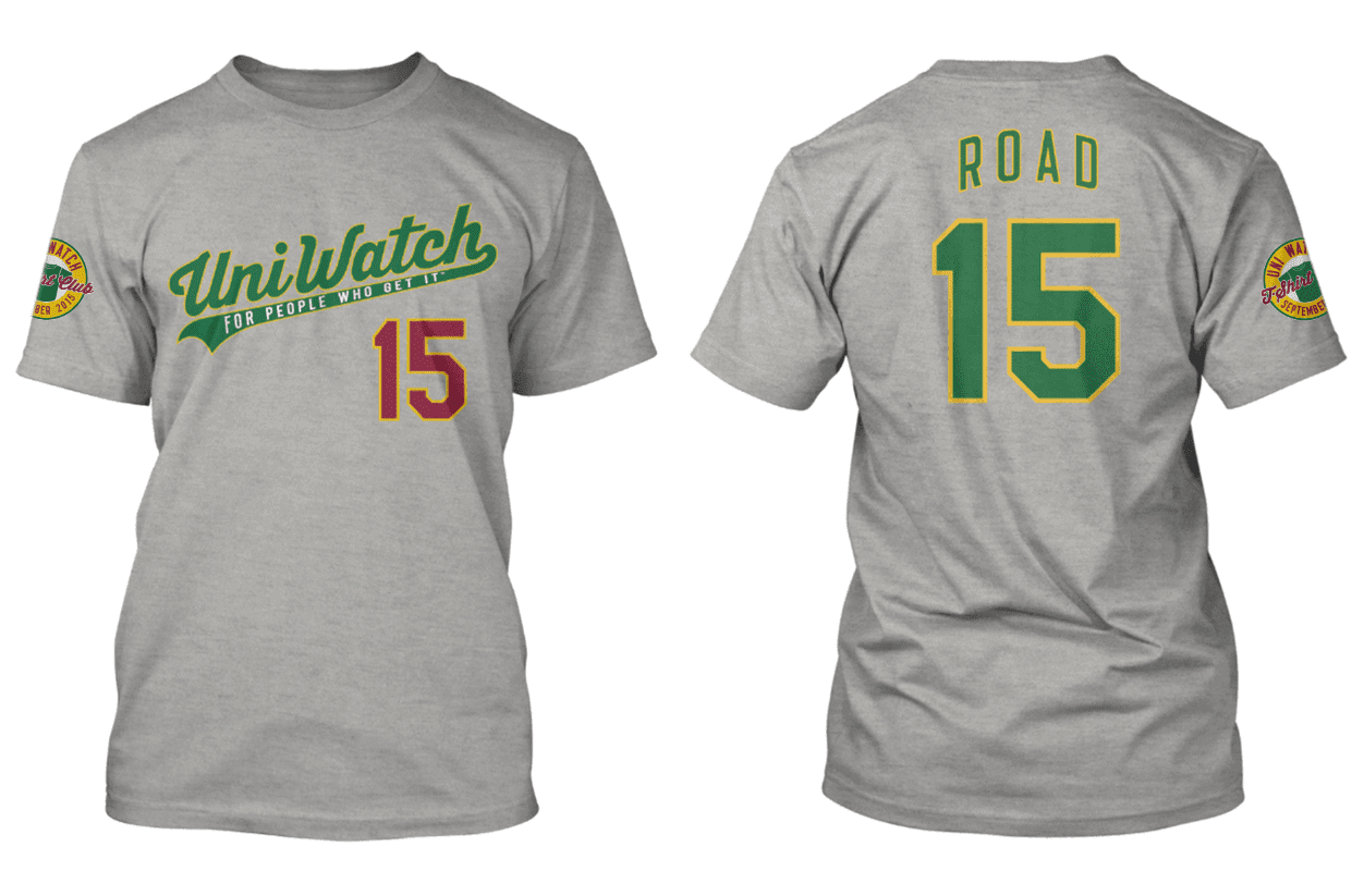
We had originally planned on doing a different design — something much more elaborate — for September. But that design turned out to be so tricky that we’ve decided to have some samples made first, so we can troubleshoot any production issues in advance. That design is now slated for October, and it’s going to be a doozy. I’m pretty sure you’ll be excited about the November and December designs, too. You’ll see.
Meanwhile, once again, the road grey design is available here. Thanks.
Uni Watch News Ticker
Compiled by Mike Chamernik

Baseball News: Here’s a comprehensive look at what the Cubs have worn on the road since 1958 (from Phil). … Forbes’ Maury Brown wrote about flat vs. curved baseball cap brim styles, and of course the piece shifted to white vs. black and old vs. young. I’m actually right down the middle on this one. Super flat brims (like where people go out of their way to flatten it) look dumb, but so do the extremely curved ones. Give me a slight curve. [Phil here — I plan on following up with Maury on this for UW at some point soon — so stay tuned. Now back to the ticker] … USA’s 15U national team wears some sharp stirrups. … Florence Freedom wore bowling shirt jerseys two nights ago. … Straight Outta Compton has been well-reviewed but Uni Watchers have been sending in the film’s sports apparel errors ever since the trailer came out. Here’s another: In the film’s opening scene, set in 1986, Eazy-E is shown wearing a White Sox cap that wasn’t used until late 1990 (from Andrew Cosentino). … The Tennessee Smokies will wear University of Tennessee-themed jerseys in support of Volunteers women’s hoops coach Pat Summitt (from Phil). … Can’t remember seeing a manager wearing a captain’s “C” on his uniform before (from Tris Wykes).

NFL News: The Packers considered changing their uniforms in the early 1990s (from several readers). … NFL game balls now feature the home team’s logo decal under the NFL shield panel, rather than the team name (from a reader who didn’t give his/her name). … Robert Griffin III is wearing four different camo-patterned accessories in this photo: sleeves, gloves, socks and a towel (thanks, Bryan Firvida). … New Colts RB Frank Gore is continuing his diabolical short pants game (from Charlie Welling).. … No photos, but the Giants will wear a No. 16 helmet decal for Frank Gifford this season along with a jersey patch for Ann Mara (from Phil). … Lions LB DeAndre Levy is selling more than 100 pairs of shoes from his sneaker collection, with the proceeds going to charity. … No new stadiums in the NFL this year, but five teams made notable modifications to their homes (from Brinke). … Lions DE Darryl Tapp finds motivation from being left out of the team photo last year. … The numbers on the Browns’ practice jerseys have a drop shadow (from Alex Sinclair).

College Football News: A few people sent this in: Georgetown’s new uniforms feature a kente-cloth pattern. … The head coaches at Ole Miss and Mississippi State both want the Confederate symbol removed from their state’s flag (from Phil). … Florida State’s Jalen Ramsey will change jerseys for kickoff returns since he and another deep man share the No. 8. Ramsey will still wear 8 on defense, but his new number isn’t yet known (from Bud Elliott). … New jerseys for Old Dominion (from Phil). … New uniforms for North Dakota (from Patrick Thomas). … Charlotte altered its uniforms (from Phil). … Here are 13 new uniforms this season, most (all?) of which we’ve seen here before (from Phil). … New yard line font for North Carolina. … Illinois changed its midfield logo. … West Florida unveiled jerseys for its inaugural football season (from Phil). … Tennessee wore gray-trimmed numbers in the late 1980s. … Not sure if this is a poke at Oregon, but apparently the East Mississippi Lions will have 216 uni combos they’ll unveil today.

Hockey News: The NHL Shop is selling an Oilers T-shirt with “Houston” written on it. As you know, the Oilers play in Edmonton; the NFL’s Houston Oilers moved to Tennessee in the late 1990s and eventually became the Titans (from Alan Kreit).

Soccer News: Sergio Ramos re-signed with Real Madrid and was presented a jersey with a four-digit number. He signed with the club through 2020 (from David Shucosky). … In case we haven’t seen this yet: England’s blue-striped kit has leaked (from Tim Cross). … Bayern’s Robert Lewandowski was fined for wearing a visible Nike logo under his shirt in a game against Hamburg (from @thEliasNevarez).

Basketball News: Might the Clippers have alternate blue jerseys? We will see if those are legit. … The Seattle Storm wore pink uniforms for Breast Health Awareness Night on Sunday. There wasn’t enough room for numbers on the backs of the jerseys, so the Storm put the alternate logo there instead. A source tells us that “these uniforms were supposed to be next year’s uni design, but the players have had a fit over it so the league is reconsidering. Many of the players wore undershirts or sleeves during this game.”

Grab Bag: White-vs.-white matchup the other day in a South Africa-Argentina Rugby World Cup warmup (from Eric Bangeman). … Denis Hurley runs a site called Pride in the Jersey, a history of the uniforms worn in the Gaelic Games. He also had a radio hit where he discussed the origins of the colors of many county teams.
And that’s a wrap for today. Thanks to Mike for the Ticker and Brinke for the CC. Make sure you check back tomorrow … Paul will be making a special guest appearance with a new lede. You won’t want to miss that!
Follow me on Twitter @PhilHecken.
Peace.
“’ANCHOR DOWN’ is what I yell through the bathroom door to my horrified and exasperated family at about 8:25 every morning.”
–Rob Ullman
Adidas left NBA jerseys alone (except all star), they’d be wise to do the same with NHL… And remove Reebok Edge elements
A return to the straight hemline would be nice.
If adidas straightens the hem but adds maker’s mark triple stripes along the now-straight bottom hems, I’d accept that tradeoff.
I agree with arrScott and Rob. The Reebok curved hem is horrible. A return to a straight hem would be most welcome!
I’m skeptical on the comments regarding jersey ads, but I’m glad it’s generating a lot of discussion. I’d be more worried about putting the trefoil on the socks, or the adidas logo on the front shoulder (like the OHL).
Bettman just commented on this in January 2015.
“My view is, I’m in no rush to put advertising on our sweaters, I think we’ve got the best jerseys in all of sports. I like the history, the traditions, I like the way they look and I’ve repeatedly said we wouldn’t be the first. You’d probably have to bring me kicking and screaming.”
link
Bettman’s not far from retirement though. Who knows what his successor will do? Fans need to keep up the pressure on the leagues not to give in to this. We’ve already conceded to them constant commercial breaks during TV broadcasts (something that isn’t possible during soccer/rugby matches, an alleged justification for jersey ads). That’s enough already.
The NHL is juuust coming around to abandoning Reebok’s goofy design elements for traditional jersey stylings. I’d say there’s less than a 1% chance of a league-wide Adidasifying of the jerseys three years from now.
Honestly, I’m a big baseball fan and a big fan of uniforms, and yet I’ve never heard about this supposed “holy war” that Maury Brown writes about. Seems baseball gives its players the most freedom of any sport to have personal expression in their attire, including how hats and stirrups are worn.
This sure feels like a guy-punch. It will almost surely not be as bad as it could be (NBA has turned out OK but for the gimmicky alternates, and Michigan has gone for some #teamadidas gimmicks but mostly stayed decent-looking.) but will be worse than it should be (stupid striped fan and practice gear, gimmicky embarrassments and ill-fitting jerseys with poorly positioned type a la Adidas college basketball, just general bad design a la Adidas college football).
The Reebok thing might be the saving grace. They’ll hopefully just change all the Reebok wordmarks to the Adidas logos and be done with it. The alternative is that Adidas will try to take the same, pity-inducing hey-look-at-me approach that it does for college teams, both those desperate for attention (Baylor, UofL) and those doing just fine, thanks (UCLA, Michigan).
Um … that was supposed to be “gut-punch.” And it probably didn’t need the hyphen.
U-Mich hockey has worn some of its best looking traditional uniforms in years since switching to adidas/reebok in ’07.
Though college hockey is in a period where traditional restrained design is the style.
I wouldn’t be surprised if Adidas comes in with some flair, like a new template. After all, the edge will be 10 years old. I have a hard time believing it’ll be as big of a shake up as the edge roll out.
Well, the Edmonton Oilers were nearly sold and moved to Houston circa 1998, before a local group was able to come through with the money to buy them and keep them in town. Though the Oilers had switched to navy, copper, and red by that point.
As for the Clippers’ blue jersey, link, just with white on the collar.
Englnd striped kit – I hope it’s a training shirt, not for matches.
ADIDAS and NHL: Considering what they’ve done to college football teams, and my favourite team not being one of the “storied franchises”, I’m more than a little worried.
That said, I’d guess advertising would look more like the minor league version:
link
I’d expect them to do something that’s considered both subtle and distinctive. So, perhaps three vertical stripes in the “Ree-box” back collar area, but some other distinct template feature like the back shoulder stripe in current soccer shirts:
link
link
link
that will change relatively frequently.
SB
I do agree that, in all likelihood, the ads would be on the AHL level – a small patch on the shoulder or sleeve. I don’t think they’ll go the soccer route of replacing and offsetting the team crest just yet.
As for enforcing their striping pattern, all I can say is, I sincerely hope not. Hopefully they’ll just restrict it to the three stripes in the Adidas logo (and maybe throwback designs could break out the trefoil for good measure).
I also had that same electric football game.
Stupid felt footballs.
I really hope that Adidas ends the recent practice of putting their stupid manufacturer’s logo above the player name on the back (which shoves the all-important jersey number down into third position). If you have to have that logo, go back to how CCM did it and put it on the bottom hem.
I agree, but given how much they’re paying for this right, I doubt they’ll move it now.
Bear in mind, it was moved up there by CCM for the 2000-01 season, with then-home whites showing the CCM brand and road and third jerseys sporting their Jofa brand. And this was years before they were bought by Reebok.
Since UW weighed in on the white pants on the road phenomenon, and a curved-vs-flat brim survey awaits, maybe we should take on a favorite subject of yours, Phil, and enumerate the teams that have worn pinstripes on the road. A personal favorite of mine were the Pirates in the 1990’s, who had them on the greys but not the whites, and then embellished (vandalized?) them with a plain grey cap. And yes, we can then address teams who wore grey caps.
Thanks for the suggestions Walt. I’m not sure the piece with Maury (still working on details) will be a curved/flat brim survey, but maybe. And a reader (forget who) actually pitched a piece to me on colored tops with road pants…not sure about a road pins piece, but maybe. As far as gray caps…well that’s been done already.
The kings of road pinstripes are link.
(Though it seems like the originals were not quite as dark as that, even when you look at an link.
I dislike boring gray and if it has to be worn, I want to see it spiced up with visible colored socks and sleeves, and pinstripes or piping. Can’t see why people are so anti-pinstripe with gray uniforms.
Agreed. The bias against road pinstripes makes no sense. If pinstripes are a kind of ridiculous pattern for a sports uniform – and they are! – then they’re equally ridiculous at home. So either the Yankees have laughably crappy home uniforms, or road pins are just fine. Especially considering that road pins are just as old as home pins in baseball history. So if it’s about history, road pins are fine. If it’s about pure aesthetics, road pins are also fine.
Twins and Rockies should be wearing road pins right now. And I’d love to see the Cubs bring pinstripes into their road and/or alternate unis. Phillies could give it a shot, too. Can’t look worse than their vaguely pink home pinstripes. And since the Phillies wear a much-too-light shade of gray on the road, pinstripes would help distinguish their roads from plain white. Not so sure the Mets could pull it off, unless they got really bold and switched to a very dark, charcoal gray road uniform with light pinstripes.
If they put CCM (parent company of adidas) on the jerseys and just have adidas do the practice jerseys that’ll be fine. I wish the owners and corporates would realize they have enough ads around the rink and arenas.
CCM is not the parent company of Adidas.
I’ve geeked on the Georgetown kente pattern since day one. More teams ought to associate themselves with patterns and textures since it obviates a problem of how to squeeze stripes into sleeker, smaller and lighter uniforms. Just spare me the corporate boilerplate of how feathers, contrails, runes etc. represent victory/tradition/spirit/(insert virtue here).
It’s extremely unlikely that old-school teams such as the Canadiens, Red Wings, Devils, Blackhawks, etc. would allow obtrusive striping. I think you’ll see the Adidas logo replace the Reebok word mark at the back of the neck. The one thing I think they might add (but probably won’t) is to add small Adidas logos on the “socks”, at knee level. That’s something they did when they outfitted college teams such as Wisconsin, Michigan, and Notre Dame.
Not sure if anyone else is having this issue, but I’ve been getting this “script” error every time I’ve come to the site the last several days…I’ll “stop” it, and it’ll pop back up 20 second later. But locks up the entire site…can’t click, can’t scroll, can’t do anything until the warning box pops up and I can kill the script…then it starts over again. It’s probably coming from an ad, but I’m not sure. Very annoying.
——————-
A script on this page may be busy, or it may have stopped responding. You can stop the script now, open the script in the debugger, or let the script continue.
Script: link
I saw that article on flat vs. curved brim hats, but wished the would have also touched on the subject on why people are leaving the stickers on their hats. I touches a nerve with me whenever I see people wear hats with the stickers still in place. I am soooo tempted to reach over and peel them off. LOL
The “Minnie Pearl Effect”?
All joking aside, I don’t know. Maybe it started with leaving on the holographic stickers, after counterfeiting became a thing, to show authenticity.
I eat, sleep and breathe hockey so if they added jersey ads, I would definitely still watch but there’s no way I’d buy a jersey with an ad on it. That photoshopped picture of the Red Wings sweater with ads breaks my heart.
Makes me wonder though, I buy uncrested jerseys to wear when I play hockey myself, so would the ads be on the uncresteds or would they just cease to make uncresteds anymore? If they made an uncrested with no ads, would the companies throw a fit?
Most NHL teams are a template for minor hockey organizations so they’ll still make uncrested shirts for the team purchase market.
I was extremely annoyed when the wings added ads to their practice jerseys. I would stop watching if they slapped one on the game jersey.
My brother had (has?) that electronic quarterback game. The field was paper, and under it was an elctric grid with a small moveable light bulb. The offense put in a card and slid the handle to the selected play. Defense did the same. The intersection of the play choices would light up when you pressed the corner button, showing the result of the play. I barely remember watching Dad and my brother play. When I got a little older one of the defense cards went missing so it sat in the attic.
Re Fla St’s two #8s: I know the number of scholarships is limited, but nothing says “football factory” to me like having so many players in uniform that they run out of numbers.
There is no NCAA limit, is there?
Nope, the only rule is that no two players on the same team can wear the same number on the field at the same time. I remember that USC’s Joe McKnight (normally #4) needed a big #40 jersey to wear over his jersey for special teams plays.
Thanks; that’s what I thought.
Teams try to avoid problems by assigning the same number to one offensive player and one defensive player. But a couple of years ago, cameras caught Notre Dame with two players with the same number of a special teams play. The officials didn’t catch it.
Just made the September UW shirt the very first thing ordered to be delivered to my new house in Wisconsin. I’m very curious about what kind of complex design would justify ordering samples. Wrap-around rainbow guts? Racing stripes down the shoulders? Edge-style curved bottom hem? TATC-style lettering vertically up the full length of the shirt?
I’m hoping for a take on the Canucks V jersey, except with a Big U or W on the front. I’m not holding my breath.
I’m really hoping for a Turn Ahead the Clock shirt with a wild design.
The article on the incorrect flat brim vs the proper slight bend was interesting. I think every pitch that Seattle pitcher throws should be ruled a hit batter till he figures out how men wear hats.
There was a nice discussion of Paul and Uni Watch yesterday on the sports podcast Hang Up and Listen. Mike Pesca talked for a bit about Travis d’Arnaud, Jacob deGrom, Bill de Blasio and the Mets’ use of the lower case ‘d’.
link
There are a couple examples out there in International hockey of Adidas running the three stripes down the sleeves.
The one that stuck in my head was Russia in 1987 Canada Cup – I remembered that one because of Lemieux’s winning goal. The Czechs had a similar design in the same tournament.
link
link
link
Yes, Adidas did most all of the national team jerseys in the mid-1980s, as well as some Euro club teams too. I thought they looked quite nice, actually.
Finally, let me go on record as preferring the Adidas trefoil logo to the one they’re using today.
link
I’m pretty sure my love for that logo (and for vintage Adidas generally) comes from years of carrying my stuff to school in one of these.
link
Does anyone not prefer the trefoil?
trefoil > mountain
and it isn’t even close
I would definitely buy more adidas gear if it had the trefoil logo. The mountain logo is horrible.
I’m all for stripes on shoulders extended to the wrists, hopefully this will eliminate the apron look.
Bettman Stripes were the worst thing ever to happen to hockey jerseys. Scooped hem was close 2nd.
But I can see Adidas adding their stripes to the collar.
RE: Curve on baseball brims. The brims of baseball hats should be “curved” in an exact duplication of the curve on batting helmets. No more, no less.
The article on the football stadiums missed Soldier Field just installed larger video boards. I wonder and am surprised that Miami would eliminate so many seats. Here in Chicago they didn’t put enough in when they rebuilt and the NFL won’t give us a Super Bowl. I guess our consulation prize is the draft.
216 uniform combinations.
That could be as simple as 2x2x2x3x3x3 if you’re looking at helmet, face mask, jersey, gloves, pants, socks. They do have gloves in the pic, although I never thought of that as part of a uniform (all players wearing the same color).
If you eliminate the face mask, I could see four jerseys. You could easily see one helmet color with three different striping and graphics, too.
Adidas putting stripes on all the hockey jerseys? I don’t think it will happen.
It’s a given for soccer uniforms, but as far as I know, Adidas hasn’t dipped its pen in the hockey market so I don’t think the stripes will be forced.
Did they stripe the NBA uniforms? NO.
Do they stripe football uniforms? NO
Did Nike drastically change the NFL uniforms? NO
Despite this scare we’ve created for ourselves, the mockups are cool.
Many more than 13 new college uniforms this year. ACC teams missing from the list are Duke with a minor change with the stripes and Wake Forest with a complete new look.
If we’re getting technical, Florida State and NC State have new jersey templates and Georgia Tech with a slight collar change.