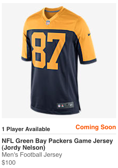
We’ve known since last fall that the Packers would have a new throwback uniform for the upcoming season, but they’ve played very coy about what it would look like and when they’d be unveiling it. Now we may finally have gotten a peek.
A bunch of jersey listings like the one shown at right (which you can click to enlarge) showed up on Nike.com just prior to midnight Eastern last night. They were for various players and were all listed as “Coming Soon.” As of this morning, these listings have vanished, which raises the obvious question: Was this an accidental leak of the Packers’ long-promised throwback for the coming season? I’m thinking it probably was.
If so, it’s a throwback to an earlier throwback, because this is essentially the same design that the Packers wore in 1994, when NFL teams turned back the clock to celebrate the league’s 75th anniversary. Here are some pics from those games (click to enlarge):

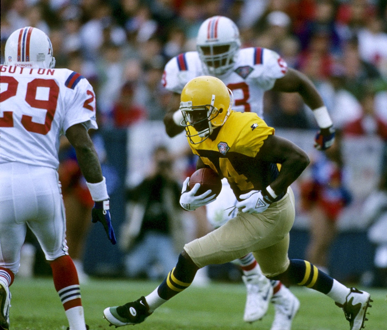
(They also wore a white version of that design for one game, which happened to take place on Halloween, which is how we ended up with the infamous jack-o-lantern helmet shot. But I digress.)
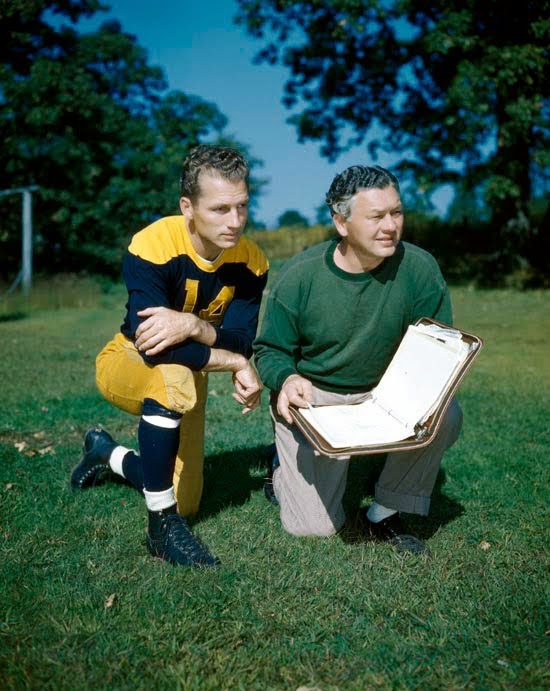
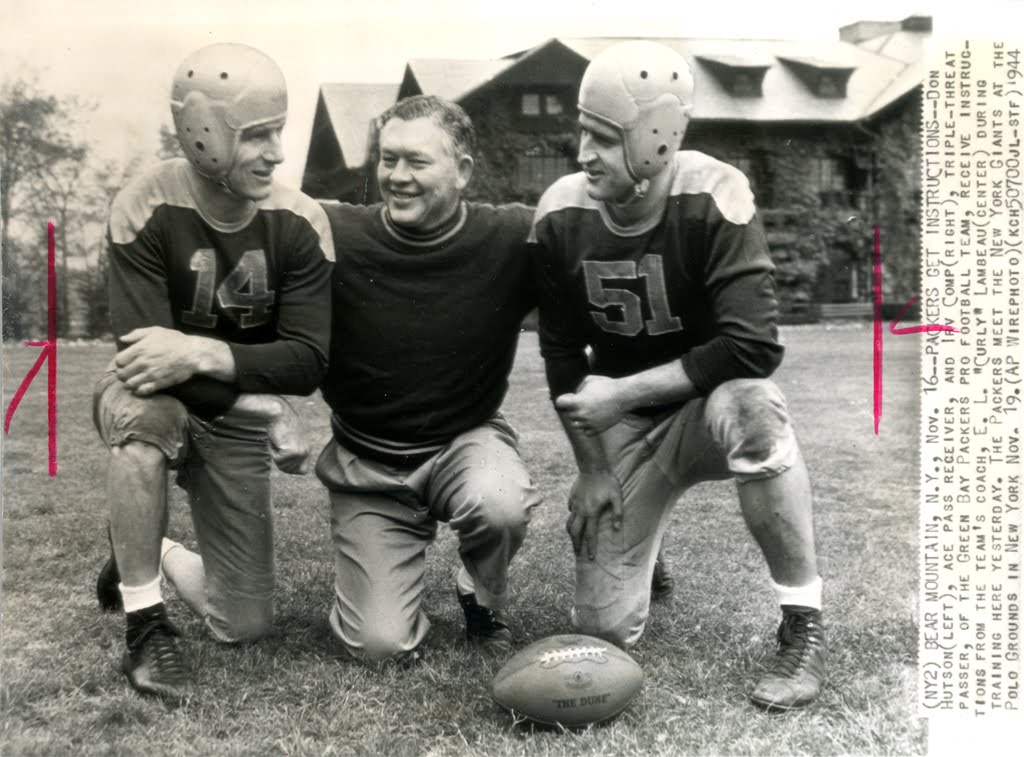
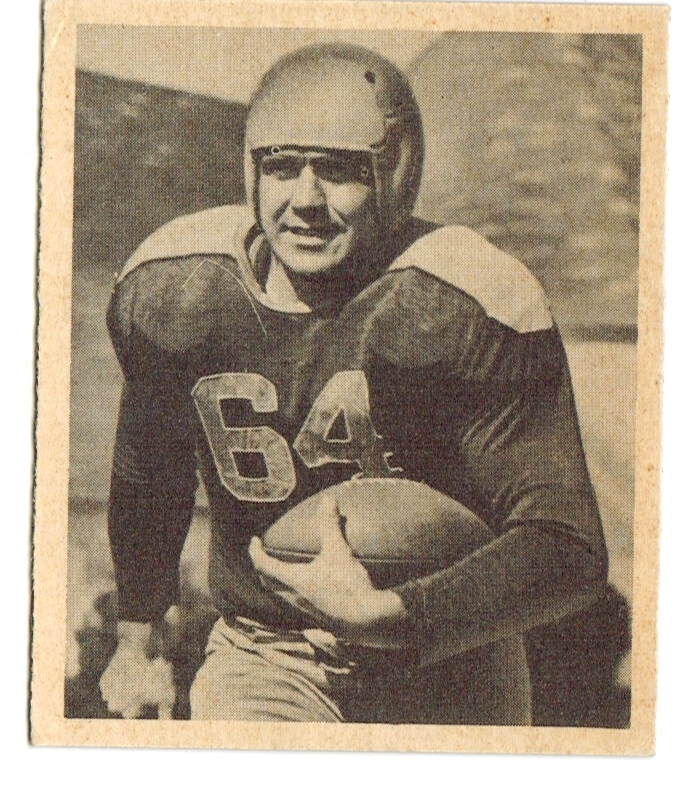
When the Packers wore this design in 1994, it was billed as a 1944 design (further info in this excellent post by Chance Michaels), although the Gridiron Uniform Database shows that this design was actually worn from 1943 through 1948 (plus something very similar was worn in 1937). In any case, it’s a design that’s generally associated with the era of Don Hutson and Curly Lambeau. Here are some old photos that show how it looked back in the day (many of which you can click to enlarge):

Of course, we still don’t have confirmation that this is definitely the Pack’s new throwback. If it is, we still need to see the pants (canvas-toned, like in 1994?) and socks (striped, like in 1994?). As for the helmet, they’d presumably go with a plain, decal-free version of their current lid, and I hope they’d also swap out the green facemasks for grey or navy (something they failed to do with the Acme Packers throwbacks in recent years, which has really bugged me).
My take: It’s not a bad design, and I’m generally a fan of contrasting yokes, so I’m sure this will look fine on the field. But I’ll miss the Acme Packers look, which I always liked.
Update 10:30am: The throwback jersey has now been confirmed:
@UniWatch Closer look at Packers new throwbacks at Shareholders Meeting pic.twitter.com/ELWd428POw
— Wagner (@12wagner52) July 28, 2015
(Big thanks to Phil Tavares, who was the first of several readers to alert me to the jersey listings on Nike.com.)
Click to enlarge
Collector’s Corner
By Brinke Guthrie
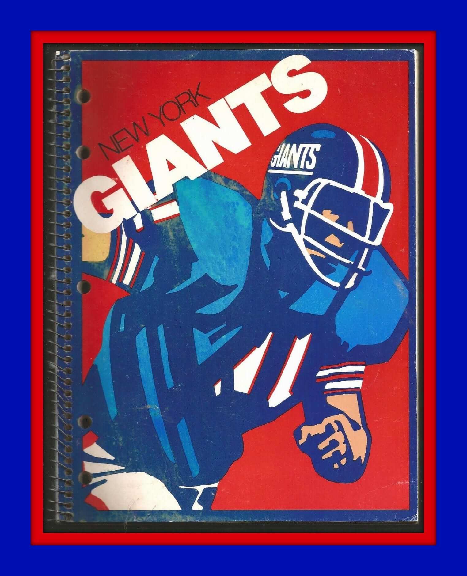
Way back in the day, I always had STP stickers on my school binders and notebooks. Remember those? I was an Indy fan at the time, so I knew what STP stood for (scientifically treated petroleum, duh), but I’m sure some kids just stuck ’em on because everyone else did. Then I discovered the NFL, and it was strictly NFL team colors for me in school from then on. Cowboys, then Bengals. But if I’d been a fan of Big Blue, maybe I would’ve used this New York Giants spiral notebook.
Here are the rest of this week’s picks:
• I love the “My Favorite Team” line at the top of this t1958 Red Sox patch. It says “Bazooka Blony” on the bottom. “Blony” was another gum brand owned by Topps. Other teams had these, too.
• I think I started collecting NFL mini-helmets around fall of 1971. I remember going to Oxmoor, the Louisville mall, right before we moved to Dallas — I bought several of the goalpost kits. This helmet always drove me nuts. That. Bolt. Is. Not. Correct.
• Here’s a pair of 1970s Baltimore Colts grey shorts. They’re “Officially Licensed,” but without any maker’s mark. Certainly wouldn’t see that today. Speaking of the Colts, this is what a 1960s youth helmet looks like.
• Really like these 1970s L.A. Rams knit gloves! One more from the Rams: this 1960s bobble is in great condition.
• San Francisco Giants fans, you’re always in style with this 1970s “Hip Pocket Styling Comb.”
• Aaaah, look at the uni colors on this 1960s photo of Lem Barney of the Lions and Gary Collins of the Browns.
• Textbook 1970s “fade” graphics on this Seattle SuperSonics windbreaker.
• Never seen a red NFL logo like the one on this 1960s pillow. Well, they weren’t as eagle-eyed about the merch back then, right?
• Ever seen a Phillies “Bull-Schmidt” pennant before? That refers to sluggers Greg “The Bull” Luzinski and Mike Schmidt, of course.
• These 1970s Golden State Warriors wristbands will set you back a pretty penny.
Follow Brinke on Twitter: @brinkeguthrie
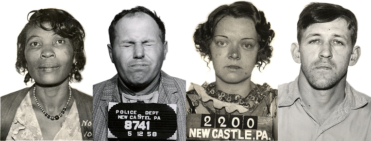
The vintage mug shots shown above are all from the excellent website Small Town Noir, which I’ve written about before. Now that project may end up as a book. Full details over on Permanent Record.
The Ticker
By Mike Chamernik

Baseball News: Reds P Raisel Iglesias’s jersey and pants were different shades of grey last night (from Adam Ure). … During Cole Hamels’s no-hitter at Wrigley Field on Saturday, catcher Carlos Ruiz ditched his sunglasses for the ninth inning because of the field’s shadows, and CF Odubel Herrera nearly forgot to wear his in the eighth inning (from Kurt Esposito). … Rickey Henderson wore plenty of different styles of uniforms over the years with the A’s (from Richard Paloma). … Here’s a cool gallery of well-known hockey players in baseball uniforms (from Anthony Juliano). … The San Antonio Missions will wear Star Wars uniforms next month (from Patrick Frey). … The Norfolk Tides will have SpongeBob jerseys in August (from @morrisoncrying). … The Bowie Baysox are holding a Back Hair Appreciation Night on Thursday. Fans who shave a No. 15 into their back hair get free box seats (thanks, Tommy Turner). … The City of Washington’s preferred typeface is the same font that the Nationals and Shake Shack use (from JH). ”¦ If you think Rickey Henderson was a hot dog, check out former MLBer Kaz Matsui, who’s now back in the Japanese leagues and recently celebrated his 2,000th hit by holding up a pre-made sign with his own milestone logo. Also of note: What’s that printed on his upper-right pant leg?

NFL News: Someone created a new logo for every NFL stadium (from Marc Burgess). … A bar in Red River, N.M. has an indoor mini-golf course and has an old Broncos helmet as an obstacle for one of the holes. I know I’ve asked before what people’s favorite helmet logos were, but that Broncos one is a pretty strong contender for my favorite (from @jbird8212). ”¦ These are always fun: Here’s an animated GIF showing the evolution of NFL team logos (from Chase Osterman).

College Football News: New uniforms from Bowling Green. They have a full brown set, along with orange jerseys and white jerseys. … A Cornhusker blog is holding a Nebraska alternate uniform redesign contest (thanks, Brandon Vogel). … Tennessee’s tickets for the upcoming season are whiskey bottle-themed (from Lee Wilds). … Duke will wear UCLA stripes this season. … Angelo State will have throwbacks. … New uniforms for Air Force. Here’s a good collection of photos of what the Falcons have worn over the years (both from Phil). … The people in the Arizona State athletic office who have seen the Sun Devils’ new jerseys have liked them, unsurprisingly. The uniforms will be unveiled Thursday (from Phil). … A Syracuse blog ranked all of the Orange’s eleven uni combinations (from Phil). … The Buckeyes have a few mannequins in full uniform in their locker room, so someone dressed up as one and scared the daylights out of unsuspecting Ohio State players. ”¦ New uniforms for USF. You can get closer looks at the various components, which include some rainbow-green stripes, here, here, here, here, here, here, and here.

Soccer News: Tottenham Hotspur’s third jersey has leaked, and folks are surprised it’s not purple (from John Muir). … “The 1981 Copa Libertadores match between Flamengo and Atletico Mineiro was played on a pitch that was mown in a bizarre ‘crop circle’ pattern,” says Graham Clayton, who, based on his Ticker submissions, apparently watches 1970s and ’80s soccer and Aussie rules football clips on YouTube all day.

Hockey News: The Avalanche’s new Stadium Series jersey may have leaked. That’s from Icethetics, which is usually a dependable source (from @ClancyKolzig). … The Sabres’ old alternate logo is apparently being used by a screen-printing company in Nevada.

NBA News: The Raptors’ inaugural set tops this list of the best to worst 1990s NBA uniforms (from Cory Collins). … New Celtics F-C Amir Johnson picked No. 90 because “every number 1-34 was basically retired.” … A video from a couple years ago animates all the NBA logos with a smooth transition in between them.

Grab Bag: Considering how unattractive the 2012 London Olympics logo was, and how much of an ordeal building the 2020 Tokyo Olympic Stadium has been, it’s fitting that Tokyo’s Olympic logo is very confusing (from Chris Bisbee). … Olympic decathlon champion and world record holder Ashton Eaton had a cooling hood designed for him (from Brinke). … I’d say that this house in Manasquan, N.J., Gets Itâ„¢. “Quite the color combo, eh?” says Keith Goggin. ”¦ B.Q. Grimes spotted a truck with a mash-up of the Alberta and Confederate flags.
Phillies P Raisel Iglesias’s jersey and pants is not the Phillies uniform. It is the Cincinnati Reds. they were playing the Cardinals last night
Fixed.
I have noticed that of some of the visitors at Nats home games this summer. Usually when sweltering out, thought it was just sweat showing through.
Jon Lester had this problem when pitching for the Cubs against Cincinnati. His gray Cool Base jersey was dark all over with sweat.
Clearly, all the more reason to not wear gray jerseys on the road.
No mention of the newly upgraded Chuck Taylors Paul? I was sure you might have a review or opinion.
Was in the Ticker late last week, and there was also some discussion in the comments.
I don’t really care. I’ve been buying lightly used Chucks and thrift/vintage shops for $15-20. No way I’m paying $80, or whatever the price is for the newfangled ones.
Eww, who buys used shoes? I don’t even like renting shoes for bowling.
Eww, who buys used shoes?
Perhaps I didn’t make it obvious enough for you: I buy used shoes.
Glad we cleared that up.
does sound kind of gnarly
Ah, it’s not like it’s used underwear. A run thru the wash or a healthy dose of Lysol and yer good to go!
There are also these things called socks.
How disappointing for the Packers, if legit. Let’s hope they at least go with yellow pants instead of that khaki garbage they did in 1994.
Yes. But because the gold pants would actually appear to be throwbacks from the Hutson era, not because you happen to hate tan pants.
Whynotboth.jpg
I don’t care for the way the yoke squares off at the end of the sleeve as opposed to being rounded off in the vintage pics. Since sleeves are practically non-existent these days, they could have rounded them off at the end of the shoulder and had a nice look.
Agreed.
Lee
The back hair night is from the Bowie Baysox not the Potamoc Nationals.
Fixed.
The Pacers’ Flo-Jo set tops this list of the best to worst 1990s NBA uniforms (from Cory Collins).
That’s a misread of the #1, which is actually the Raptors’ inaugural unis. Reggie just happens to be the featured opponent in the pic.
Fixed.
I don’t know if it’s Stockholm Syndrome but I’m really starting to like Under Armour’s designs. Specifically the fact that they are much less dependant on templates than Nike and Adidas. Also, are they Duke Stripes now, maybe LSU stripes? Can we call them something different until UCLA actually has them again?
Seconded. And those FSU uniforms with the rainbow shoulders are spiffy!
Um, Duke’s are Colts stripes.
The Buckeyes have a few mannequins in full uniform in their locker room, so someone dressed up as one and scared the daylights out of unsuspecting Ohio State players.
The Uni Watch reason to watch that is in the last 5 seconds, when the last player’s reaction includes the comment “I was like, when did we get white sleeves?”
that’s Cardale Jones fyi
I’m definitely a fan of the new Bowling Green unis. I’ve always respected them for embracing brown as a school color. My alma mater, Western Michigan, simply refuses to recognize it’s Brown and Gold color pattern.
Yeah, Western Michigan! When will you realize your colors are #1 and #2?
Tread lightly: Padres’ fan present.
I’m glad there’s love for the classic Denver Broncos’ symbol. But if they bring it back, I hope to see a forward-facing horse on the left side of the helmet.
Interesting thought. Hmmm…. wonder what that would look like.
I may ‘shop something later…. but I have a feeling it doesn’t really work or they’d have probably done it that way to begin with.
The logo on Kaz Matsui’s pants may be a sponsor logo, presumably something related to Rakuten.
I’ve noticed that the mismatching shades of grey jerseys look more noticeable if the top is covered in sweat and if the jersey top is the”Cool Base ” fabric
Yep, it’s a logo for Rakuten Life Insurance.
Iglesias’s jersey was sweated through, not a different color than his pants. This has been in the ticker a couple times for games in St. Louis. Shelby Miller had the same thing happen this weekend and it was in the ticker when the White Sox came to town. It’s not a different color, it’s wet.
Tomorrow in the ticker: man sweats while exercising or playing sports.
This is probably a result of the Cool Base jerseys teams wear now. This phenomenon was not as common until recent years.
Man, how livid would the NFL be these days if someone came out with a jack-o-lantern style helmet? That would probably result in a lifetime ban from the league.
Gallery of well known hockey players in baseball uniforms
missed a big name one – photo at the bottom of this page:
link
Some more here including him at batting practice with the Detroit Tigers:
link
Mr. Baseball? Has a nice ring to it.
Here’s another omission:
link
That Avalance jersey is NOT their stadium series design.
And you know that because..?
The Broncos helmet in the Red River NM bar was opposite of a Dallas Cowboys Helmet. Red River is between Dallas and Denver. But someone seemed to have ripped the Cowboys Helmet off. It is the most ghetto mini-golf course and is an absolute blast.
You don’t have to believe me.
I didn’t say I didn’t believe you. I asked how you know what you claim to know. Still waiting.
Packers throwbacks now confirmed:
link
Hmm… I like the 40s Packers throwbacks they wore in 1994. If that is going to be their current alternate, I’d be ok with that. Initially I was a little disappointed that they’d be using a throwback design that they’ve used already, but they more I thought about it, that’s the throwback that makes the most sense to do. They could technically throw back to the Lombardi uniforms, but they’d only be changing their stripes and their socks. If you’re doing a 3rd jersey, best to be different than your normal uniform. The Hutson era is most notable, though the Acme design was a more inspired choice.
The NFL Stadium logo redesign, how does the person not know the Bills play in Orchard Park. They’ve only been there since 1973. Pretty obvious misstep putting Buffalo, NY on there. They managed to get “Miami Gardens” and “Tampa” right.
Or just put Erie County, NY.
I like it when NFL teams change up their throwbacks frequently. Yes, the Acme Packer look is good, but we’ve seen it enough the last few years. It’s time to showcase a different bit of team history. Same with the Steelers’ bumblebee look. Interesting and novel, but I’m tired of it. The NFL has so few games each season, so I say if you’re going to wear a special throwback uni, do one that I haven’t seen regularly in recent memory.
Blame the NFL for their combination of “one helmet” and “5 year” rules.
They should ditch the 5 year rule for anything designated as a throwback. That’s just dumb. I have fewer issues with the one helmet rule.
I’d still like to see the Packers bring back the 1936 green-and-gold design, with the contrasting raglan-cut shoulders. It would still stand out today, and would be honoring the first playoff-winning championship team of the franchise.
Just FYI, there’s a block of ads on the left side of the page (a quiz widget with US Cellular ads above and below) that blocks some of the content on my iPad.
Try reading it in Safari on iPad, and NOT as a pop-out link from Twitter.
I just bought a pair of the new Chuck Taylor II’s and they are so much more comefortable with the new nike lunarlarion insole and the premium canvas along with the padded tounge. They are a great upgrade on comfortabilty with the same classic look. You will end up liking these Paul.
I won’t end up liking them because I have no plans to wear them.
I wear custom orthotics with all my footwear (bunions), so comfort isn’t really an issue for me. As long as my orthotics fit into the shoe/sneaker, I’m plenty comfy.
I’m not saying you’re a plant from Nike, but this is what a plant from Nike would say.
The creator of those new NFL Stadium logos really likes the shield for those logos. Wow.
That’s the problem when someone, however talented, takes a crack at designing a league in one crack. They’ll find one motif and use it to the point of creative exhaustion. It takes a real effort of the mind to avoid falling into such ruts.
Agreed. There’s too much of a sameness with all of those logos.
Packers throwback to be worn against Chargers
Packers really should considering doing something like this. Harken back to the early 50s. Real sharp look, and would keep the green and gold.
link
I love love love that pic of the Browns lions players in the collectors corner.
Why oh why did Detroit and Cleveland ever fukk with that look?
That best to worst NBA Uniform list makes no sense at all. It starts with the Raptors and goes to a classic Bulls, and even picks a random year in which the uniform was worn to describe it like a one-off.
A little off topic from most of the post, but the style guide and typeface referenced were for the District of Columbia, not the “City of Washington.” There hasn’t been a city of Washington (at least, as a legal entity) in the federal capital district since 1871 (see link).