Phil mentioned something in both of his weekend Tickers that I think deserves a bit more space, namely that Louisville has new baseball uniforms for the NCAA tourney, and the pants feature something we haven’t seen before: big, honking “L” logos on the back-thigh areas (or as Phil has dubbed it, SLOH — school logo on hamstring). It’s one of those “It looks so fucking awful, but I can’t look away” things. Here, see for yourself:
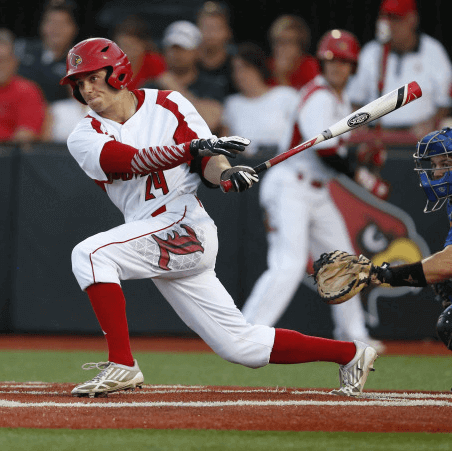
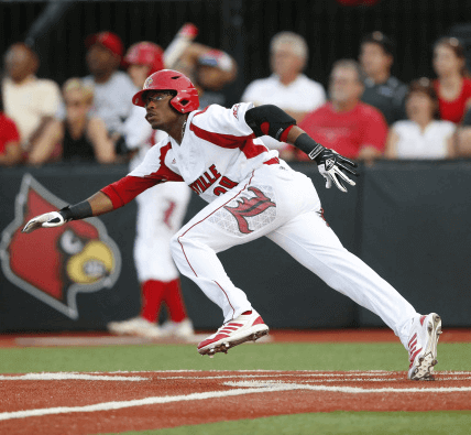
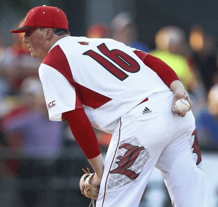
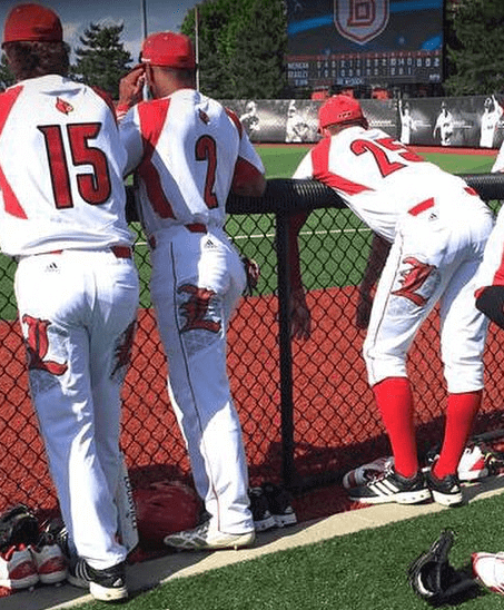
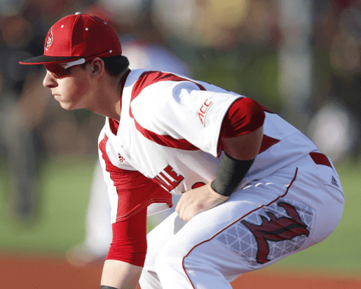
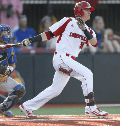
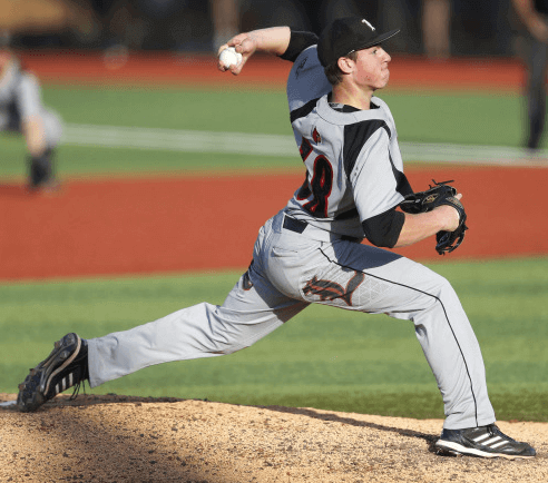
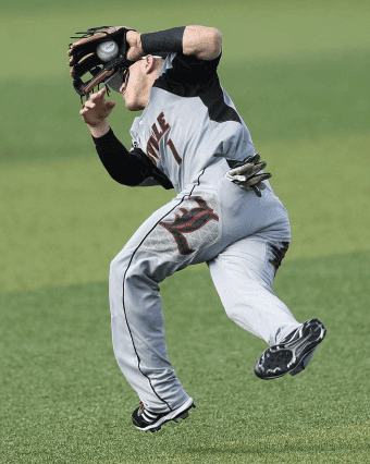
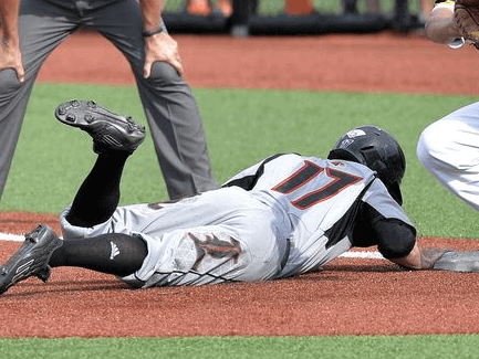
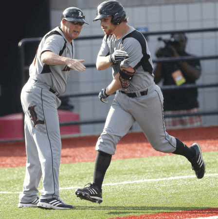
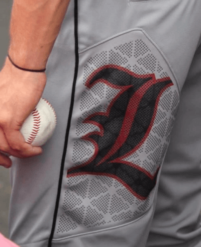
As you can see in that last shot, the logo is printed on what appears to be a mesh panel, which I assume is intended for either ventilation or padding/reinforcement. Texas A&M is wearing the same thing, only without the team logo, so they just have the mesh pattern:
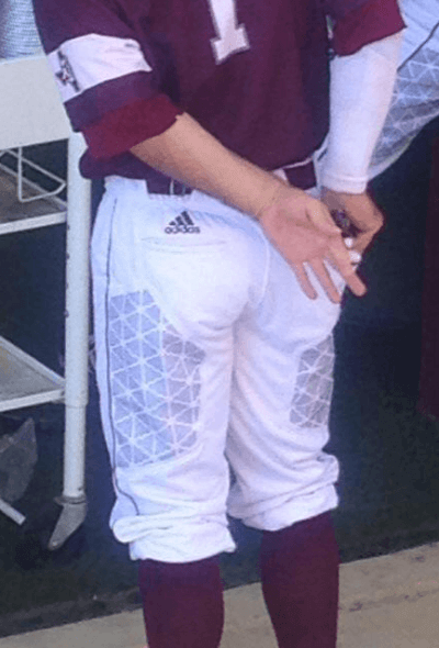
(Update: Reader/commenter Tap says, “The panels on the back of the pants are not mesh. They are ceramic dots applied to the pants to protect the pants from rips/tears in the sliding areas.” So there you go.)
They could have done that without making the panel so visible, of course. In other words, this has nothing to do with the teams and everything to do with a manufacturer — Adidas, in this case — making sure we all notice their new “innovation.” It’s the same stunt Nike pulls with the Nikelace, calling attention to a tailoring detail that could be just as functional if it were less conspicuous. It’s a bad move on two levels: It looks like shit, and it lets the outfitter upstage the team, which is not how uniforms are supposed to work.
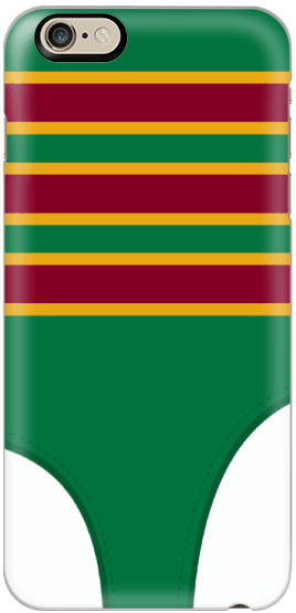
Next-to-last call: The official Uni Watch smart phone case, featuring a nifty stirrup-based design created by reader Matt Beahan, is available for only two more days. You know what to do.

Baseball News: Federal League throwbacks yesterday for the Cubs (who all went high-cuffed and the Royals (who did not). Uni numbers didn’t yet exist in the Federal League days, but the players wore them yesterday. Plenty of additional photos here. ”¦ Orioles 3B Manny Machado went high-cuffed with striped socks yesterday (from Andrew Cosentino). ”¦ The Giants normally wear their orange-brimmed alternate caps on Sundays, but not yesterday (thanks, Brinke). ”¦ The Wisconsin Timber Rattlers wore retro-ish unis based on Brewers throwbacks. … USC players turned a bunch of plastic chairs into some highly unusual rally caps. ”¦ Speaking of rally caps, Brewers C Juan Centeno wore an upside-down bubble gum bucket in the 16th inning of yesterday’s game against the D-backs (thanks, Mike).

Hockey News: Did Rolling Stones guitarist Keith Richards have an assist? That’s from Saturday’s Blackhawks/Ducks game, when Duncan Keith and Brad Richards assisted on Jonathan Toews’s second goal (nice one from Matt Larsen).

Basketball News: Here’s further confirmation that my reporting on the leak of the new Clippers uniforms was correct. ”¦ Speaking of leaks, it looks like the Hawks’ primary logo is now circulating. ”¦ I don’t know if this is the first time there’s been a QR code on a basketball jersey, but it’s the first time I’ve seen it. … Check out this old photo. Anyone know what brand of sneakers are being worn by the guy in the foreground?

Soccer News: Zenit wore special gold jerseys during their final game of the season, since they had already clinched the championship. Here’s a close-up of the front (from Alex Cohen). ”¦ New home kit for Sheffield Wednesday (from Patrick Barnett).

Grab Bag: Got an interesting note the other day from Doug Sears Jr., who asked, “Have you ever looked into why breathe right strips are exceedingly common in the NFL but never used in any other sport?” Interesting point. Anyone..? ”¦ If you like vintage spots graphics as much as I do, here’s a Twitter feed that’s definitely worth following. ”¦ David Firestone has graded all the Sprint Cup paint schemes. ”¦ New volleyball ref’s uniforms for the FIVB 2015 World League. Here’s the old look (from Jeremy Brahm). ”¦ Garbiñe Muguruza and Flavia Pennetta wore the same Adidas outfit while facing each other at the French Open (from Drew Stiling). … Reader Gene Sanny has completed his WFL electric football sets — look here, here, and here.

What Paul did last night over the weekend: I saw a ton of really good art over the weekend. First, on late Friday afternoon, my friend Robert and I went to a gallery show of 1920s Constructivist posters, magazine covers, pamphlets, and more, all created to promote the early Soviet cinema industry. I don’t know jack about early Soviet cinema, but I know plenty about Constructivism, one of the most compelling and influential art movements of the last century, and this gallery show was one of the best collections of Constructivist material I’ve ever seen in one place. Here’s a small sampling (for most of these, you can click to enlarge):
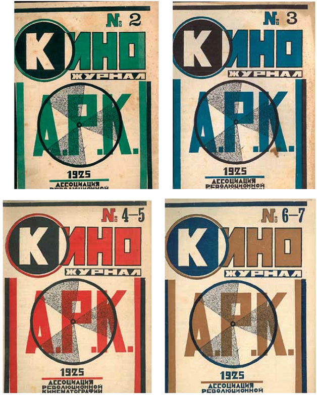
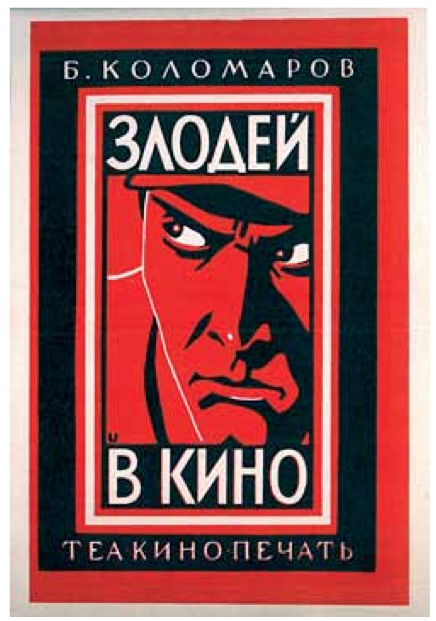
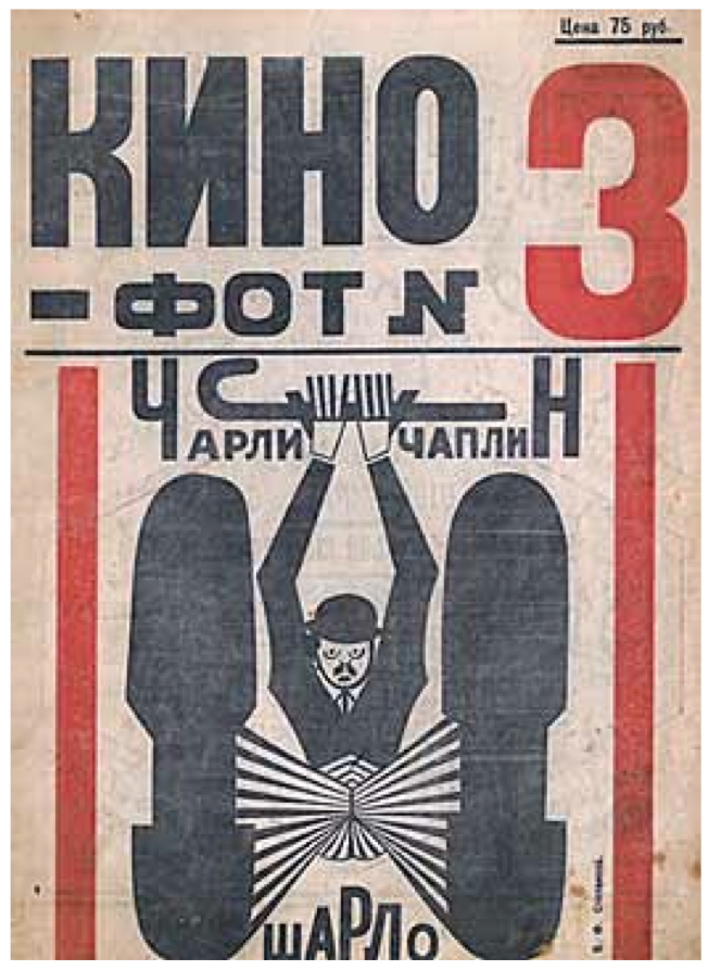
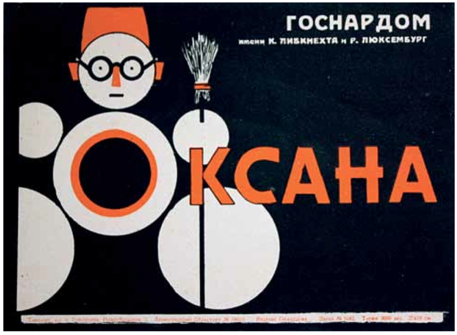
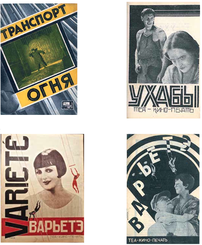
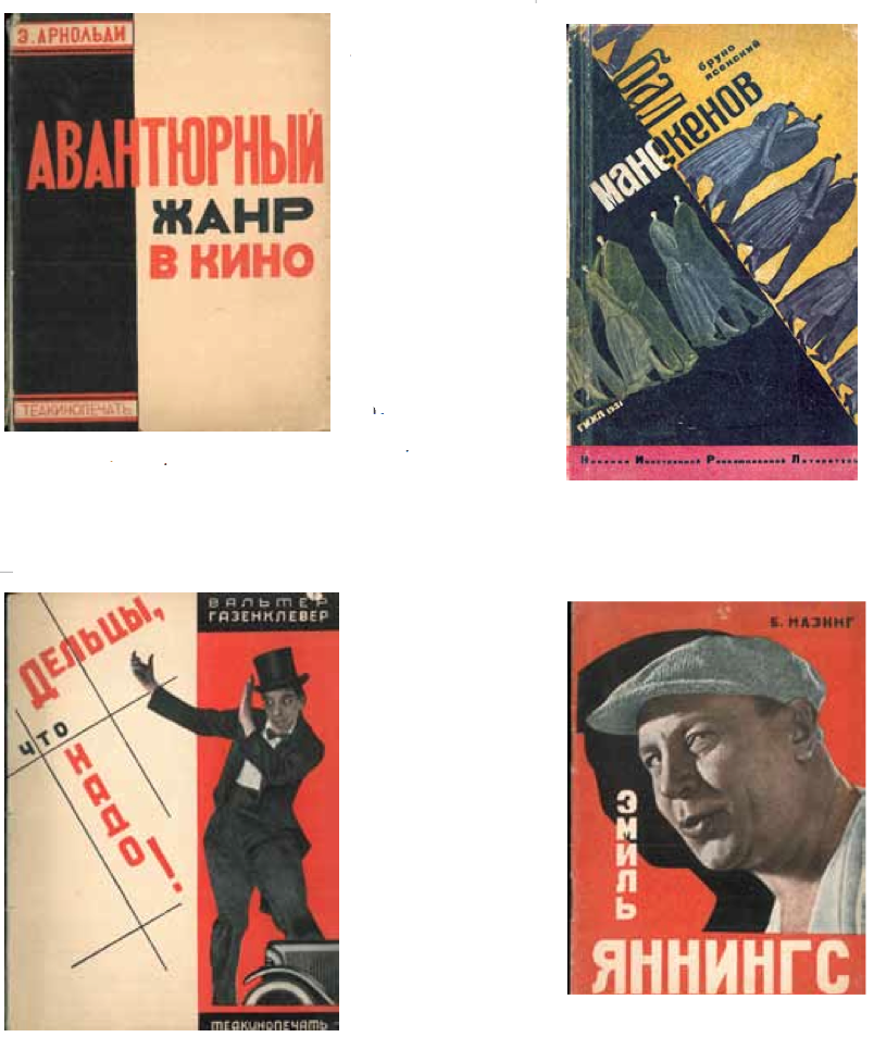
Great stuff, right? Unfortunately, the show finished its run on Saturday and is no longer available for viewing, but you can check out the catalog (which is where I grabbed all the images shown above) here.
After seeing that, Robert and I went downtown to check out the book party for a collection of early NYC punk/glam photos by the musician/photographer Paul Zone. Lots of great stuff here, some of which you can see in the slideshow at the top of this article. There were lots of first-wave CB’s/Max’s people on hand (including Debbie Harry herself, who brushed past me at one point), but the room was stultifyingly hot and humid, so I didn’t stay long.
The next day some friends and I went picnicking on Governor’s Island and then took the ferry back to Brooklyn Bridge Park, where there’s a series of installations by the Danish artist Jeppe Hein, endearingly titled “Please Touch the Art.” The most interesting piece is a labyrinth of mirrored aluminum planks, which is completely mesmerizing. Here are some photos (by me) and a short video (not by me):
Really cool public art installation at Brooklyn Bridge Park: a series of mirrored aluminum poles. Mesmerizing!
Posted by Paul Lukas on Saturday, May 30, 2015
The panels on the back of the adidas pants are not mesh. They are ceramic dots applied to the pants to protect the pants from rips/tears in the sliding areas.
Thanks. Will update text accordingly.
I still call bs, how often to pants tear/rip in that area? Definitely not enough to warrant that, what a joke.
Every year I played baseball (13 years, K-12) I had rips in that spot on my baseball pants. It’s for those that slide feet-first. The head-first slide wouldn’t get a rip there.
So, adidas now needs to “ceramic dot” the whole front for head-first sliders.
So… solving a problem that doesn’t really exist *and* making the uniforms ugly in the process. Nice jorb Adidas.
The Jeff – I like “nice jorb”–think it should become UW’s default sarcastic comment…
Whatever they are, from a distance they look a bit like tire tracks.
Well, that is an Adidas specialty, after all:
link
To me, those just look like those stretchy garbage bags.
Are they 100% for preventing rips/tears in those areas or is it for reinforced protection (or both?). There’s a whole line of sliding shorts, but they are normally a base layer as opposed to anything on the outside.
link
“Have you ever looked into why breathe right strips are exceedingly common in the NFL but never used in any other sport?”
Is it the same with oxygen bottles? My very random guess is that only in football do we have from 3 to 22 players run 40-80 yards. And then because of an incomplete pass or a penalty flag, everyone may have to perform the pass play, kickoff or punt again in one minute.
PS Love the poster art. My Cyrillic is a bit rusty; is that a Chaplin imitator in the #6 picture, or did the Soviets work out a distribution deal for his flix?
is that a Chaplin imitator in the #6 picture, or did the Soviets work out a distribution deal for his flix?
Pretty sure it was the latter. The show included several similar examples featuring other familiar American actors.
You never know. Charlie Chaplin once lost a Charlie Chaplin look-alike contest.
#6 definitely says Charlie Chaplin. My assumption is that it’s not a Chaplin imitator, just a Russian version of the poster for a Chaplin movie (Sharlo?).
(I can read Cyrillic, but I don’t necessarily know what it means.)
Thanks for the Cyrillic.
“Charlot” was the colloquial term in French for Chaplin or his Little Tramp. Strictly it means “Little Charles”.
(And I think it was also applied to a son of Charlemagne.)
RE: Breathe Rights….
I would think Track folks–particularly longer distance runners–would be using them too. Are they illegal or something?
Hockey, soccer, lacrosse, etc….. These players are constantly running/skating.
Peter Bondra used to use them when he played for the Washington Capitals.
link
I recall seeing Sergei Fedorov (hockey) using those breathe right strips back in the day…
I think the main limiter for endurance athletes is not the intake of oxygen, rather the ability to transport oxygen in the blood, hence the blood doping of cyclists and other such athletes. Breathe right strips don’t really do much, apparently
Some soccer players wore the strips in the late ’90s/early ’00s, but the fad passed quickly.
The real question is why *anyone* wears them. Like kinesiology tapes and compression socks and shooting sleeves, unless there’s a specific condition being addressed, the benefit is likely to be nothing more than placebo.
Robbie Fowler in particular was very famous here in the UK for using them.
When breathe rites came out in the 90s, they became popular for a minute. I remember a good number of NHLers and ball players wearing them , I even remember some NASCAR drivers, though I don’t recall the specific driver.
re: Clippers logo – it’s as if Ballmer has brought in the design team which brought you Microsoft Bob. All that’s missing is Comic Sans.
ed
This.
The sneakers in the foreground are pumas
Are they? I’ve never seen Pumas with a stripe running that way.
I’ve always seen it like…
link
Could the ones in that ticker photo be Sprints or something like that?
My first reaction was Pumas, as well, but I can’t prove it…
Is that Craig Kilborn in the picture for Montana State?
Yes.
link
I watched a good bit of the Cubs-Royals game yesterday. I thought it was interesting how they handled the batting helmets, which obviously didn’t exist 100 years ago. I would have made them match the caps in that case, but instead both teams wore matte black helmets with their respective Federal League team logos. Also, it was visually jarring to see the Royals manager wearing the throwback KC Packers cap with his Royals jacket. But overall I thought both teams looked sharp.
I was about to ask why the skipper needed a jacket at all, but then I checked the box score and saw that the gametime temp was 47º — on May 31! Wow.
Yeah, we had a pretty cold weekend in Chicago… and it had been in the 80’s on Friday.
It’s June 1st and the furnace in my house is on.
JUNE FIRST! Are you kidding me?
Cubs helmets were a dark blue – navy-ish…
Looking back at the photos, I see you’re right. However, it was a darker blue than the blue of their caps. Compare the helmet on player on the left with the caps on the other players in this photo. link
The navy blue matched the navy of the Whale logo and also the navy that the Cubs were wearing during those years.
I’m in the minority but I would love to see the Cubs go back to that color. It was their standard from the 19th century until about 1940.
Hello. I love your website. I was interested in the Federal League uniforms Kansas City and Chicago wore yesterday, will there be more write-up about it and pictures and information particularly about the Federal League teams these uniforms represented? Is this the same Kansas City team that Arizona dressed up as against Cubs last year? Really looking forward to this morning’s Uni Watch coverage of it but instead just a ticker blurb, really hope there is more coming?
The Soviet posters are neat but not if it takes up space meaning you don’t have room to cover all the uniform news that people come to your site for.. It is the reason people come to your site to read about the uniform stuff.
I see pictures of the uniforms on ESPN coverage of the game, but I want to read about particularly the use of the Federal League uniforms, and no one covers that stuff like UniWatch. Thank you!
P.s. I kind of like the L on the pants for Louisville.
The Soviet posters are neat but not if it takes up space meaning you don’t have room to cover all the uniform news that people come to your site for.
This is the internet — space is unlimited. It’s not a zero-sum game.
But certain other things are limited, including my time. I was out of the house almost all day and night yesterday. Got home at about 10:30pm and didn’t have the time or energy to do a full recap of the Cubs/Royals game, so it got the Ticker treatment. It happens. Thanks for understanding.
I understand, I just hope I can find in-depth uniform coverage of the game somewhere, if I can’t find it here I don’t know where else? Most media outlets don’t cover uniform aspects at all.
I think it doesn’t hurt to learn a little about art and design while at a sports uniform site.
Michael Emody, I agree. (I even said “The Soviet posters are neat”) It’s a moot point, because Paul already responded that it wasn’t due to a lack of space that the Royals-Cubs uniforms didn’t get full coverage in today’s Uni Watch. I never meant to imply so much that I didn’t like the Soviet posters, as it was that I was merely disappointed the expected uniform coverage I was looking for wasn’t here.
Maybe I can go to a art & design website and find a full “What Sergei Did Yesterday” write up about the Federal League uniforms by a Soviet Art Poster Critic in Chicago who happened to go to the Cubs’ game. I’ll admit, that’s probably unlikely.
To answer your question, yes Kansas City was throwing back to the same team that the Diamondbacks threw back to last year: the Kansas City Packers. It obviously makes much more sense for KC to do the throwback than Arizona. Also, the Federal League only lasted for two years (1914-1915). Last year’s Cubs-Diamondbacks throwback game celebrated the 100th anniversary of the first game at what is now Wrigley Field in 1914. This Cubs-Royals game threw back to the uniforms the teams wore in 1915 (which were different than last year). After the 1915 season, the American and National Leagues took over the Federal League, buying many of the teams. However, Charles Weeghman (owner of the Chicago Whales) was allowed to buy the National League’s Chicago Cubs and combined the rosters of the two teams, plus moved the Cubs from West Side Park where they had been playing to Weeghman Park (now Wrigley) that he had built for the Whales. So, the Chicago Whales are more than just another team that used to play in Chicago, they really are part of the Cubs’ heritage/lineage. P.S. This was seven years after the Cubs’ last World Series title in 1908.
Thank you.
I guess Uni Watch Comments is the #2 source for uniform coverage on the internet.
Yes, those are the worst baseball pants ever. Totally embarrassing.
You can remove the question mark from today’s headline, Paul.
To clarify: the panels aren’t the dealbreaker. Putting the L there is. I don’t even think Laverne Defazio would wear those pants.
Comment of the day.
We’ve hit a new low with those Louisville pants. Unbelievable.
As for the shoes in the Kilborn photo… I remember referring to them as “reverse Pumas.”
Could they be Kinney Shoes “Stadia”? I remember they’d knock off the latest cool designs, and slightly adjust the mark (4 stripes instead of three, and upside-down swoosh, etc.).
The other one that comes to mind, Dunlop. But I doubt that’s it. I can’t find anything that would support that. Or, perhaps the “Brown Shoe Co.” which sorta look like the ones Bruce Jenner wore back in the 70s. Fun stuff!
“In other words, this has nothing to do with the teams and everything to do with a manufacturer – Adidas, in this case – making sure we all notice their new “innovation.” It’s the same stunt Nike pulls with the Nikelace, calling attention to a tailoring detail that could be just as functional if it were less conspicuous. It’s a bad move on two levels: It looks like shit, and it lets the outfitter upstage the team, which is not how uniforms are supposed to work.”
This should be written out and nailed to the front door of adidas world HQ, like Martin Luther did.
As much as Nike gets trashed for the things they do, adidas is worse IMO. The March Madness uniforms are wretched every year (zebra stripes, wide color block across the tops of the shorts, sleeves), and now they have turned the efforts toward ruining baseball. The overdone tequila sunrise homage wasn’t enough so they put logos on hamstrings. Enough already. Stop.
It’s not every day one gets compared, however metaphorically, to Martin Luther. Hmmmm….
If you’re having girl problems I feel bad for you son
I got 95 theses but a bitch ain’t one
Strange, but I think adidas is a great manufacturer… of vintage-inspired designs.
If everything was under the trefoil brand, and maintained THAT design aesthetic, I think we’d have a much better adidas in this world. Of course, marketing currently panders to the all-things social media generation. That gen is too young to know any better.
Martin could probably just re-use one of his old standbys for this mess.
“The Lord commonly gives riches to foolish people, to whom he gives nothing else.”
adidas couldn’t do a decent baseball uniform if their life depended on it; even Michigan’s unis looked like crap.
Rally Cap chairs in Baseball Section – that’s Arizona Sate, not USC.
Arizona State.
Will fix.
…and Sprint Cup, not Spring cup it the ticker.
Fixed.
I’m pretty sure that is USC, not Arizona State.
Yes, definitely Southern Cal. link
Correct. The two box scores on the screen are confusing. The lower one is the game being shown. Here’s a better picture: link
Fixed back!
To concur…
U.S.C. – University of Spoilt Children
The interlocking SC on BP jerseys is a dead giveaway, that and the Cardinal and Gold colors.
ASU is Maroon and Gold.
Is the “continue reading” button for this article on the main page the new norm, or just a one-off to build up the suspense for the ugly pants? I hope the latter.
I propose we refer to the Louisville pants as the Ass-Ls…which, when said out loud, kinda doubles as a descriptor for whoever approved this latest “innovation”.
when said out oud? “ass less” ?
In my head I was hearing “Ass-ells”. Which, when I woke up this morning, kinda sounded like “assholes”. Probably shoulda had that second cup of coffee before commenting!
Something’s up with the soccer ticker item for Zenit – looks like an incomplete sentence and the link doesn’t work.
Coding glitch. Now fixed.
I don’t know if I’m the first to say it, but I just want to let everyone know that the new Hawks logo looks like the Golden Snitch from Harry Potter
It’s crap. But right now, I need to be outraged over the *other* new Hawks logo.
We’ve seen the bird head (“new Pac-Man”) often enough. But look what they’ve done to it now…
link
“Basketball Club”?
You have got to be kidding me.
Did Adidas have anything to do with this foolishness?
Why would Adidas bother? They’re getting out of the NBA in a couple of years anyway.
Maybe they like the idea of taking another dump on American sports on their way out the door.
That typeface is abysmal.
I guess more is more.
Would the L on the pants look “better” with an L on the jersey instead of the Louisville wordmark? That’s what annoys me. It feels redundant like NFL collar wordmarks, as if I can’t remember all of the teams.
For me it would aesthetically be acceptable with an L on the jersey.
A reader named Vince Guardado sent in an answer regarding the basketball shoes: “Those are link. They were big about 30 years ago as they were the first to have ‘Double High Tops.’ They were higher than the normal high tops that Nike, Adidas and Converse had.”
Cool. Thanks, Vince!
I *loved* Jaclars. I didn’t like high-tops, but my Jaclar low-tops were the most comfy sneakers I ever had.
Nice work, Vince!
Great find on the shoes Vince. Now, the next question. Any idea who the Craig Kilborn-led Montana State Fighting Bobcats are playing? Looks like the jersey has words above and below the numbers (like Kilborn’s) and the word on the shorts ends with an O.
I think the sneakers in that basketball photo were “Stadia” brand. My friend had a pair, and I always thought they were bad Puma ripoffs!
That’s what I was thinking above… because Kinney Shoes was notorious for modeling the designs of the day. Heck, the “Stadia” could be a whole article post unto itself. ;)
Can we just call those panels “fart vents” and get it over with?
I don’t know jack about early Soviet cinema, but I know plenty about Consructivism
…except how to spell it. ;)
Touché. Now fixed.
is it just the way the photo turned out or is the catcher on the left link?
It’s the photo. Zoom in and you’ll see the “pinstripes” on his hands, too.
The Giants have stopped wearing the orange billed caps on Sunday. They now wear them for Friday home games with the orange jerseys. I’ve always though that that is how it should be and was pleasantly surprised when they made that change. They’ve been doing it all season thus far.
Regarding Breathe Right strips and NFL, I think most other sports don’t require the short and intense efforts that NFL players do, so I don’t think the strips are of benefit. Athletes in soccer, hockey, etc. probably don’t spend too much time at the top of their aerobic levels like NFL players do. I think it’s probably of little benefit to NFL players as well, maybe placebo effect.
Found this just now link
Found this about breathe right strips, prob not very useful
link
I was going to guess that it would only be useful at the top of your aerobic range, approaching VO2Max, and that most athletes in other sports don’t work at that high of a rate during games or races. NFL players have short bursts so maybe they feel it helps them, but maybe they should just spend more time working on their fitness.
But I think that NHL/hockey players have a similar short burst approach to their shifts. I believe the average time per shift is just below a minute. That’s why they’re always exhausted when they’re coming off the ice, because they just skated their lungs out.
Posted above but will repost for people who just scroll to the bottom and add some other thoughts re: Breathe Right strips:
I think the main limiter for endurance athletes is not the intake of oxygen, rather the ability to transport oxygen in the blood, hence the blood doping of cyclists and other such athletes. Breathe right strips don’t really do much, apparently
In looking quickly online, it does seem that breathe right strips aren’t really helpful for sports. I was thinking that NFL players have such short bursts of hard efforts at the top of their aerobic capacity that they may find this useful, but I don’t think most athletes really spend that much time at the high end of their aerobic capacity, so I wouldn’t imagine that outside of a very limited scenario that other athletes would even think this to be useful.
Many American Distance runners, such as Galen Rupp (link) & meb keflezighi (link) use brethe rite strips, but like compression socks I think the mental gain actually is bigger then any physical gains in performance.
I’ll be talking about MLB logo designer Jerry Dior, who recently passed away, on NPR’s ‘All Things Considered’ today, 4:16pm-ish Eastern.
The Hawks secondary logo looks a little like the old Atlanta Flames logo, only with a basketball being carried with wings on it.
It’s bad enough to see Louisville’s players wearing those ridiculous pants, but it’s farcical to the point of surrealism to see that third base coach in them. I can’t conceive of a scenario where the “reinforced sliding panels” would ever be needed by any of the coaching staff. Certain sayings about boars and mammary glands come to mind…
What? Couldn’t Louisville get Victoria’s Secret to embroider “PINK” across their asses?
Clippers wordmark looks like NBA playoff wordmark with the swooshes. Very generic.
I know there have been posts about other leagues/teams using already established logos, yet I was searching team crests from association football leagues from around the globe and came across the Huachipato Steelers from the Chilean Primera Division who uses Pittsburgh’s logo in their crest:
link
It wouldn’t surprise me that they received permission from their American counterparts.
WHOAH, hang on.
I don’t know why I missed it earlier, but I was looking over pics of the Chicago Whales throwbacks, and noticed something.
Check this out:
link
With a couple exceptions, the Cubs all have stirrups that are half-blue, half-white. Worn with white sanis, it ends up looking rather like football socks.
Anyone else think that’s just really cool?
Love that style. Was fairly common (or at least not uncommon) a century ago. And yes, it’s very similar to the NFL style.
The Cubs wore those socks when they threw back to link, back in link. When they wore them again in 2012, they had link.
Back in 1997 they even had a better link.
I would love for these to be the regular Cubs road uniform again. Just use today’s number font and it’s perfect.
The Giants not wearing orange-billed cap on Sunday at home is nothing new. Those caps appear mostly on Orange Fridays at home paired with orange jersey. The alternate cap is also often worn with the Sunday road SF jersey.