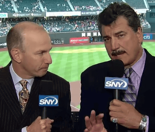
I mentioned in yesterday’s Ticker that I wouldn’t be watching the Mets on Monday night because they were scheduled to wear their brutal camouflage uniforms (which are even worse this season because they’re now paired with the pinstriped pants). But I ended up flipping channels between the Rangers and the Mets, and it’s a good thing I did, because I happened to be watching the ballgame when Mets play-by-play man Gary Cohen and analyst Keith Hernandez, both shown at right, ended up discussing Uni Watch on the air.
It happened in the bottom of the fifth with Mets third baseman Daniel Murphy at the plate, when Cohen and Hernandez began discussing the camouflage jerseys. Here’s a transcript:
Gary Cohen: First time this year the Mets are wearing the camo jerseys. What I remember most about the camo jerseys last year? That’s what Jacob deGrom was wearing when he struck out the first eight [batters of the game] against Miami.
Keith Hernandez: That’s right.
Cohen: I’m sure our statistician will find for us the Mets’ record in the camo jerseys last year. [Pause, while apparently consulting with the statistician.] He just shrugged his shoulders, as if to say, “I’m not sure I can figure that out.”
Hernandez: I don’t think that will be in the computer.
Cohen: You don’t think so?
Hernandez: I don’t think so.
Cohen: Somebody is keeping track of that. There’s a website called uni-watch.com — I’m sure they”¦
Hernandez [sounding disgusted]: Nooo!
Cohen: Yeah! They keep track of every little subtlety in every uniform.
Hernandez: They have nothing better to do.
Cohen: What they’re doing is carving out a niche for themselves. If you can be an expert in one sliver of an area, you can dominate your field.
And that was it. Based on this exchange, it would be easy to dismiss Hernandez as someone who Doesn’t Get Itâ„¢, but that’s actually not the case. He frequently offers uni-related observations. Later on in last night’s game he pointed out, correctly, that this is Cardinals outfielder Jason Heyward’s third season wearing his protective helmet extension. And Hernandez also makes it clear on a regular basis that he took his own uniform very seriously back when he was a player. Just the other day, in fact, he noted, with a discernible hint of pride, that the piping on his jersey and pants was always aligned. Asked by Cohen to name a teammate whose piping didn’t align, Hernandez thought for a moment and then said, “Doug Sisk.” And he was right!
Hernandez, in other words, is one of us, but he’s selectively myopic when it comes to his own idiosyncrasies. He’s hardly unique in that regard, of course (I think we’re all guilty of that a certain degree), but it’s funny to hear it when he’s talking about Uni Watch.
As for the Mets’ record while wearing camouflage last year, that’s a question that can’t be answered on Uni Watch — we don’t track MLB records by uniform. It can be answered, however, over on SportsLogos.net, a site that Cohen apparently isn’t aware of (and whose existence Hernandez would no doubt find doubly flummoxing).
That Mets/Cards game, incidentally featured a particularly uni-notable moment when Mets reliever Alex Torres came into the game. Torres, as you know, is the player who wears that protective halo over his cap. But the Mets have, like, eleventeen different caps, so Torres wears a different halo for each one. For weeks now Phil and I have been wondering what his camouflage halo would look like, and last night we found out (screen shot by Phil):
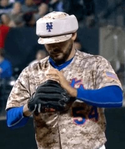
As you can see, his camo halo isn’t actually camo — it’s just khaki. Naturally, I see that as a big improvement, and of course now we can all make our “Why does Alex Torres hate America?” jokes, but it is surprising that Pinwrest, which makes Torres’s padded halos, didn’t use camouflage fabric. I’ll try to find out why — stay tuned.
T-Shirt Club ”” June design now available: Last week I gave you a sneak peek at the Uni Watch T-Shirt Club’s June design. That shirt — the “black for black’s sake” design, sure to be a conversation-starter with people who’ll be puzzled by the “BFBS” NOB — is now available.
This shirt, incidentally, was instrumental in the creation of the T-Shirt Club. Last November, when Teespring designer Bryan Molloy first contacted me with the idea of designing a few Uni Watch shirts (this was before we’d come up with the idea for a monthly club), he said, “I’d really love to do a black one. It’d look great!” And I said, “Yeah, but come on — I’m always criticizing teams that go BFBS. I can’t start doing that myself!” So Bryan mocked up a shirt with “BFBS” on the back, which I thought was pretty damn clever, and that’s when I started thinking, “Oh, we can do all sorts of designs, even ‘bad’ ones, as long as we call them out as such.” Then it becomes part commentary, part art project, and very meta, all of which I found appealing. And that’s how the T-Shirt Club idea was born.
Okay, enough backstory — let’s take a look at the June shirt (click to enlarge):
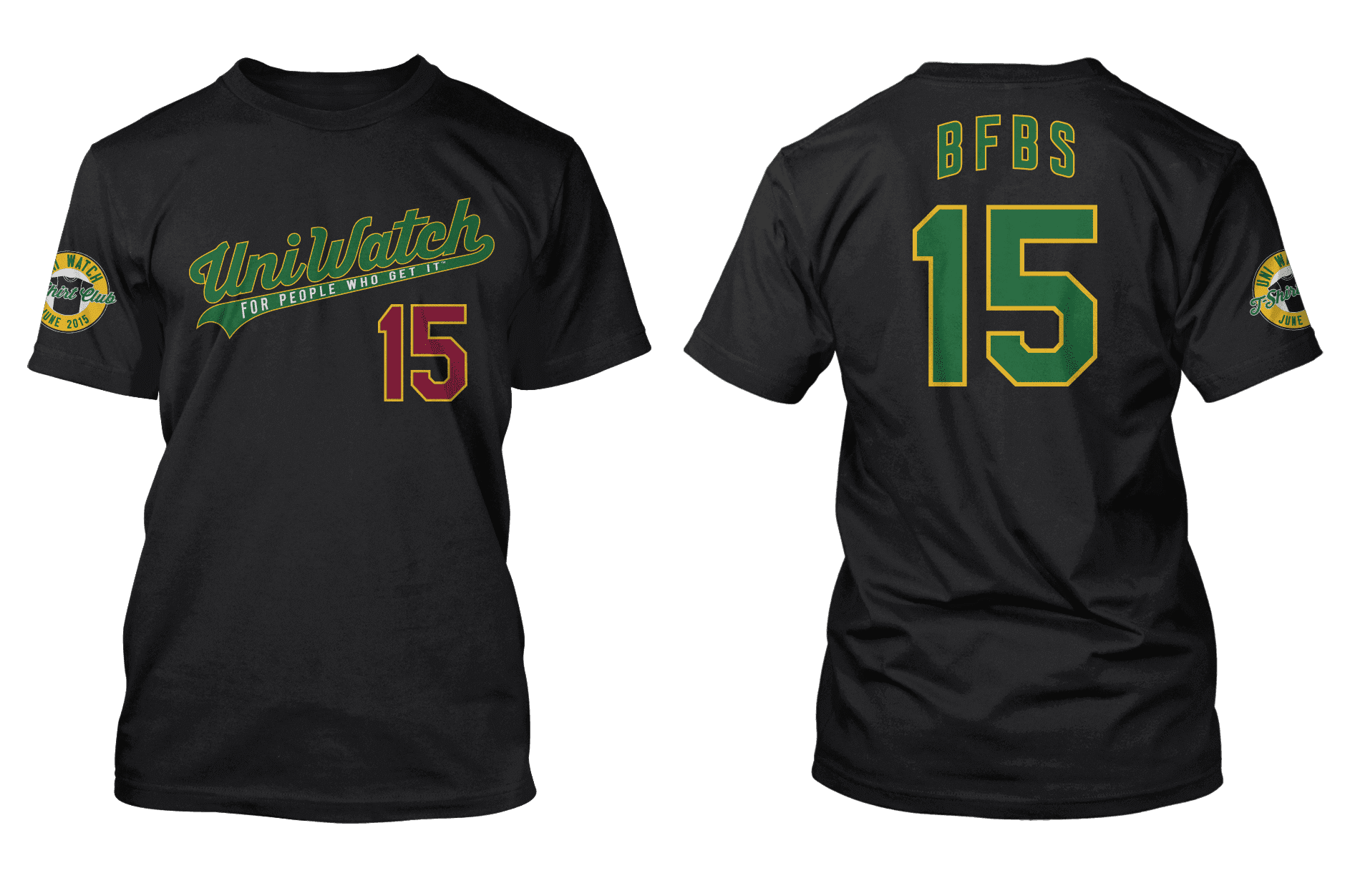
Here’s everything you need to know about this shirt and how to order it:
1. You can purchase the June shirt on this page. (Ignore the bits about “reaching our goal” and the “campaign being successful” — that’s for Teespring clients who use T-shirt sales as fundraisers.) Domestic shipping is $3.85 for the first shirt, $1 for each additional shirt; Canadian shipping is $9.50 for the first shirt, $4 for each additional; shipping to other international destinations is $12.50 for the first shirt, $4 for each additional.
2. As you can see on the ordering page, you have a choice of American Apparel or Hanes. Their tailoring and sizing are slightly different, so use the size chart button to see which shirt is best for you.
3. This design will only be available through next Tuesday, May 26, 11pm Eastern. (That’s one day longer than usual, because of the Memorial Day holiday.) After that date, the shirt will not be offered for sale. All shirts ordered by then should be delivered by June 10, and in many cases well earlier than that.
4. We want the July shirt to deliver in time for Independence Day, so it will launch on June 9. I’ll preview it on the site the week before that.
5. After we finish selling the July shirt, I’ll check to see how many people have bought each design, so I have a sense of how many people are in eligible for the year-end bonus prize. Once I get a sense of the numbers involved, I’ll have a better idea of how to proceed with the prize.
I think that’s it. Again, the June shirts can be purchased here. If you have any questions, give a holler. Thanks.
(Special thanks to Teespring designer Bryan Malloy for all his great work with the T-Shirt Club designs.)
Collector’s Corner
By Brinke Guthrie
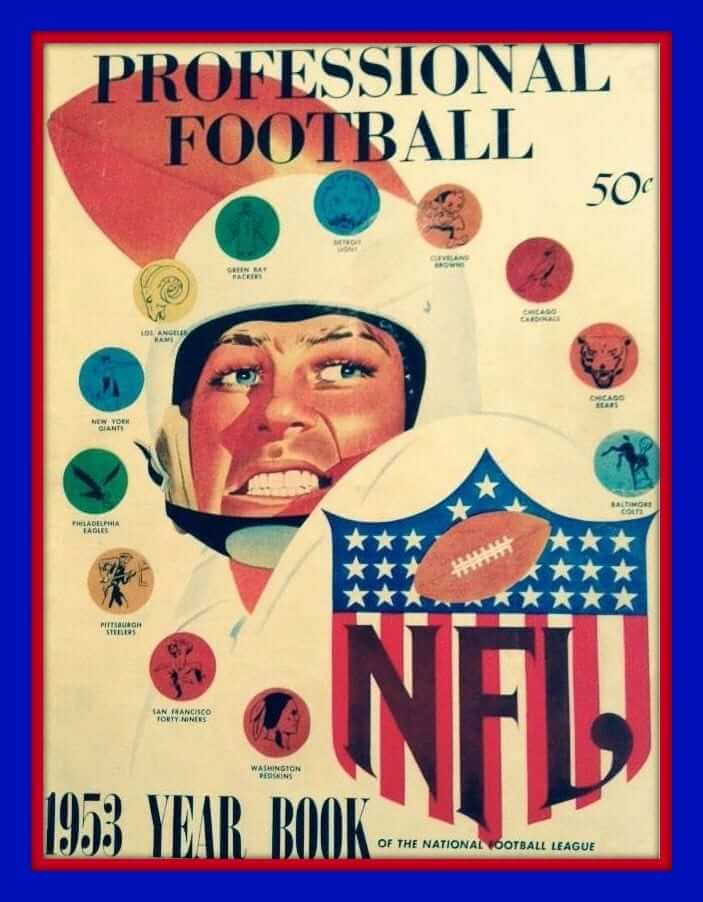
Leading off this week some great art on the cover of this 1953 NFL yearbook.
This is a proven fact: If it’s NFL retro, I love it.
Let’s see what else we have this week:
• Here’s a Dave Boss poster I’ve never seen before, featuring the San Diego Super Chargers. You’d almost think this was painted from a John Hadl/Paul Lowe photo, given the jersey numbers. Never seen this Raiders poster, either. That same eBay seller has several other Boss posters for sale, including this Bills poster. Usually the featured team player is doing something heroic, but in this case he’s getting sacked!
• Did we say John Hadl? Here he is sporting classic uni and helmet look on the cover of The Sporting News from 1968.
• I have a set of ABA Kentucky Colonels Pro Star Portrait thermal cups with the Volpe art. Here’s a set for our then-arch-rival Indiana Pacers. What’s interesting here — and I had forgotten about this — is you could also get a full-size poster featuring all the photos in the set, as well as a collector’s album. I don’t think I owned those, though.
• More ABA: Take a look at the logo in the top-left corner of this 1968-69 Miami Floridians media guide. Great cover art on this Minnesota Pipers guide, too.
• From reader Will Scheibler, here’s a game-worn Rollie Fingers jersey from the West Palm Beach Tropics. Definite Dolphins vibe here.
• I don’t think I’ve ever seen gumball helmets for the USFL before, but here’s one for the L.A. Express. Speaking of gumball helmets, this NFL set is impressive, and look at the helmet stripe on the CB Browns.
• Here’s a 1970s NHL Mini-Sport kit that’s never been assembled.
• Always liked the “roster” pennants. I had one for the 1975 and 1976 Reds for their Series wins, but this Reds pennant for the 1961 World Series against the Yankees was a bit before my time.
• Nice design on this 1969 NFL Pro Bowl ticket stub.
• Here’s a lot of 16 different Mets pennants from the 1960s and ’70s.
• Not sure when this “vintage wood oil painting” was created, but it provides an interesting take on a late-1960s Cubs uniform.
Follow Brinke on Twitter: @brinkeguthrie
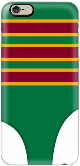
Phone case reminder: In case you missed it last week, the Uni Watch smart phone case, shown at right, is now available. Additional details here, or just go straight to the ordering page.
Accursed color update: Yesterday’s Purp Walk went well — lots of purple-centric membership sign-ups, and people seemed to enjoy the site’s one-day purple makeover. My thanks to all who helped make the day a success. The next Purp Walk will take place on Tuesday, May 17, 2016.

Baseball News: Lots to like in this old photo of Ty Cobb talking to some kids. Cobb’s sweater, the kids’ caps, everyone’s knickers — tasty (big thanks to Austin Gillis). ”¦ Louisiana-Lafayette softball pitcher Christina Hamilton wears Major League-style glasses on the mound (from John Gogarty). ”¦ At first I thought Angels pitcher C.J. Wilson’s cap was splitting along a seam or something like that yesterday. But when I posted that photo on Twitter, people quickly pointed out that he’s actually wearing a red headband beneath the cap (thanks, Mike). ”¦ Here’s a set of uniform trackers for the SEC teams (from Kevin Ives). ”¦ Astros P Lance McCullers made his MLB debut last night and wore Batman logo shoes for the occasion. ”¦ 1906 Fresno Raisin Eaters throwbacks upcoming for the Fresno Grizzlies (from Jared Buccola). ”¦ When the Marlins moved Dan Jennings from the GM’s suite to the manager’s office yesterday, people jokingly said, “Will he wear a tie?” And the answer turned out to be yes! (Thanks, Mike.)

NBA News: Here’s a really good article on the logistics, economics, and psychology of NBA postseason T-shirt giveaways. As you might imagine, I take a pretty dim view of the way teams pressure fans to wear the tees (using the scoreboard to shame your paying customers into dressing like everyone else seems particularly odious), but the larger phenomenon of these tees is definitely interesting. Recommended reading. ”¦ This is pretty great: A bunch of Philly-based actors who play Ben Franklin in various contexts were asked to assess the Sixers’ new Dribblin’ Ben logo (from Tom Hirt). ”¦ That same artist who’s been doing great representational drawings for each round of the NBA playoffs has done a new set for the conference finals (thanks, Mike).

Soccer News: “Football League in England (2nd-4th division soccer) has new sleeve patches for its promotion playoffs,” says BW. ”¦ Valencia players showed concern for the Nepali earthquake victims by wearing Nepali NOBs, with the jerseys being auctioned off for relief charities (thanks, Phil). ”¦ Steven Gerrard will be playing for the LA Galaxy soon, but he’s not a Galaxy player yet, so he refused to sign a fan’s Galaxy jersey after his final game for Liverpool (from @holycalamity).

Grab Bag: Pitt will apparently have new football uniforms in 2016. … Students at Texas A&M were so upset about the school’s recent change to the beveled logo that they changed the school’s entrance sign (from Greg Keith). ”¦ New logo for Northern Colorado athletics. ”¦ The Obama administration’s newly announced ban on federal agencies providing military equipment to local police departments includes a prohibition on “certain types of camouflage uniforms.” … As you may have noticed, Triple Crown hopeful American Pharoah’s name does not have the proper spelling of “pharaoh,” which has led to lots of typos as editors mistakenly impose the “correct” spelling onto his name (from Brian Spiess). ”¦ You know how many apps and websites (but not this one) have those three lines that indicate the presence of a menu? That’s called a “hamburger icon,” which I didn’t know until I read this article about it (thanks, Brinke). ”¦ “With Dave Letterman doing his final shows this week, it seems appropriate to share this pic of him and the Comedy Store basketball team in their unis from 1976,” says Phil Johnson. “Here’s the related blog entry with the backstory (and a whole lot more).” ”¦ A rugby team in New Zealand had its uniforms stolen. ”¦ A North Carolina boy was banned from his prom because he wore his grandfather’s kilt. ”¦ ’47 Brand is selling a line of MLB and NHL caps with rainbow team logos for gay pride (from Matt Porges). … Oooh, check out this L.A. Rams bowling pin! That’s pretty good — someone should DIY a full NFL set! (Big thanks to Larry Brunt.)
“As for the Mets’ record while wearing camouflage last year, that’s a question that can’t be answered on Uni Watch – we don’t track MLB records by uniform.”
~~~
Ahem. (Start at about 21:00)…
Someone still calculates the Mets uni records on Uni Watch. But Chris Creamer does a much better job because he does it graphically (and for every MLB matchup).
Nice move by Northern Colorado – a rare contemporary case of a logo becoming less fierce/angry looking.
Congrats on the mention!
I liked the phrase “less cartoonish” in the linked article. Is this the start of a trend? If so, I hope it will continue with fewer “clawmarks” on uniform sides.
LA Rams item in the baseball section of the Ticker.
Thanks. Now moved to the grab bag.
Based on his adamant nature, I wouldn’t be surprised if Keith “Magic Loogie” Hernandez is actually a closet uni watcher.
Have you ever seen his scorecards? Guy uses like 8 different highlighters and shit. I’d be surprised if Keith didn’t somehow make at least mental notes of the unis…
Thing’s like a goddamn Christmas tree!
If he knows enough about the site to supposedly find it annoying, then one might presume that he’s already spent a bit of time looking at it.
And given his own uniform-related fixations, I’m inclined to agree that perhaps the gentleman doth protest too much.
I think Hernandez gets it and would probably get some enjoyment out of this site, but I think when you’re first introduced to the concept of this site that someone is keeping track of these types of things, it is more of a “are you kidding me/who cares” reaction.
But I think a few of the things that make this site successful is the delivery of the content, the quality of the content and the broad array of things that are covered, even when Paul gets off topic. Paul’s quality writing doesn’t hurt either, after all he’s written about bread bag tabs and I read it all the way through.
I don’t think I’ve ever seen gumball helmets for the USFL before, but here’s one for the L.A. Express.
You’ve never seen them before because they didn’t actually exist. It’s a custom made helmet. Not only does the description say that, but look at the sticker… it’s got a bit of a jagged scissor-cut edge to it and the color is totally off.
Yep. There is a whole world of guys making custom gumball helmets (I know cuz I used to be one of them!).
Here’s a for instance:
link
Who are the Raiders playing in that Boss poster??
Practice squad.
Raisin Eaters?
Now I’ve heard everything. And I remember <a href="link
"These grapes taste like Fresno!
That “1970s NHL Mini-Sport kit” is interesting… it’s identified as an “NHL East” set, but the insert card shows the teams of the 1976-78 Campbell Conference. Weird.
Keith Hernandez once made a big deal of matching powder blue Crocs to his powder blue SNY polo shirt. He then talked about powder blue in the 70’s, and how much he loved seeing and wearing the color because it reminded him of his hometown San Diego Chargers. This is not a man who does not Get It(tm). I hate to use the phrase “come out of the closet” for this, so let’s just tell Keith he has a lot more in common with Uni Watchers than he might recognize.
That guy sounds like a metrosexual Tim McCarver.
Alex Torres was actually providing a preview of the Battle of Endor night:
link
There were some great ones tweeted out last night…
You jest, but something like that rebel helmet is probably the future of baseball headwear. And it will certainly be an aesthetic improvement over Torres’ noggin-bumper.
When that day comes, will fans want to wear padded MLB helmets? And if so, will they leave the size sticker on the brim?
Maybe Keith Hernandez was just bummed he’s missing out.
I both want and don’t want to start tracking attendance by uniform. What if we boycotted our favorite teams’ camo games? But what if attendance accidentally went up on bfbs/neon/Star Wars games. Thin line.
Finally, Valencia *showed* not “should” support, in the soccer section of the ticker.
Fixed.
I LOVE the NBA Playoff matchup illustrations – especially how the artist has incorporated a piece of the teams already beaten into the drawings moving forward – the Cavalier with the leprechaun’s shillelagh and a bull’s horn on his belt. Love it!
I’ve enjoyed these, as well. The Warrior dude wearing grizzly paws and pelican feathers as trophies is a nice touch, though it makes me somewhat curious as to whether the artist is making an intentional reference to the franchise’s early use of native imagery.
Speaking of which, given that such cultural misappropriation has been long-abandoned by the team (even the name “Warriors” seems to now suggest a more generic concept of “fighters” or “combatants”), is Golden State off-limits for Uni Watch membership card designs?
Just the other day I featured a new enrollee’s “The City” design.
OH! I see it now. That’s a nice one, too.
I must have overlooked it in the midst of all that NBA Christmas craziness…
I think the Warrior’s more a reference to the superhero-esque dude in the previous logo rather than anything Native American – hence holding the lightning bolt (although I can see how the placement of the bear paws and feathers could lead one to make that assumption).
“…Take a look at the logo in the top-left corner of this 1968-69 Miami Floridians media guide…”
Whoa. Now this is just great. That dribblin’ Floridian deserves prominence in the poster that Brinke will commission of all the NBA/ABA mascots who are depicted bringing the ball up court.
To Paul and Phil,
Have either of you had the opportunity to get your hands on a protective halo?? I am curious to know how light (or heavy) it is. I wonder how comfortable (or uncomfortable) it is to wear.
Not me. And I’m pretty sure not Phil either.
Nope.
‘The Obama administration’s newly announced ban on federal agencies providing military equipment to local police departments includes a prohibition on “certain types of camouflage uniforms.”’
Eh…I was going to stay away from this stuff, but if you’ll indulge me this inquiry…
Why would police departments need camouflage for *anything*? Seriously, unless a cop is working undercover, he or she wants to *stand out*, not blend in. I thought that the whole point of police uniforms was make it immediately obvious, even at a great distance, that *these are police officers*.
Why would a department ever want to diminish that visual effect?
Well, seeing how some people are rioting over certain police actions lately… I can kinda see how a cop might want to not look like a cop.
Well, it kinda speaks to the change in the role (and attitude) of the police over the last 30 years, right? I mean, they have a War on Drugs – police departments have been seeing themselves as and acting like military branches in recent years. Look at the link:
In the 1970s, there were just a few hundred a year; by the early 1980s, there were some 3,000 a year. In 2005 (the last year for which Dr. Kraska collected data), there were approximately 50,000 raids.
Because a lot of them like to play soldier.
About the only justification I can come up with is if you’re a police sniper acting in a hostage situation, which I would wager is a pretty miniscule occurrence. Apart from that, there’s no compelling reason I can think of wear donning camouflage serves a legitimate law enforcement purpose.
Oh, and I guess maybe if you’re conducting raids on meth labs, moonshining operations, and the like in remote areas.
A complete list of situations in which a police officer serving a city or suburban police department has a justifiable need to wear camouflage:
1. When he’s off duty, and goes hunting.
2. When he’s off duty, and serves in the National Guard.
There are any number of federal and state agencies whose law-enforcement personnel might have a need for camouflage. And it’s possible to imagine situations in which rural police departments or sheriff’s offices would need camo for force protection. But in an urban or suburban setting in North America, the only situations where camo is not absurd are exactly the sorts of rare, extreme cases for which we maintain a National Guard and an Army, who already have all the camo they need.
Place your bets on the July design: Will it be Flag Desecration style, or GI Joe style?
I’m going with Flag Desecration.
Late autumn is most likely to bring some G.I. Joevember.
Question is, will anyone buy it?
Canada Day? No?
link
“Cobb’s sweater, the kids’ caps, everyone’s knickers – tasty” anyone else slightly creep-ed out by this sentence?
You know how many apps and websites (but not this one) have those three lines that indicate the presence of a menu? That’s called a “hamburger icon,”
Now I’m going to think about link every time I use a mobile app.
Being a huge Cardinals fan I had the game on last night. I did not realize how brutal the Mets camo uni’s were until you see them on the field. Paired w/ the caps takes it to a new level of shitdom. Just looks so bad.. They do not look like major-leaguers so glad the Cards have not fallen prey to this!
Hopefully this is just a minor temporary issue, but I’m repeatedly getting a server error when trying to go to the page to buy a shirt.
I had that problem for a coupla minutes too, but it seems to be fixed now.
I’m kind of hoping he did this specifically to you, just because he knew you’d be all over the BFBS one. Lol
KEITH:[thinking] Go ahead. Kiss her. I’m a baseball player dammit.
ELAINE: [thinking] What’s he waiting for? I thought he was a cool guy.
KEITH: [thinking] Come on I won the MVP in 79. I can do whatever I want to.
KRAMER: I hate KEITH HERNANDEZ – hate him!
NEWMAN: I despise him.
ELAINE: Why?
NEWMAN: Why? I’ll tell you why…
KRAMER: Let me tell it ..
NEWMAN: No, you can’t tell it ..
KRAMER: You always tell it ..
NEWMAN: All right, tell it.
KRAMER: Ja ja ja – just tell it
Those Raisin Eaters uniforms look sweet!
I’ll see myself out.
Hey DIYers, can I pick your brains?
How hard is it to paint link?
I’ve never done this before, but I’m keen to learn.
I’m not a huge DIYer, but I’m not sure what you’re asking. Are you talking about painting the SF logo instead of using a decal, or what?
The listing says there are scuffs on the helmet. How hard would it be to make it look pristine?
A Connie Hawkins sighting!
And the Minnesota Pipers–in their debut season–get to proclaim themselves ABA Champions! A marketing gift (which didn’t do much good, turns out).
And, to take it full circle, it was the Muskies who left Minnesota to become the Floridians.
Anyone else have this issue…when I have a tab open in my browser for Uni Watch, and there is an Adobe Flash object embedded anywhere, even from 3 days ago, on the page, my mouse pointer disappears on all tabs in my browser. Originally I thought this only happened at home using IE11, but it is even happening at work using Firefox now. If I close the Uni Watch tab, pointer functions normally. Quite vexing.
Is Everett Golson the first college player to wear 3 different manufacture brands in a single college career? He has worn Adidas and Under Armor. Now that he has signed with FSU who wears Nike that makes 3 different brands.
what’s that Packers logo on the 1953 NFL Yearbook? anybody got a better view?
Did anyone else think the Timberwolves logo looked terrible in ESPN’s graphics during the draft lottery? When they got the card for the number one pick that logo still looked the same but the eyes were different and the face looked broader in the graphics. I hope that’s not a slip of a revamped logo.