Last month I solicited design submissions for a Uni Watch cell phone case, with the winning designer slated to win a $100 cash prize. Today it’s time to take a look at the best designs and let you vote to choose a winner.
First I want to acknowledge some good ideas that didn’t quite make the cut: Adam Walter’s design featured a green dot, like the ones on radio-equipped NFL helmets (might have worked better if the dot had been smaller); David Firestone came up with a Uni Watch funny car; Timothy Fesmire depicted part of a grey flannel baseball jersey, complete with buttons and a partial headspoon; Aaron Peak came up with a nice mesh fabric motif; Caleb Borchers tried to appeal my love of infinite regressions; Alex Giobbi plastered his design with assorted logos from Uni Watch history, creating a luggage-sticker effect; and our anonymous DIYer, true to his goalie-centric leanings, came up with a design based on a waffle-board blocker.
I like all of those, but I chose three finalists that I like even better. Here they are, in no particular order:
1. Blake Pass
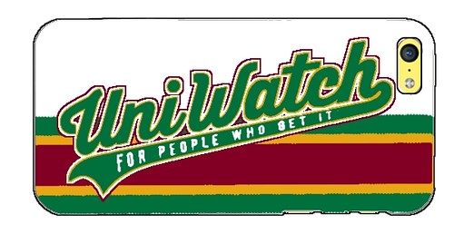
Blake used the script from the Uni Watch T-Shirt Club and paired it with the stripe pattern from the blog — a good combo. The outlining on the script could use a bit of a touch-up, but otherwise this looks really good.
2. Matt Beahan
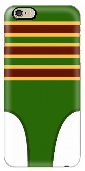
Many, many entrants came up with stirrup-themed designs (including Timothy Fesmire, Emma Bruno, Dick Holbrook, Blake Pass, and Anthony Giaccone), but Beahan’s version, shown above, was the one I liked best. It could use some minor tweakage to make the front and back openings more distinct, but aside from that it’s very strong. I particularly like that this one communicates the idea and identity of Uni Watch without needing to use the words “Uni Watch.”
3. Chris Howell
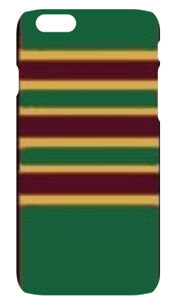
Howell submitted three designs featuring slightly fuzzed-out stripe patterns (the other two are here and here), but this is the one I liked best. It kinda feels like a wallpaper pattern for a computer monitor, and I mean that in a good way.
Those are our three finalists. Please vote for one of them here:
As you can see, you also have the option to vote for one of the non-finalists. Here’s how that will work: You can see all of the design submissions here. Each file is tagged with the name of its designer. If you like one of the non-finalists better than the three options I’ve chosen, send me an email with the file name of your choice (sort of the equivalent of a write-in ballot). If there’s a groundswell of support for one of the non-finalists, I’ll take that into consideration. But whether you vote for a finalist or a non-finalist, you can only vote for one design.
My thanks to all the designers, and to everyone who participates in the voting. This is shaping up as a fun project.
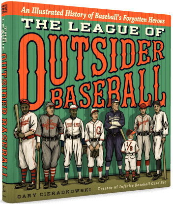
New sponsor shout-out: As you may have noticed in the right-hand sidebar, we’re currently running an ad for Gary Cieradkowski’s new book, The League of Outsider Baseball: An Illustrated History of Baseball’s Forgotten Heroes. Gary may be familiar to many of you as the creator of the excellent Infinite Baseball Card Set, which I’ve long been a fan of.
Gary’s book is devoted to the eccentric characters around the sport’s fringes. Just check out these chapter titles: “Bush Leaguers,” “Could-Have-Beens,” “Bad Guys,” “Odd Balls,” and so on. There are dozens of player profiles, each one illustrated with Gary’s beautiful artwork. In short, this one’s a keeper, and I’m very happy to have it advertised on the site. Don’t miss.

Baseball News: The Red Sox wore 1975 throwbacks last night. The good news: They included the Massachusetts bicentennial patch. The bad news: inconsistent hosiery design and non-throwback helmets. Also, you’d think this would’ve been a good game for the Rays to wear their 1970s-style fauxbacks, but they didn’t. ”¦ Speaking of retro Sox looks, the White Sox wore their beach blanket throwbacks last night for the first time this season. ”¦ The Royals will wear “Los Reales” jerseys on July 25 (thanks, Phil). ”¦ Oddibe McDowell wore No. 0 with the Rangers, as a shout-out to his first initial. But at Arizona State he went further than that: No. 0 and FiNOB! (Big thanks to David Berliner.) … A Dodgers fan got the team’s logo tattooed onto the side of his head. … This review of Pedro Martinez’s new memoir features the following: “[The book includes] the story of Pedro’s first bus ride back from a road game with that Great Falls farm team [when Martinez was 18 years old]. When someone told the players to ‘get dressed and go,’ Martinez and his teammate Raul Mondesi ‘went straight to the bus in our uniforms.’ When the manager, a white guy from Chippewa Falls, Wisconsin, saw them there, ‘he exploded.’ ‘You fucking dirty bastards,’ he shouted. ‘You don’t do that in the States, this is not the Dominican Republic.’ Martinez and Mondesi didn’t realize that they were supposed to shower before the bus ride.” … Odd trend for the Twins: We already knew they were giving away Rays-colored Twins caps when hosting the Rays next weekend, but now it turns out that they’re also giving away Cardinals-colored Twins caps when hosting St. Louis next month. “While it’s billed as a St. John’s University/College of St. Benedict-themed event, the reality is that if you buy a ticket as part of that event, you’ll get a Twins cap in Cardinals colors,” says Mike Menner. … Worst of all possible worlds: purple pandering (blame Chuck O’Connor). … Here’s a jersey worn by Stan Musial while playing for a U.S. Navy baseball team in 1945. As I’ve said before, and will keep saying, wearing throwbacks of military baseball team uniforms would be a much, much better tribute than the lazy default move of wearing camouflage. The throwbacks would be a de facto history lesson about the sacrifice that ballplayers used to make during times of war — much better than the jingoistic rah-rah pandering provided by camo. ”¦ The Yankees used to require their minor leaguers to go high-cuffed, but they’ve scrapped that rule this season. Sadly, the players at Double-A Trenton are happier going low-cuffed. ”¦ Check this out: The Mets could have been called the Bees, the Avengers, or the Burros (thanks, Phil). ”¦ Speaking of the Mets, they wore NYPD caps during BP last night, honor a slain police officer (Phil again). ”¦ The Giants wore their “Gigantes” jerseys last night. That makes seven different jerseys for the Giants so far in 2015, and the season is only a month old. ”¦ The Brewers have also worn seven different jerseys this season, if you count that one game when they wore BP jerseys. ”¦ Nice to see that Oregon can look as absurd on the diamond as they do on the gridiron. ”¦ Cubs P James Russell’s Ernie Banks memorial patch was AWOL last night.

NFL News: Reader Scott Mason was watching a Dolphins/Bengals playoff game from 1973 and spotted a Cincy player with some major paint chipped off of his helmet. … Falcons draft pick Vic Beasley is among the first LBs to wear a number in the 40s under the league’s new uni-numbering rules. Additional info on Atlanta’s rookie uni numbers here. ”¦ Lots of new uni numbers for the Lions, Eagles, and Ravens, too. ”¦ A sporting goods chain is offering “jersey insurance” for Eagles fans who buy an overpriced polyester shirt and then the player is cut or traded. Best insurance of all: Don’t waste $$$ on overpriced polyester shirts in the first place. ”¦ Dave Rappoccio made a comic about the 49ers’ new BFBS alt uni. ”¦ Hey, here’s a groundbreaking idea: Let’s rank all of the recently issued NFL uni designs (thanks, Phil). ”¦ Cowboys second-rounder Randy Gregory has gotten a big tattoo of the team’s star logo. … A runner in last Sunday’s Pittsburgh Marathon was dressed up as former Steelers RB Jerome Bettis. ”¦ The Bears did a photo shoot yesterday with T Jermon Bushrod, dressing him in a Monsters of the Midway throwback uni. Note the dark facemask, however — that throwback helmet usually gets a grey mask. It’s not clear whether they’re making a change or just didn’t bother to swap out the mask for the photo shoot (from @ImMidwayMonster).

College and High School Football News: I’m sure many of you have seen this photo of a high school football game taking place while a building is on fire in the background. Here’s a story about that incident. ”¦ New uniforms for Wake Forest (from Duncan Wilson). ”¦ Louisville is using Adidas footballs for the first time. ”¦ LSU RB Leonard Fournette has previously worn a standard NOB. But Leonard’s brother Lanard is joining the team this year, so Leonard’s NOB now has the first two letters of his first name. No sign yet of Lanard’s NOB (from Wesley Eustis).

Hockey News: Here’s a ranking of every NHL team’s home jersey. ”¦ Joe Drennan has a nice collection of NHL team patches. “I started the collection around 1998-99, which I was in junior high, sort of as a reward for my hard work,” he says. “First came the binder and one patch, then each month for two or three more patches would come in the mail. Willabee & Ward was the manufacturer. Each batch measures about 7.5″ tall and is encased in a plastic housing affixed to a cardstock backing with information and stats about the team.” ”¦ Sad day at the Nassau Coliseum, where the ice has been removed for the final time. Here’s a time-lapse of it (thanks, Garrett). … A power outage in St. Paul turned the Wild’s ice to slush 12 hours before Tuesday night’s playoff game against the Blackhawks.

NBA News: What does Dirk Nowitzki of the Mavs do with all his old gear? Find the answer here (from Jonathan Daniel). ”¦ Here’s a look at which Trail Blazers uniform produced the best record this season. ”¦ Looks like Clippers G Austin Rivers is the latest NBAer to fold down his waistband (from Mike Engle). ”¦ Conrad Burry made some Cinco de Mayo-themed NBA concepts to mark the holiday yesterday.

College Hoops News: When Shaka Smart coached at VCU, his style of pressure defense was called “havoc” — a term that VCU trademarked at the state level. Smart was hired by Texas last month, and the Longhorns intiallly made a move to trademark the terms “Horns Havoc” and “House of Havoc,” but now those moves have been withdrawn.

Soccer News: Indy Eleven will be going G.I. Joke on May 16 (from Evan Stinson). ”¦ Very interesting article on split-team soccer scarves. ”¦ New jerseys for Sao Paulo. … Real Madrid’s new change kit for the 2015-16 season appears to have been leaked (from Kary Klismet). … Also from Kary: “Austria Vienna’s mascot, ‘Super Leo,’ staged a stumbling, drunken pitch invasion during his team’s match against SC Wiener Neustadt on Saturday.”

Grab Bag: Here’s a look at UK political party logos. ”¦ New camouflage pattern coming in July for the U.S. Army. Imagine that — camo actually being worn by soldiers, instead of dress-up soldiers. ”¦ In this era of digital design, here’s something you don’t often see: a graphic designer who specializes in hand-drawn logos. ”¦ Apple is suing a Russian online store for using a logo similar to the Apple logo. ”¦ The Vatican has released a new logo for the Holy Year of Mercy. … Small note buried on this page indicates that a Canadian high school rugby team played in borrowed jerseys while waiting for their new ones to arrive. … New logo for the Tennis Hall of Fame. … UNC has an equestrian club team. Their logo turns the “C” in the school’s familiar logo into a horseshoe. ”¦ “We had an election on Tuesday in Alberta for premier (the equivalent of governor),” says Mike Styczen. “There are five parties, and their colours are orange, red, green, light blue, and dark blue, so the TV anchors are even more constrained in their choice of neutral colors than the anchors in America. Which means lots of purple.” … Here are some Uni Watch readers who wore their Cinco de Mayo T-shirts yesterday.
Play ball: Phil and I will be attending tonight’s Mets/Orioles game as guests of Mets creative services director Mike Zulla, who’s going to introduce us to his design team and talk logos with us. Should be interesting! Not sure if it’ll all be off the record, but I’ll give as full a report as I’m able in the next day or two.
Mookie Betts was a big fan of the 1975 Boston Red Sox throwback athletic wear. That’s some good news I guess.
The only problem with the stirrup phone case design is that…to someone who doesn’t know about stirrups, it looks like…um…thong underwear.
ed
That is the ugliest thing underwear I have ever seen then.
I didn’t say it was good looking thong underwear…
ed
I was going to say the same thing. Glad someone else saw that.
On the one hand, that’s a truly bizarre thought. I mean, whose thong underwear has a bottom strap that thick, or a waistband that high? That’s not a thong, that’s just panties.
On the other hand, non-uni-watchers misinterpreting it is a feature, not a bug. Anyway, adjusting one side to show a bigger opening, like proper stirrups, will solve the thong issue.
“I mean, whose thong underwear has a bottom strap that thick, or a waistband that high?”
~~~
possibly?
maybe it is just a huge wedgie? Regardless, those are some white cheeks.
Or maybe a leotard combination for aerobics or gymnastics. Whatever it is I definitely got more of the crotch impression than stirrups without the shoes or pants legs for context. Glad I’m not the only one.
Browns have released the rookie uni numbers too:
link
Sox did wear inconsistent hosiery, but they all were high cuffed and there was a lengthy discussion about blousing on the broadcast (ie: “I didn’t realize there were different pants for high socks”, “yes, otherwise there’d be too much pants rolling up required”)
At the beginning of the game, the color guy said that players in the 1970s hated wearing pants with elastic waistbands.
Except the radio guys said Louie Tiant (who visited both the radio and TV booths during the early innings) said he preferred the elastic waistband. Liked having some “give” in his pants.
At the time, I remember thinking the California Angels had the uniforms I wanted to see the Red Sox wearing. Flashier, stripey-er, more bling. The Sox really seem to need red piping; they’re dull without it.
I wish they’d go back to those striped socks!
New “4” for the Eagles? I don’t trust the picture but that’s not how it looked before.
And Wake Forest… smh. 18 and 34-degree cutouts for numbers is awesome? No it isn’t.
‘New “4” for the Eagles? I don’t trust the picture but that’s not how it looked before.’
Ohhh…good catch. Did someone use the wrong font for that rookie jersey graphic, or have the Eagles made a very quiet change here?
Compare:
link
with:
link
Interesting.
I’m sort of glad the Anonymous DIYer doesn’t sell his stuff, because I’d be broke.
I am not getting another smart device without making sure there’s a UniWatch case built for it.
Glad to see the Avs home uni vaulted to #26 out of 30 in some random internet article. I acknowledg the Colbertian “tiny triumph” of this feat.
You mean there won’t be Uni-Watch band for my Apple Watch??
Strangely, there link.
(Unless you’re referring to that already.)
The Bengals player in question is Boobie Clark
FWIW, the Bengals player in that video clip is Boobie Clark, who had a somewhat peculiar NFL career. He was a collegiate tight end who Paul Brown converted to fullback, in which position he was named Rookie of the Year. He was also named as the defendant in a lawsuit filed by an opposing player whom Clark (by his own admission) intentionally forearmed in the neck/back of the head after a play was blown dead.
It gets worse for the Twins: The team will actually be wearing uniforms on the field in Cardinals colors when they host St. Louis.
Because the Twins and Cardinals have the same team colors, and have for decades.
For thirty years or more, the Twins have given away at least two hats to fans every season, and most of the time the fan giveaway caps look nothing like the team’s on-field caps. When the Twins, a team that prominently wears red, give away a red cap, they’re not giving away Cardinals-colored caps.
The Cardinals like to do giveaways with college themed hats as well. Unfortunately a couple years ago they had Mizzou night the same night they were playing the Pirates. Somebody didn’t think that one through.
I had to vote for the stirrups, but any one of these runners-up woulda been a contenda if they’d been on the ballot. Nice work, everyone!
Pad save: link
Classic surfboard: link
Laundry tag: link
One issue I have with most of the case designs is that they are designed using an iPhone case pattern and those designs might not work as well on a case for the Samsung Galaxy S series, the HTC One series, or the LG G series where the camera is not located on the corner of the phone but on the center line of the phone and away from the edge of the phone.
The two striped patterns should work alright but most likely the camera hole will cut through one of the stripes. The script finalist will probably have a portion of the t, c, and/or h cut off by the camera hole.
The yellow mesh non-finalist would not be affected by most phones camera holes.
Similar to the hose on fire football game there was an Ultimate Frisbee tournament a few years ago where a house fire broke out next to the fields. It became a spectator sport of it’s own – link.
Hey Paul,
You gave me entirely too much credit for choosing the size of the green dot. I just filled In the “your design here” circle & text and clicked “submit”.
Brilliant! This story inspires me to send in a write-in vote for your entry.
woo hoo! Thanks tbone!
Just an aside, there’s literally hundreds, if not thousands of designers who specialize in hand-drawn work these days. It’s an enormous trend right now.
Wake Forest has it correct. Hats and britches need to be the same color.
The link to the pic of Oddibe McDowell does not show a first initial on the back as suggested.
First initial on back is FIOB. First name on back is FiNOB.
Mildly off-topic, Oddibe McDowell is the subject of IMO the high point of 20th century sports journalism
link
Interesting article about the split scarves in soccer. I am not a big fan of them but I like to pick up a scarf of the local team when I travel as a souvenir. When I was on my honeymoon in Split, Hadjuk Split happened to have a Europa League qualifier the day after we arrived. I asked about tickets, but the nice lady at the front desk said her even her husband could not get one. I picked up a split team scarf as a nice memento, along with a regular Hadjuk one.
I have a handful of scarves myself as souvenirs. I do have two split scarves – both of which I purchased as souvenirs at WC’06 for matches I attended. I wouldn’t do so for a normal league or even cup match, but I figured these were more event scarves for me as I wasn’t personally invested in the teams I saw play.
I don’t feel too strongly with regard to friendship scarves, especially if it is for a team in a minnow in a cup competition that would normally not be playing a higher level team, but do scoff at them if they are for teams that are considered rivals.
I don’t want to say anything over the top like “split scarves represent what’s wrong with sports”, but split scarves represent what’s wrong with sports. Well, kind of.
Traditional scarves are:
1) Meant to keep you warm,
2) Announce your loyalty to a club.
Split scarves, in a way, say “Look at me, I have tickets to this televised event and you don’t.” Which is fine, but it does signal shift of soccer from something that belonged to supporters to a brands and objects of conspicuous consumption.
There’s nothing wrong with the split scarves themselves or the people who buy them, but their existence does reveal an uncomfortable truth, I think.
I think this is a very astute point and draws back to one of my biggest issues with the appropriation of scarves in America in particular – that those ones you get from official team sources for $20+ are, in fact, overpriced knock-offs. The real matchday scarves were the ones you got from an unlicensed street vendor a couple of blocks from the stadium for at most a fiver. It was something you bought as a relatively inexpensive souvenir, a more durable or substantial ticket stub. As you say though, they’ve become commodified beyond all reason. I don’t think there’s necessarily all that much wrong with wanting to have some sort of material reminder of some big event you attended, but matchday scarves are becoming yet another one of those “fandom = paying for official tat” things.
A lot of the match day scarves I’ve seen are unofficial (sold by some guy in the street outside the stadium). There were several guys selling Crystal Palace-Man City scarves outside Selhurst Park last month for 10 pounds, as well as Chelsea-Stoke scarves outside Stamford Bridge (not sure how much those cost). I didn’t purchase either, and I don’t believe the club shops offered friendship scarves for those matches, but if they did I’m sure they would be a lot more expensive.
One other problem I had with last night’s Red Sox throwbacks was the absence of blue sleeves.
link
The minor-league manager in question in Joe Vavra, now the Twins’ bench coach.
A+ on those Red Sox throwback jerseys last night. Glad somebody finally recreated the McAuliffe lettering correctly. I’d love to see that lettering on their current uniforms. I’d also love to see the striped stirrups and navy undershirts come back too.
Cap logo should have been thicker with smaller serifs, but I guess that’s nitpicking.
I’m confused. I thought the McAuliffe font was the number font – and the numbers look to me to be the exact same on the regular home jerseys and pullover throwbacks.
Is the McAuliffe font considered the intellectual property of the Red Sox, or can anybody use it?
What I’m calling the “McAuliffe” lettering is the Tuscan lettering on the front of the jersey that was used from 1951-78. The Angels used this lettering on their 1965-70 road jerseys.
There are subtle differences. The McAuliffe letterforms appear more balanced and kerned better than the current lettering. The McAuliffe letters also appear to be roughly the same size (except for the height of the “S”). I think the lettering since 1979 appears sloppy and since 2005 appears crammed together. The serifs on the McAuliffe letters are smaller and chunkier. The 1979-89 lettering I call the “Wilson” typeface and can be seen on 1962-73 Mets road jerseys.
The most notable differences are the “S” and “X”. The top half of the McAuliffe “S” is slightly smaller than the bottom half. The current “S” has long elliptical negative spaces and appears symmetrical, yet it looks like it leans to the left. The current “X” is very wide in relation to the other letters, and for many years, had its upper left serif about twice as wide as its upper right one.
The negative spaces in the McAuliffe “E” are round while the current variety are somewhat v-shaped. The negative spaces in the McAuliffe lettering are much smaller than the current ones. The current “O” is noticeably taller than the “X”. The leg on the current “R” is more flared and extends more to the right than the McAuliffe “R”, which was fairly vertical.
In 2010 the Seattle Sounders produced official (club issued) split-scarves for each of their matches.
link
That NHL home uni ranking looks strange sandwiching the Caps and their odd reebok shenanigans in between a bunch of traditional uniforms.
Yeah, there’s definitely some eyebrow-raising choices, but it all comes down to personal preference.
Personally, I would never rank the Red Wings’ red jersey as #1, because while it’s a classic, it’s not as strong, in my opinion, as Montreal’s or Chicago’s red jerseys.
Devils and Lightning should have been higher.
For some reason I found this phone case contest especially fun.
“Apple is suing a Russian online store for using a logo similar to the Apple logo. …”
There is nothing I hate more than a story like this that doesn’t even show the logo (the Russian one) in question!!!
You don’t need the details. Just pick a side and start shouting!
For what it’s worth, here’s the logo:
link
I know that BFBS is strongly frowned upon by this site, but wondered if it might make sense (and, I guess, take the FBS part out of the equation) if teams used those uniforms as a once-off for Memorial Day when it actually makes sense to wear black in rememberence of those who gave their lives fighting for America. Seems to me that it would make much more sense wearing that than wearing something more properly worn during deer season (particularly since most of those war dead never wore any sort of camo uniform). I do like the idea of wearing actual teams from the Army, Army Air Force, Navy and Marines too, but perhaps that would be best worn for July 4th?
White Sox confirmed on Facebook that they’re wearing throwbacks again, the picture they showed has their “alternate” batterman cap, not sure if that’s going to be in the game or just for BP. There seems to be a growing movement on twitter for the Sox to wear the Throwbacks a lot more often, but I’m sure the good feelings could go away if they lose today…
Just to update, they are wearing the “SOX” hat in the game, not “batterman”. On a related note, I kinda love that they have a whole set of sweatshirts, pullovers, jackets, and etc. to match the throwback stuff. Much better than it would be if they tried to get away with black and silver stuff…
Mike–
Looks like an mlb.com writer has linked to your Youtube page and written about some of the MLB fight songs.
link
Quick google search shows Austin Rivers folding is waistband over at Duke and in high school as well.
Huge comeback win for the White Sox tonight. Expect to see LOTS more of the 1983 uniform for a while.
Oh yippee! Yet another Uni Watch article on New York minutiae.