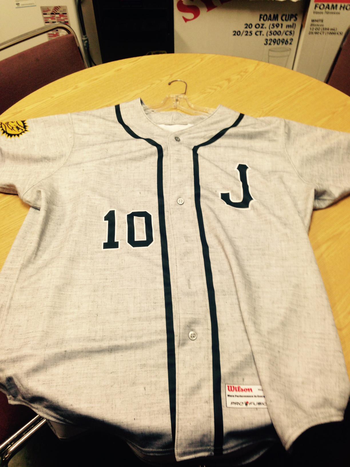
Click to enlarge
The Jacksonville Suns — the Marlins’ Double-A affiliate — sent out this photo of their new road jersey yesterday. Looks like Wilson, the manufacturer, used a faux flannel fabric, similar to what we’ve previously seen from Under Armour. I wish Majestic would come up with something like this for MLB.
Speaking of which: The 17th annual Uni Watch MLB season-preview column was posted yesterday on ESPN. Many of you have told me this is always your favorite Uni Watch column of the year. Mine, too! Check it out here.
A few late-breaking items and things I missed:
• The White Sox have added a “9” memorial patch for Minnie Minoso.
• The Phillies and Red Sox will wear 1915-style caps on April 9. According to Dressed to the Nines, those caps will look like this and this.
• A little birdie tells me that the Giants’ ring ceremony caps will look like so: “Similar to past styles — black hat, gold ‘SF,’ gold side patch. New to this year is the gold trophy with MLB logo on back.” And it looks like the birdie was right, because it turns out a Giants blogger tweeted photos of the front logo, side patch, and trophy on the back last week, but I somehow missed the boat on that. I’m assuming there’ll also be a gold-trimmed jersey, but no word on that yet.
• The Brewers will retire No. 1 for Bud Selig on May 31 (which is, of course, incredibly lame, because numbers shouldn’t be retired for people who never wore numbers to begin with).
Also: I had another ESPN piece yesterday — an interview with the guy who’s selling that vintage Mets bullpen buggy. You can read that here. (And in a related item, my ESPN colleague Jerry Crasnick is calling for the return of the bullpen cart.)
And while we’re at it: In case you missed it yesterday, my latest piece for the design website re:form is about the surprisingly complex world of bike rack design.
ESPN contest reminder: I’m currently accepting entries for an ESPN contest to name and design a team for a prospective NHL expansion franchise in Las Vegas. Details here.
@PhilHecken @UniWatch GASOL JERSEY: RIPPED https://t.co/mbjpCOHM7t
— Mike Nessen (@miken623) March 31, 2015
Come on, man, show some dignity out there: Bit of an on-court tantrum last night for Grizzlies center Marc Gasol, who showed his frustration over missing a jump shot by ripping a big tear in his jersey. I’m sure there’s someone out there who views this move as an admirable display of “intensity” or some such, but to me it’s just childish. (Interesting that the AP photographer working the game simply said the jersey “was torn” but didn’t mention how it happened. Hmmmmm.)
Then again, if this catches on with fans who start treating their overpriced polyester shirts the way Gasol treated his, that might be worthwhile. So maybe some good will come of this yet.
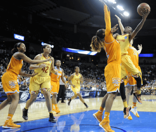
Tropicana vs. ReaLemon: Tough game for colorblind fans — and probably for everyone else as well — in last night’s Women’s Elite Eight game, as Maryland and Tennessee went yellow vs. orange, which made the court look like citrus punch. It’s actually kind of pleasing in an abstract way but not very good from a functional perspective. You can check out some video here, and there are lots of additional photos here.
T-Shirt Club update: My original plan for the Uni Watch T-Shirt Club’s May design was to do one of our “core” shirts — road grey, BFBS, or green alternate. But I knew we were already planning to do a Spanish-translation shirt at some point during the year (similar to the Brewers’ “Cerveceros” jersey), and I began thinking we should do it for Cinco de Mayo, especially since the Uni Watch shades of green and maroon are so similar to the Mexican flag colors of green and red.
So that’s what we’re doing. Here are the shirts we’ll be offering (click to enlarge):
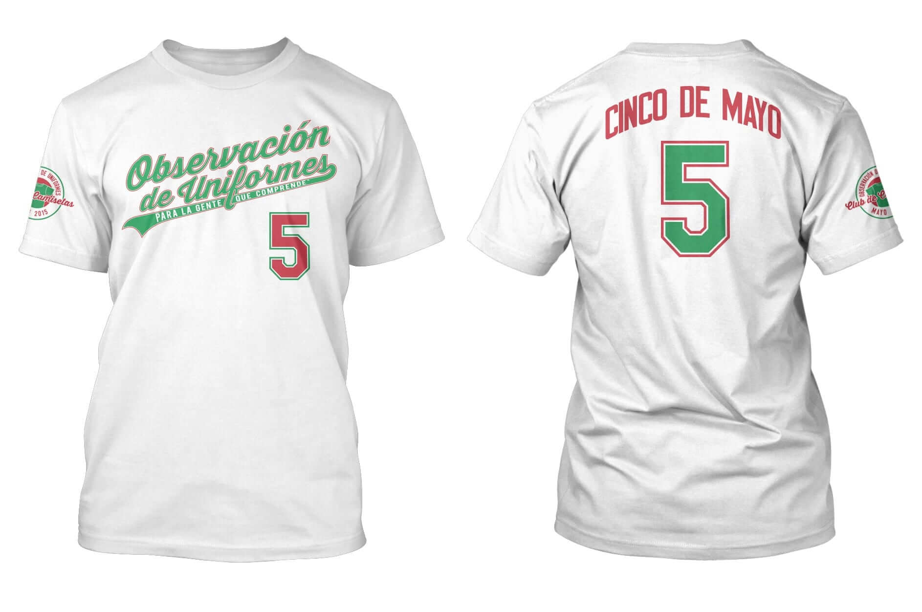
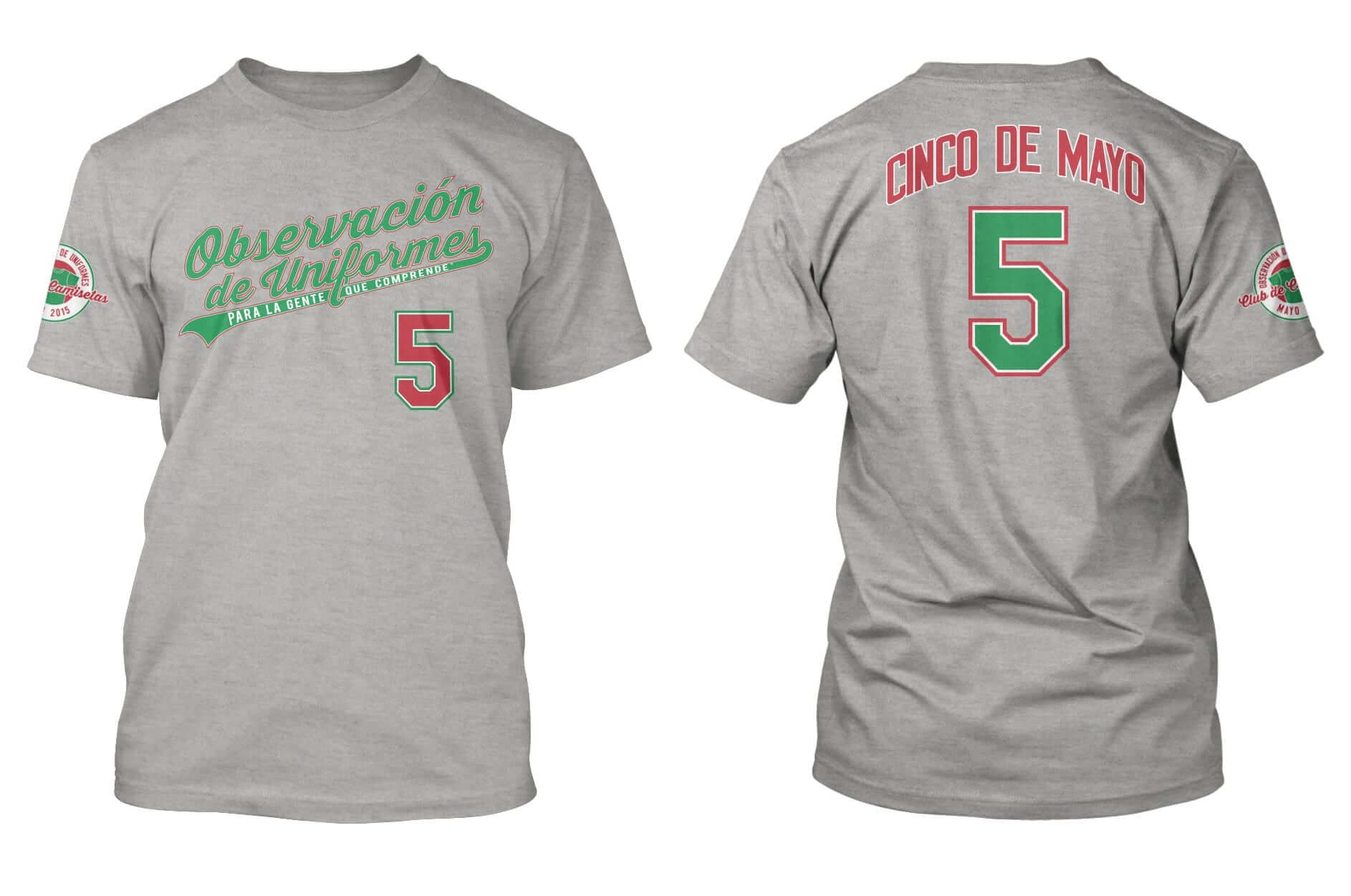
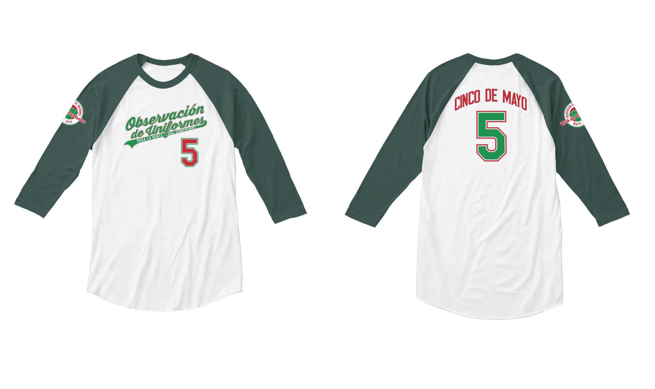
Some notes on the designs:
• As you can see, we translated “Uni Watch” (which is now “Observación de Uniformes”) and “For People Who Get It” (“Para la gente que comprende”) on the front of the shirt. On the sleeve patch, the month (“Mayo”) and “T-Shirt Club” (“Club de Camisetas”) have been translated as well.
• The uni number is 5, for Cinco de Mayo.
• The colors have been tweaked to match those of the Mexican flag.
• Just like last month, we’re offering home white and road grey options (which will be priced in the usual $22 to $24 range), plus for the first time we’re also offering a style with three-quarter-length raglan sleeves (probably a few dollars more, like $27ish). The sleeves don’t quite match the green on the shirt design, which is a bit frustrating, but I wanted to put it out there and see how people responded to it.
• If you’ve been buying each design in order to qualify for the year-end prize, you only need to purchase one of the May shirts in order to maintain your eligibility.
• If you think it seems a bit early for me to be previewing the May design, you’re right. We usually start selling the shirts on the third Tuesday of each month and preview them the week before that. But if we had stuck to that schedule, this design wouldn’t have delivered in time for Cinco de Mayo. So I’m previewing the shirts now, they’ll launch next Tuesday, and they should deliver in late April. We’ll go back to our usual third-Tuesday routine for the June design.
I want to give a big shout-out to Uni Watch reader Omar Jalife for his assistance with the translations, and also to my Teespring co-conspirator, Bryan Molloy, who gamely tackled this month’s design and made it work. Great job, Bry!
I think that’s it. Feedback welcome, as always.
Collector’s Corner
By Brinke Guthrie
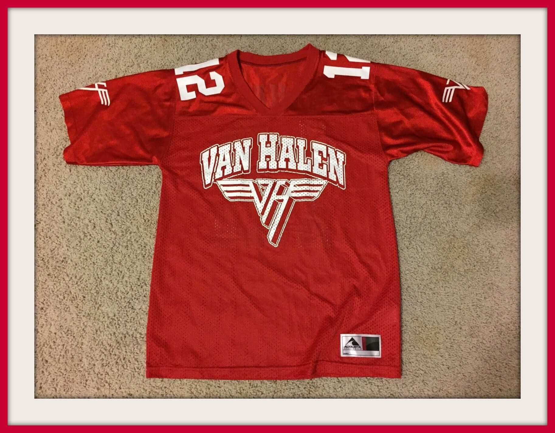
Someone sent me this Van Halen football tour jersey — a good item to lead off this week’s CC, because their live album is out today. (Yes, I’m a fan.)
Okay, here are the rest of this week’s eBay picks:
• Here’s a Monday Night Football pennant. That helmet logo looks a lot like the Officially Licensed Product logo from back in the day, eh?
• We’ve featured these great NHL posters before. Here’s an ad with all of them on it.
• Wouldn’t the patent drawing for an early football helmet make a nifty poster? You bet it would!
• Here’s a nice-looking 1970s NHL Blackhawks skate plaque!
• This 1970s Dolphins helmet radio looks like it is in great shape. But he’s not sure if it works. (Well, put a battery in it, dude. If you hear music, it works!)
• Helmet buggy alert! A NY Giants model, mint on the card. Would look great at Uni Watch HQ, right? And here’s one for the St. Louis Cardinals.
• These LA Rams playing cards have “Copyright 1969” on them, but of course the Rams weren’t doing the blue/yellow combo back then. Same deal with these Chargers cards.
• This 1970s Atlanta Braves ice cream helmet looks kinda funny without the white panel behind the “a,” no?
• Just another tequila sunrise Starter jacket. Loved that look (well, except for the numbers on the pants leg, and the bullseye on the back).
Follow Brinke on Twitter: @brinkeguthrie

Baseball News: The Mets made two trades with uni-related implications yesterday. First, they acquired pitcher Alex Torres, the guy who wore that oversized protective cap last season with the Padres. It’ll be interesting to see if he continues to wear the padded cap with his new team. Also, the Mets traded OF Matt den Dekker to the Nats. Will the Nats give him lowercase NOB lettering like the Mets did? … den Dekker, incidentally, was traded for LHP Jerry Blevins, who immediately invited Mets fans to design a new Twitter avatar for him. To his credit, he went with this one. … Very nice striped Carolina blue stirrups for Wichita East High School in Kansas (from Christopher Eshelman). ”¦ With the Giants set to receive their championship rings in a few weeks, here’s an article on World Series ring design. ”¦ Good article advocating that youth leagues should mandate that pitchers wear head and chest protection (from Brandon Merchant). ”¦ This is a little weird: On May 16 the Twins will be hosting the Rays and will be giving away a Twins cap in Rays colors (from Gary Olson). ”¦ Nebraska’s rally caps are in midseason form (from Jonathan Daniel). ”¦ Jabba the Hut jerseys upcoming for the Altoona Curve. ”¦ Cork Gaines notes that the Billy Martin button being given away by the A’s on July 30 appears to include the little cross pin on his cap. … A Colorado Little League team’s uniforms were stolen right off of the coach’s porch. ”¦ Matthew Prigge has written a blog post about a ticket from what would have been the first Brewers game ever played at County Stadium in 1953. “Of course, the Braves moved to town and the Brewers never got a chance to open up at the Stadium,” he explains. … Two high school softball teams in Ohio went pink vs. pink the other day.

Pro and College Football News: What’s with the orange jerseys that several Bucs players are wearing in this video? Are those practice jerseys, or something else? (From Julie Binder.) … Middle Tennessee State is apparently considering a matte helmet option (from Josh Claywell). ”¦ Adidas’s new deal with Miami doesn’t go into effect until Sept. 1, but the ’Canes are already using Adidas footballs. ”¦ At Pitt, coach Pat Narduzzi decides after each practice whether the offense or defense “won.” The side of the ball that won gets to wear blue jerseys at the next practice.

Hockey News: The refs at the women’s world hockey championships might have the worst officials’ unis ever (from Scott McClure). ”¦ I went in for my bi-monthly blood-donation appointment yesterday. As they were forcibly extracting my precious humors sticking the needle in my arm, I noticed that the donor in the chair to my right was wearing a New York Rangers shirt. “Nice shirt,” I said, to which she replied, “This? I don’t even like the Rangers. I just thought it would be okay if something went wrong and it ended up with blood all over it.” … Behold the first pro hockey team in Texas, the 1941 Dallas Texans. Not sure what I love more — the sweaters, the dress shoes, or the guys leaning through the bus windows (from Pete Woychick).

College Hoops News: Good story about a fan with an amazing Illinois basketball memorabilia collection. … Gonzaga students are blaming the team’s loss to Duke on the BFBS jerseys.

Soccer News: The USL’s Harrisburg City Islanders wear the logo of their MLS affiliate, the Philadelphia Union, on their arm. ”¦ “I couldn’t find an article about this in English, but the Russian Football Federation may be punished for its fans displaying certain banners/flags at the game between Montenegro and Russia last week,” says Alexander Cohen. “Here is a picture of Russian fans holding a banner that says, in Serbian, ‘Montenegro, Serbia, Russia: one family.’ They are also flying Russian Imperial and Serbian flags. And here’s an article, in Russian, about how UEFA has a rule against showing the flags of countries/organizations that don’t have ‘recognized participation’ in the match.” ”¦ Our recent look at white baseball shoes prompted this from J.M. Shemaria: “You must give a shout to Alan Hinton. He was an English winger in the 1970s and is generally known for wearing white boots in an era where that didn’t happen. There’s a good quote from him in this article about the rise of colored boots, and there’s also this article about his shoes and his relationship with legendary manager Brian Clough.” … A referee paid tribute to a Brazilian player by spelling out his name with the vanishing spray instead of marking the spot of a free kick (from Yusuke Toyoda).

Grab Bag: New logos and merch for our friends at SportsLogos.net. ”¦ Former Scottish runner Liz McColgan says Nike stopped sponsoring her years ago because she was pregnant (from Craig Ackers). ”¦ The Associated Press Style Guide, which sets the linguistic protocol for countless newspapers and websites across the country, has issued a bunch of new rules regarding sports terminology. ”¦ A new law in the UK allows guarantees Sikhs the right to wear turbans in the workplace. ”¦ Hot topic in Kalamazoo, Michigan: whether school dress codes should permit leggings. ”¦ A new Florida rule requiring girls’ lacrosse teams to wear protective headgear is proving to be unexpectedly controversial. ”¦ Good article on how Alabama is the birthplace of the sweatshirt. ”¦ “The Illinois Tollway will be creating ‘Safe Phone Zones’ at various oases in April,” says Kyle Martinek. And in what surely qualifies as a huuuuuge surprise, these phone zones will be sponsored by Verizon Wireless. Douchebags. ”¦ Good socks for Russian skip Evgeny Arkipov. ”¦ Nike will release its 2015 Basketball Easter Collection on Thursday. I was going to say, “Insert the blasphemous joke of your choosing here,” but it seems like Nike has already done that on everyone’s behalf. … Does kinesio tape really work? Shmaybe. Ditto for compression clothing (both of those from Yusuke Toyoda). … A company best known for its women’s yoga pants is seeing growth in its menswear category, in large part because its pants are designed to avoid constricting your balls (from Tommy Turner). … A traveler on his way to Abu Dhabi was detained by the authorities after a military uniform was found in his luggage. ”¦ A judge has dismissed a trademark-infringement case brought by the New Jersey Turnpike Authority, which claimed that its logo was being poached by a Florida pizzeria.
Then again, if this catches on with fans who start treating their overpriced polyester shirts the way Gasol treated his, that might be worthwhile.
That’s certainly not something the leagues would want to encourage. I mean why would they want people to spend $200 on a overpriced jersey only to ruin it so they’d have to go out and spend another $200 on another overpriced jersey?
Love the May shirts, Paul. As a fan of the site and a huge fan of Cinco de Mayo, I am in for all three.
Thanks, Gregg — glad you like!
All with Gregg. Fine-looking shirts.
But…
” As you can see, we translated ‘Uni Watch’ (which is now ‘Observación de Uniformes’) and ‘For People Who Get It’ (‘Para la gente que comprende’) on the front of the shirt…”
Para La Gente Que Comprende is to my Spanish ear a cool translation indeed. But “Uni Watch” as “Observación de Uniformes” …. I dunno. I speak Spanish pretty well, but I’d be interested in what native speakers say… “Uni Lab,” maybe? Or is it too late and I’ll just shut up?
“Uni” doesn’t work in Spanish. It is not used as a shortened version of “uniform”; instead, it is commonly used as a shortened version of “university.” So we had to go with “uniforme” (and, after much discussion, it was decided that the plural version was better — “watch of uniforms”).
Several other terms were considered before we arrived at “observación,” which seemed best.
That said, I’m open to discussion/debate/critique/etc. regarding the translation. I want the best possible version, and I think that’s what we have. But if you know of a better one, and can explain *why* it’s better, let’s hear it.
These LA Rams playing cards have “Copyright 1969″ on them, but of course the Rams weren’t doing the blue/yellow combo back then. Same deal with these Chargers cards.
It’s likely the copyright date is only for the card face designs, since 1969 only appears next to the joker on both decks.
I’m pretty sure that those Buccaneers jerseys are the normal red ones, just in odd light that makes the colors seem a bit off.
You can still see that the goofy little notches set near the edge of the brown shoulders are the actual “Buccaneer Creamsicle” color.
Admittedly, the jerseys *do* look rather orange at first glance in that video.
Yeah, definitely just the regular jersey. It looks orange in the light, but it’s more like Cleveland Browns nu-orange rather than the proper creamsicle it would be if it was an alt or anything.
Gonzaga STUDENTS are blaming the jerseys…not the players. Should change the entry verbiage.
Mea culpa. Fixed.
In any case, the logic is highly suspect.
Are the Bulldogs losing big games because they wear the black uniforms, or are they wearing the black uniforms for those games that they’re most likely to lose…?
The students are right. Teams tend to lose when they wear bad uniforms. It’s a fact.
If only things could work that way every time…
link
Sign on the wall at the arena the Texans are playing says “vs. Fort Worth”. What’s that team?
That would be the Fort Worth Rangers. Both teams were part of the American Hockey Association. link
“The sleeves don’t quite match the green on the shirt design…”
Considering that we have discussed some mismatched colors on some teams (Vikings purple… I think the Eagles, too, right?), there is no problem with this on the 3/4 length shirt. In fact, I think it’s appropriate.
Curious to know if you thought at any point about just going with “El Uni Watch” for the Cinco de Mayo shirts?
Only as an April Fool’s gag. No creative satisfaction in “El Uni Watch.” My plan all along was to go full-Cerveceros, so to speak (although it’s only very recently that I decided to do it for Cinco de Mayo).
I like it as a piece of sardonic comedy, but it’s a pretty shallow joke in the end. As you say, the full translation is much more satisfying.
This would’ve been hilarious
El Uni Watch would have been absolutely hilarious.
Paul is probably right though.
El or Los would’ve been much better I think. We see that treatment more often in pro sports than the Cerveceros or Gigantes, don’t we?
I wasn’t aware that frequency of a given trope had ever been listed as one of the T-Shirt Club’s guiding principles. In any case, plenty of teams do translations: Cerveceros, Gigantes, Pirates, Nueva York.
Bottom line: We couldn’t do “El” *and* a translated version, because that would be redundant. We could only do one. And I chose to do this one because it was more fun for me. Not as much fun for you? Them’s the breaks. (And seriously, if we had done “El,” imagine how many people would have said, “You should have done a translation!” — way more than the other way around, I’d wager. Not that people’s reactions are necessarily what guided me here, but I’m just pointing out that this is one of those situations where it’s impossible to please everyone.)
Anyway, Jeff, you’re already on record as not planning to buy any of these except maybe one of the dark-colored ones, so it’s not like you’d be snapping up an “El” version….
…Tigres.
“Los” would apply more to uniwatchers as both are plural. If only Uni Watch, “El” would’ve worked better given that you would normally say “the Uni Watch site” or “el sitio Uni Watch” and you just take out “sitio” as it is commonly done when talking about a certain topic (quick example, you normally say “el América” (a soccer team) though America is a feminine noun, you use a masculine pronoun because the whole term is “el equipo América”, so in the context, you can bypass the word “equipo” (team).
But yeah, full translation was a way better way to go
Somebody should DIY an El Uni Watch shirt. Come one, someone, please!
In regards to the All-Star caps in Cincinnati, if they’re going to do the throw-back cap like they did in Minnesota last year, they should use the pin stripe cap and make pin stripe caps for all of the teams.
Not sure how the helmet mandate for HS women’s lacrosse in Florida qualifies as “unexpectedly” controversial. As reported here some six months ago, it’s been nothing but controversial from the moment it was enacted.
link
My knowledge of lacrosse isn’t nearly sufficient to evaluate this, but part of the reasoning described is that women’s lacrosse is so substantially different from the men’s game that wearing equivalent headgear is thought to be unnecessary.
But can anyone explain why such differences are present in lacrosse? Or is it just an arbitrary thing, perhaps akin to the baseball/softball split that you see in high school and college interscholastic competition?
By contrast, men’s and women’s basketball, for example, are relatively similar.
Just curious.
I think it comes down to a rather outdated puritanism regarding women in sports. Women’s lacrosse is non-contact (or substantially reduced contact compared to men’s) in the same way that softball is intended as a toned down version of baseball, women’s hockey has outlawed body checking and numerous other sports have restrictions on physical contact that aren’t present in the men’s versions. To anybody who thinks that such double standards make sense, I would sincerely urge you to watch a game of women’s rugby. The rules are identical to the men’s game and not an ounce of the physicality or intensity one would find in a top level men’s international is lost in the equivalent women’s fixture.
The short answer is that the differences are a function of history, among them the Victorian-era notion that women shouldn’t play “contact” sports, or even ones requiring excessive exertion. Women in the 1920s certainly weren’t going to be permitted to play a game that was as brutish and violent as men’s lacrosse was (and continues to be). Hence, the early organizers of the women’s game adopted equipment and rules that resulted in a more genteel game.
Actually, your analogy to basketball is instructive, since in its original incarnation women’s basketball was played 6-on-6, with 3 players on each team occupying the frontcourt, and the remaining 3 the backcourt.
Is it due to women’s lacrosse’s roots in mid-Atlantic prep school and girls were expected to be more genteel?
I love the Spanish uniforms, but maybe September would have been a better month for that? Mexican Independence Day (9/16) is a far more important holiday than Cinco de Mayo. That being said, great job on the shirts!
Interesting call — hadn’t considered that. Thanks for the feedback.
That Dallas Texans photo is AMAZING.
Great photo. Looks like the two players on the left are goalies, based on their gloves. But did the team only have one pair of leg pads?
Aside from the girls lacrosse helmet controversy, I noticed this quote in he article:
“In Florida, where lacrosse is a new sport,…….”
Ahem…..
link
My DVR is set to record NFL Network’s “Top 10” show. Over the weekend it recorded “Top 10 Uniforms” in the NFL. If you haven’t seen it, I highly recommend it. I believe Paul has a part in each uni segment and does a great job. A lot of great facts about the history of the NFL’s best unis. Must see!
How are you able to give twice a month? I was told only every 56 days on Saturday.
One definition of “bi-monthly” is “every two months.”
I always confuse “bi-” with “semi-“.
facepalm… yes
I get paid bi-weekly.. I wish that meant two checks a week.
“Bi-monthly” means every two months.
I’m pretty sure bi-monthly means eve… nevermind.
Semi-monthly would mean twice a month.
Actually, bi-monthly can mean every two months OR twice a month:
link
Eschew obfuscation.
So I am not that much of an idiot ha
In proper usage, “bimonthly” and “semimonthly” are apparently the same thing; that is, both meaning “twice in a month.”
Similarly, “biweekly” means “twice a week,” and “biannually” means “twice a year” (not to be confused with “biennially,” which means every two years).
Of course, this invites the question of whether there is a word to describe something that occurs, say, once every two months? I honestly have no idea. The following article is interesting, though inadequate in its references:
link
I suspect that, somewhere along the line, as English developed, someone really messed up. And now here we are.
Keep in mind that this sort of thing will get worse if we tolerate such atrocities as equating “decimate” with “obliterate,” or “literally” with “figuratively.”
It’s something to think about.
This is how I remember.
Nobody has bi-annual these:
link
Nice find Troll. The wiki article actually sums it up best at the very end:
So bi(meaning twice in a period) was originally incorrect but has now come to have that meaning through repeated usage. I guess that means it’s no longer technically incorrect.
All I know is I get paid bi-weekly and that doesn’t mean 4 checks in 2 weeks, but rather one. Dammit.
I’ve continued to obsess over this issue since posting the earlier comment, and the more that I research, the less satisfied I am with the apparent status quo.
link
“Like bimonthly and biennially, but unlike biannually, in the adjective and adverb senses, the prefix bi- applies to the week rather than to the events that occur, therefore giving the sense of ‘every two weeks’. Since the term is also used in the UK to mean ‘twice a week’, it is ambiguous there.”
And the horror only intensifies from there…
link
Now, I’m not a big fan of Mignon Fogarty’s ideology of language “evolution,” but in this particular case, I’m inclined to accept her general argument that there appears to be no single reliable standard concerning how to use these words.
I generally prefer to find a definitive “right way” to do things when it comes to grammar, but without some early nineteenth century texts that actually use “biweekly” and “bimonthly,” that isn’t likely here.
It’s refreshing to see people engage in such discussion, though. Sadly, the widespread indifference that one typically encounters may lead to unpleasantness…
[NSFW] link
Along the lines of retiring a number for a non-player, many people don’t understand why the Seahawks reserved #12 for the fans so early on. It’s not like the fans did anything, so as preventing the Seahawks from leaving because of loyal support. #12 is a prime QB number, and it still seems odd after all these years for a franchise born in 1976 to put aside that number so early. Weird.
The Seahawks things was a bit of a gimmick. They retired it before Broncos-Seahawks game in last week of 1984 season. Game was a winner-take-all matchup in the Kingdome. And the Seahawks lost.
link
link
As for Selig, he shouldn’t have a number retired for him even if he was Babe Ruth, Lou Gehrig and Stan Musial rolled into one.
It actually makes sense that a young franchise retired #12. It was a way of manufacturing heritage, and without a lot of former players, they didn’t have to worry about the number being associated with anyone.
It’ll be awkward if Tom Brady decides to end his career in Seattle, though.
“Para la gente que comprende” is lovely.
It is excellent, and it reminds me of how, in Germany, Pepsi translated their slogan “the choice of a new generation” as “für die Leute von Heute”, which means just about the same thing (“for the people of today”) but sounds even better.
Paul,
I know you hate companies selling “overpriced polyester shirts” but if people start tearing theirs “the way Gasol treated his” it might not have the effect you think it will: I believe that would only make fans spend more money on “overpriced polyester shirts” only giving more money to these corporations you hate, encouraging them to make them even more expensive
Thanks for providing an in-depth analysis of what would happen in the highly likely event that people start tearing their jerseys in half.
And whatcha gonna do, Uni-Watcher, when Gasolmania runs wild on YOU…?
Check out the Steelers sleeve stripes in the Rolling Stones logo that helped announce an upcoming Stones show in Pittsburgh:
link
link
Retire 94 for Selig.
Signed,
All Expos fans
O_O
This.
If additional shirt designs are a possibility for future shirt club designs, may I suggest a Henley-type long sleeve? I don’t wear crew necks but would love something with more of an open collar and long sleeves.
And I agree with whoever above said slightly mismatched colours are quite uni-appropriate.
“…may I suggest a Henley-type long sleeve?”
link
I am a little disappointed that for the second month in a row you are going with multiple shirts. I understand the April decision, was totally cool with it, and I ordered both shirts. As someone who does want to “collect them all” this month creates a dilemma. I know that I only need to buy one for the contest, but I really did want to collect the entire series of shirts. To have to purchase three shirts to do that this month is a bit disappointing. Before I make a decision about buying one versus all three, can you please tell us whether you plan to have multiple shirts in future months as well, or will this be it? If this is going to be a regular thing, I will definitely just pick one. If this is the last multiple shirt month, I might decide to get them all.
Thanks in advance for any clarification that you can offer.
I hear ya, Lou. On some level it feels like we’ve watered down the purity of the concept.
But I’m also trying to present options for people.
For the road grey, BFBS, and green alternate, those will definitely come in only one color. But it’s possible that there may be a long-sleeve option for them. Or maybe not.
As for the other designs, which I’m not yet ready to divulge, I think they’ll likely be in only one color option. But honestly, I’m not sure — many aspects of this project have been fluid and evolving.
I realize that’s probably an unsatisfying answer — I’m sorry.
Thanks Paul.
I may compromize and get the t-shirts only.
Everyone should have such problems!
Love those faux textured jerseys, but that would really look like shit on a cool base MLB jersey.
Then get rid of the Cool Base! It already looks like crap on teams that wear pinstripes, and it’s not like it’s the only fabric that keeps you cool. They could find a compromise if they wanted to.
I don’t think it would look that and anyway; the original flannel jerseys had arm vents themselves after all.
Paul your comments about Miami using Adidas balls now is mainly the quarterbacks and running backs along with the specialists,due to the fact that each ball is different. The canes had previously used the Nike Vapor 1 as shown here link while now they are switching to the Adidas Rifle. So its really just the main ball carriers decisions to switch so soon to get used to the surface and texture of them
Alan Ball was I think the first English player to wear white boots, before Alan Hinton.
link
The “AP photographer” almost certainly did not write the caption to his own photo
The ad for the NHL posters (Collector’s Corner) contains a misspelling of the Washington DC team’s name.
It would have appeared correctly on the actual poster, right?
1:00 EST and no one mentioned the very first link (Under Armour) doesn’t work.
Maybe it’s just me?
Works fine for me.
Sends me to a 404
link
Even THAT link works fine for me!
Even the link in your comment sends me straight to the article.
Sounds like a weird browser problem.
Alex Torres will not be wearing the Gazoo cap with the Mets according to this article. He will be wearing a normal cap with a protective shield on the inside. I’m curious as to whether or not we will be seeing a FIOB since the Mets already have Carlos Torres.
link
RE: AP Stylebook
Good move on banning “dingers.” Next year they should eliminate “walk-off” home runs (“game winning” doesn’t cut it?).
More seriously, someone needs to set the record straight on the difference between “unanswered” runs and “consecutive” runs.
Exactly what I thought when I saw that about “consecutive” versus “unanswered” scoring. Two different concepts.
But “dingers”? Dingers are fine. Tater, big fly, blast, circuit clout, four-bagger, went downtown, went yard, moon shot, knock, put one over, round-tripper, salami – English is too rich a language, and baseball too whimsical a sport, to limit beat reporters to the meager “home run” or “homer.” In the name of reducing cliche, a laudable goal, AP is killing the possibility of colorful language, which is a terrible outcome.
“Game-ending” is how Morrissey would describe the concept in a Smiths song. It’s the word Eeyore would choose. A thunderstorm is “game-ending.” An athlete suffering a fatal head injury on the field is “game-ending.” The roof falling in on the arena is “game-ending.” The league’s commissioner telling everyone to just go home now is “game-ending.” An edge-of-the-seat play by the home team to score a decisive run in the final inning? “Walk-off” is just fine for that. It’s upbeat and carries a sense of excitement and action.
LOL, I like your explanations. Though, my preferred phrase was “game winning”, not “game ending.” One is indeed more upbeat than the other.
I find there to be lack of diversity, actually. Every time it happens it’s a “walk-off dinger” or “walk off home run.” Yes, i get it – you hit a home run in the bottom of the ninth in tie game, then it ends right there, and everyone leaves. I don’t necessarily need to be reminded every single time.
BIG thumbs up for offering a raglan design – although I am old enough to refer to them as ‘baseball’ style. When possible, when ordering custom shirts from places like Zazzle, I order raglan…
Appears that Phillies 1915 throwback caps are already on display in the team store.
link
Here are all of MLB’s commemorative game balls for this season:
link
College numbers’ rule- did the NBA have such a rule? Makes sense.
link
link.
May’s Uni Watch shirts are my favorite ones yet. Just saying.
An Arizona State recruit may have accidentally tweeted a photo of a previously-unreleased ASU football helmet. Look at the helmet to the right of the player in the photo. link
Loved the nod to George Harrison in the header. It made my day!