Click to enlarge
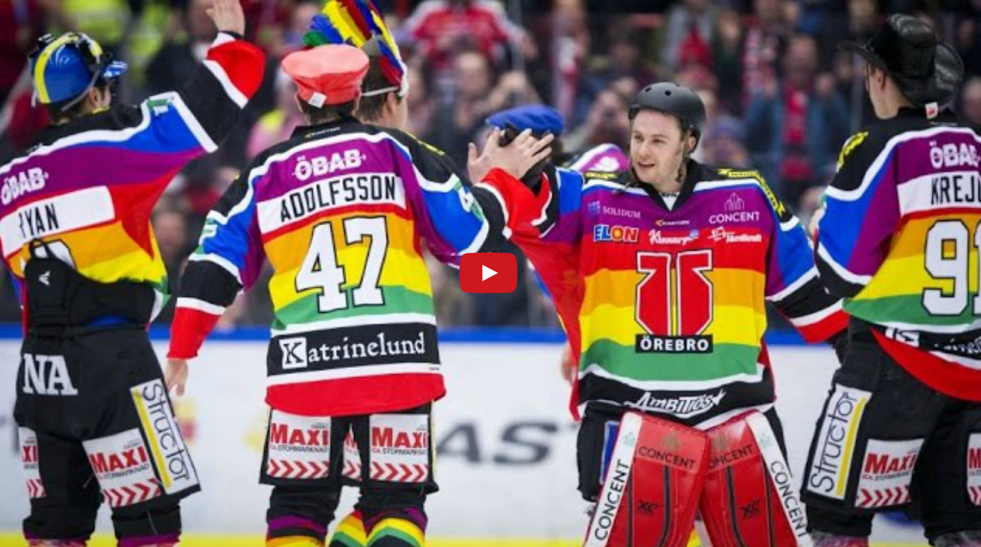
As you know, European hockey uniforms are plastered with ads. Toss in a rainbow design for Gay Pride Night, as the Swedish team Örebro did on Saturday, and the results, as you can see above, are eye-popping.
The visuals notwithstanding, it’s interesting to see a team wearing a gay pride uni. According to this Hockey News story, the entire Örebro team — players and staff — marched in the local pride parade earlier in the day.
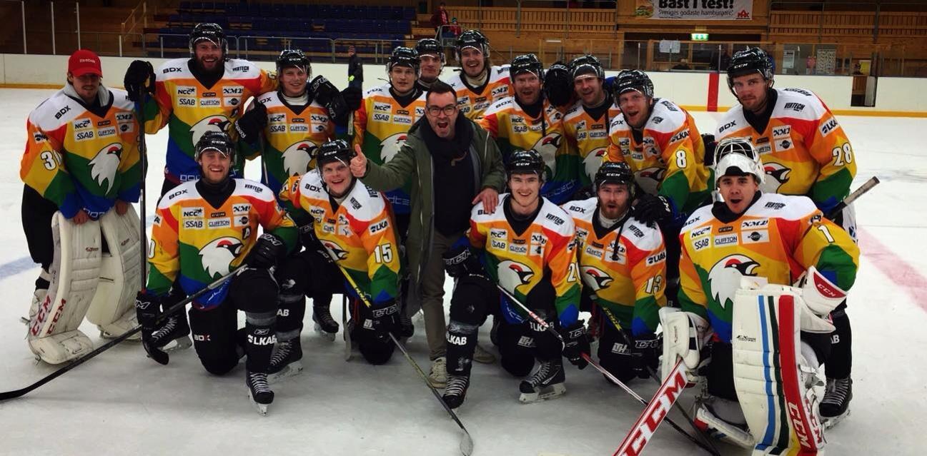
It turns out that Örebro isn’t the first Swedish hockey team to wear a uni design in support of gay rights. Kiruna IF has been wearing rainbow-patterned jerseys as their primary uniform — not just a one-off — throughout the 2014-15 season (further info here; click photo to enlarge):
Have any other teams, in any sport, ever worn a gay pride or gay rights uniform? If so, I can’t recall any. The closest things I’m aware of are these:
• In MLB, the Giants have been doing an annual LGBT Night promotion for several years now. This year’s will be on June 26, and they’ll be giving away this T-shirt.
• During last year’s Winter Olympics in Sochi, Russia, the German team wore rainbow-patterned attire for the opening ceremonies, which was widely interpreted as a protest against Russia’s anti-gay laws (although the German sports authorities denied it).
Update, 7:45am: Twitter user @dmoon informs me that Detroit FC — a fourth-tier soccer team — wore LGBT-awareness jerseys for a match last June. Further info here.
I’m not generally a fan of creating separate uniforms for every cause or initiative under the sun. Still, given the macho culture that’s rampant throughout so much of the sports world, it’s nice to see this particular cause get equal time with all the camouflage and pink uniforms. Think a team in any of the Big Four leagues would ever do something like this?
(My thanks to Rob Yasinsac for tipping me off to this one.)
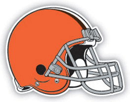
Potentially major Browns info ”” or not: Someone on Reddit who apparently works in the retail/merch biz has described what he claims to be the Browns’ new logos. He says there are three new marks, as follows:
The first is a lighter-than-we’re-used-to brown block-C with a white outline. It’s pretty straightforward.
The second is the new helmet. It’s a darker orange with a broad brown stripe bordered in white with what looks like little hats in the stripe like Seattle’s wing pattern. Brown facemask, too.
The final one is my favorite and, if I had to guess, I bet it’s the new primary logo. It’s a silhouette of a man from shoulders up wearing a derby hat, but his chin is to his chest and the hat’s brim covers all but his chin and a smirk. His hat is brown with a orange stripe. His coat is orange and his tie is brown.
I think it’s Paul Brown and they can’t show his face because his son owns the Bengals. But it’s seriously badass.
The block-C and helmet descriptions largely conform with other info that’s been circulating. The Paul Brown logo, if that’s what it is, is intriguing, no?
Of course, we have to take all of this with a grain of sodium chloride because it’s, you know, just some guy on Reddit. But still.
In any case, we’ll find out tomorrow. And no, I don’t know what time the unveiling is scheduled for, although I’m trying my best to find out.
(My thanks to Jon Dies for the Reddit link.)
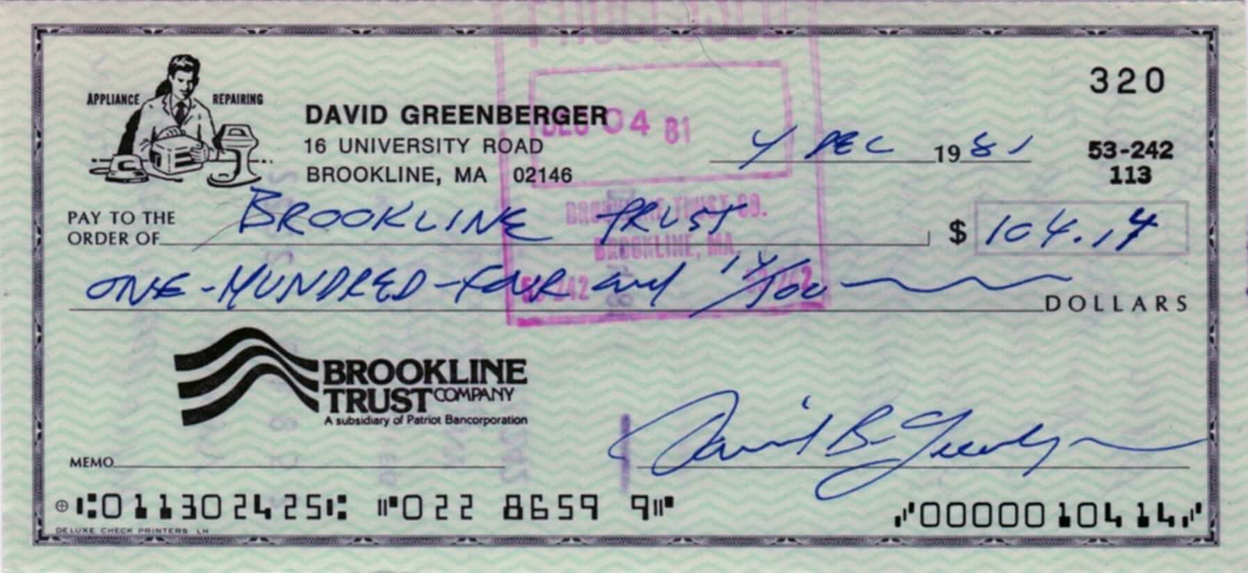
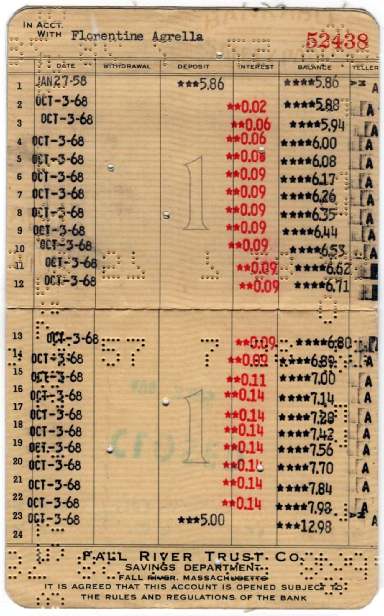
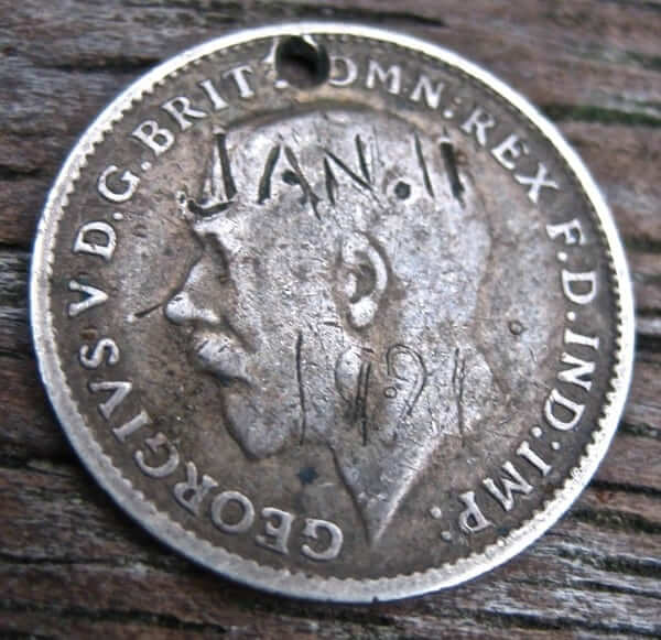
PermaRec update: I posted two new new entries on the Permanent Record site over the weekend:
• A cancelled check and a cancelled savings passbook (both shown above) are among the hard-copy banking records examined in this entry.
• Very old coins, tossed into the River Thames as love tokens and then discovered many decades later (an example of which is shown below), are discussed in this entry.
ITEM! T-Shirt Club ”” last call and new sizes now available: In case you missed it yesterday, we’ve added 4XL and 5XL size options to the Uni Watch T-Shirt Club’s March design. If you had wanted to order one of those sizes, go to the ordering page and choose the new Fruit of the Loom option, which Teespring is now offering.
No matter which size you want, today is the last day to order the March design, which is inspired by Patrick’s Day. If you want this shirt, you must order by 11pm Eastern tonight. Full details here, or just go straight to the ordering page.
Raffle results: The winner of the custom-designed bat is Scott Davis. Thanks to all who entered. More raffles coming soon.

Baseball News: Odd development in Atlanta, where Braves OF BJ Upton is now Melvin Upton Jr., and a team beat writer says he’ll have JrOB (from Mike Nessen). ”¦ Kinda like this T-shirt showing the Astrodome seats’ rainbow pattern (from Chris LaHaye). ”¦ Tyler Kepner spotted yet another version of the Tigers’ “D” down at spring training. ”¦ Picture-perfect stirrups, complete with the Liberty Bell icon, for Phillies reliever Mario Hollands. Also, note that the Phils are wearing a Clearwater centennial sleeve patch this spring — here’s a closer look at that design (photo by Ryan Lawrence, brought to my attention by Alex Krul Jr., with patch info fromJustin Dilks). ”¦ Very nice striped stirrups for MSU Denver, McNeese State, and UConn. ”¦ I’m not a fan of two-in-ones, but Under Armour has come up with a version that is definitely better-looking than the older, blocky-looking style. ”¦ Check out the 1981 Phillies’ “World Champions” warm-ups. Never seen that version of the “P” logo before. Compare to the one on Rose’s helmet. ”¦ Cubs C David Ross is experimenting with several different masks during spring training. ”¦ A couple of players at Mets camp — definitely pitchers Matt Harvey and Bobby Parnell, possibly others — have been wearing a pullover jersey with an odd collar, instead of the standard button-front BP jersey (good work by Nicholas Schiavo, who’s been tracking this rather obsessively). ”¦ Old issues of Popular Mechanics are filled with sports-related “innovations” that never panned out, including these baseball goggles from 1961 (from Graham Clayton). ”¦ Hmmm, did Reggie Jackson have “Suck” written on his batting glove? (Good spot by Tristan Ridgeway.) … Update: That’s not “Suck” on Jackson’s glove — it’s “Buck,” which was one of his nicknames.

NFL News: “This is a Walmart prize machine in Ithaca, New York, that’s remarkably and inexplicably heavy on Cleveland Browns items,” says James Comfort. “My favorite: If you look closely, there’s a fishing lure. How many fish do you expect to catch with a Browns lure?” Maybe everyone’s just clearing out their Browns merch in advance of tomorrow’s logo unveiling. ”¦ I think we may have seen this before, but once more won’t hurt: Just prior to the start of Super Bowl XII (Cowboys/Broncos), CBS play-by-play man Pat Summerall and color man Tom Brookshier showed and discussed a pair of the Broncos’ original vertically striped socks. Intriguingly, Sumerall then said that some Broncos players would be wearing those socks during the game as a tribute gesture. “I didn’t have two and a half hours to watch and see if any players actually did that, but maybe there’s an enterprising Uni Watcher out there with the time,” says Mike Wissman. I’m pretty sure it didn’t happen, but it’s interesting nonetheless.

College Football News: Absolutely worth your time to scroll all the way through this amazing 1903 Ohio State/Indiana program. Tremendous stuff (from Trayton Miller).

Hockey News: The Avs went G.I. Joe during pregame warm-ups last night. ”¦ Patrick Kane of the Blackhawks didn’t have a number on his helmet yesterday. ”¦ Pink unis on Saturday for the Belleville Bulls. ”¦ I’ll say this much for the Edmonton Oil Kings: Their pink jersey might set the record for the biggest pink ribbon (thanks, Phil). ”¦ The San Diego Gulls are back.

NBA News: The Pacers wore their FloJo throwbacks last night. ”¦ J.R. Smith, traded from the Knicks to the Cavs last month, returned to Madison Square Garden for yesterday’s Cavs/Knicks game and reportedly “tapped the Knicks logo at center court before the the game.” ”¦ Lots of love for Jerome Kersey last night in Portland, as the Blazers wore “JK25” warm-up tees and also wore their Kersey memorial patch for the first time.

College Hoops News: Nebraska wore 1954-55 throwbacks yesterday, and coach Tim Miles got into the act as well (screen shot by David Feit). ”¦ Abilene Christian and Southeastern Louisiana went color-vs.-color on Saturday (from Chris Mycoskie). ”¦ Middle Tennessee State had a blue-out yesterday, creating a color-vs.-color game against Western Kentucky (from Zack Bennett). ”¦ When UNC wore throwbacks on Saturday, Joel James had the old ACC logo. Everyone else had the current one. “So either they didn’t make him a new jersey for this year or his old one got mixed in,” says Jamie Hall. ”¦ Seriously ugly new unis for the Washington State women’s team. ”¦ Pink trim yesterday for the Duke and NC State women’s teams. It’s a little hard to see in that photo, but the NOB on the NC State player at right is “Inspire.” Other players wore “Fight” and “Courage.” ”¦ The UNC women’s team is now wearing the “DES” patch for Dean Smith (from James Gilbert).

Soccer News: Here’s a ranking of the top eight jerseys for the 2015-16 season. ”¦ West Ham midfielder Alex Song was wearing one yellow shoe and one orange shoe yesterday. Apparently this is common among Puma-clad players these days (from Brian Mazmanian). ”¦ Leicester and Everton went color-vs.-color yesterday (from Josh Billman). ”¦ Pink cancer-awareness unis the other day for the Baltimore Blast (from Steve James). ”¦ Chelsea responded to the latest racist brouhaha by promoting its anti-discrimination program on its jerseys (although it kinda gets lost amidst all the other bumper stickers) and wearing warm-up T-shirts with an anti-racism message (from Yusuke Toyoda).

Grab Bag: Remember when I wrote about pizza box lid supports a few years ago? If so, you may enjoy this cartoon that recently ran in The New Yorker. ”¦ F1 driver Sebastian Vettel says he might ignore the new ban on helmet livery changes. ”¦ Interesting article on the rebranding of Hillary Clinton, right down to the size of the “H” in her logo, as the 2016 presidential campaign approaches (thanks, Phil). … The city of Newport, Kentucky, is considering a new logo and slogan. ”¦ Jared Patz has started a Twitter account devoted to pro wrestling attire. ”¦ No photo, but an interesting NASCAR note from David Firestone: “Kyle Busch is out with injuries after a horrible wreck at the Xfinity Race. Matt Crafton took over driving duties of the No. 18 M&M’s Crispy Toyota. Crafton raced wearing Busch’s firesuit, which had to be hemmed at the last minute since Crafton is four inches shorter than Busch.” ”¦ Actor Russell Crowe thinks the UK rugby team Bath’s jersey is “kind of shitty.” ”¦ Century 21, the company that gave us MLB’s TATC uniforms in 1999, has announced new sponsorships with U.S. Soccer, CFH Racing, IndyCar Series driver Josef Newgarden, and USA Bobsled & Skeleton. ”¦ Some mismatched fonts for Army lacrosse. ”¦ NASCAR driver Brad Keselowski was wearing Adidas and Puma at yesterday’s Daytona 500.


What Paul did last night: I’ve done two Uni Watch posts on curling pins (look here and here), but I’ve never had a curling pin of my own until now — see above. That’s the pin for our curling club here in Brooklyn, which I rejoined last night, as our latest five-week competitive league began.
It had been about two months since I’d last curled, but I played pretty well. Phil’s also on board, and I’m happy to report that our team, called Sweeping to Victory, lived up to its name with a 7-0 thumping of our opponents. Then my bike slipped on black ice and fell out from under me twice on my way home — oof. A good reminder not to get too cocky. Bike and I are both okay, although at least one of us will likely end up with a black-and-blue mark. Bet you didn’t know curling was a contact sport, eh?
In the junior hockey item, it’s the Belleville Bulls
And the Saginaw Spirit.
Re: the Reggie Jackson glove, wasn’t “Buck” one of his nicknames before Mr. October?
It sure was
link
Ah, that solves the mystery, then. I’ll update the text.
That brings to mind something I’ve always found intriguing about nicknames. There are some that are purely media or fan generated and some that qualify as a genuine nickname — i.e. That’s what teammates called him.
For example, Gordie Howe was dubbed “Mr. Hockey” by media but in the dressing room he was known as “Blinky”
…. a nickname he acquired because his near-fatal incident with Teeder Kennedy left him with a permanent tic that caused him to blink more often.
If any Big Four sport did it, i would guess it would be the NHL, since they have a strong connection to You Can Play, the group started by Brian Burke’s son in memory of his late brother (who was gay).
“College Football News” item says it’s an Ohio State/Illinois program, but the link is to an Ohio State/Indiana program.
Brain cramp. Now fixed.
That’s right. See Cheer #7:
“We can, We can, We know we can,
We know we can, Beat Indian —”
Recommended:
“Wa-hoo, Wa-hoo, Rip, Zip, Bazoo,
I yell, I yell, for O. S. U., Wahoo. Wahoo.”
Most interesting to me was the advertisement in the middle of the score-keeping page: a portrait of “Dr. T.Z. Lentz, Crown and Bridgework Specialist,” surrounded by disembodied drawings of repaired teeth.
In an other ad nearby, The Troy Laundry assures the reader that “There is no tearing done on the new steam-heated bosom press machines.’
Another little tidbit from the program: the Indiana game was at home on Nov. 26. According to the schedule on p. 15, they played Michigan on the road–a 200-mile trip–THE FOLLOWING DAY.
I really hope that reddit rumor/leak isn’t true. Cleveland really needs to get over Paul Brown. Firstly, he never wanted the team named after himself and actually wanted them to be the Cleveland Panthers. Secondly, he was fired and then founded the Bengals, who are now a hated rival. You don’t pay tribute to an enemy.
Also… changing the stripes from brown-white-brown to white-brown-white? Are they crazy? The Cuyahoga river is going to burn again.
To be fair, I always got the impression that the larger portion of Browns fans loved Paul and hated Modell (for the firing, and any number of other things).
Maybe not like Washington fans hate Danny Snyder, but…you know…
yes. This is 100% true. Modell fired Paul Brown. He founded the Bengals and kept the colors similar as a “F you” to Modell.
I know that people in northern Ohio hold a special kind of hate for Art “go-to-Hell” Modell. I remember when he wanted a publicly financed new stadium, he gave new meaning to the word chutzpah; loudly complained that the stadium was falling apart because the maintenance necessary wasn’t being done. What he never said at the time was that the city was paying him to do the maintenance, and he was just pocketing the money.
@pauls… or the fact he was only paying a $1 rent and was getting money from the Indians being his tennant
Honestly, I’m really not sure why Brown was fired. I mean, seriously, who fires a coach who’s won 7 championships? (Yes, I know I made negative comments about those championships a couple days ago in comparison to Superbowl wins, but Brown was fired before the Superbowl existed, so shut up.) Someone made a bad decision. But, nonetheless, the team that plays in “Paul Brown Stadium” isn’t the Cleveland Browns. Cleveland should embrace the color, or the “Dawg Pound” thing, but they really need to leave Paul Brown to the team he created.
i think Modell fired him because he didn’t want to have a power struggle with his coach..
disagree with embracing the “dawg pound” thing.. it wasn’t really part of the team history until the 80s or so. i’d rather they go with the Brownie elf..
also i find it hard to believe that the Mike Brown(Bengals owner) would be okay with another NFL team using his father’s likeness
Everything up to the Paul Brown mascot icon sounded good to me. I like the idea of the rejiggered helmet. My only concern there is that I hope it’s just the Reddit poster’s ignorance that describes the hat design as being a “derby.” Paul Brown’s famous hats are more properly called a trilby. Assuming the team is actually using a trilby, not a derby, the whole helmet thing with a pattern in the stripe sounds promising. But man, the grinning Paul Brown-but-not-Paul Brown thing sounds worse than Poochie.
I don’t know, I’m thinking something like this…
link
Just might work.
someone made a concept and it came out sort of like that
link
Yeah, the Reddit interpretation is definitely worse than Poochie.
Still, remember that identifying that as the “new primary logo” was speculative. So assume for a moment that a person actually did see legit Browns merch with the Killing Joke Paul Brown logo. (Three separate assumptions, each probably more likely to be false than true.) Odds are that it would be one of several secondary or tertiary marks, not the team’s new primary. An updated helmet, with the trilby pattern in the brown stripe, or the block C logo, would be much more likely to be the primary logo. Probably if the Killing Joke Paul Brown logo exists, it would be part of a system of logos for fan merch and maybe stadium markings. May include a standalone hat mark and other elements.
It’s easy to give designers shit for the terrible uniforms and logos that have come out in the last decade or more but honestly is there a tougher job than a Cleveland Browns revamp? I’m all for tradition but if you HAVE to create something as the designers were tasked to do, what do you even have to work with? A color scheme that no focus group would approve for any consumer driven product and a franchise whose logo has been no logo for a long time. Yes there’s Brownie the elf but they won’t go back to that and the second best thing they have is an idea based on a supporter group that’s only existed since the 80s. I’ve never been a fan of the Dawg Pound connection anymore than I would if the Skins rebranded and utilized the Hoggettes.
Is “has described what he claims to be the Browns’ new logos” intended to just link to the helmet image on the right?
Oops — sorry. Will fix!
Now fixed. Here’s the proper link:
link
Detroit City FC in the NPSL wore a special uniform for Pride last year.
Yup, someone else just told me that — I’ve added it to the main text.
I found myself watching a few minutes here and there of the Denver/Dallas Super Bowl that was linked…
a) I noticed right off the bat that while most of Denver’s team had white facemasks, a few (including the kicker) still wore gray.
b) Dallas’ uniforms looked a lot better then – the pants seemed to match the helmets and the numbers were the same darker blue as the logo
c) If nothing else, go to about the 1:38 mark and watch Staubach’s long TD pass to Butch Johnson. There is NO WAY that would be considered a catch by today’s standards. Johnson doesn’t hold the ball anywhere near as long as Dez Bryant did versus Green Bay.
d) also note how good Pat Sumerall and Don Brookshire are as commentators. And the comparable lack of network hype.
Wow… yeah that was not a catch today. Of course, most of the pass defense of that era would be called interference today. So…
It is fun to watch old games and see how many plays would get called back with today’s rules.
Even going by the rules at the time it didn’t seem like Johnson really had full control of that pass. But the official was right there and instantly made the TD signal.
It was also interesting to see the difference in TV coverage. Today, that play would have been reviewed in super slo-mo for five minutes in addition to the officials spending time “under the hood”. The commentators would have argued back and forth about it.
But Pat and Tom just kind of agreed it was a TD and that was it.
It kind of made me miss those days. The refs made the call and the game continued.
re: Alex Song’s mismatched boots
“this is common among Puma-clad players these days” isn’t quite right. I think folks are talking about the pink and blue “Tricks” line, which is link. Song’s actually combining two different sets of boots, which not a lot of players do. He’s just a goofy guy, what with his link (and it looks like he recently switched from Nike).
Leicester and Everton went color-vs.-color yesterday
Color vs color isn’t all that remarkable, since link.
Maybe it was because Leicester wore its third kit instead of their perfectly acceptable link?
Besides, Benoit Assou-Ekkotto ruled the mismatched boot game years ago by occasionally mixing and matching manufacturers, never mind colour (though he mostly wore addidas like there link)
As much as I always like when there’s a nice long soccer section in the ticker, I think documenting every colour on colour game might just get a little ridiculous.
I mean, pretty much every match not involving Real Madrid or Tottenham would have to be listed.
I’m still not sure what the submitter’s intent was. Maybe it was in reference to the Men in Blazers’ “either you’re a red or a blue” thing, and how Leicester City is both?
No LGBT-themed unis to add here, but NBA had me confused for a minute this season by referring to their new sleeved jerseys as “Pride” jerseys.
Conversely, when Rob Yasinsac emailed me yesterday to let me know about “a Swedish hockey team wearing Pride uniforms,” I initially thought he meant they were about *Swedish* pride.
LOL. I just went with the way it was described by The Hockey News. Not sure if that was their editorial choice, or how the team announced it.
I’m like, the Eagles have already done link. Go find something else to be proud about, Sweden!
Was that a shout-out to nearby Delaware, OKA New Sweden?
Yes, though one step removed.
Philadelphia was part of New Sweden (the colony extended north past the present state line), which is why the link. The light blue and yellow scheme was a nod to the city flag.
Tyler Kepner spotted yet another version of the Tigers’ “D” down at spring training.
Not really “new”, it’s just a vertically-flipped version of the hat logo.
Yeah, I bet some intern just flipped the stamp.
The color man was Tom Brookshier, not Brookshire. And his partner spelled Summerall with two Ms.
Thanks. Fixed.
Noted. I was kind of just taking a guess on both of those.
The corrections were really for Paul in the main post. We all get more latitude in the comments, although now you know.
I actually called him “Don Brookshire” which is doubly embarrassing.
T-shirts made by CLE clothing similar to logo described:
link
I’m still calling him BJ Upton.
Maybe he caught the movie “One-on-One” on cable and decided to change after that?
“Chelsea responded to the latest racist brouhaha by promoting its anti-discrimination program on its jerseys (although it kinda gets lost amidst all the other bumper stickers)”
More in evidence to those watching on TV: The sideline ad boards for the entire game flashed “Support Chelsea. Support Equality.” … and … “Building Bridges.” No Adidas, Samsung, etc. No information on upcoming matches. Just the same message over and over.
While I’m sure that some of the actions were in response to Paris, the Chelsea game against Burnley had been advertized as a “Game for Equality” and the anti-discrimination slogans would have been there anyway. It was just a(n ironic) coincidence that there was a public controversy a few days before.
Did not know that. Just seemed strange to give the whole match to the same two signs over and over and over. Maybe a bit jarring to my eyes, as the NBCSN team didn’t really give it much attention. Perhaps the English broadcast teams did? Not sure.
Looking at highlights from link, it was way more heavy-handed this year.
It’s impossible to tell how much was in response to the incident, but it does seem like they ramped up the messaging this time.
I do know last season the Charleston Riverdogs wore Chaleston Rainbows throwbacks during the Charleston Prode weekend link
Ah, good one — I’d forgotten about that!
From the Charleston story:
“local drag queen Patti O’Furniture”
Day = made. Also by the sight of that Charleston Rainbows uni; one of the best terrible uniforms I’ve seen. Man, that cap logo on the sleeve is just all kinds of bad. It’s like, it’s not “so bad it’s good,” it’s so bad it’s transcendent. I’d wear that hat.
Linked in this morning’s Seamheads.com blog post is this link about Bill Murray’s time with the Grays Harbor Loggers in 1978. Note Murray is sans stirrups, unlike his teammates.
Correction: Nebraska’s basketball throwbacks were replicas of 1954-55 uniforms, not 1994-95.
link
Fixed.
Ye gods, you were not kidding about that Ohio State program! “Fat” Dilts is my new go-to name for an old-timer football player!
The San Francisco Bulls, a defunct ECHL team, wore LGBT-inspired jerseys January of 2014. link
Didn’t know about that one — thanks!
I’ve probably said this here before, but I’d really like to see the Browns go to a Helmet similar to the current Oregon State design- no logo with wide stripes. I’d prefer matte, but could probably warm up to a chrome version.
(another example is the Alternate chrome helmet the Buckeyes have worn recently with the wider stripes, although they wear them late in the season and the buckeye decals take up most of the helmet.)
What on earth do matte or chrome finishes have to do with the Cleveland Browns?
Lee
Because it’s 2015 and a lot of new helmets come in those finishes.
And I think the matte looks good on the Oregon St. helmets.
Oh. Its 2015.
Okay boss.
Lee
“Chelsea responded to the latest racist brouhaha by promoting its anti-discrimination program on its jerseys (although it kinda gets lost amidst all the other bumper stickers)”
I watched the start of the Chelsea game and I am pretty sure they said that Saturday was already scheduled as an anti-discrimination promotion even before the recent events. The timing was just an odd coincidence.
Sure enough, last year’s “Building Bridges” game was in late February too: link
Then again, the “Support Chelsea. Support Equality.” message seemed particularly pointed and it was on the ad board almost the whole game. I don’t remember that being the case last year.
In the Jackson-Denny McLain photo, any idea why McLain has the ’68 jersey with the 71 cap and Jackson is in the 71 uni?
Spring training shot. Teams often used older jerseys for spring workouts, esp. for new players whose unis hadn’t been ordered yet.
Using old uniforms for batting practice was common in that era.
Jared Patz has started a Twitter account devoted to pro wrestling attire.
YES! YES! YES!
\o/ \o/ \o/
For those curious, link is the the jersey which Russell Crowe thinks is “kind of shitty”. Typical of the type of uncouth savage who would rather indulge the all flash and no substance slapdash excuse for a sport that is rugby league that Crowe should not recognise class when he sees it.
That’s pretty tame by Rugby League’s standard for tackiness.
I do miss Rugby Union unis before polyester and sponsorships.
Metro State Denver represent! I’m digging the red hats for the Runners baseball team, they only had a dark blue when I went there.
Love that Brooklyn curling club pin! Maybe a trick of the lighting, but on the pin, the dominant light-blue background color almost looks like it has a touch of green, like the Statue of Liberty’s patina. Really makes the whole thing pop, especially the rings of the house. One of the most attractive curling pins I’ve seen!
re: Browns logo rumor – I hope the Paul Brown thing is true.
Never mind the pullover jersey with an odd collar, shouldn’t that Mets pitcher be in better physical condition?
Volei Futuro in Brazil, had their libero uniform change to a rainbow after Michael Santos was forced to come out after fans chanted at him during a match.
link
Article on what happened
link
RE: Check out the 1981 Phillies’ “World Champions” warm-ups. Never seen that version of the “P” logo before. Compare to the one on Rose’s helmet.
I bought a Mitchell & Ness replica of that very jacket (link). I have always loved that jacket precisely for it’s quirkiness – I can’t ever remember that style of “P” on anything else. A great reminder of the days when teams had their own, usually local, suppliers and not every piece of their uniforms was homogenized, licensed, patented, etc. etc. etc.
Was checking out the OSU/Indiana program. Go to page 11. Two members of the Indiana squad are shown wearing a skull cap (like an army or motorcycle helmet) with earmuffs?!?
Would love to know the story behind that!
Side notes of (some) interest:
That game was played at Ohio Field with a capacity of 500! (‘Shoe wasn’t built until 1922.)
Also, OSU wasn’t a member of the Western/Big 9/Big 10 Conference at the time (joined in 1912). Indiana was, however.
Sadly, Hoosiers won this game 17-16.
Thumbs up for getting the team name correct with an Ö :)
The thing with the Kiruns team is interesting. They are from a mining town and they lost several sponsors when the deal was announced but have made up for it by several donations from people who support their cause.
Also, the Kiruna jerseys are WAY better looking than the Örebro ones! I guess that’s what you get when you plan on using them over a whole season!
Also, worth keeping mind is that these things are generally quite rare in Sweden. No team ever wears throwbacks or anything else like it, so this Örebro move is very rare.
Am I the only one who thinks incorporating derby hats and the silhouette of an actual historic owner sounds like the tackiest thing imaginable? I hope to God this Browns rumor isn’t true.
I don’t know about tacky, and I’ll withhold judgement until I see it, but I think the use of a derby had and silhouette sounds silly. Of course, having a team named after a last name always seemed strange to me anyway.
Interesting that neither Örebro nor the others pictured use the familiar six-stripe pattern of the gay pride rainbow flag. That flag consists of, in order, red, orange, yellow, green, blue, purple, with red typically on top.
Maybe I am in a small minority – yet I would LOVE LOVE LOVE to own a pair of the Gold and Brown vertically striped Broncos socks!!
I’ve got a pair that I don’t wear, so hit me up…
The originals were almost all burned in a bonfire when the Broncos changed colors. (One hangs in the Hall of Fame, and there are probably other scattered around.) When they did the throwbacks in 2010, they made some socks available, so even beyond David’s kind offer, there may be some around.
” . . . it’s nice to see this particular cause get equal time with all the camouflage and pink uniforms.”
Curious, why it is, in your mind, “nice” exclusively for just this one cause to get equal time and not others – or all causes for that matter.
I join those who detest all the uni-sops.
Curious, why it is, in your mind, “nice” exclusively for just this one cause to get equal time and not others — or all causes for that matter.
If you go back and read what I wrote, you’ll discover exactly why I think it’s nice.
If you’re “not generally a fan”, more of a bad thing doesn’t make it a better thing.
I comprehended it the first time. And you used the word “particular”. So I guess it’s LGBTQIA – and that’s it – no more allowed!. It’s the word “particular” that is my issue. Either all causes – or none at all. I prefer the latter, you want something in between – and drew a fine line. That’s OK.
When I travel to LA to see the Dodgers, I like to see them in white jerseys, with blue script and red numbers. I want to see a uniform that I think is the team’s most aesthetically pleasing one. When the Orioles come to town, I don’t want to see them in the gawd-awful black tops, when they have much better road jerseys in the locker room. I paid to see teams look their best, and there’s nothing wrong being annoyed when teams foist their pandering on me to make more money (or whatever their reasons are), no matter the cause.
Also news to me that “macho” is exclusive to heterosexual people. I learn something new every day.
Dude, I don’t know what your problem is. I made it clear that I’m not a fan of special-cause uniforms. But if we have to have them, I’m more a fan of this one than of the usual pink/camo stuff. The end.
Do any of you have a good site to buy baseball helmet decals? I want my kids to have them for Little League
In the interest of proper credit, I didn’t create the screen grab of Nebraska coach Tim Miles’s gorgeous “faux-back” sweater. I simply retweeted an image from BTN’s Brent Yarina (@BTNBrentYarina).
Also, it’s a damn shame that the Huskers got smoked, because those uniforms (and Coach’s sweater) deserve to come back again.
Multiple sources reporting that the Browns logo release will be at 10am Eastern tomorrow.
Tony Grossi, Browns writer for ESPN Cleveland tweeted this earlier today
link
so probably no Paul Brown logo.
I sure hope the Paul Brown logo is not going to happen. There are some wild mock ups going around on Twitter tonight!
Here’s a pic of Matt Crafton wearing Kyle Busch’s firesuit:
link
Were the M&M’s intentionally put in a row to remind us how good they are?
Another one — SF Bulls pride jersey:
link