For all of today’s photos, click to enlarge
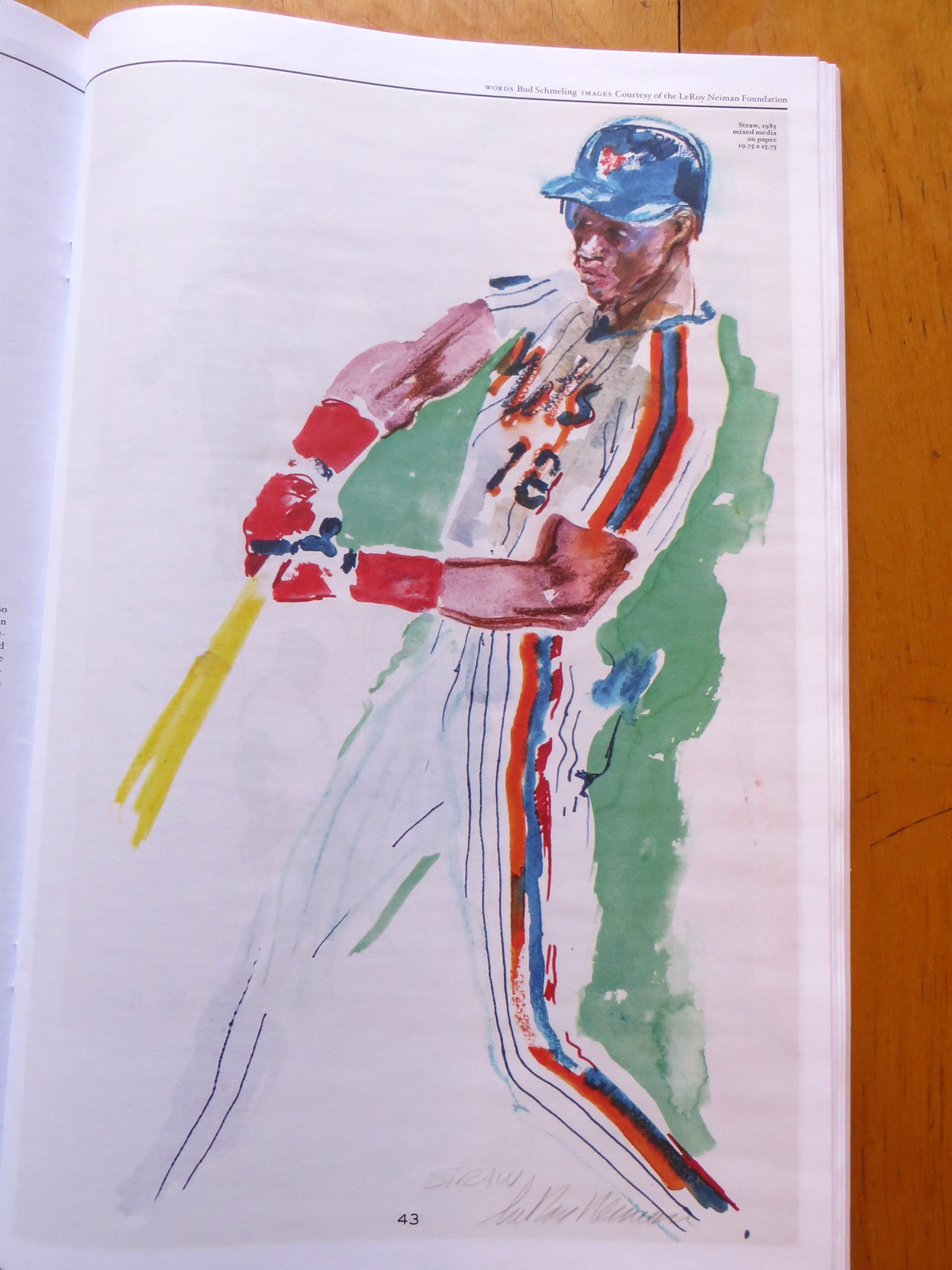
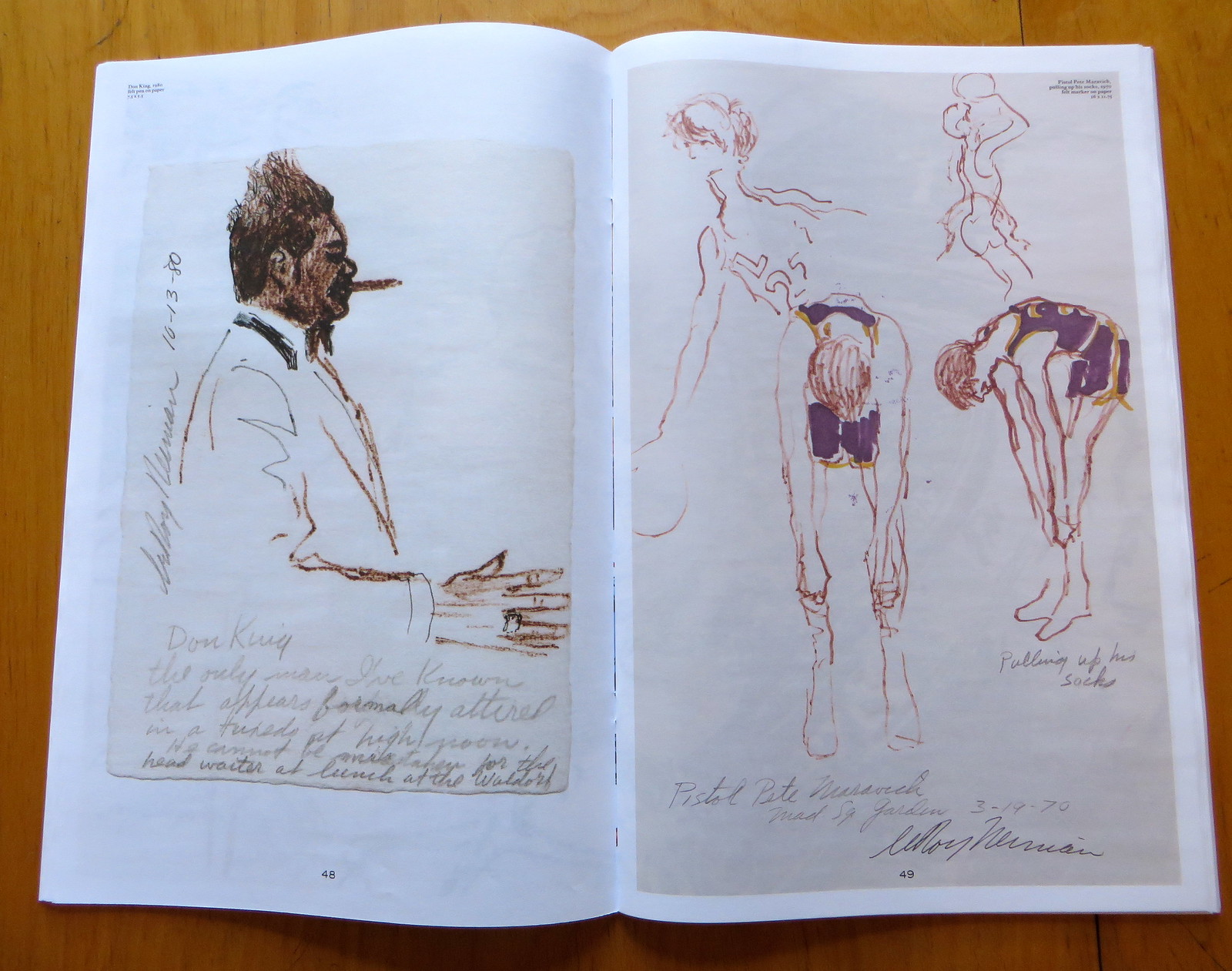
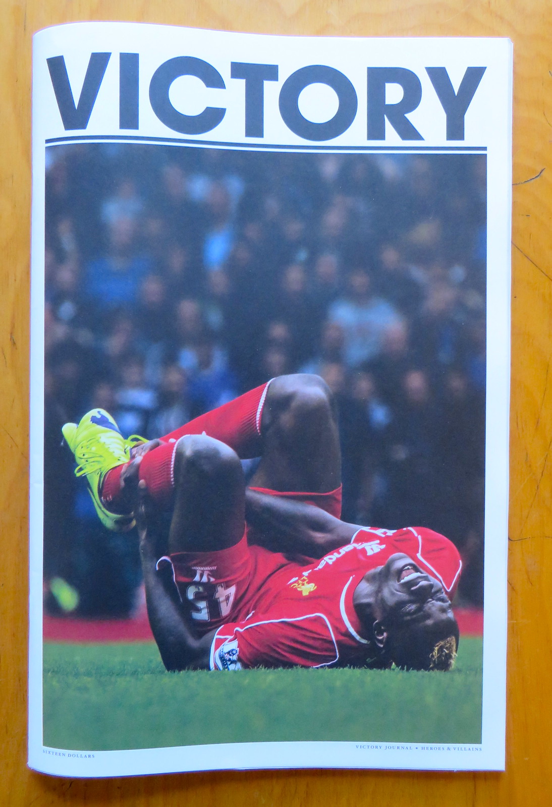
This illustration of Darryl Strawberry was done by LeRoy Neiman I’ve never been much of a Neiman fan, but the Strawberry image is part of a series of sketches that appear in the new issue of Victory Journal, the magazine published by longtime Uni Watch comrades No Mas, and I really like them. Here, check out these depictions of Vida Blue and Broadway Joe:
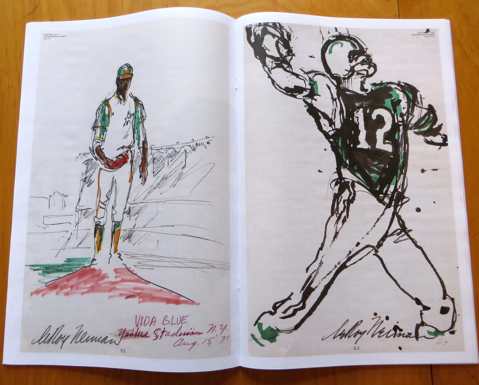
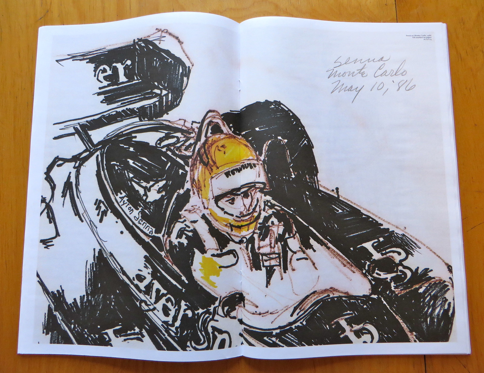
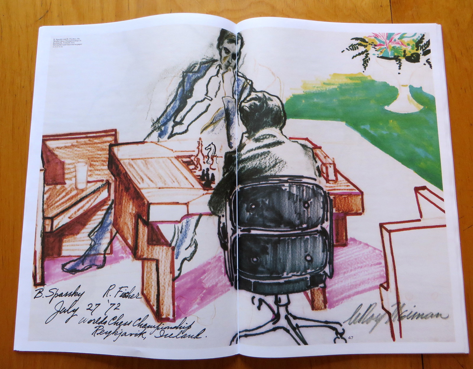
I love how spare and primitive these images are — much better than Neiman’s signature large-scale paintings, which I’ve always found to be too busy, too fussy. Wanna see more? These next spreads show, in order, former heavyweight champ Sonny Liston skipping rope and hitting the heavy bag; Grand Prix driver Ayrton Senna; 1972 World Chess Championship contenders Bobby Fischer and Boris Spassky; and boxing promoter Don King and Pistol Pete Maravich:

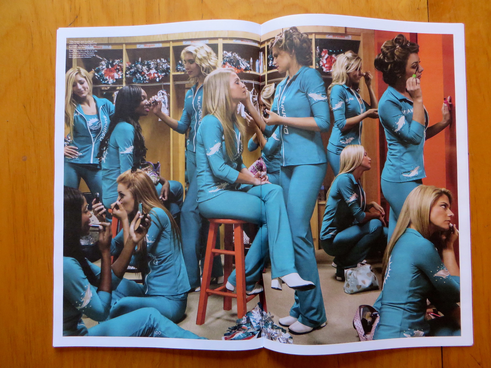
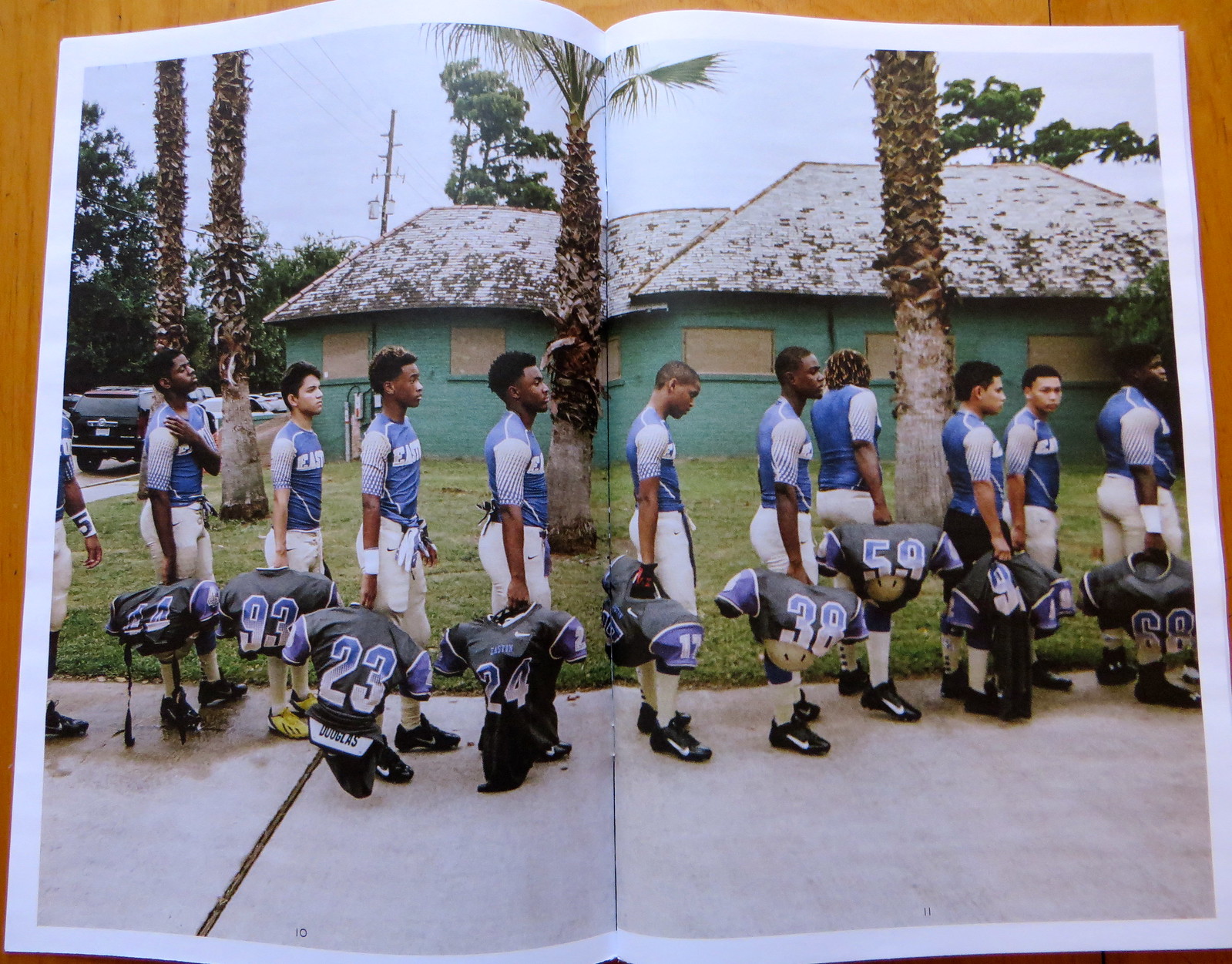
The Neiman portfolio is one of several excellent features in this new issue of Victory Journal. In case you’re not familiar with it, Victory is an oversized publication — 11″ x 17″ — and the production values are pretty stunning. If there’s a better publication for sports visuals right now, I’m not aware of it. When they bleed a photo across like the gutter to create a two-page spread, as they did with these shots of the Dolphins’ cheerleaders and a New Orleans high school football team, the colors and details really pop:
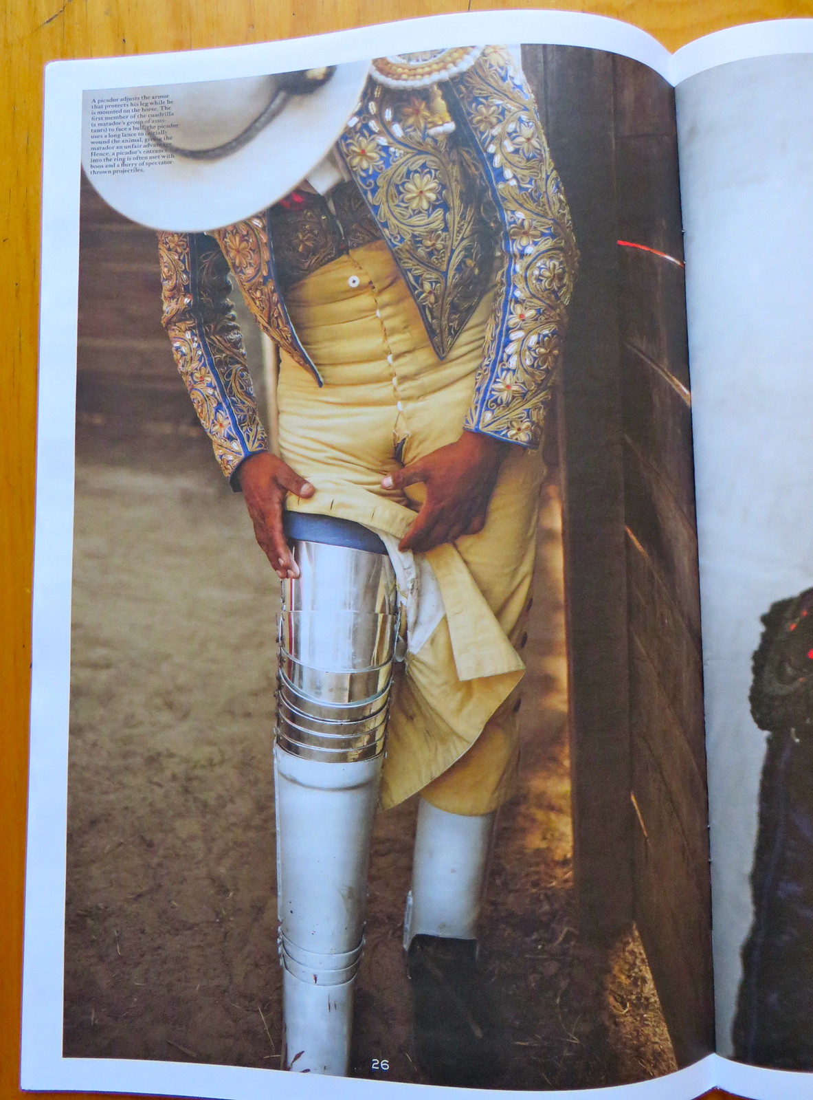
There’s also a big feature on bullfighting, which includes a unexpected uni-related photo — this shot of a picador adjusting his leg armor:
There’s more — a lot more — but I don’t want to give away the whole store. Suffice it to say that it’s very impressive, and it’d make a great stocking stuffer to boot. You can purchase a copy here.
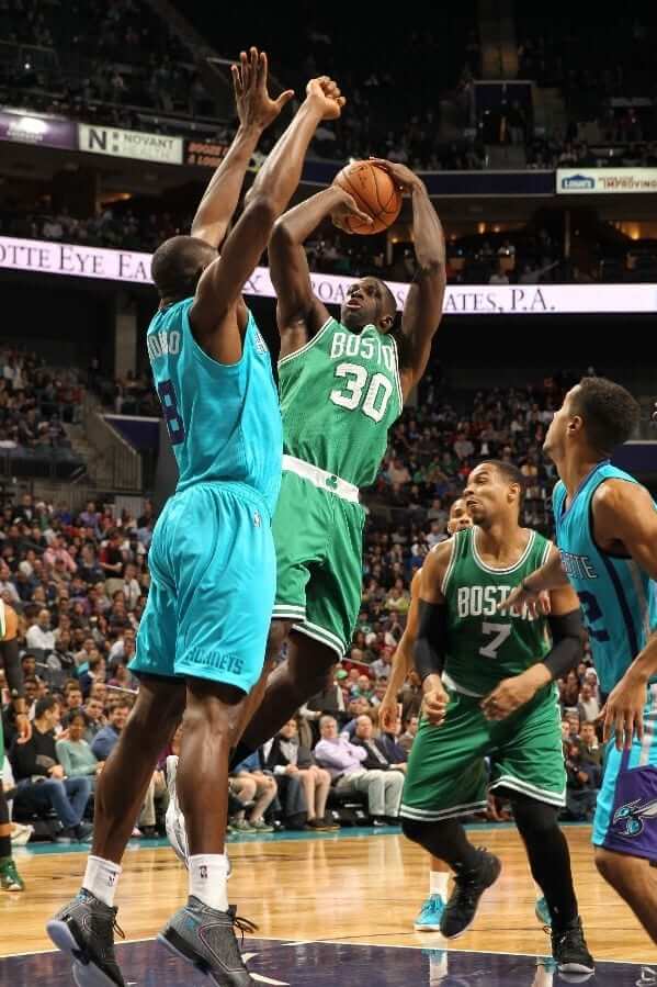
Can’t wait to hear what The Jeff has to say about this one: Bizarre scene last night in Charlotte, as the Hornets wore their teal alts and the Celtics wore their road greens, creating a color-vs.-color matchup that might charitably be considered to have had less than the optimal amount of contrast. Granted, it wasn’t as bad as last season’s Knicks/Hawks fiasco, but still. (Lots of additional photos here.)
But to give credit where it’s due, whoever was behind this move has succeeded in getting me to write a sentence I never thought would come out of my keyboard: They would’ve been better off if the Celtics had worn their sleeved gray alts.
ESPN daily double: In case you missed it yesterday, I had two ESPN pieces: one on mono-colored uniforms in the NFL and an FAQ-style explainer/backgrounder on the “I Can’t Breathe” T-shirts. Enjoy.
And speaking of the “I Can’t Breathe” phenomenon, last night it spread further, with the Trail Blazers the Georgetown college hoops team getting on board (both without Comic Sans!):
#TrailBlazers, incl. Damian Lillard & LaMarcus Aldridge wear #ICantBreathe t-shirts. pic.twitter.com/zgrmMvyuvM (via @bracehemmelgarn @cjzero)
— Phil Hecken (@PhilHecken) December 11, 2014
Hoyas wearing "I can't breathe" t-shirts pic.twitter.com/FH7ZR205xd
— Ben Standig (@BenStandig) December 10, 2014
NFL Superhero Project
By Thomas Correia
After 14 weeks, it occurred to me that I never redesigned the NFL logo to fit this project. I’ve finally done that, using the 1990s Marvel Comics logo as inspiration — you’ll see it in this week’s design.
Speaking of which: Tonight’s game is between the Cardinals and Rams, and I’m happy to bring in one of the comics world’s most popular and funny anti-heroes and an equally popular villain from the Marvel films (click to enlarge):
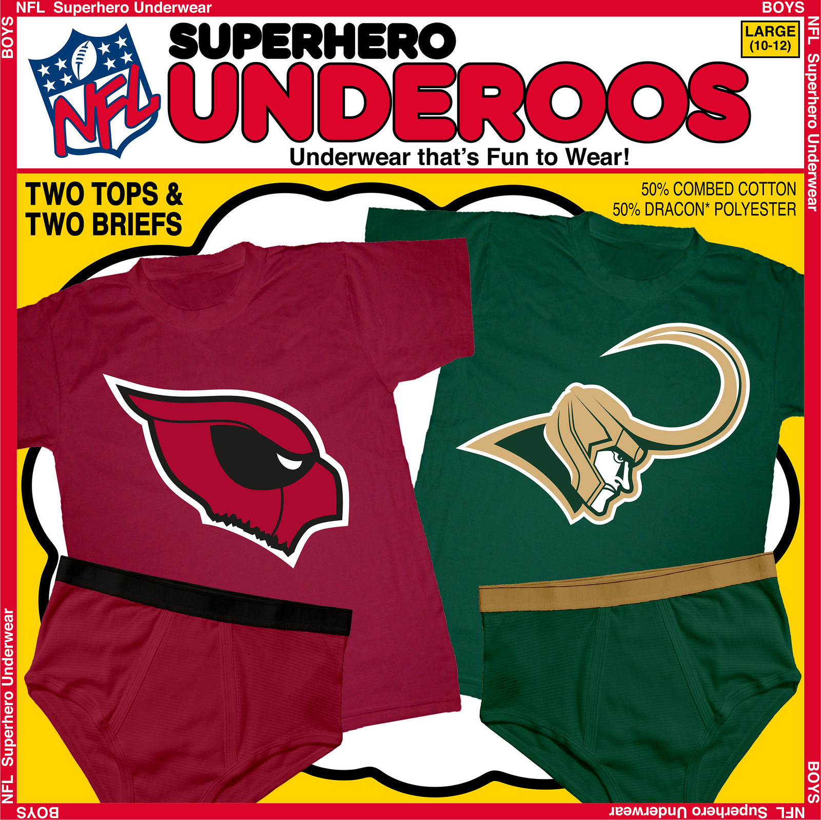
For the Cardinals, I figured I needed a hero with a red mask and some heavy black around the eyes. Got to be Spider-Man, right? Wrong — this is Deadpool, baby! Aside from the colors, the clincher for me is the point at the top back of his mask, which is always drawn in comics and mimics the same spot on Arizona’s team logo. Since Marvel’s “Merc With A Mouth” does occasionally get decapitated, it seemed fitting to have his head appear ripped off here as well.
For the Rams, it’s all about the horns. Trying to find a hero with curved horns is a tough task, but a villain is much easier. Marvel’s Loki has the most distinctive golden horns in all of comics, and I managed to include the eye, teeth, and back of St. Louis’s ram head logo. This should make for a nice pairing next time the Rams face the Vikings (Thor) in the NFL.
The final NFL Superhero matchup takes place next week, between the Titans and the Jaguars. Who will be the heroes that represent these last two teams? Post your guesses in today’s comments.

Theoretical stocking stuffers: Wouldn’t it be great, hypothetically speaking, if shirts like these were available this holiday season? If you like discussing hypothetical situations, get in touch and we’ll have a deep philosophical dialogue.
Coolest two minutes you’ll spend today: The video I’m about to show you defies description, but it includes team logos, patches, boxing gloves, a football, a soccer ball, tube socks, and several other sports-related visual elements. And for bonus points, it’s set in a delicatessen. Trust me when I say it is totally worth the two minutes it takes to watch it:

Mike’s Question of the Week
By Mike Chamernik
Which stadiums and arenas that you’ve visited have you found to be overwhelming? In other words, which venues have really impressed you, either by exceeding expectations or catching you off guard with their awesomeness? What stood out about these places?
Also, which venues have underwhelmed and disappointed you, and why?
Uni Watch News Ticker
By Mike Chamernik

Baseball News: The Braves released some artist renderings of their new ballpark. “There is a lack of attention to detail here,” says Michael Rich. “For one, the traffic on the highway is traveling in the wrong direction (first image). Second, it’s blurry, but the home team appears to be losing on the scoreboard (third image). As someone discovered and posted in the comments, the artist picked a real scoreboard from a game the Braves won in 2011 — in Nationals Park. Also, not only did they pick a road scoreboard, they picked the final Braves win of the 2011 season, which saw the Braves execute a historic September collapse to miss the playoffs on the final day of the season.”

NFL News: The Bengals will wear white jerseys with black pants on Sunday. … In October of 1989, Browns CB Hanford Dixon had his pants slip down while making a tackle, revealing some pink compression shorts. “The very first Pinktober,” says Matt Barnett. … The ’Skins wore some reflective numbers in 1938 (from Jeff Flynn). … Buffalo Bills cheerleaders were paid less than mimimum wage but were still required to spend $650 on their own uniforms. … A Bucco Bruce helmet made an appearance in the latest episode of New Girl. … In reference to yesterday’s Ticker, it seems that having the visiting team’s wordmark in the end zone wasn’t just a one-time thing. In the 1983-84 AFC Championship Game, the Seahawks had their logo in an end zone at the LA Coliseum, and in 1986-87, the Broncos had their wordmark at Cleveland Stadium (from Matt Larsen and Kevin Ortiz, respectively). … Ndamukong Suh had two pairs of gloves with him for the Lions’ most recent game. “I know players put their gloves on their facemask all the time, but this was my first time seeing a player doing so while already wearing a different set entirely,” says James Thomas. … Colin Kaepernick designed caps for New Era (from Tommy Turner). … Here’s a great shot of the 1939 NFL Championship Game between the Packers and Giants — look at that official with “NFL” on his back! And here’s what the game’s program looked like. Excellent stuff. Green Bay won the game 27-0 (from Bruce Menard).

College Football News: Here’s what the College Football Playoff National Championship ring will look like (from Phil). … George Monroe spotted an Ohio State fan’s car. … Here’s the patch West Virginia and Texas A&M will wear in the Liberty Bowl. … A character on the show The Middle attends Notre Dame, so he wore a jacket with both an ND logo and logo creep on it (from Matt Williams).

Basketball News: The Hawks used the 76ers’ Ben Franklin alternate logo on their scoreboard (from Phil). … BYU wore throwbacks last night. … Here’s how the “I Can’t Breathe” shirts caught on in the NBA. … Kevin Durant, Kobe Bryant and LeBron James will wear these shoes on Christmas. … T-Wolves forward Jeff Adrien wore a fingerless glove on the court last night (from Graham McCullough). … The Warriors unveiled renderings of their proposed new arena (from Brinke). … Yahoo still uses Bobcats orange in Hornets graphics (from Paul Lee).

Grab Bag: The Anaheim Ducks have created a farewell logo — and possible jersey patch? — for Teemu Selanne (from Chuck Eldridge). … Caddyshack-themed hats are now on sale (from Andy Horne). … “Some interesting jerseys have been unveiled for the NRL Auckland Nines rugby league comp,” says Kerry Hudson. “Many of the designs are quite ”˜loud’ compared to the teams’ normal jerseys. Also, two sleeveless designs, one of which features a charity’s logo on the front.” … New logo for Impact Wrestling, also known as TNA Wrestling.

They would’ve been better off if the Celtics had worn their sleeved gray alts.
This is one of those moments when I’m made to feel like my very slight and usually not-a-factor colourblindness is more significant than I thought. Seriously, that game from last night looks fine to me. I even went and watched some video just to make sure it wasn’t one of those “well it looks worse zoomed out and with everybody moving around” deals, but still no problems. Meanwhile, just the thought of trying to distinguish grey from teal makes my eyes feel sore.
Looked great. The numbers contrasted well so that helped…if they were both white numbers I wouldn’t have liked it near as much.
Two thoughts – I actually liked that teal on green game.
And, regarding the Broncos name painted in the end zone – was that in the Browns font?
Second was a question, I suppose.
Yes it was in the Browns font
Yes, all they did was paint over the “WNS” that was already there, squeezed in an “NCOS” and repainted the helmet.
Err.. what? How could teal vs light gray possibly provide better contrast than the teal vs green did?
I positively liked the Teal vs Kelly matchup.
Agreed. Not perhaps the best possible contrast, but sufficient, and anyway it’s such a great color combination that the overall beauty of the thing outweighs the marginal utility to be gained by stronger contrast.
I was thinking the same thing.
“The Braves released some artist renderings of their new
ballparkglitzy new real estate development with shops! and entertainment! and condos! and office space! and, well yes, a ballpark in it somewhere, but mostly the other stuff! (how much money do you expect them to make off of just stupid baseball?)”Fixed it for you.
Reads just like Lew Wolf’s pitch when he was buying the A’s. It’s clear that Lew doesn’t care about baseball, or even a stadium. He wants all the other junk.
It honestly looks a lot like the renderings of the Ballpark Village development near Busch Stadium. Same soulless character, same sprawling real estate that happens to be near a baseball stadium. Or, in the case of downtown Saint Louis, a bunch of parking lots mixed in with a small amount of real estate near a baseball stadium.
Re: The 1939 NFL Championship Game. There seems to be a disconnect between the photo and the program. The program’s cover states the game was in State Fair Park in Milwaukee, but the photo was clearly taken from a game played in NYC’s Polo Grounds.
Yup, I saw the same thing. This picture might be from the 1938 NFL Championship Game between the same two teams, but at the Polo Grounds.
Beat me to it.
Can’t be 1939 – the Packers link that year, except in the championship game in Milwaukee.
The photo could be from link, when the Packers played back-to-back games against the Giants in the Polo Grounds, first in the final week of the season and then in the title game three weeks later.
For what it’s worth, link from the 1939 Championship game in Milwaukee. The Packers and Giants played navy-on-royal in those games, even though the Packers introduced a white jersey in ’38.
Interesting the program does not mention this is, by the way, in case you’re interested, the NFL Championship game. And, how much is the program?
‘Skins “reflective” numbers….
Just satiny more than reflective I would surmise.
Satin *is* reflective.
Technically satin is diffusive, not reflective.
My original comment was meant to state that back then I think that satiny numbers were used, not reflective (per se) numbers.
And, unless I’m mistaken, could that be Jason Heyward on the scoreboard in the aerial view of the Braves’ new stadium?
“Submarine Sandwich” is terrific.
Despite the guy not using the Meat Grip Assembly properly, it is still a cute video.
First, “technically, satin is diffusive, not reflective”, now “Despite the guy not using the Meat Grip Assembly properly, it is still a cute video”? Good. God. Y’all. Over-think much?
Yes. Yes we do.
You can’t work on the Finley sprinkler head with the Langstrom 7″ wrench.
KT: It says SOCKET, not sprocket!
I thought the meat-grip thing is designed to be used either to push the meat or cheese from behind, or to clamp it from above. I see the folks at the deli counter across the street do it both ways, depending on how big the hunk of meat is.
QOTW: I’m going to be a total homer on this one, but seriously, if you ever get a chance to watch a game in Neyland Stadium in Knoxville, do it. The place is massive, the views of the river from the concourse are beautiful, and the atmosphere is electric, especially at night. You’ll (hopefully) have Rocky Top stuck in your head for a few days afterward, but it’s a small price to pay.
Neyland was awesome, even back when I went in 1980.
My QOTW: Underwhelmed by Turner Field. Built in the middle of a slum a one mile walk from anything nice. Next to an interstate that drags to a halt every day at 2 pm. Zero watering holes or restaurants nearby. Few access points, making a quick exit after the game impossible. Bad lighting makes fly balls and outfielders hard to see. It is a thrilling adventure trying to get back to your car without being mugged. No wonder they’re moving 11 miles up the road.
Forgot to mention:
“… Hawks used the 76ers’ Ben Franklin alternate logo on their scoreboard (from Phil) …”
Love it. Almost as good as Father Knickerbocker dribbling the ball for the old Knicks.
Something about the Braves “A” being seen as backwards from inside the park out of right field is unsettling to me.
Agreed.
If your design element is meant to be seen from the outside of the park, put it on the side of the building or link where it can’t easily be seen link. If it’s right in the view from the seats, link so your spectators can read it.
I believe that NOLA high school team is Warren Easton, playing maybe at Tad Gormley Stadium. It host the state soccer finals too. The palm trees in New Orleans surprised me when I went there.
1. LOVED teal v green.
2. I remember the Browns/Broncos AFC championship with the Broncos name on the field in Cleveland. Glad I wasn’t making that up.
3. Most impressive venues: Wrigley Field, old Yankee Stadium, LA Coliseum, Carmichael Auditorium in Chapel Hill (Tar Heel ’til I die).
Impressive venue: nationwide arena in Columbus. Caught me completely off guard. HUGE and beautiful.
Cow palace in SF; interesting location, interesting arena.
Agree on Nationwide. It’s almost perfect.
I watched a couple of the PES videos after you posted that one on Facebook (?) last night. They all have some kind of sporting equipment thrown in there, very cool videos.
It will be interesting (to me) if KD wears those shoes on Christmas as he has only worn last years style since coming back from injury.
link
QOTW: Most underwhelming facility I’ve ever been in is the Baltimore Arena. It’s antiquated, it’s gray, you can count the number of concession stands on 1 hand. To quote Stone Cold Steve Austin on the arena, “it’s the drizzly shits.” It’s particularly frustrating when compared to a small town like Hershey, PA having the nice Giant Center. I gladly make the hour & a half journey to Hershey Bears games but skip arena concerts & events 10 minutes from me.
I’ll take Hersheypark Arena…warts and all…over Giant Center.
QOTW: Most impressed with (not my teams): Fenway and Oriole Park at Camden Yards
Underwhelmed with (not my teams either): Old Yankee Stadium, Oakland Coliseum
QOTW –
Most overwhelming: Louisiana Superdome (simply due to its sheer enormity, especially in 1981)
Most underwhelming – Fenway Park (rickety, filthy, uncomfortable)
QOTW:
Most overwhelming: (homer pick) Kyle Field; (non-homer pick) Fenway Park – surpassed all my expectations.
Most underwhelming: Camden Yards – probably partly because I went to a day game in July against the Blue Jays when both team were bad and it was 100 degrees. I’d like to give it another shot.
QOTW: Recently caught the Nets at Barclay’s Center and was very impressed – place looks like a million bucks! Super modern. Granted I grew up with Nassau Coliseum, and MSG is aging rapidly but wow, I was not expecting an arena to be so “stylish.”
I’d be remiss to not mention Oakland Coliseum. After watching Shea and the aforementioned Nassau Coliseum deteriorate, I felt O co. was not as much of a concrete “sinkhole” as people have made it out to be. I’m not saying it’s pleasant, just saying it wasn’t as unpleasant as I was expecting.
I second Neyland Stadium as overwhelming, it’s a huge cauldron of sound and concrete and orange (pregame anyway.) Underwhelming stadium is Citrus Bowl (in 2001 anyway) very much a dump in a dangerous neighborhood.
I was at the Citrus Bowl back in 2003 and 2010 when it was still very underwhelming. But as a 70+ year old stadium without a professional/major tenant in there, I think it is what it is. It hosts two bowl games a year, minor league soccer (recently but lost that to new soccer stadium) high school state championiship, truck pulls, etc. So yes, the place is largely unused. It resembles a NASCAR track with it’s amenities more than a football stadium.
I think it would be hard to categorize the Citrus Bowl in with professional underwhelming stadiums. My least favorite would be tropicana field although I think the recent upgrades which I haven’t seen might change that.
The Citrus Bowl however recently underwent a $175M renovation where they tore down the entire original lower bowl and upgraded the place. I’m anxious to check it out but have to desire to do so with the events they hold there.
…have “no” desire with the events they hold there.
But yeah I could see if your college team is playing in a bowl game there, after playing in a nice college stadium all season long, and then visiting that place, it would be incredibly undewhelming. Bad neighborhood included.
QOTW:
Most overwhelming: Lambeau Field surprised me. The facilities around the stadium (the museum, shops, and sports bars) are terrific but then it leads into a simple bowl with a clean layout and the minimum of oppressive ads. Combine that with Packer fans who were surprisingly polite to a bunch of Bears fans and it was a nice experience. No intention to go back though until the Bears are better at football.
Most underwhelming: Petco. The layout is a little weird. The concourse tends to rise and fall making casual strolling a little difficult. Also I had to search far too long for a fish taco. In San Diego fish tacos should be sold like hot dogs.
While I agree about the Fish Tacos, I do like Petco. It is unconventional, but I like it.
QOTW: Two places I first visited in the late 70s come to mind. I was kind of disappointed by Wrigley Field. It was a chilly day in May, the crowd was small and uninterested, and the ivy wasn’t out yet. Bleah.
On the other hand — and I’m pretty ashamed to admit this — the Astrodome was actually kind of cool. They never should have played baseball in the place, but I have to admit that when I first walked in my jaw dropped. And despite the size and scale, with a big crowd it had a surprisingly warm and friendly, almost intimate, vibe. Not sure how they pulled that off.
I do not really have an underwhelmed venue but the one that has stood out to me is the Great American Ballpark for the Reds. Its very clean and orderly. Granted it is a fairly new park but it seems they are keeping great care of it. Like most parks it has it’s own quirks and is technically considered a Retro-Modern Ballpark partly because its use of Glass panes . It is simply a beauty of a park. Granted it is 1 of 2 MLB stadiums I have been to and the other is Turner Field in Atlanta and really nothing much to say there.
Old Yankee Stadium and RFK in DC… dumps.
Nothing really has overwhelmed me. Not saying there aren’t nice facilities I’ve been to, but nothing I was awestruck by. I can say, driving past Paul Brown Stadium in Cincy on the way to Louisville is impressive because of its size, but I don’t look at it like some holy grail.
Overwhelming: Bryant-Denny Stadium, Tuscaloosa, Alabama. The Bryant Museum is there, the campus is great on game day, and 103,000 people. The history and tradition at Alabama on full display. Honorable Mention: Jerry World. Yeah, I know. But, Jerry World is a spectacle to be seen. The stadium club levels, the video screen and so forth.
Underwhelming: Wrigley Field. Yes it is historical and all but the place has seen much better days.
QOTW: I hated the Metrodome. No connection to the game being played. Sterile utilitarian feel that lacked any charm
I loved Lambeau before all the renovations started about 15 years ago. No bad seats. Fans connected to the team and the game.
The Metrodome could have a distinctive charm – for baseball, and only if it was near capacity. Worst thing about it for me was that basically none of the seats were aligned for comfortable viewing of a baseball game. Mostly, the seats pointed straight out, which is fine for football, but for baseball if most of the seats are aimed at a point in deep left-center field, you spend the game craning your neck and getting a crick in your back looking over at the diamond. I describe watching a game at the Metrodome as being just like watching the game at home in your living room on TV, only less comfortable and with a worse view.
QOTW: I don’t have a candidate for overwhelming, but I don’t recall being less whelmed anywhere but the new Yankee Stadium. It’s just a big gray and navy boring ballpark. Not much for amenities, craft beer selection nearly-to-nonexistent, just overall uninspiring. It’s Yankee Stadium, ferchrissakes. Aim higher.
Citi Field is ten times as nice.
QotW: Bell Centre in Montreal. Not so much the facility itself, but the Habs put on a truly impressive, immersive experience. I think they keep the lights in the arena dimmer than any other hockey or basketball arena I’ve been to. Really focuses the whole experience on game action when the fans across from you aren’t brightly lit. And the ice positively glowed. It was fantastic.
Runners up: Camden Yards. First time there, it was $2 student ticket night, and I had what I believe can be objectively called the worst seat in the stadium. Back row of the upper deck, the seat that’s at the top of the last aisle on the third-base side. No seats in front of me, just concrete steps down to the bottom of the deck. I’ve sat in the equivalent seat at New Comiskey, and it was almost enough to induce nausea. At OPACY, that seat offered a better and more comfortable game-watching experience than most of the seats I’d ever had at the Metrodome.
Wrigley Field. Truthfully, the place was kind of a dump the year I lived on Chicago’s north side. But one meaningless late-season evening game was one of the most magical experiences I’ve ever had at a ballgame. At the half inning once the game was official, there was a ceremony to honor Gary Gaetti for reaching 2500 career games. Two innings later, the wind shifted, and what had been a warmish late-summer evening turned in moments into a crisp, brisk late-autumn night. The baseball season was days from over, and here was autumn blowing in and chasing off the last heat of the summer just as a childhood favorite player reached the last milestone of his long career. The magic of that night is right up there with Game Six of the 1987 World Series in terms of most memorable games I’ve attended.
Not sports, but still a public performance venue: The Concertgebouw in Amsterdam. No better hall for classical or chamber music.
The Submarine Sandwich video was pretty amusing. ViewMaster discs from a soccer ball? That’s just crazy!
QOTW: I was surprised how gorgeous Target Field is here in Minneapolis. You’re walking downtown, turn right, and BAM: an oasis of baseball! The concourse that offers a view onto the field, the statues, the architecture… all is beautiful and neatly tucked away.
Sentimental favorites are Miller Park and Lambeau.
The Bradley Center is very underwhelming.
Underwhelming: Tropicana Field. The Trop feels like you’re watching guys play in an unfinished basement. It does have the little pool that houses a stingray, so maybe it’s an unfinished basement with an aquarium, but it’s miles behind other MLB parks.
I enjoyed the Trop, probably because expectations were so low. It was like “holy shit! They play baseball in this?”
But in a fun way.
Ditto.
I had not been in the building in 20+ years when I went to a game last summer. I was expecting the absolute worst and (perhaps for that reason) was pleasantly surprised.
I don’t know how to be underwhelmed when you have no reason to have expectations. Something that’s underwhelming should be something that doesn’t live up to expectations or billings. I don’t know anyone who has expectations of the Trop.
Thanks for sharing the Neiman sketches. The lines and strokes reveal a lot about his large-scale style. He sculpts.
Paul, OMG, that sub sandwich video made my morning! Thanks for posting it. I particularly liked the viewfinder slices and slinky onions. Awesome!
Caddyshack-themed hats are now on sale
Okay, was I the only one really disappointed to learn that they weren’t talking about link?
Link was broken for me. Does it come with a free bowl of soup?
Yes, it should.
It looks good on you though.
Overwhelmed: Safeco Field, just a great stadium.
Underwhelmed: Yankee Stadium (the last one). Interesting neighbourhood though.
Good call on Safeco. AT&T in San Fran is also a great place but Safeco is freaking awesome.
I got a couple for overwhelming or surprisingly wow. The Ralph Engelstad Arena for hockey at the University of North Dakota is an amazing collegiate venue (though I think it kind of makes the now unnamed program kind of a one trick pony when it comes to collegiate sports. Also, Phil Jackson played basketball at ND. And they also stole Notre Dame’s ND logo for a while.) The other is Rockton Hononegah High School’s (Illinois) inflatable basketball and indoor track facility. Here, you say wow and scratch your head. Danica Patrick went to high school here.
QOTD: I love the new Wembley, though I know I’m in the minority.
Regarding the Hornets-Celtics matchup, I’m not a fan of that particular color pairing. Hornets were the home team, they should’ve worn their whites for this one, simple as that.
QOTD: I’d have to say that my first – and what proved to be my only – visit to Tiger Stadium actually overwhelmed and underwhelmed me. It was overwhelming because of the history of the park. It had been a decade since Gibby had yakked one off of Goose to clinch the 1984 World Series, and the Tigers were in decline. Still, I could feel the history, and could imagine what it was like to see some of those great events, even those from before my own lifetime. And it was underwhelming because, despite the history, I could also see the age of the park, that it was pretty shabby, with less-than-impressive amenities.
Made it to Tiger Stadium in its final season of use. More overwhelmed than underwhelmed for me. I expected an old park to be less than snazzy, so the shabbyness didn’t bother me at all. I’d always wanted to sit in the overhanging left field seats, so being able to do that was the highlight of the trip.
It was the right field that had the overhang, actually.
The game I attended was before the 1994 strike, before any serious discussion of a new stadium had begun.
Any outdoor baseball stadium during a day game on the 1st warm and sunny day in spring for best experience….,Worst stadium experience Hubert H Humphrey Metrodome for baseball, awful awful awful!
QOTW:
Overwhelmed by:
Camden Yards, Baltimore. I went to my first game there back when it was the only retro-styled stadium. The visual aesthetics of the place blew me away. It still looks great today. The Orioles got it right.
Coors Field, Denver. Architecturally and visually, it’s close to the equal of Camden Yards. When you add a stunning view of a sunset over the Rocky Mountains, it elevates the experience to transcendent.
Hilton Coliseum, Ames, Iowa. The arena itself is acceptable if somewhat unremarkable, aesthetically speaking. But the game-day atmosphere is one of the most electric I’ve experienced at a live sporting event. The fans get so loud that I swear you can feel the whole building shake.
Underwhelmed by:
Rose Bowl, Pasadena. I must qualify this by saying I’ve never been to a Rose Bowl Game. I’ve only been to regular season UCLA home football games there, which I’m sure colors my opinion. The setting in Arroyo Seco borders on breathtaking. And the main entrance with the iconic Rose Bowl logo above the gate is one of the most photogenic stadium elements in the country. But when the UCLA football team puts a mediocre product on the field, the game-day experience can best be described as apathetic. A crowd of less than 50,000 feels depressingly sparse when you play in a 92,000-seat stadium. I’d love to go to some games there now that UCLA is good again to see if the atmosphere has improved. Although I suspect the leg room in the stadium would still be a problem. It’s frustratingly narrow, especially for anyone over six feet tall.
My Question of the Week comment is “awaiting moderation,” so I’ll give a quick tl;dr recap while it serves its time in message board purgatory.
Overwhelming – Camden Yards (cool retro architecture), Coors Field (mountain views), and Hilton Coliseum (Hilton Magic).
Underwhelming – Rose Bowl (apathetic UCLA fans disguised as empty seats).
Those Caddyshack hats are a laugh-riot! “Gunga Galunga”!
QotW:
Impressive: Wrigley Field. I found i to be everything it was cracked up to be, and more. I loved the architecture, the exposed steelwork under/behind the second deck, the irregular shape of the field and dugouts, and most notably, the absence of a giant video board.
Close 2nd: Madison Square Garden, post-renovations. I never liked working at MSG and I still think it’s a ludicrously-designed building (with the floor 5 stories up from the street and only one elevator reaching all levels, among other things), but the complete transformation of the arena’s interior is nothing short of astounding.
Underwhelming: New Yankee Stadium. Everything seems to be three times bigger than it needs to be. The place has no character apart from its sheer bigness.
The thing about Wrigley is this: if you go once (or for the first time), it’s all you describe. It’s amazing.
If you go several times in a summer, or over the course of time, you realize it’s a relic and not fan-friendly at all in terms of functionality. Quite frankly, it’s a PITA.
The half-billion in renovations should alleviate some of that, though. Else there’s no point.
QOTD: The Astrodome overwhelmed me on my first visit, a Pirates-Astros game in the summer of 1967 when we first moved moved to Houston from the NY area. Having grown up watching baseball from the upper deck of to old Yankee Stadium seeing the roof and strikingly green Astroturf was very impressive. Attending the Game of the Century (Houston vs. UCLA) that following January blew my first game impressions out of the water. The totally full house, the court out in the middle of the vast dirt playing field, sitting directly opposite the huge scoreboard…. I’ll never forget that night.
Running a close second is my memory of Memorial Stadium in Lincoln. The sea of red seems to be just that.
As far as underwhelming…. last summer I visited the ballpark in Arlington where the Texas Rangers play. Global Life Stadium? The fact that it felt like it was 120 degrees in there didn’t help my impression that the place was designed by a committee that never met until the place was being built.
I’m continually underwhelmed by Miller Park. Never liked the barn; County Stadium had ten times the personality.
So it’s not just me. I’ve only seen both places on TV, but I got the same feeling.
Its very different with the roof closed verses roof open. Roof closed feels like going to slowly paced movie. Roof open feels much better.
Both experiences are improved by tailgating.
The biggest problem I have with the place is the fact that the roof doesn’t actually open. Even when they slide the panels as far apart as they go, the roof still looms overhead.
I don’t know why, but I came to Miller Park with high expectations. It’s not a bad ballpark by any means, but neither is it exceptional in any way. Well, any emotional way; intellectually, some of the technical feats of the thing impress me, but that’s nothing like the kind of human connection you can have with a really good built environment.
Also, my first game there a Brewers-Nats game in 2005, and I got hassled by several different people for wearing Nats gear on the basis of “bet you didn’t root for them when they were the Expos.” Well, duh, the team moved to my city. (Plus, I >did root for the Expos back in the day. Many seasons, they were the team I liked in the NL East. Try explaining that in a packed stadium concourse.) It was the most actively hostile treatment I’ve ever encountered at a baseball game. It’s like Milwaukee fans literally cannot imagine that someone from Washington, DC, might actually travel to their state and take in a game. Clearly, if a person shows up at Miller Park wearing opposing team gear, he’s a local resident who’s a bandwagon poseur.
I’m surprised you got that reaction. I used to see plenty of out-of-town fans wearing their gear in Milwaukee, with not a word said. But my once-every-couple-years isn’t enough to mean anything.
Well, the Nats did beat the tar out of the Brewers that game, and maybe Milwaukee just has a disproportionate number of people who were mad at how MLB shafted Montreal. (Heck, I was angry about that too!) Definitely did not match my usual experiences in Wisconsin.
I think this contest was rigged.
link
The 49ers put the Cowboys’ name and logo in one end zone during the 1970 NFC Championship at Kezar Stadium. The Cowboys reciprocated in the ’71 NFCCG by painting one end zone red and using the 49ers old-style wordmark and logo at Texas Stadium. (In fact, IIRC the Cowboys used to have goalpost pads from the opposing teams on one of the posts during home games.)
They did. It was always fun to see how the visiting team’s looked, especially if it was your favorite team (from my perspective, they did a nice job on the Bears; dark, dark navy, and a reddish-orange).
I love how spare and primitive these images are – much better than Neiman’s signature large-scale paintings, which I’ve always found to be too busy, too fussy.
That’s exactly how I feel about his work. But you’re right, the sketches are engaging. I especially love the Fischer/Spassky piece; the angled line of Fischer’s leg sticking out from behind the desk contrasting with the strong vertical of his arm and face.
That’s how I feel about his single-subject and landscape work. But man, when he’s applying his style to a larger field of motion, such as horse races, regattas, or even wider views of a football play than just the single player, he can achieve nearly transcendent technical effects.
QOTD:
overwhelming – Prudential Center. I didn’t expect much from something in Newark but I had great seats for a Nets game and the concessions were fantastic. Best food in a stadium/arena I’ve had besides the new Shea Stadium.
underwhelming – Met Life Stadium. It looks like a giant fucking metal spaceship, not a football stadium. Ugly in every imaginable way from the outside. The inside has a total lack of character (but damn good seats). I’d trade some of the “newness” and amenities for a little ambiance.
Speaking of spaceships…
Has anyone been to Soldier Field in Chicago before and after the ‘improvements’?
Would you say that was a once under-whelming venue made overwhelming, or vise-versa?
Never been but the pics definitely make it look spaceship-like.
From the outside, it looks ridiculous, like a spaceship landed inside a classic Greco-Roman arena. But once you get inside, it’s excellent. Great sight lines, improved concessions. They could use an upgrade on the video boards, though.
Good stuff, everyone. I’ve only been to like 5 baseball parks and 2 NBA arenas (and no NHL or NFL games or non-DePaul college games of any sort) so I’m kind of living vicariously through you guys here.
You are not alone in not seeing much of the major leagues live. I’ve only been to one major league stadium/arena and that was once to the Saddledome in the 1990s. Wasn’t under or overwhelmed with the building, but was underwhelmed with the one game experience: lackluster game played – very low scoring, very few shots, hits, or much of anything, and too much noise (not from people) during stoppages, and the anticipated overpriced beer/concessions were mitigated by smuggling in my own mickey of booze.
Even if I lived close to a major league venue I suspect I would probably go very rarely even if I was in a position where I could afford to. I think rather than going to a major league game once, I would more likely take in a few games at the more intimate stadium/arena of a lower level league team. There the complaint about the seating is more likely it’s comfort on your backside and not how far away a seat approaching affordability is from the action.
Met every sky high expectation: Bell Centre, Montreal. Favorite team bias might be at play, but it’s a 22k seat church with great views and a perfect experience. And all those banners in the rafters. Unmatched.
Impressive: I took a road trip with my mom to visit universities (none of which I attended, because I chose McGill), but I was in Chicago for U of C and Northwestern. We stayed an extra day in Chicago, and I wanted to go to the Field Museum. Lo and behold, what is right next door? Soldier Field! Only saw the outside, but it looks like a coliseum! Nice.
Underwhelming: New Yankee Stadium, for sure. The place is a stale sterile characature of its old self. It’s like if you won the lottery and wanted a new house that looked just the same, but you got white marble toilets instead of white porcelain toilets. No soul. There is nothing to it. It’s just where the Yankees play. The Habs brought the character to the new place, but the Yankees didn’t. Shame.
QoTW:
Overwhelmed (kid me): Franklin Field. Part stadium, part churchyard. A true treasure.
Overwhelmed (adult me): Camden Yards. The Vet was all I knew, and after making my first-ever road trip to Baltimore I felt like I had been watching live MLB baseball wrong my entire life.
Underwhelmed (kid me): JFK. Best viewed from a distance…a real toilet inside and out.
Underwhelmed (adult me): Citizens Bank Park. Just another retro re-tread, this one in the wrong section of town.
I should have mentioned Camden Yards for the same reason. When I was there in 1996 (for the deciding game of the ALCS, no less) I had only ever been to Shea and post-’70s’renovation Yankee Stadiums. Next to those, Camden Yards was so comfortable, attractive and inviting that I never looked at Shea the same way again.
QOTW: I was at SkyDome in ’95. At the time it was an architectural and technical marvel. But at the same time, id didn’t *feel* like a ballpark. Overwhelming as a building, underwhelming as a ballpark.
The best NHL rink I’ve seen a game at is Nationwide in Columbus. Great sightlines, really nice brick facades. Luckily I was there before they started with that stupid cannon. As a close second, the hockey experience and building in Nashville are *very* underrated.
If the turf was in better shape, I might have enjoyed my trip to Skydome (2002) a lot more. Plus the roof was closed even though it was a nice day.
When I think “overwhelmed” I get mental flashes of too many bells and whistles…scoreboards so big and advanced that some people watch them instead of the game, and things like that. I like a place that properly whelms me…it doesn’t distract from the game, but during breaks in the action you can look around and enjoy the feeling of being there. But I’ll play along and use the lingo:
Overwhelmed: Williams Arena in Minneapolis, Tiger Stadium, Cleveland Municipal, and of course, Richfield Coliseum and Three Rivers.
Underwhelmed: Akron’s new stadium (the Rubber Bowl didn’t need replaced, just spruced up a bit) and its basketball facility, Rhodes Arena (what it lacks in space it
makes up foralso lacks in charm) as well as Veterans Stadium.Forgot being overwhelmed by Baltimore’s Memorial Stadium. Walking around it my first thought was, it’s just like Cleveland Municipal only much cleaner and nicer. Still haven’t made it to Camden Yards. I really need to do that someday.
And duh, I forgot PNC Park. Wasn’t happy about Three Rivers being replaced, until I set foot in the new park. If you haven’t been there, go…and sit in the upper deck so you can really enjoy the skyline.
I don’t pop in to annoy everyone much during the week but since I was here looking for updates on the Pirates new leak which I’ve seen elsewhere will be terrible I’ll answer the QotW:
Overwhelmed:
The new Pirates ballpark in baseball. I might be biased as a Pirates fan but this place deserves every bit of the praise it gets. It is such an enjoyable place to watch a game. Especially now that the Bucs have decided to play winning baseball there.
The new Steelers stadium during Steeler games. I like the Steelers but they’re not my favorite team. But it is always a joy to watch a game in this place seeing the way the Steeler fans support their team. Nothing like seeing 60,000 Terrible Towels waving for an opening kickoff. Now can they PLEASE finally tear out the grass and put field turf in?
The Georgia Dome in Atlanta. I may be biased being a Falcons fan but even though I can’t wait for the new building to be finished I loved seeing a Falcons game here. I’ve never been to KC or Seattle but this was by far the loudest place I’ve been too.
The new Penguins Arena. No longer the newest arena but what a place!
Underwhelmed:
The Vet in Philly. OK my friend’s dad would get free tickets so we’d go a few times a year. There would be nobody there as we sat by ourselves right behind the 3rd base dugout in a concrete bowl watching a terrible team get crushed. But hey, free tickets! I’d lump the rest of the cookie cutters in but the only other one I was in was Three Rivers & that was only because my mother was there while pregnant with me back in the We Are Family days.
The current Flyers/Sixers arena. This place has not aged well at all. Watching games here is a painful experience in more ways than one. Maybe because I’m 6’2″ and 210 pounds. But it is just terrible.
The Civic Arena in Pittsburgh. I’d list this as just slightly better than the Flyers/Sixers arena for same reasons. I spent many games shoehorned into a seat I couldn’t fit in sitting at an angle with my knees wrapped around my head. Not an enjoyable experience.
The old Pitt Stadium. As a Panther fan I hate to say it but the place was nice in it’s time but at the end it was just a hard to reach dump. I’ve been to Panther games here and in the new stadium. The best thing that Pittsburgh did was tear this place down and move in with the Steelers.
QOTW:
Overwhelming…I have two for this one. First is the new Dallas Cowboys stadium (AT&T?). The huge video screens are fabulous, plenty of leg room and big, comfortable seats. The whole place is first rate and a great place to check out a game. Second is Memorial Stadium in Lincoln, NE. The stadium is a bit smaller looking in person than what it seems on TV on tv but the sea of red is impressive. Also, the atmosphere is the best of any stadium I’ve ever visited.
Underwhelming…Wrigley Field. I heard so much about it but it was a total letdown. Apart from the ivy on the wall, the place is a big dump, fan unfriendly and full of drunk Cubs fans. Not a good time at all.
As the nephew and cousin of bullfighters, I do feel it necessary to inform you that the image of the man adjusting his leg armor is not of a matador, but rather of a picador. The matador wears no armor. The picador, who tires the bull out from horseback during a bullfight, wears leg armor so that the bull does not crush his leg.
Ah, thank you — will adjust text accordingly!
Was underwhelmed by Shea – seriously so – despite getting to sit in great seats on a June evening in 1991. Same was true for the LA Memorial Coliseum on a fall Sunday in 1987. Maybe it would have been better pre-Raiders.
Even on a bad day, Coors Field is phenomenal.
Jaguars = armless tiger man
Titans = The Tick
Yes it is Armless Tiger Man for the Jaguars . . . or perhaps a small furry mammal that loves big guns.
As for the Titans, it’s not The Tick. Focus on the flame part of their logo for a hint.
QOTW:
Overwhelming: Lambeau, Camp Randall, Memorial Stadium (Nebraska & Clemson), Target Field, Xcel Energy Center
Underwhelming: Wrigley, Turner Field, Owen Field (Oklahoma), Notre Dame Stadium, Target Center, Bradley Center
Let me be the one to say it: color vs. color is a stupid idea.
Why? Because it’s subjective as to whether or not two uniforms contrast enough. Different people detect colors in different ways. The whole point of uniforms in team sports is so players can quickly detect who is on their team and who is not. Dress one team in white and the other team in a a dark color and be done with it.
On the other hand, it was cool that at least in a few cases for playoff/championship games that home teams were willing to put their opponent’s name and logo in one of the end zones. A nice sportsmanlike gesture and also gives the game a more unique feel – acknowledging that it’s not just a regular game.
QOTW:
Under: Fenway. Looks great on TV. Not so in person. The chairs (’96 or ’97) were small, hard and didn’t face the diamond.
Over: Old Yankee. Not a Yankee fan. But was overwhelmed when I climbed some steps and saw the beautiful green field. There were ruts (cow-paths?) in the tunnels and restrooms.
Gripe: Shea in the mid to late 90s. The PA/music was very loud…even during a boring, sleepy game.
Over: MSG. The party atmosphere when the Rangers were good. Every other arena tries it. MSG & the fans made it really rock.
Over: Coors. Those mountains! A Florida boy like myself watched the mts more than the baseball.
Even: Suncoast Dome/Thunderdome/Tropicana. Totally matches expectations. It really was grey inside. I felt like I was watching baseball through a fog. I went to several hockey games in the Thunderdome. It obviously wasn’t built for NHL. But it was overwhelming to attend a hockey game with 25,000 other fans.
QOTW
I am a day late and a dollar short but here goes:
Overwhelming – Olympic Stadium, Montreal – I had seen it a couple times before but I finally attended an event this year when the Mets and Blue Jays played two exhibition games. I probably took a thousand photos each day. The place is so photogenic. As a friend commented, it was designed when architecture was a vision of the future. We seem to have lost the ability to imagine what the future might look like.
Underwhelming – Barclays Center, Brooklyn. Thought I was in a shopping mall. Some future we developed for ourselves. It might be clean and new, but it was also generic, boring, and sterile inside.