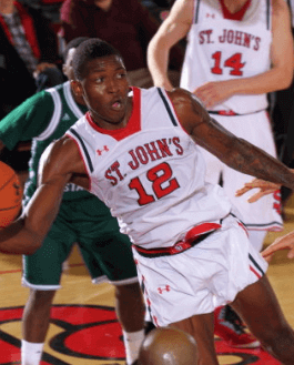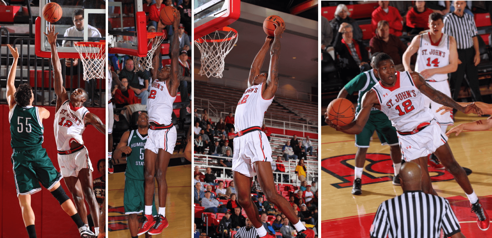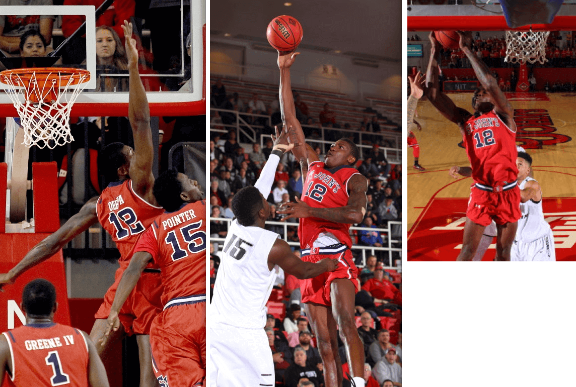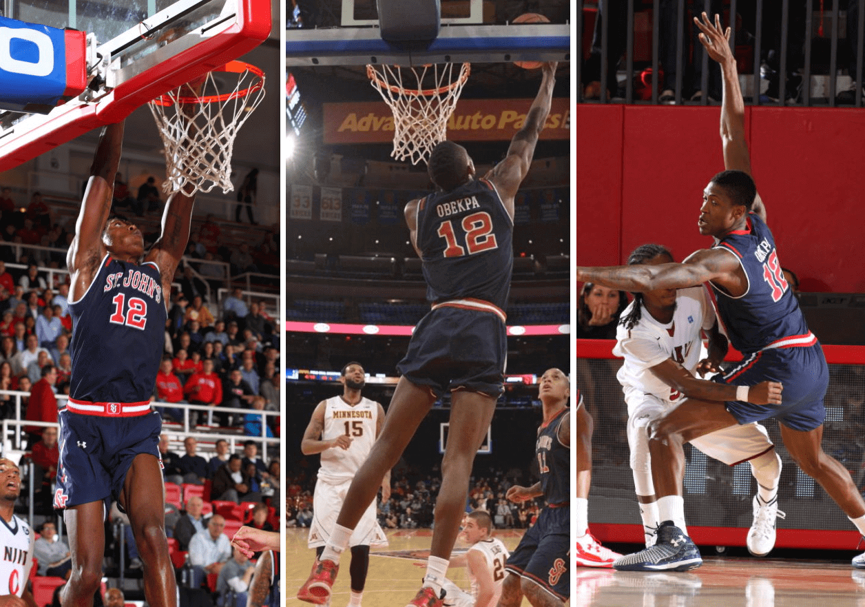
Last week I mentioned how several college hoops players, especially on Under Armour-outfitted teams, were rolling up the waistbands on their shorts, maybe to make their shorts shorter or maybe just as a style thing. But center Chris Obekpa, who plays for St. John’s — another Under Armour team — definitely wants his shorts to be shorter, and he’s taken a unique route toward achieving that: He’s tucking the bottoms of his game shorts into the bottoms of his base-layer compression shorts.
Obekpa is a junior, but this is the first season he’s been fussing with his shorts. According to this New York Daily News article, he does it because “when he perspires the moisture collects at the bottoms of the shorts and makes them heavy and cumbersome when he is running.” So he “tucks the bottoms up under the spandex padded bike shorts he wears underneath them.”
I’ve never seen or heard of anything like this. And although the season is young, Obekpa has already applied his unique stylings to all three of Red Storm’s uniforms — white, red, and blue (click to enlarge):


Apparently the shorts don’t always stay put, because I found a few game shots showing Obekpa looking normal. But those are the exceptions — he definitely likes to have them tucked in.
If you’re wondering why Under Armour doesn’t just get Obekpa some shorter shorts, well, he’s wondering the same thing. According to that Daily News piece:
Obekpa said he thought that Under Armour, who makes the Red Storm’s uniforms, would have heard about his desire for a shorter short and would have sent one by now.
“I thought everyone would know by now I need them,” Obekpa said. “I will ask the coaches to try to get me shorter shorts.”
Is it a good look? Definitely not. But I still love it, because it’s (a) something we’ve never seen before and (b) a personal uni modification that has nothing to with “Look at me!” and everything to do with functionality. In other words, it’s a personal quirk, an eccentricity, a reminder that uniforms aren’t always uniform. I like that.

’Skins Watch: A lifelong passionate ’Skins fan has decided he can no longer support the team’s name and has altered his team gear accordingly (thanks, Phil). … Here are some more ’Skins fans who’d like to see the team change its name. … The National Congress of American Indians has begun a Kickstarter fund drive for a project that will involve “digitally removing the offensive logos from an exciting Washington highlight. No R-word, no mascots, no racism. But the amazing football play remains. In this way, we’d like to remind Washington fans that their memories will remain when the mascot changes.” One of their donor rewards is this T-shirt, which is one of the simpler and better anti-’Skins tees I’ve seen. … Here’s a good podcast that looks at the ’Skins situation within the larger context of how Native Americans have been depicted and (mis)represented throughout history (from Adam Brodsky). … Here are photos and details on the anti-’Skins protest that took place prior to last weekend’s ’Skins/Niners game (from Patrick O’Neill). ”¦ Here’s a good piece on Bruce McCall, the illustrator who designed this week’s ’Skins-mocking New Yorker cover (from Yusuke Toyoda). … Washington’s new mayor-elect, Muriel Bowser, thinks the ’Skins should change their name (from Tommy Turner). … ChangeTheMascot.org has produced an anti-’Skins commercial (thanks, Phil). … Lots of Native American imagery on the cover and interior pages of this 1951 Stanford football program. The team was called the Indians in those day (from David Dinsmore III).

Baseball News: New road cap for the Brooklyn Cyclones. ”¦ If you’ve been looking to acquire a bunch of baseball pants and softball shorts with contrasting pocket flaps, look no further. ”¦ Douglas Ford was watching footage of the 1980 World Series and spotted a fan in the stands wearing an interesting two-tone Phillies batting helmet. ”¦ Check out this 1971 shot of Indians catcher Ray Fosse. Is that the team’s “C” logo on the front-facing back of his helmet? Never seen a logo on that side of a helmet before (from Marc Viquez).

NFL News: With Corey Fuller playing for the Lions and brother Kyle Fuller playing for the Bears, and those two teams playing each other yesterday, the Fullers’ parents wore a new style of Frankenjersey. Much more interesting than the usual half-and-half format, no? ”¦ For the second consecutive year, the Cowboys wore blue at home on Thanksgiving. ”¦ Bears RB Ka’Deem Carey was pushed out of bounds during yesterday’s game against the Lions and ended up bending the yard-marker pole (screen shot by Seth Moorman). ”¦ Two months ago I ran an entry on NFL coaches’ headsets. At the time, Niners coach Jim Harbaugh was wearing his earpiece on the left side. But in recent weeks he’s become a double-flapper (from Omar Jalife). ”¦ During last night’s 49ers/Seahawks game, NBC ran a graphic showing just how hard the Niners’ passing game was sucking. As you can see, they used a Reebok-era photo of Michael Crabtree (good spot by Jamie Burditt).

College Football News: Here’s a good site devoted to U. of Minnesota football uniform history (from Tony Wotzka). … Whoa, look at the texture on No. 45’s uni number in this old Georgia Tech shot. That whole photo is tremendous (big thanks to Michael Rich). … As you know, the laws of physics — or at least the laws of capitalism — dictate that Everything Must Be Branded, so the annual game between Clemson and South Carolina will henceforth be known as the Palmetto Bowl. Trophy and logo to follow in time for next year’s game, wheee! ”¦ Maryland is using its uniforms as a recruiting tool. Who knew?! (From Phil.) ”¦ In a related item, Ohio State is OK with wearing alternate uniforms against Michigan because recruits like it (from Andre Torres).

Hockey News: The Penguins made a fun Thanksgiving-themed adjustment to their Twitter avatar yesterday (from Aaron McHargue). ”¦ New gray alternates tomorrow for the Omaha Lancers. They’ll be auctioned off, with the proceeds going to support children’s brain cancer research.

NBA News: The Timberwolves wore pink shoelaces on Wednesday night as a gesture of support for Thad Young, who had missed the previous five games due to the death of his mother (from Mike Engle).

College Hoops News: Looks UNC coach Roy Williams was wearing a shirt with the outdated ACC logo the other day (from Michael Kinney). … Here are St. Bonaventure’s Buffalo Braves throwbacks for this weekend. ”¦ Those black/pink Penn State uniforms will make their on-court debut today.

Soccer News: Real Madrid has removed a small cross from its logo to appease a Middle Eastern bank (from Chris Weber). … Some awesome gameday posters on the Chicago Red Stars’ website (from Steve Johnston). ”¦ I think we’ve seen this before, but just in case: Here’s a website with a database of English and Scottish soccer uniforms (from Paine Proffitt).

Grab Bag: There’s a movement in Miami to restore an old stadium. … Love this 1929 Maine track and field jersey and program (from David Firestone). … Australian cricket player Phil Hughes, who’d been critically injured after being hit by a pitch, has died, which is leading to more articles about cricket helmets. … Electronic devices sold in America no longer have to carry certain regulatory logos and symbols. ”¦ A few days ago I mentioned the word “vexillology,” which is the study of flags. As a follow-up to that, the great design podcast 99 Percent Invisible recently did an excellent episode about the city of Portland’s flag design. Recommended listening.
Looking ahead: Phil’s taking a well-earned break, so you’re all stuck with me this weekend. See you tomorrow, yes? Yes.

Hey Paul, how was your Thanksgiving?
Swell, thamks.
Did you have ham and are subconsciously remembering how delicious it was? Or it that just a typo?
Typo.
I grew up in the DC area as a Redskins fan. I still am even though I haven’t lived there for 25 years. I root for them because they are my team. Had they been called something else they would still have been (and be) my team.
Many of my Facebook friends who are still in the DC area are adamant about the team keeping the name. I don’t know if I am not because I’m not THERE any more, or just cuz it doesn’t really matter. ???
I think the ‘Skins should probably change the name, but I would certainly hope they keep the colors. The colors catch my eye no matter where I am or what I see them on.
It’s my connection to the city, the colors, and the memories that make them my team the the name or the logo.
What if the Bears or Lions wanted to change their name? I know that would be for a different reason, but the WORD doesn’t make the team.
Wasn’t there going to be an NBA player who was going to wear shorter shorts this season? Does anyone know who that was/is and what his shorts look like this season?
Chris Douglas-Roberts of the Clippers.
After his epiphany, Washburn found a manufacturer that makes custom patches in China. Over eight months, he spent about 100 hours working with the company to perfect the font and colors of cloth strips that said, simply, “WASHINGTON.” He ordered 30 extra in case, some day, other fans wanted to use them. Total cost: more than $300.
The strips look pretty good. Looking at the math though, it appears he is using a sweatshop. If you work with a company for 100 hours for $300 and you subtract material costs, SG&A and profit, the workers at this manufacturer are being paid less than $3 an hour.
not necessarily, working for a large sports firm myself, many factories work on there colour matching / sampling stages pro bono in the hope that it leads to a larger order in the future recouping the original costs, its also unlikely it was 100 hours on there part, more he spent 100 hours on it in total.
i’ll avoid getting into a discussion on global production and relations to countries cost of living and hourly wage as its just far to big for a comments section.
You’re probably right…I was being a bit sarcastic at what I see as slipshod writing and/or fact checking by the author.
Happy T’giving, Paul.
The link to the anti-Skins tee actually goes to the video from Change The Mascot.
They used to sell those Phillies helmets even though they were never worn on the field.
Any reason the Cowboys wore blue again? May never happen again after the beating they took at the hands of the Eagles (GO BIRDS!).
There was a coding error in that part of ’Skins Watch — now fixed.
Bruce McCall, the New Yorker cover artist, was also one of the founders of fantasy baseball — the Rotisserie League, NYC, 1980. Dan Okrent was the main force, but McCall did all the logos. And they were hilarious.
The Rotisserie League covered the National League. One month later, at the invitation of Dan Okrent, who wanted a fantasy team drawing from players in the AL as well, me and and some other rural-based friends (and Dan) formed the Bush League, the AL analogue to the Rotisserie. I was the Bush League Commissioner and drew all the logos. he logos weren’t bad (if I do say so, but nothing to compete with McCall’s).
And so yes, I was one off the first fantasy sports persons. Dan and Bruce and the Rotisserie League and the Bush League operated about five more years, and then we got bored when everybody else seemed to pick it up.
Back in the early days of this site, I sent in a Bush League/Okrent/Rotisserie story, plus graphics, to Paul. He was underwhelmed, I’m afraid, and the story ended up in as a little summary item he wrote in a side blog.
Does that mean you were represented in that 30 for 30?
Nope. That was Dan Okrent all the way. The Rotisserie League constituted the great creative act, and none of us in the Bush League (except Dan) played any part in the invention. We were the first child of the Rotisserie and the only child for a couple of years, but the 30 for 30 is (appropriately, I think) about Dan and his smart NYC friends, Bruce McCall among them. The Bush League was Dan’s not-quite-so-smart Massachusetts friends.
Obekpa got his technique from Alexis Sanchez. link
Thanks for the vexillonaire link, Paul. Fascinating to read about vexillology and hear about the City of Portland’s flag design. I also checked out the one on Chicago’s flag (one I have always loved), and found this recent article:
link
How long has the header been switching between a “7” and a “15” under the magnifying glass? Just noticed…
As of tomorrow, it will be six months.
Alex Song of West Ham in the Premier League has been rocking a look similar to Obekpa.
link
Great article about the Miami Marine Stadium. I’d seen that structure before, thanks to late-night network reruns of Burn Notice. Didn’t they film a Miami Vice scene there as well?
The photo of the ’64 boat race was fantastic: the classic cars, racing boats and blimp all dwarfed by what looked like a giant robotic clam.
I hope the stadium gets a second life. Before they rehab it, though, Paul may want to visit. This video of some kids freerunning through it shows just how much the stadium has been neglected. Reminds me of his abandoned building tour of Detroit.
link
It’s an absolute beauty. A relic of an age when they built a structure to truly impress. Also reminds me of that sadly dying art of the grandstand. So many big sports venues now are built to be all encompassing structural units. Long gone are the days of stadiums with janky appendages that don’t really fit, but are damn impressive in their own right. Forbes Field for example springs to mind as one of the great Frankenstein’s Monsters.
anyone catch the corporate douchebaggery at the halftime show at PHI-DAL yesterday? see if you can spot the giant Shoe logo hanging as pitbull “sings”.
link
Real Madrid has removed a small cross from its logo to appease a Middle Eastern bank
But only on said bank’s credit card. For now.
More appeasement…
I have that Pens logo on a shirt… it was a big hit at Thanksgiving dinner last night!
Did anyone else have trouble discerning the Seahawks in gray last night?
I watched the game in three different formats, in HD, streamed (nbcsports.com) and on the old SD TV in the basement. In each case the Seahawks appeared to be more in all white than all gray. Then I went to gettyimages with the game still in progress and was finally convinced that the Seahawks were indeed in the all gray.
Wow. Maybe I need new glasses or something.
Same here. Noticed at the onset of the game that they were wearing gray, but there were definitely points where it looked like they were all in white. Which is odd because when they’ve worn the gray pants with the blue tops it’s very noticeable that the pants are gray.
They may want to darken those up a little bit for a better contrast.
Confused about the branding comment on Clemson-South Carolina because it’s not as if a corporate sponsor is in front of Palmetto Bowl.
And at least it’s a bonafide rivalry, not like when Pitt and Cincinnati attempted that link
with quite possibly the dumbest trophy ever link
Love the site, but I’m not sure I understand your “laws of capitalism” jab. If anything, the SC – Clemson rivalry is being de-branded. For the last decade or two, the teams have played for the “Hardee’s Trophy” which nobody gives a flip about. Now they’re simply going with a name that ties the game to South Carolina (the Palmetto State) instead of a corporate sponsorship. Not sure how that’s any worse than other rivalry games like the Iron Bowl or the Egg Bowl.
I agree completely. This is a solid, existing rivalry, and it doesn’t seem to have a corporate sponsor that I’m aware of. I see no reason for complaining about this.
Those St. John’s unis would be incredible if it weren’t for the collars.
Arkansas in red against Missouri in black? I like the look of that, even though both teams are going full monochrome pants/jerseys/helmets.
Can we consider Obekpa’s shorts technique to be blousing?
Not sure if this has been covered but what is it that UCLA’s QB Brett Hundley has tied (leather strip) onto the lower part of his face mask?
link
Good question. I just asked on Twitter:
link
Let’s see if we get some responses.
And we have our answer: It’s a team award that symbolizes toughness, as Hundley himself explains in this video clip:
link
Wow, never heard or seen a strip of leather signify that before, thanks Paul.
Hey, Paul: check this gem of sellouttery link