When the Dallas Mavericks recently unveiled their 2015 alternate uniform more than a year in advance of its on-court debut, I quipped that it was one of history’s earliest unveilings. But reader Joey Artigue quickly corrected me, pointing out that MLB’s two most recent expansion teams — the Diamondbacks and Devil Rays — unveiled their inaugural uniforms on Nov. 1, 1995, nearly two and a half years prior to the teams’ first games in 1998. (Here’s an AP report on the unveilings, which really shows how much the uni-verse has changed in 20 years.)
But as Joey explained to me, there was something else very unusual about the D-backs’ unveiling. Obviously, team ownership couldn’t have players on hand to model the new unis, because the expansion draft hadn’t yet taken place — the team didn’t have any players yet. But they wanted the uniforms to be worn by athletes, not just by models, so they went across the street — literally — and got some Phoenix Suns players to wear the uniforms. Both teams were owned Jerry Colangelo, so it made sense.
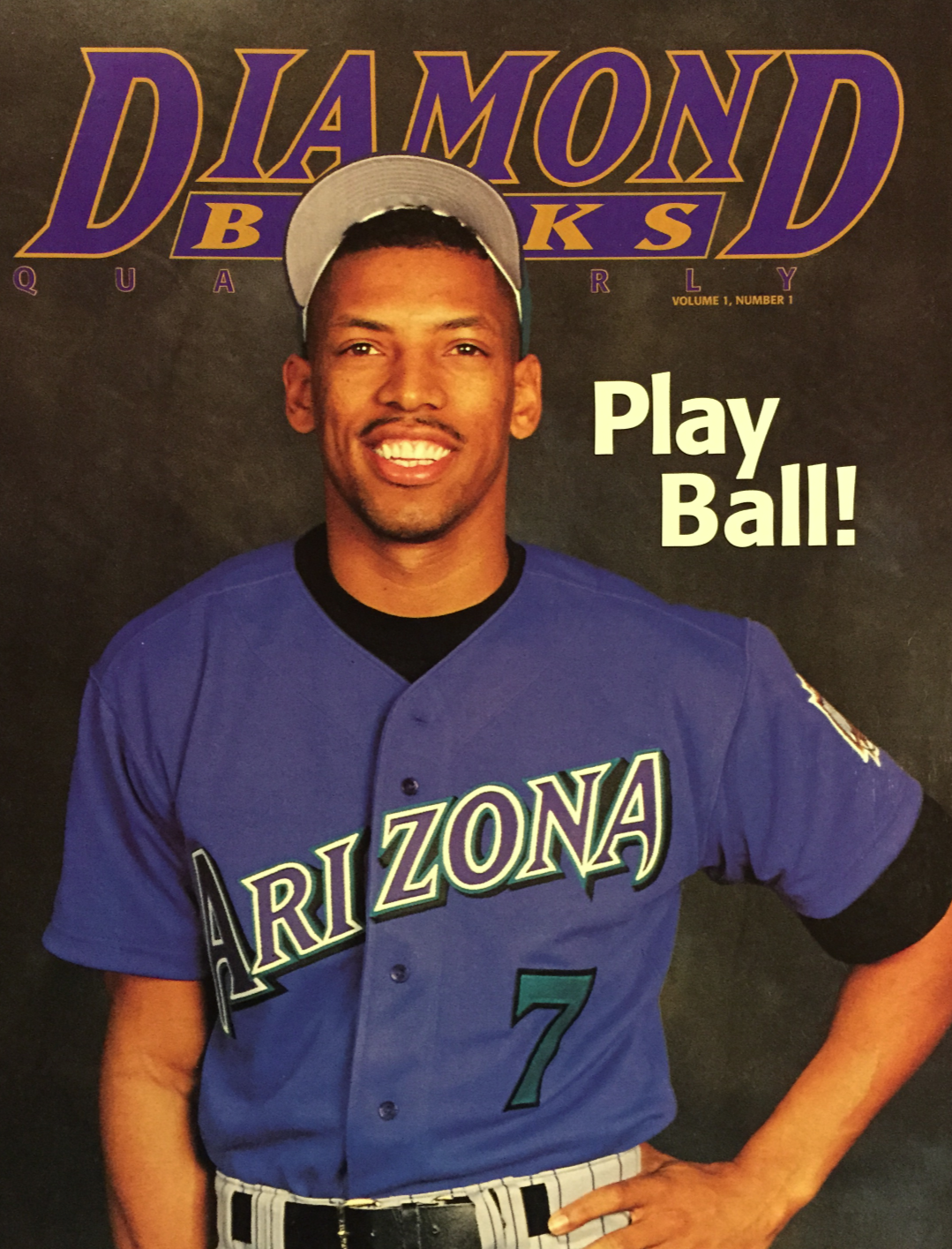
The Suns personnel who participated in the unveiling included Kevin Johnson, who was the Suns’ captain at the time; Danny Ainge, who had just wrapped up his playing career (and who, of course, had been an MLB player with the Blue Jays); Danny Manning, the team’s big free agent signing from a few months earlier; first-round draft pick Wesley Person; and head coach Paul Westphal. Joey says he’s certain there’s a group photo floating around that shows all five them, but for now we just have these shots of Johnson and Ainge (for all of these, you can click to enlarge):
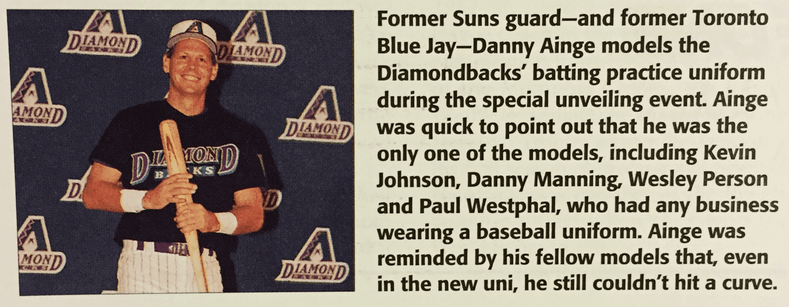
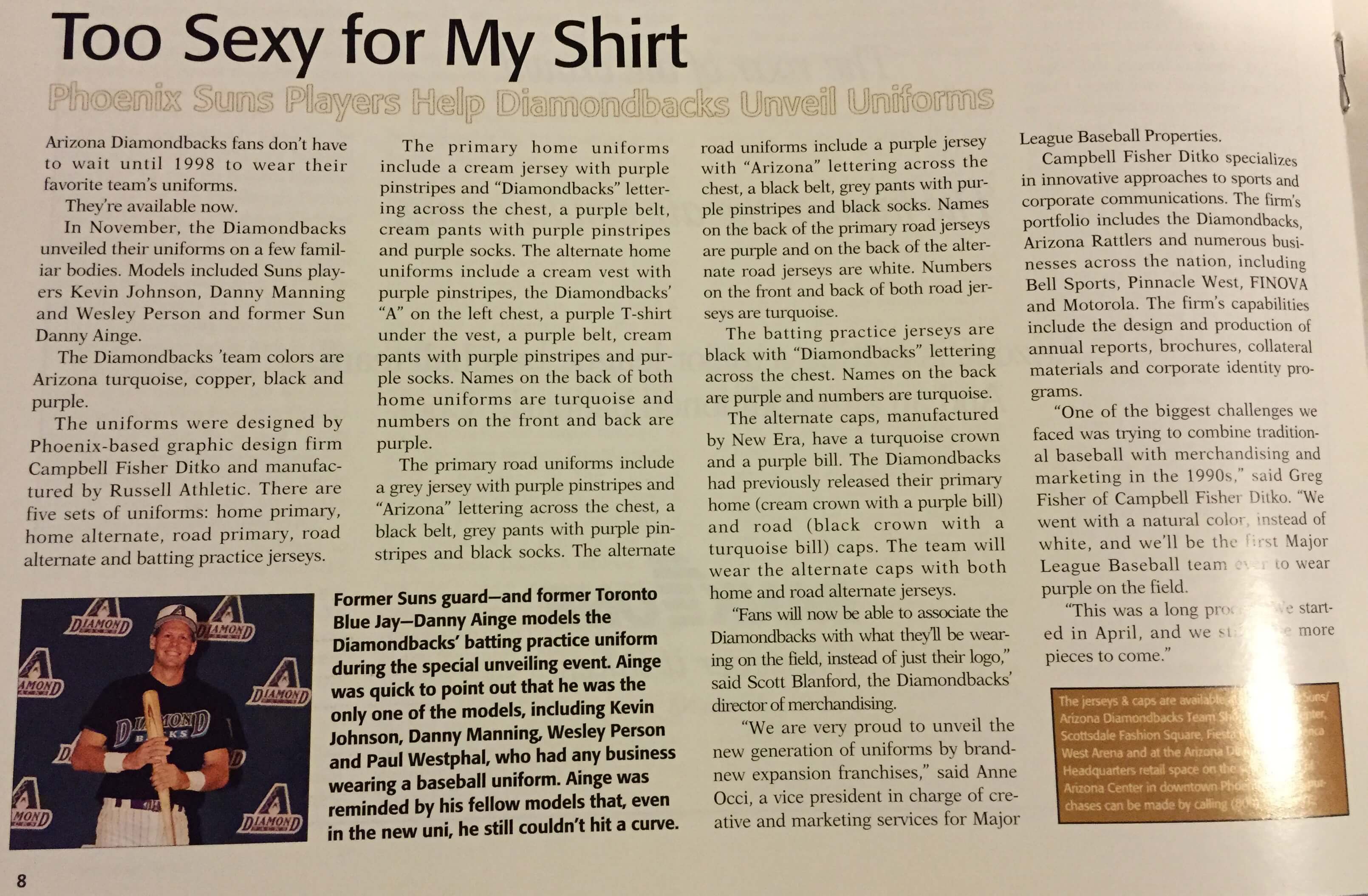
That last photo is from this article, which has more info on the uniforms:
Personally, I’m fascinated by this. Have there been other unveilings featuring athletes from a completely different sport? Maybe, but I can’t think of any. Anyone..?
Meanwhile: As you know, this unveiling took place smack in the middle of the uni-verse’s purple-and-teal phase. One Diamondbacks fan, quoted in the third and fourth grafs of this article, noted the trend and predicted that the team would end up with buyer’s remorse and have to change its colors — and he was right! Check it out:
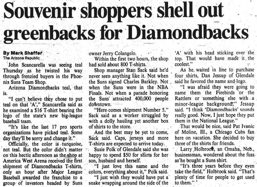
Joey Artigue — the reader who provided me with all this stuff — is 23 years old, so he was just a wee nipper when the unveiling took place. How was he able to cobble together all this stuff? His father, Ray Artigue, worked for the Suns and the D-backs for 16 years. He’s quoted at the beginning of this article, which has more to say about the team’s color scheme and also the choice of its name:

Speaking of the team’s name, Joey offers the following additional information:
“Diamondbacks” was the third-favorite team name option out of four or five options. My dad swears he and Jerry Colangelo were the only people to vote for “Diamondbacks” in the initial vote on the three finalists, with the other two options receiving about four or five votes each. For some reason they kept voting and the numbers kept changing, so Colangelo became fed up and said, “That’s it, I’m deciding — it’s Diamondbacks. I’m gonna go call Bud.”
The two favorite options of the club’s other executives were Scorpions and Rattlers. In both cases, they were going to take the logo, colors, and fonts of the Scottsdale Scorpions (a fall league team) or the Arizona Rattlers (an arena football team) and rename one of those teams. Jerry owned the Rattlers, so that would have been the easier option. They even had prototype uniforms and caps made.
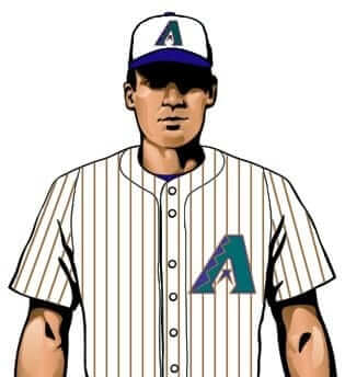
Finally, there’s this: As you probably know, the team’s inaugural white home jersey had purple pinstripes. But Joey provided a mock-up showing that it was originally supposed to have copper pinstripes:
Sensational stuff all around. Big, big thanks to Joey and his father for sharing these materials with Uni Watch.

Books and Bobbles Raffle: When intern Garrett McGrath isn’t slaving away on Uni Watch stuff, he works at the book publisher Little, Brown. He worked on The Nolan Ryan Beef & Barbecue Cookbook, which was published earlier this year, and now he has some promo items to share with the Uni Watch readership.
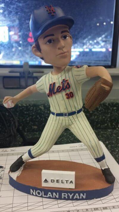
First up are two copies of the book signed by Ryan. And then there are 10 Ryan bobbleheads, showing him in a Mets uni:
We’re going to raffle these off like so: Two randomly chosen winners will get a signed book and a bobblehead; an additional eight winners will get a bobblehead.
To enter, send an email to the raffle address with your shipping address in the body of the email by 8pm Eastern this Sunday, Oct. 12. If your entry is chosen and you did not include your shipping address, your entry will be discarded and we’ll pick someone else. One entry per person. We’ll announce the winners on Monday.
Let’s hear it for Garrett for making this stuff available — thanks, buddy!
Uni Watch News Ticker
By Garrett McGrath

Baseball News: Yesterday we mentioned that Eric Hosmer’s compression sleeve has a subtle stripe pattern. Reader David Dinsmore says that striping is on all of last year’s Nike baseball line merchandise. … Not sure how I feel about this. A Cardinals fan wore a jersey with an “I am Darren Wilson” NOB during a Ferguson/Michael Brown protest at one of the Cards/Dodgers NLDS games. Watch the video in that article at your own risk (thanks, Paul). ”¦ “During last night’s NLDS game, the green screen ads behind home plate and the tape wrap on Pablo Sandoval’s bat weren’t getting along very well,” says Brian Hesise. Great job on that animated GIF!

Pro Football News: Seahawks CB Richard Sherman accused Washington WR Pierre Garçon of pulling his hair. … “Seahawks punter Jon Ryan tweeted their Oct. 7 flight menu compared to the Orioles’ menu from the day before,” says Chris Flinn. “Interestingly, Delta used the old Seahawks logo colors that haven’t been used since 2011.” … The FXFL launches tonight. Here is a roundup of the logos and helmets. ”¦ A not-very-funny installment of the comic strip “Close to Home” recently showed an NFL player wearing glasses (from Alex Allen). ”¦ Kevin Kilby reports that his local CBS affiliate in North Carolina is promoting tomorrow night’s Colts/Texans game with a very odd Colts logo. SportsLogos.net shows that as an “unused” logo from 2001, and a commenter on the page posted the following: “Logo created for Union Federal Banks, once the team’s official bank, as well as primary sponsor of the Colts’ practice facility. Only used in advertising, never intended for use as an official logo.”

College Football News: Two University of Florida players had a fight, and one was injured, over a pair of cleats (thanks, Paul). … MIOB: “Temple has two Nate Smiths on the roster, Nate D. And Nate L., so they go with full names and middle initials,” says Andrew Hoenig. … Here’s Purdue’s DayGlo helmet for their Hammer Down Cancer game this weekend. But they apparently won’t have DayGlo jerseys (from Eric Johnston). … Misssissippi State will be wearing these patches for the 100th Anniversary of Scott Field (thanks, Phil). … “I caught a bit of the Iowa State versus Oklahoma State game on Oct. 4 and noticed something odd on the NOB of senior LB Drake Ferch,” says David Prestwood. “His nameplate reads “Dr. Ferch” even though there is no other Ferch on the team. He is a kinesiology and health major, so maybe he’ll get that MD eventually. I can’t recall every seeing a FNOB shortened to Dr. before — is this a first?” … This Saturday Iowa State will be wearing mono-gold! ”¦ “Key from Key And Peele (a sketch show on Comedy Central) was honored at Penn State and they made him a custom jersey for Hingle McCringleberry, which is a character from a skit on their show,” says Chris Flinn.

Hockey News: Ring Watch: The Los Angeles Kings received their Stanley Cup championship rings yesterday (from Brian Smith). Lots of diamonds. … Penguins netminder Marc-Andre Fluery wore yellow pads and a new mask, which is a tribute and looks similar to the one Tom Barrasso used to wear (thanks, Phil).

Soccer News: Cool project from reader Denis Hurley, who’s launched a new blog called The Numbers Game, which will be focusing on uniform numbers worn in soccer. Good stuff.

NBA News: With the Nets playing the Maccabi Tel Aviv team last night, some anti-Israel protestors showed up, including someone in a Nets jersey with a “Palestine” NOB (thanks, Phil).

College Hoops News: New uniforms for Weber State basketball team confirmed in media day photo (thanks, Phil). … New uniforms for the Elon University men’s and women’s teams.

Grab Bag: Interesting lists: The Forbes Fab 40 consists of the 10 most valuable sports brands in each of four categories — businesses, events, teams and athletes — and quantifies the earning power of each brand relative to its competitors (from Tommy Turner). … “On a recent episode of Antiques Roadshow some guy had a military/athletic calendar with gorgeous art from 1919 made by an early version of Wilson Sporting Goods,” says Sean Clancy. “The expert, Nicholas D. Lowry ”” one of my faves ”” also talks about Wilson’s entry into sporting goods as a way to manufacture leftover slaughterhouse, umm, innards or something.” … DIY potential: “These vintage style jerseys from Orvis are just begging for a Uni Watcher DIY project,” says Jimmy Lonetti. … Paul covered Qalo wedding rings last year and reader Blake Pass saw that a member of Ryan Newman’s NASCAR pit crew name Cruz Gonzalez also wears one. ”¦ New logo, apparently, for the University of Portland. “That’s taken from the West Coast Conference store, so it should be legit,” says Kenny Ocker. ”¦ “The Red Bull-sponsored touring car team will have a one-off Royal Australian Air Force livery for this Sunday’s Bathurst 1000 touring car race,” says Graham Clayton.

“first-round draft pick Wesley Person in the first round” isn’t that redundant?
Yup. Fixed.
That Colt’s logo is truly bizarre. It looks like something Jimbo designed while being medicated.
This place says it is an unused logo. Not sure I believe it.
link
Wow. Creamer’s site says so too.
link
Dammit Dumb Guy! Read!
Ugliest. Logo. Ever.
Here’s an example of the bank using that logo in promotions:
link
So I’m presuming that they didn’t have a sponsorship agreement with the team? Why else would they create their own logo instead of just using the horseshoe?
Vaguely reminds me of the Indianapolis Indians (AAA Baseball) cap logo.
link
Isnt that logo from a Colts blog or something?
If you wana get fancy with Colts logo use the bucking horse retro logo !
His father, Ray Artigue, worked for the Suns and the who? for 16 years?
Fixed.
Thanks to the Artigues. It’s nice to revisit that unveiling.
BREAKING NEWS: Philadelphia Eagles green Elite 51 (Flywire collar) jerseys are available:
link
Funny how the Chinese knock-off factories can make a product to meet demand, but somehow Nike can’t get the jerseys supplied to the actual NFL team.
link
those greens don’t match, which is the whole reason why its taking Nike so long (they got a matching green look, but it was not satisfactorily Midnight Green).
Don’t get me wrong its absurd that Nike didn’t have a midnight green ready to go with the Eagles finally decided to go to the Elite 51 (considering that was one of the reasons why they opted to stick with the dazzle fabric), but saying that a chinese knockoff store accomplished this goal when they clearly did not is wrong.
LA Kings rings….
I’ve seen worse.
Why on earth did the Kings use the same home plate design that the 1997 Cleveland Indians used on their AL Champs ring?? Here’s that ring: link ~ The new Kings ring: link
UMMMMMM
link
In re: the Diamondbacks, I’ve never understood the preference for the more cartoonish D hat logo over the A logo, which I think is graphically better.
I also have a preference for the letter on the hat being reflective of the name of the city or state that the team represents, rather than the team name.
I also have a preference for the letter on the hat being reflective of the name of the city or state that the team represents, rather than the team name.
Oh, me too. Nickname letter seems so bush-league.
Me too. However, maybe Arizona’s thinking is that three other teams already have a capital-A cap logo, and it’s easier to be distinctive with the snakey “D.”
My main complaint, though, is that the “D” is utterly unlike any of the other lettering they’ve used, and something about the jersey letters has always screamed “came free with MS Word.” They really need to readdress their look from the ground up.
And they should start by introducing (bringing back?) the copper pinstripes.
How DARE that Cards fan demonstrate his support of Darren Wilson!
Seriously cool article! I love that out-of-place basketball players modeled baseball uniforms. So awkward! Even more awkward than Curtis Joseph wearing defensemen’s shin guards and holding a regular stick at a Blues uniform unveiling, which used to take the cake in my book.
Whatever happened to the classic, old school “Starters Jacket”? Satin sleeves, usually with stripes at the wrist– now replaced by hoodies. I used to have one till it was stolen. Warmest jacket I ever owned.
Didn’t satin Starter jackets just make a comeback?
If they made a comeback, it was not in MLB dugouts.
Nope, link.
The Diamondbacks actually took the D-Backs name from an Arizona Fall League team anyway.
link
The Chandler Diamondbacks ended up becoming the Phoenix (now Glendale) Desert Dogs after the MLB team took their name.
“This process has taken nine months–the time it takes to give birth–and I don’t know which is more painful,” says Anne Occi, vice president of creative and marketing services for Major League Baseball Properties in New York. She has had to go to Phoenix and Tampa half-a-dozen times. “With each meeting,” she says, “there were more people at the conference table ready to give their opinions.”
I love the honestly in this quote. In this day and age, this would have been a “statement” crafted and prepared by a “public relations specialist” and would have gone something like, “Creating these uniforms was a fantastic collaborative process between the ownership and our design team. In the end we listened to everything they had to say, and I think we ended up with something that makes everyone happy and really tells the story of this brand,” which is never true, haha.
I think it would be interesting to dig into the Jaguars’ unveiling. They obviously released their identity well in advance, so much so that they had initially unveiled a full set of logos and uniforms and still had time to completely change it before they actually took the field. I’d love to read an interview with someone who was involved with that.
1) That Colts logo looks like something even the XFL would have rejected.
2) I’ve been slacking on UW participation lately so forgive me if someone’s already mentioned: those Orvis jerseys made me think of link, one of the prettiest retail unis I’ve ever seen. Unfortunately both styles are way too rich for my wallet.
3) This question comes up regularly: does anyone know of a place that manufactures one off or very limited run patches? Recently got a new jacket, would like to customize.
Ben, I got the Uni Watch anniversary patches made by these folks:
link
I don’t think there’s a minimum quantity, but there’s a $75 set-up fee, so that may not be practical for a one-off or short-run order.
Sweet, thanks. I remember you writing about the process and had that fee in my head somewhere. Looking at the site, they do a lot of aviation stuff, so maybe I can get something “off the shelf.”
I’m pretty sure the picture of all five Suns modeling the D-backs jerseys is on the AP or Getty database site (can’t remember which right now). I remember doing some research on the early days of the ’98 expansion teams and being astonished at seeing that.
“…’On a recent episode of Antiques Roadshow some guy had a military/athletic calendar with gorgeous art from 1919 made by an early version of Wilson Sporting Goods,’ says Sean Clancy…”
Spectacularly gorgeous. Among the best I’ve seen from any era. Probably produced before the Armistice on 11 Nov 1918.
Anybody else dig into the Forbes brand valuations? These guys have a formula, but it seems to skew heavily to US sports – which might be because that’s where the $$ is. I have a few quibbles, Olympics over World Cup, Patriots over Lakers for example.
What really stuck out to me was how much the Pats are in need of a uni makeover. All the other teams have solid/distinctive uniforms, Patriots – not so much. Maybe once the Brady era ends and they need to moves some merch.
One thing that stuck out to me is the average subscriber fee for ESPN at $6.04. I don’t understand completely why ESPN wouldn’t try to sell a $10/month streaming subscription to their networks, I really think a lot of cable subscribers would rather pay that than a monthly bill for useless channels. Being a Disney property though, I’m sure it’s all about protecting the other networks under the umbrella, though.
Also, their deal with cable companies requires every single one of their customers to buy ESPN at $6.04 a month. Whether they want to watch it or not. Plus there’s those other ESPN networks – are they factored into the $6.04?
A standalone streaming app would cut into the cable companies’ exclusivity, which would make them less happy about passing along that $6.04 per month to their customers. And perhaps make some of those customers who do watch it less likely to pop for full cable packages.
That’s the same reason why HBO hasn’t yet been able to sell their standalone app, although they’re quite eager to do so. The contracts are quite complex.
I played in a men’s rec baseball league in the summer of 1996; my team was the Diamondbacks. Our jerseys were the black ones that Danny Ainge is shown modeling here; we used the black caps with teal bill and wore gray pants.
I also saw a lot of people wearing Diamondbacks swag at the All-Star Fan Fest in Philly that year.
“Phoenix Suns basketball stars Danny Ainge, Danny Manning and Kevin Johnson were picked to stroll down a runway at America West Arena in Phoenix, modeling “desert purple” baseball caps and jerseys.”
What the (expletive deleted) is desert purple?
maybe this?
link
I’m holding my breath for a big Eagles pants reveal tomorrow. Should I hold my breath for a big Eagles pants reveal tomorrow?
I will say this – they better not take the “easy” way out and give us leotards like what the Ravens and Saints wear. We need some stripe action on these pants.
I have to admit: I never saw the diamondback head in the negative space of the “A” logo until I read it in the posted article. Makes me appreciate the logo a hell of a lot more!
The Suns’ Kevin Johnson also had a brief minor league baseball career.
Ah, interesting — thanks for that tidbit!
Yes, it was very brief. link
Interesting note about the original D-Backs hats: Being a Phoenician, I bought one from the Hat Club (Owned by Danny Ainge) when they were introduced. (The black road cap with the teal bill) The “A” logo on the cap was massive, and used flat stitching. When the team hired Buck Showalter as the first manager, he made some changes to the look, including shrinking the “A” logo on the caps.
I’m not aware of another time where a manager had input on a team’s uniforms.
I noticed that the Nationals wore their red softball tops for all 4 NLDS games against the Giants. Has an MLB team ever worn its alternate jersey for an entire postseason series?
Just curious if anyone knows. Love that Giants-Cards will be traditional gray/white (cream) all the way through.
The 2007 Rock-tober Colorado Rockies: black vests on black undershirts, from their September hot streak all the way through the ALDS and ALCS sweeps.
I’m about 99.9% positive that one of those games, I believe against the D-bags, they had to wear gray, as the D-bags wore their own black alts to “stop the streak”. Will do a quick photo search for confirmation.
And BOOM, there it is.
Thanks for showing the research on what I “remembered.” But voila, two sweeps (minus) one game (equals) one whole series in alts.
Oh, absolutely — and researching that reminded me the Padres wore those “sand” unis back then. Hard to say which was worse…those or the Rocktober vests. But yeah, they wore the vests in their Wild Card tiebreaker against the Pods…then the whole series (3 game sweep) over the Phillies, and 3 of four games vs the D-bags (another sweep).
They also started the World Series in black vests, but, after dropping the first game, wore gray, black vests and finally white pins in getting swept.
2003 Marlins in black jerseys?
Also, those were sweeps in the NLDS and NLCS, before getting swept themselves by the Sawks in the WS.
So it appears a new football league is kicking off later this afternoon, the FXFL. For grins I checked out their website. They have yet to run one play, yet they’re already hawking “throwback” gear.
RE: Iowa State’s “Dr. Ferch” — his brother Dalton was on the team last year, so there was a “Dr. Ferch” and “Da. Ferch”. I’m guessing they just used the same nameplate, even though his brother is no longer on the team.
Anyone else find this interesting: “The Arizona Diamondbacks ended up with four different jerseys – one more than anybody else in organized baseball.”
A lot different than today, eh?
Not uni-related, but interesting.
With the Nationals being eliminated, there is no possibility that two expansion teams will face one another in the World Series.
Two expansion teams have never faced one another in the World Series.
I’m sure the rebrand of “Columbus SC” will be discussed tomorrow, but I just wanted to get on the record early: not a fan at all.
That patch on the L. A.Kings jerseys is way too big.