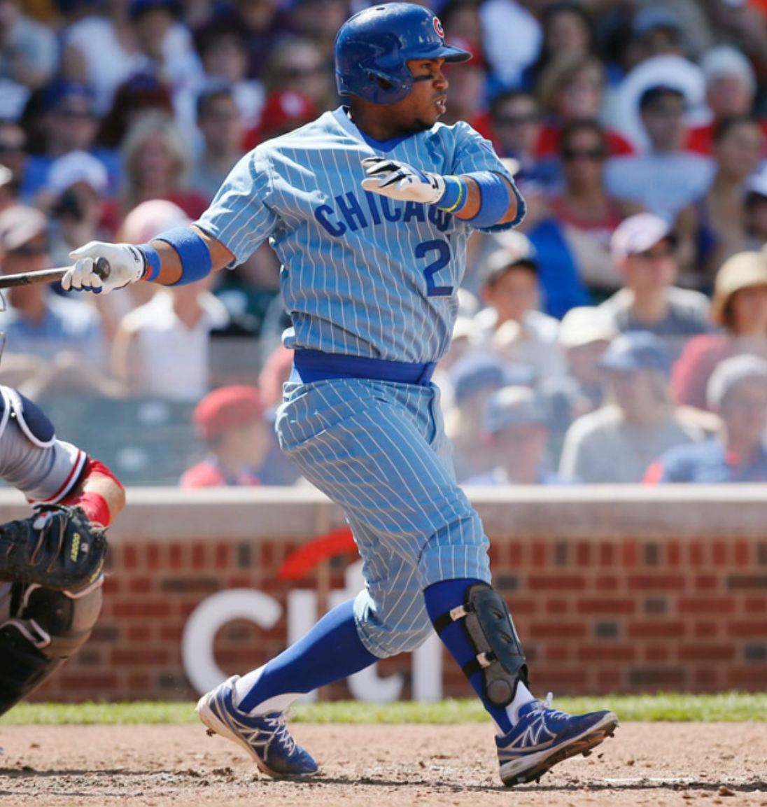
For all of today’s photos, you can click to enlarge
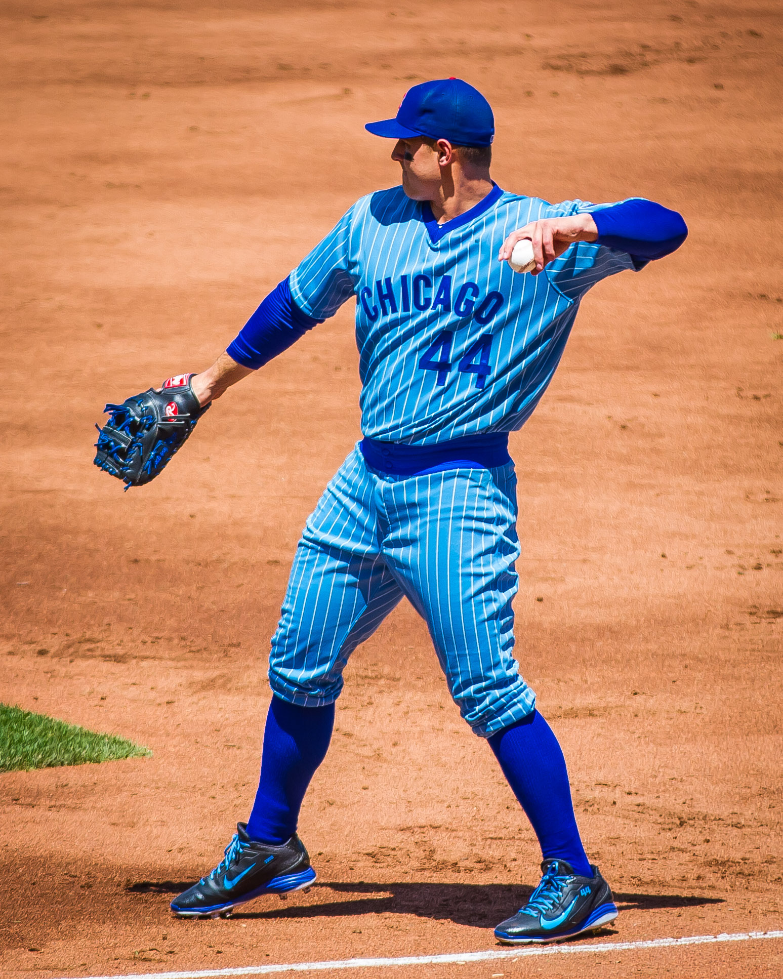
The Cubs held their latest throwback game yesterday. The year on tap this time around was 1978 and, as you can see above, the team wore their infamous pinstriped powder blues. (In case you missed it, Phil had an excellent primer on this design in yesterday’s entry.)
I’m a little conflicted about the Cubs’ inclusion of this uniform in this season’s throwback program. On the one hand, it’s precisely the sort of “so bad it’s good” design that makes for a great throwback uni, and I’m happy to have seen it on the field yesterday. But remember, the Cubbies’ throwback program this season is a celebration of Wrigley Field’s centennial, and this road uni was never worn at Wrigley, so it feels like a bit of a ringer.
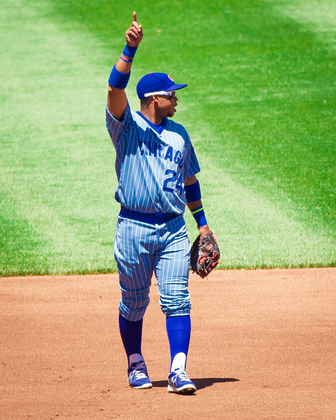
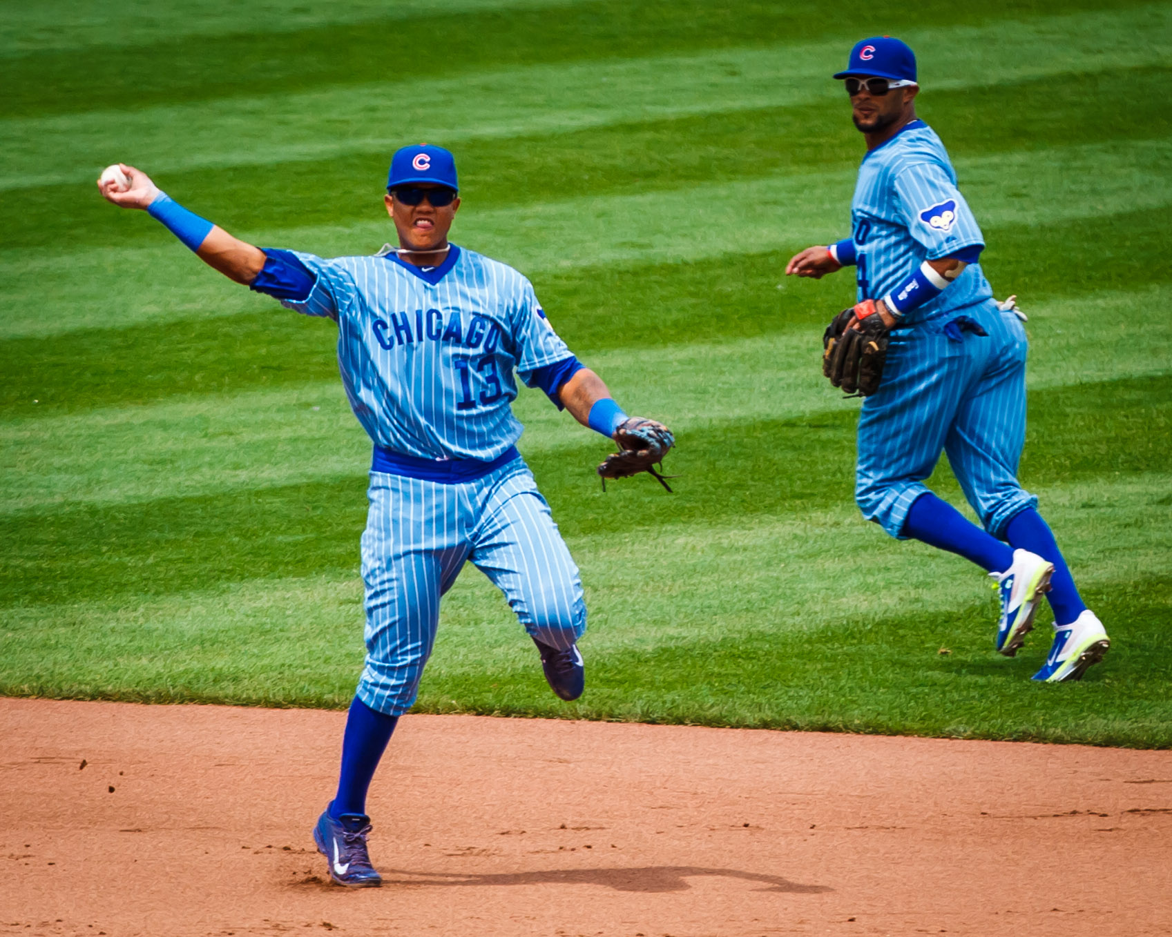
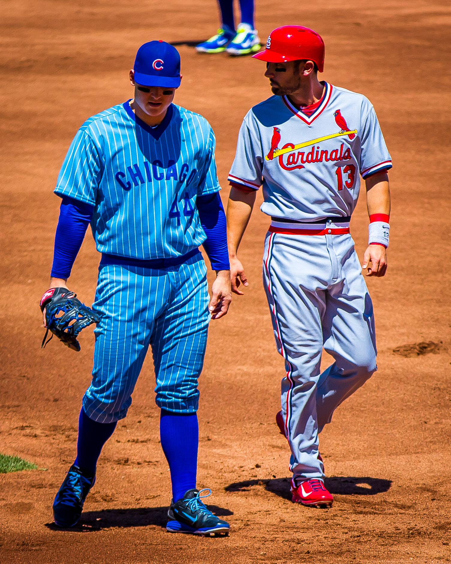
Anyway: From what I could see, all of the Cubs went high-cuffed yesterday, as has been the case with all of their throwback games. Some wore stirrups and others wore solid socks:
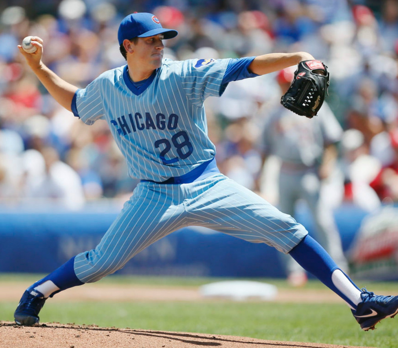
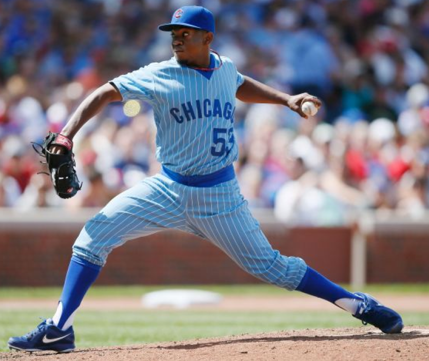
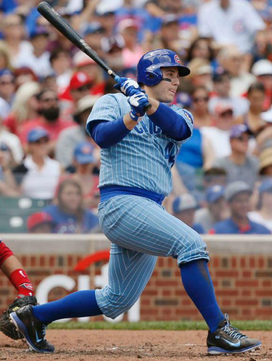
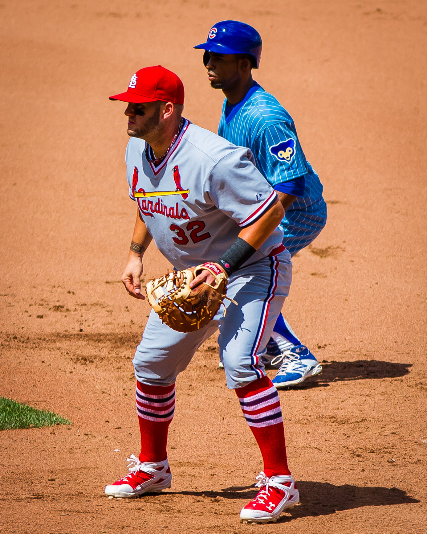
So that’s all pretty straightforward. But what about the Cubs’ opponents yesterday, the Cardinals? The Cubbies were already wearing a road design, so did the Cards wear? They could have worn their own 1978 road design, setting up a delicious power blue vs. powder blue game. Or they could have worn their 1978 home whites. But instead they wore a seriously unsatisfying gray fauxback:
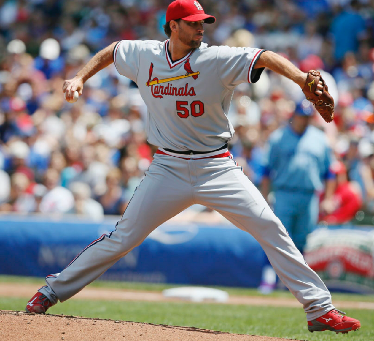
This design is more or less what the Cards wore in the mid-1980s — kind of a bogus move for a 1978 throwback game. (The blame for this goes to the Cubs, because they got to choose what the Cardinals would wear.)
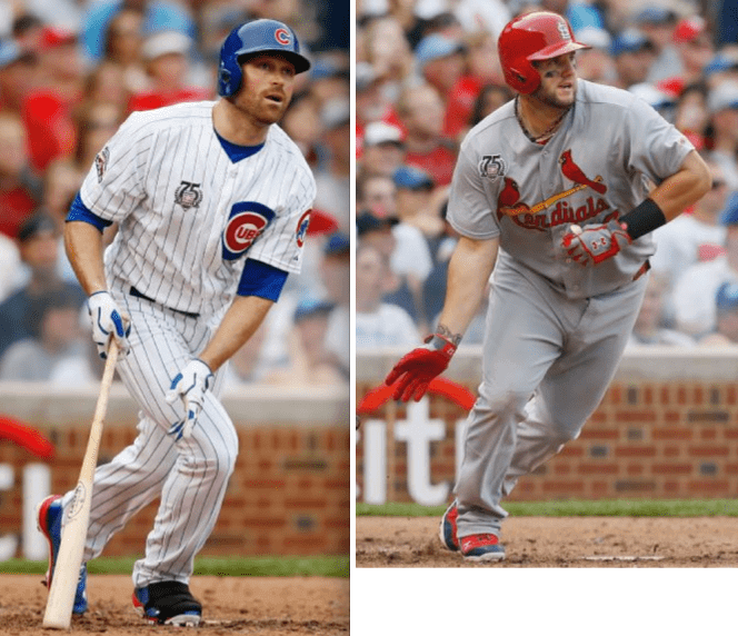
As has been the case with many of the Cubs’ throwback opponents this year, most of the Cards went low-cuffed. The only high-cuffed exceptions I saw were Kolten Wong, John Jay, and Matt Adams, the first two of whom are shown here:
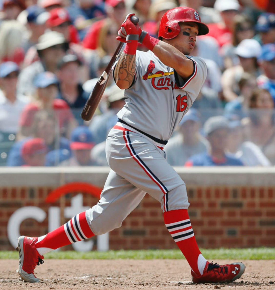
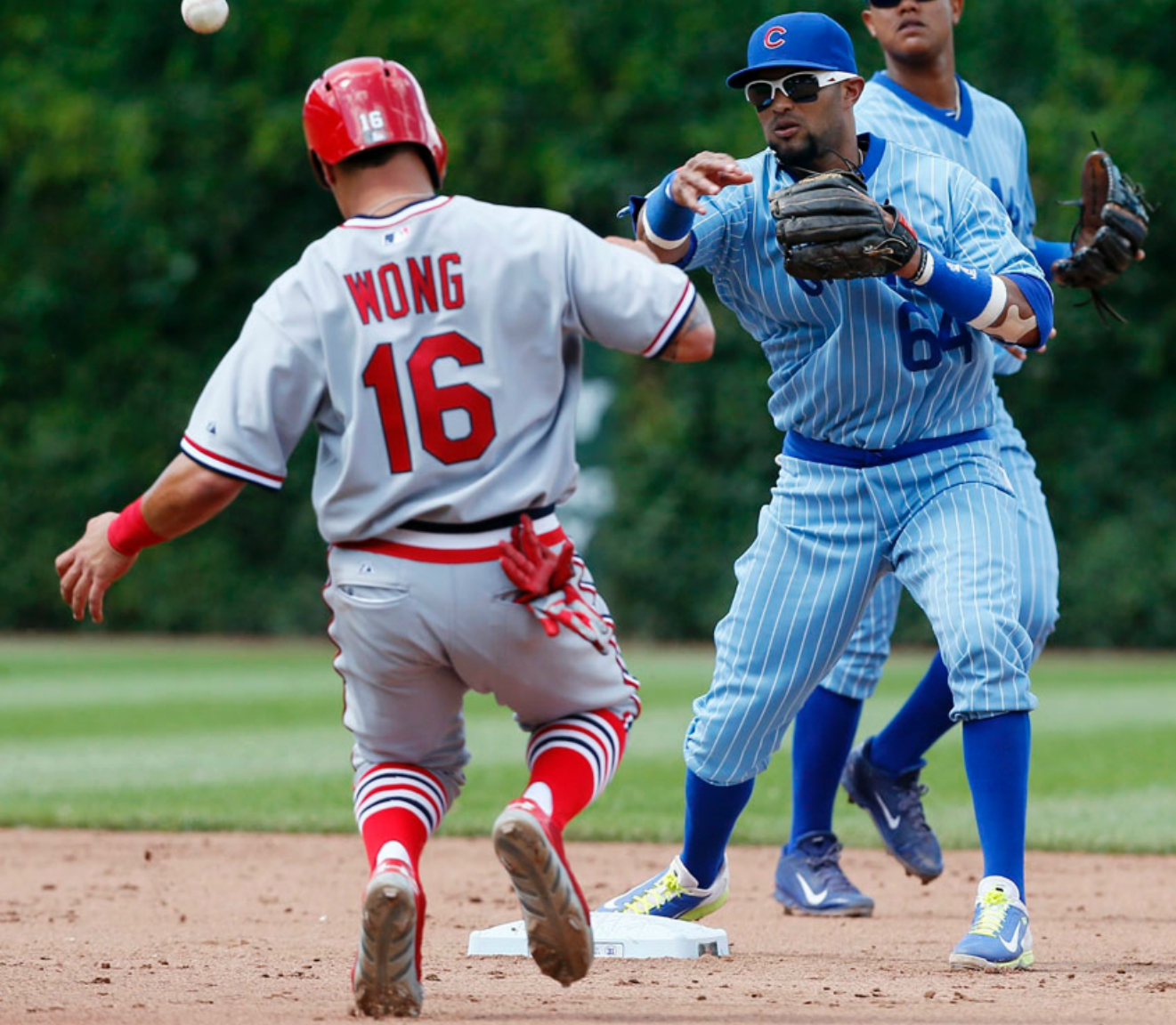

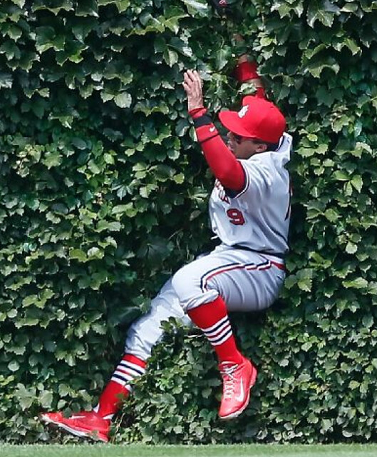
Uni Watch reader Matt DeLeon attended the game. “I liked the uniforms,” he says. “Definitely harkened back to the time, except that the unis were a lot tighter back then. Only quibbles would be that the front numbers looked a bit big, and the placement was not within the arched ‘Chicago’ lettering under the ‘AG’; seemed more under the ‘GO.’” Matt also got some superb photos, which I’m happy to share with you here:
One final note on this game: Most of the other MLB teams wore the Hall of Fame 75th-anniversary patch yesterday, but the Cubs and Cards were given a waiver because of the throwback thing. So they wore the patch a day early, on Saturday:
So that’s another retro game game in the books. Next up on the Cubs’ throwback calendar is a snoozer: the 1988 home pins, which will be worn on Aug. 10.

And speaking of that Hall of Fame patch”¦: Except for the Cubbies and Cardinals (see above), almost all of the other MLB teams wore the Hall of Fame 75th-anniversary patch yesterday. Umpires, too. But there were some glitches:
• Angels first baseman Efren Navarro began yesterday’s Tigers/Halos game patch-free, but someone must have noticed, because by the third inning he was sporting the patch like everyone else.
• Adrian Gonzalez of the Dodgers wore his patch below his chest insignia, instead of above.
• Giants pitcher Jake Peavy’s patch was coming loose, until it finally came off and Peavy put it in his pocket.
• Early in yesterday’s A’s/Rangers game, Alex Rios’s patch came off when he took a big swing, so he picked it up and pocketed it (if the video below isn’t working, click here):
• For reasons that aren’t clear to me, the Padres didn’t wear the patch. (And no, it wasn’t just that one guy, as you can see here.)
(My thanks to Matt Bunting, Chris G, Richard Paloma, and Phil for their contributions to this section.)

Baseball News: One observer thinks the Bridgeport Bluefish’s military-appreciation jerseys — which looked like a naked torso, not the usual camouflage — were seriously disrespectful (from Andy Chalifour). … Joakim Soria, recently traded from the Rangers to the Tigers, arrived to meet his new team carrying a Rangers equipment bag (from Brett Ballard, who also says Angels pitcher Matt Shoemaker was wearing his wedding ring on his glove hand on Saturday — no photo, alas). … The Ft. Wayne Tincaps wore Vera Bradley-designed jerseys yesterday (thanks, Phil). … If you’re one of the poor souls who got stuck with that misspelled Tulowitzki giveaway jersey the other night, the Rockies have an apology and an exchange program for you. ”¦ The Mets will be wearing their G.I. Joe costumes for tonight’s game against the Phillies.

NFL News: You know all those people who say the ’Skins should change their logo to a redskin potato? It turns out that football and potatoes have a connection that goes way back (great find by Daniel Klempner). ”¦ Here’s a gallery of NFL logos redesigned as Disney characters (from Jim Walaitis).

NBA News: As you’ve probably heard by now, LeBron James will wear No. 23 with the Cavs. … A promotional video for Adidas’s latest sneaker gimmick includes a clear view of what appears to be the Bulls’ new alternate uniform. Thanks for the self-leak, Adidas!

Grab Bag: “Unlike a lot of Tour de France leaders in the recent past, whose bikes and kit get often got covered in yellow, Vincenzo Nibali has mostly avoided straying from his normal gear, even to the extent of wearing the same yellow jersey whenever possible during each stage,” says Sean Clancy. “That changed for the final ride into Paris, though, when his bike was touched up with yellow graphics.” … David Firestone has written a story about how a photo of Jack Jones became the basis of the NHRA trophy. … “Back in 1943 an amalgamation of Australian rules football and American football, called AUSTUS, was created so servicemen of both countries could play against each other,” says Graham Clayton. “Here is an introductory booklet on the game, with the front cover showing U.S. Marine William Jost wearing the unique AUSTUS uniform.” ”¦ “I recently had brunch at Keke’s Breakfast Cafe in Winter Park, Florida,” says Jim Nedelka. “In their outside porch/waiting area, I noticed some chairs made by a company called Wildcat Construction, which appears to have ‘borrowed’ Kansas State’s logo.”

What Paul did last night over the weekend: When I go to a Mets game, I don’t wear a Mets jersey. When I go to see a band, I don’t wear the band’s T-shirt. When I go to a Uni Watch party, I don’t wear Uni Watch gear.
But there’s one day each year when I do wear the home team’s uniform, so to speak. It happens on the last Saturday of each July, when I attend the annual chicken barbecue fundraiser at my hometown volunteer fire department. This is what passes for the big social event of the year in the very small Long Island town (pop. 3,000-ish) where I’m from, and our family always attended when I was growing up. My parents and brothers gradually lost interest over the years, and my parents sold our house and moved away back in 2004, but I keep going to the chicken barbecue each year. It’s become a pilgrimage of sorts, a way for me to maintain a small connection with my spawning grounds and see how the town is doing. I usually bump into an old high school classmate or neighbor (one year I spotted our old mailman, which was really nice — always liked him). And even if I don’t reconnect with anyone, which occasionally happens, it’s still a good time.
Anyway: Back around 1990, give or take a year, I bought this chicken barbecue T-shirt (click to enlarge):
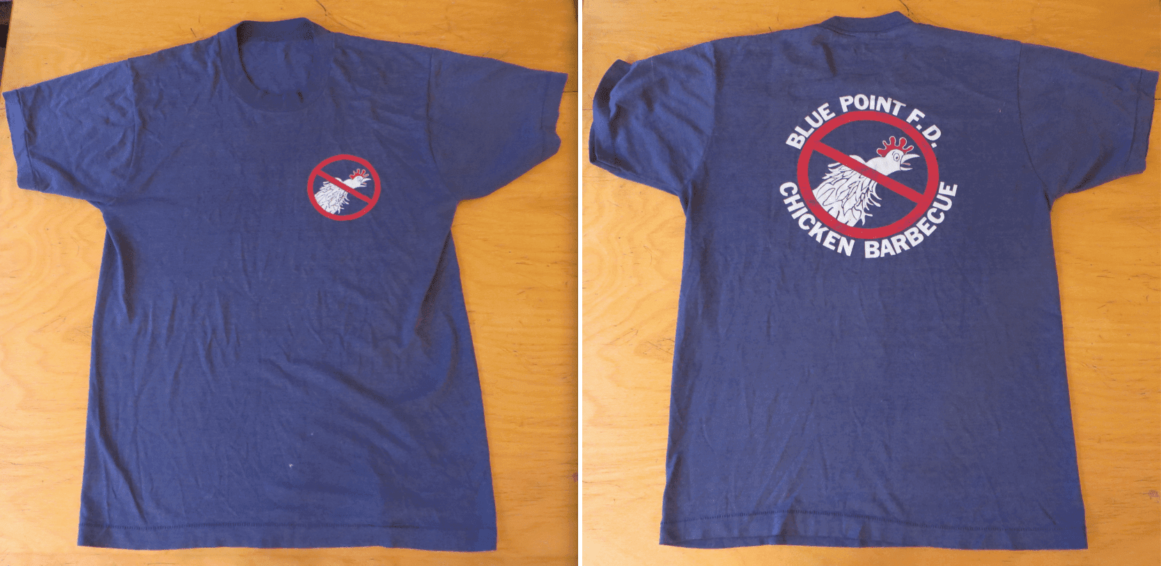
It still fits me fine, and I continue to wear it once a year, on the last Saturday of July. They only made this design for one or two years (they later switched to much less interesting designs and now no longer bother to sell T-shirts at all), so now it has sort of attained “classic” status. Each year someone will see me wearing the shirt and say, “Whoa, haven’t seen that one in a long time!” I readily admit to taking an inordinate amount of pleasure in that moment. I may not have much of a hometown connection anymore, but I still have something that gives me a bit of hometown cred.
Two days ago was the last Saturday in July, so I put on the T-shirt, put the New Girl in the car, and drove out to Long Island for my annual hometown visit. As per my usual routine, I drove by our old house to see what the family that owns it now has done to it (still looks pretty much the same from the outside), went to the pond around the corner to see how the ducks were doing (big flock this year), and drove around town to see if everything is still pretty much where I left it (yes, for the most part).
Soon it was time for the chicken barbecue, which takes place in the yard behind the firehouse. It’s a good deal: For $25 you get half a chicken, an ear of corn, a bowl of chowder, unlimited mussels, unlimited beer, and some sort of Entenmann’s-ish dessert. There’s usually a live band, dunking booths and pony rides for the kids, low-stakes gambling in the back room once the sun goes down (I lost $20 playing blackjack this year), and so on. Sure enough, we’d been there less than 10 minutes before someone commented approvingly on my shirt. And I bumped into the family that used to live next door to us (they’re no longer in that house but still live in the area). Hadn’t seen most of them in many years, and it was good to reconnect.
The New Girl took lots of pics at various points in the day. Here are my favorites (click to enlarge):


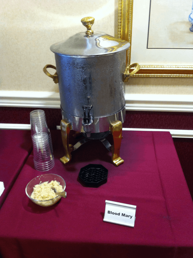
Footnote: We stayed overnight at a local motel, and then the next morning we drove about 20 minutes north and joined my mom for brunch at her retirement community, where I discovered that the most egregious typo of the weekend had nothing to do with Troy Tulowitzki:

Thumbs up, fun stories today.
PS, long live Sansabelt.
The TV coverage of yesterday’s F1 Hungarian Grand Prix showed these images of the Williams team’s spare noses, and a driver number sticker to be used depending on who needs their nose to be replaced:
link
link
Haven’t noticed any mistakes in this area yet, but I’ll be keeping an eye out! And as far as I can tell most of the other teams avoid any potential problems by placing the front driver numbers on the main part of the bodywork instead of on the replaceable nose.
I think you meant to say “went to THE pond around the corner.”
Great content today.
Thanks. Fixed.
Thoroughly enjoyed reading the chicken BBQ piece. It doesn’t quite rival the brother (Canadiens) vs. brother (Rangers) piece, but it’s up there.
Also, are those the same croquet Chucks, or did you pick up some new kicks? They look new to me.
One can never have too many pairs of Chucks.
New ones (actually purchased last year).
RE: Wildcat construction…..
It seems extra lazy to me that they would “borrow” a logo from a school with the same mascot name. There are a million other cat logos out there that would be just as good for a company name “Wildcat Whatever”. Unless they are trying to not-so-subtlely link themselve to the university.
I think it’s just a lack of imagination. Not something I want in any company I hire/purchase from.
Maybe the business owner went to Kansas State?
Or maybe they’re paying Kansas State the $10 (or whatever meager fee) to use the logo?
You’re right. It could be. I shouldn’t be so quick to be cynical.
RE: A’s/Rangers game
I could be wrong, but isn’t the guy swinging in the video Alex Rios, not Adrian Beltre?
Definitely Alex Rios. Don’t have access to MLB.tv to confirm or get a screen shot of Rios later in the game. I search of photos online only turned up photos of Rios in the third inning (which I assume was pre-big swing).
Ah, thank you! The reader who supplied the video said it was Beltre. Will adjust text accordingly.
Should read: “we’d been there less than 10 minutes before someone commented approvingly on my SHIRT. “
Eep. Bad typo. Now fixed.
It read as pretty badass with the typo.
RE: Bridgeport Bluefish Military Uni’s.
I don’t get too worked up over the military uniforms but I do agree with Paul mostly. I think it’s overdone and overused.
But those Bluefish jersey’s are pretty much the most disrespectful thing I have seen in the sporting uniform world. And it’s not even the the torso thing, it’s the dogtags (I.D. tags) hanging from the neck on the uniform. They contain vital information of a soldier and are really used for medical emergencies or death.
And to have a uniform flaunt them around, I feel, is very disgraceful.
Any non-white guys on that team? Any other color “skin” to be made?
Just wondering.
Never even thought of that. Christ, they’re awful.
As I commented when those uniforms were released last week, ‘”there’s a reason Crayola discontinued the colour “flesh”‘
That will look odd to have a black man head and arms coming out of that uniform. I mean, I don’t think anyone can think of anything worse.
Yeah — that was a Saturday ticker item, and I’m surprised there weren’t comments on it then (I guess nobody reads the weekend tickers).
As I noted,
Most definitely not a well-thought out promo.
And here’s the tweet where Mike made his comment.
there are Uni Watch weekend posts?
I actually read the college football uni rankings but neglected the tickers. :(
If their goal was to honor oddly buff white dudes in the military (non-Coast Guard) who view themselves as cartoonish superheroes, then the Bluefish succeeded beyond a shadow of a doubt.
If that wasn’t their goal, then we’ve got a colossal freaking failure here, folks.
* Played-out pandering concept to begin with? Check!
* Execute design poorly? Check!
* Put patches on bare skin? Check!
* Nipples on jersey? Check!
* Exclude Coast Guard? Check!
* Exclude non-white folks? Check!
* Exclude non-male folks? Check!
All I say is, thank the gods & goddesses that the Bluefish abandoned their plans to wear the pants that came with these jerseys.
I thought this line of the article was interesting:
“Far worse, unintentional of course, it offers a cartoon version of those who do serve.”
Which is exactly why I don’t like any of these “tributes”. They all do that.
Those jerseys add a whole new layer to the term “link uniforms.”
I see Paul’s point on wearing the powder blues to celebrate Wrigley. Very true that the uniform would not have been worn there. However, I’m fine with it. It’s still part of the Cubs’ history and I can only assume that someone chose that one because they liked it, have fond memories of it, or just want to try to hit all the diverse uniform.
This wouldn’t be the first time powder blue was worn at home. Didn’t the Royals take their powder blues out and wear them at home? We definitely know that they have used their powder blue jersey at home as an alternate, at the least.
Royals only wore powder blue *jerseys* at home — paired with white pants.
But the Blue Jays wore a full powder blue throwback as a home alternate from 2008-10:
link
In a case like this, they didn’t wear that jersey at home, but I’d rather see the jersey brought back for one game than have the team decline to wear it because it wouldn’t be ‘historically accurate’ to wear it at Wrigley.
In many instances, the road uniform is an improvement on the home uniform. Among other things, an extra color is added.
In this case, a color is substituted. There is no red at all on the jersey or pants. And that is perhaps the best thing about them.
I don’t mind them wearing road jerseys at home. I do mind that they made the choice to do a road uniform, but they’re not going to do the mid 80’s blue top-white pants that seem to be a favorite of many long time Cub fans.
link
It seems to me that outside the Uni Watch community, the similarities between the Cubs home unis of the last several decades overwhelm the differences, so tossing in the pinstriped road uniform is probably to break the monotony.
That new Bulls alt is fresh, why haven’t they thought of that before?
/sarcasm
Speaking of things they haven’t thought of before, a script “Chicago” wordmark would look great on their red jerseys in place of the arched-block “BULLS”.
No, wait a minute, am I the only one who likes the way red pinstripes look on a black background? I wouldn’t call it a Bulls’ trademark, but it’s a nice appearance.
Not at all. I always liked that look. It’s so much better than the solid black alts they’ve been wearing for the last decade and a half.
I don’t know why they ever stopped with the red pinstripes. The plain blacks looks boring. I wish they would use the BULLS on the blacks and CHICAGO on the reds as well though.
when the black alts were first introduced in the mid-90s, the players thought the pinstripes made them look too much like the Orlando Magic’s black unis.
and I agree that they should go back to the BULLS wordmark on the black jersey.
I’ve always liked the high cuffed look, but never cared mucgh whether it was “soccer” socks or stirrups. I think the solid color socks can look really good. Thos blue Cubbie socks are a case in point.
Looking through these pictures, though, I really dislike the Cardinals stripes on a soccer sock. In the Matt Adams phot it just looks so chunky and blocky (probably because Adams is chunky and blooky), that I think he would have benefited from the taper of the stirrup.
“David Firestone has written a story about how a photo of Jack Jones became the basis of the NHRA photo.”
Don’t you mean the basis of the NHRA trophy?
Yes. Will fix.
“When I go to see a band, I don’t wear the band’s T-shirt.”
Piven put it best: link
Go ahead. Be that guy. Or don’t. Why should anyone else give a shit what you wear?
I interpret “that guy” as not to be the guy wearing whatever t-shirt he pleases, but the guy who polices the audience. Not sure if that was the movie’s intention and it went over everyone’s head, but that’s how I see it.
Wearing the band’s shirts leads to cool projects such as this:
link
I wouldn’t go to a Wilco show and think “Hm, how many different Pavement shirts can I find tonight?”
Just brought to my attention and added to today’s entry: For reasons that aren’t clear to me, the Padres didn’t wear the Hall of Fame patch yesterday:
link
(And no, it wasn’t just that one guy. The whole team was patch-less.)
Anyone know why?
Not sure if it was because of the HOF patch, but the Astros broke from Sunday home pattern of wearing the BP jerseys. Instead, they wore regular home jerseys with the orange cap, a combo that is usually worn on Saturdays.
link\27\452800900.jpg&w=482&h=589
I blame Miami for not wearing gray on the road like they’re supposed to for this.
Let me try that again:
link
I love Grah Clayton’s item about AUSUS football. Thanks!
Wow – reading the rules, I really want to play it. Anybody up for starting a league?
There are Aussie Rules leagues in the U.S.
There also doesn’t seem to be too many differences between Aussie Rules and AUSUS except (1) Use of the thinner NFL football and (2) Legally able to throw the ball, including for a goal.
In Aussie Rules, the only two ways to pass the ball between teammates is either to punch the ball (a handball) and to kick the ball. And in Aussie rules, you can only kick the ball to score.
If and when my kids move me into a retirement community, it had better be one that serves Bloody Marys for breakfast.
In a coffee pot no less! How great must that place be?
Aaaaaannnnndddd…with DIY horseradish!
That chicken barbecue looks/sounds fantastic. Maybe next year’s family summer vacation should be to Long Island.
As for the powder blues with white pins, I loved them when they first started wearing them but I tired of them in year 2 or 3 and was ready for them to move to something different.
I thought they actually worked great as a home uniform yesterday and would not mind at all if they wore an updated version (belted pants) as a home alt.
Was it Blue Point Toasted Lager in the mug? Because it is deeee-lish-ous.
No. The only beers available were Bud (which is what we had in the pitcher) and Bud Light.
Blue Point brewery didn’t yet exist when I was growing up. Also, it’s not in Blue Point — it’s one town over, in Patchogue, which kinuda bugs me. Still, it’s nice to see my hometown’s name in so many bars, on restaurant menus, etc.
Ugh, Bud.
Was introduced to it a decade ago, been seeing BP Toasted a lot more lately, always make a point of ordering it.
Regularly see “Blue Point” oysters down here in DC/MD/VA, it’s got “brand recognition.”
Bluepoint oysters (one word; the town name is two words) are seen on menus across America, which always makes me happy. Our claim to fame. Local pride.
(On the down side: Former Attorney General John Mitchell, one of the more foul and corrupt public officials in recent memory, attended my elementary school. Local shame.)
I wish Westbury was famous for something… currently corporate sponsored theater in the round aside.
One of the better restaurants in San Diego is named Blue Point (two words). I don’t know if the owner is from there or if he just liked the name.
I can’t stop focusing on that pitcher. I kind of love it, for some reason. It looks like something my mom would have had in her Tupperware collection, only without the logo. Does the lid open, or do you remove it to pour? Do you have to pour out of the corner? More importantly, why am I fixated on the pitcher??
You have to remove the top to fill it, but not to pour — see the spout on the left?
Does anybody know any easy uniform design making websites? (Not Photoshop)
A number of uni-suppliers have rudimentary “DIY” designers on their sites.
If you mean a site with jerseys and/or uniforms templates to design a uniform as a online concept (and not a site where you send in artwork in a certain format for them to produce an actual jersey) Hockey Jersey Concepts site has numerous uniform templates for mspaint/paint.net (as well templates for photoshop like programs)
link
Chris Cream has the “Paint Users Paradise 2.0” section of his Concepts area:
link
Concept area also has fonts.
A ’70s/’80s throwback game ought to have the high stirrups, where you see a lot of white sock and just the long, colored, stripe-like stirrup, rather than what was on display in Chicago yesterday.
Unless you are the 70s/80s Reds, then you wear low stirrups showing mostly color.
link
I’m not advocating that they return to the pullover look, but man – those sleeve and pant stripes really make the whole Cardinals uni just pop.
link
Agreed.
Headline of the day: “Korean baseball team recruits robots as stand-ins for fans”
link
But how do they do the chicken? Is it similar to the WNY-style with vinegar-y sauce, or tomato-based, or something else?
Us carnivores want to know…
Just grilled. Very little seasoning.
“But how do they do the chicken?”
It’s not like the Boogaloo, and certainly not like the Skate or the Shing-a-Ling.
I love coming to Uni Watch each day, and love it even more when there’s a reference to delicious Chiavetta’s chicken. I really miss the church/Red Cross/Fire Department Chiavetta’s BBQ’s during the summer since I moved to the DC area.
Did you say Dunking Booths??!!
One of all too few sports hightlights of my life was being 12 years old and getting 7 balls for $1 at the fair and dunking the berating/insulting dunkee 4 times!! Call ME “flamingo legs” will he?!
I went to the Rockies-Pirates game yesterday, and the second-most-notable uni thing I saw was the Rox going high-cuffed. Is that something they always do, always do on Sundays, what?
(The most notable uni thing I saw was the guy in the complete 1979 black-and-gold Kent Tekulve uniform with pillbox hat.)
Oh, and the Rockies gave away Michael Cuddyer jerseys. His name was spelled correctly, but, as you may know, he has a fractured shoulder and has not played since early June.
They started going high-cuffed four or five days ago as a slump-buster thing. Was reported in the Ticker!
. . . after back-to-back 8-1 wins over the Pirates, success fell off yesterday, so the trend may be short-lived. :-(
Thank you! I don’t follow the Rox and should more studiously…study the Ticker!
Looking at that photo of the player crashing into the ivy wall at Wrigley….
Isn’t that a wonderful anamoly, the ivy covered wall? A plant, a climbing vine, as part of the playing field. Would mlb allow something like this in a new stadium?
Imagine a vine trained to grow around the backboard on a basketball court…or a planter box with some hanging vines along the boards in a hockey rink. Or trees planted on the baselines of a tennis court.
All plants in play!
Where would it end? Saguaros? Poison Ivy?
I think it would be neat to see some sort of ivy growing on that lame “jutt-out” in right field at Target Field.
Not to dismiss your romanticism of the thing, Jim, but I think part (perhaps revisionist) of the thinking behind the planting of the ivy was to provide some form of protection against crashes into said wall.
I’m sure Pete Reiser would have appreciated if some of that were planted at Ebbets.
But it’s an excellent point — would such an affectation be permitted in a baseball stadium today? There’d likely be no need for such, given that most stadia have padded walls, but who knows.
That apparently was NOT the rationale.
Bill Veeck wrote that his father (Bill Sr.) was acting on the direction of Mr. Wrigley, who wanted to “beautify” the park. They apparently put trees in the outfield bleachers because Mr. Wrigley wanted them in there, but the wind kept blowing all the leaves off and leaving barren trees in the bleachers.
So they needed something that would take hold and grow quickly, and planted bittersweet and ivy, and the ivy eventually took over.
link
Interesting! In the words of Johnny, “I did not know that” (actually I had no idea why the ivy was planted, but I thought it might have something to do with softening the blows of outfielders who might injure themselves by running into the walls). Good to know.
I do know however, that the notoriously cheap Branch Rickey wouldn’t add a warning track to Ebbets even after Pete Reiser (and others) ran into the brick walls on more than one occasion. Perhaps I just imparted this same reasoning onto the Wrigley Field walls.
The University of Wyoming’s War Memorial Stadium has a line of link. I suppose they’re far enough back that they don’t affect the action on the field, though.
The City Oval cricket ground in Pietermaritzburg, South Africa has a tree located just inside the boundary fence. If a ball struck by the batsmen hits the tree, they are awarded four runs, as if the ball had reached the boundary fence:
link
Why didn’t the Forbes Field ivy covered walls ever get any love?? :-(
I’m pleased to read that LeBron James will be going back to no. 23 with the Cavs. (I thought that he never should have changed in the first place. Having a number in honour of Michael Jordan is a good thing, not a bad thing.)
It makes me remember how much I wished that Reggie Jackson and Rickey Henderson had re-taken their old numbers when they returned to the A’s (9 and 35, respectively).
Compared to the jerseys they were throwing back to, the Cub front numbers were too big yesterday…the Cardinal front numbers were way too small.
Also interesting…for the last throwback, the Cubs used raglan sleeves and should have had set-in sleeves…for this one, they had set-in and should have had raglan. The Cardinal names were much taller than the originals. Accuracy is not an imperative for these throwbacks I guess.
Incredible colorized photos link – some are even sports-related, some going back far into the XIX century. NB: some very tacky/borderline NSFW ads on page.
as a footy/football (amateur) historian, i love graham clayton’s submission…austus is news to me…
cheers, graham!
1vox,
Thanks for the complement! Maybe the AFL premiers should take on the NFL Superbowl champions in a game?
Liked the Cubs throwbacks yesterday, but since uniforms are tied closely to winning, that set has been forgotten by many. The memories of that uniform would have stronger if the Cubs had worn it during their 1984 division title season.
I hope we never see the 1979 Cardinals uniform again. For a couple years or so, they made the mistake of moving the front jersey number to the sleeve. Strange decision to say the least.
Just curious if anyone had any insight as to why the HOF used Phillies templates and fonts for jerseys given to the inductees. Is it a rotation amongst the teams each year? I couldn’t find any photos from previous HOF classes. Curious given there were no Phillies enshrined. I don’t recall other leagues doing this outside of the NFL’s coats…
link
There have been times when uniform suppliers to all-star teams, particularly in the NBA and NHL, have borrowed from the host team.
One year, I remember the NBA all-stars wearing purple (oops, Forum Blue) and gold. I remember the NHL ASG jerseys (one said WALES and one said CAMPBELL) in the identical lettering font as the New York Rangers. Wouldn’t be surprised if it was done by Gerry Cosby.
Marty Appel…..In 1974 I walked into (then-General Manager) Gabe Paul’s office to find samples of new Yankee road uniforms draped across his sofa. They were the opposite of the home pinstripes — they were navy blue with white pinstripes. The NY logo was in white. Gabe liked them. I nearly fainted. Although the drab gray road uniforms were not exciting, with the plain NEW YORK across the chest, they were just as much the Yankees’ look as were the home uniforms. I think my dramatic disdain helped saved (sic) the day and saved the Yankees from wearing those awful pajamas on the field.
Famous story. We’ve gone over it here many times.
New to me.
I have to say, the Cubs powder blue uniforms have to be one of the worst uniforms ever. They really look like pajamas. In fact, I had a pair of pajamas very similar to those uniforms when I was 7 years old. They were light blue, with pinstripes. The only difference was they said “Baseball” on the front…instead of Chicago. The PJ’s even had a number on it too! I was also very disappointed that the Cardinals went with their bland 1980s road uniforms. Should have went with the home ones from the 70s.
I have recently posted a set of how I think each of the 32 NFL teams should look. I did not redesign all of the uniforms, and for each team I did one home uniform and one road uniform. Some teams have a throwback as well.
They can all be seen at:
link
Unless, of course, someone wants to show the entire set here.
Nicely done. Especially like the Saints, Eagles and Chargers concepts. Not as fond of the Broncos, Cowboys or Rams designs.
Loved the “What Paul did” segment today. Sounds like a great time. I love the small town festivals/BBQ/fundraisers.
I do have a question Paul, when does the “New Girl” become the “Girl”?