For all of today’s photos, you can click to enlarge
[Editor’s Note: Remember the anonymous contributor who came up with those great DIY NHL neckties? He’s back today with a new project, and it’s a doozie. Enjoy. ”” PL]
By Anonymous
As an ex-goalie, I always thought there should be a better way of storing pucks kept by goalies after they record a shutout. So I designed these felt bags, which are just big enough to contain a puck and are based the designs on some of my favorite hockey teams and jerseys from the past.
Here’s the first set I made:
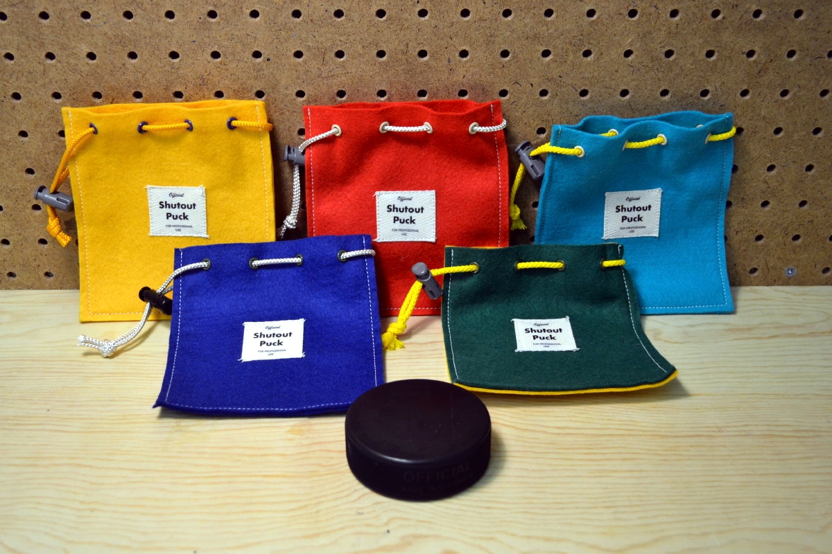
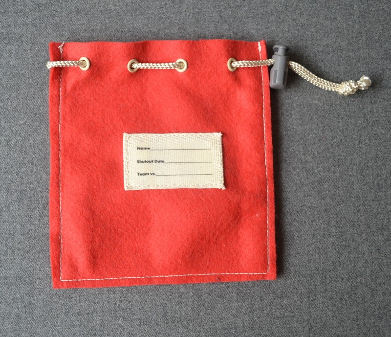
The colors are based on vintage hockey teams, with the grommets and string providing the contrasting colors. The labels on the front and back are made from iron-on transfers I made with my printer. The back label has areas to write down the name of the goalie, the date, and the team the shutout was against:
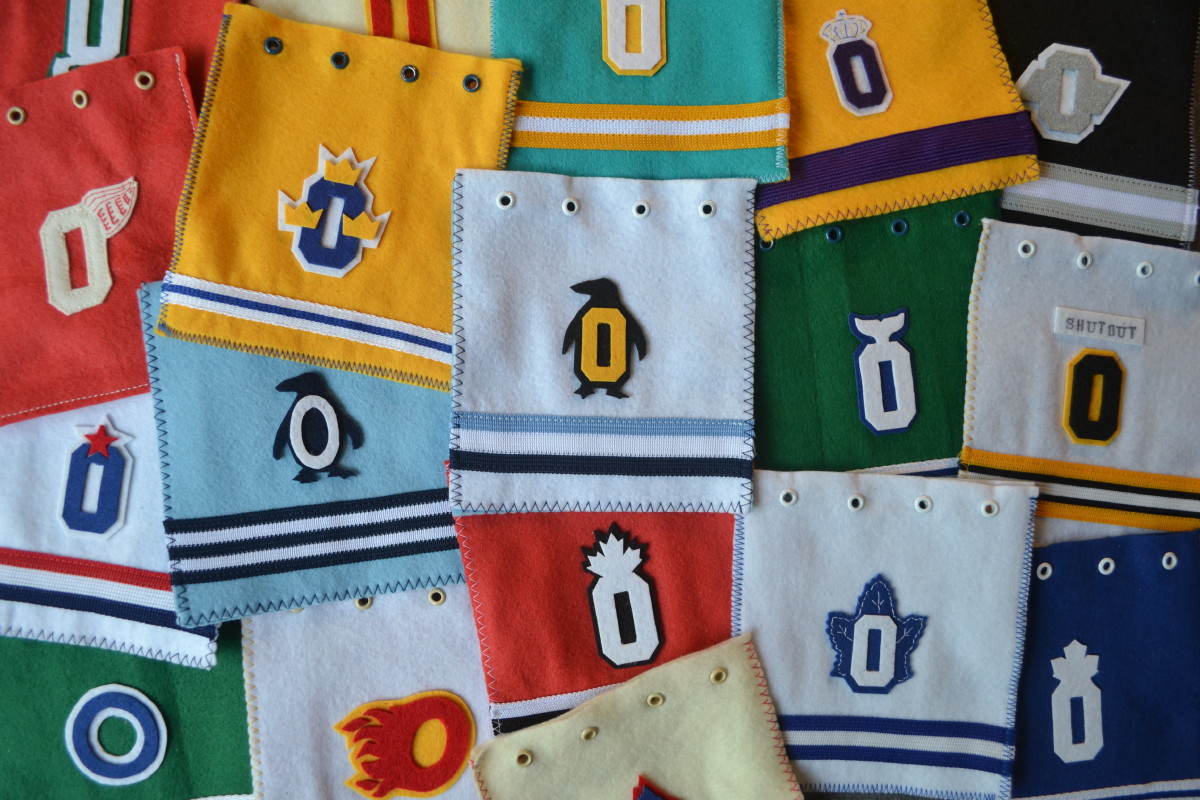
As you can see, that first batch was very simple. But after I did the necktie project that was featured here on Uni Watch, I developed some new techniques for applying logos, plus I was able to acquire a supply of vintage jersey braid striping, so I decided to take the puck bag project in a different direction. My idea was to have each bag look like a little jersey, complete with the uniform number zero (to represent the shutout), but with a twist: I would incorporate elements of the team logos into the numeral zero. I also simplified the label on the back:
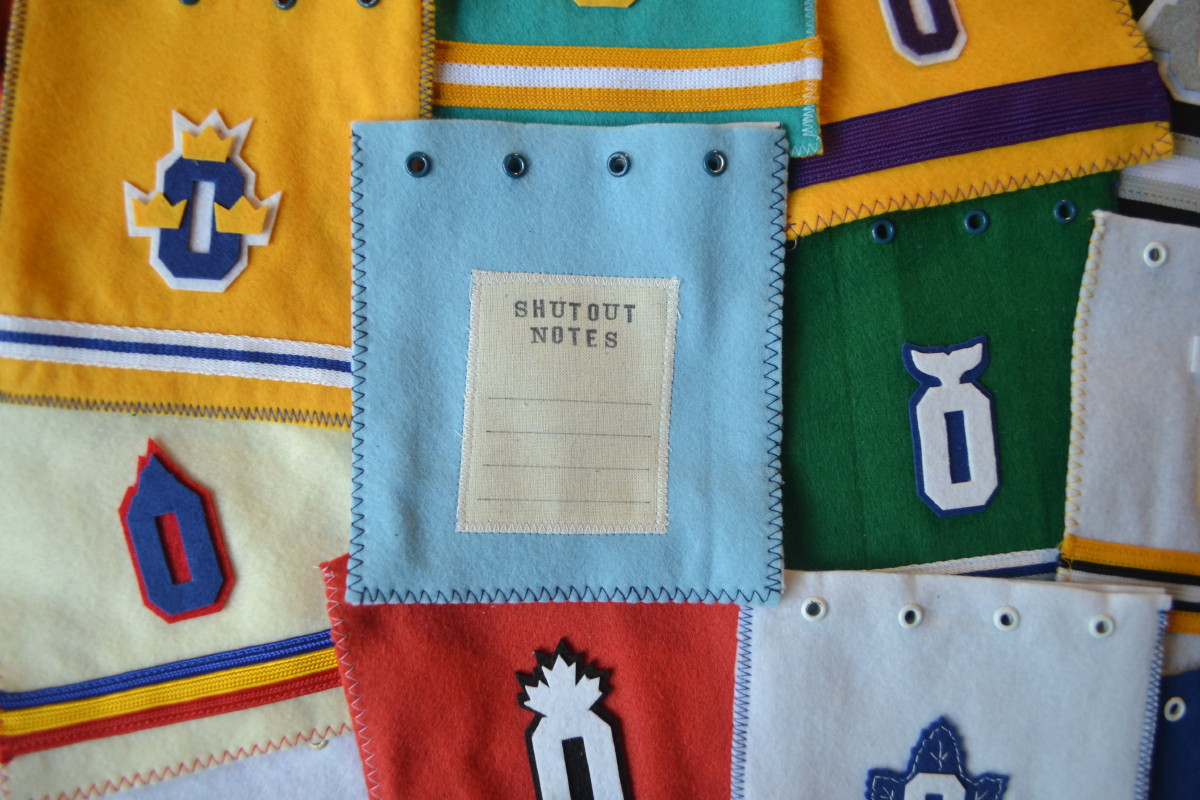
I used polyester felt, painted grommets, colored laces, and the aforementioned braid. I decided to use a zigzag stitch on the edge to resemble number stitching. The grey cordlock reminds me of the grey plastic cowling found on some older goalie skates. For the back label, I used an ink stamp set and a pen, as I wanted to get away from the inkjet transfers.
Here are the details of each of the designs, starting with these four:
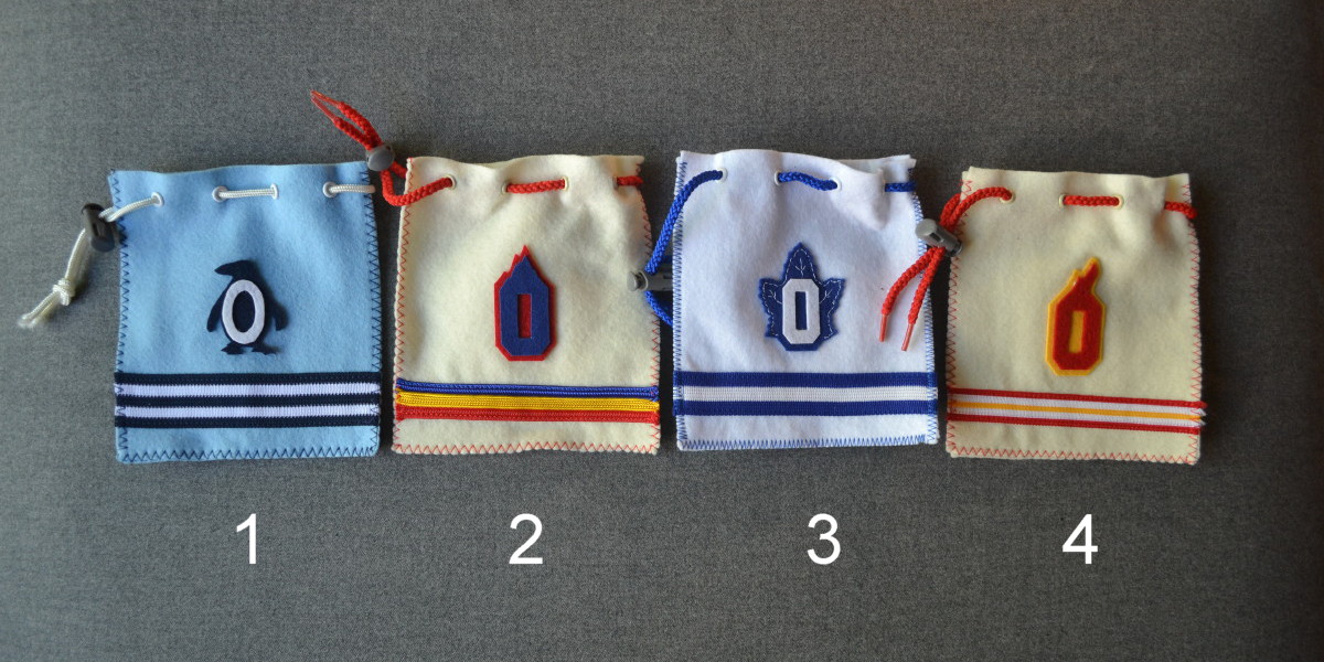
1. This one is based on the 1967-68 Penguins uniform, which is one of my favorites. Incorporating the zero into the penguin’s belly was a fun. Missed opportunity: I didn’t think of it at the time, but I should have offset the number and the penguin to make the penguin a seven o’clock drop shadow, just like the numbers on the original.
2. This one is based on the Colorado Rockies. I used an off-white material for a more vintage look.
3. A vintage Toronto Maple Leafs design. This one turned out really well as I embellished the leaf with some stitching, similar to the look of the original jerseys.
4. Atlanta Flames. The flame contours were taken from the old “A” logo.
Here’s the next set:
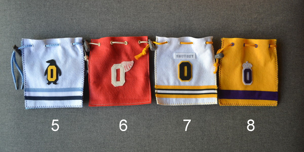
5. This one is based on the 1977-80 Penguins uniform. This bag is one of my favorites, as there is so much going on. I really like the dark and light shades of blue, and I always liked how the logo on this jersey was black and yellow. Maybe this combo shouldn’t work, but it looks really good to me. I love the yellow zero inside the black penguin, and I also really like the light blue string.
6. This vintage Red Wings design incorporates a bit of stitching to embellish the wing logo. For some reason I used straight stitching on the edge for this one, instead of zigzag stitch.
7. For this Bruins design I decided to add a nameplate, with “Shutout” above the zero.
8. The original purple and yellow Kings jersey is one of my favorites. I did a bit of stitching to embellish the crown.
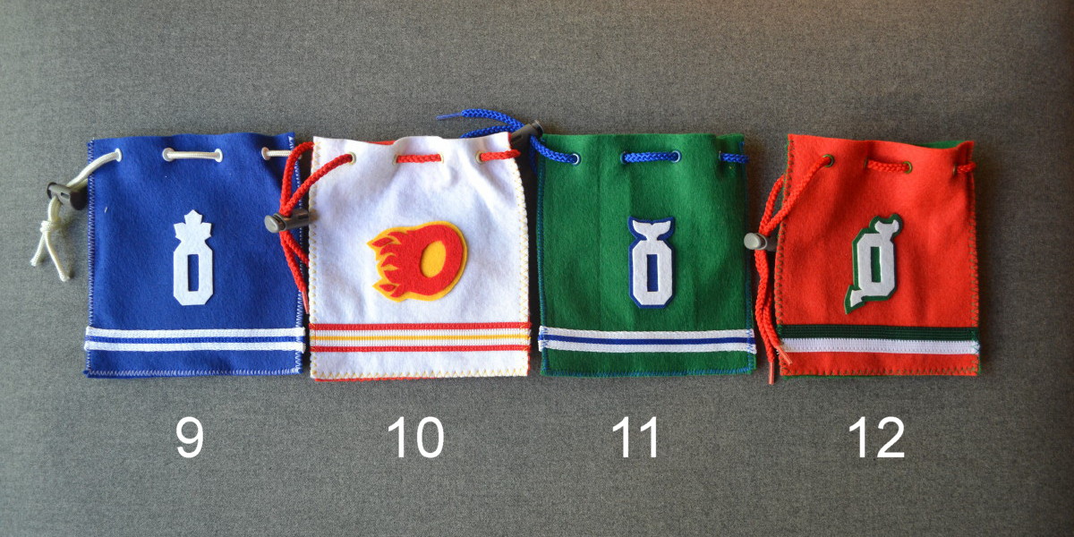
9. Modern Leafs design.
10. Traditional Calgary Flames design, I just closed the “C” to make the zero.
11. Hartford Whalers. Lots I could have done with this great uniform but I like the simple addition of the whale tail.
12. I always liked the red and green Devils look better. I think this one worked out well.
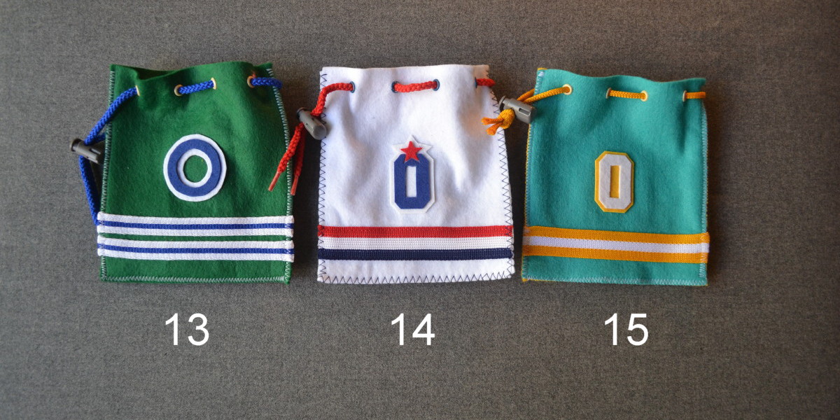
13. Based on the circle part of the Oakland Seals’ logo.
14. Original Washington Capitals design.
15. 1974-76 California Golden Seals. I couldn’t think of anything to do with the zero, but that’s OK as I love the colors on this jersey.
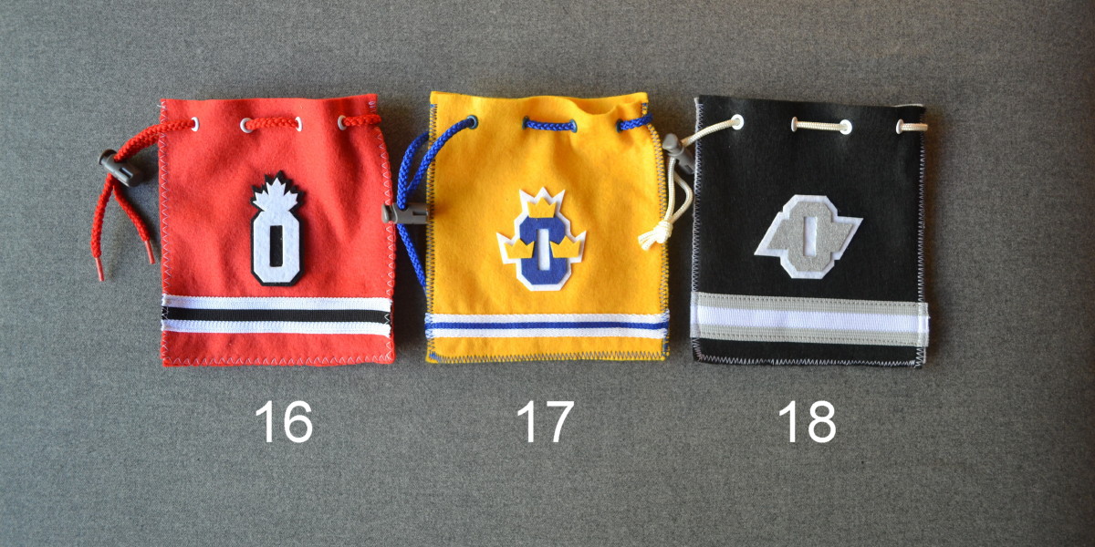
16. Team Canada.
17. Team Sweden. Lots of pieces to this design. I think it looks really good.
18. Gretzky-era Kings design. The metallic silver color was painted on.
This next photo shows a couple of details you can’t see from the front:
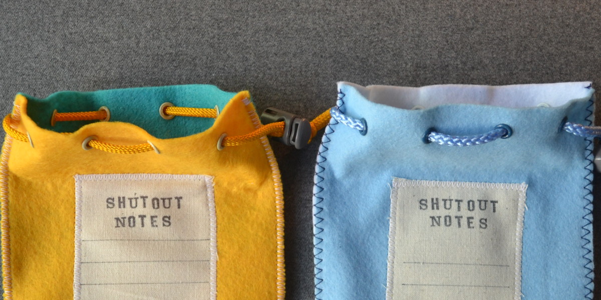
As you can see, some of the bags have a contrast-colored back, such as the 1974-76 Seals with the yellow back, and the 1977-80 Penguins with the light blue back. The Penguins bag also has white grommets on the front and darker blue ones on the back.
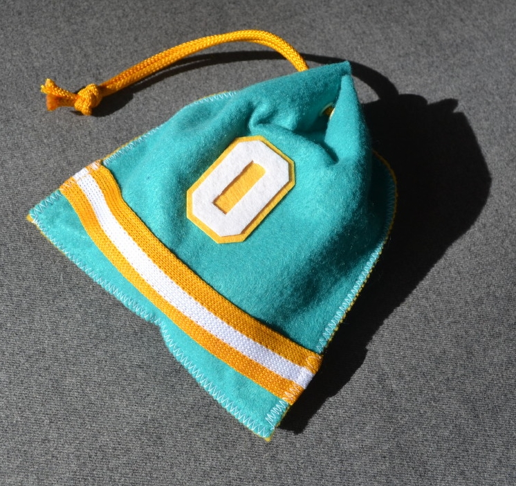
Here’s the turquoise Seals bag with a puck, ready for the trophy shelf (I like the irony that many of these designs are for teams that probably didn’t record many, if any, shutouts):
———
Paul here. Is that a great project or what? Please join me in thanking our anonymous contributor for another great entry.
That noise you just heard was Warren Junium fainting: Reader Bobby Murphy posted a comment yesterday about the new Notre Dame football uniforms. In case you missed it, here ’tis:
I had the opportunity [Tuesday] to be a part of a Notre Dame Under Armour photos hoot and was able to see next year’s home and Shamrock Series football uniforms. Although I was not allowed to take photos of the uniforms, I would like to try to describe them as best I can.
Home uniform: The base layer is blue with script words at the top reading “God, Country” followed by a large “ND” monogram across the chest. The sleeves are also blue with touching gold and white stripes at the ends.
The socks are blue, featuring the same striping pattern as the base layer.
The pants feature an “ND” monogram on the left hip and an Under Armour logo on the right hip. They remain otherwise unchanged as far as I can tell. The color remains near-identical to last season.
The jersey is blue with an Under Armour cut. “ND” Monograms at the sleeves. Under Armour logo on the left chest. No logo on the neckline (which surprised me).
The helmet is unchanged.
Shamrock Series uniform: The base layer is blue with complex gothic gating-style gold designs, which form a large cross over the chest with an “ND” monogram in the middle.
The pants are blue with gold diagonal stripes extending from the knee about a third of the way up the pant toward the thigh. I believe this will be the first time that Notre Dame has ever worn blue pants.
The jersey is blue with gold lettering. The lower part of the sleeves are gold as well, with blue “ND” logos. Gold collar.
The helmet is gold with a blue monogram logo. Probably my favorite part about the uniform.
The Shamrock Series uniform design, as far as I can tell, has no white — an interesting contrast to Adidas’s white-on-whites from last year.
Sorry again I couldn’t get pictures, they wouldn’t let me even pull out my phone if I was close.

Facebook query: You might not be aware of this, but this here website has its own Facebook page. The reason you might not be aware of it is that we don’t really do anything with it. I don’t even recall how or when we set it up (although I assume webmaster John Ekdahl did it years ago). I pretty much ignore it, frankly.
“Collector’s Corner” columnist Brinke Guthrie recently offered to become our Facebook page’s editor, to which I replied, “Nice idea, but what exactly would you do, and would anyone care? Is there a way to use the page to help attract new readers, or would we just be preaching to the converted?” Brinke then said, quite sensibly, “Why not ask the readers about that?”
So: Is there anything we could do to make you care about the site’s Facebook page? Is there a way it could help attract new Uni Watch readers? Would you rather that we continue to ignore it because you already have enough to keep track of in your life?
Post your thoughts in the comments, or send them here. Thanks in advance for your feedback.

Mike’s Question of the Week
By Mike Chamernik
The MLB All-Star Game is next week. As we’ve discussed around here recently, the MLB separates itself from the other Big Four sports leagues by having players wear their regular season uniforms instead of one-game All-Star uniforms. I have to say, I love seeing the mix of all the different designs.
But the one-off All-Star jerseys still have their charms! What’s your all-time favorite All-Star game uniform, — either a game uni or, in baseball’s case, BP jersey? Mine is the 1996 NBA ASG jerseys. They’re so ridiculous and cartoonish and such a product of that era that I really like them.
And if you don’t like All-Star designs, which is your least favorite?
As always, post your reseponses in today’s comments.
Tick-Tock: Today’s Ticker was compiled and written by Mike Chamernik.

Baseball News: A game-worn Lou Gehrig cap is up for auction (from Jonathan Daniel). … The Fort Wayne TinCaps partnered with the fashion brand Vera Bradley and will wear Ziggy Zinnia-patterned jerseys later this month (from Phil). … The Portland Sea Dogs will wear Chewbacca jerseys for Star Wars Night next month (from Phil). … Ben Peters is also a finalist in the St. Paul Saints jersey design contest. … “I absolutely love this memorial sleeve patch for Jean Yawkey, the president/part owner of the Red Sox,” says John Sheehan. “Something about the imperfect placement of the letters and the small black swatch rather than an arm band. Much better than today’s typical memorials which are mostly black circles with white initials.” … The jersey Lou Whitaker wore in the 1985 All-Star Game — the one with his number drawn in with a Magic Marker — is apparently in the Smithsonian (from Todd Herzog). … Kentucky’s Simon Kenton High School wore blue tequila sunrise jerseys this year (from Dwayne White). … The Orioles put hashtags on their bat knob decals (from Phil). … Hunter Pence has his own logo (from Brinke). … The San Jose Giants wore tie-dye jerseys and socks for Grateful Dead Tribute Night yesterday. … Rays outfielder Kevin Kiermaier hit a liner that went through Eric Hosmer’s glove on Tuesday night. … The A’s presented players their All-Star BP jerseys. Note that Jeff Samardzija’s is a different color, because it’s a National League jersey, which is what he’ll wear during pregame introductions (from Roberto Santiago). … David Teigland is volunteering for events around the All-Star Game and sends along a picture of the carpet in a mock clubhouse. I like it! … The Braves wore “Vote J-Up” T-shirts instead of BP jerseys prior to the game to promote Justin Upton’s candidacy for the final National League All-Star roster spot (thanks, Paul). … Adam Eaton was missing the right ring finger of his batting glove last night. Scott Sargent wonders if he was wearing some sort of shock absorber, or if Eaton tore his glove earlier in the season, or if this is just a common thing in MLB. Anybody know more?

College Football News: New field design fr Buffalo (from Phil). … A Penn State recruit recently got the school’s logo shaved into his head.

Soccer News: Argentina players wore black armbands yesterday in honor of former Argentine star Alfredo Di Stefano, who died earlier this week, but the armbands were all gone by the end of the match (from Yusuke Toyoda). ”¦ An Auburn University fan mocked up soccer jerseys for all 14 SEC teams (from Chris Mahr). … Jürgen Klinsmann’s bakery in Germany made some cookies to celebrate Germany’s win over Brazil (from Coleman Mullins). … New home kit for Inter Milan (from Phil). … Looks like Germany will wear white and Argentina will wear blue for the World Cup final on Sunday.

Grab Bag: Cavs draft pick Andrew Wiggins has signed with Adidas. … The Flyers will have a third jersey this fall. … The Syracuse Crunch unveiled their logo for the Frozen Dome Classic on Nov. 22. … Jason Dufner has a 43 patch on his golf bag in honor of Auburn football player Philip Lutzenkirchen, who died a few weeks ago (from Jonathon Binet). … Here’s a compilation of hidden messages in sports logos. Some examples are pretty well known and some may be completely apocryphal, but interesting stuff nonetheless. … Jonathan Daniel found a nice bounty of World Football League memorabilia. … “If the President fouls,” asks Phil, “it’s not really a foul is it?” ”¦ Rare sight: Connie Hawkins in an ABL uniform (nice find by Leo Strawn Jr.).

I’ve been a daily reader for years, though I’ve failed to comment for the better part of 5 years. I’m chiming in to compliment the amazing DIY project – colorful, classic, and thoroughly creative! Years ago, I worked with a girl who had created a little over-the-shoulder carryall out of a Bruins jersey, and these remind me of a better version of that.
I’ve accumulated a respecable collection of race-used pit crew shirts over the years and part of me is tempted to use something like this for a work satchel (tape measure, pens, level, etc.) Great stuff, Anonymous.
“… Is that a great project or what?…”
It’s a great project.
Anonymous is a creative genius. I’ve loved every project that’s been shared.
Agreed. Mr. Anonymous also seems to have a deft touch at the crafting of his objets d’art.
I think with the site being updated daily, there’s really not much point to the facebook page. I come here every day, so I don’t need to look at facebook to be reminded that there’s a new article up. I guess you might pull in a few additional pageviews if we’re liking it on FB and our other friends check it out, but there’s no real benefit to the regular readers.
I don’t facebook. Well, I did very briefly but only because a buddy wanted to know how to change some settings. Then I inactivated the account.
I agree with the Jeff. I check this site daily, so I see no need for updates via facebook.
I have a Facebook account because it is the only way to stay in touch with a few people I know, but I absolutely hate Facebook with the heat of a thousand suns, so I don’t check it very often. Everything about it irritates me but especially the horrible user interface. Nothing good can come of a Facebook presence as far as I’m concerned. Focus on this site.
I follow Phil and Paul on Twitter and that is generally where any “breaking news” would get posted. Easier than following these comment sections sometimes.
I guess twitter is ok for breaking news, but it’s crap for discussing it.
Agreed
discussions here are good enough for that. I say don’t fix what ain’t broke. I don’t need 3 places telling me all the same info. Like said above, most people check this blog daily.
@toddro if the comment section was updated a bit i’d totally agree. as of right now.. the comment section feels outdated and in need of upgrading
Don’t do Facebook or Twitter, so would be wasted on me.
I use Facebook and view this site on a daily basis, so merely linking to the day’s post, or the occasional ESPN column, wouldn’t make much difference to me. I do like the idea, however, of posting breaking news, as I’m not a Twitterer, but that stuff would be able to show up in my Facebook News Feed.
As far as who would be able to control what’s posted, while it wouldn’t be a bad thing to allow everyone to comment on new posts, I wonder if there’s a way for whoever “owns” the group to allow only certain people to post such items as are deemed noteworthy, but still allow anyone and everyone to comment on these posts.
I’m on Facebook all the time. It has it’s (puppies) drawbacks but I’ve re-connected with a lot of great people and bug my nephews through it. I paste links to U-W all the time. There are lots of sports fans on my FB. One told me she now pays more attention to what players wear because of me. I told her it’s not me, just go to Uni-Watch ’cause that’s where all the interesting stuff comes from.
If it could increase site traffic wouldn’t that be a good thing?Is there a way to set it up so all references to ____ (insert fave team, sport, league, major change) show up on my FB wall?
I’m woefully ignorant about Twitter. Are there pictures? If not, how will I get to actually see/enjoy the day that the W Sox add subtle red piping to the current uni?
Facebook (FB) would attract new readers.
Generally, a person can see whenever a FB friend “likes” or comments on a FB post or article. Sometimes, this leads to new people clicking on the post or article their FB friend “liked”.
Also, it is a few clicks easier to “share” posts to one’s personal FB feed so that his/her friends can read them. That could also attract new readers.
FB comments are – mostly – non-anonymous. Your name and photo (sometimes even place of employment) are right next to whatever you choose to write.
Important to note: that won’t actually improve commentators’ civility or germaneness a single bit. That non-anonymity also makes it much easier to cyber-stalk or cyber-bully other commentators.
I think the only thing that Facebook might be able to do is if you were collecting photos and information on a particular uniform topic and wanted them in one album.
“Notre Dame Under Armor photos hoot”
Chamernik’s question: the 2004 NHL ASG jerseys in Minnesota. So tasty. Honorable mention to the star template in the mid-90’s, but the teal and purple was too heavy for me in that context.
Now as to why Facebook, if it makes it easier for people to share content, why not? Paul’s favorite thing about writing Uni Watch is that the readers give back more than Paul himself gives, making a great back and forth. More of that cannot be a bad thing.
I’m of the opposite opinion on the Wild ASG jerseys. The retro idea was fine, but executing them in Wild colors didn’t work for me, and the use of “Minnesota wheat” in place of white helped to fuel what I consider to be an unfortunate trend in hockey. I do agree with you on the mid-90s star jerseys – nice concept, poor color choice.
As for ASG jerseys I like, I’d have to go with the 1992 NHL throwbacks, based on their 1947-59 sweaters. The black-and-orange jerseys between the mid-80s until 1993 are decent as well (both the ones with “WALES” and “CAMPBELL” down the front, and the later NHL shield jerseys). The 1998-99 jerseys were okay, but I haven’t liked any of the ones they’ve had since.
+1 on the 2004 NHL ASG jerseys, especially the green one although the white and red one was good too.
The 2004 ASG are good but I don’t like them as much as I did when they first came out.
link
Like the 1984-86 ASG Campbell/Wales quite a bit. There more in line with my vision of what an All Star jersey should look like.
link
The 1960-63 ASG are a bit simple and odd at the same time, but there’s something about them a like a lot.
link
I know this is a touchy subject, but looking at the SEC soccer jerseys, it’s so depressing that the default assumption is that Soccer = Sponsors on Jerseys. Living on the right hand side of the Atlantic, I can say with certainly that many over here look on with envy at the US Sports teams jerseys that haven’t been corrupted by ads.
Interesting. I would have assumed the ads were accepted as a foundational part of the uniform. Much the way as a baseball fan I now simply accept pajama pants, but get excited about high cuffery.
I think Ads started to creep in during the mid-80’s. I believe it happened partly b/c there was no ad revenue from TV (with no commercial breaks). It’s fair to say it’s accepted as here to say, but it doesn’t mean it’s loved. Especially when there are examples of another way (which is pretty much an example of American Exceptionalism, as most pro sports have in uni ads). I wish the MLS had focused on creating great unis & brands in the American tradition, rather than try to ape European football
And it doesn’t make sense conceptually, since these are meant to be for college teams and they’re still trying to maintain a façade of amateurism. Though college bass fishing (it’s a thing!) is link.*
Also, I’m disappointed that they went to the trouble of adding shirt sponsors, but the designs themselves don’t really *feel* like soccer jerseys. They’re really busy, especially as primary jerseys, because the school logos are oversized and competing with the sponsor logos and various design elements.
I’m thinking it’s better to think of college jerseys as national team jerseys, where the look is much cleaner and the emphasis is on the colors rather than piping/stripes/whatever.
*Can someone who follows college bass fishing do a uniform roundup? Because I’m totally fascinated but completely ignorant.
“And it doesn’t make sense conceptually, since these are meant to be for college teams and they’re still trying to maintain a façade of amateurism.”
The “façade of amateurism” is, in particular, an NCAA thing, and they have strict rules about advertising on uniforms (other than manufacturers’ marks, obviously). So you’re right, the SEC soccer shirt mock-ups would never be worn by NCAA-sanctioned teams with the ads on them like that.
For that matter, link and link both already have NCAA-recognized varsity men’s soccer programs, so the mock-ups for those two schools feel superfluous and uninformed. Besides, the real things, without jersey ads, look better than the mock-ups.
I thought the same thing about South Carolina and UK. Why include them when they exist?
It seems to me that the whole point of doing a fan concept jersey is that you are looking to show your idealised vision of how a uniform should look and so I must presume that anybody who willingly adds jersey ads to their concepts genuinely believes that jersey ads look good (in which case you’d rightly question their aesthetic sensibilities).
They would probably argue that they’re just angling for realism, which as you rightly point out terrible is misapplied for collegiate athletics. Alternatively they might argue that they’re not actually trying to represent a realistic idea of collegiate soccer, but rather colleges represented as though they were pro level teams, in which case: link
Alternatively they might argue that they’re not actually trying to represent a realistic idea of collegiate soccer, but rather colleges represented as though they were pro level teams…
I guess I buy that. But the proportions and use of color feels so haphazard, they feel downright, well, amateurish. Looking at the jerseys, they don’t look like the pro soccer equivalent of SEC. You’d think Alabama, for example, would echo the minimalist/classic feel of the American football uniform and go for something that looks like Brazil, but they went for the superfluous stripes and stuff.
I agree completely. I kind of liked the idea, but was completely turned off when I saw the ads. Just horrible, especially since this is supposed to be a college sport.
Meh, ads don’t turn me off. They definitely don’t turn me off to college sports. Why should they? Go to the majority of major college athletic events and there’ll be ads plastered everywhere. Why should a uniform be much different?
And PS, anonymous hockey DYI man, the Habs logo is begging to be altered to your theme! Take out the H in the middle and add the zero, voilà ! Also, for the Rangers, you might spell out ZERO in the diagonal font. Love your stuff! Yay hockey! (Teebz, get him on your radio show while preserving his privacy, if you can and if he wants!)
That’s definitely not Adam Eaton’s ring finger…it’s thicker than the glove, and there’s no nail. The finger of the glove has to be underneath whatever that thing is…a shock absorber or extra protection for something that might be wrong with his actual finger is a good guess. It’s probably skin-colored because the product is supposed to be used on bare hands, not over top of batting gloves.
Looks like some sort of wrap or splint on his finger that would necessitate the removal of the glove finger in order to get the glove on. I googled it, but found nothing about a finger injury.
????
Bud and Dumb Guy- I’m the one who sent Paul the info. The picture Paul posted shows the splint/pad I saw him take off and put in his pocket during the at bat. Underneath I was surprised to see that the finger in question had been cut off of the glove. Didn’t know if this was something necessitated by an injury, the size of the pad, whatever, or if this is just “one of those things” that Eaton does- cuts that finger off all of his gloves and wears a padded sleeve over the finger…or whatever.
I’ve been to Grateful Dead concerts and I have recordings of dozens of them. The tie-dye SJ Giants jerseys are bad. They could have at least kept the team color palette.
“I’ve been to Grateful Dead concerts and I have recordings of dozens of them.”
~~~
Yep. Only about 125 live shows for me (and I still have hundreds of hours of tapes). But I digress.
I won’t disagree that the pseudo-dye’s could have been better (in fact, if they really wanted to make them more ‘authentic,’ they could have tried to make each one different — not radically so, but at least mixed up the pattern placements or tried adding a second design).
Still, as far as MiLB jerseys go — I love them. I wouldn’t want to see them but once a year, but for a one-off? Better than all the flag desecration/camo/Star Wars crap that seems to be trotted out on a (seemingly) daily basis.
YMMV.
Agreed. Wouldn’t want to see it more than once a year, but in the sea of MiLB promotion night jerseys, it’s a nice Ripple.
Well, the first times are the hardest times . . .
“it’s a nice Ripple”
~~~
I’ve been dying for something interesting to happen uni-wise (well, more than it already has) at OK State, in T. Boone stadium; specifically a tear in one of the jerseys or something similar
Because the hed would be…
Ripple in Stillwater…damn it, Phil. That’s the musical equivalent of the FedEx spoon. On the bright side, at least I can stop saying “I’m a man, I’m 40.” every time OK St. gets mentioned now…I’ll just sing to myself the rest of the day instead.
Would really work well if a player – or even a coach -spilled some cheap high-alcohol wine on the sidelines.
I thought the tie-dyes were a fantastic one-off, & were especially appropriate for a team with ties to San Francisco. Shirts were designed well, & gotta give props to the tie-dyed socks. (Stirrups would’ve been better, of course, but given the sad state of baseball’s below-the-knee uniform “standards,” I’ll take what I can get.)
Back in the 1990’s, the Mahoning Valley Scrappers (Youngstown, Ohio-based NY-Penn League affiliate of the Cleveland Indians) used to hold a Grateful Dead tribute night that included tie-dyed jerseys, Dead tunes between innings, a Jerry Garcia lookalike contest, & a Dead tribute band playing before the game. Did some Googling to see if they still did this & found link.
If OSU ever gives Phil the opportunity to use that great headline, I hope it’s over the same weekend that something significant occurs with the Rancho Cucamonga Quakes, cuz we’re pretty proud of them down here …
A personal favorite photo of Connie Hawkins with the Rens:
link
I love that NOB.
And check out Hawk’s warm up jacket from 1962…
link
And it just occured to me that while the team was know familiarly at the Rens, they were in fact the Pittsburgh Renaissance, which probably makes them the first pro sports team to use a singular nickname(?)
ugh, forgive my typos…
The link would take exception to that comment.
Well, whaddaya know!
I see there was also the Racine Legion.
I saw the Hosmer “through the mitt” clip yesterday. Apparently the mitt didn’t break or anything, it just failed.
Not much good if it can’t do what it’s supposed to do!
Best all-star uniforms; 83 NHL
Oh yes, those were sharp.
So, did Wiggins going to an Adidas school sway him to signing with them as a pro?
//possible rhetorical question
I heard a rumor one time that before he committed to Kansas, he said “How much adidas do I have to wear?”
Yeah, but it starts at the AAU/prep level, where sneaker companies strike deals with coaches hoping to steer elite players to *their* schools.
I sense a disturbance in the force, and I have a great fear that LeBron James’ handlers will be faxing a document to Cleveland-area media in the next day or two. I sense this fax will have an introductory paragraph explaining that it’s a statement from King James himself, in response to questions about his future plans. The body of the fax will read:
“I’m back.”
i wonder if the “vote[insertplayernamehere]” is a thing being pushed by MLB. THe indians are doing the same thing for Corey Kluber
link
Most interesting (and best) thing about the “Vote for [whomever]” tees: No maker’s marks!
Seeing how the shirts don’t seem to be templated, I would guess it’s more of a trend than an MLB push.
The Angel’s took it a step further against Toronto.
They had:
Shirts – link
Writing on the mound – link
Writing on the infield – link
Writing behind the batters box – link
The infield one is horribly kerned.
I love that players are pushing it too. Mike Trout is offering a signed game-used bat to whoever puts the most votes in for Grich.
I haven’t followed the AL for quite a while, so seeing the reference to Grich, I started thinking it meant link making a really surprising comeback.
more shots the Tribe in their pro Kluber shirts link
Despite the ridiculous side panel stripes I do like the clean look of these:
link
I haven’t paid much attention to the NBA in 15+ years so that’s the first time I’ve seen those jerseys. The netting pattern under the pits is awesome.
I feel dumb. I didn’t realize that was meant to be a net.
Looking at link, I guess it’s not. Shoulda been though.
Agreed, the NBA had a good design that year.
Forgive me for my lack of enthusiasm for “a better way of storing pucks kept by goalies after they record a shutout.”
I clicked onto the site thinking… cool, he moved from neckties to pocket handkerchiefs! Frankly, a much better idea, with a much wider application, if I do say so myself. :)
But you must admit, the ‘shutout hockey puck pouch’ is much more innovative. In fact, I see a niche market if Anonymous were interested in such a thing (though he has rejected the idea in the past).
And, the execution is/was spectacular!
Nah, I don’t have to admit it. The execution is superb, sure. However, the idea isn’t of much interest to me.
I’d want to display the hockey puck and not hide it in a fabric bag, no matter what that bag looked like. People with diamonds don’t treasure them in a bag… they wear them. :)
I agree, my original thoughts were lukewarm towards this but afterwards I think they ended up very cool and well done. Good idea for a hockey crazed Canada.
I’d love an active Uni-Watch page on Facebook. I get a ton of information from my Facebook newsfeed as a result of ‘Liking’ various blogs and news sites. I think you could space out ticker items throughout the day by sharing the links through there, and you’re definitely going to increase exposure. You could also post images, and have an additional resource to cover breaking Uni-News as it happens. All in all, I’m for it.
Since the non-Facebook crowd is gathering above, the (sort of) pro-Facebook crowd can gather here.
The biggest plus I see to an active Uni-Watch Facebook page is that it would be easier to share my semi uni-obssesion with others and potentially recruit them to the site. It would be great if it was easier to “like” a UW FB post and comment on it, thereby posting it to my wall for my hundreds of adoring fans (okay, more like dozens of friends and family) to see.
Also, I think Facebook will be a useful place for Paul and company to share uni-related content that may not be headline worthy. Ticker items that are particularly interesting or COTD would be a good fit.
I don’t know how much work it would be to re-integrate facebook into the workload. I do remember thinking recently that it had disappeared from my news feed for quite some time, I thought it was just one of those facebook things where if you don’t like something enough it disappears, I do read this site every day.
But I do spend quite some time each day on FB, like others said it’s a way to stay in touch with a bunch of folks I have no other way to, and it doesn’t hurt seeing pictures of friends babies every once in a while when there is no way they’d email them to 250 “friends”.
I think the beneficial thing is being able to share uni-watch posts on facebook. I’ve mentioned the site to several friends who would say things like “hey did you know RG3 is sponsored by adidas and has the roman numeral III on his back that looks like the adidas stripes,” etc. They’d never heard of it before and not sure mentioning it sent them here.
But I did see an interesting post on FB the other day, an old acquaintance had run into RG3 at the airport and had his pic taken with him. RG3 is holding up his pinky, ring and middle fingers…yes…its “3” but it’s also three parallel lines. Does adidas make him do that for fan photos?
I have a FB page for my Atom-Bomb Bikini professional illustration/design identity as well as a personal page, and I find it REALLY difficult to keep up with it. I know I should, as it seems it could be beneficial, but all I ever seem to do is re-post entries from my blog. I’ll be interested to see what you come up with.
As a reader: I would definitely share more stuff if it appeared in my FB feed.
As a FB admin for my job: Creating good FB content takes some time.
True that. “Let’s do social!” is the classic easier-said-than-done proposition around my office.
That said, I think it’ll be nice to use Facebook to post new articles, breaking news and a place to share ticker-type links.
Unfortunately, like a lot of things, people don’t seem to understand that “doing social” and “doing social” right are two entirely different skills.
err… “doing social right”
[proved my own point]
I think it would be great for expanding readership. People share them and it shows up on their friends feeds and so on and so on.
It could definitely expand readership by simply linking the new article everyday.
If you want to keep everything consistent across twitter/FB, check out HootSuite. I’ve used it in the past and it worked well for cross-platform posting.
The new ND uniform sounds great if the sleeve and sock stripes look how I think they’re going to look, though I can’t say I’m excited about the news of extra clutter on the pants.
I think this is how it’ll look:
link
I’m led to understand UA is calling this the “Double Stripe,” a design element that they will try to use with all ND teams.
Sorry to be tedious, not to mention redundant, but I want to repeat what I said yesterday about the “God Country” bit on the new Notre Dame unis. I hate it. My dad played football for ND, our family is big on ND, and I hate the hell out of this.
Yeah, that’s as silly as the “Double Stripe” is beautiful.
I assume that Eaton cut his ring finger off of his glove as the splint that he has on his finger wouldn’t fit normally. It is definitely not a shock absorber and its definitely not a rip that happened earlier in the season. Do you know how many pairs of batting gloves these guys get? It is insane. They would never wear a ripped glove unless it was on purpose as is most likely the case here.
Yeah, I was thinking he just had a jammed finger or some swelling that made the glove uncomfortable on that finger.
It’s not cut off…the finger of the glove clearly goes underneath whatever that thing is. If he was gonna cut the finger off, he probably would’ve cut the whole thing off, down by it’s base at the edge of the palm.
Once again:
It’s on the base layer (what the kids wear instead of t-shirts under the pads. No one will see it during a game.
It’s made to appeal to college-age kids. Not to old farts.
If you’re a Notre Dame guy, you’d know that neither they nor Under Armour pulled that phrase out of thin air. For those who don’t know, it’s carved above the east door of the Basilica of the Sacred Heart, as a memorial to the students, faculty, and alums who died in World War I.
If your beef is mixing religious and/or patriotic kitsch with athletics, that ship sailed long, long ago, even at ND. And if your beef is with the use of the phrase in connection with athletics at ND, that ship sailed before this base layer shirt, as well. IIRC, Adidas printed it on the inside collar of the football jerseys. And you’d just love that phrase, in large gold metallic letters, embossed above the American flag at the new hockey arena on campus.
Sorry, that should have been posted in response to Mr. Nugent’s diatribe, I suppose on the theory that one good diatribe deserves another.
“the MLB” is back! I thought we already discussed this. It’s just “MLB” not “the MLB.”
Yeah. Like we say the BBC but not the CBS.
You’re right, my bad. In my defense I say just “MLB” 99 percent of the time. link.
Nice DIY project, but I have to confess that I’ve never even thought of storing my shutout pucks. I paint them, indicating the game score, and display them stacked in my office window. Many of the pucks call up fond memories of the game and the team I was playing for at the time. I’d send a photo, but this comment format doesn’t seem to permit photo attachments and I’m ignorant of the inner workings of Flickr et al.
If I did make bags for these pucks, I think I’d use the logo or name of the team that earned the shutout–nice though the NHL zero motifs are.
Paul, I have to admit I don’t understand how to use Facebook. It’s not a priority.
Re: Facebook – What a timely question for me. I say this because after being a daily reader and periodic commenter for several years, today is my first visit to the site in about 6 months. I’ve fallen out of the habit of PC based browsing and spend a much larger percentage of time working off my phone. On my phone I use things like Facebook and Twitter to agregate news items for me and I follow links from there. If UW did nothing more than post the daily link to FB it would be a useful prompt for people like me to get back to the site.
Same here – I use Facebook as my news portal. Though UW posts only daily and at a reliable time, so I don’t have much need for a reminder to click.
Very odd to see white stripes on the Sweden puck bag, considering that I’m used to seeing their national team with just two blue stripes on their gold jersey.
Interesting QOTD; I really had to put on my thinking cap.
Best- 1999 MLB Home Run Derby at Fenway Park. I like the vertical orientation of the titles.
Worst- 1982 NHL All-Stars. Cut-out stars and glue.
I’m with you. Those NHL jerseys looked so JV.
Favorite ASG jerseys – the whole decade of 80’s to 90’s. I wish the NHL would go back to those colors.
On that new U of Buffalo field, I wonder how much discussion they had about the centering of the New York state watermark. It appears visually centered, but technically it’s shifted to the right because of Long Island.
My favorite All-Star jerseys were the NBA ones from 1991-1994. It wasn’t garish but it had a nice enough touch with the airbrushed-looking star behind the numbers. The memories of probably one of the best era of players also makes those stick out.
Mike, I still have a 1996 Michael Jordan All-Star jersey at my parents house. I wish there was any good reason for a 30 year old man to wear it.
It’s interesting now in retrospect that the NBA kept the same All-Star jerseys for multiple years. I liked the look, too. Ha once in awhile I see hipsters walking around in Penny Hardaway Champion-brand NBA replica jerseys, so maybe there’s still time.
On the SEC soccer jersies, all the schools have big nationwide companies and LSU has Rasin Canes Chicken
Probably not a ton of companies based in Louisiana, and also, Rasin’ Cane’s is awesome. I think I’m gonna go have lunch there today.
Popeyes Louisiana Kitchen is, as you might expect, not based in Louisiana.
Also, Ole Miss is sponsored by FedEx, based some 80 miles north of Oxford, but in Memphis, TN.
I think the smart money for the UGA sponsor would be Coke rather than Delta, but I’m going to assume an airline was chosen just to mimic Arsenal, AC Milan, Real Madrid, etc.
I just want to say how much I love the WFL helmets, some really great logos!
-I think keeping th FB page updated and active would be great. I don’t read UW every day, but seeing the headline in my FB feed would probably bring me over here more often. It would also make sharing UW posts easier. (Sure, it’s not like it’s hard now, but it would be even easier). I use FB a lot, I’d be very happy to have more UW there.
One small nitpick on the Team Sweden puck bag. It should be two crowns over one, not one over two. I don’t know if there is any symbolism to that arrangement, but I’ve always seen it that way.
Really neat DIY !
QoTD: The 2004 NHL ASG unis with the lace up collars and diagonal lettering. I’ve got a green Western Conference one. Not just ASG specific, but one of my favorite hockey jerseys period.
100% Agree
Ditto with 1996 NBA ASG.
However the best ASG single uniform of all-time would have be Jerry West in 1972. TNOF = NOB w/ an ASG MVP award for a game winning shot in front of his home crowd in home team colors.
link
That has to be the highest-profile TNOF=NOB uniform, right?
The only thing that comes close is the occasional American League umpires with the first name “Al”.
You took me back to the 70s and it reminded me of the 1977 NBA jerseys with the link font and link on the shorts (because the game was in Milwaukee). Pretty good look.
Damn. I loved those, partly because the Old English works so well for Milwaukee (though no team there has used it since the Brewers of the 1910s) and partly because that was about two years after I moved to the city and 70s iconography still forms part of my mental image of it.
I really liked the MLB ASG jerseys from the game in SF. I liked how they incorporated the bridge into the “American” and “National.”
“Will it be black? Will it be the same design as the primary jerseys?”
Will they be hideous clown outfits? Probably, given the state of alternate uniforms these days.
I just hope they (the Philadelphia NHL team) don’t mimic the what their AHL affiliate has in store for road games next season:
link
YOWZERS! That’s a nightmare!
The 2015 NBA All-Star Game logo has been unveiled.
link
QOTW:
It has to be the 1989 NBA All-Star Game. It’s what I like to think of as “peak blandness” of NBA uniforms, before the Hornets influence really took effect. Ãœber-plain jerseys with just the NBA logo, a few stars and stripes, and of course, shin-high tube socks.
And I should probably attach a link: link
^
That!
The little puck bags are a nice touch. The NHL is really missing out on a potential merchandising opportunity.
As for the Facebook page? I haven’t used Facebook in well over a year. I’m perfectly content if Paul decides to remove it altogether.
That roundup of hidden messages in sports logos done this week by a USA Today blog was done a month ago by Mental Floss. link
It’s actually been done a million times by everyone, but people do seem to like it….
Didja guys know the negative space between the E and x in the FedEx logo forms a forward-facing arrow?!
I check this site religiously and daily and usually read it while on my throne. No facebook. Be hipster and not use it haha.
For all star nba i do like how they had a simple nba all star all the early years, i do like the cartoony 95 and 96 look i was 5th and 6th grade then. The as jerseys have sucked since 2003 on. It was cool they just wore their regular jerseys 97-2002. Check it out link
For mlb all star i like how they make their logo unique to their team. I liked the 99 sox and seattle 2001. My fav teams. Heres logos of past all star games.
link
I hate how the nfl has gotten rid of the uniqueness of each years logo and to better help me remember who won with that logo. Its a blur the last few haha.
I’ve always liked the 1959 MLB All-Star game logo.
QOTW: There has never been an all-star game or Pro Bowl uniform that I would actually say I like. Put simply, none of them are ever as good as the teams’ standard uniforms. I do, however, have a soft spot in my heart for the link. Mainly because they look like an link intra-squad game.
Those bags are pretty epic. Makes me even more motivated to post a shut out now
PL did a write-up a few years back about a Hockey HOF jersey book, and when I saw an all-star sweater like this from a 1942 war-effort/charity game, it instantly became my favorite:
link
There’s an agency in Michigan that’s been in the news for planning to care for some of the undocumented children from Central America. The agency is called “Wolverine Human Services”, but the W is an upside-down block M. I think it’s on purpose. link
The Shutout puck bags are fantastic! I think Anonymous should make a Bruins one, black with gold and white stripes, and a white rectangle with a stenciled 0 inside. Frosty would be so proud…
So now that I’m into cycling as a hobby, and following the tour de france for the first time in awhile, would be fun to have a rundown of team kits. My fave is the brown/blue ag2r-mondiale. Team Sky is cool, but too many other teams use black as well.
WFL helmets a few bucks cheaper can be had here: link
There are also many college and NFL team throwbacks as well as current helmets too.
I always liked the MLB all star BP jerseys worn in San Francisco a few years back with the Golden Gate Bridge motif in the “National” and “American” text. It perfectly represented the host team and city. I wanted to get one but never did, and now I can’t find them. Since then I have collected the David Wright NL jersey for the game played in Anaheim, where I live, and a Matt Harvey jersey from last year’s game in Citi Field. That orange jersey was awful, but hey, I’m a Mets fan.
Found this one on ebay:
link
A good sponsor for LSU would be Duck Commander, especially since the CEO, Willie Robertson, is a big LSU fan (granted football, not soccer).
Arsenal kit unveiling.
link
link
Overall, nice job. Loving the hooped socks, I’d pick a couple nits, but too excited about Alexis Sanchez signing to bother.
Cool article from the PGA on a neat aesthetic part of golf events: Tee markers.
link
I follow the site on my laptop…and occasionally by using the web browser on my phone. I don’t follow anything on Twitter. I wouldn’t benefit at all from UW’s use of FB and I hardly share anything on FB so no one else would benefit from it in my little corner of the world.
Mid 1990’s NHL Western Confrence Purple and Black ‘star’ template. So good that Dallas tweeked and recoloured it to improve on the sweaters they barely altered from Minnesota. Is it just me or the red tips on the Chicago Bulls horns are not symetrical?
Way behind, but those 2004 NHL ASG jerseys were just about the coolest thing I’d ever seen at the time. The league has come to embrace the retro look quite a bit in recent years, but ten years ago it looked revelatory!