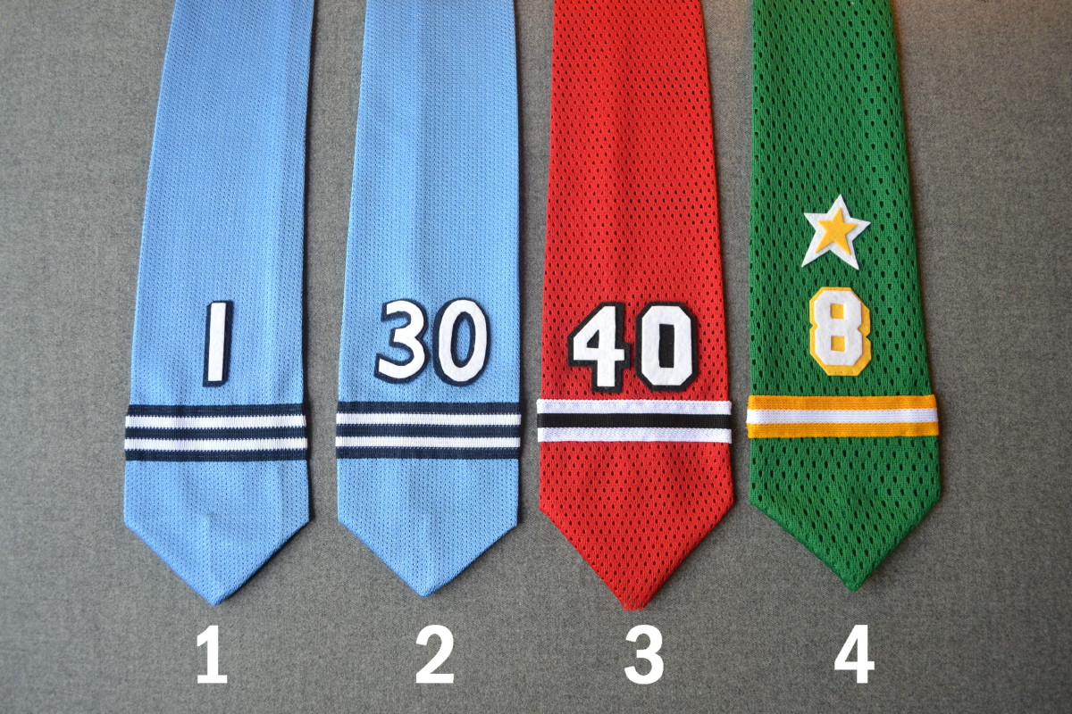
Click photos to enlarge
[Editor’s Note: Remember our recent post about DIY NHL goalie-themed neckties? That entry was extremely popular, so today we have a follow-up from the same anonymous contributor. Enjoy. ”” PL]
By Anonymous
The first three ties I made were really an afterthought — a way to use up small, leftover scraps of fabric. But after I saw the positive reaction from Uni Watch readers, I decided the project deserved a little more attention, so I made several different variations with assorted materials and designs. I also worked out some of the technical issues I’d encountered while making the first three ties
I ended up making 26 more ties. Here’s the story behind each one, with details of materials and also the teams and players they were based on, beginning with the four ties shown above:
1 and 2. I wanted to replicate the Penguins’ beautiful 1967 blue uniform. I used a modern shiny light-blue mesh that reminds me of the slight sheen that the Durene jerseys of that era had. I also wanted to do a set of two goalies from one team — in this case Hank Bassen and Les Binkley. The stripes are a sports jersey braid material similar to, but not an exact replica of, the original pattern. I also love the drop-shadow numbering this set had.
3. This is a Warren Skorodenski/Darren Pang Blackhawks design. I always liked the way No. 40 looked on this uniform. The stripe pattern is an exact match to the sleeve of these jerseys, so it looks very accurate.
4. I wanted to incorporate design elements beyond stripes and numbers, so here I took the star from the North Stars’ logo and added it to the tie. I love drop-shadow numbers, and the ones on the North Stars’ jerseys were some of the best. The stripe pattern isn’t quite accurate.
Here’s the next batch:
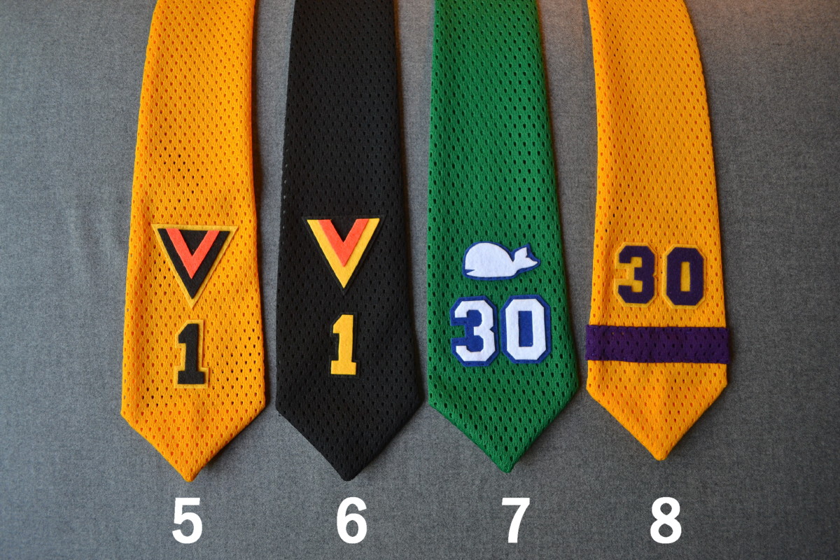
5. and 6. I love the Canucks’ old V uniforms, and I wanted to do home and away versions for the same player, so here we have Glen Hanlon’s 1978-79 set.
7. I’m not usually into replicating pro logos, but I wanted to include Pucky on this Greg Millen Whalers tie. One of my all-time favorite looks.
8. This is based on Gerry Desjardins’s King jersey. I love this uniform, and this particular tie came out the best of all of them, with the fewest mistakes. If I could keep only one of these ties, this would probably be the one.
The next batch is a departure from the previous ones, because I shifted from hockey to football:
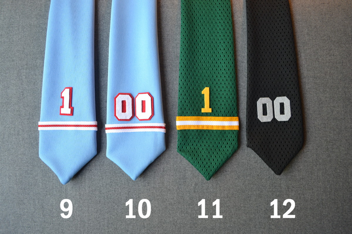
9. Warren Moon, Oilers. I loved Houston’s powder blue and red uniforms. For this tie and the next one, I used powder blue double knit baseball uniform fabric.
10. Ken Burrough, Oilers. When I was young, I would see him on TV in his distinct No. 00 uniform, which was so unique and looked great on the sky blues.
11. Moon again, this time from his Edmonton Eskimos/CFL days. Stripe pattern isn’t quite right, but overall it looks okay.
12. Jim Otto, Raiders. I never watched him play, but I seem to like No. 00, so I made this one. Also, I wanted to experiment with metallic finishes so I painted the numbers with a metallic silver paint to get the right effect.
Okay, now back to hockey:
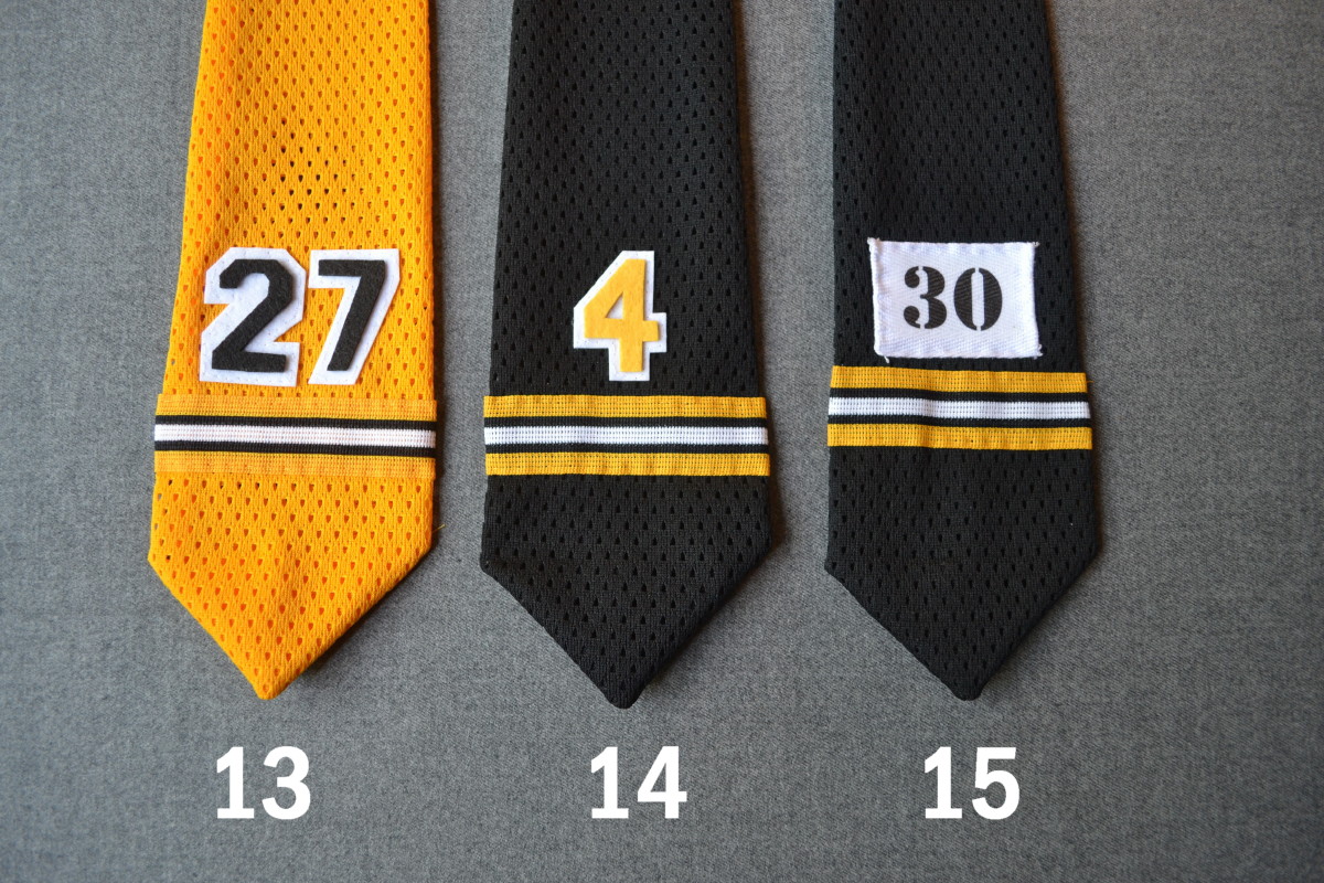
13. Bobby Orr’s rookie jersey, No. 27.
14. Here’s Orr’s more familiar No. 4. I was happy to find this braid material for the stripes, which look very close to the real thing.
15. The Bruins’ equipment manager used to identify each player’s equipment with a stencil-numbered piece of white hockey tape. I always liked this quirk, so I decided to replicate it on this Gerry Cheevers design.
One more batch of hockey designs:
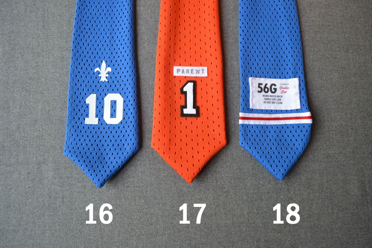
16. Since I was experimenting with different materials, I decided to pay homage to heat-pressed numbers. Actually, this Nordiques design uses a white plastic tape that I cut out and applied, but it looks very similar to heat-pressed. I always thought this jersey design was particularly beautiful.
17. I thought I should try doing one with a nameplate, so the Flyers’ contrasting design seemed like a good choice. I applied Bernie Parent’s name with an ink stamp set.
18. For fun, I made up a jersey tag and put it on a Rangers-looking tie. Its kind of a mix of eras, as “56G” is a pretty recent size for a goalie-cut jersey (it’s what I wore when I played), but the laundry instructions are what you would see on an older set.
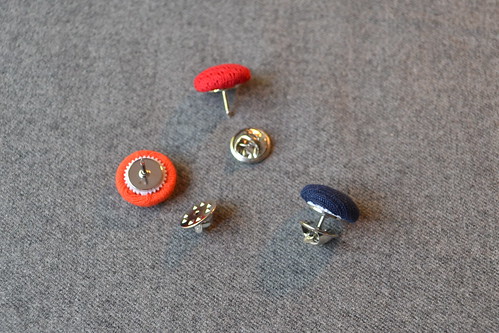
For this next batch, I found some light gray double-knit baseball uniform fabric and decided to do a run of ties based on modern MLB jerseys. I also made squatchee tie tacks (just covered buttons with a pinback added) to go along with them:
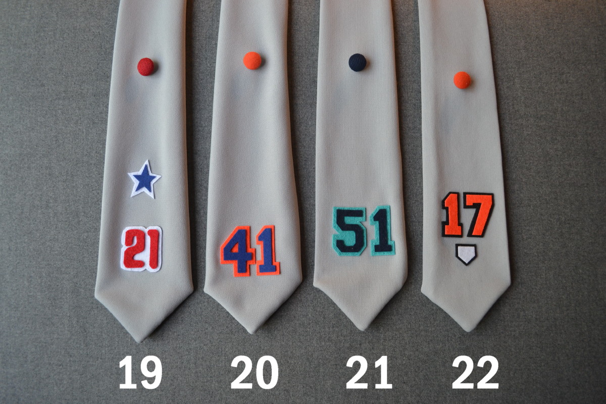
19. I don’t really follow baseball (but love the uniforms), so these are just random designs I picked. This one is based on a Phillies jersey. I love the little stars and the font used for the numbers.
20. Tom Seaver, Mets. I think the orange and blue look great on the gray, and I think 41 is a cool number. Love the orange squatchee. [One nitpick: Seaver did not play during the Mets’ orange-squatchee era, which began in 1995. He always wore a blue squatchee. Just sayin’. ”” PL]
21. A Mariners design, for Ichiro Suzuki or Randy Johnson.
22. Orioles design. I added the home plate from their baseball diamond logo. Not sure if No. 17 is anyone significant — I just like the number.
But baseball uniforms come in other colors besides gray, as you can see in this final batch:
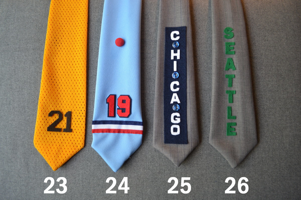
23 Cito Gaston, Padres. Love the yellow and brown colors.
24. Cardinals powder blues, topped off with a red squatchee. The stripe pattern is accurate to the trim on the originals. This one gave me a really hard time, as you can see by the distorted shape. I do like this era of uniform. This one should have come out better than it did.
25 and 26. I wanted to try a couple of vintage baseball designs, so I picked the 1909 Cubs (love the vertical placket lettering) and the 1910 Seattle Giants. I used a polyester twill that looked kind of close to what I wanted and drew the pinstripes on with a pen for both. I feel there’s a little too much going on with these, although the Seattle one seems to work better and I love the green pinstripes.
One more thought about the squatchee pins: I think wearing these as a lapel pin would be a nice, subtle way to show support for your team, especially if your team has a cool contrast-colored squatchee:
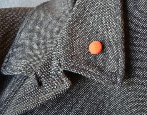
I had a lot of fun making these. They really resemble little jerseys and are a nice way for me to have a collection without spending a lot of money and taking up a lot of space.
Last time around, lots of people posted comments asking if I’d be willing to sell the ties, or take special orders. I appreciate all the interest and positive feedback, but I’m not interested in going into the tie business. Like most people, I have a reasonably busy life, and these hobbies are for relaxation and enjoyment. Turning it into a business would take that away in a heartbeat, so I’d like to avoid that. Also, when you have one of the ties in your hand, they do have a pretty homemade feel, so I’m not sure they would meet most people’s standards for something they would actually pay for (which they would only find out once they’d already paid for it). When I look at how long it takes to make one versus how much I could actually charge, it just doesn’t make sense from a profit-versus-aggravation standpoint. Thanks for understanding.
———
Paul here. Shortly after preparing this entry, Anonymous offered to make me a tie — any team/player I wanted. On a whim, I said, “How about a Packers treatment, with No. 42 for John Brockington?” Here’s how it turned out:

And here’s what Anonymous had to say about it:
At first I thought no problem — the Packers jersey is pretty straightforward. Then I thought I better look at a photo of Brockington, and I realized that football jerseys actually had sleeves in that era, and the Packers had a lot more stripes back then than they do now.
So I had to scramble a bit, because I wanted to make the stripe pattern more or less accurate. Also, I decided to integrate the stripes into the tie as opposed to putting them on as an appliqué, because that caused some problems with distortion. I was able to find a green/white/green braid, but the size of the braid was pretty big. So with the yellow mesh insert I was at least able to correctly replicate the alternating stripe pattern on the original, although the scale of the stripes is off (too much green). But no distortion!
The result is for sure the best tie I’ve made. The integrated stripes are really neat, and all of the materials look good. A very tidy job. I also made sure the number font was similar to the ones the Packers used back then. I like how all of the stripes make the tie remind me of one of those big ’70s jersey sleeves. The only problem is now I have to go back and re-make all of the other ties I made for myself now that I’ve come up with the perfect method.
Pretty awesome, right? I haven’t yet received the tie in the mail, but I’m looking forward to it. I’ll post a photo of me wearing it once it arrives.

Mike’s Question of the Week:
By Mike Chamernik
Mallory Edens, daughter of Bucks owner Wesley Edens, was wearing a pin showing the team’s original logo during the NBA draft lottery. She said the pin was for good luck, and it worked to some degree, as the Bucks received the second pick.
Do you have any sports good luck charms? Any lucky apparel, memorabilia or items? If so, what are they, when do you use them, and what do they do for you?
Tick-Tock: Today’s Ticker was compiled and written by Mike Chamernik.

Baseball News: Two more players wearing the Mizuno belts: Red Sox reliever Junichi Tazawa and A’s infielder Josh Donaldson (from Jay Sullivan and Mark Halling, respectively). ”¦ Dodgers prospect Alexander Guerrero — aka The Athlete Whose Ear Was Bitten Off and Isn’t Named Evander Holyfield — may not be able to wear a batting helmet for a while because it might rip open his stitches. ”¦ The Mariners might have cream Sunday alternate uniforms in 2015 (from Phil). ”¦ Speaking of the M’s, here are some of their more creative promotions from over the years (from Tim Dunn). ”¦ A Nats fan made a nifty table-slash-cooler (from William F. Yurasko). ”¦ Fort Knox High School, a high school team affiliated with the Army, wears camo jerseys (from Josh Claywell). … Giants reliever Santiago Casilla wore pitcher Jean Machi’s batting helmet during a rare plate appearance last night. It was Casilla’s fifth plate appearance in 405 career games. On the other hand Machi has only two career plate appearances, so how come he has a batting helmet and Casilla doesn’t? Unsurprisingly, Casilla ended up stumbling over first base and left the game with an injury (screen shot by Sean Robbins). ”¦ Two Cardinals players — Matt Holliday and Yadier Molina — were wearing dark undershirts, instead of the team’s usual red, last night. “Can’t tell if they were black or navy,” says Scott B. ”¦ Someone out there has designed new logos for all 30 MLB ballbarks (from Brian Derrick). ”¦ Speaking of ballparks, here’s the latest on new signage that’s planned for Wrigley Field (from Matthew Robins). ”¦ The Pirates convened a reunion of the 1979 championship team prior to last night’s game and dressed the players in gold throwback jerseys and pillbox caps. Additional photos here and here (from John Dankosky).

NFL News: “Saw a bunch of pictures from the USS Hampton (SSN 767) at the North Pole,” says Coleman Mullens. “Apparently the Chief of the Boat is a ’Skins fan.” ”¦ New Browns WR Miles Austin got permission from Bernie Kosar to wear No. 19 (from Phil). ”¦ Instead of giving President Obama a personalized jersey, the Seahawks gave him a 12th man flag during their trip to the White House. ”¦ MMQB took a look at the boot Tom Dempsey used to kick his record-setting 63-yard field goal (from Brinke). ”¦ “I saw this photo of protesters in Donetsk,” says John Cornwallis. “Notice the man with the Bears championship hat? I guess the NFL really has gone global!” John, your last name reminds me of the splendid “Mike Zaun” Francesa video. And yes, that was just a flimsy excuse to link to that video. I love Mike Francesa.

Hockey News: Here’s an interesting approach to making a concussion-proof helmet: make the helmet look not look like a helmet, but more like a human head. Just click on the link to see what I mean (from a reader named Jack). ”¦ Looks like WABC-TV in New York will run a story tonight on counterfeit jerseys (from Barry Brite).

NBA News: The Hornets unveiled the wordmarks that will appear on their uniforms. The actual uni unveiling is still slated for June 19 (from Phil). ”¦ Alexander Julian, the man who designed the original Hornets uniforms, did not design the revived team’s new set (from Phil). ”¦ What did NBA teams’ websites look like back in 1996? Find out here (from Mark Roberts).

Grab Bag: Forbes examined the sneakerhead culture (from Tommy Turner). ”¦ The movie Batman v. Superman will have a hybrid logo that combines the two superheroes’ logos. ”¦ Brinke sends in this really cool site, Project Thirty-Three, that showcases simple yet striking LP covers. ”¦ Marc Viquez was at an American Ultimate Disc League game and noticed that the Detroit Mechanix number-in-a-circle unis are similar to what the Astros used to wear. ”¦ Two Indy 500 notes from Chris Cruz: Here’s a gallery of the liveries of all the cars in the race, and both Chip Ganassi cars on the IndyCar side will be painted silver for the 25th anniversary of Target as a sponsor of the Ganassi team. … Here’s another rundown of this year’s World Cup Kits (from Trevor Williams).
Click to enlarge

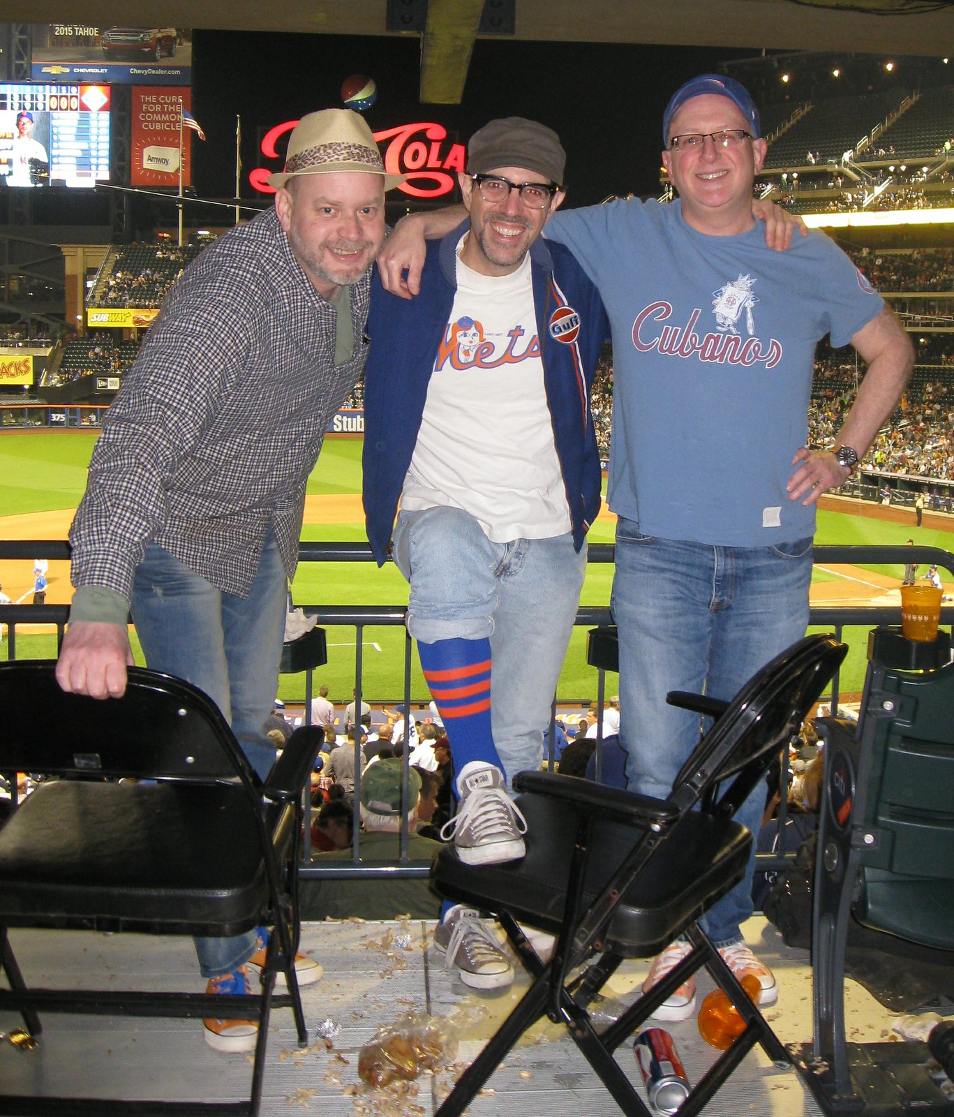
What Paul did last night: Had the pleasure of attending last night’s Mets/Dodgers game with Uni Watch weekend editor L.I. Phil Hecken (left) and uniform designer/historian Todd Radom (right). As you can see, I wore my Mets prototype striped stirrups, based on the ones shown in the mock-up held by Casey Stengel in a January 1962 press conference. Look closely and you can see that Phil wore orange sneakers with blue laces — you know, so as not to piss off those people who get annoyed when someone shows up at the ballpark without wearing the appropriate team colors. I wore my Gulf jacket for the same reason.
There was one sublime uni-related moment. At one point I noticed (and pointed out) that Dodgers outfielder Matt Kemp had his back pocket inside-out while standing on deck. Later on, while he was in the field, I saw that his pocket was tucked back in. The next time he was on deck, an inning or two later, I saw the pocket was inside-out again. I mentioned this to Phil and Todd as Kemp was walking up to the plate to take his turn at bat — and just as we were talking about it, he tucked his pocket back in.
Now, I’ll grant you that staring at Matt Kemp’s ass may not seem like the most rewarding way to spend a ballgame. But you have to admit that it’s better than focusing on the level of play being exhibited lately by the home team.
Those ties are really cool, great concept!
You should make some hoops ties to go with the fabulous ones you’ve already created. Very nice work!
And the squatchee pin is subtle yet brilliant.
First baseball ticker item is incomplete. It just lists two players. (Presumably it meant to say that they are wearing Mizuno belts.)
Thanks. Now fixed.
Are we sure these are Mizuno belts? I didn’t remember in the original post about the belt that it was discovered that they were from Mizuno.
I ask, because there are guys like Dice-K and Koji Uehara who are Nike guys that wear these belts.
If that was in the original post, I apologize…I must have missed it (I read these at work and sometimes it takes my attention away from reading Uni Watch!)
Dear Anonymous, I totally respect your wanting to keep your ties as a personal DIY and occasional gift instead of a business, but the nanosecond you change your mind, you can fill my order for a Ken Dryden Habsinspired tie.
Now to Chamernik’s question, my lucky exam smock is my 2009 Maxim Lapierre Habs replica jersey, complete with the 100 Seasons and All-Star Game patches. It isn’t necessarily lucky for game watching, just for final exams.
Seconded. I think I’ve been encouraged by this DIY project to take a shot at this tie thing myself, but I would gladly pay for a few if he ever changes his mind. These are gorgeous.
I’ll third it. I’d be happy to purchase a Bruins Ray Bourque, Auburn Charles Barkley, or a Celtics Larry Bird tie, especially if it fits my 6’5″ frame.
Seriously, I wear ties all the time and would kill to have the Whalers one. I would also think they’d be the perfect tie for coaches in the NHL/NBA — can match the team spot on.
Those squatchee lapel pins are so cool!
Agreed. That’s the business opportunity here. The ties are wonderful and all, but they would impinge on well-defended intellectual property of made for sale. But the squatchee pins? Should be totally free and clear of such concerns.
I think sticking with simple stripe combinations would be one way to steer clear of IP issues.
Wholeheartedly agree that these are great, and there’s some $$ to be made if Anonymous so chooses.
Paul you had the Met’s shirt on and the stirrups, that’s plenty enough to wear to a game. And Phil’s orange and blue sneakers is a nice subtle touch, that’s all you need. No reason to spend hundreds on fake jerseys when you can show your support in a unique way. Todd concurs as well.
Yeah, but my stirrups weren’t visible for most of the night (I didn’t have my pant legs hiked up except for that photo), and my jacket was zipped up for most of the night as well, so nobody could see my Mets shirt. Good thing the jacket was orange/blue!
It’s funny, because this is probably the first game in 4 or 5 years I haven’t worn stirrups, so glad Paul made up for it. And I told Paul to check the oil after he finished washing the windshield! (If you’re over 40, you probably get that joke)
“(If you’re over 40, you probably get that joke)”
I was about to say that people from New Jersey and Oregon probably still get the joke, but I get the sense that full service isn’t quite what it used to be.
I actually had “If you’re over 40 (or from Jersey)…” in the original post, but changed it.
Last time I stopped for gas in Jersey (ok, it was on the Turnpike, but still), I was lucky the guy even asked which octane I wanted. No way was he performing any kind of “service” other than that.
I still don’t get why in Jersey drivers can’t pump their own damn gas.
Someone once explained to me how gas employment taxes went back to the gasoline companies, helping to keep gas prices down in NJ (and with lower state taxes). He worked for the state commission that allows the gas station to complain about the price of gas of a geographically close competitor (state-approved monopoly prices!).
I may practice IP law, but that explanation made my head spin and I don’t remember it at all.
Maybe it just is a state-enforced jobs program.
link
tl;dr version: with savings in insurance, the wages don’t add to the price at the tank (gas in NJ is cheaper anyway with access to refineries), and more jobs = political winner.
There are gas stations in NYC that don’t have self-serve pump because even without the law, wages are cheaper than higher insurance premiums.
BTW, my wife grew up in Jersey and spent most of her adult life in NJ or in cities where she didn’t need to drive, so to this day, she’s terrified of pumping her own gas.
As a lifelong Oregonian (until a year ago), I can tell you that full service isn’t. Most places call it “mini service,” and some places make you have to go inside to pay. I’ve only been to one station, now fatefully closed, that was actually a model of old-fashioned full service.
Maybe Kemp kept his batting gloves in his back pocket in the field & when he pulled them out to wear them, the pocket would turn out? Just guessing…
Those ties are fantastic
I really liked the GB one
“She said the pin was for good luck, and it worked to some degree, as the Bucks received the second pick.”
Actually I would argue that the pin was of no help, since the odds were that they would get the top pick but got dropped to #2 instead.
As to the question of the week, while I do have rituals for televised Steelers games (wear my jersey, put my son’s jersey on him, keep my Myron Cope’s Official Terrible Towel ™ handy) I can’t say that they’ve brought me much in the way of luck. But it’s fun…
But there was a 53 percent chance the Bucks would have ended up with the third or fourth pick (and the best odds were on the fourth pick, at 35.8 percent). So I’m still thanking Mallory Edens’ pin.
The Ohio State University is selling off some of their game used/worn jersys from last season.. they’re only charging $100 which isn’t too bad of a price considering what the replicas go for
link
That Mariners promo article has all the journalistic integrity of a “let’s copy-and-paste a Nike press release”; they literally thank the M’s PR hack for writing it for them! Perhaps they wouldn’t need so many wacky promotions if the club would win more baseball games.
-Seattle fan sick of local sports “journalists” making excuses for the M’s, mainly because the M’s own their local channel, may as well own ESPN 710, and treat them like propaganda distribution outlets. “Read these talking points or you’re fired!”
It may have been asking too much to get Alexander Julian to put his imprimatur on the new Hornets. At least on throwback night they get to wear those original beauties. But Julian is one of the few fashionistas who “gets” sports apparel. I can’t tell you how many times I’ve rolled my eyes at bouffant sleeves or towering baseball caps offered by so-called couturier designers.
Since we are preparing to endure GI Joe baseball uniforms this weekend, I found myself thinking about how in the Late Roman Empire, even civil servants were found to be wearing ornate military-style belts and Roman civilians incorporated fashions from military camps like trousers, long sleeves, and single clasp capes.
Oh, c’mon. Nothing says “link” and “link” more than link in link!
Tanaka’s crotch and then Kemp’s butt. Paul, you are having quite the week. Maybe you should make a point of finding some women’s volleyball to go watch over the weekend to get some balance back in your life.
Hey, the belt buckle is NOT the crotch!
Nice to see Phil made it back from Istanbul so quickly.
comment of the day
that’s because i paid to get him back!
You win.
it was tough, but i paid double to overnight him.
Did you leave airholes in the box?
I completely understand Mr. Anonymous’ position of not selling ties. I’m tempted to try my own hand at it, even though last time I tried sewing – some time in the eighties when cargo shorts were hard to find at retail – it didn’t go very well.
So link for not coming out against the ‘Skins nickname, essentially.
Yadi Molina has been wearing a navy undershirt for a long time, even back to link
Anonymous: please sell these on Etsy.
In answer to today’s question: I keep an Orioles pin (the swinging bird one from 1966-88) pinned to the visor of my car. First, I put it there so I wouldn’t lose it. Now it became sort of like a “don’t drive faster than your angels can fly” thing. Except mine is not to drive faster than my Oriole can fly.
“Do you have any sports good luck charms? Any lucky apparel, memorabilia or items? If so, what are they, when do you use them, and what do they do for you?”
No, but whenever I go to a concert, I like to wear the same t-shirt. I have not been to a bad show while wearing it.
A couple months ago, I went to a show and I forgot to wear it. It was still good.
Ooh, I almost forgot. Along these lines, I NEVER listen to the band I’m going to see on the way to the show if I have any say in the matter.
When I was younger I had a long sleeve t-shirt made up with my favourite number on the back. When I started playing hockey as a goalie, I used it as an undershirt. It was perfect as I preferred long sleeves under my equipment, and also because I always had my number on, even if the actual jersey I was wearing had something different. I wore that thing until it was unwearable.
QOTW: I’ve had various lucky tokens, articles of clothing, and rituals when watching my sports teams over the years. Additionally, if my team lost an important game, I would sometimes retire the team-related shirt or hat I was wearing as having “bad juju.”
At some point several years ago, I had a moment where I just said, “What the hell am I doing?!” There is absolutely nothing that I say, do, or wear that has any effect on the outcome of a sporting event I am watching on TV, out of the millions of other people who are likewise watching.
“Do you have any sports good luck charms? Any lucky apparel, memorabilia or items? If so, what are they, when do you use them, and what do they do for you?”
I have some pendants made from game used baseballs I wear on a regular basis.
link
Good examples today, people. I’m a superstitious person myself. I kept a Vlad Guerrero Expos card in my wallet when I was younger.
Quite a few gems today. The squatchee pins are brillant; I’d rather have one of those than the ties themselves (as awesome as they are too). Meanwhile I love the logo styling of the ballpark logo concepts, and the blast-from-the-past images of the old NBA websites are gruesomely nostalgic.
Great submissions all around!
My favorite part of the 1996 NBA websites is that I just found a factual error on the Celtic’s screenshot. It states that the old Boston Arena is now Boston University’s Walter Brown Arena. Now, while Walter Brown WAS the owner of the Celtics AND the arena that bears his name IS on Babcock Street at Boston University, the OLD Boston Arena is on St. Botolph’s Street and is now Northeaster’s Matthews Arena.
Not only that, but the story on the Celtics parquet floor also states that the logo first appeared on the court in ”1973”, when it was more like 1977 or 1978
It was on the floor during the ’76 Finals.
I still have the pin that was given away for Game 1 of the 2005 World Series on the cap I wore that year. I only break it out now for games I think need extra mojo. For example the 2008 One Game Playoff against the Twins.
Me too, fellow White Sox fan!
I wore a simple forrest green t-shirt with the sleeves cut off under my baseball uniform for almost every game I played in HS. Never considered it “lucky” and didn’t go nuts if I didn’t have it, but it provided some comfort.
Wore the same cap for all 4 years – although I caught for a lot of that time so it didn’t get much use.
On the redesigned baseball stadiums in the ticker (which I really enjoyed): Whoever did them needs to be reminded that Arizona is abbreviated AZ not AR.
I thought the revised stadium logos were pretty cool on the whole, but I have a little nit as well.
The bridge used in the Oakland logo appears to be the western span of the Bay Bridge, which goes between San Francisco and Yerba Buena Island. Here’s what the new and old portions of the eastern span of the Bay Bridge, which goes between Yerba Buena Island and Oakland (and would be more appropriate for the A’s) looks like:
link
The eastern span, with a single tower, is pretty striking and could differentiate the Oakland logo from the San Francisco or Pittsburg logos.
My personal nit: The defining bit of federal architecture at Nationals Park is the U.S. Capitol, not the Washington Monument.
I actually had similar nits for pretty much all of these, but I did like the typography, colors, and use of shape and form throughout the set. You know someone is doing something interesting when they design logos for all of MLB and the Marlins wind up being among the best of the lot!
I didn’t start this one, but I’ll jump on the pile. When the Coors Field naming rights were approved twenty-odd years ago, one condition was that they couldn’t use the same typeface for stadium signage that is used on beer labels. I don’t recall whether it was MLB or the stadium district that were the bluenoses.
And Busch Stadium isn’t affiliated with the Anheuser-Busch InBev beverage by the same name.
Also, I’m a teensy bit bothered by the inconsistency between logos that use the corporate typeface and ones that don’t.
Well, we currently have some stadiums that use the corporate logos and some that don’t.
Miller Park uses an outdated version of the link (the new one is link).
I’d gladly trade the current Miller Park logo for this one.
When I think of #30 and the Kings classic jersey, it is Rogie Vachon!
Does any UWer own a satin windbreaker from Ebbets Field Flannels? Do you like it? How heavy is it? What’s the fit like?
They’re 1/2 off right now (still a steep $100), considering pulling the trigger on link
Love the ties, but have a second nitpick on the Seaver tie:
The fonts of the numbers are mismatched. The font of the 4 is the current Met font, which they have worn at home for their entire existence and on the road since the late 70s. The font on the 1 is the Wilson Varsity font they wore on the road only up until 1973 as link I suggest re-doing the 4 in Wilson Varsity and you have a Mets road tie from Seaver’s heyday.
My vote for the Otto. Beautiful. Question for Paul and the readers. Is there a better football example of a color and a font and a number and we all know instantly the player and team? Of course there is. But, I’m a Raider fan.
Butkus, Walter Payton and Singletary for sure. Alworth, Bob Griese, Mean Joe Greene, Barry Sanders would be easy adds.
Barry Sanders? Surely you mean Billy Sims.
Uh…what about me?
Not a lot of Oriole greats to wear #17. link
The best would be B.J. Surhoff who is in the Orioles HOF.
Wonder if the Hornets will have a “Charlotte” word mark road jersey? I thought NBA teams had their Mascot on Home uniforms and City on Road (with a few exceptions)
Maybe the Hornets have a teal alt
On the other hand, the original Hornets uniforms had “CHARLOTTE” on both the home and away jerseys – it was before the city had become a full-fledged banking center and a way to announce its major league status.
There are a lot of teams with nickname on home/city on road structure, but there are just as many teams that do just nickname (Celtics, Lakers, Bulls, etc) and just city name (Brooklyn, New Orleans etc).
In fact, the Sacramento Kings have CITY name on their HOME jerseys and NICKNAME on their AWAY! I noticed this a few years ago when they released new jerseys and have never understood the logic.
It’s simple. It tells the home fans, “Look! We’re not moving to Las Vegas! We’re proudly representing your city!” while not having to answer the inevitable “Where’s Sacramento?” question on the road.
Didnt realize the Bucks have Bucks on both uniforms. Strange
Q.O.T.D. – I always have my Uni Watch Membership card on my person, in case of an accident or something.
Was that the cleanest place you could find in the stands of Citi Field to take a photo?
Hah!
Actually, those were our seats — I didn’t realize it until I looked at the photo a second time, but in moving the folding chairs, you can may notice spilled brew — Paul must have knocked that over just prior to the photo being taken; but there’s a story behind the peanut shells (and also the fried chicken) — both of which are also on the ground — if maybe he wants to retell (or link to) it.
You’re probably the only one who had to look at that photo a second time to notice the filth. The rest of us had to play Where’s Waldo to spot the shoes you were wearing.
Paul’s thing about throwing peanut shells under the seats is fine…in a normal set of seats.
If you’re sitting on folding chairs, pick up after yourselves, you sloppy boys.
Dear Anonymous,
Those ties are absolutely gorgeous. I might try making some Blackhawk ones soon and seeing how my lack of artistic talent works out.
Mike Krukow and Duane Kuiper on giants broadcasts call the inside out pocket on pants “Elephant Ears”
QoTW:
On my first sports road trip (Camden Yards – 1995) it rained and was unprepared for the weather.
I wound up purchasing a Baltimore MLB team-branded trashbag with a hood, err…rain poncho out of necessity.
Ever since then I have brought it along for every outdoor sporting event (professional and amateur, rain or shine) I’ve gone to, and have only had to use it sparingly; it’s gotten more use at Pocono Raceway than anywhere else!
I can’t tell, is that a 1985 Super Bowl Champs hat? Or one of the Ghost Champions hats that got donated to people in countries in need? The design/font of the “Champions” part leads me to believe its the latter.
Also I imagine NATO is probably being protested, but it kinda looks like he is endorsing it as a good purchase (curse our language and its homonyms!).
yes, it’s from the SB loss to the Colts
QOTW: I don’t have any lucky items of clothing, but I do have an UNlucky Kansas sweatshirt.
After being worn to Allen Fieldhouse for consecutive losses in the 2004-05 season, it has been relegated to non-gameday use.
For the sake of good order, I don’t think Orr’s #27 was a “rookie jersey” as such. He wore #27 only in the pre-season, and my memory is that he wore it for only part of the pre-season. The only photos I can recall seeing him in #27 was in the yellow/gold color (away?) sweater.
The inside out pocket thing has moved down to the youth level. All of the boys on my son’s team (14 years old) do it now, and it drives me nuts.
I’ve slowly adapted to the flat billed hats and pajama pants (don’t like them, but I’ve gotten used to them), but this is terrible.
I love the idea of the squatchees as lapel pins!
These ties are outstanding. Nice work!
In the NFL section, you mentioned the protestors wearing the Chicago Bears’ Super Bowl knit hat. What is interesting is that the type of stitching and logo looks like it would be newer and definitely not from 1985. So either it’s a commemorative hat or it could possibly be one of the discarded hats for when the lost to the Colts in 2007. Thoughts?
I’m 65 percent certain it says Super Bowl Champions 1985 on there. That first numeral really looks like a “1.”
Maybe. It’s tough to tell but it looks like the same Champions font that they used for the the Colts as Super Bowl champions that year and even the NFC Champion font for the Philadelphia Eagles around that time.
I need a Bruins tie that looks like their home socks and I needed it yesterday!