For all photos in today’s post, you can click to enlarge
[Editor’s Note: Today we have a guest entry from Karl Dentino, who’s going to enlighten us regarding a DIY modification he made to an interesting football board game. Enjoy. ”” PL]
By Karl Dentino
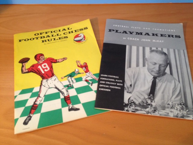
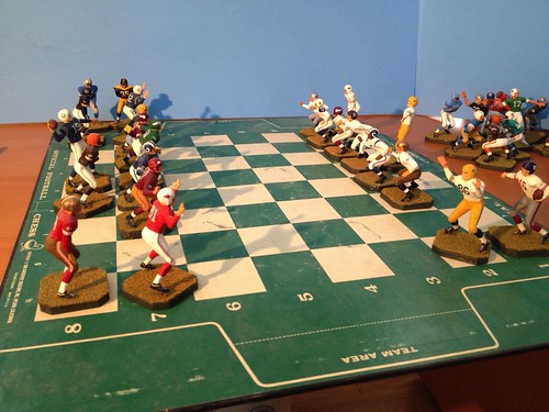
In 1967 I received a board game called Official Football Chess for Christmas. It featured unpainted football figures instead of the customary medieval chess pieces. I was 11 years old at the time, and a lousy chess player, but a huge football fan, so it was a good gift to receive.
Football chess is played like regular chess, but the number of pieces varies. For instance, the four down linemen move in the same manner as pawns. The middle linebacker is the lone knight. The two receivers move on a diagonal like bishops, and he two halfbacks move perpendicularly like Rooks. The fullback is the queen and the quarterback is the king:
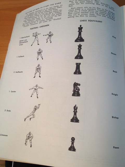
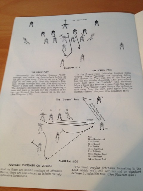
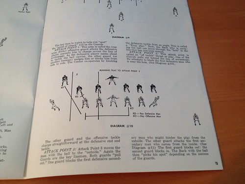
Once you commit all of that to memory, you simply play chess. But to an 11 year-old, it was much more fun to create offensive and defensive formations and “dream” the players into action instead of sticking to regular chess moves. The game’s playbook encouraged the use of the pieces as a learning tool to demonstrate offensive and defensive plays and formations:
The game was endorsed by John McKay, then head coach at USC. It included a booklet depicting McKay and the game’s inventor playing with painted teams, USC vs. UCLA:
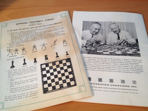
That photo was all the motivation I needed. I decided to paint the football chess pieces to showcase all of my favorite NFL and AFL players and stage my own NFL/AFL All-Star chess matches. But it didn’t turn out quite like I had envisioned, as the figures were too small and I was too impatient and unskilled to pull off such a task at age 11. But my dream remained.
In the late 1990s, the original game started popping up on eBay. Within a year or so I grabbed at least five or six of them and set out to fulfill my childhood vision of painting the figurines. The painting was done in assembly-line fashion as much as possible (i.e., I painted all of one team’s jerseys, then all the pants, etc.). I used regular flat hobby paints. If I couldn’t find a commercially available color that met my needs, I mixed my own using a toothpick to drip one color into the next until I achieved my desired result. For reference, I simply used internet photographs and books.
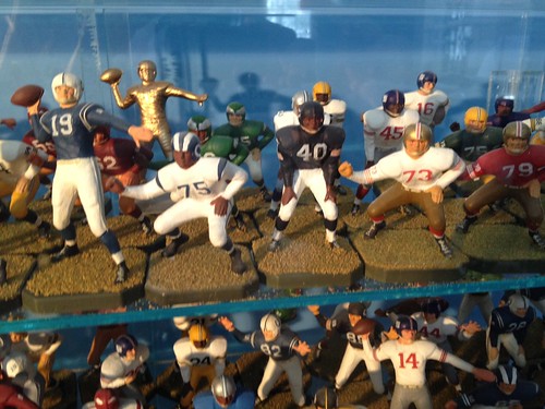
In most cases, a 1960s team’s home jersey color matched its base-layer socks and helmet, so that would be the first paint task. Once that dried, the pants and white socks were next. Next came the trim. I tried to get as much detail as I could into each figure — high tops for John Unitas, short sleeves and white shoes for Joe Namath. I used a cream color for things like belts, shoelaces, and pants laces. I varied the flesh tones and used eye black on some of the players.
For the logos and stripes on helmets, pants, sleeves, and socks, I used iamges from the internet, resized them, printed them out on very thin label paper, and added a touch of model glue to the adhesive side paper labels. The white numerals and white helmet features were decals. The colored details were printed and trimmed out on label paper. Trimming out tiny helmet logos, thin stripes, and numerals was the most painstaking part of the process. I always opted for paint over paper labels wherever possible. Once I was completely happy with a figurine I would apply a layer of clear coat to seal everything in.
I started with my favorite team, the Philadelphia Eagles. I chose the year 1960 and matched them up against the Green Bay Packers to re-create the 1960 NFL Championship Game:
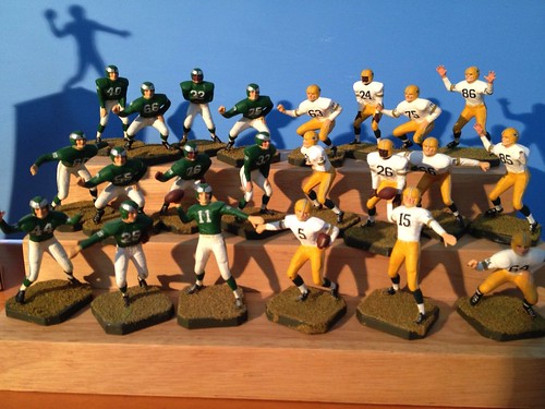
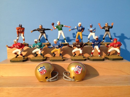
Then I created the Cowboys, Washington, and the Giants, all representing my favorite players from the 1950s and ’60s. After I completed the Giants, I created the Baltimore Colts for the epic 1958 Championship Game match-up. Then it was on to the All-Decade All-Star teams. I wanted at least one representative from each of the 10 original AFL teams, plus Miami and Cincinnati, along with the 16 NFL teams in existence at the decade’s end.
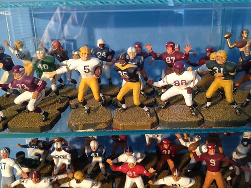
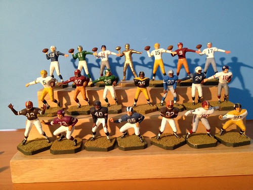
Look closely and you’ll see that figures were sculpted from a late-1950s/early-1960s uniform perspective, with long sleeves and no facemasks. They lend themselves nicely to a re-creation of players from that era:
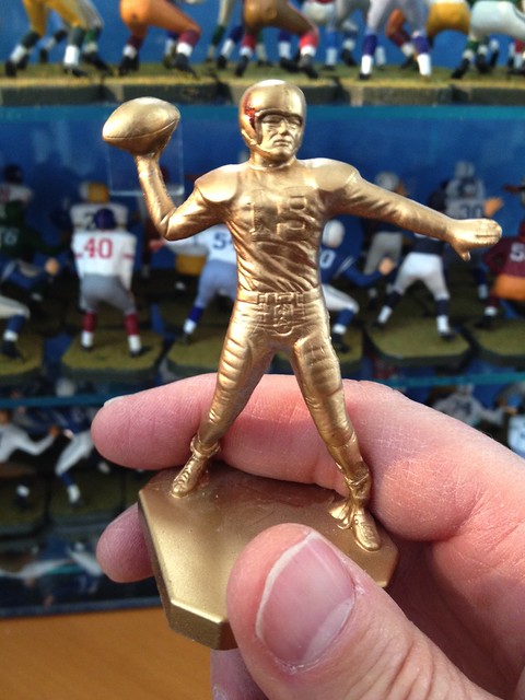
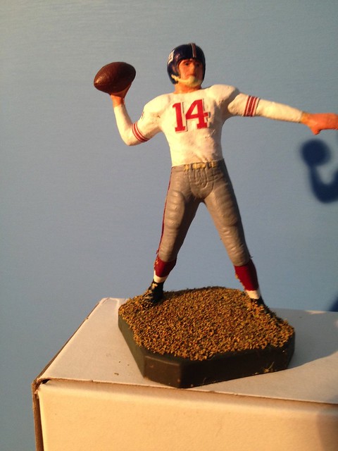
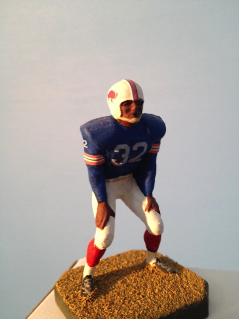
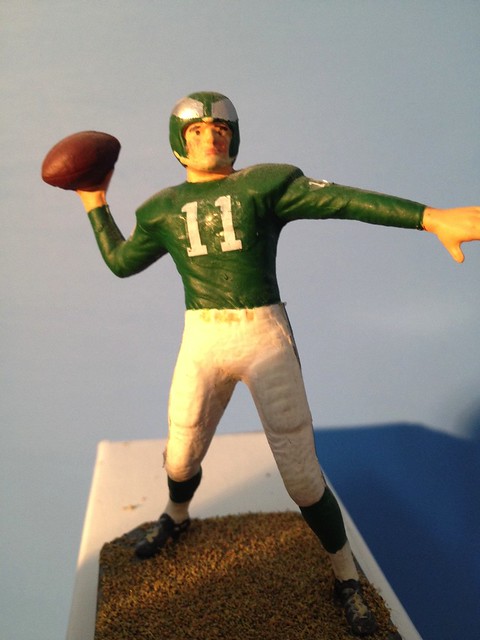
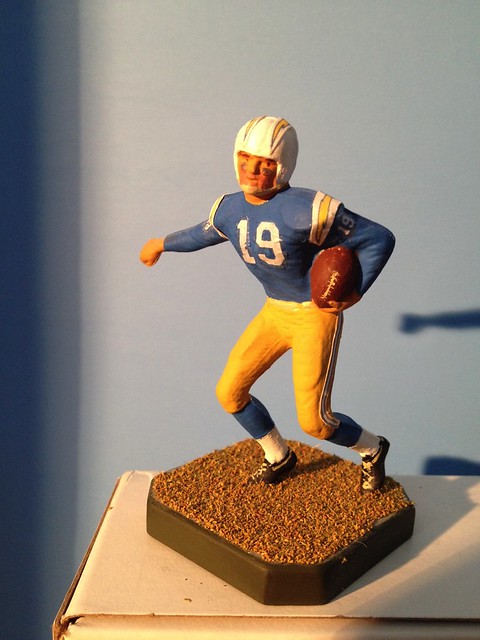
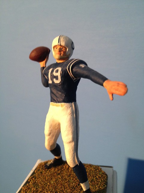
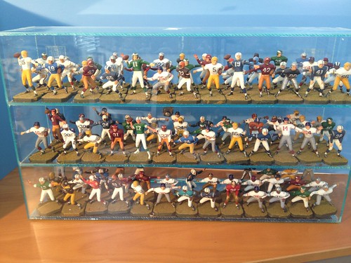
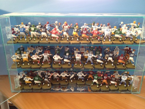
I ultimately created 111 individual pieces. I have no idea how many hours I put into the project, but I recall spending the better part of a year on it. I am sure there are inaccuracies, but in the end I was pleased. With the exception of a few sleeve stripes and helmet logos that need glue touch-up, everything has held up nicely.
For several years my kids and I would play the game as it was intended. I would provide the play-by-play in my best announcer voice, replacing “Checkmate” with something like “Bart Starr was sacked by Gino Marchetti to end the contest.” The kids would roll their eyes wondering what I was talking about.
Today, all 111 figures stare back at me from a Plexiglass case on my desk:

In case you missed it, yesterday’s entry was about the most perfect Uni Watch T-shirt idea ever. You don’t want to miss this — check it out here.

’Skins Watch: Some Native Americans in Idaho say that team names and mascots that supposedly “honor” Natives are actually quite offensive to them, proving yet again that the only people who care about this issue are white people (from Kenny Ocker).

Baseball News: Super-tasty New York Giants sweaters on view in this shot (from Lee Wilds). … This is pretty awesome: Check out George Brett’s parking space at Royals camp (from Tyler Kepner). ”¦ Looks like 15 MLB teams will be donning St. Paddy’s Day jerseys this spring (thanks, Phil). ”¦ The Cardinals have traditionally worn their regular jerseys — not BP jerseys — for Grapefruit League games. But that will change this year, according to a small note at the bottom of this page. Bummer (from Kyle Sawyer). … See that “KMV” on one of Bryce Harper’s gloves? “Those are the initials of his longtime girlfriend,” says Alan Borock. … Here’s a cool graphic showing the 2014 travel routes of every MLB team (thanks, Phil). … Here’s more about the Lehigh Valley IronPigs’ new uni set — it’s more than just bacon (from Chris Cocca). ”¦ Texas Longhorns wore 1949-50 throwbacks yesterday (from Chris Rodriguez).

NFL News: According to this story, former Giants LB Lawrence Taylor once had “partially torn pectoral muscle and torn shoulder ligaments, and he played with a harness strapping his upper left arm tight to his torso” for a 1988 game (from Kurt Esposito). … Someone has come up with ridiculous redesigns for all 32 NFL teams, if you’re into that kinda thing (from Jerry Nitzh). … Members of a church youth group recently wore their favorite NFL jerseys while serving bread and soup during a fundraiser. ”¦ Now that the Bucs have enlarged their helmet logo, what if every NFL team did that? (From Will Hughes.) ”¦ Pretty sure we’ve seen this before, but once more won’t hurt: Check out cool old NFL-themed United Airlines ad (thanks, Phil).

Hockey News: Pens goalie Marc-Andre Fleury is going with a Steelers-themed mask for the Stadium Series. … Bruce Menard was looking through some hockey-related stuff from Classic Auctions and found a bunch of cool stuff, including a 1947 NHL All-Star Game jersey, a spectacular 1940 Canadiens team jacket, a magnificent 1956 Rochester Amerks inaugural-season jersey, and a nice Flyers blazer and cardigan. … If you look in the background of this shot, you can see that the Penguins have the Stadium Series patch on their practice jerseys (from Ryan Connelly and Phil). ”¦ Tim Thomas was wearing an odd mask in practice the other day (thanks, Phil). ”¦ Nick Kotarski was at last night’s Sabres game, where he noticed that the butt end of several players’ sticks had the Sabres logo, sort of like those bat knob decals we’ve been seeing in baseball.

Soccer News: “NBC is doing a great job with their coverage of the English Premier League — I think everyone in the U.S. is in agreement about that,” says Sean Walsh. “But for some reason their iPhone app has an outdated photo showing Cesc Fabregas (who has played for Barcelona for the last 2 seasons) in the club’s shirt worn during the 2006-2008 seasons.” … Here’s something I didn’t know: The Chicago Fire were originally supposed to be called the Chicago Rhythm. “The owners balked at the Nike-provided team name and even stated ‘they would rather lose a year of merchandise sales than live a lifetime with a bad name,'” says Alan Bloomquist. “That ruffled feathers with Nike, which had spent a lot and time effort on the Rhythm name.”

NBA News: Iman Shumpert of the Knicks has been wearing an arm sleeve with some weird shit printed on it. According to this Reddit thread, those are the nicknames of some of his pals (from Daniel Cawley). … The NBA is making Jason Collins jerseys available for sale due to high demand. The last graf of that article also explains the reason for Collins wearing No. 98, which I hadn’t heard until now (thanks, Mike). … Some Nuggets players wear Kevin Durant’s signature sneaker. But should they wear it when playing against him? (From Ray Chen.) ”¦ Creepy new king cake baby mascot for the Pelicans.

College Hoops News: Marcus Smart of Oklahoma State appears to have changed his uni number from 33 to 43 (from Luke McCarnan). … UNC’s throwbacks, worn over the weekend, were a hit with the players.

Grab Bag: I was interviewed yesterday by a writer from The New Yorker, who wanted to pick my brain for a uni-related story he’s working on. First time I’ve been interviewed by them. Looking forward to the follow-up from their vaunted fact-checking department. … Someone on Kickstarter is raising money for a coloring book about disappointing moments in Cleveland sports history (from Jim Mason). … More and more writers are picking up on the fact that figure skating costumes, and the costumes’ connection to the judging, are total bullshit. … Speaking of figure skating, it may not be a sport, but it sure makes for a cool vintage sweater (big thanks to Sean Kane). ”¦ Redesign in the works for the nutrition-info labels on American food products. ”¦ Some high school football teams in Louisiana are using low-rated helmets. … “New 2014 kits for SupeRugby’s Hurricanes feature a significant color mismatch between the yellow on the front panel and the yellow on the rest of the uniform,” notes Brent Caruthers Archer. … The “Beanies of the Big Ten” site has added Maryland to its coverage (from Demetrios Demetriou). … Across the pond, the Tories are considering a new party logo. … Here’s a good site devoted to F1 liveries (from Carlos Ahmed Jalife Ruz). … New kit outfitter for USA Rugby. … Here are a bunch of movie title screen shots showing the evolution of the Warner Bros. logo (from Kurt Esposito). .. Here’s a bunch of new college and high school lacrosse gear (from Jared Buccola). … What if people on famous album covers were wearing Norwegian curling pants? (From Brent Hardman.) ”¦ The Richmond Tigers — that’s an Aussie rules football team — are inviting fans to design the team’s new jumper (from Leo Strawn Jr.).
The Browns enlarged helmet logo is the best.
absolutely! they should go with that one right now.
Closed “C” on the Kansas City helmet. Now I’m going to look for this in the same manner that I look for the arrow in the FedEx logo. Thanks so much Paul.
Might we call the consequence of this a “Uni Worm”?
By inference, I suppose the Bengals’ tiger stripes could be considered an ‘enlarged’ helmet logo as well.
Marcus Smart had to wear #43 the other night at TCU because they forgot to pack his regular jersey. This was the first road game since coming back from suspension. My guess is that the equipment staff forgot to add his jersey back into the travel gear.
Very cool chess pieces, except the 1960 Packers did not have the “G” on the side of the helmet. Beautiful work.
sure has me ready to look for football chess pieces for a similar project. very nice work.
Thanks Ronnie. They still pop up on eBay every once in a while. Appreciate your comments. Karl
Travis, you are absolutely correct about the Packers sans helmet logo in 1960! Good catch! I took a little artistic license with that one. Thanks to all for the nice comments! Karl
brilliantly done. did u do the Bengals? did I read that right?
Karl, that may be the coolest project ever! Just absolutely gorgeous!
a very nice job, and maybe the best use of stickers that i have seen. usually people use them so they don’t have to hand paint elements, and they look clunky, they don’t here. great job.
Thanks rpm. I appreciate your nice comment.
I know I’m a day late, but this was really awesome. Congrats
Chess pieces are fantastic!
Those NFL redesigns are painful. They might be the only football unis as bad as the Falcons’ current clown suits.
Best DIY ever!
Word to the wise – not a great idea to read the comments on the Jason Collins story linked in the ticker. Some real winners out there.
I made the mistake of venturing into the comments section. What I find hilarious is that a week ago, people were all up in arms about what a disastrous public affairs nightmare it will be for any NFL team who signs Michael Sam. Now we have the accusations that Brooklyn only signed Collins as a marketing ploy.
So which is it – is it bad PR to have an openly gay player, or is it good PR?
Jeff is correct about Marcus Smart.
I like that “PED Free” t-shirt that Harper is wearing.
Cesc Fabregas is shown in an Arsenal shirt (sounds like he is in an old Barca shirt from the way that sentence is written).
That was my poor sentence structure, and he’s actually in his third season at Barcelona at this point, also my mistake.
Re the Jason Collins story, myths about the Matthew Shepard murder:
1. that it was an anti-gay “hate crime”
link
2. that Fred Phelps and his idiotic Westboro Baptist “God Hates Fags” followers protested right outside the church where his funeral was held. Actually, the public park that town authorities granted them a permit to protest in was more than a mile away from there. How do I know this? Because the park was adjacent to the church where a funeral service was ongoing for my wife’s aunt at the exact same time, so it was her funeral, not Matthew Shepard’s, that they disrupted with their hateful shenanigans.
So it was simply a “hate defense” (if you take a convicted criminal’s word for it). That really doesn’t make it any better.
Sorry to hear that those pieces of shit disrupted your wife’s aunt’s funeral.
The chess pieces are one of the best DIYs I have ever seen!
I think it is the best yet, and that’s saying a lot since there have been some real gems in the mix.
If you read the comments for the ProFootballMock article, you’ll see someone posted a comment as the 1999 mlb TATC program and said “we want our idea back…on second thought, you can keep it.”
the link for the Cleveland coloring book actually links to Permanent Record
Sorry — will fix. Here’s the correct link:
link
These chess pieces are absolutely gorgeous! What a labor of love that must have been.
You don’t have to be a Twins fan to appreciate these really great spring training portraits by St. Paul Pioneer Press photographer Ben Garvin…
link
In that Twitter photo, Tim Thomas is wearing a “Mage” made by SportMask; part mask, part cage, it’s a Mage, designed to give a goalie all the protection of a Kevlar and carbon fiber mask, with the open ventilation of a standard helmet and cage combo. Also makes it easier to communicate without taking it off, because your mouth isn’t behind a big solid surface.
He’s worn them on and off for years, but this is the first time I’ve ever seen him with a HECC-certified cage; his first one was the standard non-certified cage, commonly known as a ‘cat’s eye’ because of the shape of the primary eye spaces. He’s also worn a cage that is known as a ‘cheater’ cage (not sure why), with big rectangular eye spaces, styled after the cage that Don Beaupre wore in the NHL.
Only thing is, SportMask had stopped offering the Mage on their website. Either he had someone repaint an old one from his days with the Bruins, or he had a new one special made.
Outstanding work on the chess pieces
I expect that the same criticisms of figure skating come up in the wake of every winter Olympics. Not that the criticisms aren’t valid, but nothing new.
It’s such a fine line link.
The Steelers use the rounded numbers on their helmet, not block ones. Fail.
And shouldn’t the pads be the Steelers’ yellow/gold?
Throwback numbers and what should be the current numbers. PASS
“The perfect is the enemy of the good.”
I always thought Jason Collins wore 98 for the Trevor Project, not necessarily for Matthew Shepard. Either way, looks like 98 is extremely significant to the gays. As a Uni Watcher, I wonder if it will be analogous to Dominicans wearing Clemente’s 21 or Japanese aces wearing 18.
As an aside, I thought Collins’s cover-up reason was hilarious. Before coming out and playing for Brooklyn, he claimed to wear 98 to give refs a harder time signing his number to the scorers. You need two hands, unlike his old 34. But Collins later admitted that that was a precursor to coming out publicly.
Actually, Clemente was Puerto Rican, not Dominican.
I make that mistake all the time. Oops.
From Paul’s article highlighting one instance where each number had a meaning to the athlete, Sammy Sosa (Dominican), Ruben Sierra (PR), and Carlos Delgado (PR) are countless examples of #21 for Clemente. That is how and why I always get mixed up.
Let me take a step back: Clemente was an icon for Caribbean baseball players, so you see a lot of them paying tribute that way. Another example of what I was getting at, is that imported sluggers to the Nippon Baseball League often wear #44, because Asians hate the four digit. (You can easily mispronounce it and say the word “death” with the wrong inflection.)
“The gays”? That’s not quite the way to phrase it. Recall when Donald Trump got into hot water when he was opining about how popular he was amongst “the blacks.”
I, for one, would be really interested to read about your experience with the fact checkers from The New Yorker.
I find the New Yorker’s self-congratulation for their fact-checking processes to be pretty obnoxious if for no other reason that they are hardly infallible. I will never forget that in one of Roger Angell’s recent baseball season wrapups he identified Petco Park as the home field of the Giants.
The Tim Thomas mask is one he’s used before but with a repaint and with the throat guard removed:
link
Looks like an older model SportMask Mage with the cateye cage removed and replaced with a Bauer ReAkt skater’s cage. They’re titanium, so I’m guessing he likes the ‘weight : strength’ ratio.
Those NFL uni redesigns are horrific. However, the logo redesigns in this link are pretty damn sharp.
link
“C” over “K” for the Chiefs!
Meh…. not bad, but the whole purpose behind many of the NFL helmet logos is that you don’t need to see the detail to know who they are. Case in point, the Cowboys: you see the star, you KNOW it’s the Cowboys. Why muss it up with details that get lost from over ten feet away? As long as I’m in Texas (which I’m not, actually), why replace the clean, simple look of the logo (and the Texas flag), for some generic looking bull head? Same thing with the Seahawks: why scrap the Haida/Tlingit based logo, for some bird that looks like just about any other raptor?
Does anyone really think that the Packers truly need a design change?
And why do the Bengals and Chargers look like sea horses?
Wow, never heard of that Football Chess set before…and a very cool DIY!
I must say that Uniwatch is the one thing this last month that has kept me happy.
To tell a sob story, my car was stolen, I lost my job and finally last week my wife asked me to move out.
I seek some support from my fellow uniwatchers and am kind of embarrassed to ask for some support on here as after getting out of the Navy and coming back home most of my friends and family have moved.
I hear you could make $7500 a month working from home.
It’s surprising that United didn’t have service to Miami and Minneapolis back then.
I think they still had flights to those cities, they just didn’t have any sort of contract with those teams. NFL teams operated with a bit more independence back then.
Ironic (?) item from the ad display up to: right now, there’s an ad for Washington football season tickets (my work IP address is based in Maryland). Paul, don’t know if you want to push back to Adchoices on that
‘…former Giants LB Lawrence Taylor once had “partially torn pectoral muscle and torn shoulder ligaments, and he played with a harness strapping his upper left arm tight to his torso” for a 1988 game.’
Nobody? Fine.
Cocaine is a hell of a drug.
“… a spectacular 1940 Canadiens team jacket,..”
Wow.
“… a bunch of movie title screen shots showing the evolution of the Warner Bros. logo (from Kurt Esposito)…”
See above
This Revs fan (since before they were born) likes the new home jersey. Addition-by-subtraction: They finally gave up on the gray or white patch on the arms.
And here is todays counterpoint to this blogs bizarre radical anti redskins agenda. Because both sides of the issue must be heard. And it must be acknowledged that the vast majority of the american people would like to see the name stay despite the shrill onslaughts of the far left
Despite Liberal Media Push, Poll Shows Vast Majority of Americans Aren’t Offended by ‘Redskins’
Read more: link
Contrary to your implication, I have routinely posted stories from both sides of this issue, including polls like the one cited above. That poll, in fact, is from last May, and I linked to it at the time. If/when a new poll is conducted, I’ll link to that as well, regardless of its results.
Meanwhile, could you explain how this site’s position is “bizarre” and/or “radical”? Please be specific.
Paul,
YHBT.
Yeah. Please don’t feed the trolls.
The survey cited in the article consisted of 1,004 people. Does 79% of 1,004 constitute a “vast majority of the american people”?
Is that sample size 1,004 times greater than yours?
It’s entirely possible to conduct a scientifically valid poll with that sample size.
Misunderstood me, I think – the poll’s sample size was 1,004 times greater than the troll’s.
Fluery’s metallic pads for the Stadium Series game…better than his mostly white pads, not nearly as cool as his yellow pads…
link
Brilliantly done with the chess peices
The NFL/AFL chess piece look fantastic and I never knew about this game.
One question I have is what did the author use to create the grass?
To me it looks like model railroad “ballast” (the rocks between the tracks
and ties) which is scaled down to match the size of a model railroad.
ted you are correct, karl has a pretty big minature rail road collection.
Here’s something for any other nodder aficionados out there (bidding ends tonight):
link
link
In case anyone cares, the Penn State Nittany Lions nodder sold for $7,034.53, and the Stanford Indian sold for $2,200.00.
I actually had the chance to interview the artist/author behind the coloring book of Cleveland’s disappointing sports moments. He’s a really nice guy and has as great story: link
Fantastic project and post, Karl! When I saw the words “Football Chess,” my first thought was that this was going to be an incredibly complex version of link.
Glad I was wrong – what you did is much more impressive!
Ha ha, yes. A different kind of chess game indeed. Thank you for the nice words. Karl
The Cardinals wore batting practice jerseys for exhibition games all the time when I was a kid (80s-90s). I would guess they switched to the grays (never saw them wear whites in the spring no matter where they were playing) in the early 00s.
Yeah The two time I saw them, they wore BP jerseys at Baseball City in 1993, and road grays (with red caps, IIRC) at Vero Beach in 2003.
Odd to realize both are defunct sites.
Is anyone watching the Blue Jays vs. Phillies on MLB Network? Toronto has something above the MLB logo on the back of their BP caps. I haven’t seen it before. It looks kinda like a flag or pennant…
I’m not watching the game, but if its their regular BP cap the front logo is a red maple leaf and on the back they have a tiny version of their main logo.
link
Or it could be the Blue Jays logo, since they seem to put a maple leaf on the front of their caps.
What a marvelous surprise to see the Football Chess story. I also had that game as a young man. This brought back some nice memories. Like Karl, I played with them most of the time lining up the pieces in formations rather than playing the game as “chess.” It never occurred to me to paint them, as I had done many times with my electric football figures.
I have often read Uni-Watch over the years, but have never commented before. Thank you so much for this posting, and for all the other material that I’ve enjoyed here.
David
David, I never met anybody who ever even saw this game! Glad you enjoyed seeing the project. Karl
Isn’t Shumpert’s sleeve text against NBA uniform rules? The last time I saw the rules chart, as I recall, the only mark allowed on arm sleeves was that of Adidas.
The lips and chinstrap painted on Fluery’s mask are kinda creepy, right?
The chess figures, by the way, are beautiful, but I couldn’t help but notice a little issue with the Namath piece – namely, that his sleeve stripes look too small, like a conventional Northwestern pattern, when the top stripe ought to be about where the Colts’ shoulder loops are on the Unitas piece.
Rob, you are probably correct! I would have to take a closer look. I know that I wasn’t as pleased wit the Jets figures (Namath and Maynard) as I was with some of the other teams, and that I struggled with their sleeve stripes. Perhaps reason is they are too low and small as you say. Thanks for the kind words!
Those chess figures are amazing. With all due respect to the Michigan/OSU bobblehead collection, this might be the best DIY project featured here.
Oh, you mean Robert Marshall’s intense diarama, with built-in details signifying whether the winner clinched a trip to the Rose Bowl, whether the winner eventually won the National Championship, etc.? (What’s the word for that? Ugh, can’t think of the word.) Tough call. I loved rpm’s project. Let’s just say, they’re both Uni Watch DIY first-ballot hall of fame projects.
INFOGRAPHIC.
Good memory, Mike. I was all set to say it was something else, but Robert himself called an infographic in his writeup.
I’m still in awe at the, well, awesomeness of the thing.
Mike 2, that is rare company indeed! Thank you for the kind words.
Oh, ESPN was in a hurry? Excuses, excuses.
link
The White Sox are going to have their 1983 uniforms (along with the new “retro” hats) as a permanent uniform which they can wear at any home games, not just on specific days. I’m sure there’s some precedent (although I can’t really come up with any off the top of my head), but has any team ever had two completely different looks (uniforms, colors, and logo) that they could choose on a daily basis?
link
Karl–I’m sure you’re busy, but I’m sure I’m not the only one who would love to see each player individually…
Scott, so funny you should ask. I just wrote a thank you to Paul for running the story and for all the nice comments. I mentioned I would be happy to take more pics and share them with anyone who cared to see them. I’m just not sure where to put them so everyone can see them. I guess that’s what sites like photobucket are about? Just wondering also how I would be able to send other interested readers to the site?
Thanks,
Karl
If you put the photos on a Photobucket or Flickr page, just send the address to Paul and I’m sure he’ll put it on the blog.
I still have some of those football chess figures somewhere at my parents’ house. In fact, the same company made basketball chess figures, but I never remember seeing a board or rules for them. Maybe someday I’ll find them again. For something a little more modern, check out this website: link, they have figures for football, baseball, hockey, and soccer figures (too bad no basketball or other sports). Someone out there might be inspired.