Click to enlarge
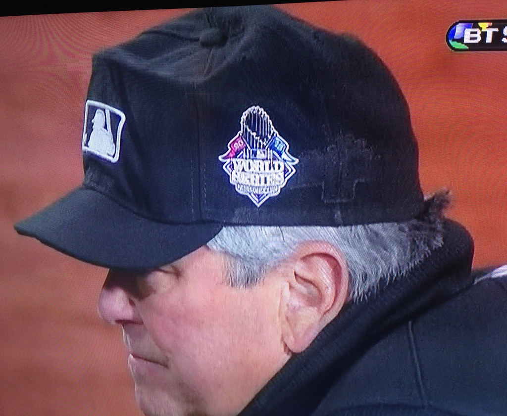
Yesterday I Ticker-linked to an article that said, “If a player wants to keep wearing the same hat he wore in the playoffs, either because it fits right or brings good luck, New Era will remove the Postseason patch from the side and replace it with the World Series patch.” That apparently applies to umpires as well, at least judging by the cap that second base ump Dana DeMuth was wearing in last night’s World Series opener. But couldn’t they have removed all the adhesive residue from the old patch before applying the new one? Ewwww.
DeMuth’s cap was my favorite uni-related observation from last night, but it was hardly the only one. Here are some more:
• You could tell it was going to be a long night for the Cardinals in general and Carlos Beltran in particular when Beltran used a Bosox-branded batting weight while on deck in the top of the first:
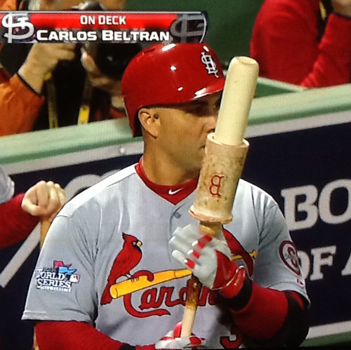
I’m not sure which is more surprising — that the Cards didn’t have their own team-branded weight, or that the weight wasn’t plastered with a World Series logo.
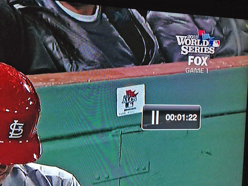
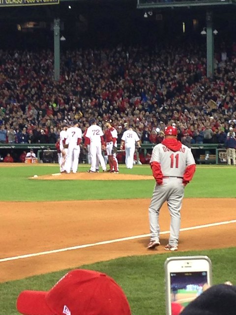
• Speaking of World Series logos, someone forgot to slap one over this ALCS logo behind the Cardinals on deck circle:
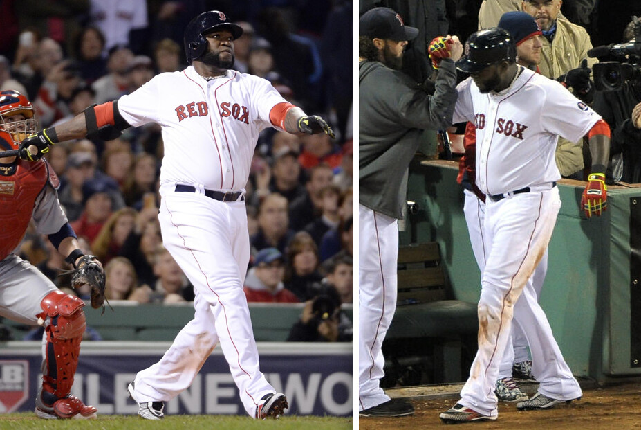
• Big Papi started the game wearing black batting gloves with ugly Day-Glo trim but later changed to red with ugly Day-Glo trim (click to enlarge):
• Cardinals third base coach Jose Oqueno was wearing a hoodie, instead of a long-sleeve undershirt, beneath his jersey:
(My thanks to Adrian Curcher, Scott Hord, Chris Perrenot, John Pritchard, and Matthew Sampson for their contributions.)

’Skins Watch: The Indians are surveying how fans feel about Chief Wahoo (thanks, Phil). … The U. of Illinois has resolved a trademark dispute over a local group’s use of Chief Illiniwek imagery (from Jordan Cutler). ”¦ Reprinted from yesterday’s comments: Here’s a story about a ’Skins fan who’s been giving out “I Support the Name” pins at FedEx Field. … Arizona Governor Jan Brewer doesn’t see what all the fuss is about (Phil again). ”¦ In case you missed it last week: Here’s my open letter to people who are sick of ’Skins Watch.

Baseball News: Here’s a really nice slideshow of fans finding creative ways to watch the World Series. … The 1946 World Series, which was the first to feature of Bosox/Cards match-up, had a uni-notable quirk: Both teams wore zippered jerseys (from Todd Radom). … The program for that 1946 Series included this fairly adorable beer ad. Odd to see quote marks used within a word balloon, and even odder to see the Cardinals sponsored by a non-Anheuser-Busch beer, but it’s still pretty great (big thanks to Chelsea Madden). ”¦ ESPN is producing a 30 for 30 installment on a surprisingly niche-y topic: the rise of Franklin batting gloves and Mike Schmidt’s role in popularizing them. The producers have asked for me to do some on-camera commentary, which I’ll sit down for on Monday. … Reprinted from yesterday’s comments: Here’s a great interactive infographic on MLB franchise values. … This close look at the El Paso Chihuahuas branding includes a tidbit I hadn’t previously been aware of: Several of the Padres’ minor league affiliates have their own versions of the Swinging Friar (thanks, Phil). … Kinda gross to see that this year’s World Series tickets include a little “Watch on Fox” ad. Corporate douchebaggery notwithstanding, it doesn’t even make sense — if you’re going to the game, you don’t need to watch it on TV (from David Kelly). … In a move that makes zero sense, Pinktober has even spread to the vintage “base ball” re-enactment crowd (from Jake Elwell). ”¦ New logos for the Arkansas Travelers. Additional info here (from Justin Bates and Michael Cossey, respectively). ”¦ Here’s an animated GIF that will either delight you or give you a seizure (blame David Firestone).

NFL News: Here’s my favorite link of the day: What’s better than a logo made of soda cases? A logo made of apples! (Thanks, Phil.) ”¦ Seven photographers are suing the NFL, the AP, and Getty Images for copyright infringement (from Tommy Turner). ”¦ Nik Streng notes that Chiefs defenders Eric Berry and Justin Houston don’t wear gloves. “Might explain why they have one interception between them,” he says.

College Football News: Good article on the guy who designed the Rutgers football uniforms (from Michael Romero). … It had already been announced that Ohio would be wearing brick patterned numerals this Saturday. According to this article, “The uniforms will become a regular part of the Bobcats’ rotation, which now gives them four different sets to choose from” (thanks, Phil). ”¦ Kentucky will be wearing team-logo thigh pads tonight against Mississippi State (from Chad Back). ”¦ Meanwhile, according to this article, “[Kentucky coach Mark] Stoops did try to put an end to rumors that Kentucky would be wearing new uniforms for the ESPN game. ‘I don’t know where these whispers come from. No. They’re not, I promise. No. One of the players even asked me. I said, “I don’t even know where the gray uniforms are. We don’t have gray uniforms. I haven’t seen them,”’ he said.” Uh-huh (thanks, Phil). ”¦ Fascinating story from Tony Miller, who writes: “In 1999, the Louisiana legislature permitted Northeastern Louisiana University and the University of Southwestern Louisiana to change their names, to the University of Louisiana-Lafayette and -Monroe, respectively. One of the stipulations was that neither school got to be just the University of Louisiana. The administration at Louisiana-Lafayette hasn’t officially violated any of this. But their football team apparently has. ”¦ Marshall will be wearing white for tonight’s game against Middle Tennessee State (thanks, Phil). ”¦ New white helmet for Old Dominion (rare non-Notre Dame submission by Warren Junium).

Hockey News: Lavender warm-up jerseys for the Blue Jackets (from Chad McNeal). … Here’s a real prize: an entire 1930 Maple Leafs program (from Chris Mizzoni). ”¦ “Looks like the Pensacola Ice Flyers will be celebrating last year’s President’s Cup with an Opening Night jersey,” says Ryan Bohannon. “One of their better-looking specialty jerseys in a quite a while.” ”¦ Remembrance Day jerseys on tap for the Kitchener Rangers (thanks, Phil).

Soccer News: Here’s a gallery of American Outlaws chapter crests (from Brian Veasey, who happens to have designed the crest for AO Hartford).

NBA News: The Heat will celebrate their title by wearing gold-trimmed jerseys for their home opener. … Jason Terry of the Nets has an odd superstition: The night before each game, he sleeps in the opposing team’s uniform shorts. … Reprinted from yesterday’s comments: The Cavs are retiring Zydrunas Ilgauskas’s number.

College Hoops News: New uniforms for Utah (from Nate Hurst). ”¦ Missouri will wear throwbacks for a preseason game this Friday (thanks, Phil). ”¦ Don’t hate me for saying this, Frank Mercogliano, but New Mexico’s new uniforms are just brutal.

Grab Bag: Great slideshow of bowling photos from the Life magazine archives here (from im Mason). … Pinktober has spread to the CFL (from Mike O’Connor). ”¦ And it’s also spread to eggs. “So glad I could do my part while making breakfast this morning!” says a sarcastic Jake Kessler.
Paul writes in the ticker: “Meanwhile, according to this article, “[Kentucky coach Mark] Stoops did try to put an end to rumors that Kentucky would be wearing new uniforms for the ESPN game. ‘I don’t know where these whispers come from. No. They’re not, I promise. No. One of the players even asked me. I said, “I don’t even know where the gray uniforms are. We don’t have gray uniforms. I haven’t seen them,”’ he said.” Uh-huh (thanks, Phil).”
That’s cool, I don’t think I’ve ever see the seldom used quote-within a quote-within-a quote pulled off before. That’s rarer than an unassisted triple play. But then again, I guess I just one-upped you in the first part of my post.
Rob, if you hadn’t posted about how ‘Paul writes in the ticker: “Meanwhile, according to this article, “[Kentucky coach Mark] Stoops did try to put an end to rumors that Kentucky would be wearing new uniforms for the ESPN game. ‘I don’t know where these whispers come from. No. They’re not, I promise. No. One of the players even asked me. I said, “I don’t even know where the gray uniforms are. We don’t have gray uniforms. I haven’t seen them,”’ he said.” Uh-huh (thanks, Phil),”’ I wouldn’t have even noticed the quoting-within-quoting-within-quoting.
(But not I have, and the much-desired quadruple play is mine!)
Actually Paul had the triple play, then I had did the quad, and now you actually completed the first ever recorded quintuple play!
Love the slogan in the 1946 beer ad: “It’s the tops”!
The Arkansas Travelers’ “alternative logo” looks much better than the regular one. It makes me wonder, though, why it isn’t just an “alternate logo”. The sleeve logo calls to mind the John Linnell song about the ship named Arkansas.
Love the slogan in the 1946 beer ad: “It’s the tops”…
And the undying “Let’s Send These Red Socks to the Cleaners!”
link
I should’ve read the ticket first !
Paul,
That’s great news about the 30 for 30!
I was about 10 years old when that happened and I remember thinking, “Who The F is Franklin?”
Someone just sent me a photo of Jose Oquendo’s hoodie, so I’ve added that to the lede.
Boy, Brandiose comes up with some awful logos. I’m surprised there is no acknowledgment in any of the logos of the Travelers’ park being located in North Little Rock… previously, the Travs had “LR” caps with “North” written in script over it.
And what’s up with Brandiose creating “custom camouflage” for the team? Sounds awful.
Neither of these can be blamed on the designer. The client – the team – has complete control of this sort of stuff. If the team wanted to keep North Little Rock on their unis, North Little Rock would still be on the unis.
And the camo? Sounds putrid, though it also sounds like it’s going to be a hunting pattern, not a military pattern. It’ll be interesting to see if the Travs dress up in what amounts to RealTree hunter camo and calls it a salute to the troops. But again, this doesn’t happen without the client’s approval. Probably the client’s original request during pre-design discovery.
“Jason Terry of the Nets has an odd superstition: The night before each game, he sleeps in the opposing team’s uniform shorts.” This really isn’ news. JET’s been doing this for over a decade. They did a little feature about it during the coverage of the 2006 Finals (if I’m remembering correctly). I guess now that he’s playing in Brooklyn the NYTimes felt it necessary to reiterate the story.
The “NEW” Oregon State Helmet has already been worn this year…
link
C’mon Paul, I expext better research out of you (or the reader). HGI just put up professional photos of the helmet. They did the same thing with the already unveiled Oregon Helmet.
Thanks. I’ll remove that item from the Ticker.
Geez, I hope you’re joking and I’m just an idiot who’s missing the joke. Paul gets it right 99 percent of the time, and to get on his case in such a manner because he missed something like this seems a bit petty.
Deadspin had an article last night about the time Mike Matheny took a ball in the face and barely flinched. He was wearing the seldom-seen late ’90s Brewers’ blue and green uniforms.
link
Man, that’s a tough dude.
Between the Brewers uniforms, the Pirates’ gray caps, and the wild umpire cap logos, that era seems a long time ago for only being 15 years.
Matheny took two balls to the face last night.
“He was wearing the seldom-seen late ’90s Brewers’ blue and green uniforms.”
Not only that, but the superior 1997-99 version. Never should have ditched those.
An under-rated and sadly short-lived set from the olden days when the Milwaukee MLB team wore one hone and one road uniform.
What a shame they did not keep them or transition right to those after ‘retiring’ the ball-in-glove Wallbanger wear.
The *only* thing I don’t like about those is that the 6, 8, and 9 all look similar from a distance. Otherwise they’re great. And I liked the touches of green, which are gone now. Bring that back!
Yes, they could have toned down the number font after a few years of complaints – maybe to a similar block Varsity font similar to the Braves. This uniform had piping along the belt loops a la Milwaukee/current Atlanta Braves, which I liked.
From the neck down, yes. They never figured out a good cap logo during the life of that set, though. Still, easily the most underrated uniform set in modern baseball. (Though I think the current Brewers uniforms, the home whites and road grays anyway, are also hugely underrated.)
We’ll have to agree to disagree there, Scott. I loved the link. Clear, distinct, and very appropriate for the city’s architecture.
The only problem was the double-outline (an issue I had with the entire set, actually). Stick to link, and the Brewers would be set.
I still say that M logo was just too narrow. A properly balanced cap logo needs just a tad more width to it than the M. The earlier MB logo was better, proportionally, though obviously all kinds of wrong otherwise. The Brewers came close, in my book, but just never got it right before ditching that set entirely.
Still, I’ve come around to regarding that as the best uniform set the Brewers have worn (at the time, I was very much not a fan).
In regards to “the Louisiana legislature permitted Northeastern Louisiana University and the University of Southwestern Louisiana to change their names, to the University of Louisiana-Lafayette and -Monroe, respectively”, this is backwards. Northeastern Louisiana is the one in Funroe, and Southwestern Louisiana is Lafayette.
I was expecting this adorable beer ad.
link
That is so so good. And accurate, too (well, for most moms and most infants; well, for the moms and infants I’ve hung around; definitely for dads).
Jose Oquendo wore the hoodie during the NLCS and was properly chastised by Ron Darling as being unacceptable.
It’s like when your mom made you wear a hoodie for a chilly game, or a jacket over your superhero Halloween costume.
I don’t care for the Travelers logos. They are all too pointy.
With all this Pinktober stuff, link is a good read if you have a minute. The league still seems to treat women as these monolithic, alien bloc, and they have trouble escaping the old “here are some cute licensed apparel!” and “We’ll help you impress your boyfriend’s friends at the next Super Bowl party!” traps.
The swinging Chihuahua’s bone/bat looks a little bit too, uh, how should I put this, like a penis.
My first thought was that the way his legs are crossed make it look like he’s waiting in line for his turn at the fire hydrant.
Yeah, I have been bothered by the ineptitude displayed in that logo. The dog is definitely not following through on his swing properly, I hope this isn’t indicative of the quality of the players.
Bowling photo #16: Lane courtesy infraction!!
Very nice Leafs program.
The offset on the magenta was way off, though, when they ran that inside cover. It kind of wrecks the ad on the inside back cover.
When I first saw that ad I thought it was supposed to be “3D”. ;-)
It’s interesting that they included two female athletes to balance the two males. Seems progressive for the era.
My favorite part of the program is at the bottom of the last page. “If you would like to mail this program to a friend, fill in the name and address below, leave program on seat and usher will collect and mail it.” Wow! I’ve never seen that before. Today’s personal seat licenses don’t buy that kind of service.
“Very nice”….? It’s spectacular!
The Wm. Hewitt that wrote the article for the program and was also sports editor at the Toronto Star was legendary hockey broadcaster Foster Hewitt’s (“He shoots, he scores!”)father.
And I love the fact that the Leafs’ game sweaters and hose were made by Monarch Knitting Mills who also made ladies’ garments.
Paul, Great stuff on the 30 for 30. Franklin is a mainstay in the batting glove world, others have come and gone. I can on and on for days on the topic. I just miss the Pro Tab velcro closure system, made popular by Tony Gwynn and Mark McGuire (during his home run chase, wearing the crisp all white Pro Tab Franklins). Tell me/us more as it becomes available!!
Clearly, the velcro on today’s gloves is of an inferior quality. Based on the fact that batters have to step out after each pitch, unfasten and refasten each glove six to eight times, adjust the gloves, and step back in.
MLB should look into the quality of the velcro.
Nice!
haha!!! I wasn’t even thinking about that development in modern day baseball!! it does kill me when I see these idiots doing that ritual, Nomar was the all time worst, he even incorporated a wristband adjustment after each pitch! The Pro Tab velcro tab was about 3 times the size of the “standard” velcro strap on batting gloves, gave a tight fit and was easy to grab.
I’m a (relatively) old guy so I think of Mike Hargrove, the Human Rain Delay, over Nomar as the all time worst. But they were both really tough to watch.
What the Cleveland Indians are doing with that survey is very obvious — and ridiculous. First of all, they’re using a classic polling trick by manipulating the wording of the survey questions/statements in order to evoke the desired response. Each of the five statements are VERY positive in favor of the logo — for example, “This logo makes me proud of the Indians”. They’re all like that.
When you couple this with the intended survey respondents, you KNOW what the results are going to be. It’s a pointless exercise.
But the team is doing it so they can, in a few months, come out publicly and say, “Hey, look at these survey results! Look at how much people love our Chief Wahoo logo! We’re going to keep using it everywhere we possibly can!”
If that’s what the Cleveland Indians want to do, fine. Then why not just come out and say it instead of going through this transparent charade? The survey is a complete waste of time, and there will be no need to take the results seriously. We already know what they’ll be.
It’s the pushiest of push polls.
I don’t think the wording makes any difference at all here. A survey of a team’s fans is going to show that they support the team. Duh. I mean, anyone that finds Chief Wahoo to be racist/offensive/whatever isn’t going to be a fan of the team, are they?
No, that’s not true. I can attest to that myself. I’m a fan of the Atlanta Braves and have been since the old days in Atlanta when they still used Chief Noc-a-Homa. But just because I’m a fan, that doesn’t mean that I support the use of that caricature (or that I supported the BP cap that they wanted to foist upon the world last winter). I’m not particularly a fan of the Tomahawk Chop, either.
Now, I understand that this probably isn’t a representative stance of most fans of teams like the Braves, Indians, etc., but it’s not accurate to say that a fan of a team MUST support their team’s name, logo, etc.
And as someone who has studied the subject, I disagree about the idea that the wording doesn’t matter here. If the wording wasn’t necessary, then the team would not have created the survey in this fashion. Polls/surveys like this are very carefully crafted, and if there is a certain “theme” to the way the questions/statements are phrased, then you can rest assured that the theme was intentional.
This happens in politics all the time, where one side or the other will commission a poll and have the questions phrased in such a way to get their desired results, even among respondents from their own side.
Don’t get me wrong, the Indians can do what they want. But this “survey” is, as I said, just transparent and ridiculous.
Fans are more than capable of compartmentalizing. You can be a fan and be embarrassed about some of its branding, especially when the team has worked so hard to give you link to like instead.
And it’s certainly much easier to say “I don’t like that logo from my favorite team” than it is the name itself. You can’t get away from the name.
The, you’re right in theory, but humans being humans and because of how they process information, wording makes all the difference in any poll – when you simply gauge how positively the respondents feel about something, that’s going to draw a generally positive response.
If the organization were truly interested, it would give a set of responses that gave more explicit mentions of reservation or offense some fans might feel about the logo.
This isn’t an explicit push poll, like I suggested above, but you can kinda see what responses they’re trying to tease out.
I was one of the survey’s recipients. The team asked the same set of questions about all three logos – Wahoo, the block ‘C,’ and the script ‘Indians.’ Also, these were just three items in a larger survey about the fan experience before, during, and after Indians games at Progressive Field.
And I get that. But the logo-related items are in there for a purpose, especially the Chief Wahoo one. There’s no doubt whatsoever about that. Businesses make moves like that without a purpose.
Businesses DON’T make moves like that without a purpose. Ugh.
It’s not unimportant that it asks the same questions about most elements of the Indians’ branding, and survey recipients have the option to “Strongly Disagree” with these statements. The problem with the coverage of this “story” is it suggests they’re conducting a referendum on Wahoo, rather than an internal review by the team of how it’s selling its product.
“But the team is doing it so they can, in a few months, come out publicly and say, “Hey, look at these survey results! Look at how much people love our Chief Wahoo logo! We’re going to keep using it everywhere we possibly can!””
The Indians organization has already reduced the prominance of Chief Wahoo without polling, prodding or protest. If last season’s helmet ‘rule’ is any indicator of things to come, maybe the Wahoo caps disappear entirely from the rotation…I happen to think the arm patch is just the right amount of Chief Wahoo anyway.
I love that in the slideshow of creative people watching the World Series, they are all watching day games!
Those are some great images. But the one of the elderly woman on her knees at Ebbets Field is hard to look at. Somebody get that woman a chair…or a pillow!
Love the mini TVs at the barber shop.
I once bought a mini TV for the car as I drove from Denver to L.A. so the wife and I could watch the Broncos playoff game. Being the Dumb Guy that I am (and her too I guess), it didn’t occur to me that I would lose the TV signal once out of town! Only saw part of the 1st quarter.
TV: Purchased in Denver; returned in Santa Monica!
Maybe the Vikings should take a look at Louisiana-Lafayette’s numbers to figure out how to do it correctly.
The Fox ad on the ticket is a reminder to scalp your tickets, use the money for a big ass tv and watch the game on your couch. I am sure there are one or two Cards fans that wish they had did that last night.
I suspect it’s because people post pics of their tickets on social media. Fox bought space on the tickets so it gets a plug for its broadcast every time somebody does that.
Maybe this has been covered, but you can see the new Majestic logo on the dugout jackets:
link
It’s not just the football team at Louisiana-Lafayette that plays loose with the “Louisiana” thing. There’s this:
link — Baseball helmet and check the jersey
link — Basketball
The ALCS tickets also had “Watch on FOX” printed on them.
very interesting article about the University of Louisiana conflict.
how is ULL violating state law buy putting Louisiana on their uniforms? By putting Flur De Lur in their logo? By branding themselves that way?
btw Lafayette is one of the larger cities in Louisiana. After Katrina hit, there was a large migration to Baton Rouge and Lafayette.
The article explains it, but basically when Lafayette & Monroe changed their names about 15 years ago, a state law had been passed prior to it saying that neither could refer to themselves in such a way that would indicate it is the flagship institution of the University of Louisiana system (totaling 9 schools in all, no others of which go by “University of Louisiana – ___).
In the article, it says that they can’t use the phrase University of Louisiana or the UL abbreviation without appending the Lafayette/L (or Monroe/M) to designate which campus. It seems, though, that simply putting the name of the state doesn’t violate the law, because the uniform doesn’t say “University of.”
A small quibble, most vintage base ball players would reject the “reenactor” moniker. While some of the teams did exist in the 1860s and 1870s (the team I played for adopted the moniker of a short-lived team in our town in 1867-8), the game isn’t reenacting as much as interpreting a set of rules for a sport. Unlike mock battles, there’s no set outcome, choreographed planning, set roles or casting, etc. While a lot of people make a connection between VBB and Civil War reenactments, they aren’t really the same thing. You can just call them vintage base ball players.
Fair point. Poor choice of words on my part. Thanks for the corrective.
That’s kinda neat to think about though — what if they really were re-enactors, though:
“Ok, Bob, this time you have to ground out to short…”
COTD: They were probably smart to go with the fried stuff.
It’s quite literally (actually, still figuratively) a “catch” of the day.
I’d forgotten that South Street had turned into a ghost town.
Next to that Forbes story was this article about tattoo licensing. Maybe I missed it before in the ticker. But question is, wouldn’t the first person to copyright the material be the owner… Can’t imagine many tattoo artists would be copyrighting their material. The player’s copyright would include the image on a body – should be case closed. What am I missing?
Can’t code links anymore I guess. link
I’m thinking that a tattoo would be considered work-for-hire and be owned by the person receiving the tattoo. The guy who designs a team logo doesn’t own it, the team does. The same thing seems to apply here.
It seems like a really stupid issue to me. Plenty of tattoos aren’t even the creation of the tattoo artist anyway. It isn’t uncommon at all for someone to go to a tattoo parlor with an image in hand that they want to use as a tattoo.
link
Gussie Busch didn’t buy the Cardinals until 1953. So the fact that another beer would buy a program ad for the 1946 World Series is no big deal. Money was money for ball clubs in those days, no matter who spent it.
Oh, I know, Terry. I’m not saying it was wrong or incongruous for a non-Busch beer to be sponsoring the team — just saying that it looks odd from our contemporary perspective.
I didn’t buy my normal brand of saltines the other day because the box had been pinked…
Good for you, I hope these companies realize it works both ways.
And I don’t feel bad because I am pretty confident the penny and a half out of the $3.19 box of crackers that may get donated isn’t going to cure cancer. Besides… I thought the point was to RAISE AWARENESS.
My brand of basmati goes pink every autumn and promotes Race for the Cure on its packaging. And every year, it hurts a little inside to realize that once again, they’ve missed the opportunity to put “Rice for the Cure” on the box.
Non-sports pink backlash:
link
Can someone from or with intimate knowledge of Louisiana explain the University of Louisiana name thing to me? I know Tulane was called that at one point before it was converted to a private school, does that have anything to do with it?
ULL and ULM are part of the “University of Louisiana System” of colleges, along with Louisiana Tech, Grambling State and others. Nine total independent universities. There is also the “Louisiana State System” which is LSU and other very small schools like LSU-Shreveport and LSU-Eunice.
I’ve never heard of the Tulane angle, my feeling on the issue is its the LSU fan lawmakers who don’t want any other school to appear as important as LSU. Like other states that have rival schools (Univ of Oklahoma and Oklahoma State, Univ of Miss and Miss St, etc) University of Louisiana sounds like it is on equal ground to Louisiana State.
Also for what its worth, I graduated from Louisiana Tech, but did not grow up in Louisiana and now live out of state. In Louisiana people are indoctrinated to be LSU fans…its very strange. The only schools that even try to challenge that are Tech and ULL…where you still have several students who root for LSU. Being from another state, I find it strange you could attend a major university and openly cheer for another major university
I grew up five driving minutes from the University of New Orleans. UNO used to go by LSUNO = Louisiana State University of New Orleans. That was WAY before my lifetime though, but if you find old pictures of the school baseball team, you can see it on the uniforms.
Yeah, Louisiana is different. My dad was a podiatrist and knew of several Tulane students who were even still LSU fans.
Ah, thanks.
The vintage “base ball” players should have worn ribbons for cholera or yellow fever awareness.
OK, now this made me laugh.
Comment of the day
Win.
Smallpox. A pink ribbon with red polka-dots.
Why don’t vintage base ball players care about “consumptiton”?
That made me laugh audibly. Thank you.
How did they cure those diseases back then without ribbons?
Is link already on your list of players who don’t wear gloves? It’s probably stranger than defenders not wearing them as he’s a pass catching [questionable] tight end.
good call!! Let’s not get started with the number of centers in the NFL that wear just one glove on their non snapping hand to get a good feel on the ball.
Awesome or logo creep? I love that the Baltimore chapter of the American Outlaws incorporates the Natty Boh guy in their crest.
Rutgers is the only college football team to have their conference logo on the side of the jersey and the same color as their uniform. its like they are trying to hide the fact they paly in the American conference
$5 says next year the bigten logo is on the right/left side of the front jersey as a normal patch like all the other schools
Can you blame them? I wouldn’t want to advertise that I was a part of that conference.
not really. but im surprised there’s not a rule about conference patches
Spurs have unveiled their camo alternate. Contrary to what had been reported a few days ago, it doesn’t have sleeves:
link
It’ll be worn on Nov. 13 and
one other date, not yet specified.Feb. 28.If the troops really need supporting, I wish that teams could find a way to do it that doesn’t look like shit.
This is as good of a place as any to point out last night’s sports/patriotism/militarism mash-up with God Bless America. We’ll see if it’s an everyday thing for the Series…
FWIW, it’s a more contemporary camouflage than the other G.I. Joe unis.
I’ve been engrossed in a really detailed book on the Battle of the Somme so right now any military rah rah stuff just makes me queezy.
The December 1930 Maple Leafs program is fascinating. If you scroll down to p. 47, the previous season’s play-off results are listed. It’s an interesting playoff format. The winners of the two divisions play a best-of-five series while the second and third place teams compete to play the winner of the best-of-five series in a best-of-three championship series. That last one is called “Series A” while the previously played series are “Series B” thru “Series E.”
Series B, D and E each went two games, one of which was a tie. Yet a winner was decided – what was it based on? Was it an aggregate score, as done sometimes in soccer?
Yes, the NHL used two-game total-goals series. I don’t know if they used the away-goals rule.
Also, page 40 lists a game as Boston vs. Boston.
Reebok Edge 2.0 (7287) retail vs. pro stock (team-issued)
(Philadelphia Flyers)
We all know that the team-issued jerseys have a “twill sandwich” fight strap.
Another difference between retail 2.0s and gamers is the waist stripe above the bottom hem. On gamers the stripe is sewn OVER the body of the jersey. On retail jerseys, the stripe is sewn UNDER the body of the jersey. See these photos (especially the fight strap photos) for details:
Gamer/team-issued (white stripe is sewn over the orange body):
link
Retail (orange body is sewn over/overlaps the white stripe):
link
Good eye, Puckboy!
I was watching some of the pre-game coverage last night and noticed a member of the Fenway Park Grounds Crew sweeping off the foul line between fist base and home plate. That’s right – sweeping off the foul line.
When I go to games at Fenway, I often arrive early enough to watch the preparations the Grounds Crew makes just before the game begins. A few years ago, I began to notice that rather than laying down the foul lines, batters boxes, and catchers box with chalk, the Grounds Crew now meticulously sweeps the infield dirt off of these lines. They must be made of some sort of substance that is level with the infield dirt and has to be swept clear with a broom to reveal them in all of their pristine white glory.
I think all of this started about then years ago – after the field was completely replaced to improve drainage, etc.
Does anyone know what these “foul lines” are made of, and why they don’t otherwise affect play? They must be some sort of porous or flexible material that “gives” when players run over them on their way to first base, or when they step on them while in the batters box. Unlike at other parks, where batters often “erase” the back of the batters box with their feet, all they can do at Fenway is kick dirt over the lines to obscure them.
I wonder if this this a Fenway-only thing, and how they avoid affecting the path of a baseball – particularly on a slow rolling bunt along the foul lines.
I know foul lines in the grass are often permanent. I don’t know about the lines on the dirt.
????
Just did a quick google search and stumbled upon this which comes from this “Photo Shoot At Fenway Park”.
From the looks of that — that’s what your foul lines are constructed of; not sure what that material is, but clearly, it’s not chalk.
Nice spot!
My Google search (“MLB permanent foul line”) turned up 2 companies that manufacture a PVC product, but neither were flat like the material used in Fenway.
One company claims their product was installed at Doubleday Field, and both state that the product is to be installed in grassy areas only.
Paul will be delighted to know that link. The lion head logo isn’t too shabby.
Oh, and link. I guess Tony Parker and Manu Ginobli weren’t patriotic enough to show up for the photo shoot.
Sorry, didn’t see that Paul already posted.
Kitchener Rangers have the best special edition jerseys in hockey.
Fantastic crest and colours. NHL could learn a thing or two.
Meanwhile, on 1600 Pinksylvania Avenue…
link
Gah, emailed Paul about this earlier, but I didn’t use any energy to find a pic. Nicely done.
Paul, When you speak to the 30 for 30 producers, see if they’re aware that Aerosmith’s drummer Joey Kramer uses Franklin batting gloves when he plays. Could be an interesting wrinkle to the documentary.
Looking at the Charlotte Knights’ new logo/color combo, and the article states that the teams’ gold/silver colors are rare. Hmmm, didn’t the NY-NJ Knights of the WLAF have a gold/silver/black color combo also?
The photo of the umpire with the residue from the LCS patch… Is that the correct World Series logo? Doesn’t look like it.