Remember our recent discussion of high school teams that use pro or college logos? Reader Larz Roberts has been wondering just how many high schools do this, and which teams’ logos get used most often. So he recently embarked on the rather Herculean task of finding out.
In order to start on a project like this, you need a breakdown of high school logos. Larz used the the state-by-state high school helmet logos posted at MG’s Helmets, which isn’t necessarily comprehensive or definitive but is a good starting point. Then he tallied how many schools from each state used logos from NFL and Division I college teams. He explains his methodology like so:
I counted current, past, primary, and secondary logos for each NFL team. If a high school team used two different team logos for its helmet, I counted for both. If a high school team changed or modified a logo enough so that it didn’t really look much like the logo it might have been based on, I didn’t count it.
As for the college teams, I counted the winged helmets as Michigan because, frankly, that’s the team I think of when I see that design. Any paw helmet that had the paw shaped exactly like Clemson’s was counted for them, with or without what little cut-out notch at the base of the Clemson paw. (And yes,there were a few with that notch cut out.)
Larz’s record-keeping method isn’t exactly on the level of a spreadsheet, but the results are still interesting. Let’s start with his tallies for how many high schools are using AFC team logos (for all of these images, you can click to enlarge):
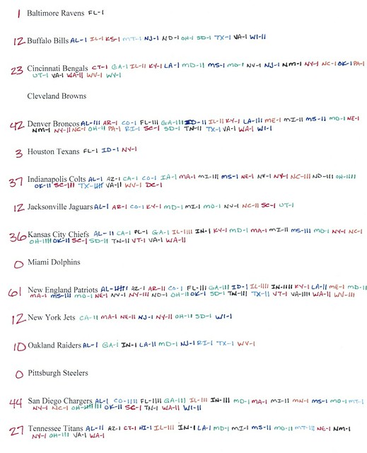
As you can see, the Patriots are by far the most popular logo source among AFC teams, with the Chargers, Broncos, Colts, and Chiefs also doing quite well. Now let’s look at the NFC:
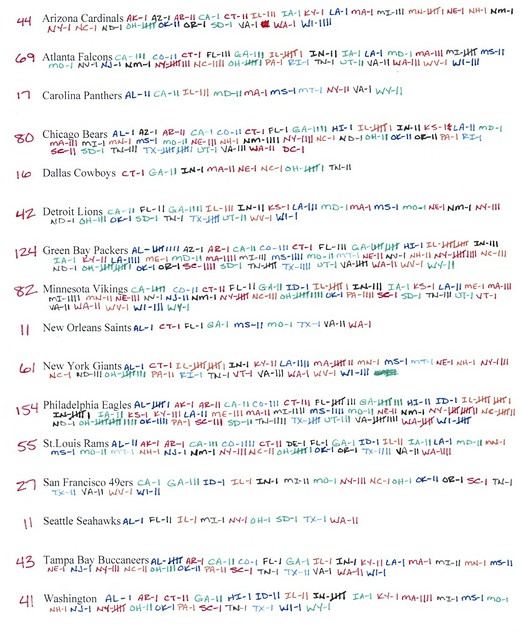
Interesting to see the Eagles’ logo as the top choice here. I would have guessed the Bears’ wishbone-C, which finished fourth. Meanwhile, it’s disappointing to see how many high schools are using Washington’s logo.
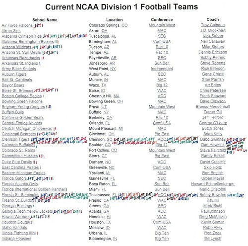
Now let’s look at Larz’s numbers for high school teams using Division I college logos (yes, he used an out-of-date list of teams, but cut him some slack):
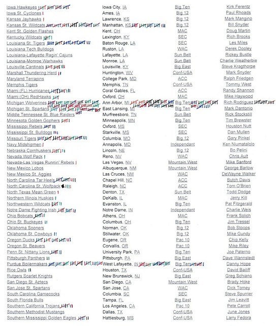
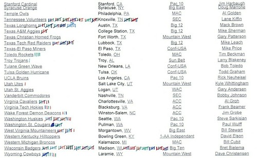
In the course of his research, Larz also found high schools that had borrowed others sorts of logos. I’ll let him explain:
What made me laugh were the miscellaneous logos that some high schools made their own. They took logos from NBA, MLB, and NHL teams. There are Van Halen helmets from Illinois and Texas, and Wu-Tang Clan helmets in South Carolina and Utah. There are multiple Superman helmets. There’s even a school in Illinois that uses the Shell Oil logo.
You can see Larz’s tallies of these logos here:

And there you have it — a very interesting research project.
As for the high school redesign project that I mentioned a few weeks back: The good news is that dozens of you chimed in with good advice, suggestions, and feedback. The bad news is that a lot of that feedback was of the “This is never gonna work, and here’s why” variety. I’m not giving up, mind you — I’ve already broached the topic with my ESPN editors and will be having further discussions with them shortly — but I now realize that this may be a steeper mountain than I had anticipated.

Ho-ho-ho: With the December holidays approaching, here are a few items of note:
• If you want to buy a Uni Watch Membership for someone as a gift but don’t know what that person would want for his or her card design, you can buy a Membership Gift Voucher. For details, look here.
• If you think a certain pair of theoretical T-shirt designs might hypothetically find a good home under your tree or in someone’s stocking, you know what to do.
• I’m now working on my annual Uni Watch holiday gift guide column for ESPN. If you have suggestions for uni-related items I should include, speak up. Thanks.
Pre-Thanksgiving treat: I wrote a piece for ESPN yesterday about my memories of a certain famous Thanksgiving football game. Enjoy.
Uni Watch News Ticker: What does a hockey writer do during the lockout? One option: Ask the Penguins what they think of the Steelers’ throwbacks (from Jerry Wolper). … New logo and uniforms for the Tokyo Yakult Swallows (from Jeremy Brahm). … A European soccer fan who wore a jersey with “Osama Bin Laden” as the NOB has been prosecuted for defending terrorism (from Marc Coale). … Fascinating article about NFL quarterbacks’ play-calling code. Highly recommended (big thanks to my buddy Rob Walker). … Neglected to mention yesterday that 49ers defensive lineman Aldon Smith will likely be fined, because he wasn’t wearing red socks on Monday night (kudos to Pinch Santos). ”¦ Some Pasadena residents don’t want an NFL team coming to the Rose Bowl, so they staged a protest — but their placards had the wrong NFL logo (from Jose Niebla). … Check out the Washington Huskies’ basketball warm-ups from 1989 (from Al Cummings). … “Based on the diagrams in this article, NASCAR may be reducing the amount of area that can have sponsor logos on its cars next year,” says John Goodrich. “Hopefully the NBA is paying attention.” … New logos for the West Michigan Whitecaps (from Tom Meyer Klipsch). ”¦ We often talk about the Tigers’ belt loops. But look at this 1971 photo of Johnny Bench — loop-o-rama! ”¦ Check out these little Adidas soccer shoe charms. They were on a key ring that Brinke’s father brought back from a trip to Germany many years ago. ”¦ Got a very nice note from Rob Ginocchio, who just discovered Uni Watch and has this to say: “The baseball league I currently run in Springfield, Missouri, has about 200 kids, aged 9 to 19. We play in an old 4000-seat semi-pro stadium that was vacated about 10 years ago. In 2011 I decided to do the whole league in retro style to the 1950s and ’60s with throwback uniforms of MLB teams of the era. We may have been the only place to have championship games featuring the Brooklyn Dodgers and Yankees, and the Senators and Colt .45s, in a long time (if ever).” ”¦ I’m seeing the orthopedist today for the two-week checkup on my wrist. I believe the plan is to remove the splint wrap I’ve been wearing and replace it with a cast (which I’ll have to wear for four more weeks), and I expect he’ll also take X-rays to see how the bones are healing. Wish me luck.
Holiday schedule: The site will be open for discussion tomorrow, although content from my end will likely be minimal. We’ll be open for business as usual on Friday, although possibly with light-ish content, and Phil and his contributors will have their usual assortment of weekend content.
Everyone have a great Thanksgiving. Be safe, be good, and save room for pie.
NASCAR isn’t reducing the area they allow sponsors to use. In fact they’re expanding it, allowing sponsor logos to extend past the B-pillar on the side of the car, and allowing a sponsor logo on the roof, which had previously been reserved for the car number.
hah, I was going to say. I have to read that sentence twice to make sure I read it right, LoL.
I’ve shared this link before, but most likely the reason the Eagles are the most commonly aped helmet design is that Eagles is also by far the most common American high school mascot:
link
Scroll down to the second yellow list on the right-hand side for the more accurate national totals.
While I like the name Eagles, and attended HS with the Eagle mascot; I had no idea it was THE, A-#1, Kingofthehill, El Supremo team nickname/mascot in these United States. Doesn’t make it as special now.
btw, when I went to Thomas A. Edison High School in Alexandria, VA our football team’s helmets merely sported the letter “E” on the side. They used the Phil. wings with an “E” inside for a while. But now they seem to be using the Phila. Eagle head logo.
not loving it.
“E- D-I- S-O-N-E-A- G-L-E-S Oh yes, cuz we are the best!”
DG, I used to live in Edison’s zone before moving down to Woodbridge, where our local HS is also the Eagles. My own high school in Eden Prairie, MN, was also the Eagles, and when I was there the football team switched from classic, one-color-wingEagles helmets to solid red. I need to check the yearbooks, but I think the EPHS Eagles wore the school’s original, student-designed EP logo on their helmets at least one year while I was there, though my memory could be playing tricks on me.
Scott, I missed your earlier referencing, so delight was fresh when I went to that high school nickname site. Fabulous. Wonder if there’s one for school colors?
Just want to add praise for Larz and his project. I loved it, and hope Paul can gain traction for the greater own-your-own-logo-dammit campaign. Wish I still ran a foundation!
“Wish I still ran a foundation!”
~~~~
slackin’ off again, conn?
Used to give away. Now I beg.
Good work, Larz. Nice to see that the Maulers’ logo lives on.
I applaud Larz for all of his hard work. But the Alabama Crimson Tide? Numbers on the side of your helmet are as basic as you can get, save for the Browns’ no-logo look. Why don’t we go all the way and start listing helmet colors, stripe colors/pattern and face mask colors.
I can understand Paul’s basic premise about schools developing their own logos. But there is only so far that you can go with the “unique logo” for every school.
As I said in my note to Paul when this topic came up I feel some of the blame should be placed at the feet of the suppliers. Uniform and sportswear makers, screen printers and embroiderers, helmet decal, stripe and numeral manufacturers. If these folks flatly refuse to violate a copy or a trade mark by duplicating a pro/college logo that would eliminate some of the problem. Fining companies heavily for each indiscretion would surely stop the copying. Money is their lifeblood.
Finally there must be some common sense used here. A generic letter or number placed on a helmet or uniform may replicate a particular team (Alabama, Penn State, the old Toronto Argonauts Block-A helmet letter)but when did a plain identifying number or letter become a pro/college team’s property?
Although the basic idea of individual logos for everyone has good intentions I feel that it’s a case of trying to lock the logo-infringement door long after the team has left the locker room.
I tend to agree with your point about omitting generic designs from this project. I suggest that perhaps the best qualifying factor for including any logo should be to include a stylized helmet design that is a registered trademark of a professional club or a university – without regard to the colors. This would reduce most debates about whether a HS team is copying a well known, but generic design such as Alabama, Penn State, the Cleveland Browns, or Michigan (PRINCETON!).
Maybe the Alabama logo counted would be the A or another secondary logo and not the number.
For the record, I didn’t count helmets with generic numbers. Those helmets featured the Alabama scripted ‘A’ on the helmet.
Great job by you! Sometimes my acknowledging the effort and expressing an appreciation for another’s work is missing from my commentary because my remarks are focused on proposing an improvement. This project is truly a herculean task.
Larz, would you say most of the schools used generic logos, original logos or a copy cat logo?
I am shocked that the Patriots is the number 1 for the AFC, I wonder if its more the old logo or new logo?
I know of at least 2 schools in Floirida that opened after 9/11 that named themselves “Patriots” and opted Flying Elvis as the logo. The many existing “Patriots” looked at the NE team’s success and went Flying Elvis as well. Shouldn’t be a shock.
Dunno, there seem to be a lot of high schools with Patriot mascots. Usually a school named after a Revolutionary War era guy.
I’m surprised that the Browns had no copies. I know my high school not only used the Browns’ “logo”, the orange helmet with brown and white stripes, but pretty much copied the entire uniform while I was in high school in the early 2000s. They’ve since gone to a much more orange-heavy design, sadly, given that the official school colors are brown and white (orange accents allowed).
Looks like Larz left the Browns blank rather than putting a zero. It probably makes as much sense to ignore blank helmets as it does to attribute them to the Browns, even if some (like yours) are direct homages.
That was it exactly.
My Dad was stationed in Okinawa, Japan in 1974. Every Thanksgiving til the day he died he retold the story of how he was listing to the ‘Skins/Cowboys game at 3:00 in the moring (Japan time), and thinking to himself, “Whatinthehell is a Clint Longley??”.
Miss you Dad!
Johnny Bench needed all those beltloops because he was a catcher. He didn’t want his thong to show when he squatted behind the plate.
The Buffalo Bisons (AAA-Toronto) came out with a “new-retro” logo/branding yesterday.
link
The logo is great but the way they treated the wordmark with the baseball is absolutely brutal.
The Mets affiliation was a bleak period in Bisons history. It’s nice to see they’re removing the last vestiges of it.
It’s been a while since I’ve been on the site, but I wanted wish all the Uni Watchers a early Happy Thanksgiving.
Nice to see that Seth Rorabaugh did his research, and didn’t buy into the Steelers’ “1934” party line on those throwbacks.
Browsing through the HS helmet website linked in the lede I came agross the Hinsdale Central helmet from Illinois. Really liked the horns for the devils, never seen that before or thought about it for a team like Duke.
link
Wow, that is a great project! THIS is the kind of stuff I love coming to the site for.
I am proud to have gone to a high school that, as far as I know, had/has a completely original “Pirate” logo. Original in the sense that it’s not a ripoff of the MLB team. Might have been taken from somewhere else though.
I guess you could say we ripped off Penn State with our helmet though… not that anybody would really know! I wonder if we are in the minority now, being a school that DOESN’T have a logo on the helmet.
When I look at websites and catalogs that provide schools and athletic programs with gear and merch it often surprises me the amount of professional and collegiate logos advertised as available. Yes the High Schools and small colleges share much of the blame for this so called identity theft, but they are buying these logos from somewhere. As long as these companies threat intellectial property as stock logos to slap on helmets and t-shirts the problem will not go away.
I would have guessed the Buccaneers’ logo would have been more popular.
Nice to see some USFL logos getting some use, but I’m surprised there aren’t more of them. I’m really surprised no one is using the N.J. Generals’ logo, which was/is awesome, although the uni as a whole wasn’t.
That’s a great point about the NJ Generals helmet vs their, ahem, general appearance. Tweak the colors slightly to burgundy and gold, and that would be an excellent helmet for a post-Redskins Washington Warriors. Very similar to the big bronze wreaths at the WWII Memorial on the National Mall. Almost a shame the USFL had this logo, since it ensures no NFL team will ever adopt anything like it.
Years ago on Madden 2003 I designed a new uniform for the Generals, with hunter green as the base color and gold and silver trim, to approximate an actual Army general’s uniform. The helmet was green with the gold five-star wreath logo on each side, silver center stripe flanked by thinner gold stripes. The home green jersey had silver numbers trimmed in gold, the road white jersey had green numbers trimmed in silver.
hope you put lots of camo and american flags on it too
Nope. No ribbons, medals or badges either.
why do you hate the troops and the country so?
I was king of hoping the Cardinals would adopt the Arizona Wranglers’ color scheme when they redesigned their unis a number of years back. A blown opportunity, IMHO.
…uh, that’s “kind of hoping”.
Beach Channel HS in NY uses the Dolphin logo.
link
I’m too lazy to do the research, but there is an embarrassing number of HS Hockey teams here in MN which use the Gopher M logo. There are years you can get 2 or 3 teams with it in one AA State Tournament.
I’m happy that my high school (which is a perennial power in hockey) does not use the M logo, and generally uses original logos. The lone exception was for about a 3-4 year period, of all logos, they ripped off the Islanders Fisherman logo (we’re the Pioneers, so it was an angry looking dude in a coon skin hat instead of fisherman guy). Thankfully they’ve moved on.
The winged helmet design currently popularized by Michigan is actually a creation of Princeton and was also worn by Michigan State prior to adoption by Michigan. So, the research should be adjusted to reflect the correct attribution to Princeton, not Michigan. Michigan is just one more imitator.
You are correct, but I think it’s pretty well explained above. IF you show someone off the street a winged helmet, 99% of them will say it’s Michigan. If a high school uses this helmet, they are most likely trying to copy Michigan, which is the point of this exercise.
this seems to be one of those jerry dior misconceptions as well…and while i’m not 100% on fritz crisler’s contribution (and subsequent popularization, with apparent misattribution), at least according to this site (and i’ve seen other research to back this up), crisler most certainly did not “invent” the winged helmet, but rather, it was a stock spaulding design
the linked site shows at least 4 teams using the design prior to crisler (with princeton) in 1935
Here’s Princeton’s official take on the topic.
link
that’s nice
too bad it’s wrong
Harmon Killebrew was the model for the winged helmet later made popular by Michigan. True fact.
that was after the rejected blue pony design, correct?
You misspelled Jerry West
On the professional side of things, the Bears had a winged helmet style in 1931.
The Reds wore a winged helmet – very similar to Indiana’s – in 1933.
The Giants wore a winged helmet from 1937-1947.
The AAFC Bisons wore one in 1946.
Among others.
When I was in high school about 10 years ago, one of our rivals, the Oakville Tigers, used Mizzou’s tiger logo on their helmets (fairly apt, as we’re in Missouri). Now I see on the MG Helmets site that they’re using Oregon’s O logo. It’s pretty fascinating to look at the different helmet logos and pick out ones identical to those used in the NFL & NCAA, but to see twists on the well-known designs, and also see the occasional logo from another pro sport entirely.
Unfortunately the MG Helmet site only shows appx. 200 out of the 700+ CA high schools that have football programs. And funny enough one of the pictured schools on Paul’s original article, La Costa Canyon which uses the Texans logo, was not tallied up on Larz’s list.
link
I know of two high schools that used collegate logos in the past. Back in the early 90s Tioga HS in Tioga, LA used the LA Tech “State-T” logo, and my alma mater Winnfield HS in Winnfield, LA used the Wisconson “W” for one year.
I know these are not currently in use by the schools, but I always thought it was interesting a HS used LA Tech’s logo.
Good luck Paul!
Great research job! I really enjoyed seeing the results of your search and will be saving this post because I know I’ll be referring back to it.
Which came first the Green Bay G or the Georgia one?
Packers.
The Packers created the logo in 1961, and Georgia started using it (with permission from the Packers) in 1964. Before 1964, Georgia used plain silver helmets.
Anyone know what the G stands for? Anyone?…
In Georgia?
Goobers.
Like the “N” on Nebraska’s helmet stands for … knowledge?
/snark
Today’s post is great but I wouldn’t call the NFL the height of originality when it comes to logos either. They’ve naturally been *much* more touchy about any plagiarism recently (see original Jax Jaguars), but if you go back far enough they clearly “borrowed heavily” from existing designs (e.g., Steelers, Bears, etc.).
Football?
I think it’s funny that so many of MG’s Helmets have tinted visors on them. Visors are against Federation rules unless a state decides to allow them. Minnesota and Wisconsin don’t.
Georgia has permission to used the Stretched G from Green Bay.
A few years back, a Minnesota high school on the North Dakota border received a nasty letter from Wyoming, saying Breckinrdige’s cowboy logo was the same as Wyoming’s.
Doesn’t it stand for “Greatness”?
*snort*
Argh… supposed to be a reply to oneblankspace’s post above. I don’t do the internets well.
Damn, I should’ve scrolled down before I posted my comment up there.
I attempted to answer your question via ESP before it was even posted. That will probably suffice as the most interesting thing I do on this non-productive Thanksgiving Eve.
I’m shocked there were no high schools found using the running mustang logo of SMU. That’s a pretty common logo for any school with a horse mascot. I can think of at least two high schools in the Dallas area alone that use the running Mustang. There is a slightly altered version used by Ford that some high schools copy, as well as the CFL Calgary Stampeders, which is almost a direct copy of the SMU logo save for the bent tail.
Looked at the helmets for Texas on MG’s site and found a handful of SMU Mustang logos right off the bat. Must be an oversight by Larz.
FD Roosevelt High in Oak Cliff had the same logo on their hats in the 1980’s. Remember when someone stole the varsity unis from Velt, SMU was going to let them use their unis while they were in the Death Penalty period. The NCAA put the squash on that immediately.
SMU and Calgary both started using the running horse at the same time, about 1968. And I’d argue they both copied the Ford Mustang logo.
Indeed, they are probably both derivative of the Ford Mustang logo, which appeared when the car debuted in 1964, although neither is an exact copy (Tail and hindquarters are different; Ford pony always runs to the left, SMU pony runs to the right except on the left side of the helmet). The odd bend in the tail of the Calgary logo appears to be an attempt to further differentiate from Ford/SMU. It would be neat if someone could clearly define who had it first, Calgary or SMU, or if there was some connection between the Stampeders and SMU back in the late 1960s. However, the running Mustang logos used by many high schools are usually exact copies of the SMU version.
link
Also, note that Ford tweaked its Mustang pony logo in 2009 for the 2010 model year:
link
And speaking of football, we all knew this had to exist, right?
link
ah I remember their T-shirt slogan. “Polo, Ponies, Porsches and Probation. No Where Else But SMU.”
Yeah. I missed that logo altogether. After I had gotten a few states in, I saw that I hadn’t been counting the running mustang from SMU. But by then, I just didn’t have the heart to go back from the beginning and count them. There are a good number of them, though.
That’s completely reasonable given the monumental task you tackled. I do think it’s extremely odd that a professional team in Canada and a college in Texas debuted such similar logos in the same year. Could make for a nice read on Uni Watch some day.
Munster High School in Munster, Indiana uses the Ford Mustang logo. School is named after the car having opened in 1964 and the colors are, of course, red and white.
link
My favorite car logo rip off is made by the Blackfoot Bronco’s basketball team – they use the Ferrari horsey
link
Steve Sabol, in the video link found in Paul’s very good espn article, suggested that the last we heard of Clint Longley, he was “selling carpet remnants out of the back of a van in Marfa, Texas.”
Thanksgiving 74. I recall where I was SITTING watching the Mad Bomber.
Sucker punching Roger was not a good career move, tho.
The Dallas Morning News attempted to find Clint Longley about 10 years ago. They never found him, and it became evident he doesn’t want to be found. I wouldn’t want to be found either if I had sucker-punched Roger Staubach!
I imagine he is selling more than carpet remnants from the van.
i believe he lives in that van…down by the river
my own high school (University of Detroit Jesuit) adopted the Mizzou Tiger logo about 6 years ago, but changed it by 25% so as to be able to legally use it (or so we were told). personally, i don’t mind a high school borrowing a professional or college logo, so long as they make some adaptations to it first. that being said, it is much nicer to see schools create their own logos.
The “anti-NFL” Rose Bowl people remind me of this:
link
this Imgur find fits today’s topic perfectly. a school in Phoenix ripping off the Eagles helmets
link
got to love the pose as well
Still got Adidas/Puma on the brain from yesterday. Reading the new book “No Easy Day,” about the Seal Team that whacked Bin Laden. In it, the author asserts you can always spot a Taliban bad guy by his shoes. “They always wear Puma knock offs, high-tops called Cheetahs.”
Back in the day—-mid 70s..the logo design wasn’t as advanced at the HS level, as I recall.
The Mariemont Warriors just knocked off Notre Dame. Gold helmets, navy jerseys, gold pants.
I know they don’t use the Steelers’ logo, but shouldn’t the Iowa Hawkeyes’ unis count as a “poaching” of Pittburgh’s uniforms?
Actually, I think it’s the other way around, i.e., I think Iowa had it first.
Per Iowa Hawkeyes football Wikipedia page:
”In 1979, Hayden Fry helped to create the Tiger hawk, the logo seen on Iowa’s football helmets. Since both teams shared the colors of black and gold, Fry gained permission from the Pittsburgh Steelers, the dominant NFL program of the 1970s, to overhaul Iowa’s uniforms in the Steelers’ image. Fry’s idea was that if the team were going to act like winners, they first needed to dress like winners. Fry had originally asked Steelers Defensive Tackle “Mean” Joe Greene for a replica helmet and home jersey; Greene was able to send Fry to one of the team owners, and three days later, the owners sent Fry reproduction copies of the home and away uniform of Steeler Quarterback Terry Bradshaw, making Iowa one of only a few schools to use the uniform scheme of an NFL team. Although the uniforms appear the same, there are subtle differences, mainly in the scheme of the white away jerseys, the Steeler jerseys have the players names in yellow, while the Hawkeyes use black.”
link
For some reason, the Steelers had the players names in black for at least the 1998 season.
legibility?
If I recall correctly, the black NOB appeared on the white Steelers jersey only during the first season with the new font. For the following season, the Steelers reverted to the rare, if not unique, gold with black lettering NOB on the white jersey….
according to the GUD, it was the 1997 season
I like this schools logo. Made the initials into a helmet.
link
A helmet logo of a helmet with a gray facemask, on a helmet with a gray facemask? Some UW readers heads are about to explode.
Grand Forks Central also changed their school mascot from Redskins to Knights in the early 90s I believe.
Also, our high school used the USFL Pittsburgh Maulers logo until this year when we switched to one unique to our school. No more poaching for us….
nobody ripping off the dolphins? thats actually a sweet logo
Not high school, but the Kihei Dolphins peewee team in Maui uses the Miami Dolphins logo on the sign at their beachfront field, and apparently used to wear mini Dolphins unis:
link……..
But they appear to have adopted an original helmet logo with a K (and possibly a dolphin within the K; hard to tell what the blue smudge is on this photo):
link
I know this because when my wife and I visited Maui last year, she saw the team’s banner and took a bunch of pictures of the cute dolphin. Didn’t have the heart to tell her it was just an NFL logo, not a cartoon of the dolphins we’d just seen out on the water a few miles south.
wow. that high school helmet site is a wormhole.
off the top of people’s heads, any teams use a Whale for a logo?
i know the CT Whale, the Hartford/NE Whalers, the Vancouver Canucks – anyone else?
thanks!
If you’re going with Hartford, you can’t forget their classic Binghamton Whalers farm team.
Let me see if I can get this right…..
Technically, all dolphins are whales. And, technically, the Orca..uh..Whale…is a dolphin. The largest dolphin.
So…technically, the Dolphins and the Canucks (with their logo) have whales for in their logos.
Technically. I think.
Some remarkably creative original HS helmets on link:
Delta Rabbits (UT); Yuma Criminals (AZ); Glasgow Scotties (MT); Buckhorn Bucks (AL); Huntsville Hornets (TX). Also really like the admittedly derivative JFK Rockets (TX).
Oh, the Lakeview (OR) Honkers is a goodun too. May not be extremely original, yet it is a looker!
link
the Broadway Gobblers link
Best Steeler throwback.
link
Looking at the website, the St. Viator Lions in Illinois seem to use a version of the Peugeot logo on their helmet.
Always thought Viator used a classic Lion Rampant.
Love the high school helmet data. So which state has the most original designs?
That’s a great question. I’ve also been focusing on the various original designs trying to see which ones I like best. Let’s have some shout outs for the best original designs. Why not give them some praise (or even an award!) to encourage more original design work and thinking.
I love the Redskin’s logo and find absolutely nothing “disappointing” about it.
What I want to know is how many of those teams classified as using the Bears logo actually have the Bears’ asymmetrical C and how many have the version closer to the Cincinnati Reds?
I would have to guess if the logo is aligned like Chicago then it is a clear case of a ‘right-click, save-as’ ripoff. I know the wishbone-c is used everywhere but no way it should have the anomalies of the Chicago C unless it was directly stolen.
Has anyone ever determine the origin or why Chicago’s C is like that to begin with? Is it something that started from the logo originally being hand-drawn?
How can the Green Bay Packers have their logo used 124 times and the Georgia Bulldogs used once. It is the same logo, just different colors. Of those 124, how many are green and yellow? In my opinion if Green Bay is at 124 then Georgia is at 124.
how many are also using the old Georgetown version of the G and even the new G-Town?
As I recall, the one I counted for Georgia used a bulldog logo that the university uses, not the G off their helmet.
Larz, Cheers on the research. My High School went from the USC Trojan to the LA Dodgers symbol on their helmets. Paul, if you need someone to help design a symbol or something, I’m willing to throw my hat in the ring. I may not be the best or have photoshop/illustrator, yet I’ll do my best. In my spare time I decided to redesign my old high school’s symbols (I haven’t done anything with them to my demise) and went along with our Athenian imagery opposed to the Trojan symbols. Athenian helmets look similar to spartan helmets and I added on small little owls to the helmets. That’s me throwing my hat in the ring to help out if you need it Paul.
I don’t know if Austin East out of Knoxville meant to do this, yet their helmet looks like some imagery representing American Eagle on their sweaters.
My dad’s school district–he both went there and taught there–uses the NE Pats logo all the time. The school is about as “third world” as it gets in the USA. I’m embarrassed that their annual golf tournament has Daddy’s name on it (because they are never clear about how much was raised or where it went). I want to turn them in so that they will be forced to learn that the world has rules and you are expected to follow them. However, this article makes me lose faith in the NL and theLicensing trademark staff. Clearly, they don’t CARE!
The “Flying Elvis” Patriots logo was the one who started this whole logos-designed-on-computers mess. Too much emphasis on refined artificial perfection & program tools on mascots, not enough human element or originality in the drawing. Sketched freehand logo ideas are way more interesting than some focus group, college grad or whatever is trendy at the time
The “Flying Elvis” Patriots logo was the one who started this whole logos-designed-on-computers mess. Too much emphasis on refined artificial perfection & program tools on mascots, not enough human element or originality in the drawing. Sketched freehand logo ideas are way more interesting than some focus group, college grad or whatever is trendy at the time.
@Rob Ginocchio –
Excellence personified
Question for Rob Ginocchio…where did you purchase those 1950s-1960s team uniforms? They’re awesome and the kids must have a great time with them. Terrific idea!
I’m from the area where the school uses the Shell Oil logo. They’re called the Roxana Shells. One of the major industries in that town is a couple of Oil Refineries, Shell being one of them. They even rock 1990’s St. Louis Blues Jerseys for their hockey unis. Another school in the area already took the name “oilers”.
That Justin Ford(Dallas, Tx) Kimball hat is awesome. But Coach Nelson needs to go back to the white facemask I have one with a white facemask.