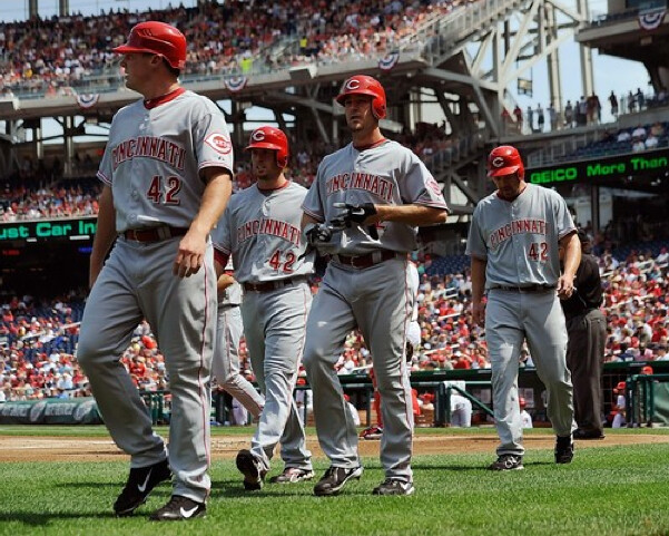
Yesterday was the day we honored the centennial of the Titanic’s sinking by wearing Ron Hodges’s uniform number, which turned out to be such a stirring tribute that the IRS decided to give everyone two extra days to file their taxes. See how everything fits together?
Seriously, I love Jackie Day, which I think can legitimately be considered the one unqualified success of Bud Selig’s reign. I love that every single player can’t help but think of Jackie when he sees that No. 42 jersey hanging in his locker; I love that the sea of NNOB 42s on the field essentially renders all the players anonymous, which is as it should be, because the only person who matters on Jackie Day is Jackie; I love that all the teams adjust the roster listings on their web sites to look like this; I love that even the umpires wear 42; I even love hearing the broadcasters occasionally getting the players mixed up.
A few notes from yesterday’s festivities:
• The Dodgers took things a step further by wearing Brooklyn headwear.
• Several players who usually go pajama-pantsed chose to go high-cuffed, including Chris Young of the Diamondbacks (nice blousing), Rafael Furcal of the Cardinals (ditto), Rockies outfielder Dexter Fowler (did he borrow those stirrups from injured teammate and stirrups stalwart Josh Outman?), and O’s outfielder Adam Jones.
• Speaking of Jones, he and Jason Heyward of the Braves wore these cleats. The colors are for UCLA, Jackie’s alma mater, which isn’t a bad gesture. But these are Griffey Jr. Swingman cleats, so they have the Griffey logo near the heel, which ruins the whole point of the Jackie tribute. Yes, I know Griffey was instrumental in the 42er movement a few years ago, but a Jackie tribute shouldn’t be about anyone but Jackie. Seems like just about any promotion involving shoe companies ends up sucking.
• Speaking of which, nothing says Jackie like Curtis Granderson’s Twitter handle. The Grandyman wore those cleats for last night’s game against the Angels. To his credit, he’s donating them for an auction that will benefit Jackie’s foundation. But if he needed to personalize them, why couldn’t he just autograph them after the game instead of turning them into a “Look at me!” promotional stunt with his Twitter handle? I’ve liked just about everything I’ve ever heard or read about Granderson, and I love his game, but those cleats are total bullshit.
Meanwhile a few other notes from the weekend’s MLB action:
• Words cannot express how great it was to see the Mets wearing their road grays without a shred of black over the weekend. It’s been a long, hard road, but now everything is as it should be.
• Yesterday Phil broke down the differences between the Braves’ standard home uni and their new home alt, but he left out one important aspect of the alts: No piping on the belt tunnels! The last time the Braves didn’t have fancy belt tunnels was in 1986, when they didn’t have a belt, period. And the last time they had plain belt tunnels on belted pants was in 1979. “I had a really hard time watching them on Saturday without that detail,” says Tyler Kepner.
• Phil also mentioned the Cards’ gold-trimmed championship uniforms, which were worn on on Friday (the home opener) and again on Saturday (the ring ceremony). Speaking of the rings, as you may have heard by now, this is the first World Series ring design to include a squirrel — a great little detail. There’s a fact sheet on the ring design here and a pretty good video here.
• The White Sox wore their 1972 throwbacks for the first time yesterday. I’m a fan. The original versions worn back in ’72 had massive uni numbers on the back, and it was cool to see that they stayed true to that yesterday (although that might’ve only been for Jackie Day — maybe they’ll add NOBs and reduce the numeral size for subsequent games, although I hope not). The big question going into the game, however, was whether anyone would wear the sox with the sox. And the answer: Yup! That’s Will Ohman — nicely done.
As for today, Fenway Park P.A. announce Carl Beane will say something today that he only says once per year: “Here are the starting lineups for this morning’s game.” That’s because today is the annual Patriots Day game, which starts at 11am. I attended the Pats Day ballgame back in 2001 (my only visit to Fenway) and it was a blast. But the best Pats Day ever should be next year, because Pats Day will coincide with Jackie Day. That’ll be a hoot.
Sample me this: I’ve recently acquired some great new additions for my collection of salesman samples, beginning with these two excellent pocket comb displays, which look like they’re from the early to mid-1960s (for all of these photos, you can click to enlarge):
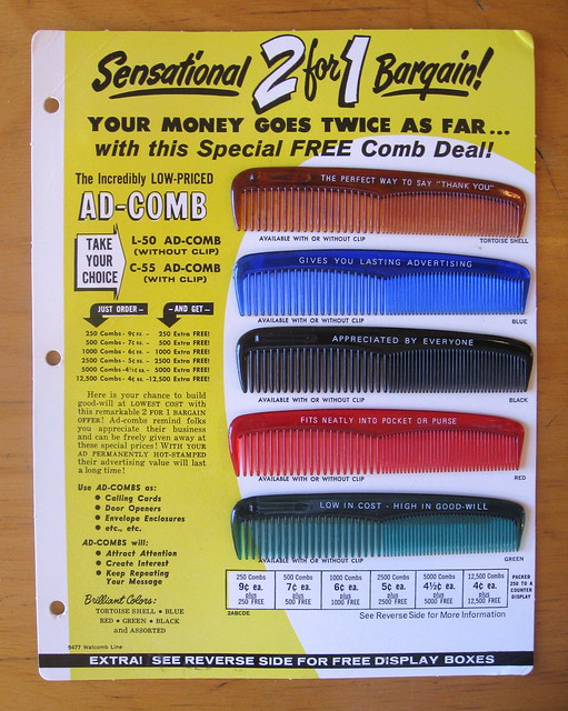

I got both of those for $12, including shipping — a total bargain. Love those jewel-tone colors on the combs! The display with the yellow background is now mounted on the wall in my bathroom; haven’t decided what to do with the other one yet.
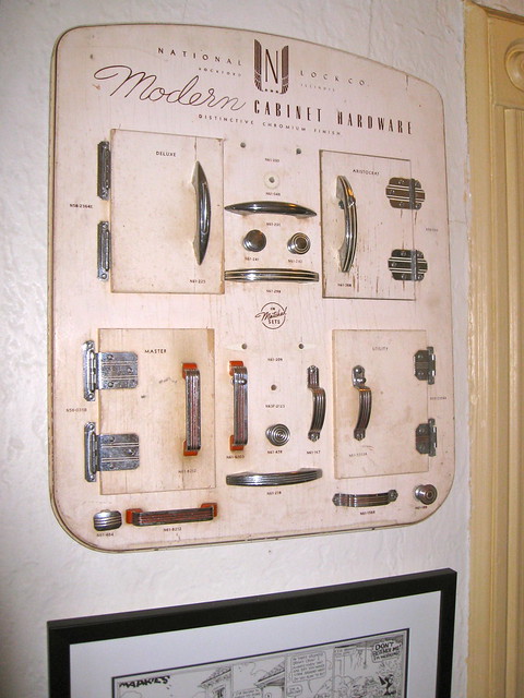
Next up is this sensational kitchen cabinetry display, which I think is either from the late 1950s or early ’60s (I included the tape dispenser for scale, because this baby is big — about 20″ x 24″):
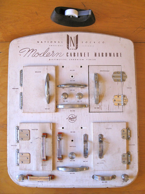
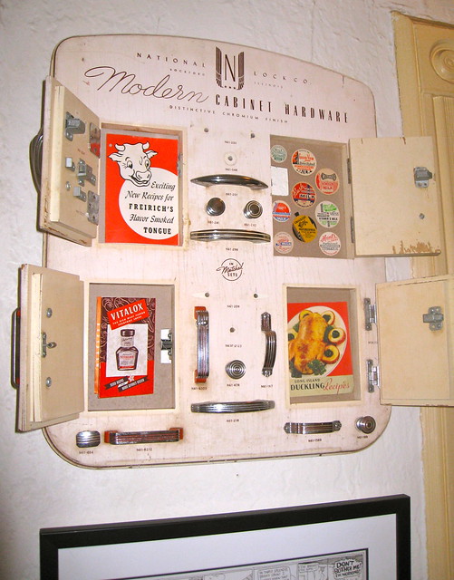
This ran $97, including shipping, which I think is totally fair for such a cool item. The great thing is that the little doors are functional. Kirsten suggested that I put something behind them, so each one would offer up a little surprise when opened. I have lots of vintage food-based pamphlets and related items floating around the house, so here’s what I’ve put behind the doors for now:
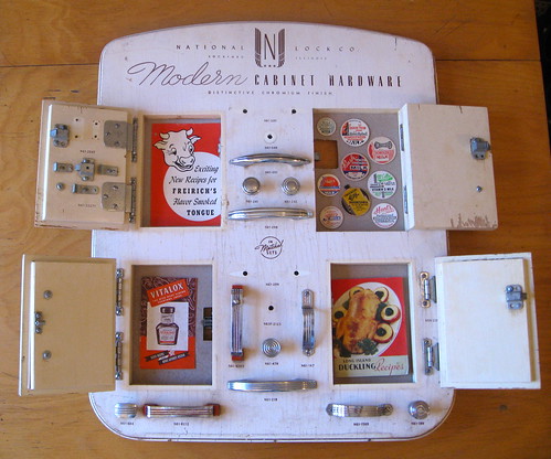
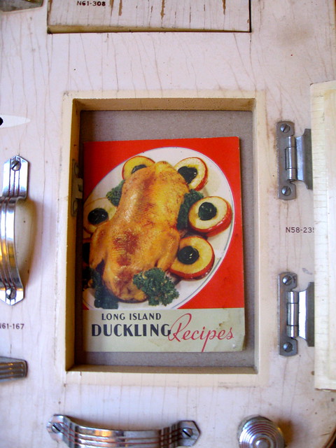
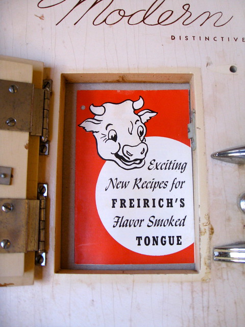
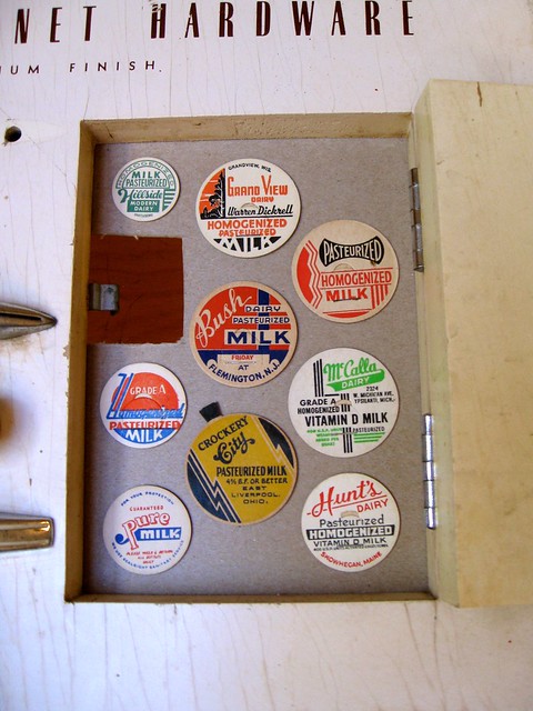
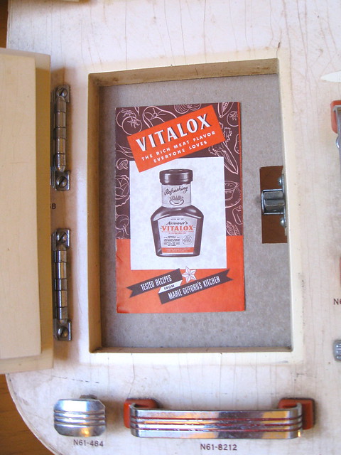
The only one of these that I’m completely happy with is the milk bottle caps, so I may end up swapping out the others for better items later on. But they’re fine for now as placeholders, and the overall effect on the wall is pretty good:
Next: a box of samples from a glass manufacturer. I don’t think this is particularly old — 1980s, maybe — but it’s still really nice:
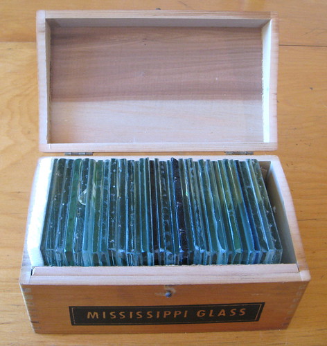
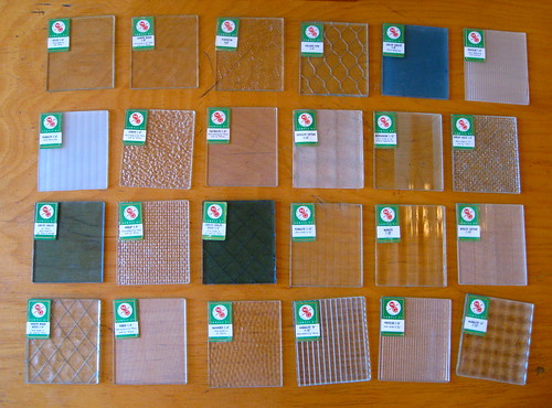
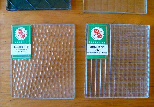
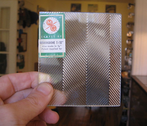
This one ran $59, including shipping — too much, really, for something I can’t display, but it was a birthday present to myself, so I decided it was okay. Anyway, it’s fun for show-and-tell, and I love the names of the various glass patterns (one of them is called “Burlap,” which seems like an odd word to be connected to glass). Ben Traxel, if you’re reading this, you probably have something like this lying around your architecture office, right?
Here’s another box of samples, this time for counter and wall surfaces. Judging by the completely excellent design on the top of the box, it’s from the 1960s:
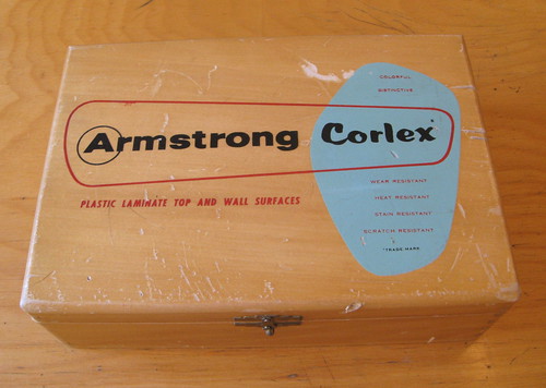

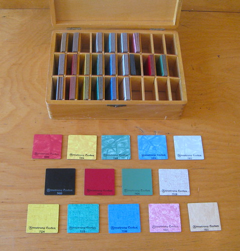

Unfortunately, the individual chips don’t have cool names like the glass samples do — just numbers. Still, the decorator colors are really nice, and the chips rattle inside their little compartments with a very satisfying sound. I like.
I currently have my eye on another cool sample display, although I’m not sure where I’d put it. My rule is to try to put things in content-appropriate places — food-related things in the kitchen, furniture-related things in the living room, health/grooming-related things in the bathroom, etc. But I don’t have a garage, so I’m not sure if there’s a suitable place for that garden hose display. Hmmmmm.
New sponsor shout-out: As you may have noticed in the right sidebar, we have a new advertiser — Game Signs, which sells a peel-and-stick product to make catchers’ signals more visible (instead of the more traditional white nail polish and/or tape around the fingers). Please join me in welcoming them to the site.
By coincidence, Mariners catcher Jesus Montero appeared to have fluorescent yellow fingernails on Saturday night. I don’t think Game Signs offers that color yet, but I bet it’ll be in the pipeline soon. (My thanks to Rick Rutherford for the screen shot.)
Uni Watch News Ticker: As you may recall, last month I appeared on WFMU’s excellent Seven Second Delay radio show, which is broadcast live from a theater in Manhattan. I posted audio of the show when it became available, but now it turns out that video is available as well. Full details here (big thanks to Uni Watch reader and WFMU producer Mike Noble). ”¦ Phil covered the new Missouri uniforms in yesterday’s entry. In case you missed it, this page has background info and a link to a photo gallery. I like the white jersey with a charcoal shoulders; as for all the rest, I plead indifference. ”¦ New football uniforms for TCU, too. ”¦ Kendrys Morales of the Angels went without his batting gloves for one of his plate appearances last Friday (screen shots by Chris Jowdy). … Nothing says hockey like a Mexican poncho. Apparently those unlicensed products are big sellers south of the border these days. … Sort of related: I think we might have seen this before, but it’s really good, so it won’t hurt to show these NHL uniforms reimagined as soccer kits once more (from Jacob Johnston). ”¦ New lacrosse gear for Onondaga Community College (from Jeff Brunelle). … I had previously mentioned that the Opening Day logo in Toronto had less blue than the normal MLB Opening Day logo, presumably to evoke the Canadian flag instead of the American flag. But as Edwin Lee points out, the bunting that was actually hanging in the stadium that day had plenty of blue. Interesting. … We’ve all seen football logos created out of cases of soda, but this is the first time I’ve seen the MLB logo rendered that way (thanks, Brinke). … Hmmm, black helmet in the works for UNC? Looks like it (from Ben Cauthren ). … Striped stirrups are great, but they ought to match, don’tcha think? That’s Oklahoma State, from a recent game (from Ryder Kouba). ”¦ Ohio baseball went BFBS and G.I. Joe simultaneously (from Johnny Bruno). ”¦ Ohio State lacrosse wore 1988 throwbacks the other day (from Bryan Grupp). ”¦ Louisiana Tech football players wore 22 on one side of their helmets for the spring game, in honor of recently deceased running back Tyrone Duplessis. … The Chiefs are giving a personalized jersey to all season ticket holders (thanks, Brinke). ”¦ Remember how I cooked a steak with a blow torch and a slow oven? I was wondering how that technique would work on a pork chop, so I tried it on Saturday night. The result: another success. ”¦ The Giants gave 49ers QB Alex Smith a team-autographed jersey prior to Saturday night’s game at AT&T Park. Only problem is that they gave him a home jersey with an NOB — a weak move for a team that goes NNOB at home (Brinke again). ”¦ Here’s the cap patch that the Red Sox are wearing for their first homestand of the season. Looks awful, as is always the case with side-positioned cap patches, because it ruins the symmetry and balance of the cap. I’d rather not have any cap patches at all, but if we have to have them, I greatly prefer the back-cap position that the Mets are using this year. ”¦ If you like red, white, and blue, you’ll love Kansas’s baseball uniform (from Scott Novosel). ”¦ Kung Fu Panda was missing his helmet logo yesterday (thanks, Kek). ”¦ D’oh! That’s Chris Young of the Diamondbacks, from last Wednesday. ”¦ Okay, this is seriously odd: a vintage flannel jersey with Rawlings tagging and a Wilson chest insignia. Strange bedfellows indeed! ”¦ So the NBA Board of Govs meeting has come and gone, and there’s no news about uniform ads. Just sayin’. ”¦ Reprinted from yesterday’s comments: Interesting story about how an upstate New York high school lacrosse team has a tradition of wearing plain white socks. ”¦ The Nats are selling an eight-pound burger called the Strasburger, and Robert Kahn says he and a buddy were among the first to sample it. “I thought it was a nice touch that they branded the bun with a curly W,” he says. “The burger was pretty good for a burger, let alone for something that I thought would just be a ballpark gimmick. We had an inkling it would be ok when it took well over half an hour to get there — they didn’t just have them warming under a heat lamp.” Another one of his friends interviewed him about the experience. ”¦ Teevee note from Dominic Atencio, who writes: “On the Season 3 finale of HBO’s East Bound and Down, fictional baseball closer Kenny Powers gets called up to the big leagues. While in the locker room, Kenny is shown sitting down with an NOB while two teammates walk out with NNOB.” ”¦ Playbook — the new ESPN.com section that’s replacing Page 2 — goes live at noon Eastern today. I’ve already written two pieces that are in the hopper, one of which (basically my own version of “Collector’s Corner”) will run today. I believe the other one will run tomorrow or Wednesday. Will advise when I know more.
The new Braves home alt is essentially the last Milwaukee/first Atlanta Braves uniform, which didn’t have piping on the belt tunnels.
About the only thing that changed with the move was the letter on the hat.
Thought I’d best find a photo…
link
or two…
link
Milwaukee version…
link
Wait a minute. Don’t get my wrong. Not saying it might not look a little odd to see the Braves without piping on their belt tunnels, but it is accurate to the uni that’s the inspiration for the new alt.
In that sense, would have been even odder if they’d included them.
I think (minus the monochromatic blue road alternate softball top) that the Braves have one of the best-looking uniform sets going, including the white home alternate throwback.
It’s a nice alt, on par with the Phillies’ home alts. Both a nod to the past without being an exact throwback.
At the risk of opening a can of worms, I kind of miss the “screaming” Brave head patch. I didn’t see him as enforcing a negative stereotype; I always thought he was laughing, not screaming, having a good time playing baseball. Hindsight is 20:20 I suppose.
Honestly, at the time I, too, thought he was laughing.
When we scream, our eyes “bug” a little, or narrow, and our eyebrows pinch.
Hiseyes are closed but relaxed, and his eyebrows are raised comfortably, with no tension in them. That’s what happens when we laugh out loud at something…
link
Not saying I think it’s an appropriate logo.
Just that those who choose to say he’s screaming might be bending things to suit their argument.
Let’s play “Eye of the Beholder,” shall we.
If we remove the earring, the feather and the haircut that might predispose us to see something a certain way, is this a man screaming or just, I dunno, Yul Brynner laughing really hard?
link
I miss the Chief Knockahoma patch on the sleeve, too. It’s a classic logo, immediately identifiable and unique to the Braves.
Y’know, now that we bring this up, I’m getting a flashback that when that logo was introduced it was referred to as the “laughing Brave.”
Maybe Chance would know?
Ricko, I lived in Atlanta in the mid-late 1980s and Levi Walker (a/k/a “Chief Noc-a-Homa”) was a friend of a friend I met a couple of times. I recall him saying the “Chief” name was applied to that logo before it was applied to him as a live mascot. I can’t be sure how accurate Levi’s claim was, however.
It’s a perfectly OK uniform, but every single change from the standard Braves home uni is a major step backwards from awesomeness. The tomahawk, the belt-tunnel piping … combined with the solid-blue cap and the blue-on-blue softball top, it’s like the Braves are deliberately trying to lower post-Cox expectations by adopting the drabbest possible uniforms. There’s nothing bad here, uni-wise, but “not bad” is a huge step down from “in the top 5 all-time.”
“…combined with the solid-blue cap and the blue-on-blue softball top”
Exactly. I don’t get the thinking behind those two choices at all. Unless they’re just really, really late to the “Get Somber & Look Tough” party.
The solid navy cap is a throwback to their uniforms of the late-60s/early-70s. They wore it at home and on the road from 1968-1970, and then on the road for the ’71 season.
That’s well known. But it wasn’t worn with the tri-color piping and the tomahawk. Was part of set that had pins at home.
I agree. None of the changes over the last few years have been positive. I hate, hate the blue softball top. It’s just so bland and colorless. The all-blue hat too, for that matter. I’m biased as a Braves fan, sure, but their actual whites and grays are easily a top-3 or 5 uniform set. Too bad they hardly ever wear them anymore.
That being said, since I saw link last year, I have been in love. Especially with the socks. I love that uniform so much, I want to take it out to a nice dinner. I’d make it a point to tune in to all 162 games (I barely catch half that nowadays) if they wore that uni every night.
I’m about to say words that aren’t allowed to be said on this site: The average fan won’t even know the difference between the Braves’ usual look and the new alt.
Braves need a black tomahawk on the regular duds. I actually like the all-navy cap, even on the regular greys.
See my post above. The black tomahawk is the way to go.
The new alternate is too ordinary-looking. The tomahawk and belt-tunnel trim set the Braves apart from garden-variety red & navy teams.
New rugby gear for Onondaga Community College
Should read “lacrosse gear.”
Thanks. Brain cramp on my part. Now fixed.
Mentioned this yesterday. Wondered if the logo on the White Sox stirrups was an oval, or just looked that way because Ohman’s stirrups were slouched.
Because the originals were a full, round circle…
link
And the logo was considerably larger.
Most saw Will Ohman in those stirrups. I kept seeing Wilbur Wood!
link
I had a question on the White Sox throwbacks. The original hat had a white button on top. Yesterday’s hats, as you may have noticed, did not. But The batting helmets all had a white dot on top of them. My question is: any idea why they didn’t go with the white button on the caps?
I’m more disappointed that the jerseys aren’t zipper front, because otherwise, they’re pretty spot-on.
I wonder how much the zipper costs. That seems to be a contentious issue with throwback uniforms.
it’s probably not a question of costs
it’s probably because majestic can’t make one
“The Chiefs are giving a personalized jersey to all season ticket holders”
Great. The stands will be filled with “69 The Hammer” jerseys.
(oh wait, that might just be “softball guy” that does that)
I don’t really see a problem with the San Fran Giants giving Alex Smith a NOB jersey, since they were honoring him, and he’s not an actual player for the Giants.
Also, does it have numbers sewn on? Because it would have been really weak if they just gave him a replica jersey with his name on it and signed it…
And if the Yankees did the same thing for Eli Manning..?
I’d be fine with NNOB, mostly because I see the Yankees as NNOB as opposed to me learning today that the Giants go NNOB at home.
I mean, I don’t watch baseball at all, so to me the only “true” NNOB team is the Yankees.
Giants have been NNOB at home since 2000.
I agree. SF GIants are new to the NNOB. Only 12 years. Yanks have been that way forever. Either way not a huge deal.
That said, I LOVE the fact that the Nationals put their W logo on top of the giant hamburger. Well done! (no pun intended)
Don’t see a problem with the NOB for Alex Smith either
(Only problem I see is calling it “San Fran” ;-) )
My main points here:
1. A blank #11 jersey would be problematic in the ‘authentic’ sense because the Giants have retired #11, so the NOB makes it more allowable.
2. My biggest issue with putting a nameplate on a usually-NNOB jersey is when fans gets a PLAYER’S name on it i.e. BONDS 25, MAYS 24, POSEY 28, etc. If it’s a customized jersey with a name and number of a person that’s never been on the roster, I’m okay with it.
Very disappointed that the finale of Eastbound and Down contained lazy, inauthentic Rangers and Indians unis, and a poor substitution for The ballpark at Arlington.
I don’t think they have any sort of deal with MLB on that show. Over the whole history of the show they did not use actual major league team names or jerseys.
Another note from Jackie day: some of the TV broadcasts (specifically, the Cubs) used player-specific graphics that showed the players’ usual numbers (when they’d show their season and in-game performance), while the Rays and Dodgers (two other games I watched yesterday) made everybody’s graphic show them as #42.
Typical lack of attention to detail from the Cubs.
At Busch Stadium yesterday the players graphics all showed their regular numbers and they were announced by their regular numbers.
I wonder if that was a decision made at top levels – I flicked through the free MLB Extra Innings preview which ended Sunday. It seemed like the Fox regionals went with numbering everybody as 42 but others, including MASN, didn’t.
WGN had every player as 42 for the Tigers-White Sox game; I believe the scoreboards at the Cell always had 42 at bat.
Hey y’all, remember when TCU wore purple? You know, their only school color (well, I think it’s purple and white)? Yeah, those were the good ol’ days.
How do Missouri fans feel this morning knowing that they share a number font with West Virginia and this new shade of gra… ahem, excuse me, anthracite, with TCU?
In a vacuum, TCU’s new duds look much better than Mizzou’s. And I know they show a purple jersey there, but I’d be willing to bet they wear the black more often. At least they didn’t adopt that hideous new frog logo and splash it on the helmet.
School colors? What are they?
Answer: A quaint notion.
TCU would look so much better using purple and white. Not this newfangled anthracite.
This is anthracite.
link
Also, it might have been specifically tailored to me, the way so much advertising is now, but I cringed when I saw an NFL Shop ad on the left hand side of Uni-Watch saying “Wear the Future of the Game – NIKE JERSEYS.”
must be tailored to you because all i get is midget porn
I think it would be good if MLB put the players’ regular numbers on their shoulder (like a TV number) on Jackie Day. It’s too dang confusing to watch. I’m fine with the 42 and NNOB. But can they at least put the number on the shoulder so I can tell more easily who is pitching and who is batting?
It’s too dang confusing to watch.
That’s part of the fun. At least for me.
That, and I even love hearing the broadcasters occasionally getting the players mixed up. are perfect illustrations of why this is a Very Bad Idea. Uni numbers serve a purpose. They’re functional, not decorative. Eliminating them – which is what making everyone wear the same number does in effect – makes the game harder to watch. You know what else would make the game harder to watch? Not televising it, just like when Jackie Robinson broke the color barrier. So, since un-retiring a retired number and eliminating uni numbers are such great fun, next year let’s really get into the spirit of it and blackout all the TV broadcasts. Baseball fans can sit in front of their dark screens and celebrate how awesome it is to take things that have a purpose and wreck them for a day!
Seriously, though, celebrating the “fun” of taking critical functional uni elements and wrecking them puts a person right there in that room with the teenagers cheering at Nike’s latest anti-design uniforms. The problem with Nike et al isn’t that they’re making ugly uniforms – that’s a matter of taste – but that they increasingly make uniforms that degrade functionality, and in some cases that actually violate the rules of the sports in question. No difference from this case, even if the motivations behind the one instance are pure.
Yes, uni numbers are functional. And yesterday their function was to make us think about Jackie. And that’s a perfectly legitimate function for them to have on one day of each year.
“That, and I even love hearing the broadcasters occasionally getting the players mixed up. are perfect illustrations of why this is a Very Bad Idea.”
Broadcasters need to be better.
It’s baseball. Baseball players are not like football players, largely hidden behind helmets and tons of pads, or hockey players who are largely (but not completely) similar in build and appearance.
Now, I’m one who thinks the whole “everybody wears 42” thing is a bit of overkill, but that’s okay, whatever. If it’s for the greater good and it’s one day of whatever you think is devastating but most think is a trivial inconvenience, I think the republic will survive.
Not to mention that absolutely zero people are advocating blacking out all the TV broadcasts. There’s such a thing as taking a premise to its logical next step, but it’s something else entirely to take a premise to a ridiculous next step that no one is advocating.
excellent points kenn & paul
Back in the day, when the only identification of a player was on the PA system, it might have been confusing. Now, when the scoreboards keep showing the player’s picture through his at-bat and tell you every statistic about a player – SP, GIDP, IW, GISP*, favorite PED – you don’t really need the numbers to identify them.
*GISP – Groupies In Scoring Position
If you can’t tell that the guy with the bat is the, y’know, batter… you might need more than just a number on a shoulder.
maybe they should slow the game down more…
I’d like to see a manager try an illegal substitution, try to put a player back in or something, keep the umps on their toes.
Jason and Arr Scott are right. It’s a well-intentioned but very bad idea. And it’s not just for one day, because some road teams do it when they head back home.
There are such things as extended rundowns in the sport of baseball. You want to be the official scorer who has to keep track of one of those? And there’s that whole substitution thing.
Honestly, instead of thinking of Jackie, when I see everyone in the same number I think of Bugs Bunny.
link
(sorry, couldn’t find a good version in English, but you get the idea)
As much as I love NNOB, I’d rather everyone wear ROBINSON on the back of their jerseys (even the NNOB teams) than have everyone in the same number. Or just wear a big patch.
vilk, just stop
you got your NNOB and giant numbers on the sox 72s
don’t make me start shitting on college hoops or indoor soccer
I don’t find it confusing at all, especially if I’m not at the ballpark.
And Jim, do you really think the official scorer needs numbers in today’s full video cycle, full instant replay parks?
Yes.
“Yes. Because I’m borderline
retardedmentally challenged.”~~~
(fixed)
Nice.
Many of the Philadelphia Flyers were wearing “bok-aid” on their orange set 3 jerseys during game 3 against the Penguins yesterday. The vector logo was covered with a wordmark patch. This is interesting, since the Flyers have gone through several additional sets this year (shirt off back night, carnival set, Red Wings McCrimmon family fundraiser set)all of which were wordmark stock (no bok-aid).
Maybe they were anticipating them getting shredded in that Slap Shot-fest yesterday afternoon, and opted to clear out their older stock for that purpose?
I love that the ChiSox throwbacks have white outlines around the numbers. It breaks the continuity of the pinstripes and frames the numbers. A small detail that you probably can’t see from the stands, but I like it.
-Jet
With the White Sox throwing it back to ’72, Adam Dunn could have gotten more into the spirit by wearing a ear-flapless batting helmet in the field!
A couple Red Sox notes:
Jason Repko’s first number with the Sox was 42, as he was called up for yesterday’s game for his first Major League appearance for Boston.
Red Sox site still shows Justin Thomas with number 78 (why he’s still on this team is beyond me), but he wore 50 when he was introduced on Opening Day on Friday with the team.
Missing the whispers? Try X-Wax! :)
I love that X-Wax display. Very Blue Velvet.
A Blue Velvet reference? Have a friend who’s very placid and mild-mannered. Hence, he was nicknamed “Frank” for Frank Booth. Everytime we found a “Frank” reference in print, we’d cut it out and tape it to his door. His door got SO, er, off-color, we literally had to take it off its hinges and hide it when a corporate visitor arrived.
Love the Comb displays and Kristen’s idea for the cabinet display. That is good stuff Paul. Thanks for sharing!
I’m surprise Paul is against sidepatches for MLB caps. I love the asymmetry. Would you have World Series patches moved to the rear as well?
I know I wasn’t a fan of the Yanks’ rear patch for the opening of New Yankee Stadium. Kind’ve bastardized the Dior logo.
Would you have World Series patches moved to the rear as well?
I’d prefer no World Series cap patches at all. But if they have to be there, then yeah, I’d rather have them in the back.
I think you were a bit harsh on Curtis Granderson..just because the shoes are branded with his name on it does not mean his heart was not in the right place. Curtis goes above and beyond when it comes to helping his community. I actually met the man..he’s the complete package. I’m not a big fan of branding myself..but when it comes to shoes that’s the norm.
It’s pretty simple: You say to your shoe rep, “No, I don’t want my Twitter handle on the shoes.” There, see how easy?
I already stated that I’m a Grandy fan. But those cleats were bullshit.
I am fairly certain that the cameras showed him with some sort of personalized 42 on the back of his spikes honoring Jackie. I believe this shot was during his 3rd or 4th at-bat (I think the one where he walked?)
Okay..a twitter handle is a bit much..but in the long run it’s the funds raised for a good cause that matters.
I think you were a little too harsh, too. You could have said something along the lines of ‘while the gesture was sincere, such a me-first element makes it look insincere or disingenuous, which is unfortunate,’ especially since that’s essentially what you said about the Griffey cleats.
I agree, a little harsh – but at least he didn’t call him a “douchebag.”
Um, that *is* basically what I said.
Yeah, that was harsh, all right.. a bit uncalled-for.
not harsh or uncalled for
and junior hisself was totally a “LOOK AT ME” player for demanding to wear “42” to begin with
i love that everyone wears it, but if the number is retired, then in all honesty, no one should get to wear it…still, i think JRR day is one thing in bud selig’s tenure that MLB actually got right
IMHO, the JRR everybody wear #42 tribute is silly and stupid. It would be better just to have one player per team wear the number. Having everyone wear it defeats the whole purpose of wearing numbers. Its like everyone is in the baseball witness protection program. I’m all for honoring the great Jackie Robinson but there’s got to be a better way to do it.
I don’t think the Griffey logo is there for any reason othet than that’s the model of shoe it is. It’s a Nike “Swingman” line cleat, so it has the logo of the line. The tribute was simply the colorway.
What about Larry Doby…no respect?
In regards to Kenny Powers: he is wearing Adidas cleats in the shot from today’s “Ticker”. I’ve seen him in plenty of advertisements shilling for K-Swiss. Quite a few of the ads were in “ESPN The Magazine” if I recall correctly.
well, I don’t think K Swiss is into cleats, are they? So his deal, if he has one, must not cover on-field.
I can’t remember if it was the Giants or Rockies (I watched parts of games from both ballparks), but I saw an out-of-town scoreboard yesterday that showed all the pitchers in both leagues as 42, which was, strictly speaking, accurate, if not particularly informative. Lent a nice “Malkovich Malkovich Malkovich” touch to things.
Well, of course, because when looking at on out-of-town scoreboard the most important thing is to honor Jackie Robinson, not convey to the fans who is pitching in the other games.
How about next year we go a step further, and the final score of every game is 42-42, regardless of how many runs are scored. And the attendance at every game is 42,042.
Sounds like someone had trouble keeping track of his fantasy league players yesterday.
Sun actually did come up this morning, despite all this.
I know. I checked.
Sweet. I knew I picked up the Sun in my fantasy celestial bodies league for a reason.
I think scoreboards are actually capable of displaying a name these days. Hell, a picture, too.
Also, I don’t think everyone’s intimately familiar with the numbers for other teams. If you tell me a certain number for the Jays is pitching, I’d still have to look at up, unless he’s a star.
“because when looking at on out-of-town scoreboard the most important thing is to honor Jackie Robinson, not convey to the fans who is pitching in the other games.”
~~~
yesterday it was
deal with it
Braves are going to retire #29 for Smoltz
And the red Sox won’t ;)
That’s a trade the Tigers would probably like to have back. Hindsight is a harsh mistress…
i love the braves new unis. i thought they were throwbacks, so i’m glad they’re permanent. they got a good southern feel to em
Nice OSU lax throwbacks. I was shocked that Michigan plays lacrosse games at the Big House? I’m used to college Lax games being played at the city park
One of my coworkers played lax at Michigan and was out there last weekend with a lot of former teammates. The Big House/Ohio State game was in “celebration” Michigan lax moving from the “club” level to Division 1. They don’t normally play in the stadium.
link
Just got the full story from my coworker – the lax game was after Michigan football’s “spring game” to drum up interest in the new lax team. It worked, there were a lot of people who stuck around to watch.
Apparently Ohio may start doing this as well. He thinks Michigan is going to schedule one lax game a year in the Big House.
Actually, The Ohio State University played a lax game in the ‘Shoe before their Scarlet-Grey Game a few years ago.
I wondered about the Buckeye tbs.
They should wear the cool throwbacks from the mid to late 50’s. The ones the football team wore with the shoulder yoke and sleeve stripes
link
link
Due to the beveling discussion last week I noticed that the JR’s 42 was beveled on the screens at the Twins game. Why would they bevel his number?
link
PS – we made a lot of 42 jokes during the game. “Who’s 42 for the Twins?” Yeah, we’re hilarious.
I imagine in Cleveland the joke was, “What a nice way to honor Paul Warfield.”
MLB’s official Jackie Day logo has always been beveled:
link
Why? Because they can.
Because MLB designed the Jackie Robinson Day logo that way.
Crap. Got beaten to it. Oh well.
That’s not to say it looks *bad*. It stands out, I like it.
Paul’s humility obviously prevented him from mentioning that he is centrally featured in the illustrated history of Page 2 featured on:
link
Love the stripped stirrups, tequila sunrise, and framed beef portrait in Paul’s ‘office’
Thanks for that. Butcher’s diagram is a great touch.
Look closely and you’ll see a Brannock Device in there too.
I thought that that was a Milwaukee racing sausage with huge ears!
and HOW many times did I fiddle with one of those as I was dragged into a shoe store by my mom?
Many.
why is there a mouse in there? did you give tucker and caitlin the day off?
Paul on the same page as Hunter S Thompson. Sweet!
I got a laugh at the lantern hanging from the ceiling.
I wish that Larry Doby would get a little appreciation during JackieFest each year.
HUGE, HUGE, HUGE validity to that point, Robert.
Larry Doby is SO forgotten. Unfairly so.
Wasn’t like he debuted a couple years later after things had settled down at least a little bit.
For the record….
Robinson’s debut: April 15, 1947
Doby’s debut: July 5, 1947
What, we’re supposed to believe everything somehow got all better and Doby’s road was smooth and perfect in a changed world after only 2+ months? That Robinson took all the hits, and Doby had it easy?
Of course, Jackie DID play in New York.
And Doby was working for Bill Veeck, who wasn’t exactly worshiped by his fellow owners…or by many entrenched sportswriters, for that matter.
at least Fawcett noticed, with this comic book title…
link
Not that they neglected Robinson…
link
How about renaming the Tribe the Cleveland Dobys?
You are exactly right, Ricko. And with Doby playing in the A.L., he was seeing plenty of new cities which had not yet had their first experience with MLB integration.
Can you recite from memory what Buzz Aldrin said after he set foot on the surface of the Moon? No one can…because Armstrong went first. That by no means diminishes the accomplishment of both men, but rank (aka being first) hath its’ privilages.
It is, however, to Doby’s credit—and showing class equal to Robinson’s—that he has never once said anything (to my knowledge) even close to resembling, “You think it was a damn cakewalk for me?”
Can you recite from memory what Buzz Aldrin said after he set foot on the surface of the Moon?
No, but did Buzz blow his lines too? ;)
As I recall, Aldrin had his own distinction; Armstrong would descend first, but all photos taken on the Moon would be of Aldrin. Of course, Armstrong found a way to link…
Armstrong’s line—the rehearsed one—was just that, rehearsed and watched with anticipation. As such, wasn’t nearly as dramatic (to me, anyway) as the first words spoken by a man from the surface of the moon…
“Houston, Tranquility Base. The Eagle has landed.”
THAT was the moment. The rest were just his thoughts when he stepped outside to look around.
Actually, they recently found a better copy of the moon footage from a NASA relay station in Australia and apparently Armstrong actually DID say “a man” but because the recording was being regenerated it got lost.
link
Ricko,
“Houston, Tranquility Base. The Eagle has landed.”
I was just 9 years old at the time, but remember it like it was yesterday. The second most most thrilling, awe-inspiring moment in my lifetime, still. (The moment of my daughter’s birth being first.) Man, I feel lucky to have been a kid then, experiencing that moment.
I know what Buzz said as he was descending the ladder.
“And I’ll close the door…making sure not to lock it…”
Not old enough to remember it live, but I do have the event on an LP record.
yes, because collins wouldn’t have let them in…
Collins was in the command module, goofus. In orbit.
yeah, but he had that remote control key fob thingy
I’m right there with Robert, Doby does not get nearly the recognition that he should. Back in 2007, the Indians all wore #14 to honor Doby’s debut, only problem was that it was in August because they were on the road on July 5th. I really believe that the Tribe should be at home and wearing 14 on the 5th. It doesn’t need to be a league-wide tribute, but the ballclub should make sure they recognize their own history.
Just some Doby fun facts: He was the first African-American to play (and homer) in the World Series. In 1974, the Indians brought him back as a coach and had designs on making him the first minority manager. Too bad for Larry that Frank Robinson was brought in as player-manager and earned the honor of being first. Doby moved on to the White Sox where he became the second African-American skipper.
I was looking for a comment in regard to Larry Doby and was soooo glad you posted one, Robert. As Ricko said, Doby is “SO forgotten. Unfairly so.” NL teams should wear #42 on April 15, Jackie Robinson Day and AL teams should wear #14 on July 5, Larry Doby Day.
So let it be written, so let it be done.
Steelers will unveil their throwbacks tomorrow at 4:30
42.
Quite simply, I thought it looked best in Year 1, when there were only a few 42’s out there. Having one or two NNOB 42’s really highlighted the special occasion, whereas the current 42-overload is just plain confusing and makes the spectacle look a little overdone.
In my tenure as commissioner, I would place 42’s in the groundskeeper artwork (paint it in the foul territories, paint it in center field, embed it in the mound, or all of the above–I wouldn’t care), and I would have every second baseman wear the NNOB 42 jersey. (Yes yes, J-Rob was a first baseman in his first game, but what comes first isn’t always what’s most famous. Cripes, Reggie Jackson was #31 at first, not #9 or #44.) Give everybody a commemorative jersey patch, but just one 42 on the field, pretty please.
But alas, that will never happen. Tributes tend to be like the Rubik’s Revenge game–you can’t dial it back. Besides, MLB wouldn’t be caught dead voluntarily reducing the supply of fund-raising auction pieces. And I think we can all reasonably assume that a “Derek Jeter jersey, not #2, only one of these available per year” would fetch more money than a “Derek Jeter jersey, yes it’s #2 like every other one, but this one has a patch.”
Man, I love those huge-numbered White Sox jerseys! (Huge in height, of course, not in magnitude; jersey numbers above 50 are hideous.)
That’s how every team should do it. No NOB, just a nice big number that you can even read from the far-off upper decks of today’s ballparks. Anyone know how tall they were? Nine inches? Ten?
Mark, I was waiting for you to weigh in on that. And come on, no critique of whether everyone else’s numbers were positioned too high or low? That’s your spesh-ee-ality!
Ten. And that’s how big all back numbers should be!
My favorite thing about Jackie Robinson Day is the league-wide NNOB. How do baseball execs not see the April 15 games as proof of how much better all their unis would look with NNOB? And while everyone wearing the same number does cause confusion for broadcasters and fans, I’ve yet to hear of anyone having a problem because of the NNOB thing. Just scrap NNOB already! Plus it’d be better for merch sales – leftovers from a trade would no longer have to go straight to clearance, and every team would have a Yankees-like distinction between the cheap merch with NOB and the “authentic” stuff with NNOB.
I like NNOB home and NOB away.
NNOB and 10″ numbers. Oooooh, yeah!
I dont remember anything being mentioned about Matt Carpenter of the Cardinals batting gloveless (I tried posting something last week but screwed it up). He had a big game yesterday so he deserves some recognition!
link
Question for Paul: With all the stuff you collect, where do you keep it all? Or is it an ongoing rotation, with as much going out as comes in?
Coupla thoughts:
1) My home is very display-ish. Lots of the stuff I collect is on the walls.
2) Many of the things I collect are relatively small, so they don’t take up too much space.
3) One of my personal rules is that I don’t acquire something unless I know where I can put it. So that helps keep things in check.
4) And yes, I sometimes deaccession certain items in order to make room for new ones, and/or just because I feel like my relationship with a given object has run its course. With all this old stuff, it’s not as if it really “belongs” to me — it just happened to cycle into my life, and sometimes it’s nice to let it cycle back out so someone else can enjoy it.
“With all this old stuff, it’s not as if it really “belongs” to me – it just happened to cycle into my life, and sometimes it’s nice to let it cycle back out so someone else can enjoy it.”
I like that philosophy. I’ve felt the same way about some of the stuff I’ve collected over the years too.
I picture your place looking like a TGI Fridays, except with cool stuff on the walls.
I’d say it has more of a gizmo gadgety retro meaty Cracker Barrel feel.
and cats
Gotta say that Cardinals ring is Classy – even making sure they include The Man on the ring…even if it is supposedly the statue. And the Squirrel is just plain, well, NUTS. You would never know that Dewitt’s dad once owned the Browns, would you?
Since buying the New Orleans Hornets, new owner (and current Saints owner) said the first thing he wants to do is rename the team to something more “New Orleans-sy” (insert joke about being drunk here).
Well, there is a movement to rename the team to the “Bounce” (which you know Paul will love because it is not plural) after a style of hip-hop that grow out of New Orleans in the nineties. They’ve even gone so far as to professionally design logos and uniforms. You can see them on their facebook page:
link
Great. I can’t wait for the team to become a perennial contender and the “Bounced into/out of the Playoffs” stories each year.
As a New Orleanian, that sucks. Journalism is down the terlet anyway, but can you imagine how far the Times-Picayune copywriters would fall, in terms of creativity?
“Bounce Bounced at Home.”
“Bulls Get Bounced.”
“Head Coach Bounced.”
Aren’t you tired of it already?
//Fun fact: I took piano lessons from the wife of a T-P sports writer for years.
Vegas Gold & black would fine (tho getting a Caribous of Colorado vibe from that look on the left), as would purple, Athletic Gold & green; but no teal, ugh.
It’s also the name of a newly formed TV network (channel 23.2 antenna Chicago):
link
The New Orleans Breakers sounds good to me, the logo could be easily adapted to a basketball uniform.
New Orleans Breakers hoops unis?
Ding! Ding! That’s one of the best ideas I’ve heard in a looooooooonnnnnng time! Make it so, NBA!
I dig it. Although, I like the teal/gold iteration of the logo more than the black/gold, gives me more of a Mardi Gras feel.
I say stick with the Saints’ theme, and name them the Bishops or Deacons.
I’ve got a great name for this team: the Seattle Supersonics.
Yeah buddy.
+1
New Orleans Cajuns.
Now how hard is that?
Surely you mean Cajers?
Re: the Mexican NHL ponchos. I was in Cozumel for a week last year, and the shops there had a bunch of unlicensed NFL stuff, including ponchos, lucha libre masks, bracelets, necklaces, etc. Most of them were really bad, obvious knockoffs. Didn’t see anything NHL related though (or any other sport for that matter).
Give a man a comb.
THE PERFECT WAY TO SAY “THANK YOU”
Two comments. First; In regards to Panda’s helmet decal missing, I don’t believe it is missing, Panda is a member of the ridiculous amount of pine tar on the helmet club and I think it is just simply covering his decal. Second; as a long time Giants fan I did think that the Smith jersey with NOB was a little bush league. Yea the Yanks have done it forever yadi, yadi, yadi but we have as others pointed out been doing it for 12 years and us fans know that any time we see a home jersey with NOB it is the shitty replicas. Weak sauce if you ask me
Seeing #42 with a blue drop shadow on the backs of those gaudy “red-orange” Marlins unis gave a whole new meaning to the phrase “color barrier”. It’s on days steeped with baseball tradition, like Jackie Day and Opening Day, where the new Fish set really is at it’s absolute worst.
From 1993-2011, while they may not have had the many decades of history some teams have, at least they looked the part on those classic baseball days.
I really liked the Florida Marlins’ original uniform set (sans the black road cap). 2 WS titles from ’93-2011…that’s some pretty decent history right there (just ask a Cubs fan?).
I really liked the Florida Marlins’ original uniform set (sans the black road cap).
Hopefully soon, you will see a tribute to that set…just in time for wiffleball season.
I really think the Missouri “rebrand” deserves further discussion, because it shows, once again, how much power Nike wields. They basically changed their color system … particularly from “old gold” to sort of a matte mustard gold.
Just as Nike did with Purdue 10 years ago … they eliminated the “old gold” for “vegas gold.” Frankly, when “old gold” is in your fight song lyrics … I think it should be the color seen on the field.
PS, that tiger is ridiculous, so 90s.
I don’t see anything bad about picking one freakin shade of “gold” and using it for everything. Missouri’s “gold” has been all over the place. link I mean, just look at that image and the helmet gold and number outlines compared to the rest of the uniform. They might as well be wearing Saints jerseys with Steelers pants.
It’s not about picking one shade and going with it (that’s obvious … but apparently not so obvious to school and its suppliers).
My point was … Nike changed the shade of gold to suit their needs, rather than alter their behavior to fit the school’s true colors. Just like they did to Purdue.
Old gold is the school color. Standardize it, not some new shade of gold.
That’s the travesty.
I think they are pretty awful. I’m surprised Paul didn’t have more to say about them, but he’s probably just chalking it up as more of Nike’s stupid shenanigans. Particularly I hate the black-on-black look. I know they’ve done it in the past, but they really needed a pair of gold pants to go with the black jersey (to inverse the other “home” set).
I do agree, however, that colors need to be standardized throughout all sports. Duh. Whatever shade you pick, just be consistent.
Those Kansas uniforms look good, but they’d look better with sansabelt pants.
Either way, I’d wear that!
I HATE KU. But those are nice. I believe that is the first time I’ve ever complemented that wretched place.
Regarding LA’s uniforms yesterday: Kudos for B’ing the caps and helmets, but I would have loved to see A) the LA taken off the sleeve (and left blank), B) B on the sleeve. B on the caps and LA on the sleeves looked odd.
can’t tell for sure from the picture linked on the site but it looks as though the hats and helmets had two different “B”‘s on them.
Yesterday, Granderson wore special cleats honoring Jackie Robinson:
link
Already in today’s entry.
I thank DirecTV and MLB for making the MLB extra innings package available through yesterday. No, I won’t take food from my kids mouths to pay for the rest of the season, but it was fun to watch while it lasted.
HOWEVER …
That much exposure to that many games for over a week made me realize that between team anniversary patches, stadium patches, winning-the-last-game-of-the-postseason patches, MLB really, REALLY seems to be trying to prepare us for ads on the uniforms. I mean, technically, those ARE ads, aren’t they? Sure, they’re ads for in-house promotions, but they are ads nonetheless.
I’m scared for the future.
Baseball teams are over-patched, as it is. Have you seen this year’s Angels’/Marlins’/Orioles’ uniforms? There is too much information on the sleeves, nowadays.
has anyone yet mentioned that the mizzou football unis have tiger stripes inside the helmet and pant striping…?
And I always thought it was a Hitchhiker’s appreciation day…
That comment took some “Deep Thought”!
“would have been simpler, of course, to know what the actual question was…”
DON’T PANIC!
Playbook is up and running, and I have two pieces up and running already:
link
link
it’d be nice if it wasn’t sharing a tab with ESPNW. i know this will come off as really chauvenist, but i don’t think ESPNW would get as many page hits without it being tied to Page 2/Playbook
You’d think they’d have some mention of it starting on the main page. They did the same thing with Page 2. If they mentioned an interesting article on the front, I’d read it, but I didn’t check it every day. Reminding me that it’s there – especially at the beginning of a new page – helps.
As for today, Fenway Park P.A. announce Carl Beane will say something today that he only says once per year: “Here are the starting lineups for this morning’s game.”
Isn’t there a chance of playing an 11am playoff game in the ALDS? Maybe not on the East Coast… but I distinctly remember the White Sox first game at home in 2005 being at 11am. I had tickets and therefore an excuse to pop a beer at 10am.
I have to ask, Paul: What’s that cutting board shaped like? It looks like a state.
Yes. My favorite state.
New US Soccer home jerseys are out. Really can’t understand why you need a sash AND stripes.
link
Oddly enough, for the first time I can remember, the MNT and WNT are wearing the same design.
Way back when the US was outfitted by Adidas, both teams wore similar designs. I’m thinking of the white strip with the enormous royal/red/royal stripes going diagonally from the shoulder to the chest. Also (and I’m slightly less sure on this), the v-neck style that the men wore at the 1990 World Cup in Italy.
No wonder I don’t remember, I was 3 in 1990.
The game-used jerseys will have a number in the middle of the chest: link
AWESOME.
Seriously, where’s Waldo?
Sorry, not a fan.
link of all their new 2012 kits, including the full US uniform, numbers, shorts, socks.
What country is that 2nd from right with the blue/green zig-zags?
I can’t access the photo from my phone. But from your description of a green “zig zag”, my guess would be Slovenia.
Good call DJ. Is that a national symbol? Mountain range?
Another Nikefied link.
Don’t hate the look, but I liked this link
Slovenia indeed: link
So glad they went with these, the striping works fantastic as a unique, American jersey.
I like the striped shirt. I’d prefer either blue socks to match the shorts or red and white striped ones to match the shirt.
The women’s shirt should look nice with the US Olympic Team logo on it (no US Soccer Federation logo permitted at the Olympics).
Those USA jerseys look awfully familiar. Say 1983… link
The Strasburger looks good, but I’m not ordering that without five friends to help me eat it.
Love the curly W branded on it. That’s so much better than what the Steel Trolley Diner puts on their burgers:
link
Great food and a great place, but that’s one idea I could do without…
I’m not ordering that without five friends to help me eat it.
And help you pay for it — it runs $59!
That’s actually reason #1…
In my youth I would have tried to eat half as those guys did, but not anymore.
I’ll see your Strasburger, and raise you one link. Yeah, I’ve shared this in the past, but… bacon. Also, can anyone link me to that article on unique ballpark foods that Mike Engle (I think) recently did?
Yep, that was my work!
Part 1:
link
and Part 2:
link
Thank you! ^_^
How to fuck with Tim Thomas’s head: Wear Obmama masks!
link
One of the reasons I love this site is that you never know exactly what you will see when you visit – except that it won’t necessarily be about uniforms. I am old enough to remember those combs with the ads on them – I think my dad had a couple when I was a kid, though I never had one myself – and when I saw what Paul did with the cabinet hardware display doors, I laughed out loud.
“Yeah, he’s crazy, but in a GOOD way.”
New Ole Miss Helmets? link
Don’t have any glass samples but have lots of other similar stuff. Suppliers will send us just about anything, whether we ask for it or not. Sometimes the packaging is really cool, other times it is obvious they spent no time on that part. We throw away most of it in time. Sometimes we take out certain samples for specific projects and get left without a full selection. It then gets tossed and they send another.
Rick Porcello was wearing a swoosh-free undershirt yesterday. The lack of swoosh is what initially caught my eye, but then I noticed that it looked much more like a T-shirt than the usual type of undershirts worn by most MLB players these days.
All in all, not a bad look.
link
Matt Cain was wearing a non Swoosh undershirt—he’s a Mizuno guy.
With how opinionated the site/comments have become the past couple months, has a poll section ever been considered? Might be kind of interesting to see how the overall readership feels on certain topics.
sometimes we have them on the weekends, and why, just last week (or was it the week before), paul had us vote on the name for the flywire collar (i believe nikelace won)
or was the poll to choose “swooshbag”? (for the name of the new seahawks design element designed to highlight the swoosh)
christ, i can’t remember shit these days
that’s right, forgot about that
Giants P coach Dave Rigetti still wearing the older model Giants Dugout jacket..different striping on the collar, larger ‘sf’ on the sleeve, and different trim than the current model.
old
link
newest
link
PS: Lincecum cleat watch:
Back to Mizuno after getting hit hard 2x in New Balance..
On those NHL revamps as Soccer Kits… To quote the Vilk, “I’d wear that!” ESPECIALLY the Coyotes’ (I’m a sucker for Argyle), The dark mustard Bruins, and the Red, Grey and Hurricane striped CAROLINA JERSEY (drool). I will admit the NC pops off the BFBS helmet and the silver helmet looks nifty as well.
Not even a hockey fan anymore, but you still can’t beat the link. There’s something about the bright-as-possible red and blue, the theatrical lettering and numbering on a gleaming white jersey over ice, the no-frills stripes . . . just straighten out the bottom of those jerseys and they’d be perfect again.