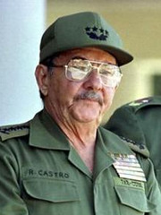
While the rest of us fixate on the baseball diamond and the NFL practice field, James Huening has come up with the best uni-related observation of the year so far: He’s noticed that Cuban prexy-for-now Raul Castro tends to wear a cheapo foam/mesh cap, while brother Fidel has always worn a full cloth version. “I realize Cuba’s no economic powerhouse,” writes Huening, “but the man’s second in command of an entire country — and who knows, he may be in charge permanently very soon. Can’t he get some decent headwear?”
So much for socialism — could the lines of class stratification be more clearly delineated than by the symbolism of cloth cap vs. foam/mesh cap? Don’t be surprised if El Presidente’s favorite chapeau gets “misplaced” during his hospitalization.
Meanwhile: Two Uni Watch readers have recently had some success with professional logo design. The first is longtime contributor Doug Brei (a baseball historian of some note up in Rochester), who saw the recent Ticker item about Alaskan League uniforms and checked in with the following:
My wife and I honeymooned in Alaska two years ago and attended a ballgame between the two Anchorage teams, the Bucs and the Glacier Pilots. We had a great time at the game, but I couldn’t help noticing how outdated the two different league logos looked [here and here]. So when I returned home, I designed my own logo concept and contacted the GMs of the two teams. I’m proud to say they officially adopted my logo design last October.
About my design: The blue and yellow are the official colors of the Alaska state flag, in which Alaskans take an inordinate amount of pride compared to most of us in the lower 48. The stars on the logo are also symbolic of those on the flag. The “A” in the ABL logo is in the shape of a snow-capped mountain representing the rugged terrain of the 49th state, and includes a baseball to represent the sport. And of course I included an outline of the state map within the “B.”
I’ve also designed logos for two of the teams that will likely be introduced in time for next season.
Our other logo entrepreneur is Josh Wagner. As you may recall, he’s the one who hates the Iowa State logo and asked for input about a month ago regarding his logo-redesign project. Here’s his latest report:
Thank you again for contributing to my successful presentation. I ended up meeting with ISU for two hours instead of the appointed one hour — such was the success of my concept. I can’t disclose any details of the meeting, but it’s fair to say I will still be working on this.
The ISU athletic director really enjoyed seeing the feedback from your first blog posting. So here‘s the current logo — and here‘s a rough idea of what I’m proposing. I still have to tweak it somewhat, but this should give you an idea.
Congrats to Doug and Josh for infiltrating the logo mafia. Now would someone please get to work redesigning logos like this and this?
Batboy Perspective: Several items from yesterday’s post prompted a note from a trusted Uni Watch source who happens to be an MLB batboy. Here’s what he had to say about umpires keeping the lineup cards wrapped in plastic: “Some umpires have plastic sleeves they can put the cards in to keep them from getting wet [from sweat]. A sandwich size Ziploc bag works just as well. One time an umpire actually asked me to keep the cards, since he was already sweating through his shirt after a few innings. When the teams changed pitchers or sent up pinch-hitters, I had to give the lineup cards back to the ump for him to write in the changes, and then he gave the cards back to me.”
The batboy also had some interesting thoughts regarding the trade deadline:
Some people (not Uni Watch readers, of course) don’t realize how stressful the trade deadline is for the equipment manager. When a transaction is completed, he’s not among the first people told. When he finally is told, he has to call the other equipment manager (after finding out where he is) to find out all the measurements for the new player, manufacturer of choice, uniform number, etc. Then he has maybe only a few hours to get all the necessary gear ready, which includes getting jerseys stitched up. Let’s just say the tailor that has all of our team’s business was pretty stressed out the other day, when we needed our new players’ jerseys ASAP. Then our starting pitcher changed his mind about the jersey he wanted to wear [this is one of the MLB teams that allows the starting pitcher to determine what the team will wear each day], so the tailor had to switch which jerseys he was working on for the new players’ first game.
As an aside, I’ll be writing soon — either on ESPN.com or here on the blog — on the subject of batboys’ uniforms. I also just interviewed one of the Tigers’ batboys for a piece that will appear soon in ESPN [the] Magazine, although that one isn’t uni-related (it’s for their regular “7 Things You Didn’t Know About…” feature). If you share my growing fascination with batboys, you’ll want to check out this article.
Uni Watch News Ticker: When Mike Pelfrey wore a blue mouthguard during his last start, we wondered if he’d switch to a black version if he pitched while wearing the Mets’ black jersey. Nope. … Disturbing sight last night in Baltimore, where Jamie Moyer traded in his usual stirrups for solid socks. … This unbuttoned jersey thing is getting out of hand. … Good catch by Jeff Cohen, who says Sean Casey could be seen in the dugout of Monday’s Tigers game (which he didn’t actually play in) wearing uni No. 12. As of this writing, Casey is indeed listed as No. 12 on the roster posted at Tigers.com, but he wore No. 21 when making his Tigers debut last night. … Special shout-out to whoever sounded the alarm among Cubs fans, dozens of whom wrote in last night to protest yesterday’s critique of Ron Santo. Among the many choice comments, this one stood out: “Pick on someone with legs, ya douchebag.”
Bobby Abreau had his first game with the Yanks last night, he was wearing #53 that he got from Larry Bowa, Bowa switched to #50. The rumor is he gave Bowa something but the terms of the deal haven’t been released yet. Also he still wore a red glove and had all Phillies travel bags. The red glove looked funny with the Yanks uniforms.
“my growing fascination with batboys”
Um…come again? :)
And I could be wrong, but it looks like there’s a small snippet of white between Moyer’s sock and his shoe, so perhaps he’s sporting stirrups after all?
BT
I have to say I think that Blue Jays logo is pretty solid. I even bought the Jays hat with that logo and am not even a Jays fan.
What’s wrong with the Caps logo? I think it is pretty classy.
The Washington Capitals alternate logo is one of the best in the league. Secound the logo that you are showing isn’t their main logo. Their main logo is the one with the eagle.
I am sorry but that proposed Iowa State logo is not good. It is just the old style “cyclone” that had Iowa State written above it elongated. It isn’t a “new” logo. I realize there is not much you can do with a cyclone, but I can’t imagine it took any hard work to arrive at the proposed logo. It is kind of boring and has little value in this age of marketing. I prefer the old logo with Cy.
“Pick on someone with legs, ya douchebag”
Does his disability have any affect on his performance?
No.
Is his disability a defense for poor performance?
No.
Does someone need to get over their politically correct tendencies?
Yes.
Not a big fan of the new Iowa State Logo, maybe it will look better when finished, but to me it looks like either a bikini bottom or some sort of pepper.
I wanted to point out to someone who posted the other day about the NY Football Giants wearing NY on the nose bumper this year. He stated that the area is left blank, however not all players leave the blank bumper, as can be seen here.
Eli
Plax
Also check out the pics from last season HERE and you will see the majority of the team actually wears the Riddell logo in the nose bumper, and a few players go blank.
Try this link link for the Giants Photos.
That new Iowa logo… looks a bit like a crunchy Bugle snack, doesn’t it?
First off, Moyer is wearing Stirrups, they’re just lower than normal.
Second, that Iowa State logo is awful. No offense to the designer, but I think if you weren’t so happy for him (and rightfully so, that’s really cool), you’d think what I think. It looks like it was drawn by the artist of Roadrunner (from Wile E. Coyote and Roadrunner), using Honey Mustard as ink and as if it were a template for a new line of Bikinis for cartoon characters.
Hey, if any of you guys read link, today is one you might have to check out. They rag on certain ESPN.com uniform articles. I thought I should let you all know.
just because a person has no legs doesn’t mean they can call a good ballgame. it also doesn’t insulate them from criticism.
i think it’s insulting to treat an individual different than others just because they are disabled.
i wish Toronto would go back to the old 80’s uni’s with the cool lettering and the light blue / blue / white motif. Dave Stieb will be imortal because of those amazing uni’s on his baseball card.
bottom line: dude sucks at calling a game.
[quote comment=”3899″]That new Iowa logo… looks a bit like a crunchy Bugle snack, doesn’t it?[/quote]
I knew it looked like something, but I couldn’t place it. The bikini bottom is good, but a Bugle is dead on.
The Capitals are going to a new uni next year with a new logo.
The are also returning to the Dale Hunter and ROd Langway uni colors or red, white, and blue.
Checkout the brutal style Joe Coccimiglio of Canicius
link
One white skate lace and one yellow skate lace. Yellow laces should be outlawed if your not worn with Graf skates
Is there a rule that Bat Boys must show leggings/stirrups? Or is it just their youthful knowledge of what looks good in baseball? Either way, I hope I am not jinxing the situation. God helps us if we have Bat Boys running around in pajama bottoms.
AND yes Moyer has stirrups on!
[quote comment=”3897″]I wanted to point out to someone who posted the other day about the NY Football Giants wearing NY on the nose bumper this year. He stated that the area is left blank, however not all players leave the blank bumper, as can be seen here.
Also check out the pics from last season and you will see the majority of the team actually wears the Riddell logo in the nose bumper, and a few players go blank.[/quote]
Riddell is the official helmet supplier for the NFL so the logos from the other helmet manufacturers (Schutt and Adams) have to be removed. Most teams fill the blank space with some variation of the team’s logo; the Chiefs, Steelers and Giants (since they went retro in 2000) have left them blank. It looks like this year the Giants are going to use the “ny” logo on the nose bumpers of the Schutt and Adams helmets.
Also, the NFL only allows one Riddell logo to appear on the helmet; all teams leave the smaller nose bumper with the Riddell logo and most teams put their own logos on the larger back bumper. Again, in prior seasons the Chiefs, Steelers and Giants have left the Riddell back bumpers blank. I didn’t see any photos of the back of 2006 Giants Riddell helmets so we’ll have to wait and see if they use the “ny” on them or leave them blank.
Article on espn.com today about Reggie Bush’s first day at camp, sounds like he wore some fancy shows.
link
I can’t believe you don’t like the Caps logo! Firstly, the old logo was horrible and it’s a nice representation of the U.S. Capitol and hockey. Hey, at least we’re not the Sabres.
Watching the Sox – Indians game last night, I noticed a small black pouch-like thing attached to Jason Johnson’s belt. After researching it, I found out it’s an insulin pouch! Paul has probably touched on this in the past, but it’s news to me!
link
I see you deleted my earlier comment, calling you out on your pathetic “special shoutout”.
If you think you can shut us up by censoring our posts and deleting our comments, you are wrong.
You *owe* Ron Santo an apology.
[quote comment=”3918″]If you think you can shut us up by censoring our posts and deleting our comments, you are wrong.quote]
It’s Paul’s blog. He can do whatever he wants with the posts. And if you don’t like the content, stop reading it.
[quote comment=”3918″]You *owe* Ron Santo an apology.[/quote]
For what? Giving an accurate critique of his broadcasting skills? It wasn’t the personal attack that some seem to think it was.
Crap. I screwed up the tags on that. It should have looked like this…
[quote comment=”3918″]If you think you can shut us up by censoring our posts and deleting our comments, you are wrong.[/quote]
It’s Paul’s blog. He can do whatever he wants with the posts. And if you don’t like the content, stop reading it.
[quote comment=”3918″]You *owe* Ron Santo an apology.[/quote]
For what? Giving an accurate critique of his broadcasting skills? It wasn’t the personal attack that some seem to think it was.
You want to step outside?
I’ve said it before and I’ll say it again — there is NO WAY Iowa State changes its logo in the near future, especially to one that looks exactly like the one from the mid-80s. I feel sorry for Mr. Wagner if he truly believes that he will get anywhere with his “design.”
link
Hey The Dude, any pics leaked yet of the Cap’s new logo or colors that you refered to in post #18?
Slainte’
Mike
The Yankee radio station announced before last night’s game that Larry Bowa traded #53 to Abreu for a Rolex watch.
i guess some people think that the uniwatchblog business day ends after work and there is no reason to revisit any replies after 5 pm. for those of you, i repost my last reply from yesterday.
a. well, im finally back after 3 weeks in ohio for work (and no internet access, yikes!)
b. i come back and read everything i miss, and find that the attitude on this blog has escalated everyday. c’mon guys, lets clean things up and keep the flaming to a minimum, err, umm to a halt. its bad enough that many americans still cant coexist while in the company of one another, now it flows in to internet conversation? we are all here because we have ONE COMMON INTEREST. i would expect a better environment within this community.
c. if i were a betting man, i would bet the ranch that it is tampa who will be going with the brick red. they have already come out and said they plan on overhauling the whole operation, uni’s, colors, etc. so it would fit that they would honor the cities baseball history of the tarpons and use their colors.
d. in reading the past posts, i’ve noticed many of you pay attention closely to kicks. ive contributed to paul on this blog and the column on my knowledge of kicks for over a year now. my question, who of you are niketalkers?
e. paul made mention a week ago that the site gets 10k hits daily, so i hope you all are helping him and his site by clicking on the side links at least once per visit. it really helps in what he can offer us.
f. sorry if i posted like a parent, but it was just getting to me.
take it for what its worth…
I agree with Todd K, things really need to lighten up a bit at times.
As far as the Cubs announcer, why can’t we critique his work? If I do something poorly I work, I certainly get called out on it. Give it a rest already people, stop being so sensitive.
I’ll have to agree..New Iowa State logo is not good. I will give him props though for trying to make something a bit more clean and simple, but is does look like a crunchy Bugle snack. Also I do like the Caps logo, but yearn for the days of the old link
[quote comment=”3932″][quote comment=”3926″]i guess some people think that the uniwatchblog business day ends after work and there is no reason to revisit any replies after 5 pm. for those of you, i repost my last reply from yesterday.
a. well, im finally back after 3 weeks in ohio for work (and no internet access, yikes!)
b. i come back and read everything i miss, and find that the attitude on this blog has escalated everyday. c’mon guys, lets clean things up and keep the flaming to a minimum, err, umm to a halt. its bad enough that many americans still cant coexist while in the company of one another, now it flows in to internet conversation? we are all here because we have ONE COMMON INTEREST. i would expect a better environment within this community.
c. if i were a betting man, i would bet the ranch that it is tampa who will be going with the brick red. they have already come out and said they plan on overhauling the whole operation, uni’s, colors, etc. so it would fit that they would honor the cities baseball history of the tarpons and use their colors.
d. in reading the past posts, i’ve noticed many of you pay attention closely to kicks. ive contributed to paul on this blog and the column on my knowledge of kicks for over a year now. my question, who of you are niketalkers?
e. paul made mention a week ago that the site gets 10k hits daily, so i hope you all are helping him and his site by clicking on the side links at least once per visit. it really helps in what he can offer us.
f. sorry if i posted like a parent, but it was just getting to me.
take it for what its worth…[/quote]
Gee thanks for filling us in on your travels Todd and reposting your entry from yesterday. I’m sure everyone here has been eagerly awaiting your return so you can keep us in line.
On to more important things. I was at Peto Park last night and counted no less that 46 permanent sponsor signs, boards, etc. on the outfield walls, scoreboards, and overhangs. I’d be interested in what park has the most “advertisement creep”[/quote]
This is something that I have been noticing a lot lately as well. I always think about Major League 2 when Bob Ueker makes a comment about Dorn’s selling of advertising space, and says: “The outfield walls now look like the yellow pages. And, any of you folks having trouble finding a good proctologist might want to come down here and check out the area around the 375 foot sign.†In attending Phillies games and watching others on TV I cannot believe how many advertisements are popping up all over, it seems more like a minor league ball park than a classic major league park.
New logo for the Milwaukee Admirals of the AHL. Black has struck another team.
Check it out here.
link
I suppose it makes sense…there’s a lot of corn in Iowa, so the new logo should look like a corn snack.
Your Iowa State Bugles!
Wow, so many things to comment on. Thing one, those proposed Iowa State logos are UGLY. Yuck. But they are not half as bad as those new Milwaukee Admirals logos. Is that a joke? It looks like a kid drew it. Props for them to making a really cool video going over their uniform history and all but come on, this logo is by far their worst. As for the Blue Jays logo, I think it’s one of the best in the business. Some traditional uniforms and logos are good but for the most part, they are outdated.
I heard it from a player in the Caps farm system.
He said that at the Hershey Bears (Wash Caps AHL affliate) camp Hershey players were filming a new Capital’s commercial wearing the new jerseys with Ovechkin 8 on the uni. Because Ovi was not in the States or something like that.
They are returning to the red, white, and blue colors.
My source also said he saw the pictures of the new unis in person along with watching the filming of the new commercial in the new unis.
He tried describing it to me. He said the white house is going to again part of the logo.
I havent heard anything about the unveiling yet.
[quote comment=”3906″]The Capitals are going to a new uni next year with a new logo.
The are also returning to the Dale Hunter and ROd Langway uni colors or red, white, and blue.[/quote]
I hope it’s the eagle head logo they leaked a few years ago with the navy red and white – looked really classy – see it at link – you can look in different decades, year by year and look for Bonus unis – you can see a GOD AWFUL St. Louis Blues third jersey that never came to fruition. You can also see the redesigned Quebec Nordique jersey that was apropos after they moved to Colorado. Loved that site.
[quote comment=”3924″]Hey The Dude, any pics leaked yet of the Cap’s new logo or colors that you refered to in post #18?
Slainte’
Mike[/quote]
check out post#37, I meant to quote your post in my last post
Great interview on Madison’s FOX Sports Radio, 100.5 FM. We simulacast with the show you did in Milwaukee this morning.
Big Jer
I don’t think Ron Santo is all that bad. When I was in school in Indiana and couldn’t listen to Yankees games, I used to listen to the Cubs broadcast just to get some baseball. Hughes and Santo are all right. At the very least, Santo cares more about his team than any other broadcaster out there. It’s nice to hear a broadcaster cheering or groaning at errors like us fans. I’d trade John Sterling for Ron Santo any day.
I hope it’s the eagle head logo they leaked a few years ago with the navy red and white – looked really classy – see it at link – you can look in different decades, year by year and look for Bonus unis – you can see a GOD AWFUL St. Louis Blues third jersey that never came to fruition. You can also see the redesigned Quebec Nordique jersey that was apropos after they moved to Colorado. Loved that site.[/quote]
Hey, where on that site are you seeing these unis? I would love to see them but I have been all over the website and cannot find them anywhere.
[quote comment=”3935″]New logo for the Milwaukee Admirals of the AHL. Black has struck another team.
Check it out here.
link
Wow, those are so horrible that I kind of like them.
[quote comment=”3934″]
Gee thanks for filling us in on your travels Todd and reposting your entry from yesterday. I’m sure everyone here has been eagerly awaiting your return so you can keep us in line.[/quote]
wow. exactly what i was talking about.
[quote comment=”3939″][quote comment=”3906″]The Capitals are going to a new uni next year with a new logo.
The are also returning to the Dale Hunter and ROd Langway uni colors or red, white, and blue.[/quote]
I hope it’s the eagle head logo they leaked a few years ago with the navy red and white – looked really classy – see it at link – you can look in different decades, year by year and look for Bonus unis – you can see a GOD AWFUL St. Louis Blues third jersey that never came to fruition. You can also see the redesigned Quebec Nordique jersey that was apropos after they moved to Colorado. Loved that site.[/quote]
I know it is not that eagle logo or those color patterns.
The Caps will wear red at home and white on the road
I believe they will wear blue pants and helmets with their red unis
click the top right of the page where it says the years – 2000
then click on the first available year right side of the page
then scroll down to the bottom of the jersey page and click on the giant question (?) mark.
There is your pot of gold
[quote comment=”3949″][quote comment=”3939″][quote comment=”3906″]The Capitals are going to a new uni next year with a new logo.
The are also returning to the Dale Hunter and ROd Langway uni colors or red, white, and blue.[/quote]
I hope it’s the eagle head logo they leaked a few years ago with the navy red and white – looked really classy – see it at link – you can look in different decades, year by year and look for Bonus unis – you can see a GOD AWFUL St. Louis Blues third jersey that never came to fruition. You can also see the redesigned Quebec Nordique jersey that was apropos after they moved to Colorado. Loved that site.[/quote]
I know it is not that eagle logo or those color patterns.
The Caps will wear red at home and white on the road
I believe they will wear blue pants and helmets with their red unis[/quote]
Did you like that design though? I saw it in an equipment catalog and went to order it – but I was told I couldn’t (mistake in printing) – I really loved the Nordique logo with the wolf head too – everyone take a look and share your thoughts.
the caps were originally supposed to change their logo in 2000? and the white house isn’t in any of thier current logo’s either its the US capital building
US capital building. My mistake, that is what is used in the new Caps logo.
Nice correction
First, commenting on Santo, I posted the other day that I am a Cub fan. It is okay, I think, to criticize him for his job. He is a good man and has had many tough incidents in his life with diabetes, etc. But, as a broadcaster, he is bad. I still hold he is not part of the worst group in Chicago, one of the Sox crews has to take that distinction.
Second, did you notice that most everyone who was chiding your comments on Santo had some problems with spelling? What does that say?
[quote comment=”3887″]I have to say I think that Blue Jays logo is pretty solid. I even bought the Jays hat with that logo and am not even a Jays fan.[/quote]
As a Torontonian, I think that the logo is solid, but because it’s the “Blue Jays,” I wish that the caps and alternate unis were blue, not black. I’m really starting to get sick and tired of teams going to black. It’s almost like sacrilege!
[quote comment=”3959″]First, commenting on Santo, I posted the other day that I am a Cub fan. It is okay, I think, to criticize him for his job. He is a good man and has had many tough incidents in his life with diabetes, etc. But, as a broadcaster, he is bad. I still hold he is not part of the worst group in Chicago, one of the Sox crews has to take that distinction.[/quote]
It’s become a sad reality: Some people apparently feel that the First Amendment doesn’t apply if it disagrees with their point of view. It even begins to affect our responses to things. Case in point, your response. “It’s OK, I THINK, to criticize him for his job”. DWhat is there to think about? Don’t worry; it’s OK. What kind of society do we live in where we’re afraid of expressing our opinion because it might offend someone else? If the guy is a bad announcer, then where is the problem in pointing that out? I think what threw everyone was Paul’s crack about Santo being an amputee. It really had nothing to do with the notion that Santo is a bad announcer, yet seemingly every response to his comment decided that Paul was making fun of his announcing skills BECAUSE he was an amputee, which, in re-reading his comments, is clearly not the case.
Also, all those comments came out of the woodwork. Did the local Cubs station tell everyone to log on and defend Santo?
Todd K. is on point with the flaming and attitudes. That should be kept to a minimum, c’mon we all should be grown-up in our disagreements. Everyone is gonna have them; just keep it to a ‘nice’ level, cliche as that may sound.
Also, I think I told you this Todd, but I’m a Niketalker, but as I think I’ve mentioned before, it’s gotten so watered down with stupid posts that I’ve almost stopped posting completely. A lot of price checks and what matches with what clothing and just some ridiculous stuff.
And hey, give Josh Wagner a break with the ISU logo. At least he is tryin’. Granted, I go to school there, but he at least took a proactive stance on something he saw and got in front of decsionmakers. Give him props for that.
Fine if you wanna slam Santo’s broadcasting skills. But the diabetes comment was low and just not funny. And as a Type 1 diabetic myself I take even greater offense to that. And if you knew anything about Ron you’d know that he has never ever asked for our sympathy because of his disease or his snubbing by the HOF. The man is tough, and to play like he did, for as long as he did given his condition in that era is amazing.
I know we’re all supposed to feel sorry for Santo, what with the diabetes and the amputations (insert pants/stirrups joke here), along with the Hall of Fame snub. But seriously, is there a bigger embarrassment on the airwaves than this guy?
As far as I can see, this is not a slam on the guy for having diabetes or being an amputee – just the fact that, in this person’s opinion, Santo is just not very good at what he does. As a Mets fan, we had the same situation with Ralph Kiner, who is famous for his malapropisms to begin with, once he contracted Bell’s Palsy, and his speech became very slurred. I have always loved Ralph Kiner – but I know people who hate him. I hated Tim McCarver because he thought he could manage the game better than the managers did. Ralph just likes to tell stories about the old days, and if he messes up a name now and again, so be it – heck I call my own kids by the wrong name half the time, and I’m only 36! Santo seems like a loveable guy – I’ve just never heard him do a game. My favorite all time Kiner-ism…Ralph hosted “Kiner’s Korner” after every home game, and he introduced himself as “Ralph Korner” one day. “Hi everybody, I’m Ralph Korner…no I’m not.” Classic stuff.
I love Ron Santo, but I don’t think his broadcasting skills are good either. I listen to Ron and Pat because they give a different perspective than the typical radio broadcast, and honestly this season I need Ron and Pat to enjoy the Cubs. And, Ron maybe a bad color guy but I do honestly think Pat Hughes is the best announcer in baseball, not only does he deal with being the play by play guy but he does enough color to cover for Ron in my opinion. And, I do not have a problem with anyone mocking Ron, I mean for god sakes he answered his cell phone on the air this season.
Ok, to comment on the NHL unis, nothing, and I mean NOTHING, was as bad as the Kings. Yes, the Blues and Ducks had some bad ones. But to put Wayne Gretzky, the greatest player the league has even seen, in that gray/white hideousness is near sacrilege.
Where on the NHLuniforms.com site are these uniforms everyone is talking about? I can’t find them anywhere.
I seem to be in the minority, but I like the “new” ISU logo. I also like the Caps unis that were never used and the Nordiques unis were also nice. However, the original QUE unis, along with the old North Stars unis, are some of my all time favorites:
link
link
[quote comment=”3972″]Where on the NHLuniforms.com site are these uniforms everyone is talking about? I can’t find them anywhere.[/quote]
1995-1996 Bonus – St. Louis Blues 3rd jersey
1996-1997 Bonus – Never used Nordique jersey
2000-2001 Bonus – Caps jersey – never used
2002-2003 Bonus – Never used Stars jersey
1980-1981 Bonus – Black North Stars Jersey – nice, but never used.
[quote comment=”3923″]I’ve said it before and I’ll say it again — there is NO WAY Iowa State changes its logo in the near future, especially to one that looks exactly like the one from the mid-80s. I feel sorry for Mr. Wagner if he truly believes that he will get anywhere with his “design.”
link[/quote]
Any particular reason why there’s some guys in red helmets and some in yellow?
Anyways, the current logo blows. A cardinal with teeth sticking out of a cyclone? No thanks. I’d gladly take the Bugle snack logo.
Our other logo entrepreneur is Josh Wagner. As you may recall, he’s the one who hates the Iowa State logo and asked for input about a month ago regarding his logo-redesign project. Here’s his latest report:
Thank you again for contributing to my successful presentation. I ended up meeting with ISU for two hours instead of the appointed one hour — such was the success of my concept. I can’t disclose any details of the meeting, but it’s fair to say I will still be working on this.
The ISU athletic director really enjoyed seeing the feedback from your first blog posting. So here’s the current logo — and here’s a rough idea of what I’m proposing. I still have to tweak it somewhat, but this should give you an idea.
I know I should be above this… but the new identity looks like a Bugle (and I don’t mean Joe) chip…and not a cyclone…sorry but when you walk in the spotlight…well you gotta be able to take the heat.
link
But I do love Bugles…crunchy delicious.
T.
Thank you I’ll check them out!!
[quote comment=”3918″]I see you deleted my earlier comment, calling you out on your pathetic “special shoutout”.
If you think you can shut us up by censoring our posts and deleting our comments, you are wrong.
You *owe* Ron Santo an apology.[/quote]
I think Ron Santo owes all of US an apology. Ron Santo is about as senile and incoherent as they come. I don’t know how any respectable fan or ballclub could put up with that kind of drudgery. You Cubs fans need to be taken down a notch.
Kind of sad how this blog has quickly turned into has turned into the C2 site. Creamer Boards the duece? Not good.
Personal (not professional) attacks.
Medicore logo posts.(sorry Josh Wagner).
Writing underneath the brim of caps. (Stop already)
Paul, let’s get back to uni conversations or blow this thing up!
T.
[quote comment=”3975″][quote comment=”3923″]I’ve said it before and I’ll say it again — there is NO WAY Iowa State changes its logo in the near future, especially to one that looks exactly like the one from the mid-80s. I feel sorry for Mr. Wagner if he truly believes that he will get anywhere with his “design.”
link[/quote]
Any particular reason why there’s some guys in red helmets and some in yellow?
Anyways, the current logo blows. A cardinal with teeth sticking out of a cyclone? No thanks. I’d gladly take the Bugle snack logo.[/quote]
the different helmet colors were used as rewards for good play or academic performance check out the helmet project at nationalchamps.net
Wait, Paul was on Milwaukee/Madison radio today? Why were we not warned so we could make popcorn and sit by the radio with bated breath?
If anyone who’s never heard Ron Santo broadcast a game would like to, you can probably check him out tonight even if you live far from Chicago. WGN is a Class A (clear channel) station that can be heard at night in a good portion of the United States and Canada. The Cubs and Diamondbacks are playing at 7:05 CDT.
After sunset, tune your AM radio to 720 and there’s a good chance that you’ll be able to pick up the signal. If you can put up with some static, listen to the broadcast for a few innings.
JTH,
The other option is to spring for XM and listen to all of the games–not trying to shill the service, but being able to listen to the home town broadcasts (and the rampant homer-ism) is worth the monthly price.
That being said, (and before the fires of the flame war hit me) listening to Santo is painful, simply for the fact that he doesn’t keep up very well with the game action. Its such a fine line between eccentric and bad and I think he has jumped the shark. Respect his career and his fight against diabetes, but its about his skills in the broadcast booth that is the point…
As far as that (a href=”www.milwaukeeadmirals.com”> Milwaukee Admirals logo is concerned I just can’t get over it. Nice flash animation and all with the history, but is the point that the cute little logo from the 60’s has died and come back as a haunted pirate? And I am the only one that thinks that Tim Burton had some hand in that logo design?
Logo creep alert! Check out ESPN’s link
I hope they got payed!
Sorry for the screwup on the code…its been a long day. Maybe I have been secretly replaced by a haunted pirate…
link
You Cubs fans need to be taken down a notch.
I’m not sure us Cub fans have any notches left to be taken down. I mean, we follow the Cubs for god’s sake.
I can’t believe people like the Toronto Blue Jays logo and jerseys. Its a monstrosity. They should just go back to what they wore during their back-to-back World Series titles. Their current color scheme just doesnt look as good as past designs. I think the top teams in Major League Baseball that are in NEED of a logo or uniform change are as follows:
1. Blue Jays (return to old color scheme)
2. Diamondbacks (need total uniform overhaul)
3. Padres (return to gold and Brown)
4. Mets and Reds (removal of the color black)
5. Phillies (return to 80s Maroon color)
[quote comment=”3982″]Wait, Paul was on Milwaukee/Madison radio today? Why were we not warned so we could make popcorn and sit by the radio with bated breath?[/quote]
Obsess much?
j/k Nicole, its great to see a woman so interested in all things Uni-related!
[quote comment=”3934″]In attending Phillies games and watching others on TV I cannot believe how many advertisements are popping up all over, it seems more like a minor league ball park than a classic major league park.[/quote]
Ebbets Field:
link
Shibe:
link
Crosley (a little small, but you can see the ads pretty well):
link
The classic look of a major league baseball park IS a wall full of ads.
Fidel’s brother is just showing the people that he’s more hip than his older sibling. What you call a mesh and foam hat is commonly referred to as a “trucker hat”. And everyone knows all of the young kids today love “trucker hats”.
Viva Raul!
Is having a Bugle on the side of your helmet a form of logo creep?
[quote comment=”3994″][quote comment=”3934″]In attending Phillies games and watching others on TV I cannot believe how many advertisements are popping up all over, it seems more like a minor league ball park than a classic major league park.[/quote]
Ebbets Field:
link
Shibe:
link
Crosley (a little small, but you can see the ads pretty well):
link
The classic look of a major league baseball park IS a wall full of ads.[/quote]
Also, the Green Monster was covered in advertisements back in the day before they eventually painted in green after WWII (a Red Sox fan is going to have to supply the specific year they changed it as I do not know it).
Ballparks have been covered in ads since they first started building stadiums. Some have been classy, others have been gimmicky (personally I’m not a huge fan of the giant coke bottle at PacBell/SBC/At&T Park amongst other things), but they’ve always been and always will be in stadiums.
With that in mind, be thankful that baseball players here don’t wear advertisements on their uniforms like players do in Japan or soccer players do in Europe.
[quote comment=”3987″]I’m not sure us Cub fans have any notches left to be taken down. I mean, we follow the Cubs for god’s sake.[/quote]
Now THAT was funny.
I feel bad for Paul, reading the comments people have left on Goat Riders, I’m sure he e-mail box is full.
In Cleveland, we had a similar situation when beloved former Indian, Herb Score finally had to step down from the radio broadcast booth in 1997.
Score was the American League ROY in 1955 and in 1956 he went 20-9. In May 1957, Score was hit in the face by a batted ball that broke nearly every bone in his face, ending his 1957 season. Fearful of another ball, the event affected his delivery, which led to injury after injury, and eventually his retirement. In 1964, he stepped into the annoucers booth.
By the end, we knew he was losing it and fans were ok with that. Even Herb would joke about it. His name blunders were legendary. Some may have been defensive of Herb, but nothing rivals what some Cubs fans are saying. Yikes.
[quote comment=”3996″]Is having a Bugle on the side of your helmet a form of logo creep?[/quote]
It’s not logo creep, it’s product placement! If this were a Nascar driver instead of the Iowa State football team, we’d think it was normal!
And about Abreu giving Larry Bowa a Rolex for #53? Bowa was his manager a couple years ago…you’d think they could come to a gentlemen’s agreement. And only on the Yankees, with all their retired numbers, is #53 a hot commodity.
[quote comment=”3988″]I think the top teams in Major League Baseball that are in NEED of a logo or uniform change are as follows:
1. Blue Jays (return to old color scheme)
2. Diamondbacks (need total uniform overhaul)
3. Padres (return to gold and Brown)
4. Mets and Reds (removal of the color black)
5. Phillies (return to 80s Maroon color)[/quote]
1. Agreed. The new logo with the old sky blue/blue/white scheme would look pretty sharp.
2. Oh hell yeah.
3. I kinda liked when they went with the blue/orange scheme (in the 90’s was it?) But the new look just doesn’t cut it for me either.
4. Agreed, although I DO like the black drop shadow on the Mets and Reds logos. Maybe keeping that while getting rid of black as a team color would work (although that would mean scrapping the black Mets jerseys that I own).
5. I think maroon on the current unis (dig that maroon pinstriping!) would work great as well.
[quote comment=”3998″][quote comment=”3987″]I’m not sure us Cub fans have any notches left to be taken down. I mean, we follow the Cubs for god’s sake.[/quote]
Now THAT was funny.[/quote]
I was thinking the same thing!
[quote comment=”3996″]Is having a Bugle on the side of your helmet a form of logo creep?[/quote]
Nice. Best post of the day.
[quote comment=”3934″][quote comment=”3932″][quote comment=”3926″]i guess some people think that the uniwatchblog business day ends after work and there is no reason to revisit any replies after 5 pm. for those of you, i repost my last reply from yesterday.
a. well, im finally back after 3 weeks in ohio for work (and no internet access, yikes!)
b. i come back and read everything i miss, and find that the attitude on this blog has escalated everyday. c’mon guys, lets clean things up and keep the flaming to a minimum, err, umm to a halt. its bad enough that many americans still cant coexist while in the company of one another, now it flows in to internet conversation? we are all here because we have ONE COMMON INTEREST. i would expect a better environment within this community.
c. if i were a betting man, i would bet the ranch that it is tampa who will be going with the brick red. they have already come out and said they plan on overhauling the whole operation, uni’s, colors, etc. so it would fit that they would honor the cities baseball history of the tarpons and use their colors.
d. in reading the past posts, i’ve noticed many of you pay attention closely to kicks. ive contributed to paul on this blog and the column on my knowledge of kicks for over a year now. my question, who of you are niketalkers?
e. paul made mention a week ago that the site gets 10k hits daily, so i hope you all are helping him and his site by clicking on the side links at least once per visit. it really helps in what he can offer us.
f. sorry if i posted like a parent, but it was just getting to me.
take it for what its worth…[/quote]
Gee thanks for filling us in on your travels Todd and reposting your entry from yesterday. I’m sure everyone here has been eagerly awaiting your return so you can keep us in line.
On to more important things. I was at Peto Park last night and counted no less that 46 permanent sponsor signs, boards, etc. on the outfield walls, scoreboards, and overhangs. I’d be interested in what park has the most “advertisement creep”[/quote]
This is something that I have been noticing a lot lately as well. I always think about Major League 2 when Bob Ueker makes a comment about Dorn’s selling of advertising space, and says: “The outfield walls now look like the yellow pages. And, any of you folks having trouble finding a good proctologist might want to come down here and check out the area around the 375 foot sign.†In attending Phillies games and watching others on TV I cannot believe how many advertisements are popping up all over, it seems more like a minor league ball park than a classic major league park.[/quote]
Glad to see sensorship is alive and well here in Uniwatch land. Come on Paul, was what I said to Todd all that bad?
If you want to critique Santo’s work as a broadcaster, that’s perfectly fine. Your opinion isn’t shared by the vast majority of people who actually listen to his broadcasts, but whatever.
What was rude and insenstive was making light of his disability. You’re pathetic.
Let him censor if he wants. It’s his blog, not yours.
I’m looking forward to the new Capitals logo/jersey. I don’t really have a problem with the ones they have now, but the older colors were solid.
I really want the Wild to come up with a new logo, I have hated that one since the beginning. I hated the name too, but they can’t really change that at this point.
I keep reading the comment that Paul made about Ron Santo, and I don’t see what the fuss is all about. Far from making light of his disability, Paul is expressing concern for Ron’s plight. He is saying, “if there are some uncouth people who want to make fun of Ron Santo and his disability, insert your own joke here. I am an upstanding citizen who refuses to triviliaze Mr. Santo’s plight and will refrain from making a comment about his disability”. Had Paul said something like “if Ron Santo disagrees with me that he sucks as a broadcaster after that horrid display, he doesn’t have a leg to stand on”, then I can understand the outrage. But clearly that is not the case here.
And before any super-sensitive foofs start flaming me, yes, that was in jest.
Ummm … unless someone wants to mention what style of polo shirt Ron Santo was wearing in the booth the other day, can we stop talking about him now?
[quote comment=”4010″]I really want the Wild to come up with a new logo, I have hated that one since the beginning. I hated the name too, but they can’t really change that at this point.[/quote]
I am waiting for them to add an animal to “Wild.” Let’s hope they become the link.
[quote comment=”4009″]If you want to critique Santo’s work as a broadcaster, that’s perfectly fine. Your opinion isn’t shared by the vast majority of people who actually listen to his broadcasts, but whatever.
What was rude and insenstive was making light of his disability. You’re pathetic.[/quote]
link, of Chicago Cubs 80s fame?? Man, that takes me back to my ’89 Topps cards.
[quote comment=”4007″]
Glad to see sensorship is alive and well here in Uniwatch land. Come on Paul, was what I said to Todd all that bad?[/quote]
i dont think we need censorship. just courtesy. we all are afforded the right to an opinion. and i encourage that. i just think all of us here are intelligent enough to express our opinions in a manner that still portrays a positive atmosphere.
[quote comment=”4012″]Ummm … unless someone wants to mention what style of polo shirt Ron Santo was wearing in the booth the other day, can we stop talking about him now?[/quote]
AMEN!!!!!!!!!
Sorry in advance for the long post.
I sent Paul the link, but there’s a story on the Admirals logo in today’s local paper. (jsonline.com – you do the searching)
But here’s the highlight:
“In conjunction with its new slogan ‘Never say die,’ which has been teasing local billboard readers for the past month, the Admirals introduced the new logo: the admiral of a ghost ship. A pirate explained to the crowd that the admiral had been at the bottom of Lake Michigan for the past 20 years and that this was what was left of him.
The new logo is quite a bit edgier than the last logo of the salty seaman admiral. The new admiral, designed by Joe Locher of Yes Men of Milwaukee, is a skull with a black admiral’s cap with ice blue trim.
The team’s new colors will be black, ice blue and silver, replacing the old red, white and blue. ‘We wanted to do something that would be really popular with the younger crowd,’ Locher said. ‘We wanted to avoid the idea of a trendy logo, yet we wanted to tie it in to the heritage of the team to have it make more sense.'”
Here’s what I say! Not only is ice blue a seriously wimpy color, but there’s something fundamentally wrong with a hockey team having any color that begins with the word “ice.”
It’s a comic skull with a photoshopped on admiral’s hat. The hat looks perfect above that weird skull drawing.
And what I told Paul was “Also, we had to get an explanation for it, which apparently is twofold. It’s not good when you need an explanation to understand a logo. But apparently, most of our team is getting pulled up, so they’re working with a skeleton crew this year (har dee har har). Secondly, they had some pirate at the “premiere” to explain that this guy is an admiral of a ghost ship. “
Looks like the new Vikings jerseys have gone with the logo at the back of the neck, ala the Cardinals:
link
[quote comment=”3997″][quote comment=”3994″][quote comment=”3934″]In attending Phillies games and watching others on TV I cannot believe how many advertisements are popping up all over, it seems more like a minor league ball park than a classic major league park.[/quote]
Ebbets Field:
link
Shibe:
link
Crosley (a little small, but you can see the ads pretty well):
link
The classic look of a major league baseball park IS a wall full of ads.[/quote]
Also, the Green Monster was covered in advertisements back in the day before they eventually painted in green after WWII (a Red Sox fan is going to have to supply the specific year they changed it as I do not know it).
Ballparks have been covered in ads since they first started building stadiums. Some have been classy, others have been gimmicky (personally I’m not a huge fan of the giant coke bottle at PacBell/SBC/At&T Park amongst other things), but they’ve always been and always will be in stadiums.
With that in mind, be thankful that baseball players here don’t wear advertisements on their uniforms like players do in Japan or soccer players do in Europe.[/quote]
Good point about Fenway, I forgot about that one. I can’t find a picture, but according to its wikipedia page it was 1947 when the ads were painted over and it became the Green Monster (before that, of course, it wasn’t green but the color of its ads).
[quote comment=”3947″][quote comment=”3935″]New logo for the Milwaukee Admirals of the AHL. Black has struck another team.
Check it out here.
link
Wow, those are so horrible that I kind of like them.[/quote]
LMFAO!! Wow that change is totally unexpected! So bad it’s good? I think I agree with that. It’s cartoonish and cute.
As a Fairbanks, Alaska resident its great to see our teams get so much recognition. Although the uniforms are outdated (the Fairbanks Goldpanners still use no button jerseys, Stanford style, and reuse the unis every summer) the qualitiy of play is still great, too many ABL to pro players to count.
Concerning the new ISU logo, I have to say that I like it. Of course, I could be biased, seeing as how I designed the thing. But I do have to say the bugles comment is hilarious. I almost fell out of my chair. I can see the resemblence now.
To be fair, that isn’t a final version of my logo and I distorted it big time to make it fit on the curvature of the helmet. I suppose my third submittal to uniwatch should be the logo as it looks face on, which has a different shape.
Also note, the logo as seen on the helmet is different from the logo I proposed… due to the need for visual contrast on a red helmet.
Concering C.J.’s comment (#27) about there being no way ISU changes its logo in the near future– I’ll take that bet. Certainly the chances of it being my logo are slim, but put it this way, the wheels are turning over there.
I appreciate the comments about my logo design. That’s why I submitted it– to get some honest feedback. Now, I’ll have to see if I can design a matching bikini top. :-)
[quote comment=”4026″][quote comment=”3947″][quote comment=”3935″]New logo for the Milwaukee Admirals of the AHL. Black has struck another team.
Check it out here.
link
Wow, those are so horrible that I kind of like them.[/quote]
LMFAO!! Wow that change is totally unexpected! So bad it’s good? I think I agree with that. It’s cartoonish and cute.[/quote]
Is anyone else thinking “Manny Calavera” or is that just me?
you sir are an ass clown. how dare you make fun of ron santo? jack ass.
Paul i wouldnt worry too much about the cubs fans…when your team is as bad as the cubs are you need something to get worked up about…i should know being a pirates fans…Criticize Bob Walk or John Wehner and see the backlash you will recieve
could this be the full sabres logo?
link
[quote comment=”4042″]could this be the full sabres logo?
link
That wouldn’t be too bad – I still like thold Buffalo though – that thing now looks like the UC Santa Barbara Banana Slug
That Sabres logo is freaking terrible!! Who thought that was a good idea. I think we should all fill that little mail thing out and send it in. Best announcers in baseball are probably Kruk and Kuip of the Giants or Don and Remy with the Red Sox. But Cubs fans, don’t be too upset you had the immortal Harry Caray for years, no one could be him in drunken ramblings. I remember when I first got WGN I was hooked, I think some innings he never talked about the action in the game, just an old story or two, classic.
ESPN Classic had old LLWS games on and i was watching the 1993 finals game. Every kid on both teams had stir ups socks socks on, even the future MLB play Sean Bourroughs (not sure on spelling).
[quote comment=”4014″][quote comment=”4010″]I really want the Wild to come up with a new logo, I have hated that one since the beginning. I hated the name too, but they can’t really change that at this point.[/quote]
I am waiting for them to add an animal to “Wild.” Let’s hope they become the link.[/quote]
Be it known, the Wild’s 3rd jersey is the best shirt in hockey.
Caps jerseys are great. I’ll be disappointed to see them go.
The Admirals new logo backlash has already begun:
link
[quote comment=”4052″][quote comment=”4014″][quote comment=”4010″]I really want the Wild to come up with a new logo, I have hated that one since the beginning. I hated the name too, but they can’t really change that at this point.[/quote]
I am waiting for them to add an animal to “Wild.” Let’s hope they become the link.[/quote]
Be it known, the Wild’s 3rd jersey is the best shirt in hockey.[/quote]
I wish they would switch the logo on it. I don’t really like the logo on the 3rd jersey. If they put the regular logo on it, I think I would like it better.
I think clarification is needed about the ISU logo. That is not the new logo, its just something someone has PROPOSED to the school.
Aside from that, I think it sucks almost as bad as the tornado-legs bird.
And lets keep the fascination with batboys to ourselves. J/K
just caught a glimpse of the “official” portion of NFL total access on NFLNetwork… seems the officials are changing their unis this season.. they look strange..different striping on the front and sleeves….
the lettering/numbering on the back is horrible!!!
also… for cold weather games the officials will be wearing slacks!!! no more knickers… ugghhh…
[quote comment=”3917″]Watching the Sox – Indians game last night, I noticed a small black pouch-like thing attached to Jason Johnson’s belt. After researching it, I found out it’s an insulin pouch! Paul has probably touched on this in the past, but it’s news to me!
link[/quote]
What that is, is an insulin pump. It puts insulin in to diabetics without having to have a shot. My sister has one, and their very handy, compared to checking blood sugar every hour or so.
Don’t know if I was seeing things but did anyone notice some writing on the back of Pujols’ jersey during his at-bat tonight during the bottom of the ninth against the Phillies on ESPN? It appeared to say something like “to john” but I couldn’t make it out. Most people will probably say it was dirt or something…but it looked too “configured”…almost like greek or chinese characters. Just wanted to see if I was going crazy or if anyone else noticed. Doubt too many people were watching though as the Phillies were crushing my beloved Cards 16-7…
I noticed that the Buffalo Sabres new logo kinda looks like the Black and Decker link the logo is small but you can the similarities
[quote comment=”4044″]That Sabres logo is freaking terrible!! Who thought that was a good idea. I think we should all fill that little mail thing out and send it in. Best announcers in baseball are probably Kruk and Kuip of the Giants or Don and Remy with the Red Sox….[/quote]
I like you’re thinkin’. Being a bay area resident, and an MVP Baseball 2004 (PS2) addict, I get more than my fair share of “Kruk and Kuip” (Mike Krukow and Duane Kuiper, respectively), and I still can’t get enough of them. They have phenominal chemistry.
My grandpa lives in New Hampshire, and my whole family back there bleeds BoSox red-and-navy. I visited him for a week in April, so I’ve had my fair dosage of Don and Remy on NESN–they’re respectible. They’re definitely one of the better broadcasting combinations I’ve heard (granted…not many), but I’d take them over my Oakland A’s broadcasters, the boring WGN announcers (White Sox and Cubbies), and the horrible TBS announcers.
…C’mon Turner, if you’re gonna subject the entire country to Atlanta Braves games, hire some more exciting broadcasters. I’d rather watch The View
Sean Casey was indeed wearing #12 on his first day with the Tigers. He did not play. Number 12 was vacated when Carlos Pena was cut from the team before the season.
Casey switched with Tigers bullpen coach Lloyd McClendon, who was wearing #21 (Last season, Tiger pitcher Jason Johnson wore it).
No details yet on any sort of transaction between the two. McClendon is now wearing #12.
Personally, I wish the Tigers would have retired #21 in honor of George Kell a long time ago.
The Blue Jays need new unis in the WORST way. The name and number font is TERRIBLE. I hate that they became the Toronto Devil Jays. That made me mad. I want them to go back to the old blue/white colours and a nice, normal font (with either no names on the back or vertically arched names… maybe they can steal the Braves old method?).
Later.