Robert Marshall’s Big Ten bowling pins are among the greatest uni-related projects I’ve ever seen. Robert’s helpfully provided an extremely detailed guide to all the aesthetic choices he made during the course of the project, so I’ll now surrender the floor to him. — Paul
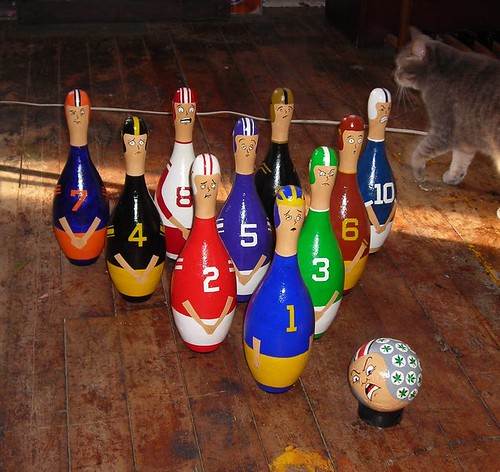
I considered painting the pins into a set of worldwide douchebags to be knocked over, but thought better of it, instead opting for a Big Ten bowling set. Notice the triangulation of yellow and white pants up front — yes, uniform balance mattered in placement. But how did I decide on the various uniforms and faces while still making sure they’d be identifiable? Let’s take a look…
Michigan was easy. Their home uniform is classic and unchanged, no white TV stroke either, just the maize and blue. And as much as it turns my stomach, the Princeton shell design is identified with the scUM now, and quite fetching. One detail worth noting, beyond the half-wit expression on the pin-face, is that the wolverine is the only Big Ten pin not smart enough to cover up his junk to protect himself from the Buckeye crotch shot. Ain’t that a real kick in the nuts?
Wisconsin, still an easy uni choice, as I have no complaints about the current badger uniform with one exception: I am not a big fan of that motion W, mainly because it motions backwards — not a good way to move in a football game. I didn’t have the patience to paint the best mascot ever on the helmet, although I wish I had. I considered this, but it’s not commonly known, so instead I opted for a simple block W, reminiscent of the motion W. As for the pin-face, it is smart enough to be worried.
Michigan State was tough. I’m glad the Spartans are finally going with a bit of a throwback look, but this was tempting, because Bobby McCalister and Lorenzo White were childhood favorites. But I decided I had enough northwestern striping in the mix, so I did the right thing and paid tribute to the great Spartans of the ’60s. The pin-face is angry, tired of being a patsy, and ready to fight back. I guess it doesn’t know it is still just a pin.
What’s wrong Iowa? you gon’a cry? Well, I had to change their uni. Could they try and look any more like the Stillers? They can keep what works — the helmet with the hawk — but if they simply take out the white in the home uniform, they have this magnificent look. Hearken back to days of yore, Hawks, hearken back. Why use white when you don’t need it?
Okay, Northwestern, it’s called northwestern striping, so use it. Jeez, they did back in the day. And just as important, the black, ditch it. You may be purple, but wear it proud. As for the pin-face, it knows it is to be knocked down again, and again — not only by the Buck, but by aaaaall the pins that surround the 5 pin. Good luck with that, Cats.
Minnesota, what were they thinking this year?! If it isn’t broke, don’t fix it. The whole thing makes me want to order gopher extermination. If they want to go back to this, fine. Take off the TV numbers, and put the M on the shell, a fine look. Otherwise, don’t change what worked. Paul, do you know how long I have waited to see this play outdoors again? Don’t be surprised pin-face gopher, you are going down for the uniform change.
Illinois was tough. Where to begin? Ah-ha! Ditch recent helmet designs and use Henry Blake’s letterman sweater for the shell decal. Butkus-era stripes on a white-free jersey, and they have a look. I will bend on my “Why white if not necessary?” rule, and allow some white stripes on the helmet and pants, but keep it confined to there. As for the pin-face, go ahead and peek, it’s not so bad to be sans white.
Oh, Indiana, those sorry sacks don’t even play football, so they can wear white at home like a basketball team. There is zero championship tradition to call on for the cream and crimson, and I guess the candelabra is okay, so I came up with this. To be sure, I also wanted to balance out the pins and didn’t want another red jersey. So don’t be too horrified, Indiana pin-face, I think you look swell.
Purdue was easy. HELLO! Ditch the white on the home uniforms, go with the over-the-shoulder striping, and replace the TV numbers with the boiler P, and they have it. As for the pin-face, that’s right, close your eyes and pray for this uniform.
Penn state. Okay, Kramer, er Joe-Pa, I won’t change your uni. Even though it was tempting, because the Lions’ helmets were not always so bare, nor their socks plain or their pants sans stripe, so they should get off their generic-unI high horse. That said, I like the Nittany uni, but their punishment for me not being able to put a stripe on the pants is the striping of socks. They don’t deserve “extras,” they are generic, and lucky they get cleats. And pin-face, brace for the payback next year.
Finally, the Buckeyes. Even though they’re my team, I still have some tweaks. This would put me on the shiv list of most THE alum, but nertz to them. So: Keep the signature stripes on the shell and pants, but the merit leaves (or leafs for Canadians) need to be green, um, like leaves. My version also features a buckeye leaf that looks like a proper buckeye leaf, not this tired joke ganja plant. I would also love it if the merit stickers were no longer white — make them clear so you could see the gray helmet — but I will live with them as is.