
Jimmer Vilk’s 5 & 1
Welcome to the Five and One for 2022!
After more than a decade in hiatus, Jim Vilk (the original “5 & 1” decider) returned! And he’s back again for 2022.
The concept of the 5&1 is simple: Jim will pick five good matchups (not necessarily the five best anymore… he will have categories that will change from week to week) and one awful matchup.
You may agree and you may disagree — these are, after all, just opinions and everyone has one. Feel free to let him know what you think in the comments section.
If you have a game you feel is “worthy” of consideration for the 5 & 1, please either post it in the comments below or tweet Mr. Vilk @JVfromOhio.
Here’s today’s 5 & 1:
“Darkness falls across the land
The extra hour is here at hand!”
(Insert Vincent Price laugh)
A very good morning to one and all! I hope you took advantage of that extra hour of sleep. Now, join me as I light a candle instead of cursing the darkness, shining a light on five very good matchups. We begin with…
5. The “Golden State Of Mind” Matchup:
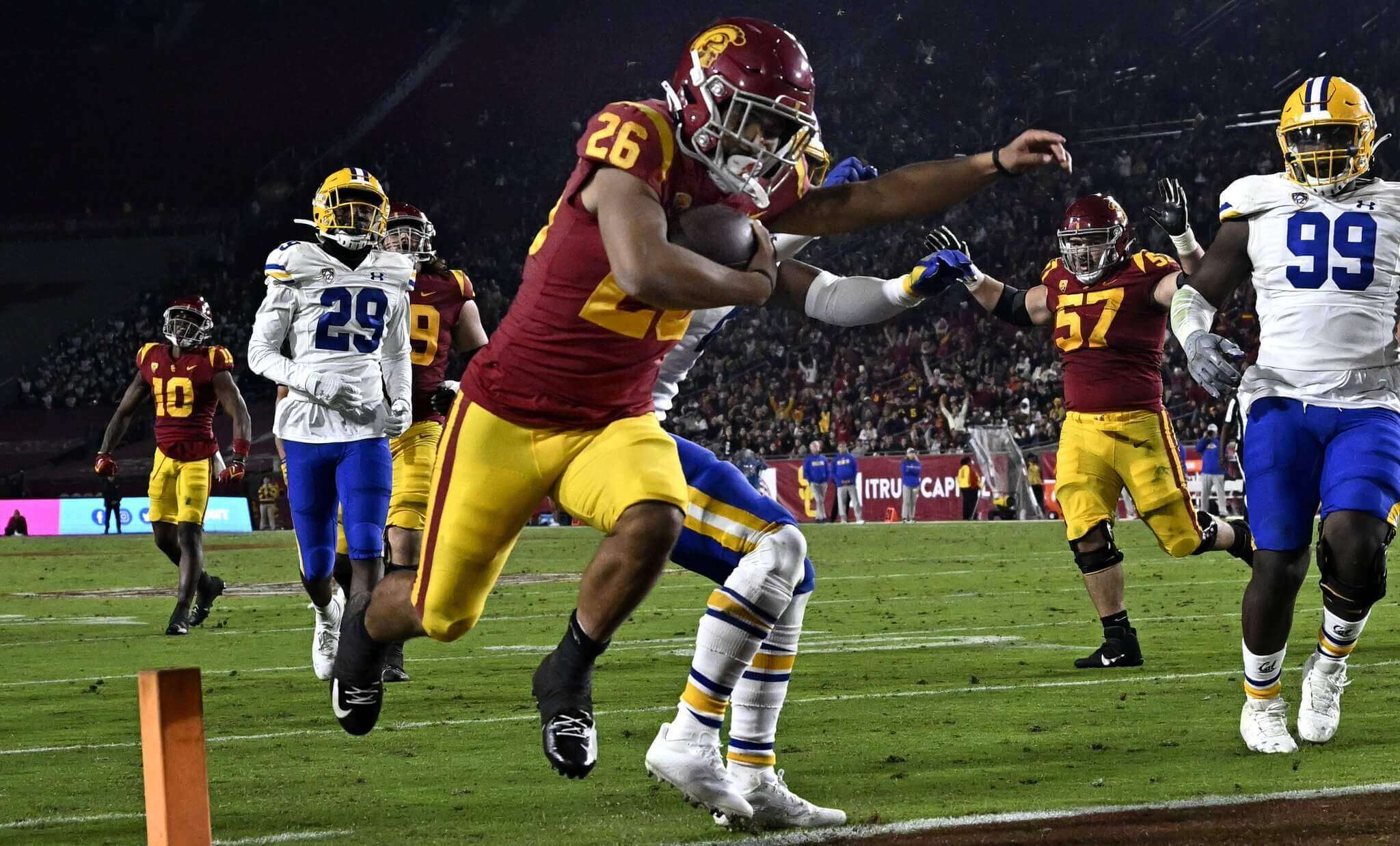
Cal/USC

I was going to rank this brightly colored game a lot higher, until I saw the infamous tiny Under Armour numbers on the Bears.
4. The “Don’t You Dare Make A Potty Reference” Matchup:
Western Michigan/Bowling Brown Green

I’m calling it The Chocolate Bowl!
3. The “While I Love A Standard Block Font…” Game:
Syracuse/Pitt

…Pitt’s Cathedral font is really growing on me as well.
2. The “You Knew This Was Coming, You Just Didn’t Know Where” Matchup:
Alabama/LSU

Not only the second best matchup, but the second best in the SEC!
1. Simply The Best:
Kentucky/Missouri

Cloudy day, diamond pattern end zones, great contrasting unis… this pressed almost all my buttons!
&1.
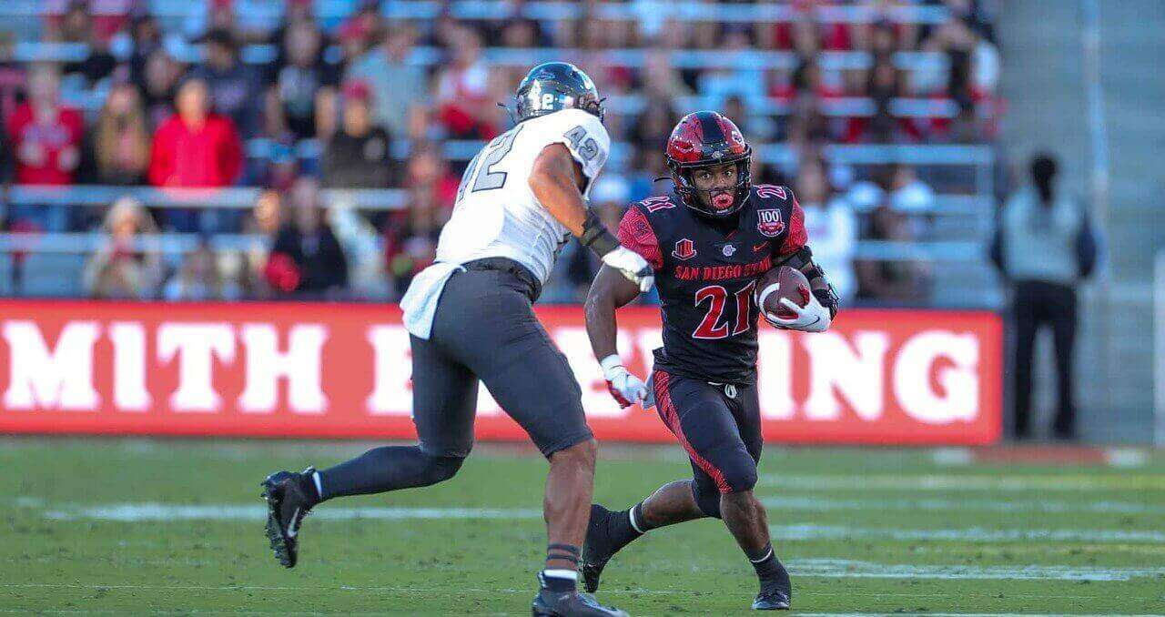
UNLV/San Diego State

While I don’t curse the darkness, I do curse these teams’ practically illegible numbers.
See you next week, and welcome to The Most Wonderful Time Of The Year!
Thanks, Jim! OK readers? What say you? Agree or disagree with Jimmer’s selections? Let him know in the comments below.
I thought UVA UNC was a great looking game! Though I prefer UVA’s white lids, the navy contrasted nicely with Carolina blue.
Here to second the UNC/UVA game. I have no love for the Hoos but navy and orange are always sharp and they have a great look these days. And my Heels… well, can’t say enough about Carolina Blue.
And if someone from the 5 has to go, the MAC Brownout can go. Brown is an underused color but this is all too much.
UNC/UVa *juuuuust* missed The Five. If I still did Honorable Mentions, they’d have been mentioned.
At least Mizzou can be #1 in something
The little credibility you had going into this weekend was lost when you ranked Kentucky-Missouri over Tennessee-Georgia. And I’m a Kentucky graduate.
Do better!
I probably disagree with Jimmer on The List more than anyone, but I’ll defend him here. UK/Mizzou was FAR FAR FAR superior to Ugga/UT. Now, there were some other questionable (IMHO) choices on this list, but UK/Mizzou wasn’t one of them.
I had credibility? When was that?
Tennessee’s numbers are just a little bit too light for me. They need an outline.
That was one of two games I had on my short list, before trimming it to the Five. So it had that going for it…
They also should NOT wear orange pants until they get an orange helmet
Pfft. The orange pants were the best part of yesterday’s uniform.
Mizzou is just 3 tweaks away from having a really great uni there:
-Replace the helmet logo with the M
-Replace that awful number font with block
-Change the pants striping to match same style as the helmet and jersey.
Re: pants
Could not agree more — they have a really solid look going (modified NW striping, aka “Bears” striping) on the hat and shirt, but for some reason they have three different striping patterns for their pants:
Gold: link
White: link
Black: link
The black pants “get it” — the other two? Not so much.
I don’t mind them changing helmet logos (it’s college!) and while I’d prefer varsity block to whatever bespoke font Nike created, but it’s not a deal breaker. But those pants stripes…
I have to disagree with you on the “illegible” numbers for UNLV/SDSU. Aztec red on black might not be perfectly clean, but we’ve seen SOOOO much worse.
Cathedral font, but in white numbers with gold trim instead, just as originally intended. THAT would look good.
One of my lingering pet peeves in the college football world is that specific Western Michigan helmet logo. In the natural world, shadows are dark, highlights are light. It seems lazy an amateurish for them to use a logo where that’s reversed – like they took their normal logo as it would appear on a white background and just inverted the colors. It looks awful and it would not be hard to fix it.
I think I probably just don’t love Kentucky’s football uniforms, but it’s hard to beat Alabama/LSU.