Time for more Uni Tweaks from the UW readership.
I hope you guys like this feature and will want to continue to submit your concepts and tweaks to me. If you do, Shoot me an E-mail (Phil (dot) Hecken (at) gmail (dot) com).
Hey Uni-Watch
Been a huge fan for years now! As we approach the world cup this year I have seen some leaks of this years kits. And the USA leaked are really boring and lave a lot to be desired. I made some concepts and I wanted to share them.
Brian Wick
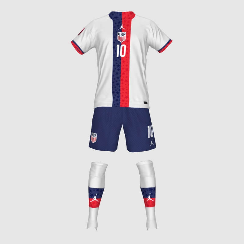
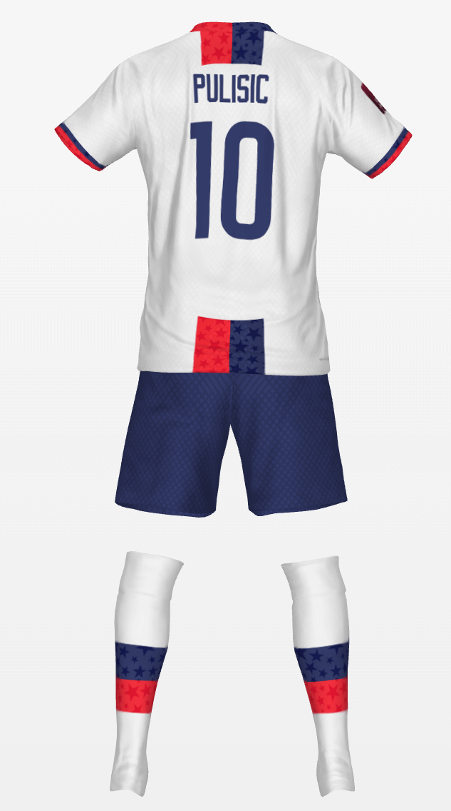
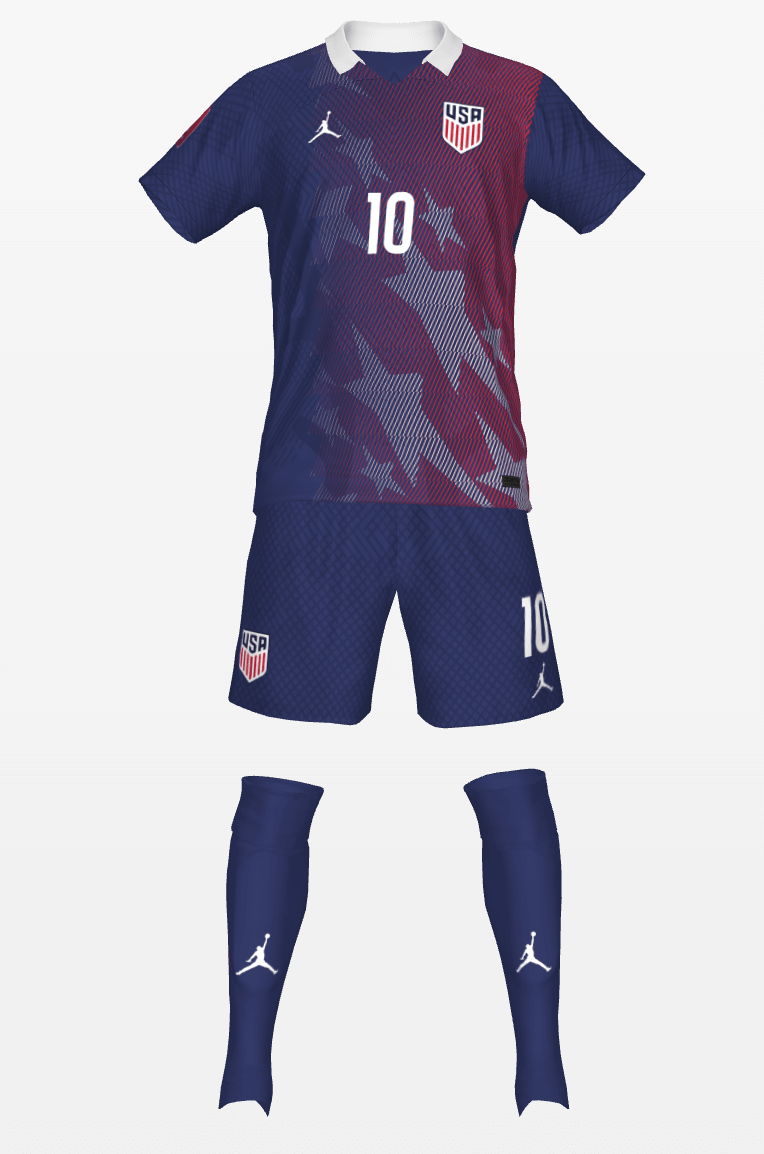
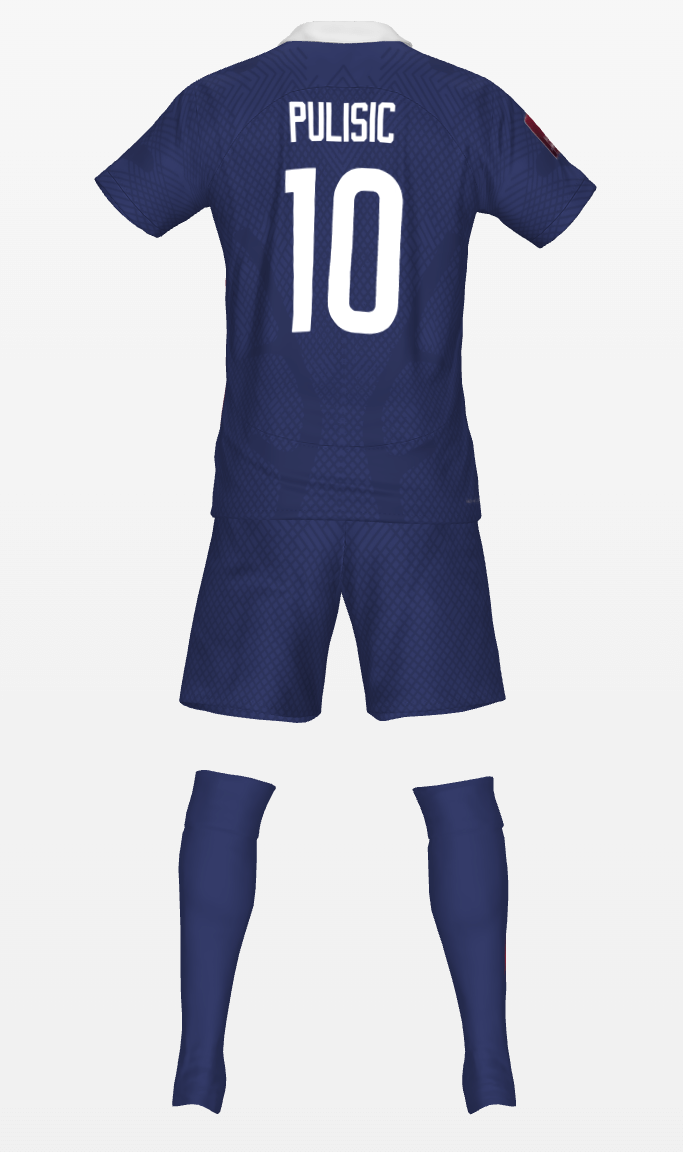
I like them, the white one looks very PSGish, which makes sense with the whole Jordan brand thing. The blue on is very good, always a fan of sublimated designs.
Or crystal palace!
Very nice. I love the ’94 influenced blue one!
I really like the blue one but am curious about the socks. I know *nothing* about soccer kits and if there are any rules about colors. In my mind, a contrasting color sock (like red or white) would help this kit. But that’s really just a design opinion of mine. Are there rules against that kind of thing though?
The rule regarding contrast has to do with the other team.
Opposing teams shirts & socks MUST contrast, shorts used to, but I’m not sure about that anymore.
World Cup has more rules than domestic leagues in general.
Lee
Love that collar on the blue ones with the nod to the ’94 flag kit. The white is a little too close to PSG for me. I think I’d really love to see a three color hoop thing going on (red white blue) but might look a little too much like the Netherland’s flag. Regardless, these are better than the supposed leak. God I hope that was a joke…
These are nice, the US needs to decide on a distinct design element and stick with it, I thought it might be red and white hoops/blue shorts, as popular as that kit was, I prefer a white shirt with red diagonal sash/blue shorts, but these vertical stripes are strong too, and would be a great uniform.
Love the sublimated designs too
This x 100. We need a look. I guess it is white over navy more than anything.
I like these. Very PSG/Crystal Palace and the callback to the WC 1994 faux denims is subtle but on point, even if the red and blue reads a little purple.
Wow, my concepts are here!
Thanks for the support!
Some changes that I would make now:
Home: Might be a little too PSG, Adding some distinct features could give it more character.
Away: This is easily my favorite of the two, but I wish I had made the design at least extend to the left sleeve and possibly onto the back. Also, the socks could use something so they aren’t just plain navy socks.
I like both of the concepts. Really well done. I would buy them if they were used by the USSF
Really like the concepts .We need a keeper look now
not a fan of center badges but with your design it works a lot better than the actual leaked jersey. would still prefer it over the heart but if this were the kit i would actually still buy it the way you made it. i really love the use of red. i find with us soccer kits, the focus tends to be more on the blue and white, a couple recent editions notwithstanding, so i really dig the red. love the collar on the away kit. would probably prefer red and/or white in either the shorts or socks, but love the homage to the 94 denims. overall they look great and far better than what we’re actually getting