Time for more Uni Tweaks from the UW readership.
I hope you guys like this feature and will want to continue to submit your concepts and tweaks to me. If you do, Shoot me an E-mail (Phil (dot) Hecken (at) gmail (dot) com).
Hi Phil,
Ever since they came into the league, Jacksonville’s uniforms have bugged me. I would have to say that their original uniforms were their best look but they have gotten progressively worse since then.
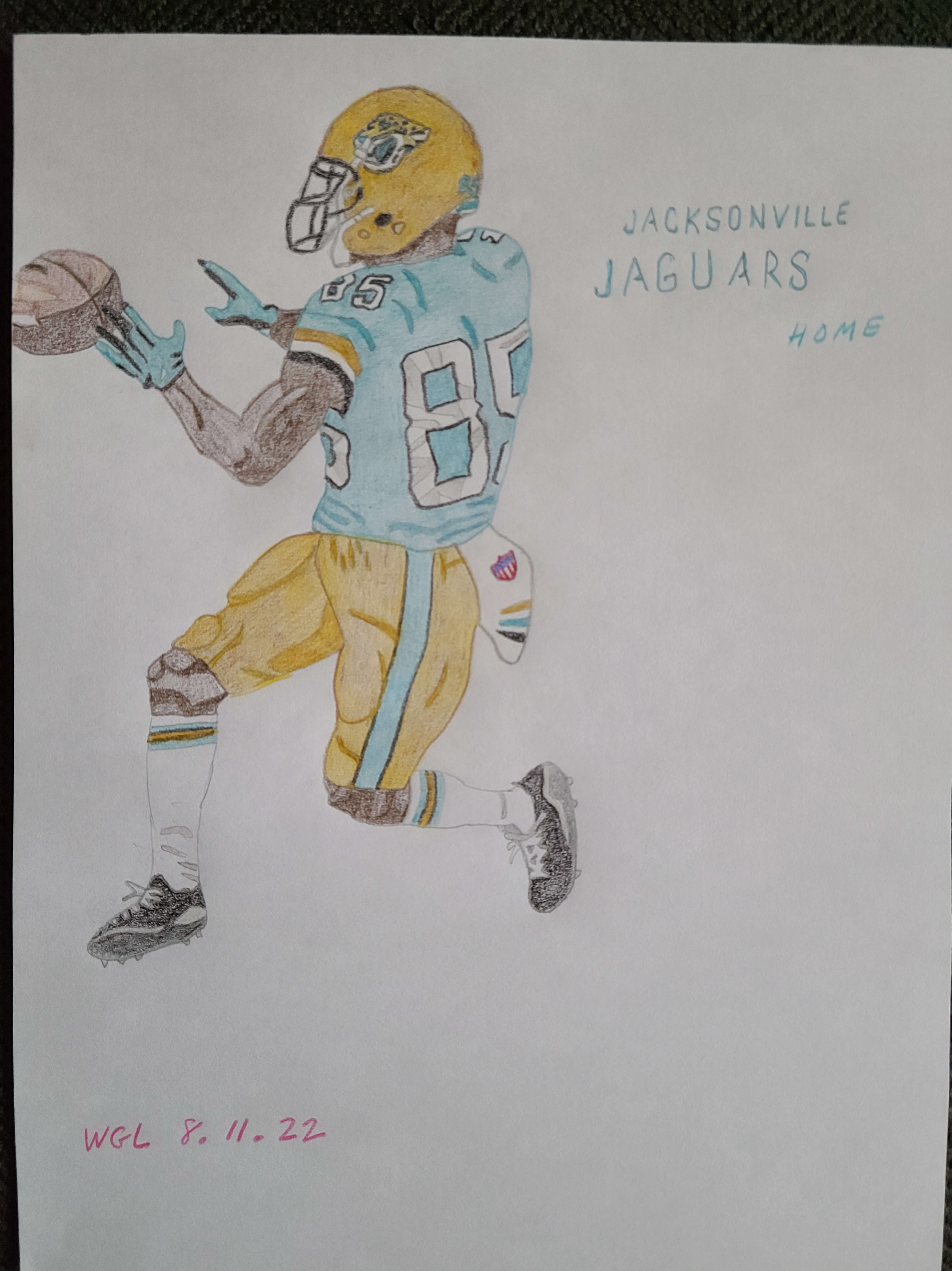
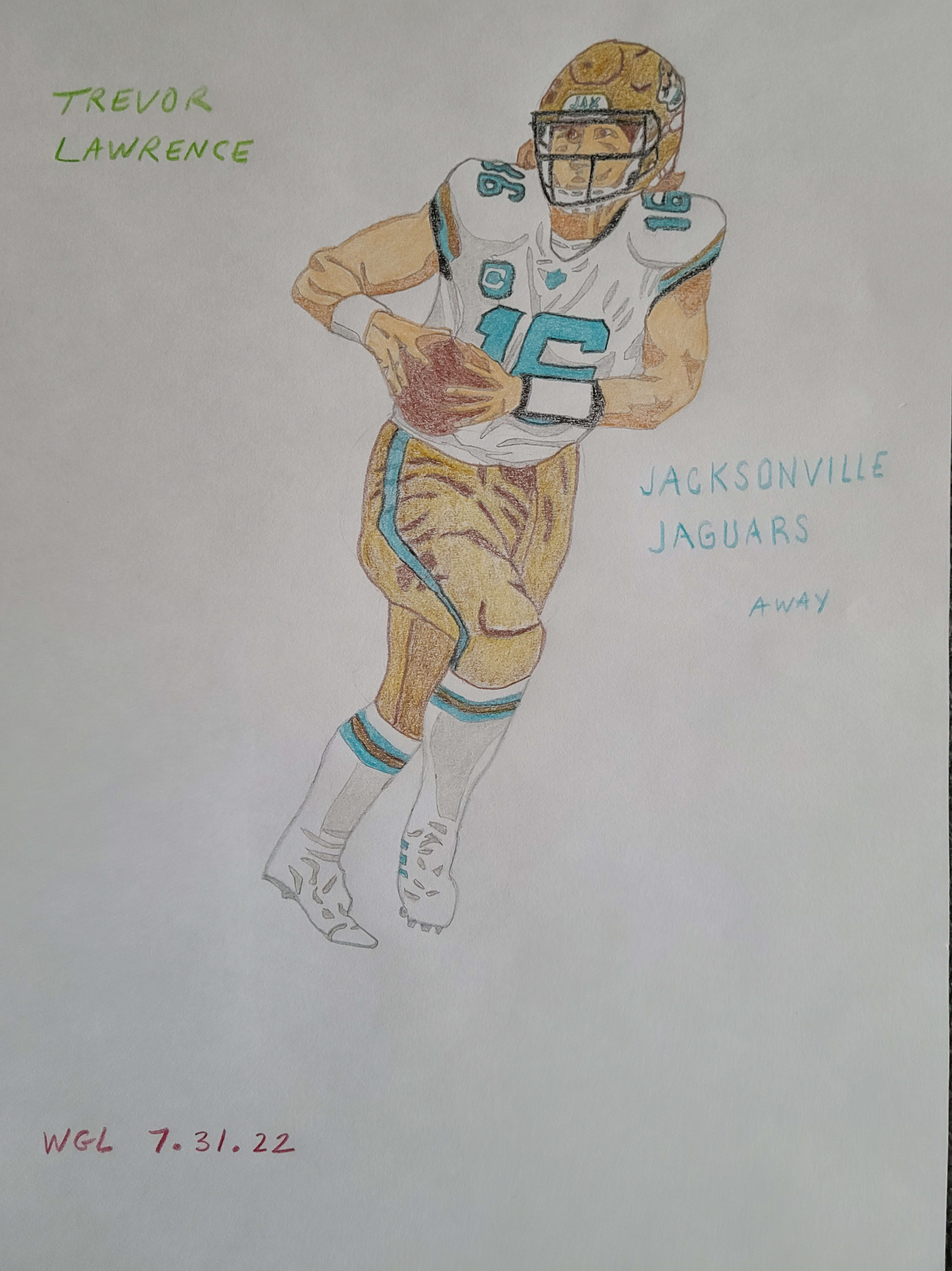
The Jags have gold as one of their primary colors but they hardly use it except for the helmet logo. They need to use it a lot more, in my opinion. There are currently only 3 NFL teams with gold/yellow helmets. There are 8 teams with black/navy helmets and 4 others with black alternate helmets. The dark helmets are overdone, at least to me. The Jags should definitely make gold at least an alternate helmet option. It would really improve what is currently a very lackluster uniform.
Thanks,
Greg Lamm


I appreciate your old-school approach. The team would be lucky to have these.
Regarding the helmets: Jax should combine the black and gold colors and make one helmet with both — oh wait.
worst helmets ever. Any league, any college, anywhere.
I definitely agree on their first look being the best. I really like the first concept above, in particular!
The gold trim on the numbers of the early jerseys made it premium. The black pants and helmet made the teal pop.
They’ve never recaptued what made those work.
I approve.
Great concept, I’ve been wanting the Jags to go gold and make black just a trim color for a while. Really like the tri-color sleeve stripes.
Like these a lot, agree that the gold should be used more.
These are really, really nice. The only detail I’d change is making the black pants stripes a little thicker. Great work on these!
Those are extremely cool. They kind of remind me of the USFL Oakland Invaders unis, which are one of my favorites of all time.
These are great, except It looks like Chargers light blue instead of teal. I’d also prefer that the socks matched the jersey.
Change light blue to teal and we got a winning combination here.
I think the Jaguars have the worst uniform and helmet of any team in the major sports. Actually most high school football teams have better uniforms and helmets.
This tweak is an improvement. IMO they just need to ditch everything and come up with a decent color scheme. Teal never works. Black and teal make an awful combination.
This is a good design. Jacksonville actually has good colors; teal and gold look good together. They just need to trust themselves. They’re really interested in being a black-and-white team for some reason, when this would be a really sharp look for them.
I really like the away look. Nice job!