[Editor’s Note: Today we have a guest post from our own Brinke Guthrie — aka my doubles partner — who is going to bring you a look at all the tennis gear for Wimbledon, which begins tomorrow. Enjoy! — PH]
2022 Wimbledon Preview
by Brinke Guthrie
Each of the Slams has its own personality. The Australian Open is sunny and cheerful, just like the people of the country, mate; the French is stylish like the fashions for sale in Paris, or gloomy like the frequent rain; the US Open is a street brawl, with huge raucous crowds exhorting their favorites deep into the NYC night, and Wimbledon is…….veddy proper. Tut tut my good man, now see here, etc.
Some things never change, ever, like serving up strawberries and cream, wearing “almost entirely white clothing,” shutting down on the middle Sunday, and “queuing up” in line.
We’re missing some big names this year: Wimbledon has banned Russian players, (Ukraine, y’know) and as a result the ATP and WTA have pulled ranking points from the event. That translates to Naomi Osaka skipping it although her Achilles is giving her problems. Roger Federer still rehabbing the knee and due back in the fall. Dominic Thiem’s wrist isn’t ready, and finally Russian Daniil Medvedev, the #1 player in the world, wants to play….but can’t. Though there is a way around that.
Equipment-wise, expect a lotta white here, because if you don’t follow their fashion rules, you don’t get out of the locker room. Here we go! Ready? Play.
🍓🇬🇧Adidas The Adidas Stan Smith is an all time classic. Listen to how she says “Adi-das.”
For Wimbledon, Adidas continues with their “Parley” campaign. The Adidas x Parley Collection will be worn by their guys (and ladies) Felix Auger-Aliassime, Elena Rybakina, Maria Sakkari (below) and Stefanos Tsitsipas who “all share a passion for working together to help end plastic waste.” (At least that’s what the press release says. Do they really have a passion for this? Who knows?) And what is this Parley, you ask? “The adidas x Parley Collection is designed to help end plastic waste whilst still being fashionable and fully functional on court. All garments in the collection are made in part with Parley Ocean Plastic and feature engineered patterns and laser-cut executions, enabling players to perform on court with style.” (I like how they said “whilst.” You don’t see that much these days, you know.)
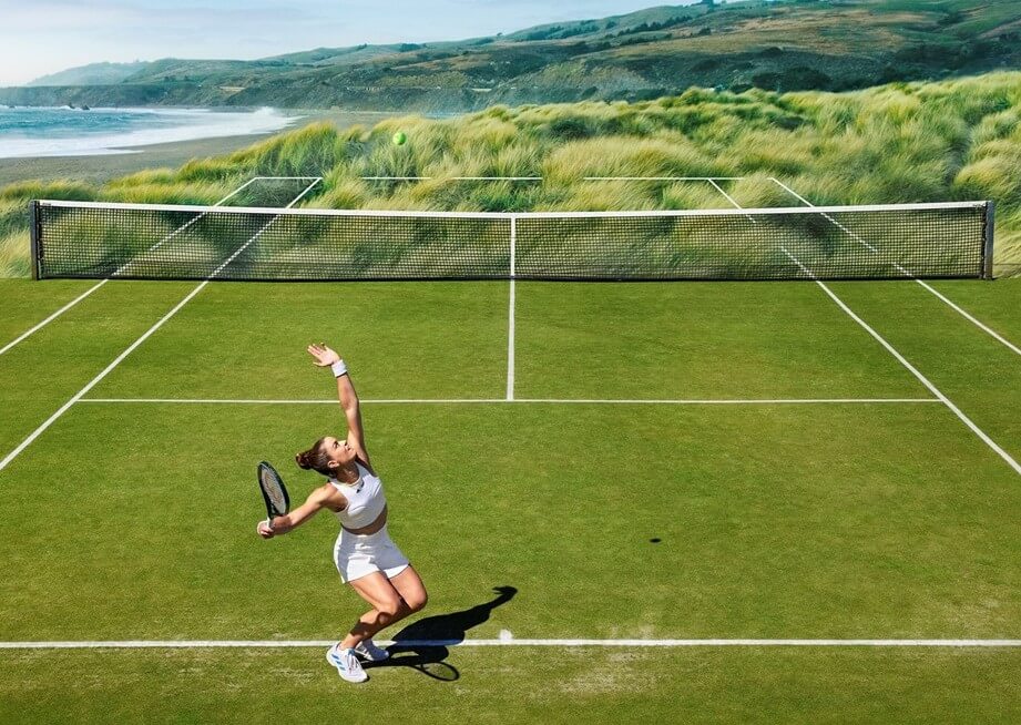
So, I wanted to see what the “engineered patterns” and “laser-cut executions” were, and here they are. Um, not a fan so much. Seems like unnecessary over-thinking to me.
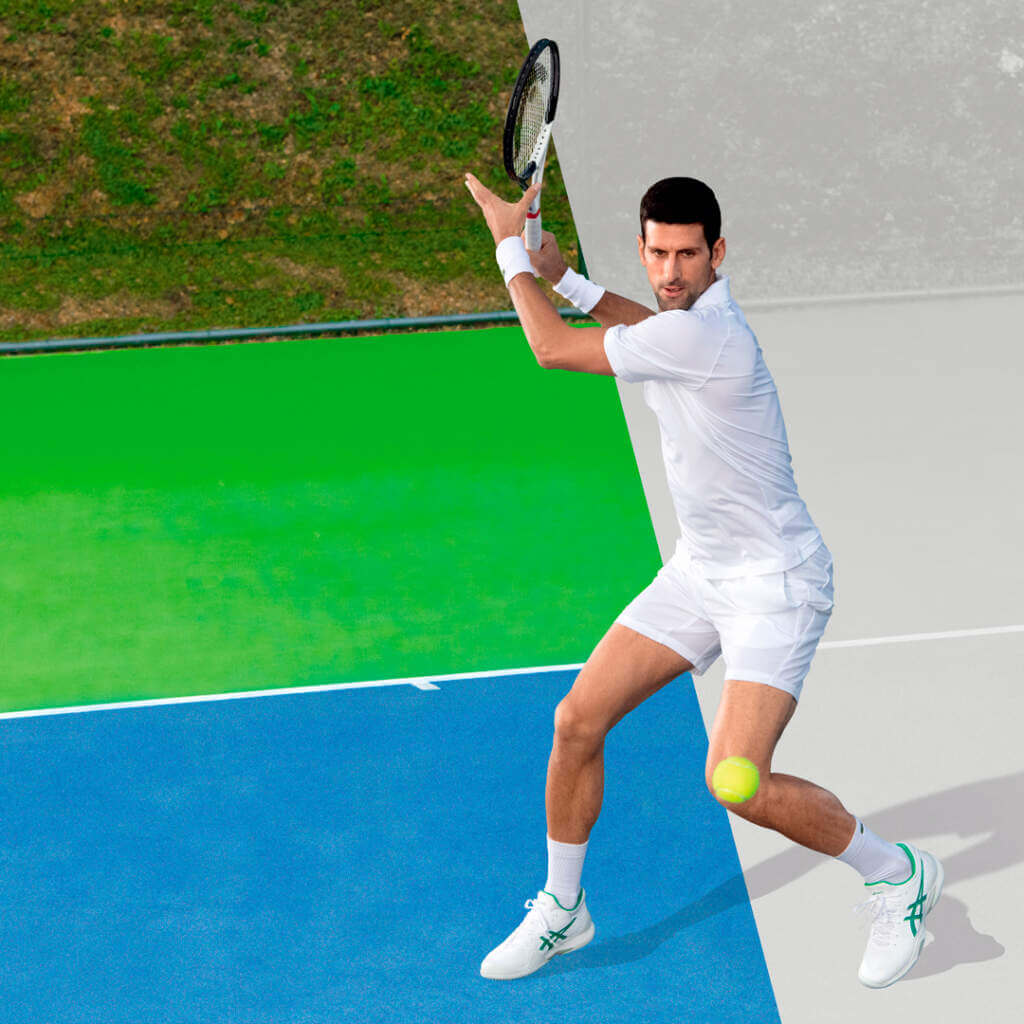
🍓🇬🇧Asics Novak Djokovic…
….and here’s Iga Swiatek; she’ll wear this while holding the winner’s trophy. Again, the prohibitive fave, currently serving up scorched earth tennis with a smile.
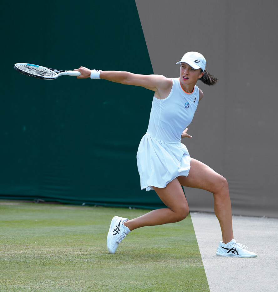
🍓🇬🇧Nike The look for Rafa Nadal:
🍓🇬🇧Polo Ralph Lauren They’re the outfitter for tournament personnel. I don’t even want to know how much this stuff costs, but I’m sure your bank can offer attractive loan terms. The official Wimbledon colors are a dark rich purple and forest green, (not all white!) featured below:
The spirit of sportsmanship
This year as the Official Outfitter of @Wimbledon, Polo Ralph Lauren is proud to reimagine our traditional ballperson uniforms and celebrate 100 years of Centre Court
Discover our official #Wimbledon uniforms: https://t.co/BTkKB285gU pic.twitter.com/tdlJ03O49D
— Ralph Lauren (@RalphLauren) June 15, 2022
Here’s another shot in case, you know, the logo isn’t big enough:
🍓🇬🇧Lacoste Here’s what world #1 Daniil Medvedev would’ve worn.
…and The Djoker:
🍓🇬🇧Uniqlo No Fed as I said, but ohlookiwantoneofthese.
🍓🇬🇧Fila They’ve unveiled their Wimbledon “White Line,” which was the name given to their tennis wear back in the 1970s.

Incidentally, while the all-white clothing rule may be tradition, it can be particularly troubling for women, which has for years been the subject of some controversy.
And that’s it for Wimbledon. Back in two months for the US Open.
Thanks, Brinke! As always, a great rundown — OK, tennis fans (and even non-fans), what do you think of this years Wimbledon gear? Pretty white, right?


Burgundy and Green? The original Avs colorscheme
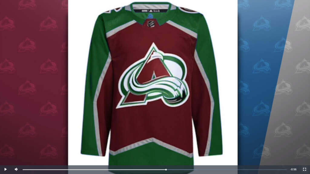
A couple weeks ago we saw how the Colorado Rockies would look wearing deep green — a very logical color for a team based in the Rocky Mountains — but did you know that Colorado’s hockey team (which relocated from Quebec) also almost wore burgundy and green, instead of the (now classic) burgundy and blue?
Well, if you read Uni Watch pal and one of the faces of the Uniform Mount Rushmore Todd Radom’s book (co-authored with another UW pal, Chris Creamer), Fabric of the Game, you would.
Todd was recently interviewed on the matter — you can check out some video here:
And be sure to check out the whole story here.
And to think…if not for a “shoddy printer,” the Avs could have been wearing one of the best looking color combos in sports.


Guess The Game…
from the scoreboard
Today’s scoreboard comes from Morgan O’Malley.
The premise of the game (GTGFTS) is simple: I’ll post a scoreboard and you guys simply identify the game depicted. In the past, I don’t know if I’ve ever completely stumped you (some are easier than others).
Here’s the Scoreboard. In the comments below, try to identify the game (date & location, as well as final score). If anything noteworthy occurred during the game, please add that in (and if you were AT the game, well bonus points for you!):
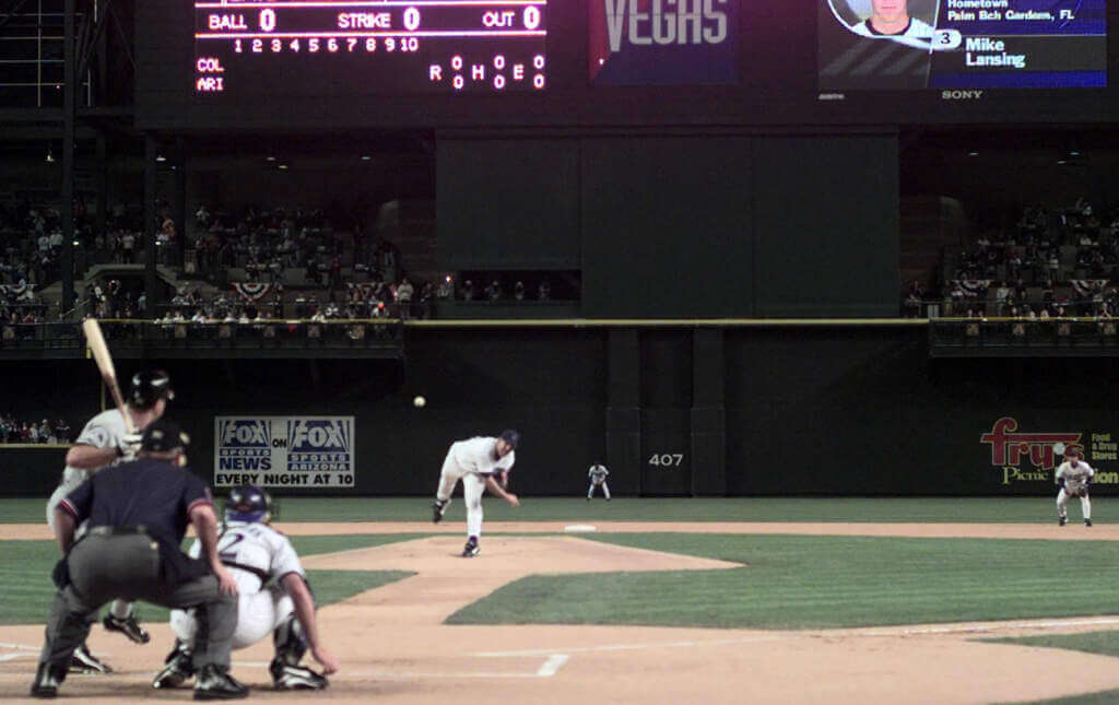
Please continue sending these in! You’re welcome to send me any scoreboard photos (with answers please), and I’ll keep running them.


Thanks, Jimmy!
Reader, contributor, pal and overall good guy Jimmy Corcoran saw yesterday’s post with its segment on my Curling Tournament last weekend, and had a little fun.
“Nice work!” he says. “Here is a little NFL Films style collage to remember this.”
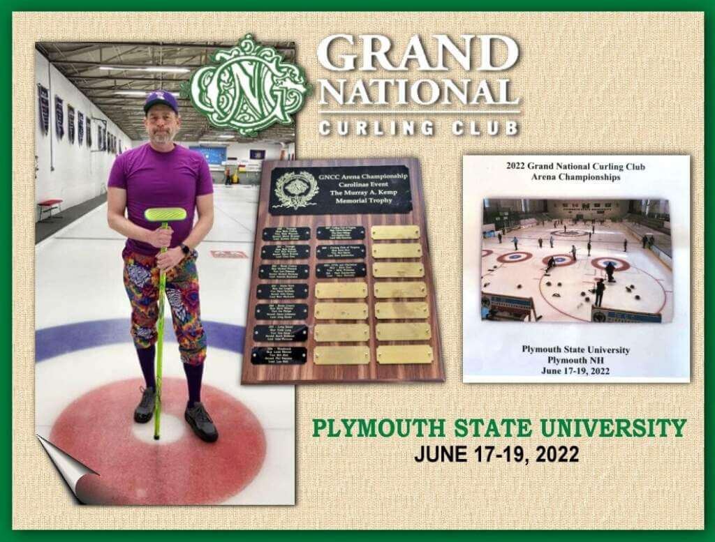
Is that cool or what? Better than the actual trophy plaque my rink received for winning the “C” bracket!
Thanks Jimmy!


Uni Watch News Ticker
By Phil

Baseball News: Reader Derek May writes, “I was at the Angels game on 4/21 versus the Royals and thought I noticed Ohtani’s shin guard was under his pants. He was the DH that night and not pitching. I was unable to get a good picture so I did a Google search for Shohei Ohtani Batting and found that he does indeed often wear the guard under his pants. I assume when pitching he wears it over the pants which I also found images of. Not sure if it’s a new discovery or just new to me.” … Here’s a fun collection of (mostly baseball) stadium objects from the collection of the Smithsonian Institution (from Max Weintraub). … Who doesn’t love sidewalk chalk art? Here’s a nice rendition of Slugger Bird (from Jeff Callahan). … One can never see too many shots of the Reds in white helmets, vests and pinstripes (from SABR Bio Project). … On Friday evening, you had the Rangers in red and Nats in blue but opposite colors on the scorebug (from Alex). … Yesterday Adam Wainright and Albert Pujols were both sporting Robert Clemente Award patches (which you can read more about here). From Nick Wiskirchen. … Did the NY Giants get “new” uniforms for the 1912 World Series? (from James Gilbert). … I’m pretty sure Paul has addressed this on more than one occasion, but it’s still odd to see a player batting while wearing a wedding band (from ItsYourKidsMarty). … The Marlins wore their CC unis yesterday, and Steve Kriske noticed they have a red spike cleaning mat (and god-awful ad) to match their CC unis. … Here is another example of the Brew Crew differing from the jersey. Check out the frame in the last photo (from Geoff). … The Salt Lake City Bees threwback to the Salt Lake City Trappers last night. … Here are three more ways the Brewers CC unis in The Show 22 differ from the on-field product (from Andrew). … Whoa…check out this DDNOB (Double-decker Name on Back). From Taylor Scroggins. That’s Pete Crow-Armstrong of the South Bend Cubs.

Football News: For those of you who care about such things as ranking the “Best” helmets in college football, THE Ohio State University was ranked #1. Perhaps not surprisingly, the reaction was swift from the rest of the college football world. … The Calgary Stampeders wore a “RGP” decal on their helmets yesterday, in honor of team executive committee member Rob Peters. Rob passed away June 15 (from Wade Heidt).

Basketball News: The Detroit Pistons presented new acquisition Jaden Ivey with the jerseys of his grandfather, father and mother (from Paul).

Soccer News: VfL Bochum 1848, a German association football club based in the city of Bochum, North Rhine-Westphalia, and who play in the Bundesliga, have introduced a new third kit (from VfL Bochum). … Wieczysta Kraków, a Polish football club based in Kraków and who currently play in the Polish Fourth Division, have introduced some new shirts (from Ed Żelaski).

Grab Bag: Remember Saturn (the automobile)? Do they still make them anymore? Anyway, reader Tom Flanagan says, “Pretty cool story — apparently these were given to ‘Olympic Hopefuls’ in 2000. Some random badging was all that differentiated, but some cool old team USA swag in the boot!” … From the “High School poaching pro team logo” files, here’s one from Bartholomew County Schools (in Indiana!), borrowed from the Broncos (from Robert Brashear). … Here’s one from a sport that isn’t featured on Uni Watch too often: cricket — Jamie Overton, of the England cricket team, lost one of the letters from his shirt advertiser when diving to make a run against New Zealand. The grass stain from the dive, though, left him with a partial ghost ‘h’ on his shirt (from Mark Gillingham). .. Speaking of cricket, there are a bunch of youths in Texas who are obsessed with bats and balls, just not the baseball kind (WaPo article, soft paywall). … ICYMI: After 85 years, officials at Kraft announced changes to its iconic Kraft Macaroni & Cheese, including a new name and box color (from bryanwdc). … IS NOTHING SACRED? (from Jeff Lagro). … Want to know what a 1 million-seat stadium might look like? Here’s one artist’s concept (from Kary Klismet).


Uni Tweet of the Day
A highly underrated look and one of their all-time best…
Steve McCatty in 1981 with those clean Athletics uniforms. pic.twitter.com/SHp6knCMq2
— Stirrups Now! (@uniformcritic) June 25, 2022


And finally… that’s it for today … and for me for the week. BIG THANKS to Brinke for his in depth look at the Wimbledon whites. How long do we think Wimbledon will hold on to that tradition?
Everyone have a great Sunday and a better week as we sail towards Independence Day weekend. Nice sunset last night. Even had a bit of company watching it.

Peace,
PH
The Brewers have a history of inconsistent jersey script. The previous Miller-style home script, of which I seem to be the only fan, was tilted noticeably differently on the uniform than on any other use, such as in print or on t-shirts and other merch. The current home script is off-center to respect the placket on on-file uniforms but centered on all other uses, including replica jerseys.
I wish I could read that WaPo story on youth cricket interest in Texas. USA Cricket has lately really anchored itself in Texas, with a new dedicated facility housing most international activity and even a lot of games for the 2022 Minor League Cricket schedule for teams not based in Texas. My own plans to see a Chicago Blasters game this summer might be scotched by games moving to Texas. Still, as a budding cricket fan, I’d love to see youth interest in the sport around its new Texas home.
“On-field,” not “file.”
right-click, open link in incognito window…(if you have a PC)
I wish cricket would anchor itself in northeast Ohio. I’d watch that!
Remember Saturn (the automobile)? Do they still make them anymore?
I miss Saturn. I bought a ’97 SW1 and requested crank windows and a cassette player. Along with my old hand-me-down ’81 Chevette, those were my two favorite cars.
As long as they keep white tops, I could see Wimbledon allowing other colors below the waist…tastefully done, of course.
I agree with you about Saturn. Great car, great company, great approach, until GM pulled the plug.
Ah, the Great Purge of the Middle-Priced Brands. A bloodbath in Detroit.
Some things never change, ever, like serving up strawberries and cream, wearing “almost entirely white clothing,” shutting down on the middle Sunday, and “queuing up” in line.
Except when some things do change. As in this year, when play is scheduled on Middle Sunday for the first time.
link
I’ll be darned.
Well, I don’t know how expected of a change it was. I wouldn’t beat myself up too much about not knowing.
Not the only change this year — a new players’ entrance at Centre Court.
link
GTGFTS: I count 26 combined zeroes/Os in the photo.
Typo: “The Adidas x Parley Collection will be worn by their guys Felix Auger-Aliassime, Elena Rybakina, Maria Sakkari and Stefanos Tsitsipas”
– Elena and Maria aren’t guys.
Fixed
“guys” was used as an expression.
Adi-das is the normal pronunciation for the brand outside the States as far as I know (it’s also how Aussies say it). Which makes sense to me, I wouldn’t pronounce the founder Adi Dassler’s name as “Ah-dee”.
Now if you want to tell me that Nike shouldn’t rhyme with Mike (as Aussies pronounce that brand), I will concede that argument
….and Adi’s brother Horst founded Puma!
because HorstDas didn’t roll off the tongue?
Comment and question.
Comment: I generally dislike all of the City Connect uniforms, but the Marlins’ are sweet and would be great as their their full time uniforms. They are the only City Connects that I like in the least.
Question: Why is it that for many columns the majority of pictures are clickable links, but for the ones that I have zero interest in like tennis outfits just about every single picture is embedded so that the column takes a while to load, especially on mobile devices?
GTGFTS: March 31, 1998, first game (& pitch) in Diamondbacks history
“And to think…if not for a “shoddy printer,” the Avs could have been wearing one of the best looking color combos in sports.”
They didn’t touch on this. I assume the equipment would have still been black and there would have been black trim too.
I want to thank the shoddy printer. I love green as much as the next guy. I was born and raised in Saskatchewan. Green is our colour for a lot of things. However, I do not feel the burgundy/hunter green colour combo is that great. The steel blue works well with the burgundy and is a nod to the old lighter blue of the Nordiques.
Speaking of good looking, underused colour schemes. I saw a van the other day and the company was using dark green trimmed with powder blue. Reminded me of Tulane Green Wave. Looks goods and an underused colour scheme in sports.
I see that as a riff on the the Devils…the former Colorado Rockies…abandoned palette, which looked good but was not as ‘fitting’ with the team name as the red/black is.
Interesting as a concept, but I’m glad they went with the burgundy/blue (though resurrecting the powder blue and red the Nordiques were born in would have been so much better).
And I’m an unrelated note-the Philadelphia Stars once again find themselves in the USFL championship game! Will they continue to wear white as they have for the last 3 games?
First, the Nordiques most famous uniform wasn’t powder blue like UCLA or the Houston Oilers; it was more an “electric blue” that was a reference to the flag of Québec. Second, red/light blue wouldn’t have been a good choice. Burgundy remains unique in the NHL, and the Avs can shift it to a dark maroon or a lighter Cardinal as they see fit. The steel blue is also fairly distinct, and evokes ice and snow.
The idea that the Avs’ burgundy color is unique in the NHL has become a widely believed myth, for whatever reason. It is, in fact, the exact same Pantone color (209 C) as the “brick red” on the Coyotes’ primary unis… which, in turn, should not be confused with the “brick red” of their alternate uni (202 C), which is a touch paler.
The Nordiques, born in the WHA, had a very Houston Oiler-like color scheme…a terrific choice IMO :
link
It “worked”, but sadly only lasted a season; they switched to a darker blue for a bit, then switched again to the “electric blue” which they cartied over when the WHA and NHL merged.
One for the grab bag: Here’s an article about Utah seeking a new state flag
Deseret News: Utah’s next state flag: What will it look like? Here are the designs.
link
“Who doesn’t love sidewalk chalk art?”
I realize this question was rhetorical, but the answer is “Susan Collins”.
Maybe one day I will be making a Curling collage of Phil at the Olympic trials?
I’m glad the video about Stan Smith mentioned that the tennis shoe was originally endorsed by Robert Haillet. I owned and wore out a pair of Haillets. Best tennis shoe ever.
And I believe the first-gen Adidas wooden tennis racquet said HAILLET on the throat, too- they rebranded it in 1973 or 74 to say NASTASE. Little did anyone know that the racquet he really played with was his usual Dunlop Maxply Fort, repainted to look like an Adidas frame. The term is “paintjob” and goes on to this day.
Can tennis be played on FieldTurf?
Steve McCatty, the pitcher, is wearing white sleeves. Did the opposing team protest? If memory serves, the 1981 Athletics wore yellow “Oakland” jerseys, for which they also used white undershirts.
I suspect the scoreboard is from March 31, 1998 – first game in Arizona Diamondbacks history. Mike Lansing led off that game, the Arizona catcher was #12 Jorge Fabergas and the pitcher was right-handed. All of those things were true of the D-Backs second game, and probably several others, but first game seems most likely to be featured.