By Phil Hecken, with Walter Helfer
Follow @PhilHecken
Good Saturday Morning, Uni Watchers — I hope everyone has had a pleasant week. I opened up the family summer place yesterday (always fraught, but yesterday was especially disconcerting — I’ll explain at the end). Anyway, despite the hiccup, it seems that all’s well.
About a month ago, dedicated reader Walter Helfer contacted Paul and me, and opened up his correspondence with the following:
I’ve been contemplating a project where the Uni Watchers weigh in a subject close to our hearts: Which teams wear the best custom number fonts? A bit of prep work shows around 60% of all major league baseball and football teams have had bespoke numbers. The hockey and basketball totals are MUCH higher. The college totals are mind-boggling, frankly, and have me wondering just how far down the rabbit-hole I should go.
Paul agreed to let me take the lead on this one, and after a good amount of back-and-forth with Walter, we narrowed the “project” down to just baseball and football. I had no idea of the breadth and depth of “font knowledge” Walter possesses, and after first agreeing to team up on this one, I ceded it to him as this one is truly in his wheelhouse. Trust me, you’re all the better for it — I would have merely added some noise to his spectacular symphony.
I’ll now turn this over to Walter as he brings you …
A Beauty Pageant for Numerals
by Walter Helfer
If there is a common factor among all the team sports, perhaps the most iconic is the basic octagonal numeral. They bond pro baseball, varsity football, ultimate frisbee, volleyball, and more. Designed with a ruler, it offers function and beauty; readable from long distances, it can be rendered plainly or in multi-colors without sacrificing legibility. But I would regard a world decorated only by these no-nonsense numbers in the same way I would consider rock & roll played only on acoustic guitars. Capable, but lacking in imagination. In a few months, I hope to examine the numerals of NFL teams in the same manner.
In MLB, the most commonly used font is Athletic Block, with a few teams using the more formal Sand Knit face. Many of you would pick these as the winners of the pageant, but that would simply be too easy. There are rabbit holes to inspect. Each font will receive a score of 5 through 0: 5- Excellent 4- Good 3- Okay 2- Poor 1- Godawful 0- Booby Prize.
Chicago Cubs:
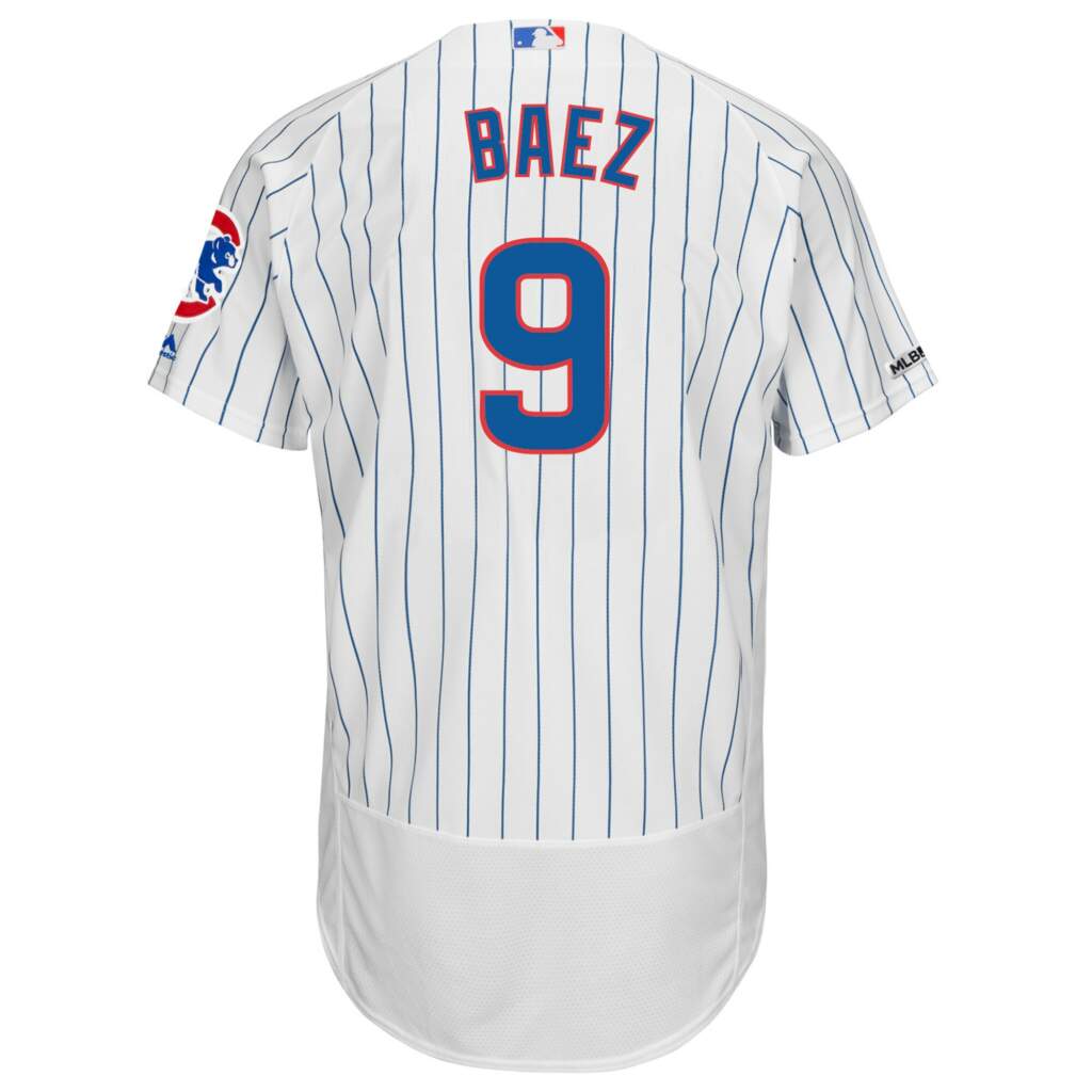
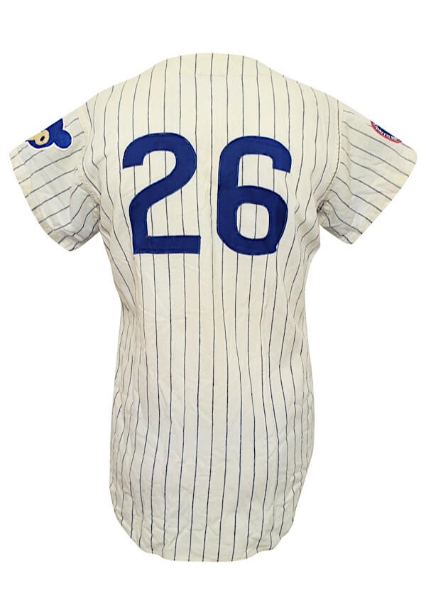
Beginning in 1938, the Northsiders numbered their uniforms with curvy blue numerals, nothing like the square-rigged figures found on other teams. Though there is a passing resemblance to the face used by the football Bears, the “1” has a short serif at the top and a long one at the bottom. The casual eye might think this is the font used by the Cubs right up to the present, but there is noticeable change around 1980; what had been oval-shaped figures before that date had changed to rectangles with rounded corners. It is particularly noticeable in the counters of the “6” and “9”, which are now shaped like thumbnails.
My score: Pre-1980: 5 Post-1980: 3
Philadelphia Phillies:
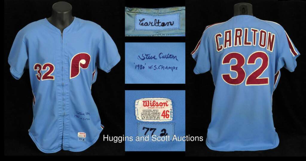
In 1970, the Phils adopted an identity which appeared influenced by the Expos and had a European look. Numbers were large, ring-spun, and in a crisp Helvetica font. These were the uniforms associated with Steve Carlton and Mike Schmidt. In 1992, Philadelphia opted for a look closer to the 1950 team, utilizing an odd, lysergic numeral font that lacked corners. Clearly bespoke and custom-designed for the team. As you can see in this picture of Scott Kingery, the Phillies anticipated the wonky “4” on Tom Seaver’s statue, codifying the numeral into its regular typeface.
My score: 5 (pre 1992); 4 (post 1992)
Atlanta Braves:
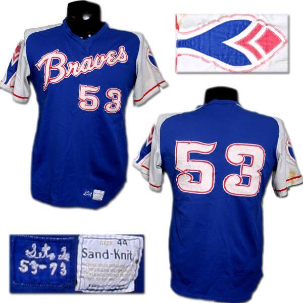
In 1972, Atlanta shelved the flannel uniforms in favor of henley pullovers with contrasting raglan sleeves. The numbers were in a circus type with feathered serifs and circular finials on the “2”, “3”, “6”, & “9”. Nowadays, the font is codified as the “St. John’s” face, but as everyone knows, college basketball lacks 6 through 9, making it hard to number baseball jerseys.
My score: 2 (for sloppy tailoring).
Toronto Blue Jays:
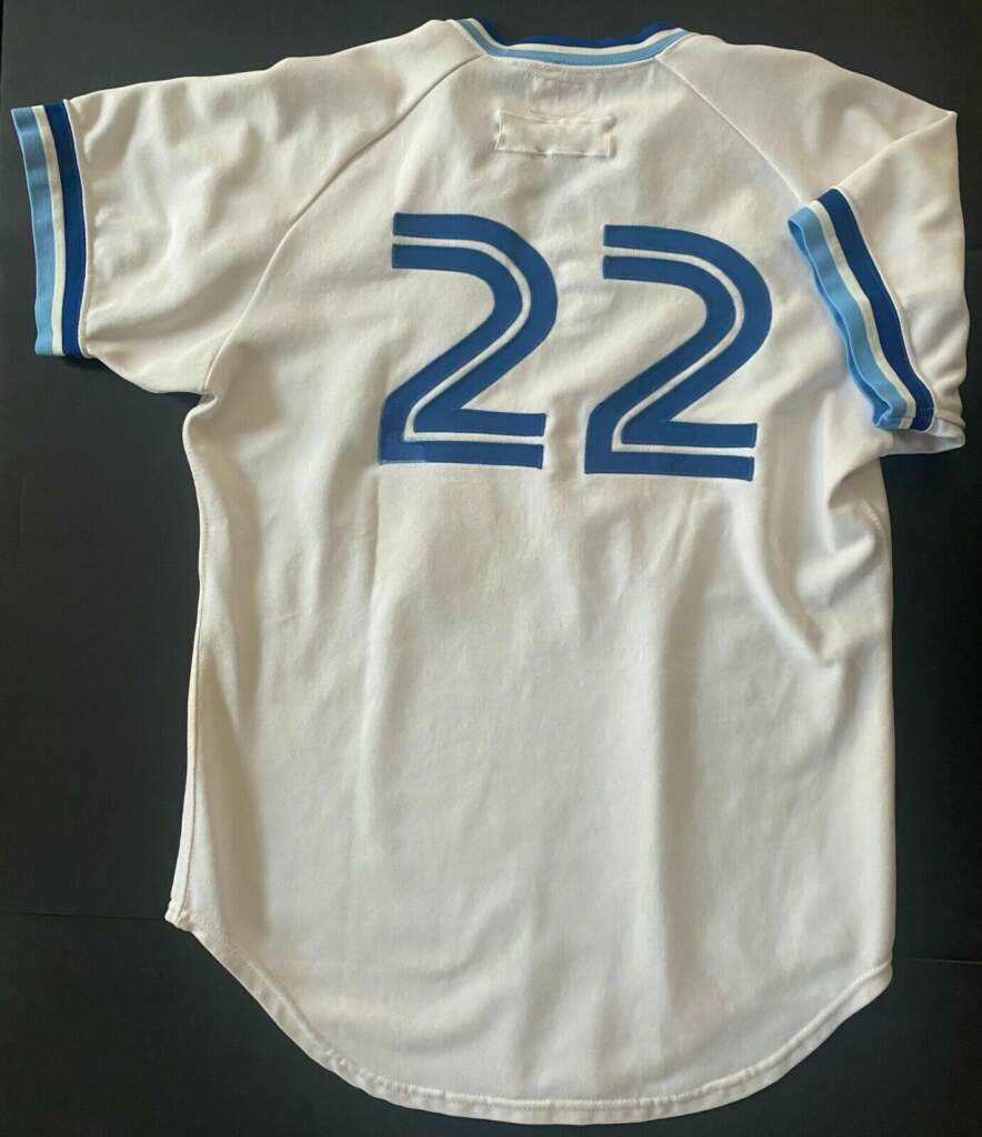
The Jays hit the field with a unified bespoke lettering and numeral font, giving their blue-trimmed pullovers a cohesive feel. Characters had a curvy feel with a slim, contrasting stripe running down the middle. They wisely returned to this theme a decade ago after ill-advised forays into blocky ’90s characters and the inscrutable Black Jays identity of the early 2000s. During the Charcoal Period they used mismatched Crillee italic numerals on the home whites and Agency Gothic faceted numbers on the road greys. What a mess!
My scores: 5 (1977); 2 (1997); 0 (2004); 5 (2012).
Milwaukee Brewers:
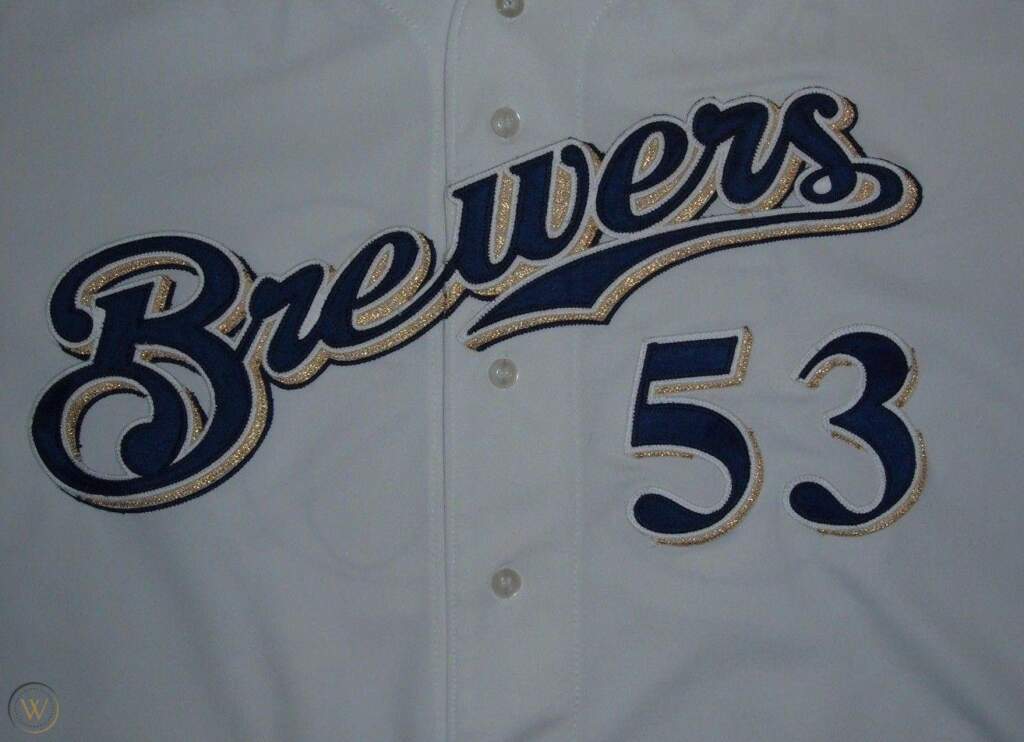
The first go-round of the “Ball in Glove” logo ended in 1994, when the Brew Crew changed their colors to Dark Blue, Old Gold and Hunter Green. The numerals took on a Victorian look, with goose-necked serifs. These were their uniforms when they shifted to the National League. In 2000, to synchronize with their move to Miller Park, they dropped the green and adopted trademarks evocative of the Miller Beer Company. Numerals were ultra curvy, but also ultra-familiar as they used the Times New Roman typeface, found in most newspapers. Not too useful as a display typeface, it lacks the elan of the equally fancy Expos’ numbers. In 2020, Milwaukee rebooted the ball-in-glove look with a blocky, angular font whose prevailing trait is a 22.5-degree angle where the 45-degree angles used to be. Weak sauce; stick to the classics!
My score: 2 (1994); 2 (2000); 2(2020)
Chicago White Sox:
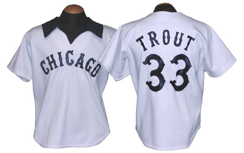
When people were talking about the White Sox’ shorts, I was talking about their cohesive lettering and numbering. It was fancy but fun, and hearkened back to the ancient all-dark Chisox’ uniforms of 1902. I love them!
My Score: 5
Arizona Diamondbacks:
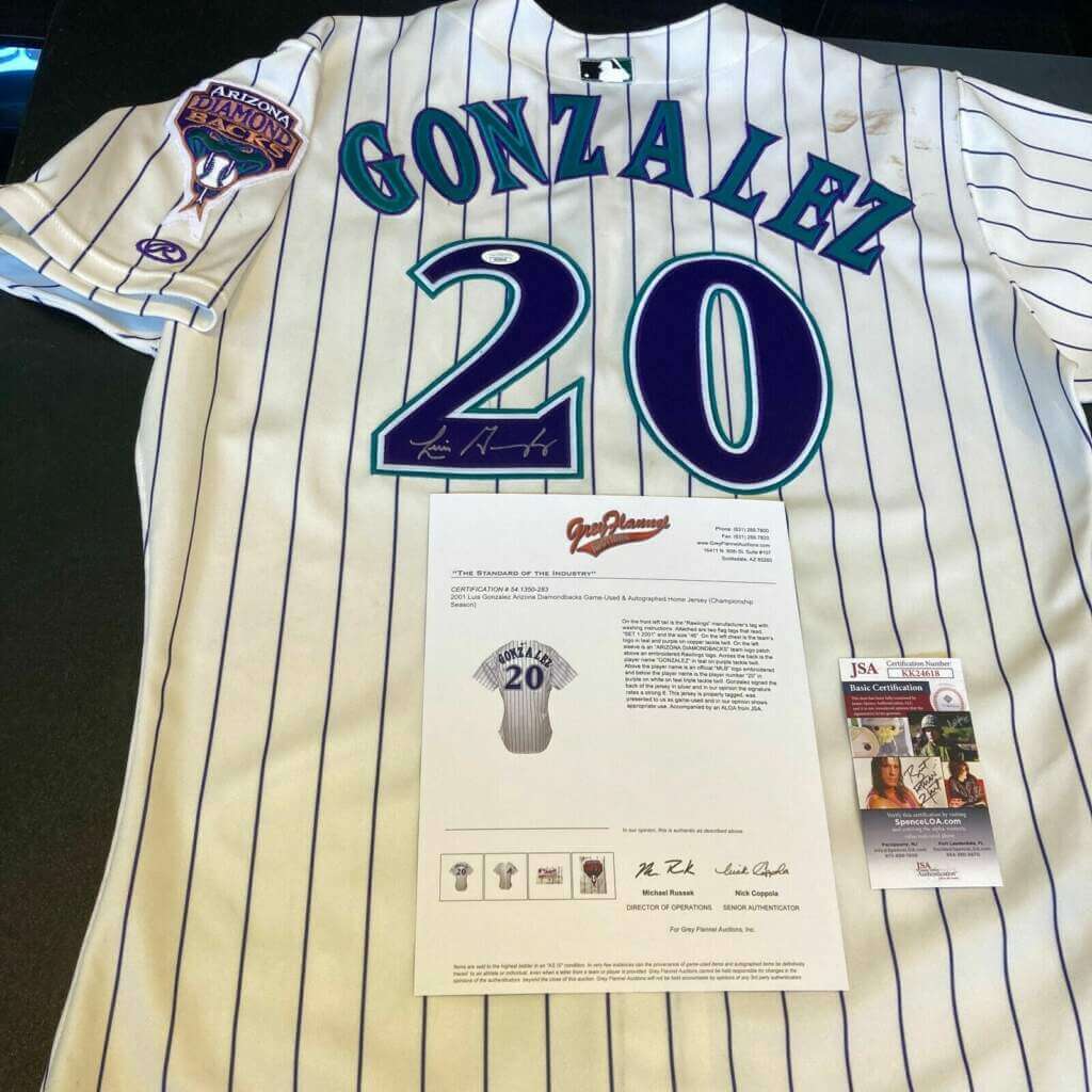
If the 1998 D’backs’ numbers look familiar to you, it’s because they were used on the jerseys of the 1996 Baltimore Ravens. One of the best parts of an overly busy uniform, if you ask me. MLB apparently requested that Arizona drop the trendy color scheme (partly because they shared a division with the NL’s only other purple team), so 2007 yielded a plainer brick/black uniform with narrower digits based upon the first font. In 2016, the Snakes made an ill-considered stab at standing out, producing a bunch of strange-looking details (pants with red cuffs, anthracite road uniforms) and introducing a much blockier numeral font. I don’t care for it; it looks like a college football typeface with its narrow triangular shadows cut from the counters.
My score: 4 (1998); 3 (2007); 1 (2016)
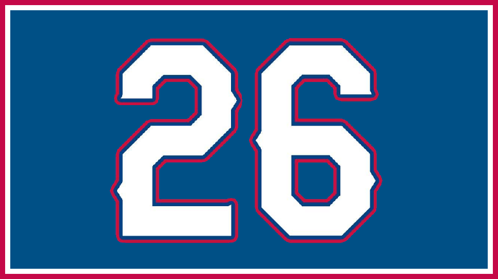
Texas Rangers:
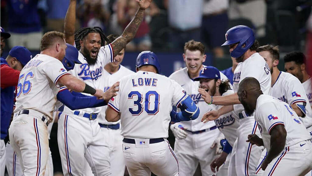
This is a bespoke font, but it really shouldn’t be; all they did was add “burrs” to Athletic Block. As such, it has good legibility as long as it’s large. But I find myself wishing they’d been more original.
My score: 3
Cincinnati Reds:
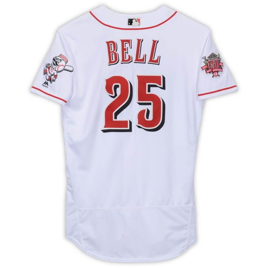
In 2007 the Redlegs went all-in on the “Oldest Major League Ball Team” image by commissioning a special victorian typeface encompassing numbers and letters. It really isn’t too bad, but suffers from superfluous outlining and would really benefit from being one-color.
My score: 4 (without outlining); 3 (as used)
Thanks, Walter! Fantastic deep dive into just the kind of minutia that Uni Watch is all about — looking forward to Part II!


Pride of the Dodgers
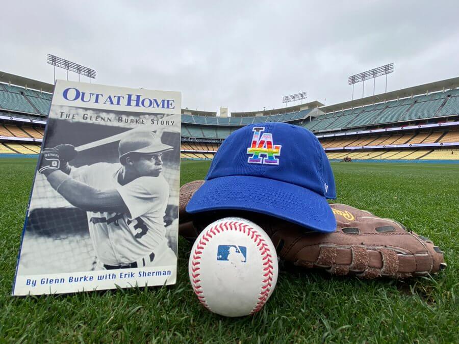
Last evening, the Los Angeles Dodgers held their ninth annual LGBTQ+ Night at Dodger Stadium, hosting the New York Mets. And for the first time ever, the Dodgers wore custom Pride caps on the field.
The Pride caps were very subtle — as you can see in the splash photo the rainbow colors are contained within the white “LA” outline on the cap. In fact, if you weren’t aware the team were wearing them, the colors were impossible to see at any distance and even somewhat closeup, were not overpowering.
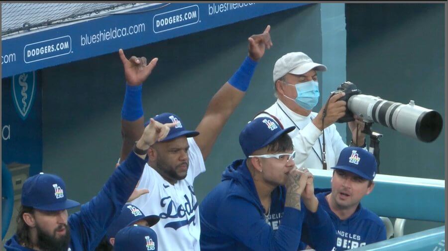
Up close shots showed the logo much more clearly.
The Dodgers became the second MLB team to wear Pride-tribute colors on their uniform. Last year, the San Francisco Giants wore Pride logos on their caps (which popped in close up, but were also a bit hard to discern at distance). In addition, the Giants also wore that same logo as a much larger sleeve patch. The Dodgers limited their tribute to just the cap (both the jersey and batting helmets had regular logos).
Many of the Dodgers advertisers created Pride-styled signs, and the mound also featured the rainbow LA logo (with some unfortunate prominent advertising juxtaposed). Former Dodger and MLB’s first openly gay player, Glenn Burke, was celebrated, as were many other prominent former players, athletes, and artists. You can read more here on the evening.
The Dodgers will again wear the caps on June 11th, when they face the Giants, who will revisit their Pride-logoed caps and jersey again. That will (obviously) mark the first time two clubs will face each other wearing Pride caps.
You can see more photos from last night’s game here.


Guess The Game…
from the scoreboard
Today’s scoreboard comes from Lux Turner.
The premise of the game (GTGFTS) is simple: I’ll post a scoreboard and you guys simply identify the game depicted. In the past, I don’t know if I’ve ever completely stumped you (some are easier than others).
Here’s the Scoreboard. In the comments below, try to identify the game (date & location, as well as final score). If anything noteworthy occurred during the game, please add that in (and if you were AT the game, well bonus points for you!):
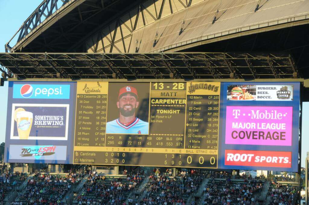
Please continue sending these in! You’re welcome to send me any scoreboard photos (with answers please), and I’ll keep running them.


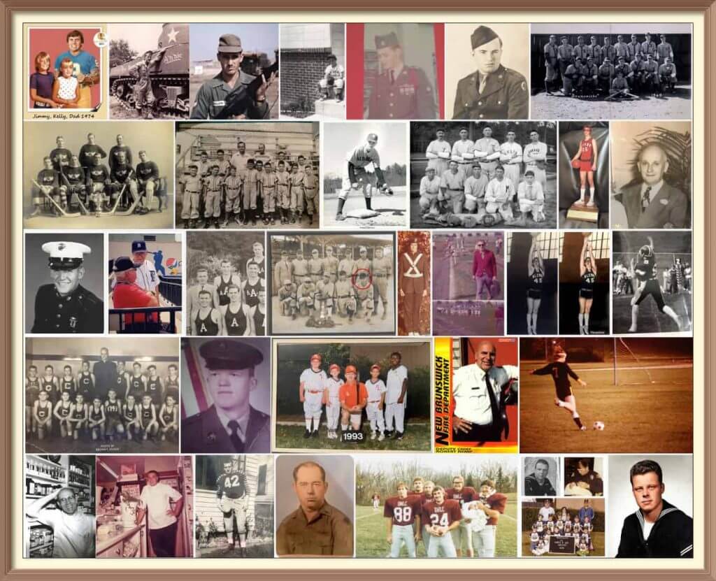
Calling All Sons (and Grandsons & Nephews)!
Father’s Day is coming soon (June 19), and I’ll once again be posting photos of Uni Watch readers’ “Dads In Uniform,” a tradition that began in 2013 (and has continued every year since then). This is always a very special day, and I’d love for as many readers as possible to participate — especially those of you who haven’t done so before. A few of you have reached out to me saying “I’ve run out of photos of my Dad” (from years’ past), so if you want to resubmit a photo used before, please do so! Because Flickr terminated my account without explanation a few years ago, any photos sent in before 2020 no longer exist on UW, so if you had sent in something before then, feel free to re-send!
To take part in this annual tradition, select one photo of your father (or grandfather or uncle) in uniform (it can be sports, military, work — as long as it’s a uniform) along with a short description of 100 words or less. Then email the photo — again, only one, please — and text to phil.hecken@gmail.com with the subject line “Uni Watch Father’s Day 2022” by TUESDAY, JUNE 14, midnight Eastern. I’ll run all of the submissions on Father’s Day. Thanks!


What is wrong with the kerning on Zamora’s jersey? #mariners pic.twitter.com/lGUQIUJOUf
— Richard Brodie 🤫🦁 (@QuietLion) June 5, 2021
And now a few words from Paul: Hi there. In case you missed it earlier this week, my latest Bulletin article is a deep dive on the NOB font used on the Mariners’ navy alternate jerseys, which over the past 20 years has provided a steady stream of kerning issues and other typographic glitches. In an effort to get at the root of the problem, I interviewed the team’s equipment staff, the guy who created the NOB font, a team exec, and more. Proofreader Jerry Wolper, who usually maintains a very even keel while performing his duties, calls this “peak Uni Watch,” and I don’t mind saying I’m pretty pleased with the article myself.
My premium subscribers can read the article here. If you haven’t yet subscribed, you can do that here (you’ll need a Facebook account in order to pay). Don’t have or want a Facebook account? Email me for workaround info. Thanks!
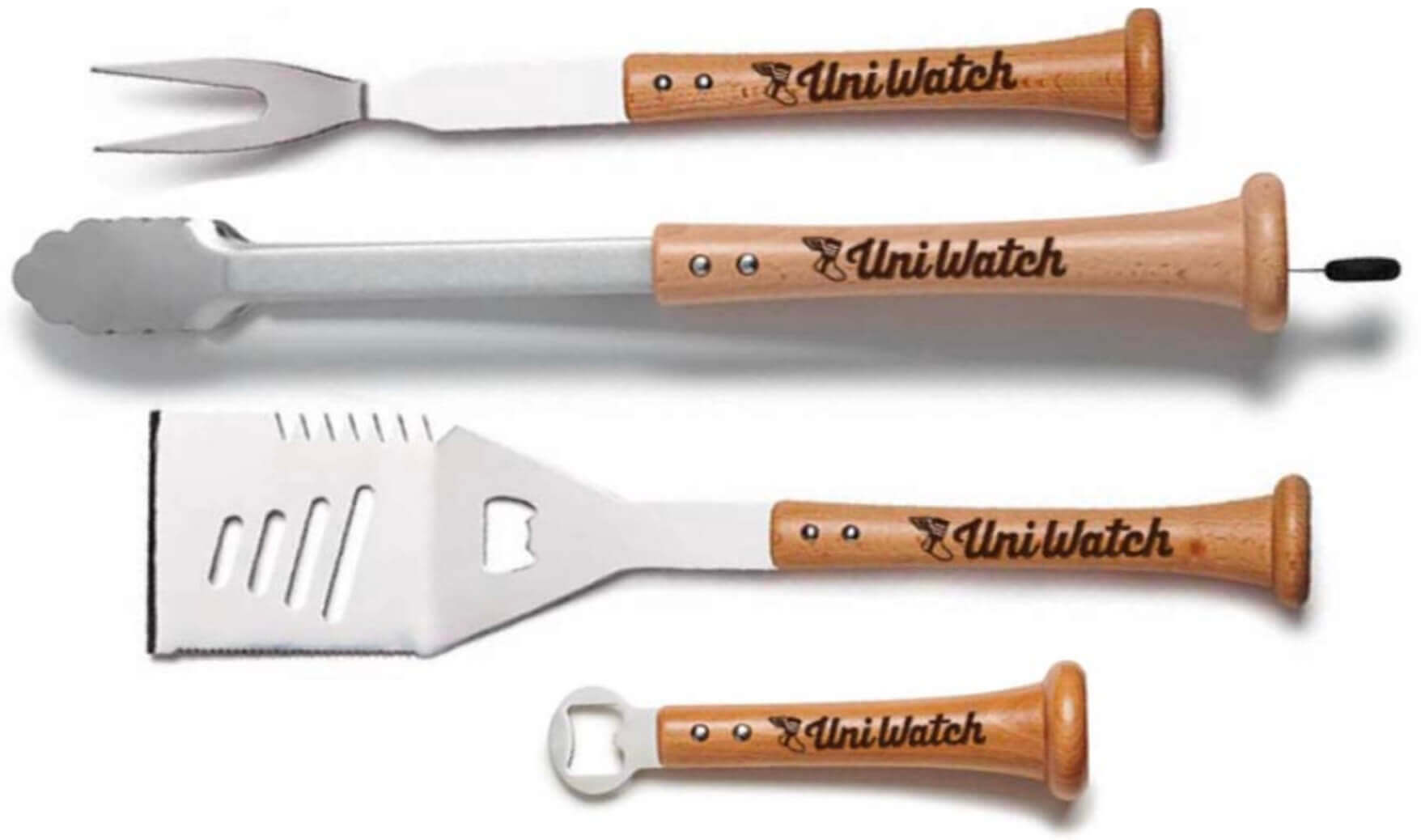
Meanwhile, with Father’s Day approaching, the folks at Baseball BBQ tell me that if you want any of our cool Uni Watch grilling tools in time for Father’s Day delivery, you must get your order in by this coming Monday, June 6. The products, with handles made from real baseball bats, are available here.
That’s it from me. Now back to Phil with the rest of today’s content!


Uni Watch News Ticker
By Anthony Emerson

Baseball News: A New York City artist wants the Mets to bring back the Shea Stadium neon player silhouettes at Citi Field, and even created modern designs for them (from James D. Marion). … The Orioles will wear orange every game this weekend in honor of National Gun Violence Awareness Day (from Andrew Cosentino). … Here’s something I don’t think we’ve seen before: Tigers 1B Cecil Fielder wearing a Blue Jays helmet during an MLB tour of Japan in 1991 — and of course, crushing a baseball while doing so (from Johnny Garfield). … The Indianapolis Indians, Triple-A affiliates of the Pirates, will wear Negro Leagues throwbacks on June 11. … The Round Rock Express, Triple-A affiliates of the Rangers, have added a memorial patch to their caps in honor of the victims of the Uvalde school shooting (from Ignacio Salazar).

NFL News: The Eagles wore a variety of orange-based practice jerseys during yesterday’s training camp, as part of the the gun violence awareness campaign Wear Orange.

Hoops News: It looks like most WNBA teams playing last night wore orange warm-up shirts for Wear Orange Day provided by the players’ association (thanks, Jamie). … Kentucky men are teasing a new jersey (from Drew O’Neal).

Soccer News: Barcelona’s new home kit has been released, allegedly inspired by the 1992 Summer Olympics held in the city (from multiple readers). … The NWSL’s Portland Thorns wore rainbow numbers last night (from our own Jamie Rathjen). … USL Championship side San Antonio FC have released a pride jersey (from @bigdondoo). … Weirdly, the UEFA Nations League scorebug’s Denmark indicator looks a lot like the flag of Greenland, which is a Danish territory.

Grab Bag: The nation of Turkey now wants to be known as Türkiye — the country’s name in Turkish — in all languages (from Max Weintraub). … A new school in Oshkosh, Wis., has unveiled its colors and mascot (from Brian Kerhin).


Uni Tweet of the Day
I think we finally got people to stop saying “Stormtrooper.” But icy whites is just as bad…
Who has the iciest white uniforms in College Football? pic.twitter.com/6Kn8gHrUfz
— CFB Kings (@CFBKings) June 3, 2022


And finally… that’s it for today. Big thanks to Walter for his deep dive into custom fonts! Fantastic stuff and looking forward to Part II.
At the top, I mentioned yesterday was particularly fraught — opening up the house is always a pain in the ass (coordinating gas/electric/plumbing turn ons, getting cable and Interwebs set up, putting away a million sheets/newspapers/mothballs etc.), but it was made particularly difficult when I arrived to find the hot water heater had broken and sprung a huge leak in the basement…now I know nothing about plumbing but fortunately the repair guy was able to come by in short order to cut the water and help with the cleanup. The bad news is the hot water heater is shot and needs to be replaced, and the earliest that can happen in Tuesday. So, it’s either no or cold showers for me for this weekend. Ugh. But it is what it is and everything else with the opening went mostly smoothly, so I’m thankful for that. Not a great way to start the weekend.
And while the cloud cover prohibited a full sunset, I was still able to capture the first “sunset” of the summer. That made everything feel right.
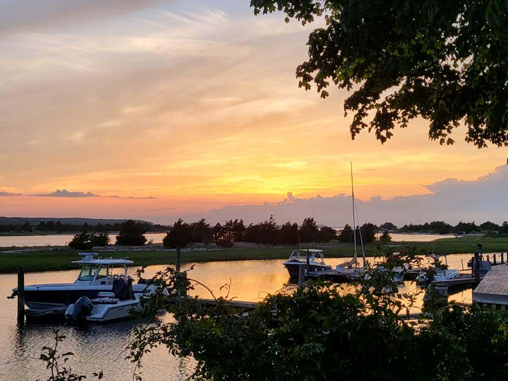
Everyone have a good Saturday and I’ll catch you back here tomorrow.
Peace,
PH
Scoreboard is from June 25, 2016. Mariners 5, Cardinals 4.
GTGFTS
St. Louis Cardinals at Seattle Mariners
June 25, 2016
Safeco Field
STL 4 SEA 5
The picture makes it feel worthwhile Phil (easy for me to say). Thanks for still putting together today’s post!
In my experience, hot water heaters can go quietly or they can create a real mess on their way out. Sorry yours chose the latter! But hang in there, hot water is on it’s way! Todays post was interesting for me. Walter did a great job on the numerals. He even touched on two of what I find to be the two most offensive MLB jerseys and those are the Reds and the Rangers. I don’t have an issue with custom numerals but I think these two teams absolutely “hit you over the head” with their font and their numberals. It’s just too much. And in the case of the Reds, they had a much cleaner look in years gone by and I don’t know why they left that.
I would be fine with “The Big Red Machine” uniforms (without the black shoes- ugh) tailored with button-fronts and belt loops. Everything you need, nothing you dont.
I always look forward to seeing the Reds and Rangers on Jackie Robinson Day because we get to see their number fonts without the busy NOBs, which look really bad with the shadows and bumps and stuff. Get rid of the NOB and the link. Same for the link
Walter and Phil – this is right up my alley. Can’t wait for Part II.
One thing, though – the Whiz Kids Phillies had a bespoke number font. A minor variation from the standard Block Varsity in the same way that the Colts’ NOB are not quite like the other “basic default” NOB letters. And they were gigantic! I was hoping that at some point, the Phillies would return to them instead of what they have now.
I disagree. I much prefer the current numbers to the more generic look from the 50s. The current numbers are an extension of the Phillies script font, they don’t just look like they’re put on the jersey, they are part of it. The only gripe I have with the numbers is the top hook on the 2. I wish it were a little shorter and didn’t hang so low.
I never warmed to the current number set. The 2 needs a shorter hook, the horizontal bar on the 4 should extend across the vertical, the 5 needs a shorter tail.
Let’s agree the Phillies’ font is way strange; it probably warrants an article of its own. I get a “Yellow Submarine” vibe.
I’m just impressed at how long the Phillies have been wearing the same uniforms with the same distinctive number font. This is their 30th consecutive year with it.
The Phillies’ numbers were CRAZY HUGE from 1950 through the day they added player names (in vertical arch- *sigh*- another subject for another day!), but only as customized as the Nationals’ or Giants’ as far as the shapes are concerned. Research showed the changes were the result of the processes used by local sporting goods manufacturers, like the metal dies used to cut the fabric. It would be like saying the black 1977 Pirates’ numbers were customized when they were only the standard Descente font.
The Phillies’ numbers were
CRAZY HUGEproperly sized from 1950 through the day they added player namesThere you go.
Totally agreed, Jim!
Great idea and nice work, Walter!
Weren’t the Phillies numbers (and mod P) in the early ‘70s chain-stitched…not familiar with the term “ring-spun”.
You are correct, sir; ring-spun is a variety of denim. I got lazy with my adjectives. The Phils’ reliance on chain-stitched figures must have made them the most labor-intensive jerseys in history!
I love the number font exploration. Great stuff – thanks! Personally, my all-time favorites are the White Sox cowboy numbers featured here and the racing-stripe era Expos. I really wish the Nationals would adopt the old Expos font, which happens to be similar to what used to be common on school busses, as it would nicely match the aesthetic of the curly W and derived scripts. Of the modern bespoke fonts, Jays and Reds are my favorites, though the current Brewers numbers are a bit of a sleeper for me. Like, it’s a number font meant to look like it’s derived from the script font, but it’s a better executed font than the lettering it’s based on.
My favorite digits, as shapes, are 2 and 4, so my fundamental test of any font after basic legibility is how attractive are the 2 and 4, followed by 5 and 3. A lot of basically serviceable number fonts get failing grades from me due to poor 2 and 4 shapes.
Looking forward to Part II!
2s and 4s; you have good taste! My first reaction is, “How did the 7 turn out?” The Nats’ chunky font is a variation on Athletic Block, as I found out- similar to the Indianapolis Colts’- but doesn’t harmonize as well with Washington’s current iconography as it did with the Todd Radom look. A return to the Expos’ font would not only look great, it would be using the DNA of the team’s ancestor.
You will not be disappointed!
A New York City artist wants the Mets to bring back the Shea Stadium neon player silhouettes at Citi Field, and even created modern designs for them (from James D. Marion).
Have they brought back the metal blue and orange rectangles that used to hang on Shea Stadium’s exterior?
I said this yesterday and I’ll say it again: those new Barcelona kits are hideous.
I never knew what bespoke meant until today! Cool word. Loved this piece by Walter. I also had not noticed the Cubs numbers were changed at some point…a downgrade.
As for the Brewers, while their numbers are oddly shaped, I have always assumed they were designed to simulate the shape of a barrel. I find that kind of cool.
I’ll admit I like the numbers better than the letters.
The Cubs’ numbers have actually gone through a lot of small changes; when they first came in (and I think they were designed by the same Otis Shepard who did their beautiful scorecard graphics), they had no serif on the 1, and the other digits were more rounded. Now they seem to be getting closer and closer to the Eurostile font; with the exception of that font’s distinctive “1”, it looks a lot like the Cubs’ font.
I always thought I was a block numeral only kind a guy, but now that I think about it, I’m not. I definitely prefer it in football, and maybe hockey, but I feel like baseball and basketball have more wiggle room for wilder fonts. And with soccer up-and-coming, I don’t think block numbers would look right.
“It started… with the evolution of man.” – D Boon
Damn voice to text.
Starting… with the affirmation
Since we’re only doing football and baseball, this “tidbit” won’t come up in the regular conversation: Custom fonts were ticking up until the Buffalo Sabres came up with those execrable red and black uniforms, and their “guillotine” typeface. I thought, “These are objectively and demonstrably horrible.” And I’m afraid I’ve taken a very critical eye toward custom typefaces ever since.
Fantastic stuff Walter, and impressive font knowledge. Looking forward to later Parts! I feel number (and NOB) fonts are a critical part of a uniform design so a custom or carefully chosen font makes or breaks it for me. I have to say though, unlike you, I’m not a huge fan of fancy serif fonts (on uniforms) as they can harm the legibility. Numbers need to be recognisable at distance in a glance. If you have to stare then they aren’t doing their job, no matter how good they look close up. This relates to the piece Paul wrote on his blog about the Mariners NOB font problems. It is a beautiful font and matches the jersey front team name, but it is totally unsuited to being a radially arched NOB font.
Serifed (or Roman) fonts are poor player name typefaces: Too many conditions. In fact, I can cite only two basketball teams that got it right; the 1977 Philadelphia 76ers (vertical arched), and the 1996 Chicago Bulls (two color). But it has to be Varsity Full Block.