[Editor’s Note: Today we have a guest entry by Zachary Wooldridge, who will bring you more information than you ever wanted to know about the jerseys of the American Ultimate Disc League. Enjoy! — PH]
Grading the Jerseys of the AUDL
By Zachary Wooldridge
I’m sure all of you are familiar with the flying disc. You may know it more commonly as a Frisbee, but that’s actually a registered trademark of the Wham-O toy company. Regardless, you know the plastic disc. You’ve probably tossed it around at a backyard barbecue, in the park on a sunny day, or maybe at the beach.
You might also be familiar with it in the context of Ultimate, which, contrary to popular belief, is more than just people standing around and throwing a disc back and forth. Ultimate is a full, real sport with high-flying, fast-paced play. Its rules are reminiscent of soccer, football, and basketball, but it is its own unique sport.
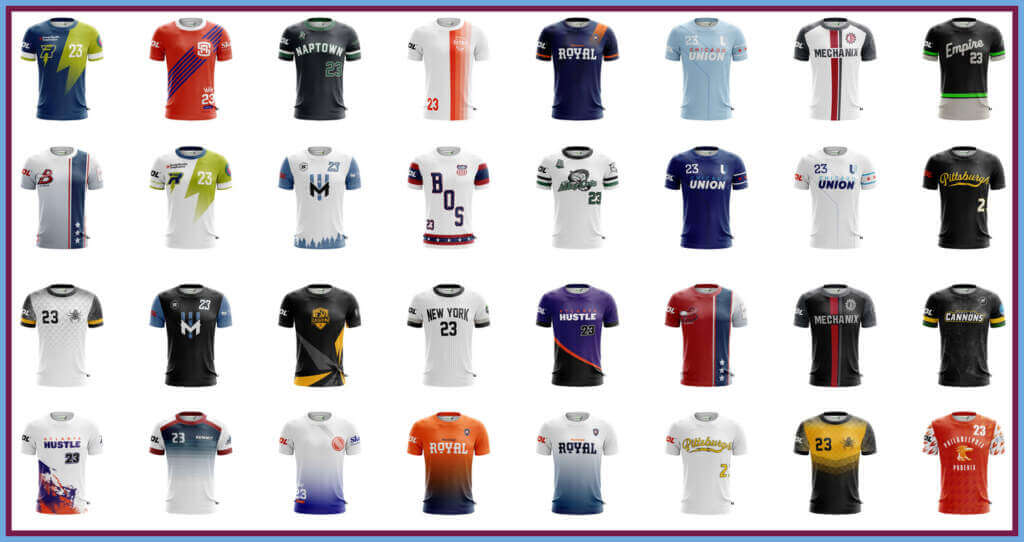
Professional ultimate is still a relatively new endeavor, and the premier league for professional competition is the American Ultimate Disc League. Since its inaugural season in 2012, the AUDL has grown from 8 to 25 teams. This season kicked off on April 29 and today we’re going to be reviewing and grading each team’s uniforms.
Let’s get started.
Atlanta Hustle
Home
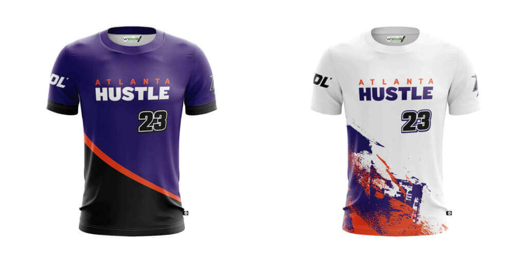
Atlanta’s home look is fairly clean, featuring a primarily purple shirt with a diagonal orange stripe and a black bottom third. While I like the purple and orange combination, where I think it falls short is on the numbers. Black on purple simply doesn’t offer enough contrast, and while the white outline helps it still isn’t enough for me.
Grade: B+
Away
The away shirt is bright and energetic, featuring what appear to be paint streaks across a white base. It’s visually interesting while also serving the purpose of contrasting with an opposing team. I’m overall a fan, though I wish the numbers were purple. Black doesn’t really show up enough anywhere else for the numbers to feel cohesive.
Grade: B
Austin Sol
Home
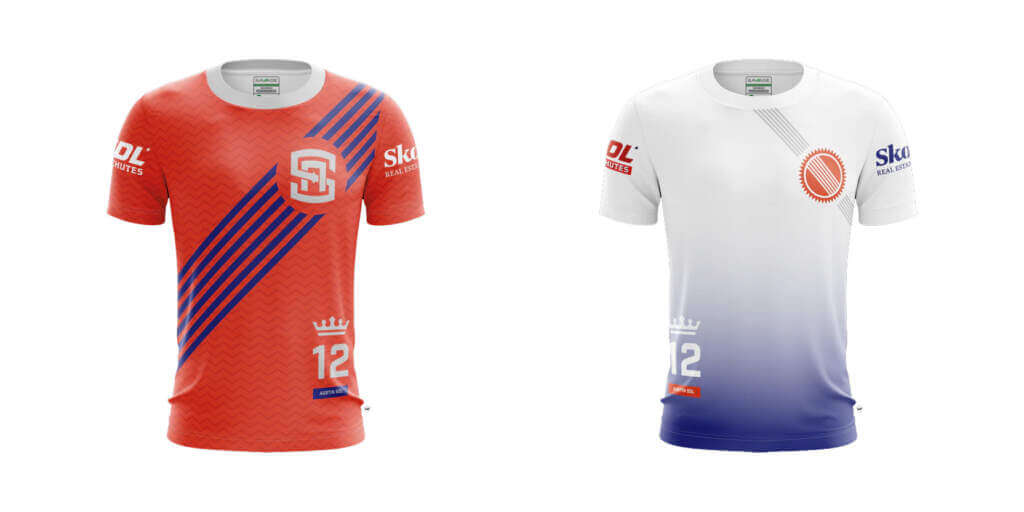
I love this jersey. It’s bright, visually interesting, but not overwhelming. The multi-stripe sash is a great element and somehow the subtle zig-zag stripes don’t clash. If I have one complaint it’s that I don’t like the placement of the numbers. I would like to see how they look on the opposite side.
Grade: A+
Away
This jersey does some things right and could improve in a few areas.
First the bad. I don’t like the gradient, I think it would look cleaner overall if it was a plain white shirt. I also don’t like the white numbers on the predominantly white jersey. I know that they’re placed over the gradient, but white on mostly white just isn’t a good idea.
Now the good. I love how the multi-stripe sash is echoed but implemented in a slightly different way. The secondary logo is also implemented well. Overall, a decent effort that I just have a few nitpicks with.
Grade: B
Boston Glory
Home
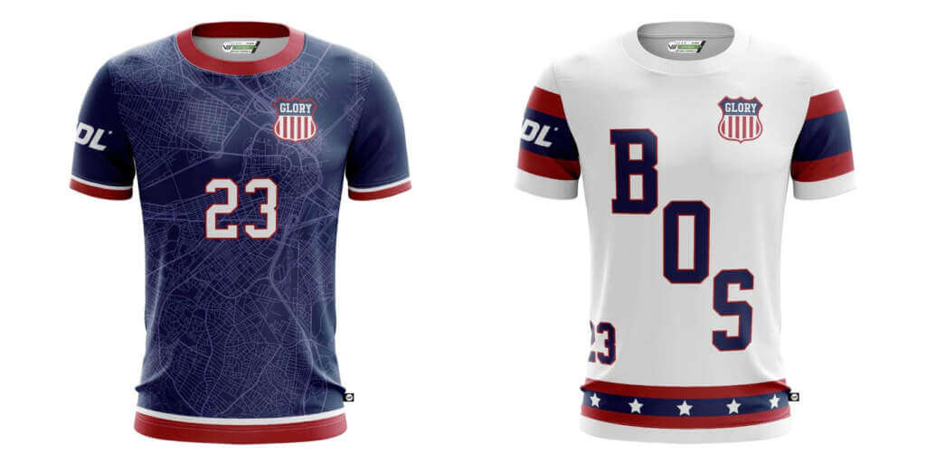
This jersey is so close to being great. The blue base with the red and white trim screams Boston to me. The number treatment also works well. What I don’t like is the sublimated map of the city on the jersey. Call me old-fashioned, but I think there are more creative ways to show where you’re from than putting the literal map of the city on it.
Grade: B+
Away
On the other hand, I have little to complain about with the away jersey. Clean and classic, I love the hockey-esque diagonal name across the front. The sleeve stripes are a classic pattern and I think it evokes Boston’s history as a sports town, even if the Glory didn’t start play until 2020. I could do without the stars at the hem, but they don’t ruin it for me.
Grade: A
Carolina Flyers
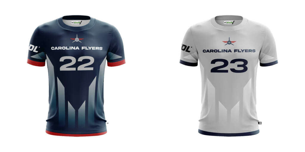
Home
I’m not sure what’s going on here. The colors are fine, but the geometric pattern looks truncated and just overall odd to me. The whole thing is busy, and not in a good way. Just a disappointing look in my book.
Grade: F
Away
I still don’t like the pattern here, but the lower contrast tones it down and makes it slightly less bad than on the home jersey. Would like to see more red used here as well. And while I’m sure the grey will provide enough contrast between the opposing team, I can’t help but think white would look better.
Grade: D
Chicago Union
Home
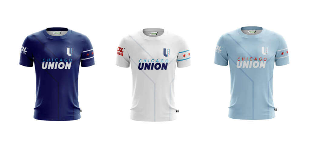
Now this I like. Great colors, a subtle pattern (which I think represents the north and south forks of the Chicago River uniting) to create just enough visual interest, and the Chicago flag reference on the right sleeve is wonderfully implemented. It would have been easy to go over the top and dress the team in the city’s beloved flag, but a little restraint goes a long way here. Well done.
Grade: A
Away
Same design as the home, just a road swap. The light blue pops a little more here and, in my opinion, pushes it slightly ahead of the home digs.
Grade: A
Alt
Where the Away was better than the Home, I think the Alt is even better than the away, Sky blue is a color you don’t see too often in American sports, so I find its use here refreshing. The red accents show up best here as well. All in all an excellent look that I think should be the main home shirt.
Grade: A+
Colorado Summit
Home
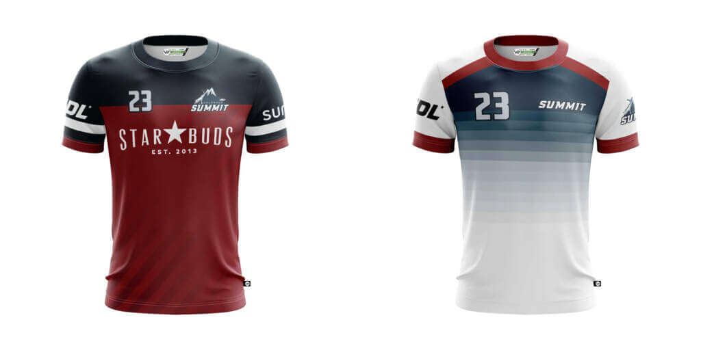
There are elements of a good jersey in here, but all in all the execution is lacking. I like the idea of the shoulder yoke, I like the idea of the subtle striping, and I like the sleeve stripes. But for some reason, all of them together are not doing it for me. It’s all too busy. And the massive shirt sponsor isn’t doing it any favors either. Visually I think the whole thing is incoherent, but it’s not totally awful.
Grade: C
Away
An improvement over the home shirt for sure. I like the gradient striping, but I don’t like the maroon stripes at the top. I think the whole thing would work better if just the collar and sleeve caps were maroon.
Grade: B
Dallas Legion
Home
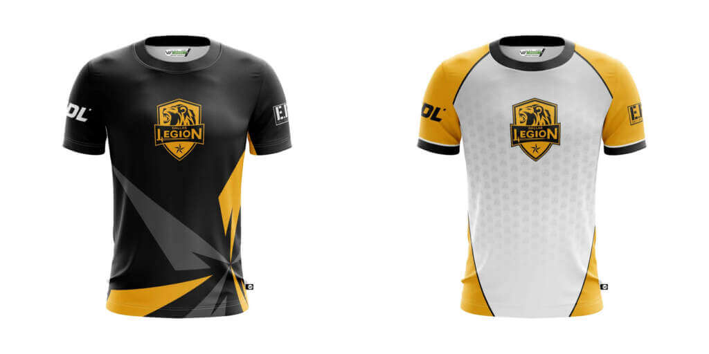
Black-and-gold is a nice color combo to work with. The team crest in the center of the shirt is nice, although I think I would prefer it placed to the side on the breast. I’m not wild about the sunburst at the bottom left, but it’s not a deal-breaker either. All in all one of the better jerseys in the league.
Grade: B+
Away
Not as big a fan of the away shirt as I am the home shirt. The gold sleeves are a nice use of color, and the contrast collar and sleeve caps work well too. However I could do without the repeated mini versions of the crest sublimated across the torso, and the gold wraparound panels make it look like the wearer is wearing a giant white bib.
Grade: C
DC Breeze
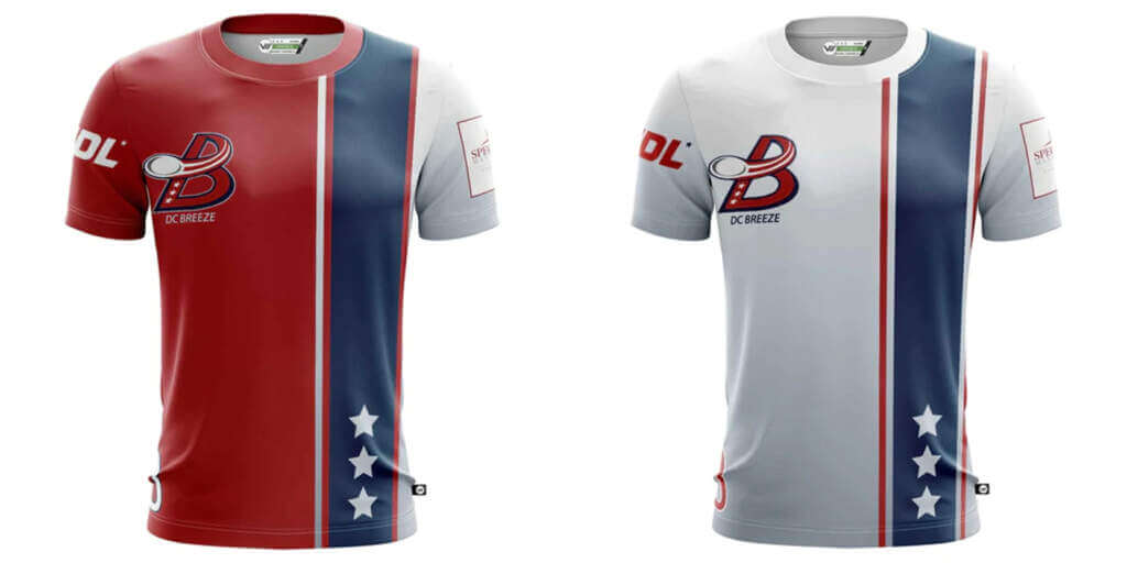
Home
While red, white, and blue is an overused color combination in American sports, you have to forgive a team from the nation’s capital for using it. I like the striping a lot, it’s simple but creates visual interest. However, I do feel like the stars and numbers are awkwardly placed. Furthermore, the predominantly red logo does not stand out well on the red shirt.
Grade: B+
Away
Personally, I prefer this to the home shirt. The striping looks more consistent here and the logo stands out better. However, it still suffers the same issues of awkwardly placed stars and numbers.
Grade: A
Detroit Mechanix
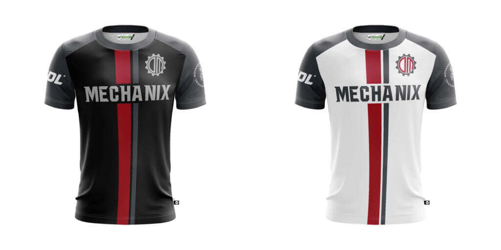
Home
This is a clean, classic look. The racing stripe down the center of the shirt is a nice element, and the red pops nicely on the black. I think it’s a bit redundant to have both the crest and the nickname on the shirt, but it doesn’t ruin it. Unfortunately, there’s a lack of contrast between the dark grey and black and I think it’d look better if it was more of a silver, or even white.
Grade: B+
Away
This is the better shirt of the two simply due to the adequate contrast between the white and dark grey. Bravo, Detroit.
Grade: A+
Indianapolis AlleyCats
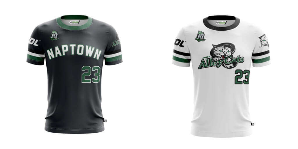
Home
I would have rather seen this shirt in green than charcoal, but I still think it’s a fantastic look. It’s drawing from heritage American sports across the board and it works wonderfully. The sleeve striping looks great and while “Naptown” might remind you of taking a snooze more than chucking a disc, I love the arched block typeface.
Grade: A+
Away
Another great look. Essentially a road swap of the home, but with the team logo on the chest instead of the “Naptown” moniker. I’m not the biggest fan of Indy’s logo, but I believe it’s been with the team since day one so I have to respect the history.
Grade: A
Los Angeles Aviators
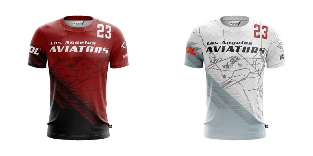
Home
I do not like anything about this. Awkwardly placed numbers, strange gradient patterns, and an airplane illustration overlaid on a map of California. It’s a mess and I’m not going to spend any more energy on it.
Grade: F
Away
Copy and paste what I said above. I can’t stress how much I dislike this.
Grade: F
Madison Radicals
Home
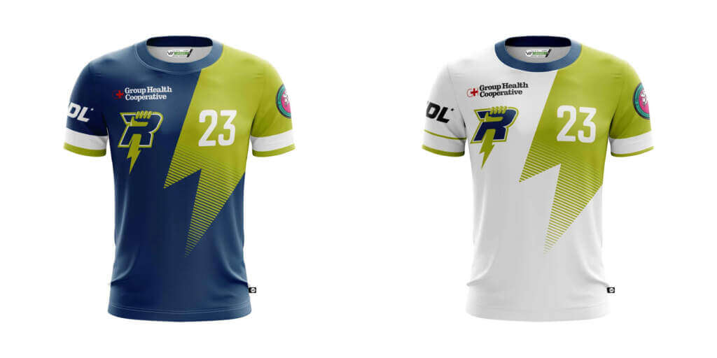
Blue and yellow are to me as green and yellow are to Paul. I’m a sucker for that combo, and this is no exception. It could have been easy to go over the top with the lightning bolt, but the Radicals deliver a clean look that strikes the balance between modern and classic. While any shirt sponsor is less-than-ideal, Madison has implemented it in about as unintrusive a way as possible. Fantastic shirt all around.
Grade: A+
Away
I love it almost as much as the home, but there’s one glaring issue: the sleeve stripes! Whereas the white sleeve stripes served as a nice accent breaking up all the blue and yellow, the white stripes on a primarily white shirt get lost in the mix. I would have loved to see the stripes in blue to echo the blue collar. Still, overall one of the better looks in the league.
Grade: A
Minnesota Windchill
Home
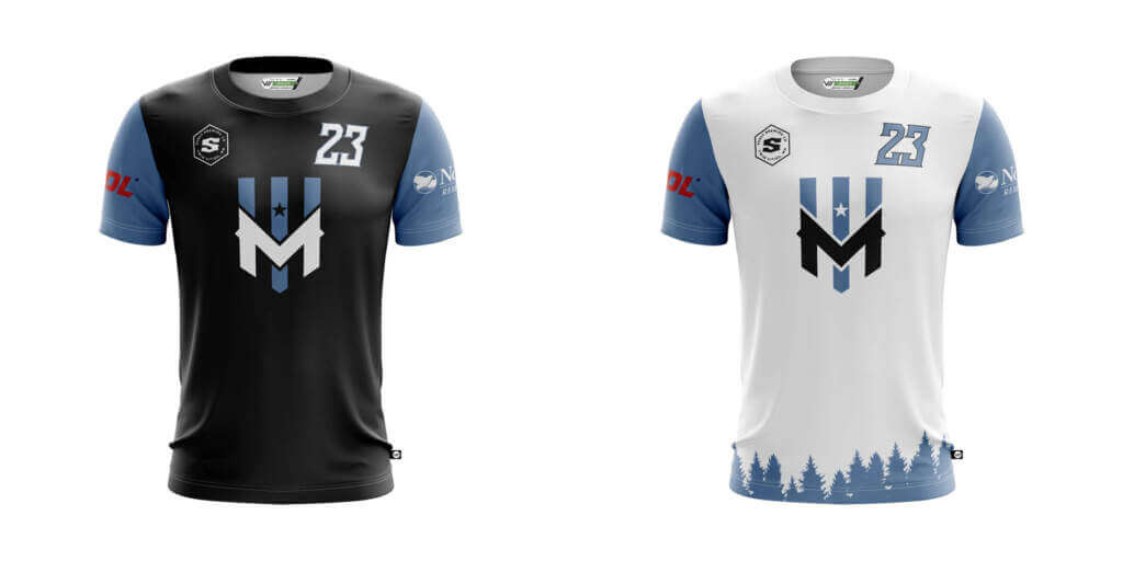
I love the colors, I love the crest, I love the whole thing. Some might think it’s a little plain, and they’d be correct. But I’d rather teams err on the side of simplicity than put out a jumbled mess.
Grade: B+
Away
Another great look and I think the forest silhouette along the hem is a nice accent. I wonder why they didn’t echo that on the home shirt? I think it would have been just the right touch that would have elevated it.
Grade: A
Montreal Royal
Home
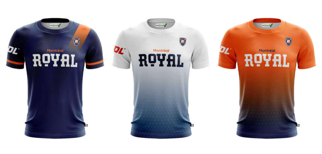
Another top-tier look. I really like the subtle sashes repeating across the shirt, though I wish that the orange sash continued all the way across instead of fading out. Still, it’s not enough to ruin it and Montreal is one of the better-dressed teams in the league.
Grade: A+
Away
Another good look. Not a fan of gradients, but it doesn’t ruin the shirt here. The fleur-de-lis pattern incorporated into the gradient is just the right touch of visual interest to keep it from being too plain a shirt.
Grade: B
Alt
An orange palette swap of the away shirt. It’s fine enough, though I think the gradient works even less here than on the away shirt.
Grade: B
New York Empire
Home
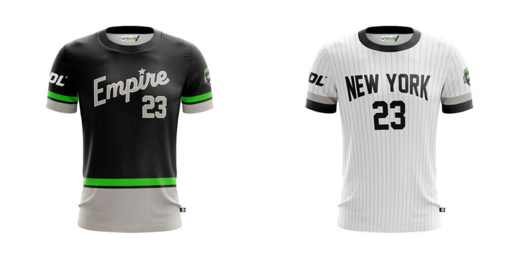
New York, baby! A great effort from the Big Apple’s team. The colors have the right level of contrast with one another and the script across the chest is the right amount of fun and classy. While neon green can be an eyesore, the restrained use here is the perfect amount.
Grade: A+
Away
A design obviously inspired by the city’s most famous sports team. I think it looks great, though I would have rather seen this used as an alternate and a more unique-to-the-Empire design used as their true road look. However, it’s hard to complain too much when it looks so nice.
Grade: B+
Oakland Spiders
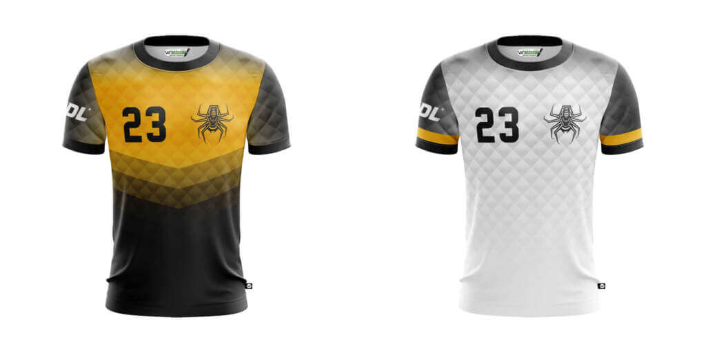
Home
There are a lot of patterns going on here, and while it’s not awful I think I would have liked to see the Spiders pick one of them and focus on that instead of trying to have the best of both worlds. All in all though, a solid look.
Grade: B
Away
This is more in line with what I wanted to see. Where I thought the home shirt fell short, I think this succeeds. Well done.
Grade: B+
Ottawa Outlaws
Home
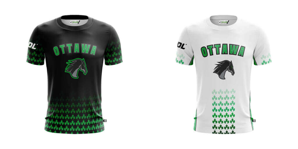
It’s fine. Nothing too bad but nothing outstanding. Overall a shirt I’m not too high on.
Grade: C
Away
I’m not sure what the impetus for changing the pattern from a full, wraparound design to a single stripe was, but it makes the shirt look incomplete to me. A step down from the already middling home design.
Grade: D
Philadelphia Phoenix
Home
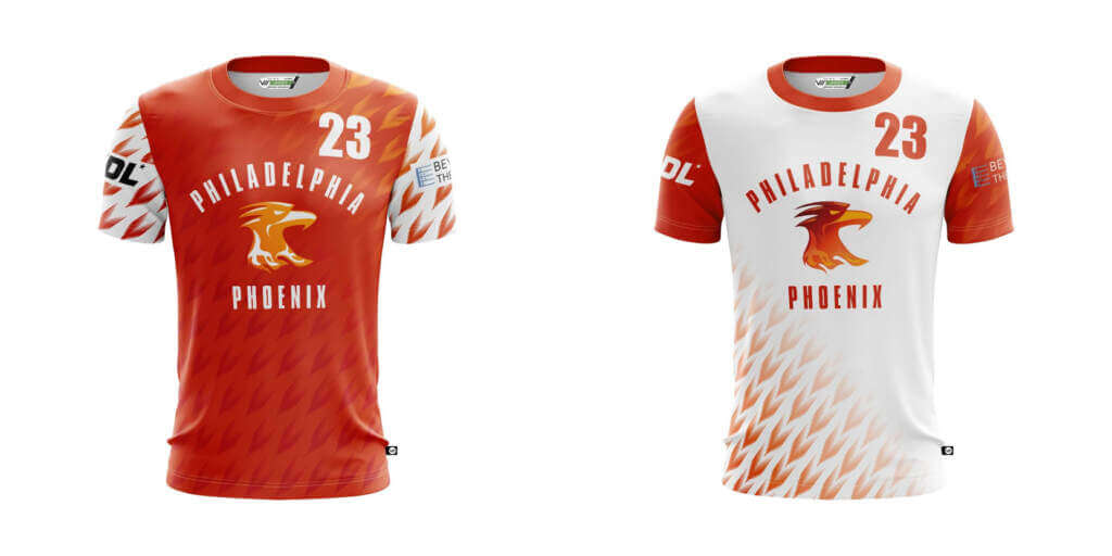
A solid look. The contrasting sleeves add some nice contrast to the orange torso. However, I think the shirt would be greatly improved by limiting the feather pattern to either the sleeves only or the torso only. Covering the whole shirt with it is a little too much for me.
Grade: B
Away
A road swap of the home shirt. I’m assuming the feather pattern is more limited on the torso to ensure the shirt is clearly white, but I would have just rather they removed it from the torso entirely and left it to the sleeves.
Grade: C
Pittsburgh Thunderbirds
Home
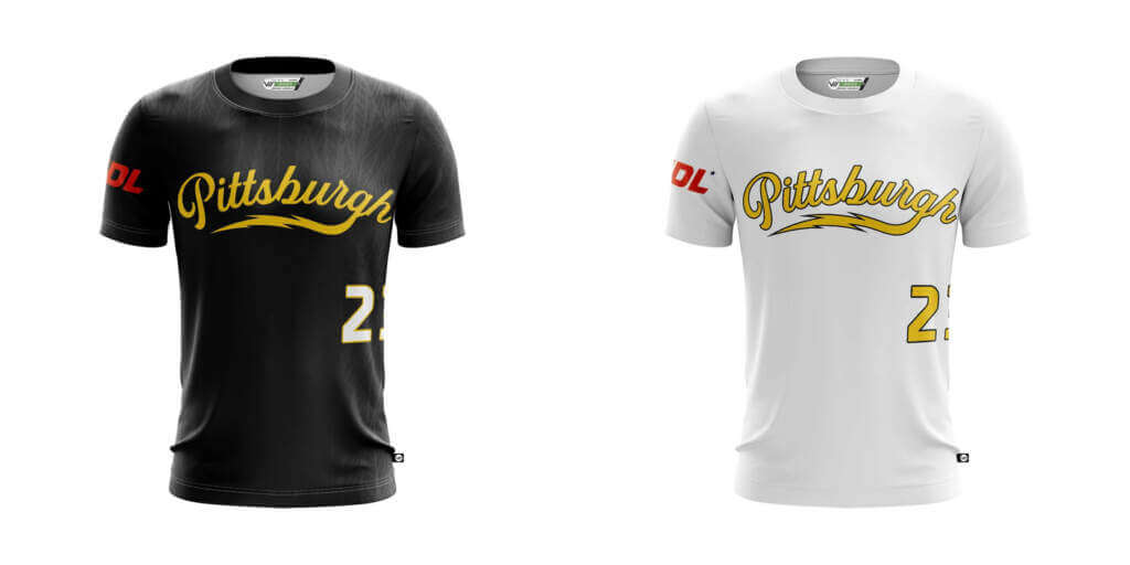
The Keystone State’s other team continues the tradition of Pittsburgh teams donning black and yellow. The subtle feather pattern over the shoulders is just the right touch to keep this shirt from being too plain. The script “Pittsburgh” with the lightning bolt swash is a nice touch as well. A good look overall, though.
Grade: A
Away
A road swap of the home shirt, though lacking the feather pattern over the shoulders. It’s a good look, but is basically just a white t-shirt.
Grade: B
Portland Nitro
Home
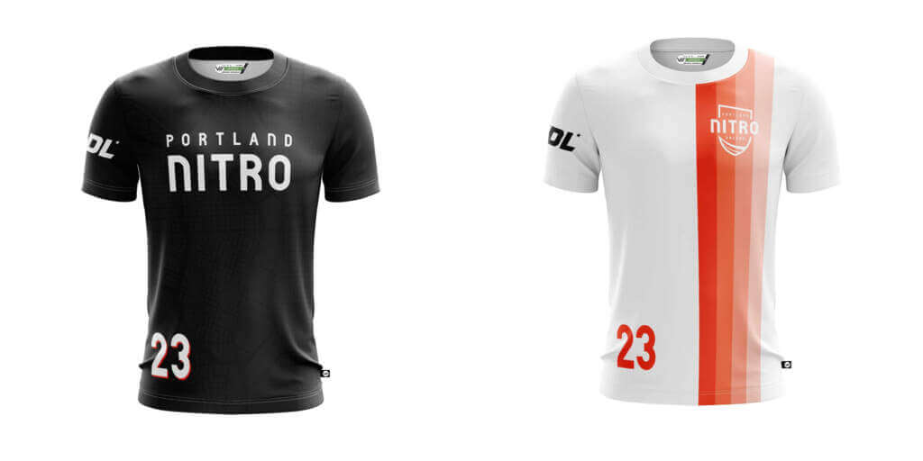
It’s fine, but it’s essentially just a black t-shirt with the team name on it. I can see that there is some kind of pattern sublimated on it, but it’s not enough to really add anything to the shirt. Overall a pretty uninspiring look.
Grade: C
Away
For as much as the home shirt lacks energy, the away shirt shows it. The striping adds color and just enough visual interest to keep this shirt from being plain. Clean and simple, but not boring. I’m a fan.
Grade: A+
Salt Lake Shred
Home
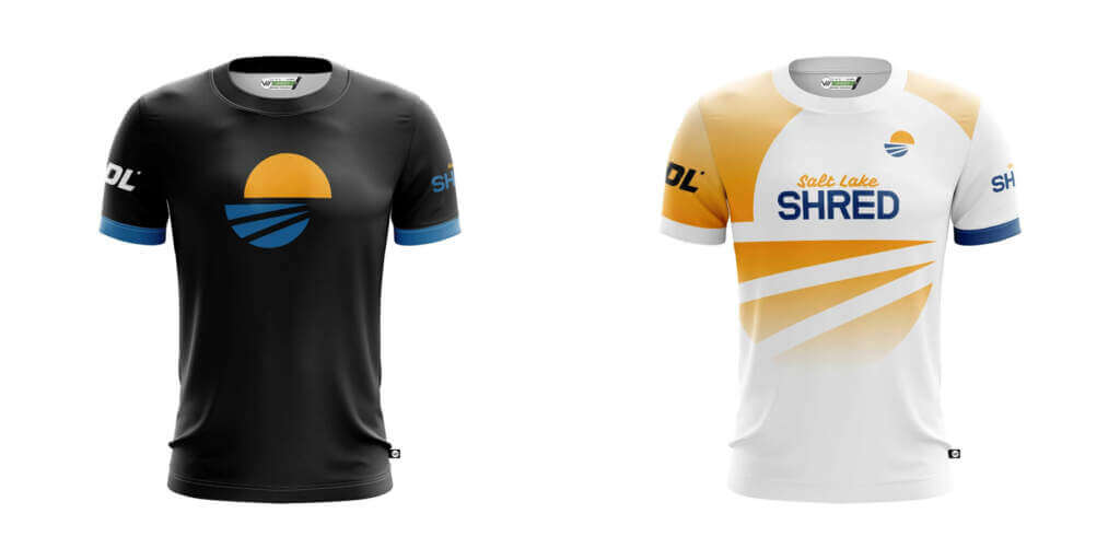
Like I said earlier, I’m a sucker for blue and yellow. But something isn’t quite working for me here and I think a big part of it is that I just don’t like Salt Lake’s logo. Nothing about it tells me what sport the team plays or what it represents. Then couple that with the basic black t-shirt look and I’m left with the impression that this is some random graphic tee found on the sale rack at JC Penny rather than a jersey. The colors are nice, but that is its only saving grace.
Grade: D
Away
At least I know the team name, although “Salt Lake Shred” just sounds like a generic tourism slogan to promote snowboarding in Utah. I see how this shirt is trying to use negative space to recreate the logo, but once again I don’t like the logo and the whole thing comes across as a jumbled mess.
Grade: D
San Diego Growlers
Home
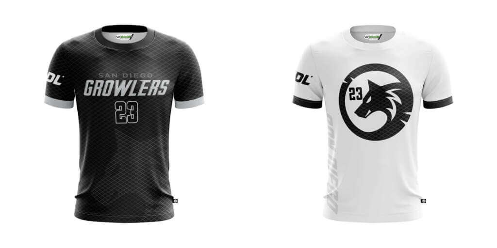
Black and silver are a classic combo and the Growlers pull it off almost to perfection here. The “San Diego” would be more legible in white or silver, but as it is now they’d have been better served to leave it off the jersey altogether. Additionally, I don’t like black numbers on a black shirt. The Growlers have red in their palette and using it on the numbers and sparingly as an accent elsewhere would have been more than enough to elevate this shirt into the upper echelon of the league. Still, I like the mesh pattern, and the integration of the wolf head adds the right touch of visual interest.
Grade: B
Away
Pretty plain, and the “San Diego” running up the side of the shirt is just a bad decision all around. Not a great effort, but it could always be worse.
Grade: C
Seattle Cascades
Home
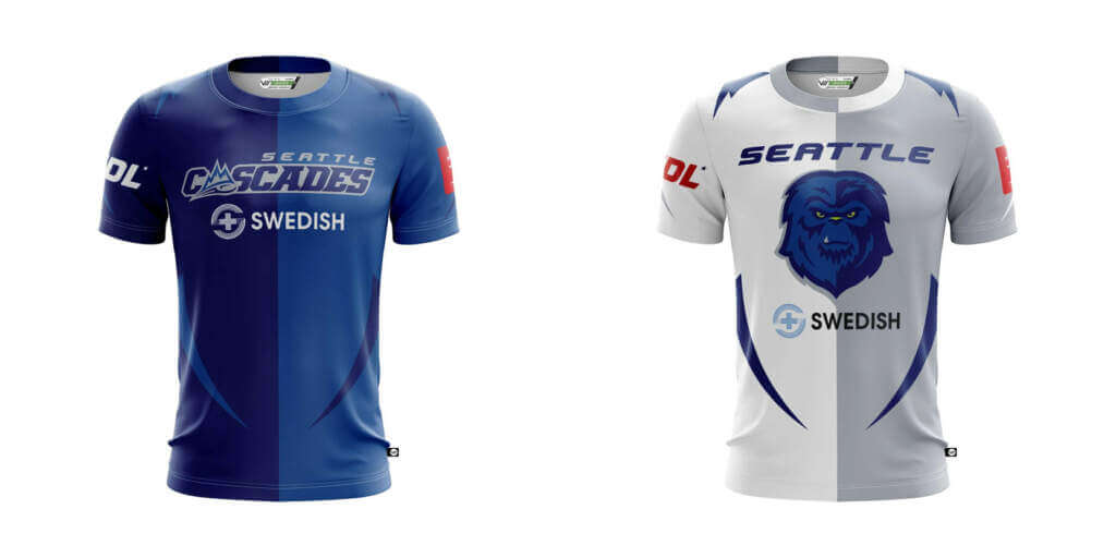
The two-tone blue halves could have been a great, unique look in this league. Unfortunately, Seattle suffers from a case of subtraction by addition with the incorporation of swashes echoing those in the fur of their sasquatch logo. It just doesn’t work at all for me and if you wanted to add more visual interest to the shirt there are better ways to do it.
Grade: D
Away
Even more of a visual mess than the home shirt. That’s all I have to say about it.
Grade: F
Tampa Bay Cannons
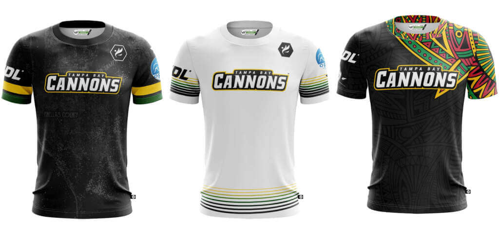
Home
Once again I’m going to start off by saying I love the colors, but I would rather see a green or yellow shirt than another black shirt. Regardless, that’s what they’ve gone for and it’s an overall well-executed design. What I don’t like, as with LA and Boston before, is the sublimated map into the shirt. It’s not as glaringly awful here as it is on those other two, but I still think it’s a lazy way to link to your city.
Grade: B+
Away
I love the striping. The rest of the shirt remains simple and let’s the bold colors and varied widths of the striping be the star of the show. One of my favorite shirts in the league.
Grade: A
Alt
The Cannons have dubbed this their African American Heritage jersey, and I think they have a major success here. Designed by players and coaches of African decent, part of the proceeds from every African American Heritage jersey go to support the community and the efforts of Disc/Diversity. A fun design executed to perfection and supporting a good cause. There’s almost nothing to dislike about this jersey.
Grade: A
Toronto Rush
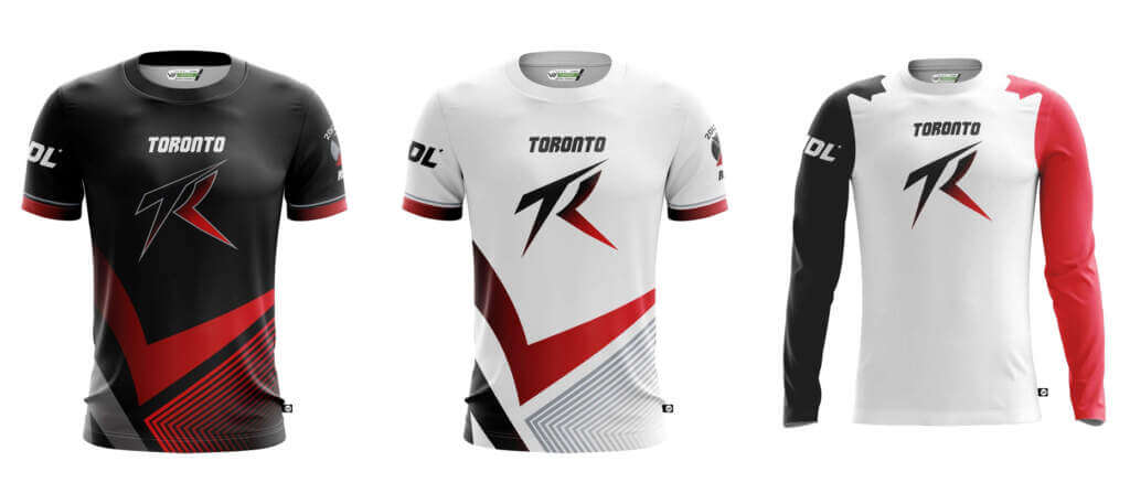
Home
Nothing on this jersey works for me. It’s loud and energetic but lacks cohesion. It feels like people just kept saying “You know what would be cool?” and then adding it to the shirt without any consideration for the overall look. I’m not a fan at all.
Grade: F
Away
Same notes as the home shirt.
Grade: F
Alt
This is their best look and should, along with a dark version for home wear, be their main look. I like the maple leaf design capping the sleeves at the shoulder. Different colored sleeves are enough to be interesting and balance out the overwhelmingly white torso. While it is fairly bland, it’d be an upgrade from their standard looks.
Grade: C
So here they are, every jersey laid out in tiers.
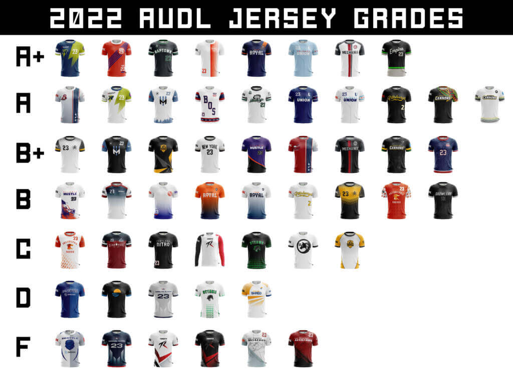
Being a relatively younger sport, especially in a professional sense, ultimate has less of an aesthetic heritage to draw from. In my experience I’ve witnessed overdesigned messes, heavily soccer-inspired shirts, and just plain ol’ t-shirts. In some ways I think the lack of a design heritage keeps things fresh, but in other ways I think it lends to a perception that ultimate continues to struggle with amongst the general population: that it isn’t a “real” sport.
Fortunately, there are more good looks than bad looks in the AUDL this year. There are more teams that look like they’re dressed to represent a professional sports organization than just out in the park playing in a local rec league. I hope that as the sport continues to grow, so does an aesthetic heritage to help push the perception of ultimate in the right direction.


Guess The Game…
from the scoreboard
Today’s scoreboard comes from Jake Palmer.
The premise of the game (GTGFTS) is simple: I’ll post a scoreboard and you guys simply identify the game depicted. In the past, I don’t know if I’ve ever completely stumped you (some are easier than others).
Here’s the Scoreboard. In the comments below, try to identify the game (date & location, as well as final score). If anything noteworthy occurred during the game, please add that in (and if you were AT the game, well bonus points for you!):
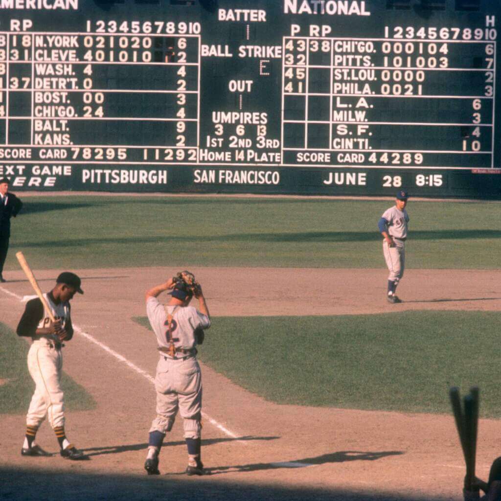
Please continue sending these in! You’re welcome to send me any scoreboard photos (with answers please), and I’ll keep running them.


Uni Concepts & Tweaks
Time for more Uni Tweaks from the UW readership.
I hope you guys like this feature and will want to continue to submit your concepts and tweaks to me. If you do, Shoot me an E-mail (Phil (dot) Hecken (at) gmail (dot) com).
Today’s concepts come from William Klumpenhower:
Hey Phil, here’s a jersey concept I made.
Unknown to many, the Toronto Maple Leafs once produced a jersey with red lettering in the crest. It sounds like sacrilege, but it’s true – though whether these jerseys ever made it onto the ice is a matter of conjecture (the only photos we have seem to be promotional, and that may have been the limit of the red text.) Regardless, I threw together a photoshop mockup of what these jerseys would look like today.
Not terrible, right? I could see them wearing these now and then, maybe on Remembrance Day or something.
– Will Klumpenhower

OK readers (and concepters). If you have some tweaks or concepts, shoot ’em my way with a brief description of your creation and I’ll run ’em here.


Uni Watch News Ticker
By Phil

Baseball News: Really good article here from the Washington Post (soft paywall) that helps explain why the baseballs themselves may be affecting offensive output (as well as being more difficult for pitchers to grip). From Tom Turner. … Two-time cheater Robinson Cano wears number 24. Here’s why. … I know it’s minor leagues (so I give them much greater leeway with softball tops), but still, a black top vs. black top game looks like shit (from Blake Jackson). … Tweeter Ben Hagen is making the re-movement proud. … So, it is now possible to make a living livestreaming one’s reactions to watching the Yankees (thanks, Paul). … Great look at 1951 ROY Willie Mays (whose birthday was this past May 6), sporting the NL’s 75th Anniversary patch. … The Tampa Bay Rays will be dropping their gray road jerseys next year (from Brian Hattab). … Apparently, you can’t use a glove in an MLB game that has a light gray and red color combination (thanks, Brinke). … NY Mets on-field reporter Steve Gelbs reports, “Remember when Travis Jankowski said that nobody will buy his jersey? There are now Travis Jankowski shirseys on everyone’s chair in the clubhouse. They were given out in the advance meeting before the game today. Jankowski apparently started laughing as the whole team clapped.” The team wore them for pregame activities yesterday. … Really good breakdown of the Dodger Stadium 60th Anniversary logo (From Ross Yoshida). … The Pirates added home run distance markers to their riverwalk this year. Tweeter Noah adds, “The logo and color scheme accuracy is spot on.”

Football News: Reader Johnny Garfield writes, “A couple years ago, I shared a pic of Jamie Mueller of the Buffalo Bills with the TV numbers on his jersey in the wrong position (shoulder pad instead of sleeve); a year later, Fulton ‘Flip’ Johnson’s jersey had that same oddity. Here’s a brief vid.” … This TikTok seems tailor-made for UWers. Submitter Adam Wood adds, “he covers the history of helmets for each NFL team. It’s really fascinating.” … Former Ohio State Buckeyes all have their jersey numbers with their new NFL teams. … Dallas Cowboys draftees now have numbers. … Detroit Lions rookies and FA’s now have numbers. … Dallas Cowboys rookies have been assigned numbers. … Here’s one Jimmer Vilk will love: the Jets and Giants are facing a lawsuit requiring them to drop “New York” from their name, as they play in New Jersey. … Here’s a story by the CFL on the Assistant Equipment Manager for the BC Lions, who is still in college (from Jeremy Brahm).

Hockey News: Reader Mark Gillingham writes he is “currently at the IIHF World Championships, watching the Sweden v Austria game. Austria (along with France) are one of the teams replacing Russia and Belarus…they aren’t wearing Nike branded jerseys, but are wearing an unbranded jersey that partly mirrors the new mid-band template that Nike introduced for the Winter Olympics.” … Oops. Looks like ESPN is using the old Stanley Cup logo (from Ikschneve McClutherness).

Soccer News: Leaked photos show Cristiano Ronaldo sporting Manchester United’s 2022/23 home, away and third kits (via Paul). … Here’s a good look at the home shirt for new USL2 side Parish Athletic Club in Baton Rouge (from Mark Jones). … New Dinamo Bucharest Badge chosen by fan and club legends vote.

Grab Bag: From our Pacific Rim correspondent, Jeremy Brahm, here’s a look at the logo for the 2022 Asian Men’s Club Volleyball Championship. … NASCAR driver Ross Chastain is a 8th-generation watermelon farmer. One of his paint schemes has a partial watermelon (from Texas Trev).


Uni Tweet of the Day
This is worded poorly, but yeah…which team is wearing the white jersey and which team is wearing the blue?
Lightning-Leafs is an annoying series to watch only because the uniforms are almost completely identical… pic.twitter.com/O2BjF3znji
— Joe Concha (@JoeConchaTV) May 15, 2022


And finally… that’s gonna do it for today, and for me for the weekend. Big thanks to Zachary for that very complete AUDL jersey rundown!
You guys have a great Sunday and a better week, and I’ll catch you back here next Saturday. Till then…
Peace,
PH
Great change of pace this morning! Thanks for an enjoyable run through the AUDL. I even agree with most of the reviews…although my biggest disagreement is with the Carolina Flyers. I love that look, probably because of the nice-sized numbers. Also, I like the use of gray instead of white. I love the Mechanix and the Empire as well.
While neon green can be an eyesore, the restrained use here is the perfect amount.
Agreed. I’m starting to think the same thing about white. In fact, I told Phil a while back I’m thinking of writing an “In Defense of Dishwater” article, saying that with some tweaks, the Rams could be on to something with their off-white unis.
With very little ad pollution (for now, at least), this could be a fun league to watch. I’ve seen highlights years ago on YouTube, and I caught a pickup game once at a park in San Jose, so I know I’d enjoy this on TV.
Currently my Big Four sports are football, ski jumping, cricket and college volleyball. I may have to add Ultimate and have a Big Five.
Football, soccer, auto racing, track and field, Stanley Cup hockey
Thanks for the comments, Jim! I know some out there really like Carolinas look, but something about it just does not work for me.
I’d be super interested in reading that dishwater defense if you ever get around to it!
That Giants-Jets lawsuit would be hilarious if it weren’t so … hilarious.
I like how the complaint says ““New York City is the Big Apple, home of the Statue of Liberty…”
Lady Liberty is in NY jurisdiction, but technically in NJ waters.
Of course the person suing said he bought season tickets and didn’t know where they played, which sounds ridiculous. If you’re a big enough fan to pay that kind of coin, then you know where your team plays its games.
And I see no problem with the TB-TOR matchup. For those of us “who get it”, it’s obvious by the striping and number fonts which team is which.
June 26, 1960. Game 2 of a Cubs at Pirates double header:
link
June 26, 1960. Game 2 of a Cubs at Pirates double header:
link
6/26/1960. Cubs at Pirates, game 2 of a double header. Let’s play two!
link
About the red lettering on the Toronto Maple Leafs logo. Interesting to note the mighty nhluniforms.com states it was on their blue jerseys from 1945-48.
link
A message for the assistant equipment manager for the BC Lions. Order some helmet stripes! 2022 promo photos for the Lions show them now without the helmet stripes:
link
A definite downgrade compared to with the helmet stripes:
link
Joe Concha made the same comment about the Lightning-Leafs jerseys that I made a few days ago on UW.
Incidentally, I’m really bummed that two teams with hideous dark uniforms were NOT eliminated in the first round. The Oilers with their dark navy jerseys/pants/socks with orange and no white anywhere … the Hurricanes with their black jerseys/pants/socks with red and the only white is on the name and numbers, no white trim… both of these are eyesores and now I have to endure another round of them…
-Jet
I agree unfortunate that both Hurricanes and Oilers wearing their alternates at home in playoffs.
I wish the St. Louis Blues would have worn alternates in playoffs instead of these two teams.
link
If the Rays really are dropping gray uniforms, a) that is lame and b) does it indicate that Nike is going to push for the lousy NBA-ification of baseball by eliminating such concepts as home and road uniforms? With the awfulness of the DH spread throughout the top tier of the sport, ads being plastered on uniforms next year and even more of interplague baseball infecting the 2023 schedule, the dropping of a traditional look will just be another reason to pay less attention to big league ball.
I disagree. More columbia blue, please. More color, less gray. Bring back the seventies, the best era of baseball uniform goodness! I also think the DH is an upgrade.
The 1970s MLB aesthetic should be left in the dustbin of history; horrible uniforms and way too much artificial turf. And the DH is the most disgusting invention ever contrived.
And the DH is the most disgusting invention ever contrived.
No, that would be a tossup between Barstool Sports and ads on uniforms.
a subtle pattern (which I think represents the north and south forks of the Chicago River uniting
Its actually Chicago’s municipal device:
link
That’s it! I actually realized this a couple days after submitting my piece to Phil, but it was too late to correct it. I’ll never forget it now though!
Wow, I don’t remember sending in that cool Leafs concept!
Maybe you want to fix it and credit the right guy ;)
Holy shit. My bad! Not sure how that happened but now fixed. The concept came from William Klumpenhower.
re: MLB/Jordan Hicks glove color.
Definitely saw him use the same glove last time they played the Giants in SF – one game last weekend.
Maybe Gabe Kepler made a mental note and decided to test it out ” juusst a little bit” before yesterday’s first pitch.
Don’t know if that’s strictly an umpire call or if a manager can request it – even if not, he can certainly put a bug in their ear.
Then, one of the three gloves that were finally presented looked like it was the same color as the illegal glove only without the red webbing.
Maybe it was the contrast in colors – the ump did veto the second clove because of a white/camo panel on two of the fingers.
My sister and I always enjoy talking about the players uni, gloves, socks and shoes –
She gets it.
Umpire here – the official MLB rule 1.15 states that “the pitcher’s glove may not, exclusive of piping, be white, gray, nor, in the judgment of an umpire, distracting in any manner.”. The general interpretation is that the glove must be predominantly one color, and cannot contain sections of contrasting or bright colors, even on the webbing. The pitcher, manager, and/or equipment manager should have known better to let him out on the mound wearing that glove.
Love seeing some ultimate content! It’s a shame that College Ultimate is so decentralized and hard to find good pics of unis, because there are some truly phenomenal unis in nationals this year.
It’s a bit disrespectful to say that Joez McFly makes his living livestreaming Yankees games. He does a lot more than that for Jomboy Media.
That AUDL New York away jersey certainly pulls inspiration from the Yankees, but the first thing I thought of was the famous John Lennon photograph of him in the sleeveless New York City shirt. link
Great work, Zachary Wooldridge! Ultimate Disc has some cool shirts, & you did a tremendous job detailing the highs & lows of this year’s offerings. Thanks!
That Leafs jersey with red letters looks sweet!
-Jet
Impressive undertaking to recap and rank all the American Ultimate Disc League jerseys, Zachary! Thanks for sharing it with us! I thoroughly enjoyed it. Overall, I’m impressed with the design quality of the league’s uniforms. For a league showcasing such a cutting-edge sport, the uniforms draw heavily from classic design principles. No complaints from me on that!
Game of the Day – Chicago Cubs vs Pittsburgh Pirates at Forbes Field on June 26th with a final score of 7 – 5 Cubs.
Of course, I love the pic of the Forbes Field scoreboard! Similar to Wrigley’s with “P”, “RP” and room for 10 innings. It looks like they’re posting the score of the first game of DH’s in the 9th inning box. The width of the city’s nameplates seem narrower than Wrigley’s, with every city being abbreviated. Some of those old-school abbreviations are hilarious: DETR’T, CIN’TI, CHI’GO. They use two letters for L.A. and S.F., but New York gets N.YORK.
In later pics of Forbes’ scoreboard (after they expanded it to include ten games) N.YORK was replaced with N.Y. for both New York teams. Yeah, I know… get a life! I’ll try.
My favorite feature of AUDL and soccer uniforms are the evolving mechanical patterns that resemble watermarks. I wish more sports would use them. The 1996 Patriots and the 1997 Nets were two teams who used textured material, and that’s too little of a good thing.
RE: the Jets and Giants are facing a lawsuit requiring them to drop “New York” from their name, as they play in New Jersey.
I hope nothing actually ever comes of this because then the Commanders will then be from Maryland, and we want nothing to do with them!