By Phil Hecken
Follow @PhilHecken
Good Sunday Morning everyone!
I’m back today with the inimitable Chris Diamond, who last month brought us a couple terrific think pieces about what might have happened had the USFL & NFL merged thirty five-ish years ago. They were quite well received. If you missed either one, or want to re-read, you can check out Part I here and Part II here. Part III (today) will look at the first 20 teams from Chris’ 40 team league, and Part IV (sometime next month) will look at the final 20.
Here’s Chris!
A 40 Team NFL: What if the NFL and USFL Merged in 1987? (Part 3)
by Chris Diamond
So here is Part III of my NFL-USFL Merger Alt-History Piece — this time I look at how the uniforms of the 40 teams in the merged league might be in 2022. Same rules as for the helmets apply: No BFBS, Uni-momentum and no wishful thinking! Here are the first 20 teams, rest to follow…
Arizona Outlaws
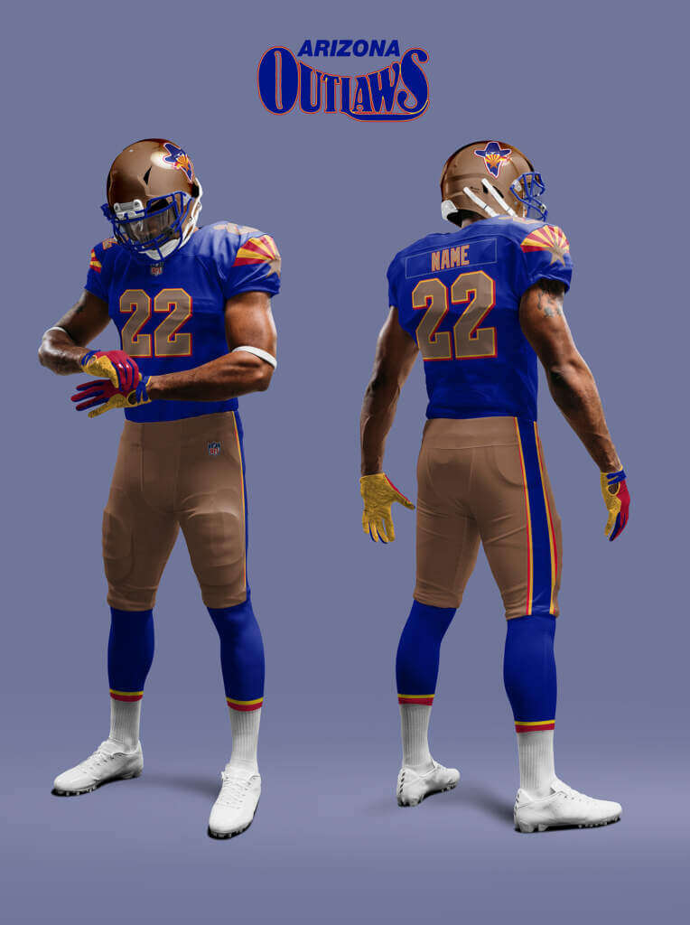
The Outlaws have merged elements from the old Wranglers look based on the Arizona Flag. After I did this I noticed in the piece on the Arizona Cardinals re-design that someone else had thought of the flag sunburst on the sleeve design!
Atlanta Falcons
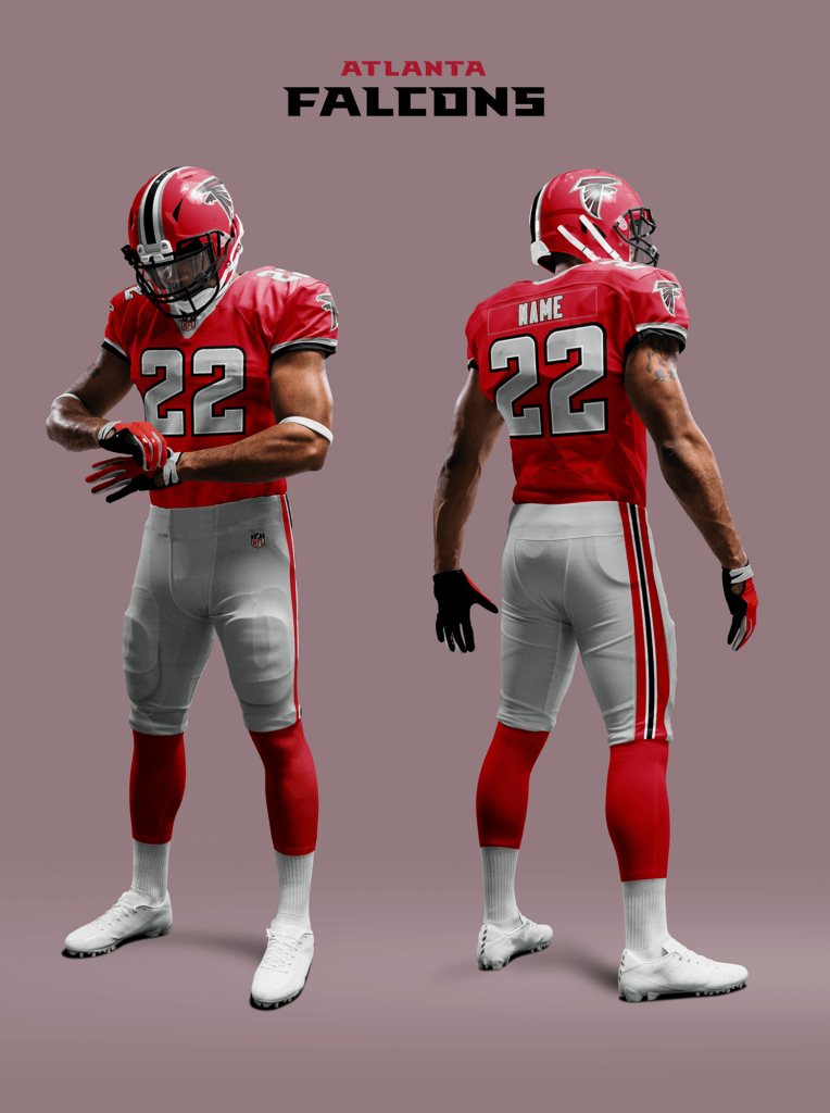
As I already said in Part II, the Falcons never went the all-black route here. So they still have uniforms based on the iconic look they debuted in 1978 of red helmet and jersey and silver pants.
Baltimore Colts
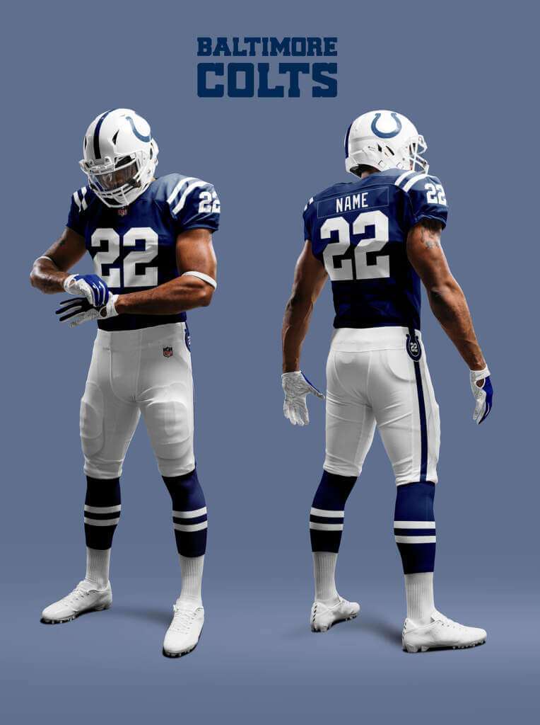
The Colts look is one of the most stable in the NFL so it’s unlikely to be hugely different here. But I’ll assume a few minor tweaks and they never needed the faux-50s grey facemask and number font to summon the winning spirit back!
Birmingham Stallions
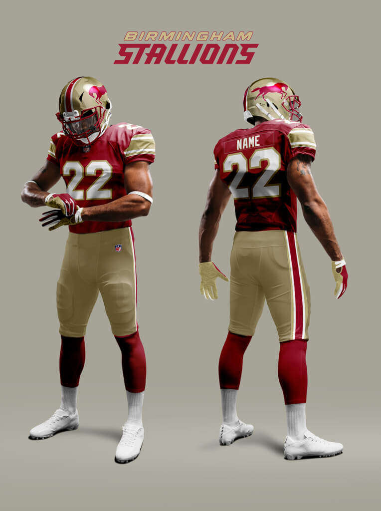
The Stallions jersey in 1987 used Northwestern stripes. These tend to be persistent (e.g. Lions, Steelers) so I assume they are here too.
Boston Patriots
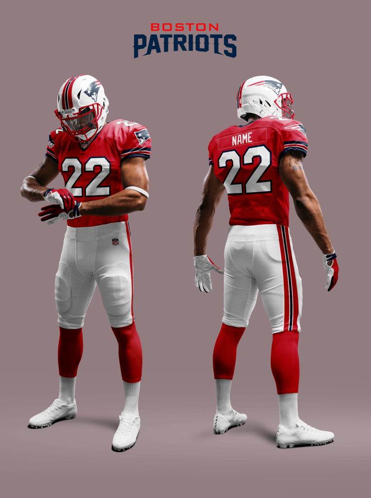
Along with their move back to Boston, I imagined they may have revived something like this Boston earlier look. Plus Elvis of course (sorry again Pat Patriot fans)!
Buffalo Bills
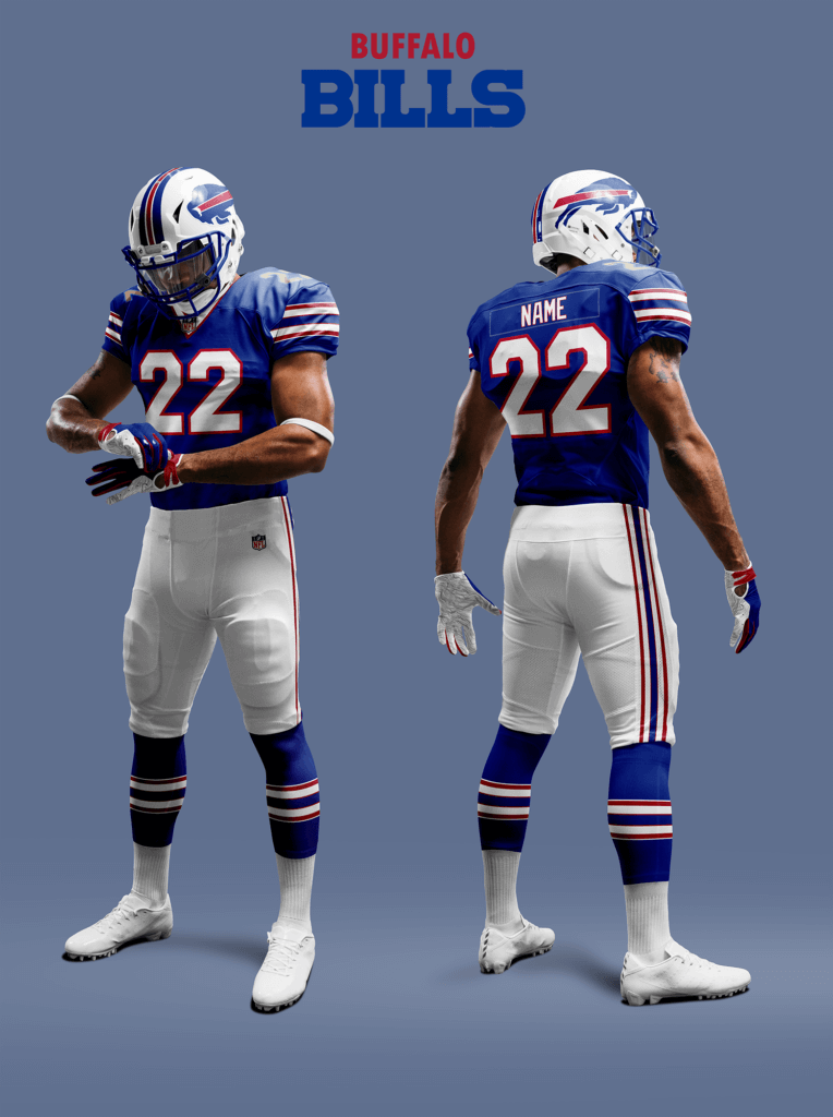
In reality the Bills have brought back elements of their pre-1975 look. Here I assume they have embraced this idea fully and modernized it.
Charlotte Panthers
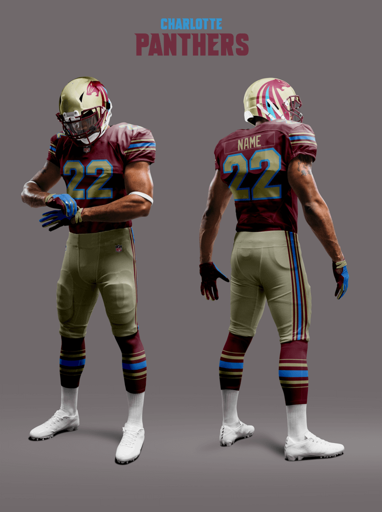
The Panthers revived the Michigan identity when they re-located from Oakland. For the logo I’ve taken inspiration from the USFL2 Panthers re-design, and assumed the uniform would also have been updated.
Chicago Bears
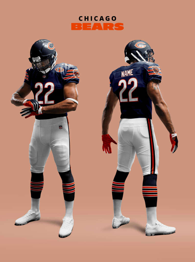
The Bears’ uniform is essentially unchanged since 1961 with only minor changes. So its Uni-momentum is huge. But here I allow for a little tweak, adding the secondary logo to the sleeves and moving the GSH memorial patch to the front.
Cincinnati Bengals
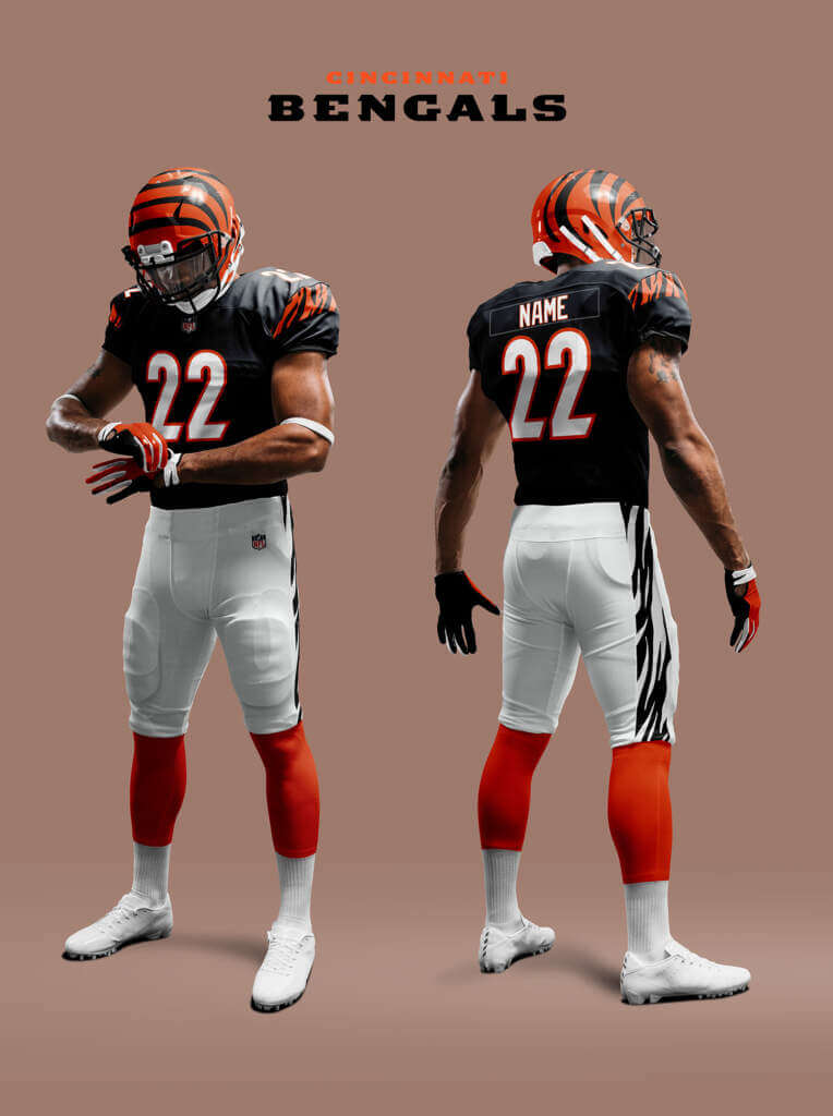
When the Bengals changed their look in 1981, it divided opinion because of the radical helmet design and tiger stripes. In reality, since then the helmet is unchanged but there have been several attempts to update the uniform with mixed results. I think like the Browns, they would eventually return to a more classic look so that is what I assume here. The only change I’ve added is the black and white pants. This actually makes design sense because Bengal Tigers leg stripes are like that.
Cleveland Browns
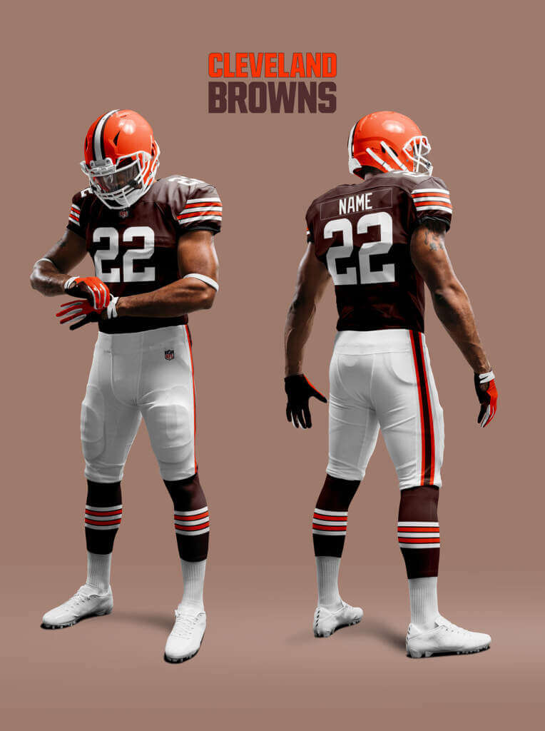
In this Alt-reality, the Browns are still the original franchise. So hopefully there were spared the worst excesses the team’s fans endured in reality. I’ve assumed they kept with the look with no need for re-boots.
Dallas Cowboys
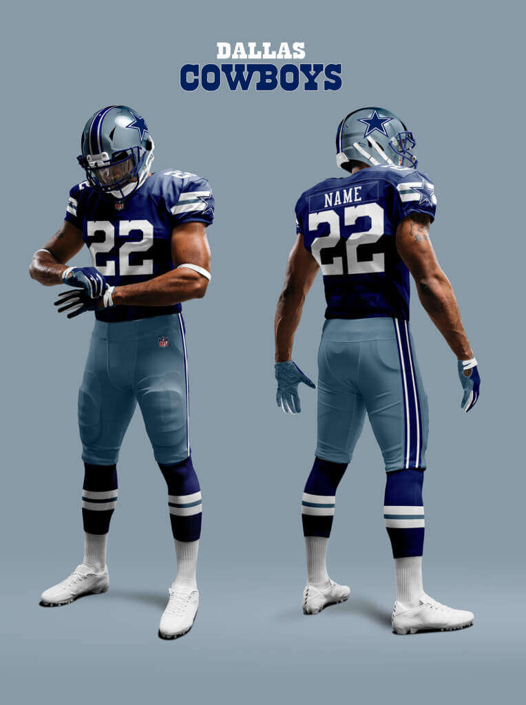
As I documented in Part II, the Cowboys current look is a hodge-podge of old and new based on the whims of their owner. So I assume in this Alt-reality that good design sense prevailed at some point. They go back to the original shades of royal blue and metallic blue they adopted in 1964 and harmonise the white and dark looks.
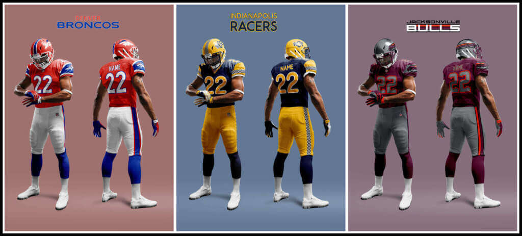
Denver Broncos
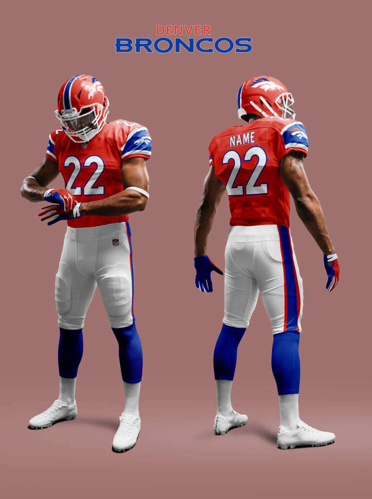
Orange has always been a big part of the Broncos identity. Of course in reality in 1997 they went all navy and promptly won two Superbowls! But in this Alt-reality they went the other way, totally embracing the orange-max look based on their 1966-67 look.
Detroit Lions
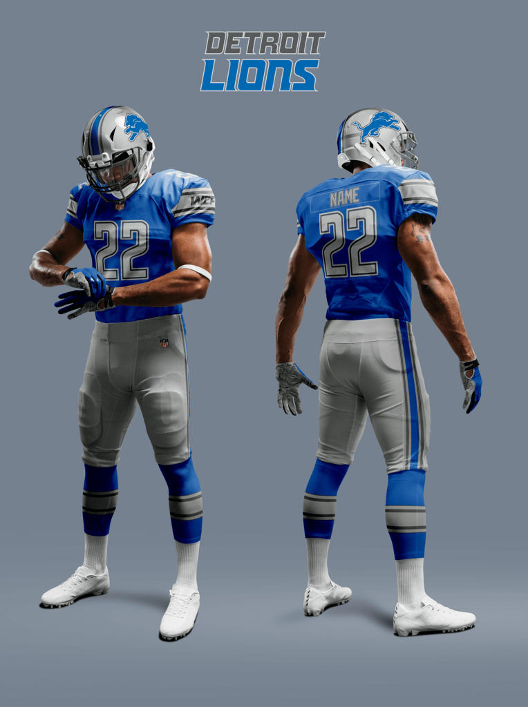
The Lions’ look has been remarkably consistent since they adopted their Honolulu blue and silver scheme in 1934, in particular the Northwestern stripes. Their most recent uniforms show a reasonable attempt to return to the pure Honolulu Blue and Silver so I will assume a similar path in this Alt-reality. But they make better use of the two shades of grey.
Green Bay Packers
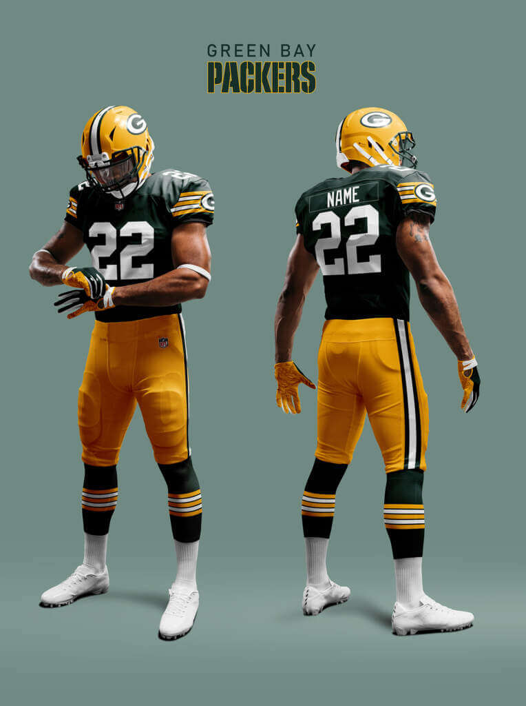
The Packers’ green and yellow look is so iconic they have huge Uni-momentum. But in our Reality they have been the victim of shrinking stripes syndrome. This debilitating affliction has affected many jerseys over the years (e.g. Lions, 49ers, Cowboys) and manifests as a decrease in the number of stripes as sleeves gradually got shorter from the 60s until now. For the Packers it started in 1981 losing two by 1983. The jersey rallied in 1984 when the G logo was added, but this had gone by 1990 and the rot set in again and by 1997 they had gone for good. In this Alt-reality the Packers jersey has kept the full set!
Houston Oilers
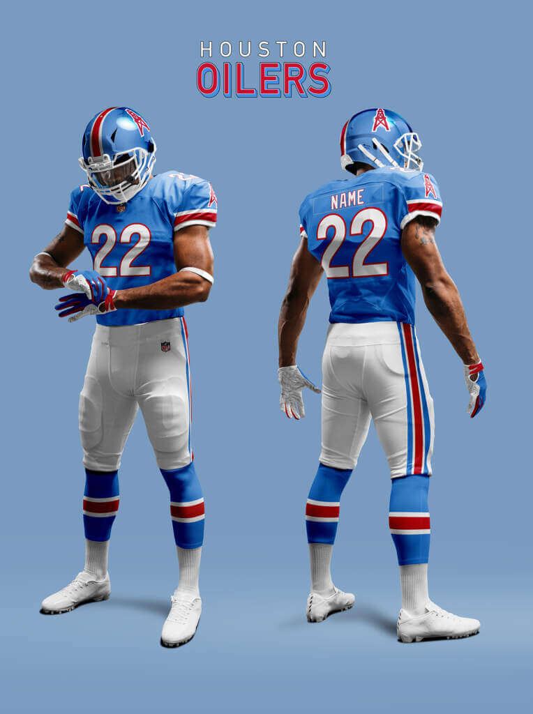
There is still a lot of love for the Oilers’ look in our reality with both the Titans and Texans being encouraged to do some throw- or faux-backs. But here in our Alt-reality such artifice is not needed as the Oilers never left Houston! As I mentioned in Part II, these Oilers have adopted a metallic Columbia Blue helmet to link back to both their silver and blue variations. They also adopt a number font like their 1960s version.
Indianapolis Racers
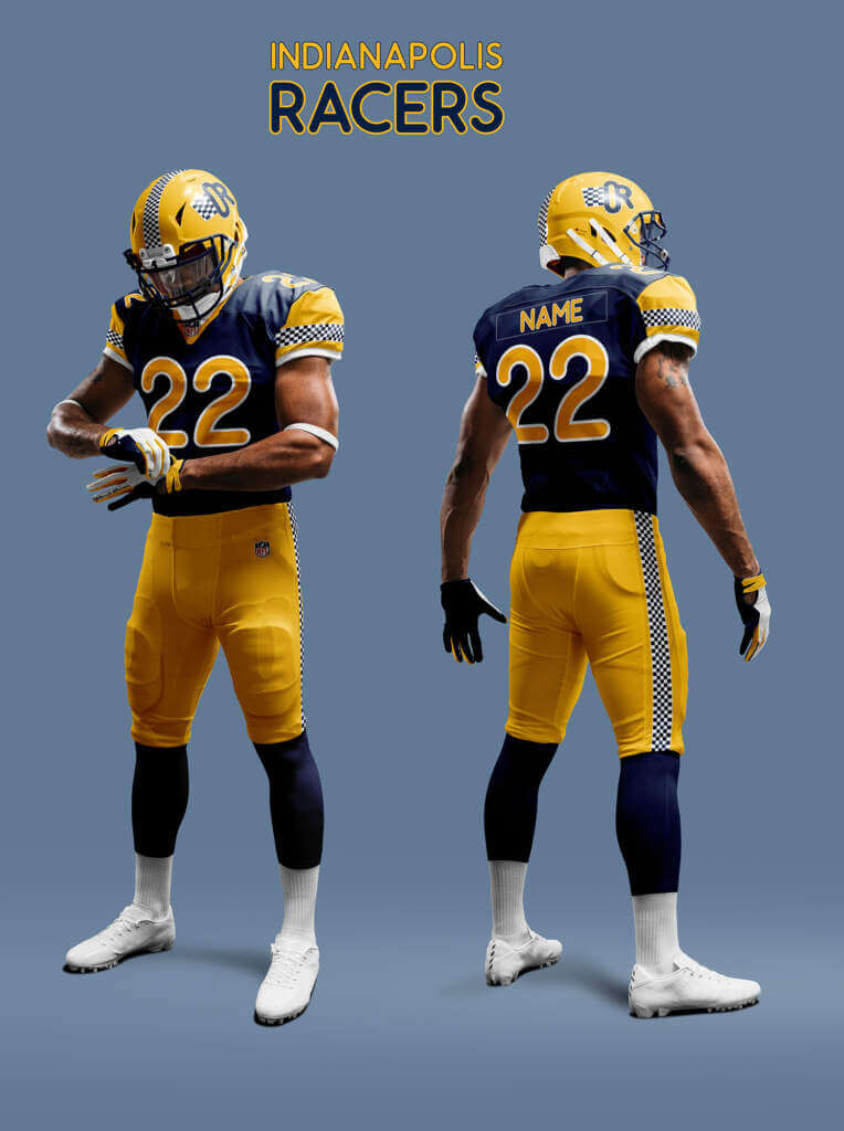
The Racers are what the Indianapolis Colts became in this Alt-reality. Initially they kept the same uniforms, but by 2022 they have had a re-design. In the spirit of cross-town solidarity they adopted the same navy and yellow scheme as the NBA’s Pacers.
Jacksonville Bulls
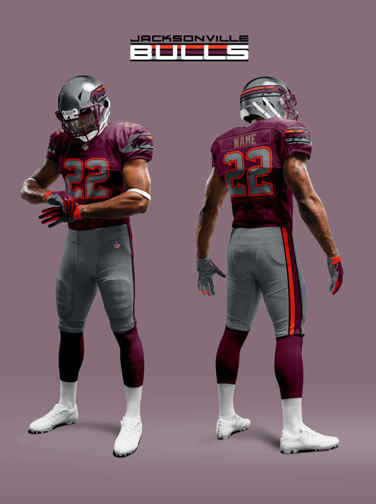
The Bulls 1984-85 uniforms were among the best in the USFL. By modern standards though, the logo is quite fussy so would likely have been updated. However I assume the overall look-and-feel of the original uniforms are maintained.
Kansas City Fire Chiefs
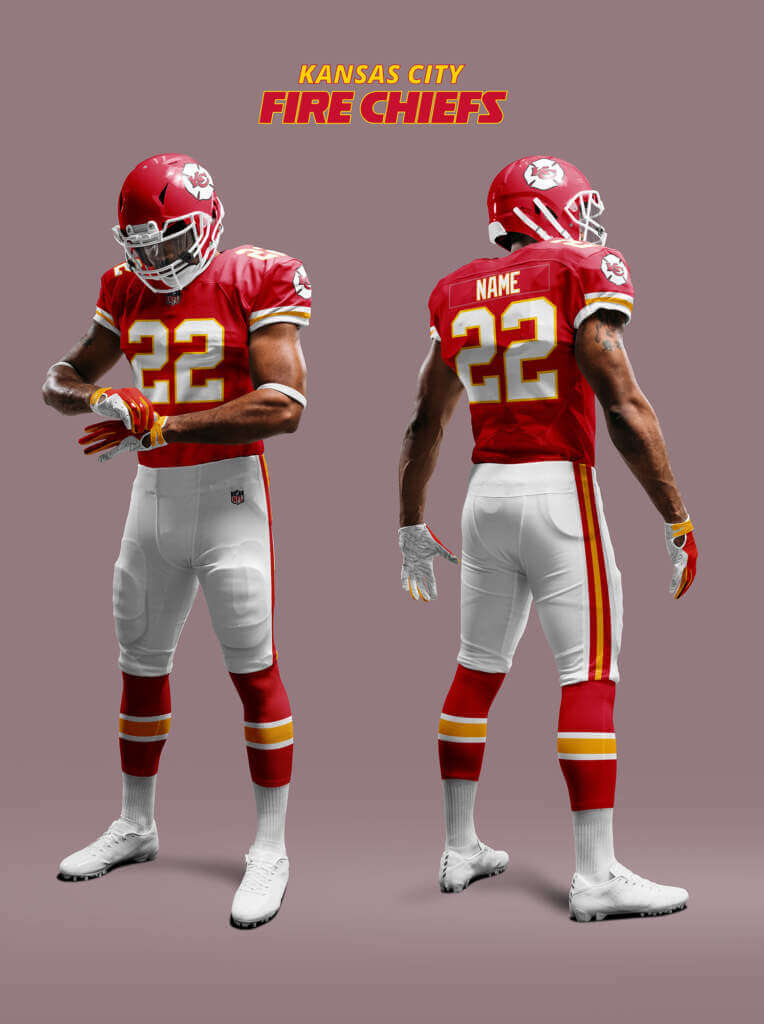
In this Alt-reality, KC have changed their name to the Fire Chiefs and incorporated the logo of a Fire Department in their logo. They’ve more-or-less kept the same look that they’ve had since 1963, but add the new logo to the sleeves. As well as the change to Fire Chiefs, they rename Arrowhead Stadium to Lamar Hunt Stadium so don’t have the perma-memorial patch to Hunt.
Las Vegas Gamblers
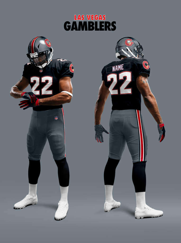
The Gamblers’ original look was black heavy. Not a good choice for a desert based team with an open air stadium. So they changed their helmet to silver to at least spare their heads from overheating! In a case of parallel evolution they end up with quite a Las Vegas Raiders-esque look.
Los Angeles Chargers
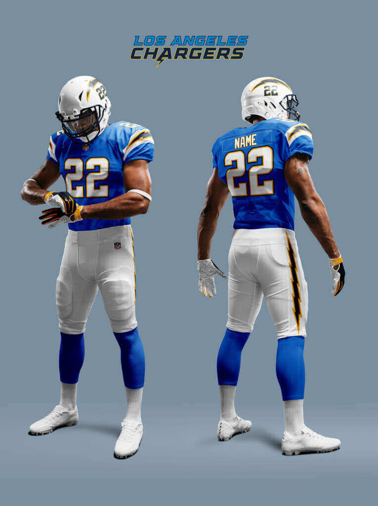
We have already seen how even in this Alt-reality the economic conditions have caused them to relocate from San Diego in a case of parallel evolution. Their uniforms in our Reality are held to be the best in the NFL. So I assume a similar level of excellence here. But in this Alt-reality they relocated 20 years earlier than our Reality. This was before the San Diego Chargers had properly revived the powder blue look. So I imagine on relocation they adopted a look based on the 1960 LA Chargers.
So that is the first twenty teams. The rest to follow soon! Thanks for checking them out :)
Thanks Chris! Nice job with those updated unis. Looking forward to the final part. Readers? What say you?


Guess The Game…
from the scoreboard
Today’s scoreboard comes from Daryl Shroot.
The premise of the game (GTGFTS) is simple: I’ll post a scoreboard and you guys simply identify the game depicted. In the past, I don’t know if I’ve ever completely stumped you (some are easier than others).
Here’s the Scoreboard. In the comments below, try to identify the game (date & location, as well as final score). If anything noteworthy occurred during the game, please add that in (and if you were AT the game, well bonus points for you!):
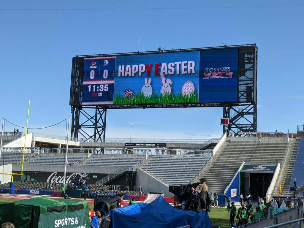
Please continue sending these in! You’re welcome to send me any scoreboard photos (with answers please), and I’ll keep running them.


Purp Walk reminder: Paul here. In case you missed it this past week, we have some big plans afoot for this year’s Purple Amnesty Day (which, as always, will be on May 17), including a live event in Denver where I’ll be dressed head-to-toe in purple. If you need to get caught up on the Purp Walk plans, everything’s spelled out here.
Also: Another big piece of news from this week is that our new line of Uni Watch Baseball Bats, produced by the great folks at the Pillbox Bat Co., are now available, and they look sensational. Available in green, yellow, BFBS, and miniature. Check this out:
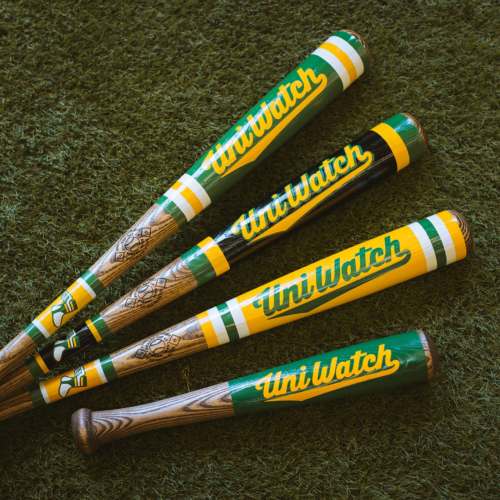
Nice, right? You can order them here.
Okay, now back to Phil!


Uni Watch News Ticker
By Phil

Baseball News: Here’s a piece on an aspect of athletics aesthetics you don’t normally see covered: the best bullpen designs in the National League (from Kary Klismet). … Also from Kary: Wednesday’s Ticker had a partial look at Jose Altuve’s Houston Astros American League championship ring. Here’s a more complete view of the team’s ring for those interested. … In a world where there can never possibly be enough “alternate” caps, Big League Chew and New Era have partnered to release bubble gum inspired caps (from Jon Viera). … Here’s a fun baseball online exhibit from the Smithsonian Institution (from Max Weintraub). … Shockingly the San Diego Union Tribune even thinks ads on unis are bad. … Lucas Giolito wanted to raise awareness for climate change on his Earth Day cleats. The left cleat represent the forests while the right cleat represents the oceans (via Paul). … The Gurriel Family is wearing the half Astros/Jays jersey this weekend (from Ignacio Salazar). … Jazz Chisholm wore Nike tights under the pants instead of socks (from Toys R’ Us Kid). … The Washington Nationals sure do love their City Connect unis (thanks, Brinke). … Gorgeous throwbacks for the Tacoma Rainiers this weekend (via Paul). … Here’s one advantage of wearing a baggy jersey (from Carlos Montalvan). … Blue Jay pitcher Alek Manoah likes to go high cuffed, so all his teammates did the same yesterday (from Batbeat). … For his http://Cameo.com profile, Angels pitcher Kenny Rosenberg may have used Microsoft Paint instead of Photoshop to change his uniform from the Rays to the Angels. However his Twitter account has a new Angels photo (from Texas Trev). … D-bax pitcher Noe Ramirez has some pretty sweet stirrups (from Allie Allie Oxenfree). … Last evening the Jacksonville Jumbo Shrimp honored Jackie Robinson by wearing some tremendous Jax Red Caps uniforms.

Football News: There are some great old photos in this feature on former CFL stadiums (from Kary Klismet). … The following four (!) items are also from Kary: (1) Monday’s Ticker mentioned that Georgia received their national championship rings last weekend during their spring game. Here’s an additional piece that shows the ring up close and provides plenty of design specs; (2) Coastal Carolina has revealed its rings for winning the Cure Bowl; (3) Here’s what a proposed new stadium for Jackson State University would like. The bill to fund the project is currently stalled in the Mississippi legislature; and, (4) Chelsea (Mich.) High School has unveiled its rings for winning the state championship. … “I attended the Rochester Browns Backers banquet where Browns great Greg Pruitt was a guest,” writes Joseph Bailey. “Pruitt won a Super Bowl with the Raiders in the 83 season. He was wearing a necklace of the Super Bowl ring. It was not just the ring on a chain.”

Hockey News: You know what the world needs more of? Lists of the best to worst alternate jerseys in the NHL. Luckily, For The Win has got you covered. … The Laval Rocket wore their Quebec classic uniforms on Friday night (from Moe Khan). … Check out the warmup jerseys for the Sharks last night for Fan Appreciation (from Wade Heidt). … Brian Fletcher noticed that the Lightning’s Amalie Arena has the banners for the Eastern Conference teams hung in alphabetical order, except Ottawa is after Philadelphia and Pittsburgh, but O definitely comes before P in the alphabet. … Les Habs honored Guy Lafleur on their sweaters last evening. Lafleur passed away Friday (from Wade Heidt). … Smashville and the Bolts broke out their Stadium Series uniforms last night (from Brayden Tweeter).

Basketball News: This story explains why the Philadelphia 76ers’ court design includes a snake (from Kary Klismet). … Speaking of the Sixers, here’s a quick reminder of how awesome the team’s warmups were in the ’70s (also from Kary).

Soccer News: There was a particularly not good looking color matchup on the pitch yesterday. In an e-mail sent to Paul, Timmy The Cop notes, “I am not as opposed to purple as you, but this is particularly hard on the senses. Brentford Vs Tottenham.” … British tennis star Emma Radacanu practiced for the Porsche Tennis Grand Prix last week while wearing a Tottenham Hotspur jersey with her own NOB (from Kary Klismet). … The Maltese Football Association has a new logo (also from Kary). … SpVgg Bayreuth of Germany’s fourth-tier Regionalliga Bayern wore special one-off kits for its match against Bayern Munich’s reserve squad this past Monday (also from Kary). … Want an instant mood booster? Then enjoy this video of a police dog cavorting around a soccer pitch and stealing the ball during the middle of a match (Kary, again). … Manchester City players wore special pre-match Puma jerseys made from repurposed soccer shirts. … And they say J-League shirts couldn’t get any wilder (from Cult Kits). … Anyone know What The Fuck is going on here? (from Brian Smith). … Forward Madison renders the team’s area code in Roman numerals (from David Hanson).

Grab Bag: The NCAA website has compiled a list of the best outdoor college track and field venues according to fan and athlete input (from Kary Klismet). … Indiana University Fort Wayne has unveiled its new costumed mascot (from Kary). … The University of Tulsa has retired its “Captain Cane” costumed mascot (Kary, again). … San Diego State University has unveiled new academic logos, and, apparently, the students hate them (thanks, Kary!).


Uni Tweet of the Day
These are actually growing on me. Definitely the best CC so far, and possibly best overall…
The Best Uniforms in @MLB™ are back.#BloomDay🌸 pic.twitter.com/LZrxEmdQdI
— Washington Nationals (@Nationals) April 23, 2022


And finally… that’s it for this weekend! Big thanks to Chris for sharing his uni-vision of his USFL/NFL 1987 merger! Great stuff.
Everyone have a good week and I’ll catch you back here next Saturday. Till then…
Peace,
PH
Scoreboard thing, not sure if this is a joke, but the game was last Sunday
4/17/22 – Birmingham, AL
New Orleans Breakers -23
Philadelphia Stars -17
What was most significant to me is that none of the USFL regular season games are played outside of Birmingham.
This explains WTF is going on at Allianz Arena.
link
Regarding new stadium for Jackson State University, “The bill to find the project” should be “The bill to fund the project”?
Cats and dogs:
As a Northwestern Wildcats fan, I am looking forward to Purple Amnesty Day. Go, Cats!
Love the police dog at the soccer game clip.
Chris, thoroughly like the NFL/USFL reimagines. Looking forward to the next installment.
Thanks Rick!
Kansas City wouldn’t have to change their name to “Fire Chiefs”, just change their imagery and logo.
Chris, that is one fine looking league you showed today! Thank you. Can’t to see more.
Sorry – I meant to type can’t WAIT to see more!
Thanks Paul!
Beautiful USFL / NFL designs by Chris, really appreciate all the striped socks. I’d strongly advocate Pat Patriot for Boston (while much preferring “Boston” to “New England”) and would keep the lightning bolts on the Chargers yellow outlined in blue instead of the other way around, but either way, every one of these designs is sharp. I especially like the Broncos’ revival of their mid 1960s scheme.
Thanks Tenz! I think more people prefer Pat Patriot over Elvis and I have seen a few updated versions of Pat that are good. But it is a very 60s style logo (like the old Dolphins logo) so is probably going to stay as a throwback. I think the current Chargers uniforms are a better design overall, but I imagined the Alt-Reality Chargers would want to revive the 1960 look.
Chris, I like a lot of the uniform ideas. Stripes on socks great. Cowboys in these colours for their dark uniform what I like to see.
Thanks Wade. Striped socks seem to really have fallen out of favour in the NFL, but I think that may be more of a symptom of the lower leg free-for-all that now exists. I went to the NFL rules site to look up what the rules for patches are the other day and read the rest of the uniform rules. I was shocked to discover how much these are being flouted! It’s a mystery to me why the league keeps the rules if they don’t enforce them.
Great job, Chris! There isn’t a bad one in the bunch. Nice touch putting the much preferred old numeral font on the Cowboys jerseys.
The ranking of NHL alternates is pretty good except for LA and Carolina being up way too high.
Thanks John! I’m not one for teams throwing back to old looks for nostalgia just because they won back then. But in the case of the Cowboys, they have lost their way design-wise so it makes sense to go back to a look that worked, including the numbers as they are part of it.
The Packers are green and gold, not green and yellow. Also, the G logo on the sleeves is an unfortunate reminder of bad times, when the Packers were no good.
And they say J-League shirts couldn’t get any wilder (from Cult Kits).
The sublimated photo on the front of the Gamba Osaka jersey is of the interior of The Tower of The Sun, an Osaka landmark retained from Expo ’70, the big world’s fair of Japan from 52 years ago. The team used to play its games directly behind the Tower, but relocated to a single-purpose stadium built on the grounds of the Expo. Think of it as akin to the relationship between the Mets and The Unisphere, a few blocks away.
link
Magnificent work, Chris! Thanks so much for sharing your talents & creativity with the rest of us.Definitely looking forward to the next set.
Thanks hcm!
My favorite thing about Chris’s Packers uniform is carrying over the sleeve stripes to the socks. Wish that were the case in real life.
I was checking out Chris’s Buffalo Bills and thinking about how much better these look than their awful, inaccurate, real-life “throwbacks,” and I noticed your Bills mock-up has the same tv numbers as the Charlotte Panthers. Which is… nice! (lol)
Thanks Michael! Yes I think the Bills was the first existing NFL team I did (after my invented ones) as I was wondering how their original uniform could have been brought up to date without losing what made it special.
And you’re right about the TV number goof-up – very well spotted! No detail is too small to slip past the eagle eyes of Uniwatch readers :) I used that style of number for several teams and that must have slipped past QC!
I don’t get why more Premier League don’t just invert their home kits on the road. Go to the alternate when there is a kit clash. I know, that’s probably a very American way of thinking about uniforms but some of these kits that they come up with just don’t make sense to me.
I’ve often thought this too, or at least the goalkeepers shirt could be some inverted version (rather than one colour outfits that give no clue to who they play for). But I think the complete change of colours for away kits is very ingrained in soccer culture. Fans often get upset if inverted colours are used (if it isn’t traditionally so) and call it “lazy”. They also seem to prefer designs or templates that are totally different from the home one. So without the club badge you would have no idea the two kits belong to the same team. No I don’t understand it either and I’m British!
Chris Diamond for league commissioner!
Thanks Jim!
I love these reworkings of the NFL and USFL uniforms, they all work for me so far. But it takes a police dog wandering on a soccer field to take the top prize for today, sorry Chris!
But great renditions, I wish the NFL and the USFL would take a good look at them and I hope you can use your vast amount of talents on a likewise NBA/ABA and NHL/WHL experiment as well!
That Stallions set sure looks a lot like Doug Flutie’s Boston College uniform (then made by Champion) down to the shape of the numerals.