For all photos, click to enlarge
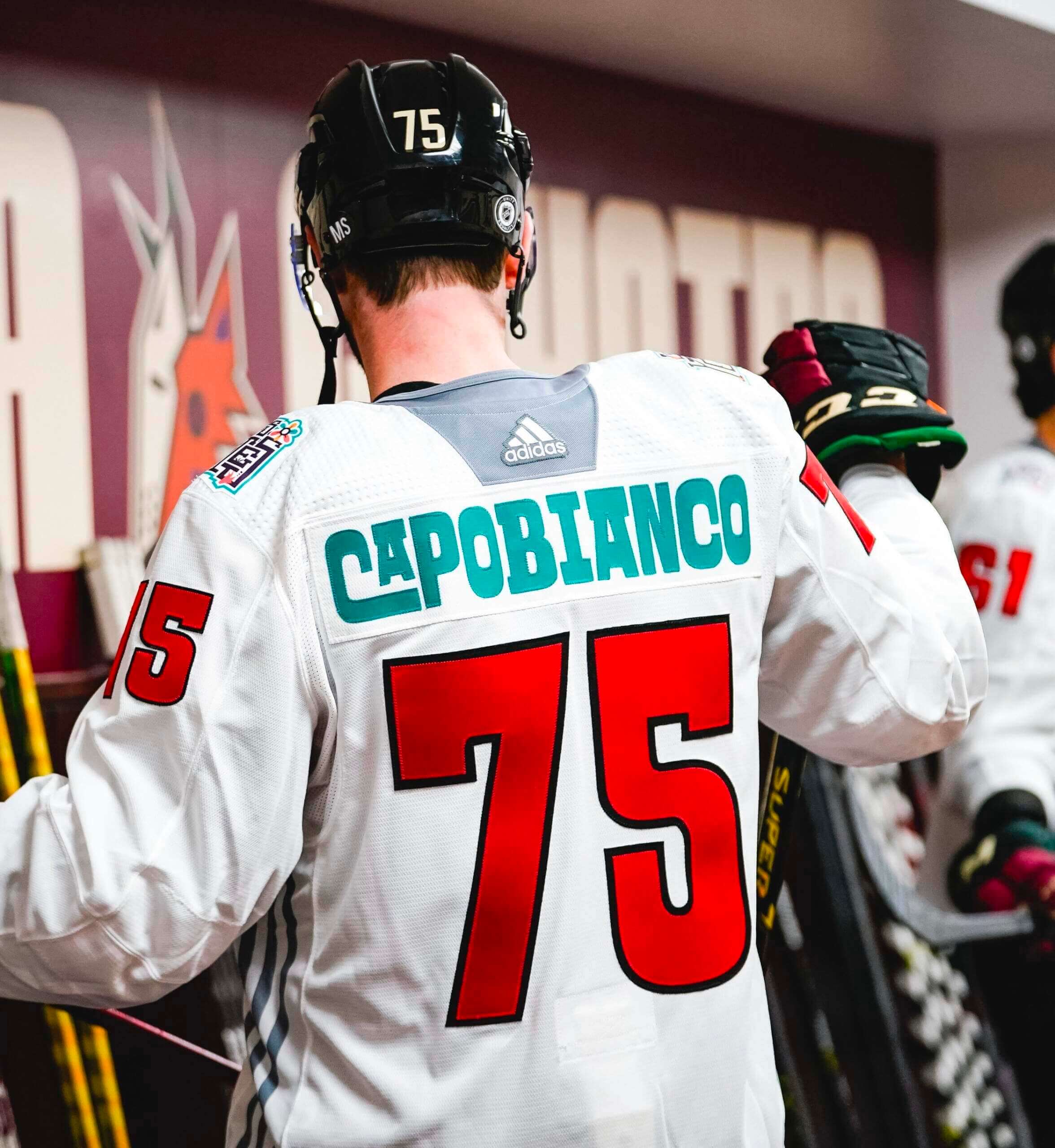
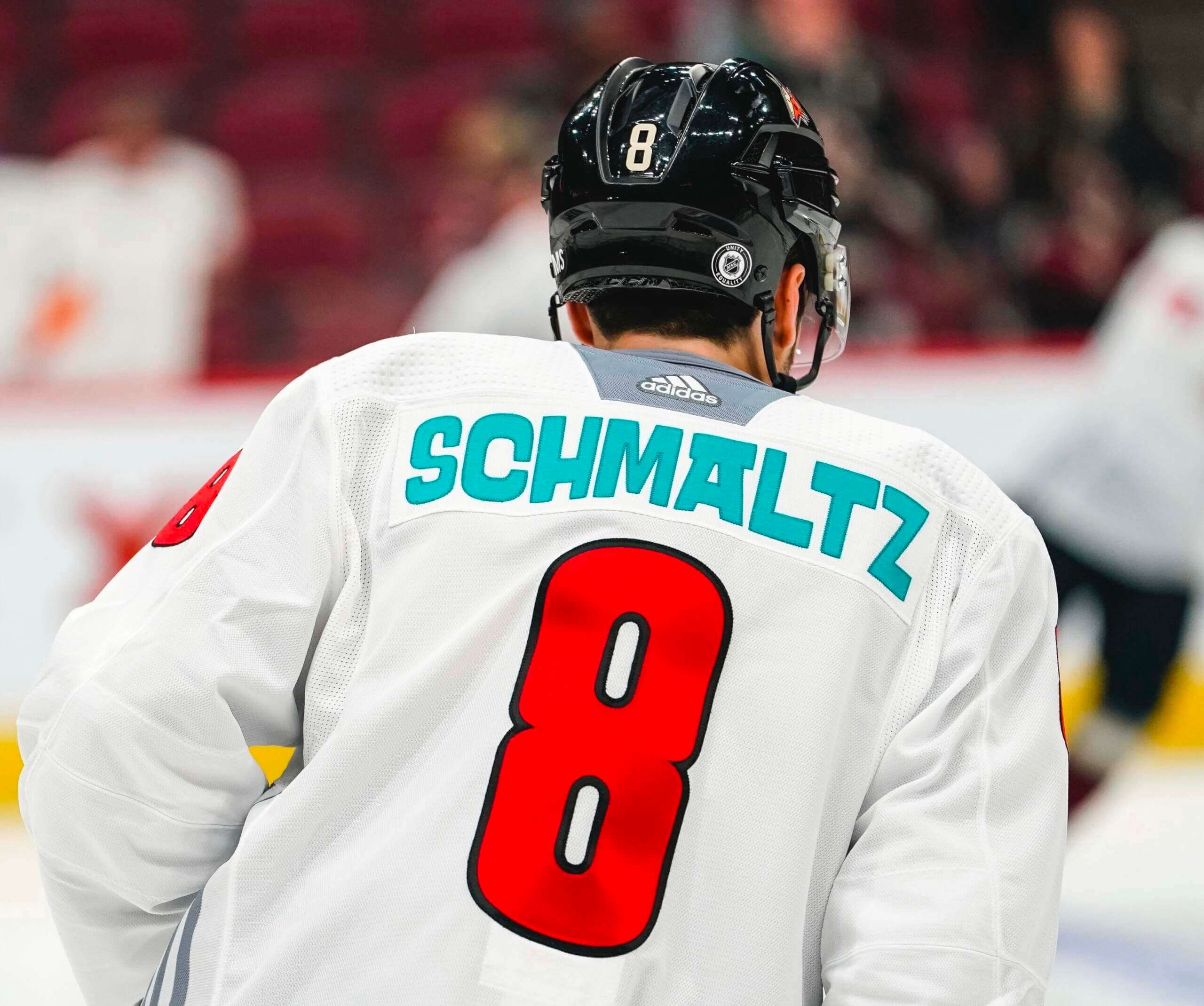
Good morning! In last Sunday’s Ticker, Phil briefly mentioned the really fun “Los Yotes” pregame jerseys that the Coyotes wore two nights earlier. I want to revisit those jerseys today, because they had some of the most interesting NOBs I’ve seen in years.
As you can see above, sometimes certain letters were nested within other letters. Here are some additional examples of that:
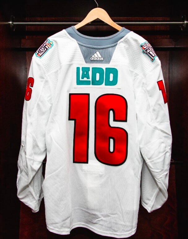
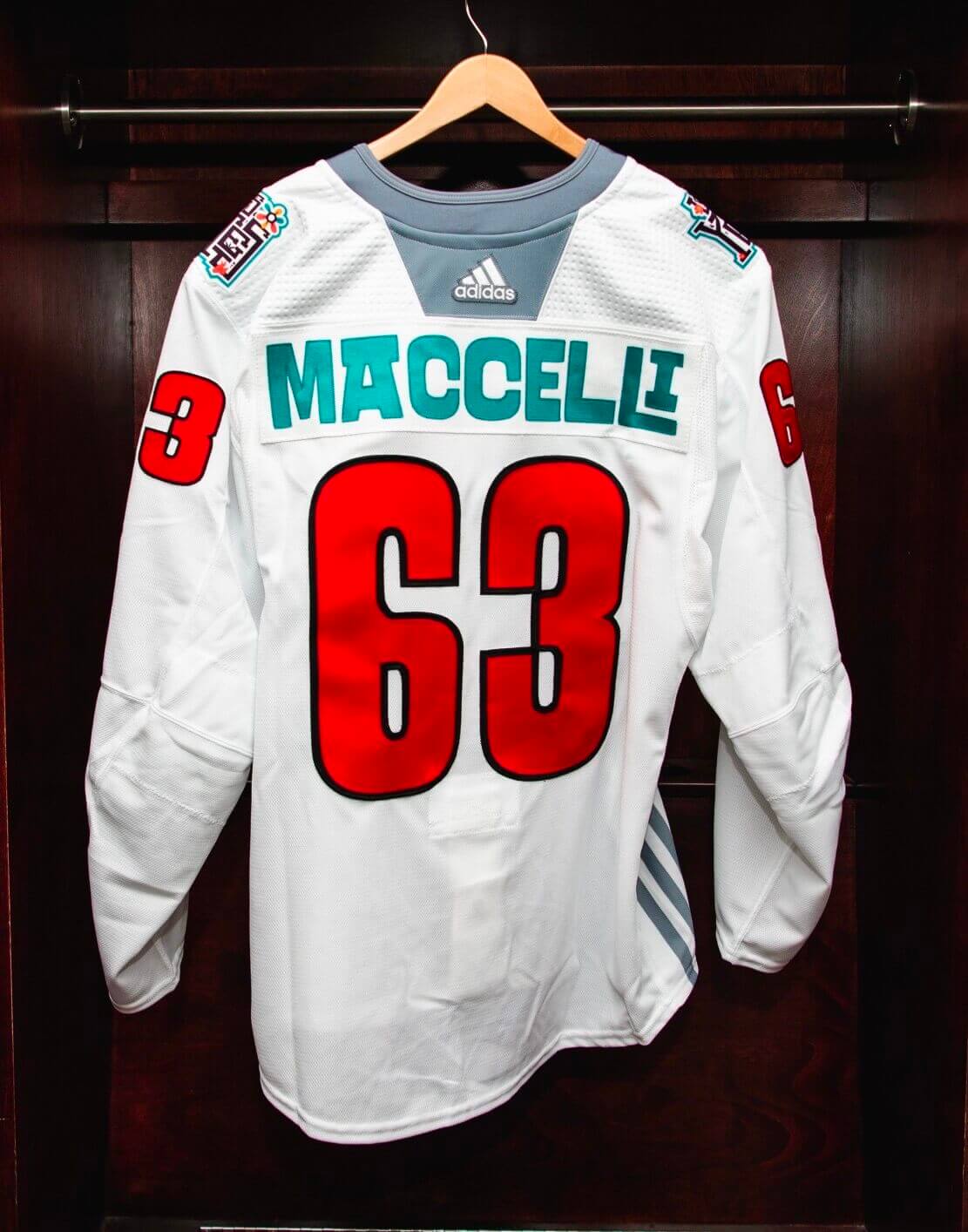
In the three examples I’ve shown you so far, there’s a letterform that gets extended to the right. But they also did the same trick by extending certain letters to the left:
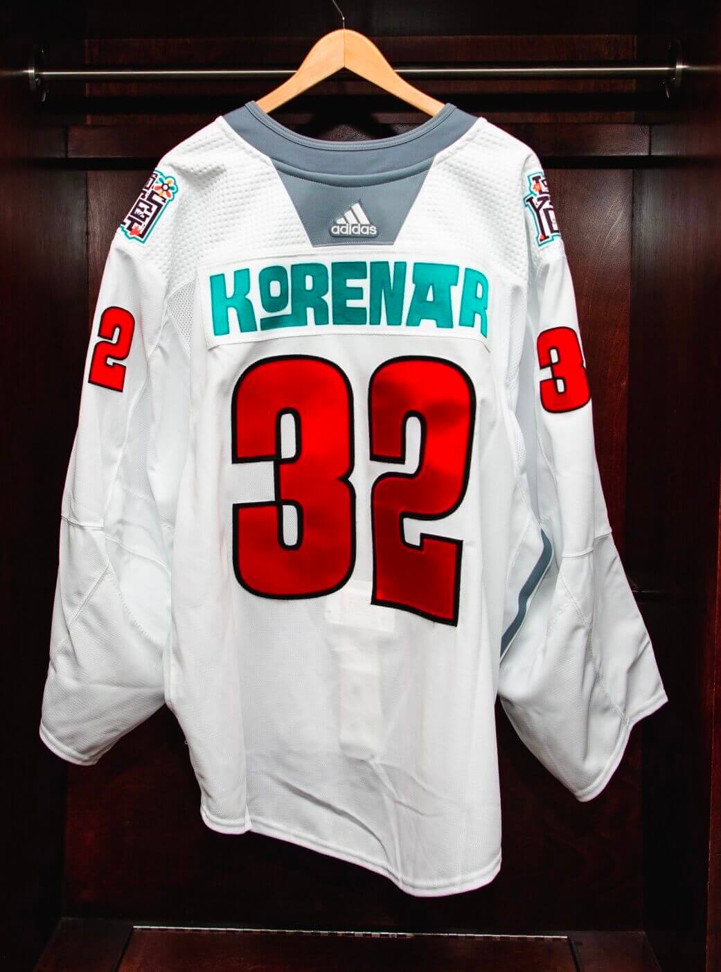
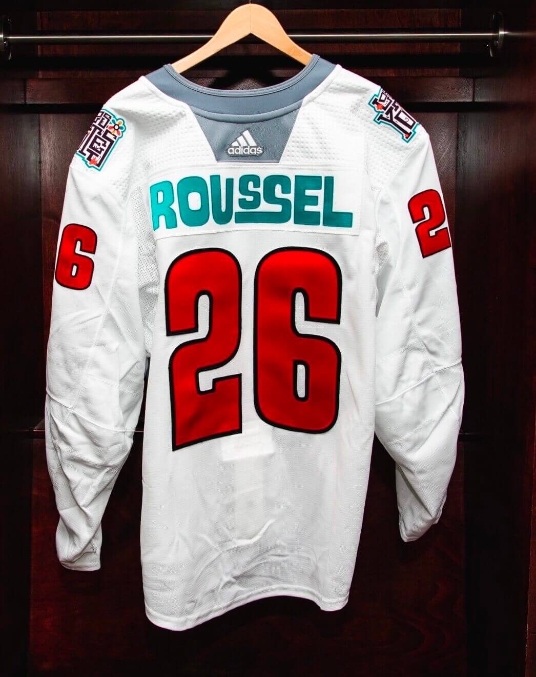
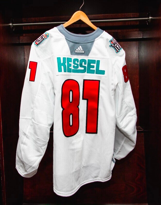
Sometimes they extended one letter to the right and one to the left:
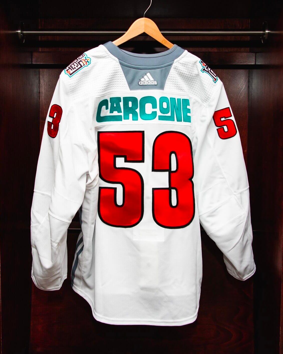
Or two in the same direction:
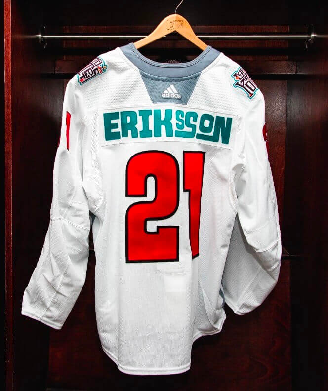
In all the examples I’ve shown you so far, the nested or diminutive letter is raised. But sometimes the nested letter ended up below the extended letter:
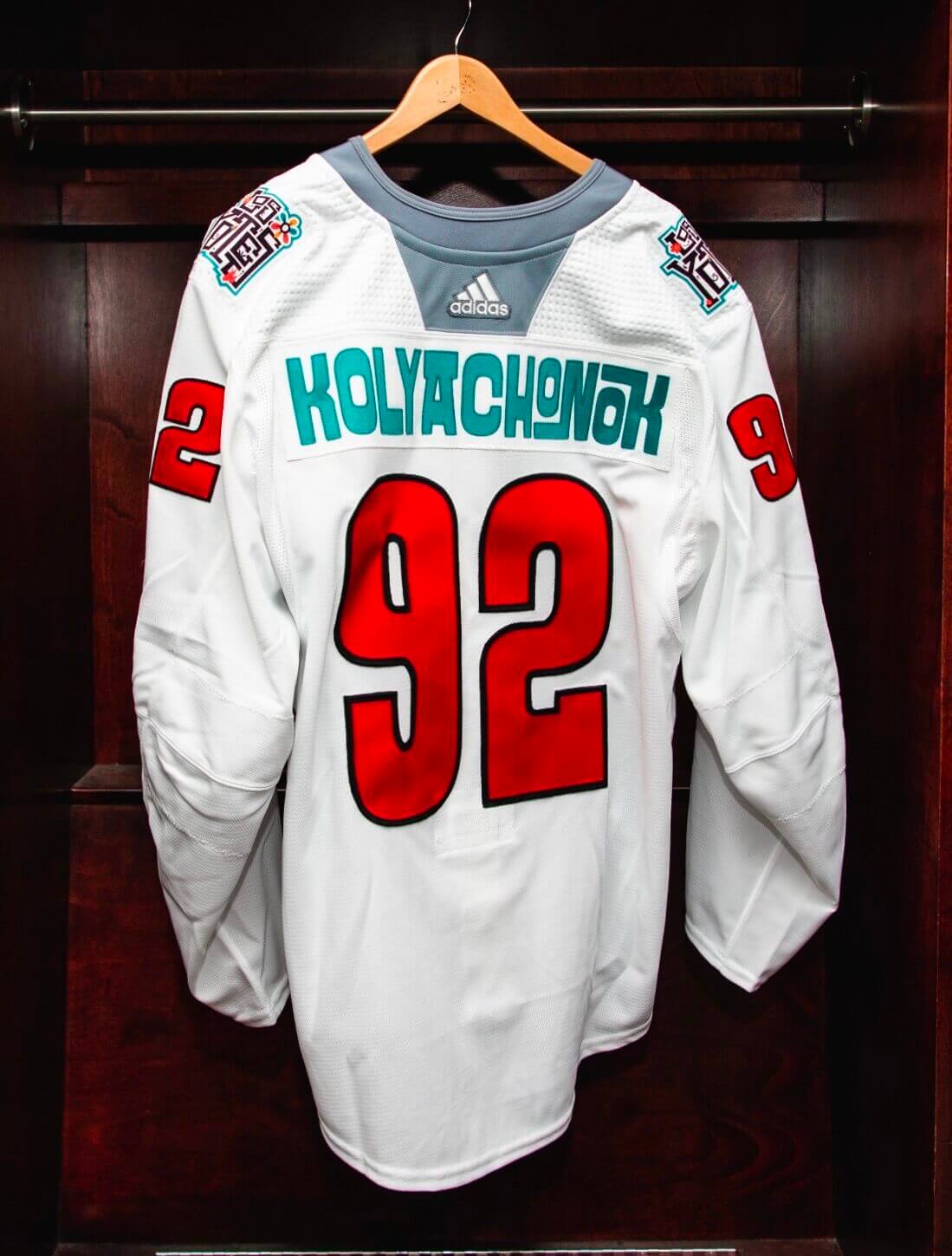
Here’s a really fun one, with two “O”s given two different treatments:
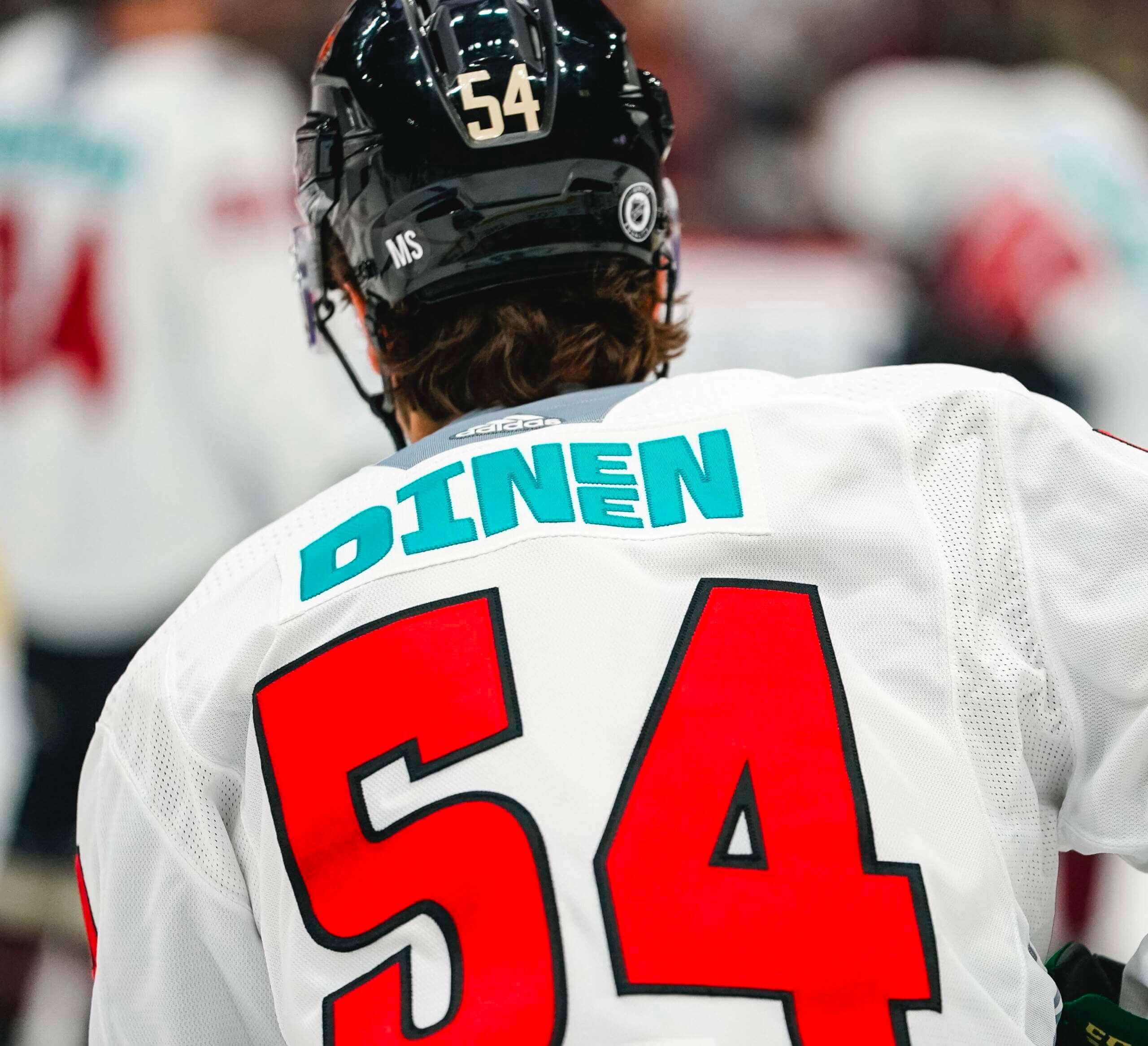
And here’s my favorite one of the entire batch. Check out the stacked “E”s:
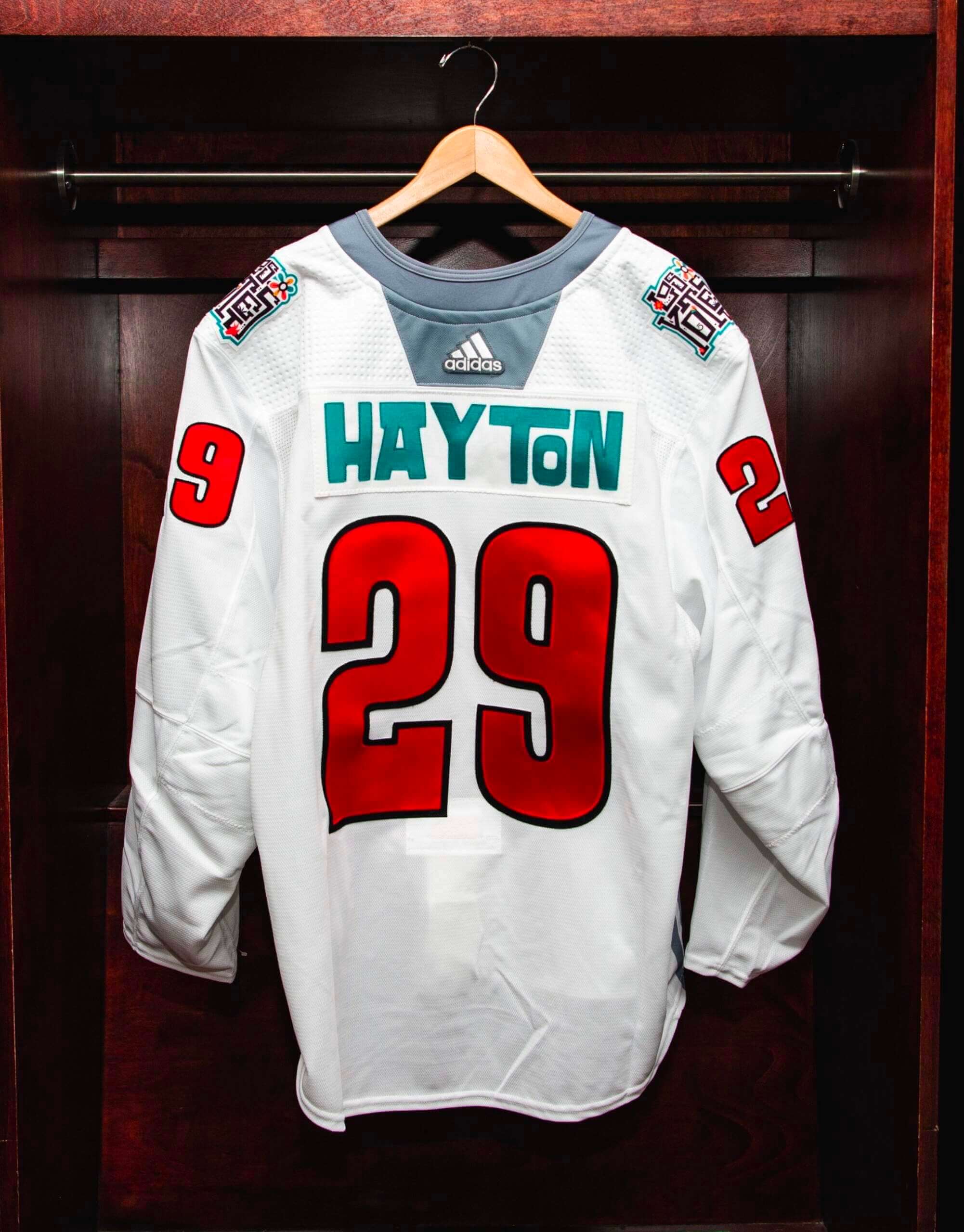
Sometimes the nesting thing doesn’t work. In this next one, the “TON” feels too separated from the “HAY”:
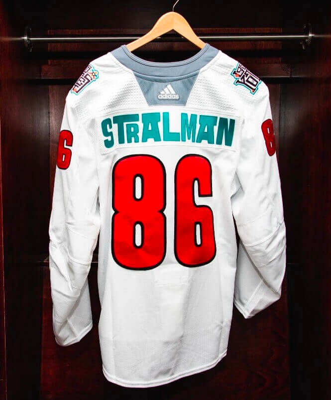
And then there’s a bunch of NOBs that they just handled conventionally, without any tricks (although you’d think they coudd’ve put the “T” inside the “L” on this one):
———
You can see the full set of NOBs here.
Everyone always tells me that I hate anything new or different, so obviously I hate these. I have to say, I love most of these. Fun, playful, creative — count me in. Would I want to see something like this on a game jersey, instead of just for pregame? In a perfect world, I think it would work really well for some teams; in the real world, my fear is that the clever typography would soon devolve into a death-spiral of stupidity as teams tried to out-“innovate” each other.
Also, it occurs to me that this typographic approach would work really well for teams using nickNOBs. I mean, nickNOBs are pretty stupid to begin with, but if you’re going to put something silly on your back anyway, wouldn’t it be better if it looked like these Coyotes NOBs, instead of like this?
In any case, I appreciate the thought and creativity (and fabric cutting!) that went into these. Good food for thought.
(Big thanks to reader Justin Adler for putting these back on my radar after their brief Ticker appearance.)
MLB Preview reminder: Today is MLB Opening Day, and you can get up to speed on all the uni-related news with the 24th annual Uni Watch MLB Season Preview, which is the biggest and arguably best article in Uni Watch history! Overflowing with tons of uni-related info ranging from the straightforward to the super-obscure, it’s an epic compendium that’s by far the most obsessively completist document I’ve ever produced — really!
The MLB Preview is available to my Premium Subscribers here. If you’ve been waiting for the “right time” to subscribe, believe me when I say the time is now (Facebook account required). Don’t have or want a Facebook account? Email me for workaround info. Thanks!
Click to enlarge
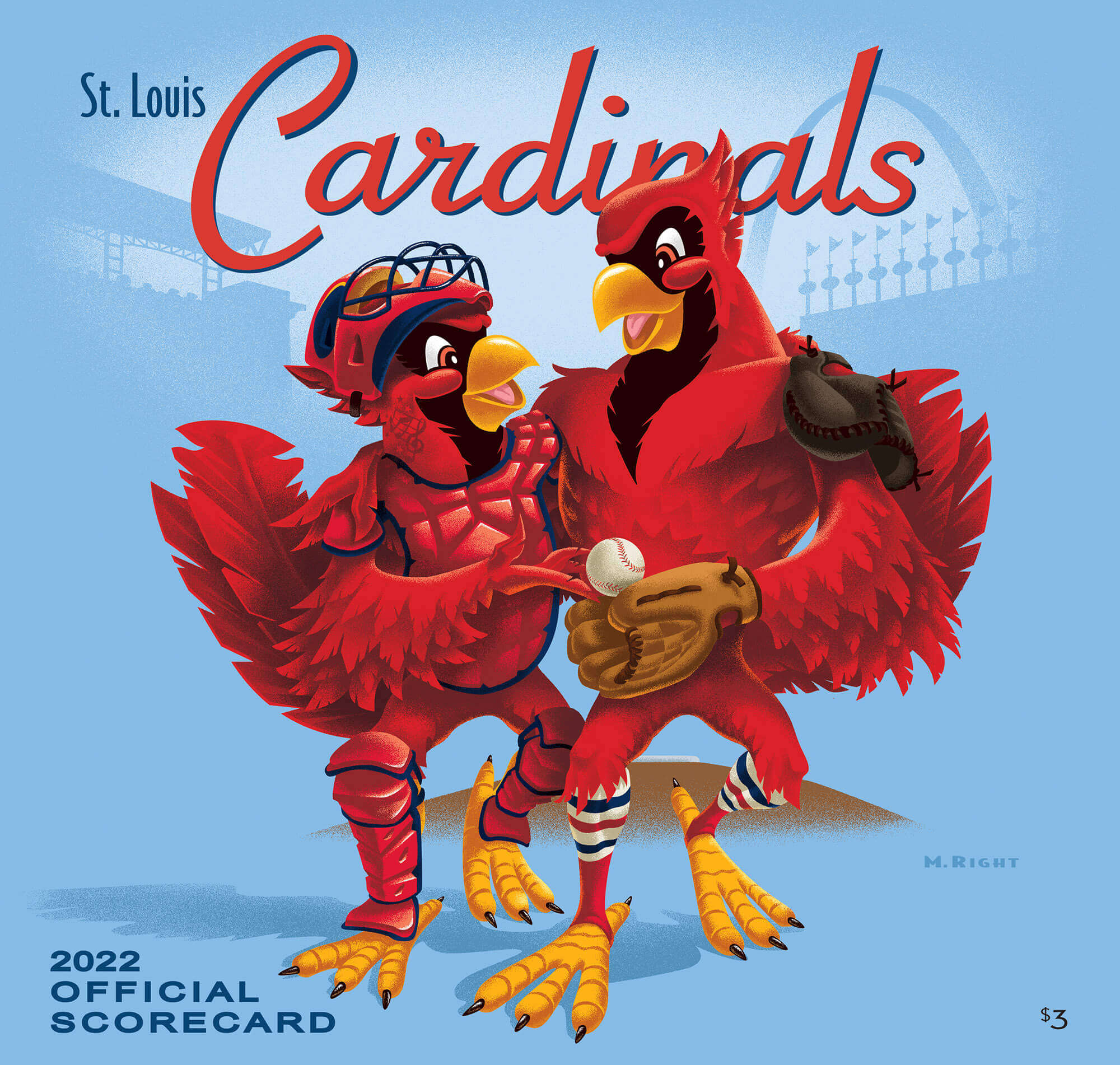
And speaking of Opening Day: About a year ago I interviewed Mike Right, who since 2003 has done the awesome cover artwork for St. Louis Cardinals programs. What you see above is the design he’s created for 2022. “It commemorates Yadier Molina and Adam Wainwright, who are 21 starts away from breaking the all-time regular season record for starts by batterymates.” Love it!
Click to enlarge
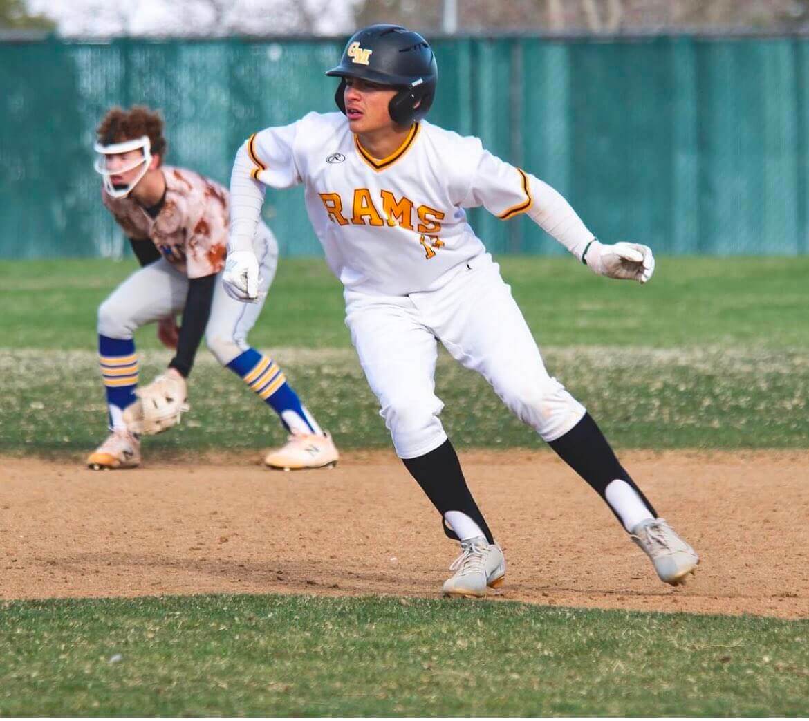
Too good for the Ticker: Man, you can fill in a lot of boxes on your Uni Watch bingo card with this photo! Stirrups, striped stirrups, a G.I. Joke jersey, both players in white shoes, and an infielder who doesn’t have a cap but does have a facemask!
That’s Green Mountain High in white and Wheat Ridge High in the field. Both schools are in the Denver area.
(Big thanks to Twitter-er @mjwild00 for this one.)
Click to enlarge

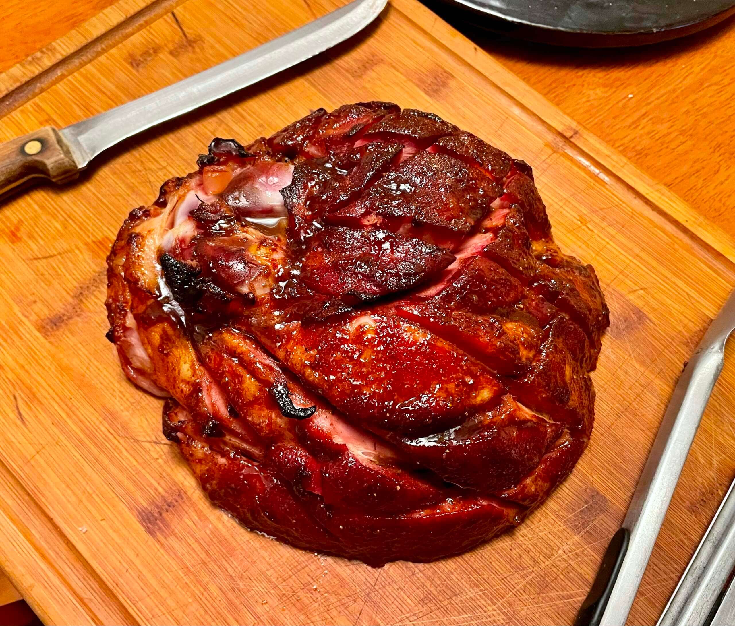
Culinary Corner: When the Tugboat Captain was sequestered in the Covid hotel/sanitarium back in November, she placed an Uber Eats delivery order that included a six-pack of Diet Dr Pepper, but they mistakenly brought regular Dr Pepper. She brought that six-pack home with her and it has sat in our fridge ever since.
So a few days ago the Captain decided that we’d have a Dr Pepper-glazed ham. I got the smallest bone-in smoked ham I could find (about four pounds — just a wedge, really) and Mary took it from there, She started with this recipe but with some modifications and freestyling, made a pan sauce with prunes, and also made some Brussels sprouts with bacon, all of which turned out very nicely. Or to put it another way, Mary catching a serious disease four and a half months ago led, in a roundabout way, to this really wonderful dinner:
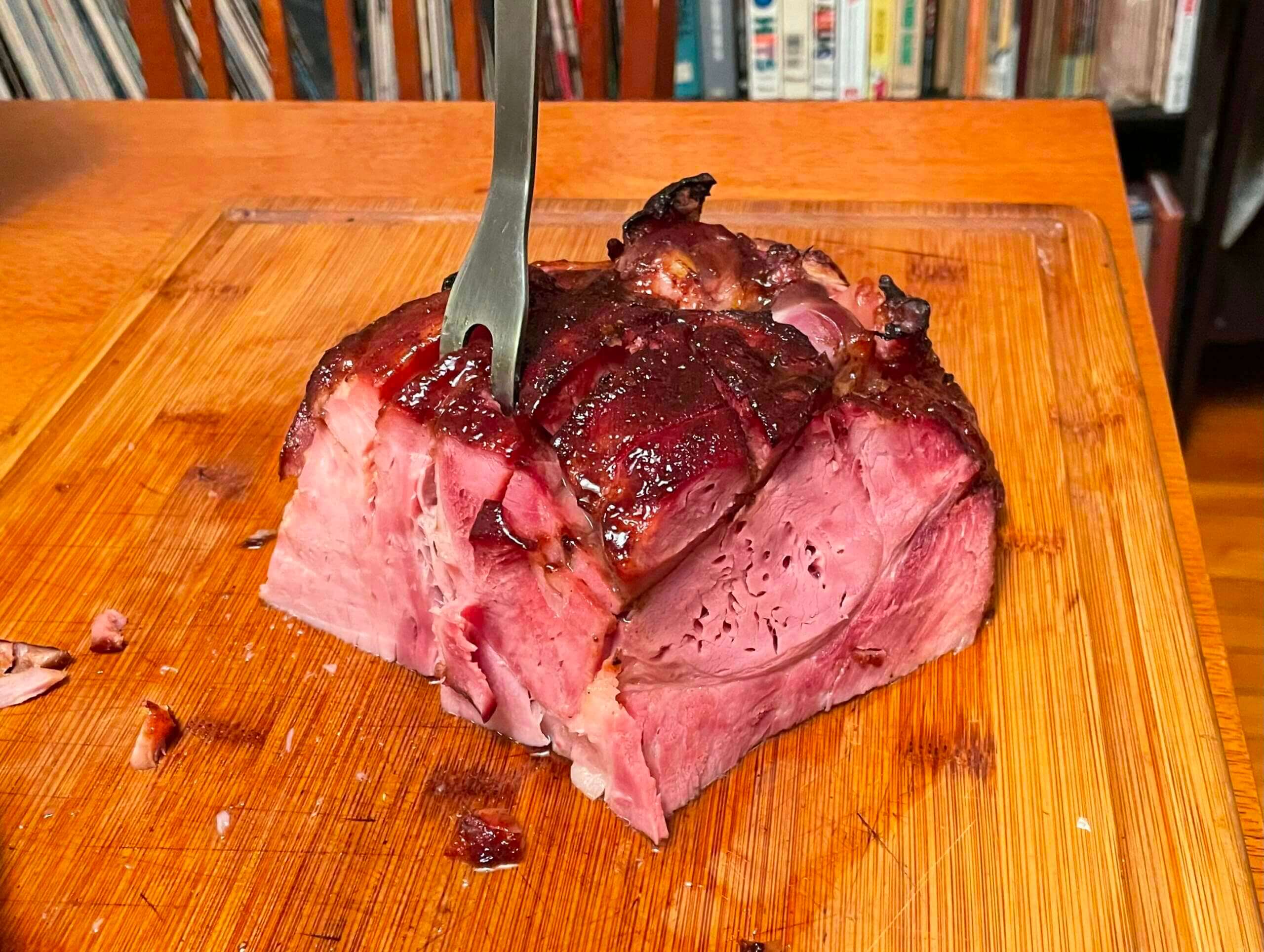
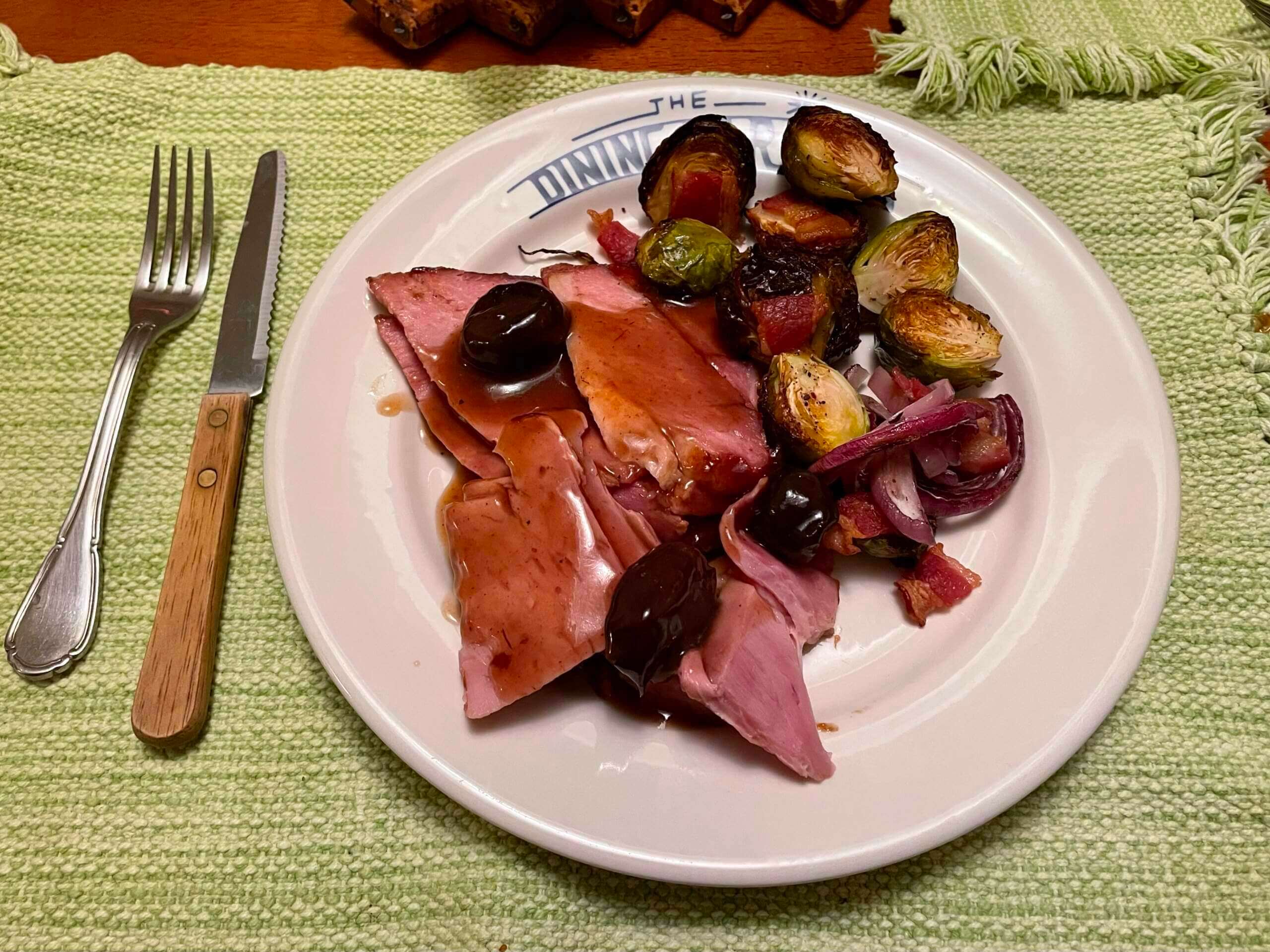
I can’t take any credit for this one — it was all Mary.
The Ticker
By Paul
Indigenous Appropriation News: Residents of Dartmouth, Mass., voted on Tuesday in a non-binding resolution to keep the local school district’s Native American sports imagery. The final decision will be up to the school board (thanks to all who shared). … The Penn Hills School District in Pennsylvania, whose teams are called the Indians, is asking for public input on the possibility of changing the team name (from David Lichota). … A fight between the Cambridge (N.Y.) school board and community members over efforts to retire the school district’s Native-themed mascot has wound up in state court (from Kary Klismet).

Baseball News: New uniforms for the Mohawk Valley DiamondDawgs, a summer collegiate team. … Here’s our first look at the new deeper left field fence at Camden Yards, along with the old version for comparison (from Marcus Hall and Andrew Cosentino). … This article about the history of baseball in the U.S. Navy includes several great vintage photos of old Navy baseball uniforms (from Kary Klismet). … Also from Kary: Bertman Mustard, the official supplier for the Guardians, has updated its logo to reflect the team’s new identity. … There’s a fire hydrant outside of UMich’s ballpark with a winged helmet-style paint job. … Here’s the Blue Jays’ home run jacket for this season. A player who hits a homer gets to wear the jacket in the dugout (from @SwiftNinjaCow). … Here’s a rundown of the commemorative baseballs that will be used at various MLB ballparks this season (from Eric Abneri).

NFL News: In the 1977 AFC Championship game, Raiders LB Ted Hendricks’s jersey numerals were much thicker than teammate Jack Tatum’s (from Kevin Clark). … Steelers WR Chase Claypool has trademarked his “Mapletron” logo (from Wade Heidt). … For some reason the Saints initially showed newly acquired QB Andy Dalton as wearing No. 91 on their roster (from @RollDate14).
College Football News: Following up on a Ticker item from a few days ago, Ohio State QB C.J. Stroud is going to stick with the new Riddell Axiom helmet even though fans don’t like how it looks. … In a related item, here’s how the Axiom looks for Arkansas (from @HogsFlashbacks). … Cross-listed from the baseball section: There’s a fire hydrant outside of UMich baseball stadium with a winged helmet-style paint job. … I still call it Liberty Bowl Stadium (from Timmy Donahue).

Hockey News: Here’s this year’s Frozen Four patch (from @minnysam32). … The Binghamton Black Bears of the Federal Prospects Hockey League will wear throwbacks to honor the Broome Dusters, a local minor-league hockey team from the ’70s (from Kary Klismet).

NBA News: Last night’s Knicks/Nets telecast on ESPN2 was produced retro-style graphics from the 1960s, ’70s, ’80s, and ’90s (thanks to all who shared).

Soccer News: Diego Maradona’s game-worn “Hand of God” jersey is being auctioned off and is expected to sell for over $5 million. … Here’s the inaugural uni set for Hailstorm FC, a USL League One expansion team set to debut this season (from Kary Klismet). … New kits for the NISA’s Chattanooga FC (from Ed Zelaski). … New Women’s Euro 2022 shirts for Germany, Northern Ireland, Sweden, and Belgium (whose men’s team will wear this same shirt design for a UEFA Nations League game) (thanks, Jamie).

Grab Bag: Here’s what several well-known corporate logos might look like if they originated in the Middle Ages (from Kary Klismet). … Cracker Jack has a new series of “Cracker Jill” package designs. No change to the product itself, but the packages feature a diverse array of female spokescharacters (from Kary Klismet). … Here’s why caddies at the Masters all wear the same white uniform (thanks, Phil). … Speaking of the Masters, here’s what some of the players will be wearing (from Lorenzo Quiogue). … New license plate design for Rhode Island (from @bryanwdc).
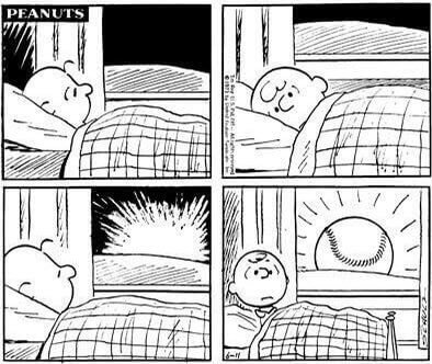
As you surely know by now, today is Opening Day. At least two of today’s games have already been rained out, and another has been changed from a day game to a night game, but there’s still plenty of baseball on the schedule. Whoever you’re rooting for, please accept my best wishes for a fun season. Play ball!
Meanwhile, we’re thinking/hoping that today may also be Opening Day for the baby doves. I’ll have an update tomorrow. — Paul
(My thanks to Brinke for the Peanuts strip.)
It’s Nice that the Coyotes got this mostly right (you already highlighted a few near misses above.) The classic font Avant Garde is designed to have all sorts of crazy ligatures and custom letter pairs, some of which play nice with other letter forms, some of which can create problems that extend through an entire word. The font isn’t easy to use digitally because it requires too many glyph options. link
The Women’s Euro 2022 shirts Belgium link brings up the Sweden page.
Thanks — fixed.
Here’s the proper link:
link
The article is really light on details, but were fans actually complaining to CJ Stroud about how his helmet looks? I get fans being critical of the design/colors of a helmet, but complaining that someone changing their helmet because the player feels it is safer, even if it looks different, seems like a bit much.
I can attest to the fact that a lot of people on social media don’t care for the look of the Axiom.
The thing I find interesting from a visual perspective on the Axiom is the facemask. It is like a modern-version look of the old 2-bar facemasks because the bars are just around the jaw area.
link
I just wonder why they don’t paint the oversized vent slots on the Riddell Axiom the same color as the helmet? Now these black vents look like a weird design on the helmet.
I’m thinking not only is it resistance to change and the traditional look of a football helmet, the Axiom will look particularly bad with the buckeye stickers. There’s no good way to put them on.
I attended Penn Hills for my high school years and I recall only referring to the team by the nickname, “Big Red.” I even thought we were way ahead of the time by dropping the “Indians” nickname, so I was surprised when the school district announced they were considering a change because I thought it was already done!
I think the Coyotes name font succeeds because it doesn’t feel templated–there’s real thought in the design that’s unique for each name. It doesn’t work for every name, but it’s a really cool idea.
The Coyotes have a player named Schmaltz. That’s awesome…
I thought of that immediately. I like the name treatment as well, but not sure I would call it schmaltzy. Ha ha.
It’s funny the reaction to CJ Stroud’s helmet. I’ve tended to react the same way to these new designs at first, but I hardly think about it now. The version with the sort of octagonal cut out on the front looked sooooo silly at first, now I don’t notice it for the most part. I recall Penn State’s players all wore a new helmet design a few years back (maybe they still do?) that made them all look like the Great Gazoo to me, but again, now I don’t see it. CJ’s spaceman helmet will become commonplace too. I don’t remember where I saw it, but I was reading an article years ago where they had an illustration with football players in the future, and their helmets were essentially motorcycle helmets: no facemasks and a shield in front. Seems we’re getting closer to something like that.
That ham looks fantastic! One of my fav meats growing up and the extra bonus was knowing that the bone would soon be in a big pot of navy bean soup!
Coyotes NOB concept here is really great. And I agree with Paul that this sort thing works in one-off situations, where one team adopts this idea and it is their thing. But it will ultimately become just a bad gimmick if other teams attempt similar things.
It sort of reminds me of the blue/green design the Atlanta Hawks briefly wore in the early 70s. It looks great on its own, but you don’t want everyone else to start doing stuff like that.
About the only downside to the Coyotes’ font is that it is harder to read, but given NOB aren’t necessary when everyone can already be identified by their numbers, that isn’t a big deal.
Assuming the Axiom helmet design becomes the norm, it’ll be fascinating to see how future logo designs are influenced by the lesser acreage of usable space. More Steelers types, less Vikings/Eagles creations. Form definitely following function.
From an aesthetics perspective, that may not be a good thing.
-C.
The thing that’s so likeable about the Coyotes NOB is that they’re human. So much uniform typography these days is just “Nike paid for this font, so we’re going to use it for something”. I would be surprised if these were hand-lettered; they’re too, well, uniform. But the variations (the different Os, the directionality) give it a much less mechanical feeling than most typography. Even if they weren’t hand-lettered, they at least feel like they were *designed*.
Thinking about this, I’m actually pretty surprised that graffiti letterforms haven’t been used more in uniforms. Seems like something obvious for a City Edition/City Connect thing.
There is no period in Dr Pepper.
There is no period in Dr Pepper.
Thank you for teaching me that! I’ll adjust the text accordingly.
Totally agree with your analysis of the typography.
I wish I hadn’t read Kevin’s comment. I was very impressed with your attention to detail!! (The ham looked incredible too!)
Today I Learned!
What is known is that Dr. Pepper became Dr Pepper (no period) in the ’50s, due to the logo’s illegibility. The period caused consumers to read the name as “DriPepper,” and was removed to lessen the confusion.
Read More: link
Holy crap, no period in Dr Pepper. I’ll never unsee that now!
This feels like a keen analysis. My initial thought was that the ensmallened letters should be lower-case, but maybe that would be too cute by half.
If there’s no period in Dr Pepper, then Dr isn’t an abbreviation. So it’s really called “Duhr Pepper”, not “Doctor Pepper.” The Keurig people need to add the period to make their soda brand make sense!
Totally agree Kevin–you said exactly what I was trying to say but wasn’t able to communicate.
I feel like the Hayton jersey would be easy to fix: nest both the Y and the O under the T, one on either side.
And put the H in Schmaltz inside the C.
Amused by an inaccuracy in the Mapletron story – the symbol identified as “Megatron’s face” is not the face of any version of that Transformers character, but is the symbol of Megatron’s faction, the Decepticons, which is actually an abstract version of the face of the Japanese toy MC-10 Cassette Man that Hasbro adapted into the Decepticon Soundwave.
The ham looks amazing. If you still have Dr Pepper you need to use up, I have a recipe for an amazing chocolate cake that uses Dr Pepper. The recipe is from the Dinosaur Bar-B-Que cookbook. They started out in Syracuse, expanded to Rochester, then Brooklyn, Buffalo, Harlem, and Troy. So perhaps you’ve been there before, either one of the NYC locations, or on one of your trips to upstate NY.
I googled the recipe and it looks good.
I have a really similar recipe for chocolate cake that uses a cup of coffee instead of a cup of Dr Pepper. I imagine this tastes pretty much the same, but with a hint of almond.
The details in the Broome County Duster sweaters are outstanding; I don’t think I’ve ever seen an NHL uniform that fancy. “B.C.” cartoonist Johnny Hart was from that area, which explains the caveman in the logo.
I highly approve. Need to see more hockey uniforms with brown.
The lettering on the Coyotes’ sweaters looks a lot like Interlock, a casual font designed by Ed Benguiat. A lot of ligatures are available, to customize nearly every word.
Kolyachono’s NOB is actually THREE different treatments for THREE different Os, rather than two.
There. I’ve posted my extremely pedantic internet comment of the day.
Was expecting a hot dog with capers for today’s post when I saw “Culinary Corner” on Twitter, for Opening Day and all…
Here is my reaction to the Orioles moving back the left field fence at Camden Yards. The stadium which began the whole trend of ballparks which we are told are more intimate, when they actually have fewer good seats than the old ballparks (particularly since the 2d and 3d decks are now set back instead of stacked on top of one another), has now lost 8 or 10 rows of the seats which were closest to the action in left field.
Love the Coyotes unis! For some reason whenever I see “Let’s Talk About” or “We Need to Talk About” I cringe. Just tired of that phrase these days (it’s all over Reddit, which is half my issue, ha ha). *Chef’s kiss* is rising up there as well.
I also should not read your Culinary Corner when I am hungry.