By Phil Hecken
Follow @PhilHecken
Good Sunday morning everyone. Hope you all had a good Saturday.
You may not agree with me, but you’d be wrong: the Arizona Cardinals have the worst uniforms in the NFL (and since the recent redesigns of the Browns, Buccaneers and Bengals — and you could even make an argument for the Falcons — it’s not even close). Fortunately, we know that Cardinals owner Mike Bidwill indicated changes, they are a-comin’, although not necessarily for the upcoming season. So it’s no longer a question of if, but when.
So, when the team redesigns, the next question is, “what will they do”? I’d like to posit that there is pretty much no redesign that could be worse than what the team currently wears, but we saw what the Falcons did when they jettisoned their equally dated-looking duds a couple years back. Fortunately, Bidwill kinda-sorta addressed the uniform update with his response to a question on the topic:
You probably know, these things, there’s a timeline for them. It takes time. It’s something among the array of things we look at around the team, it’s on the radar screen, so, appreciate the question. We’re going to honor tradition at the same time. Again, It’s part of the array of things we look at. It’s on the radar screen.” (emphasis added)
While that’s not quite a non-answer as to timing and direction, at least he mentioned the word “tradition,” which to my mind means the team’s new uniforms — whenever they are unveiled — probably won’t be going the Falcons “modern” route. And that’s a good thing. But traditional can mean a lot of things, and the Cardinals franchise has a deep history. Except for the first couple seasons in Chicago, when the team wore a more maroonish jersey, the team has always worn Cardinal red as their primary color. And for most of their seasons, they’ve worn pretty much only cardinal and white. The exceptions being in the 1930’s thru the 1950’s, when they wore a blue jersey when playing another red-shirted team (this was before the mandatory white jersey rule was implemented for TV purposes in the mid-1950s).
The only other main color the team has used is of more recent vintage: BFBS. That’s been a staple for the team since 2010, when they first introduced a BFBS jersey, and more recently, when they added a BFBS color rash uniform.
While I don’t expect the team to (re)introduce a blue alternate, I think it would be preferable to the ongoing, nauseating, BFBS trend.
If redesigns under Nike are any indication, the team will likely have at least three (primary, road, alternate) jerseys, and at least as many pants. Add in the lifting of the “one shell” rule and they’ll like have two helmet shell colors. I’d venture the current white shell is pretty much a given with any new uniform, so that would leave one additional color.
So…where do they go?
If you google “Arizona Cardinals uniform concepts” you’ll find a plethora — in fact, many of those have been featured on Uni Watch in my “uni tweaks and concepts” section. Many of the fan designs want the Cardinals to return to something “traditional” and pretty basic. Which is the route I hope they take.
Let’s break down the possibilities into a few groups, and I’ll judge these on how likely I think they are to go that route.
1. Simple/Traditional (red/white)
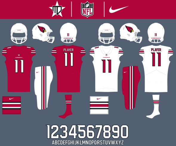
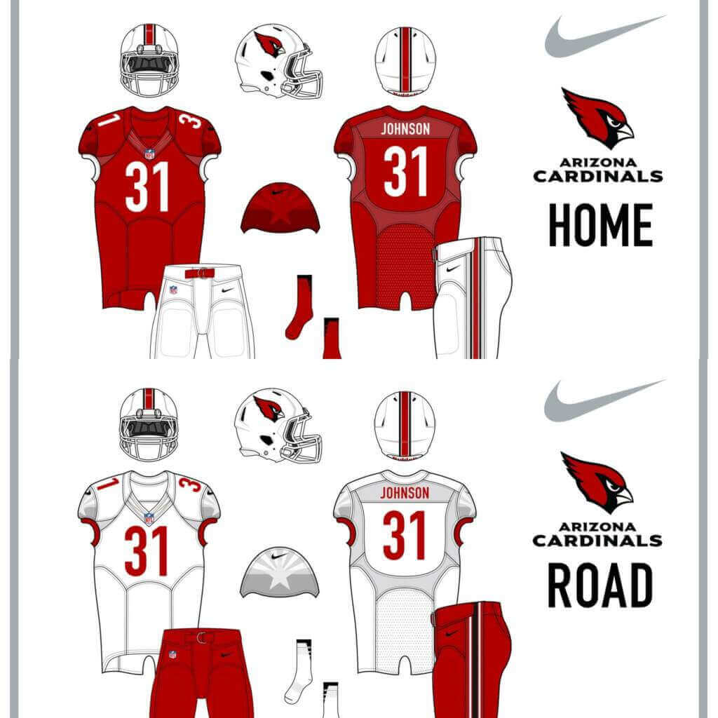
Most of these concepts use only the two traditional (white/red) color scheme, and seek to return the team to some sort of throwback-ish look. While I think many fans, especially older fans, would love this, I don’t see the team and/or the designers at swooshie staying this conservative. I’d give this about a 10% chance of happening.
2. Three Colors, One Helmet
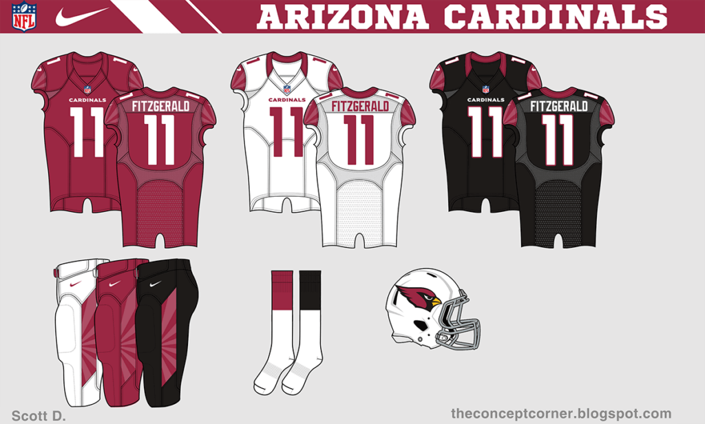
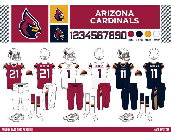
This is much more likely. The team keeps its traditional red/white color scheme, and adds a BFBS (or blue) alternate. This would likely appeal to a wider variety of fan, mixing a bit of a modern twist in with a traditional look. Of course, the current (and future) problem for the team is that a white helmet doesn’t really “go” with an otherwise monochrome color scheme. Especially a BFBS alternate. I’d say they have about a 30% chance of going this route.
3. Three Colors, Two Helmets
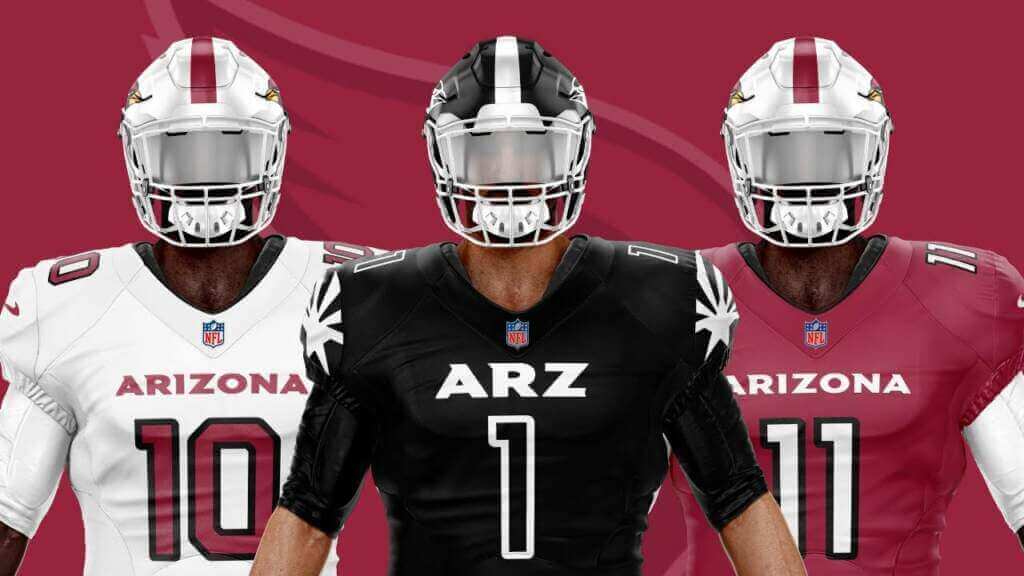
This is probably the most likely. Basically the same as option 2, except with a second helmet shell. With both the Washington Commanders and Philadelphia Eagles announcing they will have an alternate black shell this upcoming season, this would make more sense, especially if the team will be (keeping) a BFBS alternate. While I don’t relish the team going mono-black, it would be more visually appealing than the current white-shelled eyesore. I’d put this at about 35% likely.
4. Two Colors, Two Helmets
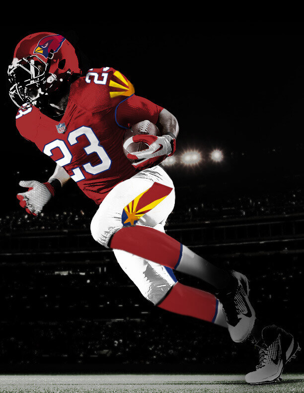
Should the team decide not to go with a BFBS alternate uniform, they could consider adding a red helmet in addition to the white helmet. While I like the concept, I’m not sure this would be a viable option — after all, if the team were to stick with red and white for main colors, then they probably wouldn’t add a red helmet. I’d give this only about a 5% shot.
5. New Colors
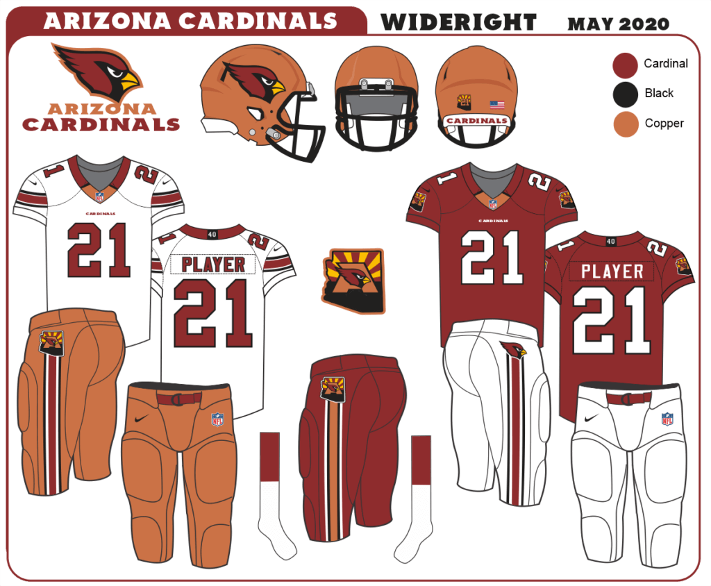
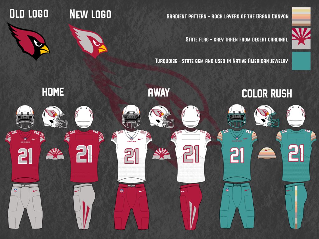
This would be an interesting notion. I’ve seen several concepts where the Cardinals add copper to their uniforms — which is an interesting direction. Copper was (and still is) a plentiful mineral in the desert southwest, and we’ve seen Arizona pro football teams sport copper before. I’m not so sure about an all turquoise color rash alternate, but adding copper and turquoise to the uni palette would be both unique and IMO a good “new” direction, if they decide to stray from their original white/red color scheme. I’d get behind this way before I’d support another BFBS uniform. I’d put the chances at this at around 5% however.
6. Fauxback
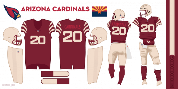
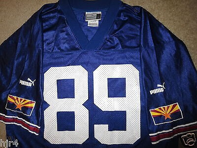
This would be more of a third (or fourth) uniform option, in addition to any of the above. Something along these lines would be a harkback to the team’s earliest days in Chicago. Another 5% chance of this happening.
7. Four Uniforms, One or Multiple Helmets
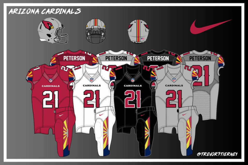
Given the popularity of both alternate uniforms AND color rash, in this option, the Cardinals could simply go hog wild and introduce a 4th uniform. Red, white, black and a fourth color (in this example, gray) would all be introduced at once, with the possibility of some mixing and matching. I certainly hope they don’t go this route, but it’s in the realm of possibility. Another 5% chance.
8. Something Else
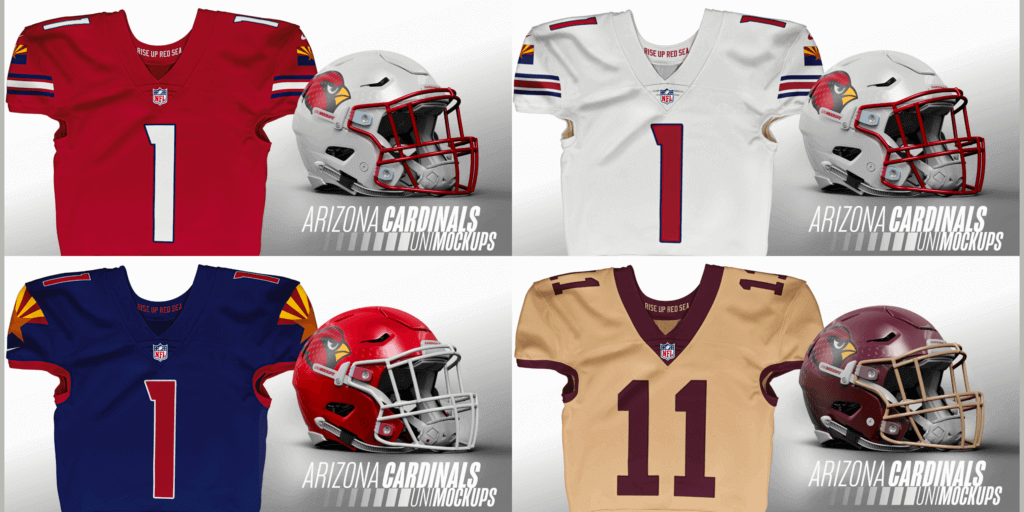
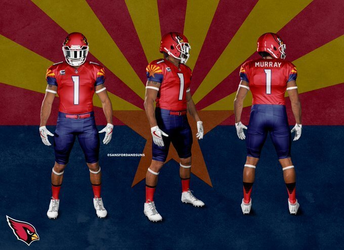
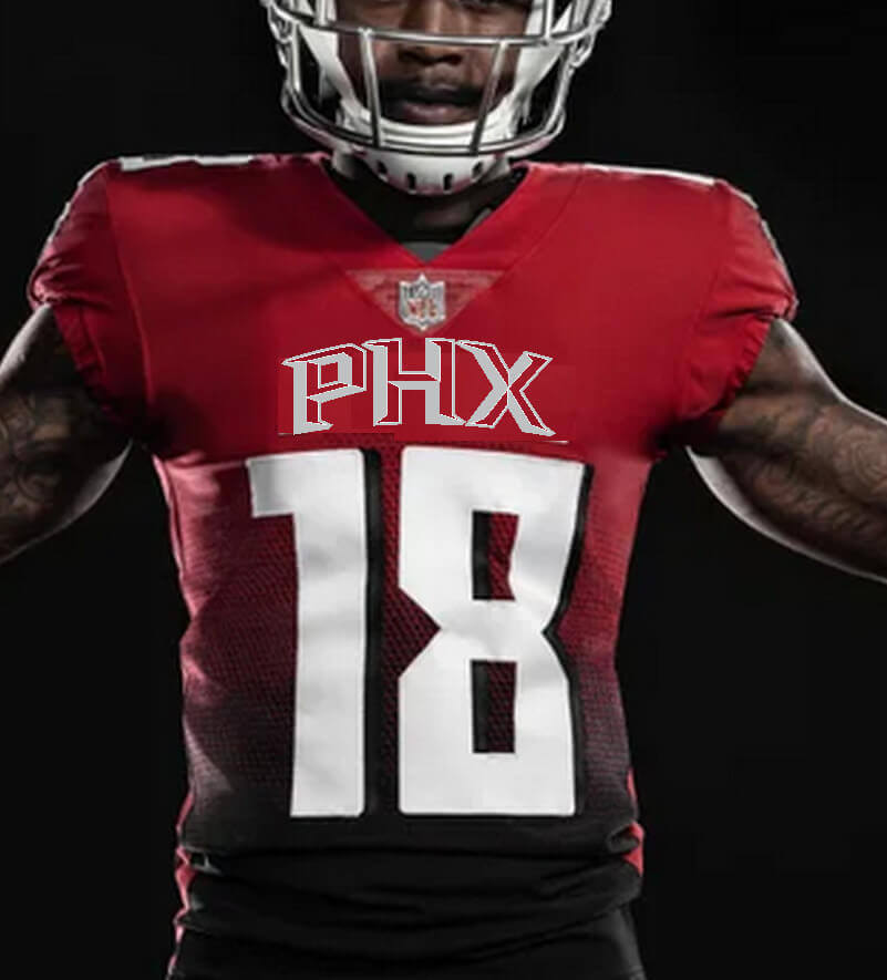
If the team decides to forego the “traditional” route, there are other paths. The examples above would certainly be some “out of the box” (although not necessarily in a good way) thinking. I’d love to put this at 0%, but given what we’ve seen under Nike redesigns since they took over the league contract in 2012, something somewhat radical probably can’t be ruled out. If the league weren’t already so heavy with red/blue teams, I could get behind the red/blue mix shown above, so long as the team doesn’t continue the BFBS route. I’ll give “something else” a 15% chance. Just so long as they don’t go the airport code route…
And there you have it. I think we can probably all agree the Cardinals are in need of a uniform redesign, and the sooner the better. How soon and in what direction the team will go remains to be seen, but I’m pretty confident however they redesign, it’ll be better that what they currently wear. How much “better” will of course be in the eye of the beholder, but with many of the options (concepts) laid out above, I’m fairly positive the change will be for the better.


Jimmer Vilk’s 5 & 1
Hey everyone — you know Jimmer Vilk (mostly) for his 5 & 1’s during the college football season, but he’s back today to make a special appearance for his NCAA Tourney 5 & 1. In case you’re not familiar, the “5 & 1” is a compilation of the five “best looking” uni matchups, and worst single matchup, in this case, for the almost completed NCAA Tournament. Sometimes there are teams worthy of “honorable” or “dishonorable” mention, so it’s not always just six games. But the gist of the 5 & 1 is for both teams to play along — sometimes the uni matchups are outstanding (the “5”) and other times both teams contribute to a stinker-looking game.
Here’s Jimmer with your
NCAA 5 & 1
Ah well… maybe last night was for the best, because at the moment I don’t have enough room on my ductwork for yet another SI cover of yet another Vilkanova title. Perhaps next year (when I’ll be able to see the game on CBS) I will. Anyway, onto the more important issue: the uniforms!
Honorable Mentions to
Akron/UCLA
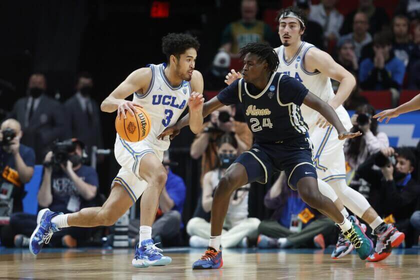
Actual school colors, cool numbers and striping… the Zips haven’t looked this good in decades.
And to UAB/Houston
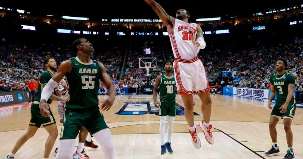
WHY CAN’T THE COUGARS WEAR THE ROAD VERSION OF THIS BEAUTIFUL THROWBACK INSTEAD OF THOSE WRETCHED MINIMAL-CONTRAST BFBS THINGS THEY WORE NEXT?
Sorry. I’m better now. Onto the Top Five.
5. Davidson/Michigan State
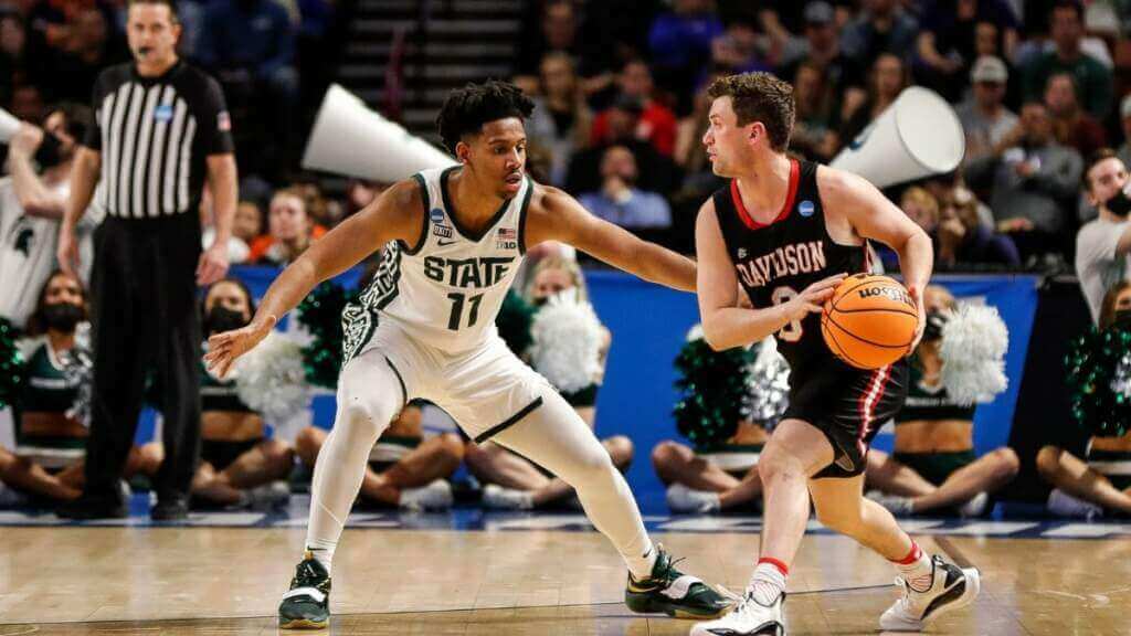
Love the funky design going down the one side of Sparty.
4. Chattanooga/Illinois
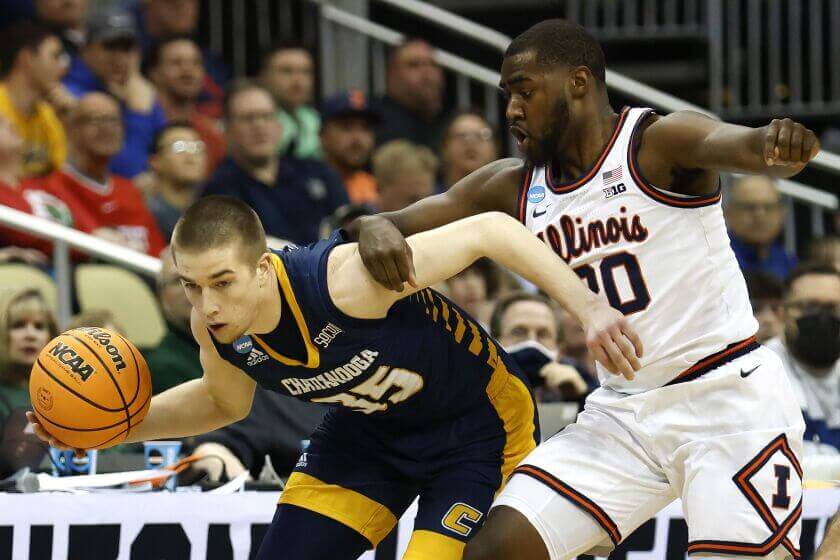
Script on the jersey and diamonds on the shorts lifted up this otherwise plain white uni.
3. Ohio State/Vilkanova
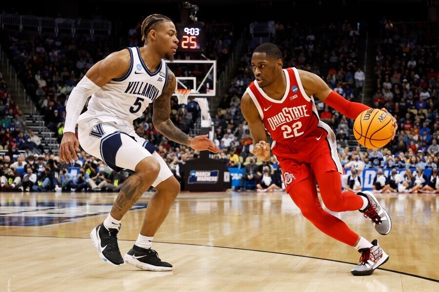
Man, I wish I was home in time to tape this matchup on my VCR!
2. Iowa State/LSU
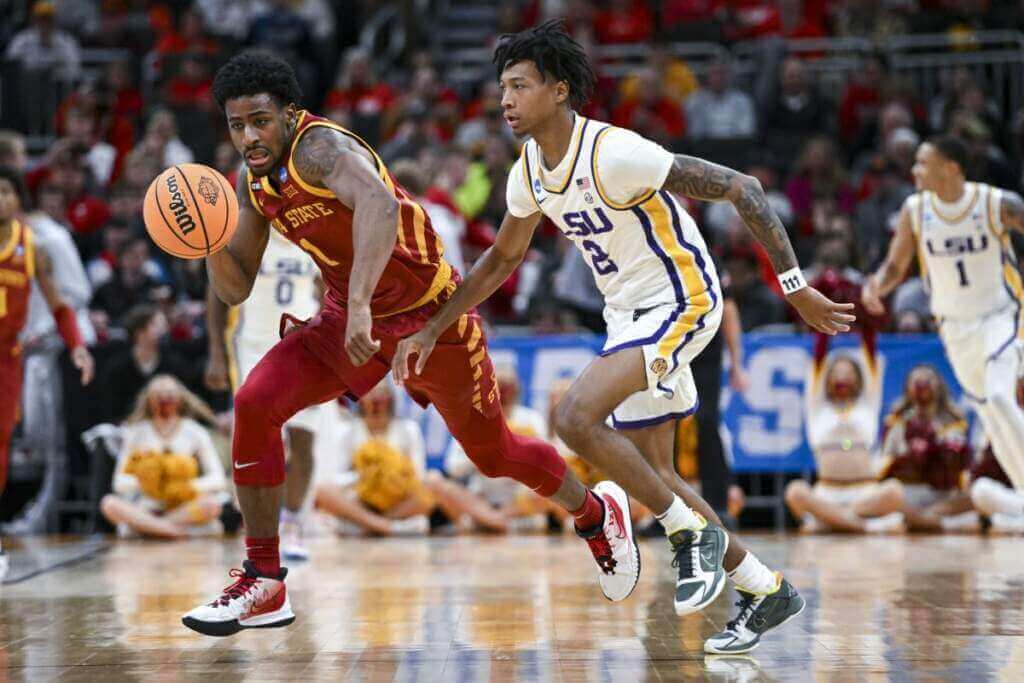
There’s only one thing I like more than cool designs on the sides…
1. Texas Tech/Duke
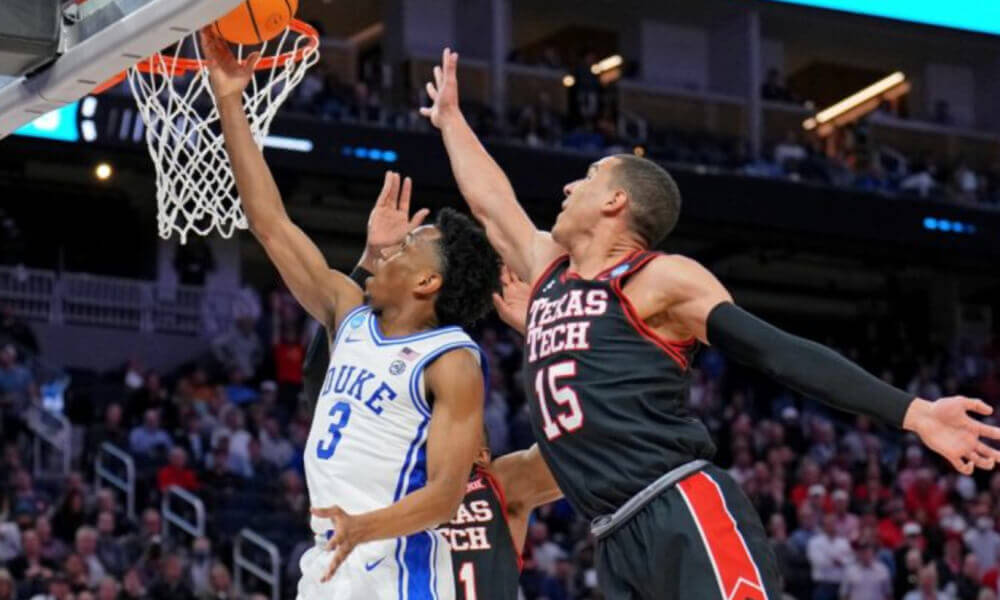
…and that’s two teams with highly visible, properly sized letters and numbers.
Dishonorable Mention to
Texas A&M-Corpus Christi/Texas Southern
I try to ignore the play-in games but this unreadable matchup was too hard to leave unadmonished.
&1. Michigan/Tennessee
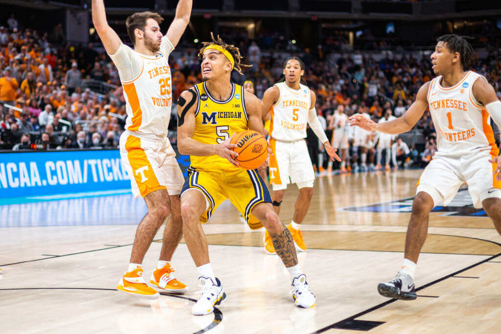
Good thing this game wasn’t played out in the sunlight, because everyone’s retinas would be fried.
Have a whole bunch of shining moments, everyone! Go Jayhawks.


Guess The Game…
from the scoreboard
Today’s scoreboard comes from Katie Moor.
The premise of the game (GTGFTS) is simple: I’ll post a scoreboard and you guys simply identify the game depicted. In the past, I don’t know if I’ve ever completely stumped you (some are easier than others).
Here’s the Scoreboard. In the comments below, try to identify the game (date & location, as well as final score). If anything noteworthy occurred during the game, please add that in (and if you were AT the game, well bonus points for you!):
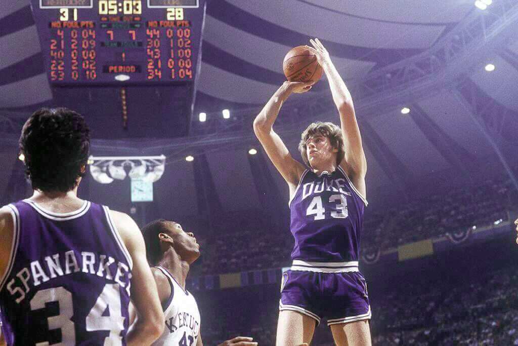
Please continue sending these in! You’re welcome to send me any scoreboard photos (with answers please), and I’ll keep running them.


My favorite TikTok account is this dude who identifies obscure sporting events in movies and TV shows. pic.twitter.com/Ok1D2PUTeZ
— Scott Sandalow (@ScottSandalow) March 17, 2022
Bulletin reminder: In case you missed it on Friday: A bunch of readers recently forwarded me the video clip shown above, which is by a guy who pinpoints the exact game — and often the exact play — that briefly appears in movies, TV shows, and even video games. It’s really fun stuff (watch the video for yourself, you’ll see), so I interviewed the guy for my latest Bulletin article.
My premium subscribers can read the article here. If you haven’t yet subscribed, you can do that here (you’ll need a Facebook account in order to pay). Don’t have or want a Facebook account? Email me for info on workarounds. Thanks!
Also: I’ve been hard at work on the 24th annual Uni Watch MLB Season Preview, which will be published on Bulletin next Tuesday morning, and I don’t mind saying it’s a doozy — the biggest and best Uni Watch MLB Preview ever! Hope you’ll subscribe so you can check it out.


Uni Watch News Ticker
By Phil

Baseball News: “Not sure if this has been on the site yet, but the estate of fantasy sportswriter Steve Moyer is auctioning off a large amount of baseball memorabilia including signed balls, board games, score cards, and even the front page of the 1927 NYT announcing Babe Ruth breaking the home run record,” writes Erick Kriewaldt. Lot’s of cool stuff, and the auction ends (tonight).” Here is an article (paywalled, from The Athletic) explaining more about Steve and the auction. … The Giants and Tigers wore throwbacks on Friday. No, not those Giants and Tigers. … The Washington Nationals new “City Connect” Cherry Blossom jerseys are apparently pretty damn popular these days. … The Tennessee “Lady” Vols softball team wore teal jerseys to honor the legacy of Alex Wilcox. I’m surprised how much I like the combination of teal and orange! And they weren’t the only ones to participate. … New softball uniforms for the UCF Knights Citronauts today (via Paul). … How many things can you count that are wrong with this baseball cap (from BK)? … Dear God, we can only pray that this is a fashion jersey for the Dodgers (from Danny Martinez). OK, it is a fashion jersey. One that should never have existed. … MLB the show now has a Canada Day presentation for the Toronto Blue Jays where they have the anthem playing and a big Canadian Flag in the outfield (from Keith). … Hmmm — here’s something to watch for in MLB this year — Special Jackie Robinson uniforms to be worn on April 15? (from Josh). … New cream uniforms for Angelo State University (from Kary Klismet. … Also from Kary: Here’s another good piece on the efforts underway to revitalize Hinchliffe Stadium in Paterson, N.J.

Football News: Reader Kurt Rozek thought Paul would appreciate his white russian in a New York Giants vessel. Kurt notes, “The Dude Abides.” … Oops! New Browns QB Deshaun Watson posted his jersey options on IG, but he forgot to remove a stray Falcons jersey (which he likely had made up in case he was traded to Atlanta). … Here’s some good NFL news: the Tennessee Titans are “actively working” to make Oilers throwbacks possible in 2023. … FSU Football stitched white numbers onto their, now obsolete, 2014 templates to use for recruiting photos. In theory, these jerseys never existed (from FSU Broc). … This is pretty great: check out the goalpost/electrical poles in Canton, Ohio (from Steve Levy). … Here’s a great look at former Falcons QB Steve Bartkowski wearing a varsity jacket under his uni! (from John Turney). … How would NFL helmets look if they were rendered in two-tone color schemes? Well, judge for yourself (from Kary Klismet).

Hockey News: A former student has designed hockey jerseys for St. Michael’s College. Here’s his twitter post about it. That comes from Seth Hubbell, who adds, “How neat is it that a graduate of the college designed the hockey jerseys? I wonder if any other colleges have jerseys designed by alumni?” And there’s also this. … Here’s an April Fools uni joke I missed in yesterday’s writeup. … WHOA! Check out these outstanding warmup jerseys worn by the Arizona Coyotes the other night (from Wade Heidt). … The Henderson Silver Knights wore special jerseys last night to celebrate the opening of their new arena (from Brayden Tweeter). Here’s some more looks (from Boston Matt). … Whoops! In a game between the San Diego Gulls vs Iowa Wild, the Gulls were wearing their Hockey Fights Cancer jerseys. Number 45 Brendan Guhle actually had an upside down 2 on his jersey (from Gregory Smith).

Basketball News: There are some great old newspaper clippings and photos in this article detailing the basketball history/rivalry of Duke and North Carolina (from James Gilbert). … Whoops! How in the world does a sticky letter fall off the top of the scoreboard? What’s the Final Fou? (great grab by Art of Scorebug). … We all know the great Mickey Mantle for his baseball prowess, but he was a fantastic athlete in many disciplines. Here’s a photo of him with the Commerce High hoops squad (from Bruce Menard). … Here’s a cool feature on the history of the basketball uniform (from Kary Klismet).

Soccer News: The NWSL’s Angel City FC revealed their first-ever second shirt yesterday and they wore it Saturday afternoon (from our own Jamie Rathjen). … Here is a shot of a peace sign at midfield from an Arsenal Women’s Champions League match Vs. Wolfsburg (also posted in Ukraine news). From timmythecop. … Joseph Mora received a commemorative jersey upon attaining 100 caps in his MLS career (via Paul). … Oops: The DraftKings app is still using “Montreal Impact” about 16 months after the team changed names/brand identity (from MouthoftheSouth). … Canadian Premier League’s Halifax Wanderers FC unveiled their new alternate kits yesterday (from Wade Heidt).

Ukraine News: Here is a shot of a peace sign at midfield from an Arsenal Women’s Champions League match Vs. Wolfsburg (also posted in soccer news). From timmythecop.

Grab Bag: The Navy announced a future oil ship to be named the USNS Ruth Bader Ginsburg after the late SCOTUS Justice (from Timmy Donahue). … Tweeter NEB says, and I agree, this might be the best sponsor advertiser placement ever. The Dude abides wipes. … The University of Iowa sent out a cool photo essay on Instagram of the evolution of its costumed mascot, Herky, over the years (from Kary Klismet). Although it should be mentioned that they missed at least a couple of versions. … The next three are also from Kary: Rim Rock Elementary School in Grand Junction, Colo., has unveiled a new mural on the exterior of the school building of its school mascot, a lynx. … Brandeis High School in San Antion, Tex., has presented its girls’ volleyball team with championship rings for winning the state title last fall. … The new Overland Elementary School in Rocherster, Minn., has unveiled its mascot (the Owls) and logo.


Uni Tweet of the Day
From your lips to God’s ears (see ticker)
The NFL needs these uniforms back asap. Would be great to see them return to Houston and be worn full time. pic.twitter.com/8iyGeuWqVn
— Addicted to Helmets (@addicted2helmet) April 2, 2022


And that’s it for today (and for me for this weekend). Thanks to Jimmer for that NCAA 5 & 1.
Everyone have a great Sunday and a better week and I’ll catch you back here next weekend.
Peace,
PH
Scoreboard: That’s the 1978 National Championship game, St. Louis, MO. The Checkerdome. Kentucky won and Jack “Goose” Givens went off for 41 points.
I was 7 and it was the first major sporting event past my bedtime I got to stay up and watch.
Also, Notre Dame was in that Final Four and, growing up near the Golden Dome, they were my favorite team. I ordered the program and still have all but the cover, which somehow got destroyed from my memorizing the entire thing.
(Yes, that’s CBS’s Jim Spanarkel in the foreground.)
That’s not an upside down 2 on the SD Gulls jersey, just a unique font for a 5.
The Tennessee “Lady” Vols softball team wore teal jerseys to honor the legacy of Alex Wilcox.
I know the “Lady Vol” appellation is usually confined to Tennessee’s women’s basketball team, but it could be applied to any of their women’s teams. So is there any special reason that only “Lady” was put in quotes?
It’s sexist and unnecessary. All teams (male and female) should be called “Volunteers” (or “Vols”).
Sorry to disagree here, Phil… Tennessee alum here… The University of Tennessee at Nike’s behest considered scrapping the name a few years back and the outcry was huge. Athletes, and not just the basketball players wanted to keep the name. The “Lady” in “Lady Volunteers can be translated to mean the same as “Badass Volunteers” thanks to Pat Summitt and company. Students, faculty, alums, fans, pretty much everyone except the boneheads at Nike were in agreement. So you might think it’s sexist, but folks in Knoxville would say it’s a bit more complicated. link
It’s still sexist.
Still sexist. Just not 100% sexist in the University of Tennessee context.
Is it me or does Duke’s jersey in the Guess The Game from the scoreboard look purple?
It does but the photo used is miscolored or faded. I remember watching the game as a 15-year-old and the colors between UK and Duke were pretty similar. And the photos in Sports Illustrated also showed them as more similar in shade of blue.
Another notable thing about the 1978 final four is that the court from Indiana’s Assembly Hall was used.
So regarding the Nationals’ new uniforms and the article about their supposed popularity, it strikes me as similar to the supposed popularity of the Copa promotion in the minor leagues: if the goal is strictly to sell more merchandise and get news articles written about said merchandise, then isn’t any new jersey, cap, sock, etc. going to be “popular”? The Yankees, with just their standard home pinstriped and road grays, and one cap, must be the least popular team in MLB these days…
“ARZ” isn’t an accepted shorthand abbreviation for Arizona anywhere. The Cardinals won’t use PHX either unless they leave their current stadium (in the suburb of Glendale) and move to Phoenix proper. I think it’s actually part of the contract. They switched from Phoenix to Arizona when they still played at ASU’s Sun Devil Stadium, in Tempe, which is also decidedly not in Phoenix.
I was about to write UniWatch a day or so ago about standardized score bugs (is Montreal MTL or MON, is Pittsburgh PIT or PGH, et al) and remembered Emerson’s quote about “a foolish consistency (being) the hobgoblin of little minds”. If it’s immediately understood, it’s acceptable.
Sounds like someone saw “Next Stop Wonderland” recently… As an Arizona native, I would imagine that our local team would have at least some agency in abbreviating our home state correctly, and that mockups for potential uniforms would defer to local knowledge. While non-residents can abbreviate the state as they see fit on their own scoreboard, as I said, “ARZ” would not be an abbreviation presented by any Arizona-based franchise.
Separately, that State 48 Black and Copper third uniform seemed pretty nice in yesterday’s post.
The cardinals are tied for worst jersey with Seattle. They will never have a good helmet as long as they keep their logo the same and keep it the primary focus of their helmet. It is a terrible logo (Seattle struggles from same since the revision of the logo along with the new color scheme, sadly Seattle at least had an amazing logo at one point and has to deal with it sitting on the shelf in favor of the more aggressive and stylized version). I would argue that if it’s between the two teams, I’m more anxious for a Seattle redesign simply because the cardinals have kept their classic colors, same logo (I know they too did an “aggressive” redesign, but it’s not as noticeable as the Seahawks) and in all likelyhood things like the basic color scheme of the jerseys and the look of the helmet won’t change much for arizona and don’t need to change much to make a vast improvement where Seattle needs an overhaul of what they have now.
That said, AZ is the team making moves, not Seattle. So to the task at hand: I have seen redesign concepts that people refer to as “desert cardinals” that incorporates tan or “sand” which is more indicative of the cardinal birds that live in the southwest (they are primarily tan with bright red highlights and black peeking through here and there, but essentially look like a color swapped version of the northeast/Midwest cardinal). I’m totally cool with this, particularly because arizona has a proud military population and I actually would accept the team using desert camo as a jersey or pants base with red as a top or bottom compliment (even a camo helmet matched with a well put together uni would be ok with me for this team). Also I think there is a huge contingent of people who want some version of the AZ flag used as a jersey element. I would hate to see it reduced to simply slapping a flag patch on the uni somewhere like the commies did. I love the idea of the entire sleeve construction bearing a star and sun rays pattern of some sort, but not necessarily a direct color for color recreation of the flag either (was it here that recently discussed the merits of flag color swaps?). I’ve also seen redesigns that attempt to incorporate native art style like the coyotes did once upon a time. I think if they use TREMENDOUS restraint, all of these things are possible to make one of the best looking and most localized sets in the league.
But then, I think the new falcons sets are actually dope and yes I am an old man (40 anyway), so it’s not youth bias. So take my opinion with a grain of salt.
Agreed re: Desert Cardinal, a neutral, third color would be good to add to the palette, and a subtle flag rendering as well.
Several of the two tone NFL helmets merit strong consideration for immediate implementation for 2022….
I think it comes down to that using that template, it’s hard to produce a truly awful helmet. So anyone who has an awful helmet, the two-tone is by definition an improvement. (E.g. Eagles) for other teams, it’s just leaning into a different element of their design, sometimes it works and sometimes it doesn’t.
I think in the Steve Bartkowski photo he has his long white sleeves tucked into the wristbands he typically wore all the time. But since long sleeved undershirts weren’t as tight fitting as modern base layers it does kind of look like a varsity jacket. A poster further down on the twitter post mentions this as well.
I don’t like BFBS, but this doesn’t apply to the Arizona Cardinals. Black is an official color. It’s not like when the Jets, Eagles, or Duke, go with a black uniform. I prefer the old school traditional uniforms, but I wouldn’t be opposed to a black option if it keeps out all the other options with Arizona flags, weird stripes, numbers, and lettering.
HOW HAS THIS NOT BEEN THE STORY OF SPRING TRAINING?!? The Guardians have full block vertically arched player names on the backs of their jerseys. If this continues to the regular season, I might spontaneously combust!
Also the Arizona Cardinals aren’t the St. Louis Cardinals, so please no blue.
Ever seen the Arizona flag?
Yes, and why is that relevant? When did NFL teams pick colors to match state or city flags?
The Steelers.
In other leagues, the Pirates and Penguins, the Knicks, the Mets, the Nationals, Texas Rangers off the top of my head
In the NFL, 1933 (Philadelphia and Pittsburgh).
The Phillies briefly flirted with yellow/blue for a season in the late ‘30s.
So teams in Pittsburgh and maybe a sprinkling of a few others. And the Mets colors were chosen from the 2 teams who left NY, the blue of the Dodgers and orange of the Giants.
Which happen to be the same as the NYC flag, the Mets didn’t choose blue and black….
Well, eventually they kind of did, so that one’s a push….
The Cardinals are the oldest team in the NFL, could we just go with something traditional and call it a day? And I live in Phoenix and I don’t need to see “PHX” or “ARZ” or an Arizona flag on them either. I know where they play.
Also, “Yes please!” to the return of the classic Houston Oilers uniforms. Maybe as a Texans makeover (even if they have to keep the Texans name).
BFBS has to be the most overused term on Uni-Watch.
Under what circumstances can a team add black (either as a jersey or accent colour) and not have it deemed BFBS by UW?
I don’t think I’ve ever seen BFBS applied to my Toronto Raptors, and yet when the NY Jets/Arizona Cardinals/Washington Commanders added black to their palette, it was considered BFBS. Is there a specific day in history, before which any black is considered acceptable, and after which it’s automatically BFBS? (Sarcastic question, but that’s certainly how it looks to me).
For the record, I totally understand legitimate examples of BFBS, such as when Duke wears their black jerseys – it’s not part or their palette at all. I’m more referring to teams that officially incorporate black as a team colour.
I’m no expert, but I’ve always considered it BFBS if a team introduces black without any history of black in their uniform, for no purpose other than to sell jerseys. Teams like the Eagles, NY Jets, and Celtics have always been green and white, and they’ve all introduced a BFBS jersey. The Ravens and Raptors use black as part of their color schemes, so BFBS doesn’t apply.
And the Arizona Cardinals have black as one of their colors, so BFBS shouldn’t apply to them.
The Eagles listed black as an official team color back in 1996, the Cardinals in 2005, the Jets did so in 2019…all used black, unofficially (a ‘necessary’(?) evil), as an accent color well before then for number borders, stripes, facemasks, etc. IMO all 3 can and should be called out for BFBS despite their designating black as a team color.
ChrisH, I’m no fan of black for the Cardinals, and they may have more recently added it as an official color, but they have had black in their bird logo and uniform trim and stripes going way back.
UTOTD-
I really would like for folks to stop calling for the Texans to dress as the Oilers.
Of course the Luv Ya Blue look should be revived (‘73-‘74 is at the top of my wish list)…by the Titans. I echo “Oilers history is Titans history” Seeing that they are making steps toward returning the Pikers branding to the field made my day.
Pikers, meant to type Oilers…ugh.
For the Cardinals, I like 5 and 6, I think copper would be a good addition to the cardinal red, though it may be too close to the 49ers, especially considering they are in the same division, which is too bad, because it looks good.
And since they are the oldest team in the NFL, some sort of throwback/fauxback makes sense, and I like the version in #6.