Click to enlarge
If you live in Kansas City, or if you’ve ever been there during football season, you know that people routinely wear red on Fridays to support the Chiefs. There’s even a longstanding annual event called Red Friday, with red merch sales going to benefit local charities.
The people in the Royals’ marketing department have apparently been looking on with envy as their NFL counterparts have rallied the community around the Chiefs’ team color. “Hey,” they thought to themselves, “why don’t we do something like that with our team color?” And then one of them took things to heroic lengths by saying, “And why don’t we compare fans wearing our colors to a cat taking a dump?”
And so it came to pass that the Royals yesterday announced a new team initiative called “Bring Out the Blue,” which among other things involves a blue “Home” flag that will be flown at Kaufman Stadium during homestands. A key part of the plan is that the Royals want fans to dress in blue on the night that the team returns home from a road trip (apparently the baseball equivalent of the Friday before a Chiefs game), a ritual that a team exec helpfully compared to, um, feline scatology.
That unfortunate analogy can be found in this Kansas City Star article from yesterday (that version is paywalled, but there’s a bare-bones free version available here), in which Tony Snethen, the Royals’ Vice President of Brand Innovation, gave this quote of a lifetime:
If you think about kittens, they are born and just innately they know they need to go to the litter box. Well, kids around here [in KC] when they’re born, they know that Fridays you dress in red. And we didn’t really have anything like that with a 162-game season and 81 games here at home. How do you create something that the city can rally around? And so we started thinking about the idea of Bring Out the Blue and supporting the boys as they come back into town.
Well, that’s certainly a brand-innovative way of framing it.
I should note here that I’m a lifelong cat owner and am nothing but grateful for the way kittens (and grown cats, for that matter) instinctively know how to use the litter box. But I’m not sure that this very special talent, miraculous though it may be, is the ideal peg on which to hang a major sports marketing campaign, especially as a metaphor for a team’s own fans wearing the team’s primary color.
But maybe there’s a method to the madness here. Before we ridicule, let’s consider all the possible upsides:
• Cat Pooper Scooper Giveaway Night.
• Selling the stadium restrooms’ naming rights to Fresh Step kitty litter. (Imagine the fun door graphics!)
• Royals Kitten Race™ in between innings No. 1 and No. 2 (get it?). Which of those adorable scamps can run fastest across the outfield to a litter box located on the warning track?
• Say it with me: cat-in-litter box bobblehead!
• Endless sponsorship opportunities by having broadcasters playfully refer to the batter’s box as the litter box several times per game.
• New ritual: Grounds crew mixes a pinch of cat litter into the infield dirt each night for good luck. (More sponsorship possibilities!)
I don’t mean to pick on Tony Snethen. He’s just a cog in a big, ridiculous machine whose job is to crank out a lot of nonsense. If you can ignore the litter box analogy for a minute, the whole idea of the town wearing blue on the night the team comes home from a road trip is pretty silly to begin with. Like, are the players really going to notice or care as they drive from the airport to their homes? Is the whole city going to gather around TVs and watch the opening game of the homestand the next night, like they do for a Chiefs game every Sunday during football season? Baseball doesn’t work that way — you can’t make every game (or even every homestand opener) into an Event, especially on a Tuesday night.
But marketing isn’t about reality. It’s about creating aspirational fantasy, and the ones buying a little too heavily into the fantasies are often the marketers themselves. I think that’s what happened here.
Anyway: The “Home” flag is very nice and should make a good addition to the ballpark. And maybe now the Royals (and the Chiefs!) can start selling team-branded litter boxes, with proceeds going to local animal shelters. That would be a nice outcome from this episode.
Uni Watch girl mascot Caitlin could not be reached for comment, because she was curled up taking a nap.

Cherry blossom clinic: Two of Washington’s Big Four teams — the Nationals and the Wizards — have hinted that they’ll be unveiling cherry blossom-themed uniforms at some point today. (The Nats’ helmet logos apparently leaked yesterday, and it also looks like the jerseys may be pink on grey, which sounds pretty brutal.)
As usual, I’ll take a little time to think about the designs and then have my say on them tomorrow. Meanwhile, as we wait for the unveilings, I leave you with this:
Click to enlarge
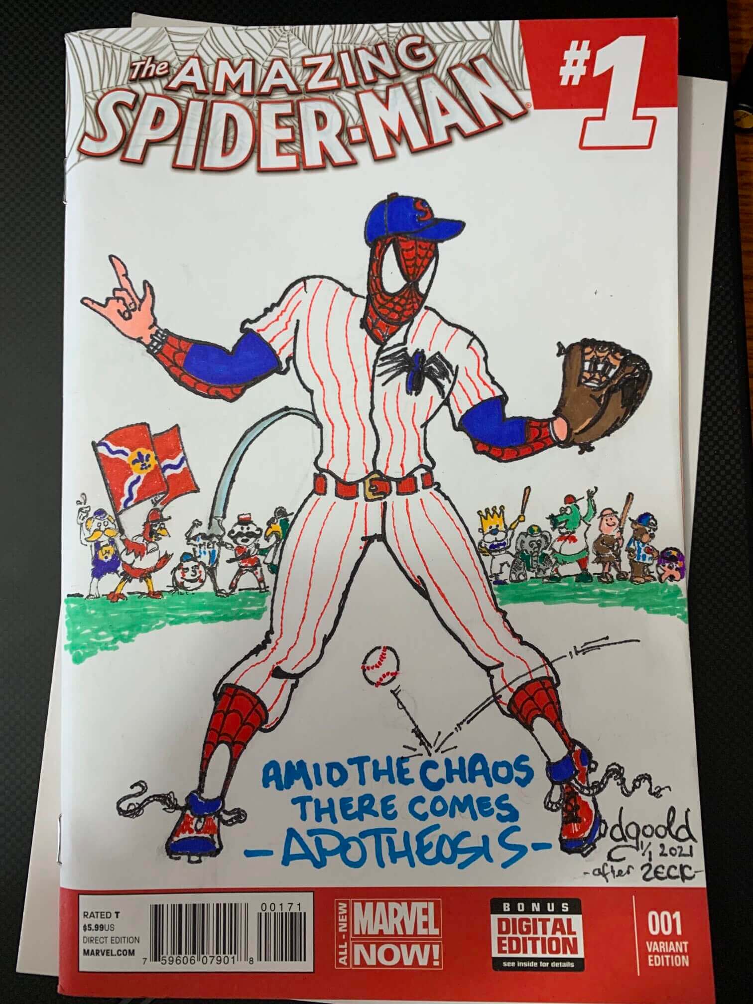
My uni sense is tingling: Love love love this illo of Spider-Man as a ballplayer, complete with web-themed stirrups, web shoelaces, and picture-perfect pants blousing. The pose and caption are based on this old Marvel cover, and the MLB mascots in the background are a nice bonus.
And who’s the artist behind this masterpiece? None other than sportswriter Derrick Goold, who’s the lead Cardinals beat writer for The St. Louis Post-Dispatch. He created that piece to help raise money for a local comics shop in St. Louis. Much like Shohei Ohtani, he’s a double threat — writer and illustrator!
I’ve long been familiar with Goold’s sportswriting byline but didn’t know about his artistic acumen until a few days ago. Now that I know, I’m thinking an interview or retrospective might be in order — stay tuned for that. Meanwhile, imagine Goold and Cardinals program cover illustrator Mike Right teaming up — it’d be a St. Looie super-artist shindig!
Click to enlarge
Collector’s Corner
By Brinke Guthrie
Follow @brinkeguthrie
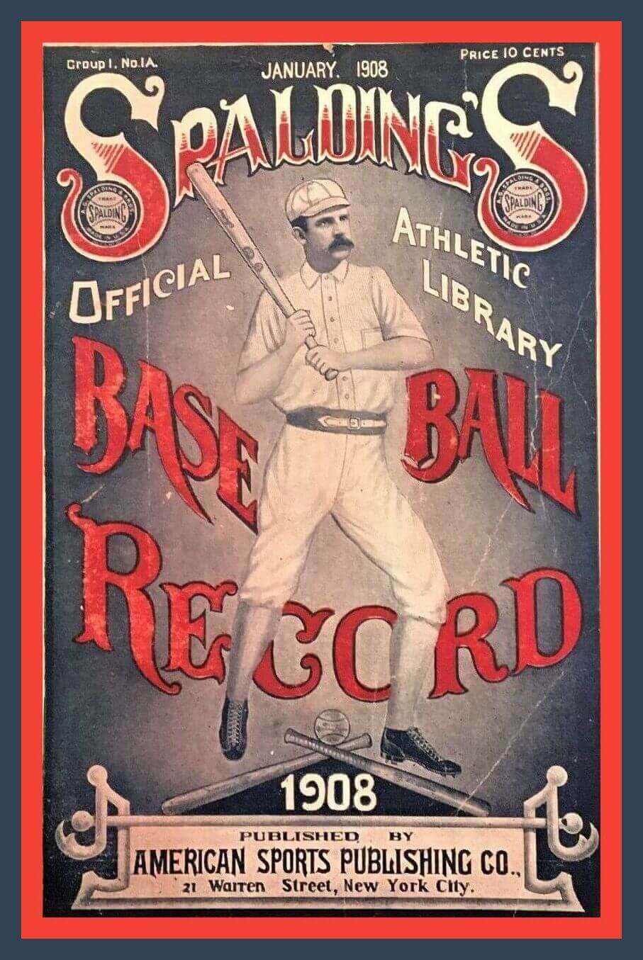
Well now, this is without a doubt one of the oldest items (114 years!) ever featured on Collector’s Corner: the 1908 Spalding Base Ball Record book from their “Official Athletic Library.”
The seller notes that the publication includes “extensive coverage of the 1907 World Series, won by the Chicago Cubs over the Detroit Tigers,” and photos of players Davy Jones, Ty Cobb, Rube Waddell, Chief Bender, Jack Chesbro, Joe McGinnity, and Christy Mathewson.
Now for the rest of this week’s picks:
• Sure looks like 49ers and Dolphins (who didn’t yet exist) on the cover of 1962’s Pro-Football Illustrated magazine. Among the candid features: “Why I left the Oilers” by Wally Lemm, and Rams linebacker Les Richter tells us, um, “I like it when it’s rough!” Whatever you say, Les.
• Is that Burt Reynolds, Tom Selleck, or maybe mustache-era G.I. Joe’s face on this Los Angeles Rams finger glove puppet? (You stick your fingers down through the pants to make his legs. I think.)
• Staying with the Rams, here’s an early-1970s light switch plate.
• Pour your Campbell’s soup into this 1970s “Souper Mug” from J.C.Penney, which included NFL logos in blue and yellow (and space to print your name on the lid!).
• What every New York Jets fan needs: This late-1960s NFL Booster Pack includes a bobble, a mini-pennant, a mini-football, and a helmet-shaped pencil sharpener.
• I’ll guess 1950s or early ’60s for this football-themed Rawlings drinking glass.
• Great artwork for sure on this dealer-promo advertising sheet for “Donruss Great Moments 1981,” featuring Steve Carlton, Pete Rose, and Fernando Valenzuela.
• Definite Bob Griese facemask action on the wrapper art for this 36-pack box of 1988 Topps football cards (gum included!).
• This Maxwell House coffee tin from 1984 features a logo-less Dan Marino, part of their “Star Quarterbacks Collector’s Series.” Good to the last drop!
• One more for No. 13: Marino is wearing a Dolphins jersey, but with “Read” on the side of his helmet, on this 1986 poster to promote reading in school.
• With March Madness approaching a crescendo, here’s a pair of Florida-themed seat cushions from the 1999 men’s Final Four in Tampa.
Click to enlarge
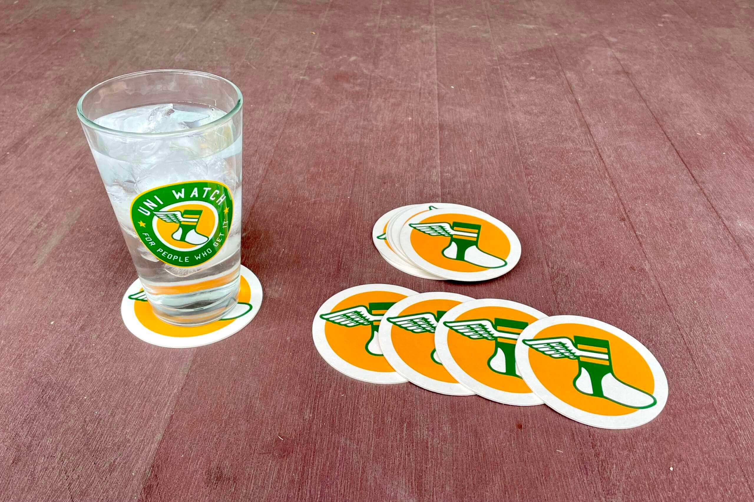
Coaster reminder: I have a very limited (and dwindling!) supply of these great Uni Watch coasters — a set of three for $9. Full details here.
The Ticker
By Alex Hider

Baseball and Softball News: Spotted at the Pirates’ spring training ballpark in Bradenton, Fla.: one of the strangest tributes to Roberto Clemente you’ll ever see, depicting him as a gecko. As Robert Brashear notes, there are plenty of little mistakes on the uni, but it deserves “extra points for the gecko stirrups.” … This great feature explores the Black-owned business in Chicago’s Chatham neighborhood that cleans the White Sox’s uniforms (from thanks to all who shared). … New uniforms for the Triple-A Buffalo Bisons (thanks to all who shared). … Hawaii P Tai Atkins is the rare ballplayer who wears his glove with two fingers sticking out, instead of one (from Cory Harrington). … The next three notes are from Kary Klismet: A St. Louis Cardinals blog has published an overview and ranking of the team’s logos throughout the years. … Here’s another ranking of current MLB unis. … The Staten Island FerryHawks of the independent Atlantic League are in the midst of a stadium renovation. … The High-A Jersey Shore BlueClaws have a commemorative logo for Opening Night (from Kevin Clark). … On Saturday, Michigan women’s basketball head coach Kim Barnes Arico honored her late brother Chris Barnes during their NCAA tournament game by wearing a yellow softball jersey with No. 11, the number Chris wore when he played basketball. The rest of her staff wore blue softball jerseys (from L.J. Sparvero).

Football News: The NFL has released the full set of 2022 draft caps (from Brinke). … Also from Brinke: A new stadium for the Bills is a step closer to becoming a reality. … No new uniform combos for the Lions in 2022, but team president Rod Wood hinted the team could have at least one new uniform or helmet in 2023 (from Jerry Nitzh and Phil). … The NFL was experimenting with a helmet-installed sensor to measure for the force of head impacts way back in 1962 (from Greg Mays). … The rest of the items in this section are from Kary Klismet: This blog counts down the top 10 throwbacks that should come back next season. … The iconic “lighthouse” in the north end zone of New England’s Gillette Stadium has been taken down as part of a renovation. It will soon be replaced by an even larger lighthouse. … Here’s another ranking of the current uniform scene in the Big Ten.

Hockey News: FiveThirtyEight published a fascinating piece about NHL players that suffer from colorblindness (from Michael Rich and @jeffisrael25). … The Providence Bruins of the AHL wore Star Wars unis on Sunday. They went the extra mile by incorporating an “AT-AT walker” into their current logo — the vehicle took the place of the bear in their crest (from Andy Chalifour). … Check out the unis worn by the Pittsburgh Pennies, a women’s team that played in the 1970s (from Troy Caldwell). … Northeastern G TJ Semptimphelter is just a freshman and a long way away from the pros. But if he were to make the NHL, John Muir believes he would tie the league record for longest surname. … The Kamloops Blazers of the WHL will wear one-off jerseys for Indigenous Night on Wednesday (from Wade Heidt and Phil). … Check out the very unusual NOB typography used by the Orlando Solar Bears in the mid-1990s (from Trevor “Teebz” Alexander).

Pro Basketball News: Win or lose, NBA teams post social media graphics with the final score from each game they play. The Lakers have lost 43 games so far this season, and none of the graphics from those games feature photographs of LeBron James (from Michael Kinney). … Two NBA number updates from Etienne Catalan: New Celtics SF Matt Ryan will wear No. 37, and new Jazz F Greg Monroe will wear No. 10. … The Iowa Wolves, Minnesota’s G League affiliate, will wear Hispanic heritage uniforms tonight. … Staying in the G League, the College Park Skyhawks will wear one-off “Kids Night” jerseys tonight. … One more G League note: The Salt Lake City Stars will wear ’70s throwbacks that honor the ABA’s Utah Stars on Friday and Saturday (from Kary Klismet). … Also from Kary: Hawks Talon Gaming, the esports affiliate of the Atlanta Hawks, has unveiled a new virtual mascot.

College Hoops: This animated visual graphic shows which programs have the most Final Four appearances. “Lots of blue at the top,” James Gilbert notes. … Couple of items from the Stanford women’s NCAA Tourney game from Friday: Cardinal players have been wearing Stanford soccer shirts as warm-ups to honor Katie Meyer, a Stanford soccer player who died by suicide earlier this year (sorry, no photo of that). Dave Landesberg notes the team has been wearing the shirts for several weeks. He also notes that twin sisters Lexie and Lacie Hull wear traditional NOBs, despite sharing a last name. … Here’s an interview with the designer of the 2022 McDonald’s All-American Game uniforms (from Kary Klismet). … Cross-listed from the baseball section: On Saturday, Michigan women’s head coach Kim Barnes Arico honored her late brother Chris Barnes by wearing a yellow softball jersey with No. 11, the number he wore when he played basketball. The rest of her staff wore blue softball jerseys (from L.J. Sparvero).

Soccer News: The next four notes are from Kary Klismet: Footy Headlines has published a review of all the shirts that will be worn at the UEFA Women’s Euro 2022 Tournament this year. … Hoffenheim of the German Bundesliga will wear one-off “Africa” uniforms this weekend. … Staying in Germany, second-tier club FC St Pauli have unveiled a new “anti-racism” jersey (also from @DetroitCSC). … New away uniforms for Forward Madison of USL League One (also from Scott Rogers). … Last week, Scottish Women’s Premier League 1 sides Hibernian and Partick Thistle wore shirts promoting United to Prevent Suicide. This week, more clubs joined in the effort, including Heart of Midlothian, Rangers, Spartans, Glasgow City and Hamilton Academical (from our own Jamie Rathjen).

Ukraine News: Canadian Premier League soccer club Atlético Ottawa will wear blue and yellow uniforms to show support for Ukraine at their home opener on April 9 (from Wade Heidt).

Grab Bag: New uniforms for all 10 cricket teams in the Indian Premier League (from Kary Klismet). … Alaska Airlines is creating gender-neutral uniforms for flight attendants and airport staff members. … Cleverly designed new logo for the New York Philharmonic. … A nonprofit organization supports the families of fallen police officers by using the officers’ uniforms to make teddy bears.
Well if all they’re playing for is a hunk of metal the analogy fits. Only baseball, man. Only baseball.
Those MLB uniform rankings are a mess. Docked the Tigers for being too simple, then puts the Cubs and Yankees in the top tier because they are simple.
I forgot my personal rule of never reading these things, and yeah, wow. Just terrible. Some of the best uniformed teams ranked at the bottom, and terribly uniformed teams like the Twins ranked near the top. The only sorta coherent section was the “good” ranking.
The writer also gets some stuff factually wrong–like he describes the Red Sox road uniforms as not having red in them, which hasn’t been the case for 8 years or so.
We should probably just stop putting ranking pieces in the Ticker. They’re almost always awful and just end up annoying everyone.
I usually find them pretty interesting even if I don’t agree. For example, I am an Angels fan and I hate that red is the primary color. To me navy is a much better look for them. But this guy loves the look. The old adage is true – YMMV
I enjoy uniform and logos ranking pieces. Even if we here at UW disagree with certain rankings, it’s useful to know what other fans think about sports aesthetics.
Nah. The rankings are interesting either way. Agree or not, it doesn’t matter, just someone’s opinion. Shouldn’t be taken personally enough to upset anyone. People who don’t want them can just skip the link, like some people do with much of the soccer section.
If the piece is good quality, I love reading it. Factually accurate, well written. I’d hate to see those go away.
If its full of mistakes or looks like it was written by an idiot, hard pass.
The site also ranked the Diamondbacks based on unis they last wore in 2019
I’m not so sure a litter box would be necessary on the warning track. Cats know what to do when walking around on sand…
Fair point!
We already have a ballpark named after a brand of toilet bowl valves, er, excuse me, “plumbing fixtures”. Is “Scoop Away Park” really that far off?
What park is that? Not thinking of any in MLB
The Spring Training home of the Chicago Cubs is Sloan Park in Mesa, Arizona.
With multiple cats and litter boxes in our house, I get it. Now, when your team is playing poorly you can just say “The team’s playing like what Mittens deposited in the litter box”!
Baseball managers often urge their players to “string together” a series of base hits. I propose that on the first game of every homestand, the KC manager instead urges his players to “clump together” a series of base hits — as a nod to the highly effective clumping cat litter.
In all seriousness, it would make more sense to wear blue on the first day of the homestand. You wear blue to work on Tuesday during the day, then watch your team play that evening.
it would make more sense to wear blue on the first day of the homestand. You wear blue to work on Tuesday during the day, then watch your team play that evening.
Yup. You just out-marketed the Royals’ entire front office. Well done.
As the sports world often takes itself too seriously, I cannot help but find the kitty litter analogy hilarious. You’d almost expect them to use to an absurd analogy to military service, patriotism, or blue collar fetishing, but nope, fandom is like a cat that instinctively knows to use a litter box.
They do “Purple Friday” in Baltimore…
Apparently there’s some code that prevents the use of the carats and anything between ’em…that was supposed to be a “whispers,” didn’t want to poke the bear that much!!!
Kim Barnes didn’t wear a “yellow” jersey last Saturday when coaching, she wore a maize jersey.
Is the leak picture that the Nats’ jersey say The District fake or is there a different retail version? The jersey announced today says WSH.
The picture isn’t “fake” — it’s a real picture. But like many purported leaks, it turns out that it doesn’t accurately reflect the final design.
That actually struck me as a clever photoshop. The angle of the photo and everything looks *exactly* like the local news station footage of the Washington Commies shop the night before the big reveal. The white script “Washington” doesn’t really match with the words “team store” next to it, and the final words look like they’re in the WFT font.
The pic could be legit, but it looks to me like someone made a guess on the design and plopped it in over the Commies mannequins.
Tell me its not the same pic: link
Sorry. The pic I saw was a thumbnail of the video on that page. Here’s the picture: link
Definitely is the same picture. The link below is from the dude who photoshopped it
link
Massive Show-Me State representation today.
Wow. I mean the Cherry Blossom idea isn’t bad in theory, but yikes those are some awful uniforms.
For starters, gray on the road, not at home. Then they are using “WSH”? Ugh.
Why not just go pale pink pants and jersey?
It did provide a perfect opportunity for a WFMU reference, however.
It’s always good to see a Terre T shoutout!!
The Royals have been playing like shit, so if the analogy fits… They’ve been the little brother to the Chiefs for a long time, and schedule-wise, I understand the sentiment of what they are trying, but good God, just pick a day (how about something insane like, Royal Blue Fridays?) and go with it.
That marketing guy appears to have just started talking, not realizing what was actually coming out of his mouth. By the way, the Royals often make me want to visit the litter box.
Spalding Guides are amazing records of early baseball — including all of the regional leagues that were around (and some still are), before the minors existed.
Even more amazing, the Library of Congress has a bunch of them digitized — link
YES! These are all gorgeous! Thanks for posting. LC has some amazing digitized collections.
If they want to rename the batter’s box to tie into litter box then it’s gotta be hitter’s box, right?
A real gruesome Mr Met decapitation in background of that comic cover. Especially egregious as Spidey in a Met fan.
Well, to many in St. Louis, the Mets are *stil* pond scum almost thirty years on. It appears that Goold is among that crowd.
RE: Milwaukee getting a city connect jersey
A coworker points out the wear date coincides with Summerfest, so maybe it will incorporate the iconic smiley face logo of the lakefront music festival
I’m hoping for a wall of cream city bricks…
Never knew Goold could draw. Nice mascots! Have to hollar up to the press box on Opening Day so we can collaborate on something stellar.
Not sure about the uniforms, but the cherry blossoms in D.C. are beautiful. Too bad they’re only in full bloom for such a short period of time each spring.
Oh, and cats are the most loathsome creatures on earth.