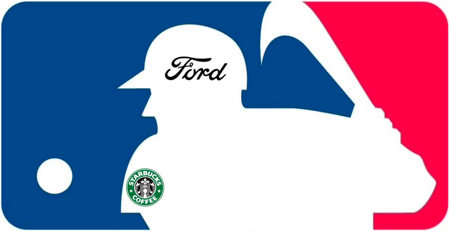
Ever since the new MLB labor deal was reached two weeks ago, I’ve been trying to get info on the new uni ad program that’s part of the collective bargaining agreement. Details have been hard to come by, but SportsBusiness.com’s Eric Fisher published a very informative article on Tuesday (although I didn’t become aware of it until Wednesday, when SB Nation blogger Al Yellon linked to it) that spells out a lot of what’s in store.
According to Fisher, “there is not yet a fully finalized program for how the uniform patches will work, but several key elements are now generally known, and some clubs are already well along in their pursuit of individual patch deal agreements.” Here are the major takeaways from his report:
1. The good news: First and foremost, jersey ads will not be happening this season. As stated in Fisher’s article, “Team-level [ad patch] deals are expected to be finalized by many teams in the coming weeks and months in advance of a planned, more coordinated on-field rollout beginning with the 2023 season.”
Translation: While some teams may be announcing jersey ad patches this spring and summer, no teams will be wearing the jersey ads until next year. (I contacted Fisher and confirmed this detail, just to be sure I wasn’t misinterpreting what he wrote.)
The imminent arrival of jersey ads still sucks, of course, but the news that we won’t be seeing them in 2022, after I’d already resigned myself to dealing with them this year, feels like a huge, unexpected gift. And hey, there’s always the outside chance that Earth could be hit by an asteroid before the start of the 2023 season, right? Never give up hope!
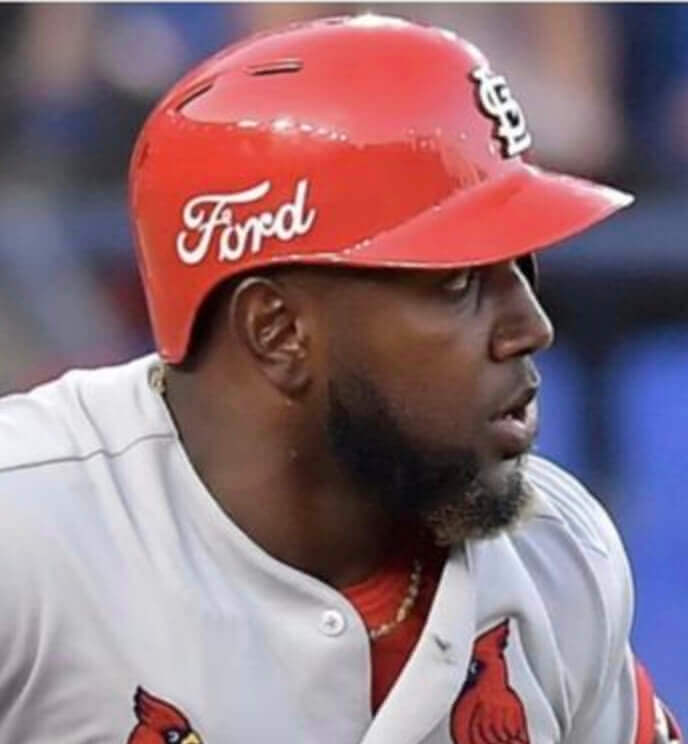
2. The bad news: Batting helmet ads, however, will likely arrive this October. Quoting from Fisher’s article: “Helmet advertising is being reserved by the league for national-level deals [as opposed to individual team deals], with a debut there arriving as soon as the 2022 postseason. The bifurcated strategy provides the central office with an additional sponsorship inventory and allows clubs to focus more fully on the uniform patches.”
Ugh — so this year’s World Series (and the rest of the playoffs) will feature unsightly helmet ads like the ones we saw for games in Mexico in 2019. This is similar to how things unfolded in 2016, when the New Era maker’s mark suddenly began appearing on caps during the postseason and then became a league-wide thing the following year.
3. Location, location, location: When jersey ads arrive next season, they will “almost certainly” (that’s Fisher’s term) be on the sleeves. Another source has confirmed that the jersey patch location isn’t yet settled but will “likely” be the sleeve.
That’s a bit of a head-fuck. I had assumed all along that the ad patches would be on the sleeves, because that’s where they’ve been for all of the non-USA/Canada games over the past two decades. The sudden possibility, however slight, that they could end up on the chest is frankly alarming. But for now, for the sake of my blood pressure, let’s round up and assume that “almost certainly” and “likely” mean “definitely,” mmkay?
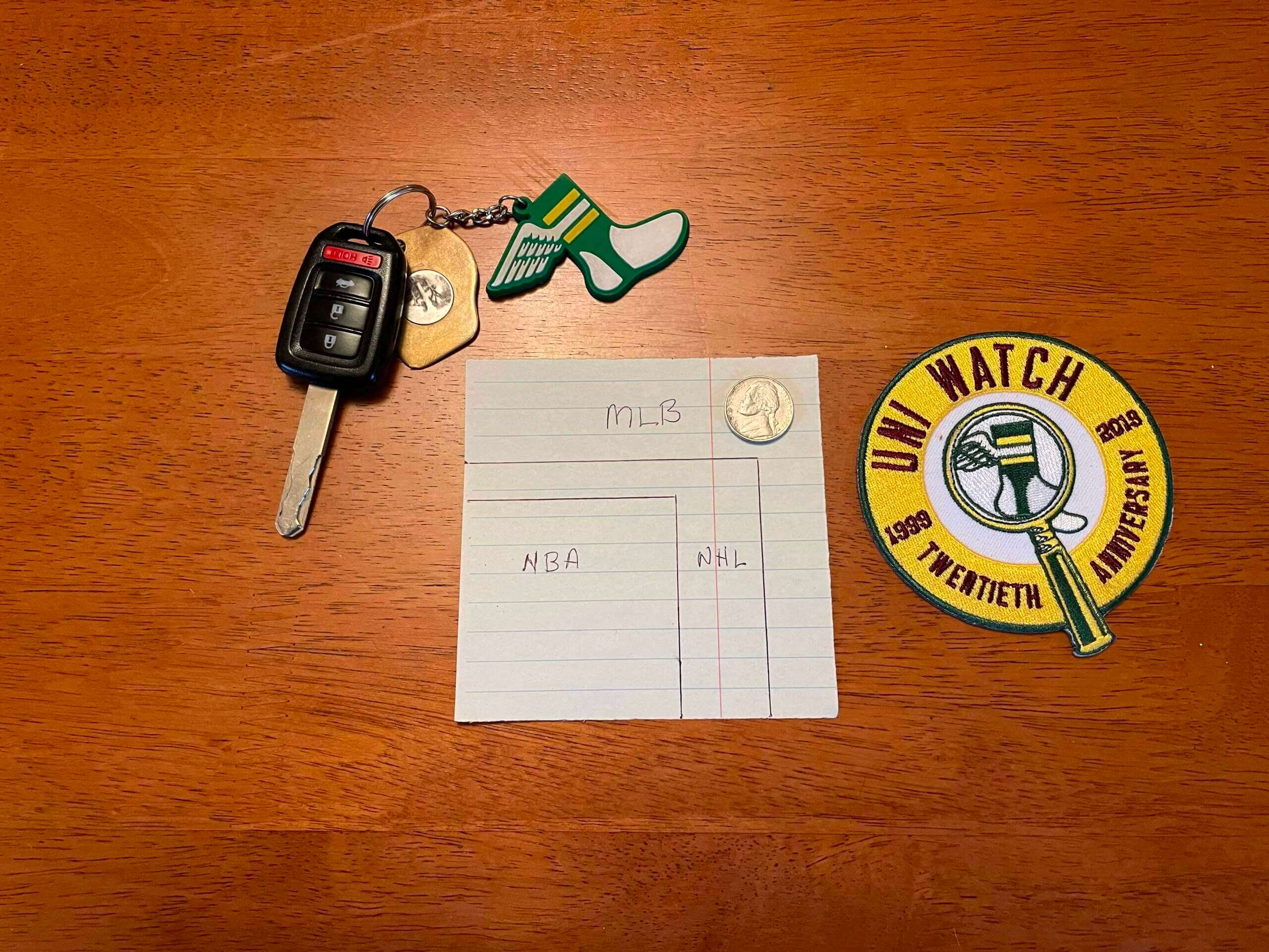
4. Size matters: The ad patches — the ones that we all fervently hope will be on the sleeves, not on the chest — will be pretty big. Fisher’s article says they’re projected to be 4.25″ by 4.25″. That compares with 2.5″ by 2.5″ for the NBA and the planned 3″ by 3.5″ for the NHL.
How big is that? I decided to see for myself by cutting out a 4.25″ square of paper. Here’s how it looks compared to the NBA and NHL patch limits, along with some other objects (click to enlarge):
And here’s how it looks on the sleeve of one of my vintage jerseys:
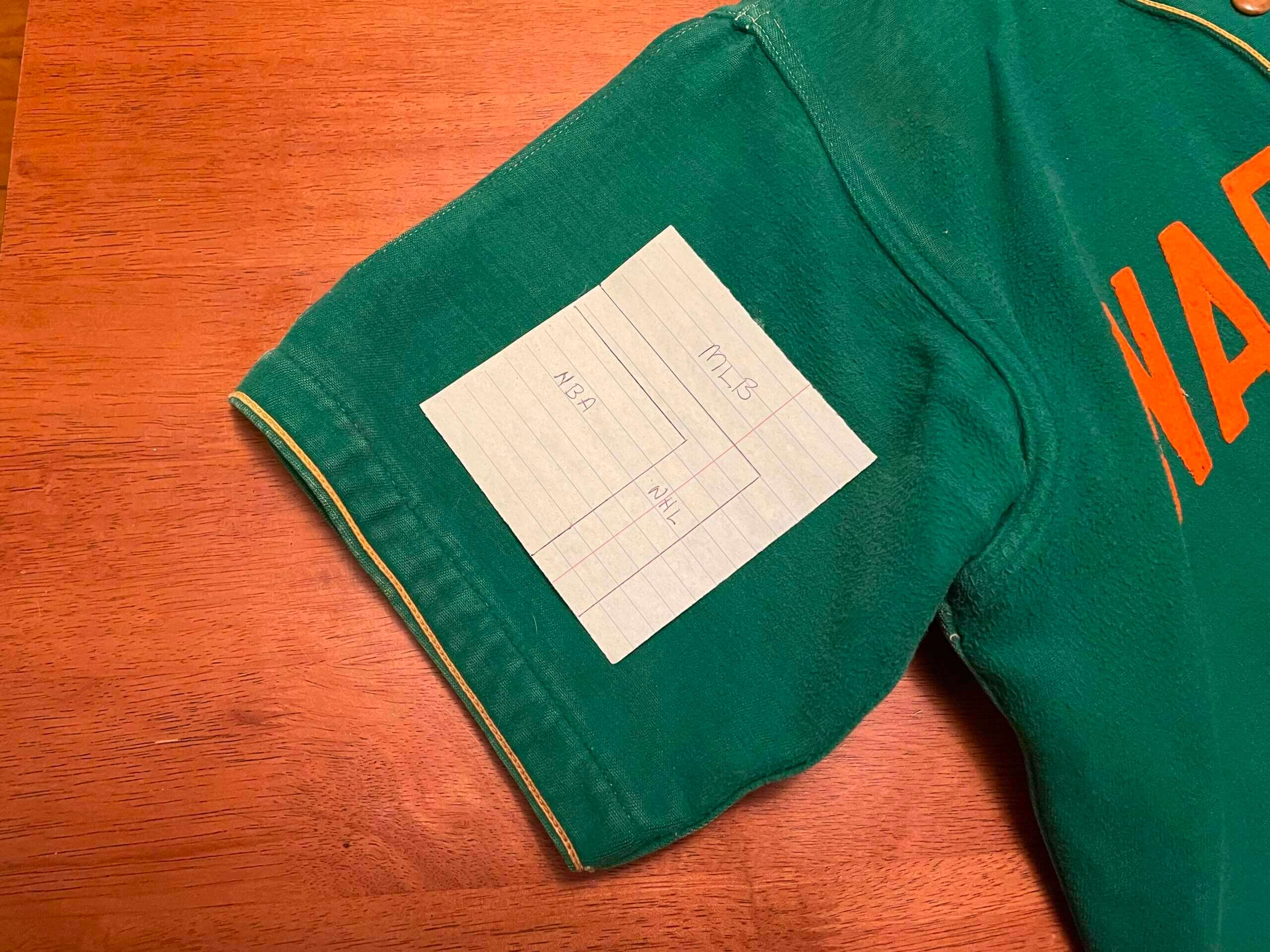
If you look at my recent breakdown of uni ads in non-USA/Canada games, the new patch size is clearly larger than the sleeve ads worn in most (but not all) of those games.
5. Lefty vs. righty: Ad patch positioning may depend on the players’ handedness. Quoting again from Fisher’s piece: “The specific sleeve patch placement for each MLB player will depend in large part on whether they are a right-handed or left-handed batter or pitcher, all with an eye toward maximizing exposure either at the plate, on the mound, or in the field.”
What will that mean for non-ad patches? The Mets, for example, wear their skyline logo as a left-sleeve patch (and just for reference, that patch is four inches across — smaller than the new ad patch limit). But if the left sleeve is the higher-visibility sleeve for a given player, will the ad patch go in that spot and then the sleeve patch move to the right sleeve? And what about memorial, anniversary, and other commemorative patches — will they move to the chest? Or maybe they won’t be used as much anymore? Hmmmm. (I’ll try to find out more about this.)
6. Hurry up and wait: Fisher’s article includes a quote from a marketing agency exec named Michael Neuman, who brings up something I hadn’t thought of before:
“You think about the biggest complaints that baseball has received of late, things like the pace of play and how its speed of the game doesn’t translate as well to younger audiences,” Neuman says. “But those are precisely the things that amplify the potential of their [advertising] patch program. I see the patch program really becoming an overachiever for MLB.”
In other words, things like longer game times and batters stepping out of the box over and over again mean more exposure for uni advertisers. That means MLB’s stated desire to quicken the pace of play and reduce game times will be in conflict with its new uni-borne revenue stream. So when proposed rule changes like a pitch clock come up, you have to wonder if some owners and execs will be saying, “Yeah, that might be good in theory, but shorter game times mean we won’t be able to charge as much for the uni ads.” Hmmmm.
———
There’s more (I recommend the whole article), but those are the major points. Obviously, the biggest one is that we won’t see uni ads during the 2022 regular season. At this point, I’ll take glad tidings wherever I can find them, so let’s celebrate this tidbit of good news.
Click to enlarge
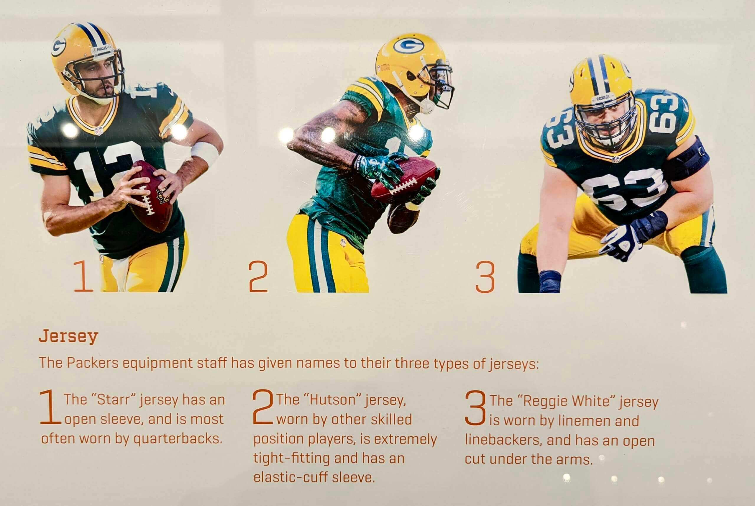
How did we not know this before? Reader Shawn Dzwonkowski recently visited the Packers Hall of Fame in Green Bay and discovered two interesting uni-related tidbits. First, as shown above, the team has named its three jersey tailoring cuts after three former Packers greats — Bart Starr, Don Hutson, and Reggie White.
I’ve never heard of a team doing anything like this! Also, it’s interesting that the Starr and Hutson cuts are named after the players’ surnames, while the Reggie White gets the full name (I guess because simply calling it the “White jersey” could be confusing when dealing with green or throwback jerseys).
In addition, there’s a display/explainer about the three types of pants that the team uses (click to enlarge):
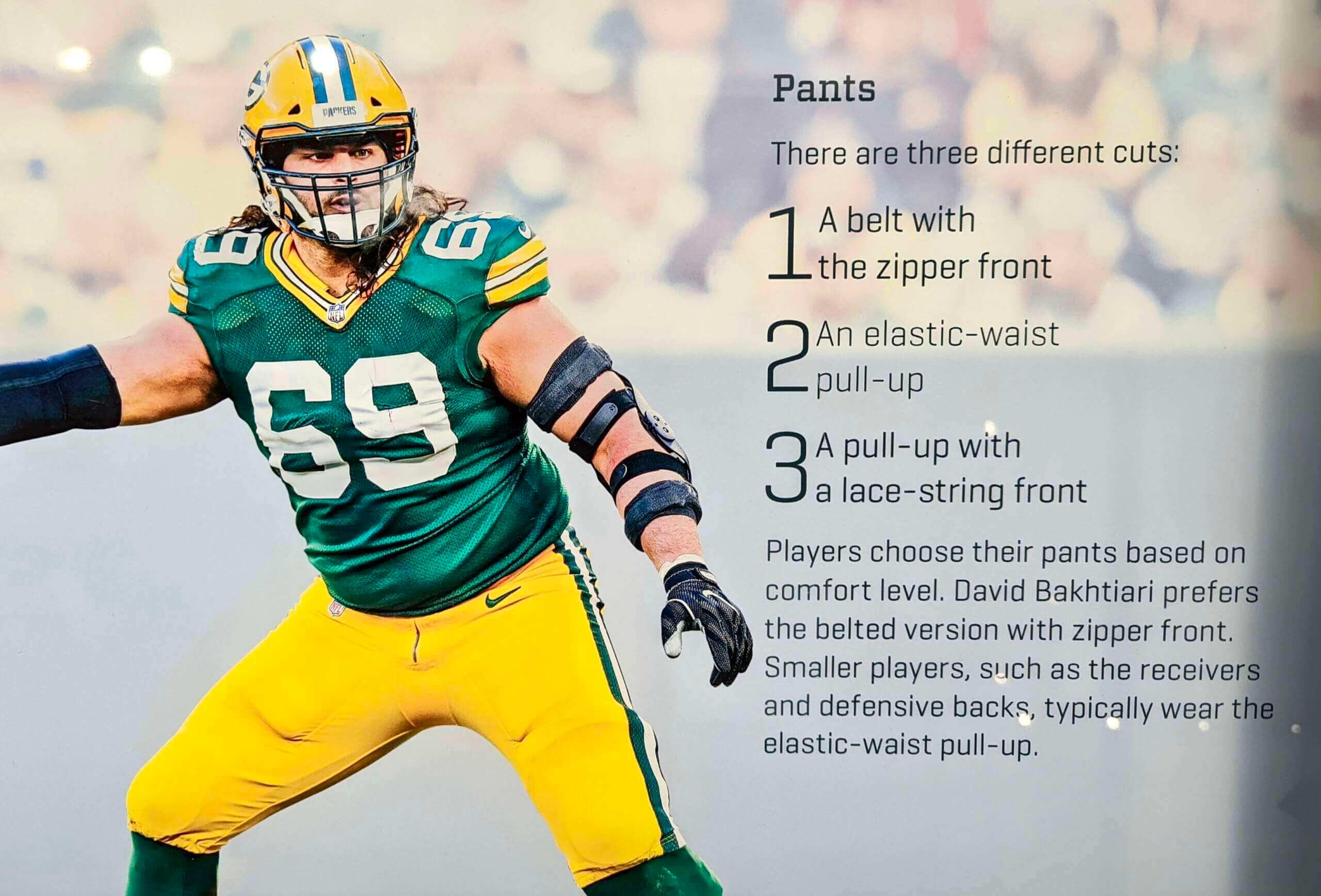
I love that the Packers Hall of Fame provides info like this — so cool! I’ve never visited this Hall but may be in the Green Bay area later this spring (more on that soon) — if so, I’ll definitely try to stop in at the Hall. Big thanks to Shawn for sharing this content with us!
Click to enlarge

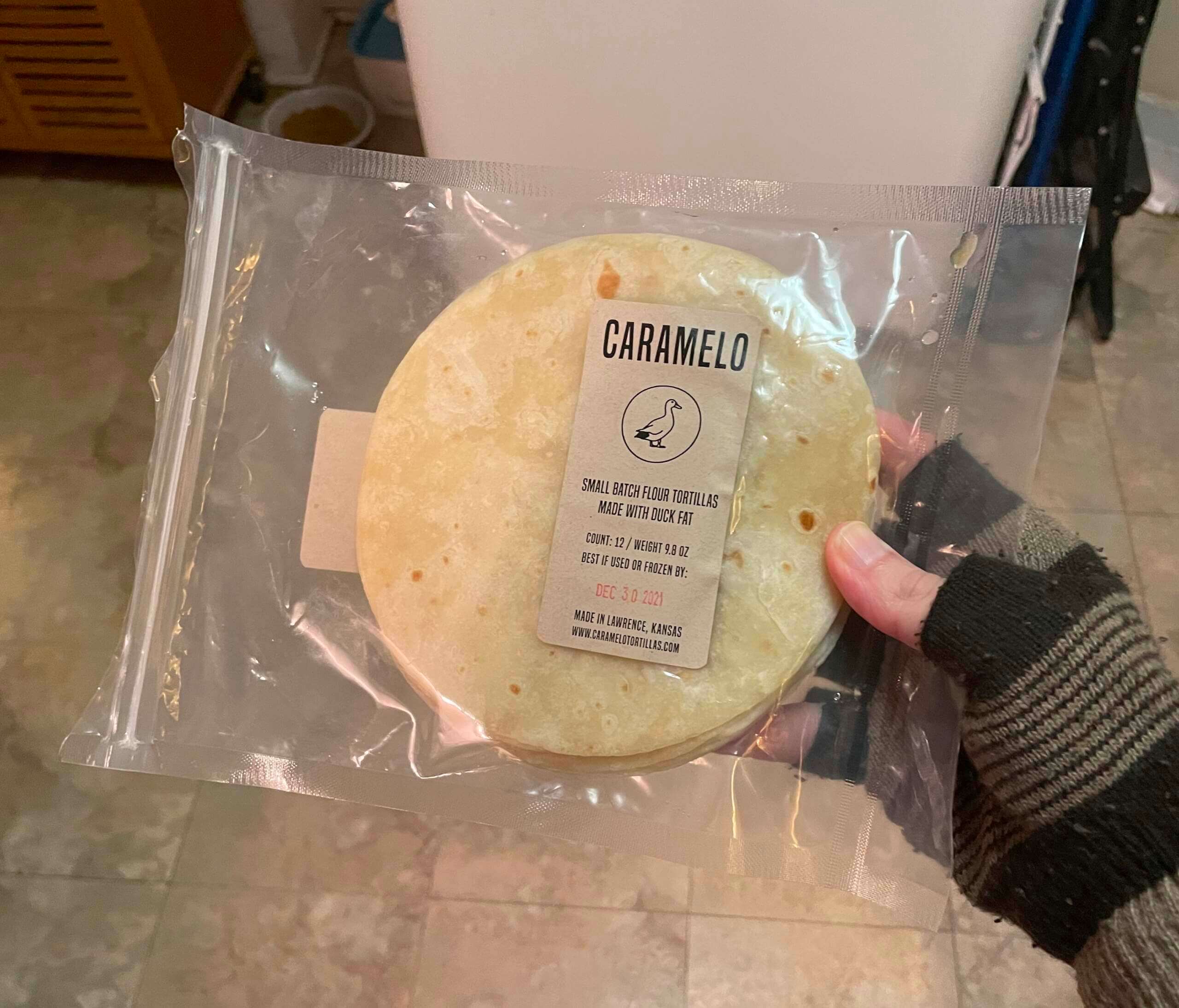
Culinary Corner: The Tugboat Captain loves cooking with duck fat — duck-fat french fries, duck-fat popcorn, duck-fat anything. And she also loves tacos. So for Christmas I got her these duck-fat tortillas, which she popped in the freezer to save for a special project.
That project came a few days ago, when she announced that we were having duck tacos on the duck-fat tortillas. Here’s how we did it:
1. We got several pounds of duck legs/thighs and confited them in lard and duck fat (of course). I didn’t take photos of this stage, sorry, but we followed the confit process shown here.
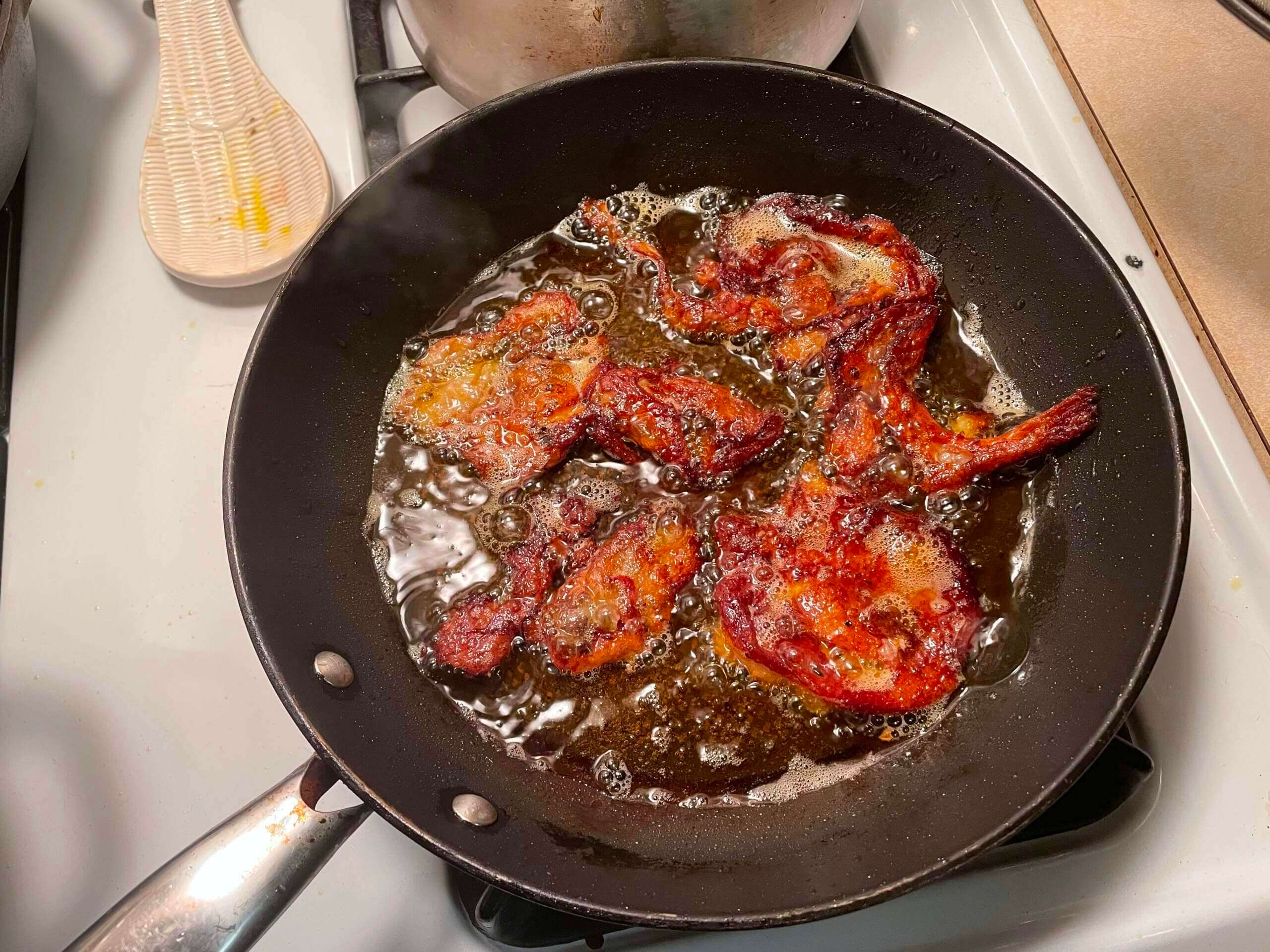
2. When the duck legs were fully confited, we removed the duck skin from the meat and fried it up into duck chicharrónes (or, if you prefer, “quacklins”):
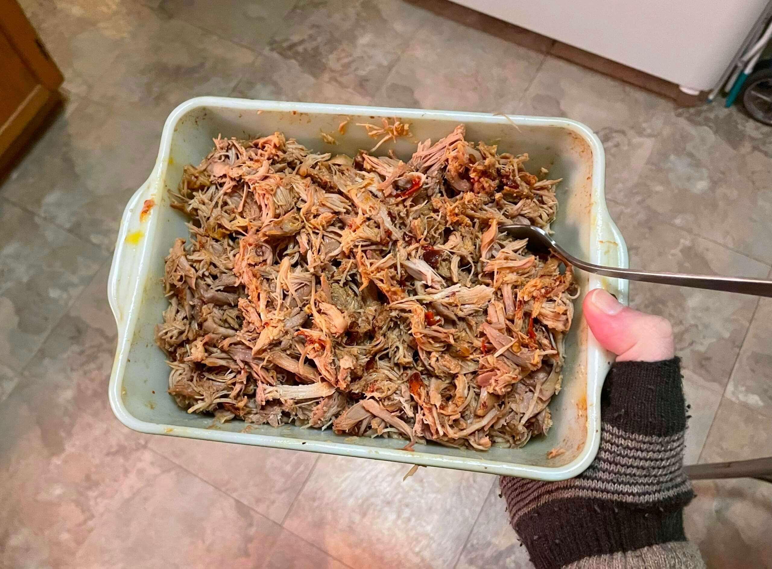
3. We shredded the duck meat by hand, resulting in something that looked very much like pulled pork:
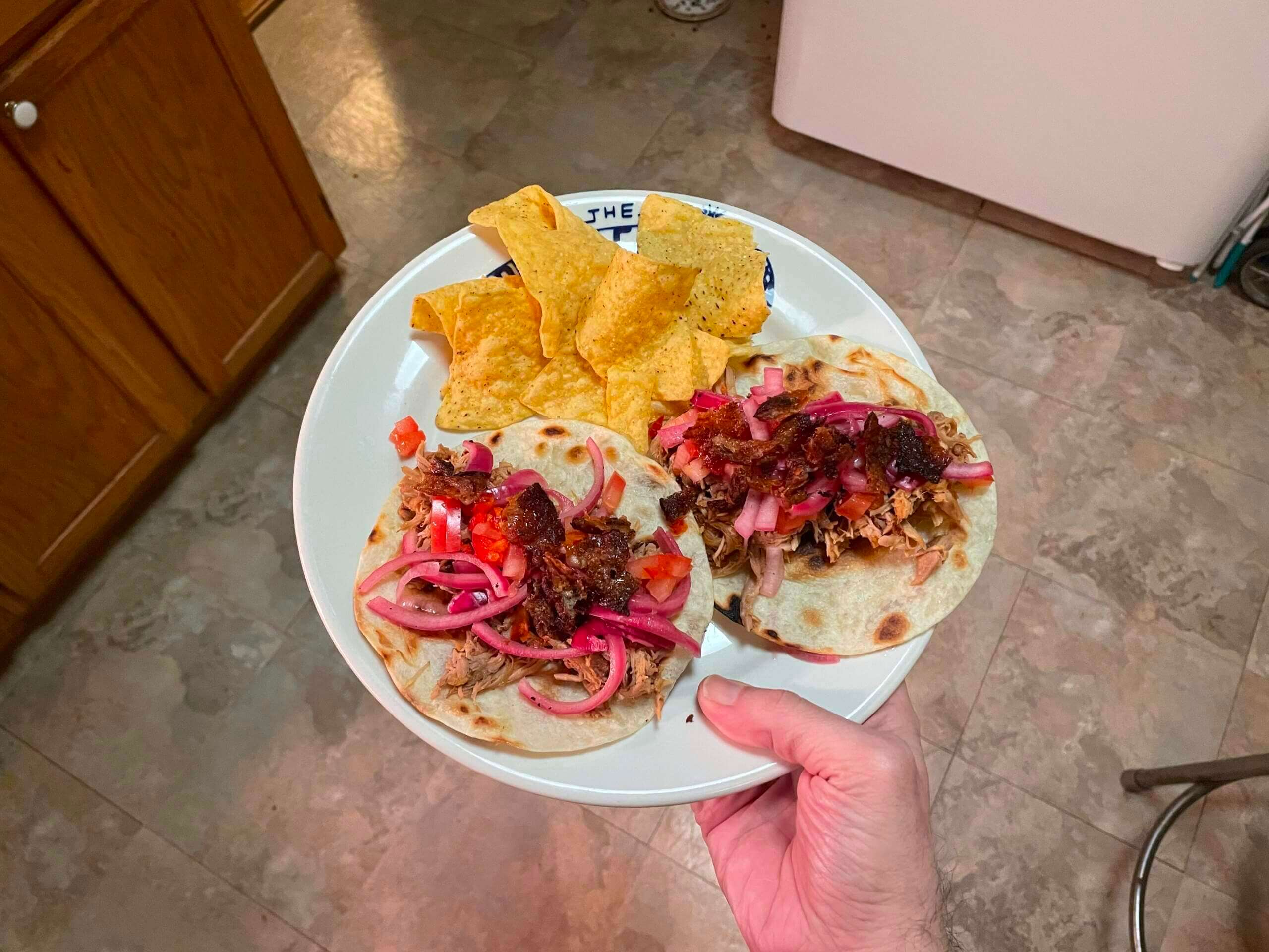
4. We heated up the duck-fat tortillas and then topped them with the shredded duck, some pickled red onions, some chopped tomatoes, and then the quacklins. Sooooo good!
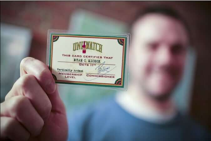

ITEM! Another membership raffle: Reader James Lutz recently won one of our membership raffles and decided to pay it forward by providing funds for another one, so that’s what we’re going to do to today.
This will be a one-day raffle. No entry restrictions. To enter, send an email to the raffle in-box by 8pm Eastern tonight. One entry per person. I’ll announce the winner tomorrow.
Meanwhile, the winner of yesterday’s membership raffle is Samuel Olmstead. Congrats to him, and thanks to Kary Klismet for sponsoring that one!
The Ticker
By Anthony Emerson
Indigenous Appropriation News: The New Hampshire legislature has rejected a bill that would have banned Indigenous logos and team names for high school sports. Neighboring state Maine passed a similar law in 2019.

Baseball News: New Phillies OF Kyle Schwarber was still wearing his Nationals elbow guard yesterday. Schwarber spent the second half of 2021 with the Red Sox after his Nationals stint last year, meaning he’s been carrying around that elbow guard for a little while (from Nick Zingaro). … Dodgers P Clayton Kershaw is the latest MLBer to eschew the new mesh spring training caps (from @THAT_G0MEZ). … Yankees P Deivi García, who wears No. 83, took the mound while wearing teammate Gerrit Cole’s No. 45 belt during yesterday’s Grapefruit League game against the Orioles (from Justin Southwell). … New Twins SS Carlos Correa, who wore No. 1 with the Astros, made no attempt to acquire that number from INF Nick Gordon and instead chose No. 4 because it’s “[j]ust a new chapter, new team, new number” (from Trevor Williams). … New alternate logo for the Springfield Lucky Horseshoes of the United States Prospects League (from David Dahl). … The Binghamton Rumble Ponies, the Mets’ Double-A affiliate, have unveiled several alternate uniforms they’ll wear this season (from Kary Klismet).

NFL News: The SportsCenter Twitter account did an almost-convincing jersey swap on a video clip of new Dolphins acquisition Tyreek Hill, except they kept KC’s Lamar Hunt patch and just colored it turquoise (from @_kymei).

Hockey News: The Kings wore pride warm-up jerseys on Tuesday night (from Wade Heidt). … A pair of Blue Jackets fans went on a road trip to NHL arenas and collected patches for every arena they visited, applying them to the back of their Blue Jackets jerseys (from John Flory). … The Erie Otters of the OHL will wear autism awareness warm-up jerseys on Friday (from John Oncea). … The Maple Leafs debuted their BFBS alternates last night. The stars of the game wore the jersey inside-out for their postgame salutes.

Basketball News: Here’s the NBA uni guidelines poster from the Bucks’ locker room (from Jeff Ash). … ESPN misspelled “Wichita” during their March Madness coverage (from @PhillyPartTwo).

Soccer News: USL League 1 team Richmond Kickers have unveiled their new kits, inspired by their inaugural kits from 1993 (from Ed Zelaski). … New crest for Italian Serie C side Calcio Catania. Old one is here. … UEFA and CONMEBOL have revealed the logo of the “Finalissima,” a new one-game playoff between the winners of the 2020 Euros (Italy) and Copa América 2021 (Argentina). The match will next be played in 2025, between the winners of the 2024 Euros and Copa América 2024 (from Kary Klismet). … Also from Kary, Liverpool have unveiled new renderings of their Anfield expansion project. … A couple of Scottish notes from our own Jamie Rathjen: Dunfermline Athletic’s men’s team wore warm-up shirts supporting the mental health charity Samaritans before their game yesterday, and Scottish Women’s Premier League 1 game between Hibernian and Partick Thistle saw both teams support the charity United to Prevent Suicide by wearing the charity’s soccer shirt. “I don’t know that they wore those shirts for warm-ups but they at least got players from both teams to pose wearing them,” says Jamie.

Ukraine News: No, Volodymyr Zelensky was not wearing a Nazi symbol while addressing the US Congress earlier this month (from J. Max Weintraub). … Speaking of Zelensky, here’s a think piece on his olive T-shirt.

Grab Bag: Here’s an excellent article on Tim Gagnon, the artist who designs NASA’s mission patches. Highly, highly recommended (from @VikingGiraffe). … New 150th-anniversary logo for Saint Peter’s University (from John Cerone). … Essendon is one half of the AFL’s annual ANZAC Day match, and they usually wear designs that turn their usual red sash into a bunch of poppies. This is this year’s design (thanks, Jamie). … The following are both from Kary Klismet: Mason City High in Iowa has chosen “River Hawks” as its new team name. … The U.S. Marine Corps is trying out a new program to loan maternity uniforms to pregnant officers, along with a number of other changes to uniform regulation, including the introduction of special characters on nameplates (from multiple readers). … Gross: New corporate-advertised name for Cal State Northridge’s Matadome. I’m sensing a T-shirt opportunity, Paul (from @JNAVLA).
Tomorrow: This week’s Bulletin article (which I originally planned for today, but I decided to push it back in light of the MLB uni news). — Paul
“quacklins” – well done!
Yes!!! Maybe Paul’s best bon mot ever. And looks delish.
Deivi Garcia’s belt is actually a tribute to Pedro Martinez: link
Ah, interesting — thanks for that!
That is interesting. Nice find Brian.
Could’ve done without this portion of the article:
“Garcia hails from Martinez’s native Dominican Republic and was born in 1999, the same year Martinez won the American League Cy Young award and famously dazzled in the All-Star Game at Fenway Park.”
Feeling much older now, thanks NBC Sports Boston
I know this site is not about covering retail jerseys, but does anyone know if I buy a retail jersey in 2023, will it come with the ad patch on it?
There’s a place in Portland ME called ‘duck fat’ which of course tells you everything you need to know. I imagine they’re not the only place like that, but we enjoyed it!
I LOVE that place, and visited it often when I lived in Maine.
Honestly I’d deal with jersey patches (but at NBA size) if the moronic “ghost runner” nonsense went away forever. That size on the sleeve would at least not be seen most of the time (it would be a different story if I actually bought jerseys). The helmet ads have always looked like something my 5 year old nephew would do playing with stickers – cool for a 5 year old; ridiculous for anyone else.
The Packers Hall of Fame is almost as awesome as “quacklins” lol
“Quacklins” had me quacking up. Some seriously delicious sounding tacos, well done.
I thought the leafs jersey on ice was not reversible. So was that wrong reporting or did they change jerseys post game
Who said the on-ice ones weren’t reversible? Not me. (If that was reported elsewhere, I missed it.)
I don’t believe anyone (especially Paul) said the jersey was “not reversible.” In fact, he *showed* the reverse jersey in yesterday’s post. What WAS stated was that the Leafs wouldn’t wear the “Bieber” version in-game. Whether they wore it for pre-game or post-game is another story, but the point was they would not wear it during actual game play. Pre- and post-game wearings do not count as on-ice (meaning “in game”). Perhaps the semantics threw you off.
Sadly, there is no “Nitschke” jersey with sleeves that extend down to the elbow.
Re: 6. Hurry up and wait, you could say the same thing about other revenue streams, especially concessions and television advertising. Why would it be a bigger issue for ad patches?
Probably more important than screen time is the number of eyes, and young impressionable eyes in particular. So I’m not sure it’s really a factor.
Actually, TV ads mostly take place between innings, so the length of the game has no bearing on that. As long as there are nine innings, TV ads are unaffected.
In the UK, the businesses that advertise on jerseys are, by and large, the ones that aren’t otherwise allowed to advertise on television. Jersey ads are pretty poor value for money. In the early 2000s, Scottish rivals Celtic and Rangers would routinely have the same jersey advertiser because they discovered that advertising one half of the rivalry meant the other half’s supporters would boycott the company.
These small patches are, in all likelihood, not an effective means of advertising. I think it’s even been discussed on this site before that NBA teams have to work pretty hard to find a patch advertiser. What’s most disappointing about the patch advertising is that it doesn’t matter if they’re effective or not – they’re not really designed to be effective. They’re designed with a slippery slope in mind. The takeaway will never be, “Welp, these ads didn’t work. We should just get rid of them.” It’ll be “Welp, these ads didn’t work. We need to make them bigger until they do.”
Mason City High in Iowa has chosen “River Hawks” as its new team name.
Would you guess there are more teams called the “River Hawks” than “Mountain Lions” and “Bighorns”? It’s funny how certain animals are overlooked.
Duh…
Point still stands that viewership matters as well as screen time for ad revenue, so it’s still not a cut-and-dry case that the goals of hastening play and managing ad revenue are at loggerheads.
OMG, those tacos look amazing. I loves me some duck (I’m a dark meat chicken/turkey guy). And I imagine the “quacklins” were the best part.
I must say, Paul’s cooking entries are some of my favorites on this site!
These executives and ad agencies treat the fans with contempt.
The Phillies wear numbers on their sleeves, what’s going to happen to that?
Are they seriously going to make the ad so that it’s facing the infield? Are switch hitters going to have ads on both sides of the sleeve?
Those ad agencies must be kidding. The law of diminishing returns dictate that having an extra 10 minutes to a 3 hour game shouldn’t really mean anything.
I’m so mad, I’m spitting vinegar.
You should be more like Al “Rob Manfred” Yellon, who is either wholly supportive or indifferent to every MLB change, from ghost runners to the DH to ads plastered on jerseys to killing off minor league teams.
If you come to Green Bay, fellow reader Scott Hurley and I can buy the first round. We’d have to see if Jeff Ash is around …
I’m usually not a fan of players putting pine tar on their helmets, but I’m hoping more players do it and cover the helmet ad. For that matter, I wouldn’t object to a little pine tar on the sleeves.
Sadly, quacklins has already been trademarked. link
“The bifurcated strategy provides the central office with an additional sponsorship inventory and allows clubs to focus more fully on the uniform patches.”
So maybe large, national brand on the helmet, and more of an opportunity for local/regional brand on the jersey. I wonder what the rules are regarding players displaying their own sponsorship deals on gloves/t-shirts/cleats/socks/etc.
Players are always allowed to wear maker’s marks of companies that are official on-field partners of the league (Nike, Rawlings, etc). That won’t change. Also, no company that competes with an approved on-field partner will be allowed to advertise on the uniform (that’s standard in all of these situations).
Interesting that MLB is waiting for the national spotlight to drop ads on the helmets, while the NHL pulls them off for their big events (at least in regular season).
And this crap better not affect the Phillies’ sleeve numbers. It was bad enough when the numbers got yanked off their sleeves in the All Star Game to make room ASG kibble (not a problem now that MLB completely destroyed the ASG aesthetic) but the number is a unique part of the Phils’ look and it better not be going anywhere.
The Phils don’t have sleeve numbers on their cream and red shirts. There seems to be plenty of room on the gray and pink-stripes sleeves to imperceptibly shrink the number a bit and fit a patch on the rest of the sleeve. ☹️
Not sure if this is common, but here’s a D-III player wearing a batting helmet with a MLB logo on the rear:
link
Interesting how it says that tank tops, must not be visible under the jersey, however, players like Anthony Davis, Jae Crowder, Cameron Johnson, Bobby Portis, and others are allowed to wear t-shirts under their jerseys. Would this be considered approved “specialized equipment”?
The Miami Dolphins colors are aqua and orange so the Tyreek Hill patch shouldn’t be turquoise if they used the correct color palette.
Meanwhile, the Finalissima logo is very, very meh.
I wouldn’t put it passed MLB to sneak in the add patches this year, I say that because the Zombie Runner in extra innings was not supposed to happen this year either, yet here we are.