By Phil Hecken, with Kyle Evans & CJ Fleck
Follow @PhilHecken
Good Saturday Morning, everyone! Hope you guys had a good week.
It’s time for the annual MLS Preview, and I’m back once again (for their sixth season) with soccer guys Kyle Evans and CJ Fleck, who’ve not only previewed and reviewed the MLS kits and jerseys from previous years, but have also reviewed other leagues plus the Olympics and World Cup.
There’s a lot to get to today — we’ll begin with the Eastern Conference and conclude with the Western Conference tomorrow — so let’s get started.
2022 MLS Uni Preview — Eastern Conference
by Kyle Evans & CJ Fleck
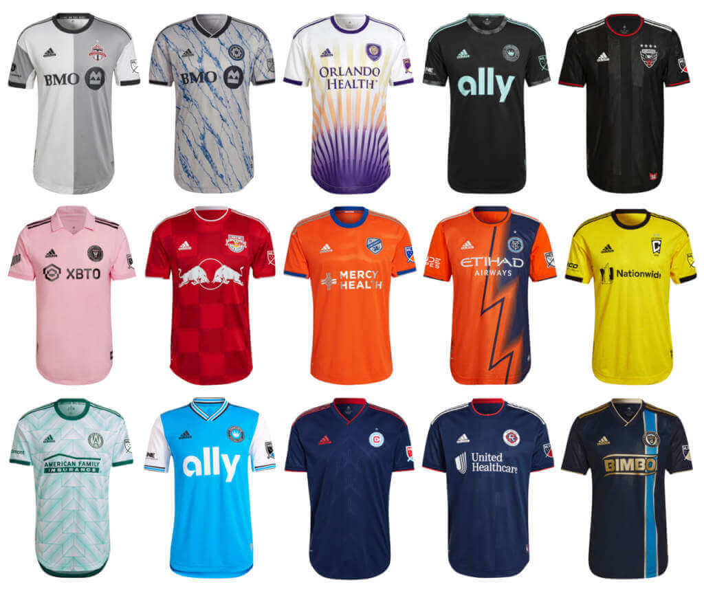
Thanks Phil! This is hard to believe but this is now the 7th year of our MLS previews here on Uni Watch. Here’s the overview for this season: the league is now up to 28 teams with the addition of expansion Charlotte FC this season (with St. Louis City joining next year), Nashville SC will open a brand-new stadium in May (and move to the Western Conference), NYCFC are the defending MLS Cup champions, and the New England Revolution are the defending Supporters’ Shield winners.
In terms of the uniforms, sleeve advertisements are now in their third season and all kits continue to be manufactured by Adidas. Third kits kind of made their return last season as the league implemented a merchandise sales quota (100,000 jerseys sold) and only Atlanta United met that and introduced a third kit midseason last year; time will tell if there are any additional third kits this season. As a reminder, the two uniforms for each team are (for the most part) on a 2-year rotation with teams alternating new kit reveals between their primary and secondary options each season. All of the new kits have “names” associated with their storytelling elements and we’ll spare you from those.
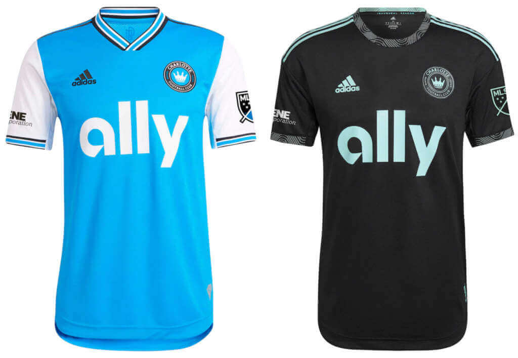
Charlotte FC
Primary: Light blue with white sleeves
Secondary: Black with mint green accents
Kyle: Solid set of looks for an expansion team. A primary that reminds you they share a stadium with the NFL’s Panthers and a secondary playing on the double meaning of “mint.” Which reminds me that I still wish they chose “Charlotte Crown” as their name.
CJ: Not too shabby to start for Charlotte. Advertising is enormous but at least it is color consistent, which helps a little bit.
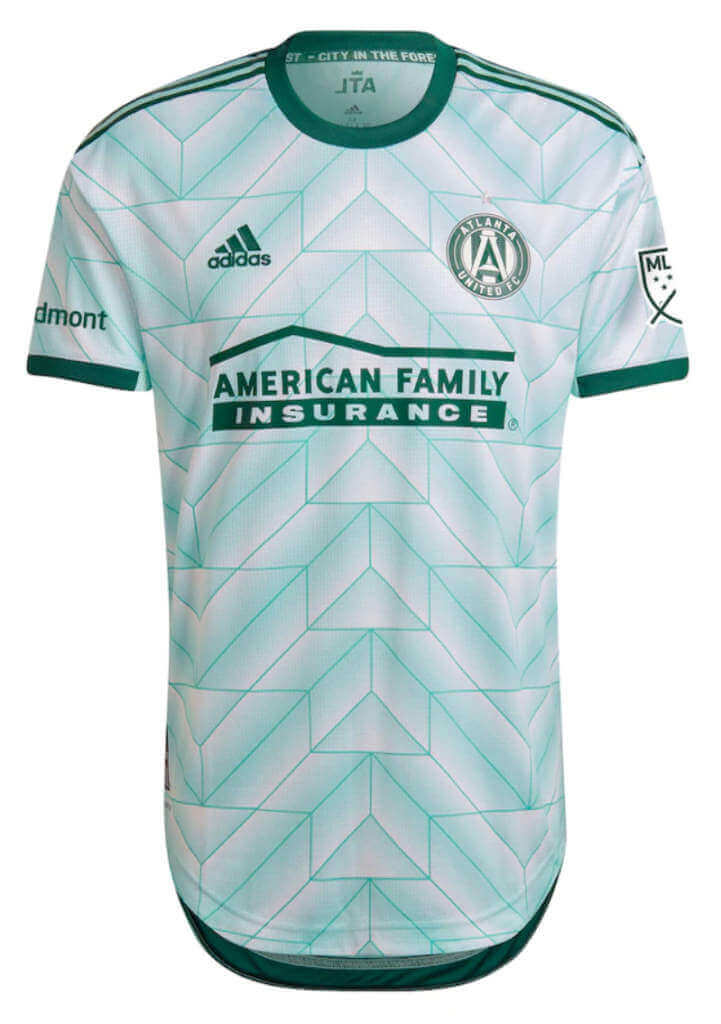
Atlanta United (secondary)
Mint green with green/white geometric pattern, inspired by 1988 Netherlands kit
Kyle: Sure? Secondary kits allow for different colors and designs and shades of green aren’t that common in MLS.
CJ: Hey, why not. Gives them a different look and I’m a fan of what appears to be a callback to old Adidas designs.
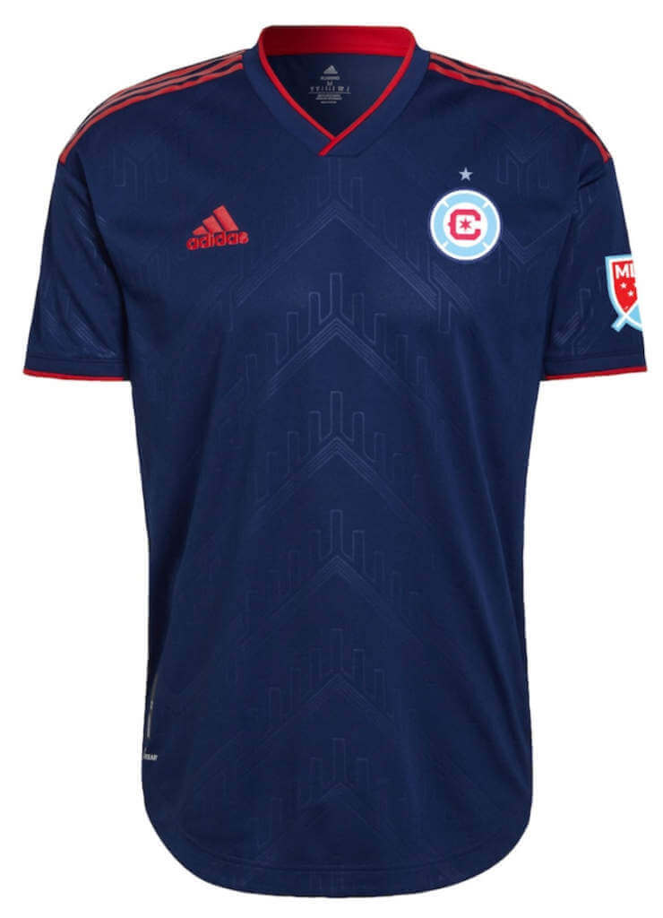
Chicago Fire (primary)
Navy with red accents and sublimated “water tower” design
Note: Chicago has a new logo which has been updated on their secondary kit as well.
Kyle: The new logo is definitely an upgrade and the simple jersey works – rumors are that we’ll see a return to their traditional red kit next season.
CJ: Certainly a shirt! Could be much, much worse.
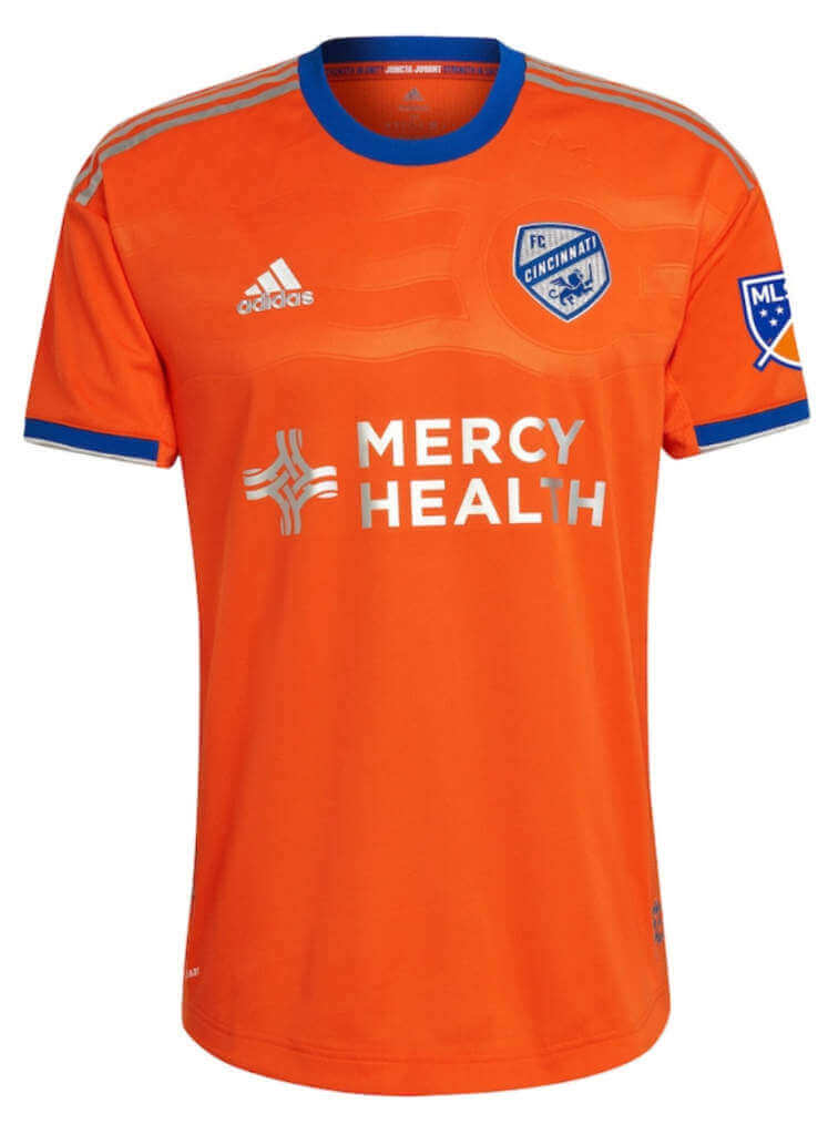
FC Cincinnati (secondary)
Orange with sublimated wave design based on city flag
Kyle: Very logical (and nice) color choice – there’s also not much orange in the league (Houston and now NYC).
CJ: Would have liked to see more use of blue elements here but I can’t complain too much. Looks like Houston with blue trim, almost.
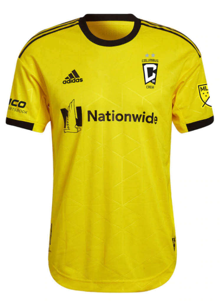
Columbus Crew (primary)
Yellow with black accents
Note: Last season’s unveiled primary kit now becomes the secondary.
Kyle: I love that the yellow is back — it’s very much their identity (along with a checkered pattern I hope to see return in the near future).
CJ: I second the call for the return of the checkered pattern!
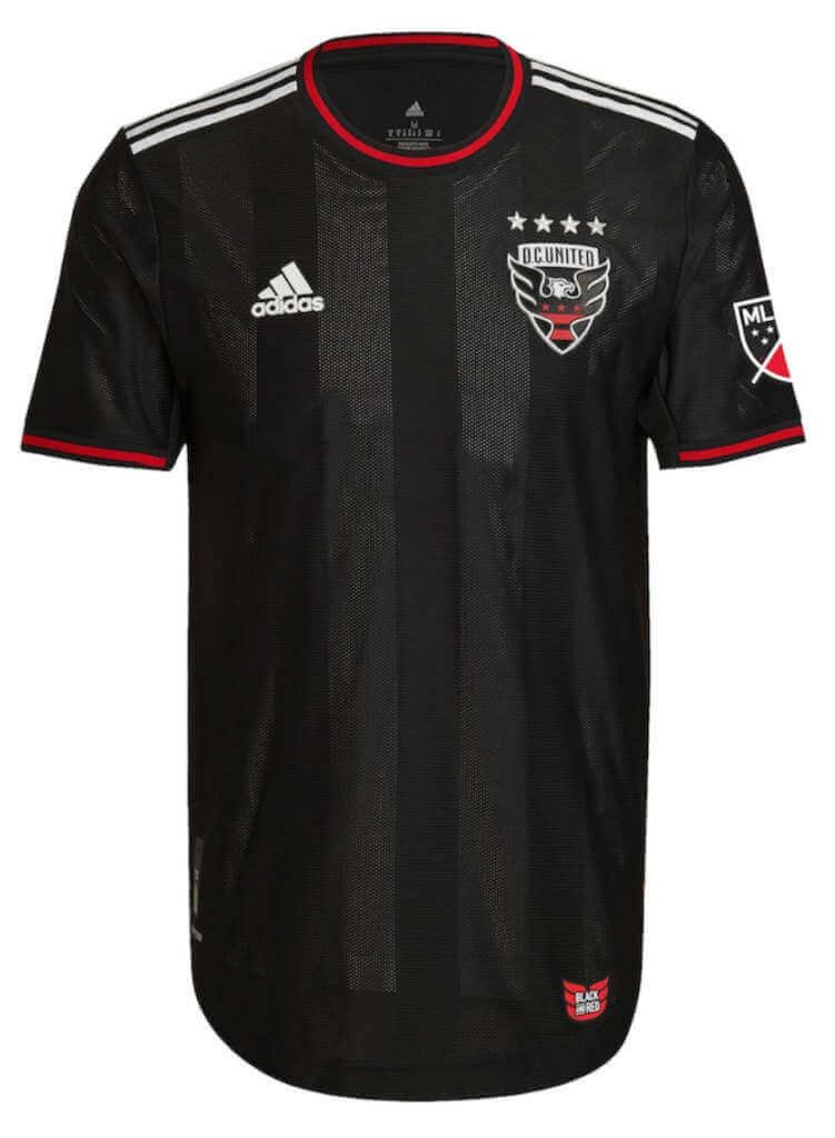
DC United (primary)
Black with red accents, sublimated vertical stripes
Kyle: DC has kept their primary look simple and consistent over the years, and rightfully so because it works.
CJ: It’s DC, you know what you’re getting. Not necessarily a bad thing, either.
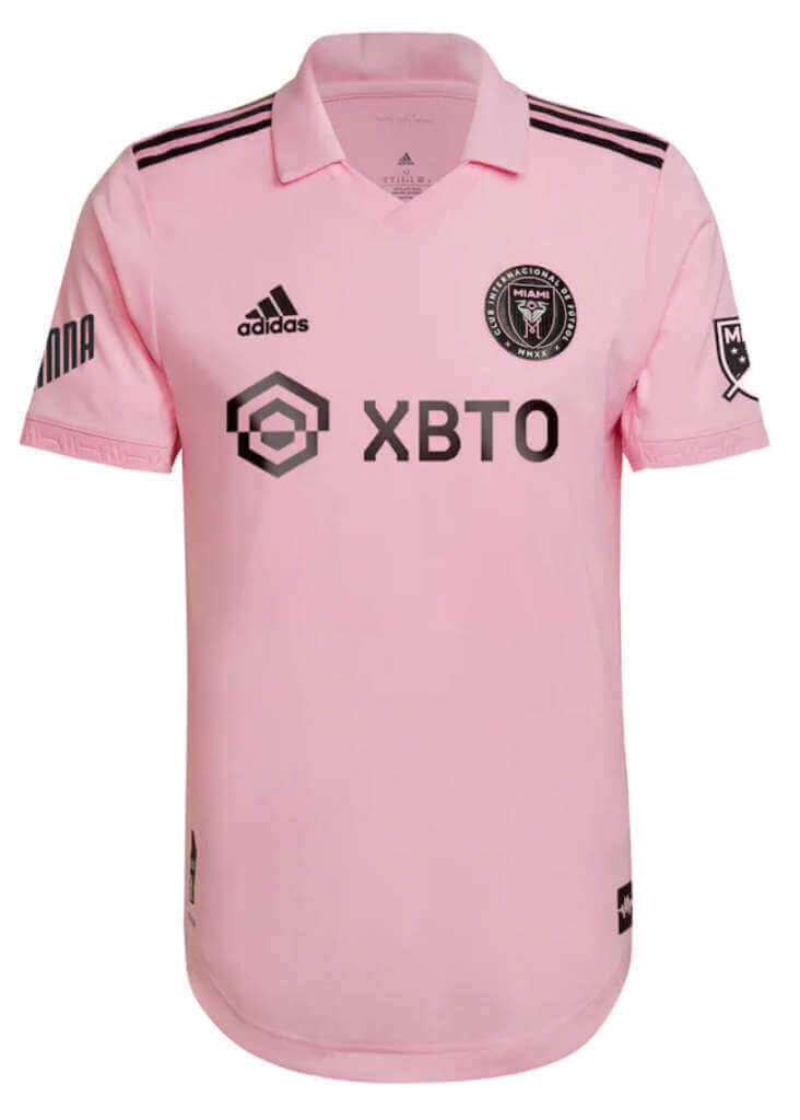
Inter Miami (primary)
Pink with black accents, only new jersey this season with a collar
Kyle: Absolutely love it — embrace the pink and own that color in the league. Plus hey CJ – collar alert!
CJ: Count me in! Great color choices and a collar, what’s not to like? (Well, besides the advertising.)
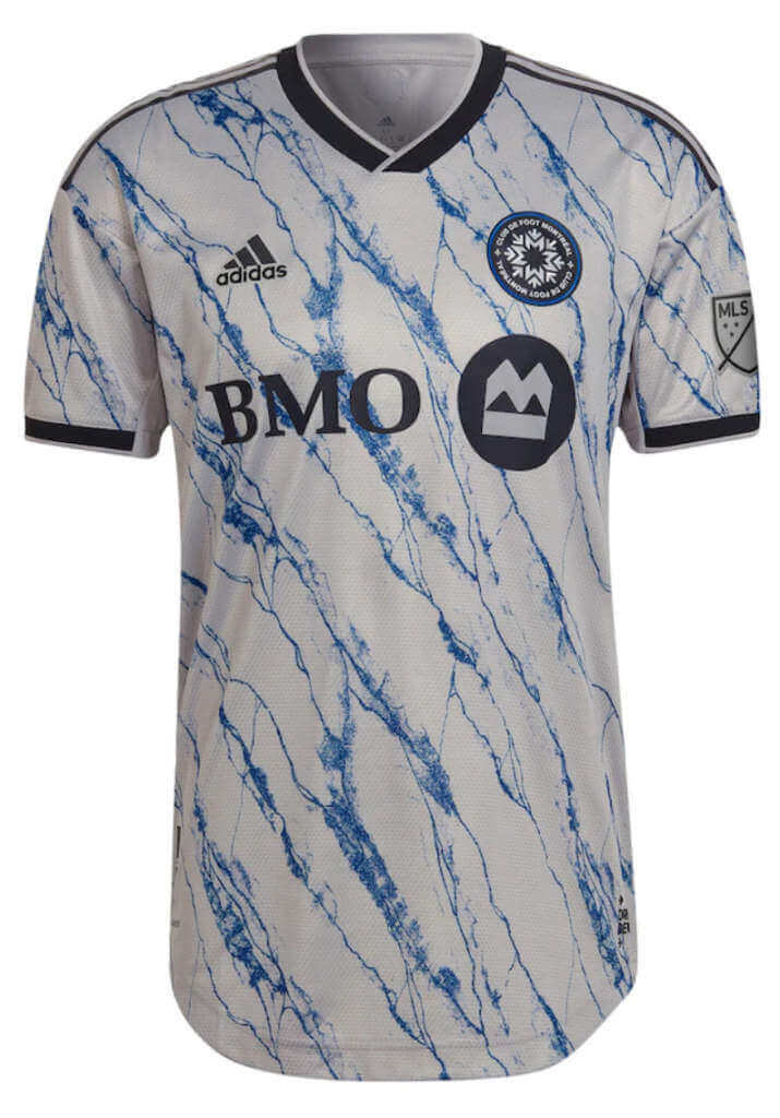
CF Montreal (secondary)
Light gray with blue marble design
Kyle: I don’t really care that it’s similar to a recent Arsenal jersey, for a secondary it works for me.
CJ: I’d be interested to see how this looks on the field, but as a design it is at least an attempt to be interesting. Those reaches outside the norm have been rare in MLS; here’s to that changing.
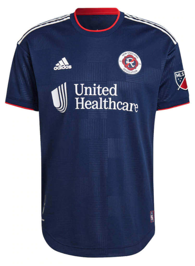
New England Revolution (primary)
Navy with sublimated checkered pattern
Note: New England has a new logo which has been updated on their secondary kit as well.
Kyle: Another logo upgrade (sorry crayon flag) and a nice simple look to go with it.
CJ: Very simple, but we’ll count the logo upgrade as a net positive. Though I will admit the crayon flag had a unique charm to it!
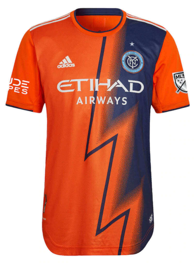
New York City FC (secondary)
Orange with unique purple zig-zag pattern (and star above crest as defending champions)
Kyle: An electric look that feels training top-ish but again I don’t mind unique jerseys as secondary options.
CJ: Let’s get those radical designs going in the secondary kits! I love this.
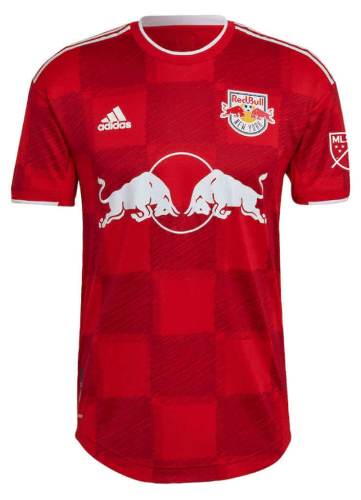
New York Red Bulls (secondary)
Red and darker red checkerboard pattern
Kyle: I’m actually a big fan of the similar color checkered pattern.
CJ: I have to agree with Kyle here, it works.
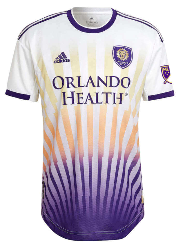
Orlando City SC (secondary)
White with purple/orange/yellow sunset pattern stripes
Kyle: We’ve definitely trended away from boring all-white kits (a good thing). This one is a good idea, the only thing that bothers me is the changing widths of the “rays.”
CJ: This could have been plain, and they went in the other direction. Give them the points.
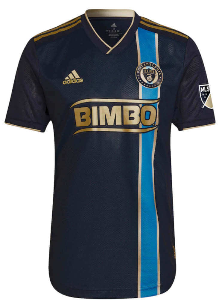
Philadelphia Union (primary)
Navy with offset blue/gold vertical stripe
Kyle: CJ’s Union bring back a vertical stripe with lovely colors (note that the ad is now color-matched for the first time).
CJ: Our long Philadelphia-based nightmare is over, they color-matched the ad. Not entirely sold on the look but I think it will grow on me. Might help if they play well in it!
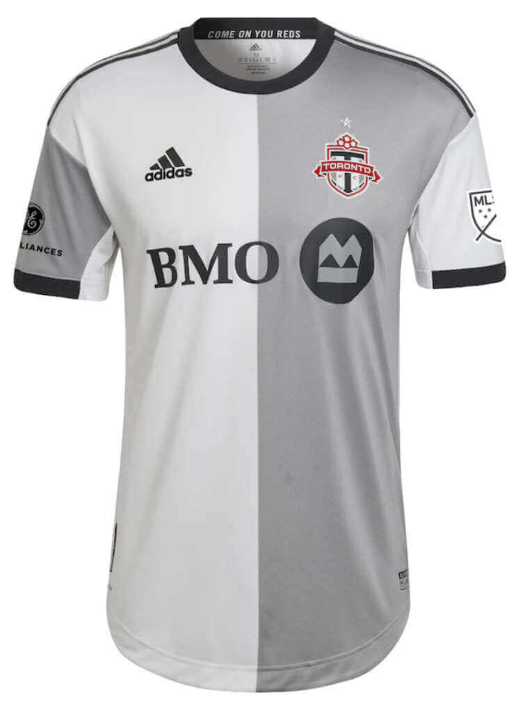
Toronto FC (secondary)
Light and dark gray halved design
Kyle: Again nice to see teams moving away from all-white looks and this is a nice application of a classic halved design.
CJ: It works, but I’m not sure I’d call myself a fan of it. At least the badge pops out.
Thanks, guys! They’ll be back again with Part II — the Western Conference — tomorrow.


Guess The Game…
from the scoreboard
Today’s scoreboard comes from Mike Styczen.
The premise of the game (GTGFTS) is simple: I’ll post a scoreboard and you guys simply identify the game depicted. In the past, I don’t know if I’ve ever completely stumped you (some are easier than others).
Here’s the Scoreboard. In the comments below, try to identify the game (date & location, as well as final score). If anything noteworthy occurred during the game, please add that in (and if you were AT the game, well bonus points for you!):
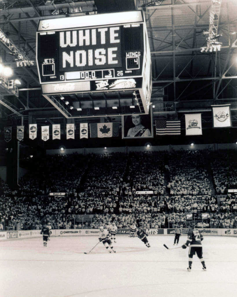
Please continue sending these in! You’re welcome to send me any scoreboard photos (with answers please), and I’ll keep running them.


Uni Concepts & Tweaks
Time for more Uni Tweaks from the UW readership.
I hope you guys like this feature and will want to continue to submit your concepts and tweaks to me. If you do, Shoot me an E-mail (Phil (dot) Hecken (at) gmail (dot) com).
Today’s concepts come from John J. Woods:
Hi Phil,
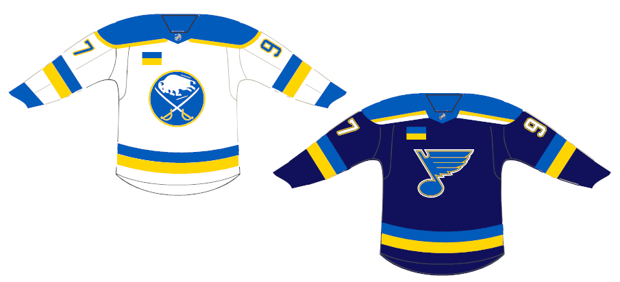
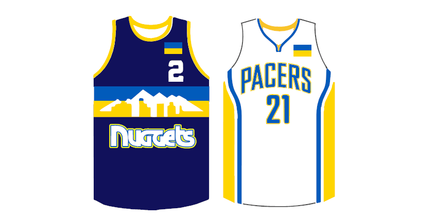
Might be too last-minute, but let’s get some teams in Ukraine colors and striping for support.
I even put the flags on the basketball jerseys instead of advertising.
– – Johnny Woods
OK readers (and concepters). If you have some tweaks or concepts, shoot ’em my way with a brief description of your creation and I’ll run ’em here.
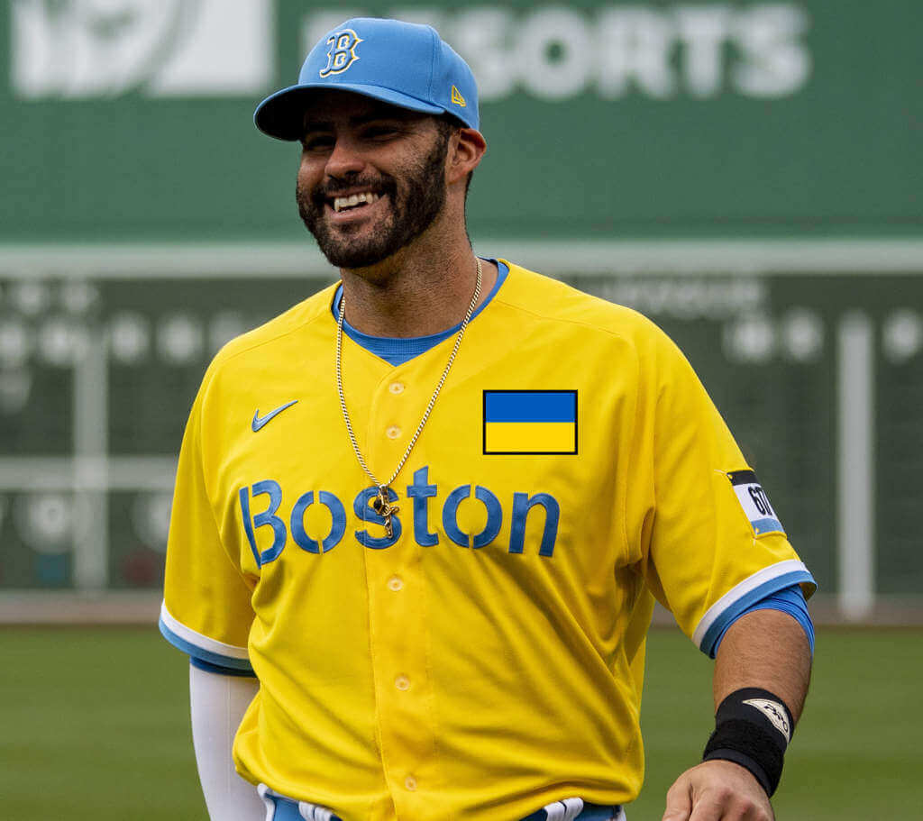
We could also include the BoSox in this, if there is an opening day (but let’s hope the war is over by then)…


The “Wrong” Font … Part I
Got a note yesterday from my pal Jimmy Corcoran (who many of you know is also the son of former NFL/WFL quarterback “King” Corcoran), regarding an interesting font mismatch on former Eagles QB Roman Gabriel.
I’ll let Jimmy explain:
Phil,
I always liked the clean understated look of the Eagles jerseys from 1970-73 Phil, but because they lost so much in those uniforms, we will probably never see them in a throwback even when they lift the one shell rule next year and can wear white helmets again. I never realized this before but looking at this 1973 Roman Gabriel jersey (this was a one-year style for him) they changed the uniforms in 1974. The font of the front number is completely different than the back number. It almost looks like it could be two different jerseys?
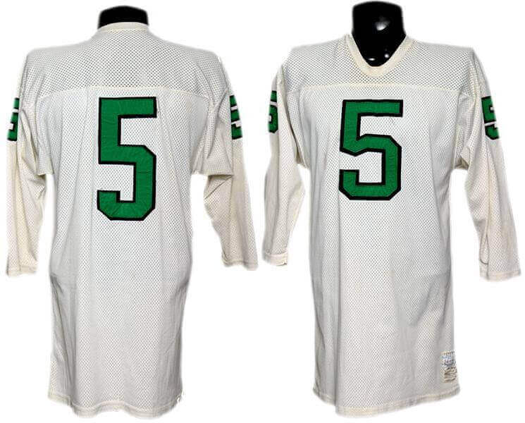
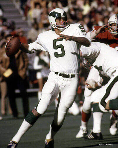
I remember my father fighting with them over getting number 7, but I don’t know what he was complaining about? at least his numbers matched.
Take care,
Jimmy Corcoran
Thanks Jimmy!


The “Wrong” Font … Part II
And in a rare sub-lede that’s definitely tied to the one above it, I got an e-mail from Jimmer Vilk yesterday, which also has to do with mismatched fonts, this time for the 1970s Oilers.
I’ll let Jimmer take it from here…
Phil,
Earlier this week I was watching old sitcoms on PlutoTV. I started flipping channels and found they had one with classic NFL games. That’s night’s selection happened to be the epic 1978 MNF contest between the Dolphins and Oilers. While watching, I saw something I hadn’t noticed before: the numbers on Houston’s jerseys didn’t all use the same font. In fact, some jerseys had two fonts!
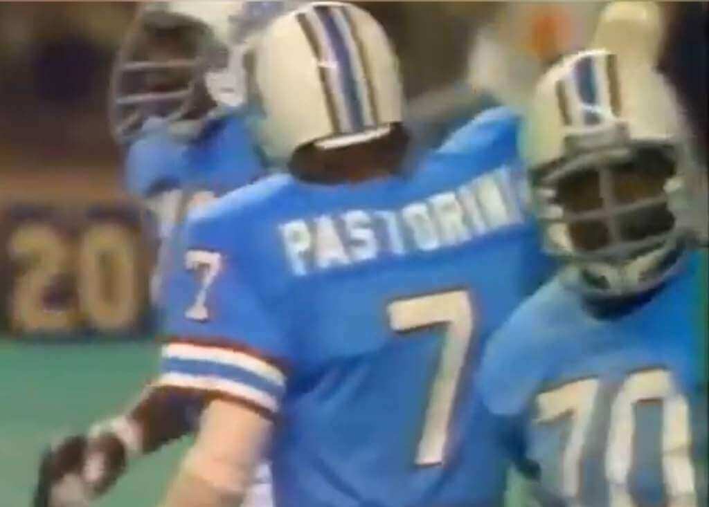
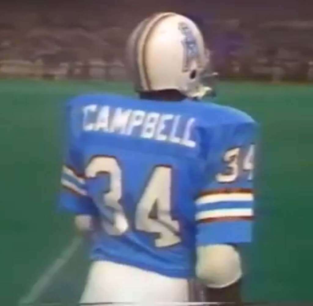
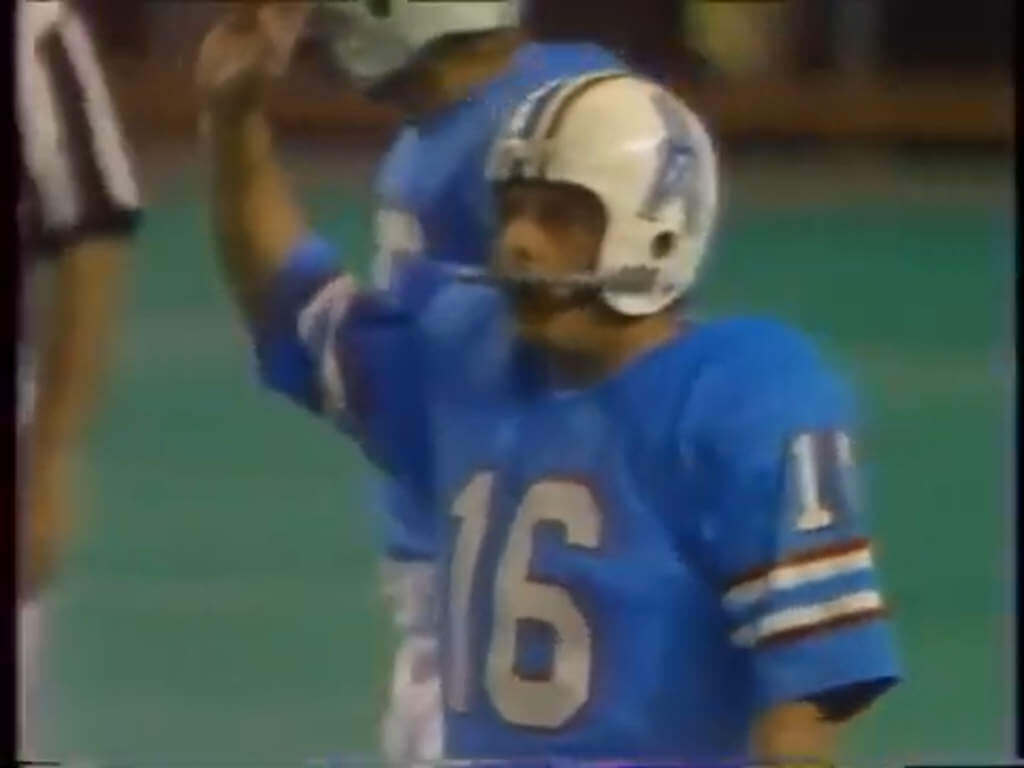
I believe all the sleeve numbers were a serifed block font, but the front and back numbers were either serif-ed or non-serif-ed. Just another quirk of the 70s Oilers. The previous (and absolutely magnificent) blue helmets sometimes came in different shades, and now this.
-Jim
Great spot Jimmer. Just another example of how uniform inconsistencies were quite common back in the old days, when men were men, and “Getting Your Bell Rung” was just a quaint euphemism for CTE.


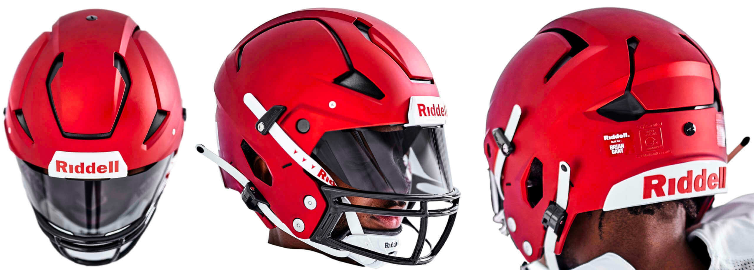
A quick reminder from Paul: Hi there. In case you missed it on Thursday, my latest Bulletin article is a deep dive on Riddell’s new Axiom helmet, which launched last month and is being touted as the latest leap in football helmet engineering. I tried to get beyond the press release hype by doing a lengthy interview with some of the higher-ups at Riddell. I learned a lot along the way and I think you will too.
My premium subscribers can read the article here. If you haven’t yet subscribed, you can do that here (you’ll need a Facebook account in order to pay). If you want more info on what you’ll get for your money, you can find that here. And if the Facebook requirement is a dealbreaker, email me and I’ll let you know about non-Facebook payment options and possible workarounds.
Now onto the ticker…


The Ticker
By Anthony Emerson

NFL News: The MetLife Field endzones are getting painted for Paul McCartney ahead of his concert there (from Ian LaMagna-Gerig). … This is about the closest Cardinals owner Michael Bidwell has come to saying the team will get new uniforms — they’re “on the radar” (thanks, Phil).
College/High School Football News: Reader Graham Clayton discovered some old footage of a 1942 Thanksgiving Day high school football game between Nebraska schools Lexington and Gothenburg. The uni-notable thing is, Lexington’s pants featured a stripe down the rear rather than the side, something I’d never seen before. … The new Joe Montana miniseries features a brief shot of him at Notre Dame wearing a helmet with a decal on it, rather than the plain gold. Unfortunately, the shot isn’t clear enough to make out the decal, but it clearly isn’t a Notre Dame logo (from @diablos20cn).

Hockey News: In 1939, Art Ross covered skates in chainmail in an attempt to cut down on ankle and foot injuries. Unfortunately, his idea never caught on (from Brandon Weir). … The OHL’s London Knights will wear throwbacks on March 2 (from Wade Heidt). … The Bakersfield Condors, AHL affiliates of the Oilers, will wear Star Wars-themed jerseys on March 5 (thanks, Phil).

College/High School Hoops News: UIC men played a game with AMOB jerseys — that’s academic major on back, the first time I’ve seen anything like this (from Dan Yopchik).

Soccer News: MLS’s new minor league, MLS Next Pro, will require players to tuck in their jerseys during matches (from John Flory).

Grab Bag: As promised, Formula 1 team Haas removed all Russian influences from their livery, and ran a plain white one during the final day of testing yesterday. Formula 1 also announced that the 2022 Russian Grand Prix would not be held in the “current circumstances”. … Meanwhile, Russian tennis player Andrey Rublev wrote “no war please” on a camera lens after winning a semifinal match yesterday.


And finally… that’s it for today. Big thanks to Kyle and CJ for the Eastern Conference MLS preview — we’ll see you again tomorrow when we preview the Western Conference.
Everyone have a good Saturday, and I’ll catch you back here tomorrow.
Peace,
PH
GTGFTS – April 28, 1996 at Winnipeg Arena. Game 6 in first round of playoffs. The last game and moments for the Winnipeg Jets who would be moving to Phoenix.
God bless Pluto TV.
An entire channel dedicated to MST3K? I’ll take it! More Time of the Apes, please.
Agreed, as well as a Rifftrax channel and Classic Doctor Who.
Thanks to Vilk for bringing this into my life last week… they also have an entire channel dedicated to Garfield and Friends!!!!
Thanks to Jimmy Corcoran for his observations about number-font inconsistencies. Those early ’70s Eagles uniforms (also a favorite of mine) had a number font, at least on the back, that looks to be the same or very similar to the Falcons and the Raiders of that era, and in both cases those teams also had differing front-number fonts, though the example I found for the Falcons was quite a bit different than the front-number fonts of the Eagles and Raiders…
link
Looks to me like Joe Montana’s “decal” is four postage stamps?
As far as the front and back numbers on Roman Gabriels jersey – the size difference makes sense, but why not use the same font? I actually like the back font better. And I always liked the eagles white helmets.
I’m not on Facebook so I couldn’t view the chainmail skates – I’ll bet they’re real sparklers.
I don’t have Facebook either. Got the picture just fine. May be something else going on for you.
MLS continues to take a backseat to the NWSL’s kits. Some teams are trying to break away from the 3 stripes template but there’s so many strong kits in the NWSL. Definitely worth a lead entry this season.
So glad the Fire ditched the horrendous logo and have returned back to their fire badge inspired look.
Hey Julie,
If you’d like to fashion an entry along those lines, I’d be happy to run it! LMK
It’s Michael Bidwell, not Bill Bidwell, who said new Cardinals uniforms are on the radar.
Thanks. Fixed.
I have the same Facebook issue so I googled it instead. Here’s an interesting site, scroll down to the Nov 2013 entry. All the other stories are great too.
link
Kind of strange that they would be painting the MetLife ends ones now for a concert in June. I wonder if that video is actually from the last time he played there.
Those MLS jerseys need some giant Mr. Yuk stickers.
The Lexington Minutemen v. the Gothenburg Swedes. When I was in high school, those towns were in our conference and we played them in all sports. The back-of-the-leg striped pants were long gone by then,though. It was cool to see them mentioned here.
Oh, and a quick correction. It was Gothenburg shown with the strip down the back of their pants, not Lexington. Lexington was my town’s rival and seeing their black-and-orange still gets me worked up. Ha.
Jimmy, glad to have someone else on my side on those early 70s Eagles’ unis. I have always loved them. Would love to see a modern interpretation of it. You’re right though, probably never going to happen because the team was dreadful then.
I am still more of a fan of the Randall era unis, but these are a close second.
It just makes me realize how much better BOTH are than what they currently wear.
Bob Colonna (the Philadelphia Bell equipment manager) was also the Philadelphia Eagles equipment man in the early 70’s) I used to help him hang up the jerseys and fold the t shirts. He told me that he was the one who changed the helmets to white with the green wings, he said he just ordered them and that it was up to him what they wore. Now I have also read that it was owner Leonard Tose who made the change to the white helmets, so one of them was taking credit for something they didn’t do?
Bob once gave Tim Rossovich a t shirt with a mud stain on it, Rosso stuffed him in a trash can a taped the lid shut and rolled it around the locker room. Poor Bob almost suffocated.
The 1933 throwbacks could be Ukraine tributes.
Yeah, but no one wants to see those ever again.
At least not with that link fabric.
Arizona “Cardinals” has never made sense. They should have ditched the moniker when they left St. Loo or at the very least when they dropped “Phoenix”. This is an eastern bird with a light presence in AZ. The cardinals that actually live out in the Sonoran look pretty ratty. And they will never supplant the MLB team as prime users of that name. There’s you opening to go with an appropriate mascot and use the wonderful colors of the Arizona state flag. Branding is everything.