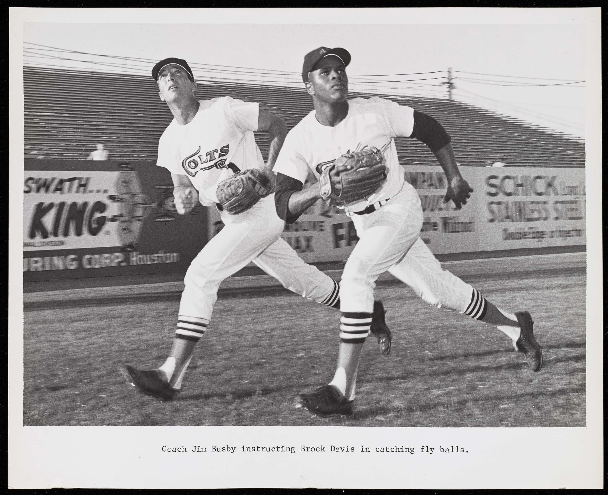
Click to enlarge
A few weeks ago, I ran a 1960s photo showing Houston Colt .45s infielder Mike White receiving a flu shot while in uniform (and also while holding a cigarette!). I found that photo in an archive of materials from former Houston sportswriter and luminary George Kirksey. The archive is digitized on the University of Houston’s website and is full of interesting stuff relating to the Colt .45s and the Astrodome (like the shot shown above of Colts outfielder Brock Davis and coach Jim Busby running in tandem). Here’s a sampling:
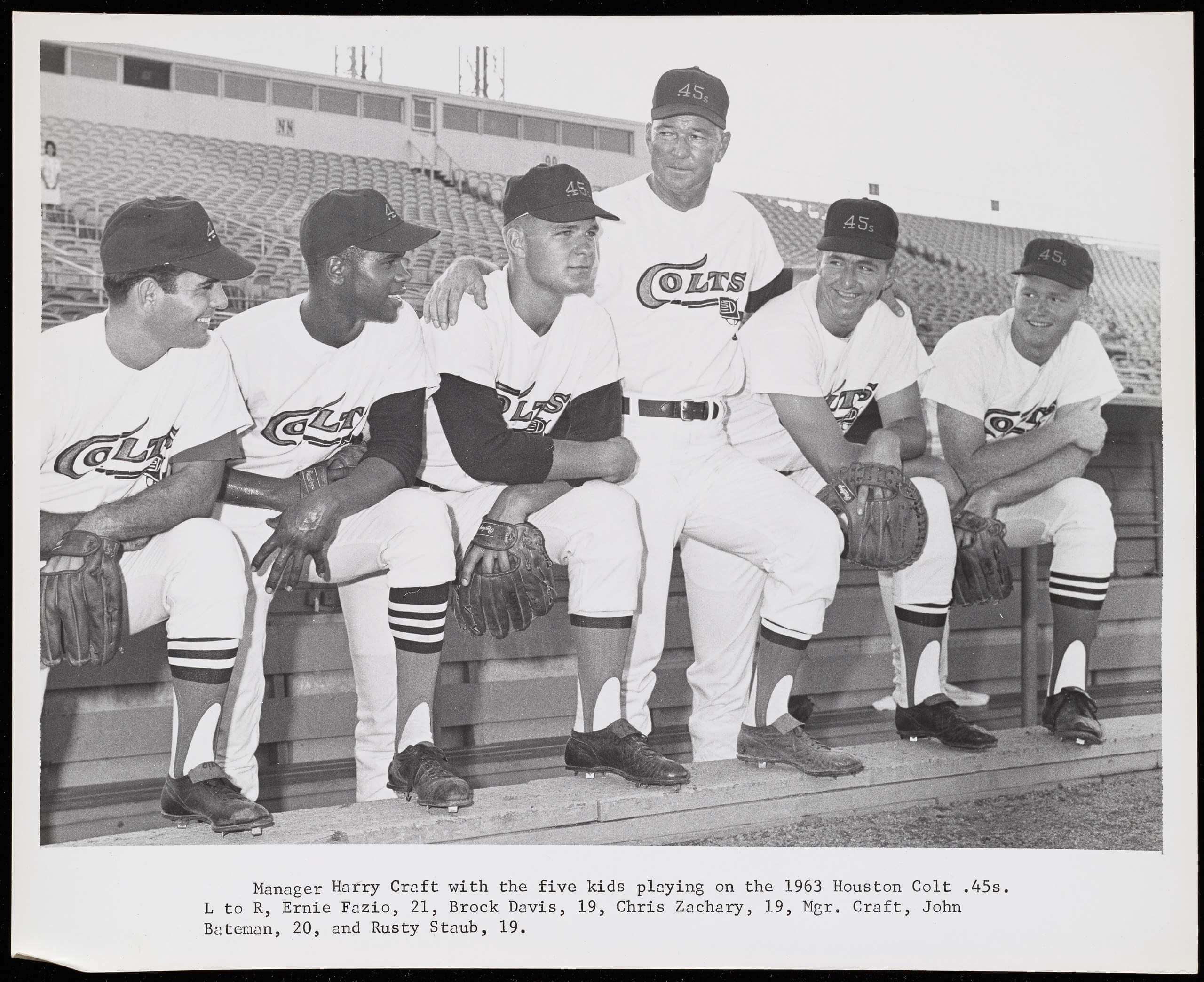
• The Colts had one of my favorite stirrup designs of all time, although players had their own ideas about how much of the striping to show:
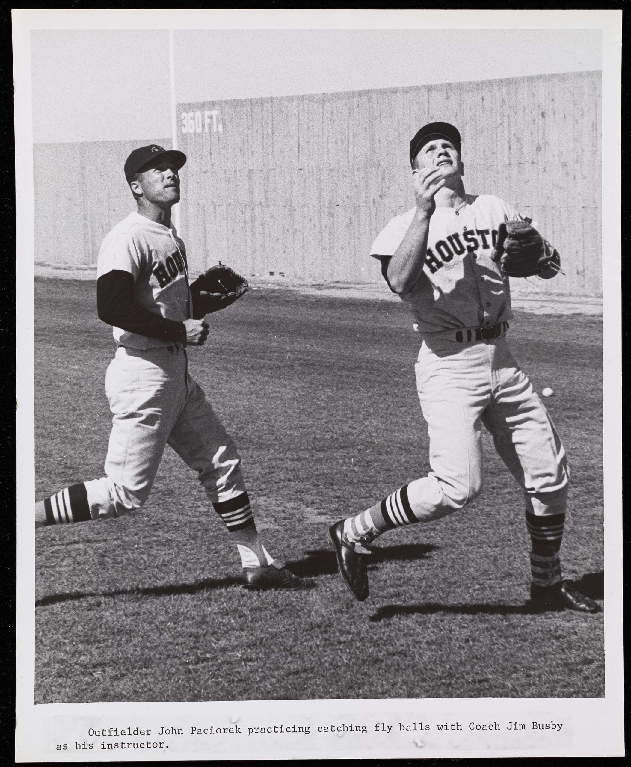
• Speaking of hosiery, I’m not sure what coach Jim Busby was wearing around his ankles here:
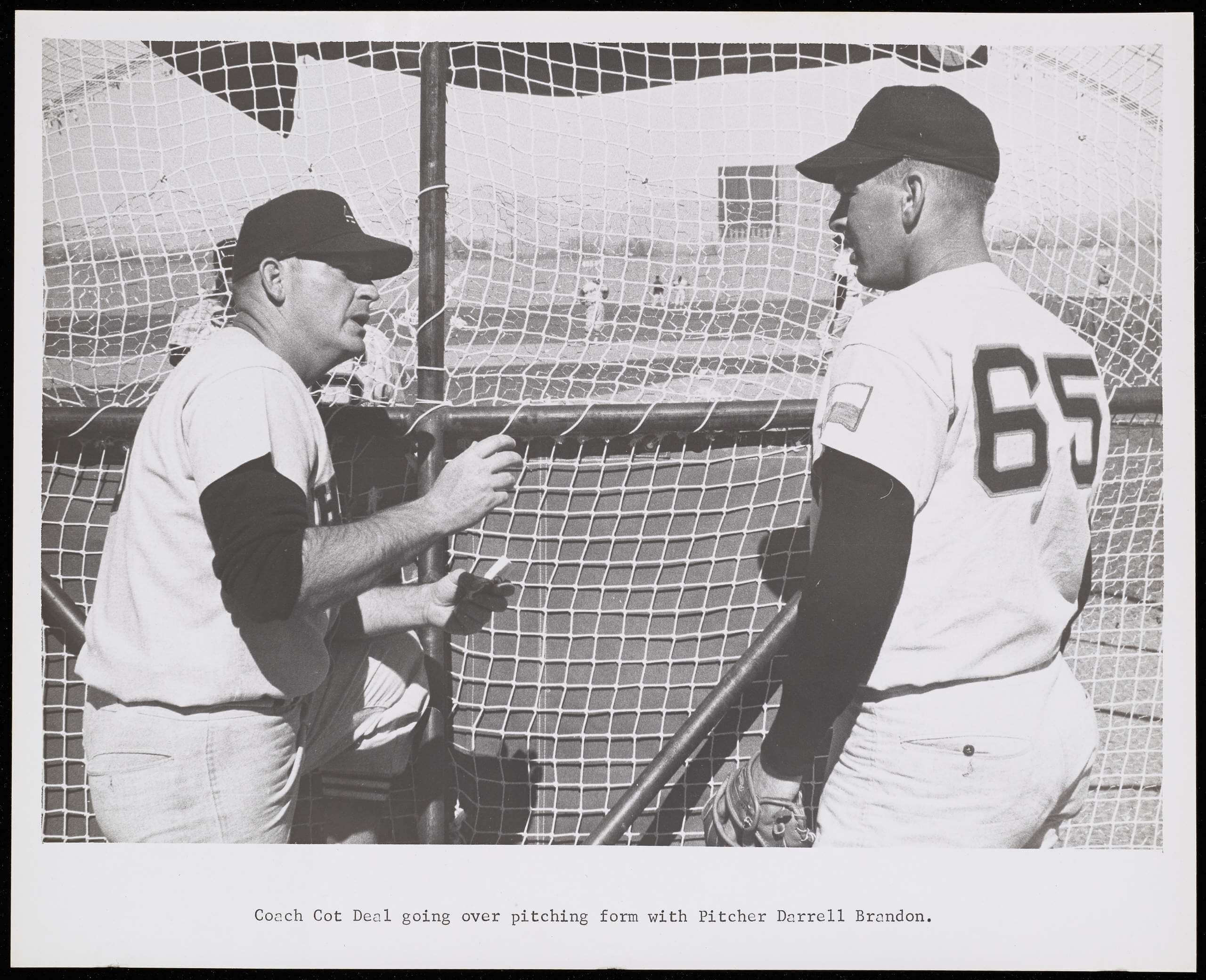
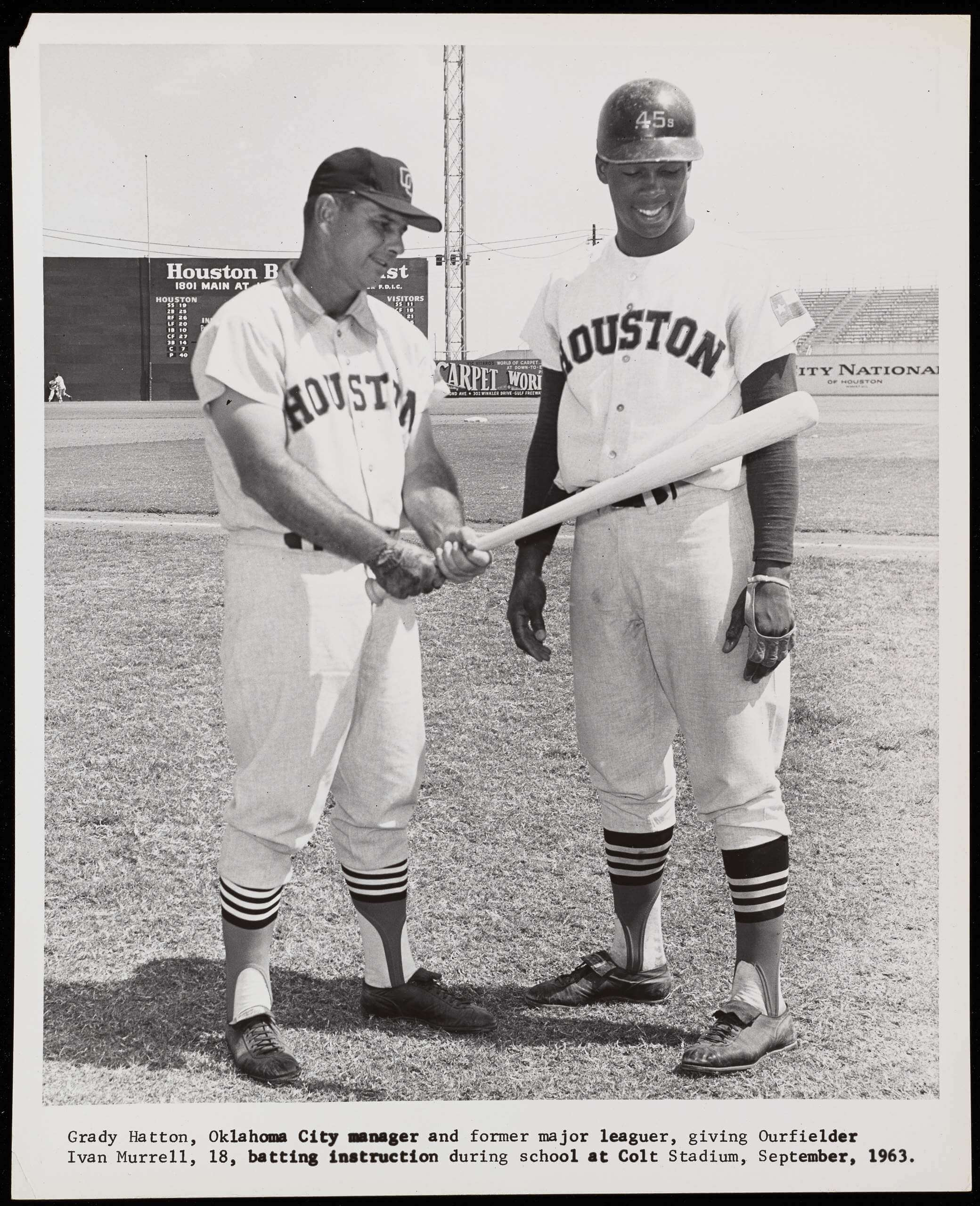
• As you can see in these next two shots, the Colts used the McAuliffe number font (popularly known today as the “Red Sox font”):
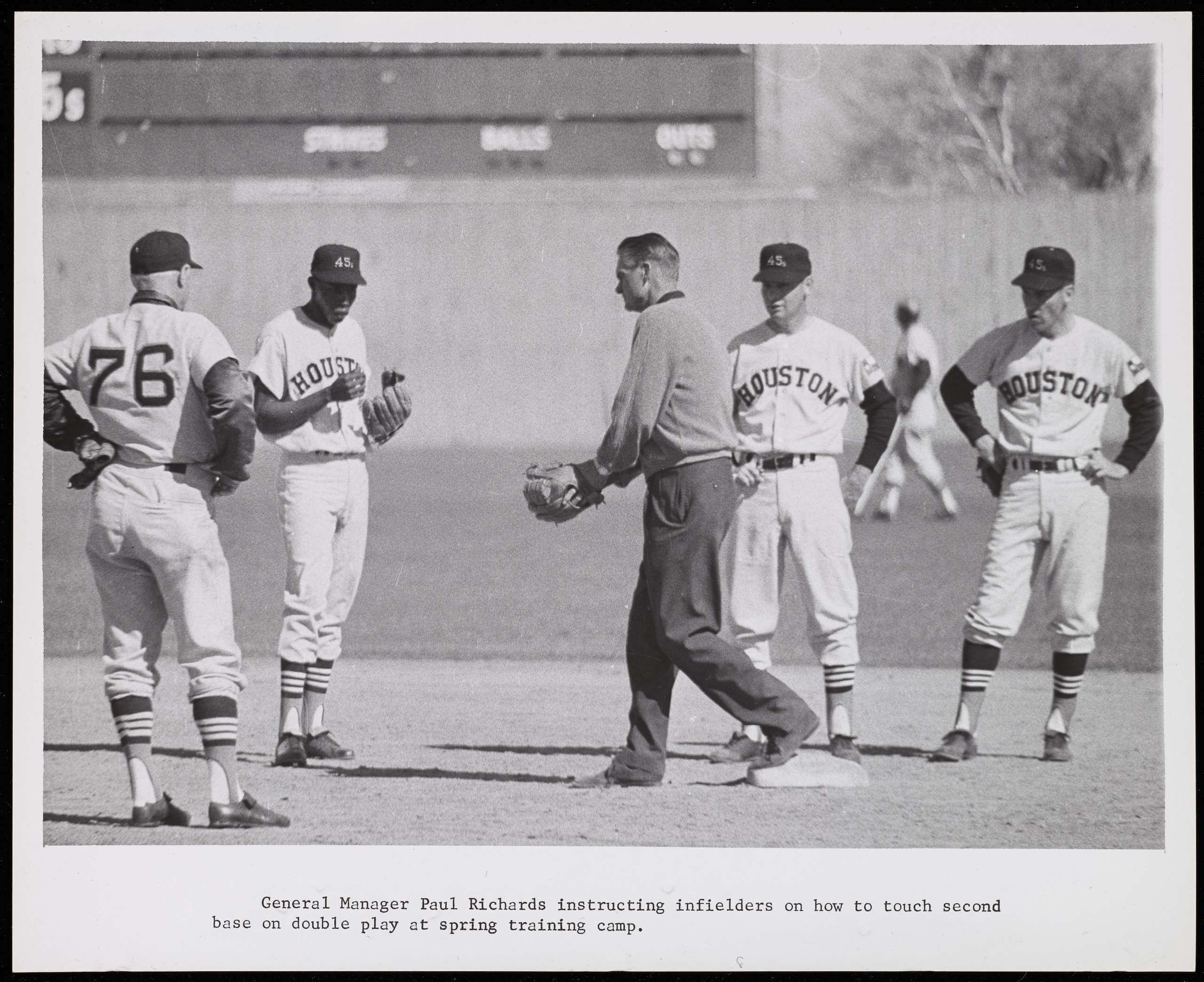
• The Colt .45s’ firearms-themed branding extended to the club’s minor league affiliates, two of which were the San Antonio Bullets and the Moultrie Colt .22s. Here’s a coach wearing a Bullets jersey and a Colt .22s cap:
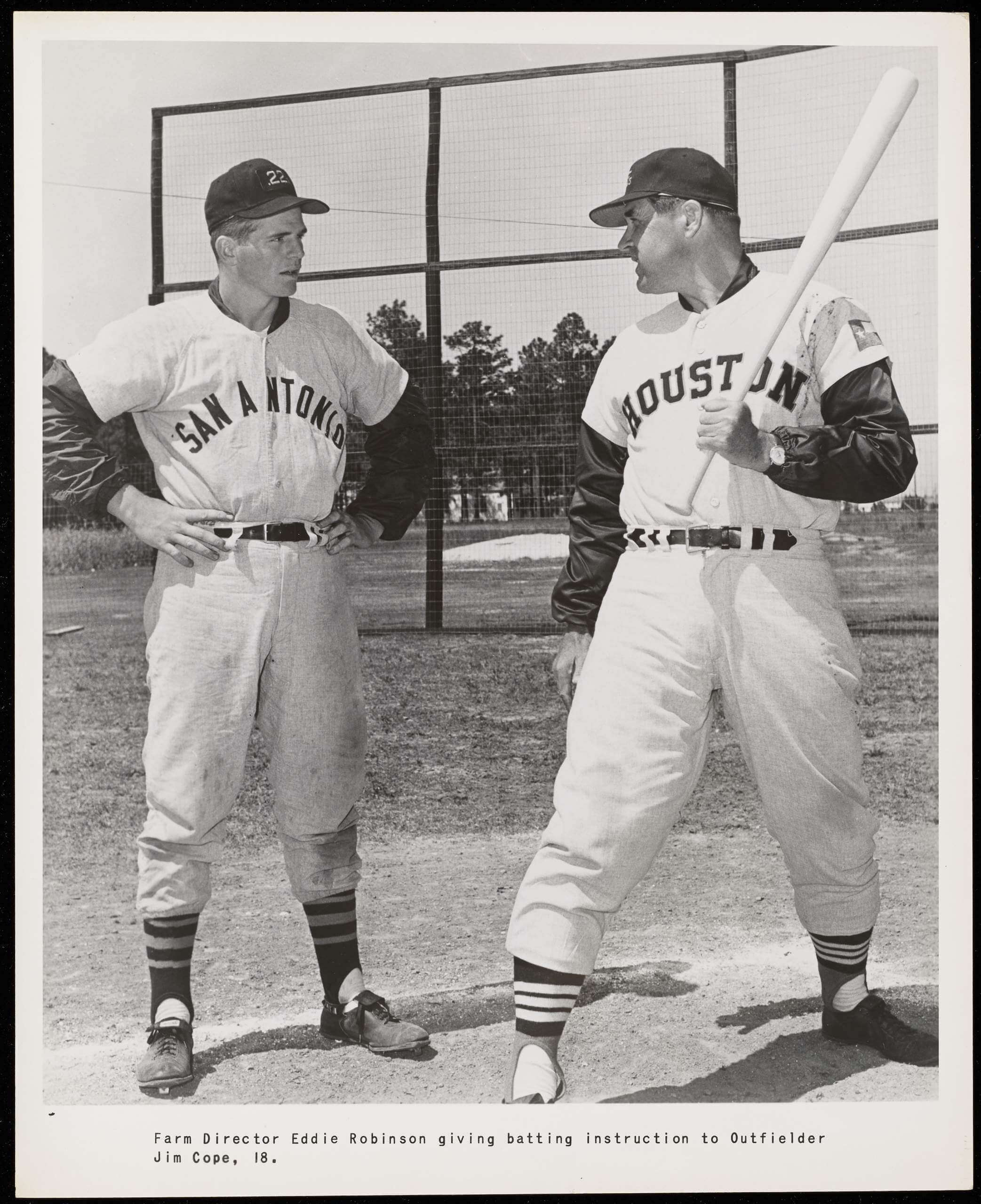
• And here’s a prospect wearing a Colt .45s jersey and a San Antonio cap:
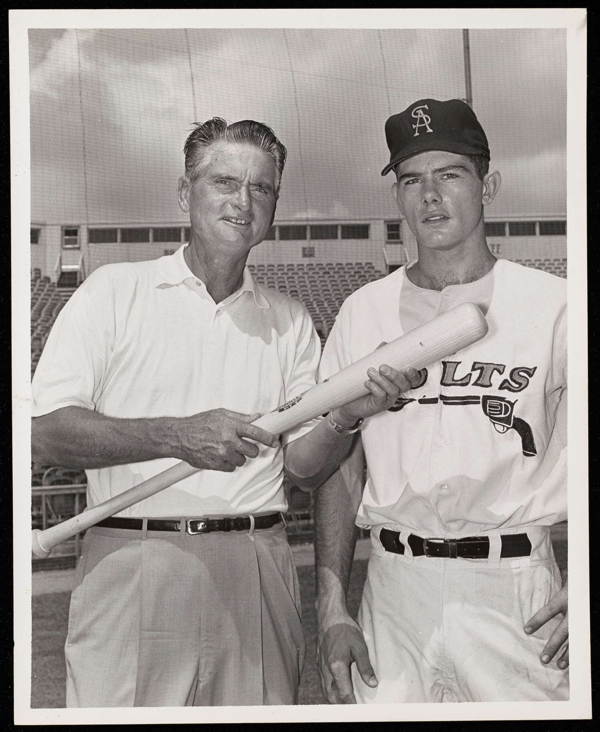
• It’s hard to be sure, but I think this coach is wearing a Oklahoma City 89ers cap. The 89ers were the Colt .45s’ top farm team:
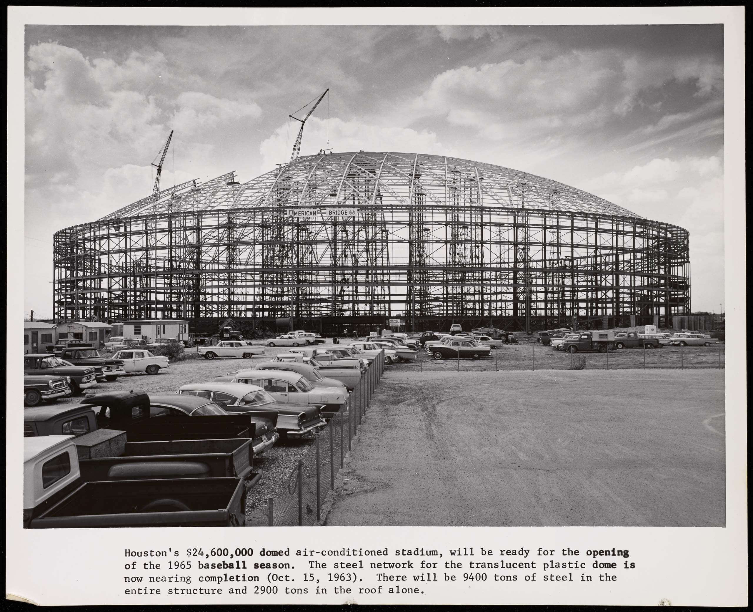
• I love this shot showing the steel frame of the Astrodome, when it was still about a year and a half from being completed:
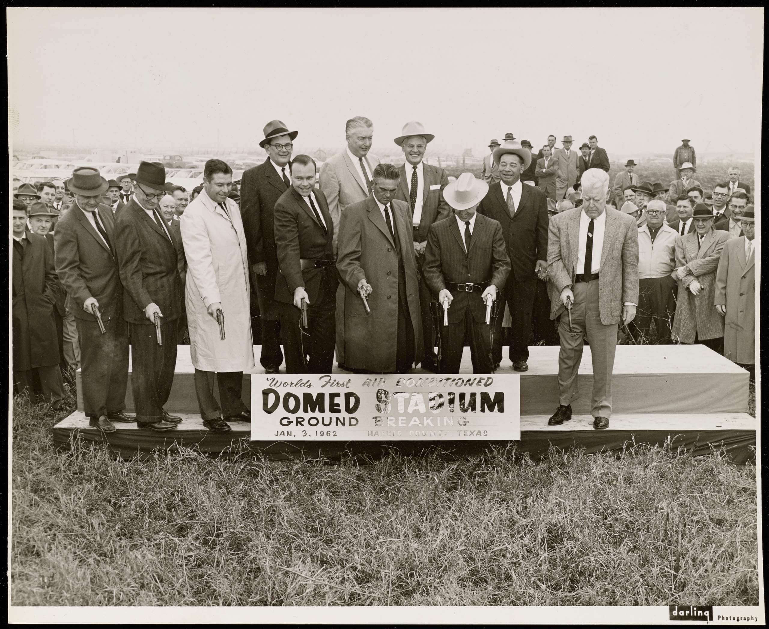
• Speaking of the Astrodome, and getting back to the firearms theme, this is pretty wild: When they held a groundbreaking for the dome in 1962, the honored guests broke the ground using Colt revolvers (firing blanks), not shovels (additional info here):
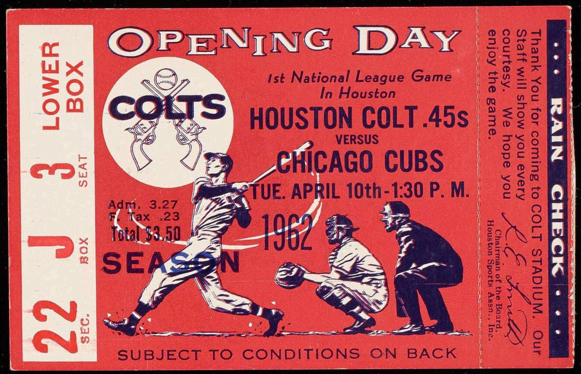
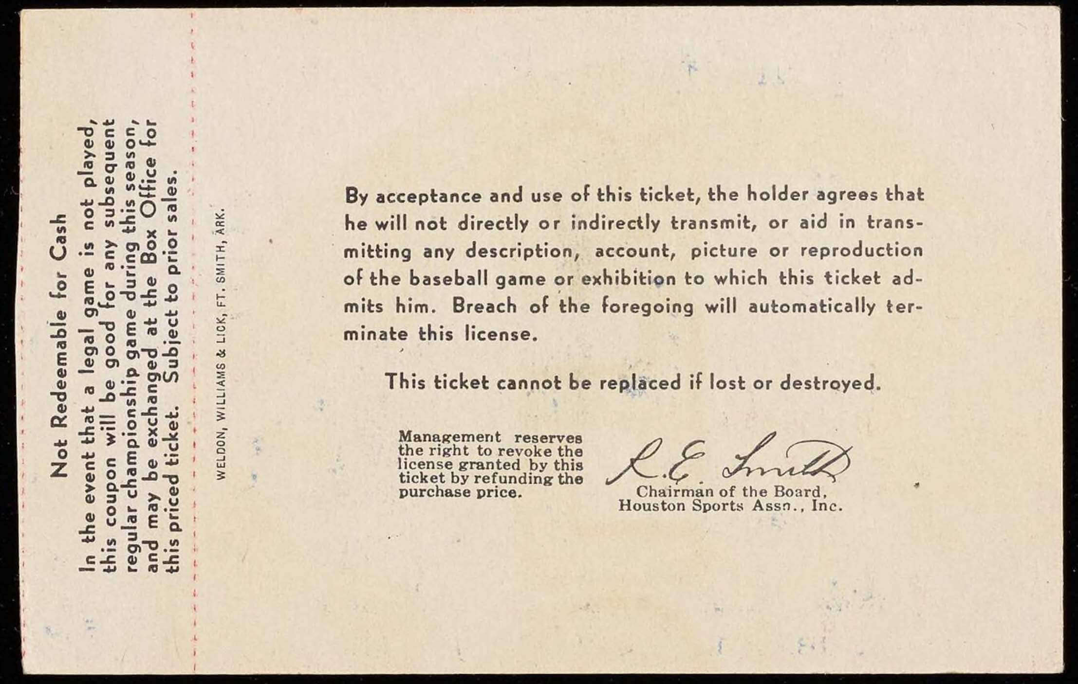
• Here’s a ticket stub from the Colts’ first game in 1962:
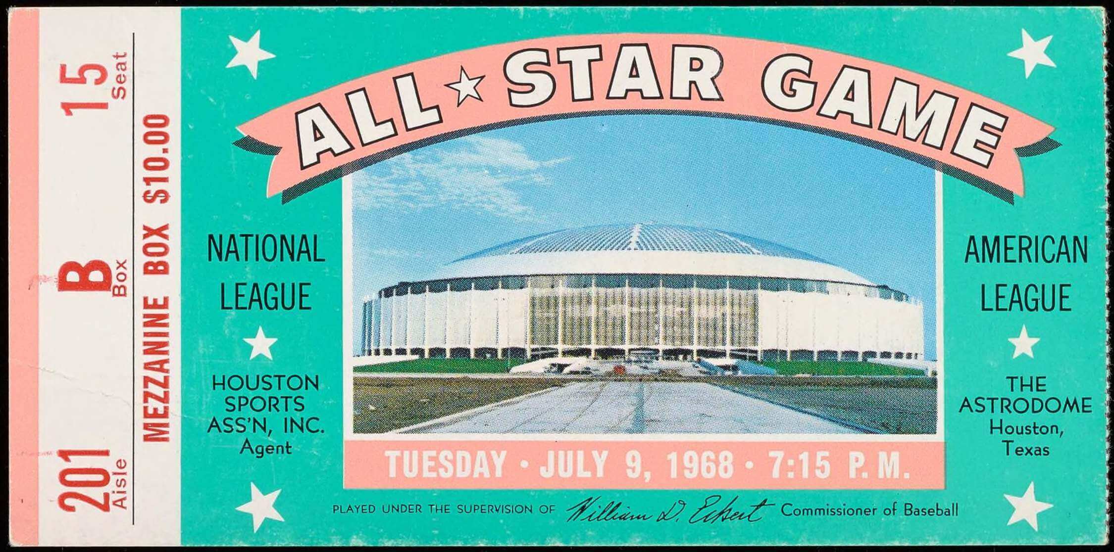
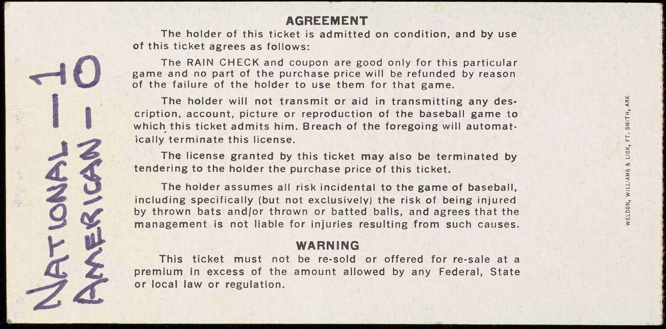
• The MLB All-Star Game was held at the Astrodome in 1968, so here’s a ticket from that game, with a handwritten note on the back:
• One more ticket, this time from a 1966 game. You can almost feel the rubber stamp going “ka-chunk!” on the back:


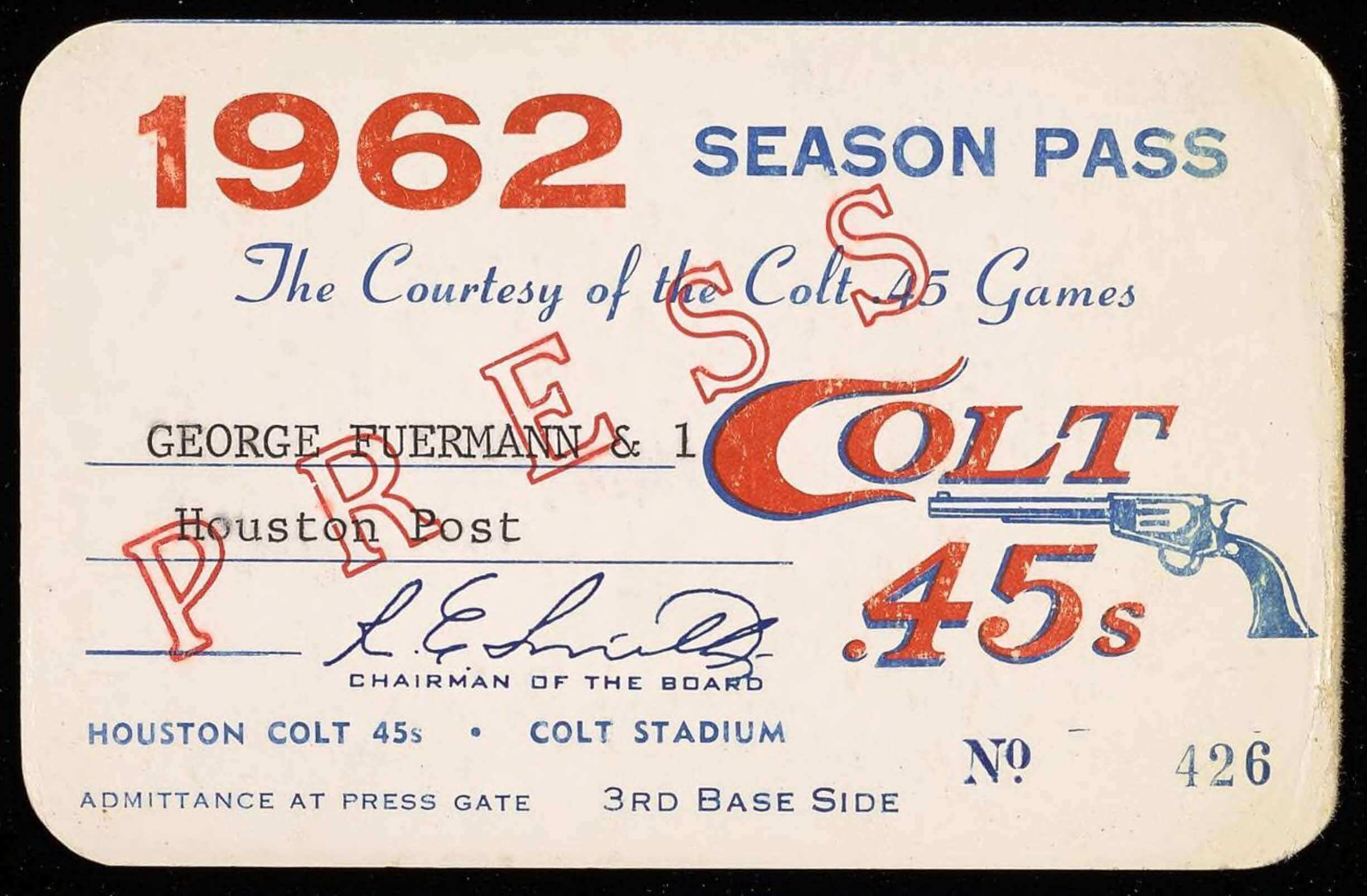
• I love this Colt .45s press pass:
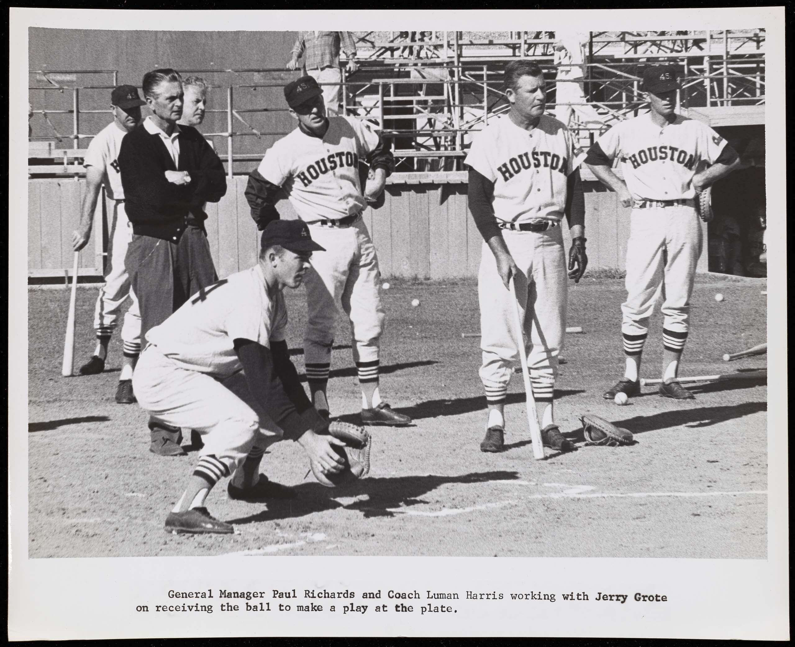
• Finally, I’m including this last shot for my fellow Mets fans, who might get a kick out of seeing catcher Jerry Grote working out in a Colt .45s uni:
———
That’s enough for now. If you want to see more from the George Kirksey archive, look here.
Click to enlarge
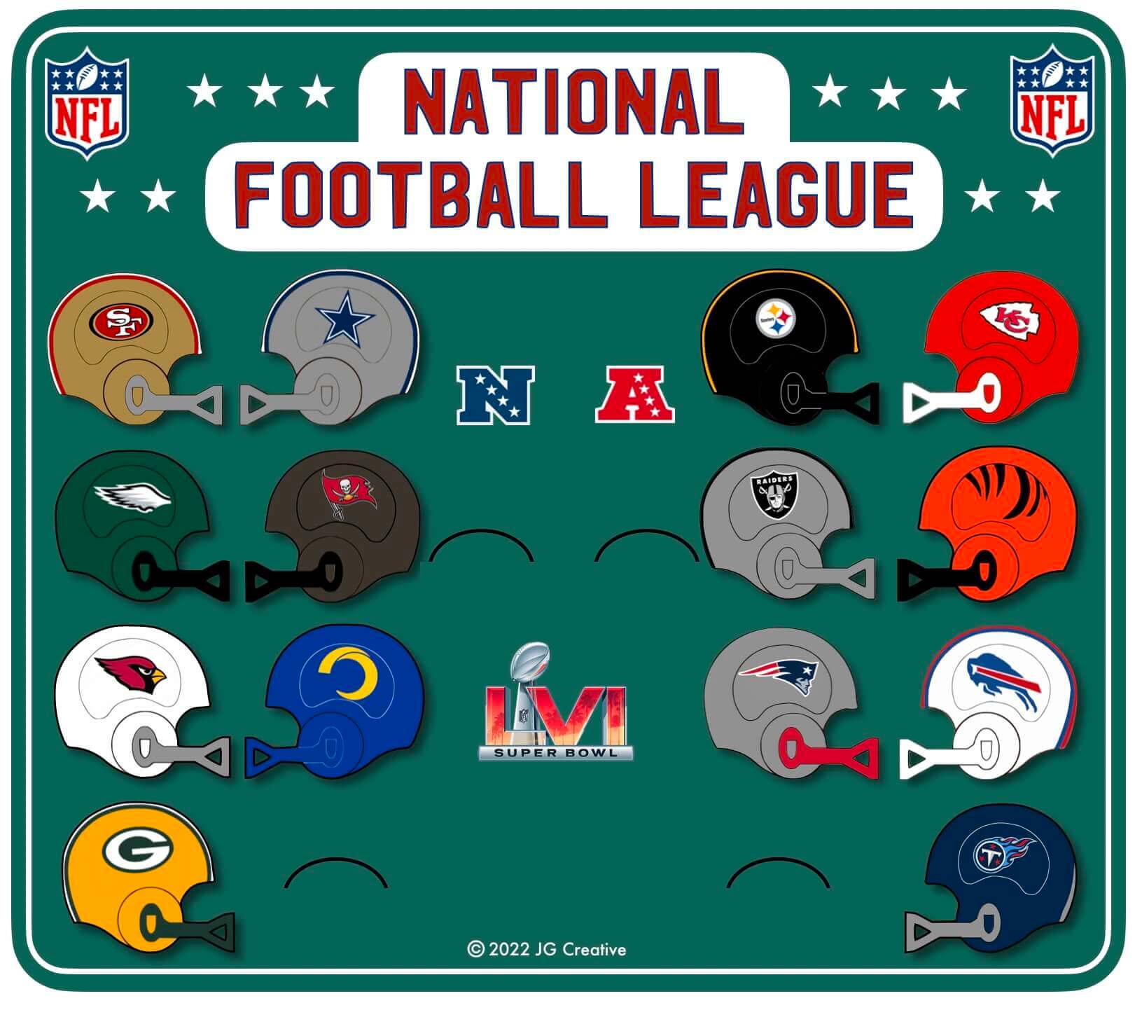
Playoff bracket: With the NFL playoffs set to kick off this weekend, reader John Williams has created another gumball-style graphic, this time showing all the playoff matchups. Nicely done, John!
Click to enlarge
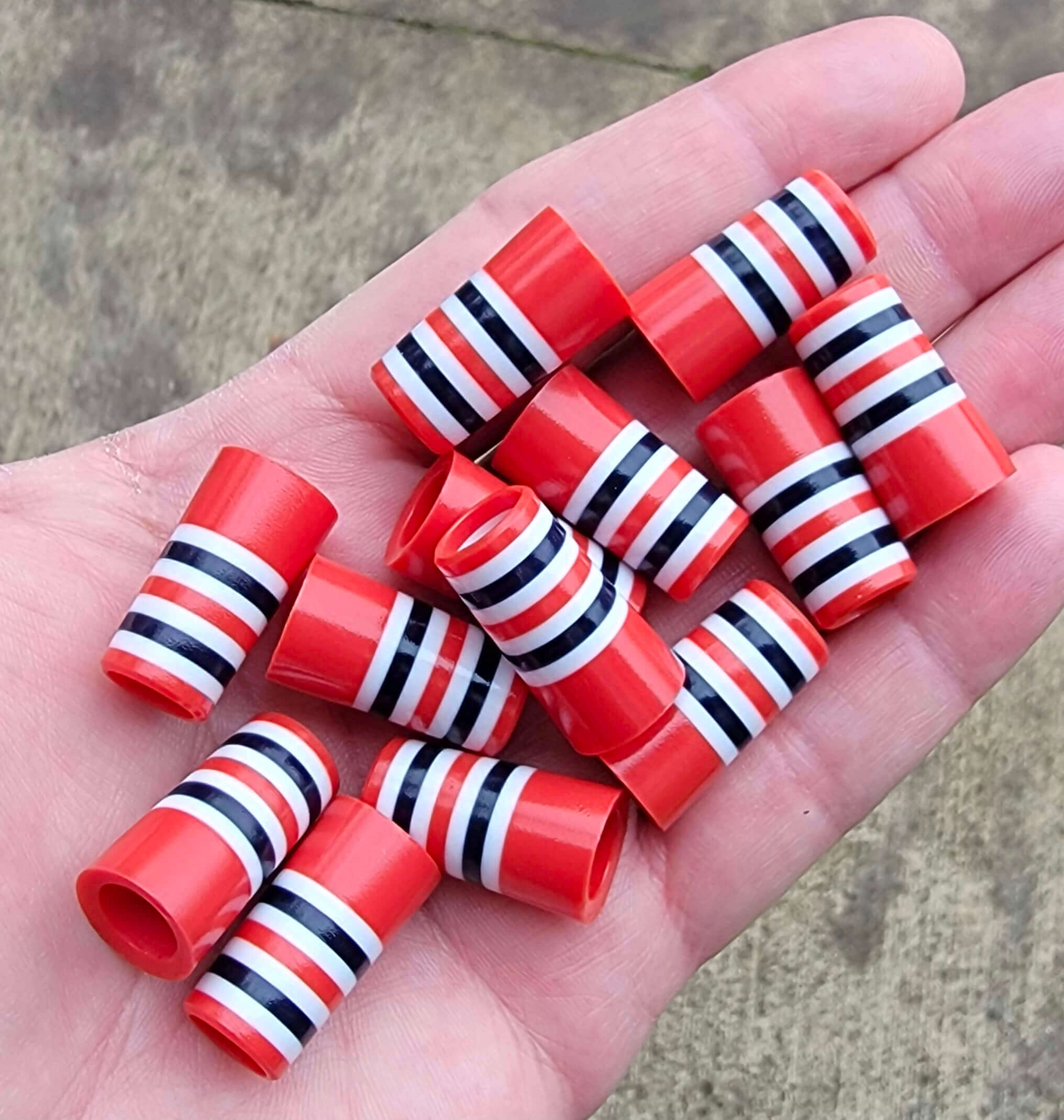
Sock it to me: What are these little plastic thingies with Cardinals sock striping — thimbles? Dollhouse accessories? Something else?
Turns out that they’re ferrules — those little decorative thingies at the base of a golf club shaft. There are lots of striped versions out there, many of which look a lot like sock or sleeve striping, but the one shown above is the best — it’s a perfect match for the Cardinals’ socks! Sadly, they’re out of stock, but definitely something to keep an eye on for golf-playing Cards fans.
(Big thanks to Lendsey Thomson for this one.)

Facebook Live reminder: With winter and the pandemic combining to keep many of us holed up inside, I’ve decided to try doing a half-hour Facebook Live session tomorrow, Jan. 13, at 7pm Eastern.
I’ll respond to questions that people post in the comments and will also show-and-tell a few items from my vintage jersey collection. I’ve never done one of these before, so we’ll see how it goes, but I’m hoping it will be a nice little comm-uni-ty event.
The event will livestream on my Facebook page. Anyone can view it, even if you don’t have a Facebook account, but you do need an account if you want to post a comment or question.
Looking forward to it — see you then!
The Ticker
By Lloyd Alaban

Baseball News: The Mets announced that they will retire Keith Hernandez’s No. 17 on July 9. … In a related item, here’s how Hernandez ended up wearing No. 17 for the Mets in the first place (from Todd Radom and Jim Brunetti). … The Orioles are moving back and raising the left-field fence at Camden Yards. “I don’t mind them moving the fences back, but I don’t like the idea of raising the wall’s height, because now outfielders won’t be able to rob home runs,” says Andrew Cosentino. … Here’s an MLB.com piece about the Tigers’ uniforms (from our own Phil Hecken). … A baseball team made up of workers from the Port Authority of New York and New Jersey wore a patch honoring the Twin Towers that used a very Twins-like wordmark (from Benjamin Engle).

Football News: The Bengals will go black over white for Saturday’s playoff game against the Raiders (from our own Phil Hecken). … Also from Phil: A concussion-related lawsuit that several high school students had brought against helmet manufacturer Riddell was dismissed. … New uniforms for Bellarmine University’s new sprint football team. Sprint football is a weight-restricted version of conventional football. … Mitchell Schwartz discusses NFL socks and cold-weather gear in the latest episode of his podcast, The Athletic Football Show (from Andrew Cosentino). … QB McKenzie Milton had a helmet with both UCF and Florida State’s logos on it for this week’s Hula Bowl. Milton has played for both schools (from @BR850).

Hockey News: The Wild used anti-racism-themed stick tape last night (from Wade Heidt). … The Sabres wore military-themed pregame jerseys last night to honor Buffalo-area fallen soldiers (from Phil). … Here are the stories behind the fallen soldiers that inspired the Sabres’ military-themed warmup NOBs (from our own Phil Hecken). … The PHF’s Connecticut Whale are wearing purple Alzheimer’s-awareness sweaters this weekend (from our own Jamie Rathjen). … The USHL’s Chicago Steel will change their name to the Ice Sharks for one game next week.

Basketball News: Numerologist Etienne Catalan has the latest NBA uni number assignments. … Monday’s episode of Antiques Roadshow had a segment on a complete collection of UConn women’s national championship rings, which the show’s expert valued at $100,000 (from James Gilbert).

Soccer News: The Seattle Sounders announced a draft pick trade using a number and NOB (from @JayJayDean). … This is the logo for the Arnold Clark Cup, a new invitational tournament England’s women’s team is hosting. Arnold Clark isn’t a memorial to someone—it’s an ad (from our own Jamie Rathjen). … Also from Jamie: Scottish club Alloa Athletic launched a women’s team starting next season, with the crest slightly modified to say “WFC” instead of “FC.” … Fourth-tier Japanese team FC Tiamo Hirakata has a new crest (from Jeremy Brahm). … Also from Jeremy: New kits for top-tier Japanese side Urawa Reds. … In last night’s AFCON match between Sudan and Guinea-Bissau, Sudan had inconsistent NOBs. Most of the NOBs were cap/lowercase, but a few were all-caps.

Grab Bag: Tennis player Leylah Fernandez has signed an apparel deal with Lululemon (from our own Brinke Guthrie).
Are those ankle weights on Jim Busby?
I think that’s what those are. They were a bit of a fad back in the ’70s, I know, and apparently before that. I had a set in the ’70s.
I think that’s Jim Paciorek wearing the ankle weights on the right, with coach Busby on the left. The caption makes it seem like it’s Paciorek (L) & Busby (R), but I don’t think that’s correct.
I think the Sabres got it right.
Those ferrules come in team designs, so it seems. The picture on the homepage of the company includes a ferrule that is exactly the sock or sleeve pattern of the Chicago Bears! Both home and away versions!
Ah, good spot! I missed those but see them now that you’ve mentioned them.
So, being a Chicago guy, there’s the natural rivalry to things St. Louis…so I immediately thought, “No Cardinals sock stripes, Blackhawks sleeve stripes!” Which sent me on a short rabbit hole to confirm my bias…Which led me to:
link
Where as I was looking at the stripe pattern on the sweaters, obviously, they’re swapping the red and black stripes between the sweaters…but since black isn’t a base color, it kinda results in a sorta-kinda imbalance between the two sweaters (it does look like the red stripe is there on the red sweater but obviously just blends with the base)…ah, but wait a minute, hang on, they did have some black base sweaters (BFBS) for awhile: link
Am I crazy or speaking heresy if I were to say that the BFBS version works better with the white version just because of the balanced striping?
Heresy in the highest form. :P
The striping pattern on the Hawks’ sleeves have been consistently inconsistent for both the home and road jerseys since the 1950s. They’ll change one, change the other, change both, change none… whatever suits their changing wants, it seems.
In short, don’t expect the Blackhawks to have a mirror-image home and road set of jerseys. It’s been 70 years or so since they did.
I find it strange that the Colt 45s were an advertisement for a gun manufacturer. It would be like a Seattle team being called the Seattle Boeing 747s. When I was a kid, late 60s or early 70s, I played for a team called the “Weatherby Rifles”, who sponsored our team. Looking at pictures my dad took, I didn’t see any rifles. On the back “Weatherby” was above the numbers, and “Rifles” below. There was a chest patch I can’t make out, and don’t remember. The royal blue stirrups were great, with white/red/white stripes, with the red stripe wider than the white stripes.
One reason they changed their name is that Colt wanted some sort of financial compensation for the use of their name.
(Also: Colt 45 Malt Liquor still exists!)
I had the same thoughts after reading the lede. Did the team just straight up steal the logo and hope Colt would be cool with it? Or was it a joint effort from the start? I suppose Colt saw how much cash was rolling in after the first few seasons and wanted a piece. I do like how the minor league team was the .22s though. Clever, that!
Funny, considering companies now pay millions to put their names on teams uniforms.
It’s always funny when your worlds collide. I usually spent my lunch break browsing Uni-Watch and some golf websites, and when I got to the BB&F ferrules, I forgot where I was for a second.
Club building and golf clubs in general are loaded with little aesthetic goodies like ferrule design. While this is probably a bit of a faux pas in the golf world, I’m not ashamed to say that how my clubs look is nearly as important as how they perform. For example, I got a new putter last year and the first thing I did was start searching for an aftermarket headcover to replace the stock one that it came with, because the color clashed with the rest of my bag.
For the record, I find decorative ferrules like those ones pictured to be too distracting on my clubs. I much prefer a traditional black.
Why do the Bengals call it a “jersey combo” when referring to the helmet, jersey, and pants? Grinds my gears.
Don’t even get me started on that! It’s become a common phrase, and I *hate* it! Uni-illiteracy.
I’m disappointed Paul didn’t work in a “back and to the left” comment for the Orioles’ left field fence after the Keith Hernandez news… :)
This!
That photo of the Colt 45s execs ceremonially firing guns straight into the ground is one of the funniest things I’ve seen in a long time.
Texas gonna Texas.
And here’s a prospect wearing a Colt .45s jersey and a San Antonio cap:
I’m pretty sure the gentleman holding the bat is Colts GM Paul Richards.
In Indigenous Appropriation news, Rutland (VT) High School reverses decision to get rid of Raiders name and arrowhead logo: link
Thoughts on two of the baseball related links: don’t like the change to the fences in Baltimore. The 12-foot height will eliminate the chances of bringing a would-be home run back into the yard. The same article says that OPaCY was one of the few parks to have a fence less than 7 feet. Why not split the difference? Realign the field as it was in 2001, reducing the amount of foul territory and pushing the fences back. Then, remove a few rows of seats to raise the fence to 8 feet.
Regarding the Tigers’ uniforms… a pox on Chris Ilitch for messing with the classiest uniform in the American League, and maybe all of The Show. The insignia on the ballcap has changed continuously over the years, finally settling on the current version some time in the 60s. The Olde English D on the home jersey, however, had been – with the exception of the 1960 season – had remained exactly the same since 1934. If you’re going to change anything, why mess with the one that’s instantly recognized around the world?
Am I the only one who really likes high fences? Seeing an outfielder pull back a potential home run is fun, but seeing a ball bounce off the wall for an extra-base hit, with runners rounding the bases and lots of action, is much more exciting.
Also, unrelated: spotted on eBay: link, with shadows that are in opposite directions, makes it look like the two digits are coming towards you with a light source behind them. Not as ugly as you might expect an upside-down number to look.
Thanks for the Colt .45s photo archive….great to see a photo of John Paciorek, baseball’s greatest hitter (3 for 3 with 2 BB in his only big league game). Don’t let anyone ever tell you no one can bat a thousand….
Awesome artwork John Williams.