By Phil Hecken, with Jimmer Vilk
Follow @PhilHecken
Good morning and Happy Saturday, Uni Watchers. I hope everyone had a good week! And to all those heading to the UW Gathering down in Durham tonight, I’m sure you’ll all have a fabulous time (wish I could be there).
Now then — on Monday of this week, at 10:17 am to be exact, reader Mic wrote in the comments, “Watching the panthers/patriots game yesterday I was surprised by how small the panthers TV #s are. They appeared to be about half the standard size, it looks like they just crammed the smallest numbers they could find between the wide shoulder stripe and large neckline.
Has this been noticed or covered before?”
While we’ve covered TV numbers before, I’m not sure we’ve ever devoted a lede to it (at least I haven’t). Later that evening, I was chatting with Jimmer Vilk, and explained to him I was thinking of delving into this and would he be interested in doing a post with me on this. We hashed out a few details over the week and have decided to look at every team’s TV numbers (or in a couple cases, lack thereof). Most teams in both the NFC and AFC have decent (or at least adequate) TV numbers, but in a few cases, we’ve determined they could be improved.
TV numbers, if you’re not aware of the term, are any numbers placed on the uniform (not necessarily on the jersey) in addition to the front and back jersey numbers. Most often, they’re on either the shoulder or the sleeve cap, but they can also appear on the helmet or the pants. Introduced during the advent of broadcast TV, they’re not really necessary (well, Jimmer thinks they are), but they do help spotters and announcers to identify players. For the purposes of this piece, we decided to review the NFC (AFC soon!) to see which teams have “adequate” or good TV numbers, and which could be improved. We’ve also assumed that TV numbers must appear somewhere on the uniform. Due to shrinking sleeve lengths and the prominence of the maker’s mark on the sleeve cap, it will sometimes be necessary to suggest TV numbers in locations other than the sleeve or shoulder. In at least one instance (in the AFC), I will suggest removing the swoosh from the sleeve and moving it to the front of the jersey, but that’s for another time.
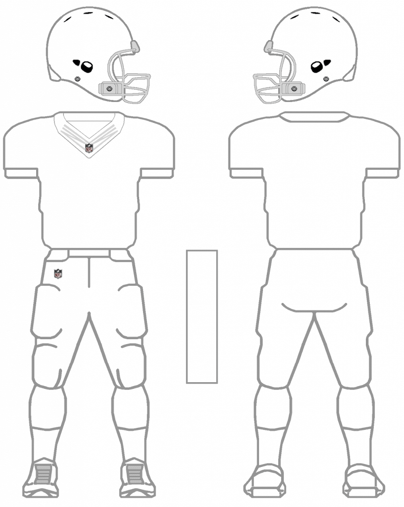
OK enough with the setup. Here’s how Jimmer and I would treat TV numbers for the NFC. For some of the suggestions below I attempted to (very poorly) mock up the suggested solution — just to give you an idea of how it might look. I apologize for my lack of proficiency in MS Paint.
NFC EAST
PH: The ‘pokes uniforms are fine. Nice big TVs, stripes not affected by swoosh.
JV: While I would like sleeves big enough for stripes *and* numbers, I can live with what they have now. Don’t change them.
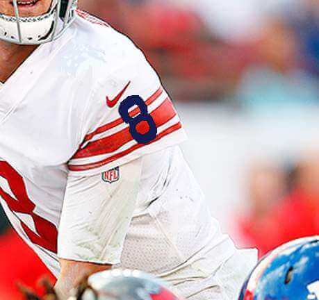
PH: Giants unis (including throwback, which are a bit smaller than I’d like) are fine.
JV: To me, a Giants jersey just doesn’t look right with shoulder numbers. For the love of Fran Tarkenton, put them on the sleeves… yes, even on the striped road sleeves!
PH: Numbers, logo and MOTB are a little scrunchy for my liking, but it works.
JV: Until you (please) do a total redesign, leave everything be.
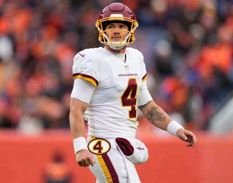
PH: They have TVs on their hats and their sleeve caps. Yeah, that’s enough, even when this happens. I think Jimmer may have some other ideas…
JV: With helmet numbers and sleeve stripes, even I don’t need TV numbers on the jersey. But, like the 80s Packers and Cowboys, I would like some hip numbers, please.
NFC NORTH
PH: Da Bears, like all NFC North teams, have their TVs on the shoulders and they’re perfect. Sleeve stripes are kind of snug, but overall no changes.
JV: Don’t touch da Bears
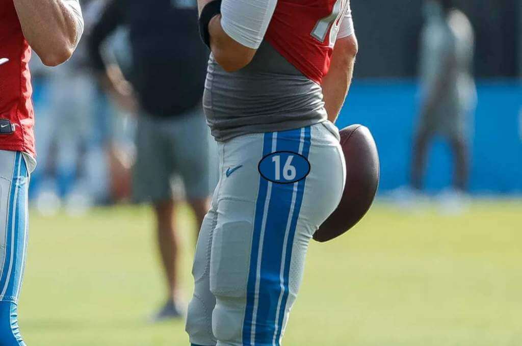
PH: They’re a bit tiny (and the silver/gray isn’t the most visible), but there’s no need to change anything.
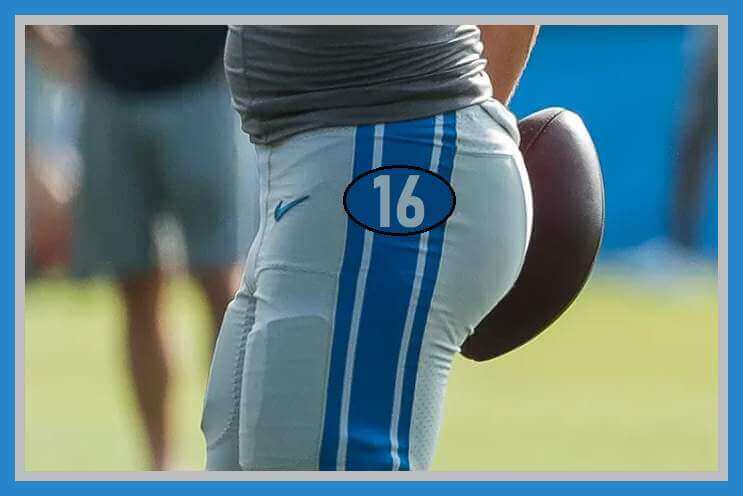
JV: Because they’re tiny, and because this isn’t a “classic” uniform, jazz things up by moving the TVs to the hip.
PH: The best uniform in football is fine as is. Yeah, the throwbacks don’t have TVs, but they’re ya know, throwbacks.
JV: One of the best uniforms is fine as is.
PH: The TVs are fine — the “sail” font is horrible and should be changed, but that’s for another day.
JV: There are so many things wrong with this look, but the TVs are the least of them.
NFC SOUTH
PH: The whole uniform set is awful, but the TVs aren’t the problem.
JV: What he said.
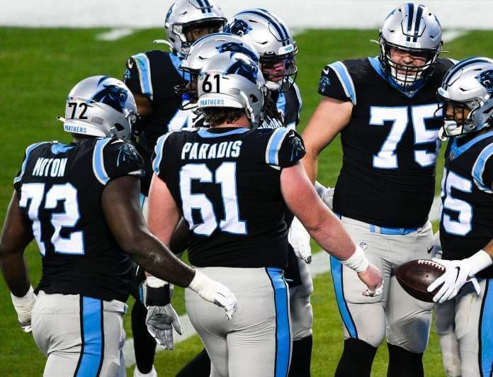
PH: Probably the “worst” TV numbers in the game. I’d say about the only way to fix this is to swap the sleeve cap patch with the shoulder TVs, AND move the swoosh to the front of the jersey. It’s a pretty radical change, but I can’t see moving TV numbers to the rather iconic helmet. Failing that change, I’d say remove the TV’s from the shoulder and put a large(r) number on the back of the helmet (as terribly mocked up above).
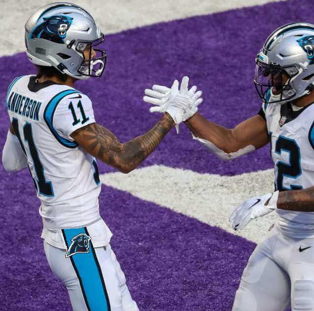
JV: I would move the swoosh to the front of every jersey (in place of the league logo, if it has to be somewhere), but I’ll settle for cat heads on hips and numbers on sleeves.
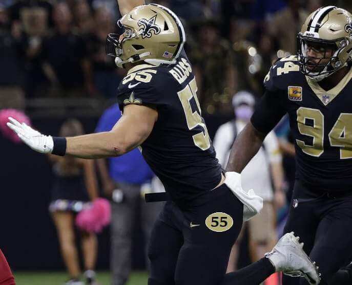
PH: I’m fine with these. Wish they were a bit more visible on the throwbacks (maybe a thicker outline)? But otherwise, no changes.
JV: This is another team that could use TVs moved to the hips, especially on those black stripeless pants.
NFC WEST
PH: These are the worst uniforms in football, but TV numbers aren’t one of their problems.
JV: These are not the worst uniforms (well, their BFBS is). There’s a small problem with the TVs: they’re a little too small.
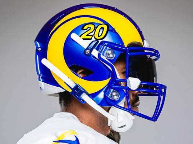
PH: Where to start? The dishwater jerseys are the only ones with TV’s to begin with, and the squishy-rubbery font is terrible (if barely serviceable). I’d probably move these to the shoulder and render them in the same font as the jersey. The new white and blue jerseys don’t have them at all. You can’t really put them on the sleeve caps (due to the ram horn striping), so they could be wedged onto the shoulders or even possibly inside the ram horn sticker/logo on the hat. (Really bad) mockup below:
JV: Since no one wears hip pads anymore, maybe the squishy-rubbery numbers could act as de facto pads.
PH: They’re fine on the shoulders. Maybe they could be a tad larger, but that’s it.
JV: I can’t believe I’m saying this twice in the same article…what he said.
PH: Fine as is.
JV: I also can’t believe I’m fine with this “new” look. Don’t change.
And there you have it. These may not be ideal solutions (in some cases, it might just be best for teams to eliminate TV numbers altogether, but that’s not an option for this exercise). What do you think? Should “hip” TV numbers come back? Should more NFL teams use helmet TV numbers? Do teams even need TV numbers at all? Love to hear your thoughts and suggestions.


Uni Concepts & Tweaks
Time for more Uni Tweaks from the UW readership.
I hope you guys like this feature and will want to continue to submit your concepts and tweaks to me. If you do, Shoot me an E-mail (Phil (dot) Hecken (at) gmail (dot) com).
Today’s concepts come from Sean Walsh:
Oakland Athletics:
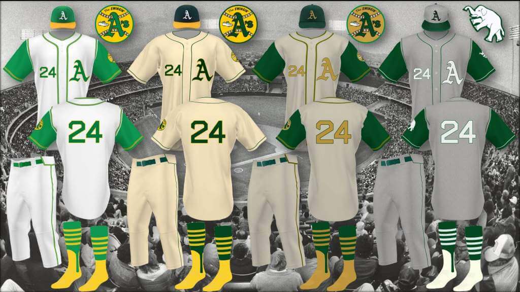
The first baseball games I went to as a kid were A’s games at the Coliseum in 1975, and those A’s uniforms had a significant influence on me. First, I basically wanted every team to have colored jerseys and contrasting stirrups and sanitaries like the A’s, and second, I loved the letter/logo look on the jersey, a look I think more teams should use (I think only 9 or 10 of 30 now, and the A’s, Giants, Twins and D-backs are only alts). As colored jerseys became more and more (way too) prevalent across the league, my tastes moved more to classic styles, and ironically, my favorite A’s uniforms became the vests that immediately preceded those 70’s uniforms. So after 30+ years, I think it’s time to retire the “Athletics” and “Oakland” script uniforms, as well as the “apostrophe s,” and bring back the classic “A” logo, and the classic vests, with a nod to the Philadelphia days (the white elephant patch, with no gold), the 70’s (the Swingin’ A’s patch), and the early 80s (in cream instead of white), to be added to the current green and recent gold “A’s” jerseys (just get rid of that “’s” and go back the McAuliffe number font).
Pittsburgh Pirates:
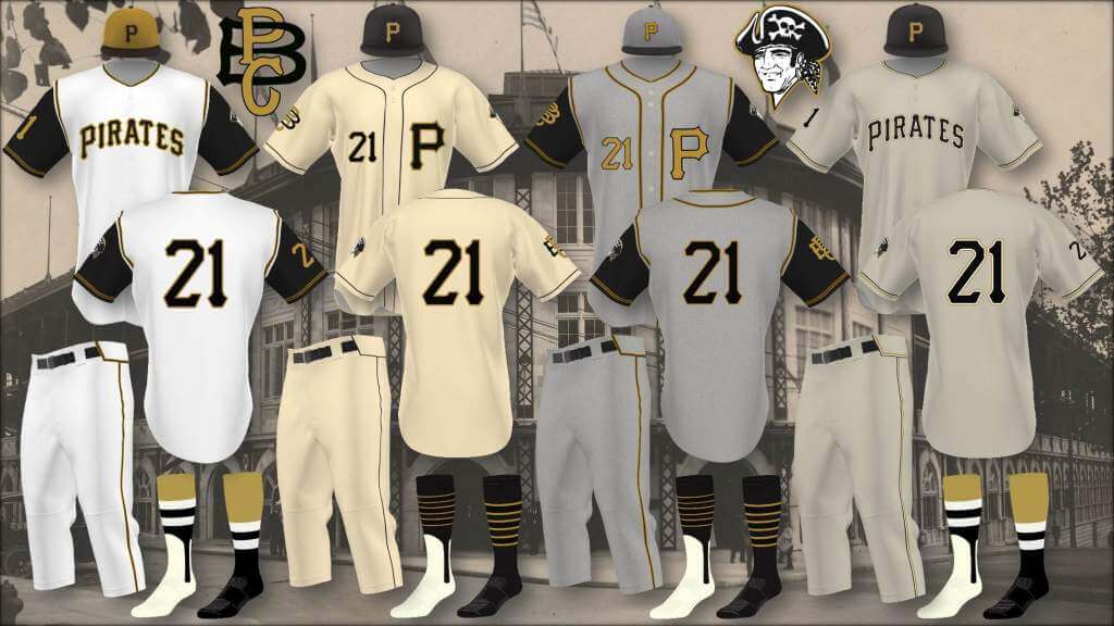
One side of the family comes from western Pennsylvania, so Pirate fandom is literally grandfathered in (4th behind the Giants, Padres and A’s). I’ve always loved the Pirates 60’s vests as well, and the early 70’s old gold / mustard uniforms, (especially that hat, my all-time favorite), so I combined these elements into a new set. The hats and stirrups/socks are pretty much interchangeable (other than the gray hat), and reviving a couple old logos on the sleeves.
While the A’s and Pirates’ sets are essentially makeovers, the following are more alternates to the softball/colored jerseys proliferating the league.
Philadelphia Phillies:
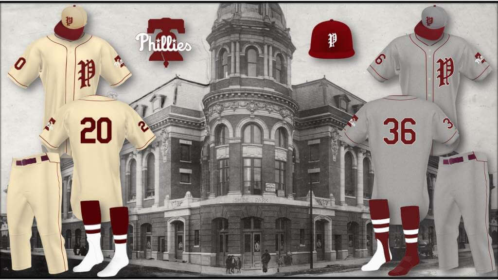
No personal connection to the Phillies, the only reason I started a Phillies alternate was because I thought their 70-80s maroon (another 70’s look I love, and a color that is sadly absent from the league currently) would look good on the gray flannel, and it does, so I did a cream version as well. I like the Phillies current set, especially their cream alts, and was going to use the current logo/fonts to tie these in with the current set, but found that old English “P” while perusing the Dressed to the Nines database, and had to use it instead.
San Francisco Giants:
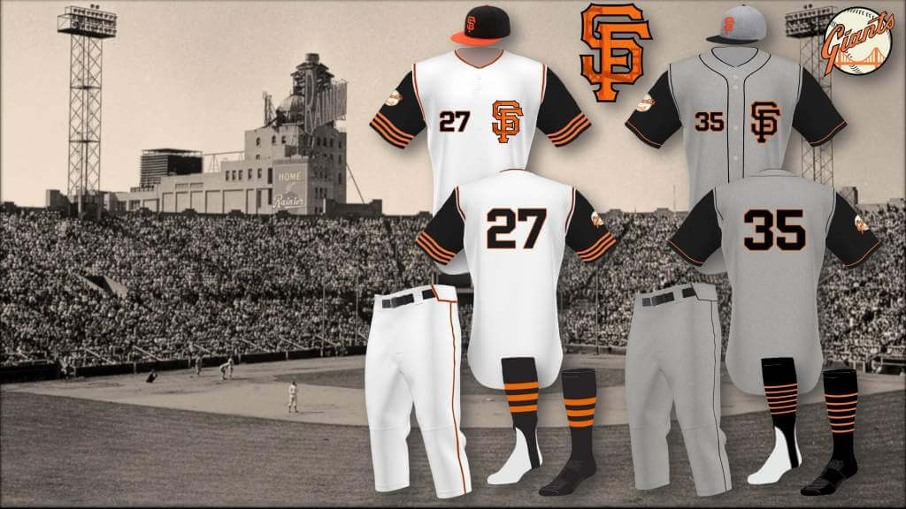
Love the Giants classic uniforms, not a huge fan of their orange and black alternates (don’t hate them, there just not a “color-jersey” team to me, despite their late 70’s orange and black shirts). No history of vests with the Giants, but I always liked their “SF” road grays from ‘83-93, and thought the combo would make nice alternates. The white alts have more color and stripes, the flannel, more subtle trim.
Boston Red Sox:
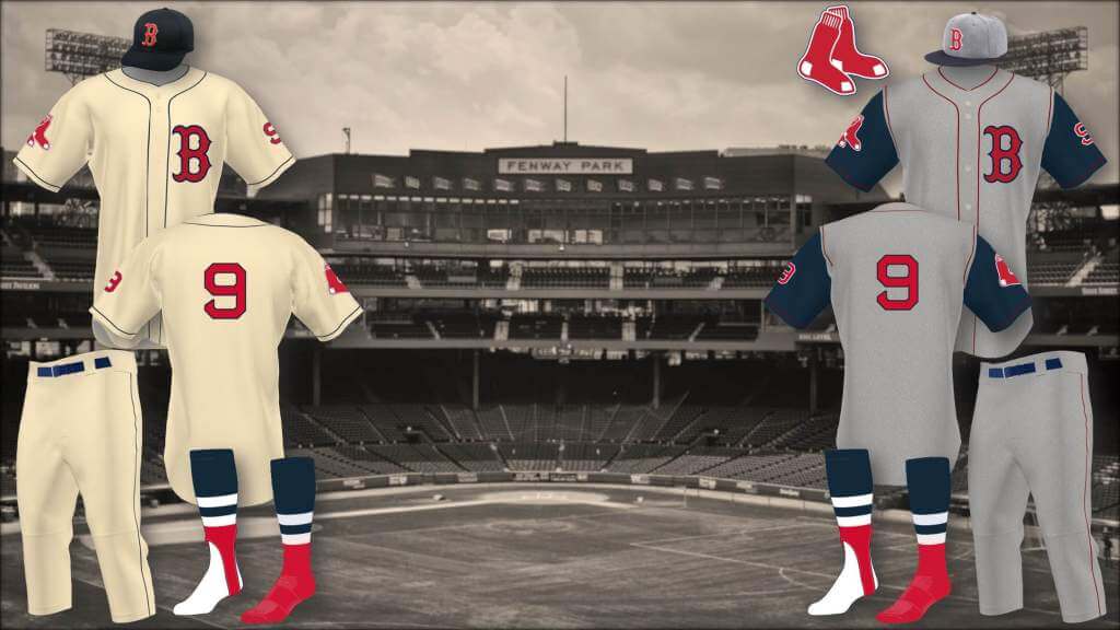
They’d never do it, too similar to the Yankees, but wouldn’t these be better alternates than the red and navy softball jerseys?
Baltimore Orioles:
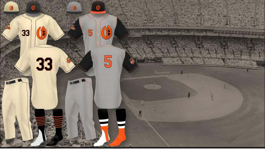
The Orioles have flirted with an alternate “O’s” logo on their hats, I created a (semi) original Olde English “O” logo for them, with a “B” nestled inside it, might work as a full overhaul, they’ve had some form of “Orioles” or “Baltimore” script on their jerseys for all but a few years of their modern incarnation, may be time for something different.
Chicago White Sox/Minnesota Twins:
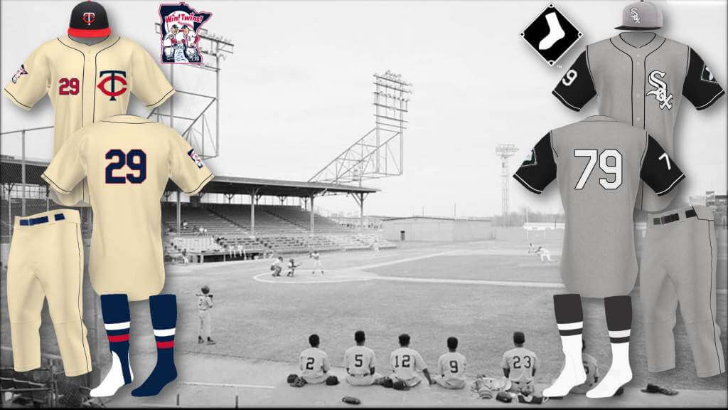
White Sox: I love White Sox current set, and their City Connect uniform was the only one that I thought actually worked, I would just add an old school flannel set, the white logo and numbers an homage to the 69-70 roadies.
Minnesota Twins: I love their all light-blue alternates, would love to see the Twin Cities logo on a cream set, instead of the red softball jersey.
To be clear, I still like colored jerseys, for some teams they work great, and this isn’t some “get off my lawn” plea for the whole league to go back to baggy, wool uniforms, just suggesting that the cream/flannel and/or vest look might provide a better alternate look for some teams, especially, though not exclusively, the pre-expansion era teams.
OK readers (and concepters). If you have some tweaks or concepts, shoot ’em my way with a brief description of your creation and I’ll run ’em here.


Guess The Game…
from the scoreboard
Today’s scoreboard comes from Albert Czervik.
The premise of the game (GTGFTS) is simple: I’ll post a scoreboard and you guys simply identify the game depicted. In the past, I don’t know if I’ve ever completely stumped you (some are easier than others).
Here’s the Scoreboard. In the comments below, try to identify the game (date & location, as well as final score). If anything noteworthy occurred during the game, please add that in (and if you were AT the game, well bonus points for you!):
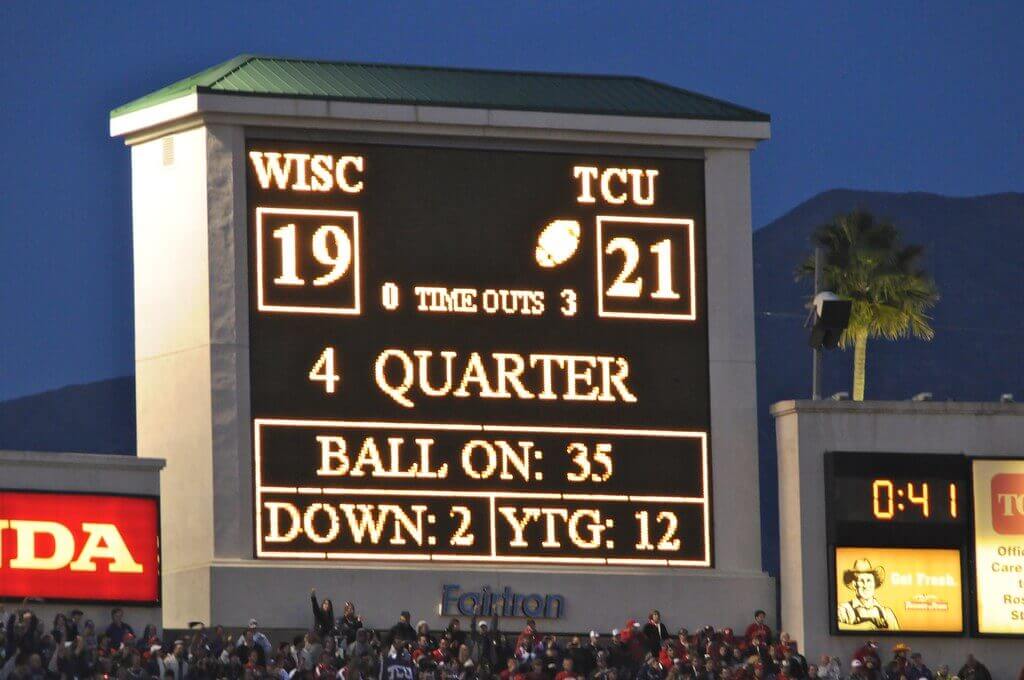
Please continue sending these in! You’re welcome to send me any scoreboard photos (with answers please), and I’ll keep running them.


ManCave Pictures Teams Up With NLBM for their 2022 Calendar!
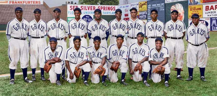
A couple weeks ago, I featured several awesome colorizations by Chris Whitehouse (of ManCave Pictures). Two of those were fantastic colorizations of Negro League Baseball squads. In case you hadn’t seen that post (or Chris’ note at the bottom of the last slide), he noted “This image, and the other Grays image here are part of a 13-image calendar project for 2022 (and the next two years as well).”
A couple of readers expressed interest in the calendar and when it might become available. I got a note from Chris the other day that the Official 2022 Negro Leagues Baseball Museum Wall Calendar is now available for ordering! As of last night, there were some “unrestored black and white images that shouldn’t be there. We never worked on them and it is all a bit confusing why they put them there. We will try to get them to change this.” All of the photos in the calendar are ManCave Pictures’ full NLB colorizations!
You can pre-order your today by following that link.
Awesome (and congrats!) Chris. Looks fantastic.


The Ticker
By Anthony Emerson

Baseball News: Oh man, check out this awesome Cubs pin someone posted in a New Era fan Facebook group (from Noah Sidel). … Reader Jon DeBord found a box full of his father’s Little League baseball unis from the 1950s, posting it on his personal blog. … With litigation still ongoing, Cleveland President of Baseball Operations Chris Antonetti wore the team’s new Guardians logo on a fleece and told Jon Heyman that he was “confident” that the team will be known as the Guardians (from Andy Zare).

NFL/CFL News: Apparently inspired by how awful the Jets looked two weeks ago, the Eagles are also going white-over-black. Yuck (from multiple readers). … The Jets wore camo practice jerseys as a “salute to service” promotion. Can’t help but notice that the ad patch remained perfectly legible (from Matt Meo). … The grounds crew at FedEx Field have made the endzones camouflage for the WFT’s Salute to Service game tomorrow (from Tom Turner). … Hamilton Tiger-Cats great Angelo Mosca passed away recently, and the TiCats are honoring him with a memorial helmet decal (from Wade Heidt).
College/High School Football News: Here are today’s unis for Appalachian State, USF, Arizona State, Syracuse, UNLV, Houston, and Ole Miss. … How many different variations of BYU’s logo can you spot in this pic? (from Josh Hjelmstad). … The two high school teams that competed for South Dakota’s state championship have identical Bulldog logos and very similar color schemes. Spoiler: the Bulldogs won.

Hockey News: The AHL’s Providence Bruins will wear memorial helmet logos in honor of Colby Cave for the remainder of the season. Cave died at the age of 25 in April of last year, and played for both the AHL and NHL Bruins, as well as the Oilers (from multiple readers).

NBA News: The Onion has poked some fun at the proliferation of NBA alternate unis (from Joe Unger).

Soccer News: England U21 striker Folarin Balogun wears No. 9, but it appears England’s kitman gave him an upside-down 6 on his jersey (from Johnny Jatt). … New away kit for Irish side Shamrock Rovers (from Ed Zelaski). … Also from Ed, new shirt sponsor for Ukraine’s Karpaty Lviv.


Uni Tweet of the Day
Have I ever mentioned this is my favorite MLB uni of all time?
A young Stan Musial – man those #Cardinals uniforms are so nice. pic.twitter.com/3CkGtPiNQY
— BaseballHistoryNut (@nut_history) November 12, 2021


And finally… that’s all for today. Thanks to Jimmer for his thoughts and opinions on TV numbers, and nice concepts from Sean.
Everyone have a good Saturday (and to those heading to the Durham gathering, enjoy!), and I’ll catch you back here tomorrow with the SMUW Crew.
Peace,
PH
2011 Rose Bowl game played on Jan.1, 2011. Final score was as shown, 21-19. This was the first Rose Bowl game not televised on network TV, broadcasted on ESPN. Andy Dalton was MVP.
Al, that scoreboard must have been something before electricity!
TV numbers are obsolete and have been for years. With today’s broadcast technologies that provide close up views from nearly any angle, TV numbers no longer serve any purpose.
Trying to embed a now useless number on ever decreasing uniform space is an exercise in design stupidity. Enjoy those remaining TV numbers because they won’t be around much longer.
I have to agree. They’re superfluous and with less sleeve to work with, it may be a necessary sacrifice even if it looks “unfinished” to our eyes.
Damn, Gary…
I agree, but while there’s no ‘need’ for them I’d still rather see numbers than logos.
FULL throttle agreement with Gary.
MLB CONCEPTS: on balance, I like these more than I don’t. The A’s set is phenomenal and I actually really like the Phillies maroon/gray and maroon/cream set without the light blue. Not sure about the Olde English P (despite the historical context) and I would bring back the giant and unique block numbers from the Whiz Kids era but I could live with these. Less crazy about the overuse of vests and I don’t like the Olde English “O” for Orioles (the monogram should represent the city or state, IMO). That aside, I like these a lot.
I generally agree. Technically, these are very well executed, and for the most part, I think they also reflect thoughtful consideration. Great work. So what I’m about to say in not a criticism of the concepts or the designer, but a thought about baseball uni design prompted by seeing these concepts. As much as I love cream for home uniforms, it turns out there is such a thing as too much cream. Several of the be-creamed teams in the concept set make me think that the team just doesn’t belong in cream. It’s a design element that, for me anyway, works for a few teams very well, but for most teams not at all.
Nice work, Sean. Love the Twins uniform.
Gray caps…No, thank you.
The Phillies kinda ‘own’ the sleeve number look, so I’d rather not see other squads adopting those.
And yes…it may soon be time to retire the Oakland script uniforms if a stadium deal isn’t reached ;)
And yes…it may soon be time to retire the Oakland script uniforms if a stadium deal isn’t reached ;)
I would hate to see the Athletics moved yet again; that poor team is enough of a tumbleweed already. Move the Rays, instead.
I love these concepts, particularly the number-only style on the back.
It feels like contrasting sleeves have completely disappeared from the game. They make a dull gray jersey look good again. Bring them back!
Thanks all for your comments, I’m used to my tastes not always being everyone’s cup of tea, but glad you like some at least.
MJ: You’re right, should have made those Phillies numbers bigger, and I did put a “B” for Baltimore in the Orioles “O”, not as clear as it could be, the resolution of the images posted doesn’t really show it.
R. Scott: Cream and flannel definitely only work for some teams, I also found through various Q&D drafts of various uniforms that darker shades of colors, i.e. navy, maroon, forest green, work, while royal blue, kelly green, and scarlet not so much.
ChrisH: Or if a stadium deal IS reached, it might be time for a new (old) look for the A’s.
Thanks Mark in Shiga.
The art of a great headline is lost in the age of SEO writing. Kudos for today’s “TV or not TV” header.
Hats off to Sean Walsh! Those A’s uniforms, especially, need to happen.
TV numbers are dumb and pointless
TV numbers on the hip are dumber and pointless-er
The TV number analysis would have been far more useful if it had included pictures of each team’s current design. It was tough to try and picture each one based on the vague comments.
Did you click on the link provided for each team (you know, the bolded green)? That showed pictures of each team’s current design.
Too clumsy, but good to know. Thank you.
I seem to be the only reader who likes the Rams’ TV numbers, I wish they’d be adopted across the board. Remember, Sand-knit numerals have a conspicuous difference between TV and trunk fonts.
Sean, it looks like all you did was design one new uniform and use it for eight different teams. Putting that uniform on the A’s *AND* Giants is particularly egregious. The Pirates’ bespoke number font is butt-ugly and the black jerseys with the big “P” are candidates for the dumpster, but you didn’t design those. I like your Phillies’ concepts, especially with the bell patch on the left sleeve. I bet it would look even better with McAuliffe numbers.