By Phil Hecken
Follow @PhilHecken
Greetings and Salutations, Uni Watchers! It’s Saturday…we made it. And it’s Hallowe’en weekend too, so you can probably expect even more uni-shenanigans that usual on the college football gridiron today.
It’s been a while since I last hosted any colorizations on here, but long-time readers know one of my favorite things is seeing black and white photos of old school uniforms brought to life in living color. Today, I’m back with one of, if not the, best colorizers out there, Chris Whitehouse, who is the proprietor of ManCave Pictures, and who is a must follow on Twitter. Chris has shared many of his outstanding colorizations with Uni Watch before, and today he returns with another outstanding set. While he specializes in baseball photo restoration and colorization, he’s included a couple vintage hockey restorations/colorizations as well. Enjoy! Here’s Chris:
ManCave Pictures Colorizations
by Chris Whitehouse
A. The First World Series double team photo.
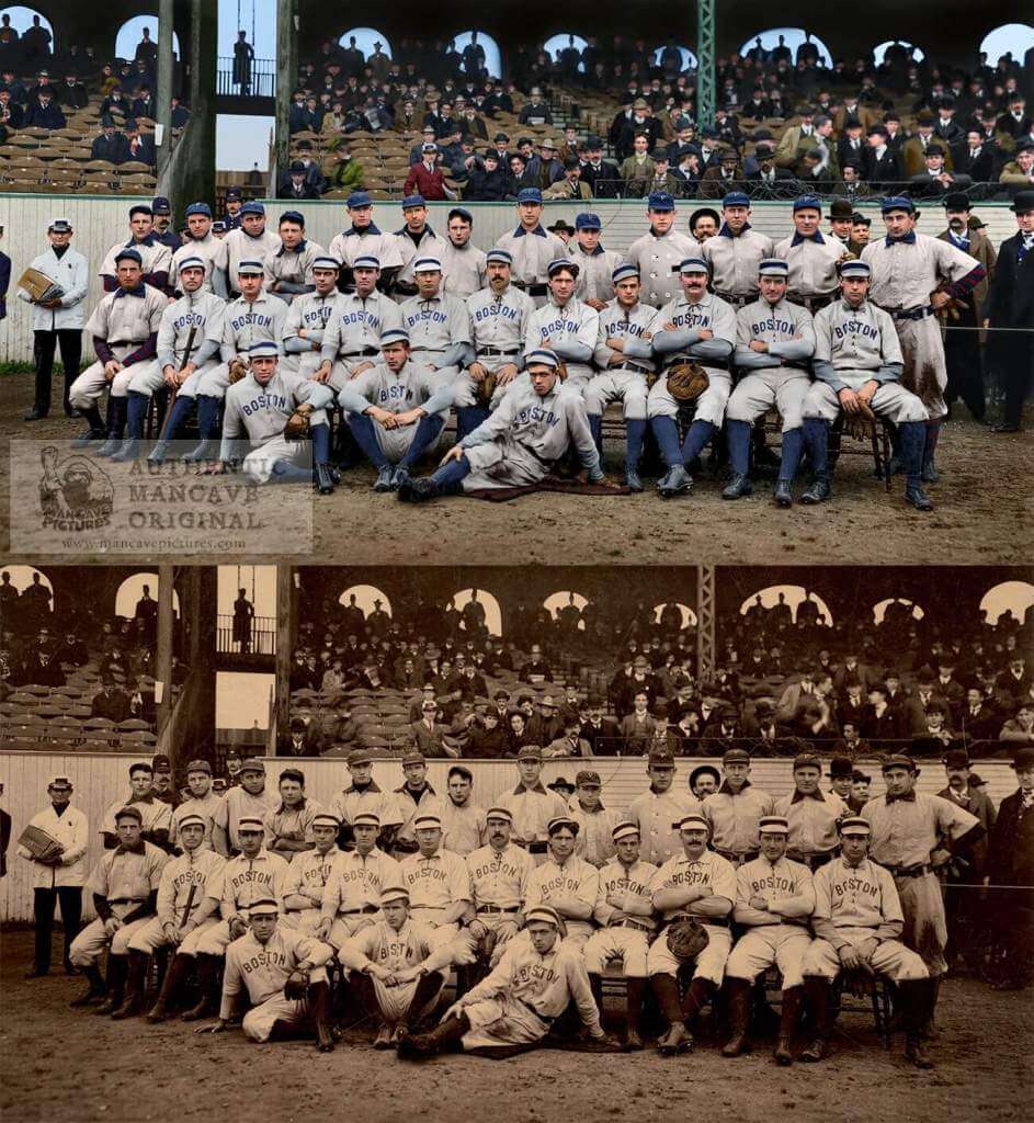
Taken at the Huntington Avenue Grounds in Boston, the Boston Americans and the Pittsburg (Then spelled without the final “h”) Pirates posed for a double team photo. The two most recognizable stars, Cy Young and Honus Wagner can be seen in the middle of the Boston team, and on the far Right of the Pirates. With single teams being even larger than this double team, it isn’t likely that we’ll see this kind of photo ever again.
B. The 1907 American League Champions Detroit Tigers
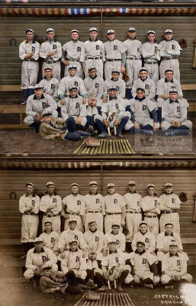
The 1907 Tigers in their first of three consecutive years as American League Champs. Unfortunately for them, they also became the first team to lose three World Series in a row. To the Cubs in 1907 and 1908 and to the Pirates in 1909. The Giants would soon repeat that failure in 1911, 1912, and 1913. It hasn’t happened since.
C. Boston Red Sox at Spring Training with Royal Rooters
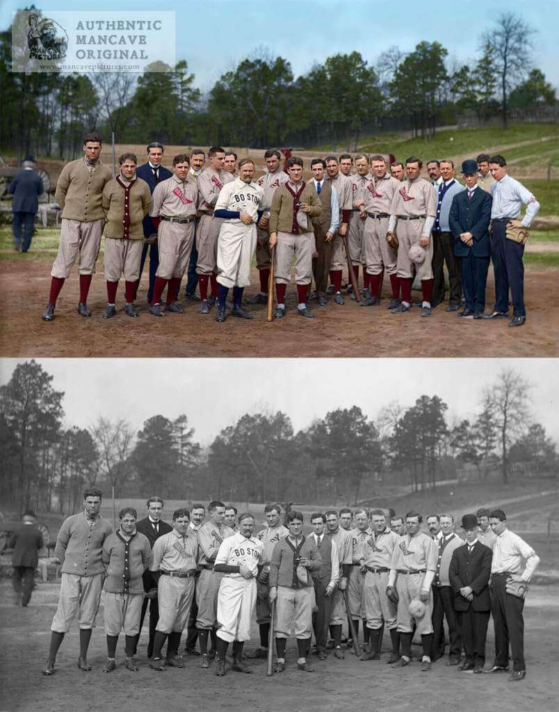
March 2, 1909 during Spring Training in Hot Springs, Arkansas, popular tavern owner and leader of the Royal Rooters Michael “Nuf Ced” McGreevy, presents the promised diamond ring to the Red Sox player with the most stolen bases. Amby McConnell was the winner with 38 steals in 1908.
D. Addie Joss Benefit Game
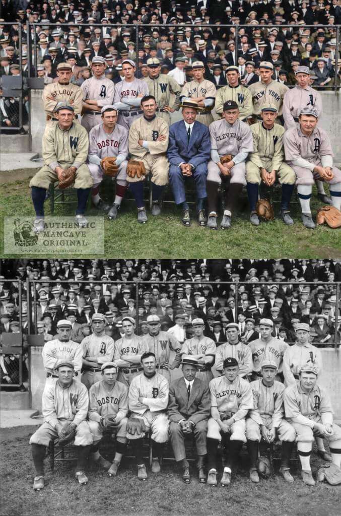
The Addie Joss Benefit Game was played on July 24, 1911, between the home field Cleveland Naps and an all-star American League team made up of representatives from each team except the White Sox. The game was played for the benefit of the family of star pitcher Addie Joss of the Naps who suddenly died in April. $12,914 ($372,888) was raised for his family. Joss’ best friend, Ed Walsh of the White Sox, was scheduled to play, but was unable to come. Ty Cobb can be seen in a Cleveland road uniform, because his Tigers uniform was lost or stolen en-rout to the game.
E. The 1931 Homestead Grays.
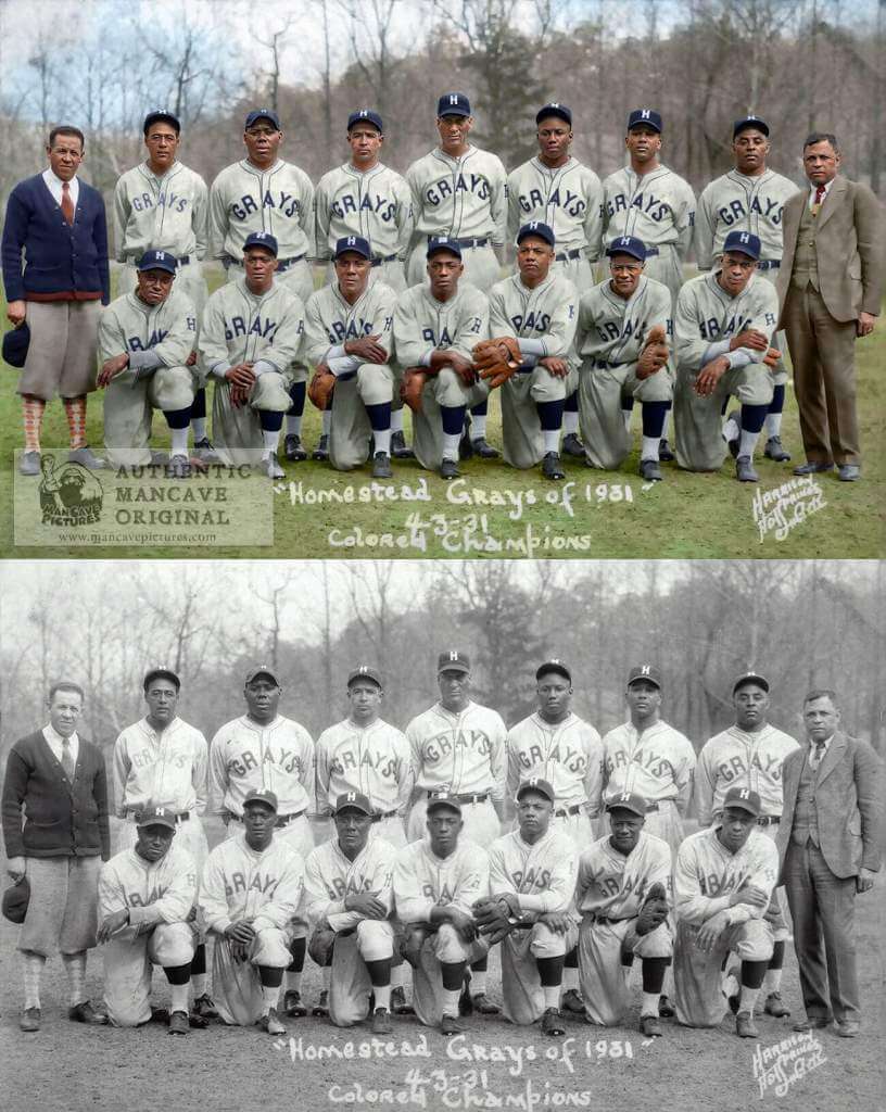
“The greatest baseball team of all time”?
F. The 1926-27 Chicago Black Hawks.
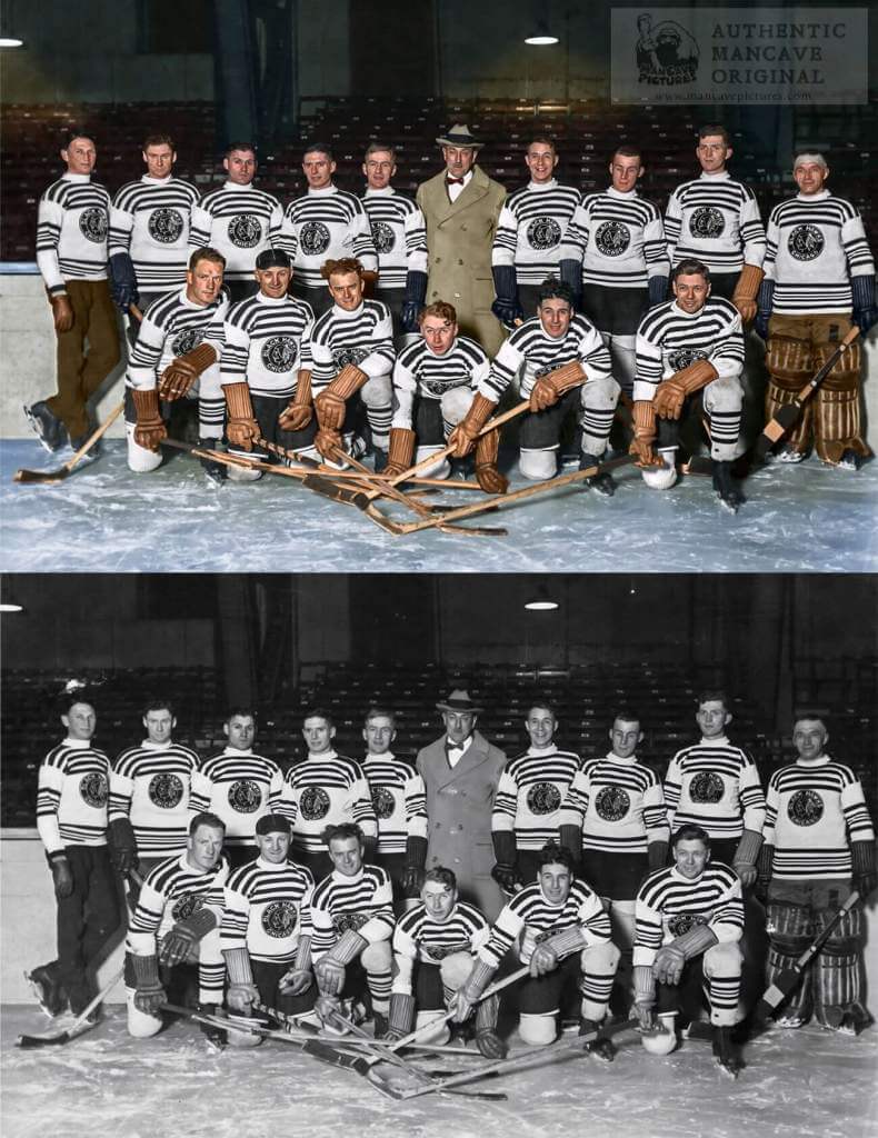
The first Black Hawk team. This is the first hockey image we’ve done. Those black and white jerseys make it look as if I never finished coloring the picture. I know the Hawks have worn throwbacks of the black with white stripes reverse of these jerseys, but I don’t know if they’ve worn these. I thought that it might be difficult to get the ice looking real, but I believe it turned out pretty well.
G. The 1930 Montreal Canadiens
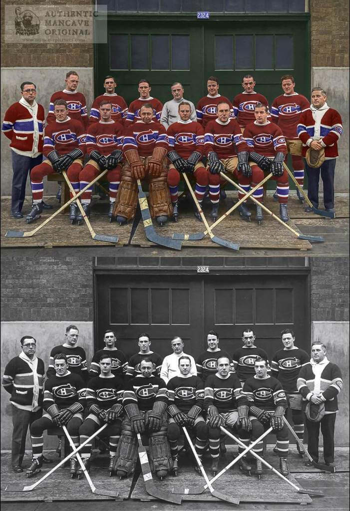
What can you say about these classic uniforms and the “Hockey Canadien” logo that have stood the test of time?
H. The 1932 World Champion New York Yankees
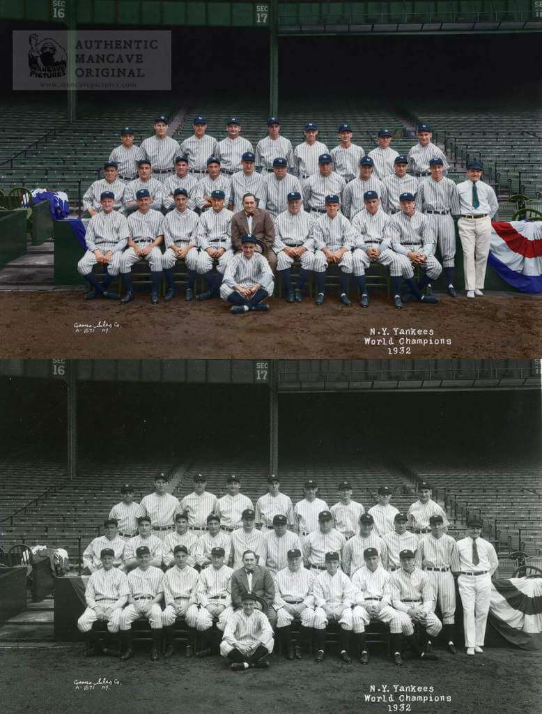
This image of the 32 champs is notable in that The Babe and Lou are not wearing pants. They had to hustle out from wherever they were so that they wouldn’t miss the photo. That’s why they are missing their pants.
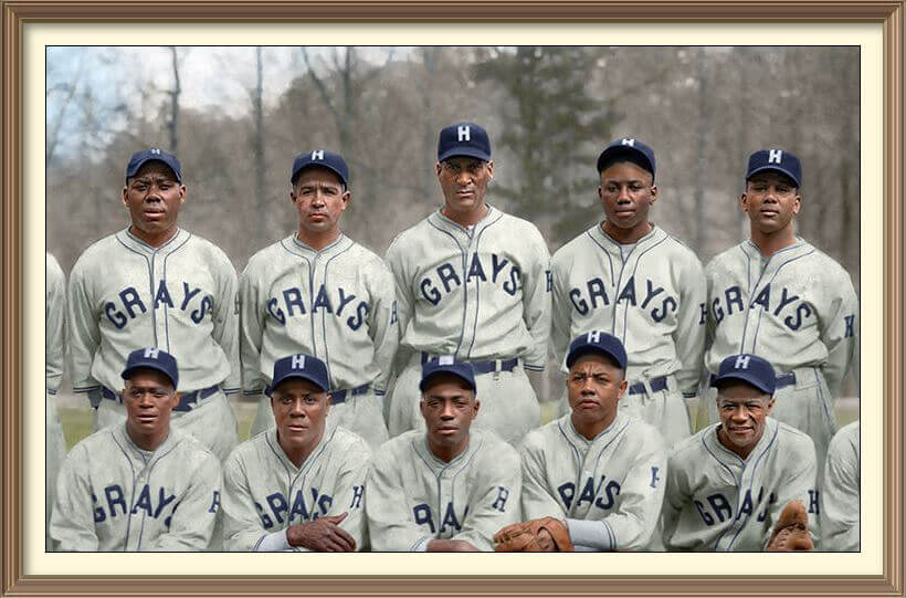
I. The 1943 Champion Homestead Grays
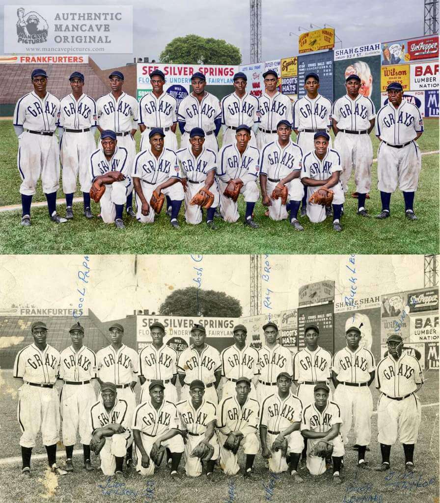
We were in a bidding war for this original photo, but somebody beat us out for it. It turned out that it was the Negro Leagues Baseball Museum, who kindly gave us a really great scan so that we could restore and color it for them. This image, and the other Grays image here are part of a 13-image calendar project for 2022 (and the next two years as well).
WOW! Thanks, Chris — as always, outstanding work here. Thank you so much for sharing. Looking forward to seeing your next projects.


Guess The Game…
from the scoreboard
Today’s scoreboard comes from Jack O’Lantern.
The premise of the game (GTGFTS) is simple: I’ll post a scoreboard and you guys simply identify the game depicted. In the past, I don’t know if I’ve ever completely stumped you (some are easier than others).
Here’s the Scoreboard. In the comments below, try to identify the game (date & location, as well as final score). If anything noteworthy occurred during the game, please add that in (and if you were AT the game, well bonus points for you!):
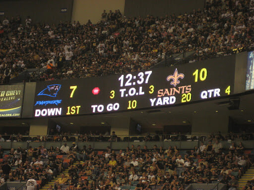
Please continue sending these in! You’re welcome to send me any scoreboard photos (with answers please), and I’ll keep running them.


Uni Concepts & Tweaks
Time for more Uni Tweaks from the UW readership.
I hope you guys like this feature and will want to continue to submit your concepts and tweaks to me. If you do, Shoot me an E-mail (Phil (dot) Hecken (at) gmail (dot) com).
Today’s concepts come from John J. Woods:
Usually, you design a logo and then create or search for a font to do the numbers, letters and wordmark.
For this one, I looked for the unique font first.
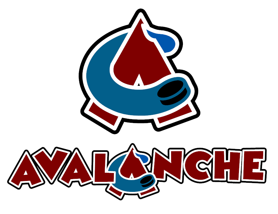
The simplified Colorado Avalanche logo is just the C and the A.
Wordmark contains the logo in the center.
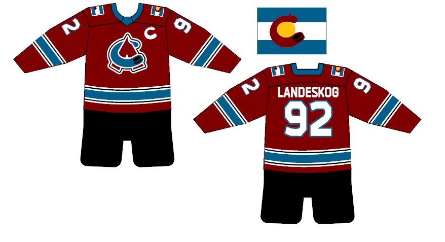
When your logo is a C and an A, you can use those shapes for captain and alternate patches.
Shoulder patch is the state flag in French blue and burgundy with the C from the logo. This is the only use of yellow.
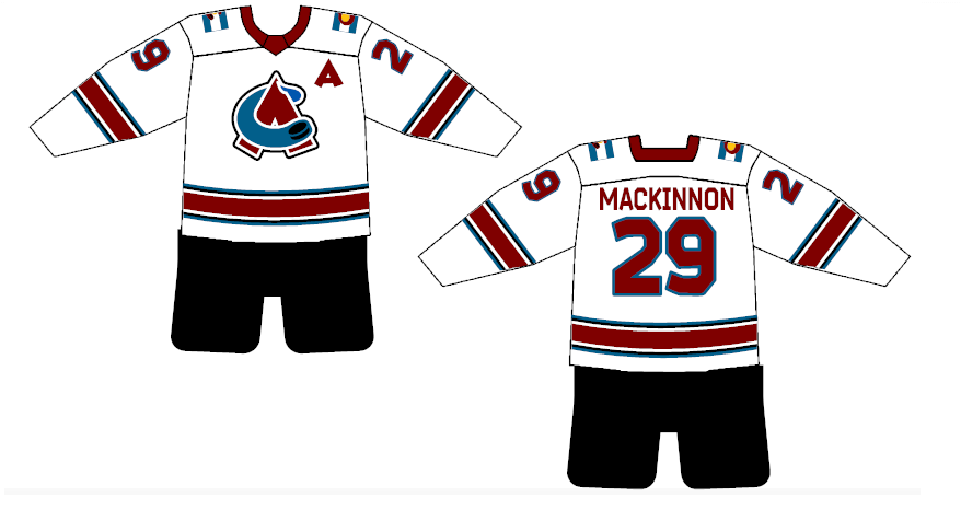
Since the main jersey is burgundy, the striping mimics the blue in the logo with white/black/white outlines.
The white jersey uses the same stripe widths with different colors.
Blue jersey uses the wordmark. Since it is wider than it is tall, time for one of those FOX third jerseys from the 90s with mountains in the shape of the A.
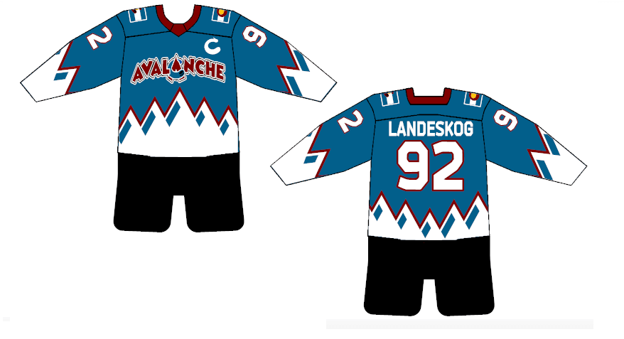
The numbers/letters had to be a more legible font than the logo/wordmark.
Johnny Woods
OK readers (and concepters). If you have some tweaks or concepts, shoot ’em my way with a brief description of your creation and I’ll run ’em here.


MLB Playoff Uni Tracking
It’s BAAAAACK.Alex Rocklein has been tracking the jerseys of all the teams involved in the MLB Post Season for the past several seasons. We’ve made it through the first three (colorful, if you like softball tops) games of the World Series. Today Alex has three graphics — the first showing the full tracking of the NL and AL Championship series, with jerseys and results:
The second shows the jersey matchups for the first three games of the World Series (sent before last night’s game in Atlanta ended, but the jerseys are correct):
And finally, the full tracker so far:
I hope you guys enjoy this annual feature and you’ll thank Alex for all his effort with a quick “Thanks” in the comments below! Look for this feature every weekend until the World Series is complete!


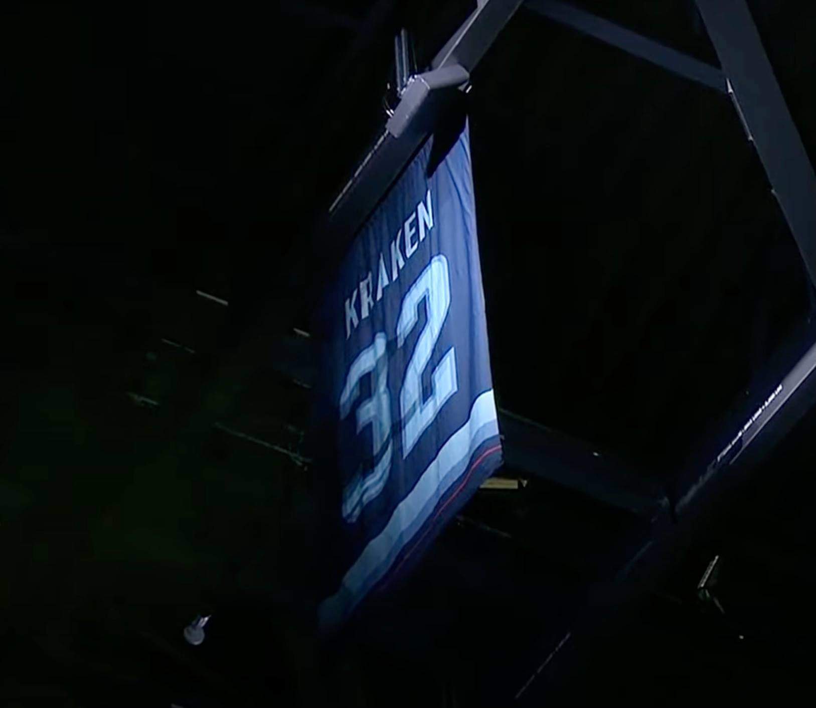
Bulletin reminders: Paul here. My latest article for Bulletin is a think piece about “conceptual” number retirements (like the Kraken’s recent retirement of No. 32 because they’re the 32nd NHL franchise, shown above), including a league-by-league rundown of them and what I think about them. You can check it out here.
Also: Remember last week’s Bulletin piece, in which I interviewed an ad industry veteran about the language of uni ads? A sports advertising exec sent me lots of really interesting feedback and insights in response to that piece, so I’ve created a bonus column in which the exec annotates the original interview. You can check that out here.
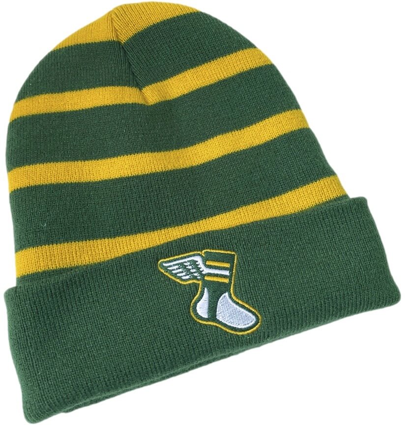
Meanwhile, if you only read Uni Watch on the weekends (I know there are some of you who do that!), here are two items of merch news that you might have missed:
• Our Uni Watch toque (or beanie, or skip cap, or whatever you want to call it), which we originally offered last winter, is now available again.
• Last weekend I mentioned that our great “Hit Sign, Win Stirrups” graphic, designed by Todd Radom, had been revived as a T-shirt and hoodie. I’m happy to report that we’re now also offering it as a poster and canvas print.
Okay, that’s it for me — now onto the ticker!


The Ticker
By Anthony Emerson

Baseball News: Cubs C Willson Contreras was in Atlanta to cheer on his brother, Atlanta C William Contreras. Willson wore a “Los Bravos” Hispanic Heritage jersey for the occasion (from Noah Kastroll). … Apparently ex-Blue Jay and current Twin Josh Donaldson still hangs out in the Greater Toronto Area, getting fitted for hockey equipment at a retailer in suburban Newmarket, Ontario (thanks, Phil).

NFL News: Bill Belichick hated the Pats’ all-blue unis they wore twice in 2002, once against the Packers and once two weeks later against the Broncos, both losses. He hated them so much, he complained about them for years later. Makes you wonder how he feels about the Pats’ current set (from @CDodge56).
College/High School Football News: Boise State has added a helmet decal honoring the victims of this week’s shooting in Boise (from Aaron Bernstein). … Here are today’s unis for Michigan State, Virginia Tech, Virginia, Michigan, Tulane, Houston, and SMU.

Hockey News: We may have covered this before, but just in case: the Caps helmet advertisement is 3D, not just a decal (from @The_VZA). … Oh man, check out Notre Dame’s new road blues. Absolutely beautiful (from Terry Mark). … Not a great pic, but BU’s Ty Amonte is going FullNOB, and it’s still not even that big across his back (from Jeff Israel). … Blues goalie Charlie Lindgren’s new pads feature hidden musical notes (from Wade Heidt). … Wade Someone also wrote in last evening: “My friend’s son plays for the Swindon Wildcats in the National Ice Hockey League in England but he is also affiliated with the lower level league ( I think division 2, not sure how it works) Bristol Pitbulls. They shared this picture on Facebook to show the stats for the 4 affiliated players.” Would you look at that, an official frankenjersey! … Also from Wade, British Columbia microbrewery Trail Beer Refinery has released a new golden ale with cans designed to look like the sweaters of the BCHL’s Trail Smoke Eaters. … NBC Sports Washington had the Coyotes listed as “AZ” instead of “ARI” on the scorebug, something I don’t think I recall seeing before (from Jake Shapiro).

NBA News: More images of the Nets’ City Edition unis have leaked. … The G League’s newest team is the Birmingham Squadron (né Erie BayHawks), and they’ve unveiled one of their new jerseys. The Squadron also graciously provided us a whole bunch of other pics, which I’ve collected for you in this imgur album. … ESPN flashed the Bobcats’ logo across the bottom of the screen during last night’s Heat/Hornets game. They could just write it off as a throwback, I guess (from multiple readers). … A 2004 Indian movie about rugby has a large Chicago Bulls logo in the background of a match, visible at the 1:10 mark in this clip. I believe the team in black is wearing it on their kits, too (from Charlie Kranz).

College Hoops News: New unis for Wichita State men (thanks, Phil). … Idaho men have new home unis (thanks again, Phil).

Grab Bag: ISIL says that their flag depicts the Prophet Muhammad’s seal — however, Ahmed El Shamsy, a professor of Islamic Thought and History, says that the seal used in the flag is from a long-debunked hoax letter dating from the 19th century (from @NUFC_monkey).


Uni Tweet of the Day
From Kyler’s lips to God’s ears…
Let's hope the Cardinals make Kyler happy and get new uniforms next year. pic.twitter.com/iwv8BqCWAa
— Addicted to Helmets (@addicted2helmet) October 29, 2021


And finally… that’s a wrap for today. Big thanks to Chris for sharing off the wonderful colorizations (and restorations!) of ManCave Pictures. Great stuff!!!
You guys have a spooky Saturday and I’ll catch you back here with the SMUW crew tomorrow.
Peace,
PH
“My friend’s son plays for the Swindon Wildcats in the National Ice Hockey League…”
Need a correction about that Hockey Ticker submission. It was not me who submitted that one particular item about the frankenjersey and did not write what was quoted there. It is someone else.
Anthony did the ticker, so not sure who wrote that. Struck your name from that item.
Thanks Phil. Maybe the submitter may come forward later today.
The colourizations are excellent! Really appreciate the awesomeness of the button-up sweaters for Montreal Canadiens’ staff when seen in colour like that.
While I prefer the original black & white photos, I do enjoy seeing them colorized. I do hope the Arizona Cardinals take their franchise QB’s advice and design new uniforms. I’d encourage the franchise to take it a step further and rebrand the team with a new nickname. The NFL can give “Cardinals” back to St. Louis as part of a settlement with the city in the ongoing lawsuit and Arizona can come up with a more geographically appropriate nickname.
Don’t you mean give the name “Cardinals” back to Chicago?
Interesting bit of trivia: the Cardinals originally got their name because they started out wearing second-hand jerseys from the U of Chicago football team, whose primary color was maroon. But after multiple washings the jerseys had faded down to a lighter shade of red. So the nickname came from the jersey colors, not the bird. I’m not sure when they adopted the bird as a logo/mascot.
Does a similar relationship exist with other names used by two or more teams, i.e. “Panthers”, “Jets”, “Rangers”, “Giants”, (and should the Adamses choose to make an issue of it, “Oilers”)? Lest we forget, the NFL blew a gasket when the CFL used “Colts” as the name for their Baltimore team in 1994, so lets throw “Lions” in that group, too.
The colorizations are totally fantastic!
I do have a sort of sensitive question for Chris or anyone else who may know about this sort of work. While historical knowledge obviously informs some of the color choices where possible, there is obviously some guesswork behind other color choices. The sensitive part is this: how are skin tones handled? It seems a terribly fraught part of this fascinating work.
On skin tones. Think about how easily it is to change your own skin tone with a little time in the sun or a few beers. Thus I can’t worry too much about it. The greyscale gives obvious clues on how light the skin should be, but the hue is all up to me.
Tip: Anybody nicknamed, “Red” will get typical ginger coloring.
The AZ scorebug thing is nothing new
link
It makes a modicum of sense for teams with state locators to use their postal abbreviations; Two-part city names (San Francisco, New Orleans) have made us familiar with two-letter score bugs.
Absolutely love the colorized Canadiens photo. I really dig the sweaters the coaches are wearing and would Vilk the hell out of that.
Beautiful colonizations! Thanks for sharing. And I just spent some time scouring the NLBM website for any sign of the calendar, but no luck. Chris, if you learn of any way we can purchase the calendar with your work, I hope you’ll let us know!
On the calendars, they are in production. I’ll let Phil know when and where they become available.
I don’t get the whole “mono-uni thing”. What is driving this? Hope this is a trend that goes away soon (just like the black jerseys the Mets wore for quite a few years) The Pats uni’s would really benefit with some grey britches.