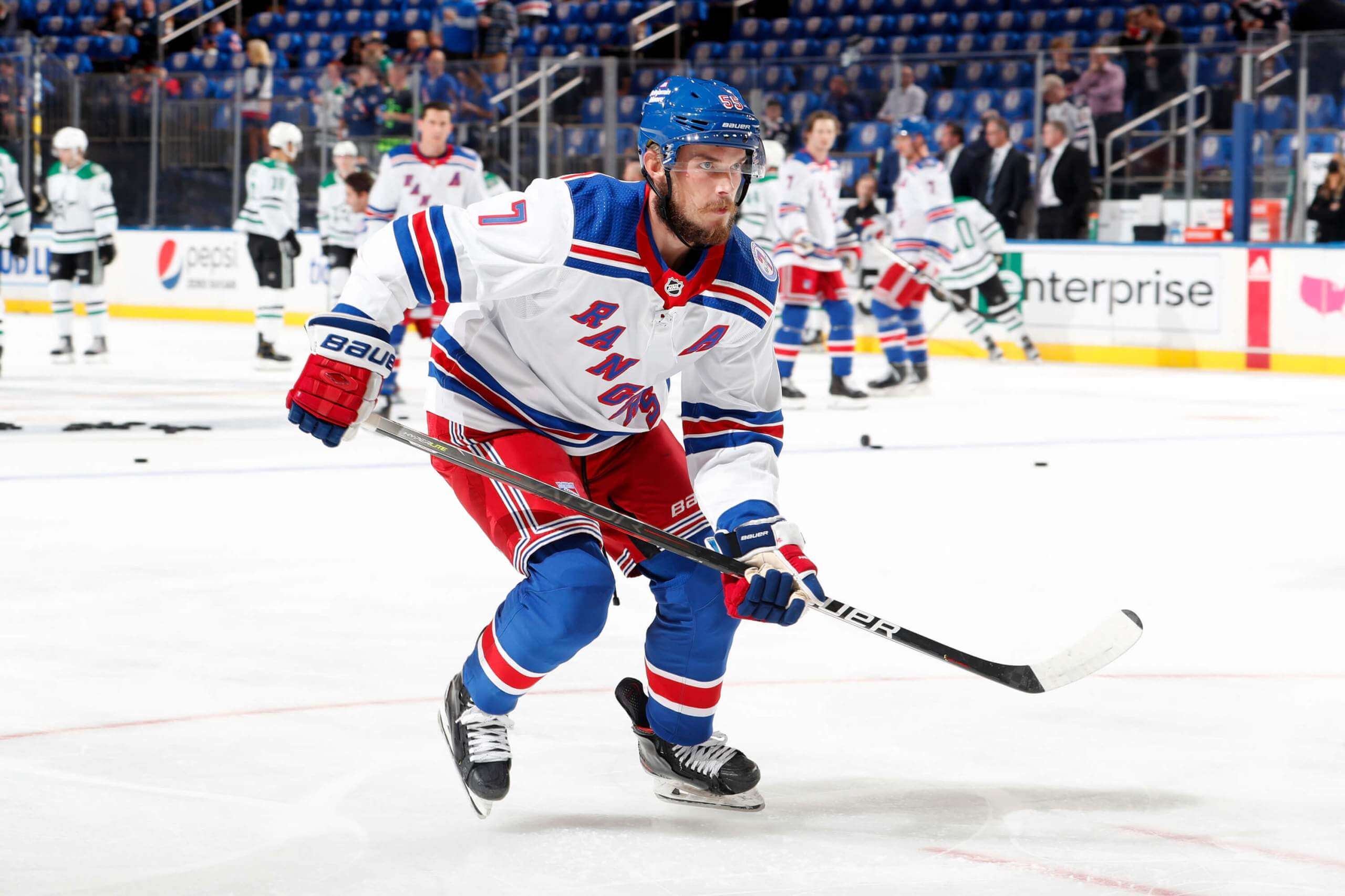
Photo by Jared Silber/NHLI via Getty Images; click to enlarge
Visually jarring mix-and-match moment at Madison Square Garden last night, as the Rangers saluted the late Rod Gilbert by wearing No. 7 Gilbert jerseys for pregame activities. Since Gilbert seems better known for playing in the white-at-home era (more on that in a second), the pregame jerseys were white — but the Rangers were wearing their blue home jerseys for the actual game, so the white pregame jerseys were incongruously paired with the team’s blue helmets and blue socks. Or to put it another way, they tributed Gilbert by wearing a uni combo he never wore. Weird!
But here’s the thing: If you look at Gilbert’s career, he played eight seasons in the color-at-home era and eight more in the white-at-home era, so the pregame jersey could just as easily have been blue. But he was more of a star in the latter part of his career — the white-at-home part — which I think is why they went with the white for last night’s pregame salute.
I can understand all of that, but here’s something I have a harder time with: In Gilbert’s day, the Rangers’ NOBs were straight. But the pregame jerseys had Gilbert’s NOB rendered in the team’s current gentle vertical arching:
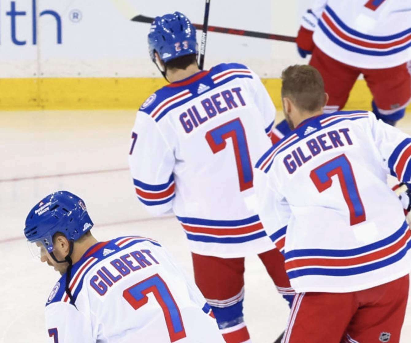
Obviously, you can’t expect them to match every period detail (Gilbert’s Rangers also had lace-up jersey collars, for example), but a straight NOB doesn’t seem like too much to ask.
Gilbert’s widow avoided the whole issue of replicating period details by wearing what appeared to be a vintage Gilbert jersey for the pregame puck drop:
@UniWatch Mrs Gilbert wearing old fashioned #nyr sweater with NNOB for puck drop #uniwatch
Awesome! pic.twitter.com/uBS4Z4anHt— Alan Wrench (@uniformnerd) October 14, 2021
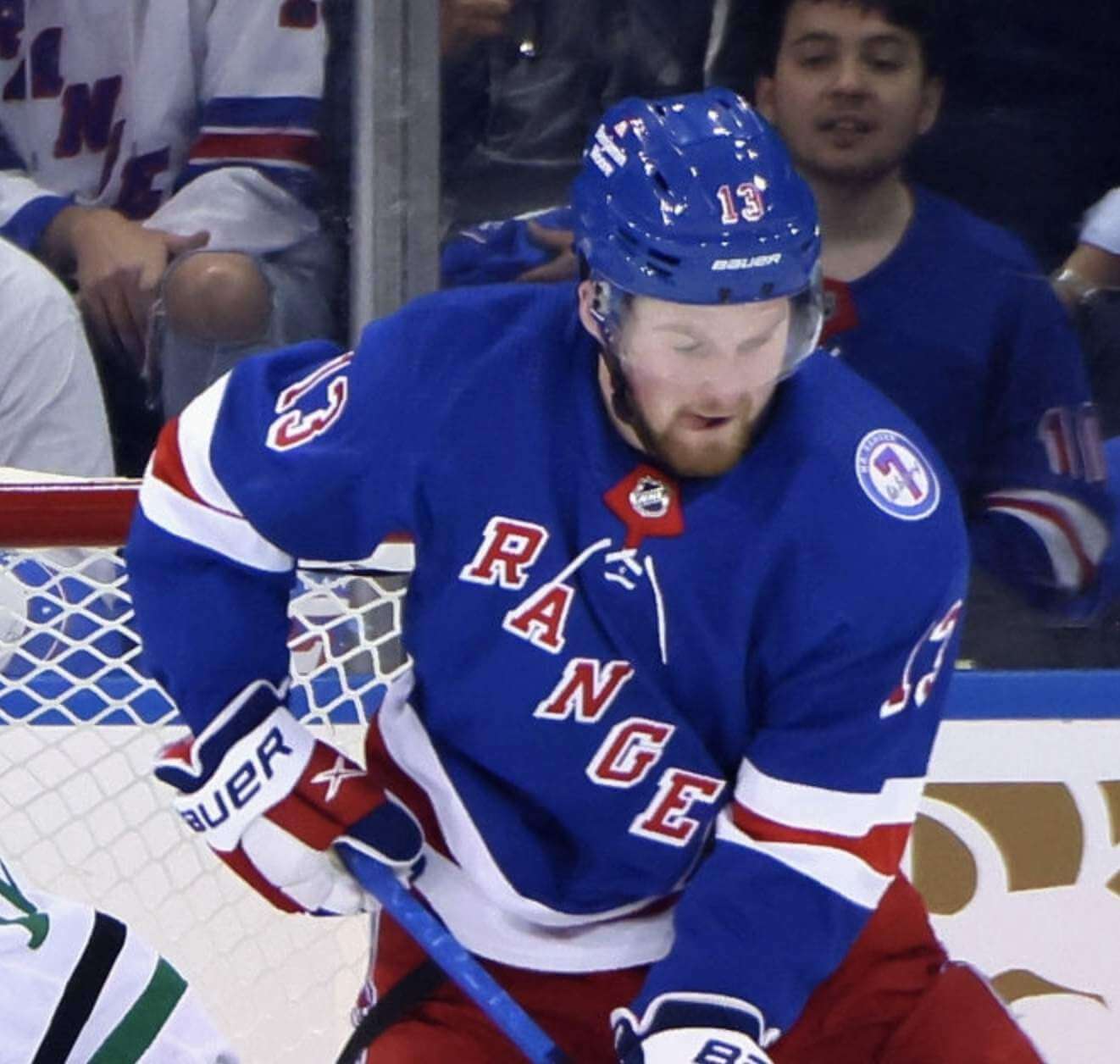
We also got our first look at how the Gilbert memorial patch looks on the team’s home uniform:
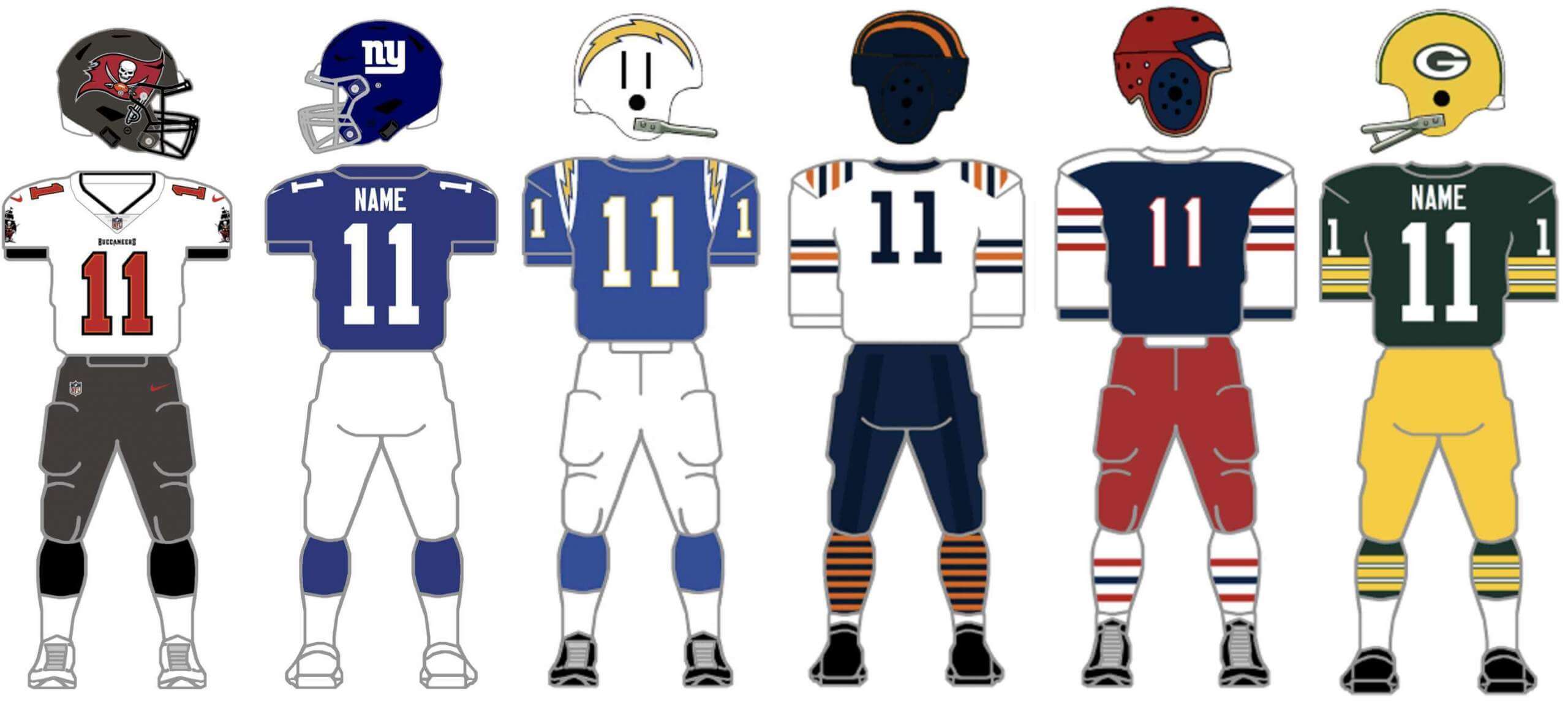
ITEM! New Bulletin article: For many years now, I’ve been singing the praises of the mighty Gridiron Uniform Database. For my latest article on Bulletin, I have an interview with one of the GUD’s honchos, Bill Schaefer, who creates all of the uniform mock-ups that appear on the site. We talked about how the GUD got started, he research methods, his “white whale,” his goals for the site’s future, and a lot more.
Those of you who’ve subscribed to receive my Bulletin content via email should already be seeing this piece in your in-boxes. Everyone else can read it on my Bulletin page. Enjoy!
Click to enlarge

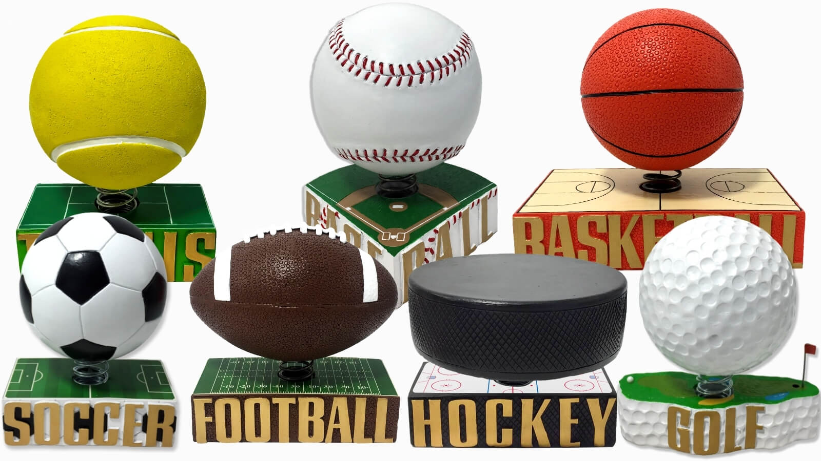
ITEM! Bobbleball raffle: Did you know that tomorrow is National Sports Day? It’s true! (Yes, it’s also silly.) Okay, so pretty much every day is National Sports Day in America, but whatever. The Bobblehead Hall of Fame is celebrating this momentous occasion by releasing a series of seven limited-edition bobbleballs. What’s a bobbleball? This:
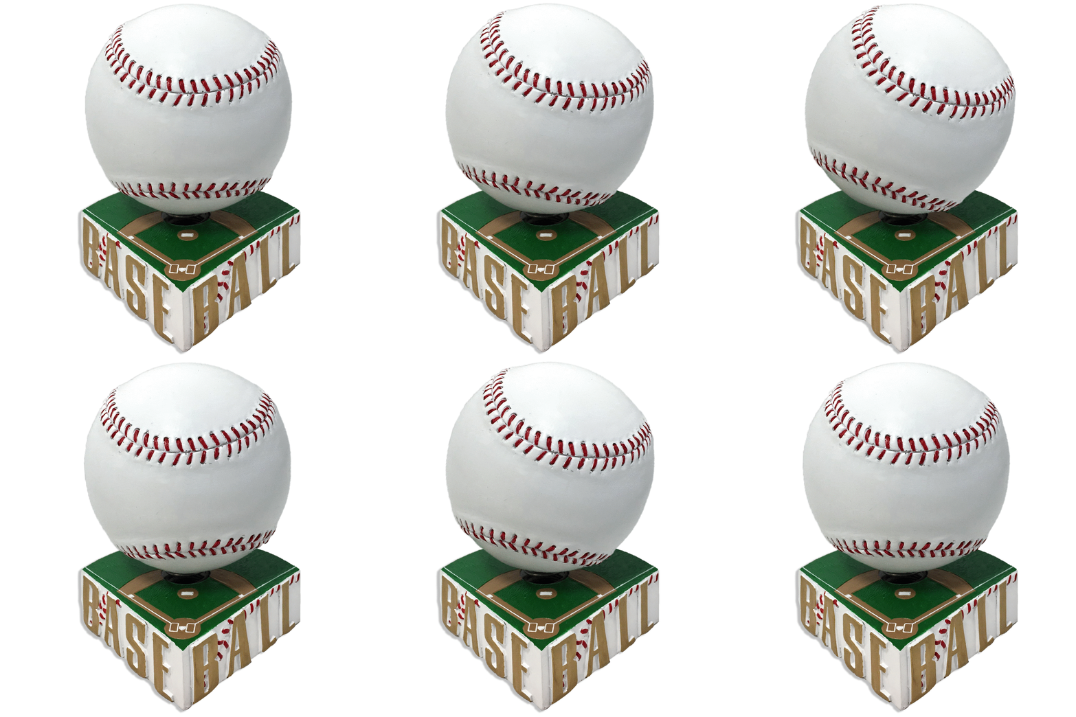
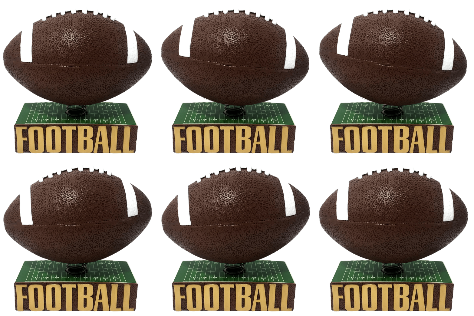
The Bobble Hall of Fame is generously allowing me to raffle off one of the bobbles to a lucky Uni Watch reader. The winner will be able to choose from any of seven bobbles shown at the top of this section.
This will be a one-day raffle. USA addresses only. To enter, send an email with your mailing address and your preferred bobble prize, to the raffle in-box by 9pm Eastern tonight. One entry per person. I’ll announce the winner on Monday. Big thanks to the Bobble Hall for sponsoring this one!

That time of year again: The Tugboat Captain and I went to get our annual flu shots yesterday. I’ve said this before but it’s worth repeating: Getting a flu shot is always a good idea — not just because it helps to protect you, but also because it helps build herd immunity that protects all of us. In my case, I happen to have asthma, so the flu could literally kill me. Getting your flu shot helps lower the risk for me, and for others with chronic respiratory disorders. If you’ve already gotten your shot, thank you! If you haven’t, I hope you’ll consider doing so soon. Vaccines work!
The Ticker
By Anthony Emerson

Baseball News: Reader Dustin L. Meador stumbled across some amazing footage of Japanese baseball from the 1920s and ’30s, courtesy of the University of South Carolina’s library. Most notable is this footage of the 1934 USA visit to Japan, but this Reddit thread has a treasure trove of cool details. … Smithsonian magazine has an article on the history of Latin American baseball and softball in the US, with a strong emphasis on the uniforms (thanks, Phil). … The Rakuten Monkeys of Taiwan’s CBPL have unveiled a very…colorful new jersey that will be worn for their “Music Festival Theme Nights” next week (from @ColHapablab).

NFL News: Washington, which hasn’t issued No. 21 since DB Sean Taylor’s death in 2007, is now retiring the number. It will be only the third retired number in franchise history. … The NFL Films Twitter account has a great mini-documentary about 1970s tearaway jerseys (from J.A. Scott). … Purple jerseys and white pants for the Ravens this week (from Andrew Cosentino).
College/High School Football News: DB Jermaine Waller will wear Frank Beamer’s No. 25 for VT tomorrow (from Andrew Cosentino). … Here are this week’s uni combos for Florida, Syracuse, Troy, TCU, Illinois State, UNC, Michigan State, Mizzou, Washington State, Kentucky, UCF, Purdue, Virginia, and Tennessee (thanks to all who shared).

Hockey News: Habs goalie Sam Montembeault appears to still be wearing his Panthers mask. Also, it looks like his NOB lettering is a bit thinner than the Canadiens’ standard (from Mike Engle and Moe Khan). … On Wednesday night, the WHL’s Victoria Royals wore 1960s Night jerseys, designed in greyscale to mimic how they would look on black-and-white TV (from Wade Heidt). … Also from Wade, the BCHL’s West Kelowna Warriors have introduced a new black alternate sweater. … The Mile One Centre in St. John’s, Newfoundland, home of the ECHL’s Newfoundland Growlers, has a new corporate name (from Ted, who didn’t give his last name). … New helmet advertiser for the Wild (thanks, Phil). … On the other hand, no helmet ads last night for the Coyotes or Sabres.

NBA News: New Jazz owner Ryan Smith has confirmed that the team will be making some brand changes in the near future, with a new focus on “black and white.” In that linked article, The Salt Lake Tribune speculates on what some of the changes could be based on updates to the team’s practice facility and its social media graphics package (thanks to all who shared).

College/High School Hoops News: Oh man, check out Smyrna (Del.) High’s 1972 uni — not only is it sleeved, but check out those stripes! The socks are nice, too (from Mike Williams).

Soccer News: Rumor has it that the new Saudi owners of Newcastle United are seeking to end Newcastle’s shirt ad deal with a betting company, as Saudi Arabia outlaws gambling (from Kary Klismet). … Also from Kary: Bundesliga side Mainz 05 has already revealed next season’s away kit after holding a fan vote to decide the design. … One more from Kary: Chicago’s Revolution Brewing Co. is releasing a beer called Hazy Pitch that features Chicago Fire FC’s new logo and colors. … Electronic Arts has filed trademark applications in the US and UK for “EA Sports FC,” leading to speculation that that may be the new name for the FIFA video game series (from Trevor Williams).

Grab Bag: The U.S. men’s field hockey team hadn’t played since February 2020 until yesterday. They wore their new kit for the first time, featuring navy blue shirts and shorts and royal blue socks and base layers. “I think the royal blue items might be borrowed from the indoor team, which actually wears royal blue,” writes our own Jamie Rathjen. … Great Britain’s National Portrait Gallery website has a fascinating article on the development of the naval uniform and its effect on men’s fashion in the 18th century (from Kary Klismet). … Also from Kary, here’s a story about the Air Force Uniform Office at Wright-Patterson Air Force Base, which designed the Space Force’s new dress uniforms. … One more from Kary: UConn’s student newspaper held a correspondent roundtable to discuss the best athletics logo in school history. … The Netflix drama miniseries Clickbait features a shot of a volleyball team wearing jerseys with the players’ name on the front of the jerseys (from Chris Mycoskie).
And that’s a wrap for this week. Enjoy Phil’s weekend content, stay well, and I’ll see you back here on Monday with MMUW — and the NBA Season Preview! — Paul
Missing link on Kary’s contribution re Space Force dress uniforms in the Ticker’s Grab Bag.
Now inserted. Here’s the proper link, so you don’t have to scroll back up:
link
Hyperlink issue in 2nd paragraph:
But here’s the thing: If you look at link career,
Fixed.
Washington’s team president Jason Wright apologized to fans for screwing up the Sean Taylor number retirement celebration mentioned in The Ticker by providing such short notice of it. link
His tweet: link
The 4 letter network has an interesting infographic for anyone wanting a condensed Stanley Cup history.
link
OMG, that site is sooooo cool.
Got my flu shot last Tuesday and booster same day. No problems. Sore on both overnight. Today happy.
Just what the NBA needs, another team with black.
Black, white, and yellow (mentioned in an article I read somewhere last night) can sometimes work, like Columbus of MLS. Or all of Pittsburgh. But I can’t see it working for the Jazz. Going back to their music note logo and uniform a few years ago was the perfect move, though it still doesn’t make any sense in Utah. There’s too much team history to make that drastic of a color change.
I didn’t realize that NBA teams still had “official” colors. I thought they just made up new uniforms without regard to what the colors actually are.
Lee
Maybe we’re looking into the Rangers tribute jersey too much. It looks like they simply put together a current template for the occasion, like those framed ones given to former coaches or honorees. The Lakers can’t even use the proper fonts in their retired numbers.
Well, yes. But if they made the conscious choice to use white, why not also make the choice of straight NOBs?
I’m guessing they used up their creative energy choosing to wear white to stand out from the normal look and forgot about the NOBs
I kind of liked the Rangers’ blue-white-red-blue combo; it had a real Miracle on Ice feel (except for the blue socks, of course). That team wore blue buckets with both the white and blue jerseys.
Love that look. I wish more teams wore colored lids with their white sweaters.
OHL’s Kitchener Rangers have worn very similar uniforms as the New York Rangers for years and years. They have 2 different helmets but neither white. Wear blue helmet with blue jersey, but go red helmet with white jersey.
link
That combo looks really good!
Love The Captain rocking her cool flu shades!
We biked over to the pharmacy, and it was a really sunny day, so she wore her prescription sunglasses. She didn’t bring her regular glasses and is basically blind without the Rx, so she had to keep wearing the shades indoors!
The exact same thing happened to Holly at the store the other day. I know it’s not night time, but I still feel shades of Cory Hart.
Prescription sunglasses for the win. I love having mine for driving.
“The Netflix drama miniseries Clickbait features a shot of a volleyball team wearing jerseys with the players’ name on the front of the jerseys (from Chris Mycoskie)”
Proofreading: the hyperlink takes me to a Twitter log-in page rather than the article described.
Fixed. Here’s the proper link, so you don’t have to scroll back up:
link
Hmmm, so the Wild has a “Helmet entitlement partner.” That’s a new one to me! How many different euphemisms are there for helmet advertisers?? Ugh!!
Absolutely loved the Bill Schaefer interview!
Thanks, Mike! After a few months of Bulletin-ing, I’m pleased with how it’s shaped up primarily as a forum for interviews. Hope you’re pleased as well!
I actually really like that Rangers look with the white jersey and blue helmet and socks. It shows off all three of their colors (blue, red, and white) about equally, and I like that effect.
It’s been decades since I covered women’s volleyball for the college newspaper, but IIRC the team name was on the back of the jerseys and the player name on the front. I don’t have any photos to check my memory with, though.
Am I the only one that kind of likes the grayscale jerseys throwing back to black and white TV? Very cool IMO
Paul:
Any rhyme or reason for choosing those 6 GUD mockups as the banner for the Bulletin article (which was an insightful and enjoyable read…kudos!)?
WFT will be wearing their fauxbacks when they play the Chiefs in a rare match-up…that’ll be just their 11th meeting.
Completely random. Was just looking for designs from a variety of eras, in a variety of colors.
If you think about the Gilbert NOB, it seems harder to do vertical arching than straight across. So they put in extra effort to get it incorrect. I may be in the minority, but though I usually love vertical arching, I never liked it on the Rangers. Of course I am probably biased, because I grew up with straight across names for them. The Knicks should be the team at MSG with vertical arching.
Counterpoint:
It’s not Gerry Cosby anymore lettering the jerseys. It’s a spot in Rockford, IL called “Exclusive Pro Sports.” They JUST got the gig. Even if all the laser cuts are by computers these days, it’s probably easier for the Rangers to say “Make us 25 ‘Gilbert #7’ white jerseys in all the sizes.” Then EPS produces the Gilbert jerseys just like Rangers standards.
If it were Gerry Cosby down the street from Madison Square Garden, I’m sure they would have had the straight names in the library and would have done it that way.
Regarding the use of the white jersey and arched lettering for the Gilbert tribute, my best guess is that they were trying to replicate his retired number banner which they had lowered from the rafters:
link
Agreed
I noticed in the clips MSG used in their pregame tribute to Gilbert that the Rangers’ white sweaters in his era had NOB but the blue ones were NNOB. Was this common in the NHL? The clips seemed to be from later in his career so it would have been white at home and blue on the road, if that matters.
I’m not sure, but my guess is the clips were not all in chronological order. The Rangers seemed to have been NNOB into the early 1970s, then probably went NOB for both blue and white at the same time.
Can’t remember when the NHL swapped the sweaters (dark for home, white on the road), but it wasn’t uncommon. According to NHL uniforms, the mandate to have NOB only began with the 77-78 season; their database shows the 76-77 season with most teams only having NOB on the white sweaters, if at all.
I was way off on this. It seems the Rangers had NOB only on the white (home) jerseys from 1970 through 1976. NNOB on the road jerseys during this time. This seems backwards as you would think the road jerseys would require the names more than the homes.
link
The Sharks wore retro helmet decals for practice yesterday, and wore team logos on the helmet during the preseason. They don’t play their first regular season game until tomorrow, but I’ll be interested to see if they join the no-advertiser group.
link
Interesting article about KU basketball. link