By Phil Hecken & the SMUW Crew
Follow @PhilHecken
Good Sunday morning Uni Watchers. Hope everyone had a good Saturday.
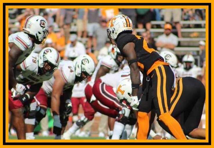
The University of Tennessee Volunteers broke out all-black uniforms yesterday, which they refer to as “Dark Mode,” just another in a long line of BFBS uniforms.
Or is it.
Well, of course it is, but there’s kind of a weird backstory to how these came about. But before the story, let’s take a look at the uniform, and forgetting for a moment that black is not an official Tennessee color, how’s it look as a uniform?
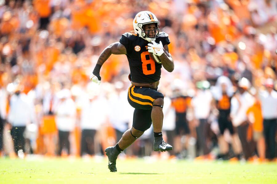
The first thing you’ll notice is the helmet is white. Most (although certainly not all) times a team goes BFBS, they wear a black helmet. UT did modify their regular white shells to add black accents (helmet stripe, Power T outline, cage), which at least brought some black to the white hat.
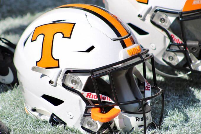
This made the uniform look a bit more, well, unified, but still, not a great look for a “dark mode” uniform.
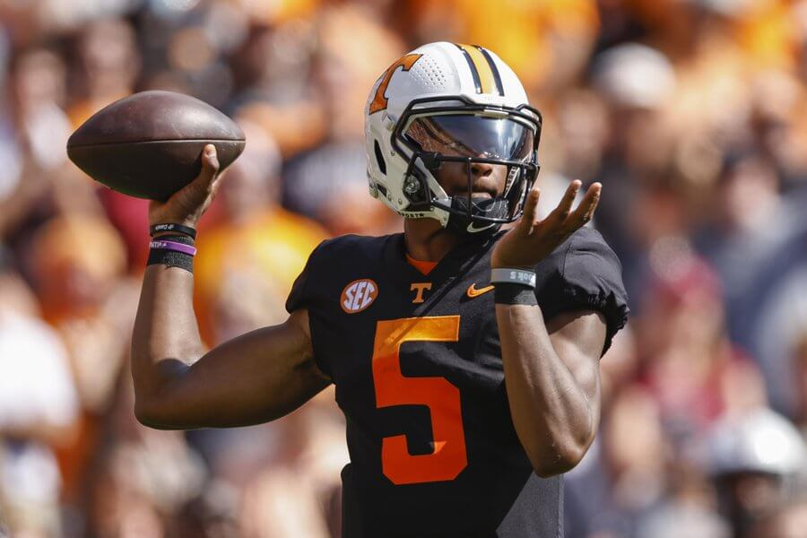
So why didn’t they wear a black helmet? Well, as you may have heard, COVID-19 has caused a disruption in pretty much every supply chain, and helmets haven’t been spared. It turns out the team wanted to wear black shells, but they simply couldn’t be delivered to the team in time. So, with the uniforms ready, and a coach who’s hell-bent on introducing new unis, the team went ahead with the white helmet and black accents to pair with the all black uniforms.
Now, as a uniform — I actually love the all-black part (although it’s NOT what I think of when I think of Rocky Top), but I wish they’d have waited for the black shells. There’s just something about a mono-black uniform (or even black britches) that doesn’t look right unless paired with a black helmet. They did the best with what they had … but we’ll just have to wait until likely next season to see a return of the “dark mode” with a black lid.
And now, I’ll turn it over to TJ with the rest of your…
Sunday Morning Uni Watch
by Terry Duroncelet, Jr.
From Thursday:
• Tulane wore their all-blue uniform against Houston. Last time they wore this against the Cougars, it was a smashing success. This time, not so much. Ah well, at least they looked good. Also, get a load of Freshman RB Charles Schibler’s (#44) jersey numbers; they got a little bit of Anime Eye Syndrome going on there.
From Friday:
• Remember these helmets that Arizona State wore last week against UCLA? Here they are again, featuring Dante from the Devil May Cry series this DOPE graphic. It’s in recognition of Hispanic Heritage Month/Week (closer look, via Blaise D’Sylva).
• Pinktober decals and other doodads for Florida International.
From Saturday:
• Sweet Homecoming throwbacks for Florida!
• Troy wore TSU (Troy State University, its former name from 1967-2005) decals on Saturday against Georgia Southern. This marks the first in 18 years that the TSU logo has appeared on the helmets (closer look, with thanks to Blaise D’Sylva, of course).
• BYU wore all-navy against Boise State. I don’t know what it is about BYU, but they’re a team that can make mono-anything look good (just so long as they don’t go BFBS). Boise State on the other hand … *sigh*
• Pinktober decals for Nevada.
• The Scarlet Knights truly living up to their name. I’m about it.
• Kent State decided to play along as well.
• North Texas with the throwback helmets against Mizzou.
• Okay Tulsa, you have my attention… and I like what I see.
• Texas Tech with a retro look against TCU. Not to harp over a maker’s mark, but I dig the older UA logo more than the current one (closer look at the details).
• I don’t mention Ivy League much, but PENN wore a fun helmet stripe against Lehigh (closer look).
• South Alabama wore rad helmet decals modeled after their mascot, SouthPaw (closer look). More of this, please (no good game photos showing it on display tho, sadly).
• Throwbacks for HOLY TOLEDO! yesterday against Northern Illinois.
• Throwback helmet decals for Ball State (closer look).
• Ole Miss in light blue tops against Arkansas.
• Utah wore an all-white version of their popular hybrid retro unis against USC. I can dig it, as well as the general idea of a “composite throwback”, if you will. A “Best Of” album, but in uni-form. I know Penn State did it four years ago, and the Cleveland Browns currently have their original AAFC unis with their 1959/1960 helmets (although that’s more out of necessity), so I don’t see why this avenue can’t be explored more. They also wore helmet decals in honor of Aaron Lowe and Ty Jordan.
Thanks, TJ! Ok, now on to the rest of your SMUW, beginning with the five ‘n one…


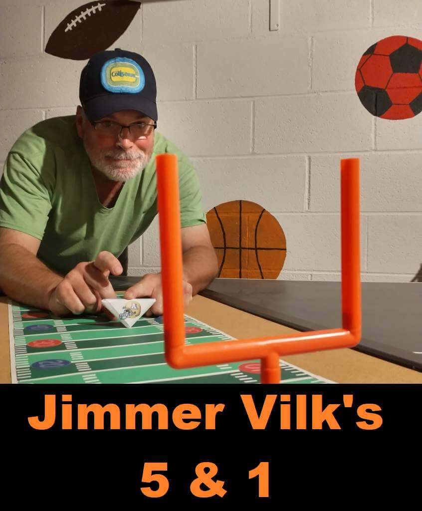
Jimmer Vilk’s 5 & 1
After more than a decade in hiatus, the original “5 & 1” decider, Jim Vilk, has returned! Jim began doing the 5 & 1 many years ago, followed Catherine Ryan, Joe Ringham, Michael “Memal” Malinowski, and several guest pickers. Once again, Jim will pick HIS 5 best looking/1 awful matchup, and occasionally have some honorable mentions (both good and bad). You may agree and you may disagree — these are, after all, just opinions and everyone has one. Feel free to let him know what you think in the comments section.
If you have a game you feel is “worthy” of consideration for the 5 & 1, please either post it in the comments below or tweet Mr. Vilk @JVfromOhio.
Here’s today’s 5 & 1:
A long time ago I used to talk about two types of contrast: maximum and optimal. They’re not always the same. Maximum is the highest quantity of any given thing, while optimal is the highest quality of said thing. In other words, more isn’t always better. I believe this applies to uniform matchups as well as to life, as you shall see.
Honorable Mentions to
Buffalo/Kent State
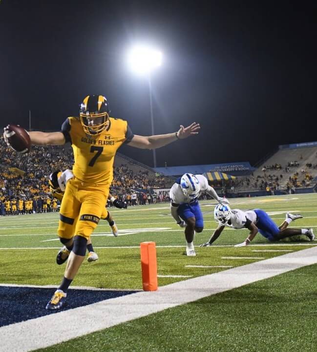
“That’s gold, Jerry…gold!”
and
UCLA/Arizona
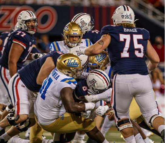
Apologies to Phil for making him wait for this late night delight.
5. Ball State/Western Michigan
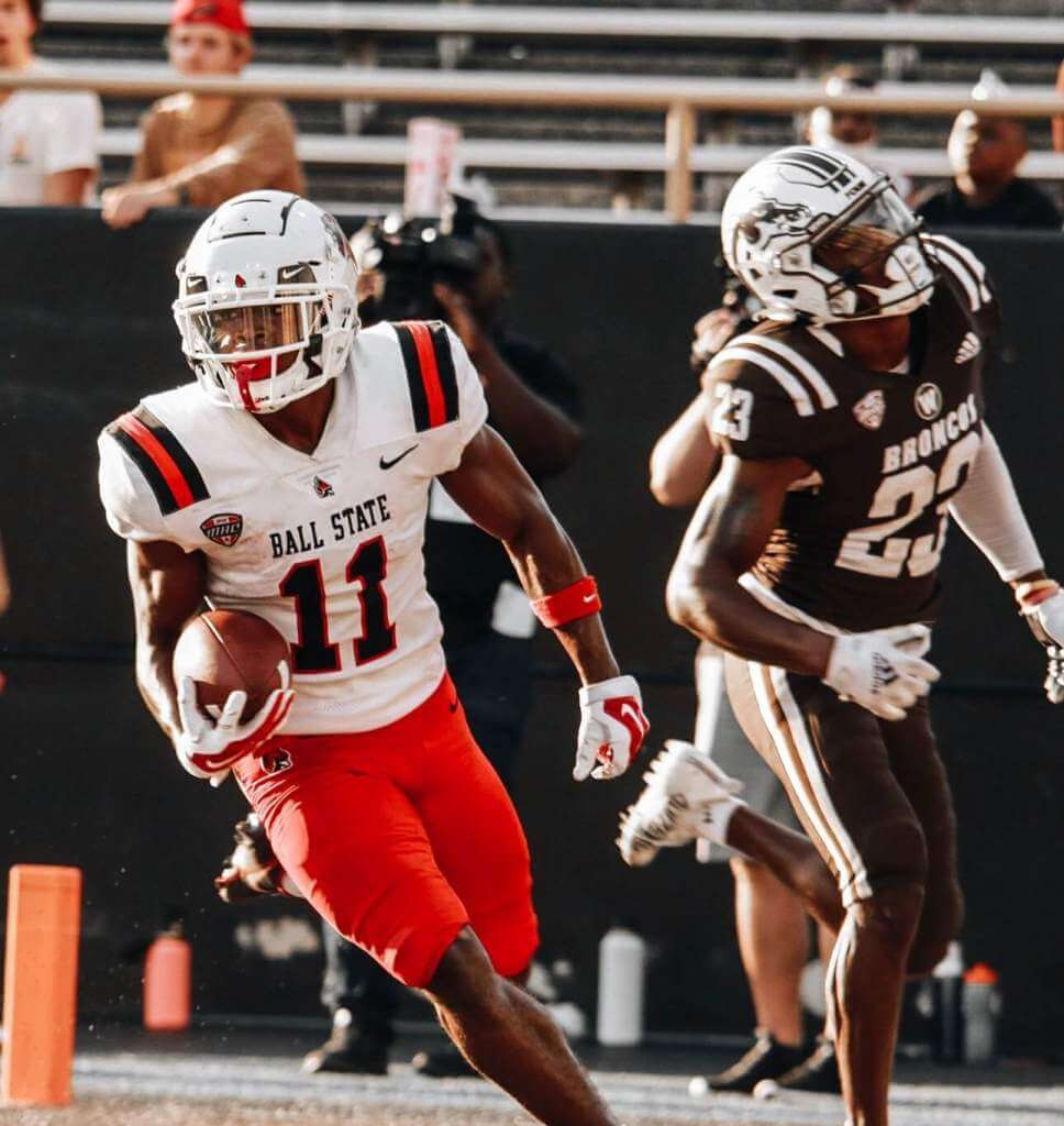
Lots of stripes, lots of brown, and a realistic cardinal logo!
4. Oklahoma/Texas
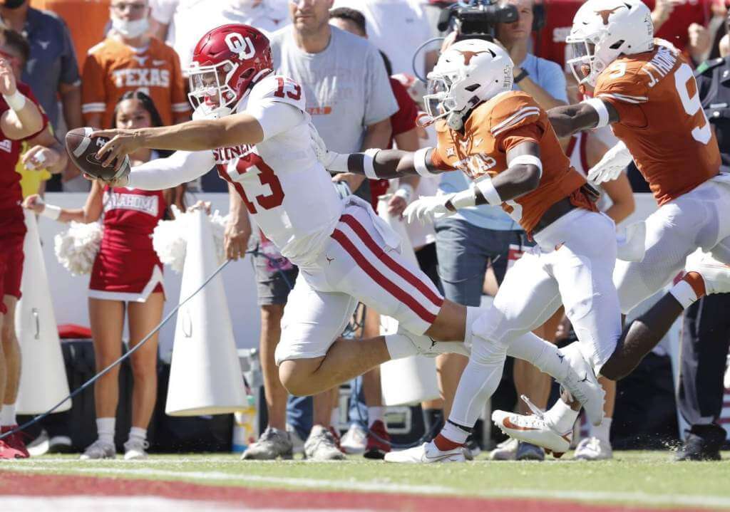
Wasn’t much of a stretch to pick this classic.
3. Wyoming/Air Force
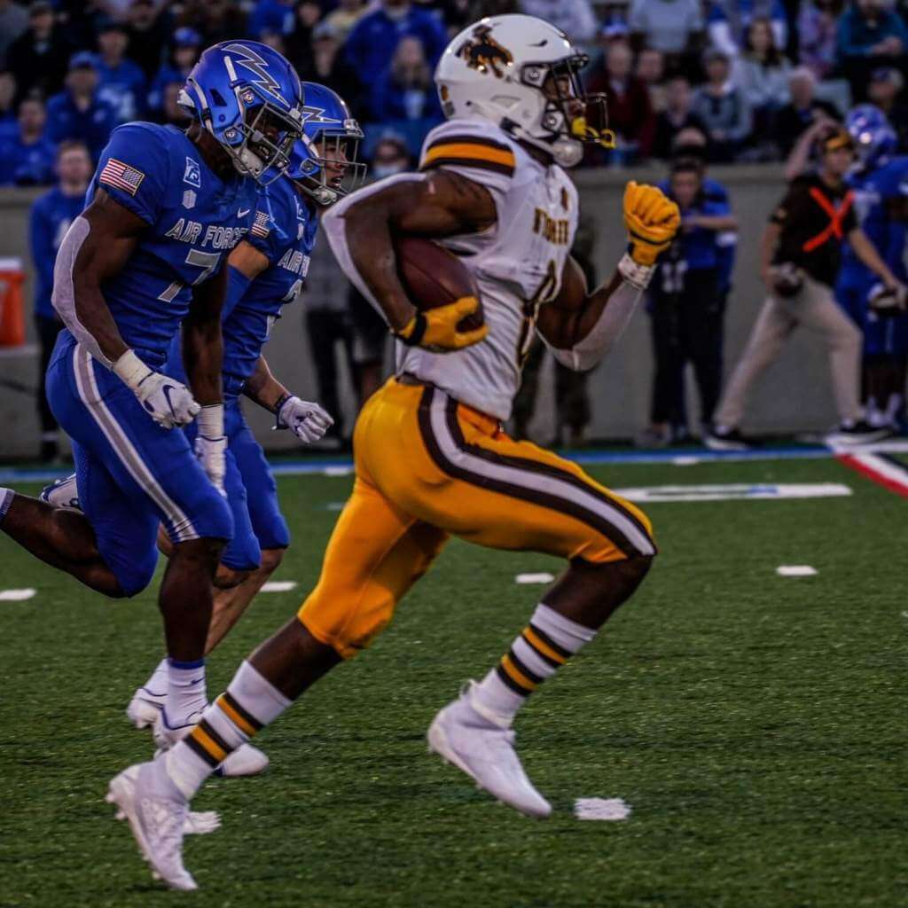
One of my favorite mono unis vs one of my favorite unis, period.
2. SMU/Navy
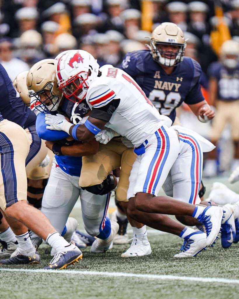
This one falls somewhere between good and optimal contrast.
1. Vanderbilt/Florida
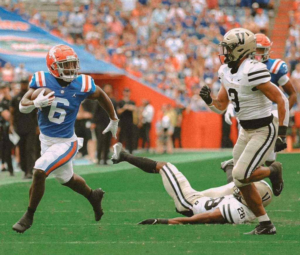
Love the blue, love the stripes, and love that Vandy looks as good as Purdue used to/should.
Dishonorable Mention to
Boise State/BYU
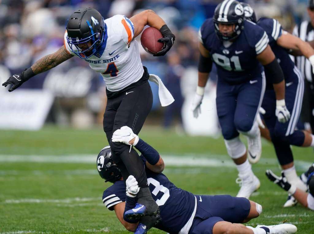
BFBSU vs…does the Y stand for Yankees with that shade of blue?
&1. Coastal Carolina/Arkansas State
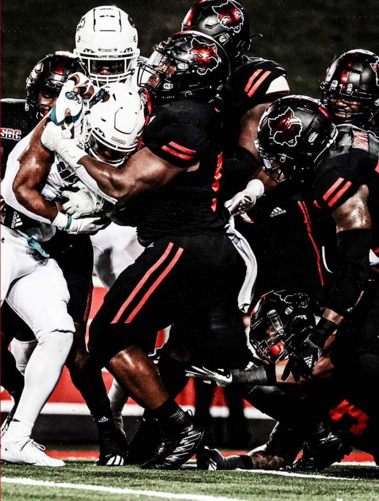
A textbook case of maximum contrast not equaling optimal contrast.
Thanks, Jim! OK readers? What say you? Agree or disagree with Jimmer’s selections? Let him know in the comments below.


NCAA Uni Tracking
Uni Watch will again track the uniform combinations worn by the “Power 5” conferences. All of the 2020 trackers are back!
We’ve got Rex Henry (tracking the ACC), Dennis Bolt (tracking the PAC-12), Kyle Acker (tracking the B1G), and Ethan Dimitroff (tracking the Big XII AND the SEC). Rex, Dennis, and Kyle and are all returning from 2015, and Ethan is back after joining the NCAA Uni Tracking a couple seasons ago. Ethan will continue to track the SEC, and has swapped the B1G for Big XII (with Kyle).
Here are the Uni Trackers for the Power 5 Conferences (along with each tracker’s info):
Rex is up first today (ACC):
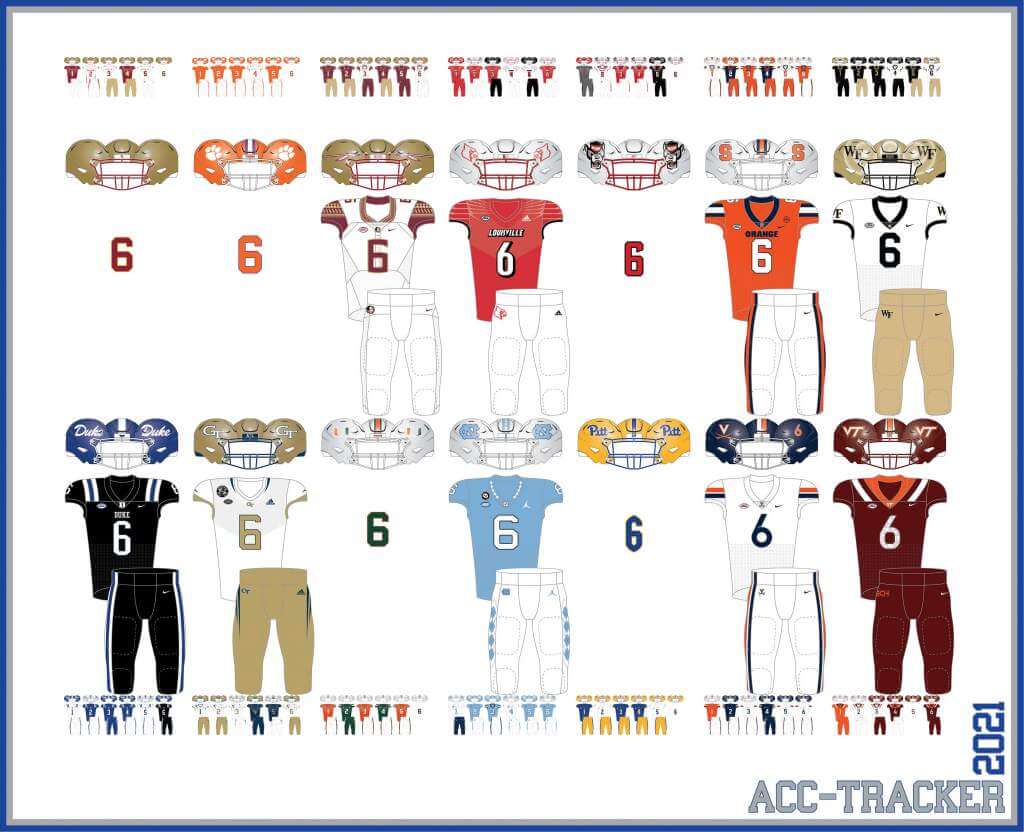
ACC
More Here.
Follow Rex on Twitter here.
And now, here’s Dennis with the PAC-12:
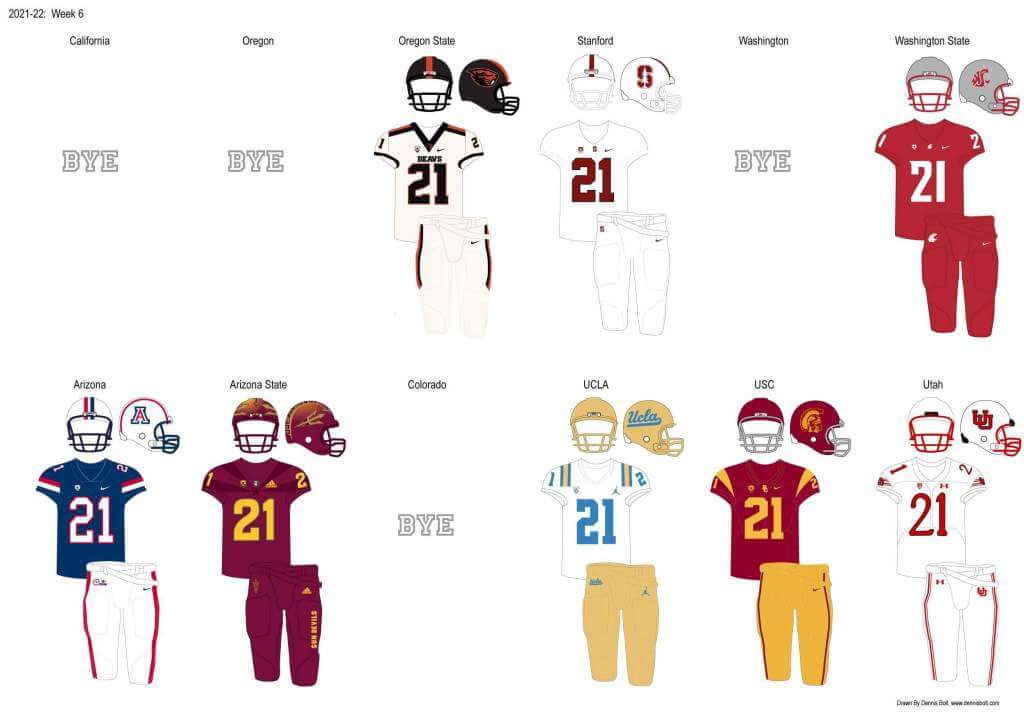
PAC-12
More here.
Follow Dennis on Twitter here.
And here is Ethan, with the SEC:
SEC
And be sure to check out Ethan’s WVU Mountaineer Tracker.
Follow Ethan on Twitter here.
And here is Kyle with the B1G:
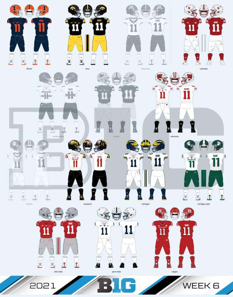
B1G
Follow Kyle on Twitter here.
And here’s Ethan with the Big XII:
Big XII


Bye-Week Duck Tracking

The Oregon Ducks were idle this weekend, but that doesn’t mean Duck Tracker Dennis Bolt took the weekend off. Nay, he was busy with some past-years tracking and here’s what he sent me yesterday:
To fill my duck time I did a look back at 2001 and 2011 duck uniforms and how they fit into the arc of Oregon uniforms since the great 1999 rebrand that started this all. Both seasons were great and had important milestones in Ducktracking. Joey Harrington in his wide stripes that went from ankle to armpit all the way up to LaMichael James and DAT. Shoulder wings 1.0 and 2.0 and chrome helmets and saying goodbye to the vaunted mallard green helmet with yellow O…
Check out his blog post right here.
Thanks, Dennis!


MLB Playoff Uni Tracking
It’s BAAAAACK.Alex Rocklein has been tracking the jerseys of all the teams involved in the MLB Post Season for the past several seasons. Every team has now played two games in the AL or NL Division Series. Although he sent me this graphic before all the games were completed, the graphic is correct for the jerseys worn (click to enlarge):
Here’s the full tracker (which will get filled in as we go through the NLDS/ALDS, NLCS/ALCS and World Series):
I hope you guys enjoy this annual feature and you’ll thank Alex for all his effort with a quick “Thanks” in the comments below! Look for this feature every weekend until the World Series is complete!


Click to enlarge
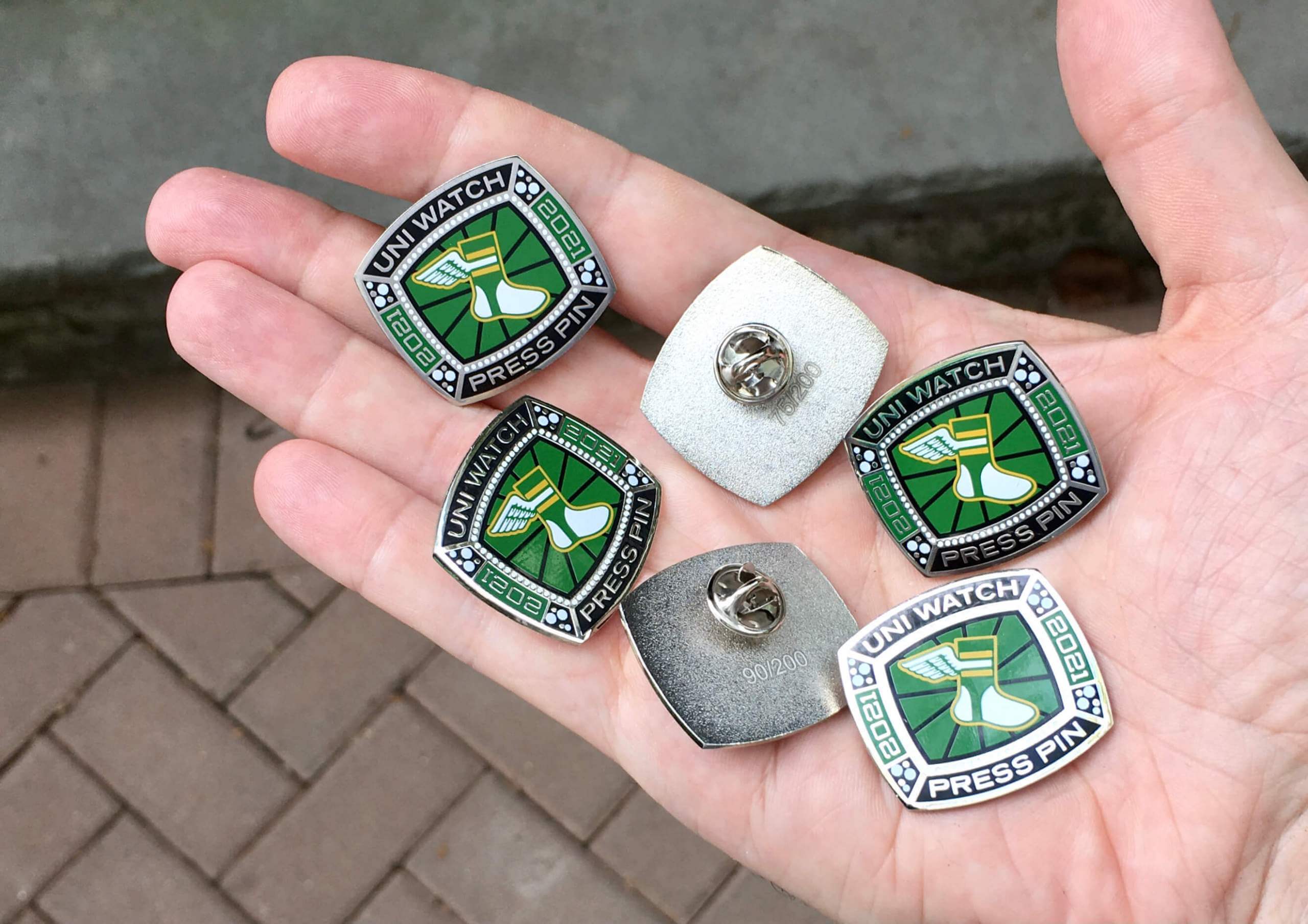
Press Pin reminder (and bobble sale): Paul here. In case you missed it on Friday, the annual Uni Watch Press Pin is now available. This pin is not part of the monthly Pin Club series (and you do not have to purchase it in order to qualify for the Pin Club’s “Collect ’Em All” bonus prize) — rather, it’s an annual pin that Todd Radom and I do each October to coincide with the MLB postseason, inspired by the rich history of World Series press pins. The idea is that everyone in the Uni Watch comm-uni-ty can legitimately wear our Press Pin, because you all contribute information, feedback, and knowledge that helps me do my job of covering the uni-verse.
As you can see above, this year’s Press Pin is based on a championship ring. Since many sports rings these days are either white gold or platinum, we went with a silver-tone finish instead of gold. Here’s a closer look (click to enlarge):
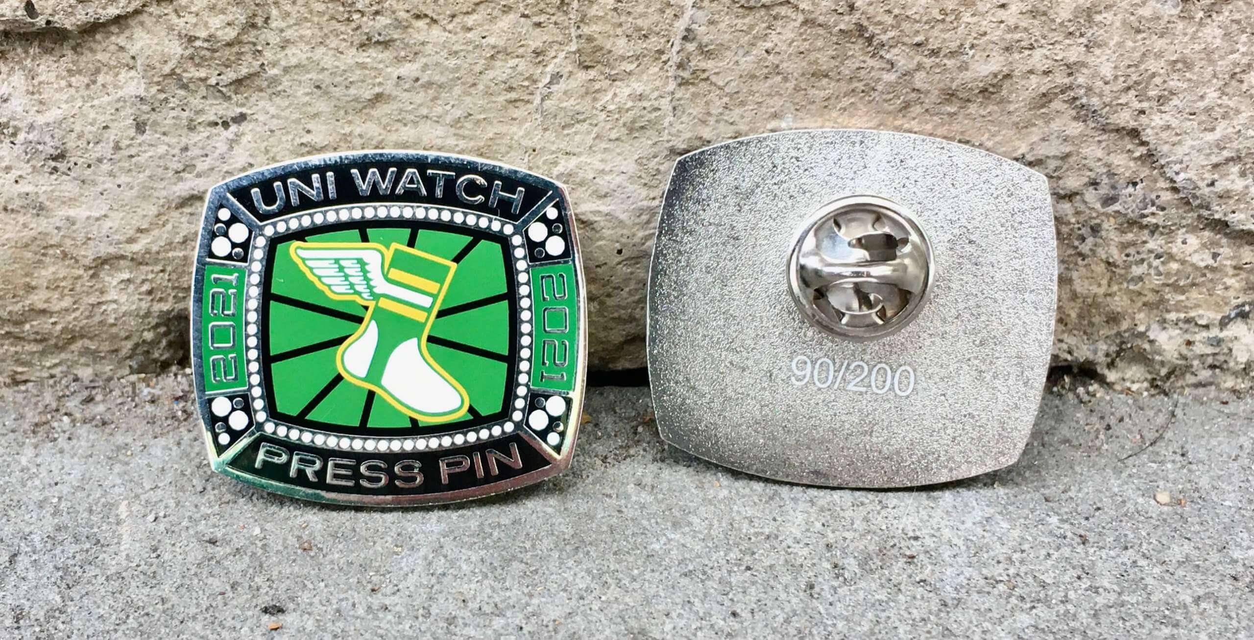
This pin was produced in a numbered edition of 200. It’s available here while supplies last. The 2019 and 2020 Press Pins both sold out quickly, so get this one while you can!
In addition, it turns out that I manufactured too many of our September bobble-pins. But my misjudgment is your gain, because I’ve now reduced the price on that pin from $13.99 to $9.99. It’s available here. My thanks, as always, for considering our products!


Uni Watch News Ticker
By Phil

Baseball News: Starting off with the CPBL: Lion and Ying Ying are showcasing the Kamen Rider uniform for the Uni-Lions upcoming Kamen Rider theme nights on October 16-17 (from Jeremy Brahm). … With the Sawx and Rays knotted at a game apiece, there will be a game 4 at Fenway on Monday. So, will they bust out the yellow/powder CC uniforms? … Dave Cataldi “Saw some unique unis at the Breaking Boundaries exhibit at the Indy Children’s Museum. The A in the middle of the ABC’s jersey is interesting, and I the circle logo for South Bend women’s team.” … What if baseball teams wore football helmets, and their coaches (manager) gave out pride stickers? (from Chad Jorgenson). … Once again Ed Kendrick has compiled MLB uniform tracking for TEN MLB teams (Arizona, Atlanta, Baltimore, Boston, Cincinnati, Houston, Miami, Milwaukee, Minnesota & San Diego). Nice work Ed!

NFL News: How do you turn a “football” stadium into a Football Stadium for American Football? (from Jeremy Brahm). … This is pretty cool — a graphic of all of Aaron Rodgers’ touchdown passes by receiver, including postseason (from Timmy Donahue). … If you like head-to-toe mono, SNF is for you: Bills (all white) vs. Chiefs (all red). … The Miami Dolphins will be in white/aqua/white today vs. the Bucs. … Jets will be in green/white/green this morning in London against the gradient Falcons. … If the Chargers and Rams end up hosting the AFC and NFC championship games, the NFL surely would dust off its Sunday-Monday plan from 2008, when the Jets and Giants were poised to possibly host both games in New Jersey. … ICYMI: Here’s a very cool graphic showing the progression of Eagles uniforms over the years. … The Las Vegas Raiders have installed a new video board on the exterior of their stadium to show game highlights to drivers on nearby Interstate 15 (from Kary Klismet). … Taima, the Seattle Seahawks’ live hawk mascot, landed on a fan’s head during their game against the Los Angeles Rams on Thursday night (also from Kary).
College/High School Football News: Have you ever seen an “Est.” helmet decal before? Mike Miller hasn’t either. It’s from Mason High School in Ohio. … ESPN has a feature on the University of Idaho’s Kibbie Dome, which it calls “college football’s weirdest stadium” (from Kary Klismet) … The website NJ.com is holding an online competition to determine the best high school football helmet in New Jersey (also from Kary). … Looks like the Florida Gators have a blue/orange/blue combo (no idea if/when it will be worn). From Gator Uniform Tracker.

Hockey News: I’m not particularly a fan of the GFGS (anthracite?) on this ASU hockey uniform, but Jason Lefkowitz is a fan: “Great color, Fork on the helmet, Captain C inside state and the silhouette of the flag on the sleeves.” … Junior “A” BCHL Penticton Vees threw it back during their regular season opener Friday night (from Wade Heidt). … Also from Wade, check out this pic of Brett Hull in Cooperalls(!) and a Koho bucket. .. The Langley Rivermen will be wearing helmet stickers this year to honor their teammate Ronin Sharma who tragically passed away in August (from Wade, again). … Interesting: the Buffalo Sabres went with their gold buffalo secondary logo on their helmets for yesterday’s preseason finale instead of the (Verizon) ad (from @jeffreybigmoney). … New sweaters for UCLA Hockey (from Seth Hagen).

NBA News: Looks like the new Chicago Bulls jersey has leaked (since it originated from the respected @camisasdanba account, it’s probably legit). … The Dallas Mavericks are introducing a new court design that features the names of player who has played a game for the team (from Kary Klismet).

Soccer News: The San Jose Earthquakes will celebrate the 20th anniversary of their first MLS Cup championship in 2001 by giving away commemorative championship rings to fans (from Kary Klismet).

Grab Bag: The Oklahoma School for the Deaf, which changed its team names to the Bison earlier this year, has unveiled new athletics logos (from Kary Klismet). … New logos for the Pacific Northwest Ski Association (from Kary again). … Derby (Ks.) High School commissioned a local artist to paint a mural of its Panther mascot above the school’s trophy case (also from Kary). … FIVB has rebranded its beach tour to be called the Volleyball World Beach Pro Tour (from Jeremy Brahm). … Also from Jeremy, the NEC Red Rockets (a volleyball team) introduced their new mascot with the rebranding, Captain Steam, on Friday.


And finally… that’s all for today — and for me for the weekend. Thanks, as always, to the SMUW crew for all their efforts, and to Alex for the MLB Playoff Tracker.
For many of us it’s a long weekend — so Happy Indigenous Peoples Day, or Columbus Day, or to our friends up north, Happy Thanksgiving to anyone celebrating. Even if you don’t have a day off from work, still have a good Monday. Enjoy the NFL today (it’s a long day, with the Jets & Falcons kicking off this morning in London) as well as the MLB playoffs.
I’ll catch you all next Saturday.
Peace,
PH
The Penn State hybrid retros are worn annually. The jersey numbers and contrasting trim are interesting, but everything else is a downgrade. White shoes?! They wore them ONCE and they lost a National Championship game. I’m not on board with Barry Krauss fan service.
I also thought the white shoes only happened because they couldn’t get black turf shoes on short notice.
It was a “reward” to the players for going undefeated in the regular season. The folklore is the players felt outdated in black shoes.
Following the loss, white shoes were never worn again until the fauxback.
Aw Yeah! Time for some College Football Uni Tracking – Canadian Rules Style!
A bit of a lighter schedule this weekend due to Canadian Thanksgiving. Canada West conference did not play at all.
Speaking of Ontario conference:
-In Kingston, we had a ketchup vs. mustard game but looking better than Color Rash Rams vs. Buccaneers. The Queen’s Gaels wearing their usual mono-yellow. The visiting Guelph Gryphons going with a red/red/black combo.
link
link
-In Ottawa, The Carleton Ravens wore their usual mono-black at home. The Toronto Varsity Blues went white over navy. Ravens have the notable logo on the top of their helmet.
link
-Speaking of teams with a logo on top of the helmet, the Windsor Lancers wore navy over yellow at home. The McMaster Marauders went white over maroon.
link
We will also throw in a Quebec conference game.
-Two teams that wore numbers on the sides of their helmets. The Sherbrooke Vert & Or going tout vert at home. Their green combo head to toe. The McGill Redbirds wearing white over red.
link
link
I’ll give Jimmer a 3/5 for his best-looking games countdown. The Texas/OU, SMU/Navy and UF/Vandy selections were right on. Not sure how the Ball State/WMU and Air Force/Wyoming matchups made it, especially over the UCLA/Arizona game.
Other games that could have been in the top 5 yesterday:
– Ole Miss in beautful light blue vs Arkansas
– UNC in their “Houston Oilers” combo vs FSU
– Texas A&M in classic throwbacks vs always classic Alabama
If you hadn’t noticed it before, Jimmer loves brown and gold (yellow). Especially together.
So in any given week, teams like Bowling Green, Lehigh, WMU, WYO, and any team going heavy on gold (yellow) are early clubhouse favorites.
I applaud the high marks Jim gives to Wyoming — excellent school colors, a nice helmet logo, a lot of tradition to the design and they very often stick to the same white helmet and yellow pants and just change with the jersey color, which to me is how a well-designed football uniform should work.
Only problem is that it’s ugly as all getout.
Many Vols fans, myself included, will never embrace the black jersey look, since they were first introduced in 2009 by “Coach-Who-Must-Not-Be-Named,” whose name rhymes with Kane Liffin.
Knew as soon I saw WYO/AF it would be in the Five!!! I almost shot you a message Vilk!!!! That Air Force uniform (and helmet) are gorgeous. The contrast against the white WYO roadies was really sharp.
There is a competition this weekend in Memphis called Premier Rugby Sevens. It is a professional rugby promotion which puts together six men’s teams and four women’s teams over a weekend of pool and knockout competitions (much like the Olympics).
The bad thing: the uniforms. On more than one occasion, letters and numbers were being detached from the shirt body, especially for the women’s “Loggerheads” team.
OK why no love for the USC Utah game. USC’s uniform is always great, and the contrast of Utah in this all white “hybrid retro look” was too good to not be included in the “5 & 1”.
Believe me, I tried. But Mr. Vilk doesn’t share your good taste ;)
…somethingsomethingnumberstoothinsomethingsomething…
Well at least the next USC game in two weeks should be included, since the Irish don’t wear one of their alternates in this classic game. Actually that’s not correct, since they have been known to break out some great looking green in this game, but don’t know why they’d waste it on this sad Trojans team.
Re: Tennessee Dark mode – “The first thing you’ll notice is the helmet is white.”
Actually, the first thing I noticed is that the orange numbers don’t match the orange pant stripes.
Yeah, some of the UT defenders on Twitter were saying that was due to sweat darkening the numbers.
Tennessee uniforms look brown, not black. Either way, they’re hideous.
If they were brown, they probably would have merited a Top 5 mention in the 5 & 1…
Thanks for the great content! One note: Badgers wore white face masks yesterday not red (B10 uni tracker).
That graphic showing Eagles uniforms over the years is indeed cool, but I’m startled they just skipped from 1960 to 1980, overlooking the mid-60s Timmy Brown era, the early 70s all-white period and the Ron Jaworksi era that included a Super Bowl appearance. A couple of my all-time favorite uniforms (mid-60s and all-white) got lost in the shuffle there.
Re: the Milwaukee Brewers football helmet. I think you mean merit decals, not pride. I was expecting to see rainbow stickers.
Dude, Western Michigan has a player named Deatherage! We need a new contest for athletes with the best name.
Has there been a discussion with anyone about the trends in what the manufacturers are doing with the helmet shells? Between the larger angular hole shapes, the hole placement, the facemask attachment points, and the angular ridges that have been appearing on them, it seems like the space available for logos is team decals is becoming trickier.
I don’t know if it’s been discussed in length here, but I think that is why your seeing the trend of number on one side, oversized logo on other. Logos in somewhat non-traditional places, because of the cuts on the traditional spots.
*you’re
Notable exception to mono-black with non-black helmets being a bad look: San Diego State. The Aztecs have always worn mono-black with red lids at home – going back at least to the Air Coryell years in the 60s, and I think much further. If memory serves, they wore red jerseys for one game back in the mid-2000’s when uniform experimentalism was catching steam – and were met with immediate scorn. They haven’t tried it since. Though SDSU has tickered with uniform design over the years, they have stuck with the red/black/black. P.S. – They have gone red/white/black for every road game for at least 60 years, save maybe a season or two in the late 2000s where they went red/white/white.
Excellent point, but I didn’t say all non-black helmets look bad, though I do think most do. Of course there are exceptions, and the SDSU hats have a decent amount of black along with that iridescent red — looks great. Bengals too, look great in mono-black (well, I’d prefer white pants but their all black look is pretty good); granted there’s a lot of black with the Bengal stripes, but still, I’d call that an orange helmet. But for the most part — and for teams doing BFBS (not-strictly mono-black, as SDSU is, and the Bengals have it as a designed option), their helmets weren’t designed with an all-black uni, so that’s why I think they look bad most of the time (like the Cards, 49ers, even Saints, etc.)