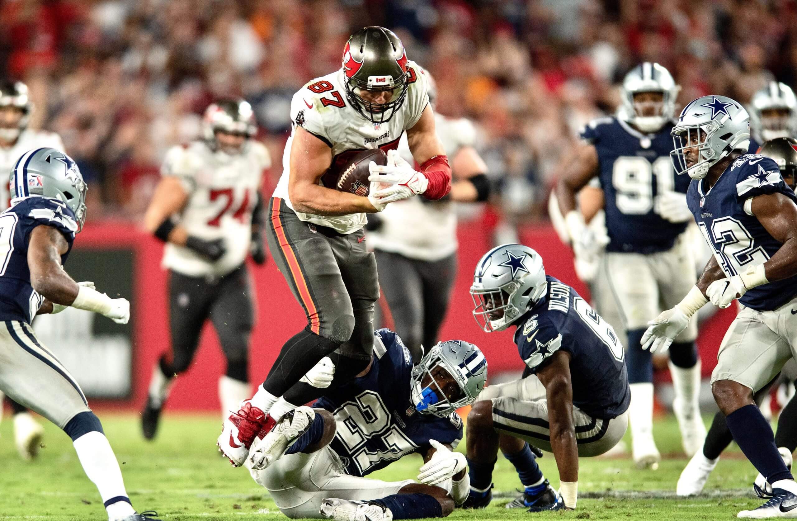
For all photos, click to enlarge
The most interesting thing about last night’s NFL season opener is that the Buccaneers chose not to wear a Super Bowl championship patch. That makes two years in a row that the defending champs have opted to forego the patch for the season opener (KC did the same last year). Prior to that, we had a three-year run of teams that did wear the patch to open the season: the Pats in 2017, the Eagles in 2018, and the Pats again in 2019.
As I’ve said before, I like that the NFL, which is so regimented about so many things, allows the defending champs to make their own choice on this issue. It adds a nice air of unpredictability, and also gives us some insights into how certain franchises choose to be more demonstrative or more reserved.
A few other notes from last night’s game:
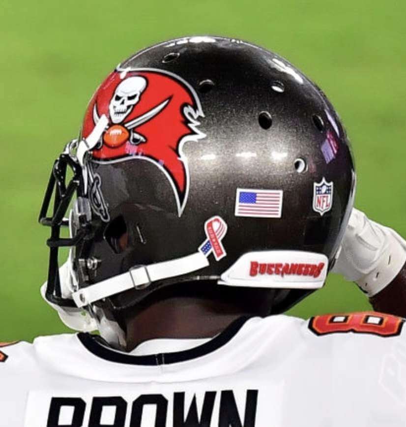
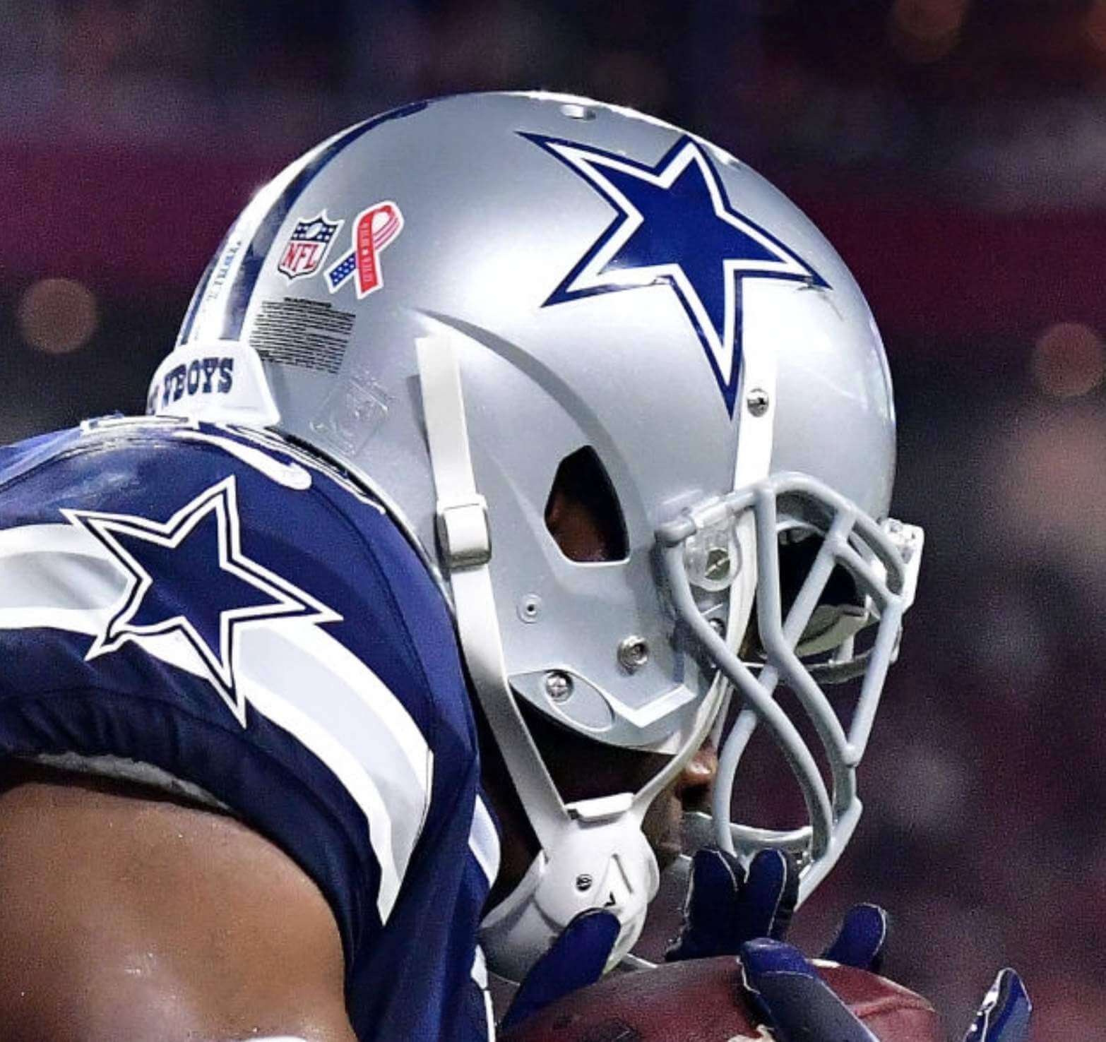
• We got our first look at the 9/11 helmet decals that all teams will be wearing in Week One. There’s apparently no rule regarding exactly where they should be positioned, because the Bucs and Cowboys wore them in different spots:
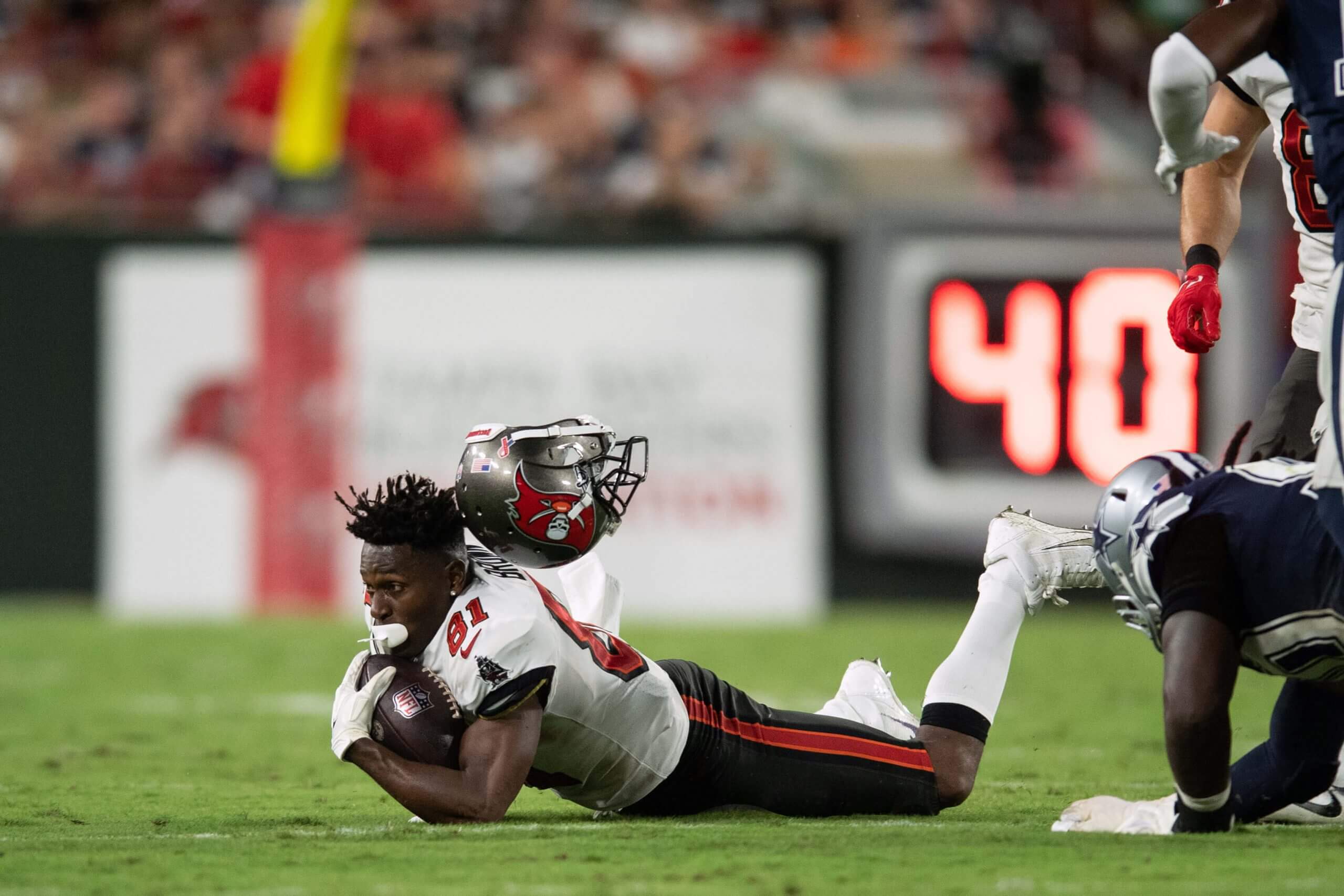
• Bucs wideout Antonio Brown’s helmet came off as he was making a catch in the fourth quarter:
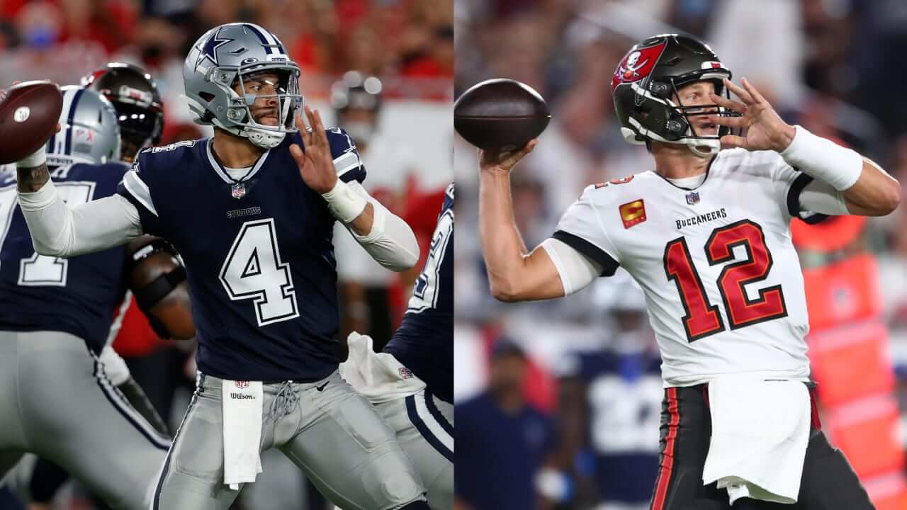
• In case you forgot, Bucs quarterback Tom Brady uses a much larger waistband towel than the standard NFL/Wilson model:
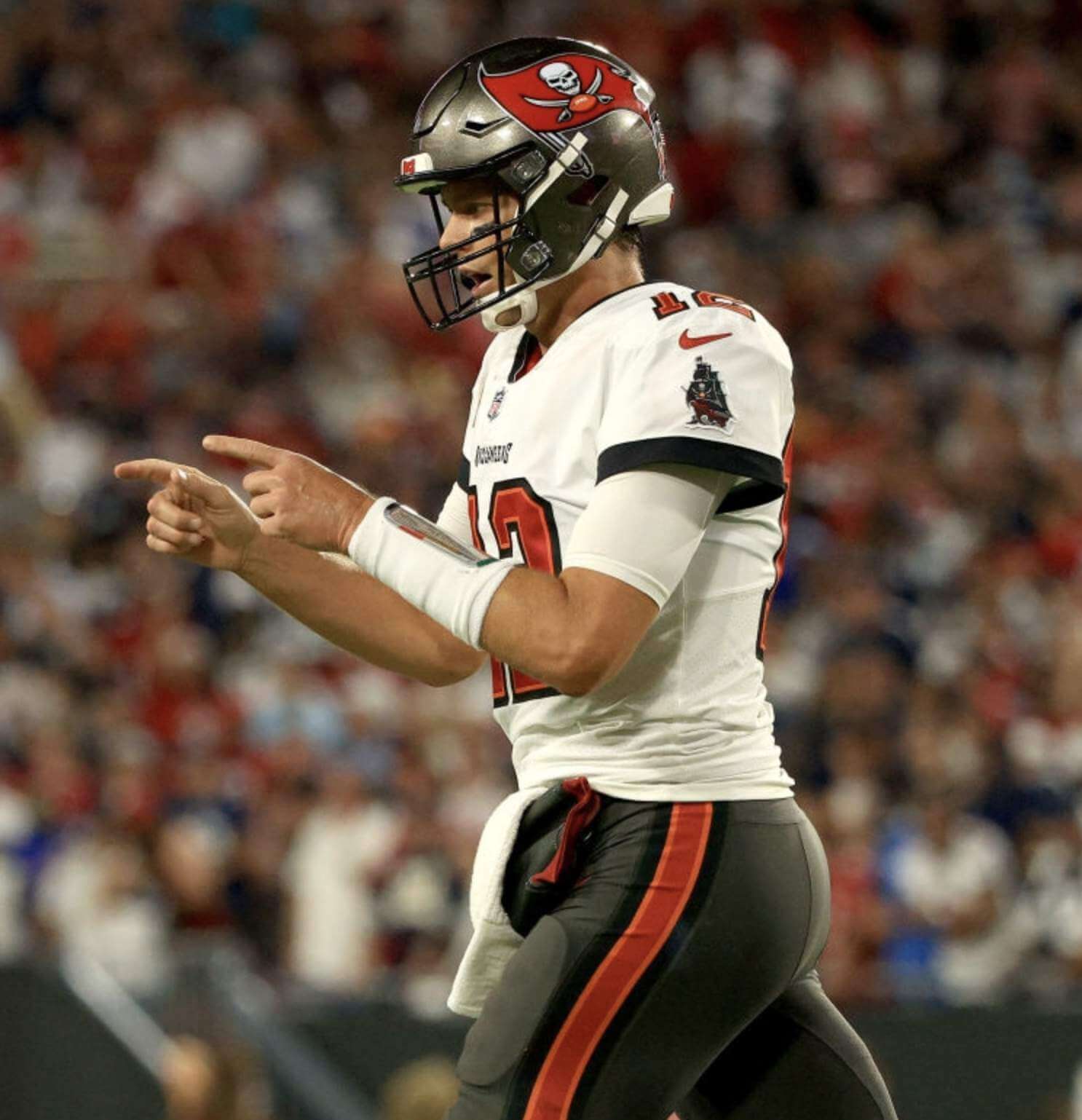
• It’s hard to see in that last photo, but Brady was wearing the towel over a handwarmer pouch, even though the gametime temp was around 80º:
• There was a bad moment when NBC showed a graphic with an absolutely brutal sextuple apostrophe catastrophe:
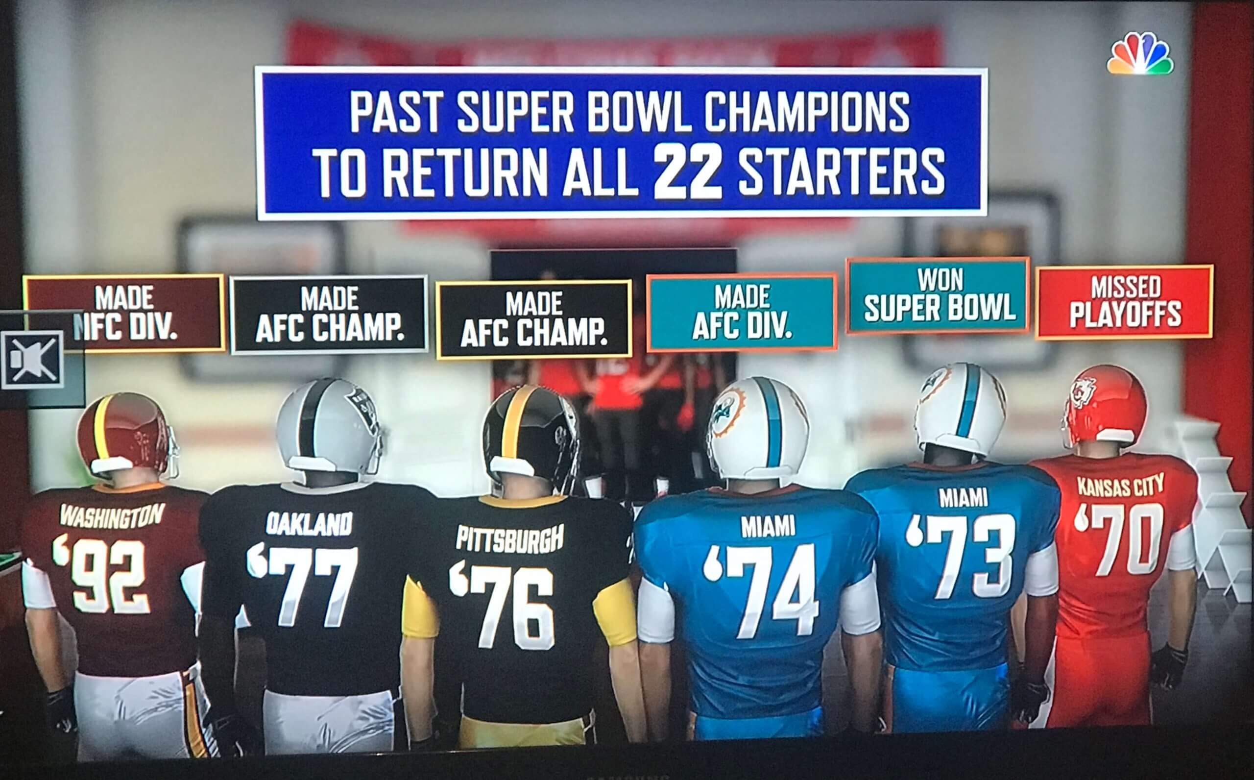
Other problems with that graphic: It shows KC in mono-red, shows Miami in mono-aqua, Miami’s helmet logos are facing the wrong way, and most of the helmet stripes are wrong. Come on, NBC — be better!
• The Bucs became first team of the year to wear white at home.
And there we are — not a bad start to the season. Did anyone spot anything I missed?
Meanwhile, in case you missed it yesterday, my annual NFL Season Preview is now available on InsideHook. Enjoy!
(Big thanks to Doug Keklak and everyone else who shared the NBC screen shot.)
In honor of the College Football season starting this month, I have created an interactive timeline that details All-Time AP Poll Appearances ranked by CFB programs.
Check out how different programs rise and fall throughout during different eras of CFB! 🏈🔥📈 @AP_Top25 pic.twitter.com/AirYnRvsO3
— Greg Harvey (@BetweenTheNums) August 1, 2021
ITEM! New Bulletin article: Over on Twitter, I’ve been retweeting a bunch of videos from a guy named Greg Harvey, who specializes in creating animated timelines (like the one above, charting the history college football AP poll appearances). These timelines, I’ve learned, are called bar chart races, and I find them irresistible. So I interviewed Harvey for my latest Bulletin piece. Those of you who’ve subscribed to receive my Bulletin content via email should already be seeing this piece in your in-boxes. Everyone else can read it on my Bulletin page. Enjoy!
Click to enlarge
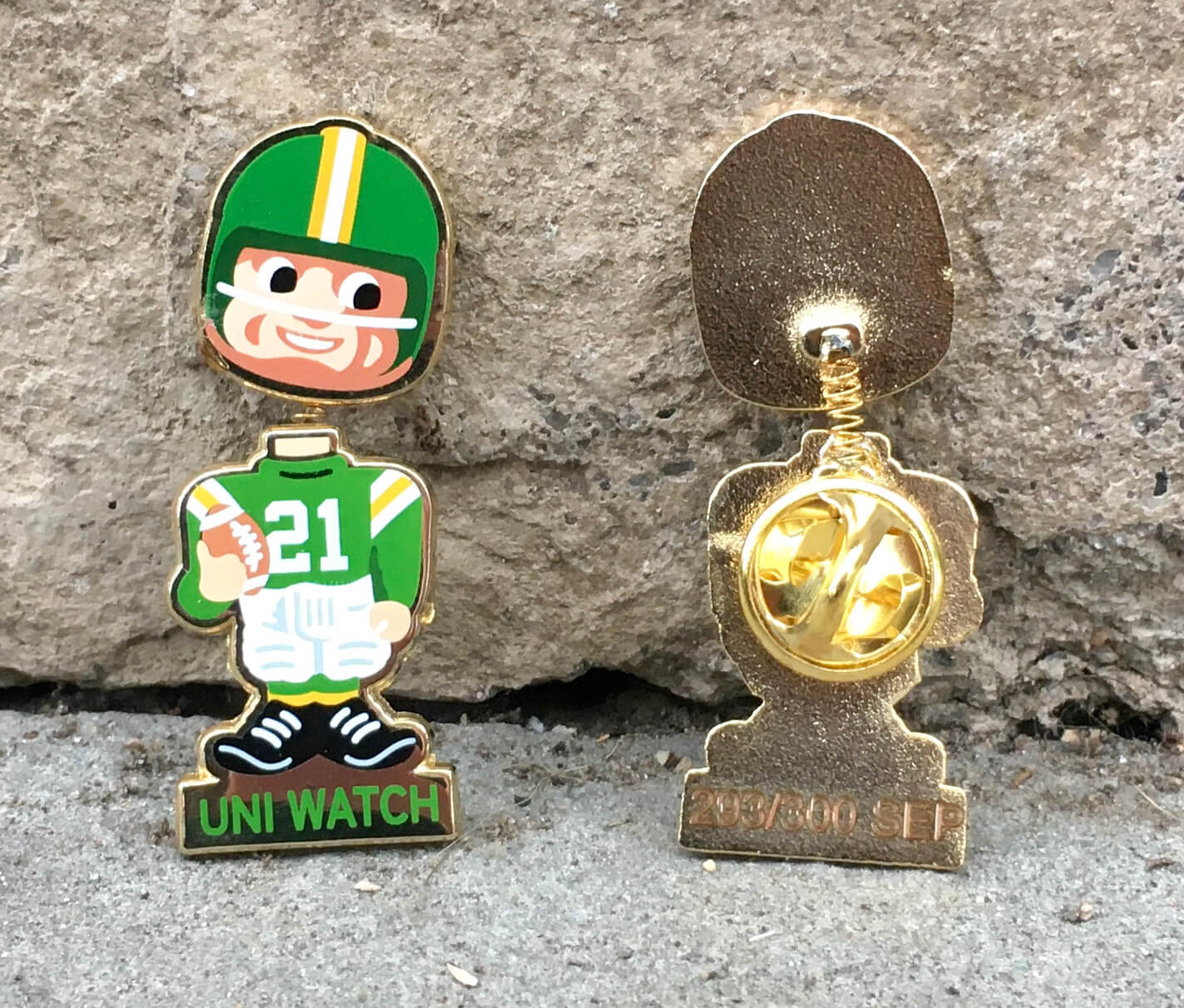
September pin reminder: In case you missed it on Thursday, the Uni Watch Pin Club’s September Pin is finally available for ordering. As you can see above, it’s a football bobblehead design. And it really bobbles! Dig:
This pin was produced in a numbered edition of 300; as of this morning, about 175 were remaining. It’s available here.
Also: You can save 10% on this pin (and everything else I sell on Teespring) by using the checkout code FABMERCH10. That code is good through the end of Sunday.
Need to get caught up? Here are our January, February, April, May, June, July, and August pins. (Sorry, March is sold out!)
The Ticker
By Anthony Emerson

Baseball News: Mariners 3B Kyle Seager has worn long pants for his entire big league career. Last night, he pulled them up while adjusting after sliding, and the socks he was wearing were definitely not team-issue (from Mike Dahlstrom). … The Red Sox have worn their colored alternate jerseys for 60% of their games this year, which might be why they’re playing so damn inconsistently. … The Atlantic League’s West Virginia Power will change their team name on Sept. 28 (from Caleb Jenkins).

Pro Football News: Fox Sports forgot that the Bengals updated their uniforms this offseason (thanks, Phil). … The Bears have unveiled their jersey schedule (from Tim Shriver). … Wade Heidt checks in with the following CFL item: “It is a tradition for the Saskatchewan Roughriders to visit the Winnipeg Blue Bombers the week after they play each other in the Labour Day Classic game in Regina. The rematch has been dubbed the Banjo Bowl, the name originating from comments former Bombers kicker Troy Westwood made to the media about Riders fans before the 2003 West Semi-Final. It is just another regular season game, but with a bit more emphasis. The game has its own trophy for the winner and it has its own logo.”
College/High School Football News: Maryland athletes who have received undergraduate degrees will wear “Graduate” patches on their uniforms. … Virginia Tech will go mono-white and longsnapper Oscar Shadley will wear Frank Beamer’s No. 25 this weekend (from Andrew Cosentino). … Texas State is going mono-white tomorrow, along with a helmet decal that depicts the World Trade Center inside the TSU logo. … Stars/stripes helmet decals for Baylor (from Philip Forester). … Bowling Green is really going overboard, with a stars/stripes logo on one side of their helmet and a big 9/11 memorial on the other (from @Mr__Jeremy). … For teams not going overboard tomorrow, there seems to be a standardized, solemn memorial decal. You can see it on the Youngstown State and UMass helmets (from Gabe Rosenberg and Bob Marshall). … UNC is going blue-blue-white with a similar decal (from James Gilbert). … Arkansas has a 9/11 memorial decal as well, but it’s quite a bit larger than others (from Taylor Crabtree). … Mizzou is going mono-white against UK (from Matthew Reitman). … Troy is going white-red-white with its military appreciation helmet (from @TrojanWallF5). … Virginia is going blue-blue-white (thanks, Jamie). … Apparently the NHL’s Reverse Retro promotion has made its way to Nebraska. Adidas provides unis for both the Huskers and the NHL (from Tyler Maun). … The following are all from Phil: Rutgers will wear special uniforms tomorrow honoring the 37 Rutgers alumni killed on 9/11. … TCU will go white-purple-white against Cal. … Michigan State is going green-green-white tomorrow. … White-blue-white with stars/stripes decals for Fresno State. … Orange-white-white for the Illini. … Ole Miss is breaking out the flag desecration helmets. … Colorado State is going orange with a throwback helmet decal this weekend. … Texas Tech is going mono-black. … Tennessee is going mono-orange. … WVU is going blue-grey-grey. … The University of Calgary has new unis (from Wade Heidt). … The Gators are going mono-white with a stars/stripes helmet logo tomorrow while coach Dan Mullen will literally trample all over the flag on the sidelines (from Moe Khan).

Hockey News: Here’s our first look at Philipp Grubauer’s mask and pads with the Kraken (from Wade Heidt). … BU and BC have each unveiled their 100th-season logo (from Brandon Weir and Rob Altman).

NBA News: A Suns blog has ranked the top 10 Suns unis of the past 25 years (thanks, Phil). … New Magic SG E’Twaun Moore will wear No. 55 (from Etienne Catalan). … Overtime Elite, a league that offers a path to professionalism outside college for high school juniors and seniors, has unveiled its uniforms (thanks, Phil).

Soccer News: Leeds United have finally gotten around to unveiling their third kit (from Jason Torban). … Barcelona have unveiled their third kit, which will be used in Champions League matches.

Grab Bag: The Women’s Big Bash League, an Australian cricket circuit, now has a naming rights advertiser (thanks, Jamie). … Check out these amazing Reddy Killowatt-themed T-shirts that a Baltimore electricians’ union made for a cornhole tournament (from @kingtaay). … Aston Martin F1 is adding a James Bond ad to its livery for this weekend’s Italian Grand Prix (from @Byron_2284). … Delta Airlines’ official Twitter account posted the company’s logo history the other day (from @chrismogren). … Here’s a general rundown of 9/11 memorials the sports world has planned for this weekend (thanks, Phil). … Breakfast cereal Count Chocula, of all things, has a 50th-anniversary logo (from Jim Vilk).
And that’s a wrap for this week. Stay well, enjoy Phil’s weekend content, enjoy the first Sunday of the NFL season, and of course my condolences to those of you who are mourning friends and loved ones who died 20 years ago on 9/11. I’ll see you back here with Monday Morning Uni Watch in a few days. Peace. — Paul
I love all the Uni Watch pin designs but I have no idea what to do with a pin so I never got one.
But dang, that bobblehead guy is irresistible. It’s my first Uni Watch merch purchase!
Fox Sports also forgot that the Browns updated their uniforms last season.
How did Phil miss that one?
Actually, I noted that in a subsequent tweet, but I guess AE didn’t see the follow up.
I don’t have any pictures, but it appeared to me that the Tampa Bay players had at least 2 different tail bumper decorations on their helmets. Maybe it was already known that this would be the case?
Apologies if this was already covered, but I was glad the Bucs and Cowboys didn’t go color rash last night. I thought that was a TNF thing. Anyone know why they didn’t?
While the game was played on Thursday night, I think this actually falls more under the category of a SNF game (NBC, Al & Cris, etc.) and being the “kickoff” has never been treated as a TNF-type game. Also, while teams still do the CR thing, it hasn’t been a TNF thing since FOX started doing the broadcasts — credit to them, even they realized the clownsuits don’t make for good viewing. Not that teams can’t or won’t do CR on Thursday nights, it hasn’t been *mandated* like it was when the whole stupid thing began. Thankfully.
Thank you for the explanation, Phil!
The program was discontinued as a league mandate after the 2017 season, so it’s team-by-team whether or not they go rash. Plus, as far as I’m aware, it never applied to the opening game of the season.
I hate that 9/11 has become co-opted by the uniform industrial complex. I do not want the day to turn into something like MLB paying lip service to the military by wearing camo. Rather than wear a 9/11 uniform maybe these schools and their uni manufacturer of choice could donate gate receipts or that week’s TV revenue to 9/11 first responders dealing with health issues or to assist with tuition for children of victims of 9/11.
I agree. Maybe they could donate the profits from the merch that they are pushing? Or maybe they could do nothing at all except make an announcement right before the playing of the National Anthem that Saturday is the 20th anniversary of 9/11 and then make a donation to whatever cause they choose to support. But then how would everyone know what “patriots” they are, right?
The exposure of the fraud that happened with MLB military merch is a pretty clear example this is all for show and team revenue. Pretty sure the NFL also got exposed on its pink breast cancer gear.
Disgusting how the leagues are so manipulative in this regard, and as uniform fans, the foul deeds resonate harder with us.
At this point I have been jaded to the stance that any time a pro team does some special recognition, or gets behind a cause it is simply because they know it will benefit their bottom line.
I agree with everyone’s points, but the question of “how far do you go” with remembrances is tough for 9/11, at least in my mind given how relatively recently it occurred/its freshness in our minds and the 20th anniversary. Personally, I would like to see mention of it pre-game (moment of silence perhaps) and am OK with a decal on the helmets (or something like it), and would like that to be it. But, I also get others opting for special helmet logos, etc. I wouldn’t like it to be the case year after year, but on “bigger” anniversaries I understand (is 20 years a “big” anniversary vs 25, etc.?). Over time I think it will be less “overboard” if you will. On the other hand, I don’t see sports unis with Pearl Harbor logos every 10 years, but perhaps that’s and apples to oranges comparison.
Just in general, I miss the days when the United States celebrated accomplishments instead of failures.
Nothing harshes my buzz more than “Patriot Porn”. Literally the worst thing about professional and varsity sports.
Looking at that Kyle Seager picture reminded me when I played Little League in the 70s and a lot of kids (myself included) would have their striped crew socks peeking out underneath their stirrups.
Exactly. I’m pretty sure Seager stole those socks out of my sock drawer . . . in 1974.
Love the silver pants from the Cowboys because that is how you do it. Have a bit of sheen to them. Cowboys and the Raiders have managed to keep silver pants and have them look the way they should. Unlike teams that used to wear silver pants but now they are just grey.
Restoring the metallic look to Tampa Bay’s pewter pants, like they had in the Dungy/Gruden era, is the one thing that would make their current set complete. The pewter/white/pewter vs silver/navy/silver matchup looked great last night, but the dull pewter pants were the missing cherry on the sundae.
Something I’ve been wondering about as certain team names disappear for social reasons; how will the media treat the old instances of these names? Will they still talk about the Redskins or Indians? Refer to them by their new name? Or just do their best to ignore it?
NBC seems to be going the ‘ignore it’ route by leaving the logo off of the old Redskins helmet. As you discussed, that graphic isn’t exactly perfectly accurate, but all of the other helmet logos are there.
I’m not sure if there’s a right or wrong way, and I’m not sure how I would handle it. But I’m interested to see how it plays out.
I think there’s at least some precedent for the “ignore it” route. I’m not aware of anyone who keeps Philadelphia Blue Jays statistics separate from Philadelphia Phillies statistics. Similarly for Yankees/Highlanders or Cardinals/Perfectos. Granted, those last two are fairly ancient history. The proposition is rare enough that there probably really is no right or wrong way.
I think they ignore it. If you’re writing about Cleveland in 2021, you don’t use the nickname. If you’re writing a retrospective about the 1997 World Series, you don’t use the nickname. I don’t think it requires too many linguistic gymnastics to just use the city name.
Leonard Fournette is still rocking the LSU shoulder pads.
I also think Devin White had on a similar pair.
(Sorry, no screenshots. I assumed someone would have already done so!)
Nothing new for either player. Fournette’s been doing this for years, back to his days with the Jags.
Would love to know if those pads require annual upkeep to keep them in optimal protective condition. You’d think after a while, they lose their padding and would rot from sweat and punishment. Perhaps their equipment manager can shed light on this. Given the league’s concerns about player safety with headwear, might they give equal concern for other protective gear, too? -C.
On the game-winning drive, Brady was seen rubbing his pants stripes with his index or middle fingers as some type of signal.
19:11 on this video.
link
I saw that. My guess was that it means “we’re gonna run a play” as opposed to “we’re going to clock it”, but that’s just my guess.
Fox Sports also photoshopped Trevor Lawrence with a black jersey on. The Jags wore teal for all three preseason games.
Love seeing the Cowboys navy look. It is a great design that should be there home set.
Maybe I just like it so much because all of the colors and elements actually match, unlike their white jersey
Totally agree. The Cowboys navy blue uniform is one of my top five NFL sets even though they so rarely wear it.
Yes, quite the contrast: the Navy set is one of the best looks, while the white set with the stupid sea foam green pants, mismatched blues and black outlines on the sleeves out of nowhere is one of the league’s worst, iconic or not.
I’m afraid I disagree. Not only do I want to see the Cowboys revert to a royal blue jersey, I’d like to see a navy+silver team since the look is sufficiently different.
Funny you brought up last night’s “returning all 22 starters after winning Super Bowl” graphic. My beef was with the right to left nature of the dates/timeline. I had to pause it to digest it. My second OCD beef was why the info banners above each player were not aligned in a straight/even height manner. Neglected to even notice the apostrophe catastrophe.
As I didn’t watch the game, I have to ask if it was just a still graphic, or if it was animated. In any case, it appears to me that they linked the position of each banner to the relative position of each player in the virtual 3D space. I do agree it would’ve been a cleaner look to have them as a separate element just going straight across.
I assume Brady’s hand warmer and towel are related – like he doesn’t have enough belt loop free belt real estate in the front of his pants to loop the preferred larger towel over, so he uses the belt from the hand warmer (which wouldn’t thread inside his pant belt loops).
The Buccaneers three rear helmet sticker placement annoys me.
It would make so much more sense to have the US flag centered with the NFL logo to the right and the 9-11 memorial to the left. You could even raise the US flag a bit to give it prominence.
Five of those six teams listed were AFC, which means their games would have been broadcast on NBC. All NBC Sports had to do was look at their tape library, or call NFL Films.