[Editor’s Note: Paul is on his annual August break from the site. Deputy editor Phil Hecken is in charge from now through the end of the month, although Paul may be popping up here occasionally.]

Image credit: Sportslogos.net
By Phil Hecken
Follow @PhilHecken
A good Wednesday to all you Uni Watch readers.
As I’m sure many of you have heard by now, it was announced (first by Sportico) yesterday that the NHL Board of Governors voted unanimously to approve of an ad patch to appear on NHL jerseys beginning the season after this (the 2022-23 season).
They will become the second major sports league in the United States — joining the NBA which approved ads beginning in 2017 — to desecrate their jerseys with anything besides makers marks.
This should not come as a huge surprise, since the NBA basically opened the door for ads on uniforms several years ago, and the COVID-19 pandemic has (supposedly) cost pro sports hundreds of millions of dollars in lost revenue (from all streams). In fact, COVID-19 was the justification for NHL teams to begin selling ad space on their helmets this past season. While not nearly as offensive as a jersey ad, the helmet ads were nonetheless a jarring first-step in the march to jersey ads.
In case you’re not familiar with the helmet ads, here’s an example (not all teams have the same ad, nor is the size or shape uniform):
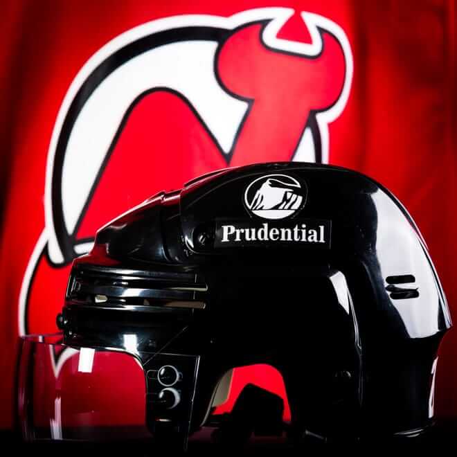
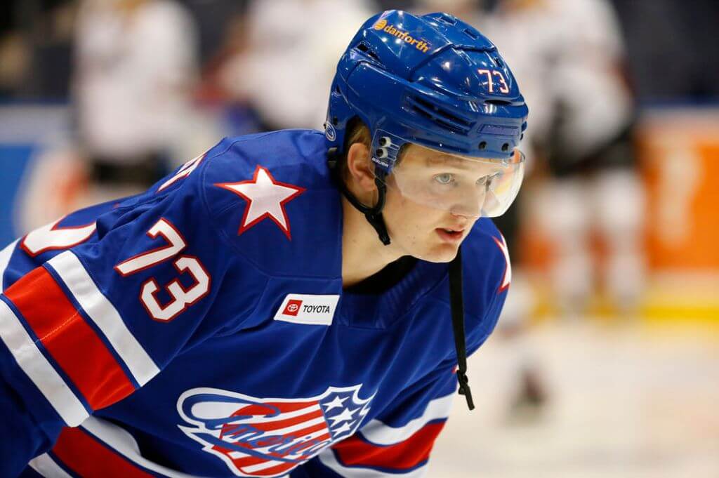
There was little public outcry against the helmet ads, and even more silence as the season progressed, which likely hastened the NHL’s decision to permit sweater ads next season. The helmet ads will again appear this season. This is the first time jerseys ads will be seen in game action — previously, teams have been able to place ads on their practice jerseys (first allowed in 2010), while American Hockey League teams have worn jersey ads for a few years now.
If you don’t think the monetary aspect of a jersey ad is huge, think again. The helmet ads have produced a windfall, and NHL Commissioner Gary Bettman noted teams “retained more than $100 million in revenue” because of those ads, as well as other, non-uni related money-drawing changes. If you clicked on the Sportico article, you may have noticed that the NBA jersey ads netted all teams $150 million.
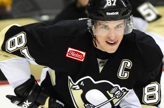
While no specific placement for the ad has yet been announced (although it is probably safe to say it will be located on either the right or left chest of the jersey), the specs were announced: the ad can be 3.5″ x 3″ (which is larger than the current NBA ads). Individual teams will be allowed to determine the ad placement. They could be on the front or on the sleeve or the back, but the right breast seems most likely, as many teams have a Captaincy or Assistant Captain logo on the left breast — similar to this:
Although I stated earlier the jersey ads should come as no surprise, Commissioner Bettman had for years been for protecting the sanctity of the jersey. As little as four years ago, he said “you’d have to drag me kicking and screaming,” or offer “a lot, a lot, a lot of money” to put ads on the NHL’s “iconic” sweaters. But the COVID pandemic has made him change his tune. Even as late as January of this year he was still on the fence (his words: “the jury is still out”) as far as jersey ads, even as he was trumpeting the “success” of the helmet ads. But he also said then the league was basically bleeding money due to the pandemic (and the two shortened seasons, with mostly limited or non-existent paying customers).
Like the NBA, and also with the helmet ads, individual teams are free to negotiate with advertisers to get the “best” fit deal. While there is no guarantee teams will accept ads from the same corporations which currently advertise on helmets, this seems like a safe bet. However, if any of those advertisers didn’t feel they got enough ROI, they may decide to move their helmet ad to the jersey, thus freeing up space on the helmet for a new advertiser. Or teams could simply elect to solicit ads from different advertisers for the jersey. That’s all down the road.
The biggest worry amongst uni-purists when the NBA announced their jersey ad deal is that it would lead to more and/or bigger jersey ads, but that hasn’t happened…yet. We all know the path soccer has taken over the past few decades where a full ad appears on the front of the jersey — leaving only a team badge and makers mark. Certainly I’m not saying that’s where this is headed, but let’s face it, only a decade or so ago, full jersey ads were unthinkable.
I certainly don’t think we’re headed for crazy European sweater (and pant/leg) ads — you know, the one’s that look like this…
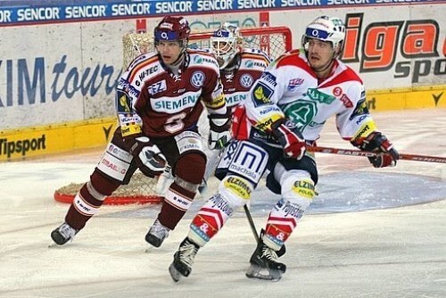
…but the slope gets slippery once the ad-door has been opened.
The NHL had been the best of the big four sports leagues when it came to sweater integrity. The makers mark has never appeared on the front of the jersey, and (like the NFL) there have been no “special” (S&S camopander, pink out, etc.) jerseys ever worn during the game. Yes, teams have worn them in pregame (the Kings are a good example), but none of that has ever infected the actual game. And unlike the NFL, no special headbands, socks, wristbands, etc. have been allowed. Even the helmet ad, noxious as it is, was not a jersey ad — and those helmet ads are still not highly visible. That’s all about to change with the 2022-23 season.
It will be interesting to see how the NHL handles the roll-out. As Paul pointed out in this great 2017 ESPN piece, the NBA’s ad program started off slowly (and you’ll recall not all teams had advertisers at the beginning of the program’s inception — even though all teams have since added advertisers). Perhaps because jersey ads were “new” to the four major leagues at the time advertisers (and teams) didn’t know what to expect or how fans would react. But seeing as how most opposition has been little more than a whimper, I don’t expect NHL teams to have much trouble selling ad space over the next year.
Your thoughts?
Blue Jays “Refresh” 2022 Concept
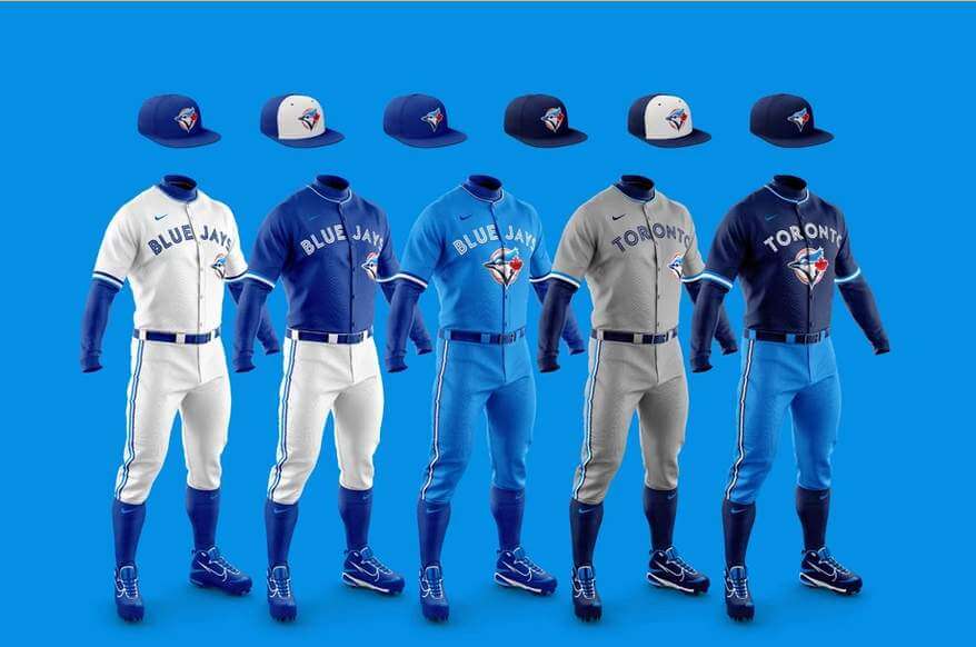
A couple months ago, Erich ‘Heinz’ Rigonan, sent in a link (which follows below) to an incredible project, which he calls “2020: Toronto Blue Jays Refresh” and which I wanted to share a few shots from.
In his intro to the project, he writes, “After the 2020 season, the energy of this new young core that the Blue Jays built has made it an exciting time for baseball in Toronto. As much as I was impressed with the rebrand in 2012, I always thought the organization could have reached deeper into its rich history while still remaining modern and classic. Since Nike recently took the reigns of manufacturing the MLB uniforms, I thought this would be the perfect time for the design nerd in me to put my spin on their brand identity to help match their new winning culture not only on the field but also in terms of design.”
There’s a ton of stuff in the project including the following concepts:
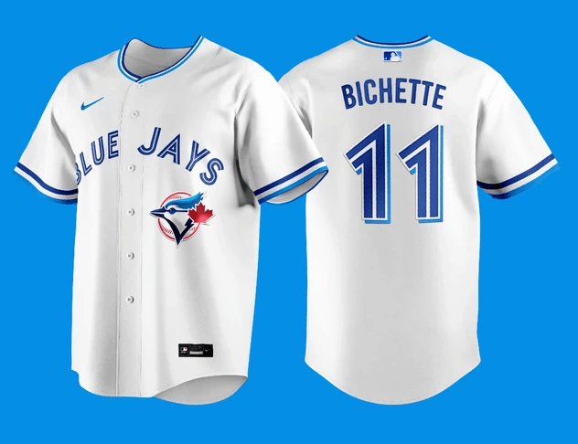
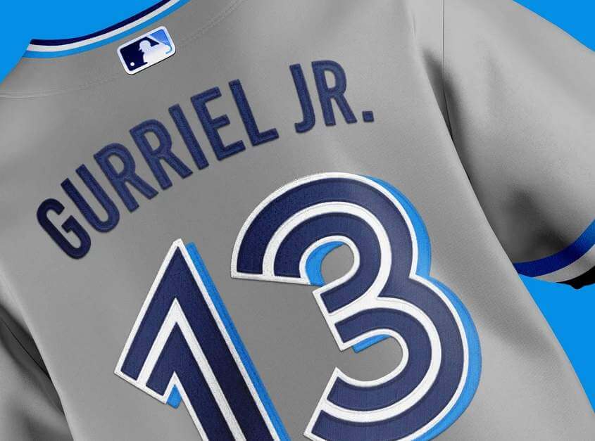
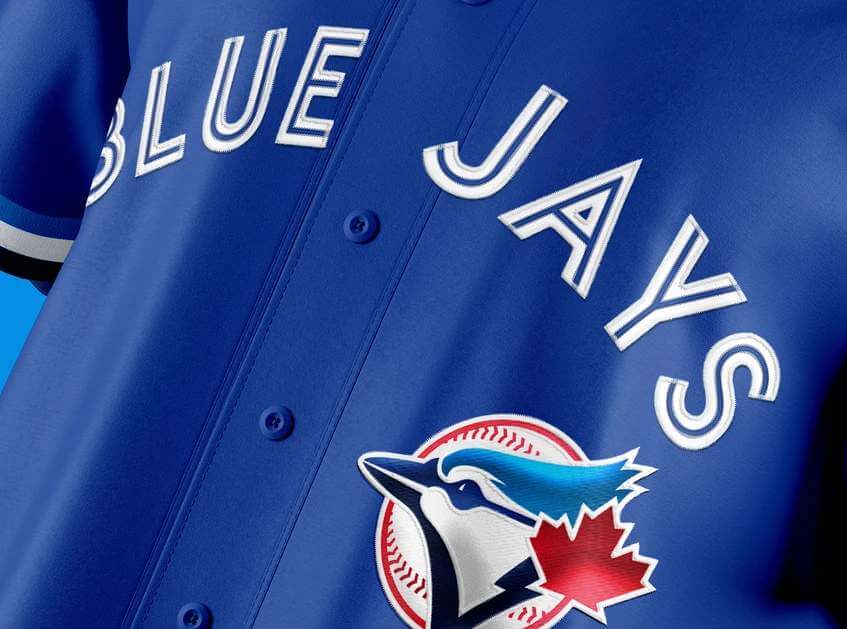
I’m a big fan of the 2012 redesigns (which harkened back to the Blue Jays’ original set), and I think these build on that nicely. Definitely worth checking out.

Guess The Game…
from the scoreboard
Today’s scoreboard comes from G. S. Lewis.
The premise of the game (GTGFTS) is simple: I’ll post a scoreboard and you guys simply identify the game depicted. In the past, I don’t know if I’ve ever completely stumped you (some are easier than others).
Here’s the Scoreboard. In the comments below, try to identify the game (date & location, as well as final score). If anything noteworthy occurred during the game, please add that in (and if you were AT the game, well bonus points for you!):

Please continue sending these in! You’re welcome to send me any scoreboard photos (with answers please), and I’ll keep running them.
The Ticker
By Lloyd Alaban

Baseball News: The Mariners wore their home Friday alternates for a road game last night (from Tim, who didn’t give his last name). … Here’s Mets P Marcus Stroman’s win-loss record according to what color durag he wears (from @BvrlyTweetmaker). … Peabody Heights Brewery in Baltimore has an Orioles-themed beer (from Andrew Cosentino).

Football News: All the Jaguars QBs had white stripes on their helmets at practice yesterday (from Johnathon Binet). … Reader Nate Mueller‘s latest 3D creation is a mini statue of former Packers Head Coach Vince Lombardi.

Hockey News: The Saginaw Spirit of the OHL released their 20th-anniversary logo (from Alex Dewitt). … New sweaters for the Cardiff Devils of the EIHL (from @artofscorebug). … 60th-anniversary logo for the BCHL (from Wade Heidt).

Basketball News: The Scarborough Shooting Stars is the latest Canadian Elite Basketball League club (from Wade Heidt).

Soccer News: New third shirt for Bayern Munich (from @themosb). … New kits for Navy soccer (from Phil Bergman).

Grab Bag: When NASCAR’s playoffs begin, the vehicles competing for the championships in each series will sport colored windshield banners and rear spoilers—yellow for the Cup cars, red for the lower tier, and blue for trucks (from Christopher Hickey). … Russia will host the 2022 Men’s Volleyball World Championship, and fans can choose the mascot: a bear, a robot, or a tiger (from Jeremy Brahm). … Quaker is using the last of its “Aunt Jemima” bottles (from Matt Barnthouse).
Uni Tweet of the Day
Despite the ‘ghosted’ wordmark and number, I still think this was the ChiSox’ best roadie ever.
Tommy John, wearing his 1969-70 @whitesox uniform with his 1967-68 stirrups during #SpringTraining. pic.twitter.com/yT6mnFJXjL
— Vintage Jerseys & Hats (@PolyesterUnis) August 17, 2021
Guest Sunset Photo
from John Chapman
Phil-
Here’s a sunset, nothing uni related, just a sunset. This was last week at Twelvemile Beach on Lake Superior in Pictured Rocks National Lakeshore. Lake Superior is known to be perpetually cold and churn up storms on a whim- but not at this moment. Enjoy and share if you’d like! (Thanks for taking over uni-watch responsibilities this month!)
John Chapman

And finally… that’s it for today — sorry to be the bearer of bad uni tidings on the NHL jersey ads. I never thought we’d need to use a seam ripper on a hockey sweater, but yet…here we are.
Everyone have a good Wednesday and I’ll catch you back here tomorrow.
Peace,
PH
I loathe the Nike swoosh on MLB jerseys so I know I’ll despise seeing ads on hockey sweaters. However….with the NHL I get the need to generate additional revenue. This league, more than any other, really relies on gate receipts. Normally when an owner cries poverty (like MLB will after the CBA expires), I’m skeptical. With the Delta variant potentially impacting attendance for a 3rd season, in this case, I’m ok with it.
Was hoping it wouldn’t go further than the helmets. I could at least ignore that as I have always viewed NHL helmets as more equipment than part of the uniform.
At this point I think we unfortunately have to resign ourselves to all sports wearing the ad patches. The comm-uni-ty weeps.
What is interesting is the ads are being put on the same time all the leagues are going into overdrive with alternate uniforms, as they see how people like uniform designs. They very much understand how popular uniforms are and take advantage of it in the retail space, but don’t seem to care about blowing up the connection fans have to uniforms by desecrating them with ads.
I knew the writing was on the wall when I started seeing people, adults and kids, wearing ad-clad soccer jerseys out and about here in the States. It’s obvious many will still buy a cloth billboard if it comes to represent their team — though I agree that, in a way probably not significant enough or at least not quantifiable, it will diminish the connection as it is just another element making the whole thing feel transactional.
And I’m sure teams/leagues will happily sell throwback merch to anybody who prefers the old way.
Let’s not shame people for whatever they choose to wear
Another thought. Let’s not criticize David for expressing an opinion about uniforms on a website dedicated to the analysis of uniforms.
Missed in the ticker today: The WTF has apparently narrowed their potential names down to 3, but no indication on what those are.
link
Given the underwhelming result of the process in Cleveland, I have to imagine WTF will also drop the ball and miss out something easy and obvious, like Redtails and incorporating their signature “R” into a fighter wing roundel.
Redtails: easy, obvious..,but good?
I’m hoping they don’t blow it, but I’m not feeling optimistic.
Stick with Football Team until a stadium deal is in place, then rebrand.
In the mean time, bring back the yellow pants!
WTF?
Looking at the Penguin photo, count the number of times you see Reebok. There are two on the glove alone. I’m going to guess there are at least two more on the other glove, and probably one more time on the front of the breezers. Does Reebok really make hockey helmets, or is that just another place to slap the name? At what point do the makers marks become full-blown ads?
Not defending. Just saying they are both bad, and we should be outraged at both.
To your point, the makers marks are so ubiquitous now Mr Rigonan has that stupid swoosh as part of his Blue Jays designs.
Gross.
That’s an old photo, as all of Reebok’s hockey business was rebranded as CCM when adidas sold off their hockey operations in 2017. The Hockey Company (a holding company that included CCM, Heaton, and Koho among others) was purchased by Reebok in 2004; so yes, technically Reebok DID make that equipment.
That’s an old photo; all of the Reebok hockey equipment was rebranded as CCM when adidas spun off their hockey operations in 2017. Reebok had purchased The Hockey Company (a holding company that owned CCM, Koho, and Heaton, among others) back in 2004, so yes, Reebok technically DID make that equipment.
Good to know! Thank you!
Re: NHL ads… it was inevitable and gave the league justification by being a source of revenue at a time they needed to cover operational costs. But it sucks, and brings it that much closer to MLB and NFL teams doing the same.
Re: Tommy John pic… they’re white numbers on gray, they’re not ghosted. The old Royals powder blues had the same issue.
GTGFTS: 3 August 1986. Candlestick Park, San Francisco. Braves 4, Giants 2 behind the pitching of the immortal David Palmer.
Hey, he pitched a (6 inn., rain-shortened) “Perfect Game” once. So, immortal indeed!
Also, the Giants lineup was listed on the scoreboard.
The Braves lineup that day was:
RF Omar Moreno 18
3B Ken Oberkfell 24
CF Dale Murphy 3
1B Bob Horner 11
LF Ken Griffey, Sr. 22
SS Andres Thomas 14
C Ozzie Virgil, Jr. 9
2B Glenn Hubbard. 17
P David Palmer 46
European soccer teams wear their sponsors’ names on jerseys instead of their own names, and nobody bats an eye
I maintain that it will be most jarring in baseball because we spend so much time staring at the guys standing around anticipating the next play (though I guess you could make a similar argument for football). Baseball uniforms feel the least utilitarian of all sports getups, too, so I’ll be sad when they look less goofy/fun and are just another eyesore my brain learns to filter out.
Soccer games also have zero commercial breaks, so this will hold water as relates to American sports when there are no commercial breaks during the games. IMO.
Yeah, the lack of commercials during game play mitigates the ads on soccer jerseys for me, still don’t like it, but if it was an A or B choice, I would choose ads on jerseys and no commercials. Be nice if you had the option to buy replicas without ads.
For me, that’s part of what’s so galling about ads on Big 4 US sports uniforms, we already have to watch your commercials every 5 minutes, but it’s never enough for billionaires.
I agree with your general idea. But the problem in US sports is that there are frequent stoppages of play. Baseball stops after every half inning to change the team in the field, and they warm up. Plus, pitching changes, mound visits and taking the field. Football, basketball and hockey have time outs, penalties, stoppages of play and more intermissions than simply a halftime break. We don’t have running clocks. So there will invariably be commercials in addition to uniform ads.
Unfortunately the ads on those soccer jerseys will not stop the networks from finding moments to break in with commercials, as they’ve already started to find ways to do.
I find it hard to get excited about matches between [Middle Eastern airline] and [Asian bookmaker]. YMMV.
Did anyone else have a issue with an ad covering the first two photos and the blurb in the Blue Jays concept section when loading the site?
Just want to say, those Rochester Americans jerseys are among the best in all of pro sports. Perfection that should never be messed with.
Sponsored by…Toyota.
I’m sure it’s an unpopular opinion in these circles, but I actually like ads on uniforms. It seems like a win-win-win. The teams get ad revenue, the companies get exposure, and the fans get exposed to cool businesses they might not have otherwise.
Okay, but they still look like shite.
That’s more of an execution problem, not a problem with the concept. I think the Nike logo on uniforms is basically an ad and that it doesn’t look bad at all.
That’s more of an execution problem, not a problem with the concept. I think the Nike logo on uniforms is basically an ad and that it doesn’t look bad at all.
Jarod,
I am assuming you are under 30 years old?
My thought exactly. A poor, miss guided soul. -C.
According to Forbes, 15 NHL teams lost money last season (i.e., their expenditures were greater than their revenue). I think you could make a fair argument that, in the case of those 15 teams, the companies they’re partnering with are truly sponsors, not just advertisers. If the team truly needs the ad revenue to survive (as opposed to just piling on more profit), “sponsor” seems like an appropriate term according to the definitions used here.
I know Paul’s not here during August to defend his point of view on the matter, but his insistence that there is a difference (in the context of uniform ads) between a “sponsor” and an “advertiser” is something that he totally made up and doesn’t conform with either the dictionary definition of a “sponsor” nor the way the term is commonly understood by the public.
I’m not bashing him here (or those who also use the terms this way), and in fact I get where he’s coming from even if I disagree with him – he’s drawing a distinction between an organization needing a “sponsor” in order to survive and one that uses an “advertiser” simply to boost profit. I’m just pointing out that the understood definition of “sponsor” doesn’t make this distinction.
Tommy John’s roadie is cool *because* of the ghosted script and numbers.
“White” is in the team name, so there’s that. But I also liked when the A’s featured white numbers on a light-colored jersey.
…And the Lakers.
Hockey is my favorite sport and biggest area of uni interest, so this has gotten me thinking about how I feel about the whole issue of ads and such in general.
I hate ad patches on uniforms as much as any other uni-watcher, but I’ve realized over time that my reasoning for it is different than most people. For me it’s predominantly an aesthetic issue. Ad patches clutter up the uniform, and their colors/symbolism often don’t match the rest of the uniform at all. It makes the uniform as a whole look less attractive and less unified.
But the more I think about it, the more I realize that I kind of feel that way about all patches (memorials, anniversaries, captain patches, etc.). I really think most hockey uniforms would look better without any of that stuff. It’s just clutter to my eyes.
Where I deviate from most uni-watchers is that, while I see a huge aesthetic problem in ad patches, I really don’t see an ethical problem. I think every human/organization has a right to try to make as much money as they can, and ad patches are just a way to do that. So, while I find the idea of ad patches on NHL unis very disappointing, I don’t feel like I have a right to be angry about it, as though the NHL has some ethical obligation to adhere to my standards of beauty in uniforms.
Anyway, these are just thoughts that have come across my mind as I’ve wrestled with the idea of my beloved Penguins having some hideous blue PPG patch (or whatever) on their chests.
I am also a huge Penguins fan from Indianapolis IN – of all places. I probably watched 30-40 Penguins games this last season. I couldn’t tell you the company sponsor of their helmet ad. I’m sure they have one. Don’t know (or care) who it is.
I’m one of those people that avoid purchasing products that advertise with sports team. The Penguin’s games on radio have an official “everything” of the Pittsburgh Penguins. I avoid doing business with those companies – pretty easy since most are local to Pittsburgh or the general region. I have the ability to block them out.
Very well put, Daniel. At the end of the day, advertisements on uniforms are pretty harmless beyond the fact that it may make the sporting events in question less enjoyable for fans. And at that point, the fans are free to “vote with their wallets” and use their entertainment dollars elsewhere.
I think this is why we have continued and will continue to see ads pop up more and more during sporting events. Fans might complain a little, but ultimately there is no evidence that people are turning away from the games altogether because of it.
I have a similar view, in that it’s not the ads that is the problem as such, it’s how they are done. For a start they should always have to be in team colours to minimise visual disruption. That way at a distance they can blend in to the uniform. This is more the norm in soccer, especially in the UK, as the big teams all tend to have sponsor names like this (e.g. Man Utd). The problem with ad patches is that by definition because they are small but “visually noisy” they are always going to mess up the uniform at whatever distance. And once they start in one place, they just multiply. Look at the CFL – they already have two ad patches now. And eventually uniforms end up looking like the dog’s dinner like Rugby over here has got now. Can it be stopped? Unless it causes owners (and hence players) to lose money then no. Can we do anything? Yes – just don’t buy jerseys that have ugly disruptive patches, but still buy ones that have ads done with some sensitivity to design. Or wear a vintage jersey!
So logically, in the future when NHL teams start returning to profitability, the ads will begin coming off the uniforms? hahahahahahahaha!
It just jumps out at me that the flag on the collar of the Cardiff Devils is a different green than the jersey.
One of the things that makes my eye twitch: The A on a hockey sweater stands for ‘Alternate Captain’ not ‘Assistant Captain’
I wonder how the ad patches will be handled for teams like the Rangers, and even the Red Wings who shifted their Captaincy patches to the other side of the jersey when the Reebok template came out a decade+ ago. Even though there seems to be a lot of real estate on a hockey jersey, they actually don’t lend themselves to ad space – Captaincy patches, League Event Patches (i.e. Cup Finals), Shoulder patches…the addition of an ad patch could make these jerseys look very cluttered.
Just a tech note, seems like the entire entry is blocked today on my browsers with the ad blocker activated. Not sure if it’s happened to anyone else (I have ublock origin on my browsers)
Happened to me as well. Finally realized what was happening when I opened it in an ad block-less browser and it worked fine!
I wonder if there is a way to make sure Detroit gets a red and white sponsor and the Leafs get a blue and white sponsor.
Other than that, whatever we need to guarantee I get a season to watch.
The European hockey pic.. the definition of absurd wouldn’t be enough… .
A few thoughts on Mr. Rigonan’s “Blue Jays Refresh” project. Do the Jays really need six on-field caps? And please respect the placket. Having the logo centered on the proposed alternates so the buttons cut right through it looks absolutely terrible.
That and including the swoosh adds up to an incredibly lousy job by Rigonan
Looks like those Jags helmet stripes are all QBs, maybe in case the red shirt didn’t yell “Don’t hit me” loud enough.
I’m pretty sure the Tommy John photo is from 71’s spring training. He was the subject of an article that filmed his delivery with a high speed camera and then analyzed it. There’s quite a few photos from that sequence floating around.
I believe it was filmed early in 71’s spring training. It might have been before spring training began. The White Sox didn’t have their new red 71 uniforms yet, so John wore 1970’s road. For some reason he wore a pair of blue stirrups that matched rather than the cool white ones they wore in 69-70. It could be the team didn’t have any white ones left. The 67-68 stirrups were not plain blue – they had 2-3 white stripes and were a darker blue.
It’s my favorite White Sox road jersey also. I managed to purchase an origional 1970 road jersey (#40). It’s the only authentic jersey I own, and it’s stunning!
“only a decade or so ago, full jersey ads were unthinkable.”
in what sport/league? In soccer? They’ve had giant ads on their shirts basically forever. And I’m not talking about the cash-strapped clubs. Heavy hitters like link and link have been riding the gravy train since at least 1982.
English soccer teams have had shirt sponsors (as they are known here) since the late 70s. At first they were banned from wearing jerseys with them in televised games (this was before all games were routinely televised). Then they were allowed but smaller than the regular size. Then the full size was allowed in the 90s IIRC. Originally the sponsors were single colour wordmarks in team colours on the front. Only later with sublimated jerseys did multi-colour ones come out. Then a few years ago a sleeve ad was approved. The lower leagues already allow jersey back and shorts adverts too so it’s only a matter of time…
Welp. That makes two major leagues I won’t watch now. RIP NBA & NHL. Your greed was too much and the jersey adverts are the last straw for this guy.
I understand that these billionaire companies have lost millions due to the pandemic and they need to get back from their regular clients by raising their ticket prices and all but I just want the NHL to bring back the painted “Seasons Greetings” at the blueline during the holiday season, that’s all.
A bummer to see concepts posted here that feature advertising. Unless Nike is paying the artist and Uni-Watch to have those ad patches in that Toronto concept. As a concept we would certainly get the idea of what the artist was going for without the ad patch. And Uni-Watch is the last place I’d expect to see such concepts with ads in them
Those Blue Jays tweaks are very similar to the ones I made for my uniform project that was published here a few years ago :) Love the hats especially!
That Toronto project is easy on the eyes. Great work! I love the Jays uni where a navy jersey is paired with powder blue pants. Awesome contrast. I love the powder revolution of the past few years but full powder is too much of a pajama look. StL, PHI, Tex, and Toronto all have beautiful powder jerseys that would look better over white or gray pants. And the powder pants would go perfectly with nearly all of their jersey options. I predict this becomes a thing. I hope it does. The contrast makes all the difference for me. Looks more balanced and visually interesting. Soccer, football, hockey, baseball … all look best with contrast between top and bottom. Basketball is the only mono sport that looks best mono.