
For all photos, click to enlarge
Good morning! Greetings from Uni Watch HQ, where I am back after spending a weekend with friends upstate. We spent a lot of Saturday poking around in various vintage shops, where I spotted an unusual number of uni-related items of interest. It’s not like I went into these shops with the goal of finding uni- or sports-related items (on the contrary, I was looking for other things), but I ended up finding a bunch of them anyway, so I want to talk about that today.
Let’s start with this football-themed novelty decanter for Lionstone bourbon (shown above). I’m familiar with novelty bourbon bottles made by Jim Beam, but I hadn’t heard of Lionstone until now. According to various online listings (like this one), the football design is from 1974, although it depicts a more old-timey scene.
The same shop also had a Lionstone basketball decanter:

And there was also a hockey decanter, although one player’s head, which functioned as the cap, was missing (here’s how it looks fully intact):

A bit of research reveals that Lionstone also made baseball-, boxing-, and golf-themed decanters. Fun stuff!
I also came across a pair of bizarre lithographs that showed hoboes bowling. The first one is particularly uni-notable, because the character appears to be wearing a Harvard football sweater and a Yale cap:


The first one is signed “Bernhardt Wall” and the second one has the initials “BW,” so they’re clearly by the same artist. I’d never heard of Bernhardt Wall before, but it turns out he was born in Buffalo and illustrated so many postcards that he became known as the “Postcard King.” I found an eBay listing for a bowling-themed postcard that he designed, but so far I haven’t found any info on the hobo prints.
(As an aside: Hoboes used to be fairly common subjects — usually in “humorous” settings — for advertising, artwork, and pop culture. I certainly grew up seeing countless depictions of hoboes with bindles slung over their shoulders — it was practically a visual cliché. All of that now seems like it’s in really bad taste. Like, would you put a “humorous” illustration of a homeless person on on your magazine cover now? I hadn’t really thought of that until I saw Bernhardt’s prints of the bowling hoboes.)
Moving on: In another shop, I saw this swell tray with a photo of a leatherhead-era football team huddling up:
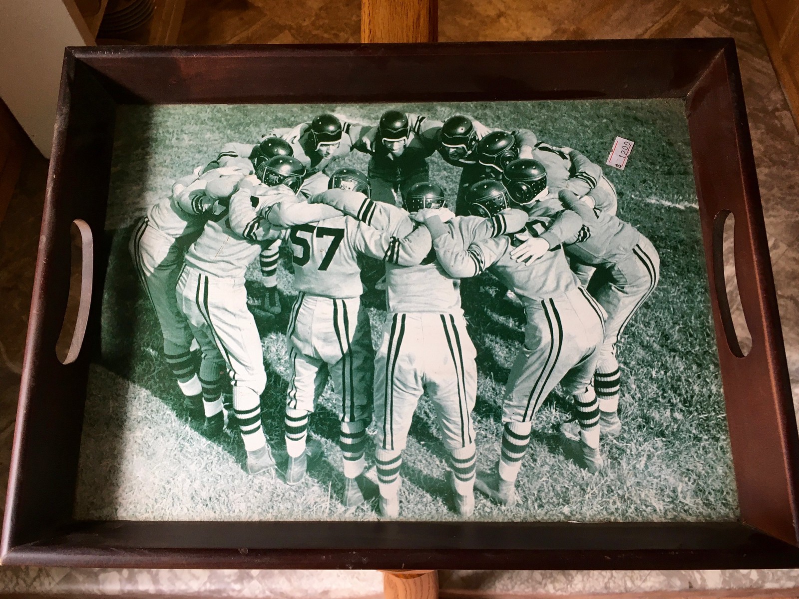
No idea what team that was, but I do like that rear pants striping!
That same shop also had this (ash?)tray with a nice illustration of a female golfer:

My default hunch for a woman golfer of that era is that it must be Babe Didrikson, but I don’t really know. Anyone..? (Update: Several reader/commenters say it’s actually Patty Berg, first president of the LPGA. Thanks for that info, guys!)
I didn’t buy any of these things. But I did buy the next thing I’m going to show you — a copy of the 1975-76 UNC hoops yearbook, called the Bluebook. The cover alone, featuring three seniors for that season’s UNC team, is worth the $1 I paid:

I’m not sure what’s better — the clothing, the haircuts, or the double apostrophe catastrophe.
Here’s the table of contents, the credits, and so on:

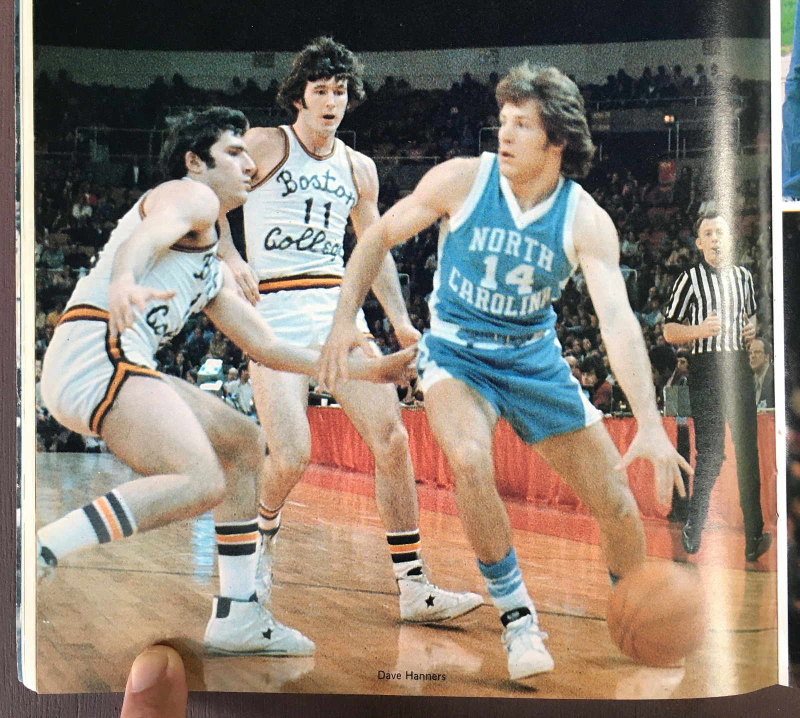
As you’d probably expect, the Bluebook’s 72 pages feature lots of color photos from the previous season, 1974-75 (nonchalantly referred to as “Another Championship Season”). Looking at those photos, two very uni-notable things become apparent. First, UNC was still wearing their uni-numbered socks that year. I knew about these socks, of course (they served as the basis for one of our Stripe-Rite sock designs a few years back), but I thought they were more of a late-’60s thing. I didn’t realize they were still being worn in the mid-’70s:


I love those numbered socks, man. Can’t get enough photos of those!
The second thing worth noting (well, other than all those players wearing Carolina blue Chucks) is evident in the photo shown above — the guy on the left, wearing No. 45. He’s wearing belted shorts. So are all the other players (although it’s hard to see in most of the photos, but it’s consistent throughout all the photos in the Bluebook). Again, I realized UNC’s shorts once had belts — so did many, many basketball teams during the 1950s and ’60s. It was a fairly common thing at the time. But I’m really surprised to learn that a top-level team like UNC was still using belts in 1975.
A few other interesting details from the Bluebook:
• Check out the primitive-looking script that Boston College was using:
• I have no idea if numbers and NOBs on warm-up tops were common in the mid-’70s, but UNC had them:

• The center of the Bluebook has a page devoted to each player on the UNC team, each featuring a sort of faded-looking illustration:
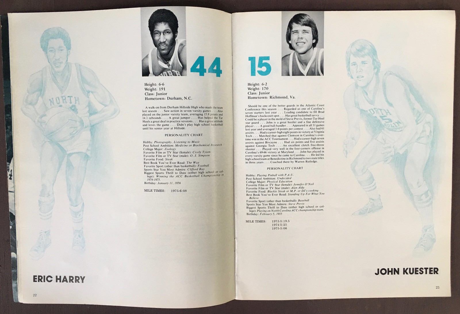

According to the credits, the illustrations were done by “a Carolina alumnus from Atlanta” named Gwyn Raker. Some quick googling reveals that Raker would go on to create Home Depot’s “Homer” mascot character. (The company is based in Atlanta.)
• UNC coach Dean Smith did not escape the era’s prevailing fashions:

———
Fun little publication. I bought it because I plan to send it to Uni Watch reader James Gilbert, who’s sent me soooooo many UNC-related Ticker contributions over the years. Well, assuming he doesn’t already have a copy of it himself, which he very well might! Let me know, James.
My weekend also entailed some grilling, some hiking, and one very excellent strawberry-rhubarb pie. Hope your weekend was just as enjoyable!
My recent article on MLB's 1999 Turn Ahead the Clock unis got a nice shout-out from @jasonbenetti on tonight's ESPN2 Statcast broadcast of the Yanks/Sox game.
Here's the article: https://t.co/lqBfgTchGE
(h/t to @DKanner10 for the video) pic.twitter.com/vWcLGAfIlY
— Paul Lukas (@UniWatch) July 19, 2021
ITEM! Another Uni Watch on-air shout-out: ESPN broadcaster Jason Benetti, who was doing the play-by-play for the Statcast/ESPN2 version of last night’s Yanks/Bosox game, gave a nice shout-out to my recent InsideHook article about MLB’s TATC uniforms. Nice!
(Big thanks to everyone who alerted me to Benetti’s Uni Watch reference, and doubleplusthanks to Dylan Kanner for capturing the video for me.)

ITEM! It’s time for Question Time It’s been more than a year (!) since the last installment of Question Time, the “Ask Me Anything”-style series where I respond to your questions. So I’m hereby putting out a call for questions.
As always, the ground rules are as follows:
• One question per person.
• You can ask me about uniforms, about Uni Watch, about sports in general, or just about me.
• No question is out of bounds, but I reserve the right to ignore questions that I think are too personal.
• I usually receive more questions than I have the time or resources to answer, so apologies in advance if I don’t get to yours.
With all that in mind, send your question — again, just one per person — here. (Please note that this is not the usual Uni Watch email address.) I’ll respond to them in a new Question Time installment soon. Thanks!
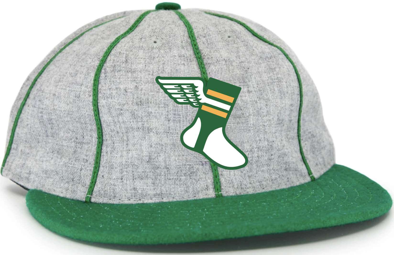
Click to enlarge
Should this be the new Uni Watch cap? In case you missed it last Friday, I’ve mocked up a new cap design we could do with Ebbets Field Flannels (see above). What do you think?
Before you answer that question, here are some details:
• This would be an eight-panel cap (not the more common six-panel) with green piping as shown in the mock-up.
• Just like the Classic Cap, this one would be 100% wool and made in the USA by Ebbets.
• That green brim is a Kelly green. As I recently explained, Ebbets no longer has the shade of green we were using for the Classic Cap. I don’t want to do a solid-Kelly cap, but I think the combination of Kelly, grey, and piping works really well.
• Speaking of the brim: The photo that I used for the mock-up showed a cap with a short, soft visor. But if I go ahead with this product, it will have a conventional-length stiff visor.
• No visible maker’s mark, of course.
• It would be available in fitted sizes. If enough people expressed interest in an adjustable version, I’d do that as well.
• It would be available to ship around the end of September.
• It would not be cheap — based on the quote Ebbets has given me, the price would be something like $43 plus $6 shipping.
I will not go ahead with this product unless I’m certain that a significant number of you are willing to purchase it. I might even require pre-orders, or at least deposits. But for now, I’m just trying to gauge how many people are interested, based on the details and pricing I’ve just spelled out. If that’s you, please send me a note indicating that you’d be on board. If you want to list your preferred size (or if you’d prefer an adjustable instead of fitted), that would also be helpful.
Thanks in advance for your feedback — much appreciated.
The Ticker
By Jamie Rathjen

Baseball News: Here is this year’s summer event uniform for Japan’s Central League’s Yokohama DeNA BayStars. It marks the 10th anniversary of DeNA buying the team (from @bigdaddy45_1969 and Jeremy Brahm). … Brewers P Josh Hader now has his personal logo on his glove (from Jason Collins). … No pictures for either one, but reader David Dahl tells us that the Cubs’ radio broadcast mentioned recently that the team plans to wear the City Connect uniforms for Friday home games. Also, the Cardinals and Giants, who faced each other over the weekend, both currently have relief pitchers named García who wear No. 66, and both appeared in Friday’s game. … The American Association’s Milwaukee Milkmen wore gold accents to commemorate last season’s championship (from @phoenixfire8282). … Youngstown, Ohio, has a new statue of city native George Shuba shaking Jackie Robinson’s hand after Robinson hit his first home run for the International League’s Montréal Royals (from Kary Klismet). … Tomorrow night’s Rays/Orioles game will make MLB history by having an all-female broadcasting crew.
College Football News: UCLA is to reveal new uniforms Aug. 7 (from Kary Klismet). … New Vanderbilt coach Clark Lea wants players to earn their numbers — which of course sounds familiar to me — so they’re now listed on the team website’s roster number-free.

Hockey News: An Ohio high school got its championship rings for winning the boys’ state championship this year (from Kary Klismet).

Basketball News: These two are from Kary Klismet: The Bucks didn’t get a parade when they won the NBA championship in 1971, just because nobody thought of it. … Some Indiana sportswriters were asked to name their favorite high school arenas.

Soccer News: Two new shirts for Germany’s Werder Bremen. … Others with new releases include England’s Bristol Rovers, Derby County, and Doncaster Rovers, Poland’s Górnik Zabrze, and Spain’s Rayo Vallecano (the last two from Ed Żelaski). … FC Buffalo Women in United Women’s Soccer, the de facto U.S./Canada second tier, have the goalies and outfield players wear two different ads, or maybe have two different ones in general, though I’m unclear on why they have five very different shirts (from @BirtMC). … New kits for top-tier Portuguese clubs Boavista and Moreirense (from @MikeDfromCT).
Olympics News: The first two are from Kary Klismet: China’s opening ceremony uniforms — at least, that’s what they seem to be — received a lot of public criticism. … Meanwhile, the South China Morning Post also ranked some of the most “stylish” countries. … Here are Japan’s boxing and weightlifting uniforms (from Jeremy Brahm). … The blog Impersonal Finances has a piece on how much Olympic medals are actually worth.

Grab Bag: Yesterday’s Ticker mentioned Norway’s women’s beach handball team wanting to wear shorts at the European championships, but the sport’s rules are written such that they have to wear bikini bottoms. At yesterday’s bronze medal game they did wear the shorts apparently without incident, but still expected potential fines. More on their adventure last week here. … In the Australian Football League, Greater Western Sydney forward Jesse Hogan has made four appearances in his first season with GWS and managed to wear all four of their designs (from @Sportrepreneur). … Cycling’s UAE Team Emirates, the team of Tour de France winner Tadej Pogačar, wore a commemorative kit for yesterday’s final stage, as other winners’ teams have done recently. … Japan’s men’s rugby union competition recently renamed itself to Japan Rugby League One — but it’s an odd name because rugby league exists, so union competitions usually don’t have “league” in their name and aren’t referred to as leagues. One of its teams, Yamaha Júbilo, also rebranded as Shizuoka BlueRevs, and another, Kobelco Kobe Steelers, got a new logo (all from Jeremy Brahm). … Coca-Cola Zero Sugar is getting a new formula and can design (from Max Weintraub). … The next three are from Kary Klismet: N.C. State got a new live puppy mascot last week. … High school track and field and cross country now allow religious head coverings and larger maker’s marks on shorts. … A youth rugby sevens team in Guam got new shirts. … English rugby union and netball club Wasps has a new logo (from Sy Hart). … Speaking of rugby union: During the recent match between South Africa “A” and British & Irish Lions, the Springboks wore their 2019 World Cup socks. “Their current kit has a blueish shade of green, so the socks stood out,” notes Hunter Sewell. Here’s how the socks looked with the 2019 World Cup kit. … New home uniforms for Japanese men’s volleyball club team Sakai Blazers (from Jeremy Brahm). … The Frick Pittsburgh museum currently has an exhibit devoted to women’s sports attire from 1800 through 1960 (from Steve Silverstein).
Wow – I’ve never been the first person to comment before! Small nit – your description of the UNC hoops yearbook lists the years as 1976-76.
Some very interesting finds here. And no, I never understood the fascination with hoboes either.
Typo fixed. Thanks!
Fun fact: There is a National Hobo Association. And they use the Hobo Font extensively in branding, because, of course. link
The old-time football photo on the tray must’ve been licensed out at some point. I got a set of 4 coasters from Pottery Barn or Crate and Barrel years ago and that image is on one of them. (Actually still set my coffee on it every morning while reading Uni Watch!)
link
Well after Google searching, the lady golfer on the plate might be Patty Berg. She happened to be a founding member and first President of the LPGA and holder of record for most majors won.
Yes, that is definitely Patty Berg.
Thanks, guys — I’ll add that to the text!
Statcast > Regular broadcast – Benetti is one of my favorites
Paul, if I remember right you teased some “big Uni Watch news” recently that ultimately got sidetracked for some reason. Is that still imminent? Just curious!
Yes, still imminent. Tomorrow or Weds.
Exciting!
Exciting!
Thanks Paul!
Sudden realization from a few years ago was how cold gyms must’ve been, because that’s a pic of UNC’s SECOND warm-up shirt. They had an even bulkier warm-up jacket. link
As I’ve noted before that shield was based on a design the team started wearing in 1958 (and for a few years) that had ‘NCAA Champions’ on it.
I have a set of coasters with old time football pics on them, and one is the same picture on the serving tray.
Oops, should have read Matt’s comment above, same coasters…
The FC Buffalo jerseys are fairly confusing. The FC Buffalo men’s and women’s teams each have their own unique kits and primary sponsor, while most clubs with two teams tend to have the same kit designs and sponsors.
Here is a rundown of the jerseys and sponsors shown in the pic.
– The blue jersey is the women’s home jersey. Community Beer Works is the primary sponsor for the women’s team.
– The tie-dyed jersey is the women’s keeper jersey.
– The green jersey is an alternate for the women’s team. Lloyd (a local taco restaurant) is normally a secondary sponsor but the primary sponsor on the alternate jerseys. I can only assume the women’s keepers wore this jersey since the regular keeper kits clashed with their opponent?
– The white pinstriped jersey is another alternate jersey for the women’s team with Lloyd as the primary sponsor.
– The purple jersey is the warmup jersey. I believe worn by both the men’s and women’s teams? The primary sponsor on this jersey also appears to switch between Community Beer Works and Lloyd.
Thanks heavens the women’s team have not reverted to their old name: the Buffalo Ffillies. Yep, two Fs, two Ls.
*advertiser
I don’t know where to leave an Inside Hook comment, but since your post is mentioned here I just want to say thank you. It’s weird to feel nostalgic for a “Turn Ahead the Clock Night” but there’s only so much history that we Mariners fans can claim. For all of the team’s failings on the field, Kevin Martinez has marketed the hell out of the Mariners and Dave Neihaus, rest his soul, ginned up excitement without being a shill. The video clip from @BSmile with Dave and Ron Fairly, two old-schoolers trying to make sense of it all, is a classic.
The real red thread in the story is the expropriation of a quirky, unique, local promotion into a league-wide merchandising campaign by MLB that only a handful of teams bought into. Unfortunately, it’s one you’ll be writing again and again in the future.
Glad you enjoyed it, Stephen — thanks!
Where does a High School get the money for those State Championship rings? Those look like 2 to 3 grand apiece. I guess they must sell a crapton of chocolate bars…“
I assume alumni donations for that sort of thing. A quick search shows that HS is a prep school, so alumni donations seem pretty likely.
I know that when the private HS in my hometown had to travel for playoff games, or would win championships, alumni would usually foot the bill for covering costs of playing said games as well as for celebrations of championships.
Mitch Kupchak features prominently in that UNC Blue Book (on the cover as a senior). He said one of the big reasons he chose to attend Carolina was the v-neck jerseys (instead of the standard rounded neck) the Tar Heels wore. Mitch clearly was a Uni-Watch guy!
Well, I’ll be damned, link
I’m glad you found that – can’t remember if that’s where I learned it, or if I heard it on an ACC basketball broadcast when Mitch was playing for the Heels.
China’s Olympic opening ceremony uniforms seem pretty tasteful to me, or at the very least pretty un-noteworthy. I’m starting to think that with online comments about such things that people who don’t like a design are much more likely to post about it and thus such comments are a very unreliable indicator of true public opinion.
Proofreading: The second thing I worth noting (well, other than all those players wearing Carolina blue Chucks)
Thanks. Fixed.
Re: the 1971 NBA Champions Bucks not getting a parade, I don’t remember the 1970 or 1973 Knicks getting a parade either so I checked the list of NYC ticker-tape parades — link. They did not get a parade and I was surprised to see that the first ticker tape parade for a baseball team was the 1954 Giants and the Yankees first parade was 1961. Golfer Bobby Jones had two parades and Ben Hogan had one before that.
Loyola Ramblers had a hobo logo and mascot well into the 1980’s, before they switched to the wolf logo. The entire Sweet Sixteen game vs Georgetown is on YouTube and the mascot can be seen.
Looks like Duke had red trim in those yearbook photos. Am I seeing the things?! Or is that an “duh, of course, Duke used to have red accents!” thing.