For all photos, click to enlarge
It’s time for another entry from baseball jersey restorer extraordinaire Bill Henderson, whose business, the Dream Shop, has been featured in several previous Uni Watch entries.
Today Bill will tell us the story of restoring a very specific aspect of a Hall of Famer’s jersey. Take it away, Bill!
Restoring a 1960 Roberto Clemente Jersey
By Bill Henderson
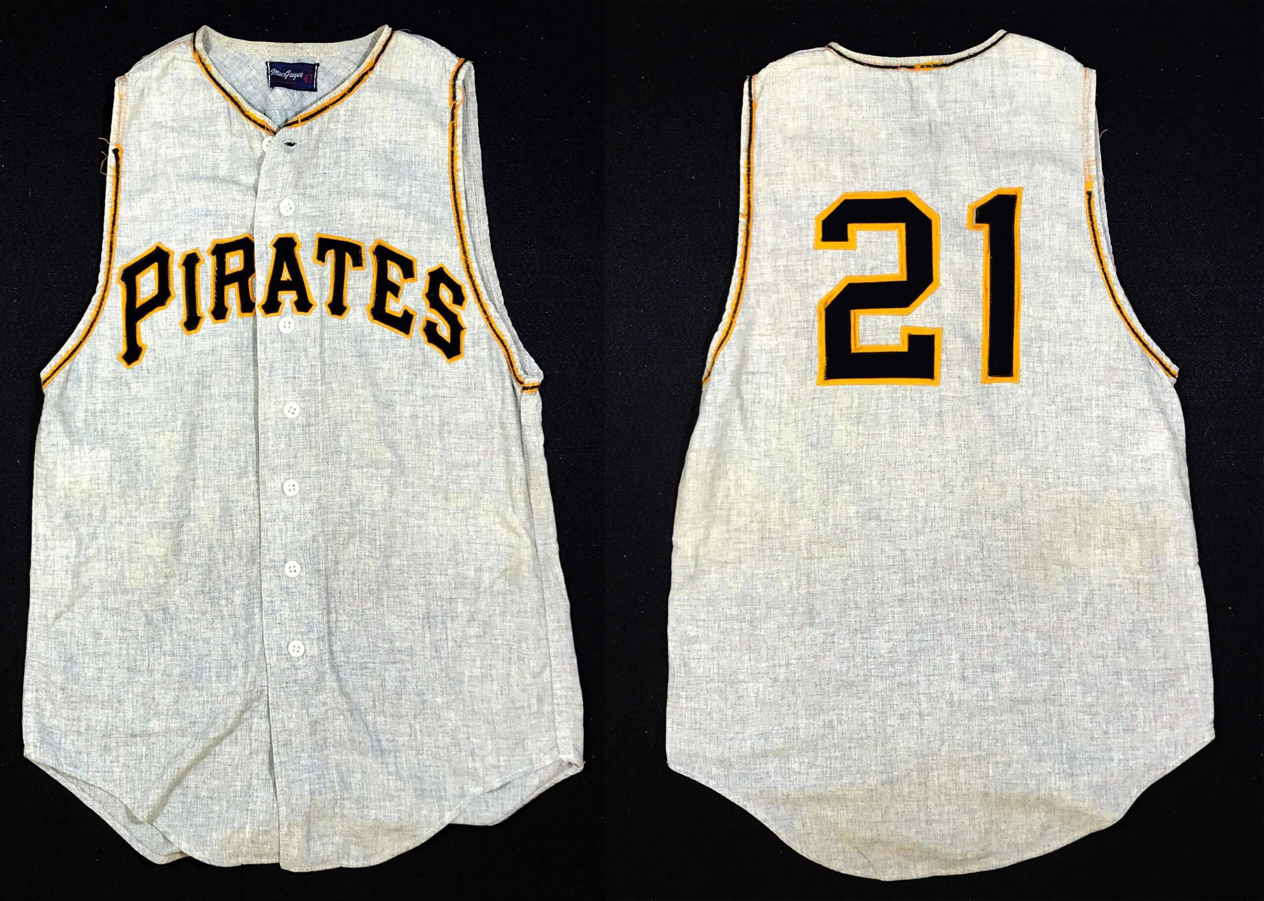
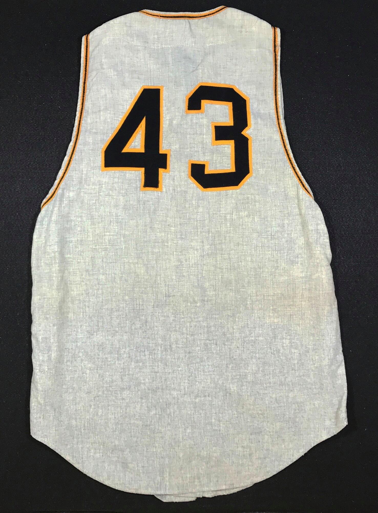
A devoted Pirates collector won this priceless relic at auction: a Roberto Clemente road jersey from the Pirates’ 1960 championship season (see above). He sent it to me asking me to renew the braid trim on the neck and armhole openings, all of which was in poor condition.
Now, we here at the Dream Shop regularly handle a lot of precious artifacts, but I’ll admit that this one made my knees go a little weak. Were we up to the task of making this jersey museum-worthy?
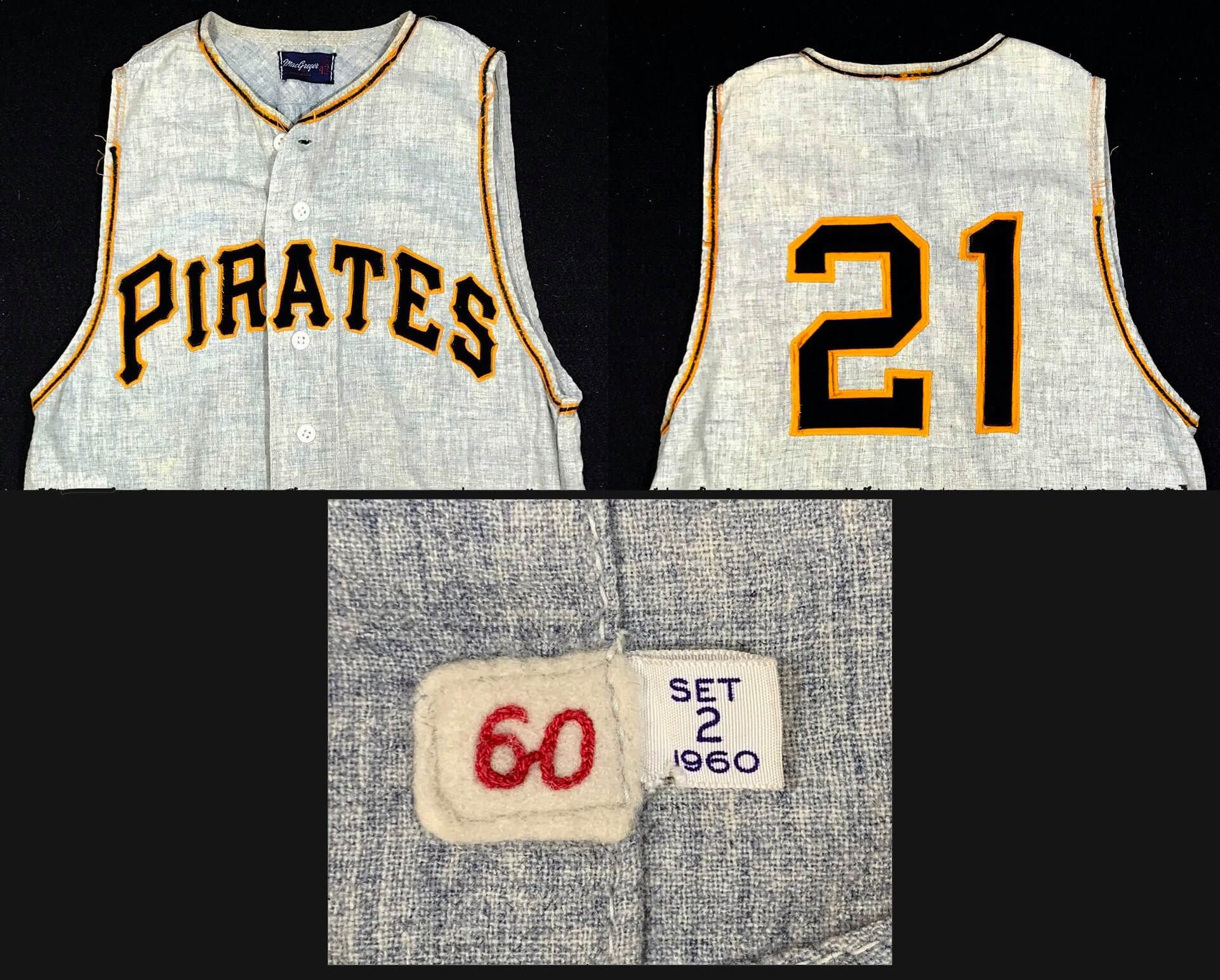
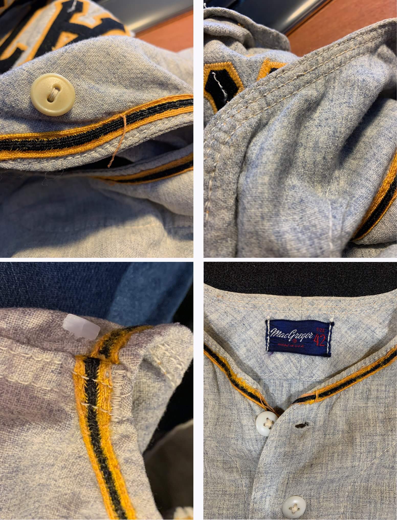
Looking closely at the neck and sleeves, all three openings showed heavy wear. The trim had deteriorated to mere threads and strings in some spots:
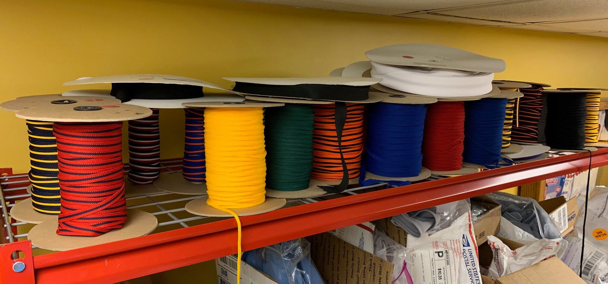
For a job like this, we normally turn to our cabinet of notions and odds and ends, where I have spools and spools of almost all the styles of braid trim used by MLB teams over the past 50 years:
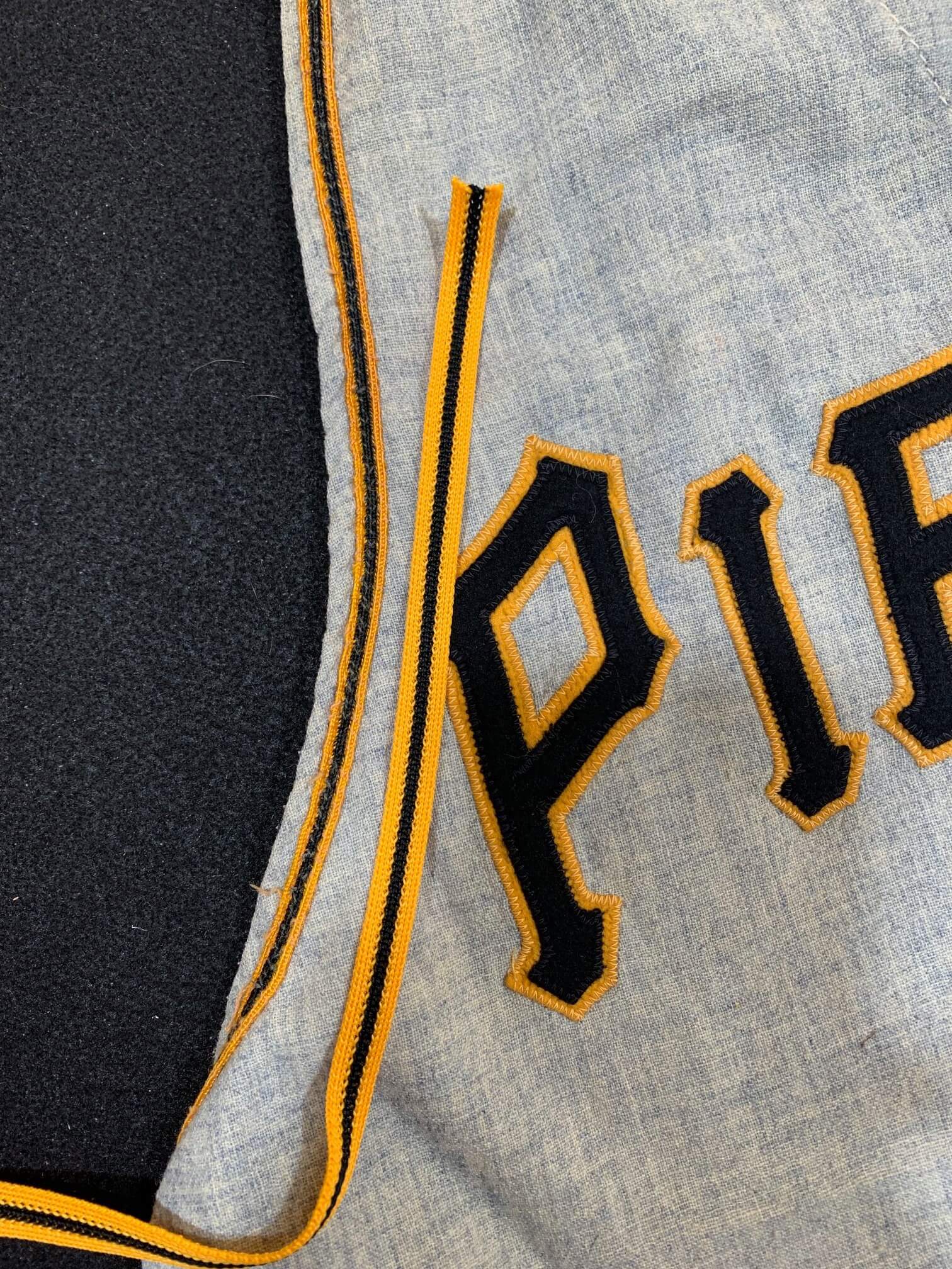
But this job was different — the 60-year-old Clemente jersey used a now-rare variety of fine-woven nylon trim. Here’s how the modern trim looks next to the original style — close, but not an exact match:
The solution came in the form of an idea that would be unthinkable for most collectors: Our customer procured another 1960 Pirates jersey that had belonged to a coach. The braid on that one was in much better shape, so the customer asked me to “harvest” the trim from it and swap it onto the Clemente. Gulp.
We started by taking dozens of detailed photos of the Clemente jersey: all the stitching front and back, the trim placement in relation to the seams and the edges of the fabric, how it is inserted and pinched inside the seams of the garment (which we’d likely have to open up as a part of the process). When it goes back together it must be undetectable!
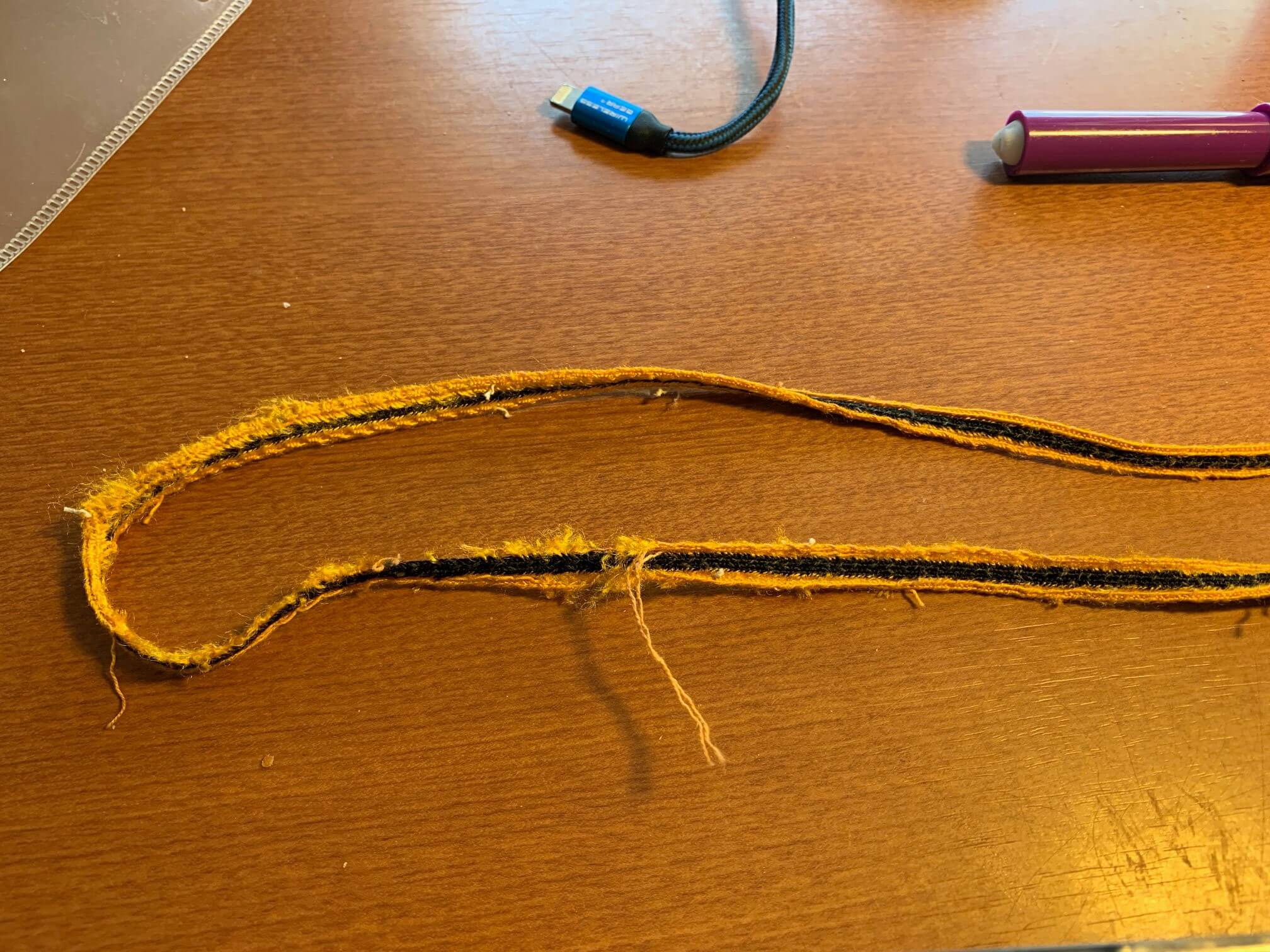
The trim had to be removed from the coach’s jersey one painstaking stitch at a time, at which point it became evident that it too had wear spots and fraying, so we would not be able to swap the entire strips onto the Clemente jersey:
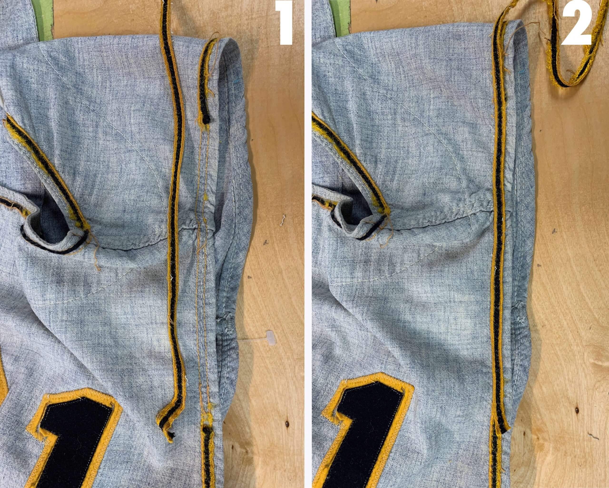
So we had to try something much trickier. We carefully removed the trim from the Clemente only in the spots where it had worn through, which amounted to about two-thirds of it. Why didn’t we take it all off? Two reason: First, we wanted to retain as much of the original trim as possible for historical value. And second, we didn’t have enough of the replacement trim to cover the collar and both armholes!
In the four photos below, you can see the steps involved in the splicing. The good trim harvested from the coach’s jersey is sectioned so that we find pieces exactly the right length to cover the bare spots on the Clemente. We then blend the edges of the woven fibers together and stitch the new using the exact color of top stitch (dark gold) and bobbin thread (medium grey) as the original. The goal here is that nobody will be able to spot the repairs unless they’re really looking for them. You can see the result in the final photo:
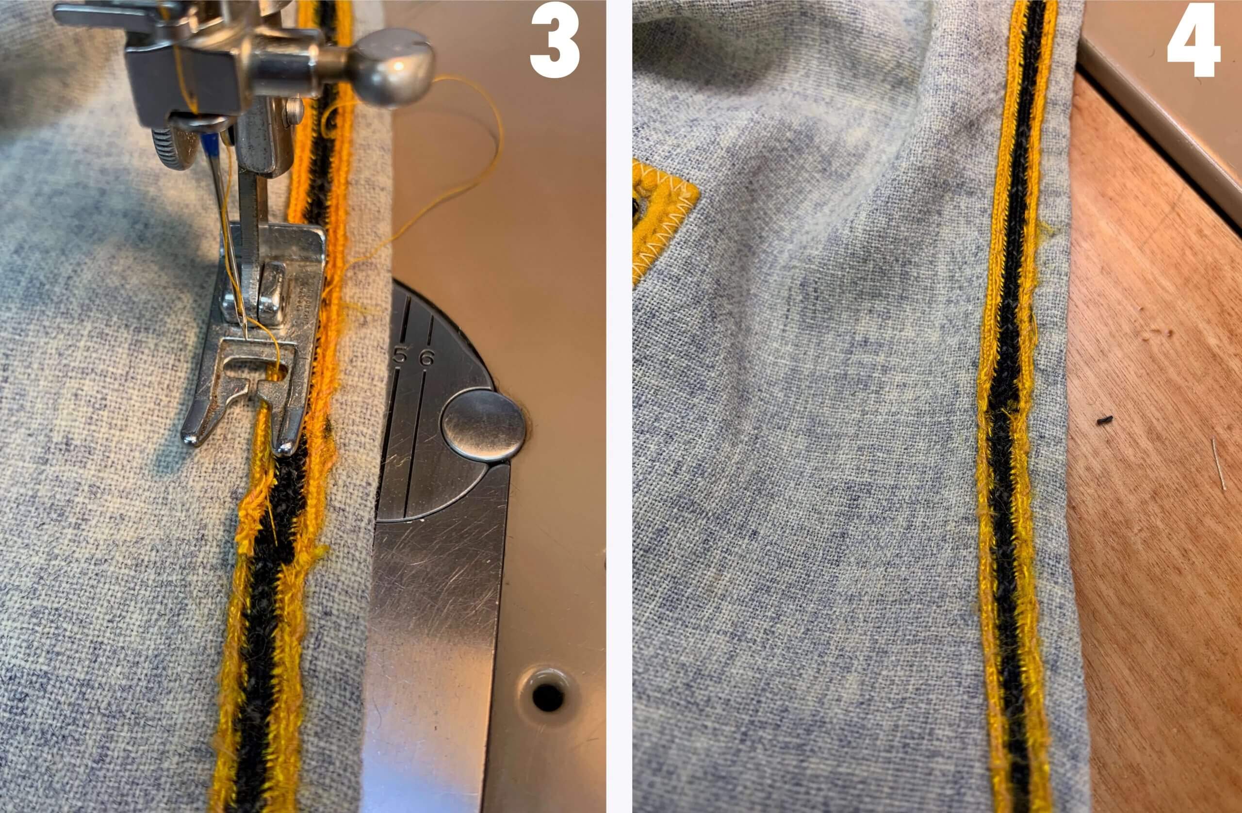
Here’s are two close-ups of the finished trim — one from the front and one from the back. Can you tell the original braid from the replacement braid?
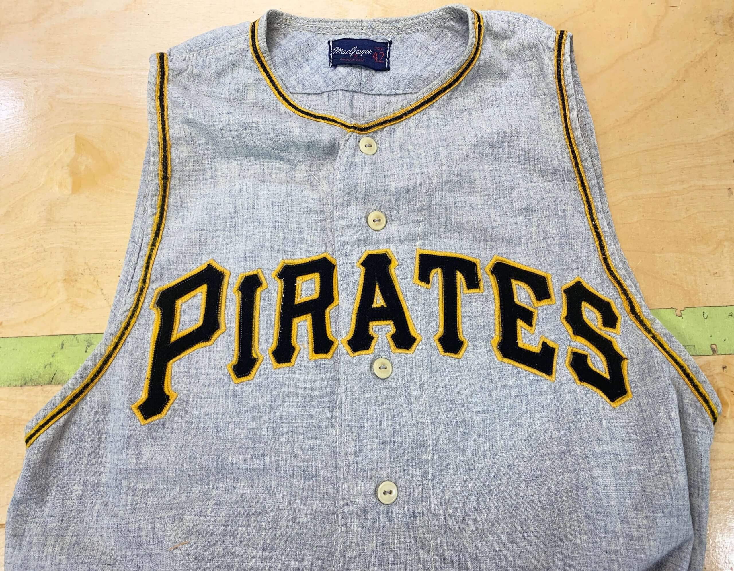
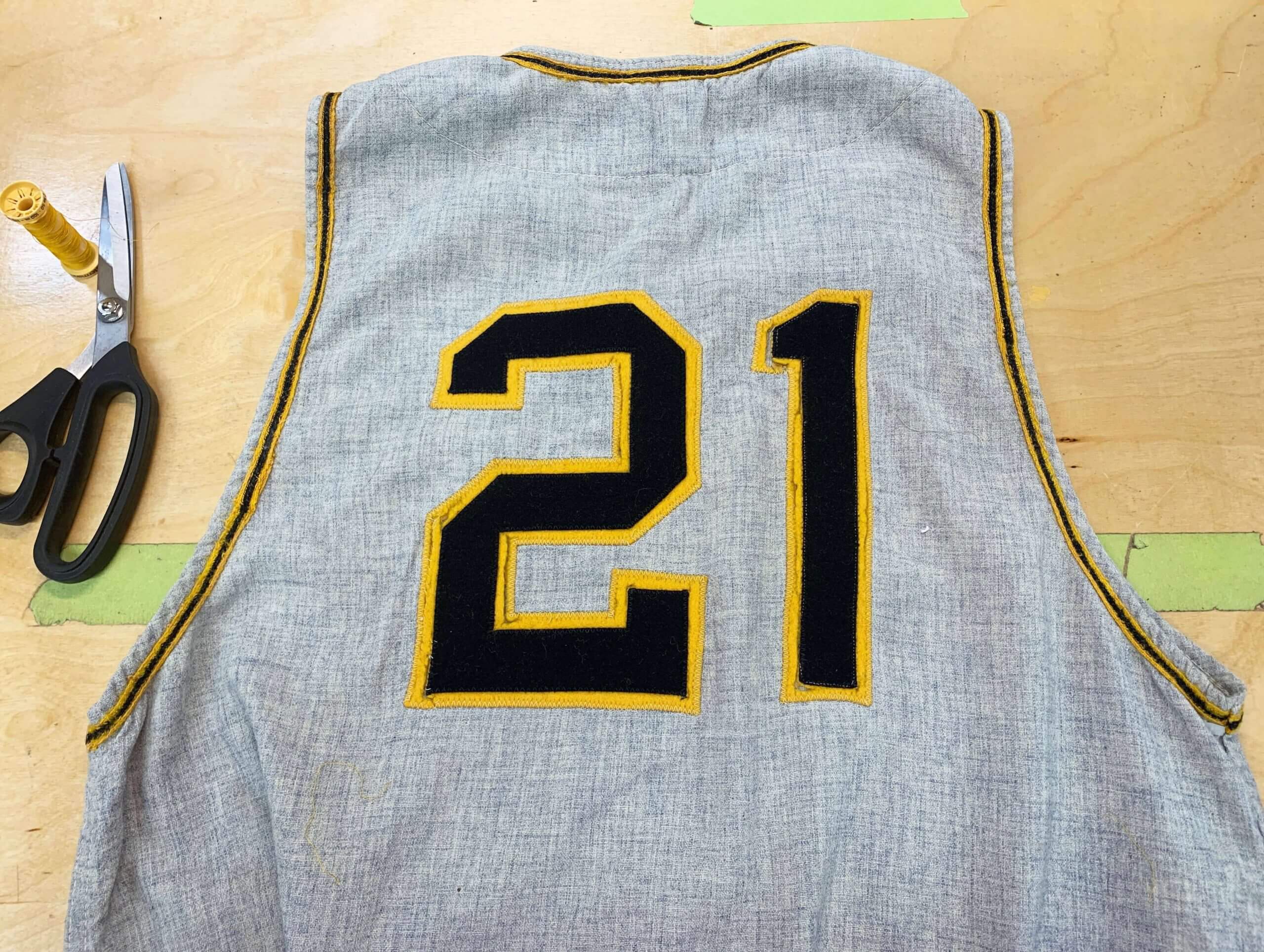
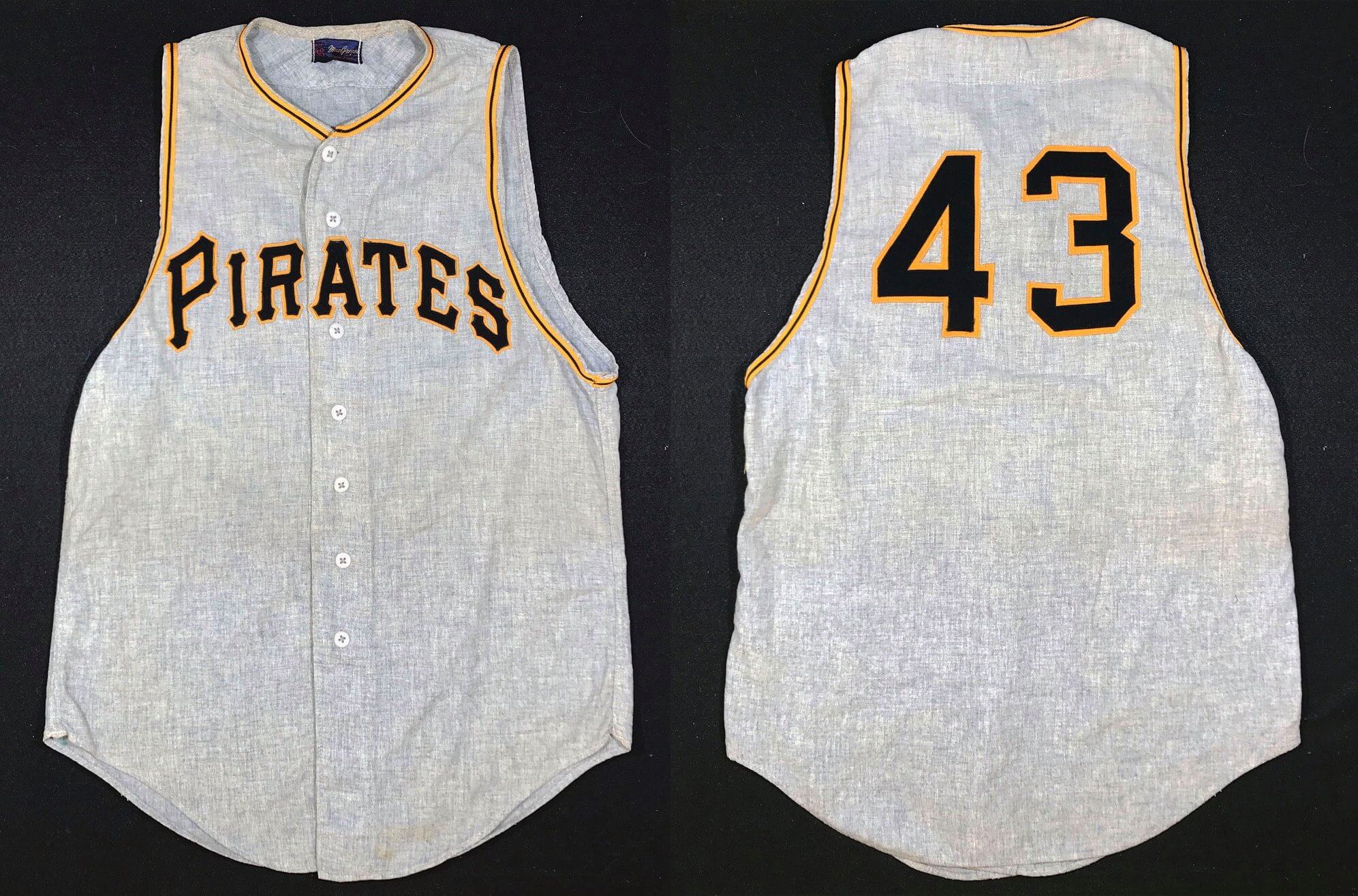
Here’s how the completed jersey looks, ready to be displayed. Sharp eyes will notice that I also swapped the entire set of original style two-hole buttons from the coach’s jersey to replace the mismatched buttons on the Clemente:
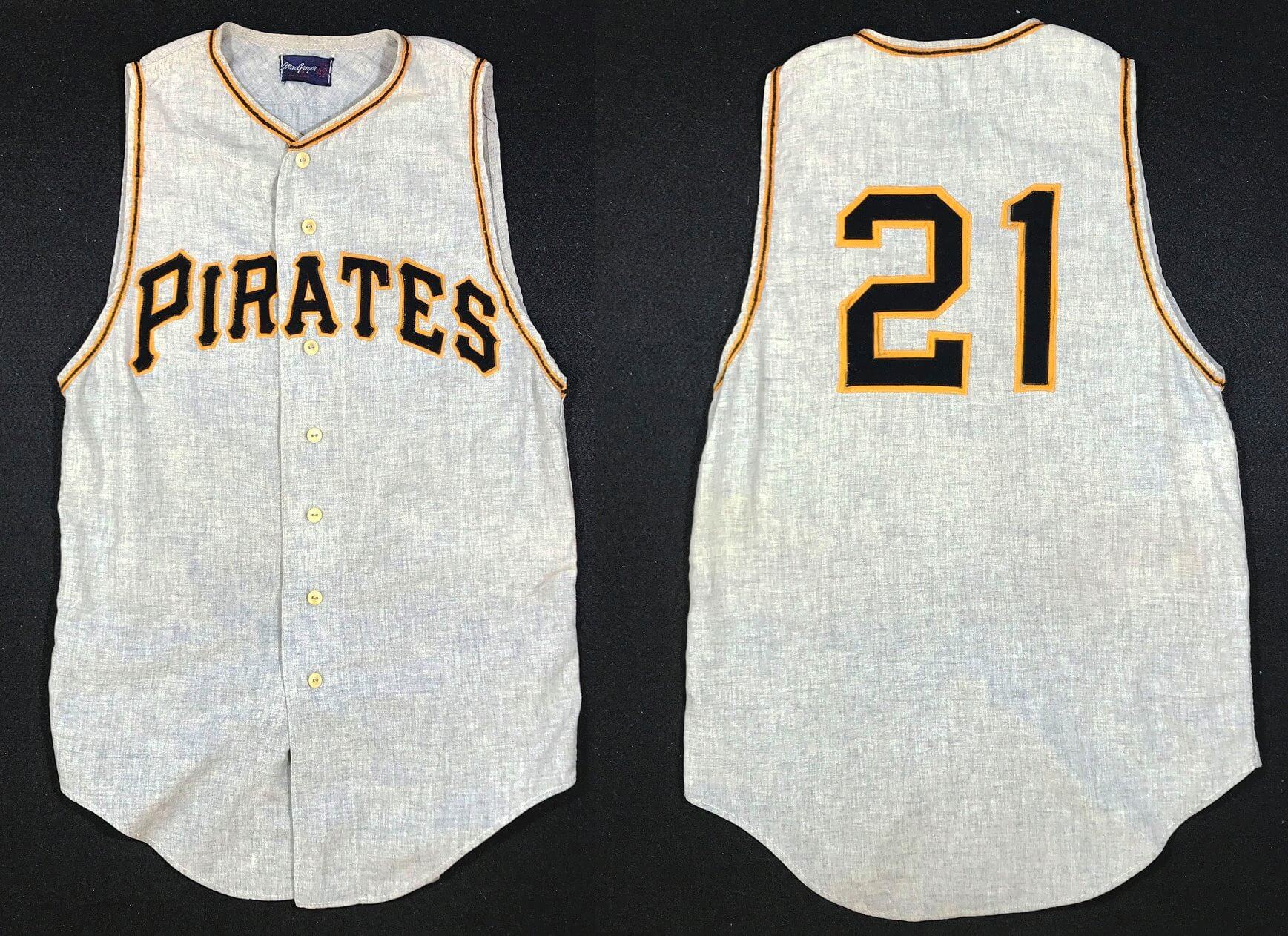
But that’s not the end of the story! We couldn’t leave the No. 43 jersey ruined and bare, so we restored that one as well, using the modern trim I showed you earlier, which you probably wouldn’t known was not original unless I told you:
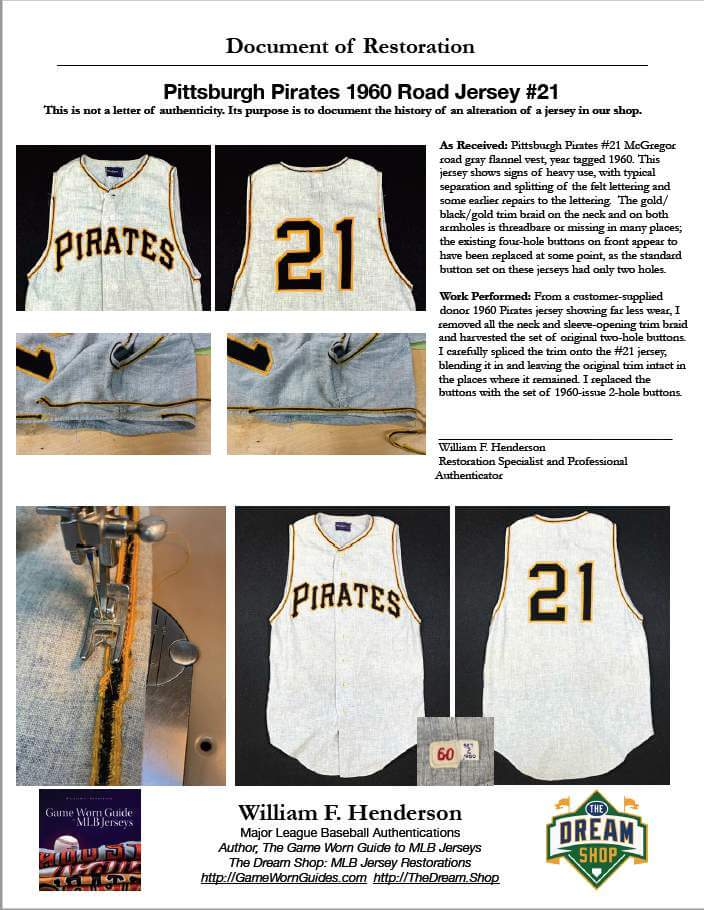
Finally — and this is so important — here’s the Document of Restoration that we supplied with the restored jersey. It tells exactly what was done, when, and by whom. So any future collector who might want to purchase this 1960 Clemente has a visual trail to explain the transformation from the version that our customer won at auction to the restored version.
———
Paul here. This is one of my favorite Dream Shop stories, because it’s so detail-specific. A whole storyline just for the trim! I really, really love that. Big thanks, as always, to Bill Henderson for sharing his expertise with us. Again, you can see more of his Tales from the Dream Shop here.

Click to enlarge
Uni Watch before there was Uni Watch: Got a note the other day from longtime reader Robert Eden, as follows:
Back in the pre-Uni Watch days, when I was alone on my uni island, I would rank MLB and NFL uniforms. I did this every year or two for about 10 years, depending on whether I thought enough teams had changed their look to merit a re-ranking. Then I’d share the rankings with my friends — who were uninterested and called me names. One friend saved them, however, and the 1996 rankings recently surfaced. I was 30 that year, but many of the “old guy” themes that we see on Uni Watch today were already top of mind back then.
Looking back at them, my opinions of the uniforms of that mid-’90s era are mostly unchanged. The one huge 180 I’ve done relates to the ’70s Pirates and others of that ilk. I apparently hated them then, but I love them now. My only explanation is that I absolutely despised all pullovers and sansabelts. I railed against them throughout the late ’70s and ’80s (“baseball uniforms MUST have buttons and belts!”). I guess I have since learned to love and appreciate the best of that era while still disliking the bad ones (Red Sox, Mets, my beloved Reds).
How great is that? The first page of Robert’s rankings are shown above; you can see the remaining pages here, here, here, and here.
To put this in some perspective, Uni Watch was still three years away from happening when Robert created these rankings, but he was already doing his own version of Uni Watch! I don’t agree with all his 1996 opinions, but I love the passion and geekiness he brought to bear.
Most of all, though, I relate to that feeling of having thought something out, needing to set it down in writing, and then needing to share it with other people, even though they might not probably won’t care. Nowadays, the internet makes it much easier for us to find like-minded folks who Get It™ (whatever your “It” happens to be), but it was a lot harder back in the day. Back in my teens and 20s, I often had the urge to create essays or lists about various topics, but I didn’t always follow through on creating them. Kudos to Robert for articulating his uni-centric passions, and for sharing them with us here.
The Ticker
By Paul
Indigenous Appropriation News: MiLB’s Spokane Indians and the Spokane Tribe are partnering with several local civic organizations to create a Native-themed basketball court at a local park (from R. Scott Rogers). … Native American groups are applauding the new logos released yesterday by the WHL’s Portland Winterhawks. The team had previously used the Blackhawks’ logo (thanks to all who shared).

Baseball News: Angels DH/P Shohei Ohtani’s cleats and other accessories from his history-making All-Star Game appearance are headed to Cooperstown (thanks, Brinke). … You know that many National League teams wore pillbox caps in 1976, but did you know that those caps were also worn by NL umpires? Here’s another example (from Dan McBride and Abe Froman). … Stalwart Ticker contributor Kary Klismet lives in Denver and on Sunday went with his dad and son to see MLB’s “Play Ball Park” exhibit, which was part of the All-Star Game promotion. “They had a nice section on the Negro Leagues, a traveling set of artifacts from the Hall of Fame, and a large display of MLB trophies,” says Kary. “I snapped as many photos of the uni-notable content as I could while still trying to keep track of a very excited five-year-old (and a 75-year-old)!” He also shared a separate batch of photos showing how Denver was decked out for the ASG. … The Triple-A Charlotte Knights will become the Charlotte Traffic Cones on Aug. 20 (from Matthew Jean).
College Football News: When Alabama and Miami open the season with a neutral-site game in Atlanta on Sept. 4, Bama will be the road team wearing white (from Griffin Smith). … New uniforms for Coastal Carolina (thanks to all who shared). … Here are UAB’s championship rings for the winning the 2020 Conference USA title (from Kary Klismet). … Louisville is adding a memorial decal for former coach Howard Schnellenberger, who died earlier this year (from James Gilbert). … New uniforms for Southern Miss (thanks, Phil). … Florida WR Jacob Copeland is switching from No. 15 to No. 1. No. 1 on offense is usually reserved for top Gators playmakers.

Hockey News: An Indiana couple like to buy Ft. Wayne Komets (ECHL) jerseys when they’re available for auction and then return the jerseys to the players who wore them. … Speaking of the ECHL: New 30th-anniversary logo for the Wichita Thunder (from Jason Schawe). … The Canucks’ relocated AHL affiliate, formerly the Utica Comets and now transplanted to Abbotsford, British Columbia, will be known as the Abbotsford Canucks. They’ll use Johnny Canuck as their primary logo, which is what I wish the NHL’s Canucks would do (thanks to all who shared).

NBA/WNBA News: Here’s a really fun story about a fan who’s trying to collect ticket stubs from every NBA game Michael Jordan ever played in. Highly recommended reading. … Chicago Sky F Candace Parker is slated to become the first female player to appear on the cover of the NBA 2K video game.

Soccer News: New home shirt for Manchester United (thanks, Anthony). … New home and away shirts for Mexican side Pumas (from Ed Zelaski). … Also from Ed: New kits for Polish club Warta Poznań, Russian side FC Zenit, and English side Millwall. … New shirts for Inter Milan, Manchester City, Aston Villa, and Scottish club Cove Rangers (thanks, Jamie). … New home kit for AS Roma. … New kits for Sheffield FC, which is now being outfitted by Copa (from Germán Cabrejo).

Olympics News: Here are the women’s soccer uniforms for the Netherlands. “They’re the same as what they usually wear, but with the crest replaced with the NOC logo,” says our own Jamie Rathjen). … Members of Great Britain’s women’s soccer team plan to kneel prior to kick-off at their Olympics matches (thanks, Anthony). … Here’s a “Tokyo Olympics by the Numbers” infographic.

Grab Bag: Police officers in New Bern, N.C., will no longer be required to wear long sleeves to cover their tattoos. … The National Federation of State High School Associations has approved two uni-related rule changes for track and field (from Paul Dalton). … The awesomely named Sleeping Bear Dunes National Lakeshore in Michigan has a 50th-anniversary logo. … A Utah company has stopped selling a kit that makes a Glock handgun look like a Lego toy after receiving a cease-and-desist letter from the Danish toymaker (from Max Weintraub). … New uniforms for the Girl Scouts of America (from Timmy Donahue). … New athletics logos for Southeastern Louisiana University (from Scott Adams). … Here’s a ranking of school uniforms that have appeared in movies. … Pro golfer Paul Casey’s caddie is wearing Union Jack socks and Jordan 1s at The (British) Open (from Chris Howell). … British F1 drive George Russell will have a new Union Jack-themed helmet design for the British Grand Prix (thanks, Anthony). … Incredibly bad 40th-anniversary logo for frozen yogurt brand TCBY (from John Cerone).
But that’s not the end of the story! We couldn’t leave the No. 43 jersey ruined and bare, so we restored that one as well, using the modern trim I showed you earlier, which you probably wouldn’t (know) was not original unless I told you
Also looks like a ton of strikethrough from the Robert Eden article all the way down
Both fixed.
Morning!
I think there might be a dangling strikethrough tag somewhere…
Yikes. Fixed!
Unclosed strikethrough code in the last graf of the Eden section.
Refresh the page.
I love it when Bill tells stories like this… that’s why he’s the best at what he does!
Agreed, I love the amount of detail and care that goes into restoring these jerseys!
In response to Mr. Eden, I see that a lot of your higher rankings for the uniforms were for teams that were closer to New York. Is this a coincidence? You complained about orange but have the Mets that high. Hmmm, I see a lot of bias here.
His downgrade of the White Sox was due to their inability to settle on a style/color. Twenty-five years of consistency since those rankings might work in their favor. Perhaps Mr Eden could create his current rankings.
It’s really interesting to look back at the uniform rankings 25 years later and see how changing opinions about fashion, style and colors influence. It is also very interesting to look at how some of the uniforms have changed (or not changed) over time and how that might change Robert’s opinion.
I share DJ’s opinion about the White Sox. I am amazed that they have kept the same uniform for thirty years. Maybe a good blog entry might be how long does a uniform design has to last for it to be a classic, or if time is the only factor in determining if a uniform is “classic.”
Thanks for including this. Much fun!
Did you see his comments about the Brewers? He gave praise for getting rid of the MB baseball glove logo and adding a totally new color (green). The uniform gods are offended!
(Yes I know Todd Radom designed these uniforms. They are nice uniforms, but not for the Brewers. He did his job well, but I think the Selig family watched too many Packers games.)
Dave Hilton, there is definitely no bias in favor of New York teams. I am from the Midwest and generally dislike New York teams or even sports-hate them (read: Yankees). With regard to the orange, I did not have a problem with it in general. I just did not like too much of it. The Mets’ more subdued use of orange was perfect.
I like the idea of doing an updated list, just to see how my tastes have evolved over the years and how changes such as the White Sox’ old instability will impact my opinions.
Robert, I would love to see either/or your updated rankings and reasoning or your current assessment of the state of uniforms looking back at 10- or 5-year intervals, like what today-you would say about 1995, 2000, 2005 etc uniforms. I found only a couple of your reviews above that I didn’t completely, utterly disagree with, and personally I find reviews/criticism much more interesting when it’s both well though-out and divergent from my own opinions. So I’d be thrilled to see more from you!
I like the idea of doing a 2021 version. Looking back at 5-year intervals is a neat idea, too. As always, it is tough to resist the need to make a list . . . .
Its cool that there wasn’t any geographical bias there, especially since you ranked the Yankees number 1. Although I think it’s easy to see why one could rank them 1st, in a bubble their uniforms really are quite bland.
Robert:
I also note, that I don’t know how old you were then. It’s just that you note certain uniforms as classic, such as the Cubs, while noting a re-design, while knocking down the Red Sox as being ‘oft-changed’ when other than the 70s – early 80s they wore essentially the same uniform.
I wonder how the notes would change as you have learned more over time, such as differences in colors (creams v. whites), differences in pinstripe widths, differences in fonts, etc…
I also have a NY sports dislike, mostly. I don’t like seeing them up top anywhere.
Looking at Robert Eden’s uniform rankings from 1996, it goes to show that some things never change. In this case, with a few exceptions we see that designs that have been around for a long white are going to be ranked highly, while newer looks are going to mostly fall to the bottom. For example, in his NFL rankings, the five newest teams at the time (Seahawks, Bucs, Ravens, Panthers, and Jags) are all ranked 23rd or lower.
OTOH, some things do change. A comment like “Chief Wahoo is timeless” probably wouldn’t be considered a big deal in 1996. It certainly would draw a lot of criticism today, however.
“now transplanted to Abottsford, British Columbia, will be known as the Abbotsford Canucks.”
Small edit needed in the Hockey Ticker Paul. Abbotsford spelling is tricky. I have to double-check it sometimes.
Thanks, Wade. Fixed.
Did you ever do an article somewhere or entry on here about the 76 pillbox hats? I think I had something about them stored in the back of my brain that made it sound like something I’d heard before when I read the ticker, but don’t know anything about it! Would like to know more/which teams specifically participated/how often if that sort of info exists somewhere! I’m also curious why it was just the NL, especially when I Google image search it, it comes up with this photo: link which looks like it shows a Tigers player in one!
It was just the NL because it was about the NL’s centennial (which happened to coincide with the USA’s bicentennial).
The photo you linked to is from an MLB overseas tour of Japan. The pillbox caps shown there are not the same ones worn by NL teams in 1976. As you can see, most of them have way more stripes.
Interesting… there’s a Detroit (AL) pillbox hat…
Was the pillbox thing in 76 like an every-team-every-game-all-season thing? Or did just a few teams decide to participate/was it for specific games/weekends/at the discretion of the team on when to wear them?
Pirates did it for all games (and kept it beyond ’76), other teams did it more selectively, some teams didn’t do it at all. Okkonen’s guide provides more info:
link
Wow, great story today. Though I must say if I owned the Clemente jersey I’d just leave it be. The wear and tear just part of the authenticity for an old, used garment like that. I totally get Bill’s hesitation and nervousness in being asked to restore such a great uniform artifact.
I know the days of Uni-Watch caps may be over but wouldn’t a UW pillbox hat look great?
I’ll have news about a possible new cap soon — probably tomorrow. (But not pillbox, sorry!)
Pillbox Uni Watch cap. Pillbox Uni Watch cap. Pillbox Uni Watch cap.
Saying it three times in hope that this works like Beetlejuice.
Pillbox Uni Watch cap. Pillbox Uni Watch cap. Pillbox Uni Watch cap.
Saying it three times in hope that this works like Beetlejuice.
Or Candyman! Be careful what you wish for.
I enjoyed Robert’s uni ranking, especially the take on Tampa’s creamsicle uniforms. I like them a lot more as a throwback seen once a year than I did as their regular set and a big part of that is due to Bucco Bruce, who I do like a lot now, being a bit of an outdated logo by the 90s when I started watching the NFL.
I’m curious what jobs like this do to the item’s monetary value. Some collectibles seem to go up in value with restoration, while others are more valued if they’re “original.”
Obviously this collector bought it and wants it in a certain condition for display, so I’m all for him making his relic look the way he wants. Just curious if it were to go up for auction now that it’s been restored, would it fetch more or less?
The white letters with no outline on the gold jersey for Southern Miss will be hard to read.
“Chief Wahoo is timeless”.
No, he turned out to be timed.
Bill does outstanding work, but this made me sick. You conserve a Roberto Clemente jersey, you don’t restore it. So sad!
Yeah, I had this feeling, too. I was a bit distressed at the old coach’s uniform being stripped for parts, but at least he restored it as well.
I wouldn’t say it made me sick. I’m also not a collector. But… I do sort of feel that a restored jersey doesn’t feel right to me. It’s in the shape it’s in, can’t go back in time.
I understand this attitude – I mostly share it, honestly – but it’s also a bit odd if you consider it in the general context of historical preservation. Like, we don’t preserve historically significant buildings, ships, or really anything by letting time work its ravages. We restore and upkeep. Even museum artifacts typically undergo some degree of cleaning and restoration before display.
If this were my Clemente jersey, I think I’d keep it as-is and also work with someone like Bill to create a replica as close as possible to the original. But that’s just my preference; I don’t begrudge the collector his decision, which is in line with how a collector or scholar would treat many types of artifact.
Restoring is a whole lot better than when Donruss the cut up Babe Ruth’s 1925 jersey…
The current Mets’ grey uniforms are not direct copies of the originals. They added a braid near the end of the sleeves.
For reasons lost to time, teams were loathe to include that extra detail for a period from 1955 (Cardinals) until 1990 (Red Sox). Multicolored braids never fell from fashion (Braves, Expos, Angels) the way the single-colored soutache trim did.
I’m partial to the Akron RubberDucks traffic cone concept over the Charlotte Knights’s version
link
These guest pieces in the top three recurring features of this site (along with Culinary Corner and Ask Me Anything). Great work and please keep them coming!
Re: Eden
I’ve always wondered why so many people — not just of this era but even back in the 90s — would look at the LA/St. Louis Rams unis and state some variation of “not bad, but they really need to bring back the classic blue and white look.” I’ve seen it expressed here, too, and the Rams sub on Reddit always contains a large and vocal number of fans who demand a “return to the classics.” But those blue and white unis existed for only eight years. For almost the entire rest of their history — dating back to 1938, the second year of existence, and not including the 1949 experiment where they switched their color scheme to red and gold for one year, the Rams have been in some version of blue and gold. Sometimes royal blue, sometimes navy blue, sometimes more gold than yellow, sometimes more yellow than gold. But always: blue and gold. This _is_ their “classic look”.
Speaking only for myself, the only Rams “classic look” that I knew was the blue & white that I saw on my older football cards when I was a kid in the ’70s. I had no idea what they wore in earlier eras.
The black jerseys are back for the Mets…may God help us all… link
In the baseball ticker, the first link from Kary “I snapped as many photos of the uni-notable content as I could while still trying to keep track of a very excited five-year-old (and a 75-year-old)” appears to be broken
Works fine for me.
Hi, Brad! Try this link:
link
I think the original settings might have been set to a more exclusive level than I originally intended. That might explain why Paul, with whom I shared the album when I first created it, could see it, but you couldn’t. This new link should correct that.
Paul, if you wouldn’t mind swapping out the link, I would be most appreciative! Thanks!
Done.
Love these restorations.
I love that in 1996 my favorite team, the Rangers, we already confused about what color they were.
I love Bill Henderson’s Clemente jersey restoration story! The eye for detail in replacing the trim is commendable, and the solution was wonderful.
And I love it’s a road jersey! The gray flannel in close up pics shows the mix of blue and gray threads woven together. In some of those pics the flannel looks to be a very light blue, in others it comes off gray. What the camera does with the info it collects has something to do with the results, but the “gray” flannel weave used by MLB from the late 50’s until 70-71 was some magical stuff!
Kudos to Mr. Henderson – excellent job, and a terrific documentation of a very cool project.
One question, tho – the term: “The Game Worn Guide” —- to which game did you wear The Guide ?I’m surprised that no one else in our uni-verse has not asked this before. I hope I’m not the only one to notice this. One of those quirky expressions that I can’t reconcile…
Good on the Spokane Indians for partnering with local Native Americans. This is a much better approach to the issue IMO than simply dumping any reference to Native people as though they don’t exist. (I understand that this particular story has nothing to do with the team’s identity, but it’s an effort of goodwill between a team and its local Native population, and that’s the most important thing.)
On the other hand, I’m not so happy with the Winterhawks story. Black Hawk was a PERSON, not a nation, tribe, or culture. And as such, I don’t think anyone but himself and his descendants deserves to have any say in the use of his likeness. Unrelated Native people (or anyone else, for that matter) asking for or celebrating its removal is selfish and presumptuous. That would be like me trying to remove George Washington from a team’s logo because he and I are both white. The use of an individual person’s likeness is a completely different issue than cultural stereotypes/appropriation, and those who can’t see that difference need to – as Paul would say – think harder. (Note that I don’t claim to know Paul’s position on this issue and whether or not he would agree with me.)
Interesting take on School Uniforms in films. I’d love to see a similar take on Sports Uniforms in films. We all know we’ve seen good ones, meh ones, and reeeeaaallly bad ones.
Robert:
I also note, that I don’t know how old you were then. It’s just that you note certain uniforms as classic, such as the Cubs, while noting a re-design, while knocking down the Red Sox as being ‘oft-changed’ when other than the 70s – early 80s they wore essentially the same uniform.
I wonder how the notes would change as you have learned more over time, such as differences in colors (creams v. whites), differences in pinstripe widths, differences in fonts, etc…
I also have a NY sports dislike, mostly. I don’t like seeing them up top anywhere.