[Editor’s Note: Today we have a guest post from our own Brinke Guthrie — aka my doubles partner — who is going to bring you a look at all the tennis gear for Wimbledon, which begins tomorrow. Enjoy! — PH]
2021 Wimbledon Preview
by Brinke Guthrie
Didn’t we just do this for the French Open? Well, no matter! It’s tennis Grand Slam time once again; and…It’s a Wimbledon Thing. Predominantly white attire, strawberries and cream, you know the deal- and for the first time in two years!
I like that video for one reason; the guy who takes a deep breath when popping open a can of new tennis balls — ahhhhhhh, nothing like it, am I right Phil?
Tennis gear writer Tim Newcomb is also here once again, offering his insight:
“With the strict rules of white at Wimbledon brands often need to focus on materials and a bit of detailing to show off a new aesthetic. Expect the use of mesh or textured materials and highlight colors for piping. Designers must also focus on silhouettes.
While brands can’t create flashy prints and eye-catching colors, the designs crafted for Wimbledon are often directed at retail success and can create a buzz for brands, especially in the summer months.
This year, the Roger Federer kit from Uniqlo will have a soft blue accent, while Adidas says they borrowed designs from international football to craft necklines and shapes. One of the more interesting styles announced so far is Fila partnering with Brooks Brothers for a lifestyle collection that will also include Wimbledon on-court design.”
Thanks Tim! Now let’s take a look at some of the new gear we’ll see on the grass courts in London for the next fortnight:
🎾Fila
Women’s World #1 Ash Barty is obviously Fila’s top endorser; she is shown wearing the Trailblazer collection, an exclusive offering that pays homage to former Fila brand ambassador, multiple Grand Slam champion, and fellow Aussie Evonne Goolagong Cawley.
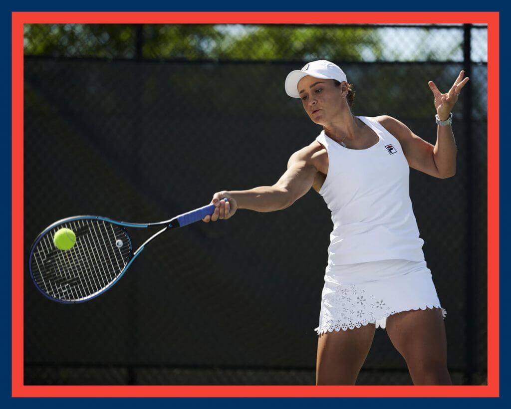
“It’s hard to put into words how much of an impact Evonne has had on the culture of tennis in Australia and on me personally, I don’t think there is anyone more iconic in our sport. I am very proud to wear this commemorative collection from Fila in celebration not only of her momentous victories on the court, but also her incredible legacy off of it.” -AB.
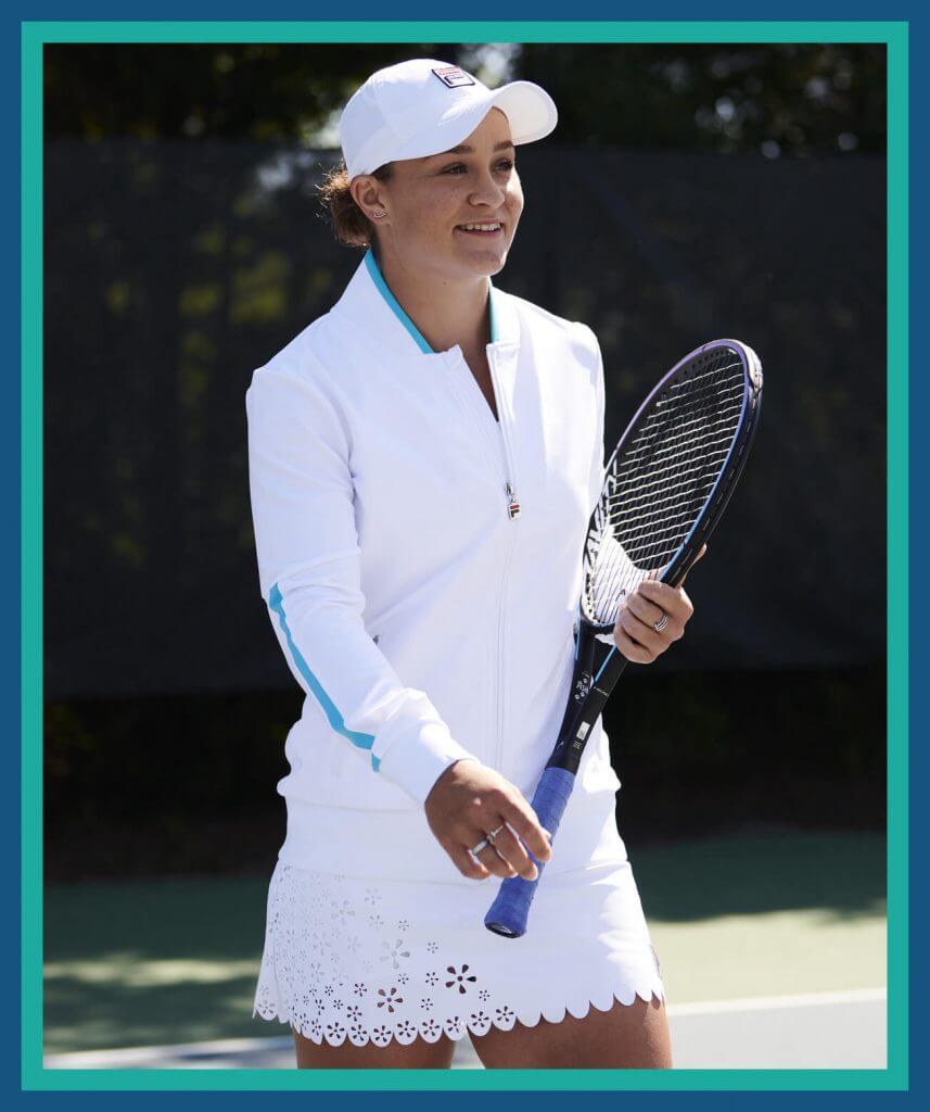
Barty’s specially-designed Trailblazer collection commemorates the 50th anniversary of Goolagong Cawley’s Wimbledon win in 1971.
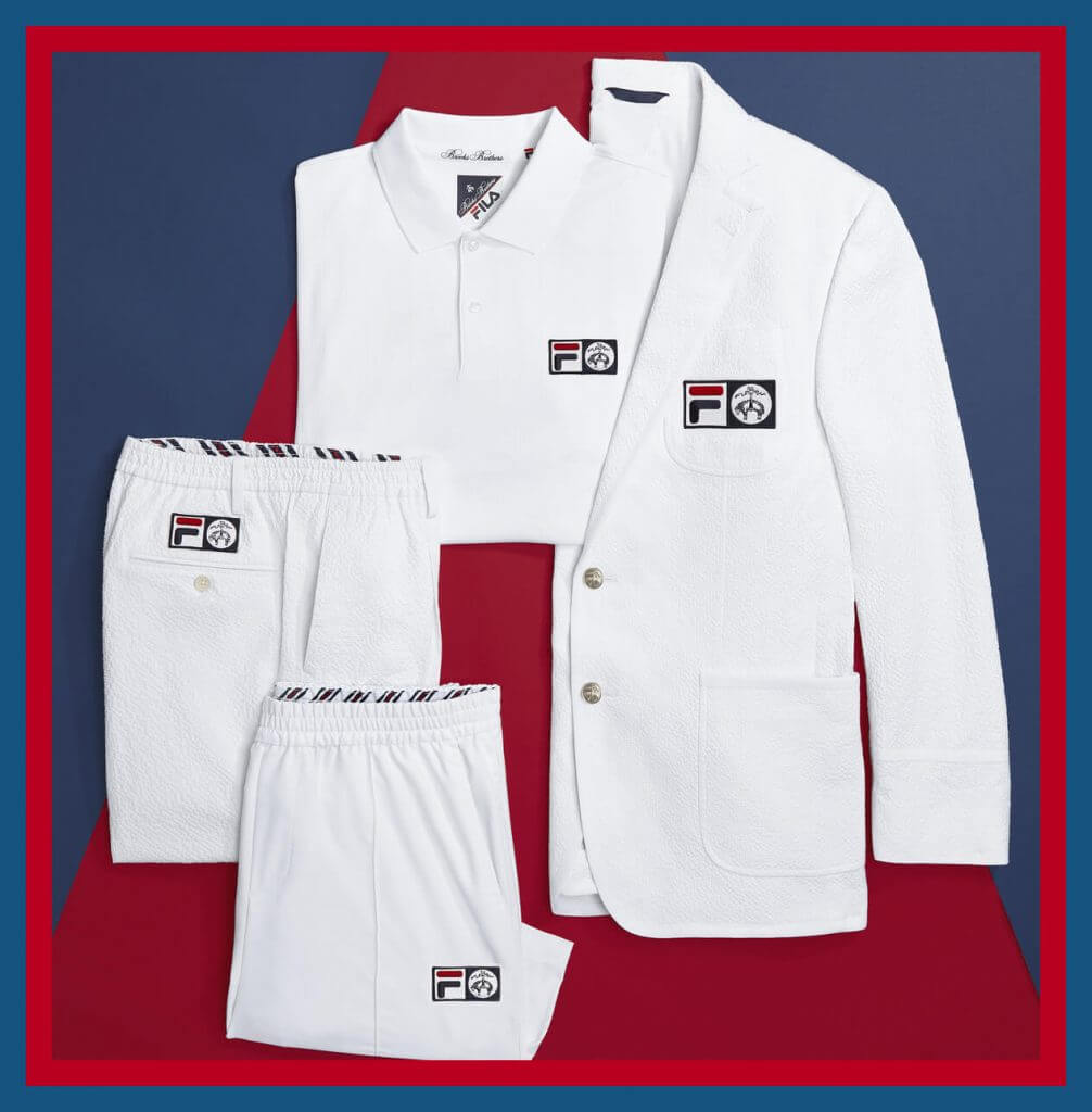
Meanwhile, as Tim mentioned, other players will be wearing a really unique looking set that Fila has created with, of all people- Brooks Brothers, the preppy standard for generations. Sorry, Polo- you’re not even close. Sofia Kenin, Kiki Bertens, John Isner, Sam Querrey and Mackie McDonald are the Fila players who will sport this classic look. The double box F|BB logo also reminds me of the old Borg logo.
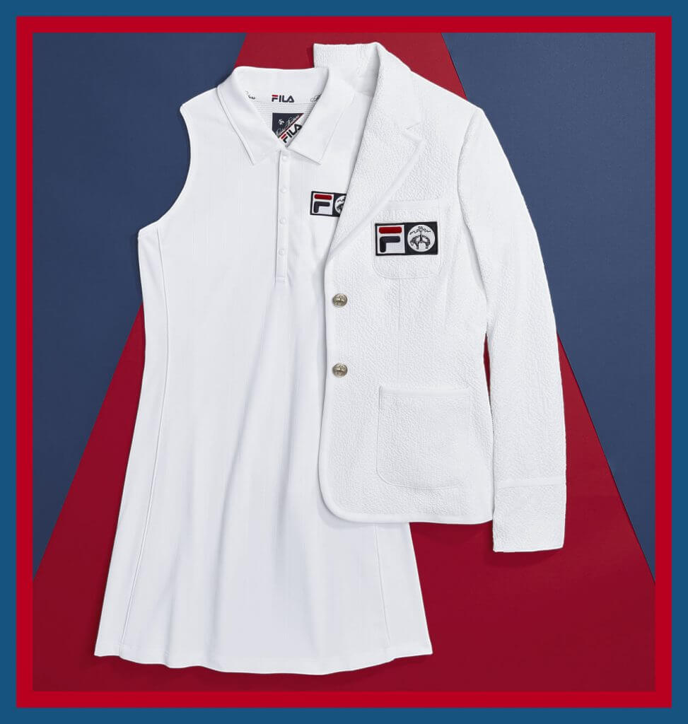
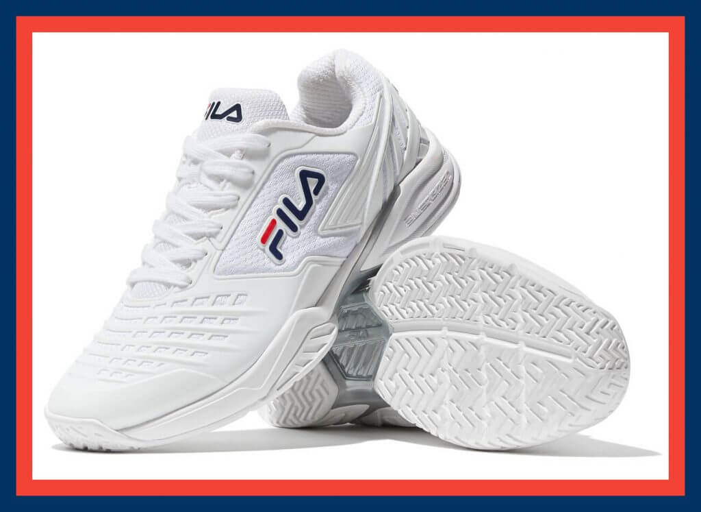
All Fila players will wear the latest white / white / Fila Navy colorway of the “Axilus 2 Energized.”
🎾Uniqlo
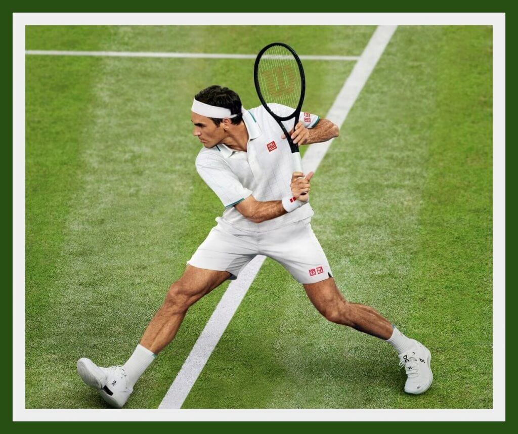
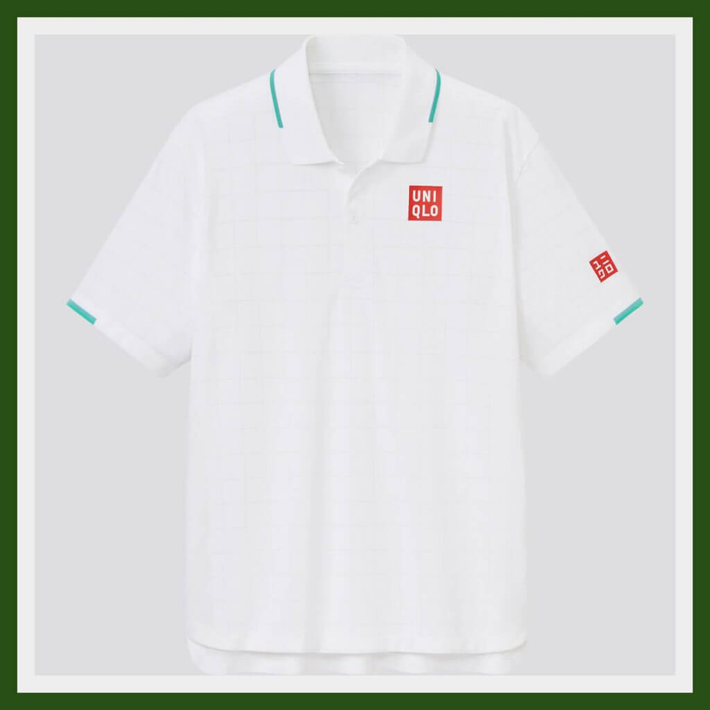
Roger Federer’s look is (of course) basic white with some slight blue/green accents. The shirt also incorporates a subtle “windowpane” pattern.
“For Wimbledon, I feel the green and blue trim is a nice accent to the iconic grounds and helps me feel right at home with the tournament so close to my heart.” -RF
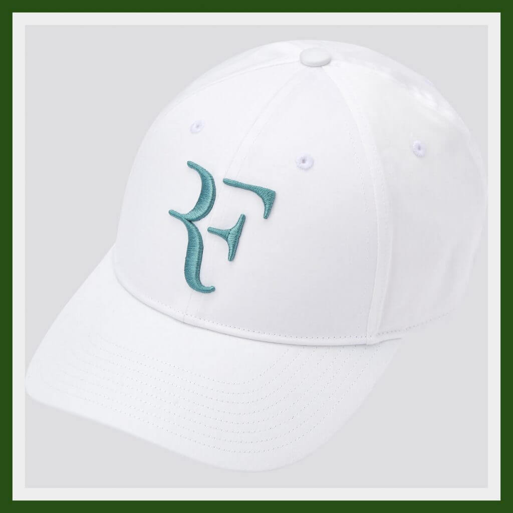
Pair that shirt/shorts/socks combo with the new RF logo cap in a matching color scheme, and you have a look fit for the GOAT. (At least until Djokovic or Nadal passes him. Time marches on.)
If white caps aren’t quite your cup of Earl Grey, they do come in a wide range of colors. Er, colours, that is. Memo to Uniqlo; are you ever going to market the warmup jacket/pants and gear bag? Asking for a friend.
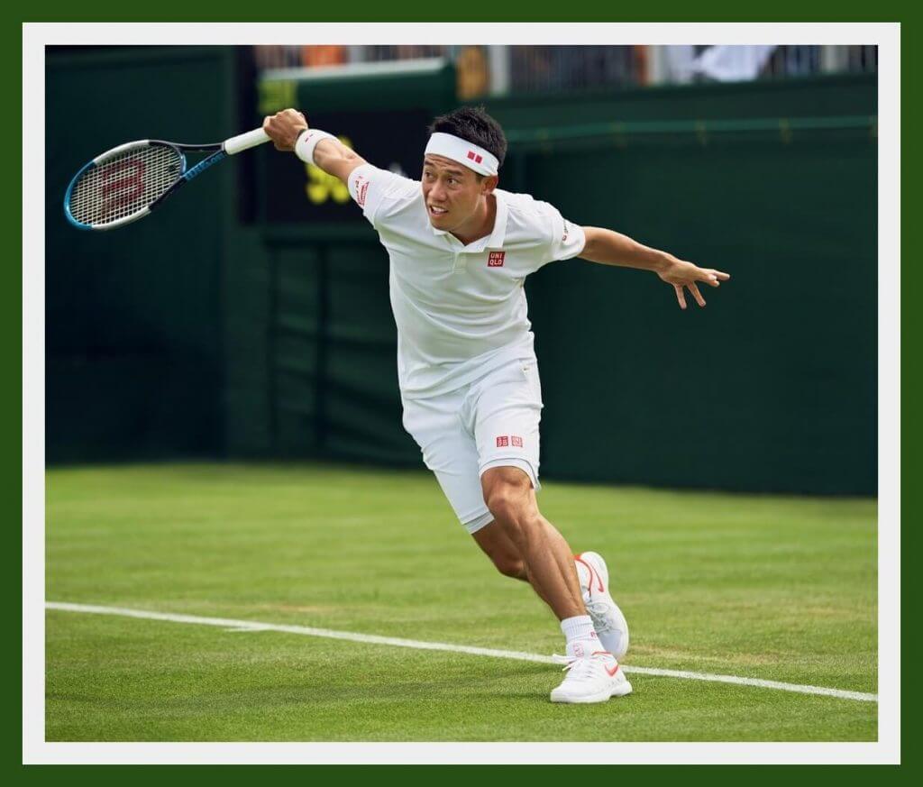
Kei Nishikori’s Uniqlo look is as basic as you can get. It’s white. And that’s that.
OK, there’s a tiny bit of yellow trim, or as Uniqlo says: “inobtrusive yellow lines along the body side to give a flashy impression during gameplay.” Flashy? At Wimbledon? No, sorry, “flashy” is not served here. Try “discreet.”
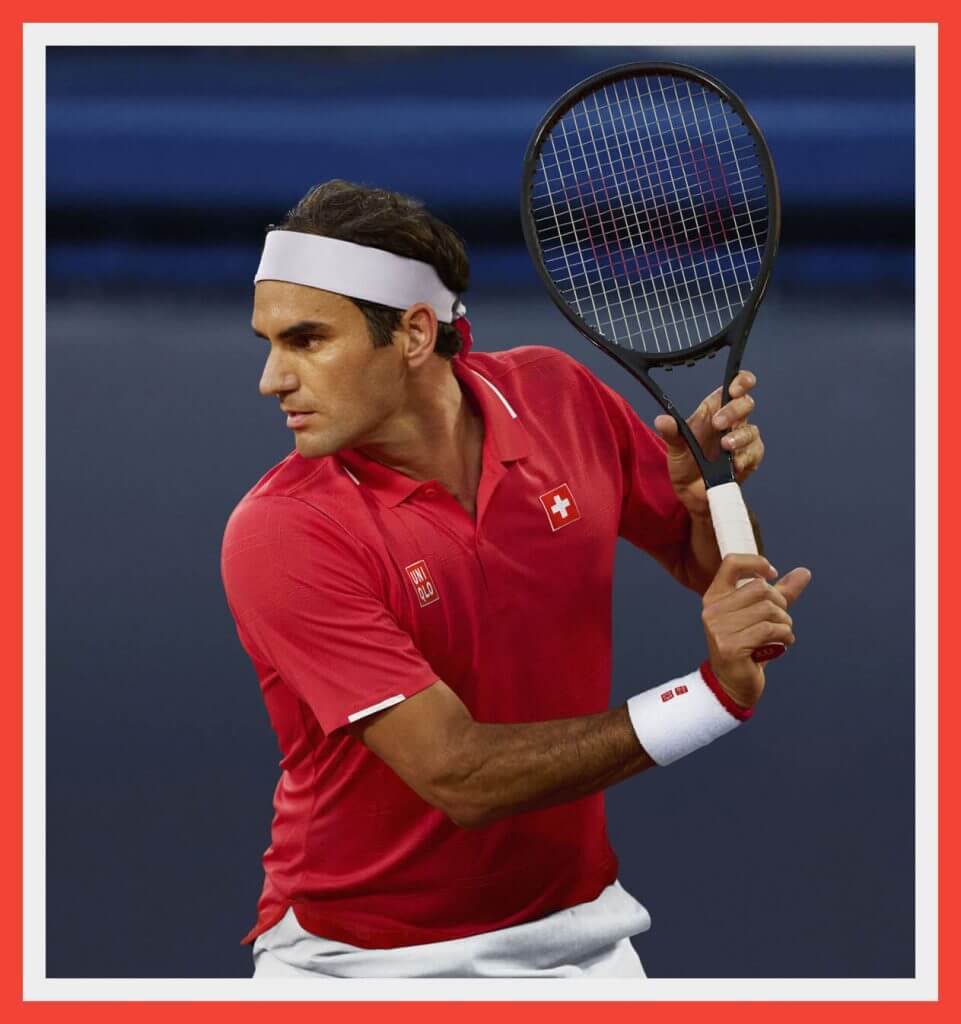
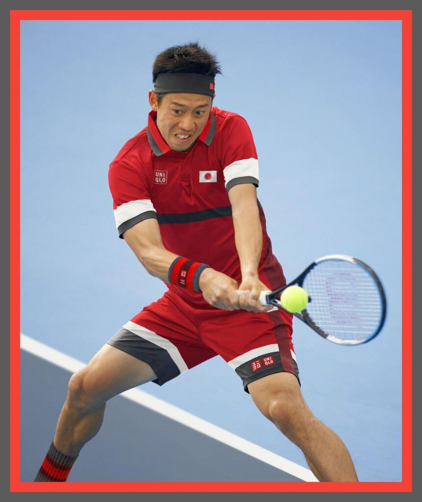
Meanwhile, Uniqlo also has something for their guys for the upcoming Tokyo Games:
🎾Hydrogen
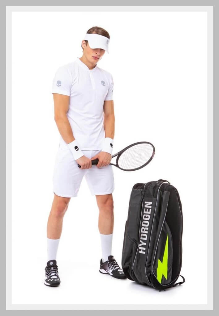
I admit two things; I’m not anywhere near the Hydrogen demo; and this Italian line is known for its decidedly edgy and Gen X (or Y or Z, whatever teens and 20 year olds are these days) appeal.
“For one of the most iconic tournaments in the world, Hydrogen abandons the camouflage, tattoos, and lightning patterns to marry the rules of total white with the addition of a touch that always differs from the others.”
You bet they did. You wouldn’t get within a mile of these grass courts in standard Hydrogen attire. Hydrogen calls this a “polyamide jersey” which allows “natural body thermoregulation.” That’s Italian for “you stay cooler.” Indeed, Hydrogen says this material will leave your skin dry and in an “optimal hygienic condition.” Memo to Hydro: you do know you can’t wear black sneakers there….right?
🎾Adidas
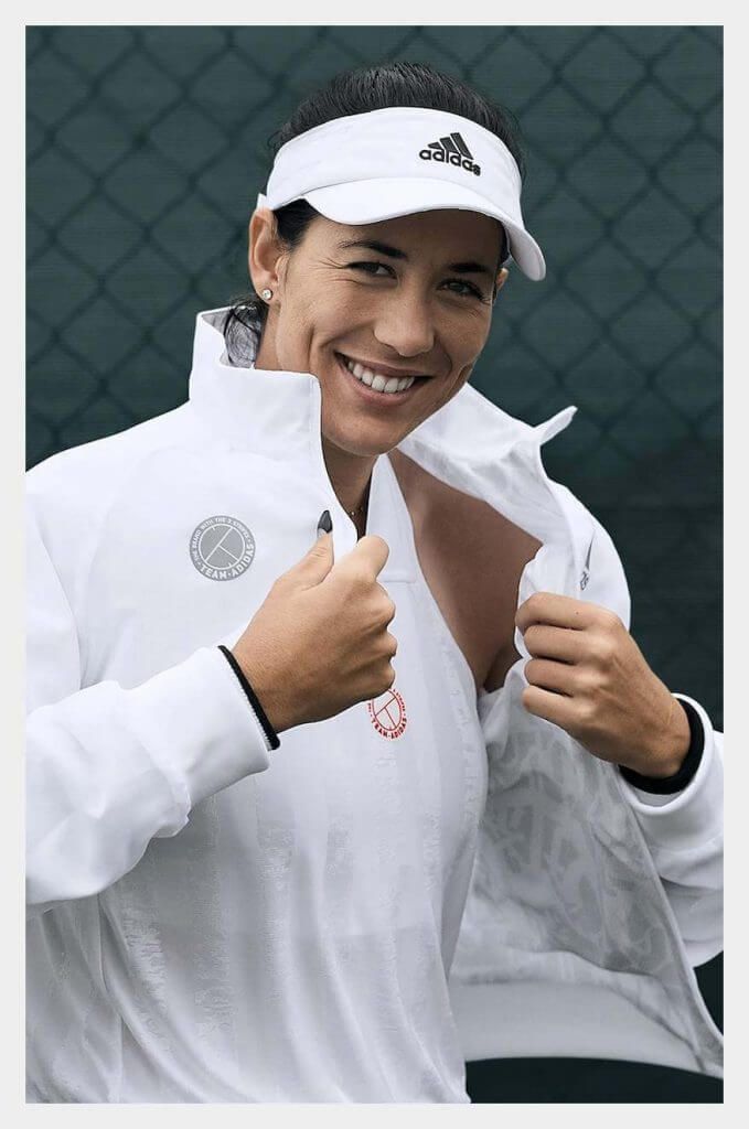
Adidas says the new “soccer-inspired UNIFORIA is influenced by classic football jersey design.”
🎾On
As of now, Federer’s “The Roger Pro” On sneaker is still just for him; nothing for retail…yet. But if you really want to buy a pair and you’ve got some extra cash sitting around, here you go.
🎾Asics
Novak Djokovic is the defending champion from 2019 and will wear the white/green trim version of his signature Asics sneaker.
🎾Yonex
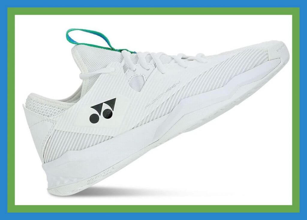
Yonex is an insanely popular racquet line on the women’s tour. They’re also one of the few major tennis brands you see on tour that can outfit a player top to bottom, IE clothing-racquet-shoes. Speaking of shoes- this first sneaker is the 4th-generation FUSIONREV; it features “an identifiable inner bootie and asymmetrical laces found in previous generations, but has evolved to provide additional arch support, better gripping, and a softer fit.”
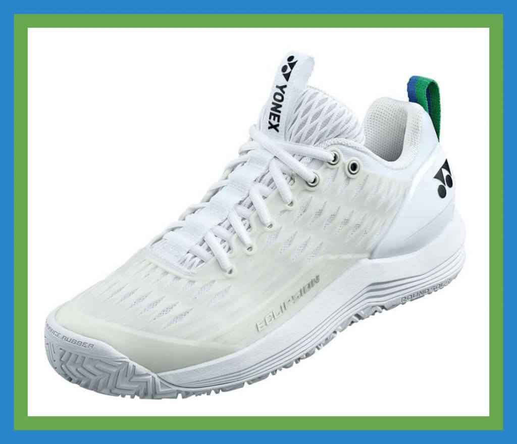
And this model is called the ECLIPSION 3. This series was developed “for superior footwork with enhanced stability for intermediate to advanced players.”
🎾New Balance
In a recent column, Tim made note of American player Danielle Collins, who will lead the brand’s marketing charge for their new Fresh Foam X Lav V2 sneaker:
🎾Nike
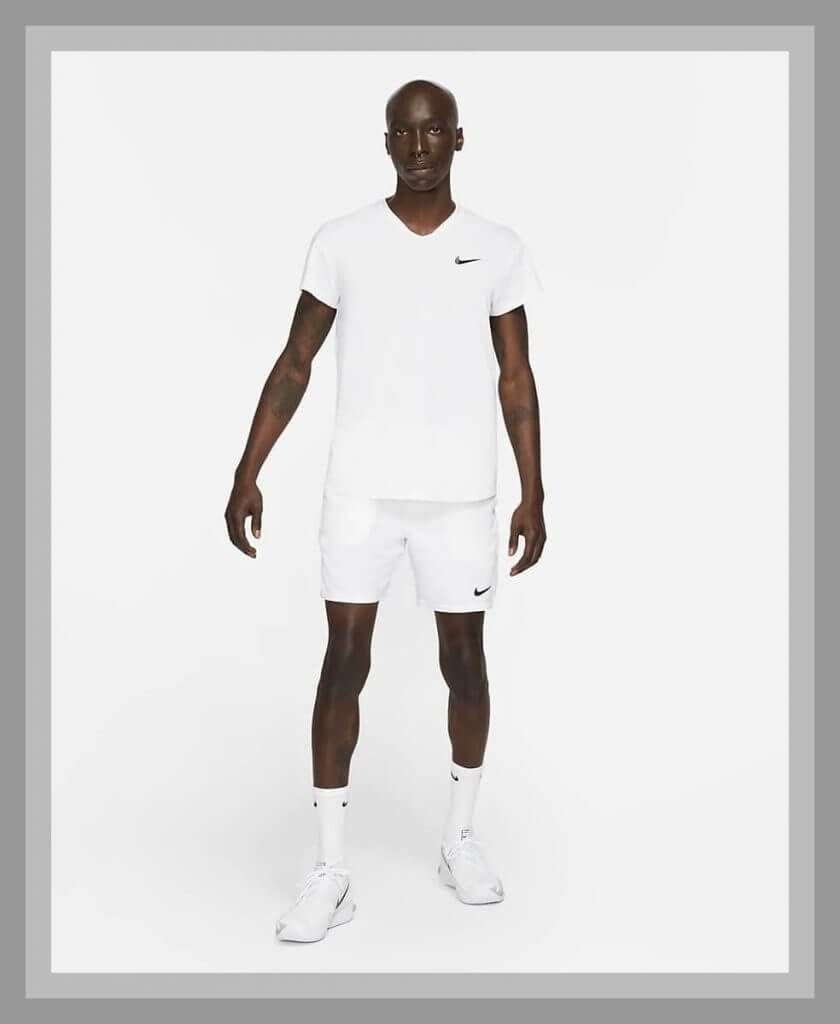
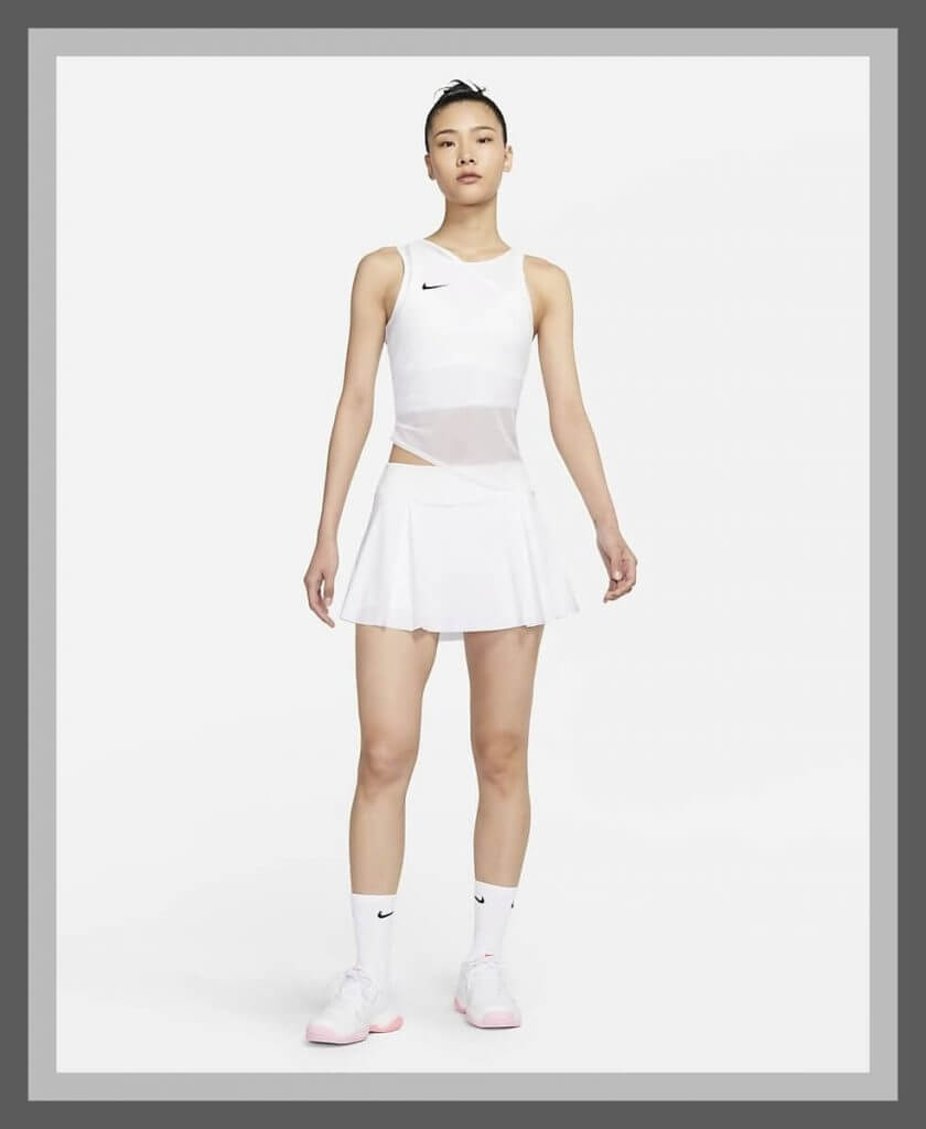
Swoosh will be missing three of its four marquee players (ouch) at Wimbledon; Nadal and Osaka previously announced they were skipping the event, and now defending 2019 champ Simona Halep is out, too. Their players will be outfitted in (surprise) the all-white NikeCourt Dri-Fit ADV Slam lineup:
That’s it for now- see you back here in late August for the US Open!
Thanks, Brinke (and Tim)! Great rundown guys — OK, tennis fans (and even non-fans), what do you think of this years Wimbledon gear? Pretty white, right?


Did the Giants City Connect Jersey Leak?
You be the judge.
please don’t tell me these are the city connect jerseys… pic.twitter.com/7KAIruKdAU
— jake (@mikeyastrzemgod) June 26, 2021
I sincerely hope not.
Hat tip to Johnny Lusardi for this one


The “BEST OF” Kreindler’s Korner
Hey guys & gals. You’ve enjoyed Kreindler’s Korner for several years now, mostly on the weekends, on Uni Watch, but with the recent coronavirus outbreak, Graig’s time is just too precious and he needs to tend to other things besides coming up with a new writeup each weekend.
So, going forward, for as long as the COVID-19 situation is bad in New York, I’m going to run a few “Best of’s” until Graig returns.
Here’s today’s offering:
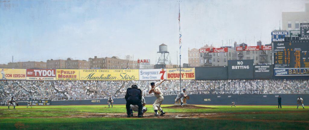
Title: “The Rookie Phenom”
Subject: Mickey Mantle, 1951
Medium: Oil on linen
Size: 70″ x 30″Yankee manager Casey Stengel claimed that the young Mickey Mantle could “hit balls over buildings” and “run as fast as Ty Cobb”. The young prodigy was merely 5’10” and around 165 pounds, but had the arms and shoulders of a blacksmith. During Stengel’s pre-season rookie camp in Phoenix, Arizona, veterans alike watched in awe of the long arching drives Mantle smashed, that would later return to earth with a bang against the distant outfield bleachers. Even more surprising to these veteran coaches was that Mantle was the same kid who had been easily winning the footraces that opened up the camp that spring.
With a sensational run against the teams of the Pacific Coast League, Mantle, who hit .402 in exhibition play, was touted as the most exciting newcomer since Jackie Robinson. The Yankee brass concluded that Mantle was to be the next Babe Ruth, Lou Gehrig, and Joe DiMaggio all rolled up into one package. Upon coming up with the team as a rookie that April, he was given jersey #6, following right behind DiMaggio’s #5, Gehrig’s #4, and Ruth’s #3. The wunderkind started off the 1951 season with impressive power from both sides of the plate, hitting home runs at both Comiskey Park and Sportsman’s Park in early May that traveled in excess of 420 feet. However, as veteran pitchers learned his weaknesses – especially his inability to lay off of high fastballs – his batting average slowly began to dip with increasing strike outs. Under the enormous weight of the swelling pressure from the New York fans and media, the ‘Commerce Comet’ was in the midst of a frustrating slump by June. He was sent down to the Kansas City Blues farm team by Manager Stengel on July 15 of that same year, in the hopes that he would find himself under less pressure to succeed.
In Kansas City, Mantle started slowly, getting only three hits in his first 22 at-bats. Though his hitting would improve to .345 after a long road trip, the phenom felt like he could do no right. The draft-board had ordered another physical – as he had received a 4-F classification in the late 1940s due to osteomyelitis, a rare bone disease – and his concentration and confidence troubles only seemed to deepen. With catcalls of ‘coward’ and ‘bust’ ringing in his ears, the 19-year old kid considered quitting baseball altogether. It took a stern hardline reaction from Mantle’s father Mutt to inspire the kid to pick up both his courage and his bat. Mickey would hit 2 more home runs the next game, and for the 39 games that followed, Kansas City saw Mantle bat in 50 runs and end his Blues stint batting .361. When Mantle returned to the Yankees for good in late August, it was Pete Sheehy, the longtime clubhouse attendant of the Yankees, who gave the young player #7 to wear, in the hopes that it would relieve the pressure of being the next Yankee legend in line.
Upon his return, the Bombers had picked up steam coming into the second half of the season. Though Boston had tied the White Sox for the American League lead on July 20, pushing the Yankees and Indians one and a half games back, the turning point of the year came with Casey’s decision to bench the slumping Jerry Coleman, and move Gil McDougald from third to second, while inserting Bobby Brown at third. This sparked a 17-3 streak for New York, and catapulted them past Boston and Chicago. During their run, the rookie McDougald was leading the team in hitting, and Yogi Berra had picked up the slack of a slumping Joe DiMaggio. Hank Bauer and Gene Woodling were also contributing tremendously. Mantle had begun to come to life as well, hitting five more home runs coming into mid-September, one of which was a monstrous shot into the left-centerfield bleachers at Municipal Stadium in Cleveland.
By the end of the summer though, the Yanks were jockeying for first place with the Indians. The last Stadium series between the two American League powerhouses found the Bombers dominating the Tribe during regular season, winning 13 out of 20 games played. It was not until this pictured game at the Stadium on September 16 that the Yanks pulled away for good.
In front of 68,760 screaming fans, Cleveland’s pitcher Bob Feller is shown firing a 2-2 pitch to the Yankee freshman, Mantle, in the first frame of the afternoon. Catcher Jim Hegan is poised behind the plate, as is umpire Bill Summers. Also visible that warm afternoon is Indian shortstop Ray Boone, third baseman Al Rosen, first basemen Luke Easter, leftfielder Sam Chapman, and centerfielder Larry Doby, with umpire Bill Grieve between first and second. The 19-year old switch-hitting Yankee would fly out on the play.
Facing ‘Rapid Robert’ that afternoon was Allie Reynolds, who at the time was pitching the best baseball of his career. ‘Super Chief’ pitched brilliantly, allowing only 5 hits, two of which came in that same fifth for a run – the only scare of the afternoon for New York. In that same inning, Feller intentionally walked Berra to face the seemingly weary DiMaggio, who had been dropped to the fifth spot by Stengel. Casey’s batting order gamble had worked in the first inning with Berra driving in a run, while DiMaggio feebly grounded out afterwards. However, this time Joe met the challenge with a thunderous wallop that ignited the crowd. The ball was belted into cavernous left-centerfield, scoring Mantle and Berra, and leaving Joe with a triple. Feller and the Indians were finished for the day.
Allie Reynolds picked up his fifteenth win, and the fifth against the Tribe that year. Outscoring the Cleveland Indians 5-1, the Yanks found themselves in first place by .003 percentage points, a lead they would never relinquish. That year, Mantle’s rookie numbers were a respectable .267 batting average, 13 home runs, and 65 RBIs. Though his season was abbreviated by the Kansas City stint, he was an instrumental part in the Yankees capturing their third straight pennant in as many years. Moreover, this first season proved to be only a glimpse of what was to come for this future Hall of Famer, one who would come to be synonymous with the Yankee dynasty and the city of New York for the next 17 years.
Thanks, Graig! You can (and should!) follow Graig on Twitter.


Guess The Game…
from the scoreboard
Today’s scoreboard comes from ojai67.
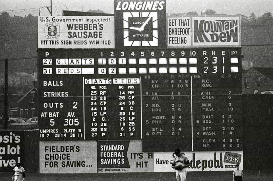
The premise of the game (GTGFTS) is simple: I’ll post a scoreboard and you guys simply identify the game depicted. In the past, I don’t know if I’ve ever completely stumped you (some are easier than others).
Here’s the Scoreboard. In the comments below, try to identify the game (date & location, as well as final score). If anything noteworthy occurred during the game, please add that in (and if you were AT the game, well bonus points for you!):
Please continue sending these in! You’re welcome to send me any scoreboard photos (with answers please), and I’ll keep running them.


Uni Watch News Ticker
By Phil

Baseball News: Here’s a uni-related story from The Onion. Submitter Ron Ruelle says, “This Little League team isn’t messing around!” … The St. Louis Cardinals have dedicated new softball and baseball fields at Harris-Stowe University on the site of the old Stars Park, longtime home of the Negro Leagues’ St. Louis Stars (from Kary Klismet). … Here’s a beautiful colorization of a young Ted Williams from his days as a star with the Pacific Coast League San Diego Padres (from Bruce Menard). … “Hadn’t seen this until today: The National League shirts are hilariously confusing since they emphasized the AL part of the word, making it look to be for the American League. “NationA(american)L(eague)”” writes R-el E-Lee. … Here’s a look at the Corpus Christi Hooks 4th of July caps (from Ignacio Salazar). … The Tampa Rays became the Devil Rays yesterday.

Football News: Here’s another article (joining the one linked to in Saturday’s Ticker – this one from the Kansas City Star) suggesting that the Kansas City Chiefs should break out Dallas Texans throwback uniforms now that the NFL has lifted the one-shell rule, despite the fact the Chiefs already could wear those throwbacks under the current rule since both helmets are red (from Kary Klismet). … Meanwhile, Sporting News has identified eight throwback helmets they’re looking forward to seeing with the repeal of the NFL’s one-shell rule. Of course, one of the teams listed, the Dolphins, already could wear the suggested throwback look since the team has always worn a white helmet shell (also from Kary). … Here is one more from Kary: And while we’re at it, Golf Digest has come out with a list of nine throwback helmets they’re eager to see return, despite the fact that two of the teams — the New York Jets (green) and the Baltimore Ravens (black) — wear helmets that are the same color as the throwbacks the magazine is calling for. Kary adds, “There seems to be a trend developing of sportswriters who are unclear on what the repeal of the one-shell rule actually means. I guess there are still a lot of them out there who don’t Get It™.” … If this script font for UM football looks familiar, that’s because it is (from brႿc). … Boston College is now outfitted by adidas, but apparently they haven’t gotten all the swag (from Ethan Moore). … “Texas is using jerseys with two different wordmarks in recruiting visit photoshoots and I’m convinced it’s being done solely to piss me off” says Rob Behrens. … Not surprisingly, fans, players and teams alike are psyched for alternate helmets once again being allowed.

Hockey News: Here are the new jerseys for the Southern Professional Hockey League’s Peoria Rivermen for upcoming season (from Wade Heidt). Larger depictions of the jerseys in this tweet. Still more here (from Kary Klismet). … Here’s the logo for the Anchorage Wolverines, the newest junior hockey team in the North American Hockey League (from Kary Klismet). … Lance Stroll, a Formula One driver, is a big Canadiens fan, so he showed his love for his team on their quest for the Stanley Cup by putting the team’s logo on his helmet for this weekend’s Styrian Grand Prix race in Spielberg, Austria.


Basketball News: The Big West Conference is moving its basketball tournament to the new 6,000-seat arena being built in Henderson, Nev., renderings of which can be seen here (from Kary Klismet. … Wow! Check out this amazing mural design for an outdoor basketball court in Victoria, B.C., (the first of ten planned for the metro area). This is also from Kary.

Soccer News: FC Porto of Portugal’s Primeira Liga have unveiled their away kits for the 2021-22 season (from Kary Klismet). … Even though it was just a friendly, but red vs orange (light red?) for Wisła Kraków vs Stal Mielec. Either way, hard to differentiate the teams (from Ed Żelaski). … Scottish Premiership side Rangers FC are celebrated their past while they unveiled new home kits for the 2021-22 season. … There’s a new away shirt for Dynamo Dresden (also from Ed Żelaski).

Grab Bag: The cycling team Alpecin-Fenix was granted permission to wear these jerseys they revealed on Thursday for the first day of the Tour de France today. They were only going to wear them for the presentation of the teams (from our own Jamie Rathjen). He explains, “Teams can generally only wear one design per year, and if they want to temporarily change it, have to change for one entire event — though in the past the Tour winner’s team has sometimes worn special jerseys for the last day.” … Several cyclists are set to debut their new national champion kits at the Tour de France next month (from Kary Klismet). … One more from Kary: Staying with cycling, Team Qhubeka NextHash from South Africa has unveiled new kits ahead of the Tour de France. … Home look 2021-2022 season for Artemis Hokkaido women’s volleyball team (from Jeremy Brahm). And this is their away look.


Uni Tweet of the Day
Huge moment in uni history took place 105 years ago yesterday…
105 years ago today (June 26, 1916) at League Park, the Cleveland Indians became the first team to wear uniform numbers. They can be seen, as placed on the left sleeves, in the team photo below. The Tribe won that day, 2-0 over the White Sox, as Fred Beebe tossed a 3-hitter. pic.twitter.com/ExGdnFUtKu
— League Park (@LeagueParkCle) June 26, 2021


And finally… big thanks to Brinke for that Wimbledon gear rundown. I know many of you probably aren’t tennis fans, but Wimbledon, despite being played on grass and with an all-white-attire requirement, is still the “big one” (and probably Roger Federer’s last chance to capture a slam and deny Novak Djokovic the third leg of the “Grand Slam”). If we get a Fed/Nole final, it will be must-see-TV.
That’ll do it for me this weekend, and next weekend being Independence Day weekend, I’ll be off (thanks, Paul!). You guys stay safe and healthy and I hope everyone is able to enjoy a fully vaccinated, big-time outdoor 4th of July party just like in the old days!

Peace,
PH
GTGFTS: June 24, 1970 – Reds 5, Giants 4 in the last game at Crosley Field.
The 1970s Mountain Dew logo was the best.
Wow. Thinking Golf Digest should stick to writing about golf and not football helmets. Anyone one of us who reads that knows why. The writer could have done a fact check that would have taken no effort to make sure that the years were right for the helmets.
Admittedly, when I read the article I didn’t pay any attention to whether or not the years were accurate. But my complaint is that it was unnecessary, it just repeated the same thing that every other story on throwbacks talks about.
I will say that the comments on the “world-weary” old Seahawks logo was pretty funny.
Missing link for the Dresden kit.
Thanks Scotty — should be there now.
I’m think The Onion (baseball ticker, 1st item) is mostly a satirical website and the story is likely not true. I have been wrong plenty of times in the past, so forgive me if I am again.
Yes, it is a satirical website…the submitter probably thought it was humorous (and uni-related), so that’s why it’s in the ticker.
I never knew Mickey Mantle had osteomyelitis as a kid. And that it was cured by penicillin! Today, osteomyelitis usually means 6 weeks of high-potency antibiotics. Getting an infection out of the bone is no easy feat.
The pixilated effect on the “G”, the obscuring of the Giants wordmark above the jock tag….San Francisco Fog.
“And finally”
I think the correct spelling is Novak Djokovic
Ugh. Yes. Fixed.
As for the G rising up from the fog like one of the towers? Very clever.
I’m not a fan of teams relocating and keeping the same look. For 20 years or so, the Giants looked just like the New York team (except for cap and road unis). I loved the 80s logo with the bold (giant?) letters. Just a different identity.
Face it, the Golden Gate Bridge IS giantic. And it’s orange. They should’ve incorporated it in their identity years ago.
I agree, I think there should be a rule that if a team relocates to a new city they should have to change nicknames and develop a new color scheme and identity. You’d think this would appeal to fans anyway in the new city, like it was their team instead of another city’s castoffs…
Yeah, I’m sure Walter O’Malley (and the LA fans) would have loved to ditch the Dodgers identity when the team moved from Brooklyn. If anything, your idea would gain more traction from the city losing its team than the one gaining it.
Agreed completely, Jasper. Back when nicknames weren’t as important and “Brooklyn NL” looked very different from “Los Angeles NL” it wasn’t as big a deal, but now I think they should make a complete change, like Washington did with the Nationals, and let the people in the old city keep their team’s identity.
Is it typical for numbers on Japanese jerseys to be underlined or is it just normal for this team?
Indoor volleyball rules require the captain’s jersey number to be underlined. The rules specify the underlining to be on the front of the jersey; perhaps the Japanese league requires it on both sides.
Thanks!
Regarding the Chiefs wearing a Dallas Texans throwback…I think teams if they’re going to wear a throwback it shouldn’t be a uniform from a previous city they played in. Same goes for the Titans/Oilers.
It’s like the team is saying, “Hey, let’s remember a time when we played in a town that we decided we didn’t want to play in anymore…”
So no throwback options for the Raiders?
Same for the Chargers – it’s 1960 or nothing?
Yeah, that’s odd. You’d lose 3 and possibly 4 of the original 8 AFC teams (Denver and Buffalo are good, the “Titans of New York” still technically works, and you could argue the “Boston” Patriots are still ok). But Da Raidahs, Chiefs/Texans, Titans/Oliers are out and LA would have to go to 1960 only. I’m not sure that’s such a good idea.
I suppose it’s a little different for the Chargers and Raiders since they didn’t change nicknames and don’t have uniform elements that are specifically tied to older cities.
Of course, I’m kind of over the whole throwback/alternative uni thing anyway. I guess I long for the days when teams had one home and one road uniform much like Paul longs for the days when there were no ads on uniforms and courts.
We are just rooting for the laundry, and I find the lack of consistent uniforms makes me feel more distant as a fan. Especially in the NBA, where you show up for a game and have no idea if your team is even going to be wearing the team colors.
The Titans could throw back to the 2 seasons they played as the Tennessee Oilers…sure, not not the franchises’s best uniform set (just ask Jim Vilk!), but good enough for those of us who Luv Ya Blue?
I don’t see what the attraction of Texans tb’s would be. They’re basically the same uniforms as today without sleeve stripes, and the same uniforms the Chiefs wore in KC until 68.
Great job, Brinke, as always, on the Wimbledon write-up! I’m ambivalent about Wimbledon’s all-white rule. On the one hand, it mutes the available color palette that could bring more visual interest to the tournament. On the other, it winds up resulting in the apparel manufacturers outfitting their endorsers with some of the most tastefully understated tennis clothing seen on the pro tours all year. On balance, I appreciate the tradition and am glad they’ve kept it.
Thank you!